
6
A voluntary churn propensity model for credit card holders
6.1 The business objective
A bank was losing credit card customers to its competitors, and the marketers of the organization decided to use analytics in order to deal with this issue. Their goal was to use data mining models for identifying customers with increased propensity to churn so they could fine-tune their retention campaigns.
Each credit card customer is unique. They all have different demographic profiles and usage characteristics. They vary in terms of spending frequency and intensity, payment behavior, and limit usage. Certain customers use their cards very often, while for others, the usage is infrequent and low, maybe because their main card is with a competitor. Some customers may have increased their usage compared to the past, while others may show signs of usage decrease. The so-called transactors usually pay their full balances every month as opposed to other customers who tend to carry past balances and use their entire credit limit. “Old” customers have a long relationship with the bank, whereas others are new customers. So what makes a customer loyal and how all these characteristics are related to customer attrition. Fortunately, all this information which defines each customer’s unique “signature” could be retrieved from the bank’s mining datamart. After proper transformations, they could be used as inputs in the churn model to be trained.
Since not all customers are equally important, the bank’s marketers also intended to combine churn propensities with value information in order to prevent the attrition of high value at risk customers. Their final goal was more ambitious than using analytics just for a single campaign. They wanted, after validating the effectiveness of the models, to build a process and integrate analytics in the marketing operations for better targeting their retention campaigns.
6.2 The mining approach
The mining approach decided was to build a voluntary churn propensity model by analyzing customer behavior prior to churn. Therefore, the model had to be trained on customers that were active at the end of the observation period in order to discern the patterns that differentiate those that finally churned (target population) from those that stayed loyal in the following period.
6.2.1 Designing the churn propensity model process
The decisions made in the design process concluded on the following.
6.2.1.1 Selecting the data sources and the predictors
The organization had already in place a mining datamart with detailed information on credit cards’ usage. This simplified the mining procedure since the tedious data preparation tasks needn’t start from raw transactional data. The mining datamart contained historical information for more than 12 months which is typically necessary for building reliable churn models. The usage information that was considered as important and was decided to participate in the model included credit card spending (amount and transactions), balances, limits, and payments. This information was supplemented with card characteristics such as opening date, expiration date, and card type along with customer demographics.
6.2.1.2 Modeling population and level of data
The modeling population included “active” credit card holders, meaning customers with at least one open credit card at the end of the historical observation period.
The campaign’s level (customers) also imposed the level of the modeling population and dataset. Therefore, an additional data preparation phase was necessary for the aggregation of card-level data at the customer level. This procedure will be briefly described later in this chapter.
6.2.1.3 Target population and churn definition
There was a debate among the marketers on what to define as churn. Some argued about defining inactivity as churn. According to this approach, a card was to be flagged as churned after some months with no spending usage. The approach finally adopted was to go with actual card closing and consider a card as churned if voluntarily closed. Cards closed involuntarily, due to bad payment behavior, were excluded and left over for a credit risk model.
But how is this translated at the customer level, and what makes a customer with more than one cards a churner? The decision was to target full churn instead of partial churn. Therefore, a customer was considered as a churner if he/she closed all of his/her cards in the period examined.
6.2.1.4 Time periods and historical information required
For the needs of model training, the retrieved data covered three distinct time periods: the observation period, the latency period, and the event outcome period.
Twelve months of historical data was decided to be analyzed in order to identify data patterns relevant to attrition. Since the modeling procedure started at mid-2013 (start of July 2013), the observation window covered the whole 2012. A latency period of 2 months was reserved for preparing the relevant campaign. A period of 4 months was examined for churn. Thus, an active customer was considered as a churner if he/she had closed all his/she cards within the 4 months after the latency period, from March to July 2013. The approach is described in Figure 6.1 which is also a guide for the data setup for the model training.

Figure 6.1 The three different time periods in the model training phase
6.3 The data dictionary
The fields retrieved from the mining datamart for the scope of the project are listed and briefly explained in Table 6.1. They include card characteristics and status information, customer demographics, and usage attributes.
Table 6.1 Data dictionary (card level) for the voluntary churn model
| Data file: CC_CHURN_DP_DATA.TXT | |
| Field name | Description |
| Usage fields | |
| SPENDING_AMOUNT_(n) | Total card spending (purchases and cash advance) for month n: 1 stands for the oldest and 12 for the most recent month of the observation period |
| TRX_(n) | Total number of spending transactions for the month |
| BALANCE_(n) | Balance (daily average) for the month |
| LAST_TRX_DATE | Most recent date of spending transaction. To be used for calculating recency of spending |
| Card and customer characteristics fields | |
| CARD_ID | The (primary) card identification number |
| NUM_CARDS | The number of add-on cards for each primary card |
| LIMIT | The credit limit at the last month of the observation period |
| CARD_TYPE | The card type (Classic/Gold/Platinum) |
| CUSTOMER_ID | The customer identification number |
| GENDER | Gender of the customer |
| EDUCATION | Educational level of the customer |
| MARITAL_STATUS | Marital status of the customer |
| AGE | Age of the customer |
| Data file: CC_CHURN_ACCOUNTS.TXT | |
| Status fields | |
| OPENING_DATE | The opening date of the card |
| EXPIRY_DATE | The expiration date of the card |
| CLOSING_DATE | The closing date of the product account. A null value for open cards |
| CLOSING_REASON | The recorded closing reason for closed cards (voluntary churn/involuntary churn and null for open cards) |
Usage attributes cover an observation period of 12 months, from January to December 2012. These fields, after proper transformations, were used as predictors in the churn propensity model; therefore, they summarize customer behavior prior to the time period reserved for observing possible churn. Their names have a suffix of _n where n corresponds to the month they summarize. One stands for the earlier month (1/2012) and 12 for the most recent month (12/2012) of the observation period.
Status fields such as the closing date and reason were used for capturing churn and for the definitions of the target (output) field of the model.
Although, normally customer demographics, card characteristics, and usage attributes reside in different database tables, for simplicity in this example, we assume that they are stored at the same table.
6.4 The data preparation procedure
Section 6.4 describes in detail the data management procedures that had been carried out in the fields of Table 6.1 before being used as inputs in the churn model. Readers not interested in the data preparation phase might skip the next sections and go directly to Section 6.5 for modeling.
6.4.1 From cards to customers: aggregating card-level data
Since the scope was to analyze and target customers, individual card usage had to be combined to convey the behavior of each customer. Therefore, the initial card usage data, listed in Table 6.1, had to be aggregated at the customer level. This step included the grouping of individual card records to summarized customer records with the use of standard summary statistics and the construction of customer attributes such as the total spending amount and the number of transactions of all cards, the last transaction date, etc. This step is illustrated in Figure 6.2.
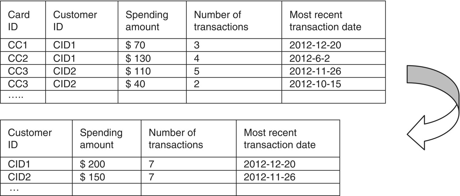
Figure 6.2 Aggregating usage data per customer
Even after aggregation, the data preparation phase was far from over since summarized data had to be enriched with informative KPIs.
But before we get into that, let’s spend some more time examining the aggregation procedure. Before the actual grouping and the replacement of the card records with the customer records, cards already closed before the observation period (prior 2012-1-1) were filtered out. Obviously, it makes no sense to analyze cards that had already been terminated before the period under examination. At first, cards open at some point within the observation period were flagged as OPEN WITHIN. These cards comprise the population to be examined for the model.
Specifically, by examining the cards’ closing dates, a card was flagged as OPEN WITHIN if it hadn’t been closed (it had a null closing date) at all or it had been closed after the beginning of the observation period (it had a closing date after 2012-1-1). Additionally, only cards opened before the end of the observation period (the so-called REFERENCE DATE of 2012-12-31) were retained. Initially, cards open within the observation period were flagged using a Modeler Derive node as shown in Figure 6.3.

Figure 6.3 Flagging cards which were open within the observation period
Then, only cards flagged as OPEN WITHIN were included in the modeling file. Cards involuntarily closed at any time were also discarded before the aggregation through a Modeler Select node (Figure 6.4).
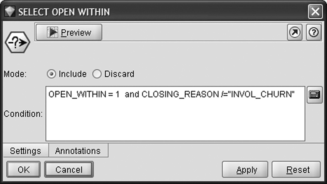
Figure 6.4 Filtering out cards closed before the observation period
Analysts also wanted to monitor the number of open cards per customer at different time points. They achieved this with a series of flags and more specifically:
- Open cards at the beginning of the observation period (2012-1-1, OPEN_AT_START field)
- Open cards at the end of the observation period (2012-12-31, OPEN_AT_END field)
- Open cards at the end of the latency period (2013-3-1, OPEN_AT_LATENCY)
- Open cards at the end of the event outcome period (2013-7-1, OPEN_AT_EVENT_OUTCOME_PERIOD field)
The flags were created with Modeler Derive nodes as sown in Figure 6.5.
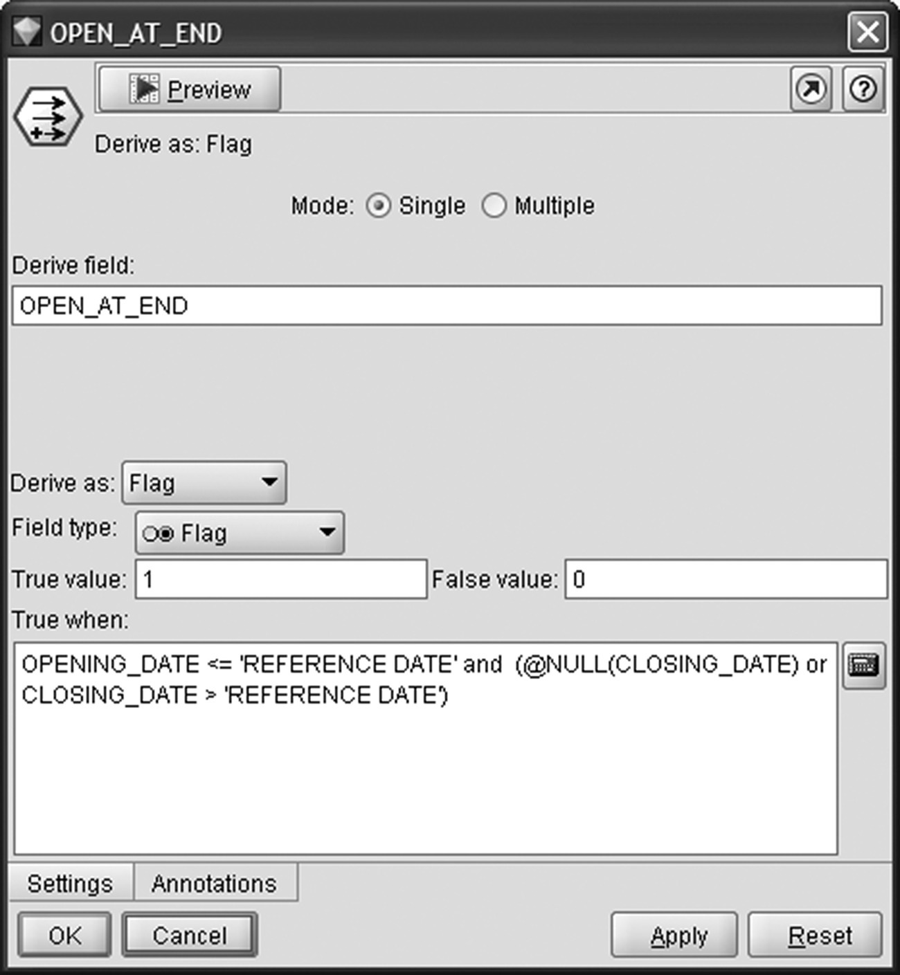
Figure 6.5 Flagging cards open at the end of the observation period. The REFERENCE DATE is the last day of the observation period (2012-12-31)
These series of flags enabled the analysts not only to capture the trend of card ownership for each customer but also, as we’ll see in the next paragraphs, facilitated the identification of churners and the definition of the target field.
Furthermore, new fields were constructed which summated individual monthly fields for each card and summarized the total spending amount, the number of transactions, and the balances over the 12 months of the observation period. Figure 6.6 displays the Modeler Derive node for the calculation of the total number of transactions in the observation period.

Figure 6.6 Calculating a new field denoting the total number of transactions over the 12 months of the observation period
These preparatory tasks were followed by the aggregation of the information per customer. Sums of spending amount, number of transactions, and balances were computed for each customer, and the card-level data were replaced with customer data form that point on. The most recent transaction date (maximum of LAST_TRX_DATE field) of all cards was calculated to enable the subsequent calculation of spending recency for each customer. Additionally, the first card opening (minimum of OPENING_DATE field) was derived to enable the calculation of the tenure for each customer. The Modeler Aggregate node was applied for aggregating the information at customer level as displayed in Figure 6.7.
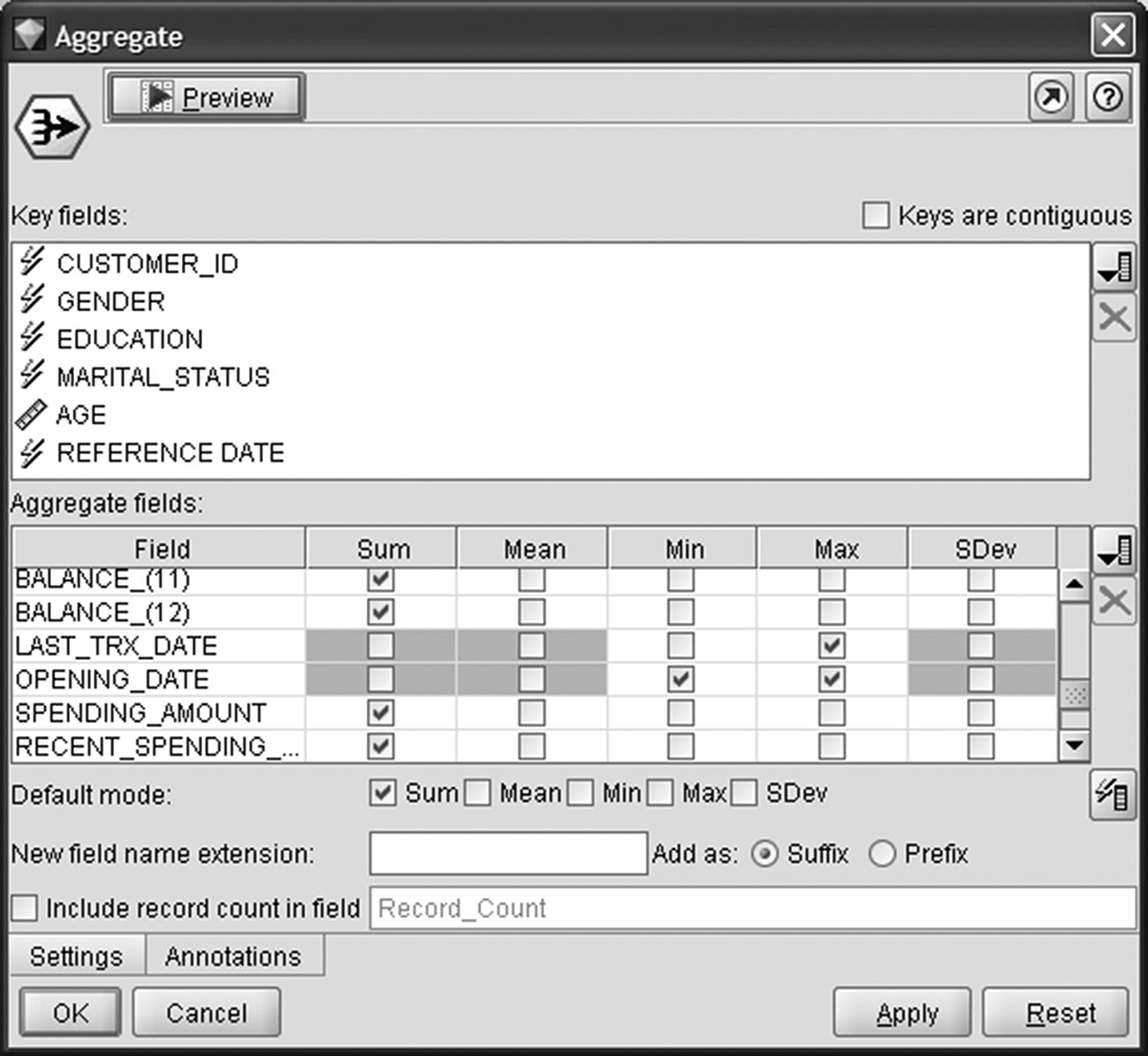
Figure 6.7 Using an IBM SPSS Modeler node for aggregating card data at the customer level
6.4.2 Enriching customer data
The data preparation procedure was continued with the enrichment of customer data with usage KPIs.
The derived fields included:
- Customer tenure
The tenure (months on books) of each customer (TENURE_CUSTOMER field). A Modeler Derive node and a date_months_difference function was used to calculate the months of relationship with each customer, based on the opening date of each customer’s first card (Figure 6.8).
- Monthly average spending amount
The monthly average spending amount (AVG_SPENDING_AMOUNT field) of each customer over the 12 months of observation period. A Modeler Conditional Derive node was used to divide the total spending amount with the customer tenure, for new customers, or 12 months, for old customers as shown in Figure 6.9.
- Spending recency and frequency
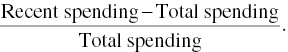
The spending recency and frequency were considered as churn predictors with potential predictive efficiency and were also derived. The spending recency (SPENDING_RECENCY field) was computed as the time from the last spending transaction (LAST_TRX_DATE_Max) to the last day of the observation period (REFERENCE DATE field) as shown in Figure 6.10.
The spending frequency (SPENDING_FRECENCY field) was calculated as the percentage of the 12 months of the observation period with spending.
- Spending Deltas
The average spending amount and spending frequency were also calculated for the last 4 months of the observation period, the 4 months nearest to potential churn. Deltas were then derived to denote changes during these 4 months. The idea was to capture a spending decline, something like a negative slope in spending, which might signify a churn prospective. The delta for spending amount (DELTA_SPENDING_AMOUNT field) was calculated as the signed ratio (±):
It denotes the relative percentage increase or decrease of spending during the most recent months of the observation period. A Modeler Conditional Derive node was used for its computation as sown in Figure 6.11.
-
Monthly average number of transactions and average transaction amount
In a way analogous to the one for spending amount, the monthly average number of transactions (AVG_TRX field) and the respective delta (DELTA_TRX field), the change in the most recent observation period, were also derived. An additional KPI calculated denoted the average amount per spending transaction (AVG_TRX_AMOUNT field).
- Monthly average balances and balances frequency
Concerning balances, monthly average balances (AVG_BALANCES field), and the ratio of months with balances (BALANCES_FREQUENCY field) were also derived.
- Limit ratios
Also, simple ratios of (monthly average) spending to credit limit (SPENDING_LIMIT_RATIO field) and (monthly average) balances to limit (LIMIT_USAGE) were constructed. The last KPI denotes limit usage and is a good indicator for identifying customers that seem to have problems with their credit limit.
-
Card ownership trends
The ownership flags computed before the actual aggregation of data enabled the comparison of the number of open cards each customer had at different time points and the capturing of ownership trends. Specifically, the indicator END_START_CARDS_DELTAS denotes the signed (±) difference in the number of open cards a customer had at the end versus the beginning of the observation period. The second trend indicator END_WITHIN_CARDS_DELTAS captures the change in the number of open cards a customer had at the end of the observation period compared to all the cards he/she had during the whole observation period (Figure 6.12).

Figure 6.8 Deriving customer tenure

Figure 6.9 Deriving monthly average spending amount for each customer
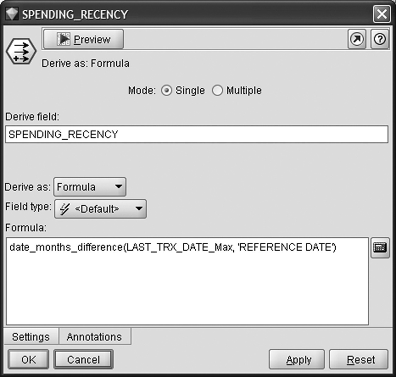
Figure 6.10 Calculating the spending recency for each customer

Figure 6.11 Capturing changes of spending with spending amount delta
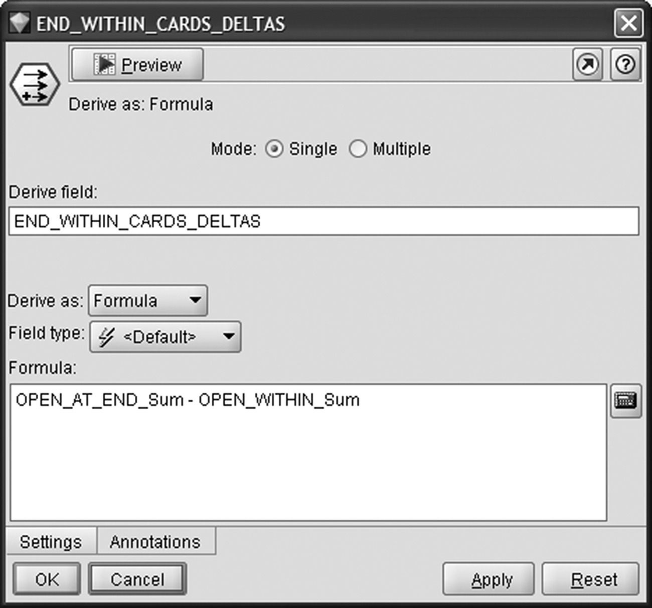
Figure 6.12 Capturing trends in card ownership
6.4.3 Defining the modeling population and the target field
After enriching predictors, it was time for selecting the modeling population and defining the target field. The approach followed was to include all customers with at least one open card at the end of the observation period (the so-called REFERENCE DATE, 2012-12-31). Remember that in deployment the REFERENCE DATE will correspond to the present. Therefore, in the scoring phase, the generated model will calculate propensities for all active customers at present. The modeling population was selected based on the number of open cards at the end of the observation period through a Modeler Select node (Figure 6.13).
Figure 6.13 Selecting the modeling population
Moreover, since latency period has been reserved, customers that have churned within 2 months after the observation period have been discarded. We want the model to be trained on churn cases for which there is a chance of retention. Immediate churners will probably leave during the campaign preparation. Even if the bank manages to contact them before their formal attrition, it’d be quite unlikely to change their decision. As shown in Figure 6.14, short-term churners have been discarded based on the number of open cards at the end of the latency period (OPEN_AT_LATENCY_Sum field).
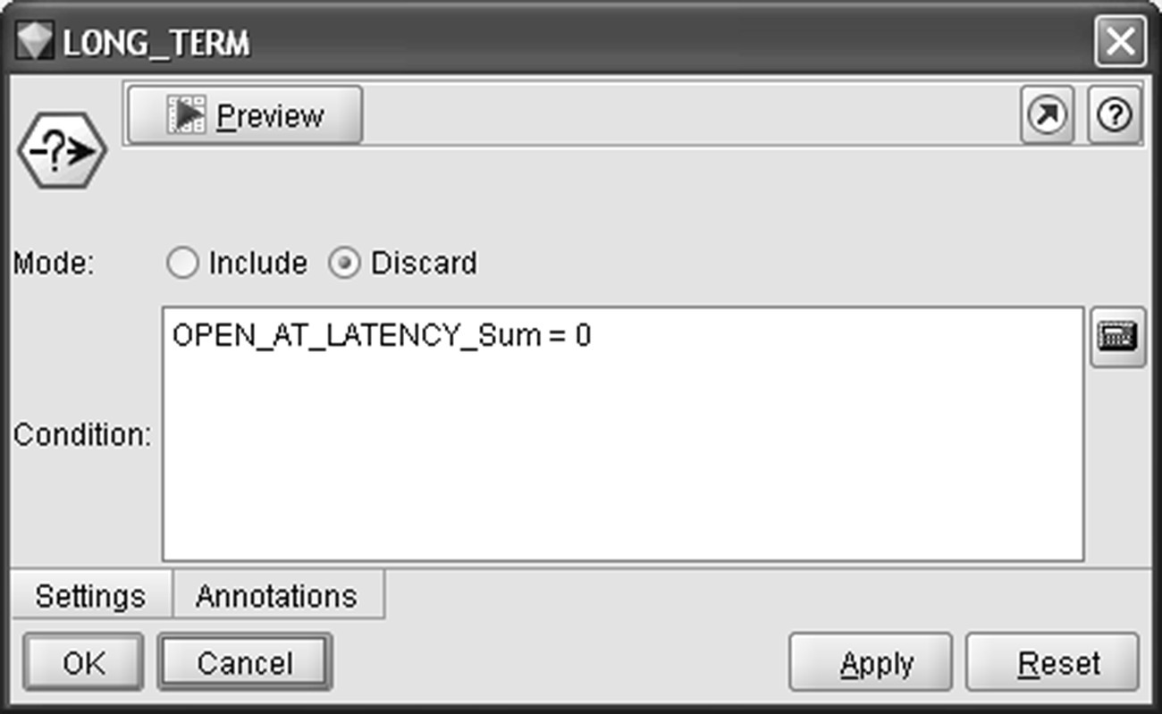
Figure 6.14 Discarding short-term churners from the model
Finally, the target field and population have been defined. Full churners, that is, customers without open cards at the end of the event outcome period (OPEN_AT_EVENT_OUTCOME_PERIOD_Sum field), have been flagged as churners (Figure 6.15, Modeler Flag Derive node).

Figure 6.15 Defining the target filed and population
6.5 Derived fields: the final data dictionary
The final list of derived fields/candidate predictors is presented in Table 6.2. Attributes finally included as predictors in the churn model are designated in the last column of the table. Fields summarizing card usage are at the customer level, and they are based on all cards that each customer had within the observation period.
Table 6.2 Data dictionary (customer level) for the voluntary churn model
| Data file: CC_CHURN_MODELING_DATA.TXT | ||
| Card and customer characteristics fields | ||
| Field name | Description | Role in the model |
| CUSTOMER_ID | The customer identification number | |
| GENDER | Gender of the customer | PREDICTOR |
| EDUCATION | Educational level of the customer | |
| MARITAL_STATUS | Marital status of the customer | PREDICTOR |
| AGE | Age of the customer | PREDICTOR |
| AGE_BANDS | Age bins (18–24, 25–34, 35–44, 45–54, 55+) | |
| NUM_CARDS_Sum | The total number of add-on cards based on all primary cards a customer had within the observation period | PREDICTOR |
| LIMIT_Sum | The sum of credit limit of all cards at the end of the observation period | |
| Usage fields | ||
| SPENDING_AMOUNT_(n)_Sum | Total card spending (purchases and cash advance) for the month n: 1 for the oldest and 12 for the most recent month of the observation period. Based on all cards that each customer had within the observation period | |
| TRX_(n)_Sum | Total number of spending transactions for the respective month | |
| BALANCE_(n)_Sum | Total balance (daily average) for the month | |
| LAST_TRX_DATE_Max | Most recent date of spending transaction | |
| OPENING_DATE_Min | The opening date of the first card | |
| OPENING_DATE_Max | The opening date of the last card | |
| REFERENCE DATE | The last day of the observation period (2012-12-31) | |
| OPEN_WITHIN_Sum | Number of cards open at some point within the observation period (2012) | |
| OPEN_AT_START_Sum | Number of cards open at the beginning of the observation period (2012-1-1) | |
| OPEN_AT_END_Sum | Number of cards open at the REFERENCE DATE, that is, at the end of the observation period (2012-12-31) | |
| OPEN_AT_LATENCY_Sum | Number of cards open at the end of the latency period (2012-3-1) | |
| OPEN_AT_EVENT_OUTCOME_PERIOD_Sum | Number of cards open 6 months after the observation period, that is, at the end of the event outcome period (2012-7-1) | |
| SPENDING_AMOUNT_Sum | Total card spending (purchases and cash advance) over the 12 months of the observation period. Based on all cards that each customer had within the observation period | |
| RECENT_SPENDING_AMOUNT_Sum | Total card spending over the last 4 months of the observation period | |
| TRX_Sum | Total number of spending transactions over the 12 months of the observation period | |
| RECENT_TRX_Sum | Total number of spending transactions over the last 4 months of the observation period | |
| BALANCES_Sum | Total balance (daily average) over the 12 months of the observation period | |
| MONTHS_TO_FEE_ANNIVERSARY_Min | Months till next fee of a card | |
| MONTHS_TO_EXPIRATION_Min | Months till next expiration of a card | |
| Classic_OPEN_WITHIN_Sum | Number of Classic cards open at some point within the observation period (2012) | |
| Gold_OPEN_WITHIN_Sum | Number of Gold cards open at some point within the observation period (2012) | |
| Platinum_OPEN_WITHIN_Sum | Number of Platinum cards open at some point within the observation period (2012) | |
| TENURE_CUSTOMER | Months since first registration of the customer | PREDICTOR |
| AVG_SPENDING_AMOUNT | Monthly average spending (purchases and cash advance) for the 12 months of the observation period. Based on all cards that each customer had within the observation period | PREDICTOR |
| SPENDING_RECENCY | Months since the last spending transaction | PREDICTOR |
| SPENDING_FREQUENCY | Percentage of the months with spending transactions | PREDICTOR |
| RECENT_SPENDING_FREQUENCY | Spending frequency for the last 4 months of the observation period | |
| DELTA_SPENDING_FREQUENCY | Relative change (percentage increase or decrease) in spending frequency during the last 4 months of the observation period | PREDICTOR |
| AVG_RECENT_SPENDING_AMOUNT | Monthly average spending (purchases and cash advance) for the last 4 months of the observation period | |
| DELTA_SPENDING_AMOUNT | Relative change (percentage increase or decrease) in monthly average spending during the last 4 months of the observation period | PREDICTOR |
| AVG_TRX | Monthly average number of spending transactions for the 12 months of the observation period | PREDICTOR |
| AVG_RECENT_TRX | Monthly average number of spending transactions for the last 4 months of the observation period | |
| DELTA_TRX | Relative change (percentage increase or decrease) in monthly average number of transactions during the last 4 months of the observation period | PREDICTOR |
| AVG_TRX_AMOUNT | Average spending amount per transaction | PREDICTOR |
| AVG_BALANCES | Monthly average balance for the 12 months of the observation period | PREDICTOR |
| BALANCES_FREQUENCY | Percentage of the months with balances | PREDICTOR |
| SPENDING_LIMIT_RATIO | Ratio of spending amount to credit limit | PREDICTOR |
| LIMIT_USAGE | Ratio of balances to credit limit | PREDICTOR |
| END_START_CARDS_DELTAS | Difference in the number of open cards between the end and the start of the observation period | PREDICTOR |
| END_WITHIN_CARDS_DELTAS | Change in the number of open cards a customer had at the end of the observation period compared to all the cards that had possessed at some point within the observation period | PREDICTOR |
| CHURN | A flag indicating customers that closed all their cards within the event outcome period (Mar - Jun 2013) | TARGET |
6.6 The modeling procedure
The IBM SPSS Modeler stream (procedure) for churn modeling is displayed in Figure 6.16. The model is trained on the fields of Table 6.2.
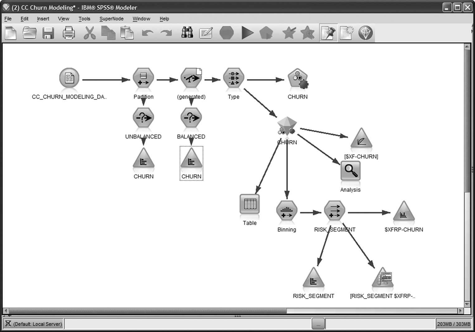
Figure 6.16 The IBM SPSS Modeler procedure for churn modeling
The modeling steps followed included:
- The transformed and enriched data were split in training and testing partitions for validation purposes.
- Then, due to the relatively small number of the observed churned cases, the distribution of the churn field was balanced through stratified sampling.
- The role of each field was determined, and the predictors to be included in the model were selected.
- Finally, a series of propensity models were developed and evaluated for their predictive efficiency.
Although the first two steps are actually data preparation steps, due to their direct effect to the model training, we consider them as modeling presteps. In the following paragraphs, we’ll examine all the above steps in detail.
6.6.1 Applying a Split (Holdout) validation: splitting the modeling dataset for evaluation purposes
A very common pitfall in data mining is to build a propensity model which memorizes the patterns of the specific training dataset and only performs well for the specific records. To avoid this pitfall, it’s highly advisable to train the model in one dataset and test it in a different one. In our example, a Split (Holdout) validation was applied through a Partition node (Figure 6.17) which split the modeling dataset into training and testing datasets through random sampling. The training partition size was set to 70%. Therefore, the 70% of the initial 22.693 records were used for the training of the model. The remaining 30% of the records were allocated at the testing partition and were used for assessing the model accuracy.
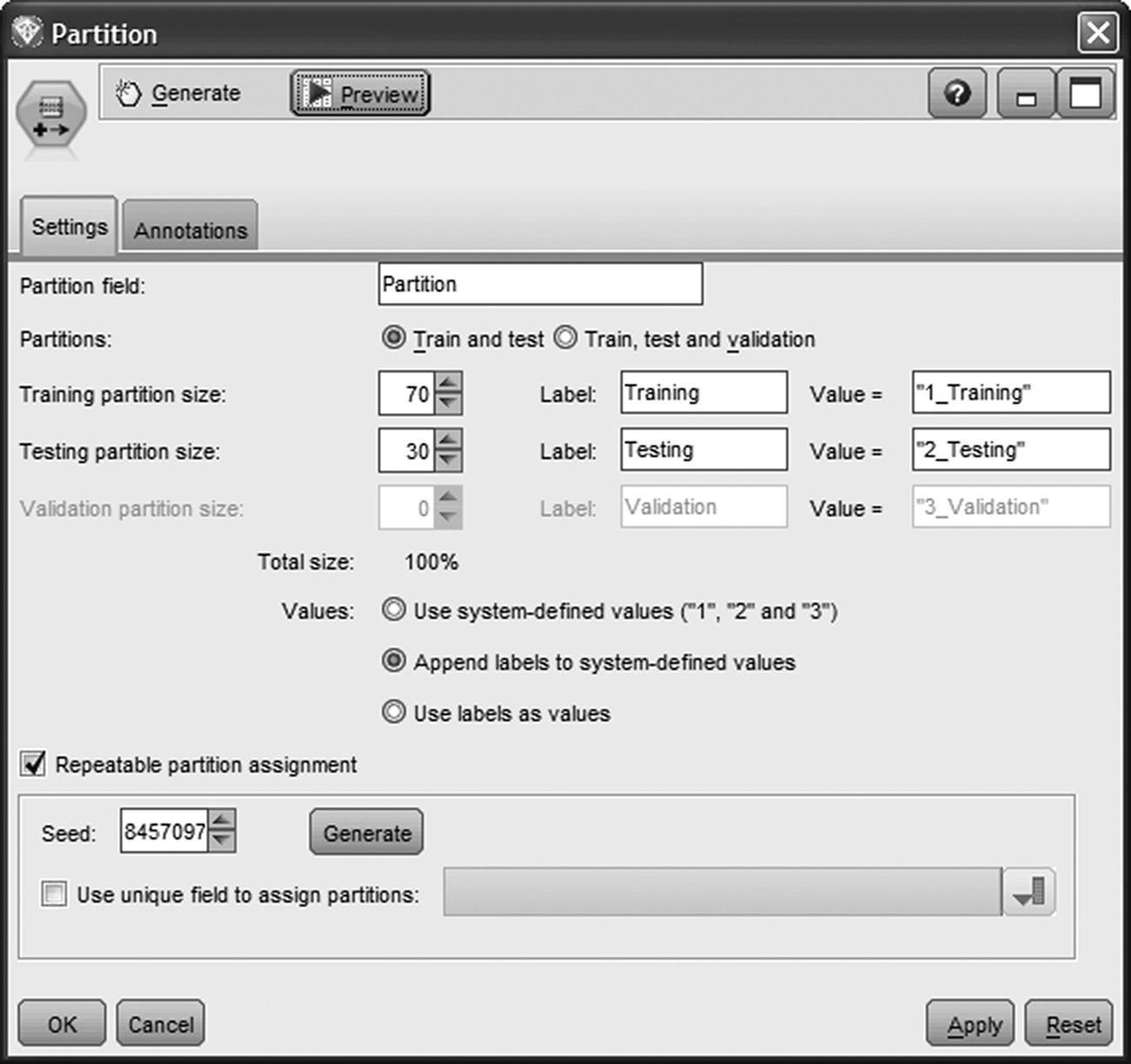
Figure 6.17 Partitioning the modeling dataset for evaluation purposes
Additionally, a random seed was specified in order to “stabilize” the underlying random sampling procedure and ensure the same partitioning on every model run.
6.6.2 Balancing the distribution of the target field
Since only a small percentage of the modeling population (almost 7%) belonged to the target group (class of churners), the analysts balanced the distribution of the outcome field by applying a Modeler Balance node. The balance technique is often applied in propensity modeling in the case of rare target events. Many propensity models do not behave well in the case of imbalanced distribution of the target field. The weighting of outcomes corrects distribution imbalances and facilitates the identification of more refined patterns.
The Balance node (Figure 6.18) applies a stratified random sampling on the training dataset. A sample ratio of 1.0 was specified for the records belonging to the class of churners. Thus, all churned customers were retained in the training dataset. On the other hand, a sample ratio of 0.23 was specified for nonchurners; thus, about one every four of nonchurners was retained.
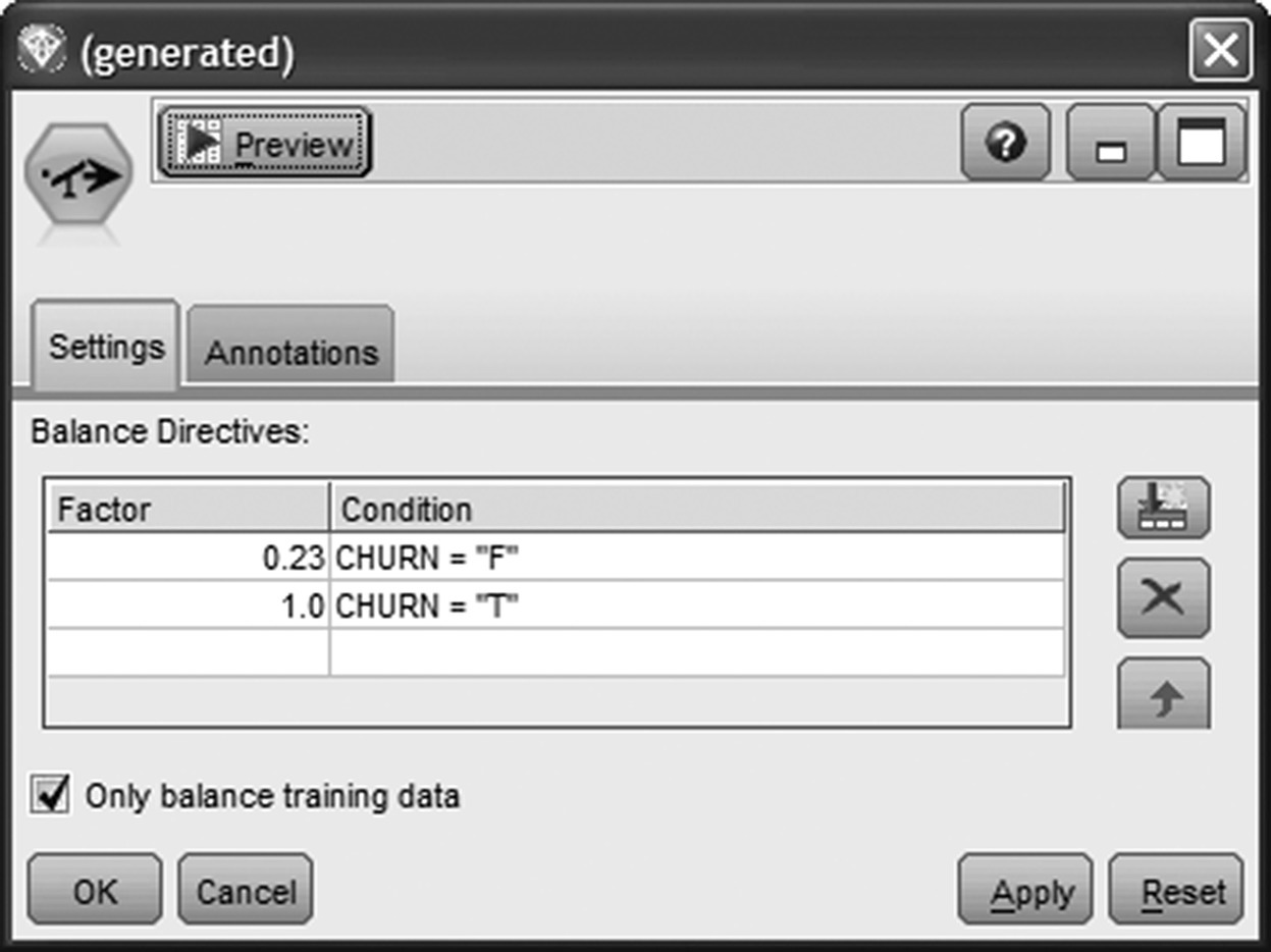
Figure 6.18 Balancing the distribution of the target field
This disproportionate sampling, called undersampling, reduced the proportion of the more frequent class and boosted the percentage of churners in the training dataset from the initial 7% to approximately 25% after balancing. The balance effect and the final distribution of the CHURN field in the training partition is shown in Figure 6.19. As you can see, a more balanced distribution of 25–75% was achieved by reducing the number of nonchurners.

Figure 6.19 The initial and the “balanced” distribution of the CHURN field in the training partition
The testing partition was not balanced, allowing a simpler and more straightforward evaluation of the model results in the next steps.
A Cache was enabled at the Balance node, saving the data that pass through the node in a temporary folder on disk. This option ensured that the Balance sampling was stored and the training partition was not altered with each data pass.
6.6.3 Setting the role of the fields in the model
Each propensity model tries to learn the input data patterns associated with the occurrence of the target event. In Modeler, the role of each field, whether to be used as an input (predict) or as an output (be predicted), is set with a Type node (Figure 6.20).

Figure 6.20 Setting the role of the fields in the propensity model
In our case study, the CHURN field was the target field to be predicted and was set with an output role (Direction Out). The fields denoted as predictors in Table 6.2 were designated as inputs (Direction In). The rest of the fields were set with direction None and were omitted from model training.
6.6.4 Training the churn model
After selecting the predictors, it was time for model training. The Auto-Classifier node enabled the building and the comparison of multiple models in a single modeling run. As shown in Figure 6.21, the first criteria selected for ranking the models was the Lift at the top 5 percentile. Therefore, the Lift of each model, the increase in predictive performance compared to the baseline “model” of random selection, was calculated for the top 5% of customers with the highest churn scores and used for comparing and ranking.
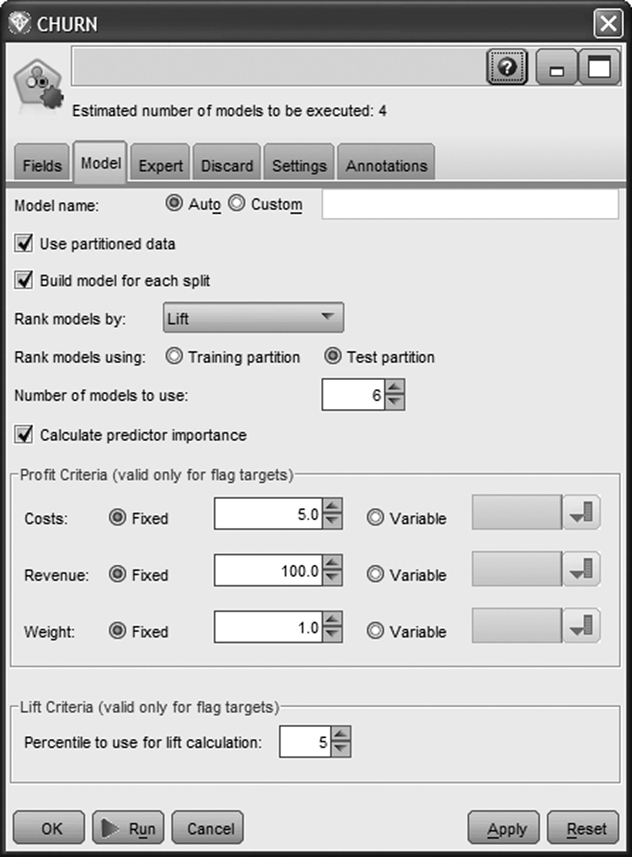
Figure 6.21 The Auto-Classifier node used for building multiple propensity models
Three Decision Tree models and an SVM model were selected for training (Figure 6.22). More specifically, the models built were CHAID, boosted C5.0, C&R Tree, and support vector machine (SVM).
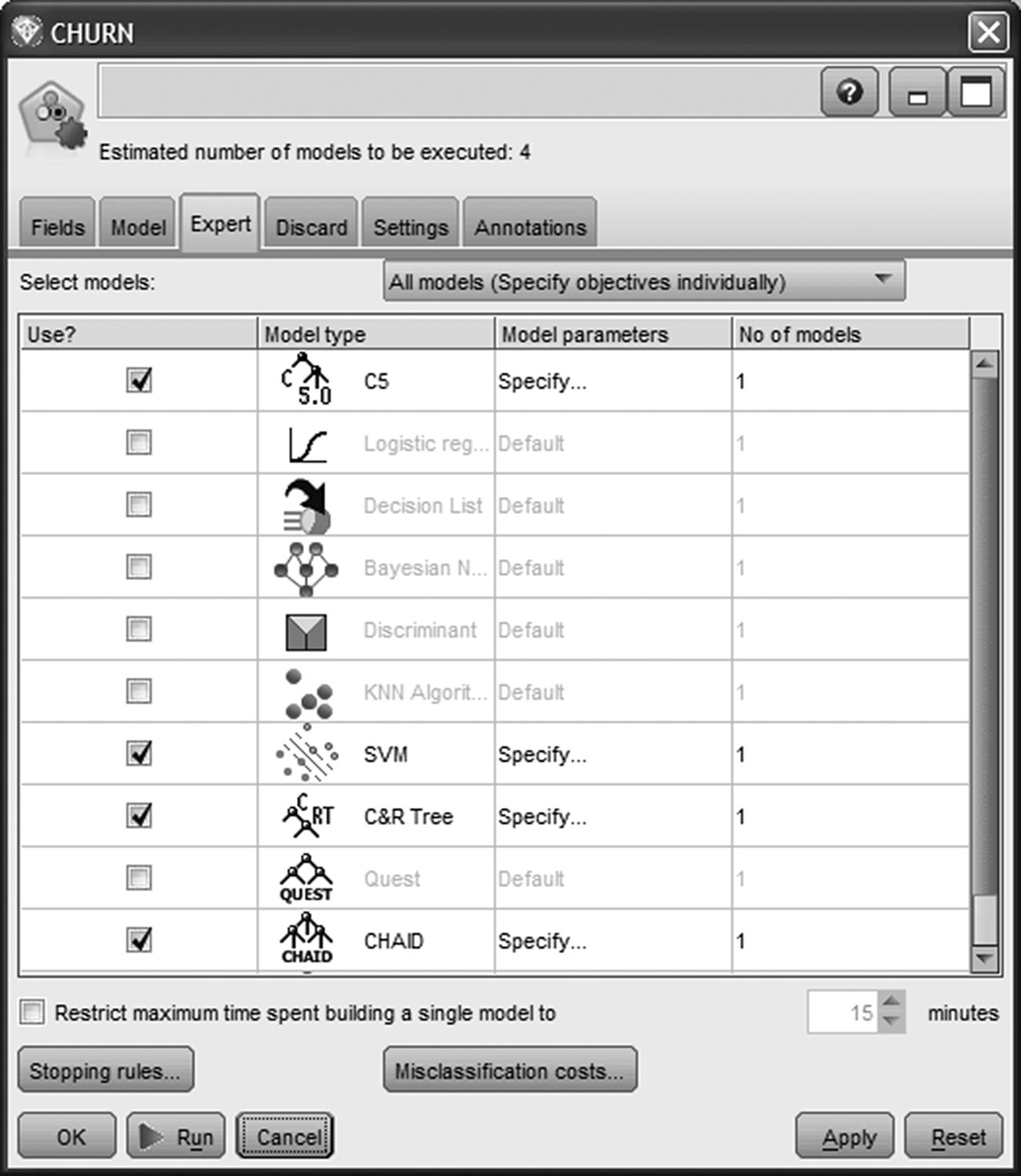
Figure 6.22 The propensity models trained for churn prediction
The main model parameters specified for each model are displayed in Table 6.3.
Table 6.3 The churn models parameter settings
| Parameter | Setting |
| CHAID model parameter settings | |
| Model | CHAID |
| Levels below root | 6 |
| Alpha for splitting | 0.05 |
| Alpha for merging | 0.05 |
| Chi-square method | Pearson |
| Minimum records in parent branch | 200 |
| Minimum records in child branch | 100 |
| C&R Tree model parameter settings | |
| Levels below root | 8 |
| Minimum change in impurity | 0.0001 |
| Impurity measure for categorical target | Gini |
| Minimum records in parent branch | 80 |
| Minimum records in child branch | 40 |
| Prune tree | True |
| Use standard error rule | True |
| Multiplier | 1.0 |
| C5.0 model parameter settings | |
| Output type | Decision Tree |
| Group symbolics | True |
| Use Boosting | True |
| Number of trials | 10 |
| Pruning severity | 75 |
| Minimum records per child branch | 50 |
| Use global pruning | True |
| Winnow attributes | False |
| SVM model parameter settings | |
| Stopping criteria | 1.0 e−3 |
| Regularization parameter (C) | 10 |
| Kernel type | RBF |
| RBF gamma | 0.25 |
6.7 Understanding and evaluating the models
By browsing the generated model, we have access (in the Model tab) to an initial output which provides valuable information for assessing the accuracy of the models (Figure 6.23). The performance measures of the candidate models include Lift, Maximum Profit, Overall Accuracy, and Area Under Curve. All these metrics are based on the testing dataset which was not used for the model training and was not balanced.
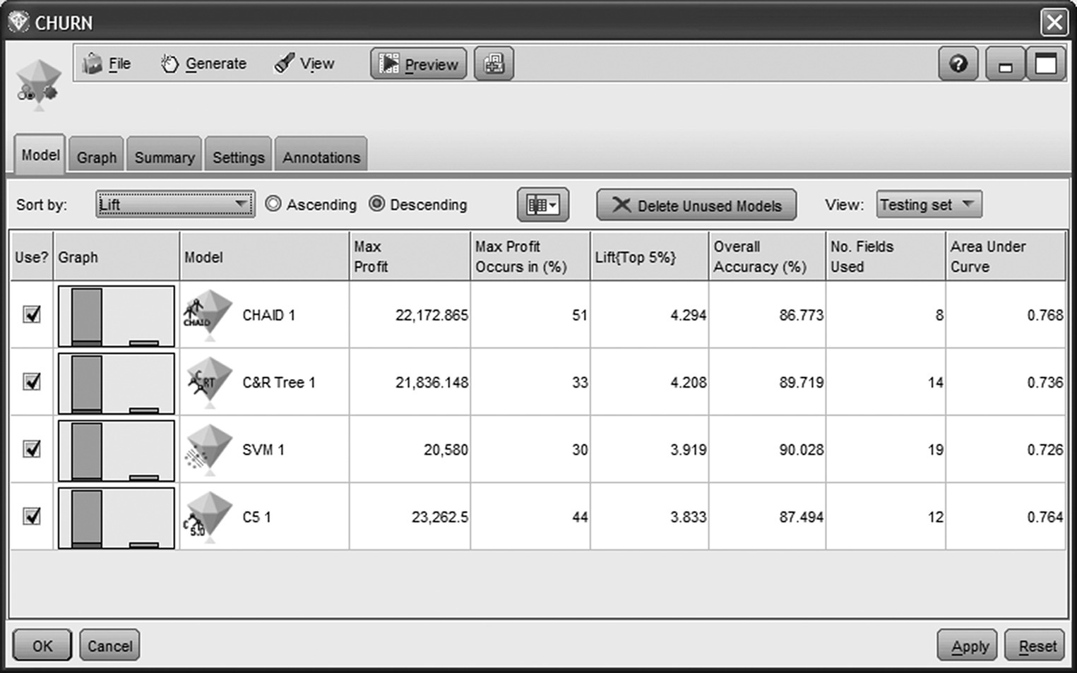
Figure 6.23 Performance metrics for the candidate models
The CHAID model is ranked first since it yielded the highest Lift (4.3) at the top 5% percentile. Since the overall percentage of churners was about 7%, a Lift of 4 denotes that the concentration of actual churners among the top 5% of customers with the highest churn scores was 4 times higher, about 28%. Thus, a list of the top 5% scored customers is expected to be 4 times denser in churners compared to randomness. The Lifts for the other classifiers were equally good, ranging from 3.8 for C5.0 to 4.2 for C&R Tree. Of course, the concentration of churners is expected to rise even more among the higher percentiles. CHAID and C5.0 performed best in terms of Area Under Curve, followed closely by the rest of the models. The overall conclusion is that all models performed well, presenting comparable evaluation measures. In terms of complexity, the SVM model appears as the most complex model since, due to the lack of an internal pruning mechanism, it had used all predictors. On the other end, CHAID only used 8 of the initial 19 predictors.
The Gains chart, displayed in Figure 6.24, provides a visual comparison of the models’ predictive power. It is generated by selecting the option Evaluation chart(s) from the Generate menu of the Model tab.
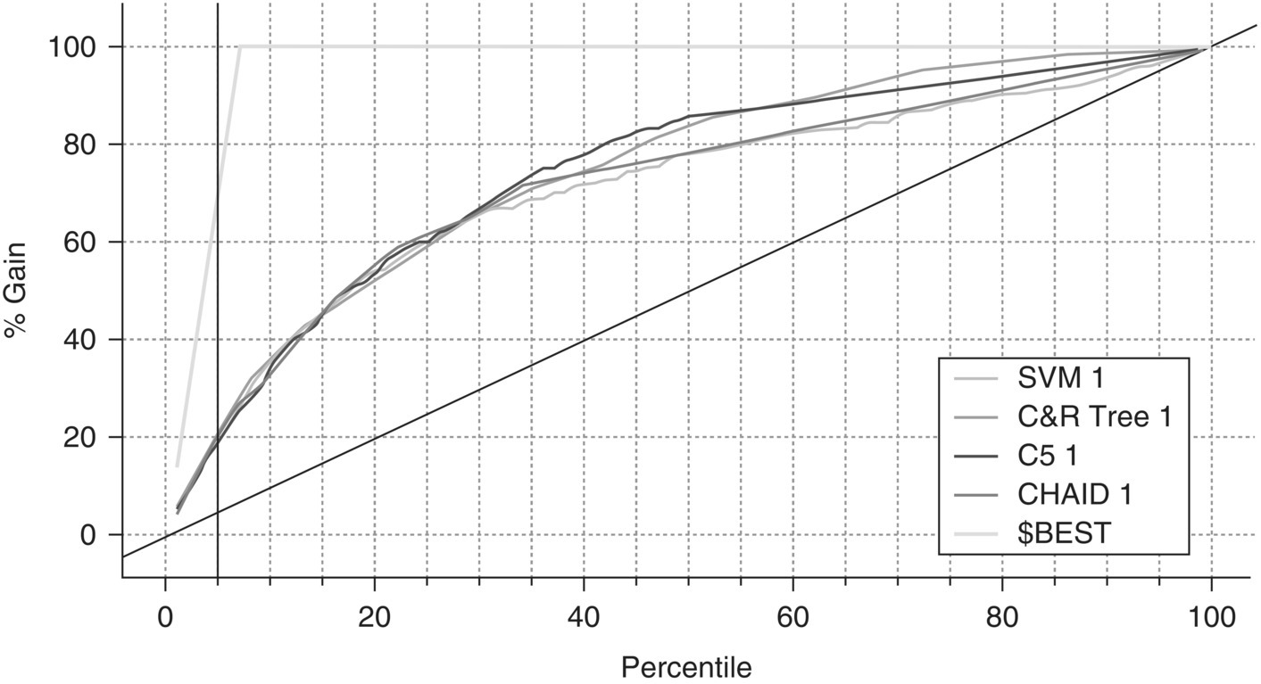
Figure 6.24 The Gains chart of the candidate models
A separate Gains curve is plotted for each model. The x-axis represents the percentiles of customers after being sorted according to their churn scores. The added vertical reference line corresponds to the top 5% percentile. The diagonal line represents the baseline model of randomness. The $BEST line corresponds to a hypothetical ideal model which classifies correctly all cases. A good model is expected to show a gradual but steep incline at the top percentiles before finally converging to the diagonal line of randomness.
As we can see in the graph, the Gain % of all models at the top 5% percentile reaches 20%. This means that a retention campaign list with those customers is expected to capture the 20% of all churners. Thus, by targeting the 5% of customers, we contact 20% of all targets, 4 times better than selecting randomly. Once again, we come upon the Lift of 4 discussed previously. Overall, all models behaved equally well at their top percentiles (left part of the x-axis).
So which model should be used for deployment? A tough question since in this case models are competing head-to-head. But instead of selecting a single classifier, why not use all of them? The analysts of the organization decided to employ an ensemble procedure. Instead of relying on an individual model, they chose to combine the predictions of all models through a voting procedure. The ensemble method selected was average raw propensity.
In the next paragraphs, we’ll examine the performance of the ensemble model which was finally used by the bank officers for scoring customers. But before examining the combined model, let’s have a look at the results of the individual models.
The Graph tab of the generated CHURN model node displays the importance of the predictors based on all generated models (Figure 6.25). Usage fields appeared to have the strongest predictive power since an early decline in usage seems to be associated with subsequent churn.
Figure 6.25 The importance of the predictors
The CHAID model with its intuitive results in tree format can help us understand the churn patterns.
In Figure 6.26, the CHAID tree is displayed in tree format. The bar with the darkest shade of gray represents the proportion of churners. The overall percentage of churners in the balanced training dataset was approximately 25%. Note that due to the balancing and the oversampling of churners, the displayed churn rates do not represent the actual churn percentages, but they can nevertheless be examined comparatively in order to interpret the model. The spending frequency (SPENDING_FREQUENCY field) was selected for the first split, and customers were partitioned accordingly. Customers with the lowest spending frequency (below 0.417) landed on Node 1 presenting an increased churn rate of about 61%. Those customers were further divided according to their monthly average number of spending transactions (AVG_TRX field). The churn rate among customers with small number of transactions (lower than 1 per month) further increased to 65%. These customers landed on Node 7 of the tree and seem to comprise a target group of customers with increased churn propensity. Likewise, by studying Node 9, we see that customers with low spending frequency which was further decreased during the most recent months (DELTA_TRX below 0.2) also had a high proportion of actual churners.
Figure 6.26 The CHAID model (tree format)
The case of Node 21 is also interesting. It contains customers with low spending in terms of frequency and amount but with relatively increased spending to limit ratio. The observed churn rate was quite high among those customers (about 55%) who may face a problem with their limit.
The right “branches” of the CHAID model were dominated by heavier users and included a limited number of actual churners. The lowest percentage of churners was found in Node 26 which contained customers with relatively high spending on a regular monthly basis and didn’t have problems with their limit.
In Figure 6.27, the CHAID model is displayed in rules format.
Figure 6.27 The CHAID model (rules format)
Now, let’s go back to meta-modeling and examine the combined model produced by the four Decision Trees and the SVM model. The separation of the generated ensemble model (CHURN model) was evaluated with an Evaluation node.
The ensemble model presented an acceptable performance, yielding a Gain of about 21% (Figure 6.28) and a Lift of about 4.3 (Figure 6.29) at the top 5 percentile. Obviously, the Lift was larger at higher cutoffs. The results of the Analysis node, shown in Figure 6.30, present the combined model’s Accuracy and Error (misclassification) rate. It also presents the Confusion (Coincidence) matrix which can be used for computing the Sensitivity, Specificity, Precision, and F-measures. Due to the imbalanced distribution of the target field, the analysts mainly studied the latter measures instead of the overall accuracy and misclassification rate. The ensemble model yielded an F-measure of approximately 30% compared to the 28% of the individual CHAID model. Its AUC (Area under the ROC curve) and Gini mesures were also increased (0.776 and 0.552 respectively).
Figure 6.28 The Gains chart of the ensemble model
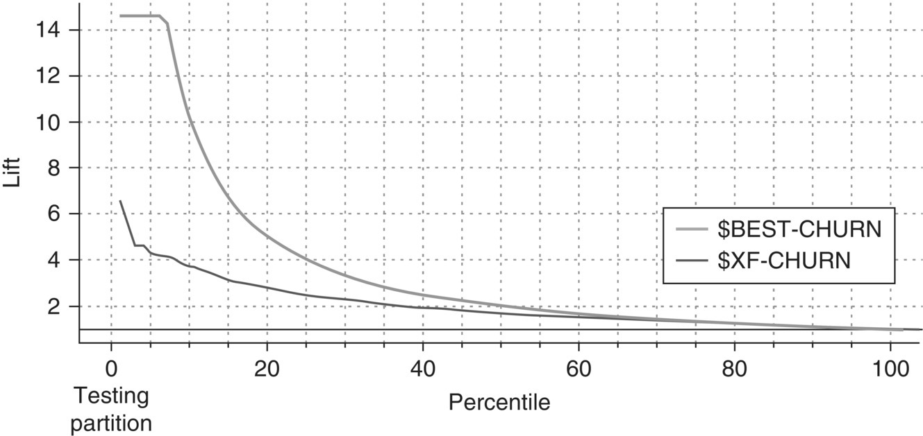
Figure 6.29 The Lift chart of the ensemble model
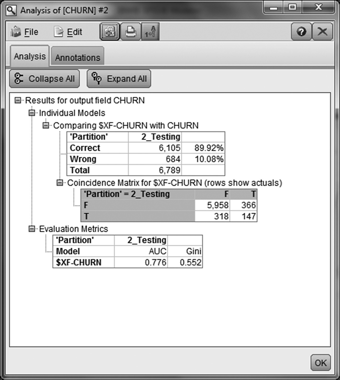
Figure 6.30 The Confusion matrix of the ensemble model
6.8 Model deployment: using churn propensities to target the retention campaign
After training and evaluating the classifiers, it was time for model deployment. The ensemble model was used for scoring and identifying the customers with increased churn likelihood, and the scheduled retention campaign was targeted according to the calculated churn propensities.
The marketers of the bank started the preparation of the retention campaign in July 2013, right after the end of the modeling procedure. In order to refresh the churn scores, the historical data had to be updated, and the data preparation process had to be repeated for currently active customers. Twelve months of observation data were retrieved summarizing usage from July 2012 to June 2013 as shown in Figure 6.31. The retention campaign included all customers active at the end of June 2013. Customers with at least one open card at that point were scored, and their churn propensities were calculated. Churn, was defined as the closing of all cards, and it was predicted 4 months ahead, from September to December 2013.
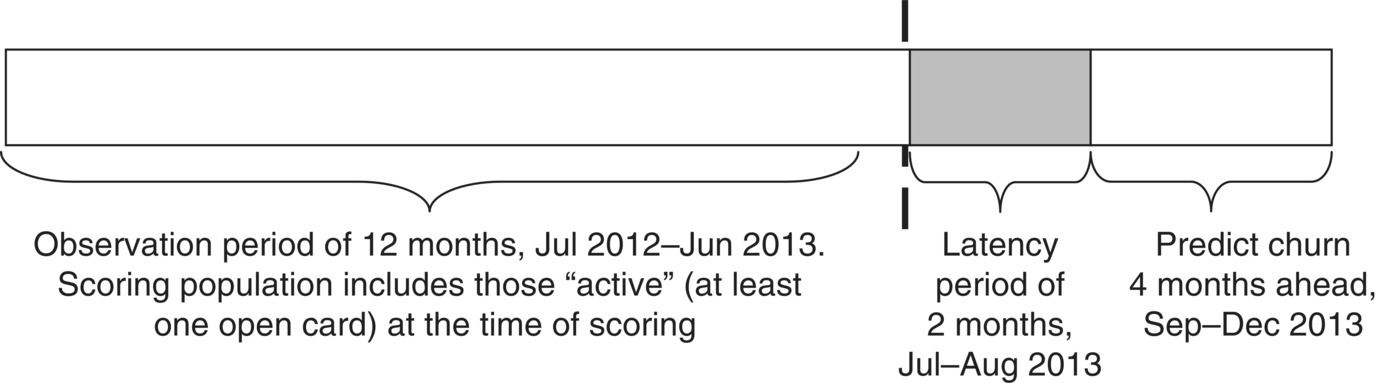
Figure 6.31 The voluntary churn model scoring procedure
In Modeler, a generated model also serves as a scoring engine which assigns a score at each record passed through it. A sample of scored customers is shown in Figure 6.32. For each customer, two new model-generated fields were derived. The $XF-CHURN field (the $ prefix designates a model-generated field) is the prediction field and denotes the assignment to a CHURN class. Since the model used for scoring was an ensemble model with the average raw propensity method used for voting, the Modeler estimated the churn propensities instead of the confidences for each prediction (field $XFRP-CHURN). The calculated propensities were raw, based on the modeling dataset which was balanced. Therefore, although they did not represent the actual churn probabilities, they indicated churn likelihood and were used as churn scores for the rank ordering of customers according to their relative likelihood to leave.

Figure 6.32 Scoring active customers and calculating churn propensities
Using a Binning node, a propensity-based segmentation had also been implemented, dividing customers into three distinct pools according to their churn propensity (Figure 6.33):
- Top Churn Risk: Top 5% percentile including customers with highest churn propensities
- High Churn Risk: High 15% percentile including customers with relatively increased churn propensities
- Medium–Low Churn Risk: Customers with lower churn propensities, belonging in the lowest 70% percentiles
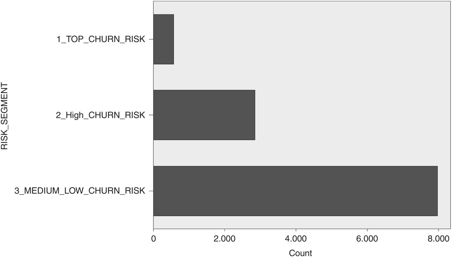
Figure 6.33 Churn propensity-based segments
The churn propensity information was then cross-examined with each customer’s present value. This combined segmentation scheme which was derived (value-based segments and propensity-based segments) was used to prioritize the retention campaign. The marketing department decided to roll out a small and targeted campaign. Therefore, their final campaign population included customers from the Top Churn Risk and Value segments.
The bank’s next steps included the evaluation of the campaign’s results in respect to the effectiveness of the retention offer as well as the model’s accuracy. Additionally, a separate churn model focused only on the high value segments was scheduled for the near future.
6.9 The voluntary churn model revisited using RapidMiner
The churn modeling procedure is presented again, this time using RapidMiner’s modeling algorithms. The modeling process is shown in Figure 6.34.
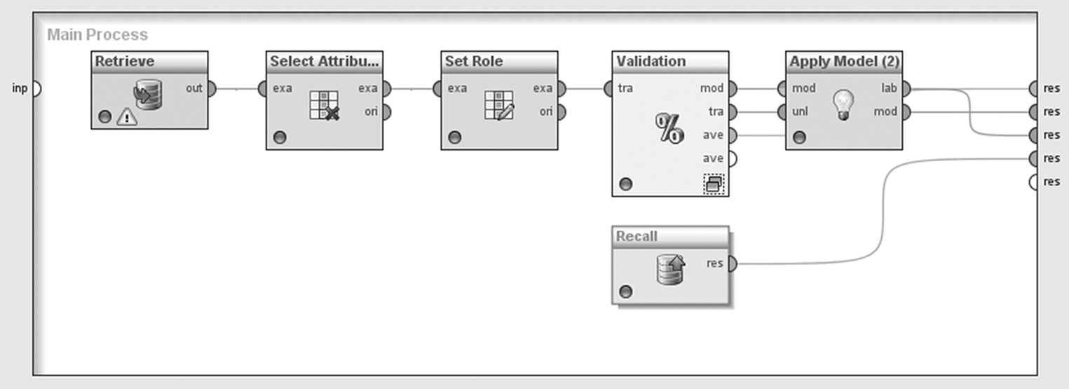
Figure 6.34 The RapidMiner modeling process
6.9.1 Loading the data and setting the roles of the attributes
After loading the modeling dataset, analysts retained in the process only the target field (the label field, in RapidMiner’s terminology) and the predictors listed in Table 6.2. A Select Attribute operator was used to keep those fields and filter out the rest which did not contribute to the model.
In the next step of the process, a Set Role operator was used to assign a label (target) role to the CHURN field. The rest of the fields kept their default regular role and participated as predictors in the subsequent propensity model. The Set Role settings are presented in Figure 6.35.

Figure 6.35 The Set Role operator used for defining the role of the attributes in the model
6.9.2 Applying a Split (Holdout) validation and adjusting the imbalance of the target field’s distribution
Before training the classification model, a Split (Holdout) validation method has been applied through a Split Validation operator. This operator partitioned the modeling dataset into training and testing parts of 70 and 30%, respectively, as shown in Figure 6.36.

Figure 6.36 The Split validation settings
The partitioning was based on random sampling. A split ratio of 0.7 randomly assigned the 70% of the training dataset to the training sample and the remaining records to the testing sample. The Split Validation operator, is comprised of two subprocesses (Figure 6.37).
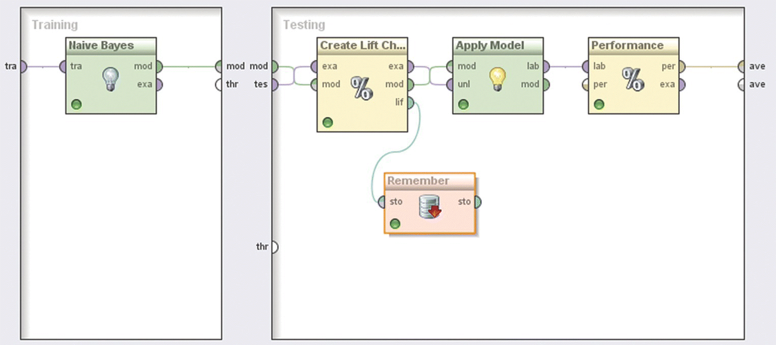
Figure 6.37 The Split Validation operator for partitioning the modeling dataset
The left subprocess corresponds to the training sample and covers the model training phase. The right subprocess corresponds to the testing dataset and wraps the evaluation actions.
6.9.3 Developing a Naïve Bayes model for identifying potential churners
The balanced training instances were then fed into a Naïve Bayes model with Laplace correction and the model was trained. The model validation is presented in Section 6.9.4.
6.9.4 Evaluating the performance of the model and deploying it to calculate churn propensities
As mentioned previously, the model evaluation procedure is executed in the right subprocess of the Split Validation operator. The subprocess receives the testing sample which is then passed through a Performance (Binomial Classification) operator to calculate a set of performance measures. Evaluation measures require scored cases. Therefore, before the Performance operator, an Apply Model operator has been inserted to classify the unseen records of the testing sample and score (label) the cases according to the generated model.
The Confusion matrix of the model is presented in Figure 6.38. As we can see, 323 churners and 4422 nonchurners were classified correctly (TP, true positives, and TN, true negatives, respectively). The overall accuracy was 69.7%. That means that 69.7% of the testing cases were correctly classified, while the model failed to classify correctly the 30.3% of the cases (misclassification rate). Since the data were imbalanced, it is recommended to focus on more adequate measures such as Sensitivity, Specificity, F-measure, and Area under the ROC curve.

Figure 6.38 The RapidMiner model Confusion matrix
The ROC curve plots the model’s sensitivity in the y-axis against the (1-specificity) values in the x-axis, in simple words the trade-off between the true-positive rate (proportion of churners classified correctly) and the false-positive rate (proportion of nonchurners incorrectly labeled as churners) at different propensity cutoffs. The ROC curve of the Naïve Bayes model is depicted in Figure 6.39. It shows a steep increase at the left of the x-axis (higher cutoffs) where the curve substantially diverges from the diagonal line of random guessing, indicating acceptable model performance. The model presents a decent Area under the ROC curve measure of 0.75 and an F-measure of 23.85%.

Figure 6.39 The Naïve Bayes model’s ROC curve
The model’s Gains chart, created through a Create Lift Chart operator, is displayed in Figure 6.40. It is based on the 6808 validation cases (30% validation sample) and ranks customers into 20 equal-sized bins (tiles) according to their churn propensity (note that in order to apply the Lift chart on the testing cases, a Remember operator was used inside the testing subprocess to store the Lift chart, and then a Recall operator was used to restore it).
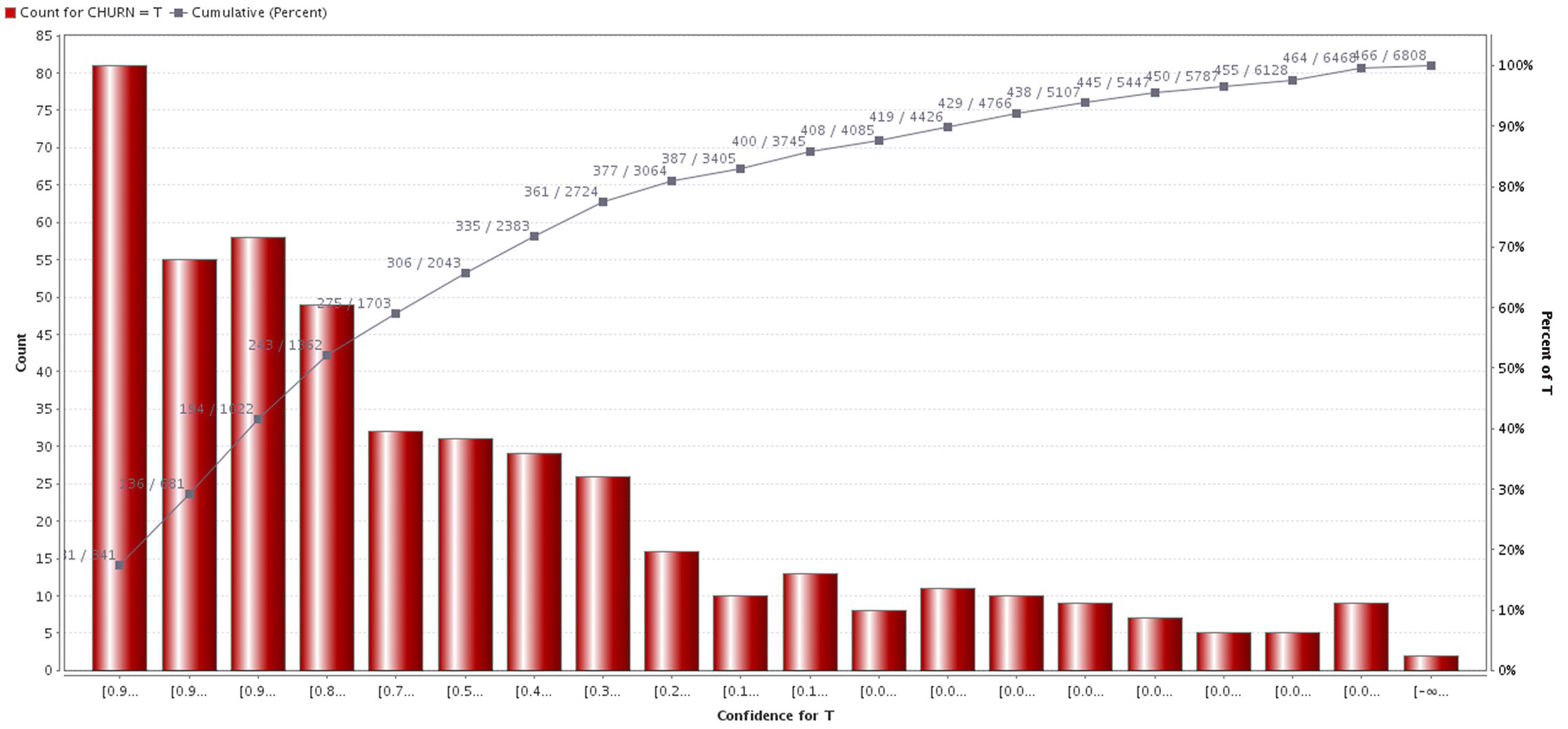
Figure 6.40 The Lift chart of the Naïve Bayes model
The model’s Lift was 3.5 at the top 5% percentile. Specifically, the top 5% percentile was comprised of the 341 customers with the highest estimated churn propensities (341/6808). Of those customers, 81 were actual churners. Thus, 17.4% of all churners (81/466) was included in the top 5% percentile, yielding a Lift of 3.5.
In the deployment phase, customers with open cards at the end of June 2013 were scored with an Apply Model operator. A sample of scored records is shown in Figure 6.41.
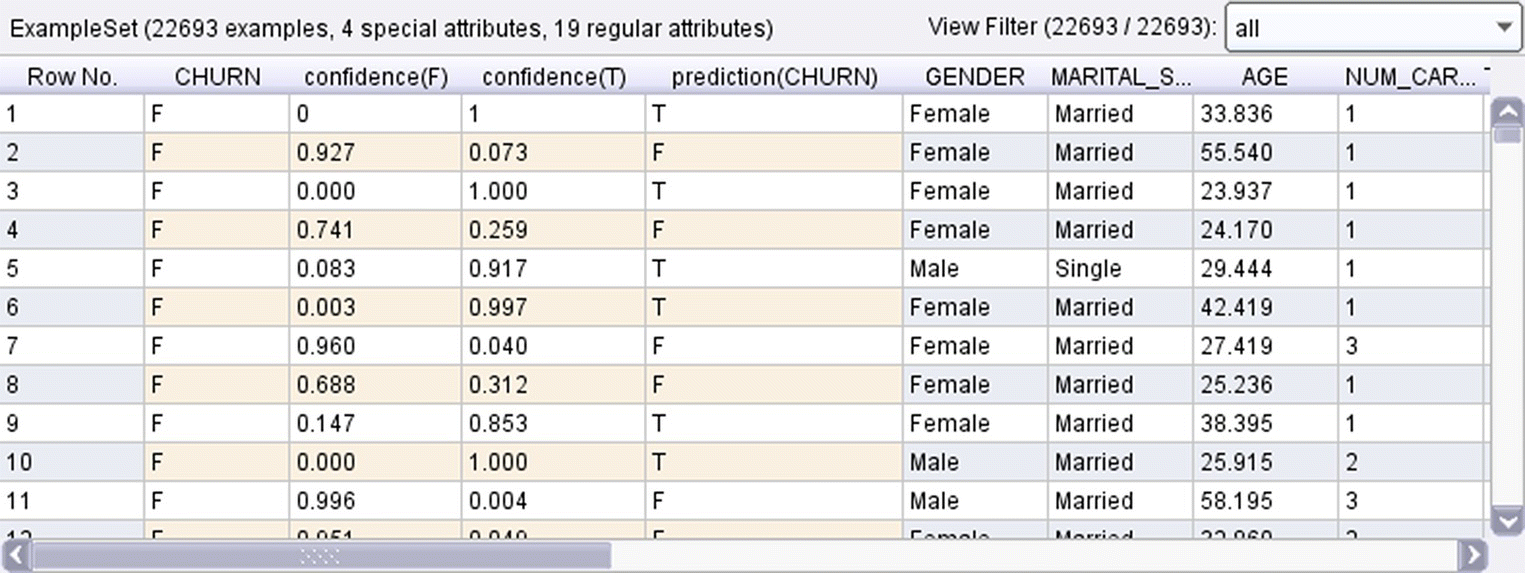
Figure 6.41 The RapidMiner model predictions and estimated propensities for each customer
Three new estimated fields were derived by the model for each case. The model’s predicted class (prediction(CHURN) field) along with the prediction confidence for each of the two classes. The confidence(T) field is the estimated churn propensity and indicates the churn likelihood for each customer.
6.10 Developing the churn model with Data Mining for Excel
The next sections present the development of the churn model using the algorithms of Data Mining for Excel. Two models were examined, one using the original data and one after balancing the distribution of the target. Since the two approaches yielded similar results, the first approach was finally selected.
6.10.1 Building the model using the Classify Wizard
In the first step of the Classify Wizard, the source training data had been selected and loaded as shown in Figure 6.42. In this example, a specific data range of the active datasheet was specified as the modeling dataset. In general, training data can also be loaded using an external data source and/or an SQL query.
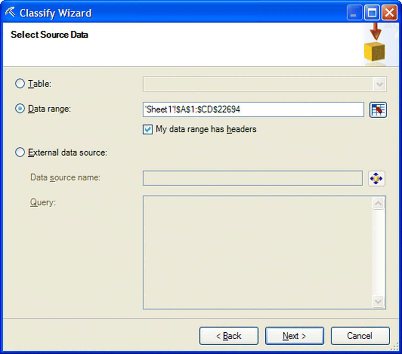
Figure 6.42 Selecting the source data for model training in the Classify Wizard of Data Mining for Excel
The second step of the wizard involved the selection of the predictors (“Inputs”) and the target (“Column to analyze”) (Figure 6.43). The complete catalogue of predictors is listed in Table 6.2.
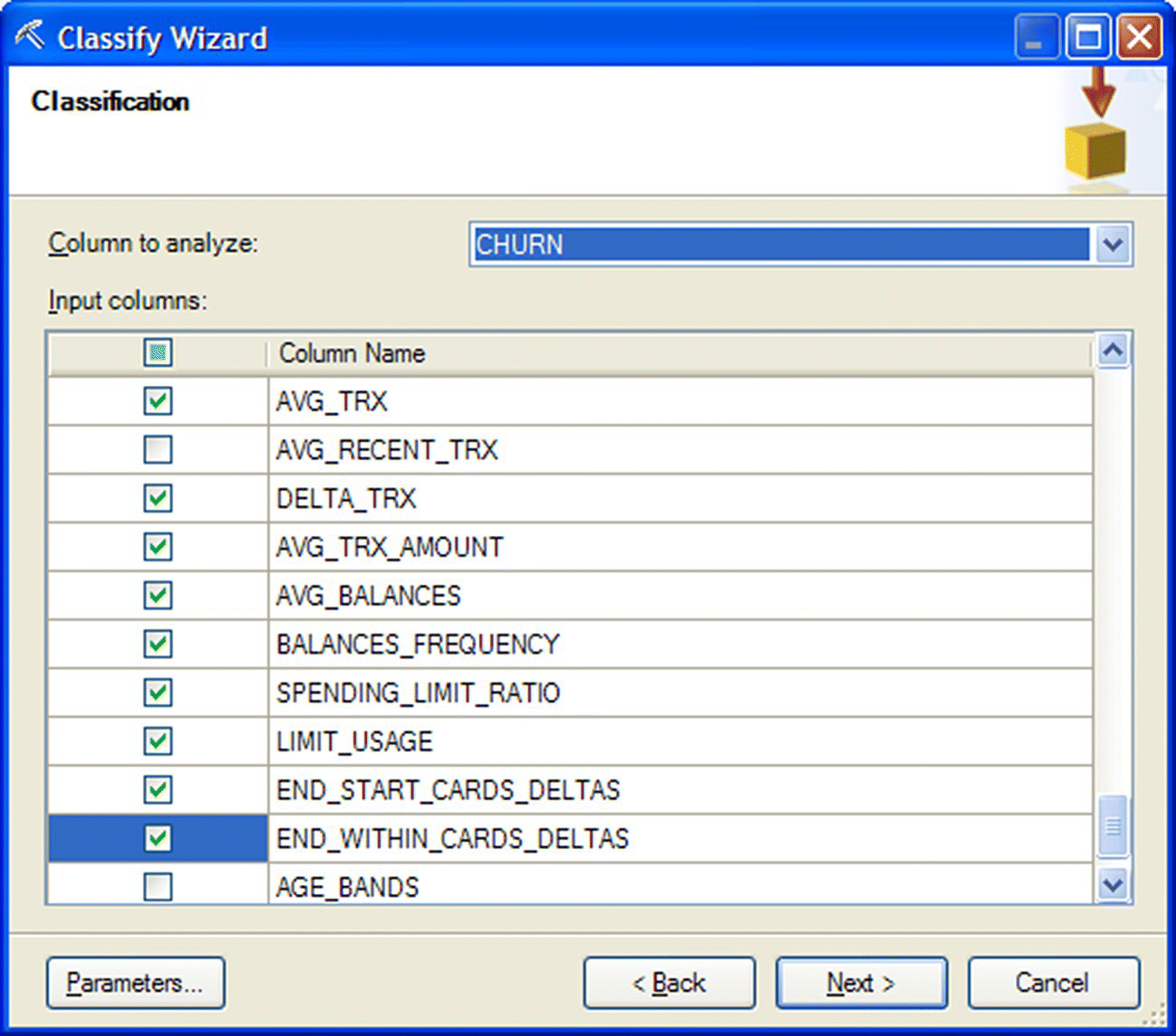
Figure 6.43 Choosing the predictors and the target in the Classify Wizard of Data Mining for Excel
6.10.2 Selecting the classification algorithm and its parameters
After experimentation with different classification algorithms, the modeling team decided to proceed with a Decision Tree algorithm with the default BDE (Bayesian Dirichlet Equivalent with Uniform prior) attribute selection method (“Score method”). The selected algorithm and its parameters were defined in the “Parameters…” menu as displayed in Figure 6.44.
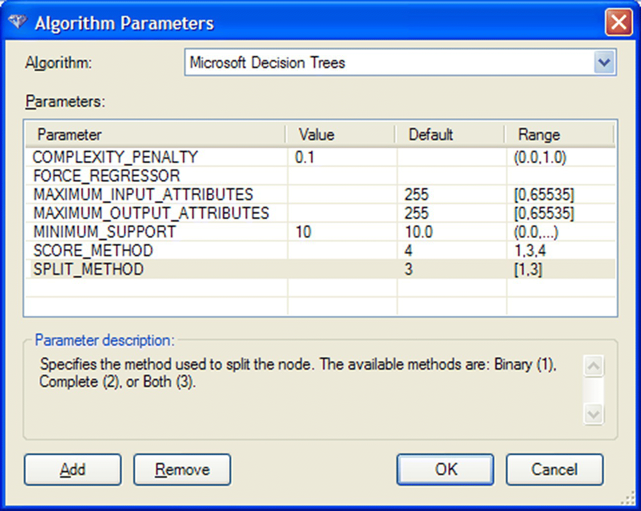
Figure 6.44 Setting the parameters for the Decision Tree models in Data Mining for Excel
The default “Split method” of “‘Both,” which optimally combines multiway and binary splits of the predictors, was applied. To obtain a more refined solution and a tree with more levels, the default “Complexity penalty” value was decreased to 0.1. Similarly, the “Minimum Support” value (minimum acceptable size of the leaf nodes) was set to a minimum of 10 instances.
6.10.3 Applying a Split (Holdout) validation
In order to avoid an optimistic validation of the model performance, it was decided to apply a Split (Holdout) validation. A random percentage of 30% of the training instances had been hold out to be used as the testing dataset as shown in Figure 6.45.

Figure 6.45 Applying a Split validation method in Data Mining for Excel
In the last step of the wizard, the created mining structure, including the model and the testing (holdout) dataset, was stored as shown in Figure 6.46. The stored testing dataset was subsequently used for model validation.
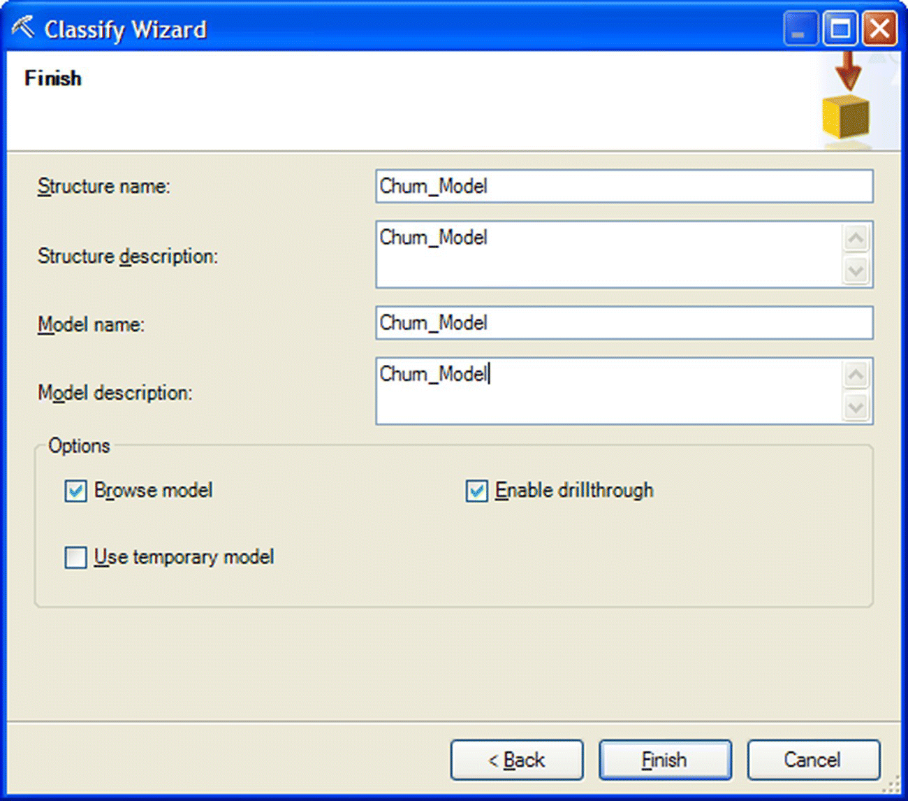
Figure 6.46 Storing the mining structure and the model
6.10.4 Browsing the Decision Tree model
The generated Decision Tree model is presented in Figure 6.47. By browsing the tree and by following the recursive partitioning and its branches, from the root down to the leaf nodes, we can gain insight on the data patterns associated with increased churn rate. In each node, a darker background color designates more dense concentrations of churners.
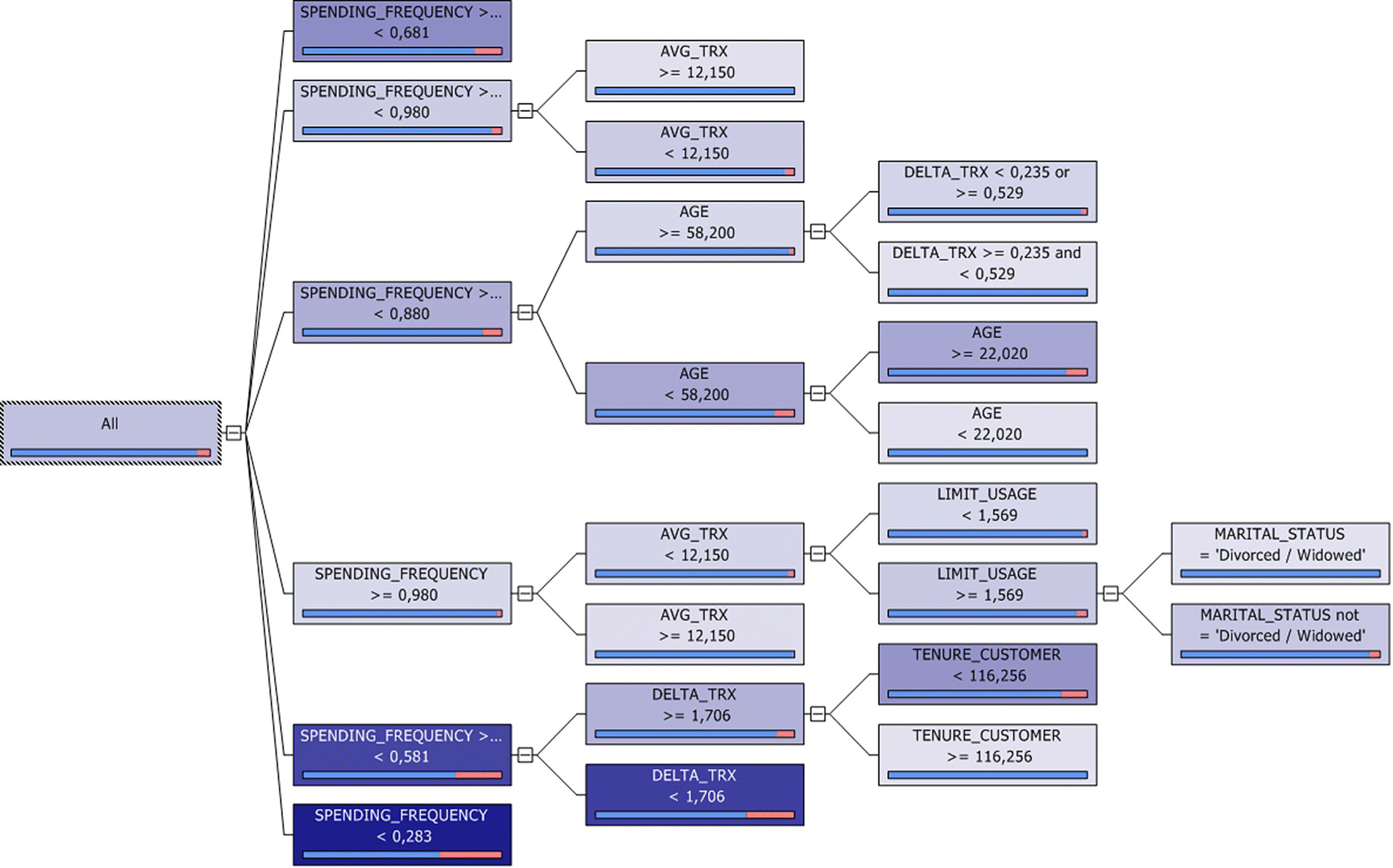
Figure 6.47 The Microsoft decision tree churn model
The spending frequency was selected for the first partition. Remember that the same predictor was selected for the first split in the Modeler CHAID tree. By studying the tree, we can infer that churn seems to be associated with low spending frequency and a decrease in transactions.
6.10.5 Validation of the model performance
The model validation was performed using the Classification Matrix Wizard and the Accuracy Chart Wizard of the Data Mining for Excel.
The Classification Matrix wizard evaluates the accuracy and the error rate of the classification model through a Confusion (misclassification) matrix. In the first step of the Classification wizard, the stored BDE Decision Tree model was selected for the validation as shown in Figure 6.48.
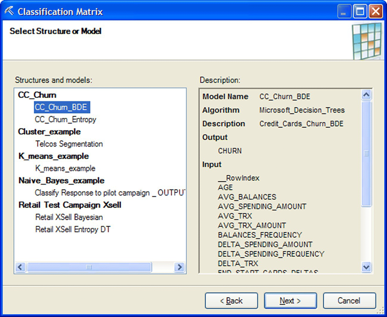
Figure 6.48 Selecting the model to evaluate in Data Mining for Excel
The target field as well as the desired format of the results (in counts and/or percentages) was specified in the second step of the wizard as shown in Figure 6.49.
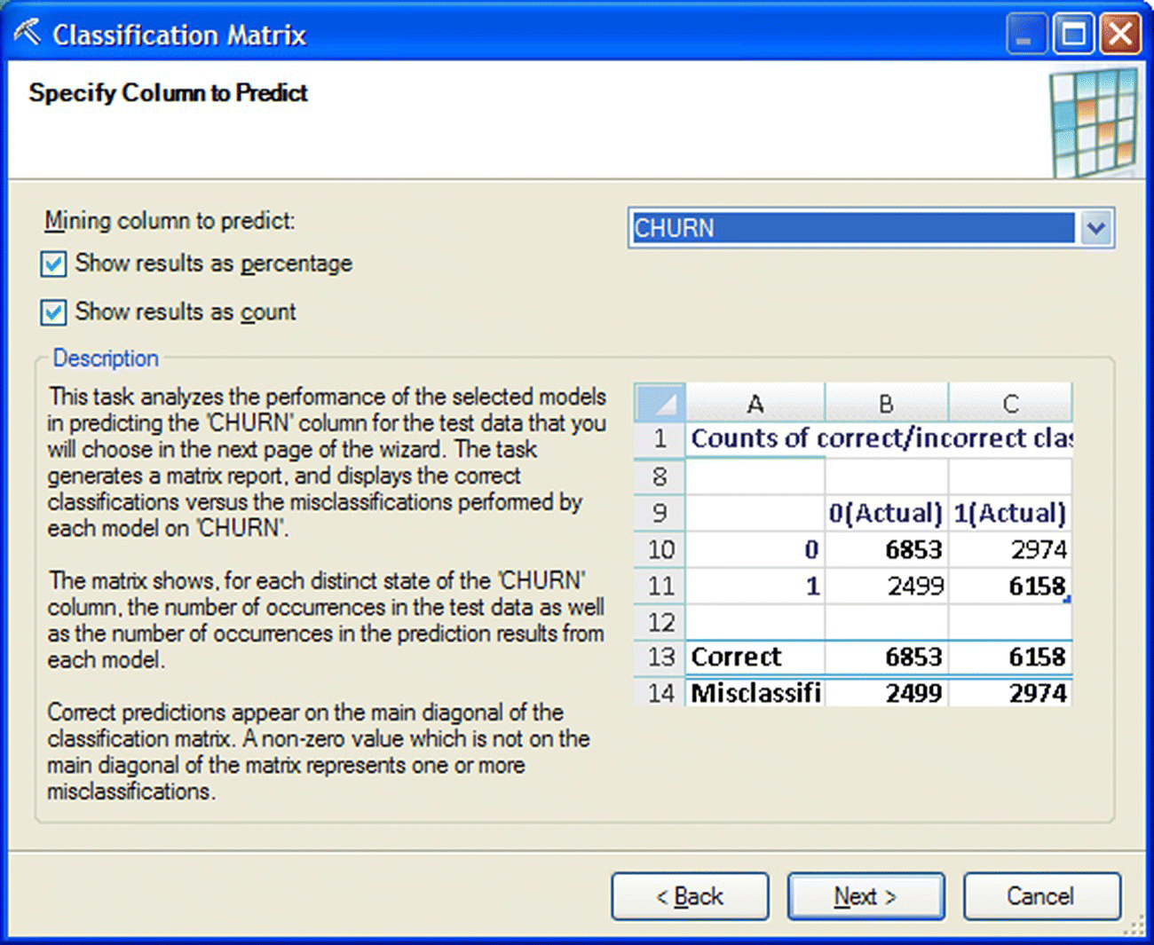
Figure 6.49 Selecting the target field for validation in Data Mining for Excel
Obviously, since a Holdout validation technique had been applied, the model was selected to be tested on the testing (holdout) dataset of the mining structure (Figure 6.50).
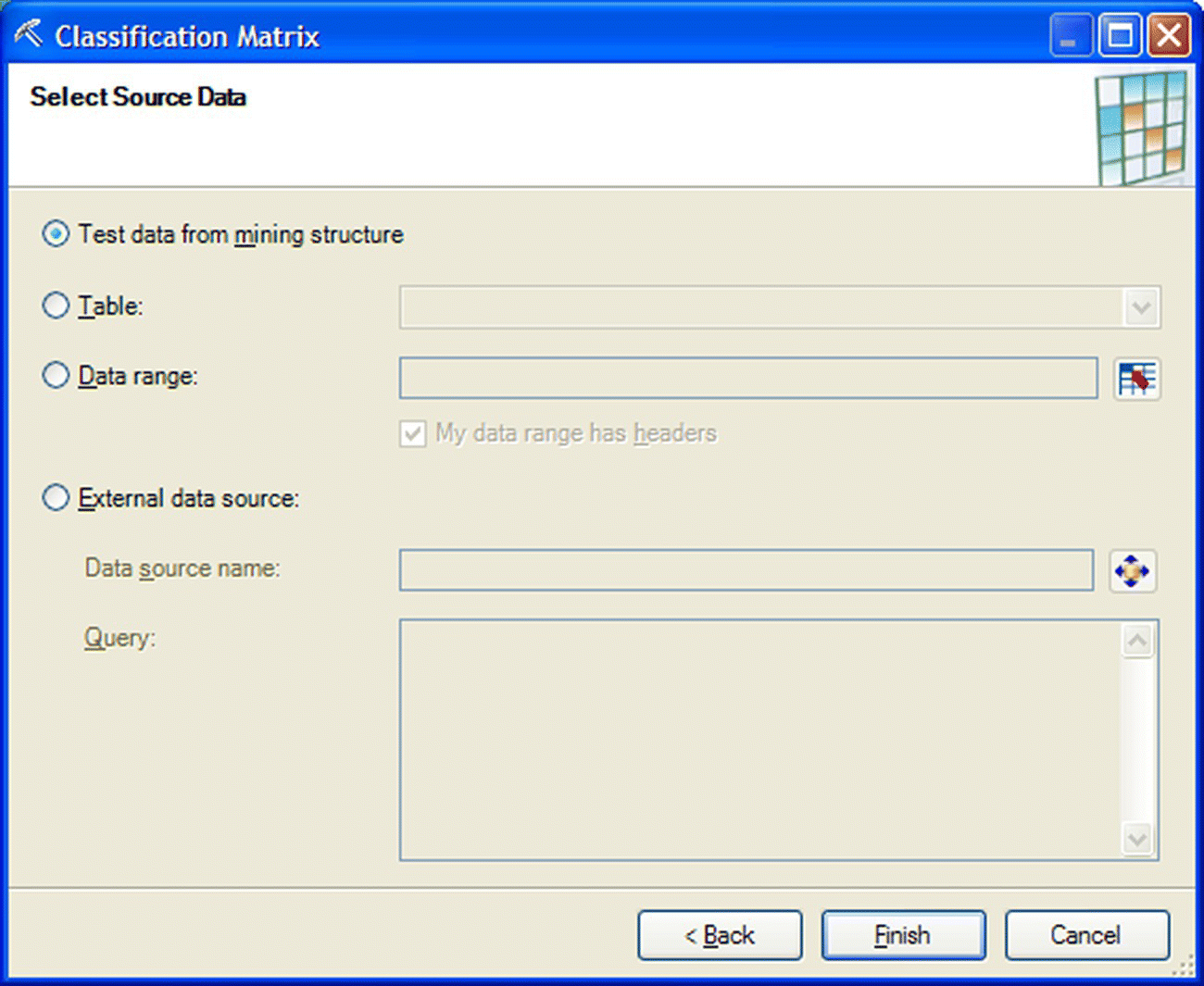
Figure 6.50 Selecting the validation dataset in the Classification Matrix wizard of Data Mining for Excel
The accuracy and the error rate of the Decision Tree model are presented in Table 6.4. The model presented an overall accuracy of 93.11% and an error rate of 6.89%.
Table 6.4 The accuracy and the error rate of the churn Decision Tree model
| Model name | CC_Churn_BDE | CC_Churn_BDE |
| Total correct | 93.11% | 6338 |
| Total misclassified | 6.89% | 469 |
The detailed Confusion matrix of the model is presented in Table 6.5. The actual classes are listed in the columns of the matrix and are cross-examined with the predicted classes which are listed in the rows of the matrix.
Table 6.5 The Confusion matrix of the Decision Tree model
| Results as counts for model “CC_Churn_BDE” | ||
| F(Actual) | T(Actual) | |
| F | 6338 | 469 |
| T | 0 | 0 |
| Correct | 6338 | 0 |
| Misclassified | 0 | 469 |
The model classified all actual churners as nonchurners because the estimated churn propensities were lower than the threshold value of 50% for classifying an instance as churner. This was an anticipated result due to the sparse target class and the imbalanced distribution of the target, and it does not mean that the model was not useful. The discrimination effectiveness of the model was the main criterion for the evaluation of its usability, and this effectiveness was examined with a Gains chart, produced through the Accuracy Chart wizard (Figure 6.51).
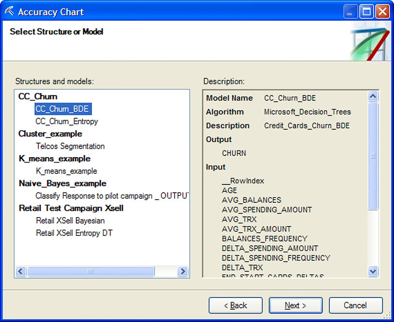
Figure 6.51 Requesting a Gains chart through the Accuracy Chart wizard of Data Mining for Excel
The Gains chart of the model is displayed in Figure 6.52.
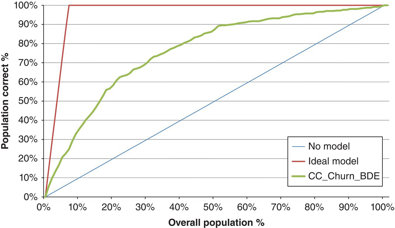
Figure 6.52 The Gains chart of the Microsoft Decision Tree churn model
Table 6.6 lists the cumulative Gain %, that is, the cumulative percentage of actual churners, for the top 20 churn propensity percentiles.
Table 6.6 The Gains table and the top 20 percentiles of the Microsoft Decision Tree churn model
| Percentile (%) | Ideal model (%) | CC_Churn_BDE (%) |
| 0 | 0.00 | 0.00 |
| 1 | 14.50 | 5.54 |
| 2 | 29.00 | 9.81 |
| 3 | 43.50 | 13.43 |
| 4 | 58.00 | 16.63 |
| 5 | 72.49 | 20.68 |
| 6 | 86.99 | 22.60 |
| 7 | 100.00 | 24.95 |
| 8 | 100.00 | 29.21 |
| 9 | 100.00 | 32.84 |
| 10 | 100.00 | 35.39 |
| 11 | 100.00 | 37.74 |
| 12 | 100.00 | 40.30 |
| 13 | 100.00 | 42.22 |
| 14 | 100.00 | 44.35 |
| 15 | 100.00 | 46.91 |
| 16 | 100.00 | 49.68 |
| 17 | 100.00 | 52.67 |
| 18 | 100.00 | 55.86 |
| 19 | 100.00 | 56.50 |
| 20 | 100.00 | 58.21 |
A random 5% sample would have included 5% of the total actual churners. After ranking the customers according to their estimated churn propensities, the relevant proportion in the top 5% percentile has been raised to 20.68%, yielding a Lift of 4.14 (20.68/5).
Figure 6.53 presents the cumulative distribution of churners and nonchurners across the estimated propensity percentiles. The maximum separation (equal to the KS statistic) was 41.17%, and it was observed in the 32% percentile.

Figure 6.53 The cumulative distribution of churners and nonchurners across the propensity percentiles
6.10.6 Model deployment
In the deployment phase, the “Query” wizard was used to deploy the stored and validated model on the scoring dataset which contained customers active at the time of scoring. The model estimates which were selected to be produced included the predicted class (based on the 50% propensity threshold), the prediction confidence (the estimated probability of the prediction), and the churn propensity (the estimated probability of churn) as shown in Figure 6.54.

Figure 6.54 Using the Query wizard to deploy the model and score customers in Data Mining for Excel
A screenshot of a sample of scored customers and their model derived estimates is shown in Figure 6.55.

Figure 6.55 The model estimates and the scored file
6.11 Summary
In this chapter, we’ve presented a case study in which the marketers of a bank attempted to proactively identify credit card customers with increased likelihood to churn. We’ve followed all the steps of the procedure for building a voluntary churn model, from defining the business objective and the mining approach to data preparation and building, evaluating, and deploying the model. We’ve used IBM SPSS Modeler, Data Mining for Excel, as well as RapidMiner, and we’ve trained and evaluated various models in order to calculate the churn propensity for each customer.