Chapter 17
Going Digital: PDF, Hyperlinks, ePUB, and HTML5 Animations
IN THIS CHAPTER
 Exporting pages as images and exporting to PDF
Working with interactive PDF features and hyperlinks
Creating reflowable and fixed layout e-books for ePub and Kindle
Creating HTML5 publications
Producing a QuarkXPress project for digital media is like pushing a ball of spaghetti: Most of it winds up where you want it, but some of it doesn’t. It’s not Quark’s fault; the digital media landscape changes every day. Instead, it’s up to you to figure out where you want to go with your project and then adjust it for that output.
In this chapter, you find out how to export your QuarkXPress layout in several digital formats, and how to set up your document to take advantage of the unique capabilities of each. You learn to add bookmarks and hyperlinks to PDFs, prepare your layout for exporting to reflowable ePub and Kindle e-book formats, and export to PDF and fixed-layout e-book formats. The chapter also tells you how to add HTML5 interactivity and animations to your layout, and how to export it as an HTML5 publication. In addition, I introduce you to creating native mobile apps using Quark’s App Studio. But first, I provide a quick explanation of how to export your pages as images to use on websites, social media outlets, and other publications.
Here we go!
Exporting Pages as Images
When you need to create an image of one or more pages in your QuarkXPress layout, you can print and scan them, or you can export them to PDF and open the PDF in Photoshop. A much easier way is available, though: You can export them as images. Just follow these steps:
-
Choose File ⇒ Export ⇒ Image.
The Export Pages as Images dialog box appears.
-
Choose a location for your exported image(s), choose which page(s) you want to export, and then click the Options button.
The Export Image Options dialog box appears, as shown in Figure 17-1.
- In the Export Image Options dialog box, enter a resolution and choose a format: PNG or JPG.
-
If you choose JPG format, use the Compression drop-down menu to choose a level of compression.
To create a higher-quality image, choose a lower level of compression.
- Select the check boxes for the things you want to include in the image:
- Transparent Background: PNG supports transparent backgrounds, so this option creates a transparent background for any item that has a background of “none,” including the empty areas of your page.
- Spreads: If your layout uses Facing Pages, this option outputs all the pages in a spread as one image.
- Include Guides: Includes the guides used on your page, which normally don’t print. Use this to show a colleague where the guides are.
- Include Text Grids: Includes the text grids on pages and in text boxes, which normally don’t print. Use this to show a colleague the text grids on your pages.
- Click OK to export your image.

FIGURE 17-1: The Export Image Options dialog box for PNG (left) and JPEG (right).
Exporting to PDF
PDF has become the de facto standard for sharing complex documents with people who don’t have the application you used to create them. It also has powerful interactive features such as bookmarks and hyperlinks that you can generate directly from QuarkXPress.
Creating a PDF file
To export your QuarkXPress layout in PDF format, follow these steps:
- Open the Export as PDF dialog box, shown in Figure 17-2, in one of these ways:
- Choose File ⇒ Export ⇒ Layout as PDF.
- Control-click (Mac) or right-click (Windows) in an empty area of the page or pasteboard and choose Export ⇒ Layout as PDF from the context menu that appears.
- At the bottom of the project window, click the Export arrow, which appears at the left of the horizontal scroll bar. Then choose Layout as PDF.
- Enter the pages you want to export in the Pages field.
- Choose a preset from the PDF Style drop-down menu.
- (Optional) Select the Open PDF after Export check box to automatically open the exported PDF in your default PDF reader application.
-
To examine or customize the PDF Export settings, click the Options button.
The PDF Export Options dialog box, shown in Figure 17-3, appears with the default settings for the Screen PDF Style (left) and with the Hyperlink Appearance options selected (right).
-
Change any of the hundreds of options for your PDF file.
In the example in Figure 17-3, the Appearance options are changed to alter the appearance of the hyperlinks in the PDF, and to fit the exported PDF into the PDF reader application’s window when it opens.
-
If you need to cancel the PDF export to make changes to the layout, click the Capture Settings button.
QuarkXPress will remember the changes the next time you open the Export as PDF dialog box.
- Click Save to export the layout in PDF format.

FIGURE 17-2: The Export as PDF dialog box, with PDF Style drop-down menu exposed (right).

FIGURE 17-3: The PDF Export Options dialog box.
 QuarkXPress has a world-class engine for directly producing PDFs. However, if you prefer to use Adobe Acrobat or Distiller to generate your PDF, you can also export your QuarkXPress layout as a PostScript file for those applications to process into PDF format. To do that, open QuarkXPress Preferences, and in the Application area, click PDF to display the PDF Preferences shown in Figure 17-4. Select the Create PostScript File for Later Distilling radio button and optionally choose the Watched Folder that you set up in Acrobat or Distiller. Click OK, and from then on, when you choose Export ⇒ Layout to PDF, QuarkXPress will export a PostScript file instead of a PDF.

FIGURE 17-4: The PDF area of the Preferences dialog box.
 To control the way QuarkXPress names your exported PDF files, open QuarkXPress Preferences, and in the Application area, click PDF to display the PDF Preferences shown in Figure 17-5. Choose a naming style from the Default Name drop-down menu.
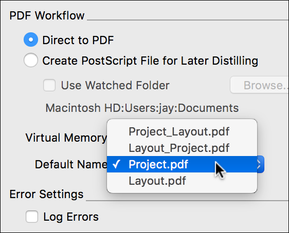
FIGURE 17-5: The Default Name options in the PDF area of the Preferences dialog box.
Using Interactive PDF Features
- If you create Hyperlinks in QuarkXPress, you can include them when you export the layout to PDF format. See the next section, “Exporting hyperlinks and bookmarks to PDF,” for more on hyperlinks.
- If you use the List feature in QuarkXPress, your lists — for example, your table of contents — can also be converted to PDF bookmarks, hyperlinks, or both. See Chapter 6 for more on Lists.
- If you create an index in QuarkXPress, the index can be hyperlinked in the PDF. See Chapter 6 for more on creating an index.
Exporting hyperlinks and bookmarks to PDF
To include hyperlinks, lists, and an index in your PDF, you simply need to select those options in the PDF Export Options dialog box (refer to Figure 17-3). See the “Creating a PDF file” section, earlier in this chapter, for more details on the PDF Export Options dialog box.
The next sections tell you about the options you need to consider if you want to export hyperlinks and bookmarks.
Choosing a PDF Style
The only preset PDF Styles that include hyperlinks are Screen – Medium Quality/Low Resolution and Screen – Low Quality/Low Resolution. If your PDF is destined for onscreen viewing, just use one of these Screen PDF Styles and you’ll be good to go. If you need the images in your PDF to have higher quality, use Print – Medium Quality/Medium Resolution instead and select all the Hyperlinks options in the Hyperlinks section of the PDF Export Options dialog box, as shown in Figure 17-3.
Setting PDF Appearance options
The Appearance options in the Hyperlinks pane let you control how the hyperlinks display in the exported PDF, and how the PDF fills the PDF reader window when it opens. The Appearance options are as follows:
- Frame: Places a rectangle around each hyperlink.
- Highlight: Makes the hyperlinks change appearance when a reader moves the mouse over them.
- Width, Color, and Style: Determine the appearance of the frame.
- Display: Tells the PDF reader application how to display the page when it opens. Inherit Zoom uses the current zoom level in QuarkXPress; Fit Window fits the entire page in the PDF reader window; Fit Width fits the page width; and Fit Length fits the page length.
Exporting an entire book to PDF
If you’re using the Books palette while building a multichapter book, as shown in Figure 17-6 (see Chapter 6 for more on building a book), you can export all the chapters as one PDF. To do that, follow these steps:
- Select all the chapters or make sure that no chapters are selected.
- Make sure that the Single File check box is selected.
- Click the Export as PDF button or choose Export Book as PDF from the Books palette menu.
- Choose your PDF options as explained in earlier sections and click Save.

FIGURE 17-6: The Books palette with no chapter selected.
Creating and Editing PDF Output Styles
The PDF Export dialog box includes PDF Output Styles to cover the most common situations, but you can also create your own when exporting a PDF or any time in the Output Styles dialog box.
Creating an Output Style while exporting a PDF
To create a new PDF Output Style while exporting a PDF, follow these steps:
-
Choose File ⇒ Export as PDF.
The PDF Export dialog box opens.
- Click the Options button in the PDF Export dialog box and select the options you want from each of the panes.
- Choose New PDF Output Style from the PDF Style drop-down menu.
-
Enter a name for your new PDF Output Style in the Name field.
The style will appear everywhere PDF Output Styles can be used.
Creating an Output Style using the Output Styles dialog box
To create a new PDF Output Style by using the Output Styles dialog box, follow these steps:
- Choose Edit ⇒ Output Styles to open the Output Styles dialog box.
-
In the Edit Output Styles dialog box, click the New button and choose PDF from the drop-down menu that appears.
This opens the Edit PDF Output Style dialog box.
- In the Edit PDF Output Style dialog box, enter a name for your PDF Output Style in the PDF Style field and select the options you want from each of the panes.
- Click OK to close the Edit PDF Output Style dialog box and return to the Output Styles dialog box.
- Click Save in the Output Styles dialog box to save your new PDF Output Style and make it available everywhere PDF Output Styles can be used.
Editing an Output Style
To edit an existing Output Style, follow these steps:
- Choose Edit ⇒ Output Styles to open the Output Styles dialog box.
- In the Edit Output Styles dialog box, select the PDF Output Style you want to edit and click the Edit button.
This opens the Edit PDF Output Style dialog box.
- In the Edit PDF Output Style dialog box, you can change the name of your PDF Output Style in the PDF Style field and select the options you want from each of the panes.
- Click OK to close the Edit PDF Output Style dialog box and return to the Output Styles dialog box.
- Click Save in the Output Styles dialog box to save the edits to your PDF Output Style and make it available everywhere PDF Output Styles can be used.
Deleting, sharing, and importing
Here are a few more tasks you might need to accomplish:
- To delete an existing Output Style: Follow the steps in the previous instructions, but click the Delete button instead.
- To export your Output Styles to share with others: Follow the steps in the previous instructions, but click the Export button instead. (You can select multiple Output Styles by holding down the Command or Ctrl key while clicking on the Output Styles you want to export.) In the Save dialog box that appears, enter a name for your exported Output Style, choose a location on your hard drive to save it, and click the Save button.
- To import Output Styles given to you by others: Follow the steps in the previous instruction, but click the Import button instead. In the dialog box that appears, navigate to the Output Styles file you want to import and click the Open button. The Output Styles contained in the exported Output Styles file are added to the Output Styles in your copy of QuarkXPress.
Fixing Common PDF File Problems
When exporting your QuarkXPress layout to PDF, you may sometimes get unexpected results. Some common problems and their solutions are explained next.
Font embedding issues
The TrueType font format includes a flag that lets font developers disallow the font’s inclusion in an exported PDF. Not many fonts have that flag enabled, but if yours does, that font will never be embedded into a PDF.
If you really need to use that particular font, you need to track down that font’s developer or distributor and ask whether a version is available that does allow embedding into PDFs.
Image issues
If the images in your exported PDF are blurry or pixelated, one of these issues arose:
- The original image has too little resolution. To fix the problem, you can acquire a higher resolution version of the image and relink it in QuarkXPress. To do that, choose Utilities ⇒ Usage to open the Usage dialog box, click Pictures in the left pane to display all the pictures used in your layout, select the image, click the Update button, and navigate to the new image file. If you don’t have a higher-resolution version of the image, you can reduce the scale percentage of the image on the page by reducing the size of the picture box and its content (as explained in Chapter 13).
- You chose a PDF Output Style that downsamples your images to a resolution lower than you expected. To fix this problem, you can do one of two things: Reexport using a PDF Output Style higher up in the PDF Style drop-down menu in the Export as PDF dialog box; or click the Options button in the Export as PDF dialog box, click Compression in the right-hand pane, and type a new value into the DPI field next to the Resolution drop-down menu.
Printer’s marks and bleed
If your exported PDF includes a page bleed (page items extending past the edge of the page border) or crop and registration marks, it’s because you chose a PDF Output Style named Press or one with PDF/X in the name. If you don’t want crop and registration marks, don’t use one of output those styles; or you can click the Options button and then do the following: In the Registration Marks pane, set the Mode to Off, and in the Bleed pane, set the Bleed Type to Page Items.
Creating Hyperlinks
You can attach a hyperlink to a selection of text or to any item on the page so that when users click it, they’re taken to a different location in the document, taken to a web page, or prompted to create a new email message. In QuarkXPress, all the destinations of hyperlinks live in the Hyperlinks palette. You manage hyperlinks in ways that are similar to managing colors or style sheets. When you export your project to PDF, EPUB, HTML5, or any other digital format, your hyperlinks are included.
Creating destinations
A destination is a general term for the location a hyperlink takes you to. A destination can be one of three types:
- URL: Points to a resource on the web
- Page: Points to a page in the layout
- Anchor: Points to a place or item on a page in the layout
Just as colors and style sheets do, each destination has a name. You can name a destination anything you like. For example, if you have a destination using the URL http://www.quark.com, you could name it “Quark website.”
To create a destination, follow these steps:
- Choose Window ⇒ Hyperlinks to display the Hyperlinks palette, shown in Figure 17-7.
-
Click the New Hyperlink button or choose New Hyperlink from the palette menu to display the New Hyperlink dialog box, shown in Figure 17-8.
Then choose one of these options:
- To create a URL destination: Choose URL from the Type drop-down menu. Then type in the URL and give your destination a name. To save yourself some typing (and errors), use the up/down arrows next to the URL field to choose from http://, https://, ftp://, and mailto: (yep, you can make a hyperlink that launches an email client and addresses a message).
- To create a Page destination: Choose Page from the Type drop-down menu and choose a page number from the Page drop-down menu.
- To create an Anchor destination: Choose Anchor from the Type drop-down menu and choose an anchor from the Anchor drop-down menu. (See the next section to learn how to create an anchor.)
- Click OK.

FIGURE 17-7: The Hyperlinks palette.

FIGURE 17-8: The New Hyperlink dialog box.
If you want to create multiple new destinations, press Shift while you click OK, and the New Hyperlink dialog box will remain open.
Creating anchors
An anchor is an invisible marker that you attach to a selection of text or a page item. To do that, select the text or item and then choose Style ⇒ Anchor ⇒ New, or Control-click (Mac) or right-click (Windows) and choose Anchor ⇒ New from the context menu. Give your anchor a name.
To create an “empty” anchor, deselect everything and then click the New Anchor button in the Hyperlinks palette. Later, you can assign a destination for the anchor. Creating an empty anchor lets you create hyperlinks that point to anchors in parts of the layout that you don’t have access to or that you haven’t created yet.
Assigning hyperlink destinations
To assign a hyperlink destination to a selection of text or a selected item on the page, do one of the following:
- Click the destination in the Hyperlinks palette.
- Choose Style ⇒ Hyperlink and select the destination.
- Control-click (Mac) or right-click (Windows) and choose Style ⇒ Hyperlink from the context menu.
Creating a hyperlink on the fly
You can also create a hyperlink by selecting text or an item and then choosing Style ⇒ Hyperlink ⇒ New (or Control-click on the Mac or right-click in Windows and then choose Hyperlink ⇒ New from the context menu). This displays the New Hyperlink dialog box, shown in Figure 17-8. Use the steps described in the “Creating destinations” section, earlier in this chapter, to create a new destination. When you do, you create a destination that is added to the project’s list of destinations. You may want to edit its name to something you’ll recognize at a later time.
Editing and appending destinations
To edit your list of destinations, choose Edit ⇒ Hyperlinks to open the Hyperlinks dialog box, shown in Figure 17-9. Here’s what you can do in the Hyperlinks dialog box:
- View hyperlinks: Just as with colors or style sheets, a project’s destination list may contain destinations that are not currently used in the project. To view only the hyperlinks used (or not used), choose an option from the Show drop-down menu.
- Limit the list to only the URLs, Pages, or Anchors: Choose an option from the Show drop-down menu.
- Edit a destination: Click Edit.
- Import hyperlink destinations from a different QuarkXPress project: Click Append and navigate to that project file.

FIGURE 17-9: The Hyperlinks dialog box.
Formatting hyperlinks
Hyperlinked text is automatically underlined and colored according to the color chosen in QuarkXPress Preferences. By default, hyperlinks are blue. To choose a different color, open the Preferences dialog box by choosing QuarkXPress ⇒ Preferences (Mac) or Edit ⇒ Preferences (Windows) and under the Print Layout or Digital Layout section in the left pane, click General to view the layout’s General preferences. There, click the color swatch next to Hyperlink Color to open the color picker and change the color.
You can also change the appearance of one selected hyperlink. To do so, simply change its attributes in the Measurements palette or apply a character style.
Navigating using the Hyperlinks palette
You can also use the Hyperlinks palette to navigate to destinations in the active QuarkXPress layout and on the web. With nothing selected on the page, double-click a destination in the Hyperlinks palette. (Or, select the destination and choose Go To from the Hyperlinks palette menu.) If you double-click a page destination or anchor, you are taken to that location in the active layout. If you double-click a URL, you are taken to that URL in your web browser.
Understanding Digital Publishing Formats
QuarkXPress let you export projects in several digital publishing formats: ePub, Kindle, HTML5 Publication, and App Studio. Your choice of output format will partly be determined by the experience you want your reader or customer to have:
- Do you want to include multimedia content, such as video, slide shows, and interactivity?
- Do you need to control the layout of the pages, or can you allow your readers to determine the font size and style for themselves?
Another factor is the amount of effort you want to put into creating your project. Have you already completed your project and want to convert it to a digital publishing format, or are you starting from scratch?
Platform compatibility may also be an issue. Do you need people to read your work on an Amazon Kindle device, an ePub reader, or in a web browser? Here is the lowdown on compatibility:
- Reflowable ePub: Compatible with all ePub Readers (including Apple’s iBooks) and Google Chrome.
- Fixed-layout ePub: Dependent on the ePub Reader’s capabilities, especially if it contains interactivity.
- Kindle: Compatible with black-and-white Kindle devices and Kindle reader apps on desktop computers.
- HTML5 Publications: Can be viewed using modern versions of Internet Explorer, Safari, Google Chrome, and Firefox.
- App Studio: App Studio is Quark’s online service that lets you create publication apps for iPad, iPhone, Kindle Fire, and Android devices.
This book doesn’t teach you how to use App Studio to create an iPad, iPhone, Kindle Fire, or Android app from your QuarkXPress project. The important thing to know is that anything you can create in a QuarkXPress digital layout can be exported to a native app, and you can enrich it to include further bells and whistles. You upload it to Quark’s online App Studio Portal and use the portal to export the app with its content. Because App Studio is intended as a tool for distributing publications, you can create and publish new “issues” for your apps, and those issues will then be available to the app. To learn more about App Studio, see Quark’s “Digital Publishing with QuarkXPress 2016” (http://files.quark.com/download/documentation/QuarkXPress/2016/English/Digital_Publishing_with_QXP_2016_EN.pdf).
Table 17-1 can help you determine which format to target with your project:
TABLE 17-1 How to Choose an E-Book Format
|
|
Kindle eBook |
ePub |
HTML5 Publications |
|
Description |
A format that lets you publish in the Amazon Kindle store |
A standard book-centric format supported by many readers |
A standard HTML5-based format supported by all major modern web browsers |
|
Best for |
Text-savvy books |
Books |
Online brochures, catalogs, magazines, and any other web content |
|
Reader |
Kindle |
Kindle, Nook, Google, Apple iBooks |
Any standards-compliant web browser like Google Chrome, Mozilla Firefox, Safari, and more. |
|
Layout arrangement |
Determined by Kindle |
Reflow ePub: Determined by ePub reader application Fixed-layout ePub: Designed in QuarkXPress |
Designed in QuarkXPress |
|
Content |
Text and pictures |
Reflow ePub: Text, pictures, audio, video Fixed-layout ePub: Text, pictures, video, slide shows, HTML interactivity, and more |
Text, pictures, video, slide shows, HTML interactivity, and more |
|
Distribution |
Amazon Kindle store |
Apple, Barnes & Noble, Amazon, any third-party ePub distributor, or your own website |
Your own web server |
Creating Projects for ePub, Kindle, HTML5, and App Studio
The process of creating a QuarkXPress project for any digital format is the same for all formats — you simply use all the features in QuarkXPress that can export to your intended output format, and then you export your project.
 If you intend to output to reflowable ePub or Kindle format, you can use either a print layout or a digital layout in QuarkXPress. All other output formats require using a digital layout.
Converting a print layout to a digital layout
If you already have a print layout, duplicating that layout and converting it to a digital layout is super easy. Just follow these steps:
- Open the print layout and choose Layout ⇒ Duplicate to display the Duplicate Layout dialog box, shown in Figure 17-10.
- Choose Digital from the Layout Type drop-down menu.
-
In the Devices drop-down menu, choose a device.
By default, the new digital layout uses the dimensions of your original print layout, but you can change the dimensions to match a standard size for a particular device that you select from the Devices drop-down menu. Devices include popular iOS, Android, and Kindle smartphones and tablets.
-
In the Orientation section, select one of the radio buttons to choose an orientation.
You can choose Portrait, Landscape, or Both. If you choose Both, two new layouts are created: one that duplicates the content and orientation of your Print layout; and a second, blank layout with the opposite orientation.

FIGURE 17-10: The Duplicate Layout dialog box (left), with the Devices menu exposed (right).
Creating a digital layout
To create a new digital layout:
- Choose File ⇒ New ⇒ Project to open the New Project dialog box, shown in Figure 17-11.
- Choose Digital from the Layout Type drop-down menu.
-
Choose a device from the Devices drop-down menu.
The Width and Height fields are automatically filled in for the chosen device.
-
In the Orientation section, select one of the radio buttons to choose an orientation.
If you select Both, QuarkXPress will automatically create two layouts, one with a Portrait orientation and one with a Landscape orientation, which is mainly useful for using App Studio to create an app from your project. QuarkXPress displays the new project in a split view so that you can work with both views of the layout at the same time. To learn more about working with split windows, see the section that explains splitting a window in Chapter 2.
When you let QuarkXPress create both a portrait and landscape layout for your digital project, those layouts are part of a “layout family” that can share content. For more information, see “Synchronizing content between orientations,” later in this chapter. -
In the Page Count field, enter how many pages you think you’ll need.
Don’t worry: You can add and remove pages later.
-
If your layout will have left and right pages (as in a magazine), select the Facing Pages check box.
This setting enables you to have different margins and Master Pages for the left- and right-facing pages. If you know that your layout will require having odd page numbers (1, 3, 5, and so on) on the left-facing pages, select the Allow Odd Pages on Left check box. Normally, you keep this deselected.
-
If you want QuarkXPress to be able to add new pages automatically as your text grows (for example, in a long document), select the Automatic Text Box check box.
This setting places a text box within the margins of the master pages and applies that text box to every page based on that master page. (You can learn all about master pages in Chapter 5.)
-
Set the Margin Guides as needed.
These special guides indicate the “live” area of your layout, where your main content will be (text, pictures, and so forth). Items such as your page numbers, headers, and footers will normally be in the margin area, so be sure to leave room for them if you plan to use them.
-
If your layout will have several columns, enter the number of columns in the Columns field under Column Guides.
The Gutter Width field determines the space between the columns. QuarkXPress then does the math for you and places guides within the margins on each page, as necessary for the number of columns and gutter width you entered. If you enabled the Automatic Text Box check box (see Step 7), the text box will have these columns as well; otherwise you need to set the number of columns for each text box manually.
-
Click OK.
A project containing a default digital layout is created.

FIGURE 17-11: The New Project dialog box (left) with the Devices menu exposed (right).
Synchronizing content between orientations
When you let QuarkXPress create both a portrait and landscape layout for your digital project, those layouts are part of a “layout family” that can share content. For example, if you create a table of contents on page 2 of the vertical layout for the iPad, you can instantly share that table of contents and copy it to page 2 of the horizontal layout for the iPad. You may need to reposition or resize the content in the other layouts, but it helps ensure that that content remains consistent everywhere it’s used. For more information about shared content, see Chapter 7.
To instantly share selected items from one member of a layout family to all others, choose Item ⇒ Copy to Other Layouts. This converts all selected boxes into shared content and places copies of them on the same page of other layouts in the layout family. Options include:
- Same Position: Puts the copies in the same position relative to the upper-left corner of the page, if possible.
- Use Relative Positioning: Puts the copies in the same position relative to the page size and overall shape.
Adding Interactivity to Digital Layouts
You can use the HTML5 palette to add a variety of types of interactivity to a digital layout, including slide shows, movies, buttons, sound, and HTML. The tools in the HTML5 palette are also handy for creating presentations and banner ads for websites.
In a digital layout, choose Window ⇒ HTML5 to open the HTML5 palette, shown in Figure 17-12. This palette lets you name and add interactivity to whichever item is selected in your layout.

FIGURE 17-12: The HTML5 palette.
Picture boxes, text boxes, anchored boxes, and no-content boxes support different kinds of interactivity. Options that are not available for the selected item are disabled.
The list at the bottom of the palette shows all the interactive objects in the active layout, including each enrichment type, object’s name, and page number. Click the disclosure triangle at its left to expose the Interactive Objects list, as shown in Figure 17-12. Double-click any object to navigate to it.
After you apply interactivity to a box, the application adds an icon to the box to show what kind of interactivity it has. To view these icons, make sure there’s a check mark next to Visual Indicators in the View menu, which indicates that it’s turned on. If there is no check mark, choose Visual Indicators in the View menu to turn it on, which adds the check mark. The icons match the icons in the HTML5 palette.
Creating a 360° image
A 360° image combines a series of images taken at fixed intervals around an object to create a single interactive image. The 360° image can auto rotate, and the user can grab the image and rotate it as well.
You can use pictures in PNG, JPEG, GIF, TIFF, and EPS formats. To create a 360° image, follow these steps:
- Select the picture box that you want to contain the 360° image.
- In the HTML5 palette, click 360° Image to display the options shown in Figure 17-13.
-
(Optional) Enter a name for the 360° image in the Name field.
This name displays in the Interactive Objects area at the bottom of the palette.
- If you want the 360° image to be initially invisible, select the Initially Hidden check box.
-
To allow the 360° image to initially rotate automatically, select the Auto Play check box.
The Revolutions field lets you specify how many times the 360° image should automatically rotate when the image is first viewed. After the image completes the number of automatic revolutions, the user can manually rotate the 360° image.
-
To add frames to the 360° image, click the Add Frames (+) button.
The following options appear:
- Add Frames from Picture Files: Lets you add picture files as frames to the image. Press Shift to select multiple contiguous files or Command/Ctrl to select multiple noncontiguous files.
- Add Frames from QuarkXPress Layout: Displays the Add Frames from Layout dialog box, shown in Figure 17-13, which lets you add pages from a QuarkXPress layout as separate frames. This is handy if you want to store your images in a layout in the same project. You can create a new layout here or choose pages from an existing layout.
-
To edit a single frame, choose a frame and click the Edit (pencil) button.
The picture file will open in the default application for editing that type of file on your computer. When you’re finished editing, resave the picture file and it will update in QuarkXPress.

FIGURE 17-13: The 360° Image options (left) and Add Frames from Layout dialog box (right).
Adding animation
You can apply an animation to move individual boxes and lines around your page, but you cannot apply an animation to a group of items. To add an animation to an item in a Digital layout:
- Select the object you want to apply the animation to.
- In the HTML5 palette, click Animation to display the options shown in Figure 17-14.
-
(Optional) Enter a name for the animation in the Name field.
This name displays in the Interactive Objects area in the bottom of the palette.
Throughout QuarkXPress, a thing on a page is called an item … except for when it’s used in animations. Then it’s called an object, probably because computer programmers commonly use object to refer to a thing that can be manipulated. -
In the Effect drop-down menu, choose the action you want the animation to perform.
For example, an object can fade in or out over time, appear or disappear, grow or shrink, rotate, or fly in from or out to any page edge.
- To allow the animation to initially play automatically, select Auto Play.
- To allow the viewer to interact with the animation, select Allow Interaction.
- If you want the animation to be initially invisible, select Hidden at Start.
- If you want the animation to become invisible after playing, select Hidden at End.
- Use Duration to specify how much time it takes for the animation to occur.
- Use Delay to specify how long of a delay there should be before the animation begins to play.
- Use Play to specify the number of times the animation is played, or select Loop to cause the animation to play repeatedly.
-
In the Timeline drop-down menu, specify the timeline for the animation.
For example, you can choose to have the animation start slowly and speed up (Ease In), or slow down at the end (Ease Out).
-
(Optional) Use the Path drop-down menu to specify a path the animation will follow.
To use this feature, you need to already have a path on the page that you gave a name to in the HTML5 palette. Its name will then appear in the Path drop-down menu. However, the object will only travel on a straight line between the start and end points of the path, from left to right, with the center of the object positioned on top of those end points.
- Set the following options in the Animate To section of the palette to determine the object’s ending point:
- Angle: The rotation angle that the object completes during the animation.
- Opacity: The opacity the object should have at the end of the animation.
- Scale: X and Scale: Y: If you want the item to grow or shrink during the animation, enter the final scale percentages to apply.
-
To preview the animation, click the Play (triangle) button.
If the object moves along a path, you can preview that movement by clicking the Preview HTML5 Publication icon (it looks like a small globe) at the left of the project’s bottom (horizontal) scroll bar.

FIGURE 17-14: The Animation options.
Adding audio
You can associate an .mp3 audio file with a picture box. When the user views the layout, the box is replaced with audio controls that allow the sound to be played. You can also configure sound files to play in the background and to continue playing when the user changes pages.
You can start and stop the playback of audio files with actions. For more information, see “Working with interactivity actions,” later in this chapter.
 Only one audio file can play at a time. If one sound is playing and another sound starts, the first sound is paused.
To add audio to a Digital layout, follow these steps:
- Select the picture box you want to replace with the audio controls.
- In the HTML5 palette, click Audio to display the Audio options, shown in Figure 17-15.
-
(Optional) Enter a name for the audio controller in the Name field.
This name displays in the Interactive Objects area in the bottom of the palette.
- If you want the audio item to be initially invisible, select the Initially Hidden check box.
-
To make the audio play automatically when the page it is on displays, select the Auto Play check box.
Auto Play for audio and video is not supported on mobile devices. - To make the audio play repeatedly, select the Loop check box.
- To make the audio stop playing when the user goes to a different page, select the Stop Audio When Page Turns check box.
- If Stop Audio When Page Turns is selected, you can hide the default audio controls by selecting the Hide Controller check box.
- To choose an audio file, click the Select Audio File button and navigate to the audio file on your computer.
- To finish configuring the audio item, click a different item or a blank part of the layout.

FIGURE 17-15: The Audio options.
Adding a button
To add a button to a Digital layout, follow these steps:
- Select the rectangular picture box you want to make into a button.
- In the HTML5 palette, click Button to display the Button options, shown in Figure 17-16.
-
(Optional) Enter a name for the button in the Name field.
This name displays in the Interactive Objects area in the bottom of the palette.
- If you want the button to be initially invisible, select the Initially Hidden check box.
-
To add an action for the button, click the Add Action (+) button.
The Action drop-down menu appears, as shown in Figure 17-16.
-
Choose an action from the Action drop-down menu, shown in Figure 17-16, then use the controls below the Action menu to configure the action.
You can add multiple actions to the same button. For more information about these actions, see “Working with interactivity actions,” later in this chapter.
- To finish configuring the button, click a different item or a blank part of the layout.

FIGURE 17-16: The Button options.
Adding a zoomable picture
A zoomable picture initially displays in a box, but takes over the entire screen when double-tapped. You can use this feature to add an animated pan-and-zoom effect to an image, or allow it to be zoomed and panned directly in its box.
Digital layouts support interactive pictures in PNG, JPEG, GIF, TIFF, and EPS formats. To add an interactive picture to a Digital layout, follow these steps:
- Select the picture box that contains the picture you want to make zoomable.
- In the HTML5 palette, click Picture Zoom Button to display the Picture Zoom options, shown in Figure 17-17.
-
(Optional) Enter a name for the zoomable picture in the Name field.
This name displays in the Interactive Objects area at the bottom of the palette.
- If you want the zoomable picture to be initially invisible, select the Initially Hidden check box.
- To allow the user to double-tap to switch back and forth between cropped view and full-screen view, select the Allow Fullscreen check box.
- To allow the user to zoom in and out with pinch gestures, select the Allow Pinch Zoom check box.
- To allow the user to pan around in the picture with one finger, select the Allow Panning check box.
-
To make the picture pan and/or zoom when it first displays, select the Animate Pan and Zoom check box.
Make the following choices for your pan/zoom animation:
- Duration: Lets you control how long the pan/zoom lasts. At the end of this duration, the picture stops and stays in its final position.
- Start and Stop: These buttons allow you to set the beginning and ending crop. Click Start and scale/position the picture for the initial position, then click Stop and scale/position the image for the final position.
- To finish configuring the zoomable picture, click a different item or a blank part of the layout.

FIGURE 17-17: The Picture Zoom options.
Adding a scroll zone
A scroll zone is a scrollable area on a page. The content for the scrollable area comes from a different layout (the scrollable layout). After you set up a scroll zone, you can populate it with any combination of QuarkXPress items — for example, a long run of text, a large panoramic picture, or a series of interactive elements. You can then use that scrollable layout in multiple layouts within a layout family.
To set up a scroll zone for a digital layout, follow these steps:
- Navigate to a layout that is part of a layout family.
- Draw a picture box to represent the size and the location of the scroll zone and then select the box.
- In the HTML5 palette, click Scroll Zone to display the Scroll Zone options, shown in Figure 17-18.
-
(Optional) Enter a name for the scroll zone in the Name field.
This name displays in the Interactive Objects area at the bottom of the palette.
- Choose whether you want to create a layout or link to an existing layout to serve as the scrollable layout:
- If creating a new layout: Click Create Layout and enter a name for the layout in the Name field. You can decide whether you want to create a horizontal or vertical scrollbox. A vertical scrollbox can be as long as you want it to be; a horizontal scrollbox is restricted to one page. Enter the height of the scrollable layout in the Height field.
- If linking to an existing layout in the active project: Click Link Layout and choose that layout’s name from the Layout drop-down menu. The size of the selected box is adjusted to fit the layout.
-
Click Next.
The HTML5 palette displays the controls shown in Figure 17-18.
- Specify the position of the scroll bar:
- Choose Top or Bottom if scrolling vertically.
- Choose Left or Right if scrolling horizontally.
- To provide scroll bars as a visual cue that the area is scrollable, select the Show ScrollBar check box.
- To automatically display arrows that indicate the direction in which the scroll zone can be scrolled, select the Automatic Arrows check box.
- To edit the scrollable layout, click the Edit (pencil) button under Layout Reference.
- To finish configuring the scroll zone, click a different item or a blank part of the layout.

FIGURE 17-18: The Scroll Zone options (left) and after clicking the Next button (right).
Adding a slide show
Slideshows may include both picture files and pages from QuarkXPress layouts. To add a slideshow to a digital layout, follow these steps:
- Select the picture box you want to contain the slide show.
- In the HTML5 palette, click Slideshow to display the Slideshow options, shown in Figure 17-19.
-
(Optional) Enter a name for the slide show in the Name field.
This name displays in the Interactive Objects area in the bottom of the palette.
- If you want the slide show to be initially invisible, select the Initially Hidden check box.
- To allow the user to switch a slide to full-screen mode and back by double-tapping it, select the Allow Fullscreen check box.
-
To display slides uncropped when the slide show is in full-screen mode, select the Show Uncropped in Fullscreen check box.
If this check box is not selected, the slides use their picture-box crop in full-screen mode.
- To allow the user to interact with the slide show, select the Allow Interaction check box.
-
To disable slide show indicators, deselect the Show Indicator check box.
By default, the option is selected to show slide show indicators.
-
Choose a style from the Transition drop-down menu to use when one slide transitions to the next.
The options are None, Slide, Fade, or Flip.
- Enter a value into the Speed field to specify how long each transition lasts.
-
To make the slide show start playing immediately when the user displays the page, select the Auto Play check box.
If this box is deselected, the user must manually change the slides with finger swipes or with buttons.
-
To have the slide show play indefinitely, select the Loop check box.
If this box is not selected, the slide show will stop playing at the last slide.
- To control how long each slide is on the screen, enter a value into the Slide Duration field.
-
To make the slide pan and/or zoom at the beginning of its display, select the Animate Pan and Zoom check box.
Then make these choices for the animation:
- Duration: Lets you control how long the pan/zoom lasts. At the end of this duration, the slide stops and stays in its final position until the next slide is displayed.
- Start and Stop: These buttons allow you to set the beginning and ending crop of each image. Click Start and scale/position the picture for the initial position; then click Stop and scale/position the image for the final position.
- To add a slide, click the Add Slide (+) button at the bottom of the slide list and choose one of these options:
- Add Slides from Picture Files: Lets you add picture files to the slide show. You can use picture files in PNG, JPEG, TIFF, PDF, and EPS formats. You can use the Shift or Command (Mac) or Ctrl (Windows) key to select multiple files.
- Add Slides from QuarkXPress Layout: Displays the Add Slides from Layout dialog box, shown in Figure 17-19. This dialog box lets you add pages from a QuarkXPress layout to the slide show. You can create a new layout or choose pages from an existing layout.
-
To edit a slide, select it and click the Edit (pencil) button.
If the slide is a picture file, that files opens in the default image editing application. If the slide is a page from a QuarkXPress layout, the layout opens and scrolls to that page.
- To execute an action when the user taps a slide, select it and click the Tap Actions for Slide button (it looks like a clapperboard) at the bottom of the HTML5 palette to display the Tap Actions For Slide dialog box shown in Figure 17-19.
-
To add an action, click the Add Action (+) button.
The Action drop-down menu activates.
-
Choose the action you want from the Action drop-down menu and configure it the way you want it.
For more information on configuring from this drop-down menu, see the “Working with interactivity actions” section, later in this chapter.
- To set the cropping for a slide, select the slide’s icon in the list and then scale and reposition the preview of the slide in the picture box.
- To delete a slide, select the slide’s icon in the list and click the trash can icon.
- To finish configuring the slide show, click a different item or a blank part of the layout.

FIGURE 17-19: The Slideshow options (left), Add Slides from Layout dialog box (center), and Tap Actions for Slide dialog box (right).
Adding a video
To add a video to a digital layout, follow these steps:
- Select the picture box you want to contain the video.
- In the HTML5 palette, click Video to display the Video options, shown in Figure 17-20.
-
(Optional) Enter a name for the picture in the Name field.
This name displays in the Interactive Objects area in the bottom of the palette.
- If you want the video to be initially invisible, select the Initially Hidden check box.
-
To make the video play automatically when the page it is on displays, select the Auto Play check box.
Auto Play for audio and video is not supported on mobile devices. - To make the video switch to full-screen mode as soon as it begins to play, select the Full Screen Only check box.
- To make the video play repeatedly, select the Loop check box.
-
To hide the default video controls, select the Hide Controller check box.
Note that if you want the user to be able to control the movie, you will need to provide a way of controlling the video with actions.
- To hide the play button, select the Hide Play Button check box.
-
To specify the location of the video, click an option in the Source area, as follows:
- To use a local video file: Click File (Embed) and then click the button and select the video file.
- To use a video from a URL: Click URL and enter the URL in the field.
- To use a video file from YouTube or Vimeo: Click YouTube/Vimeo, then paste the URL of the video in the src= field. (To get this value for a Vimeo or YouTube video, Control-click [Mac] or right-click [Windows] the video and then choose Get Embed Code or Copy Embed Code. Copy the code and paste it into a text editor, then copy the portion of the code that looks like this: http://www.[site].com/embed/XXXXXX, and paste it into the src= field in QuarkXPress. The XXX part of the fake code used here represents the strange combination of letters and numbers that YouTube/Vimeo uses to name each video file.)
Digital layouts support only H.264 video at up to 720p, 30 frames per second, Main Profile level 3.1, with AAC-LC stereo audio at up to 160 Kbps per channel, 48kHz, in the .mp4 file format. - To finish configuring the video, click a different item or a blank part of the layout.

FIGURE 17-20: The Video options.
You can start and stop the playback of video files with actions. For more information, see “Working with interactivity actions,” later in this chapter.
Adding a web view
You can use a web view to include changeable content (such as ads) or custom interactivity to a digital layout. You can use a web view to display HTML, PDF, Word, Excel, PowerPoint, RTF, and several other types of files. To add a web view to a digital layout, follow these steps:
- Select the picture box to contain the web content.
- In the HTML5 palette, click Web View to display the Web View options, shown in Figure 17-21.
-
Optionally, enter a name for the web view in the Name field.
This name displays in the Interactive Objects area at the bottom of the palette.
- If you want the web view to be initially invisible, select the Initially Hidden check box.
- To allow the user to interact with the content, select the Allow User Interaction check box.
- To specify the location of the content, click an option in the Source area, as follows:
- To use a local file: Click File (Embed). Put the file and any other files it uses (such as pictures) into a folder by themselves; then click the Select File button and select the file. To ensure that links work, all files in the folder that contains this file will be added to the article.
- To use a URL: Click URL and enter the URL in the field.
-
Click Select Image in the Offline Image area and choose a picture file if the content in the web view is not embedded.
This lets you specify a PNG or JPEG image to display when an Internet connection is not available. The pencil and trash can icons under this button let you edit or delete the offline image from this web view.
- To finish configuring the Web view, click a different item or a blank part of the layout.

FIGURE 17-21: The Web View options.
Working with interactivity actions
Actions let you add interactivity to items in a Digital layout. The actions include:
- No Action: Does nothing
- Go to URL: Navigates to a URL when the user touches or clicks the selected item (For Button interactivity, you can also add a geolocation value for the Go to URL action.)
- Go to Page: Jumps to a different page
- Go to Next Page: Jumps to the next page
- Go to Previous Page: Jumps to the page before this one
- Go to First Page of Issue: Jumps to the first page in the issue
- Go to Slide: Displays the specified slide of the slide show
- Next Slide: Displays the next slide of the slide show
- Previous Slide: Displays the previous slide of the slide show
- Play Object: Starts playing the audio or video object
- Pause Object (Toggle): Pauses and resumes the playing of the audio or video object
- Play Sound File: Plays a sound file
- Pause Sound Files (Toggle): Pauses and resumes the playback of all sound files
- Show Pop-Up: Displays a pop-up view containing either the content of a QuarkXPress layout in the same project file or the content of an external file
- Hide Pop-Up: Hides the currently displayed pop-up
- Show Object: Shows the specified object (if it is hidden)
- Hide Object: Hides the specified object (if it is visible)
- Open: Lets you open files and display them within your application
- Play Animation: Starts playing the specified animation
- Reset Page: Resets the page so that all animations are set back to their starting position
- Take Snapshot: Takes a snapshot (screenshot) of the page and saves it in the default image folder of the device
Publishing to ePub and Kindle
ePub and Kindle formats support both Fixed and Reflow views:
- Fixed: Similar to PDF in that it mimics your original layout — however complex it may be. It’s appropriate for books whose layout is arguably as important as the pictures and text, such as cookbooks, travel books, and children’s books.
- Reflow: The traditional e-book view: full screen, with an adaptive layout and resizable text. It’s appropriate for novels, how-to books, and other text-heavy publications.
Exporting to Fixed view format for ePub and Kindle
Exporting a digital layout in Fixed view format for ePub or Kindle is almost as easy as exporting a PDF: Choose File ⇒ Export ⇒ Layout as ePub (or Kindle). The key is that your layout must be a digital layout and not a print layout. If your current layout type is Print, you can quickly duplicate it and change its type to Digital by following the steps outlined in the “Converting a print layout to a digital layout” section, earlier in this chapter.
Unless you have specific reasons to change the options in the Export dialog box, choose Default ePub/Kindle Output Style and enjoy your new ePub/Kindle book.
Creating a Reflowable view e-book for ePub and Kindle
Before exporting your layout to Reflowable ePub or Kindle format, you need to identify the parts and pieces of your text and pictures and use the Reflow Tagging palette to place them into one or more Reflow Articles. If you’ve consistently applied Style Sheets to text, you’ll have relatively little work to do. If you haven’t, you probably lost some efficiency while creating your book and now have extra work to do.
If you format your book using only one long story that spans multiple text boxes, and you anchor all your pictures and captions in the text flow, exporting to Reflowable ePub or Kindle is a breeze! For more on anchoring items in text, see Chapter 14.
Before beginning the process of creating Reflow articles, complete your book. If you change the book’s content after adding it to articles, those changes will not show up in the article.
When you export a layout as an ePub or Kindle e-book, QuarkXPress will always export the first page of the layout as an image and use it as a cover of your e-book. Therefore, be sure that page one is your book cover.
The Reflow Tagging palette, shown in Figure 17-22, lets you tag text and pictures for Reflow, and reorder components within an article. The palette may contain one or more articles. Each article may contain one or more picture boxes, as well as stories that span multiple text boxes.

FIGURE 17-22: The Reflow Tagging palette.
You have two ways to create Reflow articles:
- From a selection: This approach lets you select the specific boxes you want included in the Reflow article. This approach is best if the layout has a lot of content that you don’t want to include in the Reflow output.
- From pages: This approach copies everything into the Reflow article. This approach is best if all or almost all of the content in the layout should be included in the Reflow output. (Content from master pages such as headers and footers, and content on page one is ignored.)
If you find it useful for organization, you can create one article for each chapter or section, but it’s not necessary. However, because a page break occurs between each article, you can create a new article to force an important page break.
Read on to find out the details of creating Reflow articles.
Creating a Reflow article from a selection
To create a Reflow article from a selection, follow these steps:
- Select the content you want to add to a Reflow article.
- You have several ways to create a Reflow article, including:
- Choose Item ⇒ Digital Publishing ⇒ Add to Reflow ⇒ New Article. QuarkXPress creates a new Reflow article and inserts all the text and pictures in the selected boxes.
- Click New Article in the Reflow Tagging palette and then click Add Item. QuarkXPress adds the selected content.
-
To change the name of the new article, select it and click Edit Properties.
The Edit Properties dialog box opens and you can type a new name into the Name field.
Creating a Reflow article from pages
As mentioned previously, you can also create a Reflow article from pages. To add all the content on one or more pages to an article or articles, follow these steps:
- Choose Layout ⇒ Add Pages to Reflow to display the Add Pages to Reflow dialog box, shown in Figure 17-23.
- Select a radio button in the Pages section to choose whether you want to add all the pages in the layout or only a specific range, and select a radio button in the Articles section to choose whether you want all the pages to go into the same article, or to create a separate article for each story.
-
Click OK.
QuarkXPress creates the necessary Reflow articles and inserts all the content from the selected pages into them.
-
To change the name of the new article, select it and click Edit Properties.
The Edit Properties dialog box opens and you can type a new name into the Name field.

FIGURE 17-23: The Add Pages to Reflow dialog box.
To highlight components that have been tagged for Reflow, click the Article Highlighting button on the Reflow Tagging palette.
Adding content to a Reflow article
You have two ways to add content to an existing Reflow article:
- Select one or more picture or text boxes and then choose Item ⇒ Digital Publishing ⇒ Add To Reflow ⇒ your reflow article name.
- In the Reflow Tagging palette, select the target Reflow article and then select one or more picture or text boxes and click Add Component.
To add a full-page image to an ePub layout that is to be viewed in iBooks, be sure that its dimensions are 1024 × 768 (or 2048 × 1536 for Retina).
Reordering components in a Reflow article
Each text box, story, or picture that you add to a Reflow article is added as a component. When you let QuarkXPress add items to an article, they may not appear in the correct order. To change the order of components in a Reflow article, follow these steps:
-
In the Reflow Tagging palette, click the disclosure triangle to the left of the target Reflow article.
The Reflow article expands to show the components inside it.
- From the list of components under the Reflow article you just expanded, select the component you want to move.
- Drag and drop the component up or down in the Reflow Tagging palette or use the Move Up or Move Down buttons to reposition the component.
Reflow style sheet mapping
When exporting to Reflow ePub format, you can choose to map (convert) the existing paragraph and character style sheets to different style sheets. This is useful if you want the text in your e-book to be formatted differently from your QuarkXPress layout, or if you need your exported style sheets to match the names of custom CSS styles you intend to use in your book. If you don’t understand any of this, don’t worry — most people don’t use this feature.
- In the Reflow Tagging palette, click the Reflow Style Sheet Mapping button to display the Reflow Style Sheet Mapping dialog box, shown in Figure 17-24.
-
Select the Show Used Style Sheet Only check box to list only the style sheets used in the current project.
The list of style sheets is reduced to only those that have been applied to text in your layout.
-
For each paragraph and character style sheet you would like to reassign when exporting, select the existing style sheet in the left column and choose a new style sheet from the drop-down menu in the right column.
These style sheets are applied only when you export the Reflow ePub.

FIGURE 17-24: The Reflow Style Sheet Mapping dialog box.
Click Reset All to remove all your choices and reset mapping to the defaults.
If your digital layout has multiple overlapping picture boxes and graphic text boxes whose appearance you need to maintain, you can streamline your export by grouping the boxes (to group them, select them and choose Item ⇒ Group) and then at the far right end of the Measurements palette select the Convert to Graphic on Export check box for the group. If you don’t group those boxes, each one exports as a separate HTML element. If you group them, they export as a single graphic object. However, because the text is converted to a graphic, readers won’t be able to search for it using the search feature in their e-book reader.
Creating a table of contents for ePub or Kindle
When you export a layout to ePub or Kindle format, you can create the table of contents in two ways:
- Use the order of the Reflow articles, with one table of contents entry for each Reflow article.
- Use the Lists feature in QuarkXPress to create a list to use as the table of contents, as explained in Chapter 6.
To control how the table of contents is created during export, click the Options button in the Export as ePub/Kindle dialog box to display the ePub/Kindle Export Options dialog box, shown in Figure 17-25. Here’s how to work with this dialog box:
- To use the Reflow article names as your table of contents: Select the Use Reflow Article Names radio button under Table of Contents.
- To use a list you built in QuarkXPress as your table of contents: Select the Use List as TOC Palette radio button under Table of Contents and then choose the List you want to use from the drop-down menu below that.
- To enter a custom name for the first page of your book (which is always the cover): Select the Custom radio button under Name of Cover Entry in TOC and enter the name you prefer. (By default, the table of contents lists it as “Cover.”)
- To enter a custom name for your table of contents page title: Select the Custom radio button under Title Text for HTML TOC and enter the name you prefer. (By default, the title of the table of contents page is “Contents.”)

FIGURE 17-25: The ePub Export Options dialog box.
Working with e-book metadata
When you export an e-book, invisible metadata (information about the book that isn’t necessarily in the book, such as the author, publisher, description, and custom keywords) travels along with it so that potential buyers and current users can discover information about the book. This metadata is also where book distributors retrieve your book’s title, author, publisher, copyright, ISBN, language, and description — so it’s important to make sure that all this data is correct.
To add or edit metadata for the currently open layout, choose Layout ⇒ eBook Metadata to display the eBook Metadata dialog box, shown in Figure 17-26.

FIGURE 17-26: The eBook Metadata dialog box.
If you don’t specify a title, the title of the exported e-book will be “Created with QuarkXPress” — so you really want to enter the title of the book!
Exporting to Reflowable View ePub
The ePub format supports both Fixed and Reflow views. Exporting to Fixed View ePub is explained earlier in this chapter. Exporting to Reflowable view is explained next.
To recap, here is the difference between Fixed and Reflowable views:
- Fixed: Similar to PDF in that it mimics your original layout — however complex it may be. It’s appropriate for books whose layout is arguably as important as the pictures and text, such as cookbooks, travel books, and children’s books.
- Reflow: The traditional e-book view: full screen, with an adaptive layout and resizable text. It’s appropriate for novels, how-to books, and other text-heavy publications.
To export your QuarkXPress layout to a Reflowable View ePub book, follow these steps:
- Choose File ⇒ Export ⇒ Layout as ePub to display the Export as ePub dialog box.
- Type a name for your book in the Save As field.
- If eBook Type area is available, select the Reflow radio button so that your e-book is exported as Reflowable view instead of Fixed view.
-
Choose an output style from the ePub Style drop-down menu or click the Options button.
The Default ePub Output Style in QuarkXPress works for most books. Unless you have a specific reason to change the export options, there’s no reason to click the Options button — other than curiosity.
If you click the Options button, the ePub Export Options dialog box displays, as shown in Figure 17-27.
- Make any changes you deem necessary in the ePub Export Options dialog box and click OK to return to the Export as ePub dialog box.
- Click the Save button and choose a location for your exported ePub file.

FIGURE 17-27: The ePub Export Options dialog box.
Exporting to Reflowable View Kindle
To export to Kindle format, you need to have Amazon’s KindleGen application on your computer. The first time you export to Kindle format, QuarkXPress asks you to locate KindleGen. If you don’t have it, a button will appear in the Export for Kindle dialog box to have QuarkXPress download it for you.
When you have the KindleGen application on your computer, follow these steps to export your project to Kindle format:
- Choose File ⇒ Export ⇒ Layout as Kindle to display the Export as Kindle dialog box.
- In the Save As field, enter a name for your e-book.
- If the eBook Type area is available, select the Reflow radio button so that your e-book is exported as Reflowable view instead of Fixed view.
-
Choose an output style from the Kindle Style drop-down menu or click the Options button.
The Default Kindle Output Style in QuarkXPress works for most books. Unless you have a specific reason to change the export options, there’s no reason to click the Options button — other than curiosity.
If you click the Options button, the Kindle Export Options dialog box displays, with features similar to those in Figure 17-27.
- Make any changes you deem necessary in the Kindle Export Options dialog box and click OK to return to the Export as Kindle dialog box.
- Click the Save button and choose a location for your exported Kindle file.
- Click Save.
Creating HTML5 Publications
Exporting your digital layout as an HTML5 publication is an easy way to reproduce your QuarkXPress layout as a web app that’s viewable in any web browser. However, you need to be able to host websites on a server you control. If that sounds like you, choose File ⇒ Export ⇒ Layout as HTML5 Publication. In the Layout as HTML5 Publication dialog box that appears, select a location for the files and click the Export button.
Yep, it’s really that easy. For details on how to configure the exported web app, see Quark’s “Digital Publishing with QuarkXPress 2016” (http://files.quark.com/download/documentation/QuarkXPress/2016/English/Digital_Publishing_with_QXP_2016_EN.pdf).
Even without a web server, you can preview your HTML5 publication in your computer’s web browser. To do that, go to the bottom of the QuarkXPress window and, at the left of the horizontal scroll bar, click the Preview HTML5 Publication icon. It looks like a small Earth and is visible only on digital layouts.