Chapter 16
Prepping to Print
IN THIS CHAPTER
![]() Understanding the Print dialog box
Understanding the Print dialog box
![]() Using each of the Print dialog panes
Using each of the Print dialog panes
![]() Creating an Output Style
Creating an Output Style
![]() Exporting a press-ready PDF
Exporting a press-ready PDF
![]() Resolving some common print issues
Resolving some common print issues
When working with a complex application such as QuarkXPress, you have dozens of choices to make in the Print dialog box, based on what you’ve created, what kind of printer you’re using, and what process you use to print your final product. This chapter presents what you need to know to work with the QuarkXPress Print dialog box and all its panes, as well as what you can ignore.
This chapter also tells you how to customize an Output Style for each printing scenario that you use repeatedly, saving you the hassle of redoing that setup every time. And in case you need to ship your project to a commercial printer, you can follow the steps in this chapter that tell you how to export your press-ready file. Finally, sometimes a preview of your printed images or fonts doesn’t look quite right, and I give you some tips on how to investigate and resolve those issues.
Understanding the Print Dialog Box
QuarkXPress groups your printing options into logical panels that change according to the printer you choose. If you choose a desktop inkjet printer, for example, your options will be different from those for a PostScript laser printer or imagesetter, as shown in Figure 16-1. The first few panes are likely the only ones you’ll ever use, unless you’re running an output service or a printing company.

FIGURE 16-1: The Print dialog box has 13 panes to control output, plus a Summary pane.
No matter which pane you’re working on, the top area of the dialog box remains the same, showing a preview of how your page will print on your chosen printer and paper, and providing access to some universal options. To get ready to print, you first choose your printer and, optionally, choose a print style for your current print job.
 Print Styles are collections of print settings that you can save for future use. To create one, just make all the choices you need, in all the panes, and then choose New Print Output Style from the Print Style drop-down menu in the Print dialog box. You can also create and edit Print Styles by choosing Edit ⇒ Output Styles.
Making your way down the options, indicate how many copies you want, which pages to print, and at what scaling percentage. Then select any of the following check boxes that you need:
- Collate: If you’re printing multiple copies, Collate lets you print them in collated sets rather than as multiple copies of each page.
- Spreads: If your layout has facing pages (as in a magazine), Spreads will print those pages side-by-side on your paper.
- Back to Front: If your printer delivers pages to you with the image facing up, select Back to Front so that the finished job will have your pages in their correct order.
- Fit Print Area: To shrink or enlarge your page to fit the printable area of the paper in your printer, select Fit Print Area. When you enable Fit Print Area, QuarkXPress calculates the necessary scaling and helpfully displays it in the Scale field.
The preview area of the Print dialog box has several helpful features:
- The green outline indicates the printable area for your printer and paper.
- The red area appears when any of your page items extend into the nonprintable area of your printer and paper.
- When you move your mouse over the preview area, the page number of the page being previewed appears at the top. Click the arrow in the top-right or left corner to change the preview to the next or previous page.
- Sadly, on Windows, the page preview area does not display the actual items on the layout pages. Instead, it shows only the shape and orientation of the pages in relation to the paper.
Click the question mark icon next at left of the preview to see a legend that lists the meaning of each colored area and mark.
Device pane
If you’re printing to a printer that understands the PostScript language, the Device pane, shown in Figure 16-1, lets you choose the appropriate PPD (PostScript Printer Description) file for that printer. The PPD tells QuarkXPress the details of your printer and what it’s capable of doing. My printer, for example, lets me choose a paper size and the position I’d like the page to appear on it, along with the resolution (dpi) that I want my printer to use.
Also in the Device pane is the Negative Print option, which reverses blacks and whites and is for printing on film.
And finally, for a document that won’t print, the PostScript Error Handler option is incredibly handy. It tells QuarkXPress that if a PostScript error occurs when printing this layout, please stop printing after the last successful page item and then print the page position and attributes of the page item that caused the error.
Pages pane
The Pages pane, shown in Figure 16-2, lets you rotate or flip the page on the paper, print multiple pages as small thumbnails on one sheet, and force QuarkXPress to Include Blank Pages (which would otherwise be ignored during printing). If your document page is larger than the paper in your printer, you can use the Page Tiling option to split it into pieces that print on multiple sheets, which you can then tape together.

FIGURE 16-2: A preview in the Pages pane, warning me that my paper is turned sideways.
Colors pane
The Colors pane lets you control how colors are printed. If you’re using a laser printer, you’ll most often use the Composite mode and then, under Setup, you can choose either Grayscale or Composite RGB, as shown in Figure 16-3. You also choose Printer under the Halftone pop-up menu, unless you want to see how your images will look if printed with different halftone frequencies; in that case, you choose Conventional and then select the Frequency you want. These settings can be fun to experiment with, but they’re mainly used by professionals who understand how images print on a printing press. If you’re using a color inkjet printer, these controls and the ones below them will be grayed out.

FIGURE 16-3: The Colors pane of the Print dialog box, in Composite mode (left) and Separation mode (right).
The Colors pane also lets you print separate pages for each color used in your document. Printing professionals use these controls to print the plates they need for reproducing your artwork on a printing press. Designers can use this pane to see whether they’ve inadvertently used colors they didn’t intend to use, such as the extra Pantone 371 spot plate shown in Figure 16-3. The lower box lists only the colors applied to page items; use the check boxes to print only the plates you want.
When printing black text on a desktop printer, you may notice that the text appears dark gray instead of truly black. To force your black text to print completely black, choose Grayscale 100 instead of Grayscale in the Setup drop-down menu of the Colors pane (refer to Figure 16-3). The reason the text prints lighter when Grayscale is selected is that QuarkXPress is attempting to adjust for dot gain (which occurs when printing ink soaks into the paper and spreads out). By lightening the black ever so slightly, QuarkXPress is making sure that your text doesn’t appear fatter than you intended when it’s reproduced on a printing press. Unless you intend to hand the prints from your desktop printer to a commercial printer for reproduction on a printing press, choose Grayscale 100 when you want to see truly black text.
Pictures pane
The Pictures pane, shown in Figure 16-4, controls how the pictures on your pages will print. Under Output, you usually choose Normal. But you can also choose Low Resolution to speed printing when picture quality isn’t paramount, or choose Rough if all you need are boxes that show where pictures will be.

FIGURE 16-4: The Pictures pane (left) and the Fonts pane (right) of the Print dialog box.
The Data field is normally used for troubleshooting. Keep it on Binary or Clean 8-Bit unless you have an older PC network that requires ASCII (an extremely rare situation).
The Overprint EPS/PDF Black option forces every black object in an imported EPS or PDF file to print on top of the items beneath it. This option is used mostly by output providers.
The Full Resolution TIFF Output option tells QuarkXPress to send all the data in imported TIFF images to the printer, rather than downsampling them to a resolution appropriate for your printer. Output takes longer this way, but using this type of image can help if you see unexpected blocky artifacts in your printed TIFF images.
Fonts pane
The Fonts pane, shown in Figure 16-4, is useful only if you manually downloaded some fonts to your printer’s memory or hard drive. If you have, you can deselect those fonts to improve printing time. If you’re using enormous Asian or Arabic fonts that contain thousands of characters, the Optimize Font Formats check box is your friend — it will send only the data necessary for your specific document, rather than the entire font.
Registration Marks pane
The Registration Marks pane, shown in Figure 16-5, adds registration and crop marks to your page when you’re printing on paper that’s larger than your page. Notice that the preview in Figure 16-5 indicates that my paper is too small to print registration marks around the page. If you click and hold on the question mark at left of the preview, you see a legend that explains what each of the colors indicates. As you may have guessed, red indicates areas that won’t fit on your paper.

FIGURE 16-5: Control your printers’ marks in the Registration Marks panel.
Bleed pane
If you have page items that extend off the edge of the page, the Bleed pane, shown on the left in Figure 16-6, lets you control how QuarkXPress should handle those items. Selecting the Page Items option cuts the items off at the page edge, whereas enabling Asymmetric and Symmetric lets them print beyond the edge of the page. Normally, only output providers make use of the Bleed pane.

FIGURE 16-6: The Bleed pane (left) and Transparency pane (right).
Transparency pane
The Transparency pane, shown in Figure 16-6, is used by output professionals to achieve the results intended by designers, but which are often mucked up because of the way PostScript works. You use this pane to control the resolution of transparency effects.
JDF pane
You use the JDF pane, shown in Figure 16-7, when your project is part of a system that controls the colors, styles, and output specifications using the Job Jackets feature in QuarkXPress. Most people don’t use it.

FIGURE 16-7: The JDF pane (left) and Layers pane (right) of the Print dialog box.
Layers pane
The Layers pane, shown in Figure 16-7, lets you change the visibility of the layers in your document. If you need to print only certain layers, this feature is more efficient than changing the visibility of the layers in the Layers palette (and then remembering to change it back after printing!). Instead, select the check boxes here for layers you want to print. Your changes won’t affect your document after printing unless you also select the check box labeled Apply to Layout. Then, any changes you make here will also occur when you switch back to your document.
Notes and Redline panes
The Notes feature lets you add notes to your layout that normally don’t print unless you select the check boxes in the Notes pane. Same goes for the Redline feature, which tracks changes to text, and you can choose to print its tracking marks here. Both the Notes and Redline panes are shown in Figure 16-8.

FIGURE 16-8: The Notes (left) and Redline (right) panes let you print items that normally don’t print.
Advanced pane
The Advanced pane (see Figure 16-9, on the left) provides access to some advanced features in your printer. In this case, my laser printer can interpret either PostScript Level 2 or 3. A different printer will have different features in this Advanced pane.

FIGURE 16-9: Access some of your printer’s advanced features in the Advanced pane (left) and see all your Print settings in the Summary pane (right).
Summary pane
The Summary pane, shown on the right in Figure 16-9, summarizes all the choices you’ve made in the previous panes. One bit of useful information here that isn’t easily available elsewhere is the Imageable Area of your current printer and paper. This is the area on the paper that your currently selected printer is capable of using.
Buttons
The buttons along the bottom of the Print dialog box are also quite useful. Some of your printer’s options may be available only with the Page Setup and Print buttons, shown in Figures 16-10 and 16-11 (Mac) or the Properties button (Windows).
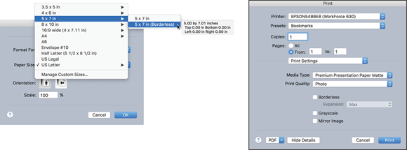
FIGURE 16-10: The Page Setup (left) and Print (right) dialog boxes for a color inkjet printer on a Mac.

FIGURE 16-11: The Printer-specific window of the Print dialog box for a PostScript laser printer on a Mac.
For example, an inkjet printer has options such as the printer presets, color management, ink, and resolution settings shown in Figure 16-10; a PostScript laser printer may have printer-specific options such as pages-per-sheet, two-sided printing, and resolution, as shown in Figure 16-11.
The Print dialog box may even remind you of a change you need to make in the document. So the Capture Settings button will become a good friend — it tells the Print dialog to remember everything you’ve done and then return you to your document. When you open the Print dialog box again, your previous settings are maintained.
Creating an Output Style
In the real world, you’re likely to only have one or two common uses for each printer you own. Smart QuarkXPress users create an Output Style for each printing scenario and then choose it from the Output Style drop-down in the Print dialog box whenever you need it.
Creating an Output Style is almost too simple — just follow these steps:
- Open a project that you would use for the kind of Output Style you want to create.
- Choose File ⇒ Print to open the Print Dialog box.
- Make all your preferred choices in each of the Print dialog panes.
- Choose New Print Output Style from the Print Style drop-down menu in the Print dialog box.
- Give your Output Style a descriptive name, such as “Jay’s laser printer-letter” or “Bookmarks-color-8x6.”
To make changes to an Output Style you created, or to import or export your Output Styles for sharing with others, choose Edit ⇒ Output Styles to open the dialog box shown in Figure 16-12.
- Click the Edit button to make changes to the selected Output Style.
- Click the Export button to export the selected Output Style to share with others. In the resulting dialog box, give your Output Style a name in the Save As field and choose a location to save it.
- Click the Import button and navigate to the location of the exported Output Style to import it into your copy of QuarkXPress.

FIGURE 16-12: The Output Styles dialog box.
Working with a Commercial Printer
When the time comes to send your project off to a commercial printer, the safest approach is to send both a press-ready PDF of each layout and the native QuarkXPress file with all its fonts and linked graphics.
Exporting a press-ready PDF
A press-ready PDF is a version of your QuarkXPress layout in PDF format that you can safely give to an output provider (such as a commercial printer) to print your project. This PDF file is generated with all the correct options for a commercial press, such as press-quality image resolution, page bleeds, and printers’ marks.
To export a press-ready PDF, follow these steps:
-
Choose Utilities ⇒ Usage to open the Usage dialog box and make sure that all your linked pictures are listed as OK.
If they’re listed as Missing, relink them; if Modified, update them as explained in Chapter 13.
- Choose Export ⇒ Layout as PDF to open the Export as PDF dialog box, shown in Figure 16-13.
- From the PDF Style drop-down menu, choose either Press or one of the PDF/X options if your printer recommends one.
- (Optional) Select the Open PDF after Export check box to view your exported PDF in your computer’s default PDF reader application.
- If you’re really brave or know a lot about PDF, click Options for access to a zillion ways to customize your PDF; otherwise, ignore this.
- Click Save and choose a location on your computer to save this PDF file.
- Repeat for any additional layouts in the project that you want to send to the printer.

FIGURE 16-13: The Export as PDF dialog box.
Your exported PDF file is now ready to be delivered to your printing company in whatever way you normally send them — via FTP; uploading to the printer’s web server; attaching to an email message; uploading to Dropbox and sending the printer a link via email; copying to a thumb drive; attaching to a carrier pigeon; and so on.
 Even though your operating system lets you export a PDF from within the Print dialog box, never use the Print dialog box to create a PDF from QuarkXPress. When you use the Print dialog box, QuarkXPress assumes that you want to print directly to a printer and may not provide the correct data to your operating system’s PDF generator.
Using Collect for Output
The Collect for Output feature collects your project, any linked pictures, the fonts it uses — everything necessary for someone else to open and edit your project in QuarkXPress, along with a helpful report about it.
 Quark added the multiple layouts feature in version 6, and finally in QuarkXPress 2015 (five versions and 12 years later), Quark added the capability to collect all the layouts and their assets with the Collect for Output feature. Rejoice!
To use the Collect for Output feature, follow these steps:
- Choose File ⇒ Collect for Output to open the Collect for Output dialog box, shown in Figure 16-14.
- Select any or all layouts you want to export.
-
Select all the check boxes under Collect, unless you have a specific reason not to.
If you deselect Layouts as Project, each layout will be exported as a separate QuarkXPress file.

FIGURE 16-14: The Collect for Output dialog box.
Troubleshooting Your Print Results
Alas, sometimes despite your best efforts to dot all your i’s and cross every single one of your t’s, something goes awry. If your prints don’t turn out the way you expect, read on for some ideas of what might be going wrong and how to fix them.
If your pictures look blurry or pixelated, try the following:
- Check the resolution of the pictures you imported. Select one on the page and look in the Home/Classic tab of the Measurements palette. At the far right end of the bottom row is an Effective Image Resolution value (the icon looks like a grid of gray squares). If the resolution is lower than about 240 ppi and the print is blurry or pixelated, you need to either obtain a higher resolution image and reimport it or reduce the size of the picture box in QuarkXPress.
- In the Pictures pane of the Print dialog box, make sure that you choose Normal and not Low Resolution in the Output drop-down menu.
The Effective Image Resolution is simply the original resolution of the image multiplied by the scaling factor used on that picture box. For example, if you import a 300 ppi picture and enlarge it to 200 percent, the Effective Image Resolution becomes 150 ppi. If you reduce it to 50 percent, the Effective Image Resolution becomes 600 ppi.
Another problem you might be having is with your fonts. If your fonts come out wrong, check to see whether you have these issues:
- Missing font in EPS picture files: If you imported a picture in EPS format and it uses a font, you must have that font active on your computer when you print your layout or it will substitute with another font, such as the dreaded Courier.
- Missing font styles: Not all fonts have a bold or italic variation (think about Zapf Dingbats or Wingdings). If you apply a bold or italic style to a font that doesn’t have that variation, QuarkXPress may attempt to fake the effect by making the characters thicker (to appear bold) or leaning them over (to appear oblique). Choose Utilities ⇒ Usage and look at the Fonts pane. If a font has a warning triangle next to it like the one shown in Figure 16-15, select it and click the Show First button. Select an offending character on your page and look at the Character tab of the Measurements palette. If the Bold or Italic button is engaged and it has a warning triangle on it, that font doesn’t have that style, and QuarkXPress is faking it for you, as shown for Zapf Dingbats in Figure 16-15.

FIGURE 16-15: The Fonts pane of the Usage dialog box.
 This chapter highlights the most important and common settings in the Print dialog box. For a complete explanation of absolutely everything, see my “QuarkXPress 8 Essential Training” at Lynda.com. The features in version 8 are practically identical to those in QuarkXPress 2016.