
CHAPTER 2
Get Control: Exploring Windows Phone Controls
The thought of design and particularly layout makes many developers cringe. We have spent our careers boldly looking past our user interfaces in search of pure code. For us, functionality always takes precedence over form. That is, until we show our application to an actual user. It's at that point we realize our weakness. Yes, our application works. Yes, it meets all of the business requirements. But no, it doesn't make any sense to our users, and in many cases, they can't even figure out how to do simple tasks.
When building mobile applications, your user interface may have more impact on your app's success than the underlying code. Potential users will look through the marketplace, and screenshots are an easy way to determine if an application is great or mediocre. A stellar interface will always give you an advantage over your competitors.
In this chapter, you're going to learn about how Windows Phone provides the tools, called controls, to take the guesswork out of user interface construction Each control has a look and feel that is native to the entire Windows Phone operating system, which makes it easy for us, as developers, to create beautiful (and familiar) applications for our users. This will include controls for layout, like the Grid and Canvas, tools for navigation, like the Panorama and the NavigationService, as well as controls for making your application more beautiful, like the Image control. We'll also focus on the power of the TextBox, and show you how you can customize the on-screen keyboard it uses for input.
This chapter will introduce the Application Bar, a powerful OS-level feature that you can use to promote the most important features of your pages.
If you apply a few rules for layout to the use of these controls, you'll have a functional application that your users can understand too. To show how it's done, we'll build an interface for a home inventory application that uses all of the controls introduced in this chapter to create a compelling user experience.
Introducing Layout Controls
Before we get started building the application, there are a few things you should know about placing controls on Windows Phone 7 pages. Microsoft provides three primary Panel controls, and each possesses its own strengths and weaknesses. These controls are the Grid, the Canvas, and the StackPanel. Each of these controls serves a specific purpose. The grid panel provides rows and columns, the stack panel allows you to align items one on top of or next to each other, and the grid allows for absolute positioning. As you build your first applications, you'll start to see how these panels can be used separately and together.
The Grid Control
The Grid control is often compared to table-based layout in HTML, but this can be misleading. While it is true that the use of HTML tables is often discouraged, the Grid does not suffer the limitations or bloat of the table, and is an essential layout control for the Phone, one whose use is encouraged.
The Grid is the default container for every new Windows Phone project, and for good reason. It provides a specific layout structure for each page, and is flexible enough to stretch and grow as your content changes. Listing 2-1 shows a simple example of a Grid control in Xaml.
Listing 2-1. A Grid Control
<Grid>

  <Grid.ColumnDefinitions>

    <ColumnDefinition Width="100" />

    <ColumnDefinition Width="100" />

    <ColumnDefinition Width="100" />

  </Grid.ColumnDefinitions>

  <Grid.RowDefinitions>

    <RowDefinition Height="100" />

    <RowDefinition Height="100" />

  </Grid.RowDefinitions>

  <Rectangle Fill="Red" Grid.Row="0" Grid.Column="0" />

  <Rectangle Fill="Orange" Grid.Row="0" Grid.Column="1" />

  <Rectangle Fill="Yellow" Grid.Row="0" Grid.Column="2" />

  <Rectangle Fill="Green" Grid.Row="1" Grid.Column="0" />

  <Rectangle Fill="Blue" Grid.Row="1" Grid.Column="1" />

  <Rectangle Fill="Purple" Grid.Row="1" Grid.Column="2" />

</Grid>
As you can see in Listing 2-1, within the Grid we define columns (with ColumnDefinition tags) and rows (with RowDefinition tags). We assign the individual elements to the specific row and/or column that is appropriate.
You'll notice that the Xaml example doesn't really look like the HTML table layout that you've seen in the past. Instead, we've separated the content from the layout. We don't have to wrap each element in a set of table tags. We define a Grid, and then we simply assign each element to a cell of that Grid.
Please note that the Grid locations start in the top left corner with (0, 0), not (1, 1).
In the examples in this book, we provide a Xaml solution for the layout. Xaml is very descriptive and very human readable, but it's also very static. Many times you're not going to know how many rows your table needs, or even how many elements you'll have to place in it. In those cases, you can recreate any Xaml element via code in your code-behind file. Listing 2-2 shows the exact same grid would look like created dynamically in C#. You should notice that it's significantly more difficult to visualize what the end result looks like.
Listing 2-2. A Grid Created By C#
Grid newGrid = new Grid();

newGrid.ColumnDefinitions.Add(new ColumnDefinition{ Width = new GridLength(100) });

newGrid.ColumnDefinitions.Add(new ColumnDefinition { Width = new GridLength(100) });

newGrid.ColumnDefinitions.Add(new ColumnDefinition { Width = new GridLength(100) });

newGrid.RowDefinitions.Add(new RowDefinition { Height = new GridLength(100) });

newGrid.RowDefinitions.Add(new RowDefinition { Height = new GridLength(100) });


Rectangle r1 = new Rectangle{ Fill = new SolidColorBrush(Colors.Red) };

Grid.SetColumn(r1, 0);

Grid.SetRow(r1, 0);

Rectangle r2 = new Rectangle { Fill = new SolidColorBrush(Colors.Orange) };

Grid.SetColumn(r2, 1);

Grid.SetRow(r2, 0);

Rectangle r3 = new Rectangle { Fill = new SolidColorBrush(Colors.Yellow) };

Grid.SetColumn(r3, 2);

Grid.SetRow(r3, 0);

Rectangle r4 = new Rectangle { Fill = new SolidColorBrush(Colors.Green) };

Grid.SetColumn(r4, 0);

Grid.SetRow(r4, 1);

Rectangle r5 = new Rectangle { Fill = new SolidColorBrush(Colors.Blue) };

Grid.SetColumn(r5, 1);

Grid.SetRow(r5, 1);

Rectangle r6 = new Rectangle { Fill = new SolidColorBrush(Colors.Purple) };

Grid.SetColumn(r6, 2);

Grid.SetRow(r6, 1);


newGrid.Children.Add(r1);

newGrid.Children.Add(r2);

newGrid.Children.Add(r3);

newGrid.Children.Add(r4);

newGrid.Children.Add(r5);

newGrid.Children.Add(r6);


LayoutRoot.Children.Add(newGrid);
In Listing 2-2, you can see that there's a bit more work required. For each element (ColumnDefinition, RowDefinition, Rectangle), we have to create an instance of that element, and then we have to add it to its parent container. So each Rectangle is added to the newGrid element, and then the newGrid element is added to our LayoutRoot element. (LayoutRoot is the default Grid that is created when you create your page. In both examples, you should end up with a layout of six colored boxes, in two rows, as shown in Figure 2-1.
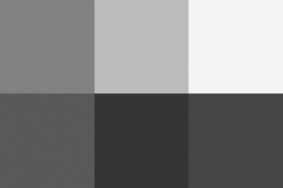
Figure 2-1. Layout of six colored boxes in grayscale
Ultimately, the Grid can be used in a variety of ways, especially when you need elements to be aligned with each other. When you need something a little more free-form, however, you might want to consider the Canvas as your primary panel control. Where the Grid takes many liberties with its contents (resizing elements to fit the Grid cell, centering elements automatically), the Canvas is almost completely hands-off.
The Canvas Control
Just as the Grid control is comparable to an HTML table, the Canvas control behaves like the absolute positioning provided by HTML/CSS. When you use a Canvas, each element is given a specific location on the page, and nothing but code can move them. This is also one of the limitations of the Canvas, but for many applications, particularly animation-intensive applications, you'll find it to be ideal.
When elements are absolutely positioned, they just don't adjust. Elements will overlap, without having any positioning-related effect on its neighbors. This is one of the fastest ways to get your elements positioned on a page, and the taboos that came with absolute positioning in CSS are erased, because we're developing for a mobile operating system, not seventeen flavors of browser and platform combinations.
So what exactly does a Canvas look like? Listing 2-3 shows the Xaml to re-create the same layout that we used in the Grid example.
Listing 2-3. Using the Canvas Control
<Canvas>

    <Rectangle Fill="Red" Width="100" Height="100" Canvas.Top="100" Canvas.Left="100" />

    <Rectangle Fill="Orange" Width="100" Height="100" Canvas.Top="100" Canvas.Left="200" />

    <Rectangle Fill="Yellow" Width="100" Height="100" Canvas.Top="100" Canvas.Left="300" />

    <Rectangle Fill="Green" Width="100" Height="100" Canvas.Top="200" Canvas.Left="100" />

    <Rectangle Fill="Blue" Width="100" Height="100" Canvas.Top="200" Canvas.Left="200" />

    <Rectangle Fill="Purple" Width="100" Height="100" Canvas.Top="200" Canvas.Left="300" />

</Canvas>
For each element in your Canvas, you will need to specify the Canvas.Top and Canvas.Left properties. Omitting these values will result in your elements being positioned in the top left corner of the Canvas, at position 0, 0. As with any Xaml element, you can embed these controls inside each other, giving you the ability to segment and separate your content into different panels.
Another important difference to notice in the Canvas example is that we have to be explicit about sizes of our elements. In the Grid example, we didn't have to size our Rectangles because they will automatically fill the size of the Grid cell they occupy. In a Canvas, everything needs to be explicit, or the element will either not show up (because it has a height and width of zero), or will render at its default size (if it has one.)
In Chapter 5, we're going to cover animation, and show how adding movement to an application can enhance your user's experience. In most cases, the Canvas is the ideal surface for creating animations, because there aren't any other “rules” as to how or where its contents should be displayed. Creating animations with elements that live in a Grid control, for example, can be more difficult, because you'll find yourself wanting to move elements from cell to cell, which can create some unwanted behaviors.
The StackPanel Control
The last of the big three panel controls is the StackPanel. This control might seem a little more familiar to the CSS fans who love flow-based layouts. As the name might suggest, the StackPanel stacks the elements it contains. By default, StackPanels stack their contents vertically, but you can also set a property to “stack” the objects horizontally instead.
In Listing 2-4, we are going to recreate the same output we created with the Grid and Canvas, using StackPanels. Since we have six Rectangles that we want to arrange in a 3 × 2 block, we should start with an outer StackPanel that, by default, will stack our elements vertically. However, we want to have two rows of three Rectangles each, so we are going to nest two more StackPanels inside. Each of these child StackPanels will need their Orientation property set to Horizontal to create the rows. Again, Listing 2-4 renders the exact same layout as the Grid and Canvas examples from earlier.
Listing 2-4 Using the StackPanel Control
<StackPanel>

    <StackPanel Orientation="Horizontal">

        <Rectangle Fill="Red" Width="100" Height="100" />

        <Rectangle Fill="Orange" Width="100" Height="100" />

        <Rectangle Fill="Yellow" Width="100" Height="100" />

    </StackPanel>

    <StackPanel Orientation="Horizontal">

        <Rectangle Fill="Green" Width="100" Height="100" />

        <Rectangle Fill="Blue" Width="100" Height="100" />

        <Rectangle Fill="Purple" Width="100" Height="100" />

    </StackPanel>

</StackPanel>
Recap
As we've shown in the previous three examples, each panel control treats your content differently, and recognizing those differences will allow you to select the right control for the right situation. Each of these controls has its strengths and weaknesses, so the important lesson here is that if your content looks and behaves the way you expect it to, you've made a good choice.
In the next section of this chapter, we're going to build a real application, using real controls and layout practices. We'll point out some easy stumbling blocks to avoid, while giving you the insight to make your application more useable for your users along the way.
Building a Real User Interface
For the remainder of this chapter, we are going to build a user interface that lets us explore many of the controls that are available to us by default for Windows Phone. We'll focus on several controls in the Visual Studio Toolbox, and show how best to use them.
We're going to build something simple, but useful: a home inventory application. If you're not familiar with the idea of a home inventory, imagine something terrible happened to your home last week. How would you prove to your insurance company that you had fifteen computers, nine Xbox 360s, and a bag full of diamonds? By taking a home inventory, you'll have descriptions, serial numbers, locations, and photos of all of the valuable items you own (using the camera is covered in Chapter 9).
In our application, we're going to create several different pages. The home page will provide links for navigation and expose some of our data using a Panorama control. We'll also include pages for adding new items, new categories, and new locations.
Getting Started
We'll begin by opening a new application and deleting some default code created by Visual Studio that we won't need.
1. Open Visual Studio 2010, and choose File New Project Windows Phone Application, a shown in Figure 2-2. Complete the dialog and click OK.

Figure 2-2. Shows how to open a new project with Open Visual Studio 2010
One of the first things you may want to do when starting a new Windows Phone project is to delete the default code in your MainPage.xaml file. The default code is great for your first “Hello World!” application, but is a little simplistic for what we are trying to accomplish in this chapter. We're not deleting everything, but we are deleting the code responsible for the default user interface.
2. Go to
MainPage.xaml. You can delete all of the code shown in Listing 2-5.
Listing 2-5. The Xaml You Can Remove from the Default Page Template
<!--LayoutRoot is the root Grid where all page content is placed-->

<Grid x:Name="LayoutRoot" Background="Transparent">

    <Grid.RowDefinitions>

        <RowDefinition Height="Auto"/>

        <RowDefinition Height="*"/>

    </Grid.RowDefinitions>


    <!--TitlePanel contains the name of the application and page title-->

    <StackPanel x:Name="TitlePanel" Grid.Row="0" Margin="12,17,0,28">

        <TextBlock x:Name="ApplicationTitle" Text="MY APPLICATION" Style="{StaticResource PhoneTextNormalStyle}"/>

        <TextBlock x:Name="PageTitle" Text="page name" Margin="9,-7,0,0" Style="{StaticResource PhoneTextTitle1Style}"/>

    </StackPanel>


    <!--ContentPanel - place additional content here-->

    <Grid x:Name="ContentPanel" Grid.Row="1" Margin="12,0,12,0"></Grid>

</Grid>


<!--Sample code showing usage of ApplicationBar-->

<!--<phone:PhoneApplicationPage.ApplicationBar>

    <shell:ApplicationBar IsVisible="True" IsMenuEnabled="True">

        <shell:ApplicationBarIconButton IconUri="/Images/appbar_button1.png" Text="Button 1"/>

        <shell:ApplicationBarIconButton IconUri="/Images/appbar_button2.png" Text="Button 2"/>

        <shell:ApplicationBar.MenuItems>

            <shell:ApplicationBarMenuItem Text="MenuItem 1"/>

            <shell:ApplicationBarMenuItem Text="MenuItem 2"/>

        </shell:ApplicationBar.MenuItems>

    </shell:ApplicationBar>

</phone:PhoneApplicationPage.ApplicationBar>-->
Most of the time, we prefer the first page of an application to be a rich, robust experience that gives our user access to as much data and navigation as we can. Many applications pack tons of buttons on the first screen, but there's a better way to provide lots of options to your users: the Panorama control. If you look in your default Visual Studio Toolbox, you'll probably notice that the Panorama isn't listed. Let's fix that first.
Adding Missing Controls to Your Toolbox
Figure 2-3 is a quick look at the default contents of your Visual Studio Toolbox. There are many other controls available to you, but they're hidden because they're not part of the default namespaces that are included in your project.
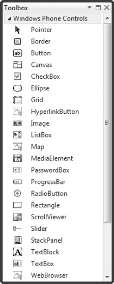
Figure 2-3 The Visual Studio Toolbox for Windows Phone applications
In order to get the hidden controls into your Toolbox, you'll need to add them.
1. To do this, right-click on your Toolbox and select “Choose Items…” (as shown in Figure 2-4).
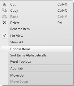
Figure 2-4 Adding additional controls to your Toolbox
2. The “Choose Toolbox Items” dialog box that appears (shown in Figure 2-5) allows you to choose the specific controls you want in your Toolbox. There are dozens of additional controls to use, and almost all of them will require an additional reference in your application. Feel free to add any of the controls that sound interesting, but for our application, we're only going to need the
Panoramacontrol. Also notice that the Toolbox doesn't alphabetize the controls for you, so if you want to movePanoramaup between theMediaElementand thePasswordBox, just drag it up there once you've added it. (You can also right-click again, and choose “Sort Items Alphabetically.”)
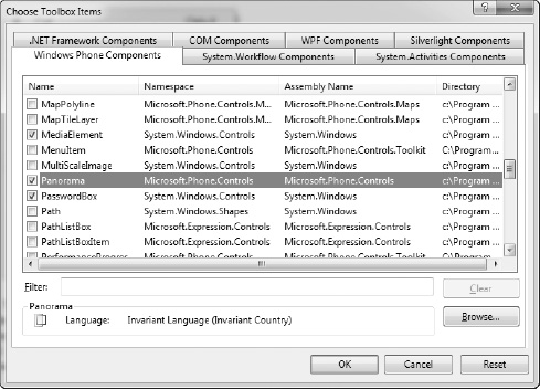
Figure 2-5 The Choose Toolbox Items dialog box
Using the Panorama Control
You're almost ready to add this Panorama to the application home page.
3. If you drag the
Panoramacontrol from your Toolbox to the place in your Xaml where you deleted all of that code earlier, you'll notice that it adds a tag that looks like Listing 2-6.
Listing 2-6 The Base Panorama Xaml Tag
<controls:Panorama />The controls: portion of that tag refers to the new namespace that has been added to your page. If you look at the very top of your page, there should now be a line that looks like the following:
xmlns:controls="clr-namespace:Microsoft.Phone.Controls;assembly=Microsoft.Phone.Controls"
When you dragged the Panorama into your code, Visual Studio added this tag for you automatically, as well as reference to the Microsoft.Phone.Controls assembly. This assembly is where the Panorama control lives, and without the assembly included in your project, you can't use the Panorama control. You could have typed both of those lines, but sometimes drag-and-drop can save you some time. (If you dragged the Panorama from the Toolbox to your design surface, you got a little more Xaml than Listing 2-6 showed. To continue following this example, just trim back your Xaml to look like Listing 2-7.)
4. Because we actually want to put content inside our
Panorama, we're going to need to expand the self-closing tag that was placed there for us. You should also add a title to yourPanoramacontrol, because this is the huge text that appears at the top of the control. This is shown in Listing 2-7.
Listing 2-7. Expanding the Panorama Control Tag
<controls:Panorama Title="home inventory">


</controls:Panorama>
After you add this content to your page, your design surface should look like Figure 2-6.
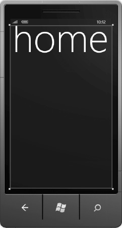
Figure 2-6. An empty Panorama with a title property
Everything else that put on this page will be contained within this all-important tag. This is because every Xaml page can only have one root container. In this case, we've chosen a Panorama, but on most pages (and the rest of this application) will use one of the layout controls that we discussed earlier in this chapter.
5. Let's continue by adding some sections to our
Panorama. We do this withPanoramaItemcontrols. Listing 2-8 shows the four sections we'll have in our application.
Listing 2-8. Adding PanoramaItems to a Panorama Control
<controls:Panorama Title="home inventory">

    <controls:PanoramaItem Header="your stuff">


    </controls:PanoramaItem>

    <controls:PanoramaItem Header="categories">


    </controls:PanoramaItem>

    <controls:PanoramaItem Header="rooms">


    </controls:PanoramaItem>

    <controls:PanoramaItem Header="photos">


    </controls:PanoramaItem>

</controls:Panorama>
At this point, stop and press F5 to run your application. The emulator should spin up, and you should see an application with a black background, and some large white text. You should be able to click-and-drag the screen in either direction, and see that native Panorama behavior, where the screen slides from section to section, and the Panorama title moves at a slower pace.
6. The last step we'll take in our
Panoramacontrol is to add a background image. We add this right alongside thePanoramaItemcontrols that we added before, by defining theBackgroundproperty of thePanorama, and then adding Xaml inside it to specify the actual background image. Listing 2-9 shows what the Xaml will look like.
Listing 2-9. Adding a Background Image to a Panorama Control
<controls:Panorama.Background>

    <ImageBrush ImageSource="images/warehouse.jpg" Opacity=".4" />

</controls:Panorama.Background>
We have specified two properties on an ImageBrush control, ImageSource and Opacity. The ImageSource points to an image that added to the project, and the Opacity is used because the raw image is just a little too bright to contrast with the white text on the screen.
7. To add an image to your project, right-click on your project's name, and choose “Add New Folder…” and name it “images.” Now, right-click on that new folder, and choose “Add Existing Item…” Select an image file from your computer that you'd like to use as your backgroundct.
You always want to use an image that is 800 pixels tall, or your image will be stretched to fill the space. The width, however, is entirely up to how many PanoramaItems you intend to use. Our recommendation is to use an image with a minimum width of 1024 pixels, but if you're using more than five PanoramaItems, add approximately 200 more pixels per additional PanoramaItem. You'll see this in the next section.
Adjusting Background and Accent Colors
By default, your application and your emulator are both set to use the Dark background on the phone, and a Red accent color. The Dark background includes dark backgrounds with light text. The Light background uses white backgrounds with dark text. If you're not familiar with the ways a user can customize their phone, you're going to want to become intimately close with these concepts. This is the number-one reason why applications fail marketplace validation, and with a little attention to detail, they can easily be avoided.
8. Open up your emulator, and press the Home button (the Windows icon) that is on the bottom center of the device.
9. Press the circled arrow, and choose Settings from the list of applications that appears.
10. Inside Settings, look for the “theme” option. Choose that, and you'll discover that you can change both background and accent color on the emulator, as shown in Figure 2-7.
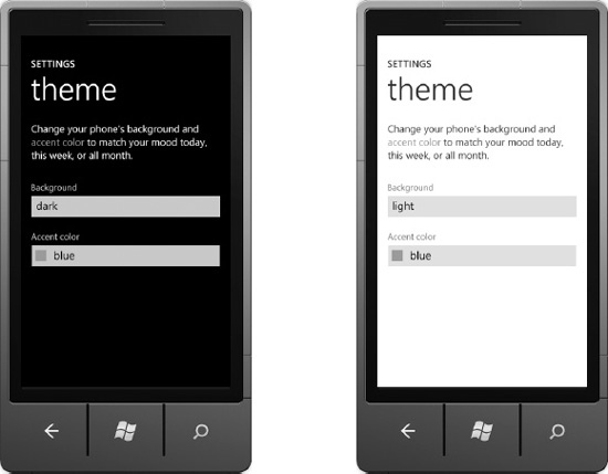
Figure 2-7. Changing the theme of the Windows Phone emulator
These are system-wide settings that apply to every default color in every application on the phone. So far in our application, we have only used default colors, so we should be incredibly conscious of what our application looks like under each theme. Figure 2-8 gives you a quick look.

Figure 2-8. Our home inventory application using the different themes
.As we progress further into our application, this is going to become more and more important to pay attention to. This is because black text on black backgrounds isn't visible, just as white text on white backgrounds vanishes. If we stick with all default values, we should generally be safe, but the moment we start explicitly naming colors of our controls is when we venture into more dangerous territory.
Thankfully, Expression Blend makes this easy for us to test. Open the Devices tab in Expression Blend and you'll find the ability to switch themes and accent colors very easily, as shown in Figure 2-9..
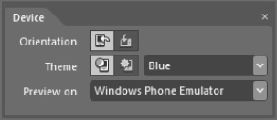
Figure 2-9 The Device tab in Expression Blend
Another recommendation we give to developers with actual Windows Phone devices is to set your device to the Light Theme, because your emulator will always default to Dark. This way, as you're testing your applications, you'll be certain to see the interface in both themes.
Adding Images to a Page
One of the most common controls you will use in your applications will be the Image control. You will use it to show photos and other images to your user. In the “photos” section of our Panorama, we want to show the user all of the photos they have added to their collection. To do this, we'll lay the images out in a Grid control.
11. First, we will need some images in our application. The
Imageelement can use PNG, JPG, and BMP files. GIF format is not supported. (In a fully-functional application, these images would be created and saved as the user added new items to the app. In our example, we're going to use static images, but the user interface will be identical.)
Inside the “photos” PanoramaItem of our MainPage.xaml file, we need to add a Grid, its Column and Row definitions, as well as the images we just selected.
12. Listing 2-10 shows the Xaml you need, including the
PanoramaItemfor reference. Add it now.
Listing 2-10. Adding a Grid and Images to a PanoramaItem
<controls:PanoramaItem Header="photos">

    <Grid>

        <Grid.ColumnDefinitions>

            <ColumnDefinition Width="110" />

            <ColumnDefinition Width="110" />

            <ColumnDefinition Width="110" />

            <ColumnDefinition Width="110" />

        </Grid.ColumnDefinitions>

        <Grid.RowDefinitions>
            <RowDefinition Height="110" />

            <RowDefinition Height="110" />

            <RowDefinition Height="110" />

            <RowDefinition Height="110" />

        </Grid.RowDefinitions>

        <Image Source="images/laptop.jpg" Width="100" Height="100" />

        <Image Source="images/nook.jpg" Width="100" Height="100" Grid.Column="1" Grid.Row="0" />

        <Image Source="images/clicker.jpg" Width="100" Height="100" Grid.Column="2" Grid.Row="0"/>

        <Image Source="images/headphones.jpg" Width="100" Height="100" Grid.Column="3" Grid.Row="0"/>

        <Image Source="images/bag.jpg" Width="100" Height="100" Grid.Column="0" Grid.Row="1"/>

        <Image Source="images/mifi.png" Width="100" Height="100" Grid.Column="1" Grid.Row="1"/>

    </Grid>

</controls:PanoramaItem>
As we show in Listing 2-10, we have a primary element, the Grid, as the only element inside our PanoramaItem. We defined four columns and rows that are each 110 pixels wide and tall, respectively. We then added six Image elements, and assigned them to individual cells of the Grid control, just as we discussed earlier in this chapter. If you run your project, you should now have a nice layout of images for your user, as shown in Figure 2-10.

Figure 2-10. Our PanoramaItem populated with six images in a Grid
This simple interface makes it very easy for your user to look through their images, but we're somewhat restricted by the size of the screen. We would be able to show a maximum of 20 images. This gives us an opportunity to introduce one more incredibly valuable control: the ScrollViewer. By wrapping our Grid in a ScrollViewer control, we immediately get the ability to scroll down to a much longer list of images. Listing 2-11 shows a larger example of our previous Grid and Image controls, using a ScrollViewer.
Listing 2-11. Using a ScrollViewer for a Large Set of Images
<controls:PanoramaItem Header="photos">

         <ScrollViewer>

            <Grid>

               <Grid.ColumnDefinitions>

                  <ColumnDefinition Width="110" />

                  <ColumnDefinition Width="110" />

                  <ColumnDefinition Width="110" />

                  <ColumnDefinition Width="110" />

               </Grid.ColumnDefinitions>

               <Grid.RowDefinitions>

                  <RowDefinition Height="110" />

                  <RowDefinition Height="110" />

                  <RowDefinition Height="110" />

                  <RowDefinition Height="110" />

                  <RowDefinition Height="110" />

                  <RowDefinition Height="110" />

                  <RowDefinition Height="110" />

                  <RowDefinition Height="110" />

               </Grid.RowDefinitions>

               <Image Source="images/laptop.jpg" Width="100" Grid.Column="0" Grid.Row="0" />

               <Image Source="images/nook.jpg" Width="100" Grid.Column="1" Grid.Row="0" />

               <Image Source="images/clicker.jpg" Width="100" Grid.Column="2" Grid.Row="0"/>

               <Image Source="images/headphones.jpg" Width="100" Grid.Column="3" Grid.Row="0"/>

               <Image Source="images/mifi.png" Width="100" Grid.Column="0" Grid.Row="1"/>

               <Image Source="images/laptop.jpg" Width="100" Grid.Column="1" Grid.Row="1" />

               <Image Source="images/nook.jpg" Width="100" Grid.Column="2" Grid.Row="1" />

               <Image Source="images/clicker.jpg" Width="100" Grid.Column="3" Grid.Row="1"/>

               <Image Source="images/headphones.jpg" Width="100" Grid.Column="0" Grid.Row="2"/>

               <Image Source="images/bag.jpg" Width="100" Grid.Column="1" Grid.Row="2"/>

               <Image Source="images/mifi.png" Width="100" Grid.Column="2" Grid.Row="2"/>

               <Image Source="images/laptop.jpg" Width="100" Grid.Column="3" Grid.Row="2" />

               <Image Source="images/nook.jpg" Width="100" Grid.Column="0" Grid.Row="3" />

               <Image Source="images/clicker.jpg" Width="100" Grid.Column="1" Grid.Row="3"/>

               <Image Source="images/headphones.jpg" Width="100" Grid.Column="2" Grid.Row="3"/>

               <Image Source="images/bag.jpg" Width="100" Grid.Column="3" Grid.Row="3"/>

               <Image Source="images/mifi.png" Width="100"   Grid.Column="0" Grid.Row="4"/>

               <Image Source="images/laptop.jpg" Width="100" Grid.Column="1" Grid.Row="4" />

               <Image Source="images/nook.jpg" Width="100"   Grid.Column="2" Grid.Row="4" />

               <Image Source="images/clicker.jpg" Width="100" Grid.Column="3" Grid.Row="4"/>
               <Image Source="images/headphones.jpg" Width="100" Grid.Column="0" Grid.Row="5"/>

               <Image Source="images/bag.jpg" Width="100" Grid.Column="1" Grid.Row="5"/>

               <Image Source="images/mifi.png" Width="100"   Grid.Column="2" Grid.Row="5"/>

               <Image Source="images/laptop.jpg" Width="100" Grid.Column="3" Grid.Row="5" />

            </Grid>

         </ScrollViewer>

      </controls:PanoramaItem>
As we have shown, there's nothing significant about the ScrollViewer's implementation, but it gives us the power to scroll content, both horizontally and vertically, when we need it. You will find that this tool comes in very handy with large sets of data. In the next chapter, we'll discuss the best ways to work with your user's data on a Windows Phone.
Navigating Between Pages
In its simplest form, navigating between pages in Windows Phone is as simple as navigating between pages in a web site. We create a UI element (e.g., a Button), and on its click-event, we call a navigation method that directs the user to the next page.
Let's start by adding the following new pages to your application:
Categories.xamlRooms.xamlItems.xaml
13. To do this, right-click on your project in Visual Studio, and choose “Add New Item…” or you can press Ctrl+Shift+A on your keyboard, as shown in Figure 2-11.

Figure 2-11. Adding a new item to your project
14. Once you've done this, you'll be presented with an Add New Item dialog box for adding just about anything to your project, but fortunately a new Windows Phone Portrait Page is the default option. Give it the appropriate name, in this case
Categories.xaml, and then add the other two pages the same way (shown in Figure 2-12).
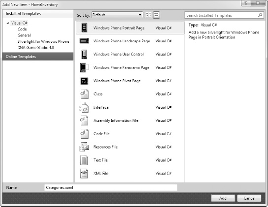
Figure 2-12. Adding a new page to our project
15. Now let's go back to
MainPage.xamland add a Button to our page so that we can navigate to one of these new Xaml files we created. Inside thePanoramaItemthat has the Header “categories,” let's add aGridand aButtoncontrol, as shown in Listing 2-12 and Figure 2-13.
Listing 2-12. Adding a Grid and Button to Our PanoramaItem
<controls:PanoramaItem Header="categories">

    <Grid>

        <Button x:Name="CategoriesButton" Width="200" Height="100" Content="Add New" />
</Grid>
</controls:PanoramaItem>
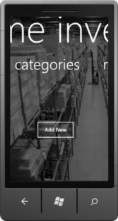
Figure 2-13. The appearance of our new Grid and Button
By adding a Click event handler to this button, we can then execute any code we want. The following are three ways to add a Click event handler:
- Double-click on the button
- Type in the event handler in the Xaml
- Add the event handler in the code-behind (discussed later in this chapter)
16. If you double-click on the
Button, Visual Studio will create the event handler for you, naming it with the name of the button, followed by an underscore, followed by the name of the event (as shown in Listing 2-13).
Listing 2-13 An Empty Click Event Handler Method
private void CategoriesButton_Click(object sender, RoutedEventArgs e)

{


}
17. This is where we will add our navigation code. To navigate to our
Categories.xamlpage, it requires one line of code (shown in Listing 2-14).
Listing 2-14. Using the NavigationService to Move Between Pages
private void CategoriesButton_Click(object sender, RoutedEventArgs e)

{

    NavigationService.Navigate(new Uri("/Categories.xaml", UriKind.Relative));

}
You should also find that the Click event handler code was added to your Xaml Button as well, as shown in Listing 2-15.
Listing 2-15. The Click Event Handler Added to Our Button Tag
<Button x:Name="CategoriesButton" Width="200" Height="100" Content="Add New" Click="CategoriesButton_Click" />18. Go ahead and run the project again (press F5). If you slide your
Panoramato the left, revealing the Categories section, you should be able to click on your button, and navigate to the new, empty Categories page. Pressing the Back button on the emulator should return you to yourPanorama, on the same panel that we left it. This is how theNavigationServiceworks. We programmatically move the user forward, and the Back button allows them to move backwards.
 Note We can also programmatically move backwards through the “back stack” using the
 NavigationService.Back() method, but with a dedicated hardware button, that will usually be unnecessary, and most often will violate the design guidelines for the phone.
Dealing with the Back Stack
One of the bigger navigation challenges in Silverlight applications for Windows Phone is the concept of the back stack, and how it can quickly build a maze for your user. Think of the back stack as an ever-growing list of pages you have visited. Not only within your application, but the entire Windows Phone operating system. When your application provides links to other pages, the back stack quickly grows larger and larger. This is especially true when you provide any type of mechanism to get back “home.” The following is an example navigation path in our current application.
Home Categories Add Category Categories
In that example, we navigated to our Categories page, went to another page that allows us to add a category, and then when we finished that task, we returned the user to the Categories page so that they could see the new item in the list. Each of these moves used code similar to that in Listing 2-14, which means that when the user uses the Back button to navigate to the first page of our application, it's actually going to take three confusing clicks to get there. In short, the back stack on the phone doesn't match the back stack in your user's head. Now imagine that your user decides to start entering dozens of categories at once. They could require more than 20 Back button presses to get back home. Before that happens, they're going to exit your application, never to return.
Thankfully, there's a better solution. In the Windows Phone 7.5 release, the NavigationService was expanded to allow more flexibility in navigating through our applications.
To solve the problem presented, we can use the RemoveBackEntry method of the Navigation Service on our Add Category page (shown in Listing 2-16). This removes the Add Category page from our page stack, and when the user saves a value, we can use the NavigationService.Back() method to go back to the main Categories page.
Listing 2-16. Using the RemoveBackEntry Method
if (NavigationService.CanGoBack)

    NavigationService.RemoveBackEntry();
You'll notice that we wrapped the method call in a check to see if we can, in fact, go backwards in the navigation stack. If there is not an available entry in the navigation stack, you will get an InvalidOperationException and your application will crash. To remove multiple entries in the back stack, you can call the method multiple times.
You'll always be safer to make the CanGoBack check before calling the RemoveBackEntry method.
You should still be very cautious about modifying the default navigation behavior of your application, because it is very easy to miss a step and get your user lost, or caught in a navigation loop, and these are situations that will cause your application to be denied from the Marketplace every time. We will cover the Marketplace, and our tips and tricks for navigating it in Chapter 10.
Using TextBoxes
On each of our individual category pages, we need a way to capture our user's input. There are many ways to capture input from a user (shake, touch, microphone, camera), but text input will overwhelmingly be the way that we get information into our apps. Thankfully, we have some robust power available inside the standard TextBox control, and we're going to cover two of them: InputScope and the Software Input Panel (SIP) or keyboard.
When users tap on a TextBox, they expect to be able to type text or numbers. This means that the keyboard pops up every time this happens. What's nice about this is that we can choose which keyboard gets shown to the user by setting its InputScope property, and there's dozens. An InputScope is simply a definition of which type of keyboard you want to present to your user. To add a standard TextBox to our page is pretty straightforward, as shown in the following:
<TextBox Width="400" Height="75" />
Adding an InputScope is just as simple, as follows:
<TextBox Width="400" Height="75" InputScope="EmailNameOrAddress" />
For those of you following along in Visual Studio as you read, you probably just noticed that Visual Studio doesn't seem to provide IntelliSense for the different InputScope values. Unfortunately, this format doesn't accommodate that. (You'll find that you generally only use three or four different InputScopes, but to explore the list, you can use this slightly more verbose format).
<TextBox Width="400" Height="75">

    <TextBox.InputScope>

        <InputScope>

            <InputScopeName NameValue="EmailNameOrAddress" />

        </InputScope>

    </TextBox.InputScope>

</TextBox>
Figures 2-14, 2-15, 2-16, and 2-17 show a few of the most common InputScope keyboards.

Figure 2-14. Default Windows Phone keyboard
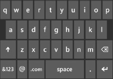
Figure 2-15. EmailNameOrAddress InputScope keyboard
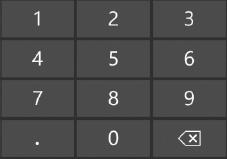
Figure 2-16. Number InputScope keyboard

Figure 2-17. TelephoneNumber InputScope keyboard
It's important to remember that InputScope does not equal validation. Using the TelephoneNumber scope, for example, will not validate that the user is actually entering a properly formatted phone number. InputScope only defines the type of keyboard that will be presented to the user. Nonetheless, InputScope is a great way to make data entry easier on your user, and should be applied at every appropriate opportunity.
Using the ApplicationBar
The ApplicationBar is an important part of the Windows Phone operating system. It provides additional screen real estate, and is distinctively a Windows Phone feature. You may have noticed the small circled icons at the bottom of many of the applications in the Windows Phone Marketplace, and these icons are just one part of the ApplicationBar. The icons are meant to provide easy access to the most common functions a user would perform on the specific page. The other part of the ApplicationBar, the ApplicationBarMenuItems, provide a way to bury other functionality that would otherwise take up your valuable screen real estate.
It's important to remember that the ApplicationBar runs at the operating system's shell level, not at your application level. This distinction is important because as you become more familiar with the ApplicationBar, you'll notice that it doesn't have the same types of robust flexibility that standard Silverlight controls offer us. It's a bit more primitive than some of the other controls you've worked with to this point, but it also has some features that are huge timesavers.
19. Let's start by adding a simple
ApplicationBarto a page. Open one of the new pages we created for our home inventory application. Here we're using theCategories.xamlpage, primarily because we've already provided a way to navigate there in our app. At the bottom of that page, there's a large section of Xaml commented out. It looks like Listing 2-17.
Listing 2-17. The Default Commented-out Application Bar
<!--Sample code showing usage of ApplicationBar-->

<!--<phone:PhoneApplicationPage.ApplicationBar>

    <shell:ApplicationBar IsVisible="True" IsMenuEnabled="True">

        <shell:ApplicationBarIconButton IconUri="/Images/appbar_button1.png" Text="Button 1"/>

        <shell:ApplicationBarIconButton IconUri="/Images/appbar_button2.png" Text="Button 2"/>

        <shell:ApplicationBar.MenuItems>

            <shell:ApplicationBarMenuItem Text="MenuItem 1"/>

            <shell:ApplicationBarMenuItem Text="MenuItem 2"/>

        </shell:ApplicationBar.MenuItems>

    </shell:ApplicationBar>

</phone:PhoneApplicationPage.ApplicationBar>-->
20. Uncommenting this code will automatically enable the
ApplicationBar, including adjusting thed:DesignHeightproperty of your page. Give it a try. The defaultDesignHeightvalue is 768, which removed 32 pixels to accommodate theSystemTraythat shows the clock, battery level, etc. When you add theApplicationBar, theDesignHeightdrops to 696 pixels. This is because theApplicationBartakes up 72 pixels. There are ways to reclaim those pixels, and we'll show you how to do that a little later in this section.
If we look closely at the elements of the ApplicationBar in Listing 2-17, there are two specific pieces that should stand out: an ApplicationBarIconButton and an ApplicationBarMenuItem.
The ApplicationBarIconButton
Each of the ApplicationBarIconButton elements are the icons you see at the bottom of the application If you look at the code for the ApplicationBar, you've likely noticed that it's pointing to two images that are not currently part of your project. If you run your app, you'll notice that it shows an X icon for each of the ApplicationBarIconButtons (shown in Figure 2-18).
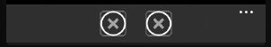
Figure 2-18. ApplicationBarIconButtons with “broken” images
We could very easily go create some images for these buttons, add them to our project, and then reference them on those lines of code, but there is a much easier way; and it is found in Expression Blend.
21. Open your app in Expression Blend, and navigate the “Objects and Timeline” tree until you find those
ApplicationBarIconButtonobjects, as shown in Figure 2-19.
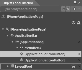
Figure 2-19. The Objects and Timeline panel in Expression Blend
22. When you click on one of the
ApplicationBarIconButtons, check the Properties tab. You'll see a simple way to set the icon and text for each one. Figure 2-20 shows what it looks like.

Figure 2-20. The ApplicationBarIconButton properties tab
If you drop down the IconUri select box, you'll see a wealth of standard icons that you can use in your applications. Unless you have a custom icon that you absolutely can't live without, these icons should serve most of your needs (you can always create your own icon and add it manually). And by selecting one, it automatically adds the white version of that icon to your project. All of your icons should only be white. You don't need multiple versions because the OS can manipulate the colors of the ApplicationBar automatically. We'll cover this in detail later in this chapter. If you're not following along in Blend, here's the list of standard icons.
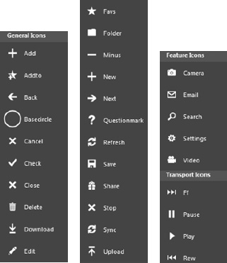
Figure 2-21. List of default icons available in Expression Blend
Expression blend automatically adds a folder named “icons” to your project. If you are creating your icon manually, we recommend that you also create an icons folder in your project.
You can right-click to add this folder, and then right-click on the folder to Add Existing Item. You can also use Shift+Alt+A on your keyboard. You can select the icon you wish to use from your computer, and it will add it your project. Change the path of the image in one of the IconButtons to the path of your image, and it will now be sitting inside a white circle in the ApplicationBar.
Each of these IconButtons has an available Click event handler, and it is how you allow your user to take an action when they tap the button. To add the Click event, you can either edit the Xaml, as shown in Listing 2-18, or you can use the Events portion of the Properties tab in Expression Blend.
23. To access this, click the icon with the lightning bolt in the top right region of the Properties tab, as shown in Figure 2-22.
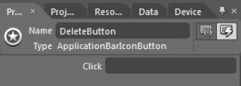
Figure 2-22. The Events tab in Expression Blend
Type the name of the event handler you would like to create in the box labeled Click to add an event handler to your ApplicationBarIconButton, as shown in Listing 2-18.
Listing 2-18. Completed ApplicationBarIconButton elements in Xaml
<shell:ApplicationBarIconButton x:Name="AddButton" IconUri="/icons/appbar.add.rest.png" Text="add" Click="AddButton_Click"/>

<shell:ApplicationBarIconButton x:Name="DeleteButton" IconUri="/icons/appbar.delete.rest.png" Text="delete" Click="DeleteButton_Click"/>
Note that we included a Text value for each of the two ApplicationBarIconButtons. This text value is used below each icon, as shown in Figure 2-24. Figure 2-23 shows what this ApplicationBar will look like on the screen by default.

Figure 2-23. The Application Bar with icons
Note the ellipses in the top right corner of Figure 2-23. Tapping that, or any unused space in the Application Bar, will raise it slightly, showing the text values of the button, as shown in Figure 2-24. This is also how you access the ApplicationBarMenuItems that we cover next in this chapter.

Figure 2-24. Showing the text values of the ApplicationBarIconButtons
Instead of showing another simple event handler example, we'll use our event handler method to change the icon of the ApplicationBarIconButton. Listing 2-19 shows what the event handler looks like.
Listing 2-19. Using an Event Handler with an ApplicationBarIconButton
private void AddButton_Click(object sender, EventArgs e)

{

    ApplicationBarIconButton button = sender as ApplicationBarIconButton;

    button.IconUri = new Uri("icons/appbar.delete.rest.png", UriKind.Relative);

}
You'll notice that even though we gave our ApplicationBarIconButton a name in our Xaml file, we didn't use that name in the code-behind method. Because our IconButton is part of the ApplicationBar, and not a Framework object, we can't make direct references to them by name. We can, however, catch a reference to the sender in our event handler, and assign a new IconUri. This icon swap makes sense in many situations, but try not to overuse this. For example, perhaps you have a state your user can toggle, like auto-save is on or off. Tapping the icon would allow them to switch the states. The buttons on the ApplicationBar should be consistent and predictable to your users, and swapping them can cause confusion if they're not used appropriately.
Another important lesson for these controls is that you can have a maximum of four ApplicationBarIconButtons. Any more than four, and the compiler will actually tell you that you have too many items in the list. Make sure that you are focused on exposing the four (or fewer) bits of functionality that a user will most want to perform on that page.
The ApplicationBarMenuItem
If the ApplicationBarIconButton is meant for the most common functions you'll perform on a page, then the ApplicationMenuBarItem is meant to give the user access to every other possible action on that page. We commonly recommend using them for tasks like the following:
- Contact Us
- About This Software
- Check for Updates
- Reset This Application
- Log Out
- Report a Bug
These are generally features that you want to offer to your users, but filling the screen with them can take a costly amount of space. By placing them in the ApplicationBar, you make those features readily available, but not so prominent that they're taking away from the main purpose of the page.
Like the IconButtons, these elements have a Click event handler that we can leverage to take the action the MenuItem suggests. Unlike the IconButtons, we don't get any images or icons to use. The ApplicationBarMenuItem is specifically text only (shown in Listing 2-20).
Listing 2-20. Creating ApplicationBarMenuItems in Xaml
<shell:ApplicationBar.MenuItems>

    <shell:ApplicationBarMenuItem Text="about home inventory" Click="About_Click"/>

    <shell:ApplicationBarMenuItem Text="contact customer support" Click="Support_Click"/>

</shell:ApplicationBar.MenuItems>
You can add an unlimited number of ApplicationBarMenuItems to the list, but we highly recommend no more than six. Anything greater than six will require the user to scroll to see the items in the list, and there's no visual indication that the list can scroll. If you're putting more than six items in the ApplicationBarMenuItems list, you're likely trying to use this menu for something it wasn't designed for.
Customizing the Appearance of the ApplicationBar
You may have noticed earlier that we recommended only using white versions of your icons. For some developers, perhaps white doesn't go with the rest of your application. Maybe you've got a need for the application bar to have brown icons, or an orange background.
The ApplicationBar has a ForegroundColor and BackgroundColor property that we can use to make it look however we choose. Listing 2-21 shows our ApplicationBar from earlier, but now rendered with brown icons and an orange background.
Listing 2-21. ApplicationBar with Foreground and Background Colors
<phone:PhoneApplicationPage.ApplicationBar>

    <shell:ApplicationBar IsVisible="True" IsMenuEnabled="True" ForegroundColor="#FF3F2503" BackgroundColor="Orange">

        <shell:ApplicationBarIconButton x:Name="AddButton" IconUri="/icons/appbar.add.rest.png" Text="add" Click="AddButton_Click"/>

        <shell:ApplicationBarIconButton x:Name="DeleteButton" IconUri="/icons/appbar.delete.rest.png" Text="delete" Click="DeleteButton_Click"/>

        <shell:ApplicationBar.MenuItems>

            <shell:ApplicationBarMenuItem Text="about home inventory" Click="About_Click"/>

            <shell:ApplicationBarMenuItem Text="contact customer support" Click="Support_Click"/>

        </shell:ApplicationBar.MenuItems>

    </shell:ApplicationBar>

</phone:PhoneApplicationPage.ApplicationBar>
Remember that we are still only using white icons. The ApplicationBar will automatically make the icons and the surrounding circle the color you specify.
Next, there is an Opacity property to the ApplicationBar as well. Using this property is really only recommended for situations where you are not using ApplicationBarMenuItems, as it becomes difficult to read the text of the buttons when overlaid on the contents of the page. When you only have ApplicationBarIconButtons, however, these buttons can appear to simply hover over our background image, giving both a nice appearance, as well as the removal of that thick, chunky, dark bar at the bottom of the page. Figure 2-25 shows an example of what this could look like.

Figure 2-25. An ApplicationBar with an opacity of zero
To do this, all we need to do is specify an Opacity value for our ApplicationBar. Listing 2-22 shows what the ApplicationBar in Figure 2-25 would look like in Xaml.
Listing 2-22. ApplicationBar with an Opacity of Zero
<phone:PhoneApplicationPage.ApplicationBar>

    <shell:ApplicationBar IsVisible="True" IsMenuEnabled="True" Opacity="0">

        <shell:ApplicationBarIconButton x:Name="AddButton" IconUri="/icons/appbar.add.rest.png" Text="add" Click="AddButton_Click"/>

    </shell:ApplicationBar>

</phone:PhoneApplicationPage.ApplicationBar>
We feel that this use of Opacity in your ApplicationBar gives you the opportunity to mix the Windows Phone look-and-feel with your own application branding, which results in a nice blend of both appearances. Give this approach serious consideration in the times that you choose to use an ApplicationBar in your app.
Finally, you can disable ApplicationBarIconButtons when appropriate. If you have a Save button in your ApplicationBar, disabling this button when there isn't any new content to save might make sense in your app. You can set this in the Xaml, using the IsEnabled = "false" property, but its more likely you'll want to disable the button via code. To disable an ApplicationBarIconButton with code, we need to reference it via its position in the Buttons array of the ApplicationBar (shown in Listing 2-23).
Listing 2-23. Setting an ApplicationBarIconButton to Disabled
ApplicationBarIconButton abib = (ApplicationBarIconButton)ApplicationBar.Buttons[0];

abib.IsEnabled = false;
Disabling one of the ApplicationBar's buttons is also very effective for actions that require some sort of latency, like reaching out to your web services. Again, like swapping icons, this should be used sparingly. Disabling a button can be perceived by your user as losing control of the app. Make sure that they understand why you have disabled their buttons.
Summary
In this chapter, we showed how to use a variety of controls to build the beginnings of a home inventory app. By using controls like the Panorama and the ApplicationBar, your users will be instantly aware of how to navigate through your application, as they are found throughout the Windows Phone UI. Grid, Canvas, and StackPanel controls made it easy to get our elements in the right place on the screen. We focused primarily on creating the user interface of the application in this chapter, and in the chapters following this one, we'll focus on how we can make use of real data, not only from our code, but from the camera, our user's interactions, and a variety of sensors on the device.