
C H A P T E R 2
User Interface Development
Since all client applications require some sort of end-user experience, user interface development is the first topic I will dive into after the introduction provided in Chapter 1. Also, for client-application development, it is usually the first aspect of the application that developers start to experiment with in learning a new technology.
The user interface is usually the hallmark of a great application proposal or application prototype. It helps communicate what an application will look like, as well as what it will actually do. How an application looks and feels is just as important as what the application actually does. It is understandable, as users expect more from client-applications, especially non-Web-based client applications such as mobile applications.
First up is an overview of the Windows Phone application design language and design resources. The Windows Phone product team is incredibly passionate about the user interface they created for Windows Phone. In an effort to help jumpstart great user experience (UX) design and development for Windows Phone developers, the Windows Phone design team created detailed resources and guidance, which I cover in this chapter.
In this second edition of the book, I have expanded this section covering design to include a description of what makes a well-designed application. In addition, I provide coverage of Expression Blend 4 SketchFlow, which can help you create design documentation and a working prototype that you can share without having to require a Windows Phone device.
After covering design, the chapter dives into developing UX in Visual Studio 2010, with a quick background on the underlying architecture of the Silverlight programming model and the.NET Framework for Silverlight for mobile developers new to the platform. This book is not an introductory one, but this section provides hopefully enough background to fill in the major blanks as well as help understand the important namespaces and classes if you are new to Silverlight development.
The markup language for Windows Phone UX is Xml Application Markup Language (XAML). XAML development started out in Visual Studio 2005 with a basic design surface for Windows Presentation Foundation. Expression Blend was created to provide a design tool to make it easier for designers to work in XAML, but in a visual way. Both Visual Studio 2010 and Expression Blend XAML tooling has improved greatly, with unique support for phone development with Silverlight. I cover the built-in controls and capabilities using Visual Studio 2010 as the backdrop.
After covering Visual Studio 2010, UX development with Expression Blend 4 is next. As a developer, you need to learn Expression Blend 4 – it is definitely not just a tool for designers, and you will find some tasks are much easier to do in Expression Blend, such as visual data binding and creating sample data. The section covers laying out controls in Blend, sample data, data binding, and animations in Expression Blend as well.
The chapter concludes with an overview of what's new in Windows Phone OS 7.1 (Mango) as it relates to user interface development, where the biggest change in the update is moving from Silverlight 3 compatibility to Silverlight 4.
UX Performance Improvements
Developers with experience in Windows Phone have probably experienced challenges with UI performance for ListBox scrolling. There were a set of tips and tricks that developers leveraged to improve scroll performance for ListBox controls, data virtualization, etc. With Windows Phone OS 7.1 (Mango), the product team made significant improvements in controls so that developers do not have to do this work themselves. There are two major areas of improvement:
- An input thread has been added to improve performance for things such as
ListBoxscrolling. - Images are now decoded on a background thread, which means text and other elements will appear quickly and the images will load when they are available.
WebClient has also been improved to return on the calling thread. I cover WebClient in Chapter 4. In the next section I provide an expanded overview on designing for Windows Phone.
Designing for Windows Phone
This section covers design-oriented content that a developer will find very useful. I phrase it that way because this book in general is not geared toward designers; however, just as end-users were no longer satisfied with character-based UI when graphical UI came into vogue, today's end-users expect even more from client-based mobile applications when compared to the rich UX available via the desktop. Developers are an integral part to the design/development cycle, which is why it is strongly encouraged that developers embrace design concepts as much as possible to help create better UX beyond design wireframes and visual comps.
Design Approach
The design team at Microsoft refers to the “design language” of Windows Phone, codenamed “Metro,” when describing the approach they took when designing the Windows Phone UI. The Metro codename is inspired by the graphics found in transportation systems worldwide, which rely on big, bold, beautiful graphics and text to communicate to the “end-user” or traveler where they need to go. It is inspired by other sources as well, such as Zune, video games, product packaging, and the like, which focus on these key principles:
- Light and simple: Focus on primary tasks, achieving a lot with very little (little user effort and few phone resources, steps, and so on). Use whitespace to its full advantage.
- Typography: Focus on beautiful, not just legible, with sensitivity to font weight, balance, and scale to communicate a sense of hierarchy for the content.
- Motion: Responsive and alive UI. Transition between UI is just as important as the design of the UI. Create an animation system, not just transitions.
- Content, not chrome: Reduce visuals that are not content. Navigate via content itself.
- Honest: Design for the form factor, keeping things simple and direct. Be authentic. Content makes the UI beautiful.
Probably the most important design approach not to take is to simply port an iPhone or Android application to Windows Phone without modifying the user interface to match the platform. This statement is not meant to be negative toward iOS or Android user interfaces at all. Rather, the point is that you need to design for the platform. Many iOS and Android user interfaces consist of swiping left/right for the majority of the application. Windows Phone is more hierarchical with a physical Back key.
Windows Phone users are familiar with the navigation model and UX design intrinsic to the platform. Porting over an iOS/Android UX to Windows Phone without refactoring will look odd and out of place if it does not at least use the default templates for the built-in controls and font styles for text.
An excellent way to examine this further is to take a look at applications that Microsoft promotes as “showcase” examples and then compare them to their iOS or Android counterparts. Again, I am not saying one is better than the other. The key point is that the application design and information architecture is very different, yet each version, whether iOS, Android, or Windows Phone, “fits” into the platform it targets. Check-out a couple of popular applications on both platforms to see the differences.
In the next section I cover the design resources available to help you build an authentic Windows Phone user interface, whether you are creating a new application or porting an existing one.
Design Resources
The Windows Phone documentation includes several designer-oriented resources to help generate a beautiful user experience. If you are new to Windows Phone design or development, you will want to review these resources.
Windows Phone Design System – Codename Metro
The Windows Phone Design System – Codename Metro is available here:
http://go.microsoft.com/fwlink/?LinkID=189338
This document describes what the product team calls its design language: seven areas of differentiation, and “red threads,” or guiding principles. The user experience of Windows Phone is partly inspired by the image of the simple and effective communication style provided by metropolitan public transportation system signage as shown in Figure 2–1.

Figure 2–1. Metropolitan signage as inspiration
The product team describes Metro as
“…our code name for our design language. We call it metro because it it's modern and clean. It's fast and in motion. It's about content and typography. And it's entirely authentic.”
There are key points to take notice of in this description. “Modern and clean” means an application should provide just what is needed to get the task done, whether that task is to provide a movie, the news, or a weather forecast.
“Fast and in motion” means anything other than snappy performance is unsatisfactory. While this may seem obvious, the key here is that a user's perception is what's important. No doubt some tasks take time, so the key is to provide animation and indicators that help shape the user's perception that the application is responsive.
“Content and typography” means that the focus of the application is on the content, not application chrome. Navigate via the content with touch instead of a scroll bar is one example. Typography is incredibly important, so much so that the design team created a special font type for Windows Phone called Segoe WP that looks great onscreen and is pleasing to the eye. Finally, “authentic” means that the application does not try to do more than what it is.
UI Design and Interaction Guide for Windows Phone
The UI Design and Interaction Guide for Windows Phone is important for developers to review closely. You will find a few items in the guide that are different from other platforms:
- No “Home” button
- No “Exit” button
- Dialogs do not have a “Close” button
- Close dialogs with the “Back” button
- Do not navigate applications with buttons
- Navigate applications via content
These are just a few examples of items that developers need to think about in a different way. Here is a link to the UI Design and Interaction Guide for Windows Phone:
http://msdn.microsoft.com/en-us/library/hh202915(v=VS.92).aspx
It cannot be overstated: this document is a must-read for both designers and developers. It covers all of the user experience customizations, input methods, and controls to help developers and designers understand how to build a great looking Windows Phone user interface.
Reviewing this document will help you combine Metro with your company's brand in the best way, resulting in an authentic user experience that is true to your brand and Windows Phone. Figure 2–2 is a page from the document with annotations.
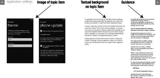
Figure 2–2. UI Design and Interaction Guide format
The UI Design and Interaction Guide for Windows Phone v2.0.pdf document prints out in a large format and is best viewed on a large monitor. Each section provides a topic item, such as “Application settings” (as shown in Figure 2–2). It displays an image and textual context for the topic item, along with guidance for designers and developers with do's and don'ts. As far as I am concerned, this document is required reading for anyone who designs or develops a Silverlight-based Windows Phone application.
Application Icons
Windows Phone design resources includes a zip of icons to use directly in your application or as a model for custom application icons you build. The application icons come in .png and XAML vector format. The .png format comes in both a light and dark variant to support the light and dark themes in Windows Phone. Figure 2–3 shows the included icons, as well as other sample icons. The image is taken from the Windows Phone Design System – Codename Metro.pdf document.

Figure 2–3. Collage of application icons for Windows Phone
The icons are included with the Windows Phone design resources, as well as installed by the Windows Phone Developer Tools, at C:Program Files (x86)Microsoft SDKsWindows Phonev7.1Icons on an x64 Windows machine. The icons come in black and white to match the built-in application themes available in Windows Phone.
The most common place to use the icons is for the Application bar if included in your application; however, they be incorporated into the main UI as well.
Design Templates for Windows Phone
The design templates for Windows Phone.zip file includes 28 Adobe Photoshop files that designers can use to create pixel-perfect UX. Share this download with your Windows Phone designer friends and they will be forever grateful. It takes the guesswork out of how to size the design. It will also save rework for developers, as the templates will be ready to go when imported – more on this in the next section.
One little gem you will not want to ignore is the Design Templates for Windows Phone.pdf document that is included in the template download zip located here:
http://go.microsoft.com/fwlink/?LinkId=196225
This document details how to use the templates, which is especially important for controls that are not shipped as part of the Windows Phone Developer Tools. A great time to use this document is when you need to build UI, like a notification, where there isn't an existing control. The guidance is provided to help designers and developers match both visually and in interaction the built-in version of the control that appears in Windows Phone OS 7.0.
 Tip Many additional controls are shipped in the Silverlight Toolkit for Windows Phone, which is available for download at CodePlex:
 http://silverilght.codeplex.com.
This section concludes the overview of the design resources for Windows Phone. Please do checkout these resources as it will save you rework later. The next section covers the mechanics of how designers and developers can work together to build a Silverlight for Windows Phone user interface.
Designer and Developer Mechanics
As with most client application development, Windows Phone applications begin as a sketch. If you have the full version of Expression Blend you can download and install the Expression Blend SketchFlow Template for Windows Phone, available here at http://wp7sketchflow.codeplex.com.
SketchFlow lets you quickly create a UI “sketch” to build out your user interface concepts without coding using Expression Blend. To get started, launch Expression Blend 4 and click File  New Project, select Windows Phone, choose Windows Phone SketchFlow Application, provide a name, and click OK. The new project is created with one screen initially. You can add a control such as a
 Panorama to the screen by clicking the chevron on the toolbar on the left in Expression Blend to search for it and then double-clicking to add. Configure it to fill the area by right-clicking on the Panorama control in the Objects and Timeline window and select Auto Size Fill. Figure 2-4 shows the SketchFlow UI with a ListBox on Panorama Item 1 with some sample data.

Figure 2–4. Expression Blend 4 SketchFlow interface
I will cover how to work with sample data later in this chapter, but you can work in SketchFlow just like you normally would in Expression Blend with some enhanced capabilities for developing a design without coding. You can visually connect screens to create application navigation with the SketchFlow Map window as shown at the bottom of Figure 2-4. You can test and distribute a SketchFlow demo application for review using the SketchFlow runtime, which runs in the browser. Figure 2-5 shows an example of the SketchFlow Player.

Figure 2–5. Expression Blend 4 SketchFlow Player in the browser
Once you have a sketch of your application you can next build-out wireframes mapping the sketches to an information architecture diagram and eventually an interaction diagram. While SketchFlow allows you to interactively create and build both of these diagrams in a working prototype, you will want to create a large image mapping out these diagrams for review in addition to the SketchFlow implementation. Figure 2-6 shows an example information architecture diagram.
Figure 2–6. Sample information architecture diagram
The information architecture maps out the wireframes into a hierarchy. There will be interactions that are specific to a page (e.g., Search) as well as interactions between pages. Essentially any user click or possible interaction should be mapped out. This is where the interaction diagram comes into play. An example is shown in Figure 2-7.
Figure 2–7. Sample interaction diagram
Creating an information architecture and user interaction diagram are very effective steps to help you successfully map an existing iOS or Android UI over to Windows Phone, resulting in a better, more usable application.
The next and generally last piece of design documentation is comprehensive artwork, or “visual comps” for short, that consists of a refined full user interface mock-up of what the final user interface should look like. Quite often the actual development results in a far less stunning UI when compared to original comps. This is a result of a mismatch of the output from the design process, usually a vector drawing flattened into an image format and the input of the development process, which is a development language.
Starting with Windows Presentation Foundation, XAML was introduced as a language to describe UX that is both user- and tool-consumable, meaning a developer can author XAML directly or tools vendors can build applications that allow a designer and developer to visually create UX that generates the appropriate XAML. Silverlight was introduced after XAML as a lightweight version of WPF that fits into a small (approximately 5 MB) cross-platform, cross-browser desktop plug-in. Initially Silverlight included a subset of the most commonly used features of WPF. Since its introduction, Silverlight has steadily added additional capabilities to match more closely the full capabilities available in WPF. Examples include more support for triggers, Commanding, and COM Interop, making offline desktop Silverlight a capable alternative to WPF for many desktop application scenarios.
Silverlight for Windows Phone is based on Silverlight 4, putting XAML-based development front and center in mobile application development. Also, since Silverlight for Windows Phone does not run in a browser, some features, like browser-interoperability available in Silverlight for the desktop, are removed from Silverlight for Windows Phone. Fundamentally, however, they share core capabilities.
The reason XAML is so important and useful is that the output of visual design tools can be directly consumed by developers, since the output of the visual design is human-readable XAML. Designers can use Expression Design to create rich visual designs for application control templates as well as general application UX. Expression Design supports exporting XAML.
While Expression Design is a great tool, the world of designers is dominated by the Adobe toolset. What may not be well-known by many designers is that Expression Blend 4 has excellent import capabilities to pull in the vector output from the Adobe toolset directly into Expression Blend as XAML. The Expression Blend 4 import capabilities are shown in Figure 2–8.
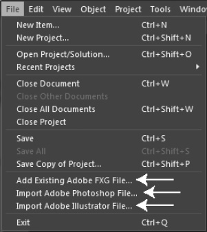
Figure 2–8. Expression Blend 4 file menu import capabilities
The menu offers import capabilities for three Adobe file formats: .fxg, .psd (Photoshop), and .ai (Illustrator). The .fxg file is the new file interchange format introduced in Adobe Creative Suite 5 that provides a common interchange format for the Adobe toolset. The format is very similar to .svg format. The other two file formats are the native format of Adobe's well known Photoshop and Illustrator tools. Figure 2–9 shows one of the Windows Phone design templates opened in Photoshop.
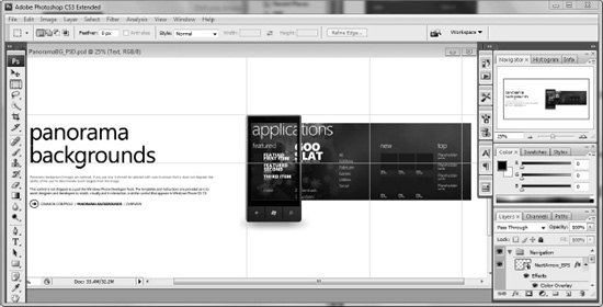
Figure 2–9. Windows Phone design template in Photoshop
Let's say the example in Figure 2–9 is part of a real application that you are building. In Expression Blend, you can import the background using the File Import Photoshop File … menu item and then selecting the desired layer as shown in Figure 2–10.
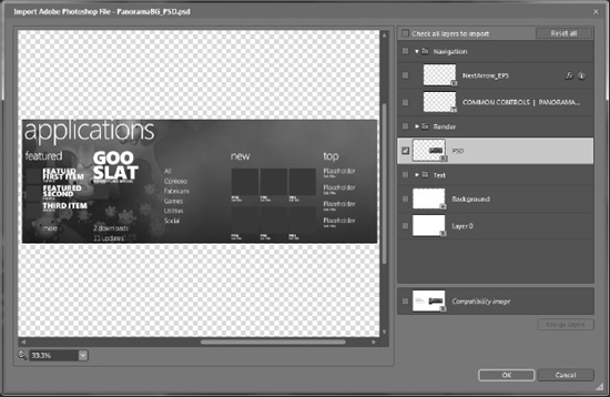
Figure 2–10. Import a layer from a sample Photoshop file
When you click OK in the dialog shown in Figure 2–10, a Canvas object is added to the currently opened XAML file and the image assets are brought into the project in a new folder named with the same name as the imported asset but with the suffix _images appended. At the bottom on the right of Figure 2–10 there's an option to generate a “Compatibility image” instead of attempting to import the vector components of the image as XAML. What this option does is take the selected layers and “flatten” it to a .png image. This is a handy option when you just need a flattened image instead of the layers, which in many cases has better performance than having to calculate vector-based layout.
This section provided an overview of how designers and developers can work in their preferred tools while allowing for the smoothest work stream possible with Expression Blend 4 as the bridge between a pure designer and developer.
The technical designer or developer who works in Expression Blend will also build out the interaction model for the user experience using the built-in animation capabilities, which I cover later in this chapter. Before I jump into Expression Blend 4, I next cover Visual Studio 2010 with an introduction to the .NET Framework for Silverlight for Windows Phone and an overview of the available controls.
User Interface Development in Visual Studio 2010
Visual Studio 2010 Windows Phone Developer Tools 7.1 includes several additional controls and project templates to help developers get started building their mobile application. Figure 2–11 shows the available templates.
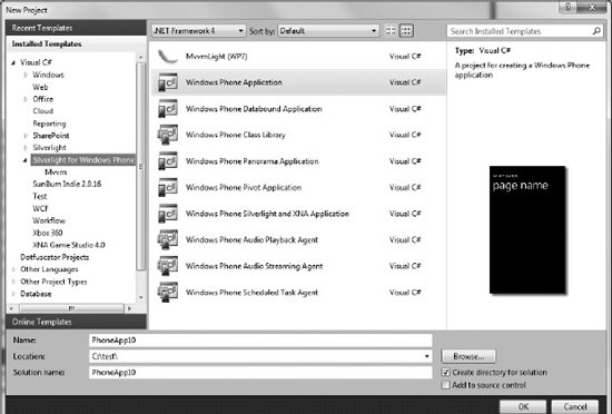
Figure 2–11. Visual Studio 2010 File New Project – Silverlight for Windows Phone dialog
In Windows Phone Developer Tools 7.1, several new project templates are added including the Windows Phone Silverlight and XNA Application as well as the three background agent projects. I cover the Panorama and Pivot controls later on in this chapter, since they define unique application UI navigation architectures. In Chapter 8 I cover XNA Framework Shared Graphics, where you can render Silverlight and XNA Framework on the same surface. Background agent processing is covered in Chapter 10.
The first thing you will notice when reviewing a Silverlight for Windows Phone application is that the control templates follow the Windows Phone theme style, defaulting to the Dark theme. The other available theme is the Light theme.
Note The built-in controls will automatically adjust to application theme changes by the user; however, the developer may need to adjust the rest of the UI such as images, backgrounds, and so on, if the end-user changes the phone theme to light or vice versa. This is a certification requirement.
We create the BuiltInControls project by selecting File New Project… and select the Windows Phone Application template. Figure 2–12 shows the Solution Explorer tool window for the BuiltInControls project.
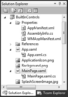
Figure 2–12. Initial project file layout in the Solution Explorer tool window
A typical Windows Phone project consists of an App.xaml and App.xaml.cs file that represents the non-visual Application object that is the root of the project and application structure. MainPage.xaml with the MainPage.xaml.cs code-behind file is the default initial UI for the application. There are three graphic files associated with the project structure:
Background.png: This is a 173 × 173-pixel image that represents the application's “tile” when pinned to the Start screen. The user has to pin your tile. Applications cannot pin themselves.ApplicationIcon.png:This is a 62 × 62–pixel image that is the icon in the application list when installed on a device.SplashScreenImage.jpg:This is a 480 × 800-pixel image displayed when an application first launches. Developers do not have to do anything to show the image or hide the image. The framework handles it.
Tip From the certification requirements applications must show UI within 5 seconds and be functional within 20 seconds after launch. The splash screen image is displayed until the UI is shown.
The next section covers the Windows Phone manifest file in more detail.
WMAppManifest.xml File
A file unique to the Windows Phone Visual Studio project templates is the WMAppManifest.xml file under the properties folder. Listing 2–1 shows the default WMAppManifest.xml file for the BuiltInControls project.
Listing 2–1. WMAppManifest.xml Configuration File
<?xml version="1.0" encoding="utf-8"?>


<Deployment xmlns="http://schemas.microsoft.com/windowsphone/2009/deployment" AppPlatformVersion="7.1">

  <App xmlns="" ProductID="{7694daf6-c945-4213-b480-c358c9ea0d2b}" Title="PhoneApp10"

RuntimeType="Silverlight" Version="1.0.0.0" Genre="apps.normal"  Author="PhoneApp10 author"

Description="Sample description" Publisher="PhoneApp10">

    <IconPath IsRelative="true" IsResource="false">ApplicationIcon.png</IconPath>

    <Capabilities>

      <Capability Name="ID_CAP_GAMERSERVICES"/>

      <Capability Name="ID_CAP_IDENTITY_DEVICE"/>

      <Capability Name="ID_CAP_IDENTITY_USER"/>

      <Capability Name="ID_CAP_LOCATION"/>

      <Capability Name="ID_CAP_MEDIALIB"/>

      <Capability Name="ID_CAP_MICROPHONE"/>

      <Capability Name="ID_CAP_NETWORKING"/>

      <Capability Name="ID_CAP_PHONEDIALER"/>

      <Capability Name="ID_CAP_PUSH_NOTIFICATION"/>

      <Capability Name="ID_CAP_SENSORS"/>

      <Capability Name="ID_CAP_WEBBROWSERCOMPONENT"/>

      <Capability Name="ID_CAP_ISV_CAMERA"/>

      <Capability Name="ID_CAP_CONTACTS"/>

      <Capability Name="ID_CAP_APPOINTMENTS"/>

    </Capabilities>

    <Tasks>

      <DefaultTask  Name ="_default" NavigationPage="MainPage.xaml"/>

    </Tasks>

    <Tokens>

      <PrimaryToken TokenID="PhoneApp10Token" TaskName="_default">

        <TemplateType5>

          <BackgroundImageURI IsRelative="true"

IsResource="false">Background.png</BackgroundImageURI>

          <Count>0</Count>

          <Title>PhoneApp10</Title>

        </TemplateType5>

      </PrimaryToken>

    </Tokens>

  </App>

</Deployment>
When you configure project settings by right-clicking the BuiltInControls project node in the Solution Explorer and select Properties, the values are updated in AssemblyInfo.cs just like for every other .NET Framework project, but it also updates values in WMAppManifest.xml. The WMAppManifest.xml is rewritten when you submit your application to marketplace based on capabilities detection and based on the metadata provided to marketplace when submitting the application.
You can carefully edit the WMAppManifest.xml during development to help identify certification requirements. As an example, if you do not believe your application needs location information, you can remove ID_CAP_LOCATION from the Capabilities XML element. When you run your application, you will discover errors indicating that your application needs that capability. Using location means that certain certification requirements need to be met such as asking for permission as well as having a setting to disable location. Capabilities are an important part of certification.
Note You can use the Marketplace Test Kit available in Visual Studio by right-clicking on a project and selecting the “Open Marketplace Test Kit” option.
Continuing to explore WMAppManifest.xml, the App element contains several key pieces of information. You should not change the ProductID once the application is published in Marketplace. If you change the ProductID when submitting an update, Marketplace will infer it to be a new product and not an update to an existing product. Existing users will never see the update in this case.
The Genre is configured based on user selection in the marketplace metadata. The default for Silverlight and XNA Framework is apps.normal. You can change it to Apps.Games to force the application to appear in the Games Hub on a device.
One item to be aware of is that if you rename MainPage.xaml, you should also update the DefaultTask element under the Tasks element to match the first UI Xaml page that should be displayed. If you do not, the application will fail to launch. For more information on the WMAppManifest.xml file, go to:
http://msdn.microsoft.com/en-us/library/ff769509(VS.92).aspx
If your application has a background agent, you add it to the <Tasks> section in WMManifest.xml. I'll cover more on background processing in Chapter 10. In the next section I will cover the anatomy of a Windows Phone application.
Anatomy of a Windows Phone Application
As mentioned, App.xaml and App.xaml.cs are the code files for the application object that hosts the individual pages. Listings 2–2 and 2–3 contain a default App.xaml file and its code behind file.
Listing 2–2. App.xaml File
<Application

    x:Class="BuiltInControls.App"

    xmlns="http://schemas.microsoft.com/winfx/2006/xaml/presentation"

    xmlns:x="http://schemas.microsoft.com/winfx/2006/xaml"

    xmlns:phone="clr-namespace:Microsoft.Phone.Controls;assembly=Microsoft.Phone"

    xmlns:shell="clr-namespace:Microsoft.Phone.Shell;assembly=Microsoft.Phone">


    <!–Application Resources–>

    <Application.Resources>

    </Application.Resources>


    <Application.ApplicationLifetimeObjects>

        <!–Required object that handles lifetime events for the application–>

        <shell:PhoneApplicationService

            Launching="Application_Launching" Closing="Application_Closing"

            Activated="Application_Activated" Deactivated="Application_Deactivated"/>

    </Application.ApplicationLifetimeObjects>

</Application>
Listing 2–3. App.xaml.cs Code File
using System;

using System.Collections.Generic;

using System.Linq;

using System.Net;

using System.Windows;

using System.Windows.Controls;

using System.Windows.Documents;

using System.Windows.Input;

using System.Windows.Media;

using System.Windows.Media.Animation;

using System.Windows.Navigation;

using System.Windows.Shapes;

using Microsoft.Phone.Controls;

using Microsoft.Phone.Shell;


namespace BuiltInControls

{

  public partial class App : Application

  {

    /// <summary>

    /// Provides easy access to the root frame of the Phone Application.

    /// </summary>

    /// <returns>The root frame of the Phone Application.</returns>

    public PhoneApplicationFrame RootFrame { get; private set; }


    /// <summary>

    /// Constructor for the Application object.

    /// </summary>

    public App()

    {

      // Global handler for uncaught exceptions.

      UnhandledException += Application_UnhandledException;


      // Show graphics profiling information while debugging.

      if (System.Diagnostics.Debugger.IsAttached)

      {

        // Display the current frame rate counters.

        Application.Current.Host.Settings.EnableFrameRateCounter = true;


        // Show the areas of the app that are being redrawn in each frame.

        //Application.Current.Host.Settings.EnableRedrawRegions = true;


        // Enable non-production analysis visualization mode,

        // which shows areas of a page that are being GPU accelerated with a colored overlay.

        //Application.Current.Host.Settings.EnableCacheVisualization = true;

      }


      // Standard Silverlight initialization

      InitializeComponent();


      // Phone-specific initialization

      InitializePhoneApplication();

    }


    // Code to execute when the application is launching (eg, from Start)

    // This code will not execute when the application is reactivated

    private void Application_Launching(object sender, LaunchingEventArgs e)

    {

    }


    // Code to execute when the application is activated (brought to foreground)

    // This code will not execute when the application is first launched

    private void Application_Activated(object sender, ActivatedEventArgs e)

    {

    }


    // Code to execute when the application is deactivated (sent to background)

    // This code will not execute when the application is closing

    private void Application_Deactivated(object sender, DeactivatedEventArgs e)

    {

    }


    // Code to execute when the application is closing (eg, user hit Back)

    // This code will not execute when the application is deactivated

    private void Application_Closing(object sender, ClosingEventArgs e)

    {

    }


    // Code to execute if a navigation fails

    private void RootFrame_NavigationFailed(object sender, NavigationFailedEventArgs e)

    {

      if (System.Diagnostics.Debugger.IsAttached)

      {

        // A navigation has failed; break into the debugger

        System.Diagnostics.Debugger.Break();

      }

    }


    // Code to execute on Unhandled Exceptions

    private void Application_UnhandledException(object sender,

 ApplicationUnhandledExceptionEventArgs e)

    {

      if (System.Diagnostics.Debugger.IsAttached)

      {

        // An unhandled exception has occurred; break into the debugger

        System.Diagnostics.Debugger.Break();

      }

    }


    #region Phone application initialization


    // Avoid double-initialization

    private bool phoneApplicationInitialized = false;


    // Do not add any additional code to this method

    private void InitializePhoneApplication()

    {

      if (phoneApplicationInitialized)

        return;


      // Create the frame but don't set it as RootVisual yet; this allows the splash

      // screen to remain active until the application is ready to render.

      RootFrame = new PhoneApplicationFrame();

      RootFrame.Navigated += CompleteInitializePhoneApplication;


      // Handle navigation failures

      RootFrame.NavigationFailed += RootFrame_NavigationFailed;


      // Ensure we don't initialize again

      phoneApplicationInitialized = true;

    }


    // Do not add any additional code to this method

    private void CompleteInitializePhoneApplication(object sender, NavigationEventArgs e)

    {

      // Set the root visual to allow the application to render

      if (RootVisual != RootFrame)

        RootVisual = RootFrame;


      // Remove this handler since it is no longer needed

      RootFrame.Navigated -= CompleteInitializePhoneApplication;

    }


    #endregion

  }

}
Applications can locate application-wide resources such as data sources, styles, and templates in the Application.Resources element of App.xaml. The ApplicationLifetimeObjects element in App.xaml can contain references to classes that extend application services without having to subclass the Application class. The order of the services listed dictates the order that they are initialized and the order that lifetime event notifications are received. A class must implement the IApplicationService interface and optionally the IApplicationLifetimeAware interface in order to be an ApplicationLifetimeObject service.
The default extension that is configured in the ApplicationLifetimeObjects is the Microsoft.Phone.Shell.PhoneApplicationService extension that manages lifetime events such as Launching, Closing, Activated, and Deactivated for tombstoning, which I cover in Chapter 4. In the next section we create a Configuration Settings service that you can use to manage your application's configuration.
Note Windows Phone has a limit of 10 side-loaded applications for developers, so the source code is broken up into two solutions; therefore, if you cannot find a project, open the other Chapter 2 solution.
Configuration Settings Service
As part of user interface development, customizable settings are an important component to the user experience. In the sample source code is the ConfigSettingsDemo project that demonstrates how to create an application service for managing settings beyond the UI. The project contains an application lifetime service named ConfigurationSettingsService, which implements the IApplicationService interface. The project includes a Services folder containing the ConfigurationSettingsService.cs code file as shown in Listing 2–4.
Listing 2–4. ConfigurationSettingsService.cs Code File
using System;

using System.Collections.Generic;

using System.IO;

using System.Linq;

using System.Net;

using System.Windows;

using System.Xml.Linq;

using ConfigSettingsDemo;


namespace ConfigSettingsDemo.Services

{

  public class ConfigurationSettingsService : IApplicationService

  {

    private string _configSettingsPath = @"Settings";

    private string _configSettingsFileName = " ConfigurationSettings.xml";


    //Event to allow the Application object know it is safe to

    //access the settings

    public event EventHandler ConfigurationSettingsLoaded;


    #region IApplicationService Members

    void IApplicationService.StartService(ApplicationServiceContext context)

    {

      LoadConfigSettings();

    }


    private void LoadConfigSettings()

    {

      //TODO - Load ConfigSettings from isolated storage


      //Check to see if the event has any handler's attached

      //Fire event if that is the case

      if (ConfigurationSettingsLoaded != null)

        ConfigurationSettingsLoaded(this, EventArgs.Empty);

    }


    private void SaveConfigSettings()

    {

      //TODO - Save ConfigSettings to isolated storage

    }


    void IApplicationService.StopService()

    {

      SaveConfigSettings();

    }

    #endregion


    //Stores configuraiton settings in

    public Dictionary<string, string> ConfigSettings { get; set; }

  }

}
The sample doesn't implement the actual loading or saving of the data until I cover Isolated Storage later in Chapter 4; however, the service is fully wired up within the application. First we have to list the ConfigurationSettingsService in the App.xaml Application.ApplicationLifetimeObjects element. To do so, we have to make the class available in Xaml by adding an xml namespace:
xmlns:services="clr-namespace:ConfigSettingsDemo.Services"
The service can now be added to the ApplicationLifetimeObjects using the services namespace:
<services:ConfigurationSettingsService />
Adding that line of code completes the changes in App.xaml. In App.xaml.cs the ConfigSettingsDemo.Services is added via a using clause. The App() constructor is modified to get a reference to the ConfigurationSettingsService and to add an anonymous event handler that allows the configuration settings to load before launching the main user interface:
ConfigurationSettingsService service =

  App.Current.ApplicationLifetimeObjects[1]

  as ConfigurationSettingsService;


service.ConfigurationSettingsLoaded += new EventHandler((s, args) =>

{

  // Phone-specific initialization

  InitializePhoneApplication();

});
The splash screen will display until this event fires. As a test, modify ConfigurationSettingsService. LoadConfigSettings and add this line of code:
System.Threading.Thread.Sleep(10000);
The splash screen will display for about 10 seconds. This demonstrates the effect of the anonymous event handler in allowing the configuration settings to fully load.
This completes our overview of how to create a lifetime service. I will now shift gears to a quick discussion of the events present in App.xaml.cs. The App.xaml.cs code-behind file contains the events and methods associated with the Application object. There are several important methods and events available to applications that we cover in the next few sections.
The Default App() Constructor
Besides wiring up the Application_UnhandledException event, the default constructor enables the Application.Current.Host.Settings.EnableFrameRateCounter if the debugger is attached as shown in code Listing 2–3. The frame rate counter is much more valuable on the device than in the emulator and it is something to monitor throughout development as features are added. Figure 2–13 shows the counters:

Figure 2–13. Frame rate counters
Table 2–1 explains the counters identified by letters in Figure 2–13.

Jeff Wilcox, a senior software development engineer on the Silverlight phone and devices team at Microsoft, provides some target frame rates for good performance on his blog: www.jeff.wilcox.name/2010/07/counters/, but here is a summary:
- Render Thread FPS: 60 fps is great performance. 30 fps or below will show a poor experience. Turns red below 30 fps.
- UI Thread: This is the busiest thread. Applications must try to take as much work as possible off of the UI thread by leveraging the Render Thread or a background thread. Turns red below 15 fps.
- Screen Fill Rate: Below 2.0 is ideal. Above 2.5 indicates overdraw.
The frame rate counters can be zero when there isn't an animation playing on the thread at the moment and then spike during an animation or transition. Applications can play a simple continually playing animation to always show a frame rate.
The best way to leverage the frame rate counters and the screen fill rate counter is to continuously monitor them when testing on an actual device. The best time to address frame rate issues is after making a change and it results in a drop in performance. Check out the Creating High Performing Silverlight Applications for Windows Phone Samples for more information on UX performance:
www.microsoft.com/downloads/en/details.aspx?displaylang=en&FamilyID=3a8636bf-185f-

449a-a0ce-83502b9ec0ec
Application UnhandledException Event
The Application_UnhandledException event is where you can log, report, and display an error message to a user when something unexpected happens in your application that causes an unhandled exception. Applications should customize this event to present a friendly message to the user. Many users welcome the ability to enter feedback regarding a failure so displaying a simple UI to collect information on what the user was doing at the time and recording to a local error log for review can help increase application quality.
In the Chapter 2 Solution's ConfigSettingsDemo project's App.xaml.cs, the Application_UnhandledException event handler is modified to show an error message to the user when an exception is encountered.
private void Application_UnhandledException(object sender,

 ApplicationUnhandledExceptionEventArgs e)

{

  MessageBox.Show(

    "Error!  We logged the error.  Click OK to turn on logging mode.",

    "Error Diagnostics", MessageBoxButton.OKCancel);

  //TODO – Add logging service

  //Log error to logging service here

  //Turn on logging mode for logging service if OK clicked by user

  //Use the Microsoft.Phone.Tasks.EmailComposeTask

  //to collect exception information and offer to the user

  //to send in the exeception info.

  //Set e.Handled to true if recoverable  e.Handled = true ;


  if (System.Diagnostics.Debugger.IsAttached)

  {

    // An unhandled exception has occurred; break into the debugger

    System.Diagnostics.Debugger.Break();

  }

}
You can intentionally cause an error to display the error message by clicking the DivideByZero button at the bottom of the main page. Run the application without the debugger connected by deploying the project and running the app manually in the emulator or on a device. You will notice that the error message displays and then the application exits.
The Application_UnhandledException event handler arguments include the familiar sender object and an instance of the ApplicationUnhandledExceptionEventArgs. The ApplicationUnhandledExceptionEventArgs class contains the following properties:
ExceptionObject property:A reference to the original exception that was thrown.Handledproperty: Set to true to if the application can recover from the error.
In the previous code, uncomment the line e.Handled = true; and the application will continue to run after the error is thrown. This property gives the application a chance to recover without kicking the user completely out of the application, providing a much better experience.
The comments hint at creating a logging service and adding logging to the application with the implication that the user can choose to upload the logs. Such a logging service could implement IApplicationService, and therefore be available anywhere in the application via the Application. ApplicationLifetimeObjects collection along with the Configuration Service discussed above.
Consider that, in a consumer-oriented application, you may not have a direct relationship to your customer, so you simply cannot ask them what they saw just before the crash. One option is to prompt the user if they would like to send more info. If the user agrees, display the Microsoft.Phone.Tasks.EmailComposeTask to send the Exception object's Message and StackTrace values to the support email alias. I cover the EmailComposeTask in Chapter 4.
Part of the overall user experience is to build applications that can recover as well as give the user an opportunity to provide additional information. Most users will be happy to do so if they like your application and want to help make it better.
Anatomy of a PhoneApplicationPage
I covered the Application object and related PhoneApplicationFrame object that hosts the application. You can get access to the PhoneApplicationFrame with code like this:
PhoneApplicationFrame frame = App.Current.RootVisual as PhoneApplicationFrame;
Once the root PhoneApplicationFrame loads, the first UI displayed after the splash screen is a PhoneApplicationPage identified as the default task in WMAppManifest.xml, named MainPage.xaml with its corresponding code-behind file named MainPage.xaml.cs. The code-behind partial class inherits from PhoneApplicationPage. MainPage.xaml is linked to the code-behind via the Class attribute on the root PhoneApplicationPage root element.
The root element includes several namespace declarations to bring in common namespaces, like the phone namespace alias that pulls in the Microsoft.Phone.Controls namespace. I cover options related to PhoneApplicationPage in the next sections.
Orientation
The root element of the page declaration includes two attributes related to page layout, SupportedOrientations and Orientation. SupportedOrientations has three options:
LandscapePortraitPortraitOrLandscape
The Orientation attribute can be set to any of the SupportedOrientations permissible values. For the ConfigSettingsDemo project, SupportedOrientations is set to PortraitOrLandscape in order to test orientation changes. When SupportedOrientations is set to PortraitOrLandscape, the page automatically changes the display depending on how you hold the phone. We set SupportedOrientations to PortraitOrLandscape for the ConfigSettingsDemo project.
The page does not automatically change the layout of controls. So, if the page has more than 480 pixels of content when held in Portrait mode, the content will run off the screen when held in Landscape mode. An application has an opportunity to react to orientation changes by adjusting the layout content in the PhoneApplicationPage.OrientationChanged event. I cover how to handle orientation changes in detail in Chapter 6, but for this demo, I will use a simple switch statement to reposition the single UI element, the divideByZeroBtn Button object:
private void PhoneApplicationPage_OrientationChanged(object sender,

 OrientationChangedEventArgs e)

{

  switch (e.Orientation)

  {

    case PageOrientation.Landscape:

      divideByZeroBtn.Margin = new Thickness(12, 200, 235, 0);

      break;

    case PageOrientation.LandscapeLeft:

      divideByZeroBtn.Margin = new Thickness(12, 200, 235, 0);

      break;

    case PageOrientation.LandscapeRight:

      divideByZeroBtn.Margin = new Thickness(12, 200, 235, 0);

      break;

    //default is Portrait

    default:

      divideByZeroBtn.Margin = new Thickness(12, 400, 235, 0);

      break;

  }

}
SystemTray
The system tray is the bar across the top of the screen in Portrait mode that displays the connection signal strength, Wi-Fi, and current time. According to the UI Design and Interaction Guide for Windows Phone, the system tray or status bar is 32 pixels high in Portrait mode and 72 pixels width in Landscape mode. Developers can set it to not display by editing the XAML for the page to this value:
shell:SystemTray.IsVisible="False"
It is not recommended to hide the SystemTray, as users consider it to be valuable information. Letting the SystemTray display is helpful to the user who wants to see the current time without having to exit the application. Probably the most common reason to hide the system tray is for a XNA Game Studio game.
Application Bar
The Application Bar is located at bottom of the screen to provide menu icon buttons for actions and views related to the content presented on the page. You can put up to four icon buttons at any time. If you have additional actions, you can place them into the Application Bar Menu instead. The Application Bar Menu item text will run off the screen. The recommendation is between 14 and 20 characters.
By default, XAML for the Application Bar is available in a new page but commented it out. The default XAML is un-commented for the ConfigSettingsDemo project. Two of the Application Bar IconButton images that are installed by default in the C:Program Files (x86)Microsoft SDKsWindows Phonev7.0Icons folder are dropped into an Images folder for the project and set as the icon for two of the objects. Figure 2–14 shows the Application Bar after swiping up on the Application Bar to display the Application Bar menu items.
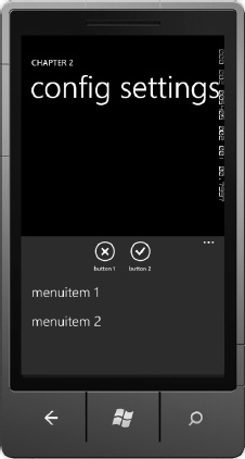
Figure 2–14. Expanded Application Bar
If you click the back button when the Application Bar is expanded, the Application Bar will close down. The application bar height is 72 pixels both in portrait and landscape mode and cannot be changed. The Application Bar can be displayed and hidden.
Developers should resist the temptation to use the Application Bar for navigation. Developers should not put a Home button into the Application Bar either, because it breaks the back stack. Users should navigate your application via the content and the hardware Back button.
In Windows Phone 7, the Application Bar was not available to developers in the Panorama, and it was also not recommended to use the Application Bar in the Panorama control. This lead to developers plopping icons all over the UI, which in the end went against the clean look end users expect in Windows Phone. With Windows Phone OS 7.1 (Mango), the Application Bar is supported and encouraged to be used in the Panorama Control.
Another issue with the Application Bar has been screen real estate, even when closed. With Windows Phone OS 7.1, the Application Bar has a “low profile” mode that renders the Application Bar to less than half its previous size when closed. Simply add this attribute to the shell:ApplicationBar Application Bar XAML element:
Mode="Minimized"
In Windows Phone OS 7.1, developers can also set the Opacity and Background color on the Application Bar, helping it to blend in much better with the application UI and theme. While you usually configure the Application Bar in XAML, this link to MSDN explains how to create the Application Bar in code:
http://msdn.microsoft.com/en-us/library/ff431786(v=VS.92).aspx
Page Navigation
Most Windows Phone applications will consist of more than one page. Silverlight for Windows Phone leverages the built-in navigation framework available as part of Silverlight. Pages navigation occurs within the hosting Application PhoneApplicationFrame object via the Page.NavigationService instance of the System.Windows.Navigation.NavigationService object.
In addition to the NavigationService, the page has two methods to override called OnNavigatedTo and OnNavigatedFrom. I cover these options in the next two sections.
NavigationService
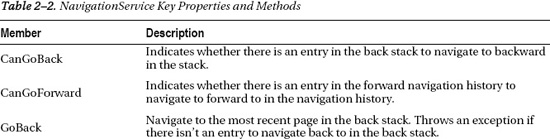
The NavigationService has several properties and methods to aid in application navigation listed in Table 2–2.
The NavigationService provides full control over application flow but the most common member called is the Navigate method. In this chapter's solution PageNavigation project, MainPage.xaml contains a TextBlock that when clicked navigates to Page2.xaml:
private void NavToPage2_MouseLeftButtonDown(object sender, MouseButtonEventArgs e)

{

  this.NavigationService.Navigate(new Uri("/Page2.xaml", UriKind.Relative));

}
When the project is run and the TextBlock with the Text “Navigate to Page 2” is clicked, the event fires and Page2.xaml is displayed. Developers can pass parameters to the navigation target using standard Query string parameters with the question mark and paramname=paramdata notation like this:
this.NavigationService.Navigate(

  new Uri(String.Format("/Page2.xaml?page2data={0}",textBox1.Text), UriKind.Relative));
Pass multiple parameters like this: Page2.xaml?ParamName1=ParamData1&ParamName2=ParamData2 and so on with an ampersand between parameter values. Generally parameters consist of keys or object IDs such that the page can look up the full object or object collection of data for rendering.
In Table 2–3, the events like Navigating and Navigated provide opportunities to display progress to the user as navigation events fire. To test this, add the below line of code to the constructor for Page2.xaml:
System.Threading.Thread.Sleep(5000);
The effect is that when the TextBlock is clicked, the UI appears frozen for about five seconds before the navigation occurs. To provide feedback to the user, a ProgressBar is added to the UI and IsIndeterminate is set to False and Visibility to Collapsed.
Note IsIndeterminate should be set to false anytime the ProgressBar is not needed in order to conserve CPU resources. The Silverlight for Windows Phone toolkit includes a performance optimized PerformanceProgressBar control as well.
Navigation.Navigating and Navigation.Navigated are wired up to an event handler in the PhoneApplicationPage_Loaded event in MainPage.xaml.cs in the PageNavigation project. The Navigating event handler enables and makes visible the ProgressBar. The Navigated event handler hides the ProgressBar and sets IsIndeterminate to false. Here is the code from the PageNavigation project's MainPage.xaml.cs code file:
private void PhoneApplicationPage_Loaded(object sender, RoutedEventArgs e)

{

  NavigationService.Navigating += new navigation.NavigatingCancelEventHandler

(NavigationService_Navigating);

  NavigationService.Navigated += new navigation.NavigatedEventHandler

(NavigationService_Navigated);

}


void NavigationService_Navigating(object sender, navigation.NavigatingCancelEventArgs e)

{

  progressBar1.Visibility = Visibility.Visible;

  progressBar1.IsIndeterminate = true;

}


void NavigationService_Navigated(object sender, navigation.NavigationEventArgs e)

{

  progressBar1.Visibility = Visibility.Collapsed;

  progressBar1.IsIndeterminate = false;

}
The performance of the ProgressBar is choppy because, by default, it runs on the UI thread, which is put to sleep in the Page2 constructor. I cover the PerformanceProgressBar in Chapter 6 when I go over the Silverlight for Windows Phone toolkit.
Tip In Silverlight there are two threads that draw to the screen, the UI thread and the Render thread. Storyboard animations run on the Render thread. User code runs on the UI thread. Any animations that run on the UI thread can become choppy if the UI thread is very busy doing application work. Developers should strive to offload as much work as possible from the UI thread and keep an eye on the Render thread and UI thread frame rate counters to see how code changes affect render performance.
This sample so far shows how to use the NavigationService to navigate to a page, as well as hook into navigation related events. The next section covers the PhoneApplicationPage overrides available that allow additional hooks into the navigation system.
OnNavigated Overrides
There are two PhoneApplicationPage method overrides available to further plug into the navigation system:
OnNavigatedFrom:Event fires when navigating from the current page.OnNavigatedTo:Event fires when navigating to the current page.
Both methods take a NavigationEventArgs object. This object includes two properties:
Uri:Uri of the target for navigation.Content:The content of the target being navigated to.
The OnNavigatedFrom override is the method where you can take any final actions when the page has become inactive. The OnNavigatedTo override is called when the page becomes active in the navigation frame. Developers can access query parameters on OnNavigatedTo with code similar to the following from MainPage.xaml.cs in the PageNavigation project:
protected override void OnNavigatedTo(System.Windows.Navigation.NavigationEventArgs e)

{

  if (NavigationContext.QueryString.ContainsKey("page2data"))

    dataFromMainPageTextBlock.Text = NavigationContext.QueryString["page2data"];


  base.OnNavigatedTo(e);

}
In this code, we first check to make sure that the parameter is present and then retrieve the value. Otherwise, if you attempt to retrieve data for a non-existing key, it results in an error. We will explore navigation further in Chapters 6 and 7, but many of the examples leverage navigation so this section provides an overview. This completes the discussion on the navigating events.
Up to now, this chapter focused on overall design and then dove into project organization covering the Application object, PhoneApplicationFrame, PhoneApplicationPage, and an overview of the navigation framework. In the next section I step back a bit and provide an overview of the .NET Framework for Silverlight and programming XAML, to help prepare for more advanced topics such as data binding, control templates, and control customization.
.NET Framework for Silverlight
As I mentioned previously, Silverlight for Windows Phone 7 was based on Silverlight 3 with some key features pulled forward from Silverlight 4, such as the WebBrowser control and offline DRM for Silverlight Smooth Streaming Support, which means you can play DRM'd content when in airplane mode. I cover DRM and Smooth Streaming in more detail in Chapter 7.
Now with full Silverlight 4 compatibility, except for features that do not make sense like browser Interop, Windows Phone developers have the full power of the same framework used to build everything from rich media experiences on the Web to building mission critical Line-Of-Business applications behind the firewall in corporations.
Since this chapter is focused on building application user experience in Silverlight for Windows Phone, it provides a deeper look at the .NET Framework for Silverlight. Here is a summary of the major .NET Framework namespaces available in Silverlight for Windows Phone:
- System
- System.Collections
- System.Collections.Generic
- System.Diagnostics
- System.Globalization
- System.IO
- System.Linq
- System.Media
- System.NET
- System.Reflection
- System.Runtime
- System.Security
- System.ServiceModel
- System.Text
- System.Threading
- System.Windows
- System.Windows.Controls
- System.Windows.Input
- System.Windows.Shapes
- System.XML
If you are at all familiar with Silverlight and the .NET Framework in general, you can see that much of your existing skills will translate right over. If you are new to Silverlight, this book strives to help you get up to speed. However, consider reviewing an Introduction or Silverlight reference book for additional background information.
Tip Check out Silverlight Recipes: A Problem-Solution Approach, Second Edition, co-authored by Jit Ghosh and me (Apress, 2010), for more on general Silverlight development.
For Windows Phone, Microsoft adds additional assemblies and namespaces related to phone specific functionality that I cover in this chapter and throughout this book:
- Microsoft.Devices
- Microsoft.Phone
- Microsoft.Phone.Controls
- Microsoft.Phone.Shell
These assemblies and namespaces identify a rich set of APIs available to developers in order to build powerful Silverlight for Windows Phone mobile applications.
Next let's take a deeper look at Xml Application Markup Language (XAML) and how it relates to the .NET Framework for Silverlight.
XAML Overview
There are a lot of great references available on Silverlight development, but it is important to provide fundamentals on the XAML language itself in case you are a mobile developer from another platform and not familiar with Windows Presentation Foundation (WPF) or Silverlight development. As XAML is based on XML, it is hierarchical in nature, which lends itself to tooling because it is simple XML manipulation under the covers. Expression Blend 4 takes advantage of this by providing a GUI interface to XAML development that you will want to take advantage of when building animation storyboards and data binding.
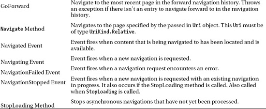
Since this section is focused on XAML as a markup language, I explore the capabilities of XAML using Visual Studio 2010. We could just as easily explore XAML capabilities in Expression Blend 4. Expression Blend 4 includes syntax highlighting and IntelliSense as shown in Figure 2–15.
Figure 2–15. Expression Blend 4 syntax highlighting and IntelliSense
We will be looking at some C# code as well, so Visual Studio serves our purposes better in this section. But unlike with previous versions of Expression Blend, you don't have to leave Blend in order to hand-edit XAML with syntax Highlighting and IntelliSense support.
Importing a .NET Class into XAML
As you can see in Figure 2–15, the XAML markup for the XAMLBasics project includes several namespace imports using xmlns, including the xmlns:phone import that is used to declare the root element phone:PhoneApplicationPage. What may not be completely obvious at first glance is that PhoneApplicationPage is a class in the Microsoft.Phone.Controls namespace, contained in the Microsoft.Phone.dll assembly reference. Here is the xmlns import for the phone namespace:
xmlns:phone="clr-namespace:Microsoft.Phone.Controls;assembly=Microsoft.Phone"
In the xmlns import above, you see the .NET namespace, Microsoft.Phone.Controls, and the assembly name, Microsoft.Phone. This corresponds to a using clause in .NET code:
using Microsoft.Phone.Controls
The point is that markup written in XAML corresponds to objects in C# code. For example, you can create a button in C# using the code Button btn = new Button(). In XAML, you create a button with this markup: <Button />. You can essentially consider XAML as a human editable serialization format for .NET Framework for Silverlight.
With this background in hand, you can deduce that making custom C# classes available within XAML is as simple as creating a xmlns namespace import, which is correct. One consideration is that for a .NET classes to be brought in to a XAML markup page, it must have a parameter-less constructor so that you can simply declare it as <foo /> in XAML without needing parameters in the constructor, which is not supported.
Programming XAML
With the appropriate namespaces in place, creating a user experience in XAML is simple XML editing with XML Elements and Attributes. Elements generally represent a class or object such as a Button declared as <Button />. To set properties on the Button, you can add XML Attributes such as Height and Width: <Button Height="40" Width="100" />.
Some properties are of type System.Object or some other complex type, which could be difficult to set via an attribute depending on the value. The Button's Content property is of type System.Object, which means that it can point to pretty much anything. For a Button's Content property, it can be set as an attribute like so:
<Button Height="40" Width="100" Content="Hello Reader" />
For a not so simple type, The Button.Content property can be set using XML property element syntax:
<Button>

    <Button.Content>

        <MediaElement />

    </Button.Content>

</Button>
Remember that the Button.Content property is of type System.Object, so you could actually play a video as the “content” of a Button object via a MediaElement. With property element syntax, more complex objects such as a MediaElement playing a video named video1.wmv can be set as the value for the Content:
Other properties can be set to an enumerated type such as a System.Windows.Media.Color value configured on a Brush type such as a SolidColorBrush object. In the example below, how does XAML know what do to with the text value "Blue" in this example?
<Button Background="Blue" />
Intuitively, the developer understands what this means, however, there is a little bit of magic to support this simplified syntax. In the XAML above, the text “Blue” is converted to a System.Windows.Media.Color value via a built in System.ComponentModel.TypeConverter for the Brush type. Without the type converter, the full property element syntax is required:
<Button>

  <Button.Background>

     <SolidColorBrush Color = "Blue" />

  </Button.Background>

</Button>
TypeConverter objects are intrinsic to straightforward XAML programming. Developers can create their own custom TypeConverter objects to simplify data binding between two XAML objects with two different types allowing the developer to avoid cluttering event handlers in the code-behind file for a XAML page.
The last XAML concept I will cover in this overview is markup extensions. Markup extensions are similar to type converters in that they allow for more straightforward XAML development. Markup extensions allow a string value to be converted into a configured object, which can greatly reduce the amount of XAML that must either be hand-written or generated by a tool.
In order to identify and parse a markup extension, since it is configured as attribute property text, a special syntax is required that uses curly braces: attribute="{ extension goes here}". The curly braces tell the XAML parser that a markup extension is inbound for parsing.
The two most common markup extensions are used for specifying a resource for an object property or attribute value and for configuring data binding for an object property or attribute value. Listing 2–5 shows the MainPage.xaml file for the XAMLBasics project where you can see Style attributes configured using the markup extension syntax:.
<TextBlock x:Name="ApplicationTitle" Text="MY APPLICATION"

   Style="{StaticResource PhoneTextNormalStyle}"/>
Listing 2–5. XamlBasics MainPage.xaml File
<phone:PhoneApplicationPage

    x:Class="XAMLBasics.MainPage"

    xmlns="http://schemas.microsoft.com/winfx/2006/xaml/presentation"

    xmlns:x="http://schemas.microsoft.com/winfx/2006/xaml"

    xmlns:phone="clr-namespace:Microsoft.Phone.Controls;assembly=Microsoft.Phone"

    xmlns:shell="clr-namespace:Microsoft.Phone.Shell;assembly=Microsoft.Phone"

    xmlns:d="http://schemas.microsoft.com/expression/blend/2008"

    xmlns:mc="http://schemas.openxmlformats.org/markup-compatibility/2006"

    mc:Ignorable="d" d:DesignWidth="480" d:DesignHeight="768"

    FontFamily="{StaticResource PhoneFontFamilyNormal}"

    FontSize="{StaticResource PhoneFontSizeNormal}"

    Foreground="{StaticResource PhoneForegroundBrush}"

    SupportedOrientations="Portrait" Orientation="Portrait"

    shell:SystemTray.IsVisible="True">

  <phone:PhoneApplicationPage.Resources>

    <Style x:Key="TestTextBlockStyle" TargetType="TextBlock">

      <Setter Property="Foreground" Value="#FFD49696"/>

      <Setter Property="FontSize" Value="16"/>

    </Style>

  </phone:PhoneApplicationPage.Resources>


  <!–LayoutRoot is the root grid where all page content is placed–>

  <Grid x:Name="LayoutRoot" Background="Transparent">

    <Grid.RowDefinitions>

      <RowDefinition Height="Auto"/>

      <RowDefinition Height="*"/>

    </Grid.RowDefinitions>


    <!–TitlePanel contains the name of the application and page title–>

    <StackPanel x:Name="TitlePanel" Grid.Row="0" Margin="12,17,0,28">

      <TextBlock x:Name="ApplicationTitle" Text="MY APPLICATION"

                       Style="{StaticResource PhoneTextNormalStyle}"/>

      <TextBlock x:Name="PageTitle" Text="page name" Margin="9,-7,0,0"

                       Style="{StaticResource PhoneTextTitle1Style}"/>

    </StackPanel>


    <!–ContentPanel - place additional content here–>

    <Grid x:Name="ContentPanel" Grid.Row="1" Margin="12,0,12,0" >

      <TextBox Height="72" HorizontalAlignment="Left" Margin="12,66,0,0"

       Name="textBoxOriginal" Text="Original" VerticalAlignment="Top"

       Width="374" />

      <TextBlock Height="30" Margin="35,185,0,0" Name="textBlock1"

       Text="{Binding Text, ElementName=textBoxOriginal}"

       VerticalAlignment="Top" Width="374"

       Style="{StaticResource TestTextBlockStyle}" />

      <TextBox Height="72" HorizontalAlignment="Left" Margin="12,280,0,0"

        Text="{Binding Text, ElementName=textBoxOriginal, Mode=TwoWay}"

        VerticalAlignment="Top" Width="374" Name="textBox2" />

    </Grid>

  </Grid>

</phone:PhoneApplicationPage>


<Button Style="{StaticResource CustomButtonStyle}" />
The next question is where is CustomButtonStyle defined? It can be defined either in App.xaml or the current XAML page in the Resources collection like this:
<phone:PhoneApplicationPage.Resources>

    <Style x:Key="CustomButtonResource" TargetType="Button" >

        <Setter Property="Margin" Value="20,20,0,0" />

    </Style>

</phone:PhoneApplicationPage.Resources>
Figure 2–16 shows the UI in the emulator for the XamlBasics project.

Figure 2–16. XAML Basics UI
The UI is pretty simple, but it helps me explain the concept of markup extensions for resources and data binding. The TextBlock has a style resource applied to it via a markup extension that makes the text very small and a reddish color. Here is the style resource wrapped in the PhoneApplicationPage.Resources element from Listing 2–1:
<phone:PhoneApplicationPage.Resources>

  <Style x:Key="TestTextBlockStyle" TargetType="TextBlock">

    <Setter Property="Foreground" Value="#FFD49696"/>

    <Setter Property="FontSize" Value="16"/>

  </Style>

</phone:PhoneApplicationPage.Resources>
The style is named TestTextBlockStyle via the x:Key attribute. The style is applied to the TextBock via the StaticResource markup extension as shown here:
<TextBlock Height="30" Margin="32,187,50,0" Name="textBlock1" ….

Style="{StaticResource TestTextBlockStyle}" />
This syntax applies to all types of resources, not just element styles. It allows for consistent UX by sharing resources across an application. Resources can be stored at the Page level or the Application level in App.xaml. Resources can also be stored in external files in Resource Dictionaries. I explore the StaticResource markup extension further when I cover Expression Blend later in this chapter, but for now this section provides solid background to help you understand how to program in XAML with resources.
Let's now move on to an overview of the data binding markup extension with Element Data binding. Element data binding allows one control's property to data bind to another control's property value. The stylized TextBlock and the TextBox below it in Figure 2–16 databind to the first TextBox via element data binding. Run the project and enter text in the first TextBox, notice the other two change values as you type.
Tip If you would like to use your keyboard when typing in the emulator, click the “pause” button on your physical keyboard. This allows the emulator OS to capture the physical keyboard and can save a lot of time typing. Exit the element and click “pause” again to switch back to the soft key keyboard within the emulator.
Element Data binding is a powerful concept, but at its simplest level it saves the developer from writing simple event handlers that do nothing but copy values from one control to another. How this works is that when you type in the first TextBox on the screen shown in Figure 2–12, the reddish text TextBlock and the TextBox below it get the same value automatically via Element Data binding. Here is the XAML for the TextBlock that uses the Binding markup extension to element databind:
<TextBlock Height="30" Margin="32,187,50,0" Name="textBlock1"

  Text="{Binding Text, ElementName=textBoxOriginal}"

  VerticalAlignment="Top" Width="374"

  Style="{StaticResource TestTextBlockStyle}" />
The Binding markup extension first identifies the target property that the property is binding to, in this case TextBlock.Text is binding to TextBox.Text. The ElementName attribute value within the Binding markup extension specifies textBoxOriginal.Text as the target control/property that textBlock1.Text is databound to by default as one-way or read-only data binding.
The third control on the page in Figure 2–16, the TextBox, also databinds to the first TextBox as shown here:
<TextBox Height="72" HorizontalAlignment="Left" Margin="12,280,0,0"

  Text="{Binding Text, ElementName=textBoxOriginal, Mode=TwoWay}"

  VerticalAlignment="Top" Width="374" Name="textBox2" />
The Binding markup extension for the textBox2 TextBox looks very similar to the TextBlock's Binding, except that it also specifies Mode=TwoWay in the Binding markup extension. This means that if you type a value in the third TextBox named textBox2, the same value propagates back to the original TextBox named textBoxOriginal, which then updates the TextBlock's value via one-way Element data binding.
Data binding in XAML is an incredibly powerful construct that extends beyond Element data binding to object data binding via collections of data retrieved from a server via web service calls. I explore data binding further in a later section in this chapter on Expression Blend.
Combining TypeConverters with Element Data binding can provide a powerful XAML construct that avoids writing what would normally be a lot of boilerplate code. As an example, you could Element Databind a TextBlock to the Position property of a MediaElement that is playing either an audio or video segment. There is a type mismatch between the TextBlock.Text property's type of String and the MediaElement.Position property's type of TimeSpan. You can get around this by writing a simple event handler that manually converts from a TimeSpan value to a String value. A more elegant way to handle this is to create a simple ValueConverter that is applied as part of the Element Data binding markup extension. TypeConverter objects are used by the XAML parser at compile time; however, ValueConverter objects apply at runtime for converting values when data binding. I cover ValueConverters in detail in Chapter 7.
This section concludes the XAML overview. The next section dives into the class model available within Silverlight for Windows Phone and is the underlying objects behind the XAML markup.
Key Silverlight UI Base Classes
Silverlight for Windows Phone is similar to Silverlight for the desktop and traces its roots back to Windows Presentation Foundation. As such it has a similar control tree to support functionality endemic to XAML UIs such as data binding, styling, and animation to name a few.
As with all of.NET, the root base class is Object. Next in line from Object is DependencyObject, which you will find in Windows Presentation Foundation (WPF) and Silverlight. DependencyObject provides dependency property system services to derived classes. The DependencyObject includes the concept of dependency properties to enable automatic data binding, animation, and styling. Dependency Properties support three major functions over standard .NET properties: Change notification, Property value inheritance, and value providers.
The UIElement class inherits from the DependencyObject class and serves as the base class for most objects that have visual appearance and that can process basic input. Example properties and events are Visibility, Opacity, Clip, GotFocus, KeyDown, and MouseLeftButtonDown, etc. Check out the MSDN documentation for a full list of properties and methods:
http://msdn.microsoft.com/en-us/library/system.windows.uielement(v=VS.95).aspx
The FrameworkElement class is the common base class for System.Windows.Shapes namespace classes like Shape, Ellipse, and Rectangle and System.Windows.Controls namespace classes like Control, Button, and TextBox. FrameworkElement implements layout, data binding, and the visual object tree functionality. Properties and events implemented in FrameworkElement include Margin, Padding, Height, Width, SizeChanged, and LayoutUpdated. The next section covers graphic primitives followed by an overview on controls. Check out the MSDN documentation for a full list of properties and methods:
http://msdn.microsoft.com/en-us/library/system.windows.frameworkelement(v=VS.95).aspx
Graphics Primitives
Silverlight for Windows Phone supports 2D graphics primitives such as rectangles, ellipses, lines, and paths. Generally these objects have been used in Silverlight to build up images, separate UI areas, as well as incorporated within controls. One of the key reasons to use XAML primitives is to take advantage of the infinite scaling capabilities of vector-based graphics.
On Windows Phone, UI design is all about the content, not UI “chrome” – so you won't see a heavy use of UI control chrome in most applications. Where graphics primitives can be useful on Windows Phone is in game development when you need to draw game scenes for 2D game development.
For game development, vector graphics primitives or raster images can be used to draw the scene – so which one should you use? Vector-based graphics require a level of CPU processing to convert from a vector to raster format so that the GPU can render the scene. Therefore, wherever possible, it is recommended to use a raster format like .png files to avoid the additional format conversation, saving battery. Given the fixed screen size of a mobile device, little fidelity is lost by sing raster graphics.
I cover the graphics primitives in more detail with a sample application called GraphicsPrimitives in the Chapter 2 Solution. Figure 2–17 shows the UI.

Figure 2–17. Graphics Primitives UI
Listing 2–6 shows the XAML markup for the GraphicsPrimitives project.
Listing 2–6. GraphicsPrimitives MainPage.xaml File
<phone:PhoneApplicationPage

    x:Class="GraphicsPrimitives.MainPage"

    xmlns="http://schemas.microsoft.com/winfx/2006/xaml/presentation"

    xmlns:x="http://schemas.microsoft.com/winfx/2006/xaml"

    xmlns:phone="clr-namespace:Microsoft.Phone.Controls;assembly=Microsoft.Phone"

    xmlns:shell="clr-namespace:Microsoft.Phone.Shell;assembly=Microsoft.Phone"

    xmlns:d="http://schemas.microsoft.com/expression/blend/2008"

    xmlns:mc="http://schemas.openxmlformats.org/markup-compatibility/2006"

    mc:Ignorable="d" d:DesignWidth="480" d:DesignHeight="768"

    FontFamily="{StaticResource PhoneFontFamilyNormal}"

    FontSize="{StaticResource PhoneFontSizeNormal}"

    Foreground="{StaticResource PhoneForegroundBrush}"

    SupportedOrientations="Portrait" Orientation="Portrait"

    shell:SystemTray.IsVisible="True">


  <!–LayoutRoot is the root grid where all page content is placed–>

  <Grid x:Name="LayoutRoot" Background="Transparent">

    <Grid.RowDefinitions>

      <RowDefinition Height="Auto"/>

      <RowDefinition Height="*"/>

    </Grid.RowDefinitions>


    <!–TitlePanel contains the name of the application and page title–>

    <StackPanel x:Name="TitlePanel" Grid.Row="0" Margin="12,17,0,28">

      <TextBlock x:Name="ApplicationTitle" Text="Chapter 2"

        Style="{StaticResource PhoneTextNormalStyle}"/>

      <TextBlock x:Name="PageTitle" Text="graphics primitives"

         Margin="9,-7,0,0" Style="{StaticResource PhoneTextTitle1Style}"/>

    </StackPanel>


    <!–ContentPanel - place additional content here–>

    <Grid x:Name="ContentPanel" Grid.Row="1" Margin="12,0,12,0">

      <Ellipse Height="146" HorizontalAlignment="Left" Margin="12,28,0,0"

         x:Name="ellipse" Stroke="White" StrokeThickness="3"

         VerticalAlignment="Top" Width="176" />

      <Rectangle x:Name="Rectangle" Fill="LightGray" HorizontalAlignment="Left"

         Margin="12,200,0,227" Stroke="White" Width="145"/>

<Image HorizontalAlignment="Left" Margin="21,213,0,0"

         x:Name="image1" VerticalAlignment="Top"

         Source="images/bookcover.png" Stretch="None" />

<Path x:Name="Line" Data="M245,28 L404,200" Fill="#FFF4F4F5"

         HorizontalAlignment="Right" Height="173" Margin="0,28,51,0"

         Stretch="Fill" UseLayoutRounding="False" VerticalAlignment="Top"

         Width="160" Stroke="White" StrokeThickness="5" />

      <Path Data="M406,307 L244,306 L239,187" Fill="White"

         HorizontalAlignment="Right" Margin="0,200,49.5,227" Width="161.5"

         Stretch="Fill" Stroke="White" UseLayoutRounding="False" Name="Pen" />

      <Path x:Name="pencil"   Height="55" Margin="24,0,19,93.143"

          Stretch="Fill" Stroke="White" UseLayoutRounding="False"

          VerticalAlignment="Bottom" Data="M31,396 C36.294918,415.62234 34.544609,412.77231

 57,424

 C67.599434,429.29971 74.964737,436.59296 87,439 C91.685699,439.93713 97.165527,439 102,439

C131.96695,439 133.0285,434.60718 158,419 C181.28416,404.44739 192.78926,421.84195 221,443

C236.51602,454.63702 255.19547,455.07272 274,430 C290.42596,408.09872 279.30313,393.7677

 319,407

C334.2662,412.08875 343.0755,439.55231 359,441 C369.82889,441.98444 372.32379,433.58371

 379,425

C383.57141,419.12247 397.35007,414.1167 406,417 C419.57794,421.52597 422,469.74692 422,412

C428.6496,413.32993 435.72543,412.92343 443,413"/>

<Canvas Height="104" HorizontalAlignment="Left" Margin="6,495,0,0" Name="canvas1"

              VerticalAlignment="Top" Width="444">

        <Ellipse Canvas.Left="75" Canvas.Top="24" Height="60"

           x:Name="ellipseCanvas1" StrokeThickness="1" Width="76" Stroke="White" />

        <Ellipse Canvas.Left="290" Canvas.Top="24" Height="60"

           x:Name="ellipseCanvas2" StrokeThickness="1" Width="76" Stroke="White" />

      </Canvas>

    </Grid>

  </Grid>

</phone:PhoneApplicationPage>
The Ellipse and Rectangle controls are pretty straightforward except that, as a developer, you might be wondering what is setting the top and left values for the Ellipse and Rectangle objects at the top. How are they positioned?
<Ellipse Height="146" HorizontalAlignment="Left" Margin="12,28,0,0"

    x:Name="ellipse" Stroke="White" StrokeThickness="3"

    VerticalAlignment="Top" Width="176" />

<Rectangle x:Name="Rectangle" Fill="LightGray" HorizontalAlignment="Left"

    Margin="12,200,0,227" Stroke="White" Width="145"/>
Since I mentioned game development earlier, it is worth spending a little bit of time on the layout system. Silverlight includes a layout system as part of the rendering engine that places objects based on the Margin property for the Grid and StackPanel layout controls. The Margin property takes four values representing the distance from the Left, Top, Right, and Bottom sides of the containing control, in this case the ContentPanel Grid object. Notice that just the first two values are configured for the Ellipse. If the other values are not set, the Width and Height values determine sizing for the object.
For game development, it would be odd to draw game scenes using just Margin values to place game sprites or images. Silverlight includes another layout control, the Canvas object, which allows the developer to set Top and Left directly on the object. This may seem strange because graphics primitives and even controls do not include a Top or Left property. Check the Properties Tool window in Visual Studio 2010 for any object to confirm.
We added a Canvas at the bottom of the Grid and place two Ellipse objects in it. Here is the markup for the Ellipse objects.
<Canvas Height="104" HorizontalAlignment="Left" Margin="6,495,0,0" Name="canvas1"

        VerticalAlignment="Top" Width="444">

  <Ellipse Canvas.Left="75" Canvas.Top="24" Height="60"

      x:Name="ellipseCanvas1" StrokeThickness="1" Width="76" Stroke="White" />

  <Ellipse Canvas.Left="290" Canvas.Top="24" Height="60"

      x:Name="ellipseCanvas2" StrokeThickness="1" Width="76" Stroke="White" />

</Canvas>
The Ellipse objects are placed using Attached Property syntax, i.e., Canvas.Top and Canvas.Width properties. Attached properties are a special dependency property that allows the attached property to be configured on and apply to a contained object in the XAML tree. I cover attached properties in the next section, but they provide a powerful extensibility mechanism without having to create custom objects. Given that Silverlight objects tend to have many more properties then their Windows Forms counterparts already, attached properties allows controls to take advantage of additional properties without having to actually declare them in every object
The last item I'll cover here are the two <Path /> objects named Pen and Pencil. The controls have those named because that is the tool I used to draw them in Expression Blend. I cover Expression Blend later in this chapter. The Path objects include a Data property that is set to what looks like a code.
The Data property is set to a value that follows the syntax of the Path Mini-Language. The Path Mini-Language has a similar syntax as the Scalable Vector Graphics (SVG) markup Path object. Please refer to a SVG reference for more info on the syntax if interested. Otherwise, use Expression Blend to visually draw objects without worrying about the underlying Data value generated for the Path object.
The other object that is part of the GraphicsPrimitives project is the Image object. It takes an image file such as a .png as the value for its Source property. It can be configured to stretch and scale an image by setting the Stretch property to Fill or UniformtoFill. The Image object is the most common graphics primitive a developer will work with. I cover working with the Image object in detail in Chapter 7.
This wraps up the overview of the .NET Framework for Silverlight and XAML. Now let's dive into the details on controls.
Controls
Silverlight for Windows Phone includes a rich set of controls that are already templated with the Metro theme” by default. Figure 2–18 shows a quick search of controls available on my laptop.
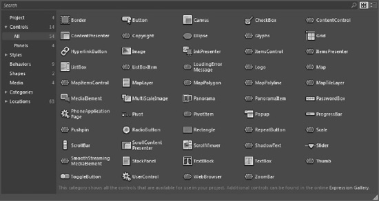
Figure 2–18. Avaialble controls on the author's laptop
Some of the controls are “sub” controls that are generally associated with a primary control. As an example, the ListBoxItem control always sits within a ListBox control. The ZoomBox control is part of the Bing Maps Map control, etc. Still, as you can see, there are a rich set of controls available for Windows Phone developers.
Note I cover the additional controls available in the Silverlight for Windows Phone Toolkit in Chapter 6.
The Chapter 2 solution in the code download has a project named BuiltInControls to demonstrate a few of the controls that ship with the Windows Phone Developer Tools. One control in Figure 2–18 that may not be on your system is the SmoothStreamingMediaElement control. This control plays media like the built-in MediaElement, but it also supports IIS Smooth Streaming adaptive streaming technology, which allows you to chunk up a media stream to different sizes depending on available bandwidth conditions. Smooth Streaming is especially important on mobile devices where bandwidth can vary greatly by optimizing the user experience for available conditions. You can learn more about Smooth Streaming at IIS.net. I cover media playback in Chapter 7.
There's an additional control available as part of the Microsoft Advertising SDK for Windows Phone. You can download it here:
www.microsoft.com/downloads/en/confirmation.aspx?FamilyID=b0f00afc-9709-4cc2–ba2c-57728db6cbd6
The download installs the control and API documentation here:
C:Program Files (x86)Microsoft Advertising SDK for Windows Phone
All that's needed is to add a reference to the control and a few lines of code to generate revenue from your free applications. I cover how to integrate advertising into your application in Chapter 7. Other controls shown in Figure 2–18 are pulled in by the Silverlight for Windows Phone Toolkit, which is covered Chapter 6.
User Interface Development with Expression Blend 4
In this section we build on the introduction to Expression Blend 4 for Windows Phone provided in Chapter 1 by delving into key concepts such as the layout system, sample data, data binding, and control templates. I provide coverage of the Silverlight for Windows Phone Toolkit and then return to an overview of the Panorama and Pivot controls.
Layout System
The Silverlight for Windows Phone layout system is based on the desktop Silverlight layout system, so it behaves in a similar manner. The Silverlight layout system enables dynamic positioning of vector-based UI elements using device-independent units or pixels that default to 96 units per inch, regardless of display resolution.
For example, if you set a rectangle to be 96 units high and 96 units wide in Visual Studio 2010 or Expression Blend 4, the rectangle will be one-inch square by default, because the Windows Phone default is 96 dpi.
The Silverlight for Windows Phone layout system includes containers that manage the size and position of controls placed within the container. UI elements are placed into one of three primary containers that inherit from the Panel base class:
Canvas: Defines an area within which you can explicitly position child elements by coordinates relative to the Canvas area.StackPanel:Arranges child elements into a single line that can be oriented horizontally or vertically.Grid:Defines an area containing rows and columns where elements can be placed.
I cover the container controls over the next few sections, but first let's look at the layout system in more detail. This is a critically important topic when laying out UI. The layout system is a recursive operation that first sizes, then positions, and finally draws elements onscreen.
The layout system is a two-pass system that is applied starting at the top of the visual XAML tree and then works its way through the Children collection of each control. During the Measure pass, the desired size of each child element is determined. In the Arrange pass, each child element's size and position are finalized.
Two closely related properties with respect to layout are Margin and Padding. Whereas all FrameworkElements have the Margin property, only objects that inherit from Control and the Border FrameworkElement have a Padding property. The difference is that Margin defines the extra space placed around the outside edges of the element, and Padding defines the extra spaced placed around the inside edges of the control.
You can use Margin and Padding to force mandatory separation between controls; it is applied by the layout system as the UI is resized, either programmatically or as the user resizes the browser.
Values for Margin and Padding can be specified using three notations: a unique value for each edge, such as “1,2,3,4”; two numbers, such as “3,5”, which applies 3 for the left and right and 5 for the top and bottom; or a single value such as “4.” If you set the property to a single value, that Margin or Padding will be applied to the left, top, right, and bottom edges of the control. If you set each edge explicitly to “1,2,3,4”, the order applied is left, top, right, bottom.
Canvas
The Canvas object may feel most comfortable to developers who are not familiar with WPF or Silverlight and have built UIs in technologies similar to .NET Windows Forms. The Canvas container enables absolute positioning of UI elements – very similar to Windows Forms or other layout technologies.
StackPanel
The StackPanel arranges controls side-by-side, either vertically or horizontally, via the Orientation property, taking into account the configured Margin and Padding for each control nested within the StackPanel control.
Grid
The Grid control is similar to an HTML table in laying out controls. It supports multiple rows and columns in the RowDefinitions and ColumnDefinitions collections. By default, if a control is nested inside a Grid without any rows or columns defined, the control renders in the upper left-hand corner, which represents row zero and column zero.
When you define columns and rows on a Grid, you can specify the Width in the ColumnDefinition object for a column and the Height in the RowDefinitions object for a row in pixels. You can also leave Width and Height set at their default value of Auto or specify Auto explicitly for each.
Leaving Width and Height set to Auto causes the Grid to size rows and columns equally as much as possible; however, the ultimate size is determined by the layout system, which takes into account the size of the content. For example, if a Grid has two rows defined with the default of Auto, but the content in the first row has a minimum size that is twice that of the content in the second row, the layout system causes the first row to be twice the width of the second.
The Grid supports a much more powerful method of sizing columns and rows: star sizing. When you specify a star (*) as the Width or Height of a column or row, the column or row receives a proportional amount of space relative to the other columns or rows, respectively. This XAML has the same effect as setting Width and Height to the default of Auto:
<Grid.ColumnDefinitions>

  <ColumnDefinition Width="*"/>

  <ColumnDefinition Width="*"/>

</Grid.ColumnDefinitions>

<Grid.RowDefinitions>

  <RowDefinition Height="*"/>

  <RowDefinition Height="*"/>

</Grid.RowDefinitions>
It gets interesting when you prepend an integer to * for Width or Height. For example, to give up to twice the amount of available space to the second column and second row, specify 2* for both the Width and Height, like this:
<Grid.ColumnDefinitions>

  <ColumnDefinition Width="*"/>

  <ColumnDefinition Width="2*"/>

</Grid.ColumnDefinitions>

<Grid.RowDefinitions>

  <RowDefinition Height="*"/>

  <RowDefinition Height="2*"/>

</Grid.RowDefinitions>
Note that I said “up to twice the amount.” That is because the layout system takes into account the minimum size required for content. If the second column wants twice as much space as the first column, the content in the first column may prevent the second column from getting all the requested space, depending on the minimum width values configured on the content in the first column.
Layout Controls Sample and Blend Behaviors
The project LayoutControls in the Chapter 2 solution demonstrates how the Canvas, StackPanel, and Grid layout controls work. Since this section is focused on Expression Blend, I introduce a new concept called Behaviors to provide navigation without writing any C# code.
Behaviors Overview
WPF introduced the concept of Triggers, which allowed actions to happen such as starting an animation StoryBoard object by clicking a button without writing any C# code. Behaviors were introduced in Silverlight 3 and take the concept of Triggers even further while including full Expression Blend support with drag-and-drop support to apply behaviors.
Behaviors allow developers to add logic to a control visually in Blend. You can think of them as code-less events or actions meaning no C# code is needed to utilize a Behavior. To find behaviors in Expression Blend, click on the Assets tab and select Behaviors to filter to the list of items. Figure 2–19 shows a list of available behaviors.
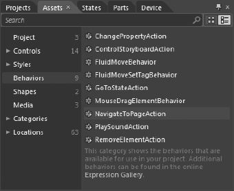
Figure 2–19. Expression Blend built-in behaviors
Additional Silverlight behaviors can be found at the Expression Blend Gallery located here:
http://gallery.expression.microsoft.com/en-us/site/search
For the LayoutControls sample project, three TextBlock controls are put into the UI of MainPage.xaml with text of Canvas, StackPanel, and Grid, respectively. Three pages are added to the project named CanvasPage.xaml, StackPanelPage.xaml, and GridPage.xaml. Switch back to MainPage.xaml to drag-and-drop a NavigateToPageAction behavior onto the TextBlock with the text Canvas. Figure 2–20 shows the Properties window for the behavior. The EventName property indicates the event to kick off the action, in this case touching the label will navigate to the page configured for the TargetPage property.

Figure 2–20. NavigateToPageAction behavior configuration
Without writing any code, when the Canvas TextBlock is touched, the MouseLeftButtonDown event fires and the PhoneApplicationFrame will navigate to the TargetPage of CanvastPage.xaml. We do the same for the other two labels so that they navigate to the StackPanelPage.xaml and GridPage.xaml pages respectively. Here is a snippet of the XAML added to the Canvas textbox as a result of dragging-and-dropping the behavior:
<TextBlock HorizontalAlignment="Left" TextWrapping="Wrap" Text="Canvas"

 VerticalAlignment="Top" Margin="12,43,0,0">

  <Custom:Interaction.Triggers>

    <Custom:EventTrigger EventName="MouseLeftButtonDown">

      <ic:NavigateToPageAction TargetPage="/CanvasPage.xaml"/>

    </Custom:EventTrigger>

  </Custom:Interaction.Triggers>

</TextBlock>
Under the hood, behaviors are just XAML markup programmed visually with Expression Blend. The navigation actions do not include animations but this quick demo touches upon just the beginning of what Silverlight Behaviors can offer in terms of simplifying code with standardized behaviors and actions. Chapter 6 covers how to add animations to page transitions.
Layout Controls
Now that the navigation has been visually programmed with Behaviors, it is time to add the layout controls starting with the Canvas control to CanvasPage.xaml. By default the Canvas control is not listed in the Asset Bar. As covered in Chapter 1, click and hold the chevron at the bottom of the Asset Bar on the left to pop-out the search UI, or click and hold on the Grid icon in the Asset Bar and the UI to switch to Canvas is presented.
Double-click on Canvas to add it to the CanvasPage.xaml UI. Type Shift-V to go back to Selection mode and then right-click on the Canvas and select Auto-Size Fill. The Canvas now occupies the content area. The interesting part is when an object is placed inside a Canvas such as an Ellipse. Click-and-Hold the Rectangle to switch to Ellipse, double-click as before to add the Ellipse to the Canvas. The Ellipse is added to the Canvas instead of the Grid named ContentPanel, because Canvas was the control selected (blue rectangle) in the Object and Timeline Tool Window.
Move the Ellipse to about the middle of the ContentPanel Grid's area. Notice that the Margin value did not change as what is normally the case when objects are placed within a Grid layout control. Because the Ellipse is within a Canvas layout control, objects are absolutely positioned using Canvas.Left and Canvas.Top attached properties instead of via Margin. Here is the XAML for the ellipse:
<Ellipse Fill="#FFF4F4F5" Height="100" Stroke="Black" Width="100" Canvas.Left="176"

 Canvas.Top="279"/>
The Canvas layout control operates differently with respect to the Silverlight Layout system. Controls are absolutely positioned within a Canvas, making it the ideal layout control for Silverlight-based game development. Developers can apply Margin to controls within a Canvas but the Margin is applied relative to the Canvas.Top and Canvas.Left properties, not to the bounds of the Canvas, which is different behavior compared to a Grid.
Grid Page
For GridPage.xaml, we don't add an additional Grid, because there is already a Grid control named ContentPanel by default when adding a new page to the project. Click and hold the Rectangle to switch to Ellipse, and double-click as before to add the Ellipse to the Grid. By default it is placed in Grid.Row = 0 and Grid.Column=0. Initially the ContentPanel does not have any additional Rows or Columns so let's add a couple visually to make a tic-tac-toe type grid layout as shown in Figure 2–21.
Figure 2–21. GridPage.xaml at desig time
The Ellipse is placed in the center position in the Grid control resulting in this Xaml:
<Ellipse Fill="#FFF4F4F5" Stroke="Black" Grid.Column="1" Grid.Row="1" Width="100"

 Height="100"/>
We see two additional attached properties used to position the Ellipse within the Grid Control: Grid.Column and Grid.Row.
StackPanel Page
Double-click on StackPanel to add it to the StackPanelPage.xaml UI. Press Shift-V to go back to Selection mode, and then right-click on the StackPanel and select Auto-Size Fill. The StackPanel now occupies the content area. The interesting part is what happens when multiple objects are placed inside a StackPanel such as an Ellipse. Click and hold the Rectangle to switch to Ellipse, and double-click as before to add an Ellipse to the StackPanel. This time, double-click on the Ellipse icon in the Asset Bar five more times. Notice how each Ellipse is automatically added under the previous Ellipse or “stacked” on top of one another.
The StackPanel control does not support absolute positioning like the Canvas. Developers can use Margin and Padding to adjust the display within the StackPanel. Remove two of the six Ellipses so that four are stacked. Multi-select the remaining four Ellipse controls and then set the Top and Bottom Margin values to 10. This results in the Ellipses separating from each other a bit but still within the behavior of the StackPanel.
Now set a Width on all four Ellipse controls of 100 pixels to remove the stretch. By default, we now have four circles stacked and spaced. Finally, add a 100 Left Margin to the second Ellipse and 100 Right Margin to the third Ellipse resulting in Figure 2–22.

Figure 2–22. StackPanel.xaml at design time
Layout Tips
The layout controls provide an immense amount of flexibility within the layout system. Developers should use the controls to lay out UI as much as possible initially. As an example, use a Grid with Rows and Columns to separate UI first. For items that are lined up either horizontally or vertically, use a StackPanel. Adjust HorizontalAlignment and VerticalAlignment as needed.
Once the general layout is in place, Apply Margin and Padding as needed to space controls within containers. Resist the temptation to set Width and Height on every control initially. Width and Height override all other layout configurations and can result in odd layout behavior where controls appear to be cut off. Only set Width or Height when needed to ensure correct display of content.
With all that said, the Silverlight Layout System takes CPU cycles to determine positioning. In most cases following the above recommendations works fine and provides maximum flexibility with great performance. Only in cases when frame rates are dropping should a developer consider absolute positioning to reduce layout calculations and even then the gains may be marginal. In the next section, I shift gears over to another major topic in XAML development: data binding.
Data Binding
Support for data binding is engineered directly into XAML-based programming languages like WPF and Silverlight. This means most properties are of type DependencyProperty, which includes built-in support for change notifications and data binding. It would be nearly impossible to cover Silverlight user experience without also covering data binding. There are three main categories for data binding:
- Element data binding
- Object data binding
- XML data binding
Silverlight for Windows Phone OS 7.1 includes full data binding support comparable to what is related in Silverlight 4. Improvements over Windows Phone 7 include the following:
- Binding to
DependencyObjectinstances - Binding to
Stringindexers - Ability to specify
Stringformatting options through theStringFormatproperty. This is very helpful and can help reduce the need forIValueConverterinstances, which I cover in Chapter 7. - Ability to specify default display values through the
FallbackValueandTargetNullValueproperties to reduce coding logic to handle blank or null data values - Ability to group collection items through the
GroupDescriptionsproperty of theCollectionViewSourceclass - Support for the
ICollectionViewFactoryinterface, which enables custom data-entity collections to provide customICollectionViewimplementations to theCollectionViewSourceandDataGridclasses - Support for complex, multi-property validation of bound objects that implement the
INotifyDataErrorInfoorIDataErrorInfointerface, which can greatly help with error handling. I cover these interfaces in Chapter 7
In order to create sample code, some demo live data is needed. The next section covers the DemoLiveData project available in the Chapter 2 solution.
Demo Live Data
In addition a separate project named DemoLiveData is available to provide an object collection and an xml data file to work with for the rest of this chapter. The project contains two simple classes, a Customer class and a Customers class to serve as the live data. Listings 2–7 and 2–8 show the Customer and Customers classes.
Listing 2–7. Customer.cs Code File
namespace SampleData.LiveData

{

  public class Customer

  {

    public string FirstName { get; set; }

    public string LastName { get; set; }

    public string PhoneNumber { get; set; }

    public string Address { get; set; }

    public string City { get; set; }

    public string State { get; set; }

    public string Zip { get; set; }

  }

}
Listing 2–8. Customers.cs Code File
using System.Collections.Generic;


namespace SampleData.LiveData

{

  public class Customers

  {

    private List<Customer> _customerList;


    public Customers()

    {

      _customerList = new List<Customer>()

      {

        new Customer(){FirstName="Rob",LastName="Cameron",PhoneNumber="555-555-5555",

                        Address="123 Main Street", City="Atlanta",State="GA", Zip="30042"},

        new Customer(){FirstName="Amanda",LastName="Cam",PhoneNumber="555-555-5555",

                        Address="123 Main Street", City="Philadephia",State="PA",

 Zip="19111"},

        new Customer(){FirstName="Anna",LastName="Ron",PhoneNumber="555-555-5555",

                        Address="123 Main Street", City="New York",State="NY", Zip="10001"},

        new Customer(){FirstName="John",LastName="Smith",PhoneNumber="555-555-5555",

                        Address="123 Main Street", City="Chicago",State="IL", Zip="20011"},

        new Customer(){FirstName="Jane",LastName="Doe",PhoneNumber="555-555-5555",

                        Address="123 Main Street", City="San Francisco",State="CA",

 Zip="30333"},

        new Customer(){FirstName="Daniel",LastName="Booth",PhoneNumber="555-555-5555",

                        Address="123 Main Street", City="Dallas",State="TX", Zip="79999"},

        new Customer(){FirstName="Arthur",LastName="Olson",PhoneNumber="555-555-5555",

                        Address="123 Main Street", City="Seattle",State="WA", Zip="50000"},

        new Customer(){FirstName="Janet",LastName="Rich",PhoneNumber="555-555-5555",

                        Address="123 Main Street", City="Portland",State="OR", Zip="43334"},

        new Customer(){FirstName="Janus",LastName="Poor",PhoneNumber="555-555-5555",

                        Address="123 Main Street", City="Sacramento",State="CA", Zip="85755"},

        new Customer(){FirstName="Alice",LastName="Mer",PhoneNumber="555-555-5555",

                        Address="123 Main Street", City="Kansas City",State="KA", Zip="48488"}

      };

    }

    public List<Customer> CustomerList { get { return _customerList; } }

  }

}
To instantiate the data, simply create the Customers class and data bind to the CustomerList. The XML file named ApressBooks.xml lists details on about 20 books that have been published by Apress over the years. I won't list the full XML file, but here is a summary of the schema with one of the sample book data present:
  <ApressBook>

    <ID>4</ID>

    <ISBN>1-4302–2435-5</ISBN>

    <Author>Jit Ghosh and Rob Cameron</Author>

    <Title>Silverlight Recipes: A Problem-Solution Approach, Second Edition</Title>

      <Description>Silverlight Recipes: A Problem-Solution Approach, Second Edition is your

 practical companion to developing rich, interactive web applications with Microsoft's

 latest technology. This book tackles common problems and scenarios that on-the-job

 developers face every day by revealing code and detailed solutions. You'll quickly be able

 to integrate real-world, functioning code into your applications—and save hours of coding

 time.</Description>

    <DatePublished>2010-07-15T00:00:00</DatePublished>

    <NumPages>1056</NumPages>

    <Price>$49.99</Price>

  </ApressBook>
The next three sections cover the scenarios listed previously and demonstrated in the Chapter 2 solution. That includes a project named Data Binding, which includes a MainPage.xaml and a folder named pages that includes three pages to cover each topic that follows.
Element Data Binding
Element data binding is when a property on one control data binds to the value of a property on another control. To demonstrate this, we add a Rectangle and a Slider control to the page named ElementDataBindingPage.xaml with the Rectangle on the left and the Slider control oriented vertically.
The experience we want to create is that when the Slider is positioned, the Opacity on the Rectangle is modified. The Slider has a MinimumValue of zero and MaximumValue of one, with a default of one. The LargeChange property is changed to .1 and the SmallChange property is changed to .01 to keep the value consistent with what are valid values for the Opacity property.
What we want to do is data bind the Rectangle's Opacity value to the Value property of the Slider. To do this, select the Rectangle object and click the small button to the right of the field in the Properties Window to bring up the menu shown in Figure 2–23 to select the Element Property Binding... menu item.

Figure 2–23. Expanded menu options for the Opacity property
The menu shown in Figure 2–23 is mostly the same for any Property selected for a control. When Element Property Binding… is clicked, the Artboard switches to Element Property Binding mode, allowing the developer to select a control to then choose a property. Figure 2–24 shows the UI. Notice that it indicates that the Slider control will be given a name of slider. This is because the control must be named for Element Binding to work.
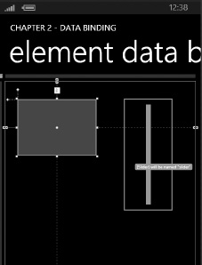
Figure 2–24. Element Binding mode with mouse over the slider
Once the Slider control is clicked, it is named slider and you can select the property to bind to as shown in Figure 2–25.

Figure 2–25. Element Binding – Create Binding dialog
The Slider.Value property is the desired property so click OK to create the element binding. The XAML or the Rectangle is updated to include element binding for the Opacity value as shown here:
<Rectangle Fill="#FF0000E0" Height="134" Margin="30,44,0,0" Stroke="Black"

 VerticalAlignment="Top"

 HorizontalAlignment="Left" Width="188" Opacity="{Binding Value, ElementName=slider}"/>
The Binding markup extension indicates that the Opacity property for the Rectangle should get its value from the UI element named “slider.” Markup extensions are identified by the braces within the quotes as covered above in the XAML overview. Binding is a class in the .NET Framework for Silverlight that connects the property, in this case Opacity, to the data source, in this case the Value property on the Slider control.
Object Data Binding
Data binding to collection of objects is a very typical scenario. Silverlight for Windows Phone has rich support for data binding to object collections, as is the case with Silverlight. We continue to customize the DataBinding project by adding a ListBox onto the ObjectDataBindingPage.xaml ContentPanel Grid. Add a reference to the DemoLiveData project to provide an object data source.
In Expression Blend, right-click on the ListBox and select the “Data bind ItemSource to Data…” menu item. Click the “+CLR Object” button in the Create Data Binding dialog shown in Figure 2–26.

Figure 2–26. Create Data Binding dialog
This brings up the Create Object Data Source dialog shown in Figure 2–27, where we select SampleData.LiveData.Customers and click OK.
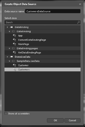
Figure 2–27. Create Object Data Source dialog
This returns us back to the Create Data Binding dialog with an object data source pointing to the custom object collection. Select the CustomerList Field to data bind it to the ItemSource as shown in Figure 2–28 and click OK.

Figure 2–28. Create Data Binding with Object data source
Figure 2–29 shows the ListBox now data bound to the object data source.

Figure 2–29. Data-bound ListBox
In Figure 2–29, the data source is configured but it just displays the ToString() value for the Customer object, which defaults to the full type name. This is because an ItemTemplate is not configured on the ListBox. The ItemTemplate is used to layout the individual Customer records. Listing 2–9
Listing 2–9. ObjectDataBindingPage.xaml Code File
<phone:PhoneApplicationPage

    xmlns="http://schemas.microsoft.com/winfx/2006/xaml/presentation"

    xmlns:x="http://schemas.microsoft.com/winfx/2006/xaml"

    xmlns:phone="clr-namespace:Microsoft.Phone.Controls;assembly=Microsoft.Phone"

    xmlns:shell="clr-namespace:Microsoft.Phone.Shell;assembly=Microsoft.Phone"

    xmlns:d="http://schemas.microsoft.com/expression/blend/2008"

    xmlns:mc="http://schemas.openxmlformats.org/markup-compatibility/2006"

    xmlns:SampleData_LiveData="clr-namespace:SampleData.LiveData;assembly=DemoLiveData"

    x:Class="DataBinding.ObjectDataBindingPage"

    SupportedOrientations="Portrait" Orientation="Portrait"

    mc:Ignorable="d" d:DesignHeight="768" d:DesignWidth="480"

    shell:SystemTray.IsVisible="True">


  <phone:PhoneApplicationPage.Resources>

    <SampleData_LiveData:Customers x:Key="CustomersDataSource" d:IsDataSource="True"/>

  </phone:PhoneApplicationPage.Resources>


  <phone:PhoneApplicationPage.FontFamily>

    <StaticResource ResourceKey="PhoneFontFamilyNormal"/>

  </phone:PhoneApplicationPage.FontFamily>

  <phone:PhoneApplicationPage.FontSize>

    <StaticResource ResourceKey="PhoneFontSizeNormal"/>

  </phone:PhoneApplicationPage.FontSize>

  <phone:PhoneApplicationPage.Foreground>

    <StaticResource ResourceKey="PhoneForegroundBrush"/>

  </phone:PhoneApplicationPage.Foreground>


  <!–LayoutRoot is the root grid where all page content is placed–>

  <Grid x:Name="LayoutRoot" Background="Transparent" DataContext="{Binding

 Source={StaticResource CustomersDataSource}}">

    <Grid.RowDefinitions>

      <RowDefinition Height="Auto"/>

      <RowDefinition Height="*"/>

    </Grid.RowDefinitions>


    <!–TitlePanel contains the name of the application and page title–>

    <StackPanel x:Name="TitlePanel" Grid.Row="0" Margin="12,17,0,28">

      <TextBlock x:Name="ApplicationTitle" Text="Chapter 2 - DATA BINDING"

 Style="{StaticResource PhoneTextNormalStyle}"/>

      <TextBlock x:Name="PageTitle" Text="object data binding" Margin="9,-7,0,0"

 Style="{StaticResource PhoneTextTitle1Style}"/>

    </StackPanel>


    <!–ContentPanel - place additional content here–>

    <Grid x:Name="ContentPanel" Grid.Row="1" Margin="12,0,12,0">

      <ListBox Margin="12,0" ItemsSource="{Binding CustomerList}"/>

    </Grid>

  </Grid>

</phone:PhoneApplicationPage>
The Expression Blend work results in the following XAML changes:
- Added an
xmlnsnamespace import to theSampleData.LiveDatanamespace at the top of the XAML page - Added a
CustomersDataSourceresource to thePhoneApplicationPage.Resourcessection. - Set the
DataContextattribute for theLayoutRootGrid to theCustomersDataSourceresource via aBindingmarkup extension. - Bind the
ListBox ItemSourceattribute to theCustomerListproperty of theCustomersclass.
It is important to note that by setting the DataContext on the LayoutRoot Grid, it makes the data source collection, individual records, and fields available to nested XAML controls automatically. As an example, an ItemTemplate can be added to the ListBox that Binds TextBlock control Text properties to the FirstName and LastName properties of the Customer class just by specifying the data field name in the Binding markup extension. I demonstrate how to do this visually next.
Right-click on the ListBox, select Edit Additional Templates, then Edit Generated Items, and finally click Create Empty. This puts the Artboard into template editing mode with an empty Grid. Drag two TextBlock controls next to each other with some spacing to fit the FirstName and LastName fields. Next click the more actions button next to the Text property in the Properties Window for the first TextBlock to bring up Figure 2–30.

Figure 2–30. Create data binding
Expression Blend understands that we are creating an ItemTemplate to display individual Customer records in the ListBox that is data bound to the CustomersList so the fields available for controls in the ItemTemplate are Customer class fields. We select FirstName for the left TextBlock and LastName for the second TextBlock. Adding the ItemTemplate results in the much more useful display of first name and last name for each record. Here is the resulting XAML:
<DataTemplate x:Key="CustomersListBoxDataTemplate">

  <Grid>

    <TextBlock Margin="0" TextWrapping="Wrap"

    Text="{Binding FirstName}"

    d:LayoutOverrides="Height" Width="75"/>

    <TextBlock Margin="0,0,-148,0" TextWrapping="Wrap"

    Text="{Binding LastName}"

    d:LayoutOverrides="Height" HorizontalAlignment="Right" Width="118"/>

  </Grid>

</DataTemplate>
XML Data Binding
The first step to data binding to XML is to obtain the XML file, which can be retrieved from a remote server or embedded as part of the application. For this demonstration, the XML file is retrieved from the application, because I don't cover remote server access until Chapter 4.
There are two ways to parse XML data in Silverlight: the XmlReader class and LINQ to XML, which is one of the new technologies that became available in .NET Framework 3.5 and later. The XmlReader class is a fast-forward–only, non-caching XML parser. For processing large XML files, XmlReader is better suited than LINQ to XML for performance reasons. LINQ to XML provides rich object-based XML processing using the common LINQ syntax.
The work in this section is focused on the XmlDataBindingPage.xaml page, which has two ListBox controls: a ListBox named XmlDataLinqListBox that is loaded via data binding with LINQ to XML and another ListBox named XmlDataReaderListBox that is loaded via XmlReader in Code.
The ApplicationBar control is enabled with two icon buttons, one to switch between the two ListBox controls by alternatively hiding and making visible the controls. The other icon button loads data into the XmlDataReaderListBox ListBox. We configure an icon for the icon button that loads the data via XmlReader by simply browsing the list of icons available as resources and configure the Refresh icon. The other icon was created by combining the default next and back icons into one. The second icon button switches between the two ListBox controls using the Visibility property.
Now that we have the sample project set up, the next two sections cover the code to load the XML data using both methods.
LINQ to XMLs
The Silverlight XmlReader works in a similar manner as the XmlReader in the full version of the .NET Framework. Visit this site for details on the differences between the .NET Framework and the .NET Framework for Silverlight versions of XmlReader:
http://msdn.microsoft.com/en-us/library/cc189053(VS.95).aspx
Silverlight for Windows Phone is a rich subset of the full .NET Framework 3.5 and that it includes LINQ. There are many web sites, blogs, and books that cover LINQ, so I won't dive into all the details here.
Tip A great resource on LINQ is Joseph C. Rattz Jr.'s Pro LINQ: Language Integrated Query in C# 2008 (Apress, 2007).
Since the XML file is embedded into the application, we use an XmlResolver. In this case the XmlXapResolver, which extracts XML from the xap, and then loads the XML data into an XDocument object.
We call XDocument.Load(XmlReader) to load the contents into an XDocument so that it can be queried using LINQ. The XDocument class, located in the System.Xml.Linq namespace, is the key object in LINQ to XML functionality.
The XmlReader class can be used to read XML data from the IsolatedStorage file system as well as from streams retrieved via the network just like in the full .NET Framework. A unique Silverlight for Windows Phone ability that we take advantage of in this section is to use an XmlXapResolver to retrieve XML data embedded into the application's .xap file, which is the container for Silverlight applications. An XML resolver in .NET resolves, or evaluates, external XML resources. An XmlUrlResolver is used to resolve the Url location passed into XmlReader.Create. The XmlXapResolver looks for the name passed into XmlReader.Create within the .xap file for the application:
XmlReaderSettings XmlRdrSettings = new XmlReaderSettings();

XmlRdrSettings.XmlResolver = new XmlXapResolver();

XmlReader reader = XmlReader.Create("ApressBooks.xml",

XmlRdrSettings);
The resolver is configured for the XmlReaderSettings object that is passed into the Create method. For more information on the XmlReaderSettings class, refer to the MSDN documentation here:
http://msdn.microsoft.com/en-us/library/system.xml.xmlreadersettings(VS.95).aspx
The LINQ to XML code is encapsulated in the ApressBooks class that is part of the DemoLiveData project shown in Listing 2–10.
Listing 2–10. APressBooks.cs Code File
using System;

using System.Collections.Generic;

using System.Linq;

using System.Xml;

using System.Xml.Linq;

using System.Collections;


namespace DemoLiveData

{

  public class ApressBooks

  {

    private List<ApressBook> _apressBookList;

    public List<ApressBook> ApressBookList

    {

      get

      {

        if (null == _apressBookList)

          RetrieveData();

        return _apressBookList;

      }

    }


    private void RetrieveData()

    {

      XmlReaderSettings XmlRdrSettings = new XmlReaderSettings();

      XmlRdrSettings.XmlResolver = new XmlXapResolver();

      XmlReader reader = XmlReader.Create("ApressBooks.xml", XmlRdrSettings);


      XDocument xDoc = XDocument.Load(reader);


      _apressBookList =

        (from b in xDoc.Descendants("ApressBook")

         select new ApressBook()

         {

           Author = b.Element("Author").Value,

           Title = b.Element("Title").Value,

           ISBN = b.Element("ISBN").Value,

           Description = b.Element("Description").Value,

           PublishedDate = Convert.ToDateTime(b.Element("DatePublished").Value),

           NumberOfPages = b.Element("NumPages").Value,

           Price = b.Element("Price").Value,

           ID = b.Element("ID").Value

         }).ToList();

    }

  }

}
It is similar to the Customers class in the same project in that it just returns a list of objects to databind. The object type is ApressBook shown here:
using System;


namespace DemoLiveData

{

  public class ApressBook

  {

    public string Author { get; set; }

    public string Title { get; set; }

    public string ISBN { get; set; }

    public string Description { get; set; }

    public DateTime PublishedDate { get; set; }

    public string NumberOfPages { get; set; }

    public string Price { get; set; }

    public string ID { get; set; }

  }

}
The significant difference between the Customers class and the ApressBooks class is the LINQ to XML code that parses out an ApressBook object from the XML. Otherwise, the data binding process is the same within Expression Blend so we how all of the dialogs to data bind ApressBooks to the XmlDataLinqListBox ListBox control on the XmlDataBindingPage.xaml page. The next section covers reading the XML data and loading it directly into the Items collection of the ListBox control.
XmlReader
For this section, the XML records are added to the ListBox.Items collection for the XmlDataReaderListBox on the XmlDataBindingPage.xaml page without using an ItemTemplate. In Silverlight 4 XPath is supported so that you can create a Data Template that parses the bound XML object but for now we just bind the XML object as is without a template. Here is the code to load up the data:
private void XmlReaderIconButton_Click(object sender, EventArgs e)

{

  XmlReaderSettings XmlRdrSettings = new XmlReaderSettings();

  XmlRdrSettings.XmlResolver = new XmlXapResolver();

  XmlReader reader = XmlReader.Create("ApressBooks.xml", XmlRdrSettings);


  // Moves the reader to the root element.

  reader.MoveToContent();


  while (!reader.EOF)

  {

    reader.ReadToFollowing("ApressBook");

    // Note that ReadInnerXml only returns the markup of the node's children

    // so the book's attributes are not returned.

    XmlDataReaderListBox.Items.Add(reader.ReadInnerXml());

  }

  reader.Close();

  reader.Dispose();

}
Figure 2–31 shows both methods in action.

Figure 2–31. Xml Data Binding UI
In this section I covered the Silverlight for Windows Phone data binding capabilities. When live data is not available, developers can take advantage of the sample data capabilities available in Expression Blend, which I cover in the next section.
Sample Data
It is difficult to build out a user experience without the content available in a usable format. Quite often, a project will have development and test services and classes to make data available within an application. Still, this means that you must have an Internet connection available, or have VPN configured to access services. Being able to work with a local copy of the data is more convenient and probably quicker in terms of iterative development than connecting over and over to a data service. Expression Blend 4 includes a Data Panel on the right in the Blend UI as shown in Figure 2–32 where developers and designers can add or import sample data.

Figure 2–32. The Data Panel in Expression Blend 4
Table 2–3 identifies key aspects of the Data Panel with a couple of fake data sources configured to help explain the various capabilities.
The Data Panel allows developers and designers to work with the design-time data in Expression Blend while also displaying the design-time data at runtime for testing and demonstration purposes. Developers can also add a live datasource to the UI that pulls data from a live datasource for display at runtime, by clicking item E in Figure 2–32.
As long as your schema is compatible between the design-time datasource and the live datasource, a developer can use both a design-time and a runtime data source in an application. The steps to use both are pretty straightforward. Start working with a design-time datasource to build an application. Next add a live datasource to the Data panel in Expression Blend. Drag items from the live datasource, and drop them onto the control displaying the corresponding sample data. This will bind the control to design-time data at design-time and runtime data at runtime.
Note Clear the check box next to Enable When Running Application in the design-time datasource properties to allow the live datasource to display data at runtime.
As long as the data schemas match, the sample data displays on the Artboard in Expression Blend and the live data displays when the application executes. This is because the sample datasource bindings are not removed or overwritten when the run-time datasource is added. Once you create a sample data source, you can work with it just like with live data as demonstrated above in the section on Data Binding.
Control Styling
By default, Windows Phone controls are styled to fit the Metro design language intrinsic to Windows Phone. You can apply the built-in styles to your application's user interface as well as create your own styles. Silverlight styles allow you to define a set of properties related to UI that can be reused throughout an application to create a standardized look and feel.
Expression Blend 4 can apply Metro text styles as shown in Figure 2–33 by right-clicking on the control and selecting Edit Style Apply Resource and selecting a style.

Figure 2–33. Applying built-in Metro text styles
After visually applying the style, the XAML is updated with a StaticResouce markup extension applied to the Style property.
<TextBlock Margin="12,273,31,270" TextWrapping="Wrap" Text="Apply a Built in Style"

   Style="{StaticResource PhoneTextExtraLargeStyle}"/>
You can create your own styles tailored to your brand or application theme but otherwise try to use the built-in Metro styles. To create a custom Text style right-click on a TextBlock and select Edit Style as before but this time select “Create Empty…” to bring up the dialog box shown in Figure 2–34.
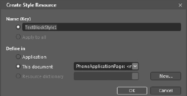
Figure 2–34. Create Style Resource dialog
The Name (Key) attribute is how you reference the resource when applying it as a style with this syntax Style="{StaticResource ResourceKeyNameHere}".
Resources can be defined at the application level in the <Application.Resources> element, at the page level in the <phone:PhoneApplicationPage.Resources> element, or in a separate Resource Dictionary by clicking the “New..” button. Clicking the “New…” button brings up the Resource Dictionary dialog shown in Figure 2–35.

Figure 2–35. Resource Dictionary New Item dialog
Clicking OK to the dialog in Figure 2–35 enables the Resource Dictionary option and sets the name on the dropdownlist box in the dialog shown in Figure 2–34. Clicking OK to that dictionary adds an entry to the Application.Resources element in App.xaml.
<Application.Resources>

  <ResourceDictionary>

    <ResourceDictionary.MergedDictionaries>

       <ResourceDictionary Source="Chapter2ControlStylesResourceDictionary.xaml"/>

    </ResourceDictionary.MergedDictionaries>

  </ResourceDictionary>

</Application.Resources>
Resource dictionaries are a great way to segregate XAML markup to keep markup files from becoming unwieldy and achieve better project organization. Now that you understand how styles are referenced and stored, let's move on to creating a custom text style that we can apply to the TextBlock named CustomStyleTextBlock.
We continue visually editing the TextBlockStyle1 style now located in the Chapter2ControlStylesResourceDictionary.xaml resource dictionary. We set the Foreground color to Gold and the Opacity to 70%. Here is the resulting XAML markup:
<Style x:Key="TextBlockStyle1" TargetType="TextBlock">

        <Setter Property="Foreground" Value="Gold"/>

        <Setter Property="Opacity" Value="0.7"/>

</Style>
Tip Implicit styles are introduced in Silverlight 4, but they are not supported in Silverlight for Windows Phone, which is based on Silverlight 4. Implicit styles are defined without an x:key so that the style is applied to all controls that match the TargetType without an explicit Style value configured.
A style consists of a TargetType and nested series of Setter property elements. The TargetType must be a control that inherits from the FrameworkElement base class. Each Setter consists of a Property name and a Value. These identify what control properties the settings apply to as well as what the value should be. For a complex property, the <Setter.Value> </Setter.Value> syntax like this:
<Style x:Key="TextBlockStyle2" TargetType="TextBlock">

  <Setter Property="Foreground">

    <Setter.Value>

      <LinearGradientBrush EndPoint="0.5,1" StartPoint="0.5,0">

        <GradientStop Color="Gold" Offset="0"/>

        <GradientStop Color="White" Offset="1"/>

      </LinearGradientBrush>

    </Setter.Value>

  </Setter>

  <Setter Property="Opacity" Value="0.7"/>

</Style>
Another attribute available on the Style element is the BasedOn attribute, which allows a Style to inherit from another Style. The TextBlockStyle2 is modified to inherit from the built-in Metro style using this attribute setting on the Style element:
BasedOn="{StaticResource PhoneTextExtraLargeStyle}"
The last option I will cover is inline styles, where the Style is nested within the XAML markup for the control. Here is an example with a single property:
<TextBlock Height="57" HorizontalAlignment="Left" Margin="42,427,0,0"•

 Name="InlineStyleTextBlock" Text="TextBlock" VerticalAlignment="Top" Width="162">

  <TextBlock.Style>

    <Style TargetType="TextBlock" BasedOn="{StaticResource PhoneTextLargeStyle}">

      <Setter Property="Foreground" Value="Orange" />

    </Style>

  </TextBlock.Style>

</TextBlock>
Any control that inherits from the FrameworkElement base class has a Style property that can be standardized across the application, though not all controls support visual editing of styles via menu items. To create a custom style for a Button, edit the XAML in the Chapter2ControlStyleResourceDictionary.xaml file to start a custom Style with a TargetType of Button and a name of ButtonStyle. Once the custom Style is manually created, you can visual edit styles using the Resources window as shown in Figure 2–36 with the ButtonStyle selected and ready to be edited visually.
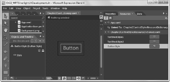
Figure 2–36. Resources window
Once the custom Button style is completed, you can apply it to an existing Button control by selecting the Button, finding the Style property in the Properties window, and clicking the button to apply a Local Resource named ButtonStyle. See Figure 2–37.
In Figure 2–37, the Properties Window is filtered by typing Style in the filter box at the top of the Properties Window.

Figure 2–37. Applying ButtonStyle via Properties window Style property
The Style is already applied to the Button but the arrows highlight the small green button, which is usually black until the property is customized. Green around a property indicates that a resource is applied. Additional menu items light up such as Edit Resource… and Convert to New Resource… Here is the final XAMLfor the ButtonStyle Style:
<Style x:Key="ButtonStyle" TargetType="Button" >

  <Setter Property="Foreground">

    <Setter.Value>

      <LinearGradientBrush EndPoint="0.5,1" StartPoint="0.5,0">

        <GradientStop Color="Gold" Offset="0"/>

        <GradientStop Color="White" Offset="1"/>

      </LinearGradientBrush>

    </Setter.Value>

  </Setter>

  <Setter Property="Opacity" Value="0.7"/>

  <Setter Property="BorderBrush" Value="Red"/>

</Style>
This completes the overview on Control Styles and customization. The next section provides background on control templates.
Control Templates
In most “real” software development projects, custom controls are needed to customize data presentation, customize how a control appears, as well as how a control functions. In Silverlight, developers generally do not create custom controls. Instead, Silverlight developers modify existing controls vial control templates.
Right-click on the ListBox control on the ListBoxTemplatePage.xaml page and you will see two menu items related to Templates: Edit Template and Edit Additional Templates. I cover both menu items in the next two sections.
Edit Template Menu Item
This menu item enables direct modification of the control for maximum customization. There are two sub-menu items “Create Empty…” and “Edit a Copy…” to create a customized control. Selecting the “Create Empty…” menu item is essentially starting from scratch. The template contains a Grid to start create a new control UI.
Most customizations start with the “Edit a Copy…” menu item, which extracts the Control's internal visual tree, including visual states and animations, and makes it available for customization. This is very similar to inheriting from an existing control in other languages but much more powerful.
Edit Additional Templates
The Edit Additional Templates menu item can have one or more options depending on the control. For example, a ListBox control has the following options:
- Edit Generated Items (ItemTemplate)
- Edit Generated Item Container (ItemContainerStyle)
- Edit Layout of Items (ItemsPanel)
The Generated Items ItemTemplate is the template applied to the data bound list of items. Without customization, the ListBox displays the .ToString() value for the data bound type. This is the most common – and necessary – customization for a ListBox control.
The ItemContaineStyle is also a customization applied to the data bound list of items. This style is applied to the container element generated for each item. For a ListBox, the generated container control is a ListBoxItem control. I don't cover ItemsContainerStyle in this section. I will discuss customizations in Chapter 6 when I cover the Visual State Manager.
The last additional template for the ListBox is the ItemsPanel template, which just has a “Create Empty…” option. This template customizes the container that all of the ListBoxItem controls exist in.
As mentioned, different types of controls can have different options for additional templates to edit. As another example, the progress bar does not have any additional templates to edit but the Button Control has a ContentTemplate that customizes content rendering for the Button control by applying a data template to the content.
I discuss editing the control template and additional templates in the next couple of sections to demonstrate these concepts with the ListBox, Button, and ProgressBar controls.
ListBox Customization
The ListBox control needs to data bind with a collection of data to be interesting. We create a sample data source at the Project level named ProductsSampleData that has 100 items. The sample data text, a url, and an image in order to make it interesting. Next up is working with the ItemTemplate in the first section.
Working with ItemTemplate
The first step we take is to drag the Products collection to the ListBox, which data binds the collection and creates an ItemTemplate automatically that can be used as a starting point as shown in Figure 2–38.

Figure 2–38. Generated ItemTemplate for Products sample data
Here is the XAML markup for the ItemTemplate that we customize in Blend shortly:
<DataTemplate x:Key="ProductsItemTemplate">

  <StackPanel>

    <TextBlock Text="{Binding Description}"/>

    <TextBlock Text="{Binding Name}"/>

    <TextBlock Text="{Binding Price}"/>

    <Image Source="{Binding ProductImage}" HorizontalAlignment="Left" Height="64" Width="64"/>

    <TextBlock Text="{Binding Url}"/>

  </StackPanel>

</DataTemplate>
To edit the template, click the drop-down arrow next to (ListBox) at the top of the ArtBoard under where the filenames are displayed and select Edit Additional Templates Edit Generated Items (ItemTemplate) Edit Current to go into template editing mode.
The first modification is to add 40px bottom margin to the root StackPanel to create space between the items. Next the items are re-arranged to present a better display with the item name, price, image, and URL at the top. Do this by re-arranging the controls in the first item visually.
Note Because it is a repeated template for each item, the ItemTemplate is dynamically applied to the items below the first item as the first item is visually edited.
To improve the display and better utilize space, multi-select the Name and Price fields, right-click, select Group Into, and pick a container control. Any one of the containers can be used to arrange the Name and Price fields, but choose the StackPanel with Orientation set to Horizontal in this case to flow the content across the screen. Grab the lower right-hand corner of the Image to increase the Image size. We next apply built-in styles to further refine the UI. Finally, set the Description TextBox TextWrapping property to Wrap. Figure 2–39 shows the final modifications to the generated template shown in Figure 2–38.
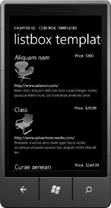
Figure 2–39. Customized ItemTemplate for Products sample data
This completes our overview on working with the ItemTemplate customization for the ListBox. Let's turn to the ItemsPanel customization next.
Custom ItemsPanel
By default, the ListBox uses a VirtualizedStackPanel as the ItemsPanel. The VirtualizedStackPanel enables much faster data refresh with very long lists, because only the visible elements are drawn. For a list that is tens of items or low hundreds of items, the VirtualizedStackPanel may not provide much benefit and can potentially impact scroll performance.
If scrolling is not smooth for your application, select the ListBox control and go to the breadcrumb menu up top of the ArtBoard near the filenames and click on ListBox, select Edit Additional Templates, Edit Layout of Items (ItemsPanel), and then “Create Empty…” to get started. The Create ItemsPanelTemplate Resource dialog box pops up. Provide a name and store the template in This Document to place the template in the Resources section. By default it creates this ItemsPanelTemplate with a StackPanel.
<ItemsPanelTemplate x:Key="ItemsPanelTemplate1">

        <StackPanel/>

</ItemsPanelTemplate>
Because there is a few hundred items, you can experience the performance differences. Without the custom ItemsPanelTemplate modification, when you click Customize ListBox, the ListBoxTemplatePage.xaml page loads immediately, because the data is virtualized in the ListBox with the default VirtualizedStackPanel items container.
When you modify the ItemsPanelTemplate to be a StackPanel, the page takes noticeably longer to load –about four or five seconds. Scrolling appears smoother, but the load time may be unacceptable. This is because all of the items, a couple of hundred, must be created before rendering, i.e., the data is no longer virtualized.
As you can see, there are always trade-offs with performance recommendations to consider and test before implementation.
Button Customization
In this section I cover some additional control customizations available to developers. Next we transform a standard rectangle Button to an ellipse Button via a custom control template.
Custom Control Template
To get started, drag a Button on the ArtBoard, right-click on the Button, and select Edit Template, then “Edit a Copy…” to go into control template editing mode. The ButtonBackground Layer is a Border. You may be tempted replace the Border with an Ellipse control, but that would make the necessary changes much more complex due to animation dependencies and the fact that the Border is actually a container control whereas the Ellipse is not.
Instead, make a simple modification by adjusting the CornerRadius property for the Border by setting it to 50. The Button now has rounded corners and can take on various elliptical shapes depending on the Height and Width properties. Figure 2–40 shows the Button in action.

Figure 2–40. Custom Button control template
There are much more complex modifications possible that involve editing the Visual States defined in the template. I cover modifying states in Chapter 6, when I discuss the Visual State Manager. For this section I will expose you to control customizations by modifying the internal visual tree via a control template.
Animation Fundamentals
Silverlight has powerful animation capabilities that allow the designer or developer to animate any property value of type Double, Color, or Point. Animation lets you vary a property between two values over a specified period of time, thus providing the illusion of motion or transformation.
In Silverlight for Windows Phone, the animation engine is left to interpret how to change the value over the specified period of time between the configured values for the property that is being animated. To apply an animation to a UI element, create a Storyboard, which I describe in the next section and then move on to key frame animations.
Creating an Animation Storyboard
In the Chapter 2 project BasicAnimations, we add a navy blue Rectangle control named NavyRect to animate using a Storyboard. To apply an animation to a UI element, create a Storyboard in XAML, and set TargetName and TargetProperty to specify the element and the property of the element to animate. Nest the animation within the Storyboard element in XAML in phone:PhoneApplicationPage.Resource like this:
<Storyboard x:Name="NavyRectMouseClick">

  <DoubleAnimation BeginTime="00:00:00.5" From="1" To="7"

   AutoReverse="True" Duration="00:00:00.5"

   Storyboard.TargetName="Rect1"

   Storyboard.TargetProperty="(Shape.StrokeThickness)"/>

</Storyboard>
The TargetName and TargetProperty attributes are attached properties for the Storyboard class. Storyboard objects are usually created as resources within either the Application.Resources or UserControl.Resources element, making it easy to interact with the Storyboard by referencing it by the x:Name value.
This XAML contains a DoubleAnimation object, which can animate a value of type Double between the values configured in the From and To properties. An additional property configured here is AutoReverse, which indicates whether the animation should automatically reverse itself and animate in the opposite direction starting at the To value and ending at the From value. BeginTime indicates how long after starting the Storyboard should the animation actually begin. Duration specifies how long the animation should take to animate between the From and To values for the property of type Double. Also, a Storyboard can contain more than one animation, allowing one Storyboard to animate multiple objects and properties.
The Storyboard class provides Begin, Pause, Stop, and Resume methods you can use to control the Storyboard programmatically. The following code starts the animation when you touch the Rectangle:
private void NavyRect_MouseEnter(object sender, MouseEventArgs e)

{

  NavyRectMouseClick.Begin();

}
The Loaded event is the only RoutedEvent supported in a Trigger for Silverlight. You can read more about RoutedEvents in the Silverlight documentation:
http://msdn.microsoft.com/en-us/library/system.windows.routedevent(VS.96).aspx
Triggers provide an elegant way of firing an animation. Silverlight for Windows Phone supports Triggers like WPF, where an animation is kicked off via XAML code only; but currently, the only supported event that can be associated with a trigger is the Loaded event. Here is an example from the BasicAnimations project:
<Rectangle.Triggers>

  <EventTrigger RoutedEvent="Rectangle.Loaded">

    <BeginStoryboard>

      <Storyboard>

        <DoubleAnimation Storyboard.TargetName="NavyRect"

          BeginTime="00:00:00" From="0.0" To="1.0" Duration="0:0:0.5"

          Storyboard.TargetProperty="(UIElement.Opacity)" />

      </Storyboard>

    </BeginStoryboard>

  </EventTrigger>

</Rectangle.Triggers>
The Loaded event is very handy to have UI fade into view as the XAML loads. Run the sample to see the effect. You may wonder why the Storyboard is embedded in the Rectangle declaration and not configured as a Resource on the Page. The reason is that Silverlight does not support loading a value for Storyboard using the StaticResource markup extension within a Trigger.
In addition to the DoubleAnimation, developers can also create ColorAnimation and PointAnimation objects within a Storyboard object. To demonstrate this, add an Ellipse named GoldEllipse to the XAML:
<Ellipse Name="GoldEllipse" Stroke="Navy" Height="100" Fill="Gold" Width="100"

  Margin="30,162,0,0" HorizontalAlignment="Left" StrokeThickness="1"

  VerticalAlignment="Top" MouseEnter="GoldEllipse_MouseEnter"

  MouseLeave="GoldEllipse_MouseLeave" />
Here are several ColorAnimation examples that are started in the MouseEnter event and stopped in the MouseLeave event. Because there isn't a mouse pointer in Windows Phone, these events fire when your finger touches and then is moved off of the Ellipse.
<Storyboard x:Name="EllipseMouseEnter">

  <ColorAnimation BeginTime="00:00:00" Duration="00:00:00.3"

                  From="#FFC18125" To="#FF2DBD43"

                  Storyboard.TargetName="GoldEllipse"

                  Storyboard.TargetProperty=

                  "(Shape.Fill).(SolidColorBrush.Color)"/>

</Storyboard>

<Storyboard x:Name="EllipseMouseLeave">

  <ColorAnimation BeginTime="00:00:00" Duration="00:00:00.3" To="#FFFFD700"

                  Storyboard.TargetName="GoldEllipse"

                  Storyboard.TargetProperty="(Shape.Fill).(SolidColorBrush.Color)"/>

</Storyboard>
To demonstrate PointAnimation, add a Path object with the shape defined by a PathGeometry:
<Path Name="OlivePath" Fill="Olive" Margin="46,380,75,6"

  MouseLeftButtonDown="OlivePath_MouseLeftButtonDown" >

  <Path.Data>

    <PathGeometry>

      <PathFigure>

        <ArcSegment x:Name="animatedArcSegment" Point="50,50" Size="50,150"

        RotationAngle="-20" IsLargeArc="False"

              SweepDirection="Clockwise"/>

      </PathFigure>

    </PathGeometry>

  </Path.Data>

</Path>
Here is the related PointAnimation that is invoked by touching the Path object via the MouseLeftButtonDown event:
<Storyboard x:Name="PathClick">

  <PointAnimation AutoReverse="True"

    Storyboard.TargetProperty="Point"

    Storyboard.TargetName="animatedArcSegment"

    Duration="0:0:2" To="200,200"/>

</Storyboard>
This section covered the basics of Storyboard animation. The next section introduces key frame animation with Expression Blend.
Creating Animations in Blend
I covered the basics of animation in the previous section using Storyboard objects. In this section we will dive deeper into creating animations using keyframe objects to explore animating multiple controls and properties in the same Storyboard, configuring the interpolation type for the animation, as well as configuring easing in, easing out, i.e., acceleration for overall animation to provide fine-tuned animation control.
To create and manage animations, you work in the Objects and Timeline Tool Window as shown in Figure 2–41.
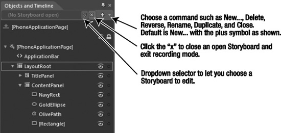
Figure 2–41. Animation management in the Objects and Timeline tool window
Clicking the “plus” sign to create a new Storyboard prompts for a name, name it RectStoryboard, and then click OK. With our new Storyboard, let's create an animation that re-positions and rotates the Rectangle vertically. Select just the Rectangle in the Storyboard editor as shown in Figure 2–42.
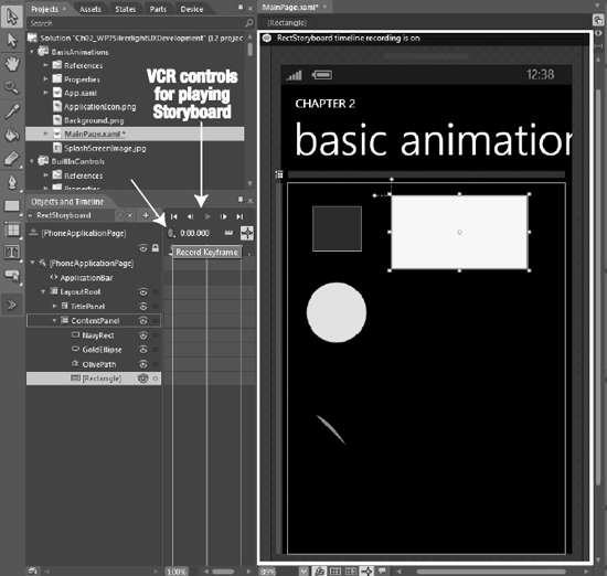
Figure 2–42. Storyboard editor
Clicking the record keyframe button (the small blue oval with the plus sign pointed to by the arrow) adds a keyframe for the selected or multiple selected objects on the Artboard. Recording a Storyboard is a matter of adding keyframes at different points of time, slide the yellow timeline marker to later on the timeline, reposition the object(s), and then click the add keyframe button again. Silverlight will interpret the animation behavior between keyframes. You simply have to position objects and record keyframes to create an animation.
Click the close animation button (the “x” button) to exit timeline recording mode. You don't want to accidentally record random editing as part of an animation.
Open the Chapter 2 BasicAnimation project to explore the Storyboard editor and play the RectStoryboard animation. Clicking on one of the keyframe objects in the timeline brings up the visual keyframe editor as shown in Figure 2–43.
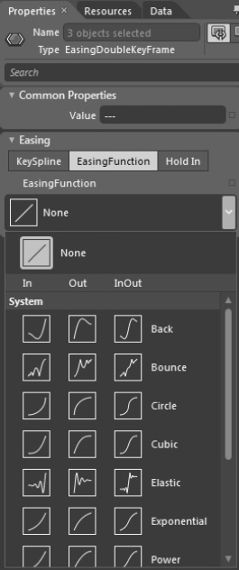
Figure 2–43. Individual Keyframe editor
Select the second keyframe at one second and change the easing from the default straight line to a Cubic Out Easing Function to improve the animation's behavior towards the end of the animation. Select an “In” animation to affect the beginning of the animation. The EasingFunction options provide a quick and easy way to visually identify how the changes will affect the animation.
The other options available are KeySpline and Hold In. The Hold In easing modification holds the animation and then adjusts position very quickly at the end. The KeySpline easing modification allows for more fine grained control by adjusting the yellow control handles to modify the values as shown in Figure 2–44.
Figure 2–44. KeySpline easing customization
Add a TextBlock and then drop the ControlStoryboardAction behavior on to the TextBlock. Leave the EventName to MouseLeftButtonDown and the ControlStoryboardOption to Play. All that has to be changed is the name of the Storyboard. Change it to RectStoryboard, which means that when the TextBlock is clicked or touched on a device, the white Rectangle will animate. Listing 2–11 has the generated XAML from the work in Expression Blend.
Listing 2–11. RectStoryboard Code Fragment
<Storyboard x:Name="RectStoryboard">

  <DoubleAnimationUsingKeyFrames Storyboard.TargetProperty="(UIElement.RenderTransform)

.(CompositeTransform.TranslateY)" Storyboard.TargetName="rectangle">

    <EasingDoubleKeyFrame KeyTime="0" Value="0"/>

    <EasingDoubleKeyFrame KeyTime="0:0:1" Value="198.876">

        <EasingDoubleKeyFrame.EasingFunction>

                <CubicEase EasingMode="EaseOut"/>

        </EasingDoubleKeyFrame.EasingFunction>

    </EasingDoubleKeyFrame>

  </DoubleAnimationUsingKeyFrames>

  <DoubleAnimationUsingKeyFrames Storyboard.TargetProperty="(UIElement.RenderTransform)

.(CompositeTransform.TranslateX)" Storyboard.TargetName="rectangle">

    <EasingDoubleKeyFrame KeyTime="0" Value="0"/>

    <EasingDoubleKeyFrame KeyTime="0:0:1" Value="-35.955">

        <EasingDoubleKeyFrame.EasingFunction>

                <CubicEase EasingMode="EaseOut"/>

        </EasingDoubleKeyFrame.EasingFunction>

    </EasingDoubleKeyFrame>

  </DoubleAnimationUsingKeyFrames>

  <DoubleAnimationUsingKeyFrames Storyboard.TargetProperty="(UIElement.RenderTransform)

.(CompositeTransform.Rotation)" Storyboard.TargetName="rectangle">

    <EasingDoubleKeyFrame KeyTime="0" Value="0"/>

    <EasingDoubleKeyFrame KeyTime="0:0:1" Value="89.949">

        <EasingDoubleKeyFrame.EasingFunction>

                <CubicEase EasingMode="EaseOut"/>

        </EasingDoubleKeyFrame.EasingFunction>

    </EasingDoubleKeyFrame>

  </DoubleAnimationUsingKeyFrames>

</Storyboard>
As you can see in the generated XAML, The animation class is DoubleAnimationUsingKeyFrames. Just like DoubleAnimation, ColorAnimation, and PointAnimation objects, the keyframe animations work on certain types, including Color, Double, Point, and Object with the corresponding keyframe class of ColorAnimationUsingKeyFrames, DoubleAnimationUsingKeyFrames, PointAnimationUsingKeyFrames, and ObjectAnimationUsingKeyFrames.
Each of these classes includes a KeyFrames collection containing keyframe objects that correspond to the type being animated, with an additional wrinkle of the algorithm used to interpolate between keyframes.
The available animation interpolation options are linear, discrete, and splined. Linear interpolation animates at a constant rate for the duration of the segment and is the default. Discrete or Hold interpolation animates at discrete intervals without interpolation over time.
KeySpline interpolation is more similar to linear than discrete but provides the ability to accelerate or decelerate the animation within the duration of a segment. The spline interpolation method has an additional property called KeySpline that defines a Bezier curve to create more realistic effects. The KeySpline property defines a Bezier curve with two control points that go from (0,0) to (1,1). The first control point defines the curve factor of the first half of the curve, and the second control point defines the curve factor for the second half of the curve; the curve factor defines the rate of change or acceleration for the spline keyframe as shown in Figure 2–44.
This concludes my exploration of animations in Blend. I will build on this work throughout the text as needed to demonstrate more advanced concepts such as handling orientation changes in Chapter 6. The next section covers an example of how to create animation in code.
Creating Animations in Code
On Windows Phone, such as when you click a tile or other objects in the phone UI, there is a Tilt animation to give visual feedback that the action was registered. This link provides an overview of the Tile Effect sample in the Windows Phone documentation.
http://msdn.microsoft.com/en-us/library/ff941094(v=VS.92).aspx
This link references a code sample that contains a file named TiltEffect.cs. This link describes how to use the TilfEffect code sample but I'll also cover the steps here:
http://msdn.microsoft.com/en-us/library/ff941108%28v=VS.92%29.aspx
We add TiltEffect.cs code file to the BasicAnimations project and change the namespace to BasicAnimations. We add the xmlns:tilt="clr-namespace:BasicAnimations" namespace to MainPage.xaml. We also add this line to the PhoneApplicationPage element to enable Tilt: tilt:TiltEffect.IsTiltEnabled="True". We also add a ListBox control with a few items to test the TiltEffect. Run the sample to see the TiltEffect in action. Note that it only applies to controls that inherit from ButonBase or ListBoxItem by default. Developers can add additional control types programmatically via code:
TiltEffect.TiltableItems.Add(typeof(“AdditionalControl”))
Application Layout
Windows Phone 7 provides a differentiated user experience with unique interaction models. In Chapter 1 and at the beginning of Chapter 2, I discussed the Metro design language with examples provided by the “Hubs” like People, music+video, and so on. Hub experiences are based on a Panorama control. The built in Outlook application is based on a Pivot control. I cover both the Panorama and Pivot controls in the next two sections.
Panorama
The Panorama control allows Windows Phone developers to build “Hub-like” experiences within their own applications. Generally an application will have one Panorama as the first screen in the application. It is not recommended to have multiple Panorama controls within an application.
Tip Don't forget to take advantage of the new support in the Application Bar in the Panorama control, leveraging the Mode=”Minimized” configuration and setting Background color and Opacity.
Think of the as the magazine cover and table of contents of an application. From a design perspective, a Panorama control should not be jammed-packed with content. Rather an application's Panorama page should highlight top items, favorites, and a menu to navigate to the details of an application hosted on Pivot pages for detailed lists of items or regular pages for individual item details.
The control provides full design-time experience to switch between PanoramaItem panes and visually edit content. The built-in Panorama control matches the look and behavior of the built-in Windows Phone experience, including the gesture-and-flick support.
A Panorama control includes automatic page animations so that transitioning between panes, with different layers moving at different speeds, providing a nice parallax effect. The layers consist of a Title layer at the top left-aligned on the PanoramaItem pane furthest to the left by default. The next layer is the header for the individual PanoramaItem panes.
A Panorama control consists of multiple panes or PanoramaItem objects that span beyond the phone screen horizontally. Generally a Panorama application spans between three and five PanoramaItem objects wide, though four is the recommended maximum. The number of PanoramaItem panes that perform well depends on the content weight in each Pane. Having four PanoramaItem controls richly packed with images and content may well bog down an application with performance issues. Keep an eye on the UI performance counters when working with the Panorama control especially.
Caution Keep an eye on transitions, animations, and scrolling. If transitions and animations cut short or don't render, that's an indication of too much work on the UI thread. Poor scrolling performance is also an indicator. Reduce rendering complexity as well as offload work from the UI thread wherever possible in these situations.
In situations where performance is suffering, developers can hide individual PanoramaItems until content is visible. Dynamically loading and unloading PanoramaItems may help in some cases as well. Pay attention to the graphic performance counters covered previously to see the impact of changes as content is added.
PanoramaItem panes overlap onscreen such that 24 pixels of the pane to the right show on the current pane in view as shown in Figure 2–45. The content to the right of the line with arrows overlaid on to the screenshot is from the PanoramaItem item to the right, giving a hint to swipe right and reveal the content.

Figure 2–45. The “peek” on a PanoramaControl
Notice the straight edges and grid like nature of content on the screen. It is perfectly OK for a PanoramaItem object to extend into two panes such as the “History” section of the music+video Hub on a Windows Phone device. You can set the PanoramaItem control's Orientation property to Horizontal to flow into additional panes and achieve the same effect.
Note Across Windows Phone applications, whether Panorama or not, content should align on the left margin at 24px. In general, examine margin values and try to apply margin to the largest container possible in order to achieve alignment while reducing calculations.
A Panorama can have a background image. It is recommended to keep a Panorama background image less than 2,000 pixels wide and 800 pixels in height. If the image is not 800 pixels in height, the image will be stretched automatically without consideration to aspect ratio. The background image should span the entire width of the Panorama control or be a single-colored background. I demonstrate how to add a custom image as well as correct the Title layer positioning in the next section.
Correct Title Position
We start by creating a new project named PanoramaApp using the Windows Phone Panorama Application project template. This template is a fully functioning application that is based on the Panorama control leveraging sample data.
A 2272 wide x 1704 in height photo from a recent vacation is added to the project. We modify the photo to be 800 pixels in height, maintaining aspect ratio, in Paint.NET to prevent stretching the image when the project is debugged. In the emulator, the image fits nicely but the White text doesn't show very well against the image – it needs more contrast. Open the image in any editing too, such as Paint.NET and add a layer that is 30% Black over the entire of the image to provide more contrast with the White text while allowing the background image to show through when the project is run again in the emulator.
Notice though that, when you swipe over to the second pane, part of the text is clipped in the Title, as shown in Figure 2–46. The lower case ‘l' and ‘I' are clipped at the top.

Figure 2–46. Clipped Title text
To fix this, you can modify the control template in Expression Blend. Select the Panorama control, right-click, select Edit Template, Edit a Copy to create a Style resource. Click OK to the dialog box to go into Style editing mode. Select the TitleLayer in the Objects and Timeline Tool Window. Adjust the Top Margin to slide the title down a bit by changing the value from -76 to -68. When you run the application, this puts the top of the ‘l' right against the top of the screen to fully display the text. Otherwise, the application behaves just as before.
Image as Title and Themes
Let's say you want to put your company name and logo as the title for a Panorama application. Once again, we can edit the Panorama control's template to create a custom Style to support this. First we add a new wrinkle to the sample code. The image for the Title in the Panorama will be an Apress logo. In the spirit of customizing the design to fit the logo, the Panorama background is changed to a solid color to a yellow similar to Apress' logo yellow.
In Expression Blend, the Device tab shown in Figure 2–47 can help you test out your application by changing the Orientation, Theme, and Accent color at design time. It also allows you to choose to preview the application in the emulator or device.
Figure 2–47. Device tab in Expression Blend
Switching the Theme from the default of Dark to Light changes the font from White to Black. The darker font of the Light theme looks much better; however, this is a setting that a user can change on a whim. By default Windows Phone obey the theme settings automatically because of the default control styles applied to controls.
Applications can override the default theme by setting custom values for Foreground color and the like on individual controls but that can be error prone. A better way to do this is to redefine the built-in Metro styles to force the foreground color to Color.Black regardless of theme setting, making the change in effect for the entire application with just a few lines of code.
In the App Application object constructor, remove the pre-defined resource and then add back the resource with modifications. Here is example code to redefine the pre-defined styles:
this.Resources.Remove("PhoneForegroundColor");

this.Resources.Add("PhoneForegroundColor",  Colors.Black);


this.Resources.Remove("PhoneAccentColor");

this.Resources.Add("PhoneAccentColor",Color.FromArgb(200,200,200,200));


this.Resources.Remove("PhoneBackgroundColor");

this.Resources.Add("PhoneBackgroundColor ",  Colors.White);
Now that the resources are redefined to better fit the branding colors, we will now convert the title from a text title to an image. You can make this modification two different ways. The simplest method is to set Panorama.Title to an Image without editing the control template using code like this:
<controls:Panorama.Title>

  <Image Source="images/panorama_title.png" Height="80" Width="420" Margin="-20,80"/>

</controls:Panorama.Title>
The other way to modify the Title is to edit the Panorama's TitleTemplate by right-clicking on the Panorama, select Edit Additional Templates, and then Create Empty… to enter template editing mode in Expression Blend. This updates the Panorama's TitleTemplate to point to a resource:
<controls:Panorama  Background="#FFFFCC00"

TitleTemplate="{StaticResource PanoramaTitleDataTemplate}">
Here is the XAML for PanoramaTitleDataTemplate:
<DataTemplate x:Key="PanoramaTitleDataTemplate">

  <Grid>

    <Image HorizontalAlignment="Left" VerticalAlignment="Top"

       Source="images/panorama_title.png" Margin="-20,80,0,0"/>

  </Grid>

</DataTemplate>
Dynamic Background Image
A nice application customization is to make the Panorama.Background image dynamic. The Title property can be databound to a Brush type, which can be a png image or color Brush or it could simply be set when the page is Loaded or Activated via a background thread. If the Image is downloaded dynamically, you would not want to perform the download in the main UI thread. For the same reason, the background image could be configured on a Timer control as well.
Programmatically Set the Current PanoramaItem
The Panorama control lands on the most left PanoramaItem by default. Many applications implement a navigation menu on the left most pane but want the user to land on a PanoramaItem with content by default. We modify the PanoramaImageTitle project by adding a PanoramaItem to the left of the two existing PanoramaItem objects and mock up a menu.
The new PanoramaItem is named MenuPanoramaItem. The second PanoramaItem with the first set of content is named DefaultPanoramaItem, and will be displayed when the application first loads. A line of code is added to the MainPage_Loaded event to display the DefaultPanoramaItem upon load:
MainPanorama.DefaultItem = DefaultPanoramaItem;
When the user loads the application, it lands on the content page as before, but when wiping right the user will find the second set of content and then swiping again brings up the menu. The circular page scrolling in the Panorama control makes discoverability of the navigation menu via the menu very easy.
Now that I've discussed the Panorama control, let's switch over to the other major navigation control, the Pivot control.
Pivot
Upon initial examination, the Pivot control appears to be very similar to the Panorama control. It has a title and header, and swipes left and right to view additional content. However, upon closer examination, you will find significant differences. Create a new project and name it PivotApp based on the Windows Phone Pivot Application project template to get started. Figure 2–48 shows the default UI for the PivotApp project.

Figure 2–48. Visual differences for a Pivot compared with a Panorama
As you can see in Figure 2–48, there are visual differences compared to the Panorama. Also, note that while the Panorama has “peek” to indicate content to the right, the Pivot control header items show the selected PivotItem in the normal font Foreground color and additional PivotItem controls to the right or left in a faded font Foreground color.
The other significant difference for the Pivot control is that PivotItem objects are dynamically created as they are scrolled to, which is unlike the Panorama control that loads all PanoramaItem objects upfront. This has implications in terms of start-up behavior, page weight, memory consumption, and so on.
Generally, a Pivot control can hold more containers of data than a Panorama control because of the dynamic memory allocation. Also, the Pivot is used more often to present a denser view of content as compared to the Panorama control. I cover additional differences below in the section titled Panorama vs. Pivot.
Pivot Background Image
Like the Panorama control, the Pivot control supports having a Background configured as a Brush (Color or Gradient), as well as an image in the same way that a Panorama can be configured. This includes data binding the background image as well as dynamically loading the image.
Pivot Title Customization
The Pivot Title property can be modified exactly like the Panorama as demonstrated in the section above covering either modifying the TitleTemplate or simply setting the value onto the Title property via element property syntax.
Programmatically Set the Current PivotItem
The Pivot control exposes a SelectedItem property that can be set in order to display a particular PivotItem other than the default leftmost PivotItem. Simply provide a name to the Pivot and PivotItem controls so that they can be identified in code. This code in MainPage_Loaded in MainPage.xaml sets the second PivotItem as the default:
MainPivot.SelectedItem = SecondPivotItem;
In the next section I conclude this chapter with a comparison of the Pivot Control vs. the Panorama control.
Pivot vs. Panorama
As mentioned, the Panorama and Pivot controls have a lot in common in terms of base functionality. Both controls mimic the built-in native control versions in terms of behavior and animations yet provide a simple programming interface with strong customization available. The controls include built-in touch navigation with support for flick and pan for a great navigation experience.
From a programming standpoint both controls function like tab controls with an Items collection for either Panorama or PivotItem controls allowing rich content presentation in compact amount of space. Both controls allow the developer to focus on building the content within the Item control panes, which is usually a matter of customizing a ListBox control, greatly simplifying programming tasks while providing a rich user experience.
The controls themselves can be data bound with content template properties and item container styles for the Title, Header, and Item Panel, and so on. The controls also include full Blend support such as control template modification and visual states.
In terms of usage, the vast majority of Windows Phone Silverlight applications will open to an initial page containing either a Panorama or Pivot control. For rich initial content presentation, the Panorama control is usually the better choice. For denser content presentation, or larger amounts of content, the Pivot control is ideal.
Many applications will consist of a root Panorama control with a PanoramaItem dedicated to a menu. The menu items then use the navigation framework to navigate the UI to sub-pages consisting of Pivot controls or plain old page depending on content needs. The hardware Back button provides navigation back to the root Panorama control and is in incredibly important part of the navigation framework.
Windows Phone 7.5 User Experience Enhancements
From a user experience perspective, Windows Phone 7.5 includes Silverlight 4 compatibility, improving upon Windows Phone 7's Silverlight 3 compatibility. As with Windows Phone 7, Silverlight for Windows Phone 7.5 does not include APIs related to browser integration or other browser related features (i.e., the general programming model remains the same).
New Controls
There are new user experience controls available in Silverlight including the RichTextBox control, though it is a read-only control on Windows Phone. Still, it allows you to display text with character or paragraph formatting, hyperlinks, and inline images.
The RichTextBox control supports a block-based content model where each block is represented by the Paragraph markup. Within each Paragraph block you can have the following inline elements:
SpanBoldItalicUnderlineHyperlinkInlineUIContainer
When you use an inline element from this list, a Run element is implicitly created. You can also use a Run element explicitly to contain unformatted text. A Span element groups other inline content elements together.
Another control also available to developers is the Viewbox control, which will take a single child control (that can contain additional child controls) and stretch it to fit the Viewbox. Not a new control, but the existing WebBrowser control has been updated to support Internet Explorer 9, which includes HTML5 support.
New Controls Demonstration
To test out the new controls, I added a project named New7.1Controls to the Chapter 2 solution. I added a couple of pages to a pages folder, one each for the RichTextBox, IE9 WebBrowser control, and the Viewbox control. I next wired up navigation from MainPage.xaml to the three new pages and dropped a RichTextBox control on RichTextBox.xaml. I set IsReadOnly to false and ran the sample. I received an UnSupportedException because on Windows Phone the RichTextBox control is a read-only control.
You may wonder what the value of this control is if it is a read-only control. There are many instances where the control can be useful, such as the following:
- Display large amounts of text within a native control instead of the
WebBrowsercontrol - Displaying formatted text such as Books using the RTF format
I added some example inline formatted text as shown in Listing 2-12.
Listing 2–12. RichTextFormat with inline Formatted Text
<RichTextBox Name="richTextBox1" Margin="12,0,0,0" >

  <Paragraph>

    This is an RTF document created in WordPad.  RTF documents can contain images as well.  Here is an image of the first edition of this book.

  </Paragraph>

  <Paragraph>

    <InlineUIContainer>

      <Image Source="../BookImage.png" Width="123"/>

    </InlineUIContainer>

    You can wrap text around the Image using an InlineUIContainer.  RTF also supports text formatting such as

    <Bold>Bold</Bold> ,

    <Italic>Italic</Italic>, and

    <Underline>Underline</Underline>, or

    <Bold>

      <Italic>

        <Underline>combine all three together</Underline>

      </Italic>

    </Bold>.

  </Paragraph>

  <Paragraph>

    You can also have an inline hyperlink as well such as this

    <Hyperlink TargetName="_new" NavigateUri="http://www.apress.com/mobile/windows-phone/9781430232193">one</Hyperlink>.

  </Paragraph>

</RichTextBox>
It displays the text shown in Figure 2-49.
Figure 2–49. RichTextBox in the Emulator
One item to note is that the rendered text in the emulator does not quite match what is rendered at run-time on the phone. Figure 2-50 shows the designer with the RichTextBox content.

Figure 2–50. RichTextBox in the Visual Studio Designer
Notice that the space in the format around the commas and periods is not rendered properly, so it is important to check it at run-time on the phone.
The text in the RichTextBox control has a hyperlink at the end that opens up the web page in Internet Explorer 9 for the first edition of this book. For this to work you need to add the TargetName attribute to the Hyperlink element:
<Hyperlink TargetName="_new"

 NavigateUri="http://www.apress.com/mobile/windows-phone/9781430232193">one</Hyperlink>
Just like with any other XAML, you can create the object tree for the RichTextBox content in code. The RichTextBox control provides a nice alternative to having to go to the WebBrowser control when you need formatted text.
The next demo is the Internet Explorer 9 WebBrowser control. It is configured with the Microsoft IE9 mobile test site URL. IE9 supports HTML 5 just like the full browser application but within your Windows Phone applications. The IE9WEbBrowserControl.xaml page in the pages folder shows how the WebBrowser control works by loading the IE9 mobile test drive web site:
http://ie.microsoft.com/testdrive/mobile/
You must also configure this attribute on the WebBrowser control for it to render many of the demos because they require script:
IsScriptEnabled="True"
I cover the browser control in more detail in Chapter 4, but this demo gives a high-level overview of this greatly enhanced control in Windows Phone OS 7.1.
The last demo in the New7.1Controls project is the Viewbox control. The Viewbox control can be used to scale UI by setting its height and width. The Viewbox will force whatever UI it contains to fit within its area, scaling it.
For the demo I put a RichTextBox control with some text inside of the Viewbox control. I added a Slider control to the page UI. The Height of the Viewbox control is data bound to the Slider so that as you adjust the Slider control it scales the RichTextBox content. Listing 2-13 shows the XAML for the UI.
Listing 2–13. RichTextFormat with inline Formatted Text
<Grid x:Name="LayoutRoot" Background="Transparent">

    <Grid.RowDefinitions>

        <RowDefinition Height="Auto"/>

        <RowDefinition Height="*"/>

    </Grid.RowDefinitions>


    <!–TitlePanel contains the name of the application and page title–>

    <StackPanel x:Name="TitlePanel" Grid.Row="0" Margin="12,17,0,28">

        <TextBlock x:Name="ApplicationTitle" Text="CHAPTER TWO" Style="{StaticResource PhoneTextNormalStyle}"/>

        <TextBlock x:Name="PageTitle" Text="viewbox" Margin="9,-7,0,0" Style="{StaticResource PhoneTextTitle1Style}"/>

    </StackPanel>


    <!–ContentPanel - place additional content here–>

    <Grid x:Name="ContentPanel" Grid.Row="1" Margin="12,0,12,0">

  <Viewbox Name="viewbox1" VerticalAlignment="Top" Height="{Binding Value, ElementName=slider}" >

    <RichTextBox x:Name="richTextBox1" Width="330" VerticalAlignment="Top" Height="438">

      <Paragraph><Run Text="This is an RTF document created in WordPad. RTF documents can contain images as well. Here is an image of the first edition of this book."/></Paragraph>

      <Paragraph><InlineUIContainer>

                <Image Source="../BookImage.png" Width="123"/>

        </InlineUIContainer><Run Text=" You can wrap text around the Image using an

InlineUIContainer. RTF also supports text formatting such as "/><Bold><Run Text="Bold"/></Bold>

<Run Text=" , "/><Italic><Run Text="Italic"/></Italic><Run Text=" , and "/><Underline><Run

Text="Underline"/></Underline><Run Text=" , or "/><Bold><Italic><Underline>

<Run Text="combine all three together"/></Underline></Italic></Bold><Run Text="

."/></Paragraph>

      <Paragraph><Run Text="You can also have an inline hyperlink as well such as this

"/><Hyperlink TargetName="_new" NavigateUri="http://www.apress.com/mobile/windows-phone/9781430232193"><Run Text="one"/></Hyperlink><Run Text=" ."/></Paragraph>

    </RichTextBox>

  </Viewbox>

</Grid>

    <Slider x:Name="slider" HorizontalAlignment="Right" Margin="0,8,35,0" Orientation="Vertical" Maximum="607" Value="607" Height="153" />

</Grid>
Figure 2-51 shows the UI zoomed out so as you adjust the Slider control to a smaller value; the content also shrinks.
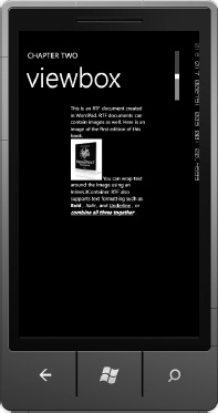
Figure 2–51. ViewboxZoomed UI
For situations where you need to have a scalable user interface, the Viewbox may be the tool of choice for your scenario. In the next section I cover implicit styles.
Implicit Styles
With Silverlight 4 compatibility, you can set a style implicitly similar to what is possible in Cascading Style Sheets (CSS) where you define a style and it can automatically apply to every control of that type. In Silverlight for Windows Phone, an implicit style can be defined that applies to every UIElement of that type.
I create a new project in the Chapter 2 part 2 solution named ImplicitStyles. I drop several TextBlock controls on to MainPage.xaml that we will use to demonstrate how implicit styles work.
The easiest way to quickly create an implicit style is to create a new style for the target control type as you normally would do. Once you are satisfied with the style, edit the XAML to remove the x:Key value for the Style. Next edit the control that you originally created the style for and reset it to no style. Here is an example implicit style:
<Style TargetType="TextBlock">

  <Setter Property="Foreground" Value="Yellow" />

  <Setter Property="FontStyle" Value="Italic"  />

  <Setter Property="FontSize" Value="30"  />

</Style>
Notice that no x:key value is set. Also, the four TextBlock controls added do not have a style set except for one to show how the implicit style is overridden. Figure 2-52 shows the UI.
Figure 2–52. Implicit styles
Implicit styles are an excellent addition to Windows Phone development. One use for implicit styles that can save a lot of time and code is to define them for controls where you must override the theme support. As an example, if you need to keep Font color black regardless of theme, Implicit styles can be used.
Conclusion
In this chapter I provide a sweeping overview of the Silverlight user experience controls starting with layout controls, data binding, and a demonstration of how to take advantage of sample data. I then move on to a discussion of control templates and an overview of animation in Expression Blend. In the next section I cover an overview of the Panorama and Pivot controls, which are the major navigation controls in Windows Phone. I conclude by providing coverage on what's new for Windows Phone now that it has Silverlight 4 compatibility. In the next chapter I will cover input on Windows Phone 7.