
Chapter 13. Making Sense of the Mess
If you’ve made it this far, you’ve successfully asked questions pertinent to your work, screened and recruited participants, and conducted qualitative or quantitative research. There is no rest for the weary researcher, though, and the most integral part of any protocol is just ahead: research analysis, or making sense of the mess, as Abby Covert, author of How to Make Sense of Any Mess, calls it. This chapter will demystify many of the challenges and hurdles pertaining to analysis.
Why Bother with Analysis?
Project teams often want to go from research directly to design and production. The assumption is that because researchers heard the data, they can communicate the key needs verbally or in an email, and the team can save time and money by moving ahead with the project. This overlooks the opportunities analysis offers and creates more challenges than it solves.
By having a formal analysis process, your project team and stakeholders are able to create a shared understanding of what was heard and how your project goals might shift. This also empowers the team to communicate through a common language. Before getting much further in how to analyze research in UX and product design, however, we will highlight how research analysis is performed in fields outside of our own.
Manufacturing and Engineering
This book started with a history of research in Chapter 1 and noted some manufacturing and industrial applications. What we didn’t mention is how to perform research analysis. In automobile design, research is used both for manufacturing efficiencies and safety improvements. Think back to the last car commercial you saw. There is a good chance it featured a crash test dummy (Figure 13-1). While the tests shown in the commercial are staged, they are not for marketing purposes only. Analyzing data from tests informs the design of crumple zones, airbag placement, and emergency detection systems and thus increases our overall safety on the road.

Beyond automobile design, architects and engineers use computers and 3-D models to test the stability of their designs (Figure 13-2). Without structural analysis, the bridge we drive over in our statistically safe car might not handle the weight of rush hour!

Game Design
Stepping closer to our work as product designers, we can look at game design as another avenue for testing and analysis. Often called playtesting, this form of research analysis involves playing out games in real life. For board and card games, this can be as literal as writing out rules on index cards and seeing where the hurdles in gameplay are. For games that will eventually be played out on the screen, this may involve a degree of role-playing (pun intended) and activities similar to bodystorming, mentioned in Chapter 10. In either case, research and testing help the game designers understand where a game could be improved, and data analysis highlights these opportunities.
Analysis in Product Design
In product design, research analysis is based on data captured on the screen or research notes written down. In either case, we don’t get to crash cars, build 3-D models, or play card games. So how do we analyze data in design when we don’t get all these fancy tools? It starts with a data point.
What Is a Data Point?
A data point can be defined as a single thought, concept, or idea. This applies to all forms of research, both qualitative and quantitative. Still, the nuances of what makes a data point vary depending on your method and approach.
Quantitative data points
For quantitative research, such as analytics or surveys, a data point is a single cell in your spreadsheet (Figure 13-3). This may be the time a user spent on a page, the number of times a button was clicked, or whether a user scrolled or not. The key is to keep data points as discrete as possible so that they may be organized, sorted, and visualized in the most effective way possible. It is not uncommon for a survey that spans hundreds of participants or a series of analytics to result in thousands of data points. Fortunately, quantitative data is already digitized and can be analyzed en masse quite efficiently.

Qualitative data points
With qualitative research, the idea of a data point is a little less cut-and-dried. Rather than measuring a 1–10 satisfaction ranking, you have a conversation to filter through. It is often tempting for newer researchers to try to combine many data points into a single note or item.
Just as with quantitative data points, though, it is important to consider how the data might be used later on and to keep data points distinct. For instance, the data point “Participant found checkout flow complex and wished that guest checkout was available like their competitors” is two separate data points: “Participant found checkout flow complex” and “Participant desires guest checkout flow.” With this distinction, it is not uncommon for teams to collect over 100 data points per interview over six 60-minute interviews.
Using Data Points
With hundreds or even thousands of data points floating around, how is anybody supposed to start organizing the information, let alone enact positive change? We will start by outlining a process for coding, or cataloging, the data and discuss theory around organizing the information. We will then share some common methods for analysis.
How to code
While there is no one way to code data points, there are a few common practices. The first step is to create a master list of your participants and assign each a number. Don’t get too creative here—P1, P2, P3, and so on works well for simplicity and for anonymity (Figure 13-4).
Once you have your master sheet, start to enter data in your spreadsheet. While affinity diagrams and other physical tools (covered later in this chapter) are great for collaboration, a central, digital document provides redundancy when the air conditioner kicks on mid-weekend, blowing sticky notes halfway down the hall. When entering data, reserve a column for the participant code and, if you can, the task that the data point refers to. In the next column, write your data point, one per cell. At this stage, your goal is to capture the data from research in a central location. For quantitative research this may be as simple as cleaning up some existing data and creating pivot tables, while for qualitative research this process may take significant effort.

Only after the data has all been coded can you start to analyze at a broader level. To do this, you need to understand how to handle repetitive data points and data points that may apply to multiple themes.
Dealing with repeats
When dealing with hundreds of data points, you will come across the same piece of information multiple times. This is a good thing. When participants repeat information, it’s a sign of a trend. Write down each data point, even if it feels redundant. When you start to visualize the data, tools like Tomer Sharon’s Rainbow Spreadsheets (https://www.smashingmagazine.com/2013/04/rainbow-spreadsheet-collaborative-ux-research-tool) can help show data trends at a glance (Figure 13-5). In this tool, feedback is displayed in rows, and participant codes in columns. Color-coding each participant and highlighting cells where they have a data point makes trends more apparent.
Assigning multiple homes
It is also common for data points to fit in multiple groups throughout analysis. For instance, if a participant said, “The system times me out too quickly,” this might be grouped under a section on security as well as one on session time. If it seems important to list a piece of information twice, then do just that. Whether with a digital tool or analog process, record the note twice and then mark it with a symbol, usually “x2,” to flag it as a duplicate.

Different points of view
The reason you talk to a variety of participants is because each person has a unique perspective. It is your task to take these different opinions and identify common threads and opportunities. One approach to balancing these individual biases is to look at data from many perspectives.
As you organize data, invite team members into the process to see how they interpret the content. After organizing in one particular order, take a picture or save a version and ask what other approaches might be taken. If data is currently organized based on frequency of page visits or time on task, what insights might be revealed if you look instead at user demographics? How might organizing data points by page differ from organizing them by task or function? Each of these perspectives tells a different story, and only by identifying as many as possible can you determine what is most important.
When data points disagree
Because individual participants vary, data points may directly contradict one another. What if one user says a feature is the most important thing to them and another finds it unwieldy? This is an opportunity to ask questions such as: What is the source of the feedback? What distinctions between participants can be tied back to personas and workflows? Or is there something larger impacting your data collection? By answering these questions and looking at the data from various points of view, you’ll get richer interpretations.
Measuring Data Points
Spreadsheets full of data are a starting point for organizing data points. There are a number of pivots and charts you can generate to represent the information you gathered, especially when navigating large sets of quantitative information. While each data set requires its own visualization, some best practices are outlined here:
- Use a valuable scale
If your data is on a 1–5 scale, don’t display the chart on a 1–100 scale.
- Use valuable visualizations
If your data represents parts of a whole, a pie chart may be valuable. But don’t use a pie chart if you are showing growth over time or content that doesn’t compare well.
- Use embellishments sparingly
This is a frustration we have with PowerPoint. It is all too easy to add drop shadows, gradients, and reflections to charts. These embellishments, while adding a sense of flare, at best distract from the data and at worst confuse it. Figure 13-6 showcases some good and bad samples.

Setting Aside Time
The process of coding and cataloging data is time-consuming. While there is no recipe for success, we recommend a minimum of three hours of analysis and collating for every hour of research. For instance, if you conducted 10 one-hour contextual inquiries, plan for a minimum of 30 hours of analysis. This number is a little harder for quantitative research, but it is still common to plan higher than lower.
Using the 30-hour example, the process may be generally divided as follows:
8–12 hours reviewing recordings and coding notes
8–12 hours organizing and reorganizing data
8–12 hours analyzing data
When reviewing recordings and notes, you are in the first stage of coding data. During this time you want to create your individual data points. This often takes slightly longer than the actual sessions, as you might be listening, pausing, and rewinding tapes to capture data correctly. The organizing and reorganizing phase is when you’ll group the different perspectives, duplicates, and contradicting data in various ways. Lastly, analyzing data is the process of identifying the opportunities. This takes a good amount of time, as the broader team is invited for review and collaboration. The rest of this chapter will look at common tools for analysis.
Methods of Analysis
So far we have defined data points and how to go about organizing them differently. Next we’ll cover some of the most common approaches to analyzing that data.
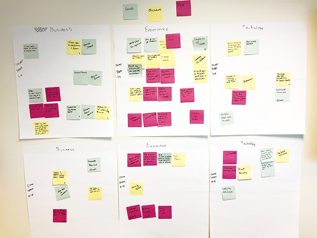
Affinity Diagrams
Affinity diagramming (Figure 13-7) is the process of organizing data into logical groups at a holistic level. While there are many digital tools to affinity diagram, we suggest you first try with stacks of colored sticky notes. Use the following as a primer:
Write each individual data point on a sticky note. Use only one color, usually the default yellow, for this step. If your data points are digitized in an Excel spreadsheet, you can actually purchase printer sheets that make creating the initial stack of notes a breeze. Don’t forget to include the participant code on each sticky.
On a large, clean whiteboard (sticky notes adhere better to whiteboards and glass than paint), take turns reading each data point out loud and stick it to the wall. As you encounter data points that relate to other data points, group them together.
As clusters start to have 10–15 data points each, give them a group title and list that with another colored sticky note. If you find two groups are related, use a third color for a section label.
Don’t be afraid of reorganizing the content as you move along. Sticky notes are cheap.
At the end of the process, take a picture and digitize the diagram in an Excel sheet or other visualization for reflection later on.
Quadrant Mapping
Where affinity diagramming takes data points and groups them in an open manner, quadrant mapping maps data to an established grid. One common approach is called SWOT analysis. SWOT stands for strengths, weaknesses, opportunities, and threats. Draw this 2×2 grid on the wall, and with the same sticky notes as before, read each one aloud and determine which of the four quadrants it fits into (Figure 13-8). For instance, improving the guest checkout flow is an opportunity for any commerce platform, whereas an on-demand offering may be a threat to a brick-and-mortar store. Approaches like this are particularly helpful when you’re meeting with business leaders to impact strategic roadmaps.

For more information on quadrant mapping techniques, see Gamestorming by Sunni Brown, James Macanufo, and Dave Gray (O’Reilly).

In a few words, describe your job.
As an information architect, it is my job to help organizations make sense of messes of language and structure.
How do you approach research analysis?
When I start a new project to improve the language and structure of a product, the organization I am working within doesn’t always have a clear understanding of what is actually wrong with what they have. Instead, they have a hunch (or data) that isn’t serving them as well as they wish it were.
The first step I take is to reverse-engineer diagrams of the current language and structure so it can be “seen” and discussed. This is like an architect drawing a blueprint of an existing space in order to discuss a remodel.
One of the most important diagrams that I often make is an association map of language. By interviewing stakeholders and users I get the conversational language used to describe the product. Then I start to “mine” for language used within things like the organization’s websites, marketing materials, help documentation, customer service scripts, and database schemas. By making an association map of all of these sources, I can show how inconsistencies of language are getting in the way of clarity.
Recently, I was working with a startup that had acquired two other startups. By creating a language association map, I was able to show that the organization had up to 14 labels for the same or similar concepts. This was keeping them from being clear with their customers, made onboarding of new employees more difficult, and created technical debt that was slowing down projects all over the organization. At the time I made this map, the startup was preparing to translate their product into five languages as a first step into becoming a globally available product. Can you imagine how much more complex that would be if they kept those 14 ways of saying the same thing?
Frequency Mapping
Frequency mapping is an approach best suited for quantitative data or open questions from surveys. Often referred to as tag clouds or word clouds, frequency maps represent the repetition of data visually. For open questions from surveys, this technique can represent the frequency of issues (Figure 13-9), while with ranked data it can show the importance of features.

For more information, see Practical Statistics for Data Scientists by Peter Bruce and Andrew Bruce (O’Reilly).
Spectrum Analysis
Spectrum analysis is the process of looking at the context surfaced by your data points. Rather than organize data points as a collective group, with this approach you refer back to your customer journeys, personas, and workflows and map data points to the point in the process you are looking to study. When you analyze data in this way, opportunities and challenges literally jump out of the page to you. This approach can even be done digitally, through annotated PDFs (Figure 13-10).
For more information on spectrum analysis, see Shlomo Goltz’s article “A Closer Look at Personas: A Guide to Developing the Right Ones (Part II)” (https://www.smashingmagazine.com/2014/08/a-closer-look-at-personas-part-2).

Insights Inform the Design Process
All of these processes of analysis are valuable, but you might be asking, “What does this offer me?” Ultimately, analysis leads to insights, and insights inform the design process.
Design
Think back to the beginning of a new project. You probably felt a bit naïve about the details of that domain. Having completed some research, you now have a greater understanding of what challenges lie ahead. This understanding comes from research analysis, and those data-supported insights you’ve gathered inform your design decisions. Design direction is easier to discuss and defend with your client when you have data from real users to refer to. This prevents design justifications like “because I like it.”
Strategy
Ultimately, a business has a strategic plan for success. By asking good questions of your product’s functions, you can answer, “Does the product meet our business needs and how?” A business goal to increase revenue threefold, or increase customer retention, is measurable only against analysis from research.
Communicating Insights
Informing design and strategy is an important part of research analysis. But how does this all happen? It starts by crafting a story about the research, the goals, and the opportunities. This is how we communicate insights. Our next chapter will focus on this in more detail.
Exercise: Performing a Candyland Analysis
This exercise looks at your organization skills. Rather than working with project data, though, you’re going to use candy.
Gather your candy.
Rather than purchasing dozens of candy bars, refer to USA Today’s curated list of the most popular candies (http://content.usatoday.com/communities/popcandy/post/2011/02/list-the-top-50-candies-of-all-time/1#.V8ZAfpMrLOY).
Organize the candy.
Think about how you can organize the candy in the list. On a whiteboard, sticky notes, or other tool, take 5–10 minutes to organize the candy list.
Pause and reflect.
Look back to how you organized the candy. Was it by size? Satisfaction? Flavor (e.g., fruity or chocolatey)? Personal preference?
Change your perspective.
Now choose another lens to review the data points from, and take another 5–10 minutes to reorganize the data. How have your insights changed between the first and second round of organization?
Parting Thoughts
Data analysis can often be daunting and time-consuming. This is no reason to shy away from it, though. Some of your best “aha” moments will come after hours of sorting through data. Rather than fight the tedium of analysis, make it a game. Invite your team members, take breaks, and engage in the process in a social and collaborative way. By doing this, you not only invite other perspectives into the analysis but also open yourself up to critique and opportunities to learn from your entire team. Research shouldn’t be done alone, and neither should analysis. While analyzing, keep in mind the story you want to tell, as we continue to our next chapter.