
Chapter 9. Collection Views
This chapter has been revised for Early Release. It reflects iOS 14, Xcode 12, and Swift 5.3. But screenshots have not been retaken; they still show the Xcode 11 / iOS 13 interface.
A collection view (UICollectionView) is a UIScrollView that generalizes the notion of a table view (Chapter 8). Where a table view has rows, a collection view has items. (UICollectionView extends IndexPath so that you can refer to its item property instead of its row property, though in fact they are interchangeable.)
If you mentally substitute for items for rows, you’ll find that, knowing about table views, you know a great deal about collection views already:
-
The items are portrayed by reusable cells. These are UICollectionViewCell instances. If the collection view is instantiated from a storyboard, you can get reusable cells from the storyboard; otherwise, you’ll register a class or nib with the collection view.
-
A collection view can clump its items into sections.
-
A collection view has a data source (UICollectionViewDataSource) and a delegate (UICollectionViewDelegate), and it’s going to ask the data source Three Big Questions:
-
numberOfSections(in:) -
collectionView(_:numberOfItemsInSection:) -
collectionView(_:cellForItemAt:)
Alternatively, starting in iOS 13, you can use a UICollectionViewDiffableDataSource.
-
-
To answer the third Big Question, your data source will obtain a reusable cell by dequeuing it from the collection view:
-
dequeueReusableCell(withReuseIdentifier:for:)
-
-
A collection view allows the user to select a cell, or multiple cells. The delegate is notified of highlighting and selection.
-
Your code can rearrange the cells, inserting, moving, and deleting cells or entire sections, with animation.
-
If the delegate permits, the user can long press a cell to produce a menu, or to rearrange the cells by dragging.
-
You can scroll your collection view in code by calling
scrollToItem(at:at:animated:). The collection view’s delegate is its scroll view delegate (and UICollectionViewDelegate conforms to UIScrollViewDelegate). -
A collection view can have a refresh control.
-
You can manage your UICollectionView through a UICollectionViewController.
A collection view section can have a header and footer, but the collection view itself does not call them that; instead, it generalizes its subview types into cells, on the one hand, and supplementary views, on the other. A supplementary view is just a UICollectionReusableView, which is UICollectionViewCell’s superclass. A supplementary view is associated with a kind, an arbitrary string that categorizes it however you like; you can have a header as one kind, a footer as another kind, and anything else you can imagine. Supplementary views behave quite similarly to section header or footer views in a table view:
-
Supplementary views are reusable.
-
You are asked for a supplementary view in a data source method (not a delegate method):
-
collectionView(_:viewForSupplementaryElementOfKind:at:)
-
-
In that method, your data source will obtain a reusable supplementary view by dequeuing it from the collection view:
-
dequeueReusableSupplementaryView(ofKind:withReuseIdentifier:for:)
-
The big difference between a table view and a collection view is how the collection view lays out its elements (cells and supplementary views). A table view lays out its cells in just one way: a vertically scrolling column, where the cell widths are the width of the table view, their heights are dictated by the table view or the delegate, and the cells are touching one another. A collection view has no such rules. In fact, a collection view doesn’t lay out its elements at all! That job is left to another object — a collection view layout.
A collection view layout is an instance of a UICollectionViewLayout subclass. It is responsible for the overall layout of the collection view that owns it. It does this by answering some Big Questions of its own, posed by the collection view; the most important are these:
collectionViewContentSize-
How big is the entire content? The collection view needs to know this, because it is a scroll view (Chapter 7), and this will be the content size of the scrollable material that it will display.
layoutAttributesForElements(in:)-
Where are the elements to be positioned within the content rectangle? The layout attributes, as I’ll explain in more detail in a moment, are bundles of positional information.
To answer these questions, the collection view layout needs to ask the collection view some questions as well. It will want to know the collection view’s bounds; also, it will probably call such methods as numberOfSections and numberOfItems(inSection:), and the collection view, in turn, will get the answers to those questions from its data source.
The collection view layout can assign the elements any positions it likes, and the collection view will faithfully draw them in those positions within its content rectangle. That seems very open-ended, and indeed it is. To get you started, there are two built-in UICollectionViewLayout subclasses:
-
UICollectionViewFlowLayout
-
UICollectionViewCompositionalLayout (introduced in iOS 13)
UICollectionViewFlowLayout arranges its cells in something like a grid. The grid can be scrolled either horizontally or vertically, but not both, so it’s a series of rows or columns. Through properties and a delegate protocol of its own (UICollectionViewDelegateFlowLayout), the UICollectionViewFlowLayout instance lets you provide instructions about how big the cells are and how they should be spaced. It defines two supplementary view kinds to let you give each section a header and a footer.
Figure 9-1 shows a collection view, laid out with a flow layout, from my Latin flashcard app. This interface lists the chapters and lessons into which the flashcards are divided, and allows the user to jump to a desired lesson by tapping it. Originally, I was using a table view to present this list; when collection views were introduced (in iOS 6), I adopted one for this interface, and you can see why. Instead of a lesson item like “1a” occupying an entire row that stretches the whole width of a table, it’s just a little rectangle; in landscape orientation, the flow layout fits about half a dozen of these rectangles into a line for me. So a collection view is a much more compact and appropriate way to present this interface than a table view.
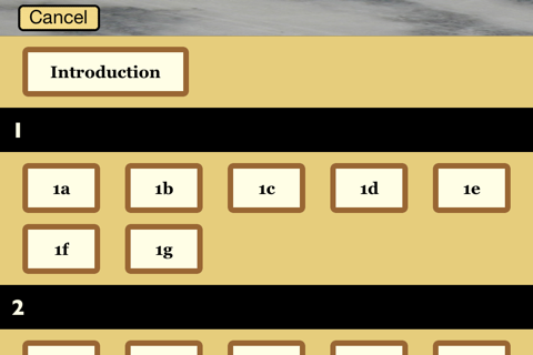
Figure 9-1. A collection view in my Latin flashcard app
If UICollectionViewFlowLayout doesn’t quite meet your needs, you can subclass it. Alternatively, you can subclass UICollectionViewLayout itself to create a layout from scratch. Starting in iOS 13, there’s a third possibility: you can use a UICollectionViewCompositionalLayout. This is a powerful and flexible layout that does all the heavy lifting for you; it can do everything a flow layout can do, and much more.
Collection View Classes
Here’s a conceptual overview of the main classes associated with UICollectionView; I don’t recite all the properties and methods of each class, because you can gather them from the documentation:
- UICollectionViewController
-
A UIViewController subclass. Like a table view controller, UICollectionViewController is convenient if a UICollectionView is to be a view controller’s view, but using it is not required. It is the delegate and data source of its
collectionViewby default. The designated initializer requires you to supply a collection view layout instance, which will be assigned to the collection view as its layout. In the nib editor, there is a Collection View Controller nib object, which comes with a collection view. - UICollectionView
-
A UIScrollView subclass. Its capabilities are parallel to those of a UITableView, as I outlined in the preceding section. It has a
backgroundColor(because it’s a view) and optionally abackgroundViewin front of that. Its designated initializer requires you to supply a collection view layout instance, which will be itscollectionViewLayout. In the nib editor, there is a Collection View nib object, which comes with a Collection View Flow Layout by default; you can change the collection view layout class with the Layout pop-up menu in the Attributes inspector. - UICollectionViewLayoutAttributes
-
A value class (a bunch of properties) tying together an element’s
indexPathwith the specifications for how and where it should be drawn. These specifications are reminiscent of view or layer properties, with names likeframe,center,size,transform, and so forth. Instances of this class function as the mediators between the collection view layout and the collection view; they are what the collection view layout passes to the collection view to tell it where all the elements of the view should go. - UICollectionViewCell
-
An extremely minimal view class. It has an
isHighlightedproperty and anisSelectedproperty. It has acontentView, aselectedBackgroundView, abackgroundView, and of course (since it’s a view) abackgroundColor, layered in that order, just like a table view cell; everything else is up to you — except that, new in iOS 14, a UICollectionViewCell hascontentConfigurationandbackgroundConfigurationproperties (“Apple’s Cell Configuration Architecture”). If you start with a collection view in a storyboard, you get prototype cells, which you obtain by dequeuing. Otherwise, you obtain cells through registration and dequeuing. - UICollectionReusableView
-
The superclass of UICollectionViewCell — so it is even more minimal! This is the class of supplementary views such as headers and footers. (You can use UICollectionViewCell as the supplementary view class if you like.) If you’re using a flow layout in a storyboard, you are given header and footer prototype views, which you obtain by dequeuing; otherwise, you obtain reusable views through registration and dequeuing.
- UICollectionViewLayout
-
The layout workhorse class for a collection view. A collection view cannot exist without a collection view layout instance! As I’ve already said, the collection view layout knows how much room all the subviews occupy, and supplies the
collectionViewContentSizethat sets thecontentSizeof the collection view, qua scroll view. In addition, the collection view layout must answer questions from the collection view, by supplying a UICollectionViewLayoutAttributes object, or an array of such objects, saying where and how elements should be drawn. These questions come in two categories:- Static attributes
-
The collection view wants to know the layout attributes of an element (an item or supplementary view), specified by the element’s index path, or of all elements within a given rect.
- Dynamic attributes
-
The collection view is inserting or removing elements. It asks for the layout attributes that an element, specified by index path, should have as insertion begins or removal ends. The collection view can animate between the element’s static attributes and these dynamic attributes. If an element’s dynamic layout attributes
alphais0as removal ends, the element will appear to fade away as it is removed.
The collection view also notifies the collection view layout of pending changes through some methods whose names start with
prepareandfinalize. This is another way for the collection view layout to participate in animations, or to perform other kinds of preparation and cleanup.UICollectionViewLayout is an abstract class; to use it, you must subclass it, or start with a built-in subclass, either UICollectionViewFlowLayout or UICollectionViewCompositionalLayout.
Warning
When you choose File → New → File and make a new UICollectionViewController, the template’s viewDidLoad registers the UICollectionViewCell class with the collection view: self.collectionView!.register(UICollectionViewCell.self.... As a result, if you design a prototype cell in the storyboard, it will not be loaded; you’ll get empty cells instead. The solution is to delete that line of code.
Flow Layout
UICollectionViewFlowLayout is a concrete subclass of UICollectionViewLayout. It lays out items in a grid that can be scrolled either horizontally or vertically, and it defines two supplementary element types to serve as the header and footer of a section. A collection view in the nib editor has a Layout pop-up menu that lets you choose a Flow layout, and you can configure the flow layout in the Size inspector; in a storyboard, you can even add and design a header and a footer.
A flow layout has the following configurable properties:
-
scrollDirection, either.verticalor.horizontal -
sectionInset(the margins for a section); starting in iOS 11, thesectionInsetReferenceproperty lets you specify where the inset is measured from (.fromContentInset,.fromLayoutMargins, or.fromSafeArea) -
itemSize, along withminimumLineSpacing(spacing in the scroll direction) andminimumInteritemSpacing(spacing in the other direction) -
headerReferenceSize,footerReferenceSize -
sectionHeadersPinToVisibleBounds,sectionFootersPinToVisibleBounds; iftrue, they cause the headers and footers to behave like table view section headers and footers when the user scrolls
At a minimum, if you want to see any section headers, you must assign the flow layout a headerReferenceSize, because the default is .zero. Otherwise, you get initial defaults that will at least allow you to see something immediately, such as an itemSize of (50.0,50.0) along with reasonable default spacing between items and rows (or columns).
UICollectionViewFlowLayout also defines a delegate protocol of its own, UICollectionViewDelegateFlowLayout. The flow layout automatically treats the collection view’s delegate as its own delegate. The section margins, item size, item spacing, line spacing, and header and footer size can be set for individual sections, cells, and supplementary views through this delegate.
Warning
You must explicitly declare that the collection view’s delegate adopts the UICollectionViewDelegateFlowLayout protocol. Otherwise, your flow layout delegate methods won’t be called.
To illustrate, here’s how the view shown in Figure 9-1 is created. I have a UICollectionViewController subclass, LessonListController. Every collection view must have a collection view layout, so LessonListController’s designated initializer initializes itself with a UICollectionViewFlowLayout:
init(terms data:[Term]) {
    // ... other self-initializations here ...
    let layout = UICollectionViewFlowLayout()
    super.init(collectionViewLayout:layout)
}
In viewDidLoad, we give the flow layout its hints about the sizes of the margins, cells, and headers, as well as registering for cell and header reusability:
let headerID = "LessonHeader"
let cellID = "LessonCell"
override func viewDidLoad() {
    super.viewDidLoad()
    let layout = self.collectionView.collectionViewLayout
        as! UICollectionViewFlowLayout
    layout.sectionInset = UIEdgeInsets(top:10, left:20, bottom:10, right:20)
    layout.headerReferenceSize = CGSize(0,40)
    layout.itemSize = CGSize(70,45)
    self.collectionView.register(
        UINib(nibName: self.cellID, bundle: nil),
        forCellWithReuseIdentifier: self.cellID)
    self.collectionView.register(
        UICollectionReusableView.self,
        forSupplementaryViewOfKind: UICollectionView.elementKindSectionHeader,
        withReuseIdentifier: self.headerID)
    self.collectionView.backgroundColor = .myGolden
    self.collectionView.contentInsetAdjustmentBehavior = .always
}
My data model is just like the model for the table of U.S. states I’ve been using throughout this chapter. (What are the chances of that?) The difference is that my rowData, instead of being an array of Strings, is an array of Terms. (Term is basically a custom value class.) The first two of the Three Big Questions are extremely familiar:
override func numberOfSections(
    in collectionView: UICollectionView) -> Int {
        return self.sections.count
}
override func collectionView(_ collectionView: UICollectionView,
    numberOfItemsInSection section: Int) -> Int {
        return self.sections[section].rowData.count
}
The third of the Three Big Questions creates and configures the cells. In a .xib file, I’ve designed the cell with a single subview, a UILabel with tag 1; if the text of that label is still "Label", the cell has come freshly minted from the nib and needs further initial configuration. Among other things, I assign each new cell a selectedBackgroundView and give the label a highlightedTextColor, to get an automatic indication of selection:
override func collectionView(_ collectionView: UICollectionView,
    cellForItemAt indexPath: IndexPath) -> UICollectionViewCell {
        let cell = collectionView.dequeueReusableCell(
            withReuseIdentifier: self.cellID, for: indexPath)
        let lab = cell.viewWithTag(1) as! UILabel
        if lab.text == "Label" {
            lab.highlightedTextColor = .white
            cell.backgroundColor = .myPaler
            cell.layer.borderColor = UIColor.brown.cgColor
            cell.layer.borderWidth = 5
            cell.layer.cornerRadius = 5
            let v = UIView()
            v.backgroundColor = UIColor.blue.withAlphaComponent(0.8)
            cell.selectedBackgroundView = v
        }
        let term = self.sections[indexPath.section].rowData[indexPath.item]
        lab.text = term.lesson + term.sectionFirstWord
        return cell
}
The data source is also asked for the supplementary element views; in my case, these are the section headers. I configure the header entirely in code. Again I distinguish between newly minted views and reused views; the latter will already have a single subview, a UILabel:
override func collectionView(_ collectionView: UICollectionView,
    viewForSupplementaryElementOfKind kind: String,
    at indexPath: IndexPath) -> UICollectionReusableView {
        let v = collectionView.dequeueReusableSupplementaryView(
            ofKind: kind,
            withReuseIdentifier: self.headerID, for: indexPath)
        if v.subviews.count == 0 {
            let lab = UILabel(frame:CGRect(10,0,100,40))
            lab.font = UIFont(name:"GillSans-Bold", size:20)
            lab.backgroundColor = .clear
            v.addSubview(lab)
            v.backgroundColor = .black
            lab.textColor = .myPaler
        }
        let lab = v.subviews[0] as! UILabel
        lab.text = self.sections[indexPath.section].sectionName
        return v
}
As you can see from Figure 9-1, the first section is treated specially — it has no header, and its cell is wider. I take care of that with two UICollectionViewDelegateFlowLayout methods:
func collectionView(_ collectionView: UICollectionView,
    layout lay: UICollectionViewLayout,
    sizeForItemAt indexPath: IndexPath) -> CGSize {
        var sz = (lay as! UICollectionViewFlowLayout).itemSize
        if indexPath.section == 0 {
            sz.width = 150
        }
        return sz
}
func collectionView(_ collectionView: UICollectionView,
    layout lay: UICollectionViewLayout,
    referenceSizeForHeaderInSection section: Int) -> CGSize {
        var sz = (lay as! UICollectionViewFlowLayout).headerReferenceSize
        if section == 0 {
            sz.height = 0
        }
        return sz
}
When the user taps a cell, I hear about it through the delegate method collectionView(_:didSelectItemAt:) and respond accordingly. And that’s the entire code for managing this collection view!
Warning
When you create a new collection view (or collection view controller) with a flow layout in the nib editor, its Estimate Size pop-up menu in the Size inspector is set to Automatic, and the prototype cell’s Size pop-up menu is set to Automatic as well. This means that cells are self-sizing by default; they expect to be sized from the inside out by their contents, using autolayout. If that’s not what you’re expecting, your cells may appear at the wrong size, and implementing the flow layout delegate method collectionView(_:layout:sizeForItemAt:) might not help. Try changing one or both of those pop-up menus to fix it.
Compositional Layout
In iOS 13, a new concrete UICollectionViewLayout subclass was introduced — UICollectionViewCompositionalLayout. It can do everything UICollectionViewFlowLayout can do; even more important, it can achieve layouts that previously required you to write a custom UICollectionViewLayout subclass from scratch.
In general, you construct a compositional layout by building up a description from the smallest element to the largest (hence the term compositional). The elements are:
- item (NSCollectionLayoutItem)
- group (NSCollectionLayoutGroup)
-
A single unidimensional set of items, either horizontal or vertical. Think of it as a single row or column. In most layouts, a group will run along the other axis from the layout’s scrolling direction. If a layout scrolls vertically, a group will typically be horizontal and will represent one row of cells.
- section (NSCollectionLayoutSection)
-
A section repeats a group. If a group is a row, a section may contain many rows. Your data may have one or more sections. Sections can be laid out differently from one another.
- layout (UICollectionViewCompositionalLayout)
-
The object that will actually be handed to the collection view as its layout.
Size, Count, Spacing, and Insets
As you construct a compositional layout, you must specify the size of a section’s group, the size of an item in the group, and the count of items per group. These are the most important determinants of how the cells will be laid out in the section; further refinements are provided through various spacing and inset properties.
Size is specified using the NSCollectionLayoutSize initializer init(widthDimension:heightDimension:). A dimension is an NSCollectionLayoutDimension, which has four class methods:
absolute-
A definite number of points.
fractionalWidthfractionalHeight-
A proportion, between 0 and 1, of the container. For an item, the container is the group. For a group, the container is the collection view bounds. These are just numbers, so it is legal for the
heightDimension:to be afractionalWidthand vice versa. estimated-
A number of points, but you are inviting the layout engine to measure cells using internal autolayout constraints to determine the actual value. A common situation is that one dimension of a size is fixed while the other is estimated.
A group is instantiated using the horizontal or vertical class method. You supply parameters in two different ways:
horizontal(layoutSize:subitems:)vertical(layoutSize:subitems:)-
The group repeats one or more item types, as many per group as will fit. Suppose the
subitems:consists of two item types, one wide and one narrow; then the layout will alternate wide item with narrow item, filling a group before going on to the next group. horizontal(layoutSize:subitem:count:)vertical(layoutSize:subitem:count:)-
The group repeats a single item type, a fixed number of times per group. The items will be equally sized, possibly overriding the item’s own size in that dimension. For instance, you can specify that there should be exactly three equally sized items per group.
Apple’s own examples illustrate some basic combinations of item size, group size, and item count; these are all vertically scrolling collection views, so a group is a row:
-
The item has width dimension fractional width
1and height dimension fractional height1. The group has width dimension fractional width1and height dimension absolute44, and thesubitems:initializer is used.So each row is as wide as the collection view and 44 points tall, with one item per row, filling the row. It looks rather like a table view.
-
Like the previous layout, but the group’s
subitem:count:initializer is used with acount:of2.So there are exactly two cells per row and they have equal widths; the item’s
layoutSize:width dimension is effectively ignored. -
The item has width dimension fractional width
0.2and height dimension fractional height1. The group has width dimension1and height dimension fractional width0.2, and thesubitems:initializer is used.So an item’s width is one-fifth the width of the collection view, and a row’s height is that same value — and an item’s height fills it, resulting in a grid of square cells, five per row.
Further size refinements are applied through spacing and insets properties of the item, group, and section:
- Item
edgeSpacing -
An NSLayoutEdgeSpacing object with
leading:,top:,trailing:, andbottom:parameters. A parameter is eithernilor an NSCollectionLayoutSpacing object, instantiated through a class function, eitherflexibleorfixed. For instance, in a vertically scrolling layout whose group uses thesubitems:initializer, if there is room for only one cell per group, then aleading:andtrailing:spacing of.flexible(0)will center the cell horizontally. - Group
interItemSpacing -
The distance between items within the group. This is also an NSCollectionLayoutSpacing, so it can be
flexible, causing the items to be spaced out equally and justified at both extremes. - Section
interGroupSpacing -
A CGFloat determining absolutely the distance between rows (or columns) in the section.
- Layout
interSectionSpacing -
A CGFloat. A property, not of the layout itself, but of its
configuration, a UICollectionViewCompositionalLayoutConfiguration (a value class). The configuration is also how you specify the layout’sscrollDirection; the default is.vertical, so if that’s what you want, and if you don’t need to set the section spacing, you might not need a layout configuration. - Item, group, or section
contentInsets -
An NSDirectionalEdgeInsets (Chapter 1). Content insets are applied after the sizing and layout have been worked out. In Apple’s example of a grid with 5 square cells per row, if a positive
contentInsetsis applied to the item, there are still five cells per row, each in a square area, but a cell itself is inset within that square area. (AnycontentInsetsalong anestimateddimension are ignored.)
You now know almost enough to achieve the layout shown in Figure 9-1 as a compositional layout! I haven’t talked yet about section headers, and the first section’s single item needs to be wider than all other items; but if we concentrate on just the items of the remaining sections, we can construct the layout like this:
private static func prepareLayout() -> UICollectionViewLayout {
    let itemSize = NSCollectionLayoutSize(
        widthDimension: .absolute(70),
        heightDimension: .fractionalHeight(1))
    let item = NSCollectionLayoutItem(layoutSize: itemSize)
    let groupSize = NSCollectionLayoutSize(
        widthDimension: .fractionalWidth(1),
        heightDimension: .absolute(45))
    let group = NSCollectionLayoutGroup.horizontal(
        layoutSize: groupSize, subitems: [item])
    group.interItemSpacing = .flexible(10)
    group.contentInsets = NSDirectionalEdgeInsets(
        top: 0, leading: 20, bottom: 0, trailing: 20)
    let section = NSCollectionLayoutSection(group: group)
    let vSpace = CGFloat(10)
    section.contentInsets = NSDirectionalEdgeInsets(
        top: vSpace, leading: 0, bottom: vSpace, trailing: 0)
    section.interGroupSpacing = vSpace
    let layout = UICollectionViewCompositionalLayout(section: section)
    return layout
}
Here’s how that compositional layout mimics the flow layout shown in Figure 9-1:
- Flow behavior
-
The compositional layout lays out its rows like a flow layout, because:
-
The group uses the
subitems:initializer, meaning that a row consists of as many cells as will fit. -
The group uses
.flexibleinteritem spacing, which causes the cells to be justified at the leading and trailing edges with equal spacing between them.
-
- Cell size
-
In the flow layout, we set an
itemSizeofCGSize(70,45). In the compositional layout, the same effect is achieved like this:-
An item has width dimension absolute
70and height dimension fractional height1. -
The group has width dimension fractional width
1and height dimension absolute45.
-
- Margins
-
The flow layout has a
sectionInsetwith a UIEdgeInsets value(10.0,20.0,10.0,20.0). In the compositional layout:-
Horizontally, each group has leading and trailing margins.
-
Vertically, each section has top and bottom margins along with spacing between the rows.
-
Supplementary Items
In a compositional layout, supplementary items come in two main categories:
- NSCollectionLayoutSupplementaryItem
-
An item or group’s
supplementaryItems. An item’s supplementary items must be declared in the item initializer; a group has a settablesupplementaryItemsproperty.The initializer is
init(layoutSize:elementKind:containerAnchor:itemAnchor:):-
The
elementKind:is an arbitrary string. -
The anchors are NSCollectionLayoutAnchor objects; the item anchor is optional. An anchor has
edges(an NSDirectionalRectEdge) along with an optionalabsoluteOffsetorfractionalOffset, which is a CGPoint. An NSDirectionalRectEdge is an option set consisting of.top,.trailing,.leading, and.bottom.
A supplementary item also has a
zIndexfor front-to-back layering. Apple’s example of an item’s supplementary item has edges[.top, .trailing]and afractionalOffsetofCGPoint(x:0.5,y:-0.5); that’s a badge centered at the top right corner. -
- NSCollectionLayoutBoundarySupplementaryItem
-
An NSCollectionLayoutSupplementaryItem subclass. Can be applied to a section or a layout:
-
A section has a settable
boundarySupplementaryItemsproperty. -
For a layout, its
configurationhas aboundarySupplementaryItemsproperty.
A boundary supplementary item has an
alignmentwhich is an NSRectAlignment, along with a possibleabsoluteOffset. The NSRectAlignment is an enum specifying a single edge or corner:.top,.topLeading,.leading, and so on; a header in a vertically scrolling layout would be attached to the section’s.top. If the supplementary item’sextendsBoundaryistrue(the default), it lies outside what would otherwise be the layout size of its container. There is also apinToVisibleBoundsproperty so that a section header or footer can behave like a table header or footer. -
We are now ready to add section headers to the Latin LessonListController example! As we construct the section, we insert these lines:
let headerSize = NSCollectionLayoutSize(
    widthDimension: .fractionalWidth(1),
    heightDimension: .absolute(40))
let header = NSCollectionLayoutBoundarySupplementaryItem(
    layoutSize: headerSize, elementKind: "header", alignment: .top)
section.boundarySupplementaryItems = [header]
I’ve used an arbitrary elementKind: string "header". Its significance is that I use the same string to register the reusable view class with the collection view:
self.collectionView.register(
    UICollectionReusableView.self,
    forSupplementaryViewOfKind: "header",
    withReuseIdentifier:self.headerID)
Our implementation of collectionView(_:viewForSupplementaryElementOfKind:at:) is called, and section headers now appear in the layout! Our compositional layout now looks almost identical to the original flow layout in Figure 9-1. Only the first section is wrong; I’ll deal with that now.
Multiple Section Layouts
In the layout shown in Figure 9-1, the first section needs to be special. It should have no section header, and its single cell needs to be wider than the subsequent cells. With a flow layout, we took care of these differences with two UICollectionViewDelegateFlowLayout methods. With a compositional layout, we handle section differences by changing the layout initialization slightly. Currently, we have this:
let itemSize = NSCollectionLayoutSize( // ...
// ...
let section = NSCollectionLayoutSection(group: group)
// ...
let layout = UICollectionViewCompositionalLayout(section: section)
return layout
We change it to this:
let layout = UICollectionViewCompositionalLayout { index, env in
    let itemSize = NSCollectionLayoutSize( // ...
    // ...
    let section = NSCollectionLayoutSection(group: group)
    // ...
    return section
}
return layout
Instead of the UICollectionViewCompositionalLayout initializer init(section:), we are now using init(sectionProvider:). The parameter is a section provider function that is called for each section. Each time, it is fed the index number of that section, and returns the section. So the section we construct can differ depending on the index number! The starred comments mark the lines where we behave differently; if this is the first section, an item is 150 points wide instead of 70 points wide, and we don’t attach the header:
let layout = UICollectionViewCompositionalLayout { index, env in
    let itemSize = NSCollectionLayoutSize(
        widthDimension: .absolute(index == 0 ? 150 : 70), // *
        heightDimension: .fractionalHeight(1))
    // ...
    let section = NSCollectionLayoutSection(group: group)
    // ...
    let header = NSCollectionLayoutBoundarySupplementaryItem(
        layoutSize: headerSize, elementKind: "header", alignment: .top)
    if index != 0 { // *
        section.boundarySupplementaryItems = [header]
    }
    return section
}
return layout
The second parameter in the section provider function (env) is an NSCollectionLayoutEnvironment object, a value class consisting of two properties:
container-
An NSCollectionLayoutContainer telling us the
contentSizeandcontentInsetsof the overall layout. traitCollection-
The current UITraitCollection for this view.
The section provider function is also called whenever the layout environment changes. Using the environment object, you can make your layout differ depending on the size or orientation of the view. Apple’s example is a grid of cells that has five cells per row, unless the view is wider than a certain amount — in which case it has ten cells per row.
Other Compositional Layout Features
This section describes some further compositional layout features.
Manual cell layout
So far, we’ve been sizing our cells (items) by initializing a group with the .horizontal or .vertical class functions and giving an item a layoutSize. But there’s another way. You initialize the group with the .custom class function. You supply an item provider function: it receives an NSCollectionLayoutEnvironment (whose container reports the content size and content insets of this group), and returns an array of NSCollectionLayoutGroupCustomItem objects. This is a value class consisting of a frame and an optional zIndex. You are now in complete charge of how many cells this group contains and what their frames should be.
In this example, the height of each cell in the row is a little smaller than that of the preceding cell; a new row starts when there are too many cells or the cell height becomes vanishingly small (Figure 9-2):

Figure 9-2. Manual cell layout
let group = NSCollectionLayoutGroup.custom(layoutSize: sz) { env in
    var items = [NSCollectionLayoutGroupCustomItem]()
    let w = CGFloat(40)
    var frame = CGRect(0, 0, w, env.container.contentSize.height)
    while true {
        items.append(NSCollectionLayoutGroupCustomItem(frame: frame))
        frame.origin.x += w + 10
        frame.size.height -= 6; frame.origin.y += 3
        if frame.size.height < 20 {
            return items
        }
        if frame.maxX > env.container.contentSize.width {
            return items
        }
    }
}
Nested groups
A group is an item (NSCollectionLayoutGroup is a subclass of NSCollectionLayoutItem). This means that a group can contain a group. A nested group can have a different orientation (horizontal or vertical) from its container group.
In this example, the section’s group is a horizontal group composed of two vertical groups of two items. The result is that items are clumped into blocks of four, in the order upper left, lower left, upper right, lower right (Figure 9-3):

Figure 9-3. Nested groups
let itemSize = NSCollectionLayoutSize(
    widthDimension: .fractionalWidth(1),
    heightDimension: .fractionalHeight(0.5))
let item = NSCollectionLayoutItem(layoutSize: itemSize)
let vgroupSize = NSCollectionLayoutSize(
    widthDimension: .fractionalWidth(0.48),
    heightDimension: .absolute(60))
let vgroup = NSCollectionLayoutGroup.vertical(
    layoutSize: vgroupSize, subitems: [item])
let hgroupSize = NSCollectionLayoutSize(
    widthDimension: .fractionalWidth(1),
    heightDimension: .absolute(60))
let hgroup = NSCollectionLayoutGroup.horizontal(
    layoutSize: hgroupSize, subitems: [vgroup])
hgroup.interItemSpacing = .flexible(1)
let section = NSCollectionLayoutSection(group: hgroup)
Orthogonal scrolling
A section has an orthogonalScrollingBehavior property, a UICollectionLayoutSectionOrthogonalScrollingBehavior enum. By default, this is .none. If you change it to anything else, the section’s groups are arranged in a single row (or column) along the other axis from the layout’s scrolling direction, and the section is scrollable so that the user can view all the items. For instance, if the layout scrolls vertically, a scrolling section lines up all its groups in a single horizontal row, which scrolls horizontally. It’s like having a collection view inside a collection view, scrolling at right angles to it.
The scrolling behavior values are:
continuous-
Normal unrestricted scrolling.
continuousGroupLeadingBoundary-
Normal unrestricted scrolling, but comes to rest with the leading edge of a group at the leading edge of the collection view.
paging-
The user can scroll only one collection view width at a time.
groupPaging-
The user can scroll only one group at a time.
groupPagingCentered-
The user can scroll only one group at a time, and a group comes to rest centered in the collection view.
Collection View Diffable Data Source
A collection view’s data source can be a diffable data source (UICollectionViewDiffableDataSource). It works similarly to a table view’s diffable data source (“Table View Diffable Data Source”), but there are some extra requirements (and failure to fulfill them will result in a crash at runtime):
-
Any calls to the collection view’s
register(_:forCellWithReuseIdentifier:)orregister(_:forSupplementaryViewOfKind:)must take place before an initial snapshot is applied to the data source. -
If any supplementary views are to be displayed, the diffable data source’s
supplementaryViewProviderproperty must be set before an initial snapshot of data is applied to the data source. Basically, this function replaces the data source methodcollectionView(_:viewForSupplementaryElementOfKind:at:), and must do the same work that that method would have done. Its parameters are the collection view, the supplementary view kind (a string), and the index path, and it returns a UICollectionReusableView that has been dequeued from the collection view.
Diffable Data Source Construction
To illustrate, I’ll create a simple collection view (with a flow layout) based on the Three Big Questions; then I’ll convert it to use a diffable data source. This will be a collection view version of the table view displaying the names of the U.S. states in sections, and the conversion will be exactly parallel to what I did in “Populating a Diffable Data Source”.
First I’ll construct the Three Big Questions version of my collection view. The data model initially will be our familiar array of Section objects:
struct Section {
    var sectionName : String
    var itemData : [String]
}
var sections : [Section]()
I’ll also declare instance property constants for our registration identifiers, as usual:
let cellID = "Cell"
let headerID = "Header"
When the view loads (viewDidLoad), we parse the text file of state names into the self.sections array as usual:
let s = try! String(
    contentsOfFile: Bundle.main.path(
        forResource: "states", ofType: "txt")!)
let states = s.components(separatedBy:"
")
let d = Dictionary(grouping: states) {String($0.prefix(1))}
self.sections = Array(d).sorted {$0.key < $1.key}.map {
    Section(sectionName: $0.key, itemData: $0.value)
}
We register our cell and header types; our cell is a UICollectionViewCell subclass called Cell, designed in a nib called Cell.xib, with a lab outlet to a UILabel:
self.collectionView.register(UINib(nibName:"Cell", bundle:nil),
    forCellWithReuseIdentifier: self.cellID)
self.collectionView.register(UICollectionReusableView.self,
    forSupplementaryViewOfKind:UICollectionView.elementKindSectionHeader,
    withReuseIdentifier: self.headerID)
We also configure the flow layout (I won’t bother showing that code). Now for the data source methods. Here are the Three Big Questions:
override func numberOfSections(
    in collectionView: UICollectionView) -> Int {
        return self.sections.count
}
override func collectionView(_ collectionView: UICollectionView,
    numberOfItemsInSection section: Int) -> Int {
        return self.sections[section].itemData.count
}
override func collectionView(_ collectionView: UICollectionView,
    cellForItemAt indexPath: IndexPath) -> UICollectionViewCell {
        let cell = collectionView.dequeueReusableCell(
            withReuseIdentifier: self.cellID, for: indexPath) as! Cell
        // ...
        cell.lab.text =
            self.sections[indexPath.section].itemData[indexPath.row]
        return cell
}
And here’s how we provide the header views:
override func collectionView(_ collectionView: UICollectionView,
    viewForSupplementaryElementOfKind kind: String,
    at indexPath: IndexPath) -> UICollectionReusableView {
        let v = collectionView.dequeueReusableSupplementaryView(
            ofKind: kind, withReuseIdentifier: self.headerID, for: indexPath)
        if v.subviews.count == 0 {
            let lab = UILabel()
            v.addSubview(lab)
            // ...
        }
        let lab = v.subviews[0] as! UILabel
        lab.text = self.sections[indexPath.section].sectionName
        return v
}
That’s a working collection view; now I’ll convert it to use a diffable data source.
We start by deleting the Section struct and the sections instance property:
// this is gone!
// struct Section {
//     var sectionName : String
//     var itemData : [String]
// }
// var sections : [Section]()
Instead, we now have a diffable data source instance property. I’ll make this an implicitly unwrapped Optional, automatically initialized to nil:
var datasource : UICollectionViewDiffableDataSource<String,String>!
In viewDidLoad, we do things in a definite order — registration, instantiation, and population:
// registrationself.collectionView.register(UINib(nibName:"Cell", bundle:nil), forCellWithReuseIdentifier: self.cellID) self.collectionView.register(UICollectionReusableView.self, forSupplementaryViewOfKind:UICollectionView.elementKindSectionHeader, withReuseIdentifier: self.headerID) // instantiation
self.datasource = UICollectionViewDiffableDataSource<String,String>( collectionView:self.collectionView) { cv,ip,s in return self.makeCell(cv,ip,s) // * } self.datasource.supplementaryViewProvider = { cv,kind,ip in return self.makeSupplementaryView(cv,kind,ip) // * } // population
// ... parse the data into `sections` ... var snap = NSDiffableDataSourceSnapshot<String,String>() for section in sections { snap.appendSections([section.0]) snap.appendItems(section.1) } self.datasource.apply(snap, animatingDifferences: false)
We register our cell and supplementary view.
We instantiate the diffable data source and configure it with two functions, one for producing cells, and one for producing supplementary views. I’ve coded speculatively, postponing the actual code of those functions by moving them into instance methods.
We populate the diffable data source with data. This part is identical to how we populated the table view diffable data source with the same data.
Now I’ll write the two functions from step 2, which I called makeCell and makeSupplementaryView. These are effectively the same as what we were already doing in our data source methods!
makeCell replaces collectionView(_:cellForItemAt:), and does the same thing, except that we receive the actual data from the diffable data source:
func makeCell(_ collectionView:UICollectionView,
    _ indexPath:IndexPath, _ s:String) -> UICollectionViewCell {
        let cell = collectionView.dequeueReusableCell(
            withReuseIdentifier: self.cellID, for: indexPath) as! Cell
        // ...
        cell.lab.text = s // *
        return cell
}
makeSupplementaryView replaces collectionView(_:viewForSupplementaryElementOfKind:at:), and does the same thing, except that we look up the data in the diffable data source:
func makeSupplementaryView(_ collectionView:UICollectionView,
    _ kind:String, _ indexPath:IndexPath) -> UICollectionReusableView {
        let v = collectionView.dequeueReusableSupplementaryView(
            ofKind: kind, withReuseIdentifier: self.headerID, for: indexPath)
        if v.subviews.count == 0 {
            let lab = UILabel()
            v.addSubview(lab)
            // ...
        }
        let lab = v.subviews[0] as! UILabel
        let snap = self.datasource.snapshot() // *
        lab.text = snap.sectionIdentifiers[indexPath.section] // *
        return v
}
Registration Objects
New in iOS 14, we can effectively skip the first step, the registration of the cell and supplementary view. Actually, we don’t so much skip it as combine it with the data source’s cell provider and supplementary view provider functions. This is just a bit of syntactic sugar, really, but it has the advantage of neatening up the rather tedious sequence of steps by which a diffable data source is configured — plus it lets us eliminate the reuse identifier constants that we’ve been maintaining.
To demonstrate, I’ll rewrite the preceding example a bit more. We start by deleting the reuse identifiers:
// this is gone!
// let cellID = "Cell"
// let headerID = "Header"
In step one, instead of calling self.collectionView.register, we create two registration objects. These are generic types with rather long names, so to save space later I’ll declare a couple of type aliases:
typealias CellReg = UICollectionView.CellRegistration
typealias SuppReg = UICollectionView.SupplementaryRegistration
The registration types are generic over the view type and the data source’s item type. If we are registering a nib, we need to pass it in the initializer as well. The initializer takes a function, which is where we configure the cell view or supplementary item view. Note that we do not need to return the view! We are passed the view as a parameter, by reference:
let cellReg = CellReg<Cell, String>(
    cellNib: UINib(nibName:"Cell", bundle:nil)) { [weak self]
        cell, ip, s in self?.configureCell(cell, ip, s) // *
}
let headReg = SuppReg<UICollectionReusableView> (
    elementKind: UICollectionView.elementKindSectionHeader) { [weak self]
        v, kind, ip in self?.configureHeader(v, kind, ip) // *
}
(As usual, I’ve coded speculatively; I’ll write configureCell and configureHeader later.) In step two, in our data source’s cell provider and supplementary view provider functions, when I dequeue, I call a method, new in iOS 14, that has Configured in its name — and I immediately return the result:
self.datasource = UICollectionViewDiffableDataSource<String,String>(
    collectionView:self.collectionView) { cv,ip,s in
        cv.dequeueConfiguredReusableCell(using: cellReg, for: ip, item: s)
}
self.datasource.supplementaryViewProvider = { cv,kind,ip in
    cv.dequeueConfiguredReusableSupplementary(using: headReg, for: ip)
}
Let’s pause for a moment to appreciate what’s just happened. Consider the cell provider function. We call dequeueConfiguredReusableCell, supplying as the first parameter the cell registration object cellReg that we declared a moment before. The runtime looks at the cell registration object and dequeues the cell for us. In this case, it discovers that the cell is to come from a nib; so if there is no existing cell among the pile of reusable cells, it loads the nib to instantiate the cell. It then passes the cell down into the body of the function we supplied to the cell registration initializer, and all we have to do is configure it.
How do we do that? The same way as before! The only difference is that our configureCell and configureHeader methods receive the actual view and configure it; they don’t need to return anything:
func configureCell(_ cell:Cell,
    _ indexPath:IndexPath, _ s:String) {
        // ...
        cell.lab.text = s
}
func configureHeader(_ v:UICollectionReusableView,
    _ kind:String, _ indexPath:IndexPath) {
        // ...
        lab.text = snap.sectionIdentifiers[indexPath.section]
}
Section Snapshots
New in iOS 14, a UICollectionView’s diffable data source’s snapshot can refer to a single section of the diffable data source. Instead of (or alongside) NSDiffableDataSourceSnapshot, you can use NSDiffableDataSourceSectionSnapshot:
- Obtaining a section snapshot
-
To obtain a section snapshot from the diffable data source, call
snapshot(for:); the parameter is the section identifier. - Applying a section snapshot
-
To apply a section snapshot to the diffable data source, call
apply(_:to:animatingDifferences:completion:)The second parameter is the section identifier; if the section doesn’t exist, it is created.
Section snapshots allow you to construct a multisection diffable data source in a somewhat cleaner way. That’s useful especially when the model data itself comes from different sources for different sections, but we can illustrate well enough just by using our U.S. states data source once again. Previously, we were saying this:
var snap = NSDiffableDataSourceSnapshot<String,String>()
for section in sections {
    snap.appendSections([section.0])
    snap.appendItems(section.1)
}
self.datasource.apply(snap, animatingDifferences: false)
Now we can rewrite it like this:
for section in sections {
    var snap = NSDiffableDataSourceSectionSnapshot<String>()
    snap.append(section.1)
    datasource.apply(snap, to: section.0, animatingDifferences: false)
}
Also, unlike normal data source snapshots, a section snapshot permits its items to be arranged hierarchically, so that you can implement an outline interface. I’ll demonstrate that in a moment.
Collection View Lists
New in iOS 14, a collection view can imitate most features of a table view. Its cells can look like table view cells, including accessory views, swipe actions, and more. A collection view that behaves this way is called a list. This is a compositional layout feature. Either the entire layout or a section of it can be a list:
- Entire collection view
-
To ask for a list layout for the entire collection view, create a UICollectionLayoutListConfiguration and pass it into the UICollectionViewCompositionalLayout
.list(using:)static method. Now use that as your collection view’s layout. - Compositional layout section
-
To ask for a list layout for a section of a compositional list, create the layout with a section provider function, and call the NSCollectionLayoutSection static method
list(using:layoutEnvironment:)to create the section.
The UICollectionLayoutListConfiguration initializer takes an appearance: value that corresponds to the style of a table view: .plain, .grouped, and so on. You can also use the configuration to determine the overall background color and the visibility of separators. Apple points out that in a list, self-sizing of a cell’s height using autolayout internally is the default; if that’s not what you want, you have to use a cell subclass and override preferredLayoutAttributesFitting(_:).
Here’s a minimal demonstration of lists. I’ll make a small table-like collection view showing the names of the three Pep Boys. I’m using a UICollectionViewController. I’ll configure the layout in viewDidLoad:
private let cellId = "Cell"
override func viewDidLoad() {
    super.viewDidLoad()
    let config = UICollectionLayoutListConfiguration(appearance: .plain)
    let layout = UICollectionViewCompositionalLayout.list(using: config)
    self.collectionView.collectionViewLayout = layout
    self.collectionView.register(
        UICollectionViewListCell.self,
        forCellWithReuseIdentifier: self.cellId)
    }
I have registered the UICollectionViewListCell class for our collection view cells. Just like a table view cell, it offers a defaultConfiguration that we can use to set up our contentConfiguration (“Apple’s Cell Configuration Architecture”).
Here are the data source methods for our simple list:
let data = ["Manny", "Moe", "Jack"]
override func numberOfSections(
    in collectionView: UICollectionView) -> Int {
        return 1
}
override func collectionView(
    _ collectionView: UICollectionView,
    numberOfItemsInSection section: Int) -> Int {
        return data.count
}
override func collectionView(
    _ collectionView: UICollectionView,
    cellForItemAt indexPath: IndexPath) -> UICollectionViewCell {
        let cell = collectionView.dequeueReusableCell(
            withReuseIdentifier: self.cellId, for: indexPath)
            as! UICollectionViewListCell
        var contentConfig = cell.defaultContentConfiguration()
        contentConfig.text = data[indexPath.item]
        cell.contentConfiguration = contentConfig
        return cell
}
That’s all there is to it! To make things more interesting, let’s say I want the user to be able to select a cell to make that Pep Boy the favorite. I’ll signify that with a checkmark accessory. A collection view list cell has an accessories property that lets us specify accessory views. I’ll keep track of favorite status with an instance property:
var favorite: Int?
In collectionView(_:cellForItemAt:), I’ll insert a line to determine the presence of the checkmark:
cell.accessories = self.favorite == indexPath.item ? [.checkmark()] : []
Finally, I’ll implement a delegate method to respond to selection by changing the favorite:
override func collectionView(_ collectionView: UICollectionView,
    didSelectItemAt indexPath: IndexPath) {
        self.favorite = indexPath.item
        delay(0.2) {
            collectionView.reloadData()
        }
}
To get something that looks like a table view section header or footer, we need to set the headerMode or footerMode of our UICollectionLayoutListConfiguration. We can set it to .supplementary if we want to supply a supplementary view. But for headers only, there’s a more lightweight approach; we can set the header mode to .firstItemInSection, in which case the first item is used as a header:
var config = UICollectionLayoutListConfiguration(appearance: .plain)
config.headerMode = .firstItemInSection
let layout = UICollectionViewCompositionalLayout.list(using: config)
I’ll change my data model to start with the header text:
let data = ["Pep", "Manny", "Moe", "Jack"]
And I’ll add a delegate method to prevent the “header” from being selectable:
override func collectionView(_ collectionView: UICollectionView,
    shouldSelectItemAt indexPath: IndexPath) -> Bool {
        return indexPath.item != 0
}
The list now works just as before, with the addition of the Pep header, which has a default gray background. It isn’t a real header, though; it’s a cell, so it acts like a cell, scrolling with the other cells rather than staying pinned to the top of the view like a table view section header. If you want a header that acts more like that, use a supplementary view instead. As we’re not using a diffable data source, I can simply set a headerId constant instance property and register it with the collection view to get a reusable view. Apple suggests that we use UICollectionViewListCell as the class for header; when we do, we still get the default gray background, and we can use the built-in configuration architecture:
var config = UICollectionLayoutListConfiguration(appearance: .plain)
config.headerMode = .supplementary
let layout = UICollectionViewCompositionalLayout.list(using: config)
// ...
self.collectionView.register(UICollectionViewListCell.self,
    forSupplementaryViewOfKind: UICollectionView.elementKindSectionHeader,
    withReuseIdentifier: self.headerId)
Now I implement the data source method to configure the supplementary view:
override func collectionView(_ collectionView: UICollectionView,
    viewForSupplementaryElementOfKind kind: String,
    at indexPath: IndexPath) -> UICollectionReusableView {
        let v = collectionView.dequeueReusableSupplementaryView(
            ofKind: kind,
            withReuseIdentifier: self.headerId,
            for: indexPath) as! UICollectionViewListCell
        var contentConfig = v.defaultContentConfiguration()
        contentConfig.text = "Pep"
        v.contentConfiguration = contentConfig
        v.layer.zPosition = 1
        return v
}
Now the header is pinned to the top of the view like a table view header. I’ve set the header’s layer’s zPosition to 1, because otherwise the header is pinned behind the other cells, which looks wrong (I regard that as a bug).
The UICollectionLayoutListConfiguration has leadingSwipeActionsConfigurationProvider and trailingSwipeActionsConfigurationProvider properties that are functions taking an index path. Your function can return different swipe actions, or nil, for different rows of the list (see “Table View Swipe Action Buttons”). Let’s give each Pep Boy a Delete button as its trailing action. Go back once again to the point where we created our layout list configuration:
var config = UICollectionLayoutListConfiguration(appearance: .plain)
config.trailingSwipeActionsConfigurationProvider = { indexPath in
    let del = UIContextualAction(style: .destructive, title: "Delete") {
        [weak self] action, view, completion in
        self?.delete(at: indexPath) // *
        completion(true)
    }
    return UISwipeActionsConfiguration(actions: [del])
}
I’m coding speculatively here; we haven’t written any method delete(at:) for actually deleting a cell. I’ll talk later about how to do that.
As my examples have already shown, a UICollectionViewListCell has an accessories property, which is an array of UICellAccessory instances. These are powerful little objects, not only decorating the cell but in some cases acting as key to the user’s ancillary interaction with the cell. For example, if there’s a reorder accessory, the user can reorder the cells. You obtain them using UICellAccessory static methods:
-
disclosureIndicator(displayed:options:) -
checkmark(displayed:options:) -
delete(displayed:options:actionHandler:)(leading Minus button) -
insert(displayed:options:actionHandler:)(leading Plus button) -
reorder(displayed:options:) -
multiselect(displayed:options:)(leading circle with checkmark) -
outlineDisclosure(displayed:options:actionHandler:) -
label(text:displayed:options:)(brief text) -
customView(configuration:)(any UIView)
Most parameters are optional; recall that earlier I made a checkmark by saying checkmark(), with no parameters:
displayed:-
The
displayed:parameter lets you specify the cell states in which the accessory should be visible:.always,.whenEditing, and.whenNotEditing. The default, if you omit this parameter, will be the value appropriate to the particular accessory; a checkmark’s default is.always, but a delete button’s default is.whenEditing. options:-
The
options:depend on the particular accessory and have mostly to do with color and layout. actionHandler:-
Some interactive accessories let you intervene with a custom response when the user taps the accessory. For the most part, you won’t need to do so; for example, a delete accessory, by default, when the user taps it, reveals the trailing swipe actions, which is usually what you want.
I’ll demonstrate the outline disclosure accessory in the next section.
Hierarchical Items
New in iOS 14, a collection view section can be hierarchical. This, as I mentioned earlier, is actually a feature of the diffable data source, and in particular of the section snapshot. You can make any sort of collection view section behave hierarchically, but a demonstration is especially easy with a section that’s a list, because everything is configured for you automatically.
To illustrate, I’ll use the little list of Pep Boys from the previous section and make it hierarchical. The plan is to lay out the list elements like this:
Pep
    Manny
    Moe
    Jack
Pep will be a parent in our outline; Manny, Moe, and Jack will be Pep’s children. The user will be able to expand and collapse Pep to show and hide Manny, Moe, and Jack.
To get started, I have to replace my string array data model with a diffable data source:
var datasource: UICollectionViewDiffableDataSource<String, String>!
In viewDidLoad, when I create the data source, I’ll take advantage of the new cell registration object that I described earlier. I need to give my parent cell an outline disclosure accessory, so that the user has a way to expand and collapse it:
typealias CellReg = UICollectionView.CellRegistration
let reg = CellReg<UICollectionViewListCell, String> { cell, ip, s in
    var contentConfig = cell.defaultContentConfiguration()
    contentConfig.text = s
    if ip.item == 0 {
        let opts = UICellAccessory.OutlineDisclosureOptions(style: .header)
        cell.accessories = [.outlineDisclosure(options: opts)]
    } else {
        cell.accessories = []
    }
    cell.contentConfiguration = contentConfig
}
let ds = UICollectionViewDiffableDataSource<String, String>(
    collectionView:self.collectionView) { cv, ip, s in
        cv.dequeueConfiguredReusableCell(using: reg, for: ip, item: s)
}
self.datasource = ds
Now we’ll populate the data source. We must use a section snapshot, because that’s where the ability to specify the hierarchy is implemented:
var snap = NSDiffableDataSourceSectionSnapshot<String>()
snap.append(["Pep"]) // to:nil
snap.append(["Manny", "Moe", "Jack"], to: "Pep")
self.datasource.apply(snap, to: "Dummy", animatingDifferences: false)
We append Pep as a root-level item by not appending it to anything. (Optionally, we could say to:nil to make that explicit.) But we append Manny, Moe, and Jack to Pep as their parent. The result is that the user initially sees just Pep — with a disclosure icon. The user taps Pep, and the disclosure icon swivels to point down, and Manny, Moe, and Jack are revealed — with their text indented.
Warning
That example works only if the collection view is in a navigation interface. That feels like a bug, though perhaps one might argue that a collection view should always be in a navigation interface anyway.
A section snapshot has numerous properties reflecting the possibility that the items might be hierarchical:
-
It has a
rootItemsproperty; a root item is an item whose parent isnil(it is at the top level of the outline). -
It has a
visibleItemsproperty; a visible item is either a root item or a child of an expanded item. -
You can ask for an item’s parent.
-
You can ask for an item’s level; a root item’s level is
0. -
You can ask whether an item is expanded; an item with no children is considered collapsed.
-
You can replace an item’s children.
You can obtain an item’s children. The procedure is a little tricky. You call snapshot(of:includingParent:) on an existing snapshot; the first parameter is the item. This gives you what Apple calls a partial snapshot. The default is not to include the parent, and in that case the root items of the result are the children:
let snap = self.datasource.snapshot(for: "Dummy")
let snap2 = snap.snapshot(of: "Pep")
let children = snap2.rootItems // Manny, Moe, Jack
You can expand or collapse a parent item; indeed, when the user taps to expand or collapse a parent item, by default the runtime takes a snapshot, expands or collapses that item, and applies the resulting snapshot. If you want to be notified when the user expands or collapses an item, use the diffable data source’s sectionSnapshotHandlers property; this is a SectionSnapshotHandlers instance, a struct consisting entirely of properties whose values are functions:
-
shouldExpandItem -
shouldCollapseItem -
willExpandItem -
willCollapseItem -
snapshotForExpandingParent
The last one lets you determine in real time what the user should see when expanding this item. That’s valuable in case actually obtaining the data in question is expensive; instead of obtaining the data and storing it in the diffable data source up front, you obtain it only if the user happens to expand the parent.
Another way to interfere when the user taps a parent item to toggle expansion is to give the outline disclosure accessory an action handler function. You do that when you initialize the accessory:
let f : () -> () = { /* ... */ }
cell.accessories = [.outlineDisclosure(options: opts, actionHandler: f)]
In that case, you’ve replaced all automatic behavior; collapsing or expanding the item is now completely up to you.
Basic Cell Manipulation
This section describes some basic manipulations you can perform on collection view cells.
Selecting Cells
A collection view has a notion of cell selection, similar to a table view:
-
A collection view has
allowsSelectionandallowsMultipleSelectionproperties; if these are notfalse, the user can tap a cell to select it. -
A collection view has an
indexPathsForSelectedItemsproperty, along with methods for selecting and deselecting an item. -
A cell has an
isSelectedproperty and aselectedBackgroundViewproperty. -
The delegate has a full complement of
shouldanddidmethods for highlighting and unhighlighting, selecting and deselecting. When the user taps to select a cell, the cell highlights, unhighlights, and selects (though the user is unaware of this, as a highlighted cell and a selected cell look the same). -
Starting in iOS 13, the delegate also has three
multipleSelectionInteractionmethods for when the user pans with two fingers to perform multiple selection; unlike a table view, a collection view has no notion of edit mode to complicate matters. You can permit multiple selection by gesture even if the collection view’sallowsMultipleSelectionisfalse.
As with a table view, you can indicate selection visually with subviews that respond to highlighting and the selectedBackgroundView property. Earlier in this chapter, I configured a cell containing a label like this:
lab.highlightedTextColor = .white
cell.backgroundColor = .myPaler
let v = UIView()
v.backgroundColor = UIColor.blue.withAlphaComponent(0.8)
cell.selectedBackgroundView = v
Deleting Cells
In general, collection views don’t provide any standard interface for allowing the user to delete cells. You are free to display a UICollectionViewController’s editButtonItem, and when the user taps it, the collection view controller’s setEditing(_:animated:) is called; but the interface does not automatically change in response, and neither a collection view nor a collection view cell has an isEditing property; providing interface that lets the user express a desire to delete a cell is left completely up to you. For instance, you might have a Delete button that appears in every cell when the view controller’s isEditing is true, parallel to the Minus editing control of a table view cell.
A collection view list, on the other hand, behaves like a table view: its cells have state, and it does respond automatically when the collection view controller’s setEditing(_:animated:) is called. If you give a list cell a delete accessory (a Minus button), then by default that accessory will appear automatically when the cell is in editing mode — and when the user taps it, the trailing swipe actions will appear. A delete accessory plus a Delete trailing swipe action is a standard interface for letting the user ask to delete a cell.
How should you respond to the user asking to delete a cell? With a Three Big Questions data source, you have to alter the data, being careful about the order of operations, and then call performBatchUpdates to remove items and sections from the collection view with deleteItems(at:) and deleteSections(_:).
Deleting cells is a lot simpler if you’re using a diffable data source: you just manipulate a snapshot and apply it. Earlier, I made a collection view list where the “table” cells have a Delete trailing swipe action; the user taps Delete, and we respond by calling our own delete(at:) method. Now let’s write that method:
func delete(at ip: IndexPath) {
    var snap = self.datasource.snapshot()
    if let ident = self.datasource.itemIdentifier(for: ip) {
        snap.deleteItems([ident])
    }
    self.datasource.apply(snap)
}
Here’s another example. Imagine a full-fledged collection view where the user has selected multiple cells and has tapped a Delete button; I want to respond by deleting the selected cells, along with any sections that are now empty. Unsurprisingly, the code for doing that is almost exactly the same as what we developed earlier for doing this in a table view (“Changing a Diffable Data Source”):
guard let sel = self.collectionView.indexPathsForSelectedItems,
    sel.count > 0 else {return}
let rowids = sel.map {
    self.datasource.itemIdentifier(for: $0)
}.compactMap {$0}
var snap = self.datasource.snapshot()
snap.deleteWithSections(rowids) // implemented in an extension
self.datasource.apply(snap)
Menu Handling
Menu handling is completely parallel to a table view, using the context menu interface based on UIMenu and UIAction. Here’s some code that lets the user long press a cell to produce a Copy menu item; as usual, I have a collection view displaying U.S. state names, and the name of the long pressed cell’s state is copied to the clipboard if the user taps Copy:
override func collectionView(_ collectionView: UICollectionView,
    contextMenuConfigurationForItemAt indexPath: IndexPath,
    point: CGPoint) -> UIContextMenuConfiguration? {
        let config = UIContextMenuConfiguration(
            identifier:nil, previewProvider: nil) { _ in
                let action = UIAction(title: "Copy") { _ in
                    let d = self.datasource
                    if let state = d.itemIdentifier(for: indexPath) {
                        UIPasteboard.general.string = state
                        print("copied", state)
                    }
                }
                let menu = UIMenu(title: "", children: [action])
                return menu
            }
        return config
}
Warning
Menus don’t play very well with selection, because the long pressed cell visibly highlights first, after which the long press gesture recognizer recognizes, unhighlights the cell, and produces the menu.
Rearranging Cells
You can permit the user to rearrange cells by dragging them. If you’re using a collection view controller, it supplies a gesture recognizer ready to respond to the user’s long press gesture followed by a drag. (This is incompatible with a menu, because the menu long press gesture recognizer recognizes first.)
To permit the drag to proceed, you implement two data source methods:
collectionView(_:canMoveItemAt:)-
Return
trueto allow this item to be moved. collectionView(_:moveItemAt:to:)-
The item has been moved to a new index path. Update the data model, and reload cells as needed.
You can also limit where the user can drag with this delegate method:
collectionView(_:targetIndexPathForMoveFromItemAt:toProposedIndexPath:)-
Return either the proposed index path or some other index path. To prevent the drag entirely, return the original index path (the second parameter).
If you’re using a diffable data source, dealing with user rearrangement of cells was extremely tricky in iOS 13. You had to implement the data source methods, and the implementation was difficult to get right. New in iOS 14, it’s trivial: do nothing! Do not implement the data source methods. The data source responds automatically; the user rearranges cells, and the data source is rearranged to match.
New in iOS 14, if you need an event related to the user rearranging cells, use the data source’s reorderingHandlers property; this is a ReorderingHandlers struct consisting of properties that are functions you can set:
-
canReorderItem -
willReorder -
didReorder
You must supply a canReorderItem function, even if it always just returns true; otherwise, user reordering of cells will not be possible.
By the time you receive didReorder, the data inside the diffable data source has already been reordered. The purpose of this method is just in case you are also storing your model data somewhere else and you need to update it. The parameter is an NSDiffableDataSourceTransaction (new in iOS 14) that you can use to work out what happened.
Even if you’re using a diffable data source, you can still use the delegate method. In this example, the delegate method prevents the move if the drag crosses a section boundary:
override func collectionView(_ collectionView: UICollectionView,
    targetIndexPathForMoveFromItemAt orig: IndexPath,
    toProposedIndexPath prop: IndexPath) -> IndexPath {
        if orig.section != prop.section {
            return orig
        }
        return prop
}
If you prefer to provide your own gesture recognizer, then if you’re using a collection view controller, set its installsStandardGestureForInteractiveMovement to false. Your gesture recognizer action method will need to call these collection view methods to keep the collection view apprised of what’s happening (and the data source and delegate methods will then be called appropriately):
-
beginInteractiveMovementForItem(at:) -
updateInteractiveMovementTargetPosition(_:) -
endInteractiveMovement -
cancelInteractiveMovement
Custom Collection View Layouts
It is possible that neither a flow layout nor a compositional layout does quite what you want, and that you’ll want to tweak its behavior or even write your own UICollectionViewLayout subclass. The topic is a very large one, but getting started is not difficult; this section explores the basics.
Tweaking a Layout
Both UICollectionViewFlowLayout and UICollectionViewCompositionalLayout constitute powerful starting points, so it may be that all you need is to tweak what they already do. To illustrate, I’ll use an example from a WWDC 2012 video.
Suppose we have a horizontally scrolling collection view as wide as the screen and 128 points tall. Centered vertically in this collection view is a horizontal series of single square cells 75 points on a side, spaced fairly well apart. About three cells fit on the screen; the user can scroll horizontally to see more cells.
Our goal is to modify the behavior of the collection view such that as the user scrolls horizontally, the currently central cell is emphasized. As a cell approaches the horizontal center of the screen, it grows, and as it moves away from the horizontal center, it returns to its normal size. This sort of interface is commonly referred to as a carousel (Figure 9-4).
Figure 9-4. A carousel layout
Flow layout subclass
We can easily configure our collection view with a flow layout:
lay.itemSize = CGSize(width: 75, height: 75)
lay.minimumLineSpacing = 65
To achieve our “carousel” tweak, we subclass UICollectionViewFlowLayout and set our collection view’s collectionViewLayout to an instance of the subclass. In the subclass, we override the method that describes how each cell should be laid out, namely layoutAttributesForElements(in:).
The parameter of the layoutAttributesForElements(in:) method is a CGRect, and the method returns an array of UICollectionViewLayoutAttributes objects describing all the subviews of the collection view within that CGRect. The properties of each attributes object are the indexPath identifying the view, along with the frame, center, size, transform, transform3D, and zIndex that it should have. All of these properties are basically correct already in the default implementation, so we can call super and make modifications as necessary. All we have to do is to change the transform3D when this cell is near the center of the screen.
A layout has a collectionView property, which we can use to work out the collection view’s visible bounds and the horizontal center of those bounds. Having called super, we have the array of attributes objects that the method would return. We copy the attribute objects (that’s crucial) and examine the frame and center of each one in turn. If it isn’t within the visible bounds, or if it isn’t a cell, or if it isn’t sufficiently close to the horizontal center of the screen, there’s nothing more to do. Otherwise, we change the transform3D in proportion to the distance of the center from the collection view’s horizontal center, and substitute the copy for the original. Finally, we return the whole array of copies:
override func layoutAttributesForElements(in rect: CGRect)
    -> [UICollectionViewLayoutAttributes]? {
        guard let cv = self.collectionView else { return nil }
        let r = CGRect(origin:cv.contentOffset, size:cv.bounds.size)
        let arr = super.layoutAttributesForElements(in: rect)!
        return arr.map { atts in
            let atts = atts.copy() as! UICollectionViewLayoutAttributes
            if atts.representedElementCategory == .cell {
                if atts.frame.intersects(r) {
                    let d = abs(r.midX - atts.center.x)
                    let act = CGFloat(70)
                    let nd = d/act
                    if d < act {
                        let scale = 1 + 0.5*(1-(abs(nd)))
                        let t = CATransform3DMakeScale(scale,scale,1)
                        atts.transform3D = t
                    }
                }
            }
            return atts
        }
}
We also override another method:
override func shouldInvalidateLayout(
    forBoundsChange newBounds: CGRect) -> Bool {
        return true
}
This override ensures that the collection view will ask for layout repeatedly as the user scrolls. Our flow layout subclass is complete!
Compositional layout invalidation handler
Exactly the same overrides work if we are using a compositional layout instead of a flow layout, and we could do the same thing by subclassing UICollectionViewCompositionalLayout. But there’s no need for that! It turns out that a compositional layout provides a hook method that lets us modify the attributes of visible items directly.
To do so, we set the section’s visibleItemsInvalidationHandler to a function that takes three parameters:
-
An array of NSCollectionLayoutVisibleItems. These are just like UICollectionViewLayoutAttributes objects, except that you can set their properties directly. Moreover, the array contains only objects representing those collection view subviews that are actually visible at the moment.
-
A CGPoint representing the collection view’s current scrolling offset.
-
The NSCollectionLayoutEnvironment.
Here’s a compositional layout that looks and behaves like our tweaked flow layout:
let itemSize = NSCollectionLayoutSize(
    widthDimension: .fractionalWidth(1),
    heightDimension: .absolute(75))
let item = NSCollectionLayoutItem(layoutSize: itemSize)
item.edgeSpacing = NSCollectionLayoutEdgeSpacing(
    leading: nil, top: .flexible(0),
    trailing: nil, bottom: .flexible(0))
let groupSize = NSCollectionLayoutSize(
    widthDimension: .absolute(75),
    heightDimension: .fractionalHeight(1))
let group = NSCollectionLayoutGroup.vertical(
    layoutSize: groupSize, subitems: [item])
let section = NSCollectionLayoutSection(group: group)
section.interGroupSpacing = 65
section.contentInsets = NSDirectionalEdgeInsets(
    top: 0, leading: 75, bottom: 0, trailing: 75)
section.visibleItemsInvalidationHandler = { items, offset, env in
    let r = CGRect(origin:offset, size:env.container.contentSize)
    let cells = items.filter {$0.representedElementCategory == .cell}
    for item in cells {
        let d = abs(r.midX - item.center.x)
        let act = CGFloat(70)
        let nd = d/act
        if d < act {
            let scale = 1 + 0.5*(1-(abs(nd)))
            let t = CATransform3DMakeScale(scale,scale,1)
            item.transform3D = t
        }
    }
}
let config = UICollectionViewCompositionalLayoutConfiguration()
config.scrollDirection = .horizontal
let layout = UICollectionViewCompositionalLayout(
    section: section, configuration:config)
Collection View Layout Subclass
For total freedom, you can subclass UICollectionViewLayout itself. The WWDC 2012 videos demonstrate a UICollectionViewLayout subclass that arranges its cells in a circle; the WWDC 2013 videos demonstrate a UICollectionViewLayout subclass that piles its cells into a single stack in the center of the collection view, like a deck of cards seen from above. For my example, I’ll write a simple collection view layout that ignores sections and presents all cells as a plain grid of squares. This is unnecessary now that compositional layouts exist, but it demonstrates nicely the basics of writing a layout from scratch.
In my UICollectionViewLayout subclass, called MyLayout, the big questions I will need to answer are collectionViewContentSize and layoutAttributesForElements(in:). To answer them, I’ll calculate the entire layout of my grid beforehand. The prepare method is the perfect place to do this; it is called every time something about the collection view or its data changes. I’ll calculate the grid of cells and express their positions as an array of UICollectionViewLayoutAttributes objects; I’ll store that information in a property self.atts, which is a dictionary keyed by index path so that I can retrieve a given layout attributes object by its index path quickly. I’ll also store the size of the grid in a property self.sz:
override func prepare() {
    let sections = self.collectionView.numberOfSections
    // work out cell size based on bounds size
    let sz = self.collectionView!.bounds.size
    let width = sz.width
    let shortside = (width/100).rounded(.down)
    let side = width/shortside
    // generate attributes for all cells
    var (x,y) = (0,0)
    var atts = [UICollectionViewLayoutAttributes]()
    for i in 0 ..< sections {
        let jj = self.collectionView!.numberOfItems(inSection:i)
        for j in 0 ..< jj {
            let att = UICollectionViewLayoutAttributes(
                forCellWith: IndexPath(item:j, section:i))
            att.frame = CGRect(CGFloat(x)*side,CGFloat(y)*side,side,side)
            atts += [att]
            x += 1
            if CGFloat(x) >= shortside {
                x = 0; y += 1
            }
        }
    }
    for att in atts {
        self.atts[att.indexPath] = att
    }
    let fluff = (x == 0) ? 0 : 1
    self.sz = CGSize(width, CGFloat(y+fluff) * side)
}
It is now trivial to implement collectionViewContentSize, layoutAttributesForElements(in:), and layoutAttributesForItem(at:). I’ll just fetch the requested information from the sz or atts property:
override var collectionViewContentSize : CGSize {
    return self.sz
}
override func layoutAttributesForElements(in rect: CGRect)
    -> [UICollectionViewLayoutAttributes]? {
        return Array(self.atts.values)
}
override func layoutAttributesForItem(at indexPath: IndexPath)
    -> UICollectionViewLayoutAttributes? {
        return self.atts[indexPath]
}
Finally, I want to implement shouldInvalidateLayout(forBoundsChange:) to return true, so that if the interface is rotated, my prepare method will be called again to recalculate the grid. There’s a potential source of inefficiency here, though: the user scrolling the collection view counts as a bounds change as well. Therefore, I return false unless the bounds size has changed:
var oldBoundsSize = CGSize.zero
override func shouldInvalidateLayout(forBoundsChange newBounds: CGRect)
    -> Bool {
        let ok = newBounds.size != self.oldBoundsSize
        if ok {
            self.oldBoundsSize = newBounds.size
        }
        return ok
}
Decoration Views
A decoration view is a third type of collection view subview, on a par with cells and supplementary views. The difference is that it is implemented entirely by the collection view layout. You register a decoration view class (or nib) with the layout — not with the collection view. A collection view will faithfully draw a decoration view imposed by the collection view layout, but none of the methods and properties of a collection view, its data source, or its delegate involve decoration views. There is no support for letting the user select a decoration view or reposition a decoration view. There aren’t even any collection view methods for finding out what decoration views exist or where they are located.
A flow layout comes with no built-in support for adding a decoration view, but a compositional layout does. It is of class NSCollectionLayoutDecorationItem (an NSCollectionLayoutItem subclass), and represents just one kind of decoration, a background behind a section. So there’s a single class function, background, which takes an elementKind, and you set the section’s decorationItems. There must be a corresponding UICollectionReusableView (or a nib containing such a view) registered with the layout.
As a simple example, I’ll put a pale blue background behind each section of a compositional layout. Here’s my view class:
class Deco : UICollectionReusableView {
    override init(frame: CGRect) {
        super.init(frame: frame)
        self.backgroundColor = UIColor.blue.withAlphaComponent(0.1)
    }
    required init?(coder: NSCoder) {
        fatalError("init(coder:) has not been implemented")
    }
}
Here’s how I register that class with the layout when I configure the collection view:
let layout = self.createLayout()
layout.register(Deco.self, forDecorationViewOfKind: "background")
self.collectionView.collectionViewLayout = layout
And here’s how the decoration view is added to the section (in createLayout):
let deco = NSCollectionLayoutDecorationItem.background(
    elementKind: "background")
deco.contentInsets = NSDirectionalEdgeInsets(
    top: 5, leading: 5, bottom: 5, trailing: 5)
section.decorationItems = [deco]
You can also implement a decoration view in a layout subclass that you write, and you are free to define any desired mechanism for allowing a user of this collection view layout to customize your decoration views. You implement layoutAttributesForDecorationView(ofKind:at:) to return a UICollectionViewLayoutAttributes object that positions the UICollectionReusableView. To construct this object, you call init(forDecorationViewOfKind:with:) and configure its properties.
Finally, you implement layoutAttributesForElements(in:) such that the result of layoutAttributesForDecorationView(ofKind:at:) is included in the returned array.
Switching Layouts
An astonishing feature of a collection view is that its collection view layout object can be swapped out on the fly. You can substitute one collection view layout for another, by calling setCollectionViewLayout(_:animated:completion:). The data hasn’t changed, and the collection view can identify each element uniquely and persistently, so it responds by moving every element from its position according to the old layout to its position according to the new layout — and, if the animated: argument is true, it does this with animation! The elements are seen to rearrange themselves, as if by magic.
This animated change of layout can even be driven interactively in response to a user gesture. You call startInteractiveTransition(to:completion:) on the collection view, and a special layout object is returned — a UICollectionViewTransitionLayout instance (or a subclass thereof; to make it a subclass, you need to have implemented collectionView(_:transitionLayoutForOldLayout:newLayout:) in your collection view delegate). This transition layout is temporarily made the collection view’s layout, and your job is then to keep it apprised of the transition’s progress (through its transitionProgress property) and ultimately to call finishInteractiveTransition or cancelInteractiveTransition on the collection view.
Furthermore, when one collection view controller is pushed on top of another in a navigation interface, the runtime will do exactly the same thing for you, as a custom view controller transition. To arrange this, the first collection view controller’s useLayoutToLayoutNavigationTransitions property must be false and the second collection view controller’s useLayoutToLayoutNavigationTransitions property must be true. The result is that when the second collection view controller is pushed onto the navigation controller, the collection view remains in place, and the collection view layout specified by the second collection view controller is substituted for the collection view’s existing collection view layout, with animation of the elements as they adopt their new positions.
During the transition, as the second collection view controller is pushed onto the navigation stack, the two collection view controllers share the same collection view, and the collection view’s data source and delegate remain the first view controller. After the transition is complete, however, the collection view’s delegate becomes the second view controller, even though its data source is still the first view controller. I find this profoundly weird; why does the runtime change who the delegate is, and why would I want the delegate to be different from the data source? I solve the problem by resetting the delegate in the second view controller, like this:
override func viewDidAppear(_ animated: Bool) {
    super.viewDidAppear(animated)
    let oldDelegate = self.collectionView.delegate
    DispatchQueue.main.async {
        self.collectionView.delegate = oldDelegate
    }
}
Collection Views and UIKit Dynamics
The UICollectionViewLayoutAttributes class adopts the UIDynamicItem protocol (see Chapter 4). This means that collection view elements can be animated under UIKit dynamics. The world of the animator here is not a superview but the collection view layout itself:
-
Instead of
init(referenceView:), you’ll create the UIDynamicAnimator by callinginit(collectionViewLayout:). -
When adding an item to a UIDynamicBehavior, instead of being a UIView, the item is a UICollectionViewLayoutAttributes object.
But there’s a tricky bit. On every frame of its animation, the UIDynamicAnimator is going to change the layout attributes of some items — but the collection view knows nothing of that! It still wants to draw those items in accordance with the collection view layout’s layoutAttributesForElements(in:). We need to make the collection view modify its layoutAttributesForElements(in:) so as to obtain those layout attributes from the UIDynamicAnimator. There are some helpful UIDynamicAnimator convenience methods:
layoutAttributesForCell(at:)layoutAttributesForSupplementaryView(ofKind:at:)-
The layout attributes for the requested item, in accordance with where the animator wants to put them — or
nilif the specified item is not being animated.
How will we hook into the layout’s layoutAttributesForElements(in:)? In iOS 12 and before, you’d need a custom subclass of UICollectionViewLayout so that you could override layoutAttributesForElements(in:). If you’re using a compositional layout, you can use the section’s visibleItemsInvalidationHandler.
In this example, I’m using a compositional layout to arrange the collection view’s cells in a grid. I’ll animate the visible cells to fall off the screen with random rates and random rotation. As usual, I have an Optional UIDynamicAnimator instance property called self.anim:
let layout = cv.collectionViewLayout
let anim = UIDynamicAnimator(collectionViewLayout: layout)
var atts = [UICollectionViewLayoutAttributes]()
for ip in cv.indexPathsForVisibleItems {
    if let att = cv.layoutAttributesForItem(at: ip) {
        let beh = UIDynamicItemBehavior(items:[att])
        beh.resistance = CGFloat.random(in: 0.2...6)
        beh.addAngularVelocity(CGFloat.random(in: -2...2), for: att)
        anim.addBehavior(beh)
        atts.append(att)
    }
}
let grav = UIGravityBehavior(items: atts)
grav.action = {
    let items = anim.items(in: self.collectionView.bounds)
    if items.count == 0 {
        anim.removeAllBehaviors()
        self.anim = nil
    }
}
anim.addBehavior(grav)
self.anim = anim
We run that code, and nothing appears to happen. But something is happening: the animator runs, and it stops as expected when all the cells are off the screen. The trouble is that the cells drawn by the collection view are not moving! This is where the visibleItemsInvalidationHandler comes in, when we construct our compositional layout:
let section = NSCollectionLayoutSection(group: group)
section.visibleItemsInvalidationHandler = { items, offset, env in
    if let anim = self.anim {
        for item in items {
            if let atts = anim.layoutAttributesForCell(at:item.indexPath) {
                item.center = atts.center
                item.transform3D = atts.transform3D
            }
        }
    }
}
While the animator is running, the invalidation handler is called on every frame. We cycle through the NSCollectionLayoutVisibleItem objects (items), replacing their center and transform3D values with those provided by the animator. The cells now visibly fall off the screen when the animator runs.