Chapter 2. Drawing
This chapter has been revised for Early Release. It reflects iOS 14, Xcode 12, and Swift 5.3. But screenshots have not been retaken; they still show the Xcode 11 / iOS 13 interface.
The views illustrated in Chapter 1 were mostly colored rectangles; they had a backgroundColor and no more. But that’s not what a real iOS program looks like. Everything the user sees is a UIView, and what the user sees is a lot more than a bunch of colored rectangles. That’s because the views that the user sees have content. They contain drawing.
Many UIView subclasses, such as a UIButton or a UILabel, know how to draw themselves. Sooner or later, you’re also going to want to do some drawing of your own. You can prepare your drawing as an image file beforehand. You can draw an image as your app runs, in code. You can display an image in a UIView subclass that knows how to show an image, such as a UIImageView or a UIButton. A pure UIView is all about drawing, and it leaves that drawing largely up to you; your code determines what the view draws, and hence what it looks like in your interface.
This chapter discusses the mechanics of drawing. Don’t be afraid to write drawing code of your own! It isn’t difficult, and it’s often the best way to make your app look the way you want it to. (I’ll discuss how to draw text in Chapter 11.)
Images and Image Views
The basic general UIKit image class is UIImage. UIImage knows how to deal with many standard image types, such as HEIC, TIFF, JPEG, GIF, and PNG. A UIImage can be used wherever an image is to be displayed; it knows how to provide the image data, and may be thought of loosely as wrapping the image data. It also provides supplementary information about its image, and lets you tweak certain aspects of the image’s behavior.
Where will the image data inside a UIImage come from? There are three main sources:
-
An image file previously stored on disk.
-
An image that your app constructs in code.
-
Image data that your app downloads from the network.
The first two are what this chapter is about. Downloading image data is discussed in Chapter 24.
Image Files
UIImage can read a stored file, so if an image does not need to be created dynamically, but has already been created before your app runs, then drawing may be as simple as providing an image file as a resource inside your app itself. When an image file is to be included inside your app, iOS has a special affinity for PNG files, and you should prefer them whenever possible. (The converse operation, saving image data as an image file, is discussed in Chapter 23.)
A pre-existing image file in your app’s bundle is most commonly obtained in code through the UIImage initializer init(named:), which takes a string and returns a UIImage wrapped in an Optional, in case the image doesn’t exist. This method looks in two places for the image:
- Asset catalog
-
We look in the asset catalog for an image set with the supplied name. The name is case-sensitive.
- Top level of app bundle
-
We look at the top level of the app’s bundle for an image file with the supplied name. The name is case-sensitive and should include the file extension; if it doesn’t, .png is assumed.
When calling init(named:), an asset catalog is searched before the top level of the app’s bundle. If there are multiple asset catalogs, they are all searched, but the search order is indeterminate, so avoid multiple image sets with the same name.
Tip
The Image library lists images both in the asset catalog and at the app bundle’s top level. Instead of calling init(named:), which takes a literal string that you might type incorrectly, you can drag or double-click an image in the Image library to enter an image literal directly into your code. The resulting token represents a call to the UIImage initializer init(imageLiteralResourceName:), and produces a UIImage, not an Optional.
With init(named:), the image data may be cached in memory, and if you ask for the same image by calling init(named:) again later, the cached data may be supplied immediately. Caching is usually good, because decoding the image on disk into usable bitmap data is expensive.
Nevertheless, sometimes caching may not be what you want; if you know you’re just going to fetch the image once and put it into the interface immediately, caching might represent an unnecessary strain on your app’s memory. If so, there’s another way: you can read an image file from your app bundle (not the asset catalog) directly and without caching, by calling init(contentsOfFile:), which expects a pathname string. To obtain that pathname string, you can get a reference to your app’s bundle with Bundle.main, and Bundle then provides instance methods for getting the pathname of a file within the bundle, such as path(forResource:ofType:).
Hardware-related image variants
An image file can come in multiple variants for use on different hardware. When the image file is stored in the app bundle, these variants are distinguished through the use of special name suffixes:
- High-resolution variants
-
On a device with a double-resolution screen, when an image is obtained by name from the app bundle, a file with the same name extended by
@2x, if there is one, will be used automatically, with the resulting UIImage marked as double-resolution by assigning it ascaleproperty value of2.0. Similarly, if there is a file with the same name extended by@3x, it will be used on a device with a triple-resolution screen, with ascaleproperty value of3.0.Double- and triple-resolution variants of an image file should have dimensions double and triple those of the base file. But thanks to the UIImage
scaleproperty, a high-resolution variant of an image has the same CGSize as the single-resolution image. On a high-resolution screen, your code and your interface continue to work without change, but your images look sharper.This works for UIImage
init(named:)andinit(contentsOfFile:). If there is a file called pic.png and a file called [email protected], then on a device with a double-resolution screen, these methods will access [email protected] as a UIImage with a scale of2.0:let im = UIImage(named:"pic") // uses [email protected] if let path = Bundle.main.path(forResource: "pic", ofType: "png") { let im2 = UIImage(contentsOfFile:path) // uses [email protected] }
- Device type variants
-
A file with the same name extended by
~ipadwill automatically be used if the app is running natively on an iPad. You can use this in a universal app to supply different images automatically depending on whether the app runs on an iPhone (or iPod touch), on the one hand, or on an iPad, on the other. (This is true not just for images but for any resource obtained by name from the bundle. See Apple’s Resource Programming Guide in the documentation archive.)This works for UIImage
init(named:)and Bundlepath(forResource:ofType:). If there is a file called pic.png and a file called pic~ipad.png, then on an iPad, these methods will access pic~ipad.png:let im = UIImage(named:"pic") // uses pic~ipad.png let path = Bundle.main.path( forResource: "pic", ofType: "png") // uses pic~ipad.png
If possible, however, you will probably prefer to supply your image in an asset catalog rather than in the app bundle. This has the advantage, among other things, that you can forget all about those name suffix conventions! An asset catalog knows when to use an alternate image within an image set, not from its name, but from its place in the catalog:
-
Put the single-, double-, and triple-resolution alternatives into the slots marked “1x,” “2x,” and “3x” respectively.
-
For a distinct iPad variant of an image, check iPhone and iPad in the Attributes inspector for the image set; separate slots for those device types will appear in the asset catalog.
-
An image set in an asset catalog can make numerous further distinctions based on a device’s processor type, wide color capabilities, and more.
Many of these distinctions are used not only by the runtime when the app runs, but also by the App Store when thinning your app for a specific target device.
Vector images
An image file in the asset catalog can be a vector-based PDF or (new in Xcode 12) an SVG. By default, a vector-based image will be resized automatically for double or triple resolution, and because it’s a vector image, the resizing will be sharp. If you check Preserve Vector Data, the image will be resized sharply for any size, either when scaled automatically (by a UIImageView or other interface item), or when your code scales the image by redrawing it (as I’ll describe later in this chapter).
Starting in Xcode 11 and iOS 13, the system also supplies a large collection of standard named SVG symbol images intended for use both as icons and in conjunction with text. In iOS 14 there are about 2400 of them. To obtain one as a UIImage in code, call the UIImage initializer init(systemName:). In the nib editor, an interface object that accepts an image, such as a UIImageView or a UIButton, lets you specify a symbol image by name using a pop-up menu. The symbol images are displayed along with their names in the SF Symbols application, available for
download
from Apple.
(A few symbol images are also vended directly as class properties of UIImage: .add, .remove, .close, .actions, .checkmark, and .strokedCheckmark.)
Certain details of how a symbol image is drawn may be dictated through its symbolConfiguration (UIImage.SymbolConfiguration). You can supply this when you create the image, or you can change it by calling the UIImage instance methods .withConfiguration(_:) or .applyingSymbolConfiguration(_:). Alternatively, you can attach a symbol configuration to the image view that displays the symbol image. Configurations can involve one of nine weights, one of three scales, a font or text style, and a point size, in various combinations; this is to facilitate association with text.
I’ll talk about that in detail in Chapter 11.
Warning
If your app is backward compatible to iOS 13, pay attention to the availability information about symbol images. Some symbol images are new in iOS 14, and trying to obtain one of these under iOS 13 will fail (and possibly crash). Also, some symbol images that are present in iOS 13 have a different name in iOS 14.
Asset catalogs and trait collections
An asset catalog can distinguish between variants of an asset intended for different trait collections (“Trait Collections”). The chief distinctions you might want to draw will involve size classes or user interface style (light and dark mode).
Consider an image that is to appear in different variants depending on the size class situation. In the Attributes inspector for your image set, use the Width Class and Height Class pop-up menus to specify which size class possibilities you want slots for. If we’re on an iPhone with the app rotated to landscape orientation, and if there’s both an Any Height and a Compact Height alternative in the image set, the Compact Height variant is used. These features are live as the app runs; if the app rotates from landscape to portrait, the Compact Height variant is replaced with the Any Height variant in your interface, there and then, automatically.
Similarly, an image can vary depending on whether the environment is in light mode or dark mode. To display the necessary slots, in the Attributes inspector, use the Appearance pop-up menu. If you choose Any, Dark, you’ll get a slot for light or unspecified mode and a slot for dark mode. A UIImage obtained from the asset catalog will switch automatically to the appropriate variant when the interface style changes. A named color defined in the asset catalog can make the same distinction, making it a dynamic color (as I described in Chapter 1).
If you need a specific trait collection variant of an image or named color in an asset catalog, and you know its name, you can call init(named:in:compatibleWith:); the third parameter is the trait collection. But what if you already have this UIImage or UIColor in your interface? How does the interface in your running app, which already contains a UIImage or a UIColor, automatically change when the trait collection changes? This magic is baked into UIImage and UIColor.
Let’s start with UIImage. When an image is obtained from an asset catalog through UIImage init(named:), its imageAsset property is a UIImageAsset that effectively points back into the asset catalog at the image set that it came from. Each image in the image set has a trait collection associated with it (its traitCollection). By calling the UIImageAsset method image(with:), passing a trait collection, you can ask an image’s imageAsset for the image from the same image set appropriate to that trait collection.
A built-in interface object that displays an image, such as a UIImageView, is automatically trait collection–aware; it receives the traitCollectionDidChange(_:) message and responds accordingly. To demonstrate how this works under the hood, we can build a custom UIView with an image property that behaves the same way:
class MyView: UIView {
    var image : UIImage!
    override func traitCollectionDidChange(_ prevtc: UITraitCollection?) {
        super.traitCollectionDidChange(prevtc)
        self.setNeedsDisplay() // causes draw(_:) to be called
    }
    override func draw(_ rect: CGRect) {
        if var im = self.image {
            if let asset = self.image.imageAsset {
                im = asset.image(with:self.traitCollection)
            }
            im.draw(at:.zero)
        }
    }
}
The really interesting part is that no actual asset catalog is needed. You can treat images as trait-based alternatives for one another without using an asset catalog. You might do this because your code has constructed the images from scratch or has obtained them over the network while the app is running. The technique is to instantiate a UIImageAsset and then associate each image with a different trait collection by registering it with this same UIImageAsset. Here’s an example:
let tcreg = UITraitCollection(verticalSizeClass: .regular)
let tccom = UITraitCollection(verticalSizeClass: .compact)
let moods = UIImageAsset()
let frowney = UIImage(named:"frowney")!
let smiley = UIImage(named:"smiley")!
moods.register(frowney, with: tcreg)
moods.register(smiley, with: tccom)
If we now display either frowney or smiley in a UIImageView, we see the image associated with the environment’s current vertical size class, and, amazingly, it automatically switches to the other image when the app changes orientation on an iPhone. Moreover, this works even though I didn’t keep any persistent reference to frowney, smiley, or the UIImageAsset! (The reason is that the images are cached by the system and they maintain a strong reference to the UIImageAsset with which they are registered.)
UIColor works in a simpler way. There is no UIColorAsset class. A dynamic color is declared by calling init(dynamicProvider:), whose parameter is a function that takes a trait collection and returns a color. The knowledge of the color corresponding to a trait collection is baked directly into the dynamic color, and you can extract it by calling resolvedColor(with:), passing a trait collection.
Namespacing image files
When image files are numerous or need to be clumped into groups, the question arises of how to divide them into namespaces. Here are some possibilities:
- Folder reference
-
Instead of keeping images at the top level of your app bundle, you can keep them in a folder in the app bundle. This is easiest to maintain if you put a folder reference into your project; the folder itself is then copied into the app bundle at build time, along with all its contents. There are various ways to retrieve an image in such a folder:
-
Call UIImage
init(named:)with the folder name and a forward slash in front of the image’s name in the name string. If the folder is called pix and the image file is called pic.png, then the “name” of the image is"pix/pic.png". -
Call Bundle
path(forResource:ofType:inDirectory:)to get the image file’s path, followed by UIImageinit(contentsOfFile:). -
Obtain the bundle path (
Bundle.main.bundlePath) and use NSString pathname and FileManager methods to drill down to the desired file.
-
- Asset catalog folder
-
An asset catalog can provide virtual folders that function as namespaces. Suppose that an image set myImage is inside an asset catalog folder called pix; if you check Provides Namespace in the Attributes inspector for that folder, then the image can be accessed through UIImage
init(name:)by the name"pix/myImage". - Bundle
-
A fuller form of
init(named:)isinit(named:in:), where the second parameter is a bundle. This means you can keep images in a secondary bundle, such as a framework, and specify that bundle as a way of namespacing the image. This approach works regardless of whether the image comes from an asset catalog or sits at the top level of the bundle.
Image files in the nib editor
Many built-in Cocoa interface objects will accept a UIImage as part of how they draw themselves; a UIButton can display an image, a UINavigationBar or a UITabBar can have a background image (Chapter 13), and so on. The image you want to supply will often come from an image file.
The nib editor stands ready to help you. The Attributes inspector of an interface object that can have an image will have a pop-up menu from which you can choose an image in your project, or a built-in symbol image. Your project’s images, as well as the built-in symbol images, are also listed in the Image library; from here, you can drag an image onto an interface object in the canvas, such as a button.
Image Views
When you want an image to appear in your interface, not inside a button or other interface object but purely as an image, you’ll probably hand it to an image view — a UIImageView — which has the most knowledge and flexibility with regard to displaying images and is intended for this purpose.
An image view is the displayer of images par excellence. In code, just set the image as the image view’s image. In the nib editor, drag the image from the Image library onto an image view or set its image through the Image pop-up menu, or drag an image from the Image library directly into a plain UIView to get a UIImageView whose image is that image.
Tip
An image view (or a UIButton, because its image is contained in an image view) can be configured to display a particular variant of any symbol image assigned to it by setting its preferredSymbolConfiguration; you can do that in code or in the nib editor.
A UIImageView can actually have two images, one assigned to its image property and the other assigned to its highlightedImage property; the value of the UIImageView’s isHighlighted property dictates which of the two is displayed at any given moment. A UIImageView does not automatically highlight itself merely because the user taps it, the way a button does. However, there are certain situations where a UIImageView will respond to the highlighting of its surroundings; within a table view cell, for instance, a UIImageView will show its highlighted image when the cell is highlighted (Chapter 8).
A UIImageView is a UIView, so it can have a background color in addition to its image, it can have an alpha (transparency) value, and so forth (see Chapter 1). An image may have areas that are transparent, and a UIImageView will respect this, so an image of any shape can appear. A UIImageView without a background color is invisible except for its image, so the image simply appears in the interface, without the user being aware that it resides in a rectangular host. A UIImageView without an image and without a background color is invisible, so you could start with an empty UIImageView in the place where you will later need an image and subsequently assign the image in code. You can assign a new image to substitute one image for another, or set the image view’s image property to nil to remove its image.
How a UIImageView draws its image depends upon the setting of its contentMode property (UIView.ContentMode); this property is actually inherited from UIView, and I’ll discuss its more general purpose later in this chapter. .scaleToFill means the image’s width and height are set to the width and height of the view, filling the view completely even if this alters the image’s aspect ratio; .center means the image is drawn centered in the view without altering its size; and so on. Most commonly you’ll use .scaleAspectFit or .scaleAspectFill; they both keep the image’s aspect ratio while filling the image view. The difference is that .scaleAspectFill fills the image view in both dimensions, permitting some of the image to fall outside the image view. The best way to get a feel for the meanings of the various contentMode settings is to experiment with an image view in the nib editor: in the image view’s Attributes inspector, change the Content Mode pop-up menu to see where and how the image draws itself.
You should also pay attention to a UIImageView’s clipsToBounds property; if it is false, its image, even if it is larger than the image view and even if it is not scaled down by the contentMode, may be displayed in its entirety, extending beyond the image view itself.
When creating a UIImageView in code, you can take advantage of a convenience initializer, init(image:). The default contentMode is .scaleToFill, but the image is not initially scaled; rather, the image view itself is sized to match its image. You will still probably need to position the UIImageView correctly in its superview. In this example, I’ll put a picture of the planet Mars in the center of the app’s interface (Figure 2-1; for the CGRect center property, see Appendix B):
let iv = UIImageView(image:UIImage(named:"Mars"))
self.view.addSubview(iv)
iv.center = iv.superview!.bounds.center
iv.frame = iv.frame.integral
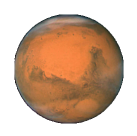
Figure 2-1. Mars appears in my interface
What happens to the size of an existing UIImageView when you assign a new image to it depends on whether the image view is using autolayout. Under autolayout, the size of the image becomes the image view’s intrinsicContentSize, so the image view adopts the image’s size unless other constraints prevent.
An image view automatically acquires its alignmentRectInsets (see Chapter 1) from its image’s alignmentRectInsets. If you’re going to be aligning the image view to some other object using autolayout, you can attach appropriate alignmentRectInsets to the image that the image view will display, and the image view will do the right thing. To do so in code, derive a new image by calling the original image’s withAlignmentRectInsets(_:) method;
alternatively, you can set an image’s alignmentRectInsets in the asset catalog (use the four Alignment fields).
Resizable Images
Certain interface contexts require an image that can be coherently resized to any desired proportions. A custom image that serves as the track of a slider or progress view (Chapter 13) must be able to fill a space of any length. Such an image is called a resizable image.
To make a resizable image in code, start with a normal image and call its resizableImage(withCapInsets:resizingMode:) method. The capInsets: argument is a UIEdgeInsets, whose components represent distances inward from the edges of the image. In a context larger than the image, a resizable image can behave in one of two ways, depending on the resizingMode: value (UIImage.ResizingMode):
.tile-
The interior rectangle of the inset area is tiled (repeated) in the interior; each edge is formed by tiling the corresponding edge rectangle outside the inset area. The four corner rectangles outside the inset area are drawn unchanged.
.stretch-
The interior rectangle of the inset area is stretched once to fill the interior; each edge is formed by stretching the corresponding edge rectangle outside the inset area once. The four corner rectangles outside the inset area are drawn unchanged.
In these examples, assume that self.iv is a UIImageView with absolute height and width (so that it won’t adopt the size of its image) and with a contentMode of .scaleToFill (so that the image will exhibit resizing behavior). First, I’ll illustrate tiling an entire image (Figure 2-2); note that the capInsets: is .zero, meaning no insets at all:
let mars = UIImage(named:"Mars")!
let marsTiled =
    mars.resizableImage(withCapInsets:.zero, resizingMode: .tile)
self.iv.image = marsTiled
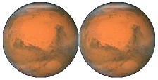
Figure 2-2. Tiling the entire image of Mars
Now we’ll tile the interior of the image, changing the capInsets: argument from the previous code (Figure 2-3):
let marsTiled = mars.resizableImage(withCapInsets:
    UIEdgeInsets(
        top: mars.size.height / 4.0,
        left: mars.size.width / 4.0,
        bottom: mars.size.height / 4.0,
        right: mars.size.width / 4.0
    ), resizingMode: .tile)
Figure 2-3. Tiling the interior of Mars
Next, I’ll illustrate stretching. We’ll start by changing just the resizingMode: from the previous code (Figure 2-4):
let marsTiled = mars.resizableImage(withCapInsets:
    UIEdgeInsets(
        top: mars.size.height / 4.0,
        left: mars.size.width / 4.0,
        bottom: mars.size.height / 4.0,
        right: mars.size.width / 4.0
    ), resizingMode: .stretch)
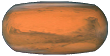
Figure 2-4. Stretching the interior of Mars
A common stretching strategy is to make almost half the original image serve as a cap inset, leaving just a tiny rectangle in the center that must stretch to fill the entire interior of the resulting image (Figure 2-5):
let marsTiled = mars.resizableImage(withCapInsets:
    UIEdgeInsets(
        top: mars.size.height / 2.0 - 1,
        left: mars.size.width / 2.0 - 1,
        bottom: mars.size.height / 2.0 - 1,
        right: mars.size.width / 2.0 - 1
    ), resizingMode: .stretch)
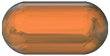
Figure 2-5. Stretching a few pixels at the interior of Mars
In the preceding example, if the image view’s contentMode is .scaleAspectFill, and if the image view’s clipsToBounds is true, we get a sort of gradient effect, because the top and bottom of the stretched image are outside the image view and aren’t drawn (Figure 2-6).
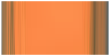
Figure 2-6. Mars, stretched and clipped
Alternatively, you can configure a resizable image in the asset catalog. It is often the case that a particular image will be used in your app chiefly as a resizable image, and always with the same capInsets: and resizingMode:, so it makes sense to configure this image once rather than having to repeat the same code.
To configure an image in an asset catalog as a resizable image, select the image and, in the Slicing section of the Attributes inspector, change the Slices pop-up menu to Horizontal, Vertical, or Horizontal and Vertical. When you do this, additional interface appears. You can specify the resizingMode with the Center pop-up menu. You can work numerically, or click Show Slicing at the lower right of the canvas and work graphically.
This feature is even more powerful than resizableImage(withCapInsets:resizingMode:). It lets you specify the end caps separately from the tiled or stretched region, with the rest of the image being sliced out. In Figure 2-7, the dark areas at the top left, top right, bottom left, and bottom right will be drawn as is; the narrow bands will be stretched, and the small rectangle at the top center will be stretched to fill most of the interior; but the rest of the image, the large central area covered by a sort of gauze curtain, will be omitted entirely. The result is shown in Figure 2-8.
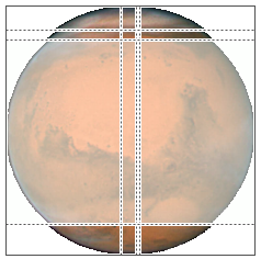
Figure 2-7. Mars, sliced in the asset catalog
Figure 2-8. Mars, sliced and stretched
Transparency Masks
Certain interface contexts, such as buttons and button-like interface objects, want to treat an image as a transparency mask, also known as a template. This means that the image color values are ignored, and only the transparency (alpha) values of each pixel matter. The image shown on the screen is formed by combining the image’s transparency values with a single tint color.
The way an image will be treated is a property of the image, its renderingMode. This property is read-only; to change it in code, start with an image and generate a new image with a different rendering mode, by calling its withRenderingMode(_:) method.
The rendering mode values (UIImage.RenderingMode) are:
-
.automatic -
.alwaysOriginal -
.alwaysTemplate
The default is .automatic, which means that the image is drawn normally except in those particular contexts that want to treat it as a transparency mask. With the other two rendering mode values, you can force an image to be drawn normally, even in a context that would usually treat it as a transparency mask, or you can force an image to be treated as a transparency mask, even in a context that would otherwise treat it normally.
To accompany this feature, iOS gives every UIView a tintColor, which will be used to tint any template images it contains. Moreover, this tintColor by default is inherited down the view hierarchy, and indeed throughout the entire app, starting with the window (Chapter 1). Assigning your app’s main window a tint color is probably one of the few changes you’ll make to the window; otherwise, your app adopts the system’s blue tint color. (Alternatively, if you’re using a main storyboard, set the Global Tint color in the File inspector.) Individual views can be assigned their own tint color, which is inherited by their subviews. Figure 2-9 shows two buttons displaying the same background image, one in normal rendering mode, the other in template rendering mode, in an app whose window tint color is red. (I’ll say more about template images and tintColor in Chapter 13.)

Figure 2-9. One image in two rendering modes
You can assign an image a rendering mode in the asset catalog. Select the image set in the asset catalog, and use the Render As pop-up menu in the Attributes inspector to set the rendering mode to Default (.automatic), Original Image (.alwaysOriginal), or Template Image (.alwaysTemplate). This is an excellent approach whenever you have an image that you will use primarily in a specific rendering mode, because it saves you from having to remember to set that rendering mode in code every time you fetch the image. Instead, any time you call init(named:), this image arrives with the rendering mode already set.
The symbol images, in general, have no color of their own, so in effect they are always template images. New in iOS 14, however, about 150 of the symbol images are multicolor images. (The other symbol images are called monochrome.) Multicolor symbols images possess inherent colors of their own. Some have a single color; most of them have two. In a template environment, such as a button, if you apply the .alwaysOriginal rendering mode to a multicolor symbol image, its inherent colors will appear.
Starting in iOS 13, a tint color can be applied to a UIImage directly; call withTintColor(_:) or withTintColor(_:renderingMode:). This is useful particularly when you want to draw a symbol image or a template image in a context where there is no inherited tint color (such as a graphics context).
Nonetheless, I find the behavior of these methods rather weird:
- Original images become template images
-
If you apply
withTintColorto an ordinary image, it is then treated as a template image — even if you also set the rendering mode to.alwaysOriginal. - Template images may ignore the assigned tint color
-
If you apply
withTintColor(_:)to a template image — because it’s a symbol image, or because you said.alwaysTemplate, or because we’re in a context that treats an image as a transparency mask — then if you assign it into an view with atintColorof its own, the tint color you specify is ignored! The view’s tint color wins. If you want the tint color you specify to be obeyed, you must also set the rendering mode to.alwaysOriginal.
For example, the following code specifically sets a symbol image’s tint color to red; nevertheless, what appears on the screen is a blue symbol image (because the default image view tintColor is blue):
let im = UIImage(systemName:"circle.fill")?.withTintColor(.red)
let iv = UIImageView(image:im)
self.view.addSubview(iv)
To get a red symbol image, you have to say this:
let im = UIImage(systemName:"circle.fill")?.withTintColor(.red,
    renderingMode: .alwaysOriginal) // *
let iv = UIImageView(image:im)
self.view.addSubview(iv)
(Applying a tint color directly to a multicolor symbol image turns it monochrome, even if you also apply the .alwaysOriginal rendering mode.)
Tip
New in Xcode 12, in the nib editor, when you have assigned a symbol image to an image view (or a button), pop-up menus appear that let you assign it a rendering mode, as well as a scale.
Reversible Images
The entire interface is automatically reversed when your app runs on a system for which your app is localized if the system language is right-to-left. In general, this probably won’t affect your images. The runtime assumes that you don’t want images to be reversed when the interface is reversed, so its default behavior is to leave them alone.
Nevertheless, you might want an image to be reversed when the interface is reversed. Suppose you’ve drawn an arrow pointing in the direction from which new interface will arrive when the user taps a button. If the button pushes a view controller onto a navigation interface, that direction is from the right on a left-to-right system, but from the left on a right-to-left system. This image has directional meaning within the app’s own interface; it needs to flip horizontally when the interface is reversed.
To make this possible in code, call the image’s imageFlippedForRightToLeftLayoutDirection method and use the resulting image in your interface. On a left-to-right system, the normal image will be used; on a right-to-left system, a reversed variant of the image will be created and used automatically. You can override this behavior, even if the image is reversible, for a particular UIView displaying the image, such as a UIImageView, by setting that view’s semanticContentAttribute to prevent mirroring.
You can make the same determination for an image in the asset catalog using the Direction pop-up menu (choose one of the Mirrors options). Moreover, the layout direction (as I mentioned in Chapter 1) is a trait, so you can have pairs of images to be used under left-to-right or right-to-left layout. The easy way to configure such pairs is to choose Both in the asset catalog’s Direction pop-up menu; now there are left-to-right and right-to-left image slots where you can place your images. Alternatively, you can register the paired images with a UIImageAsset in code, as I demonstrated earlier in this chapter.
You can also force an image to be flipped horizontally without regard to layout direction or semantic content attribute by calling its withHorizontallyFlippedOrientation method.
Graphics Contexts
Instead of plopping an image from an existing image file directly into your interface, you may want to create some drawing yourself, in code. To do so, you will need a graphics context. This is where the fun really begins!
A graphics context is basically a place you can draw. Conversely, you can’t draw in code unless you’ve got a graphics context. There are several ways in which you might obtain a graphics context; these are the most common:
- Cocoa creates the graphics context
-
You subclass UIView and override
draw(_:). At the time yourdraw(_:)implementation is called, Cocoa has already created a graphics context and is asking you to draw into it, right now; whatever you draw is what the UIView will display. - Cocoa passes you a graphics context
-
You subclass CALayer and override
draw(in:), or else you give a CALayer a delegate and implement the delegate’sdraw(_:in:). Thein:parameter is a graphics context. (Layers are discussed in Chapter 3.) - You create an image context
-
The preceding two ways of getting a graphics context amount to drawing on demand: you slot your drawing code into the right place, and it is called whenever drawing needs to happen. The other major way to draw is just to make a UIImage yourself, once and for all. To create the graphics context that generates the image, you use a UIGraphicsImageRenderer.
Moreover, at any given moment there either is or is not a current graphics context:
-
When UIView’s
draw(_:)is called, the UIView’s drawing context is already the current graphics context. -
When CALayer’s
draw(in:)or its delegate’sdraw(_:in:)is called, thein:parameter is a graphics context, but it is not the current context. It’s up to you to make it current if you need to. -
When you create an image context, that image context automatically becomes the current graphics context.
What beginners find most confusing about drawing is that there are two sets of tools for drawing, which take different attitudes toward the context in which they will draw. One set needs a current context; the other just needs a context:
- UIKit
-
Various Cocoa classes know how to draw themselves; these include UIImage, NSString (for drawing text), UIBezierPath (for drawing shapes), and UIColor. Some of these classes provide convenience methods with limited abilities; others are extremely powerful. In many cases, UIKit will be all you’ll need.
With UIKit, you can draw only into the current context. If there’s already a current context, you just draw. But with CALayer, where you are handed a context as a parameter, if you want to use the UIKit convenience methods, you’ll have to make that context the current context; you do this by calling
UIGraphicsPushContext(_:)(and be sure to restore things withUIGraphicsPopContextlater). - Core Graphics
-
This is the full drawing API. Core Graphics, often referred to as Quartz, or Quartz 2D, is the drawing system that underlies all iOS drawing; UIKit drawing is built on top of it. It is low-level and consists of C functions (though in Swift these are mostly “renamified” to look like method calls). There are a lot of them! This chapter will familiarize you with the fundamentals; for complete information, you’ll want to study Apple’s Quartz 2D Programming Guide in the documentation archive.
With Core Graphics, you must specify a graphics context (a CGContext) to draw into, explicitly, for each bit of your drawing. With CALayer, you are handed the context as a parameter, and that’s the graphics context you want to draw into. But if there is already a current context, you have no reference to it until you call
UIGraphicsGetCurrentContextto obtain it.
You don’t have to use UIKit or Core Graphics exclusively. On the contrary, you can intermingle UIKit calls and Core Graphics calls in the same chunk of code to operate on the same graphics context. They merely represent two different ways of telling a graphics context what to do.
We have two sets of tools and three ways in which a context might be supplied; that makes six ways of drawing. I’ll now demonstrate all six of them! To do so, I’ll draw a blue circle (Figure 2-10). Without worrying just yet about the actual drawing commands, focus your attention on how the context is specified and on whether we’re using UIKit or Core Graphics.
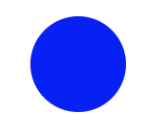
Figure 2-10. A blue circle
Drawing on Demand
There are four ways of drawing on demand, and I’ll start with those. First, I’ll implement a UIView subclass’s draw(_:), using UIKit to draw into the current context, which Cocoa has already prepared for me:
override func draw(_ rect: CGRect) {
    let p = UIBezierPath(ovalIn: CGRect(0,0,100,100))
    UIColor.blue.setFill()
    p.fill()
}
Now I’ll do the same thing with Core Graphics; this will require that I first get a reference to the current context:
override func draw(_ rect: CGRect) {
    let con = UIGraphicsGetCurrentContext()!
    con.addEllipse(in:CGRect(0,0,100,100))
    con.setFillColor(UIColor.blue.cgColor)
    con.fillPath()
}
Next, I’ll implement a CALayer delegate’s draw(_:in:). In this case, we’re handed a reference to a context, but it isn’t the current context. So I have to make it the current context in order to use UIKit (and I must remember to stop making it the current context when I’m done drawing):
override func draw(_ layer: CALayer, in con: CGContext) {
    UIGraphicsPushContext(con)
    let p = UIBezierPath(ovalIn: CGRect(0,0,100,100))
    UIColor.blue.setFill()
    p.fill()
    UIGraphicsPopContext()
}
To use Core Graphics in a CALayer delegate’s draw(_:in:), I simply keep referring to the context I was handed:
override func draw(_ layer: CALayer, in con: CGContext) {
    con.addEllipse(in:CGRect(0,0,100,100))
    con.setFillColor(UIColor.blue.cgColor)
    con.fillPath()
}
Drawing a UIImage
Now I’ll make a UIImage of a blue circle. We can do this at any time (we don’t need to wait for some particular method to be called) and in any class (we don’t need to be in a UIView subclass).
To construct a UIImage in code, use a UIGraphicsImageRenderer. The basic technique is to create the renderer and call its image method to obtain the UIImage, handing it a function containing your drawing instructions.
In this example, I draw my image using UIKit:
let r = UIGraphicsImageRenderer(size:CGSize(100,100))
let im = r.image { _ in
    let p = UIBezierPath(ovalIn: CGRect(0,0,100,100))
    UIColor.blue.setFill()
    p.fill()
}
// im is the blue circle image, do something with it here ...
And here’s the same thing using Core Graphics:
let r = UIGraphicsImageRenderer(size:CGSize(100,100))
let im = r.image { _ in
    let con = UIGraphicsGetCurrentContext()!
    con.addEllipse(in:CGRect(0,0,100,100))
    con.setFillColor(UIColor.blue.cgColor)
    con.fillPath()
}
// im is the blue circle image, do something with it here ...
In those examples, we’re calling UIGraphicsImageRenderer’s init(size:) and accepting its default configuration, which is usually what’s wanted. To configure the image context further, call the UIGraphicsImageRendererFormat class method default, configure the format through its properties, and pass it to UIGraphicsImageRenderer’s init(size:format:). Those properties are:
opaque-
By default,
false; the image context is transparent. Iftrue, the image context is opaque and has a black background, and the resulting image has no transparency. scale-
By default, the same as the scale of the main screen,
UIScreen.main.scale. This means that the resolution of the resulting image will be correct for the device we’re running on. preferredRange-
The color gamut. Your choices are (UIGraphicsImageRendererFormat.Range):
-
.standard -
.extended -
.automatic(same as.extendedif we’re running on a device that supports “wide color”)
-
A single parameter (ignored in the preceding examples) arrives into the UIGraphicsImageRenderer’s image function. It’s a UIGraphicsImageRendererContext. This provides access to the configuring UIGraphicsImageRendererFormat (its format). It also lets you obtain the graphics context (its cgContext); you can alternatively get this by calling UIGraphicsGetCurrentContext, and the preceding code does so, for consistency with the other ways of drawing. In addition, the UIGraphicsImageRendererContext can hand you a copy of the image as drawn up to this point (its currentImage); also, it implements a few basic drawing commands of its own.
UIImage Drawing
A UIImage provides methods for drawing itself into the current context. We already know how to obtain a UIImage, and we already know how to obtain a graphics context and make it the current context, so we are ready to experiment with these methods.
Here, I’ll make a UIImage consisting of two pictures of Mars side by side (Figure 2-11):
let mars = UIImage(named:"Mars")!
let sz = mars.size
let r = UIGraphicsImageRenderer(size:CGSize(sz.width*2, sz.height),
    format:mars.imageRendererFormat)
let im = r.image { _ in
    mars.draw(at:CGPoint(0,0))
    mars.draw(at:CGPoint(sz.width,0))
}
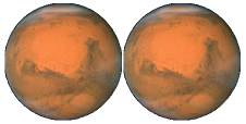
Figure 2-11. Two images of Mars combined side by side
Observe that image scaling works perfectly in that example. If we have multiple resolution variants of our original Mars image, the correct one for the current device is used, and is assigned the correct scale value. The image context that we are drawing into also has the correct scale by default. And the resulting image im has the correct scale as well. Our code produces an image that looks correct on the current device, whatever its screen resolution may be.
Tip
If your purpose in creating an image graphics context is to draw an existing UIImage into it, you can gain some efficiency by initializing the image renderer’s format to the image’s imageRendererFormat.
Additional UIImage methods let you scale an image into a desired rectangle as you draw (effectively resizing the image), and specify the compositing (blend) mode whereby the image should combine with whatever is already present. To illustrate, I’ll create an image showing Mars centered in another image of Mars that’s twice as large, using the .multiply blend mode (Figure 2-12):
let mars = UIImage(named:"Mars")!
let sz = mars.size
let r = UIGraphicsImageRenderer(size:CGSize(sz.width*2, sz.height*2),
    format:mars.imageRendererFormat)
let im = r.image { _ in
    mars.draw(in:CGRect(0,0,sz.width*2,sz.height*2))
    mars.draw(in:CGRect(sz.width/2.0, sz.height/2.0, sz.width, sz.height),
        blendMode: .multiply, alpha: 1.0)
}
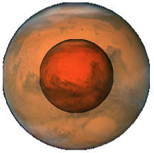
Figure 2-12. Two images of Mars in different sizes, composited
Redrawing an image at a smaller size is of particular importance in iOS programming, because it is a waste of valuable memory to hand a UIImageView a large image and ask the image view to display it smaller. Some frameworks such as Image I/O (Chapter 23) and PhotoKit (Chapter 18) allow you to load a downsized image thumbnail directly, but sometimes you’ll need to downscale an image to fit within a given size yourself. For a general utility method that downsizes a UIImage to fit within a given CGSize, see Appendix B. (For a better downscaling algorithm, use the Core Image CILanczosScaleTransform filter; I’ll discuss Core Image a little later.)
Sometimes, you may want to extract a smaller region of the original image — effectively cropping the image as you draw it. Unfortunately, there is no UIImage drawing method for specifying the source rectangle. You can work around this by creating a smaller graphics context and positioning the image drawing so that the desired region falls into it. There is no harm in doing this, and it’s a perfectly standard strategy; what falls outside the graphics context simply isn’t drawn.
To obtain an image of the right half of Mars, you can make a graphics context half the width of the mars image, and then draw mars shifted left, so that only its right half intersects the graphics context (Figure 2-13):
let mars = UIImage(named:"Mars")!
let sz = mars.size
let r = UIGraphicsImageRenderer(size:CGSize(sz.width/2.0, sz.height),
    format:mars.imageRendererFormat)
let im = r.image { _ in
    mars.draw(at:CGPoint(-sz.width/2.0,0))
}
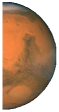
Figure 2-13. Half the original image of Mars
A nice feature of UIGraphicsImageRenderer is that we can initialize it with a bounds instead of a size. Instead of drawing mars shifted left, we can achieve the same effect by drawing mars at .zero into a bounds that is shifted right:
let mars = UIImage(named:"Mars")!
let sz = mars.size
let r = UIGraphicsImageRenderer(
    bounds:CGRect(sz.width/2.0, 0, sz.width/2.0, sz.height),
    format:mars.imageRendererFormat)
let im = r.image { _ in
    mars.draw(at:.zero)
}
Vector images work like normal images. When you call draw(in:), a PDF vector image in the asset catalog for which you have checked Preserve Vector Data will scale sharply; an SVG image in the asset catalog, or a symbol image, always scales sharply:
let symbol = UIImage(systemName:"rhombus")!
let sz = CGSize(100,100)
let r = UIGraphicsImageRenderer(size:sz)
let im = r.image { _ in
    symbol.withTintColor(.purple).draw(in:CGRect(origin:.zero, size:sz))
}
The resulting rhombus is purple, because we gave the image a tint color before drawing it, and is smoothly drawn at 100×100, because it’s a vector image. But of course, once you’ve drawn the vector image into a UImage like our im, that image does not scale sharply; it isn’t a vector image.
It is better, however, not to do what I just did. You really should try not to call draw(in:) on a symbol image. Instead, generate a UIImage with a custom symbol configuration, specifying a point size, and call draw(at:), letting the symbol image size itself according to the point size you provided.
CGImage Drawing
The Core Graphics analog to UIImage is CGImage. In essence, a UIImage is (usually) a wrapper for a CGImage: the UIImage is bitmap image data plus scale, orientation, and other information, whereas the CGImage is the bare bitmap image data alone. The two are easily converted to one another: a UIImage has a cgImage property that accesses its Quartz image data, and you can make a UIImage from a CGImage using init(cgImage:) or init(cgImage:scale:orientation:).
A CGImage lets you create a new image cropped from a rectangular region of the original image, which you can’t do with UIImage. (A CGImage has other powers a UIImage doesn’t have; for instance, you can apply an image mask to a CGImage.) I’ll demonstrate by splitting the image of Mars in half and drawing the two halves separately (Figure 2-14):
let mars = UIImage(named:"Mars")!
// extract each half as CGImage
let marsCG = mars.cgImage!
let sz = mars.size
let marsLeft = marsCG.cropping(to:
    CGRect(0,0,sz.width/2.0,sz.height))!
let marsRight = marsCG.cropping(to:
    CGRect(sz.width/2.0,0,sz.width/2.0,sz.height))!
let r = UIGraphicsImageRenderer(size: CGSize(sz.width*1.5, sz.height),
    format:mars.imageRendererFormat)
let im = r.image { ctx in
    let con = ctx.cgContext
    con.draw(marsLeft, in:
        CGRect(0,0,sz.width/2.0,sz.height))
    con.draw(marsRight, in:
        CGRect(sz.width,0,sz.width/2.0,sz.height))
}
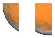
Figure 2-14. Image of Mars split in half (badly)
Well, that was a train wreck! In the first place, the drawing is upside-down. It isn’t rotated; it’s mirrored top to bottom, or, to use the technical term, flipped. This phenomenon can arise when you create a CGImage and then draw it, and is due to a mismatch in the native coordinate systems of the source and target contexts.
In the second place, we didn’t split the image of Mars in half; we seem to have split it into quarters instead. The reason is that we’re using a high-resolution device, and there is a high-resolution variant of our image file. When we call UIImage’s init(named:), we get a UIImage that compensates for the increased size of a high-resolution image by setting its own scale property to match. But a CGImage doesn’t have a scale property, and knows nothing of the fact that the image dimensions are increased! Therefore, on a high-resolution device, the CGImage that we extract from our Mars UIImage as mars.cgImage is larger (in each dimension) than mars.size, and all our calculations after that are wrong.
The simplest solution, when you drop down to the CGImage world to perform some transmutation, is to wrap the resulting CGImage in a UIImage and draw the UIImage instead of the CGImage. The UIImage can be formed in such a way as to compensate for scale — call init(cgImage:scale:orientation:) — and by drawing a UIImage instead of a CGImage, we avoid the flipping problem:
let mars = UIImage(named:"Mars")!
let sz = mars.size
let marsCG = mars.cgImage!
let szCG = CGSize(CGFloat(marsCG.width), CGFloat(marsCG.height))
let marsLeft =
    marsCG.cropping(to:
        CGRect(0,0,szCG.width/2.0,szCG.height))
let marsRight =
    marsCG.cropping(to:
        CGRect(szCG.width/2.0,0,szCG.width/2.0,szCG.height))
let r = UIGraphicsImageRenderer(size:CGSize(sz.width*1.5, sz.height),
    format:mars.imageRendererFormat)
let im = r.image { _ in
    UIImage(cgImage: marsLeft!,
        scale: mars.scale,
        orientation: mars.imageOrientation).draw(at:CGPoint(0,0))
    UIImage(cgImage: marsRight!,
        scale: mars.scale,
        orientation: mars.imageOrientation).draw(at:CGPoint(sz.width,0))
}
Snapshots
An entire view — anything from a single button to your whole interface, complete with its contained hierarchy of views — can be drawn into the current graphics context by calling the UIView instance method drawHierarchy(in:afterScreenUpdates:). The result is a snapshot of the original view: it looks like the original view, but it’s basically just a bitmap image of it, a lightweight visual duplicate.
Tip
drawHierarchy(in:afterScreenUpdates:) is much faster than the CALayer method render(in:); nevertheless, the latter does still come in handy, as I’ll show in Chapter 5.
An even faster way to obtain a snapshot of a view is to use the UIView (or UIScreen) instance method snapshotView(afterScreenUpdates:). The result is a UIView, not a UIImage; it’s rather like a UIImageView that knows how to draw only one image, namely the snapshot. Such a snapshot view will typically be used as is, but you can enlarge its bounds and the snapshot image will stretch. If you want the stretched snapshot to behave like a resizable image, call resizableSnapshotView(from:afterScreenUpdates:withCapInsets:) instead. It is perfectly reasonable to make a snapshot view from a snapshot view.
Snapshots are useful because of the dynamic nature of the iOS interface. You might place a snapshot of a view in your interface in front of the real view to hide what’s happening, or use it during an animation to present the illusion of a view moving when in fact it’s just a snapshot.
Here’s an example from one of my apps. It’s a card game, and its views portray cards. I want to animate the removal of all those cards from the board, flying away to an offscreen point. But I don’t want to animate the views themselves! They need to stay put, to portray future cards. So I make a snapshot view of each of the card views; I then make the card views invisible, put the snapshot views in their place, and animate the snapshot views. This code will mean more to you after you’ve read Chapter 4, but the strategy is evident:
for v in views {
    let snapshot = v.snapshotView(afterScreenUpdates: false)!
    let snap = MySnapBehavior(item:snapshot, snapto:CGPoint(
        x: self.anim.referenceView!.bounds.midX,
        y: -self.anim.referenceView!.bounds.height)
    )
    self.snaps.append(snapshot) // keep a list so we can remove them later
    snapshot.frame = v.frame
    v.isHidden = true
    self.anim.referenceView!.addSubview(snapshot)
    self.anim.addBehavior(snap)
}
CIFilter and CIImage
The “CI” in CIFilter and CIImage stands for Core Image, a technology for transforming images through mathematical filters. Core Image started life on the desktop (macOS), and when it was originally migrated into iOS 5, some of the filters available on the desktop were not available in iOS, presumably because they were then too intensive mathematically for a mobile device. Over the years, more and more macOS filters were added to the iOS repertoire, and now the two have complete parity: all macOS filters are available in iOS, and the two platforms have nearly identical APIs.
A filter is a CIFilter. There are more than 200 available filters; they fall naturally into several broad categories:
- Patterns and gradients
-
These filters create CIImages that can then be combined with other CIImages, such as a single color, a checkerboard, stripes, or a gradient.
- Compositing
-
These filters combine one image with another, using compositing blend modes familiar from image processing programs.
- Color
-
These filters adjust or otherwise modify the colors of an image. You can alter an image’s saturation, hue, brightness, contrast, gamma and white point, exposure, shadows and highlights, and so on.
- Geometric
-
These filters perform basic geometric transformations on an image, such as scaling, rotation, and cropping.
- Transformation
-
These filters distort, blur, or stylize an image.
- Transition
-
These filters provide a frame of a transition between one image and another; by asking for frames in sequence, you can animate the transition (I’ll demonstrate in Chapter 4).
- Special purpose
-
These filters perform highly specialized operations such as face detection and generation of barcodes.
A CIFilter is a set of instructions for generating a CIImage — the filter’s output image. Moreover, most CIFilters operate on a CIImage — the filter’s input image. So the output image of one filter can be the input image of another filter. In this way, filters can be chained. As you build a chain of filters, nothing actually happens; you’re just configuring a sequence of instructions.
If the first CIFilter in the sequence needs an input image, you can get a CIImage from a CGImage with init(cgImage:), or from a UIImage with init(image:). When the last CIFilter in the sequence produces a CIImage, you can transform it into a bitmap drawing — a CGImage or a UIImage. In this way, you’ve transformed an image into another image, using CIImages and CIFilters as intermediaries. The final step, when you generate the bitmap drawing, is called rendering the image. When you render the image, the entire calculation described by the chain of filters is actually performed. Rendering the last CIImage in the sequence is the only calculation-intensive move.
Warning
A common beginner mistake is trying to obtain a CIImage directly from a UIImage through the UIImage’s ciImage property. In general, that’s not going to work. That property does not transform a UIImage into a CIImage; it is applicable only to a UIImage that already wraps a CIImage, and most UIImages don’t (they wrap a CGImage).
The basic use of a CIFilter is quite simple:
-
Obtain a CIFilter object. You can specify a CIFilter by its string name, by calling
init(name:); to learn the names, consult Apple’s Core Image Filter Reference in the documentation archive, or call the CIFilter class methodfilterNames(inCategories:)with anilargument. Starting in iOS 13, you can obtain a CIFilter object by calling a CIFilter convenience class method named after the string name; to learn about the convenience names, look in the CIFilterBuiltins header:let filter = CIFilter(name: "CICheckerboardGenerator")! // or: let filter = CIFilter.checkerboardGenerator()
-
A filter has keys and values that determine its behavior. These are its parameters. You set them as desired. You can learn about a filter’s parameters entirely in code, but typically you’ll consult the documentation. To set a parameter, call
setValue(_:forKey:), or use the corresponding CIFilterBuiltins convenience property:filter.setValue(30, forKey: "inputWidth") // or: filter.width = 30
There are several variations on those steps:
-
Instead of calling
setValue(_:forKey:)repeatedly, you can callsetValuesForKeys(_:)with a dictionary to set multiple parameters at once. -
Instead of obtaining the filter and then setting parameters, you can do both in a single move by calling
init(name:withInputParameters:). -
If a CIFilter requires an input CIImage, you can call
applyingFilter(_:parameters:)on the CIImage to obtain the filter, set its parameters, and receive the output image, in a single move.
Now let’s talk about how to render a CIImage. This, as I’ve said, is the only calculation-intensive move; it can be slow and expensive. There are three main ways:
- With a CIContext
-
Create a CIContext by calling
init()orinit(options:); this itself is expensive, so try to make just one CIContext and retain and reuse it. Then call the CIContext’screateCGImage(_:from:). The first parameter is the CIImage. The second parameter is a CGRect specifying the region of the CIImage to be rendered. A CIImage does not have a frame or bounds; its CGRect is itsextent. The output is a CGImage. - With a UIImage
-
Create a UIImage wrapping the CIImage by calling
init(ciImage:)orinit(ciImage:scale:orientation:). You then draw the UIImage into some graphics context; that is what causes the image to be rendered. - With a UIImageView
-
This is a shortcut for the preceding approach. Create a UIImage wrapping the CIImage and use it to set a UIImageView’s
image. The display of the image view causes the image to be rendered. In general, this approach works only on a device, though it might work in the simulator in Xcode 11.
Tip
There are other ways of rendering a CIImage that have the advantage of being very fast and suitable for animated or rapid rendering. In particular, you could use Metal. But that’s outside the scope of this book.
We’re ready for an example! I’ll start with an ordinary photo of myself (it’s true I’m wearing a motorcycle helmet, but it’s still ordinary) and create a circular vignette effect (Figure 2-15).
I’ll take advantage of the convenience methods and properties; to bring these to life, we must import CoreImage.CIFilterBuiltins:

Figure 2-15. A photo of me, vignetted
let moi = UIImage(named:"Moi")! let moici = CIImage(image:moi)!let moiextent = moici.extent let smaller = min(moiextent.width, moiextent.height) let larger = max(moiextent.width, moiextent.height) // first filter let grad = CIFilter.radialGradient()
grad.center = moiextent.center grad.radius0 = Float(smaller)/2.0 * 0.7 grad.radius1 = Float(larger)/2.0 let gradimage = grad.outputImage! // second filter let blend = CIFilter.blendWithMask()
blend.inputImage = moici blend.maskImage = gradimage let blendimage = blend.outputImage!
From the image of me (
moi), we derive a CIImage (moici).We use a CIFilter (
grad) to form a radial gradient between the default colors of white and black.We use a second CIFilter (
blend) to treat the radial gradient as a mask for blending between the photo of me and a default clear background: where the radial gradient is white (everything inside the gradient’s inner radius) we see just me, and where the radial gradient is black (everything outside the gradient’s outer radius) we see just the clear color, with a gradation in between, so that the image fades away in the circular band between the gradient’s radii.
We have obtained the final CIImage in the chain (blendimage), and the processor has not yet performed any rendering. Now we want to generate the final bitmap and display it. Let’s say we’re going to display it as the image of a UIImageView self.iv. I’ll demonstrate two of the ways of doing that.
First, the CIContext approach. self.context is a property initialized to a CIContext. The starred line is the actual rendering:
let moicg = self.context.createCGImage(blendimage, from: moiextent)! // *
self.iv.image = UIImage(cgImage: moicg)
Second, the UIImage drawing approach; the starred line is the actual rendering:
let r = UIGraphicsImageRenderer(size:moiextent.size)
self.iv.image = r.image { _ in
    UIImage(ciImage: blendimage).draw(in:moiextent) // *
}
A filter chain can be encapsulated into a single custom filter by subclassing CIFilter. Your subclass just needs to override the outputImage property (and possibly other methods such as setDefaults), with additional properties to make it key–value coding compliant for any input keys. Here’s our vignette filter as a simple CIFilter subclass with two input keys; inputImage is the image to be vignetted, and inputPercentage is a percentage (between 0 and 1) adjusting the gradient’s inner radius:
class MyVignetteFilter : CIFilter {
    @objc var inputImage : CIImage?
    @objc var inputPercentage : NSNumber? = 1.0
    override var outputImage : CIImage? {
        return self.makeOutputImage()
    }
    private func makeOutputImage () -> CIImage? {
        guard let inputImage = self.inputImage else {return nil}
        guard let inputPercentage = self.inputPercentage else {return nil}
        let extent = inputImage.extent
        let smaller = min(extent.width, extent.height)
        let larger = max(extent.width, extent.height)
        let grad = CIFilter.radialGradient()
        grad.center = extent.center
        grad.radius0 = Float(smaller)/2.0 * inputPercentage.floatValue
        grad.radius1 = Float(larger)/2.0
        let gradimage = grad.outputImage!
        let blend = CIFilter.blendWithMask()
        blend.inputImage = self.inputImage
        blend.maskImage = gradimage
        return blend.outputImage
    }
}
And here’s how to use our CIFilter subclass and display its output in a UIImageView:
let vig = MyVignetteFilter()
let moici = CIImage(image: UIImage(named:"Moi")!)!
vig.setValuesForKeys([
    "inputImage":moici,
    "inputPercentage":0.7
])
let outim = vig.outputImage!
let outimcg = self.context.createCGImage(outim, from: outim.extent)!
self.iv.image = UIImage(cgImage: outimcg)
CIImage is a powerful class in its own right, with many valuable convenience methods. You can apply a transform to a CIImage, crop it, and even apply a Gaussian blur directly to it. Also, CIImage understands EXIF orientations and can use them to reorient itself.
Blur and Vibrancy Views
Certain views on iOS, such as navigation bars and the control center, are translucent and display a blurred rendition of what’s behind them. You can create similar effects using the UIVisualEffectView class.
A UIVisualEffectView is initialized by calling init(effect:); the parameter is a UIVisualEffect. UIVisualEffect is an abstract superclass; the concrete subclasses are UIBlurEffect and UIVibrancyEffect. You’ll use a visual effect view with a blur effect to blur what’s behind it; then if you like you can add a visual effect with a vibrancy effect along with subviews. The vibrancy effect view goes inside the blur effect view’s contentView. Any subviews of the vibrancy effect view go inside its contentView, and they will be treated as templates: all that matters is their opacity or transparency, as their color is replaced. Never give a UIVisualEffectView a direct subview!
UIBlurEffect is initialized by calling init(style:). The styles are adaptive to light and dark user interface style, and are called materials. There are five of them (plus each material has two nonadaptive variants with Light or Dark appended to the name):
-
.systemUltraThinMaterial -
.systemThinMaterial -
.systemMaterial -
.systemThickMaterial -
.systemChromeMaterial
UIVibrancyEffect is initialized by calling init(blurEffect:style:). The first parameter will be the blur effect of the underlying UIVisualEffectView. The style: will be one of these:
-
.label -
.secondaryLabel -
.tertiaryLabel -
.quaternaryLabel -
.fill -
.secondaryFill -
.tertiaryFill -
.separator
Here’s an example of a blur effect view covering and blurring the interface (self.view), and containing a UILabel wrapped in a vibrancy effect view:
let blurEffect = UIBlurEffect(style: .systemThinMaterial)
let blurView = UIVisualEffectView(effect: blurEffect)
blurView.frame = self.view.bounds
blurView.autoresizingMask = [.flexibleWidth, .flexibleHeight]
self.view.addSubview(blurView)
let vibEffect = UIVibrancyEffect(
    blurEffect: blurEffect, style: .label)
let vibView = UIVisualEffectView(effect:vibEffect)
let lab = UILabel()
lab.text = "Hello, world!"
lab.sizeToFit()
vibView.bounds = lab.bounds
vibView.center = self.view.bounds.center
vibView.autoresizingMask =
    [.flexibleTopMargin, .flexibleBottomMargin,
    .flexibleLeftMargin, .flexibleRightMargin]
blurView.contentView.addSubview(vibView)
vibView.contentView.addSubview(lab)
Figure 2-16 shows the result in light and dark mode.
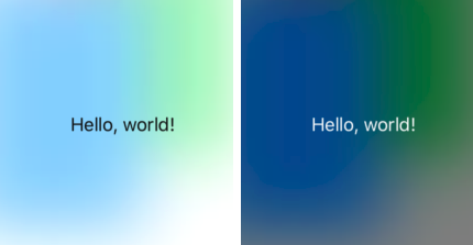
Figure 2-16. A blurred background and a vibrant label
Both a blur effect view and a blur effect view with an embedded vibrancy effect view are available as Library objects in the nib editor.
Drawing a UIView
Most of the examples of drawing so far in this chapter have produced UIImage objects. But, as I’ve already explained, a UIView itself provides a graphics context; whatever you draw into that graphics context will appear directly in that view. The technique here is to subclass UIView and implement the subclass’s draw(_:) method. The result is that, from time to time, or whenever you send it the setNeedsDisplay message, your view’s draw(_:) will be called. This is your subclass and your code, so you get to say how this view draws itself at that moment. Whatever drawing you do in draw(_:), that’s what the interface will display.
When you override draw(_:), there will usually be no need to call super, since UIView’s own implementation of draw(_:) does nothing. At the time that draw(_:) is called, the current graphics context has already been set to the view’s own graphics context. You can use Core Graphics functions or UIKit convenience methods to draw into that context. I gave some basic examples earlier in this chapter (“Graphics Contexts”).
The need to draw in real time, on demand, surprises some beginners, who worry that drawing may be a time-consuming operation. This can indeed be a reasonable consideration, and where the same drawing will be used in many places in your interface, it may make sense to construct a UIImage instead, once, and then reuse that UIImage by drawing it in a view’s draw(_:).
In general, though, you should not optimize prematurely. The code for a drawing operation may appear verbose and yet be extremely fast. Moreover, the iOS drawing system is efficient; it doesn’t call draw(_:) unless it has to (or is told to, through a call to setNeedsDisplay), and once a view has drawn itself, the result is cached so that the cached drawing can be reused instead of repeating the drawing operation from scratch. (Apple refers to this cached drawing as the view’s bitmap backing store.) You can readily satisfy yourself of this fact with some caveman debugging, logging in your draw(_:) implementation; you may be amazed to discover that your custom UIView’s draw(_:) code is called only once in the entire lifetime of the app!
In fact, moving code to draw(_:) is commonly a way to increase efficiency. This is because it is more efficient for the drawing engine to render directly onto the screen than for it to render offscreen and then copy those pixels onto the screen.
Here are three important caveats with regard to UIView’s draw(_:) method:
-
Don’t call
draw(_:)yourself. If a view needs updating and you want itsdraw(_:)called, send the view thesetNeedsDisplaymessage. This will causedraw(_:)to be called at the next proper moment. -
Don’t override
draw(_:)unless you are assured that this is legal. It is not legal to overridedraw(_:)in a subclass of UIImageView, for instance; you cannot combine your drawing with that of the UIImageView. -
Don’t do anything in
draw(_:)except draw. That sort of thing is a common beginner mistake. Other configurations, such as setting the view’s background color, or adding subviews or sublayers, should be performed elsewhere, such as its initializer override.
Where drawing is extensive and can be compartmentalized into sections, you may be able to gain some additional efficiency by paying attention to the parameter passed into draw(_:). This parameter is a CGRect designating the region of the view’s bounds that needs refreshing. Normally, this is the view’s entire bounds; but if you call setNeedsDisplay(_:), which takes a CGRect parameter, it will be the CGRect that you passed in as argument. You could respond by drawing only what goes into those bounds; but even if you don’t, your drawing will be clipped to those bounds, so, while you may not spend less time drawing, the system will draw more efficiently.
When a custom UIView subclass has a draw(_:) implementation and you create an instance of this subclass in code, you may be surprised (and annoyed) to find that the view has a black background! This is a source of considerable confusion among beginners. The black background arises particularly when two things are true:
-
The view’s
backgroundColorisnil. -
The view’s
isOpaqueistrue.
When a UIView is created in code with init(frame:), by default both those things are true. If this issue arises for you and you want to get rid of the black background, override init(frame:) and have the view set its own isOpaque to false:
class MyView : UIView {
    override init(frame: CGRect) {
        super.init(frame:frame)
        self.isOpaque = false
    }
    required init?(coder: NSCoder) {
        fatalError("init(coder:) has not been implemented")
    }
}
With a UIView created in the nib, on the other hand, the black background problem doesn’t arise. This is because the UIView’s backgroundColor is not nil. The nib assigns it some actual background color, even if that color is UIColor.clear.
Graphics Context Commands
Whenever you draw, you are giving commands to the graphics context into which you are drawing. This is true regardless of whether you use UIKit methods or Core Graphics functions. Learning to draw is really a matter of understanding how a graphics context works. That’s what this section is about.
Under the hood, Core Graphics commands to a graphics context are global C functions with names like CGContextSetFillColor; but Swift “renamification” recasts them as if a CGContext were a genuine object representing the graphics context, with the Core Graphics functions appearing as methods of the CGContext. Moreover, thanks to Swift overloading, multiple functions are collapsed into a single command; for example, CGContextSetFillColor and CGContextSetFillColorWithColor and CGContextSetRGBFillColor and CGContextSetGrayFillColor all become the same command, setFillColor.
Graphics Context Settings
As you draw in a graphics context, the drawing obeys the context’s current settings. For this reason, the procedure is always to configure the context’s settings first, and then draw. To draw a red line and then a blue line, you would first set the context’s line color to red, and draw the first line; then you’d set the context’s line color to blue, and draw the second line. To the eye, it appears that the redness and blueness are properties of the individual lines, but in fact, at the time you draw each line, line color is a feature of the entire graphics context.
A graphics context has, at every moment, a state, which is the sum total of all its current settings; the way a piece of drawing looks is the result of what the graphics context’s state was at the moment that piece of drawing was performed. To help you manipulate entire states, the graphics context provides a stack for holding states. Every time you call saveGState, the context pushes the current state onto the stack; every time you call restoreGState, the context retrieves the state from the top of the stack (the state that was most recently pushed) and sets itself to that state. A common pattern is:
-
Call
saveGState. -
Manipulate the context’s settings, changing its state.
-
Draw.
-
Call
restoreGStateto restore the state and the settings to what they were before you manipulated them.
You do not have to do this before every manipulation of a context’s settings, because settings don’t necessarily conflict with one another or with past settings. You can set the context’s line color to red and then later to blue without any difficulty. But in certain situations you do want your manipulation of settings to be undoable, and I’ll point out several such situations later in this chapter.
Many of the settings that constitute a graphics context’s state, and that determine the behavior and appearance of drawing performed at that moment, are similar to those of any drawing application. Here are some of them, along with some of the commands that determine them (and some UIKit properties and methods that call them):
- Line thickness and dash style
-
setLineWidth(_:),setLineDash(phase:lengths:)
UIBezierPathlineWidth,setLineDash(_:count:phase:) - Line end-cap style and join style
-
setLineCap(_:),setLineJoin(_:),setMiterLimit(_:)
UIBezierPathlineCapStyle,lineJoinStyle,miterLimit - Line color or pattern
-
setStrokeColor(_:),setStrokePattern(_:colorComponents:)
UIColorsetStroke - Fill color or pattern
-
setFillColor(_:),setFillPattern(_:colorComponents:)
UIColorsetFill - Shadow
-
setShadow(offset:blur:color:) - Overall transparency and compositing
-
setAlpha(_:),setBlendMode(_:)
- Anti-aliasing
-
setShouldAntialias(_:)
Additional settings include:
- Clipping area
-
Drawing outside the clipping area is not physically drawn.
- Transform (or “CTM,” for “current transform matrix”)
-
Changes how points that you specify in subsequent drawing commands are mapped onto the physical space of the canvas.
Many of these settings will be illustrated by examples later in this chapter.
Paths and Shapes
By issuing a series of instructions for moving an imaginary pen, you construct a path, tracing it out from point to point. You must first tell the pen where to position itself, setting the current point; after that, you issue commands telling the pen how to trace out each subsequent piece of the path, one by one. Each new piece of the path starts by default at the current point; its end becomes the new current point.
A path can be compound, meaning that it consists of multiple independent pieces. A single path might consist of two separate closed shapes: say, a rectangle and a circle. When you call move(to:) in the middle of constructing a path, you pick up the imaginary pen and move it to a new location without tracing a segment, preparing to start an independent piece of the same path.
If you’re worried, as you begin to trace out a path, that there might be an existing path and that your new path might be seen as a compound part of that existing path, you can call beginPath to specify that this is a different path; many of Apple’s examples do this, but in practice I usually do not find it necessary.
Here are some path-drawing commands you’re likely to give:
- Position the current point
-
move(to:) - Trace a line
-
addLine(to:),addLines(between:) - Trace a rectangle
-
addRect(_:),addRects(_:) - Trace an ellipse or circle
-
addEllipse(in:) - Trace an arc
-
addArc(tangent1End:tangent2End:radius:) - Trace a Bezier curve with one or two control points
-
addQuadCurve(to:control:),addCurveTo(to:control1:control2:) - Close the current path
-
closePath. This appends a line from the last point of the path to the first point. There’s no need to do this if you’re about to fill the path, since it’s done for you.
Note that a path, in and of itself, does not constitute drawing! First you provide a path; then you draw. Drawing can mean stroking the path or filling the path, or both. Again, this should be a familiar notion from certain drawing applications. The important thing is that stroking or filling a path clears the path. That path is now gone and we’re ready to begin constructing a new path if desired:
- Stroke or fill the current path (and clear the path)
-
strokePath,fillPath(using:),drawPath. UsedrawPathif you want both to fill and to stroke the path in a single command, because if you merely stroke it first withstrokePath, the path is cleared and you can no longer fill it. There are also some convenience functions that create a path from a CGRect or similar and stroke or fill it, in a single move:-
stroke(_:),strokeLineSegments(between:) -
fill(_:) -
strokeEllipse(in:) -
fillEllipse(in:)
-
If a path needs to be reused or shared, you can encapsulate it as a CGPath. Like CGContext, CGPath and its mutable partner CGMutablePath are treated as class types under “renamification,” and the global C functions that manipulate them are treated as methods. You can copy the graphics context’s current path using the CGContext path method, or you can create a new CGMutablePath and construct the path using various functions, such as move(to:transform:) and addLine(to:transform:), that parallel the CGContext path-construction functions. Also, there are ways to create a path based on simple geometry or on an existing path:
-
init(rect:transform:) -
init(ellipseIn:transform:) -
init(roundedRect:cornerWidth:cornerHeight:transform:) -
copy(strokingWithWidth:lineCap:lineJoin:miterLimit:transform:) -
copy(dashingWithPhase:lengths:transform:) -
copy(using:)(takes a pointer to a CGAffineTransform)
To illustrate the typical use of path-drawing commands, I’ll generate the up-pointing arrow shown in Figure 2-17. This might not be the best way to create the arrow, and I’m deliberately avoiding use of the convenience functions, but it’s clear and shows a nice basic variety of typical commands:
// obtain the current graphics context
let con = UIGraphicsGetCurrentContext()!
// draw a black (by default) vertical line, the shaft of the arrow
con.move(to:CGPoint(100, 100))
con.addLine(to:CGPoint(100, 19))
con.setLineWidth(20)
con.strokePath()
// draw a red triangle, the point of the arrow
con.setFillColor(UIColor.red.cgColor)
con.move(to:CGPoint(80, 25))
con.addLine(to:CGPoint(100, 0))
con.addLine(to:CGPoint(120, 25))
con.fillPath()
// snip a triangle out of the shaft by drawing in Clear blend mode
con.move(to:CGPoint(90, 101))
con.addLine(to:CGPoint(100, 90))
con.addLine(to:CGPoint(110, 101))
con.setBlendMode(.clear)
con.fillPath()

Figure 2-17. A simple path drawing
The UIKit class UIBezierPath is actually a wrapper for CGPath; the wrapped path is its cgPath property. It provides methods parallel to the CGContext and CGPath functions for constructing a path, such as:
-
init(rect:) -
init(ovalIn:) -
init(roundedRect:cornerRadius:) -
move(to:) -
addLine(to:) -
addArc(withCenter:radius:startAngle:endAngle:clockwise:) -
addQuadCurve(to:controlPoint:) -
addCurve(to:controlPoint1:controlPoint2:) -
close
When you call the UIBezierPath instance methods fill or stroke or fill(with:alpha:) or stroke(with:alpha:), the current graphics context settings are saved, the wrapped CGPath is made the current graphics context’s path and stroked or filled, and the current graphics context settings are restored.
Using UIBezierPath together with UIColor, we could rewrite our arrow-drawing routine entirely with UIKit methods:
let p = UIBezierPath()
// shaft
p.move(to:CGPoint(100,100))
p.addLine(to:CGPoint(100, 19))
p.lineWidth = 20
p.stroke()
// point
UIColor.red.set()
p.removeAllPoints()
p.move(to:CGPoint(80,25))
p.addLine(to:CGPoint(100, 0))
p.addLine(to:CGPoint(120, 25))
p.fill()
// snip
p.removeAllPoints()
p.move(to:CGPoint(90,101))
p.addLine(to:CGPoint(100, 90))
p.addLine(to:CGPoint(110, 101))
p.fill(with:.clear, alpha:1.0)
There’s no savings of code here over calling Core Graphics functions, so your choice of Core Graphics or UIKit is a matter of taste.
Clipping
A path can be used to mask out areas, protecting them from future drawing. This is called clipping. By default, a graphics context’s clipping region is the entire graphics context, meaning that you can draw anywhere within the context.
The clipping area is a feature of the context as a whole, and any new clipping area is applied by intersecting it with the existing clipping area. To restore your clipping area to the default, call resetClip.
To illustrate, I’ll rewrite the code that generated our original arrow (Figure 2-17) to use clipping instead of a blend mode to “punch out” the triangular notch in the tail of the arrow. This is a little tricky, because what we want to clip to is not the region inside the triangle but the region outside it. To express this, we’ll use a compound path consisting of more than one closed area — the triangle, and the drawing area as a whole (which we can obtain as the context’s boundingBoxOfClipPath).
Both when filling a compound path and when using it to express a clipping region, the system follows one of two rules:
- Winding rule
-
The fill or clipping area is denoted by an alternation in the direction (clockwise or counterclockwise) of the path demarcating each region.
- Even-odd rule (EO)
-
The fill or clipping area is denoted by a simple count of the paths demarcating each region.
Our situation is extremely simple, so it’s easier to use the even-odd rule:
// obtain the current graphics context
let con = UIGraphicsGetCurrentContext()!
// punch triangular hole in context clipping region
con.move(to:CGPoint(90, 100))
con.addLine(to:CGPoint(100, 90))
con.addLine(to:CGPoint(110, 100))
con.closePath()
con.addRect(con.boundingBoxOfClipPath)
con.clip(using:.evenOdd)
// draw the vertical line
con.move(to:CGPoint(100, 100))
con.addLine(to:CGPoint(100, 19))
con.setLineWidth(20)
con.strokePath()
// draw the red triangle, the point of the arrow
con.setFillColor(UIColor.red.cgColor)
con.move(to:CGPoint(80, 25))
con.addLine(to:CGPoint(100, 0))
con.addLine(to:CGPoint(120, 25))
con.fillPath()
The UIBezierPath clipping commands are usesEvenOddFillRule and addClip.
Gradients
Gradients can range from the simple to the complex. A simple gradient (which is all I’ll describe here) is determined by a color at one endpoint along with a color at the other endpoint, plus (optionally) colors at intermediate points; the gradient is then painted either linearly between two points or radially between two circles. You can’t use a gradient as a path’s fill color, but you can restrict a gradient to a path’s shape by clipping, which will sometimes be good enough.
To illustrate, I’ll redraw our arrow, using a linear gradient as the “shaft” of the arrow (Figure 2-18):
// obtain the current graphics context
let con = UIGraphicsGetCurrentContext()!
// punch triangular hole in context clipping region
con.move(to:CGPoint(10, 100))
con.addLine(to:CGPoint(20, 90))
con.addLine(to:CGPoint(30, 100))
con.closePath()
con.addRect(con.boundingBoxOfClipPath)
con.clip(using: .evenOdd)
// draw the vertical line, add its shape to the clipping region
con.move(to:CGPoint(20, 100))
con.addLine(to:CGPoint(20, 19))
con.setLineWidth(20)
con.replacePathWithStrokedPath()
con.clip()
// draw the gradient
let locs : [CGFloat] = [ 0.0, 0.5, 1.0 ]
let colors : [CGFloat] = [
    0.8, 0.4, // starting color, transparent light gray
    0.1, 0.5, // intermediate color, darker less transparent gray
    0.8, 0.4, // ending color, transparent light gray
]
let sp = CGColorSpaceCreateDeviceGray()
let grad = CGGradient(
    colorSpace:sp, colorComponents: colors, locations: locs, count: 3)!
con.drawLinearGradient(grad,
    start: CGPoint(89,0), end: CGPoint(111,0), options:[])
con.resetClip() // done clipping
// draw the red triangle, the point of the arrow
con.setFillColor(UIColor.red.cgColor)
con.move(to:CGPoint(80, 25))
con.addLine(to:CGPoint(100, 0))
con.addLine(to:CGPoint(120, 25))
con.fillPath()

Figure 2-18. Drawing with a gradient
The call to replacePathWithStrokedPath pretends to stroke the current path, using the current line width and other line-related context state settings, but then creates a new path representing the outside of that stroked path. Instead of a thick line we now have a rectangular region that we can use as the clip region.
We then create the gradient and paint it. The procedure is verbose but simple; everything is boilerplate. We describe the gradient as an array of locations on the continuum between one endpoint (0.0) and the other endpoint (1.0), along with the color components of the colors corresponding to each location; in this case, I want the gradient to be lighter at the edges and darker in the middle, so I use three locations, with the dark one at 0.5. We must also supply a color space; this will tell the gradient how to interpret our color components. Finally, we create the gradient and paint it into place.
(See also the discussion of gradient CIFilters earlier in this chapter. For yet another way to create a simple gradient, see the discussion of CAGradientLayer in the next chapter.)
Colors and Patterns
A color is a CGColor. CGColor is not difficult to work with, and can be converted to and from a UIColor through UIColor’s init(cgColor:) and its cgColor property.
When the user interface style (light or dark mode) changes, your draw(_:) override is called and UITraitCollection.current is set for you, so any dynamic UIColors you use while drawing will be correct for the current interface style. But there’s no such thing as a dynamic CGColor, so if you’re using CGColor in some other situation, you might need to trigger a redraw manually. For an example, see “Interface Style”.
A pattern is also a kind of color. You can create a pattern color and stroke or fill with it. The simplest way is to draw a minimal tile of the pattern into a UIImage and create the color by calling UIColor’s init(patternImage:). To illustrate, I’ll create a pattern of horizontal stripes and use it to paint the point of the arrow instead of a solid red color (Figure 2-19):
// create the pattern image tile
let r = UIGraphicsImageRenderer(size:CGSize(4,4))
let stripes = r.image { ctx in
    let imcon = ctx.cgContext
    imcon.setFillColor(UIColor.red.cgColor)
    imcon.fill(CGRect(0,0,4,4))
    imcon.setFillColor(UIColor.blue.cgColor)
    imcon.fill(CGRect(0,0,4,2))
}
// paint the point of the arrow with it
let stripesPattern = UIColor(patternImage:stripes)
stripesPattern.setFill()
let p = UIBezierPath()
p.move(to:CGPoint(80,25))
p.addLine(to:CGPoint(100,0))
p.addLine(to:CGPoint(120,25))
p.fill()
Figure 2-19. A patterned fill
The Core Graphics equivalent, CGPattern, is considerably more powerful, but also much more elaborate:
con.saveGState()
let sp2 = CGColorSpace(patternBaseSpace:nil)!
con.setFillColorSpace(sp2)
let drawStripes : CGPatternDrawPatternCallback = { _, con in
    con.setFillColor(UIColor.red.cgColor)
    con.fill(CGRect(0,0,4,4))
    con.setFillColor(UIColor.blue.cgColor)
    con.fill(CGRect(0,0,4,2))
}
var callbacks = CGPatternCallbacks(
    version: 0, drawPattern: drawStripes, releaseInfo: nil)
let patt = CGPattern(info:nil, bounds: CGRect(0,0,4,4),
    matrix: .identity,
    xStep: 4, yStep: 4,
    tiling: .constantSpacingMinimalDistortion,
    isColored: true, callbacks: &callbacks)!
var alph : CGFloat = 1.0
con.setFillPattern(patt, colorComponents: &alph)
con.move(to:CGPoint(80, 25))
con.addLine(to:CGPoint(100, 0))
con.addLine(to:CGPoint(120, 25))
con.fillPath()
con.restoreGState()
To understand that code, it helps to read it backward. Everything revolves around the creation of patt using the CGPattern initializer. A pattern is a drawing in a rectangular “cell”; we have to state both the size of the cell (bounds:) and the spacing between origin points of cells (xStep:, yStep:). In this case, the cell is 4×4, and every cell exactly touches its neighbors both horizontally and vertically. We have to supply a transform to be applied to the cell (matrix:); in this case, we’re not doing anything with this transform, so we supply the identity transform. We supply a tiling rule (tiling:). We have to state whether this is a color pattern or a stencil pattern; it’s a color pattern, so isColored: is true. And we have to supply a pointer to a callback function that actually draws the pattern into its cell (callbacks:).
Except that that’s not what we have to supply as the callbacks: argument. What we actually have to supply here is a pointer to a CGPatternCallbacks struct. This struct consists of a version: whose value is fixed at 0, along with pointers to two functions, the drawPattern: to draw the pattern into its cell, and the releaseInfo: called when the pattern is released. We’re not specifying the second function here; it is for memory management, and we don’t need it in this simple example.
As you can see, the actual pattern-drawing function (drawStripes) is very simple. The only tricky issue is that it must agree with the CGPattern as to the size of a cell, or the pattern won’t come out the way you expect. We know in this case that the cell is 4×4. So we fill it with red, and then fill its lower half with blue. When these cells are tiled touching each other horizontally and vertically, we get the stripes that you see in Figure 2-19.
Having generated the CGPattern, we call the context’s setFillPattern; instead of setting a fill color, we’re setting a fill pattern, to be used the next time we fill a path (in this case, the triangular arrowhead). The colorComponents: parameter is a pointer to a CGFloat, so we have to set up the CGFloat itself beforehand.
The only thing left to explain is the first three lines of our code. It turns out that before you can call setFillPattern with a colored pattern, you have to set the context’s fill color space to a pattern color space. If you neglect to do this, you’ll get an error when you call setFillPattern. This means that the code as presented has left the graphics context in an undesirable state, with its fill color space set to a pattern color space. This would cause trouble if we were later to try to set the fill color to a normal color. The solution is to wrap the code in calls to saveGState and restoreGState.
You may have observed in Figure 2-19 that the stripes do not fit neatly inside the triangle of the arrowhead: the bottommost stripe is something like half a blue stripe. This is because a pattern is positioned not with respect to the shape you are filling (or stroking), but with respect to the graphics context as a whole. We could shift the pattern position by calling setPatternPhase before drawing.
Graphics Context Transforms
Just as a UIView can have a transform, so can a graphics context. Applying a transform to a graphics context has no effect on the drawing that’s already in it; like other graphics context settings, it affects only the drawing that takes place after it is applied, altering the way the coordinates you provide are mapped onto the graphics context’s area. A graphics context’s transform is called its CTM, for “current transform matrix.”
It is quite usual to take full advantage of a graphics context’s CTM to save yourself from performing even simple calculations. You can multiply the current transform by any CGAffineTransform using concatCTM; there are also convenience functions for applying a translate, scale, or rotate transform to the current transform.
The base transform for a graphics context is already set for you when you obtain the context; that’s how the system is able to map context drawing coordinates onto screen coordinates. Whatever transforms you apply are applied to the current transform, so the base transform remains in effect and drawing continues to work. You can return to the base transform after applying your own transforms by wrapping your code in calls to saveGState and restoreGState.
Here’s an example. We have hitherto been drawing our upward-pointing arrow with code that knows how to place that arrow at only one location: the top left of its rectangle is hard-coded at (80,0). This is silly. It makes the code hard to understand, as well as inflexible and difficult to reuse. Surely the sensible thing would be to draw the arrow at (0,0), by subtracting 80 from all the x-values in our existing code. Now it is easy to draw the arrow at any position, simply by applying a translate transform beforehand, mapping (0,0) to the desired top-left corner of the arrow. To draw it at (80,0), we would say:
con.translateBy(x:80, y:0)
// now draw the arrow at (0,0)
A rotate transform is particularly useful, allowing you to draw in a rotated orientation without any nasty trigonometry. It’s a bit tricky because the point around which the rotation takes place is the origin. This is rarely what you want, so you have to apply a translate transform first, to map the origin to the point around which you really want to rotate. But then, after rotating, in order to figure out where to draw, you will probably have to reverse your translate transform.
To illustrate, here’s code to draw our arrow repeatedly at several angles, pivoting around the end of its tail (Figure 2-20). Since the arrow will be drawn multiple times, I’ll start by encapsulating the drawing of the arrow as a UIImage. This is not merely to reduce repetition and make drawing more efficient; it’s also because we want the entire arrow to pivot, including the pattern stripes, and this is the simplest way to achieve that:
lazy var arrow : UIImage = {
    let r = UIGraphicsImageRenderer(size:CGSize(40,100))
    return r.image { _ in
        self.arrowImage()
    }
}()
func arrowImage () {
    // obtain the current graphics context
    let con = UIGraphicsGetCurrentContext()!
    // draw the arrow into the graphics context
    // draw it at (0,0)! adjust all x-values by subtracting 80
    // ... actual code omitted ...
}
In our draw(_:) implementation, we draw the arrow image multiple times:
override func draw(_ rect: CGRect) {
    let con = UIGraphicsGetCurrentContext()!
    self.arrow.draw(at:CGPoint(0,0))
    for _ in 0..<3 {
        con.translateBy(x: 20, y: 100)
        con.rotate(by: 30 * .pi/180.0)
        con.translateBy(x: -20, y: -100)
        self.arrow.draw(at:CGPoint(0,0))
    }
}
Figure 2-20. Drawing rotated
Shadows
To add a shadow to a drawing, give the context a shadow value before drawing. The shadow position is expressed as a CGSize, where the positive direction for both values indicates down and to the right. The blur value is an open-ended positive number; Apple doesn’t explain how the scale works, but experimentation shows that 12 is nice and blurry, 99 is so blurry as to be shapeless, and higher values become problematic.
Figure 2-21 shows the result of the same code that generated Figure 2-20, except that before we start drawing the arrow repeatedly, we give the context a shadow:
let con = UIGraphicsGetCurrentContext()!
con.setShadow(offset: CGSize(7, 7), blur: 12)
self.arrow.draw(at:CGPoint(0,0))
// ... and so on
Figure 2-21. Drawing with a shadow
It may not be evident from Figure 2-21, but we are adding a shadow each time we draw. This means the arrows are able to cast shadows on one another. Suppose, instead, that we want all the arrows to cast a single shadow collectively. The way to achieve this is with a transparency layer; this is basically a subcontext that accumulates all drawing and then adds the shadow. Our code for drawing the shadowed arrows now looks like this:
let con = UIGraphicsGetCurrentContext()!
con.setShadow(offset: CGSize(7, 7), blur: 12)
con.beginTransparencyLayer(auxiliaryInfo: nil)
self.arrow.draw(at:CGPoint(0,0))
for _ in 0..<3 {
    con.translateBy(x: 20, y: 100)
    con.rotate(by: 30 * .pi/180.0)
    con.translateBy(x: -20, y: -100)
    self.arrow.draw(at:CGPoint(0,0))
}
con.endTransparencyLayer()
Erasing
The CGContext clear(_:) function erases all existing drawing in a CGRect; combined with clipping, it can erase an area of any shape. The result can “punch a hole” through all existing drawing.
The behavior of clear(_:) depends on whether the context is transparent or opaque. This is particularly obvious and intuitive when drawing into an image context. If the image context is transparent, clear(_:) erases to transparent; otherwise it erases to black.
When drawing directly into a view, if the view’s background color is nil or a color with even a tiny bit of transparency, the result of clear(_:) will appear to be transparent, punching a hole right through the view including its background color; if the background color is completely opaque, the result of clear(_:) will be black. This is because the view’s background color determines whether the view’s graphics context is transparent or opaque, so this is essentially the same behavior that I described in the preceding paragraph.
Figure 2-22 illustrates; the blue square on the left has been partly cut away to black, while the blue square on the right has been partly cut away to transparency. Yet these are instances of the same UIView subclass, drawn with exactly the same code! The UIView subclass’s draw(_:) looks like this:
let con = UIGraphicsGetCurrentContext()!
con.setFillColor(UIColor.blue.cgColor)
con.fill(rect)
con.clear(CGRect(0,0,30,30))
Figure 2-22. The very strange behavior of the clear function
The difference between the views in Figure 2-22 is that the backgroundColor of the first view is solid red with an alpha of 1, while the backgroundColor of the second view is solid red with an alpha of 0.99. This difference is imperceptible to the eye — not to mention that the red color never appears, as it is covered with a blue fill! Nevertheless, it completely changes the effect of clear(_:).
If you find this as confusing as I do, the simplest solution may be to drop down to the level of the view’s layer and set its isOpaque property after setting the view’s background color:
self.backgroundColor = .red
self.layer.isOpaque = false
That gives you a final and dependable say on the behavior of clear(_:). If layer.isOpaque is false, clear(_:) erases to transparency; if it is true, it erases to black.
Points and Pixels
A point is a dimensionless location described by an x-coordinate and a y-coordinate. When you draw in a graphics context, you specify the points at which to draw, and this works regardless of the device’s resolution, because Core Graphics maps your drawing nicely onto the physical output using the base CTM and anti-aliasing. Therefore, throughout this chapter I’ve concerned myself with graphics context points, disregarding their relationship to screen pixels.
Nonetheless, pixels do exist. A pixel is a physical, integral, dimensioned unit of display in the real world. Whole-numbered points effectively lie between pixels, and this can matter if you’re fussy, especially on a single-resolution device. If a vertical path with whole-number coordinates is stroked with a line width of 1, half the line falls on each side of the path, and the drawn line on the screen of a single-resolution device will seem to be 2 pixels wide (because the device can’t illuminate half a pixel).
You may sometimes encounter the suggestion that if this effect is objectionable, you should try shifting the line’s position by 0.5, to center it in its pixels. This advice may appear to work, but it makes some simpleminded assumptions. A more sophisticated approach is to obtain the UIView’s contentScaleFactor property. You can divide by this value to convert from pixels to points. Consider also that the most accurate way to draw a vertical or horizontal line is not to stroke a path but to fill a rectangle. This UIView subclass code will draw a perfect 1-pixel-wide vertical line on any device (con is the current graphics context):
con.fill(CGRect(100,0,1.0/self.contentScaleFactor,100))
Content Mode
A view that draws something within itself, as opposed to merely having a background color and subviews (as in the previous chapter), has content. This means that its contentMode property becomes important whenever the view is resized. As I mentioned earlier, the drawing system will avoid asking a view to redraw itself from scratch if possible; instead, it will use the cached result of the previous drawing operation (the bitmap backing store). If the view is resized, the system may simply stretch or shrink or reposition the cached drawing, if your contentMode setting instructs it to do so.
It’s a little tricky to illustrate this point when the view’s content is coming from draw(_:), because I have to arrange for the view to obtain its content from draw(_:) and then cause it to be resized without draw(_:) being called again. As the app starts up, I’ll create an instance of a UIView subclass, MyView, that knows how to draw our arrow; then I’ll use delayed performance to resize the instance after the window has shown and the interface has been initially displayed (for my delay function, see Appendix B):
delay(0.1) {
    mv.bounds.size.height *= 2 // mv is the MyView instance
}
We double the height of the view without causing draw(_:) to be called. The result is that the view’s drawing appears at double its correct height. If our view’s draw(_:) code is the same as the code that generated Figure 2-18, we get Figure 2-23.
Figure 2-23. Automatic stretching of content
Sooner or later, however, draw(_:) will be called, and the drawing will be refreshed in accordance with our code. Our code doesn’t say to draw the arrow at a height that is relative to the height of the view’s bounds; it draws the arrow at a fixed height. Therefore, the arrow will snap back to its original size.
A view’s contentMode property should therefore usually be in agreement with how the view draws itself. Our draw(_:) code dictates the size and position of the arrow relative to the view’s bounds origin, its top left; so we could set its contentMode to .topLeft. Alternatively, we could set it to .redraw; this will cause automatic scaling of the cached content to be turned off — instead, when the view is resized, its setNeedsDisplay method will be called, ultimately triggering draw(_:) to redraw the content.