Chapter 14. Modal Dialogs
This chapter has been revised for Early Release. It reflects iOS 14, Xcode 12, and Swift 5.3. But screenshots have not been retaken; they still show the Xcode 11 / iOS 13 interface.
A modal dialog demands attention; while it is present, the user can do nothing other than work within it or dismiss it. This chapter discusses various forms of modal dialog:
-
Within your app, you can show alerts and action sheets. An alert is basically a message, possibly with an opportunity for text entry, and some buttons. An action sheet is effectively a column of buttons.
-
You can provide a sort of action sheet even when your app is not frontmost (or even running) by allowing the user to summon quick actions — also known as shortcut items — by long pressing on your app’s icon.
-
A local notification is an alert that the system presents on your app’s behalf, even when your app isn’t frontmost.
-
An activity view is typically summoned by the user from a Share button. It displays possible courses of external and internal action (activities), such as handing off data to another app, or processing data within your app. Your app can also provide activities that other apps can display in their activity views, through an action extension or share extension.
Alerts and Action Sheets
Alerts and action sheets are both forms of presented view controller (Chapter 6). They are managed through the UIAlertController class, a UIViewController subclass. To show an alert or an action sheet is a three-step process:
-
Instantiate UIAlertController with
init(title:message:preferredStyle:). Thetitle:andmessage:are large and small descriptive text to appear at the top of the dialog. ThepreferredStyle:argument (UIAlertController.Style) will be either.alertor.actionSheet. -
Configure the dialog by calling
addAction(_:)on the UIAlertController as many times as needed. An action is a UIAlertAction, which basically means it’s a button to appear in the dialog, along with a function to be executed when the button is tapped; to create one, callinit(title:style:handler:). Possiblestyle:values are (UIAlertAction.Style):-
.default -
.cancel -
.destructive
An alert may also have text fields (I’ll talk about that in a moment).
-
-
Call
present(_:animated:completion:)to present the UIAlertController.
The dialog is automatically dismissed when the user taps any button.
Alerts
An alert (UIAlertController style .alert) pops up unexpectedly in the middle of the screen, with an elaborate animation, and may be thought of as an attention-getting interruption. It contains a title, a message, and some number of buttons, one of which may be the cancel button, meaning that it does nothing but dismiss the alert. In addition, an alert may contain one or two text fields.
Alerts are minimal, and intentionally so: they are meant for simple, quick interactions or display of information. Often there is only a cancel button, the primary purpose of the alert being to show the user the message (“You won the game!”); additional buttons can give the user a choice of how to proceed (“You won the game; would you like to play another?” “Cancel,” “Play Another,” “Replay”).
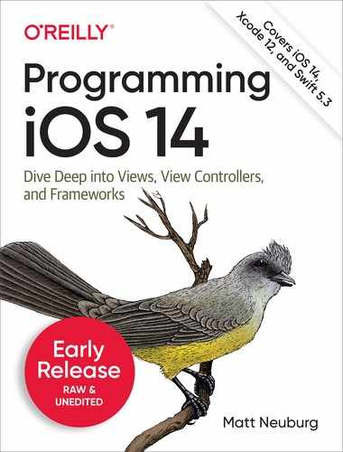
Figure 14-1 shows a basic alert, illustrating the title, the message, and the three button styles: .destructive, .default, and .cancel respectively. Here’s the code that generated it:
let alert = UIAlertController(title: "Not So Fast!",
    message: """
    Do you really want to do this
    tremendously destructive thing?
    """,
    preferredStyle: .alert)
func handler(_ act:UIAlertAction) {
    print("User tapped (act.title as Any)")
}
alert.addAction(UIAlertAction(title: "Cancel",
    style: .cancel, handler: handler))
alert.addAction(UIAlertAction(title: "Just Do It!",
    style: .destructive, handler: handler))
alert.addAction(UIAlertAction(title: "Maybe",
    style: .default, handler: handler))
self.present(alert, animated: true)
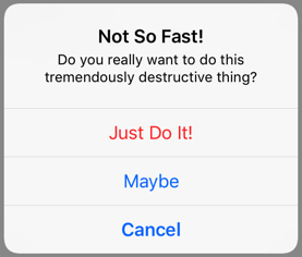
Figure 14-1. An alert
In Figure 14-1, the .destructive button appears first and the .cancel button appears last, without regard to the order in which they were added with addAction. The order in which the .default buttons were added, on the other hand, will be the order of the buttons themselves. If no .cancel button is added, the last .default button will be displayed as a .cancel button.
You can also designate an action as the alert’s preferredAction. This appears to boldify the title of that button. Suppose I append this to the preceding code:
alert.preferredAction = alert.actions[2]
The order of the actions array is the order in which we added actions, so the preferred action is now the Maybe button. The order isn’t changed — the Maybe button still appears second — but the bold styling is removed from the Cancel button and placed on the Maybe button instead.
The dialog is dismissed automatically when the user taps a button. If you don’t want to respond to the tap of a particular button, you can supply nil as the handler: argument (or omit it altogether), but the dialog will still be dismissed. In the preceding code, I’ve provided a minimal handler: function, just to show what one looks like. As the example demonstrates, the function receives the original UIAlertAction as a parameter, and can examine it as desired. The function can also access the alert controller itself, provided the alert controller is in scope at the point where the handler: function is defined (which will usually be the case). My example code assigns the same function to all three buttons, but more often you’ll give each button its own individual handler: function, probably as an anonymous function using trailing closure syntax.
Text fields may be added to an alert. Because space is limited on the smaller iPhone screen, especially when the keyboard is present, an alert that is to contain a text field should probably be assigned at most two buttons, with short titles such as “OK” and “Cancel,” and at most two text fields. To add a text field to an alert, call addTextField(configurationHandler:). The configurationHandler: function is called before the alert appears; it will receive the text field as a parameter. Button handler: functions can access the text field through the alert’s textFields property, which is an array.
In this example, the user is invited to enter a number in a text field. When the text field is added, its configurationHandler: function configures the keyboard. If the alert is dismissed with the OK button, the OK button’s handler: function reads the text from the text field:
let alert = UIAlertController(title: "Enter a number:",
    message: nil, preferredStyle: .alert)
alert.addTextField { tf in
    tf.keyboardType = .numberPad
}
func handler(_ act:UIAlertAction) {
    let tf = alert.textFields![0]
    // ... can read tf.text here ...
}
alert.addAction(UIAlertAction(title: "Cancel", style: .cancel))
alert.addAction(UIAlertAction(title: "OK",
    style: .default, handler: handler))
self.present(alert, animated: true)
A puzzle arises as to how to prevent the user from dismissing the alert if the text fields are not acceptably filled in. The alert will be dismissed if the user taps a button, and no button handler: function can prevent this. The solution is to disable the relevant buttons until the text fields are satisfactory. A UIAlertAction has an isEnabled property for this very purpose. I’ll modify the preceding example so that the OK button is disabled initially:
alert.addAction(UIAlertAction(title: "Cancel", style: .cancel))
alert.addAction(UIAlertAction(title: "OK",
    style: .default, handler: handler))
alert.actions[1].isEnabled = false
self.present(alert, animated: true)
But this raises a new puzzle: how will the OK button ever be enabled? The text field can have a delegate or a control event target–action pair (Chapter 11), and so we can hear about the user typing in it. I’ll modify the example again so that I’m notified as the user edits the text field:
alert.addTextField { tf in
    tf.keyboardType = .numberPad
    tf.addTarget(self,
        action: #selector(self.textChanged), for: .editingChanged)
}
Our textChanged method will now be called when the user edits, but this raises a further puzzle: how will this method, which receives a reference to the text field, get a reference to the OK button in the alert in order to enable it? My approach is to work my way up the responder chain from the text field to the alert controller (for the next(ofType:) method, see Appendix B). Here, I enable the OK button if and only if the text field contains some text:
@objc func textChanged(_ sender: Any) {
    let tf = sender as! UITextField
    let alert = tf.next(ofType: UIAlertController.self)
    alert?.actions[1].isEnabled = (tf.text != "")
}
But there is a hole in our implementation, because a user with a hardware keyboard can still enter nondigits and can still press Return to dismiss the alert even when the text field is empty. To prevent that, we also give the text field a delegate (in the handler: function for alert.addTextField) and implement the appropriate delegate methods:
func textField(_ textField: UITextField,
    shouldChangeCharactersIn range: NSRange,
    replacementString string: String) -> Bool {
        if string.isEmpty { return true }
        if Int(string) == nil { return false }
        return true
}
func textFieldShouldReturn(_ textField: UITextField) -> Bool {
    return textField.text != ""
}
Action Sheets
An action sheet (UIAlertController style .actionSheet) is similar to menu; it consists primarily of buttons. On the iPhone, it slides up from the bottom of the screen; on the iPad, it appears as a popover.
New in iOS 14, Apple expects your use of action sheets to be greatly reduced. The vast majority of the time, an action sheet appears in response to the user tapping a button or a bar button item — and in iOS 14, those have real menus! When your goal is to present courses of action between which the user is to choose, a menu effectively sprouts from the button the user tapped; the button becomes the choices. With an action sheet, especially on the iPhone, the user, having tapped a button, must look elsewhere for the menu of options, down at the bottom of the screen; that creates more friction.
On the other hand, sometimes friction is exactly what you want; in those cases, an action sheet remains appropriate. An action sheet is the right way to give the user an opportunity for reflection before taking a possibly destructive action. In Apple’s Photos app, asking to delete a photo brings up an action sheet whose buttons are Delete Photo and Cancel; in Apple’s Calendar app, starting to create a new event and then canceling brings up an action sheet whose buttons are Discard Changes and Keep Editing.
Perhaps the alert presented in Figure 14-1 would have been better as an action sheet. If we change the preferred style from .alert to .actionSheet, we get Figure 14-2.
Figure 14-2. An action sheet on the iPhone
On the iPad, an action sheet wants to be a popover. This means that a UIPopoverPresentationController will take charge of it. It is incumbent upon you to provide something for the popover’s arrow to point to (as explained in Chapter 10) or you’ll crash at runtime:
self.present(action, animated: true)
if let pop = action.popoverPresentationController {
    let v = sender as! UIView
    pop.sourceView = v
    pop.sourceRect = v.bounds
}
The cancel button for a popover action sheet on the iPad is suppressed, because the user can dismiss the popover by tapping outside it. On the iPhone, too, where the cancel button is displayed, the user can still dismiss the action sheet by tapping outside it. When the user does that, the cancel button’s handler: function will be called, just as if the user had tapped the cancel button — even if the cancel button is not displayed.
Alert Alternatives
Alerts and action sheets are deliberately limited, inflexible, and inappropriate to any but the simplest cases. Their interface can contain title text, buttons, and (for an alert) one or two text fields, and that’s all. What if you wanted more interface than that?
Some developers have hacked into their alerts or action sheets in an attempt to force them to be more customizable. This is wrong, and in any case there is no need for such extremes. These are just presented view controllers, and if you don’t like what they contain, you can make your own presented view controller with its own customized view. If you also want that view to look and behave like an alert or an action sheet, then make it so!
As I have shown (“Custom Presented View Controller Transition”), it is easy to create a small presented view that looks and behaves quite like an alert or action sheet, floating in front of the main interface and darkening everything behind it — the difference being that this is an ordinary view controller’s view, belonging entirely to you, so that you can populate it with any interface you like (Figure 14-3).
Figure 14-3. A presented view behaving like an alert
But a presented view controller doesn’t have to look like an alert in order to have the same effect.
A popover is virtually a secondary window, and can be truly modal. The popovers in Figure 10-1 are effectively modal dialogs.
A presented view controller on an iPad can use the .formSheet presentation style, which is effectively a dialog window smaller than the screen.
On the iPhone, any presented view is essentially a modal dialog, and can replace an alert or action sheet.
In Apple’s Mail app, when reading a mail message, the action button in iOS 12 and earlier summons an action sheet letting the user reply to the current message, forward it, or print it; starting in iOS 13, Apple wanted to add many more options, so that button now summons a custom presented view controller instead of an action sheet.
Quick Actions
Quick actions are essentially a column of buttons summoned when the user long presses on your app’s icon. They should represent convenient ways of accessing functionality that the user could equally have performed from within your app.
Quick actions are of two kinds:
- Static quick actions
-
Static quick actions are described in your app’s Info.plist. The system can present them even if your app isn’t running — indeed, even if your app has never run — because it can read your app’s Info.plist.
- Dynamic quick actions
-
Dynamic quick actions are configured in code. This means that they are not available until your app’s code has actually run. Your code can alter and remove dynamic quick actions, but it cannot affect your app’s static quick actions.
When the user taps a quick action, your app is brought to the front (launching it if necessary) and a delegate method is called. In iOS 12 and before, this was an app delegate method; now it’s a scene delegate method. You’ll be handed a UIApplicationShortcutItem describing the button the user tapped; now you can respond as appropriate.
A UIApplicationShortcutItem is just a value class, embodying five properties describing the button that will appear in the interface. Those five properties have analogs in the Info.plist, so that you can configure your static quick actions. The Info.plist UIApplicationShortcutItems entry is an array of dictionaries, one for each quick action, each containing the
properties and values you wish to set.
The UIApplicationShortcutItem properties and corresponding Info.plist keys are:
typeUIApplicationShortcutItemType-
An arbitrary string. You can use this string in your delegate method to distinguish which button was tapped. Required.
localizedTitleUIApplicationShortcutItemTitle-
The button title; a string. Required.
localizedSubtitleUIApplicationShortcutItemSubtitle-
The button subtitle; a string. Optional.
iconUIApplicationShortcutItemIconTypeUIApplicationShortcutItemIconFile-
An icon to appear in the button. Optional, but it’s good to supply some icon, because if you don’t, you’ll get an ugly filled circle by default. When forming a UIApplicationShortcutItem in code, you’ll supply a UIApplicationShortcutIcon object as its
iconproperty. UIApplicationShortcutIcon has four initializers:init(type:)-
A UIApplicationShortcutIcon.IconType. This is an enum of about 30 cases, each representing a built-in standard image, such as
.time(a clock icon). init(templateImageName:)-
Works like UIImage’s
init(named:). The image will be treated as a template image. Apple says that the image should be 35×35, though a larger image will be scaled down appropriately. init(systemImageName:)-
Works like UIImage’s
init(systemName:). The image should be a symbol image. init(contact:)-
A CNContact (see Chapter 19). The icon will be based on the contact’s picture or initials.
In the Info.plist, you may use either the
IconTypekey or theIconFilekey. The value for theIconTypekey is the Objective-C name of a UIApplicationShortcutIcon.IconType case, such asUIApplicationShortcutIconTypeTime. The value for theIconFilekey is the name of an image file in your app, suitable for use withUIImage(named:). userInfoUIApplicationShortcutItemUserInfo-
An optional dictionary of additional information, whose usage is completely up to you.
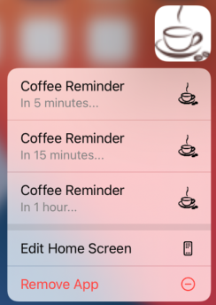
Figure 14-4. Quick actions
To illustrate, imagine that our app’s purpose is to remind the user periodically to go get a cup of coffee. Figure 14-4 shows a quick actions menu of three items generated when the user long presses our app’s icon. The first two items are static items, generated by our settings in the Info.plist, which is shown in Figure 14-5.
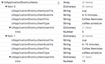
Figure 14-5. Static quick actions in the Info.plist
The third quick action item in Figure 14-4 is a dynamic item. The idea is that our app lets the user set a time interval as a favorite default interval. We cannot know what this favorite interval will be until the app runs and the user sets it; that’s why this item is dynamic. Here’s the code that generates it; all we have to do is set our shared UIApplication object’s shortcutItems property:
let subtitle = "In 1 hour..." // or whatever
let time = 60 // or whatever
let item = UIApplicationShortcutItem(type: "coffee.schedule",
    localizedTitle: "Coffee Reminder", localizedSubtitle: subtitle,
    icon: UIApplicationShortcutIcon(templateImageName: "cup"),
    userInfo: ["time":time as NSNumber])
UIApplication.shared.shortcutItems = [item]
Both in the Info.plist static quick actions and in this dynamic quick action, I’ve configured the userInfo so that when I receive this UIApplicationShortcutItem in my delegate method, I can look at the value of its "time" key to find out what time interval the user specified.
So now let’s say the user taps one of the quick action buttons. Our delegate method is called! If our app is already running, this will be the scene delegate’s windowScene(_:performActionFor:completionHandler:) method. In our response, we are supposed to finish by calling the completionHandler, passing a Bool to indicate success or failure; but in fact I see no difference in behavior regardless of whether we pass true or false, or even if we omit to call the completionHandler entirely:
func windowScene(_ windowScene: UIWindowScene,
    performActionFor shortcutItem: UIApplicationShortcutItem,
    completionHandler: @escaping (Bool) -> Void) {
        if shortcutItem.type == "coffee.schedule" {
            if let d = shortcutItem.userInfo {
                if let time = d["time"] as? Int {
                    // ... do something with time ...
                    completionHandler(true)
                }
            }
        }
        completionHandler(false)
}
If our app is launched from scratch by the user tapping a quick action button, windowScene(_:performActionFor:completionHandler:) is not called. Instead, we have to implement scene(_:willConnectTo:options:) and check whether the options: parameter’s shortcutItem isn’t nil:
func scene(_ scene: UIScene,
    willConnectTo session: UISceneSession,
    options connectionOptions: UIScene.ConnectionOptions) {
        if let shortcutItem = connectionOptions.shortcutItem {
            if shortcutItem.type == "coffee.schedule" {
                if let d = shortcutItem.userInfo {
                    if let time = d["time"] as? Int {
                        // ... do something with time ...
                    }
                }
            }
        }
}
If your app supports multiple windows on iPad, the runtime needs a way to know which window scene’s delegate to call. To answer that question, use your UIScene’s activationConditions: set it to a UISceneActivationConditions object whose canActivateForTargetContentIdentifierPredicate and prefersToActivateForTargetContentIdentifierPredicate properties specify appropriate predicates.
The targetContentIdentifier in question is a property of UIApplicationShortcutItem; it’s just a string, such as "myShortcutIdentifier". The predicate’s self is the incoming targetContentIdentifier string, so the predicate will be something like this:
let pred = NSPredicate(format: "self == 'myShortcutIdentifier'")
Warning
Apple has not explained how to specify a symbol image or a target content identifier for a static UIApplicationShortcutItem defined in the Info.plist.
Local Notifications
A local notification (Figure 14-6) is an alert to the user presented by the system — not by your app. You instruct the system as to when the notification should fire, and then you just stand back and let the system deal with it. At the time the system decides to present the alert, your app doesn’t have to be frontmost; it doesn’t even have to be running! The notification can appear when your app is frontmost, but even then it is the system that is presenting it on your behalf.
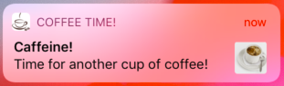
Figure 14-6. A local notification
Notification alerts can appear in any of these venues:
-
On the lock screen.
-
In the notification center; this is the interface that appears when the user swipes down from the top screen edge.
A local notification, as it fires, can do other things:
-
It can play a sound.
-
It can cause a badge number to appear on, or to be removed from, your app’s icon.
Taken together, those five possibilities constitute your app’s delivery options for local notifications. The user, in the Settings app, can veto any of the delivery options for your app’s local notifications, and can even turn off your app’s local notifications entirely. The user can also do just the opposite, turning on delivery options that were previously turned off. A user who permits your notifications to appear as a banner also gets to choose between a temporary banner, which vanishes spontaneously after displaying itself briefly, and a persistent banner, which remains until the user dismisses it.
The user can also, upon receipt of a notification from your app, summon a Manage Notifications dialog, where a Deliver Quietly button limits your app’s notifications to appear only in the notification center; there is also a Turn Off button that suppresses them entirely (Figure 14-7). Other user settings can affect notification delivery as well; for instance, the user turning on Do Not Disturb has the same effect as choosing Deliver Quietly.

Figure 14-7. The user manages your app’s notifications
The user can interact with local notification alerts in some rudimentary ways. At a minimum, a local notification alert can be tapped as a way for the user to summon your app, bringing it to the front if it is backgrounded, and launching it if it isn’t running. This response to the notification is its default action. In the lock screen or notification center, the user can slide the notification to reveal standard buttons such as Clear (to close the alert), Manage (to bring up the dialog shown in Figure 14-7), and Open (to summon your app).
The user can also elect to view the notification. Depending on the circumstances, the user might slide the notification sideways to reveal the View button and tap it, or drag it downward, or long press it. This produces the notification’s secondary interface, which you get to design.
You can add custom actions, in the form of buttons to appear in the secondary interface. A local notification can also carry an attachment, which may be an image, a sound file, or a video; in the secondary interface, if the attachment is an image, the image is displayed, and if the attachment is audio or video, interface is provided for playing it.
In Figure 14-6, the little image at the right of the alert is the thumbnail of an image attachment. In Figure 14-8, the user has summoned the alert’s secondary interface, displaying the image as well as two custom action buttons.
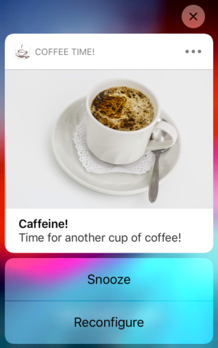
Figure 14-8. Local notification secondary interface
But wait, there’s more! You can modify the secondary interface still further by writing a notification content extension. This lets you design the interior of the secondary interface however you like. Figure 14-9 shows an example; I’ve replaced the default title and body with a caption in my own font, and I’ve shown the attachment image in a smaller size.
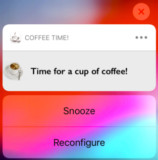
Figure 14-9. Local notification with custom secondary interface
Use of a local notification involves several steps:
-
Your app must obtain authorization for notifications.
-
You might register a notification category.
-
Your app creates and schedules the local notification, handing it over to the system.
-
Your app is prepared to hear about the user responding to the notification after it fires.
I’ll describe this sequence one step at a time; then I’ll talk about writing a notification content extension.
You’ll need to import the User Notifications framework (import UserNotifications). Most of your activity will ultimately involve the user notification center, a singleton UNUserNotificationCenter instance available by calling UNUserNotificationCenter.current().
Authorization for Local Notifications
You have a choice of two strategies for obtaining initial authorization for your app’s notifications:
- Full authorization
-
Before trying to schedule any local notifications, you ask the system to present a one-time authorization alert on your behalf. The user must choose between granting and denying authorization to your app (Figure 14-10, on the left). An app that gains full authorization in this way is eligible initially for all delivery options.
- Provisional authorization
-
With no explicit user authorization, you can be automatically authorized for “quiet” delivery: your notifications can appear in the notification center only, with no sound and no icon badging. In the notification center, your notification is accompanied by options to keep or turn off your app’s notifications (Figure 14-10, on the right). If the user ignores this choice, “quiet” delivery of your app’s notifications will continue. If the user taps Keep, an action sheet lets the user grant your app full authorization. (This form of authorization was introduced in iOS 12.)

Figure 14-10. Two ways of requesting user authorization
Which strategy should you choose? Full authorization, if you can obtain it, gives your notifications the widest range of possible venues immediately; but it can be hard to obtain. Who of us hasn’t seen that alert (Figure 14-10, on the left) and wondered: “What’s that all about?” If you’re like me, you instinctively tap Don’t Allow and move on. The idea of provisional authorization is that the user, having seen your notifications in the notification center, and having understood what they are for, might then grant full authorization. But no matter what sort of authorization you obtain, the user, at any time, can return to the Settings app and increase or decrease the powers of your local notifications.
Whichever strategy you decide on, your first step before scheduling any local notifications should be to find out whether we are already authorized. To do so, call the user notification center’s getNotificationSettings method. It returns a UNNotificationSettings object asynchronously; examine the authorizationStatus property of that object. The possibilities are (UNAuthorizationStatus):
.denied-
The user has explicitly disallowed all notifications from your app. There may be no point scheduling any local notifications, as they will not fire unless the user’s settings are changed. (You might put up an alert begging the user to switch to the Settings app and authorize your app’s notifications.)
.authorized.provisional.ephemeral-
You have authorization! Your authorization is full, provisional, or ephemeral (granted within your app’s app clip; new in iOS 14). Go ahead and schedule a local notification.
.notDetermined-
This is the really interesting case — the moment when you’re going to try to get authorization! You should immediately send
requestAuthorization(options:)to the user notification center. A Bool is returned asynchronously, telling you whether authorization was granted. Theoptions:argument is a UNAuthorizationOptions object, an option set that can include any of the following:.badge.sound.alert-
The maximum range of abilities you want your app to have.
.badgemeans you might want your app’s icon to be badged with a number when a notification fires..soundmeans you might want a sound to play when a notification fires..alertmeans you might want a notification alert to be presented when a notification fires. Be sure to include all choices that might be needed for any of your app’s notifications, as you won’t get another chance! For instance, if you don’t include.badge, the switch that lets the user turn on badges for your app’s notifications will never even appear in Settings. .provideAppNotificationSettings-
I’ll discuss this more in a moment.
.provisional-
You are opting for provisional authorization.
What happens as a result of your call to
requestAuthorization(options:)when the authorization status is.notDetermineddepends on whether your UNAuthorizationOptions does or doesn’t include.provisional:- It doesn’t include
.provisional -
The authorization alert will appear (Figure 14-10, on the left), and the user must make a choice on the spot. The outcome of that choice is the Bool that is returned from the call to
requestAuthorization(options:). - It does include
.provisional -
The authorization alert will never appear, and you will be granted provisional authorization immediately — the Bool will be
true.
Both getNotificationSettings and requestAuthorization(options:) return their results asynchronously (see Appendix C) and possibly on a background thread (Chapter 25). This means that you cannot simply follow a call to getNotificationSettings with a call to requestAuthorization(options:); if you do, requestAuthorization(options:) will run before getNotificationSettings has a chance to return its UNNotificationSettings object! Instead, you must nest the calls by means of their completion functions, like this:
let center = UNUserNotificationCenter.current()
center.getNotificationSettings { settings in
    switch settings.authorizationStatus {
    case .denied:
        break // or beg for authorization
    case .authorized, .provisional, .ephemeral:
        break // or schedule a notification
    case .notDetermined:
        center.requestAuthorization(options:[.alert, .sound]) { ok, err in
            if let err = err {
                return // could do something with the error information
            }
            if ok {
                // authorized; could schedule a notification
            }
        }
    }
    @unknown default: fatalError()
}
The parameter that arrives in your getNotificationSettings completion function (settings in the preceding code) is a UNNotificationSettings object. This object describes your app’s notification settings in the Settings app as they are configured at this moment. That information might be of interest at any time, especially because the user can change those settings. In addition to its authorizationStatus, a UNNotificationSettings object has the following properties:
soundSettingbadgeSettingalertSettingnotificationCenterSettinglockScreenSetting-
How the user has configured the notification settings for your app. A UNNotificationSetting:
-
.enabled -
.disabled -
.notSupported
-
alertStyle-
How the user has configured the alert style setting for your app. A UNAlertStyle:
-
.banner -
.alert -
.none
-
showPreviewsSetting-
How the user has configured previews for your app. I’ll discuss the implications of this setting later. A UNShowPreviewsSetting:
-
.always -
.whenAuthenticated -
.never
-
providesAppNotificationSettings-
This depends on whether your app included
.provideAppNotificationSettingswhen requesting authorization. I’ll explain that later, when I talk about the user notification center delegate.
Notification Categories
A notification category is a somewhat nebulous entity, embracing a miscellany of possible settings to be associated with individual notifications. You register any desired categories with the user notification center; each category has an arbitrary string identifier. Later, when you create a notification, you associate it with a previously registered category by means of that string identifier.
Categories have grown over the years to embrace more and more settings, so a category (UNNotificationCategory) now has three initializers with increasingly more parameters. The fullest form is:
-
init(identifier:actions:intentIdentifiers:hiddenPreviewsBodyPlaceholder:categorySummaryFormat:options:)
The identifier: is how a subsequent notification will be matched to this category. I’ll talk about the other parameters later (except for intentIdentifiers:; it has to do with SiriKit, which is not covered in this book).
To bring a category into force, you register it with the user notification center by calling setNotificationCategories. The parameter is an array of categories:
let cat1 = UNNotificationCategory(identifier: /* ... */)
let cat2 = UNNotificationCategory(identifier: /* ... */)
let cat3 = UNNotificationCategory(identifier: /* ... */)
let center = UNUserNotificationCenter.current()
center.setNotificationCategories([cat1, cat2, cat3])
There are no category management commands, in the sense of adding or removing individual categories. But the categories are maintained as a Set, so it does no harm to register the same identical category multiple times. Moreover, there is a command that allows you to get categories; you can retrieve the existing categories, add a category to the list, and set the categories again:
let center = UNUserNotificationCenter.current()
center.getNotificationCategories { cats in
    var cats = cats
    let newcat = UNNotificationCategory(identifier: /* ... */)
    cats.insert(newcat)
    center.setNotificationCategories(cats)
}
You might use a notification category for any of the following purposes:
-
You want your notification’s secondary interface to display custom actions.
-
You want your app to be notified when the user dismisses your notification.
-
You want to customize the text of your notification when the user has suppressed previews.
-
You want to customize the text that summarizes your notifications when they are grouped.
I’ll talk now about the first three of those uses, leaving grouped notifications for later.
Custom actions
Custom actions are basically buttons that appear in a notification’s secondary interface (Figure 14-8). Before iOS 12, the only way to get these was through a notification category. In iOS 12 and later, you can create custom actions in a notification context extension, so you don’t need to use a category for this unless your notification has no corresponding notification context extension.
A custom action is a UNNotificationAction, a value class whose initializer is:
-
init(identifier:title:options:)
The identifier: is an arbitrary string; you might use it later to distinguish which button was tapped. The title: is the text to appear in the button. The options: are a UNNotificationActionOptions bitmask; here are the options and what they mean if you include them:
.foreground-
Tapping this button summons your app to the foreground. Otherwise, this button will call your app in the background; your app will be given just enough time to respond and will then be suspended.
.destructive-
This button will be marked in the interface as dangerous (by being displayed in red).
.authenticationRequired-
If this is not a
.foregroundbutton, then if the user’s device requires authentication (such as a passcode) to go beyond the lock screen, tapping this button in the lock screen will also require authentication. The idea is to prevent performance of this action from the lock screen without the user explicitly unlocking it.
Alternatively, an action can be a text field where the user can type and then tap a button to send the text to your app. This is a UNTextInputNotificationAction, a UNNotificationAction subclass. Its initializer is:
-
init(identifier:title:options:textInputButtonTitle:textInputPlaceholder:)
Having created your actions, initialize your UNNotificationCategory with the actions in an array as the actions: argument. I’ll explain how your app responds to the tapping of a custom action button later, when I talk about the user notification center delegate (and custom content extensions).
Dismiss action
The user can dismiss your local notification (removing it from the notification center) without interacting with it in any other way that might cause your app to get an event — without tapping it to summon your app (the default action) and without tapping a custom action button. Normally, when that happens, your app will get no event at all, so you won’t even know that the user has seen the notification.
However, you can change that. In the UNNotificationCategory initializer, the options: parameter is a UNNotificationCategoryOptions, an option set. Include .customDismissAction if you want your code to get an event under those circumstances. I’ll explain how your app gets this event later, when I talk about the user notification center delegate.
Warning
Unfortunately, there is no dismiss event when the user merely swipes up to remove a notification alert banner; perhaps this is because the notification is not truly dismissed (it might still be in the notification center).
Previews
Notifications can pop up unexpectedly, including on the lock screen. So the user might prefer, in the interests of privacy, to suppress the notification’s text when the alert initially appears. The text would then be visible only in the notification’s secondary interface. The text in a local notification alert when it initially appears is called the preview of the notification.
In the Settings app, the user has three choices about when previews should be permitted to appear: always, when the phone is unlocked (to prevent the previews on the lock screen only), and never.
By default, if previews are turned off, the title and subtitle of the notification are suppressed, and the body text is replaced by a placeholder — the word “Notification.” Instead of “Notification,” you can supply your own placeholder. In the UNNotificationCategory initializer, set the hiddenPreviewsBodyPlaceholder: argument to the desired placeholder.
If your notification’s title and subtitle contain no sensitive information, you can cause them to appear even if previews are turned off. To do so, include the UNNotificationCategoryOptions .hiddenPreviewsShowTitle and .hiddenPreviewsShowSubtitle in the options: argument when you initialize your UNNotificationCategory.
Scheduling a Local Notification
To schedule a notification, you create a UNNotificationRequest, by calling its designated initializer:
-
init(identifier:content:trigger:)
You then tell the user notification center to add(_:) this notification to its internal list of scheduled notifications.
The identifier: is an arbitrary string. You might use this later on to distinguish which notification this is. And it lets you prevent clutter. If you schedule a notification when a previous notification with the same identifier is already scheduled, the previous notification is deleted; if a notification fires (is delivered) when a previous notification with the same identifier is already sitting in the notification center, the previous notification is deleted.
The content: is the heart and soul of this individual notification — what it is to display, what information it carries, and so forth. It is sometimes referred to as the payload of the notification. It is a UNNotificationContent object, but that class is immutable; in order to form the payload, you’ll start by instantiating its mutable subclass, UNMutableNotificationContent. You will then assign values to as many of its properties as you like. Those properties are:
title,subtitle,body-
Text visible in the notification alert.
attachments-
UNNotificationAttachment objects. An attachment is created by calling its designated initializer:
-
init(identifier:url:options:)
The
identifier:is an arbitrary string. Theurl:is the attachment itself; it must be a file URL pointing to an image file, an audio file, or a video file on disk. The file must be fairly small, because the system, in order to present it on your behalf in the notification’s interface after the notification fires some time in the future, is going to copy it off to a private secure area of its own. -
sound-
A sound (UNNotificationSound) to be played when the notification fires. You can specify a sound file in your app bundle by name (UNNotificationSoundName), or call
defaultto specify the default sound:content.sound = UNNotificationSound(named: UNNotificationSoundName("test.aif")) badge-
A number to appear on your app’s icon after this notification fires. Specify
0to remove an existing badge. (You can also set or remove your app’s icon badge at any time by means of the shared application’sapplicationIconBadgeNumber.) categoryIdentifier-
The identifier string of a previously registered category. This is how your local notification will be associated with the settings you’ve applied to that category.
userInfo-
An arbitrary dictionary, to carry extra information you’ll retrieve later.
threadIdentifier-
A string; notification alerts with the same thread identifier are grouped together physically in the lock screen and notification center. I’ll talk more about that later.
launchImageName-
Your app might be launched from scratch by the user tapping this notification’s alert. Suppose that when this happens, you’re going to configure your app so that it appears differently from how it normally launches. You might want the momentary launch screen, shown while your app starts up, to correspond to that different interface. This is how you specify the alternative launch image to be used in that situation.
The trigger: parameter tells the system how to know when it’s time for this notification to fire. It will be expressed as a subclass of UNNotificationTrigger:
- UNTimeIntervalNotificationTrigger
-
Fires starting a certain number of seconds from now, possibly repeating every time that number of seconds elapses. The initializer is:
-
init(timeInterval:repeats:)
-
- UNCalendarNotificationTrigger
-
Fires at a certain date-time, expressed using DateComponents, possibly repeating when the same DateComponents occurs again. For instance, if you use the DateComponents to express nine o’clock in the morning, without regard to date, then the trigger, if repeating, would be nine o’clock every morning. The initializer is:
-
init(dateMatching:repeats:)
-
- UNLocationNotificationTrigger
-
Fires when the user enters or leaves a certain geographical region. I’ll discuss this further in Chapter 22.
As an example, here’s the code that generated Figure 14-6:
let interval = // ... whatever ...
let trigger = UNTimeIntervalNotificationTrigger(
    timeInterval: interval, repeats: false)
let content = UNMutableNotificationContent()
content.title = "Caffeine!"
content.body = "Time for another cup of coffee!"
content.sound = UNNotificationSound.default
content.categoryIdentifier = self.categoryIdentifier
let url = Bundle.main.url(forResource: "cup", withExtension: "jpg")!
if let att = try? UNNotificationAttachment(
    identifier: "cup", url: url, options:nil) {
        content.attachments = [att]
}
let req = UNNotificationRequest(
    identifier: "coffeeNotification", content: content, trigger: trigger)
let center = UNUserNotificationCenter.current()
center.add(req)
Hearing About a Local Notification
In order to hear about your scheduled local notification after it fires, you need to configure some object to be the user notification center’s delegate, adopting the UNUserNotificationCenterDelegate protocol. You’ll want to do this very early in your app’s lifetime, because you might need to be sent a delegate message immediately upon launching; application(_:didFinishLaunchingWithOptions:) is a good place. The user notification center delegate might be the app delegate itself, or it might be some helper object that the app delegate creates and retains:
func application(_ application: UIApplication,
    didFinishLaunchingWithOptions launchOptions:
    [UIApplication.LaunchOptionsKey : Any]?) -> Bool {
        let center = UNUserNotificationCenter.current()
        center.delegate = self // or whatever
        return true
}
The UNUserNotificationCenterDelegate protocol consists of three optional methods. All three of them provide you with a UNNotification object containing the fire date and your original request (UNNotificationRequest). You can identify the local notification, and you can extract information from it, such as an attachment or the userInfo dictionary. Here are the delegate methods:
userNotificationCenter(_:willPresent:withCompletionHandler:)-
This method is called only if your app is frontmost when your local notification fires. By default, when that happens, the notification’s entire user interface is suppressed: no sound is played, no banner appears, no notification is added to the notification center or the lock screen. This method lets you know that the notification fired, but the user has no way of knowing. The idea is that your app itself, as it is already frontmost, might inform the user of whatever the user needs to know.
However, you can opt to let the system do what it would have done if your app had not been frontmost. You are handed a completion function; you must call it, with some combination of UNNotificationPresentationOptions values —
.banner,.sound, and.badge— or an empty option set, if you want the default behavior. (.banneris new in iOS 14, replacing.alert, which is deprecated.) Here’s an example where we tell the runtime to present the local notification alert within our app:func userNotificationCenter(_ center: UNUserNotificationCenter, willPresent notification: UNNotification, withCompletionHandler completionHandler: @escaping (UNNotificationPresentationOptions) -> ()) { completionHandler([.sound, .banner]) } userNotificationCenter(_:didReceive:withCompletionHandler:)-
Called when the user interacts with your local notification alert. The second parameter is a UNNotificationResponse, consisting of two properties. One, the
notification, is the UNNotification object. The other, theactionIdentifier, is a string telling you what the user did; there are three possibilities:UNNotificationDefaultActionIdentifier-
The user performed the default action, tapping the alert or the Open button to summon your app.
UNNotificationDismissActionIdentifier-
The user dismissed the local notification alert. You won’t hear about this (and this method won’t be called) unless you specified the
.customDismissActionoption for this notification’s category — and even then, as I mentioned earlier, the user merely swiping a banner up and off the screen does not count as dismissal in this sense. - A custom action identifier string
-
The user tapped a custom action button, and this is its
identifier.
If the custom action was a text input action, then the UNNotificationResponse will be a subclass, UNTextInputNotificationResponse, which has an additional
userTextproperty. You’ll cast down safely and retrieve theuserText:if let textresponse = response as? UNTextInputNotificationResponse { let text = textresponse.userText // ... }You are handed a completion function, which you must call when you’re done. You must be quick, because it may be that you are being awakened momentarily in the background, and your code is running on the main thread. Here’s an example where the user has tapped a custom action button; I use a background task (Chapter 25) and my
delayutility (Appendix B) so as to return immediately before proceeding to obey the button:func userNotificationCenter(_ center: UNUserNotificationCenter, didReceive response: UNNotificationResponse, withCompletionHandler completionHandler: @escaping () -> ()) { let id = response.actionIdentifier if id == "snooze" { var id = UIBackgroundTaskIdentifier.invalid id = UIApplication.shared.beginBackgroundTask { UIApplication.shared.endBackgroundTask(id) } delay(0.1) { self.createNotification() UIApplication.shared.endBackgroundTask(id) } } completionHandler() }If the user tapped on your notification alert (the default action), your app is activated and, if necessary, launched from scratch. If your app with window scene support is launched from scratch or if the notification is routed to a scene that was previously disconnected, your scene delegate’s
scene(_:willConnectTo:options:)is called with thenotificationResponsein itsoptions:parameter. As with a shortcut item, you can set your notification request content’stargetContentIdentifierto specify which scene the notification should be routed to. In any case,userNotificationCenter(_:didReceive:withCompletionHandler:)is still called. userNotificationCenter(_:openSettingsFor:)-
When you requested authorization, you may have included the
.provideAppNotificationSettingsoption. Doing so constitutes a promise that your app provides its own internal interface for letting the user manage notifications-related settings. In response, the runtime provides on your behalf a special app notification settings button in appropriate places like the Settings app. The user has now tapped that button, and you should immediately display that interface.How might you use this feature? Well, suppose your app has several clearly distinct categories of notification; you might want to allow the user to elect to turn notifications on or off for a particular category. Your app provides interface for letting the user do that, and the button in the Settings app provides a direct pathway to that interface. The idea is that permitting the user to perform fine-grained notification management will reduce clutter in the user’s interface and might increase the chances that the user will allow your app to continue sending notifications.
Grouped Notifications
In iOS 12 and later, grouping of notifications by app is the default (though, as usual, the user can turn it off). So you do not need to set the threadIdentifier of a notification request’s payload (UNMutableNotificationContent) merely in order to group your notifications in the lock screen and the notification center.
Rather, the purpose of the threadIdentifier is so that, if you have multiple notification types, you can use different threadIdentifier values to subdivide your app’s group into multiple groups.
Another way to tweak your grouped notifications is to change the summary text that labels each group. In Figure 14-11, the summary text “2 more notifications” is generated automatically. It might be nice to customize it, depending on what sort of thing my notifications represent. For example, I might like to describe these notifications as “reminders.” That’s the purpose of the categorySummaryFormat: parameter of the UNNotificationCategory initializer.
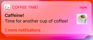
Figure 14-11. A local notification group
The categorySummaryFormat: is a format string. At a minimum, it will contain a "%u" format specifier where the count is to go, such as "%u more reminders" (Figure 14-12).
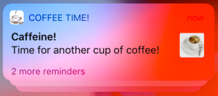
Figure 14-12. Customizing a group summary
When you create the payload for your notification, you can supply a summaryArgument string. By default, the summary text will then incorporate this as the sender or source of the notification; if the summaryArgument for three notifications is "Matt", the summary text will say “2 more notifications from Matt.” To customize that, my categorySummaryFormat string would need to contain a "%@" format specifier where the summary argument is to go, such as "%u more reminders from %@".
(Rarely, an app might also include a summaryArgumentCount in the payload. This is to cover the special case where a single notification represents more than one of whatever is represented. In the summary text, the count will be sum of the summaryArgumentCount values of the grouped notifications, rather than just the count of the grouped notifications.)
Managing Notifications
The user notification center is introspectable. It vends two lists of notifications: those that have been scheduled but have not yet fired, and those that have fired but have not yet been removed from the user’s notification center:
- Scheduled notifications
-
These are the methods for managing scheduled notifications:
-
getPendingNotificationRequests(completionHandler:) -
removePendingNotificationRequests(withIdentifiers:) -
removeAllPendingNotificationRequests
You can examine the list of scheduled notifications, and you can remove a notification from the list to cancel it; that also means you can effectively reschedule a notification (by removing it, copying it with any desired alterations, and adding the resulting notification).
You can learn when each notification is scheduled to fire; if a notification has an interval trigger or a calendar trigger, you can ask for its
nextTriggerDate. (Unfortunately, thenextTriggerDateis useless for a time interval trigger notification request, because it adds the time interval to the current time rather than to the time at which the notification was scheduled. I regard this as a major bug.) -
- Delivered notifications
-
These are the methods for managing delivered notifications:
-
getDeliveredNotifications(completionHandler:) -
removeDeliveredNotifications(withIdentifiers:) -
removeAllDeliveredNotifications
By judicious removal of notifications from this list, you can keep the user’s notification center trimmed. You might prefer that only your most recently delivered notification should appear in the notification center. You can even modify the text of a delivered notification, so that the notification will be up-to-date when the user gets around to dealing with it; to do so, you add a notification whose identifier is the same as that of an existing notification.
-
Warning
Canceling a repeating local notification is up to your code; if you don’t provide a way of doing that, then if the user wants to prevent the notification from recurring, the only recourse may be to delete your app.
Notification Content Extensions
You can customize what appears in your notification’s secondary interface. To do so, you write a notification content extension. This is a target, separate from your app target, because the system needs to access it outside your app, possibly when your app isn’t even running.
To add a notification content extension to your app, create a new target and specify iOS → Application Extension → Notification Content Extension. The template gives you a good start on your extension. You have a storyboard with a single scene, and the code for a corresponding view controller. The code file imports both the User Notifications framework and the User Notifications UI framework, and the view controller adopts the UNNotificationContentExtension protocol.
The view controller code contains a stub implementation of the didReceive(_:) method, which is the only required method.
The parameter is a UNNotification whose request is your original UNNotificationRequest; you can examine this and extract information from it as you configure your interface. The attachment URL is security scoped, so if you want to extract an attachment, you’ll have to wrap your access in calls to these URL methods:
-
startAccessingSecurityScopedResource -
stopAccessingSecurityScopedResource
The only other thing your view controller really needs to do is to set its own preferredContentSize to the desired dimensions of the custom interface. Alternatively, you can use autolayout to size the interface from the inside out.
To illustrate, here’s how the custom interface in Figure 14-9 was attained. The interface consists of a label and an image view. The image view is to contain the image attachment from the local notification, so I extract the image from the attachment and set it as the image view’s image. I find that the interface doesn’t reliably appear unless we also call setNeedsLayout at the end:
override func viewDidLoad() {
    super.viewDidLoad()
    self.preferredContentSize = CGSize(320, 80)
}
func didReceive(_ notification: UNNotification) {
    let req = notification.request
    let content = req.content
    let atts = content.attachments
    if let att = atts.first, att.identifier == "cup" {
        if att.url.startAccessingSecurityScopedResource() {
            if let data = try? Data(contentsOf: att.url) {
                self.imageView.image = UIImage(data: data)
            }
            att.url.stopAccessingSecurityScopedResource()
        }
    }
    self.view.setNeedsLayout()
}
The template also includes an Info.plist for your extension. You will need to modify it by configuring these keys:
UNNotificationExtensionCategory-
A string corresponding to the
categoryIdentifierof the local notification(s) to which this custom secondary interface is to be applied. This is how the runtime knows to associate this notification content extension with this notification! There does not have to be an actual category with this identifier. UNNotificationExtensionInitialContentSizeRatio-
A number representing the width of your custom interface divided by its height. This doesn’t have to be perfect — and indeed it probably can’t be, since you don’t know the actual width of the screen on which this interface will be displayed — but the idea is to give the system a rough idea of the size as it prepares to display the custom interface.
UNNotificationExtensionDefaultContentHidden-
Optional. A Boolean. Set to
YESif you want to eliminate the default display of the local notification’s title, subtitle, and body from the custom interface. UNNotificationExtensionOverridesDefaultTitle-
Optional. A Boolean. Set to
YESif you want to replace the default display of your app’s name at the top of the interface (where it says “Coffee Time!” in Figure 14-9) with a title of your own choosing. To determine that title, set your view controller’stitleproperty in yourdidReceive(_:)implementation.
Figure 14-13 shows the relevant part of the Info.plist for my content extension.
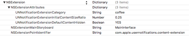
Figure 14-13. A content extension’s Info.plist
Action button management
Your secondary interface may include custom action buttons. If the user taps one of these, your user notification center delegate’s userNotificationCenter(_:didReceive:withCompletionHandler:) is called, as I described earlier. However, your notification content extension view controller can intervene in this mechanism by implementing didReceive(_:completionHandler:). This is different from didReceive(_:)! The parameter is a UNNotificationResponse, not a UNNotification, and there’s a second parameter, the completion function.
What you do in your implementation of didReceive(_:completionHandler:) is up to you. You might respond by changing the interface in some way. When you’ve finished doing whatever you came to do, the runtime needs to know how to proceed; you tell it by calling the completion function with one of these responses (UNNotificationContentExtensionResponseOption):
.doNotDismiss-
The local notification alert remains in place, still displaying the custom secondary interface.
.dismiss-
The alert is dismissed.
.dismissAndForwardAction-
The alert is dismissed and the action is passed along to your user notification center delegate’s
userNotificationCenter(_:didReceive:withCompletionHandler:).
Even if you tell the completion function to dismiss the alert, you can still modify the interface, delaying the call to the completion function so that the user has time to see the change.
Your notification content extension view controller can create and remove custom actions on the fly, in code. Your view controller inherits the UIViewController extensionContext property, which is an NSExtensionContext object. Its notificationActions property is an array of UNNotificationAction. A UNNotificationAction is an action button! This array therefore initially consists of whatever action buttons you configured in your category — and any changes you make to it will immediately be reflected in the action buttons the user sees.
This means you don’t have to create your custom actions in your category configuration in the first place! Creating custom action buttons in your category configuration allows you to have custom buttons without a notification content extension. But if you have a notification content extension, you can create the custom actions in the view controller’s didReceive(_:completionHandler:) instead.
Interface interaction
Prior to iOS 12, a custom secondary interface (the notification content extension view controller’s main view) is not interactive. If the user taps it, nothing happens — except that the notification’s default action is performed, which means that the notification is dismissed and your app is summoned. The exception is that the runtime can add a tappable play/pause button for you; this is useful if your custom interface contains video or audio material. Three UNNotificationContentExtension properties can be overridden to dictate that the play/pause button should appear and where it should go, and two methods can be implemented to hear when the user taps the play/pause button.
Starting in iOS 12, the view controller’s main view can be interactive. This is an opt-in feature: under the NSExtensionAttributes in the Info.plist, add the UNNotificationExtensionUserInteractionEnabled Boolean key and set its value to YES. Now the entire mechanism for user interaction springs to life. For instance, your interface can contain a button; if you’ve configured its action in the storyboard to call a method in your view controller, the user can tap the button to call that method.
Making your content extension view interactive in this way means that the user can no longer tap in the view to trigger the notification’s default action, dismissing the notification and summoning your app. Therefore, there is a way for your code to trigger the notification’s default action: tell the extension context to performNotificationDefaultAction. In your app, the user notification center delegate’s userNotificationCenter(_:didReceive:withCompletionHandler:) will be called with the UNNotificationDefaultActionIdentifier, as you would expect.
You can also dismiss the notification without summoning your app: tell the extension context to dismissNotificationContentExtension. In that case, userNotificationCenter(_:didReceive:withCompletionHandler:) is not called, even if you have registered for the .customDismissAction (I regard that as a bug).
Activity Views
An activity view is the view belonging to a UIActivityViewController, typically appearing when the user taps a Share button. To display it, you start with one or more pieces of data, such as a string or an image, that you want the user to have the option of sharing or working with. The activity view, when it appears, will then contain a menu item or app icon for every activity (UIActivity) that can work with this type of data. The user may tap one of these to send the data to the activity, and is then perhaps shown additional interface belonging to the provider of the chosen activity.
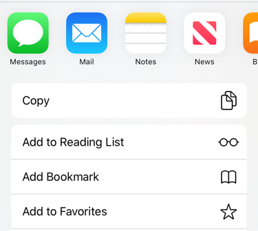
Figure 14-14. An activity view
Figure 14-14 shows an activity view from Mobile Safari. There’s a row displaying the icons of some apps that provide applicable built-in system-wide activities; this is followed by menu items representing activities provided internally by Safari itself. When you present an activity view within your app, you can add menu items for activities provided internally by your app. Moreover, your app can provide system-wide activities that are available when any app presents an activity view; these come in two forms:
- Share extensions
-
A share extension is represented as an app icon in the upper row of an activity view. Share extensions are for apps that can accept information into themselves, either for storage, such as Notes and Reminders, or for sending out to a server, such as Twitter and Facebook.
- Action extensions
-
An action extension is represented among the menu items of an activity view. Action extensions offer to perform some kind of manipulation on the data provided by the host app.
I’ll describe how to present an activity view and how to construct an activity that’s internal to your app. Then I’ll give an example of writing an action extension, and finally an example of writing a share extension.
Presenting an Activity View
You will typically want to present an activity view in response to the user tapping a Share button in your app. To do so:
-
Instantiate UIActivityViewController. The initializer you’ll be calling is:
-
init(activityItems:applicationActivities:)
The
activityItems:argument is an array of objects to be shared or operated on, such as string or image objects. Presumably these are objects associated somehow with the interface the user is looking at right now. -
-
Set the activity view controller’s
completionWithItemsHandlerproperty to a function that will be called when the user’s interaction with the activity interface has finished. -
Present the activity view controller, as a presented view controller; on the iPad, it will be a popover, so you’ll also configure the popover presentation controller. The presented view will be dismissed automatically when the user cancels or chooses an activity.
Here’s an example:
let url = Bundle.main.url(forResource:"sunglasses", withExtension:"png")!
let things : [Any] = ["This is a cool picture", url]
let avc = UIActivityViewController(
    activityItems:things, applicationActivities:nil)
avc.completionWithItemsHandler = { type, ok, items, err in
    // ...
}
self.present(avc, animated:true)
if let pop = avc.popoverPresentationController {
    let v = sender as! UIView
    pop.sourceView = v
    pop.sourceRect = v.bounds
}
The activity view is populated automatically with known system-wide activities that can handle any of the types of data you provided as the activityItems: argument. These activities represent UIActivity types (UIActivity.ActivityType):
-
.postToFacebook -
.postToTwitter -
.postToWeibo -
.message -
.mail -
.print -
.copyToPasteboard -
.assignToContact -
.saveToCameraRoll -
.addToReadingList -
.postToFlickr -
.postToVimeo -
.postToTencentWeibo -
.airDrop -
.openInIBooks -
.markupAsPDF
Consult the UIActivity class documentation to learn what types of activity item each of these activities can handle. For instance, the .mail activity will accept a string, an image, or a file (such as an image file) designated by a URL; it will present a mail composition interface with the activity item(s) in the body.
Since the default is to include all the system-wide activities that can handle the provided data, if you don’t want a certain system-wide activity included in the activity view, you must exclude it explicitly. You do this by setting the UIActivityViewController’s excludedActivityTypes property to an array of activity type constants.
Tip
Apps other than Messages, Mail, and Books have no corresponding UIActivity type, because they are implemented as share extensions; it is up to the user to include or exclude them.
In the UIActivityViewController initializer init(activityItems:applicationActivities:), if you would prefer that an element of the activityItems: array should be an object that will supply the data instead of the data itself, make it an object that adopts the UIActivityItemSource protocol. Typically, this object will be self (the view controller in charge of all this code). Here’s a minimal, artificial example:
extension ViewController : UIActivityItemSource {
    func activityViewControllerPlaceholderItem(
        _ activityViewController: UIActivityViewController) -> Any {
            return ""
    }
    func activityViewController(
        _ activityViewController: UIActivityViewController,
        itemForActivityType activityType: UIActivity.ActivityType?) -> Any? {
            return "Coolness"
    }
}
The first method provides a placeholder that exemplifies the type of data that will be returned; the second method returns the actual data. The second method can return different data depending on the activity type that the user chose; in this way, you could provide one string to Notes and another string to Mail.
The UIActivitySource protocol also answers a commonly asked question about how to get the Mail activity to populate the mail composition form with a default subject:
extension ViewController : UIActivityItemSource {
    // ...
    func activityViewController(
        _ activityViewController: UIActivityViewController,
        subjectForActivityType activityType: UIActivity.ActivityType?)
        -> String {
            return "This is cool"
    }
}
If your activityItems: data is time-consuming to provide, substitute an instance of a UIActivityItemProvider subclass:
let avc = UIActivityViewController(
    activityItems:[MyProvider(placeholderItem: "")],
    applicationActivities:nil)
The placeholderItem: in the initializer signals the type of data that this UIActivityItemProvider object will actually provide. Your UIActivityItemProvider subclass should override the item property to return the actual object. This property will be consulted on a background thread, and UIActivityItemProvider is itself an Operation subclass (see Chapter 25).
Custom Activities
The purpose of the applicationActivities: parameter of init(activityItems:applicationActivities:) is for you to list any additional activities implemented internally by your own app. These will appear as menu items when your app presents an activity view. Each activity will be an instance of one of your own UIActivity subclasses.
To illustrate, I’ll create a minimal (and nonsensical) activity called Be Cool that accepts string activity items. It is a UIActivity subclass called MyCoolActivity. So, to include Be Cool among the choices presented to the user by a UIActivityViewController, I’d say:
let things : [Any] = ["This is a cool picture", url]
let avc = UIActivityViewController(
    activityItems:things, applicationActivities:[MyCoolActivity()])
Now let’s implement MyCoolActivity. It has an array property called items, for reasons that will be apparent in a moment. We need to arm ourselves with an image to represent this activity in the activity view; this will be treated as a template image and will be scaled down automatically. Here’s the preparatory part of the implementation of MyCoolActivity:
var items : [Any]?
var image : UIImage
override init() {
    // ... construct self.image ...
    super.init()
}
override class var activityCategory : UIActivity.ActivityCategory {
    return .action // the default
}
override var activityType : UIActivity.ActivityType {
    return UIActivity.ActivityType("com.neuburg.matt.coolActivity")
}
override var activityTitle : String? {
    return "Be Cool"
}
override var activityImage : UIImage? {
    return self.image
}
override func canPerform(withActivityItems activityItems: [Any]) -> Bool {
    for obj in activityItems {
        if obj is String {
            return true
        }
    }
    return false
}
override func prepare(withActivityItems activityItems: [Any]) {
    self.items = activityItems
}
If we return true from canPerform(withActivityItems:), then a menu item for this activity with title Be Cool and displaying our activityImage will appear in the activity view (Figure 14-15).
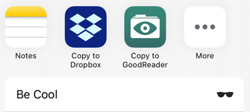
Figure 14-15. Our activity appears in our activity view
If the user taps our menu item, prepare(withActivityItems:) will be called. We retain the activityItems into our items property, because they won’t be arriving again when we are actually told to perform the activity.
The next step is that we are told to perform the activity. To do so, we implement one of these:
performmethod-
We immediately perform the activity directly, using the activity items we’ve already retained. If the activity is time-consuming, it should be performed on a background thread (Chapter 25) so that we can return immediately; the activity view interface will be taken down and the user will be able to go on interacting with the app.
activityViewControllerproperty-
We have further interface that we’d like to show the user as part of the activity, so we provide an instance of a UIViewController subclass. The activity view mechanism will present this view controller for us; it is not our job to present or dismiss it. (But we may subsequently present or dismiss dependent interface. If our view controller is a navigation controller with a custom root view controller, we might push another view controller onto its stack while the user is interacting with the activity.)
No matter which of those we implement, we must eventually call this activity instance’s activityDidFinish(_:). This is the signal to the activity view mechanism that the activity is over. If the activity view is still being presented, it will be taken down or not, depending on the argument we supply here, true or false; and the argument will be passed into the function we supplied earlier as the activity view controller’s completionWithItemsHandler:
override func perform() {
    // ... do something with self.items here ...
    self.activityDidFinish(true)
}
If the UIActivity is providing a view controller as its activityViewController, it will want to hand that view controller a reference to self beforehand, so that the view controller can call the activity’s activityDidFinish(_:) when the time comes. This reference will need to be weak; otherwise, a retain cycle ensues.
To illustrate, suppose our activity involves letting the user draw a mustache on a photo of someone. We need our own interface for that, so we return a view controller as the activityViewController. Our view controller will include some way of letting the user signal completion, such as a Cancel button and a Done button. When the user taps either of those, we’ll do whatever else is necessary (such as saving the altered photo somewhere if the user tapped Done) and then call activityDidFinish(_:). We could implement the activityViewController property like this:
override var activityViewController : UIViewController? {
    let mvc = MustacheViewController(activity: self, items: self.items!)
    return mvc
}
And then MustacheViewController would have code like this:
weak var activity : UIActivity?
var items: [Any]
init(activity:UIActivity, items:[Any]) {
    self.activity = activity
    self.items = items
    super.init(nibName: "MustacheViewController", bundle: nil)
}
// ... other stuff ...
@IBAction func doCancel(_ sender: Any) {
    self.activity?.activityDidFinish(false)
}
@IBAction func doDone(_ sender: Any) {
    self.activity?.activityDidFinish(true)
}
Our activityViewController is displayed as a presented view controller. Starting in iOS 13, this is a sheet that the user can dismiss by dragging down. If the user does that, the right thing happens automatically: activityDidFinish is called for us with an argument of false.
Note
The purpose of the SFSafariViewController delegate method safariViewController(_:activityItemsFor:title:) (Chapter 12) is now clear. This view controller’s view appears inside your app, but it isn’t your view controller, its Share button is not your button, and the activity view that it presents is not your activity view. Therefore, you need some other way to add custom UIActivity items to that activity view; to do so, implement this method.
Action Extensions
Your app’s activity can appear among the menu items when some other app displays an activity view. To make that happen, you write an action extension. A single app can provide multiple action extensions.
To write an action extension, start with the appropriate target template, iOS → Application Extension → Action Extension. There are two kinds of action extension, with or without an interface; you’ll make your choice in the second pane as you create the target.
In the Info.plist, in addition to setting the bundle name, which will appear below the activity’s icon in the activity view, you’ll need to specify what types of data this activity accepts as its operands. In the NSExtensionActivationRule dictionary, you’ll provide one or more keys, such as:
-
NSExtensionActivationSupportsFileWithMaxCount -
NSExtensionActivationSupportsImageWithMaxCount -
NSExtensionActivationSupportsMovieWithMaxCount -
NSExtensionActivationSupportsText -
NSExtensionActivationSupportsWebURLWithMaxCount
For the full list, see the “Action Extension Keys” section of Apple’s Information Property List Key Reference. It is also possible to declare in a more sophisticated way what types of data your activity accepts, by writing an NSPredicate string as the value of the NSExtensionActivationRule key. Figure 14-16 shows the relevant part of the Info.plist for an action extension that accepts one text object.
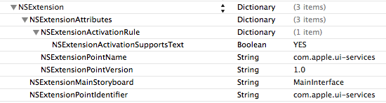
Figure 14-16. An action extension Info.plist
To supply the image that will appear in the menu item for your activity, add an asset catalog to the action extension target and create an iOS app icon in the asset catalog. The icon will be treated as a template image.
I’ll describe how to implement an action extension with an interface. This, in effect, is your chance to inject an entire presented view controller into another app!
Our example extension accepts a string that might be the two-letter abbreviation of one of the U.S. states, and if it is, it provides the name of the state. The template provides a storyboard with one scene, along with the code for a corresponding UIViewController subclass called ActionViewController. I’ll give the interface a Cancel button, a Done button (self.doneButton), and a label (self.lab). I’ll also declare two Optional string properties to hold our data, self.orig (the incoming string) and self.expansion (the state name, if any). Finally, self.list will be a dictionary whose keys are state name abbreviations and whose values are the corresponding state names; that information comes from a text file in the action extension bundle:
let list : [String:String] = {
    let path = Bundle.main.url(forResource:"abbrevs", withExtension:"txt")!
    // ... load the text file as a string, parse into dictionary (result)
    return result
}()
I have a little utility method that looks up a string in that dictionary:
func state(for abbrev:String) -> String? {
    return self.list[abbrev]
}
Our view controller’s viewDidLoad starts by preparing the interface:
override func viewDidLoad() {
    super.viewDidLoad()
    self.doneButton.isEnabled = false
    self.lab.text = "No expansion available."
    // ...
}
We turn next to the data from the host app, which is supposed to be a string that might be a state abbreviation. It arrives by way of the view controller extensionContext property, which is an NSExtensionContext (wrapped in an Optional). Think of this as a holding a nest of envelopes that we must examine and open:
-
The NSExtensionContext’s
inputItemsis an array of NSExtensionItem objects. -
An NSExtensionItem has an
attachmentsarray of NSItemProvider objects. -
An NSItemProvider vends items, each of which represents the data in a particular format. In particular:
-
We can ask whether an NSItemProvider has an item of a particular type, by calling
hasItemConformingToTypeIdentifier(_:). -
We can retrieve the item of a particular type, by calling
loadItem(forTypeIdentifier:options:completionHandler:). The item may be vended lazily, and can take time to prepare and provide; so we proceed in thecompletionHandler:function to receive the item and do something with it.
-
We are expecting only one item, so it will be provided by the first NSItemProvider inside the first NSExtensionItem. So my first move is to look inside that envelope and make sure it contains a string:
if self.extensionContext == nil {
    return
}
let items = self.extensionContext!.inputItems
let desiredType = UTType.plainText.identifier
guard let extensionItem = items[0] as? NSExtensionItem
    else {return}
guard let provider = extensionItem.attachments?.first
    else {return}
guard provider.hasItemConformingToTypeIdentifier(self.desiredType)
    else {return}
If we’ve gotten this far, there’s a string in that envelope, and we’re now ready to retrieve it and see if it is the abbreviation of a state. If it is, I’ll enable the Done button and offer to place the abbreviation on the clipboard if the user taps that button:
provider.loadItem(forTypeIdentifier: desiredType) { item, err in
    DispatchQueue.main.async {
        if let orig = (item as? String)?.uppercased() {
            self.orig = orig
            if let exp = self.state(for:orig) {
                self.expansion = exp
                self.lab.text = """
                    Can expand (orig) to (exp).
                    Tap Done to place on clipboard.
                    """
                self.doneButton.isEnabled = true
            }
        }
    }
}
All that remains is to implement the action methods for the Cancel and Done buttons. They must both call this method of the extension context:
-
completeRequest(returningItems:completionHandler:)
That call is the signal that our interface should be taken down. The only difference between the two buttons is that the Done button puts the expanded state name onto the clipboard:
@IBAction func cancel(_ sender: Any) {
    self.extensionContext?.completeRequest(returningItems: nil)
}
@IBAction func done(_ sender: Any) {
    UIPasteboard.general.string = self.expansion!
    self.extensionContext?.completeRequest(returningItems: nil)
}
Share Extensions
Your app can appear in the row of app icons when some other app displays an activity view. To make that happen, you write a share extension. A share extension is similar to an action extension, but instead of processing the data it receives, it is expected to deposit that data somehow, such as storing it or posting it to a server. Your app can provide at most one share extension.
The user, after tapping your app’s icon in the activity view, is given an opportunity to interact further with the data before completing the share operation, possibly modifying it or canceling altogether. To make this possible, the Share Extension template, when you create the target (iOS → Application Extension → Share Extension), will give you a storyboard and a view controller. This view controller can be one of two types:
- An SLComposeServiceViewController
-
The SLComposeServiceViewController provides a standard interface for displaying editable text in a UITextView along with a possible preview, plus user-configurable option buttons, along with a Cancel button and a Post button.
- A plain view controller subclass
-
If you opt for a plain view controller subclass, then designing its interface, including providing a way to dismiss it, will be up to you.
Whichever form of interface you elect to use, your way of dismissing it will be this familiar-looking incantation:
self.extensionContext?.completeRequest(returningItems:nil)
I’ll describe the basics of working with an SLComposeServiceViewController, as it can be rather tricky. Its view contains a text view that is already populated with the text passed along from the host app when the view appears, so there’s very little more for you to do; you can add a preview view and option buttons, and that’s just about all. Figure 14-17 shows my share extension, summoned from within the Notes app; the text of the note has been copied automatically into the SLComposeServiceViewController’s text view.

Figure 14-17. A share extension
An option button displays a title string and a value string. When tapped, it will typically summon interface where the user can change the value string. My SLComposeServiceViewController implements an option button, visible in Figure 14-17. It’s a Size button, whose value can be Large, Medium, or Small. (I have no idea what this choice is supposed to signify for my app; it’s only an example!) I’ll explain how I did that.
To create the configuration option, I override the SLComposeServiceViewController configurationItems method to return an array of one SLComposeSheetConfigurationItem. Its title and value are displayed in the button. Its tapHandler will be called when the button is tapped. Typically, you’ll create a view controller and push it into the interface with pushConfigurationViewController:
weak var config : SLComposeSheetConfigurationItem?
var selectedText = "Large" {
    didSet {
        self.config?.value = self.selectedText
    }
}
override func configurationItems() -> [Any]! {
    let c = SLComposeSheetConfigurationItem()!
    c.title = "Size"
    c.value = self.selectedText
    c.tapHandler = { [unowned self] in
        let tvc = TableViewController(style: .grouped)
        tvc.selectedSize = self.selectedText
        tvc.delegate = self
        self.pushConfigurationViewController(tvc)
    }
    self.config = c
    return [c]
}
My TableViewController is a UITableViewController subclass. Its table view displays three rows whose cells are labeled Large, Medium, and Small, along with a checkmark (compare the table view described in “Cell Choice and Static Tables”). The tricky part is that I need a way to communicate with this table view controller: I need to tell it what the configuration item’s value is now, and I need to hear from it what the user chooses in the table view. So I’ve given the table view controller a property (selectedSize) where I can deposit the configuration item’s value, and I’ve declared a delegate protocol so that the table view controller can set the selectedText of the SLComposeServiceViewController. This is the relevant portion of my TableViewController class:
protocol SizeDelegate : class {
    var selectedText : String {get set}
}
class TableViewController: UITableViewController {
    var selectedSize : String?
    weak var delegate : SizeDelegate?
    override func tableView(_ tableView: UITableView,
        didSelectRowAt indexPath: IndexPath) {
            let cell = tableView.cellForRow(at:indexPath)!
            let s = cell.textLabel!.text!
            self.selectedSize = s
            self.delegate?.selectedText = s
            tableView.reloadData()
    }
    // ...
}
The navigation interface is provided for me, so I don’t have to do anything about popping the table view controller: the user will do that by tapping the Back button after choosing a size. In my configurationItems implementation, I cleverly kept a reference to my configuration item as self.config. When the user chooses from the table view, its tableView(_:didSelectRowAt:) sets my selectedText, and my selectedText setter observer promptly changes the value of the configuration item to whatever the user chose.
The user, when finished interacting with the share extension interface, will tap one of the provided buttons, either Cancel or Post. The Cancel button is handled automatically: the interface is dismissed. The Post button is hooked automatically to my didSelectPost implementation, where I fetch the text from my own contentText property, do something with it, and dismiss the interface:
override func didSelectPost() {
    let s = self.contentText
    // ... do something with it ...
    self.extensionContext?.completeRequest(returningItems:nil)
}
If the material provided from the host app were more elaborate, I would pull it out of self.extensionContext in the same way as for an action extension. If there were networking to do at this point, I would initiate a background URLSession (as I’ll explain in Chapter 24).
There is no official way, as far as I can tell, to change the title or appearance of the Cancel and Post buttons. Apps that show different buttons, such as Reminders and Notes, are either not using SLComposeServiceViewController or are using a technique available only to Apple. I was able to change my Post button to a Save button like this:
override func viewDidLayoutSubviews() {
    super.viewDidLayoutSubviews()
    self.navigationController?.navigationBar.topItem?
        .rightBarButtonItem?.title = "Save"
}
But whether that’s legal, and whether it will keep working on future systems, is anybody’s guess.