Chapter 10. iPad Interface
This chapter has been revised for Early Release. It reflects iOS 14, Xcode 12, and Swift 5.3. But screenshots have not been retaken; they still show the Xcode 11 / iOS 13 interface.
This chapter discusses some iOS interface features that differ between the iPad and the iPhone:
- Popovers and split views
-
Popovers and split views were exclusive to the iPad when they were introduced in iOS 3.2. Starting in iOS 8, they became available also on the iPhone, where they typically adapt, appearing in an altered form more appropriate to the smaller screen. New in iOS 14, split views have been completely overhauled.
- iPad multitasking
-
iPad multitasking, introduced in iOS 9, is an interface confined to the iPad, where two apps can occupy the screen simultaneously.
- Drag and drop
-
Drag and drop was introduced in iOS 11 primarily to allow the user to drag from one app to another in an iPad multitasking interface. It can also be used within a single app, even on the iPhone.
- Pointer and keyboard handling
-
New in iOS 14, an iPad user can attach a pointing device, such as a mouse or trackpad; your app can respond to and manipulate the onscreen cursor. If an external keyboard is attached, your app can also detect keyboard shortcuts.
- Multiple windows
-
Starting in iOS 13, an app can display multiple windows on the iPad.
Popovers
A popover is a temporary view layered in front of the main interface. It is usually associated, through a sort of arrow, with a view in the main interface, such as the button that the user tapped to summon the popover. It might be effectively modal, preventing the user from working in the rest of the interface; alternatively, it might vanish if the user taps outside it.
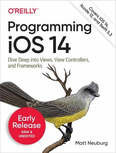
Popovers bring to the larger iPad the smaller, more lightweight flavor of the iPhone. In my LinkSame app, both the settings view (where the user configures the game) and the help view (which describes how to play the game) are popovers (Figure 10-1). On the iPhone, these views occupy the entire screen; the user navigates to one of them and later has to navigate back to the main game interface. But on the larger iPad screen, neither view is large enough, or important enough, to occupy the entire screen exclusively. A popover is the perfect solution. A popover view is small and secondary, and the user summons it temporarily, works with it, and then dismisses it, while the main interface continues to occupy the rest of the screen.
Figure 10-1. Two popovers
A popover is actually a form of presented view controller — a presented view controller with a modalPresentationStyle of .popover (which I didn’t tell you about in Chapter 6). There’s a guideline that a maximum of one popover at a time should be shown; a view controller can’t have more than one presented view controller at a time, so the guideline is enforced automatically.
Like a sheet presented view controller, a popover can adapt, depending on the size class environment. The default adaptation of a popover on the iPhone depends on what system we’re running on:
- iOS 12 and before
-
The default adaptation on the iPhone is
.fullScreen. - iOS 13 and later
-
The default adaptation on the iPhone is
.formSheet. This is indistinguishable from.pageSheet, meaning that it leaves a gap at the top in portrait, but behaves like.overFullScreenin landscape.
You don’t have to accept the default; you can customize how the popover adapts. It can appear on the iPhone as .fullScreen even in portrait; it can even appear as a popover! I’ll explain later how to make it do that.
Tip
A popover presented view controller that appears as a popover has a .compact horizontal size class, even on an iPad.
To display a popover, you’re going to present a view controller. Before that presentation takes place, you’ll turn this into a popover presentation by setting the view controller’s modalPresentationStyle to .popover:
let vc = MyViewController()
vc.modalPresentationStyle = .popover
self.present(vc, animated: true)
But that code is insufficient. In fact, it will crash at runtime when the popover is presented! The reason is that some further configuration of the popover is required before it appears.
To configure a popover, you’ll talk to its presentation controller. Setting the view controller’s modalPresentationStyle to .popover, as in the preceding code, causes its presentationController to become a UIPopoverPresentationController (a UIPresentationController subclass). The popover view controller’s popoverPresentationController property points to the presentation controller as a popover presentation controller (or to nil). That’s the object you need to talk to.
In general, it is permissible to perform your configurations just after telling your view controller to present the popover, because even though you have ordered the presentation, it hasn’t actually started yet. This is a common pattern:
let vc = MyViewController()
vc.modalPresentationStyle = .popover
self.present(vc, animated: true)
if let pop = vc.popoverPresentationController {
    // ... configure pop here ...
}
Arrow Source and Direction
At a minimum, the popover presentation controller needs to know where its arrow should point. You’ll specify this by setting one of the following:
barButtonItem-
A bar button item in the interface, with which the popover should be associated. The popover’s arrow will point to this bar button item. Typically, this will be the bar button item that was tapped in order to summon the popover (as in Figure 10-1).
sourceView,sourceRect-
A UIView in the interface, along with a CGRect in that view’s coordinate system, with which the popover should be associated. The popover’s arrow will point to this rect. Typically, the
sourceViewwill be the view that was tapped in order to summon the popover, and thesourceRectwill be that view’sbounds.
Here’s a minimal popover presentation that works without crashing; the popover is summoned by tapping a UIButton in the interface, and this is that button’s action method:
@IBAction func doButton(_ sender: Any) {
    let vc = MyViewController()
    vc.modalPresentationStyle = .popover
    self.present(vc, animated: true)
    if let pop = vc.popoverPresentationController {
        let v = sender as! UIView
        pop.sourceView = v
        pop.sourceRect = v.bounds
    }
}
In addition to the arrow source, you can set the desired arrow direction, as the popover presentation controller’s permittedArrowDirections. This is a bitmask with possible values .up, .down, .left, and .right. The default is .any, comprising all four bitmask values; that will usually be what you want.
Popover Size
You can specify the desired size of the popover view. This information is provided through the presented view controller’s preferredContentSize. Recall (from Chapter 6) that a view controller can use its preferredContentSize to communicate to its container view controller, qua UIContentContainer, the size that it would like to be. The popover presentation controller is a presentation controller (UIPresentationController), which is also a UIContentContainer; it will consult the presented view controller’s preferredContentSize and will try, within limits, to respect it. The presentation of the popover won’t fail if you don’t supply a size for the popover, but you probably will want to supply one, as the default is unlikely to be desirable.
Who will set the presented view controller’s preferredContentSize, and when? It’s up to you. The presented view controller might set its own preferredContentSize; its viewDidLoad is a reasonable place, or, if the view controller is instantiated from a nib, the nib editor provides Content Size fields in the Attributes inspector. Alternatively, you can set the presented view controller’s preferredContentSize when you configure the popover presentation controller:
if let pop = vc.popoverPresentationController {
    let v = sender as! UIView
    pop.sourceView = v
    pop.sourceRect = v.bounds
    vc.preferredContentSize = CGSize(200,500) // *
}
It is possible to change the presented view controller’s preferredContentSize while the popover is showing. The popover presentation controller will hear about this (through the preferredContentSizeDidChange mechanism discussed in Chapter 6), and may respond by changing the popover’s size, with animation.
The popover presentation controller’s canOverlapSourceViewRect can be set to true to permit the popover to cover the source view if space becomes tight while attempting to comply with the preferredContentSize. The default is false.
You can also set the popover presentation controller’s popoverLayoutMargins as a way of encouraging the popover to maintain some distance from the edges of the presenting view controller’s view. (This property was broken starting about iOS 8, but works correctly again starting in iOS 13.)
Popover Appearance
By default, a popover presentation controller bases the arrow color on the color of the presented view controller’s view.
Alternatively, you can set the popover presentation controller’s backgroundColor; this sets the arrow color as well. But the presented view controller’s own view color will override this, unless it is .clear or nil.
For full control, you can customize the entire outside of the popover — that is, the “frame” surrounding the content, including the arrow. To do so, you set the UIPopoverPresentationController’s popoverBackgroundViewClass to your own subclass of UIPopoverBackgroundView (a UIView subclass). You then implement the UIPopoverBackgroundView’s draw(_:) method to draw the arrow and the frame. The size of the arrow is dictated by your implementation of the arrowHeight property. The thickness of the frame is dictated by your implementation of the contentViewInsets property.
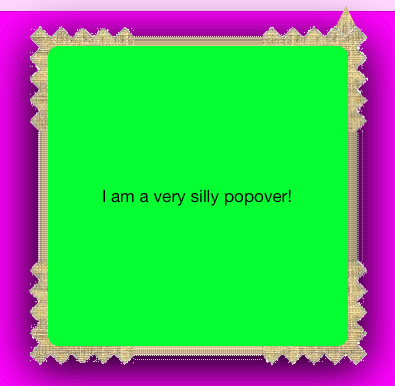
Figure 10-2. A very silly popover
A very silly example is shown in Figure 10-2. Here’s how that result was achieved. I start by implementing five inherited members that we are required to override, along with our initializer:
class MyPopoverBackgroundView : UIPopoverBackgroundView {
    override class func arrowBase() -> CGFloat { return 20 }
    override class func arrowHeight() -> CGFloat { return 20 }
    override class func contentViewInsets() -> UIEdgeInsets {
        return UIEdgeInsets(top: 20, left: 20, bottom: 20, right: 20)
    }
    // we are required to implement these, even trivially
    var arrOff : CGFloat
    var arrDir : UIPopoverArrowDirection
    override var arrowDirection : UIPopoverArrowDirection {
        get { return self.arrDir }
        set { self.arrDir = newValue }
    }
    override var arrowOffset : CGFloat {
        get { return self.arrOff }
        set { self.arrOff = newValue }
    }
    override init(frame:CGRect) {
        self.arrOff = 0
        self.arrDir = .any
        super.init(frame:frame)
        self.isOpaque = false
    }
    // ...
}
Now I’ll implement draw(_:). Its job is to draw the frame and the arrow. This can be a bit tricky, because we need to draw differently depending on the arrow direction (which we can learn from the UIPopoverBackgroundView’s arrowDirection property). I’ll simplify by assuming that the arrow direction will always be .up.
I’ll start with the frame. I divide the view’s overall rect into two areas, the arrow area on top and the frame area on the bottom, and I draw the frame into the bottom area as a resizable image (Chapter 2):
override func draw(_ rect: CGRect) {
    let linOrig = UIImage(named: "linen.png")!
    let capw = linOrig.size.width / 2.0 - 1
    let caph = linOrig.size.height / 2.0 - 1
    let lin = linOrig.resizableImage(
        withCapInsets:
            UIEdgeInsets(top: caph, left: capw, bottom: caph, right: capw),
        resizingMode:.tile)
    let arrowHeight = Self.arrowHeight()
    let arrowBase = Self.arrowBase()
    // ... draw arrow here ...
    let (_,body) = rect.divided(atDistance: arrowHeight, from: .minYEdge)
    lin.draw(in:body)
}
Our next task is to fill in the blank left by the “draw arrow here” comment in the preceding code. We don’t actually have to do that; we could quite legally stop at this point. Our popover would then have no arrow, but that’s no disaster; many developers dislike the arrow and seek a way to remove it, and this constitutes a legal way. But let’s continue by drawing the arrow.
My arrow will consist simply of a texture-filled isosceles triangle, with an excess base rectangle joining it to the frame. The runtime has set the arrowOffset property to tell us where to draw the arrow: this offset measures the positive distance between the center of the view’s edge and the center of the arrow. However, the runtime will have no hesitation in setting the arrowOffset all the way at the edge of the view, or even beyond its bounds (in which case it won’t be drawn); to prevent this, I impose a maximum offset limit:
let con = UIGraphicsGetCurrentContext()!
con.saveGState()
// clamp offset
var propX = self.arrowOffset
let limit : CGFloat = 22.0
let maxX = rect.size.width/2.0 - limit
propX = min(max(propX, limit), maxX)
// draw!
con.translateBy(x: rect.size.width/2.0 + propX - arrowBase/2.0, y: 0)
con.move(to:CGPoint(0, arrowHeight))
con.addLine(to:CGPoint(arrowBase / 2.0, 0))
con.addLine(to:CGPoint(arrowBase, arrowHeight))
con.closePath()
con.addRect(CGRect(0,arrowHeight,arrowBase,15))
con.clip()
lin.draw(at:CGPoint(-40,-40))
con.restoreGState()
Passthrough Views
When you’re configuring your popover, you’ll want to plan ahead for how the popover is to be dismissed. The default behavior is that the user can tap anywhere outside the popover to dismiss it, but it can be modified through two properties:
- UIPopoverPresentationController’s
passthroughViewsproperty -
An array of views in the interface behind the popover; the user can interact normally with these views while the popover is showing, and the popover will not be dismissed.
- UIViewController’s
isModalInPresentationproperty -
If this is
truefor the presented view controller (or for its current child view controller, as in a tab bar interface or navigation interface), then if the user taps outside the popover, the popover is not dismissed. The default isfalse. The user can still interact with any of thepassthroughViews, even ifisModalInPresentationistrue.
If you’ve set the presented view controller’s isModalInPresentation to true, you’ve removed the user’s ability to dismiss the popover by tapping outside it. You would then presumably provide some other way of letting the user dismiss the popover — typically, a button inside the popover which the user can tap in order to call dismiss(animated:completion:).
Surprisingly, if a popover is summoned by the user tapping a UIBarButton item in a toolbar, other UIBarButtonItems in that toolbar are automatically turned into passthrough views! This means that, while the popover is showing, the user can tap any other button in the toolbar.
I regard this as a bug; working around it is remarkably difficult. If you set the popover presentation controller’s passthroughViews too soon, your setting is overridden by the runtime. The best place is the presentation’s completion function:
self.present(vc, animated: true) {
    vc.popoverPresentationController?.passthroughViews = nil
}
Popover Presentation, Dismissal, and Delegate
A popover is a form of presented view controller. To show a popover, you’ll call present(_:animated:completion:). If you want to dismiss a popover in code,
you’ll call dismiss(animated:completion:).
Messages to the popover presentation controller’s delegate (UIPopoverPresentationControllerDelegate) provide further information and control. Typically, you’ll set the delegate in the same place you’re performing the other configurations:
if let pop = vc.popoverPresentationController {
    // ... other configurations go here ...
    pop.delegate = self
}
The most commonly used delegate methods are:
prepareForPopoverPresentation(_:)-
The popover is being presented. This is another opportunity to perform initial configurations, such as what interface object the arrow points to. (But this method is still called too early for you to work around the
passthroughViewsissue I discussed a moment ago.) presentationControllerShouldDismiss(_:)-
The user is dismissing the popover by tapping outside it. Return
falseto prevent dismissal. Not called when you dismiss the popover in code. presentationControllerWillDismiss(_:)-
The user has dismissed the popover by tapping outside it. The popover is still on the screen. Not called when you dismiss the popover in code.
presentationControllerDidDismiss(_:)-
The user has dismissed the popover by tapping outside it. The popover is gone from the screen and dismissal is complete, even though the popover presentation controller still exists. Not called when you dismiss the popover in code.
popoverPresentationController(_:willRepositionPopoverTo:in:)-
The popover’s
sourceViewis involved in new layout activity. This might be because the interface is rotating. Theto:andin:parameters are mutable pointers to the popover’ssourceRectandsourceViewrespectively, so you can change the attachment of the arrow through theirpointeeproperties.
The delegate methods provide the popover presentation controller as parameter, and if necessary you can use it to identify the popover more precisely; the view controller being presented is the popover presentation controller’s presentedViewController. The delegate dismiss methods make up for the fact that, when the user dismisses the popover, you don’t have the sort of direct information and control that you would get if you had dismissed the popover by calling dismiss(animated:completion:) with a completion function.
If a popover can be dismissed both by tapping outside the popover and by tapping an interface item that calls dismiss(animated:completion:), you may have to duplicate some code in order to cover all cases. Consider the first popover shown in Figure 10-1. It has a Done button and a Cancel button; the idea here is that the user sets up a desired game configuration and then, while dismissing the popover, either saves it (Done) or doesn’t (Cancel). But what if the user taps outside the popover? I interpret that as cancellation. If the Cancel button’s action function does any work besides dismissing the popover, my presentationControllerDidDismiss(_:) implementation will have to do the same thing.
Adaptive Popovers
A popover is a presented view controller, so it’s adaptive (see “Adaptive Presentation”). By default, on an iPhone, the .popover modal presentation style will adapt as .formSheet, which is identical in appearance to .pageSheet, the default for a presented view controller on an iPhone; and so
with no extra code you’ll get something eminently sensible on both types of device.
But sometimes the default is not quite what you want. A case in point appears in Figure 10-1. The popover on the right, containing our help info, has no internal button for dismissal. It doesn’t need one on the iPad, because the user can dismiss the popover by tapping outside it. But this is a universal app. On the iPhone, the popover will adapt to .formSheet. In landscape on the iPhone, a .formSheet presentation appears as fullscreen — and the user will have no way to dismiss this view controller! Clearly, we need a Done button that appears inside the presented view controller’s view — but only on the iPhone.
To achieve this, we can take advantage of UIPresentationController delegate methods. The popover presentation controller is a UIPresentationController, and its delegate (UIPopoverPresentationControllerDelegate) is a UIPresentationController delegate (UIAdaptivePresentationControllerDelegate). Set the presentation controller’s delegate before calling present(_:animated:completion:); otherwise, the adaptive presentation delegate methods won’t be called:
let vc = MyViewController()
vc.modalPresentationStyle = .popover
if let pop = vc.popoverPresentationController {
    pop.delegate = self // *
}
self.present(vc, animated: true)
We’ll implement the delegate method presentationController(_:viewControllerForAdaptivePresentationStyle:) to substitute a different view controller. The substitute view controller can be the original view controller wrapped in a UINavigationController; if we also give our original view controller a navigationItem with a working Done button, the problem is solved:
func presentationController(_ controller: UIPresentationController,
    viewControllerForAdaptivePresentationStyle
    style: UIModalPresentationStyle) -> UIViewController? {
        let vc = controller.presentedViewController
        let nav = UINavigationController(rootViewController: vc)
        let b = UIBarButtonItem(barButtonSystemItem: .done,
            target: self, action: #selector(dismissHelp))
        vc.navigationItem.rightBarButtonItem = b
        return nav
}
@objc func dismissHelp(_ sender: Any) {
    self.dismiss(animated:true)
}
The outcome is that in a situation where we don’t adapt (such as an iPad) we get an ordinary popover; otherwise, we get a presented view controller that can be dismissed with a Done button in a navigation bar.
You can also implement the delegate method adaptivePresentationStyle(for:traitCollection:). You might use this to return something other than a sheet
in a .compact size class environment. One possibility is to return .none, in which case the presented view controller will be a popover even on iPhone:
func adaptivePresentationStyle(for controller: UIPresentationController,
    traitCollection: UITraitCollection) -> UIModalPresentationStyle {
        return .none
}
Popover Segues
If you’re using a storyboard (with Use Trait Variations checked), you can configure a popover presentation with little or no code. Draw (Control-drag) a segue from a button or view controller that is to summon the popover to a view controller that is to be the popover, and specify Present As Popover as the segue type. The result is a popover segue.
The segue, as it is triggered, configures the presentation just as you would configure it in code. It instantiates and initializes the presented view controller, sets its modal presentation style to .popover, and presents it. The sourceView, barButtonItem, and permittedArrowDirections can be set in the segue’s Attributes inspector. You can also set the passthrough views in the nib editor — but not in such a way as to override the unwanted bar button item behavior I discussed earlier.
To perform additional configurations in code, implement prepare(for:sender:).
At the time prepare(for:sender:) is called, the popoverPresentationController of the segue’s destination view controller exists, but the presentation has not yet begun, so you can successfully set the popover presentation controller’s delegate here if desired:
override func prepare(for segue: UIStoryboardSegue, sender: Any?) {
    if segue.identifier == "MyPopover" {
        let dest = segue.destination
        if let pop = dest.popoverPresentationController {
            pop.delegate = self
        }
    }
}
The popover version of an unwind segue is dismissal of the popover, and so both presentation and dismissal can be managed through the storyboard. A further possibility is to specify a custom segue class (as I explained in Chapter 6).
Popover Presenting a View Controller
A popover can present a view controller internally; you’ll specify a modalPresentationStyle of .currentContext or .overCurrentContext, because otherwise the presented view will appear over the entire screen (see Chapter 6).
What happens when the user taps outside a popover that is currently presenting a view controller’s view internally? Unfortunately, different systems behave differently. Here’s a sample:
- iOS 7 and before
-
Nothing happens.
- iOS 8.1
-
The entire popover, including the internal presented view controller, is dismissed.
- iOS 8.3
-
The internal presented view controller is dismissed, while the popover remains.
- iOS 9 and later
-
Like iOS 8.1.
In my opinion, the iOS 7 behavior was correct. Presented view controllers are supposed to be modal. They don’t spontaneously dismiss themselves because the user taps elsewhere; there has to be some internal interface, such as a Done button or a Cancel button, that the user must tap in order to dismiss the view controller and proceed. You can restore the iOS 7 behavior by implementing the delegate method presentationControllerShouldDismiss(_:) to prevent dismissal if the popover is itself presenting a view controller:
func presentationControllerShouldDismiss(
    _ pc: UIPresentationController) -> Bool {
        return pc.presentedViewController.presentedViewController == nil
}
Split Views
A split view is a way of displaying the views of multiple view controllers simultaneously on an iPad. The interface is managed by a split view controller (UISplitViewController). The split view controller acts as a parent view controller, maintaining and managing the other view controllers as its children. A UIViewController that is a child, at any depth, of a UISplitViewController has a reference to the UISplitViewController through its splitViewController property.
New in iOS 14, UISplitViewController has been completely overhauled, giving it an improved architecture. I will discuss the new architecture; the old architecture is documented in earlier editions of this book. If you were using split view controllers in the past, prepare to forget just about everything you knew about them!
In iOS 14, a split view controller can have two or even three children whose views can appear simultaneously. (Apple’s Contacts app is an example where a split view controller has three child views.) There are various ways of displaying the children’s views, as I’ll describe later, but the most characteristic is on an iPad in landscape orientation, where by default the child views appear side by side.
The typical purpose of a split view controller is to implement a master-detail architecture. The first view is the master view, and is usually a list. It generally occupies a third of the screen or less. The majority of the screen displays the second view, which is the detail view. The user taps an item of the list in the master view to determine what should appear in the the detail view. We may speak of the two children of the split view controller as the master view controller and the detail view controller. Officially, they are the primary and secondary view controllers; in iOS 14, they are said to occupy the primary and secondary columns of the split view controller. If a third view controller’s view is displayed as well, it is the supplementary view controller, and its view appears to the right of the primary view.
The split view controller’s display is adaptive, meaning that, by default, it differs depending on the environment. I’ll describe a split view controller with a primary and a secondary view controller:
- iPad in landscape
-
The primary and secondary views appear side by side; by default, there is a way for the user to dismiss and summon the primary view, so another possibility is that the secondary view occupies the entire screen.
- iPad in portrait
-
By default, the secondary view occupies the entire screen; the user can summon the primary view as an overlay and can then dismiss it again. The overlay, when present, is modal; it covers part of the secondary view, which is dimmed.
- Big iPhone in landscape
-
Like the iPad in portrait.
- iPhone in general
-
A completely different interface is substituted. In addition to the primary, secondary, and (optional) supplementary child view controllers, the split view controller has a compact child view controller. This is the view controller whose view appears in a horizontally
.compactsize class situation — an iPhone in portrait, a normal iPhone in landscape, or an iPad involved in multitasking (as I’ll describe later in this chapter). Typically this will be a navigation controller, implementing the master–detail interface familiar from Chapter 6. The introduction of the separate compact child view controller is the most significant innovation in the iOS 14 overhaul of the split view controller architecture.
Those are the defaults, but there are many other possible variations. In the Settings app, for example, on an iPad, the master and detail views appear side by side even in portrait, and there is no option to dismiss the master view. I’ll talk later about those sorts of customizations.
To get started with split view controllers, there’s no better approach than to construct one. I’ll proceed in three stages. First, I’ll make a basic split view controller on an iPad. Second, I’ll add more code so that the same split view controller works on an iPhone as well. Finally, I’ll talk about the tricky case where the same split view controller toggles between iPad and iPhone configurations.
Expanded Split View Controller
For reasons that will be clear later, a split view controller on the iPad is called an expanded split view controller; its isCollapsed property is false. For our example, I’ll create a split view controller with a master (primary) child view controller and a detail (secondary) child view controller:
- Master view
-
The master view will be a collection view list displaying the names of three Pep Boys. Its name is PepListViewController.
- Detail view
-
The detail view will contain a label and an image view, displaying the name and face of the Pep Boy selected in the master view. Its name is Pep.
The app’s root view controller is called ViewController. It creates the split view controller, puts it in the interface as a standard child view controller, and populates it with a PepListViewController and a Pep view controller:
// create the split view and put it in the interface
let split = UISplitViewController(style: .doubleColumn) // *
self.addChild(split)
self.view.addSubview(split.view)
split.view.frame = self.view.bounds
split.view.autoresizingMask = [.flexibleHeight, .flexibleWidth]
split.didMove(toParent: self)
// populate the split view
let pepList = PepListViewController()
split.setViewController(pepList, for: .primary) // *
let pep = Pep()
let pepNav = UINavigationController(rootViewController: pep)
split.setViewController(pepNav, for: .secondary) // *
The UISplitViewController is initialized with a style: parameter. It is this move that alerts the runtime to the fact that this is going to be a new-style iOS 14 split view controller! Our choices are .doubleColumn and .tripleColumn; a third option, .unspecified, would throw us back to the UISplitViewController from iOS 13 and earlier.
Having asked for two columns, we must also populate those columns by providing the child view controllers. We do that by calling setViewController(_:for:). The second parameter is an enum that specifies the column — here, either .primary or .secondary.
I’ll tackle the master and detail view controllers in reverse order. First, the detail view controller, Pep:
class Pep: UIViewController {
    let boy : String
    @IBOutlet var name : UILabel!
    @IBOutlet var pic : UIImageView!
    override var nibName: String? { "Pep" }
    init(pepBoy boy:String) {
        self.boy = boy
        super.init(nibName: nil, bundle: nil)
    }
    convenience init() {
        self.init(pepBoy: "Manny")
    }
    required init(coder: NSCoder) {
        fatalError("NSCoding not supported")
    }
    override func viewDidLoad() {
        super.viewDidLoad()
        self.name.text = self.boy
        self.pic.image = UIImage(named:self.boy.lowercased())
    }
}
It doesn’t get much simpler than that! The master detail view controller, PepListViewController, is a little more interesting, but not much. In its viewDidLoad, it constructs the collection view list, just as in Chapter 9:
class PepListViewController: UICollectionViewController {
    var datasource: UICollectionViewDiffableDataSource<String, String>!
    convenience init() {
        self.init(collectionViewLayout: UICollectionViewLayout())
    }
    override func viewDidLoad() {
        super.viewDidLoad()
        self.title = "Pep"
        self.navigationController?.navigationBar.prefersLargeTitles = true
        let config = UICollectionLayoutListConfiguration(
            appearance: .sidebarPlain) // *
        let layout = UICollectionViewCompositionalLayout.list(using: config)
        self.collectionView.collectionViewLayout = layout
        typealias CellReg = UICollectionView.CellRegistration
        let reg = CellReg<UICollectionViewListCell, String> { cell, ip, s in
            var contentConfig = cell.defaultContentConfiguration()
            contentConfig.text = s
            cell.contentConfiguration = contentConfig
        }
        let ds = UICollectionViewDiffableDataSource<String, String>(
            collectionView:self.collectionView) { cv, ip, s in
                cv.dequeueConfiguredReusableCell(using: reg, for: ip, item: s)
        }
        self.datasource = ds
        var snap = NSDiffableDataSourceSectionSnapshot<String>()
        snap.append(["Manny", "Moe", "Jack"])
        self.datasource.apply(snap, to: "Dummy", animatingDifferences: false)
    }
    fileprivate func respondToSelection(_ indexPath: IndexPath) {
        // ???
    }
    override func collectionView(_ collectionView: UICollectionView,
        didSelectItemAt indexPath: IndexPath) {
            self.respondToSelection(indexPath)
    }
}
There are just two interesting lines in that code; I’ve marked them with comments.
First, when we create our list configuration, we use the .sidebarPlain appearance. That’s what this sort of primary view in a split view controller is — it’s a sidebar. Apple wants us to use .sidebar or .sidebarPlain here, and I think .sidebarPlain is more appropriate for this list.
Second, what should happen when the user taps a Pep Boy’s name? The whole idea is that we should make the detail view controller change to match the tapped name. The way to do that, it turns out, is to call showDetailViewController on this view controller. Here’s the missing content of our respondToSelection method:
fileprivate func respondToSelection(_ indexPath: IndexPath) {
    let snap = self.datasource.snapshot()
    let boy = snap.itemIdentifiers[indexPath.row]
    let pep = Pep(pepBoy: boy)
    let nav = UINavigationController(rootViewController: pep)
    self.showDetailViewController(nav, sender: self) // *
}
The starred line is the key to the entire implementation of the master–detail architecture. Despite being sent to self, the call to showDetailViewController(_:sender:) actually walks up the view controller hierarchy until it arrives at the split view controller. (The mechanism of this walk is quite interesting of itself; I’ll discuss it later.) The split view controller responds by making the nav view controller its .secondary child, replacing the existing detail view and causing the selected Pep Boy’s name and face to appear in the interface.
In that code, I’ve created a Pep view controller corresponding to the selected name; but before handing it over to the split view controller as the detail view controller, I’ve wrapped it in a navigation controller. That’s deliberate; I did the same thing in the root view controller when I initially populated the .secondary column. Why?
It turns out that if we don’t wrap a child view controller in a navigation controller, the runtime will do it for us; and I have relied on that behavior in populating the .primary column. But when the runtime creates this navigation controller, it adds some default behavior. For the secondary view controller, that behavior is to push each new view controller supplied through showDetailViewController(_:sender:) onto the existing navigation controller’s stack. If we permit that, then when the user taps Manny and then Moe, the detail view displaying Moe will have a Back button which, when tapped, leads back to Manny. That isn’t what I want; I want the detail view to be just one Pep Boy, not a navigation stack of Pep Boys. So I supply my own navigation controller, to prevent the default behavior; I replace the existing navigation controller rather than pushing onto it.
The next step is — nothing! We now have a complete working split view controller on iPad. As long as the user never reduces our app to a partial-width multitasking window, the split view controller works perfectly; with no further customization, we get a lot of elaborate and powerful functionality “for free”:
- In landscape
-
The master and detail views appear side by side. The runtime has supplied a button (as the master view navigation bar’s left bar button item) that the user can tap to dismiss the master view, and when it has been dismissed, the same button (as the detail view navigation bar’s left bar button item) summons the master view. Alternatively, the user can swipe from the left edge to summon the master view interactively as an overlay; the overlay is dismissed when the user chooses a Pep Boy or taps outside the overlay.
- In portrait
-
The detail view always occupies the whole screen. The master view, if it appears, is an overlay; the overlay is dismissed when the user chooses a Pep Boy or taps outside the overlay. To summon the overlay, there’s a chevron button (like a back button) at the left of the detail view’s navigation bar, or the user can swipe from the left edge.
Collapsed Split View Controller
A split view controller on a normal iPhone is a collapsed split view controller; its isCollapsed property is true. Now, we can in fact launch the app we’ve already created on an iPhone — and, incredibly, it works almost perfectly. However, what we’re seeing is merely the automatic adaptive behavior left over from iOS 13. In iOS 14, there’s a different mechanism entirely. Our implementation of the split view controller is incomplete. Let’s fix that.
In addition to the primary and secondary child view controllers, we will give the split view controller another child view controller — the .compact view controller. This is the view controller that provides the split view controller’s single visible child view in a compact environment. The idea is that there are two different and completely separate view controller hierarchies — one for a compact environment (when the split view controller is collapsed), and one for a regular environment (when the split view controller is expanded).
In our app, what should the compact view controller be? Our case is pretty simple and clear-cut: it should be a navigation controller whose root view controller is similar to the PepListViewController — except that it should use the .plain appearance and the cells should have disclosure indicators. And when the user taps a row of the list, we should create something similar to a Pep view controller and just push it onto the navigation controller.
So now we’re going to create two new view controllers, remarkably similar to the existing view controllers. I’ll call them PepListCompactViewController and PepCompact. Here’s the compact master view controller PepListCompactViewController; there are just three differences from PepListViewController, which I’ve marked with comments:
class PepListCompactViewController: UICollectionViewController {
    var datasource: UICollectionViewDiffableDataSource<String, String>!
    convenience init() {
        self.init(collectionViewLayout: UICollectionViewLayout())
    }
    override func viewDidLoad() {
        super.viewDidLoad()
        self.title = "Pep"
        self.navigationController?.navigationBar.prefersLargeTitles = true
        // ** plain appearance! **
        let config = UICollectionLayoutListConfiguration(appearance: .plain)
        let layout = UICollectionViewCompositionalLayout.list(using: config)
        self.collectionView.collectionViewLayout = layout
        typealias CellReg = UICollectionView.CellRegistration
        let reg = CellReg<UICollectionViewListCell, String> { cell, ip, s in
            var contentConfig = cell.defaultContentConfiguration()
            contentConfig.text = s
            cell.contentConfiguration = contentConfig
            // ** disclosure indicators! **
            cell.accessories = [.disclosureIndicator()]
        }
        let ds = UICollectionViewDiffableDataSource<String, String>(
            collectionView:self.collectionView) { cv, ip, s in
            cv.dequeueConfiguredReusableCell(using: reg, for: ip, item: s)
        }
        self.datasource = ds
        var snap = NSDiffableDataSourceSectionSnapshot<String>()
        snap.append(["Manny", "Moe", "Jack"])
        self.datasource.apply(snap, to: "Dummy", animatingDifferences: false)
    }
    fileprivate func respondToSelection(_ indexPath: IndexPath) {
        let snap = self.datasource.snapshot()
        let boy = snap.itemIdentifiers[indexPath.row]
        let pep = PepCompact(pepBoy: boy)
        // ** just push! **
        self.navigationController?.pushViewController(pep, animated: true)
    }
    override func collectionView(_ collectionView: UICollectionView, didSelectItemAt indexPath: IndexPath) {
        self.respondToSelection(indexPath)
    }
}
The compact detail view controller, PepCompact, is absolutely identical to Pep in my example, so I won’t bother to show it. (Nevertheless I’ll distinguish them as two different detail view controllers, for clarity.)
To make our app work in a compact environment, we now go back to the ViewController class, where we configure the split view controller, and give the split view controller a .compact view controller:
let pepListCompact = PepListCompactViewController()
let nav = UINavigationController(rootViewController: pepListCompact)
split.setViewController(nav, for: .compact)
Our interface now works perfectly on an iPhone as well as on an iPad.
Collapsing and Expanding Split View Controller
If life consisted entirely of just fullscreen iPad apps, on the one hand, and normal iPhones, on the other, we would be finished now. The fact is, however, that there are hybrid situations in which your app can sometimes think it is effectively running on an iPad and sometimes think it is effectively running on an iPhone:
- “Big” iPhones
-
A “big” iPhone (currently the iPhone 6/7/8 Plus, iPhone XR, iPhone XS Max, iPhone 11, and iPhone 11 Pro Max) is a hybrid device: its horizontal size class is
.regularin landscape orientation but.compactin portrait orientation. - iPad multitasking
-
An iPad app can participate in iPad multitasking: it might appear in slideover mode, occupying only part of the screen, or it might be made to share the screen horizontally with another app in splitscreen mode. The horizontal size class is
.regularwhen the app is fullscreen but.compactduring iPad multitasking.
Our split view controller can thus alternate between being collapsed and being expanded on a single device, in real time. This is not as daunting a prospect as you might suppose. In fact, our app does work in these hybrid situations. The only problem is that, as things stand, when the user causes this alternation to happen, the app loses the user’s place.
Let’s take the “big” iPhone as an example. The user launches the app in portrait orientation, sees the list of Pep Boys, and taps Jack. Now the user is looking at Jack’s face in the detail view. The user now rotates the device to landscape — and sees Manny’s face! This is bad.
Why is this happening? The split view controller can be displaying either of two completely separate view controller hierarchies, depending on whether it is expanded or collapsed. The expanded view controllers are expressed through its .primary and .secondary columns; the collapsed view controllers are expressed through its .compact column. In rotating the device, we have switched from a hierarchy with PepListCompactViewController and PepCompact, on the one hand, to a hierarchy with PepListViewController and Pep, on the other — and the two hierarchies know nothing about one another’s states. We need to fix that. When the split view controller collapses or expands, the view controller hierarchy that the user now sees needs to be in the same “place” — expressing the same state, or data — as the view controller hierarchy that the user was seeing a moment ago.
Apple is a little coy on this topic, but I believe that what we’re intended to do is as follows. Back in ViewController, where we configure the split view controller, we append to our existing code this single line:
split.delegate = self
The result is that we can now adopt the UISplitViewControllerDelegate protocol and receive callbacks through delegate methods as the user expands and collapses the interface:
extension ViewController : UISplitViewControllerDelegate {
    func splitViewController(_ svc: UISplitViewController,
        topColumnForCollapsingToProposedTopColumn
        proposedTopColumn: UISplitViewController.Column)
        -> UISplitViewController.Column {
            // ...
            return proposedTopColumn
    }
    func splitViewController(_ svc: UISplitViewController,
        displayModeForExpandingToProposedDisplayMode
        proposedDisplayMode: UISplitViewController.DisplayMode)
        -> UISplitViewController.DisplayMode {
            // ...
            return proposedDisplayMode
    }
}
I’m going to implement those delegate methods — but not because I intend to change the proposedTopColumn or the proposedDisplayMode. I’m going to use them as hooks to make adjustments in the split view controller itself as it collapses or expands.
My approach is crude but effective. First, I’ll give ViewController a state variable:
var chosenBoy : String?
In PepListViewController and PepListCompactViewController, when the user chooses a Pep Boy’s name, we also set the state variable:
(self.splitViewController?.parent as? ViewController)?.chosenBoy = boy
In the delegate methods, I call a utility method that will be responsible for adjusting the split view controller. I use delayed performance so as not to be changing the split view controller during the delegate method:
func splitViewController(_ svc: UISplitViewController,
    topColumnForCollapsingToProposedTopColumn
    proposedTopColumn: UISplitViewController.Column)
    -> UISplitViewController.Column {
        delay(0.1) {
            self.swap(svc, collapsing: true)
        }
    return proposedTopColumn
}
func splitViewController(_ svc: UISplitViewController,
    displayModeForExpandingToProposedDisplayMode
    proposedDisplayMode: UISplitViewController.DisplayMode)
    -> UISplitViewController.DisplayMode {
        delay(0.1) {
            self.swap(svc, collapsing: false)
        }
    return proposedDisplayMode
}
My utility method, swap(_:collapsing:), does all the work. When the split view controller is collapsing, whatever Pep Boy the user has chosen for display from the .primary column in its expanded state, that same Pep Boy needs to be displayed in the PepCompact view controller pushed onto the navigation controller in the .compact column in its collapsed state. When the split view controller is expanding, whatever Pep Boy the user has chosen for display in the .compact column in its collapsed state, that same Pep Boy needs to be displayed in the .secondary column in its expanded state:
if collapsing {
    if let boy = self.chosenBoy,
    let nav = svc.viewController(for: .compact) as? UINavigationController {
        let newPep = PepCompact(pepBoy: boy)
        nav.popToRootViewController(animated: false)
        nav.pushViewController(newPep, animated: false)
    }
} else {
    if let boy = self.chosenBoy,
    let list = svc.viewController(for: .primary) as? PepListViewController {
        let newPep = Pep(pepBoy: boy)
        let nav = UINavigationController(rootViewController: newPep)
        list.showDetailViewController(nav, sender: self)
    }
}
(The UISplitViewController method viewController(for:) returns the view controller that we assigned to that column. So our call to viewController(for: .primary) returns a PepListViewController, even though the split view controller itself has wrapped that view controller in a navigation controller.)
The example is deliberately simple and artificial, but it illustrates the underlying principle neatly. The split view controller expresses to the user some state or data, and it must continue to express that same state or data even when we switch between view controller hierarchies. Depending on the nature of your data and how the split view controller expresses it, you’ll find a way to transfer that state from one view controller hierarchy to the other at the moment the user collapses or expands the split view controller.
Customizing a Split View Controller
The most important determinant of an expanded split view controller’s interface appearance is its display mode, describing what columns are visible and how the .secondary column relates to the others. To learn the actual display mode being used, ask for the current displayMode. To alter the display mode, set the preferredDisplayMode property; use .automatic to allow the display mode to adopt its default value.
Possible values are (UISplitViewController.DisplayMode):
.secondaryOnly-
Just the
.secondarycolumn is visible, occupying the entire interface. .oneBesideSecondary.oneOverSecondary-
There are two columns, either side by side or with the
.secondarycolumn fullscreen and overlaid by theone. The name is coy about which column is theone, because this will be different depending on whether there are two or three columns: if there are two columns, it is obviously the.primarycolumn, but if there are three columns, it is the.supplementarycolumn. To put it another way, in a three-column layout, the.supplementarycolumn can appear without the.primarycolumn, but the.primarycolumn cannot appear without the.supplementarycolumn. .twoBesideSecondary.twoOverSecondary.twoDisplaceSecondary-
Applicable only in the three-column layout. In the
displacemode, both the.primaryand.supplementarycolumns appear, and the.secondarycolumn appears beside them but without being reduced in width — instead, it is darkened, as in an overlay mode, and pushed partially offscreen. It is the default when both the.primaryand.supplementarycolumns are visible in a three-column layout in landscape on an iPad.
Your preferred display mode is only a preference; the runtime remembers and applies it as appropriate in terms of the interface’s orientation and the user’s actions. If the goal is to change the display mode on just one occasion, you might be better off calling show(_:) or hide(_:), which take a column.
For instance, I happen to think that the default policy of hiding the .primary column in portrait on an iPad is wrong; if we launch into portrait, I’d rather have the user see the .primary column on that one occasion:
var initial = true
override func viewDidLayoutSubviews() {
    super.viewDidLayoutSubviews()
    if self.initial {
        if self.traitCollection.userInterfaceIdiom == .pad {
            if self.view.bounds.width < self.view.bounds.height {
                let svc = self.children[0] as! UISplitViewController
                svc.show(.primary)
            }
        }
    }
    self.initial = false
}
The split view controller’s response to your preferredDisplayMode setting is mediated also by its split behavior. To learn the actual split behavior in effect, ask for the current splitBehavior. To alter the split behavior, set the preferredSplitBehavior property; use .automatic to allow the split behavior to adopt its default value. Possible values are (UISplitViewController.SplitBehavior):
tile-
No
overordisplacedisplay mode is allowed. overlay-
No
besideordisplacedisplay mode is allowed. displace-
No
overdisplay mode is allowed;.oneBesideSecondaryis allowed, as otherwise we’d never see the.primarycolumn in a double-column layout.
If you ask for a display mode that isn’t permitted by the split behavior, you’ll get a different display mode. For instance, if you ask for .oneBesideSecondary when the split behavior is .overlay, you’ll get .oneOverSecondary.
The user’s ability to switch between display modes using buttons and gestures is affected by two properties:
presentsWithGesture-
The default is
true. Despite the name, it actually affects two things: the enablement of the swipe gesture, and the presence of the toggle button. If this property isfalse, the user cannot hide the.primarycolumn if it is showing in abesidedisplay mode, and cannot summon the.primarycolumn if it is not showing; giving the user a way to do those things, if desired, would be up to you. showsSecondaryOnlyButton-
The default is
false. Iftrue, then in a three-column layout, a button is present that allows the user to dismiss all columns except the.secondarycolumn, or to summon the.supplementarycolumn if it is not showing.
Here are some further properties of a UISplitViewController that allow it to be customized:
primaryEdge-
Which side the
.primarycolumn (and.supplementarycolumn) appears on. Your choices (UISplitViewController.PrimaryEdge) are.leadingand.trailing. A.trailingsplit view controller is a rarity, but it isn’t illegal. preferredPrimaryColumnWidth,preferredPrimaryColumnWidthFractionminimumPrimaryColumnWidth,maximumPrimaryColumnWidthpreferredSupplementaryColumnWidth,preferredSupplementaryColumnWidthFractionminimumSupplementaryColumnWidth,maximumSupplementaryColumnWidth-
Sets the widths that the
.primaryand.supplementarycolumns will have when showing:-
To specify the default width, use
UISplitViewController.automaticDimension. -
To let the
.supplementarycolumn fill the remainder of the screen, useUISplitViewController.automaticSupplementaryFillDimension. -
To learn the actual width being used, ask for the current
primaryColumnWidthandsupplementaryColumnWidth.
If you set both a fractional and an absolute width, the absolute width takes precedence. You must set the preferred maximum width before any other width setting will take effect!
-
Split View Controller Delegate Methods
These are the split view controller delegate methods (UISplitViewControllerDelegate) that you’re most likely to use in iOS 14:
splitViewController(_:willShow:)splitViewController(_:willHide:)-
The split view controller is about to show or hide a column.
splitViewController(_:topColumnForCollapsingToProposedTopColumn:)splitViewController(_:displayModeForExpandingToProposedDisplayMode:)-
The split view controller is collapsing or expanding, respectively. You can change the column that will be used in the collapsed state or the initial display mode in the expanded state; but, as I’ve already shown, these methods are more important as being the moment when you can transfer data state information between the two view controller hierarchies.
splitViewControllerDidCollapse(_:)splitViewControllerDidExpand(_:)-
The split view controller has switched between the collapsed and expanded state.
splitViewController(_:willChangeTo:)-
The split view controller is about to change its display mode.
splitViewControllerInteractivePresentationGestureWillBegin(_:)splitViewControllerInteractivePresentationGestureDidEnd(_:)-
The user is employing the edge swipe gesture. The gesture may end without completing (because it was cancelled instead).
If a split view controller is the top-level view controller, it determines your app’s compensatory rotation behavior. To take a hand in that determination without having to subclass UISplitViewController, make one of your objects the split view controller’s delegate and implement these methods, as needed:
-
splitViewControllerSupportedInterfaceOrientations(_:) -
splitViewControllerPreferredInterfaceOrientationForPresentation(_:)
A split view controller does not relegate decisions about the status bar appearance to its children. To hide the status bar when a split view controller is the root view controller, you might have to subclass UISplitViewController. But there’s no need to do that if the split view controller is the child of a custom container view controller, as in my example.
Expanding a Split View Controller
Suppose you want a split view controller to behave like a split view controller, showing its .primary and .secondary columns, on an iPhone. The problem here is that we need to control the value of the split view controller’s isCollapsed property — but we can’t just set it directly, because this property is read-only.
The split view controller decides its own expanded or collapsed state depending on the environment — in particular, on whether the current trait collection’s horizontal size class is .compact. We need, therefore, to lie to the split view controller about its trait collection environment, effectively making it believe that it’s on an iPad even though it’s really on an iPhone.
We can do that through our custom container view controller that sits above the split view controller in the view controller hierarchy. By sending this container view controller the setOverrideTraitCollection(_:forChild:) message, we cause it to pass a trait collection of our choosing down the view controller hierarchy to the split view controller.
In this example, suppose our app runs on an iPhone only. Nevertheless, it has a side-by-side split view controller interface:
var didInitialSetup = false
override func viewWillLayoutSubviews() {
    if !self.didInitialSetup {
        self.didInitialSetup = true
        let svc = self.children[0] as! UISplitViewController
        svc.preferredSplitBehavior = .tile
        svc.preferredDisplayMode = .oneBesideSecondary
        svc.maximumPrimaryColumnWidth = 200
        svc.preferredPrimaryColumnWidthFraction = 0.5
        let reg = UITraitCollection(horizontalSizeClass: .regular)
        let traits = UITraitCollection(traitsFrom: [reg])
        self.setOverrideTraitCollection(traits, forChild: svc)
    }
}
View Controller Message Percolation
As I mentioned earlier, my code sends showDetailViewController(_:sender:) to self (the .primary view controller), but it is actually the split view controller that responds. How is that possible? The answer is that this message percolates up the view controller hierarchy to the split view controller.
Only two built-in UIViewController methods are implemented to behave in this way: show(_:sender:) and showDetailViewController(_:sender:). Underlying this behavior is a general architecture for percolating a message up the view controller hierarchy, which I will now describe.
The heart of the message-percolation architecture is the method targetViewController(forAction:sender:), where the action: parameter is the selector for the method we’re inquiring about. This method, using some deep introspective voodoo, looks to see whether the view controller to which the message was sent overrides the UIViewController implementation of the method in question. If so, it returns self; if not, it effectively recurses up the view controller hierarchy by returning the result of calling targetViewController(forAction:sender:) with the same parameters on its own parent view controller or presenting view controller — or nil if no view controller is ultimately returned to it. (A view controller subclass that does override the method in question but does not want to be the target view controller can implement the UIResponder method canPerformAction(_:withSender:) to return false.)
So show(_:sender:) and showDetailViewController(_:sender:) are implemented to call targetViewController(forAction:sender:). If this call returns a target, they send themselves to that target. If it doesn’t return a target, they call present(_:animated:completion:) as a kind of fallback.
The reason for the percolation architecture is that it allows show(_:sender:) and showDetailViewController(_:sender:) to work differently depending on how the view controller to which they are originally sent is situated in the view controller hierarchy. There are two built-in UIViewController subclasses, UINavigationController and UISplitViewController, whose overrides of these methods matter; if they are further up the view controller hierarchy than the view controller on which these methods are called, they will take charge of what happens:
- UINavigationController
show(_:sender:) -
UINavigationController implements
show(_:sender:)to callpushViewController(_:animated:). That explains the dual behavior ofshow(_:sender:)— everything depends on whether or not we’re in a navigation interface:- In a navigation interface
-
If you send
show(_:sender:)to a view controller whose parent is a UINavigationController, it is the navigation controller’s implementation that will be called, meaning that the parameter view controller is pushed onto the stack. - Not in a navigation interface
-
If you send
show(_:sender:)to a view controller without a parent that overrides this method, it can’t find a target, so it executes its fallback, meaning that the parameter view controller is presented.
- UISplitViewController
showDetailViewController(_:sender:) -
UISplitViewController implements
showDetailViewController(_:sender:)as follows:- If the split view controller is expanded
-
The split view controller replaces its
.secondarychild view controller with the parameter view controller. - If the split view controller is collapsed
-
If the split view controller’s
.compactchild view controller is a UINavigationController, it sendsshow(_:sender:)to it — and the navigation controller responds by pushing the parameter view controller onto its own stack.If not, the split view controller calls
present(_:animated:completion:).
Now that you understand the percolation mechanism, perhaps you’d like to know whether your own custom methods can participate in it. They can! Extend UIViewController to implement your method such that it calls targetViewController(forAction:sender:) on self and sends the action method to the target if there is one:
extension UIViewController {
    @objc func showHide(_ sender: Any) {
        if let target = self.targetViewController(
            forAction:#selector(showHide), sender: sender) {
                target.showHide(self)
        }
    }
}
In that example, I don’t know what any particular UIViewController subclass’s override of showHide(_:) may do, and I don’t care! What matters is that if showHide(_:) is sent to a view controller that doesn’t override it, it will percolate up the view controller hierarchy until we find a view controller that does override it, and it is that override that will be called.
iPad Multitasking
Current iPad models can perform a kind of multitasking where the windows of two different apps can appear simultaneously. There are two multitasking modes (Figure 10-3):
- Slideover
-
One app appears in a narrow format in front of the other, occupying roughly one-third of the screen’s width. The rear app continues to occupy the full width of the screen. On older iPad models, the rear app is deactivated and covered by a dimming view, and the user cannot interact with it without dismissing the front app. The rear app remains active and the user can interact with either app.
- Splitscreen
-
The two apps appear side by side and are both active simultaneously; the user can interact with either app. One of the two apps can occupy roughly one-third of the screen’s width; in landscape orientation, the apps can also divide the screen’s width equally.

Figure 10-3. Slideover multitasking mode and splitscreen multitasking mode
Your iPad or universal app, by default, will participate in iPad multitasking if your Info.plist permits all four orientations. If you would like to opt out of participation in iPad multitasking, set the Info.plist key UIRequiresFullScreen to YES; you can do that conveniently while editing the app target by checking Requires Full Screen in the General tab. But Apple warns that this option is slated to be removed; multitasking will become a requirement.
If your app participates in iPad multitasking, its size can change from occupying the device’s entire screen to a narrower size. This, in turn, may be accompanied by a change in the trait collection to a .compact horizontal size class.
So your app can be toggled between a .compact horizontal size class and a .regular horizontal size class, and it must be prepared to cope with that change.
When your app changes size because of multitasking, your view controller will receive events to signal what’s happening (see “Resizing and Layout Events”); the application or scene (or both) may be inactive at the time these events arrive:
-
Your view controller will receive
viewWillTransition(to:with:)to report the size change. -
If the size change also involves a transition from one horizontal size class to another, then your view controller will also receive
willTransition(to:with:)andtraitCollectionDidChange(_:)to report the trait collection change.
The good news is that, if your app is a universal app, it is probably prepared already to respond coherently to these events, and might well be able to participate in iPad multitasking with no significant change. Your code should already be thinking in terms of size classes, not device type. A view controller on an iPad can have a .compact horizontal size class quite apart from iPad multitasking (it might be a popover or form sheet presented view controller), so your code is already prepared for that possibility. And your view controllers will adapt to a size class change in real time:
-
If a view controller is a presented view controller, then if the size transition involves a trait collection transition, the view controller will adapt, there and then. An iPad popover will transform into a sheet before the user’s eyes as the app transitions from a
.regularhorizontal size class to.compact(and you can take a hand in how the presented view controller adapts by functioning as the presentation controller’s delegate). -
In a split view controller interface, the split view controller will collapse and expand before the user’s eyes as the app transitions from a
.regularhorizontal size class to.compactand back again. This is no different from the ability of a split view controller to collapse and expand when a big iPhone is rotated, and essentially the same precautions will take care of it satisfactorily.
Here are some of the likely challenges you’ll face in adapting your app to cope with iPad multitasking:
- Size ratio
-
The variety of absolute sizes that your app’s interface might assume under iPad multitasking is unlikely to raise any new concerns. If this is a universal app, then you are already taking care of a wide range of possible sizes through size classes and autolayout, and you probably won’t have to do anything new to cover these new sizes. But there’s a large possible range of ratios between the longer and shorter dimensions of your window’s size. On a large iPad Pro, the window can go from a roughly square height-to-width ratio all the way up to a very tall and narrow height-to-width ratio. Designing an interface that looks decent and can be operated correctly under such widely variable size ratios can be tricky.
- Window bounds and screen bounds
-
Under iPad multitasking, you can’t assume that window bounds are screen bounds (see “Window Coordinates and Screen Coordinates”). What actually changes when your app is resized is the size of its window. Under iPad multitasking, your app’s window bounds can be different from screen bounds. Moreover, if your app appears on the right, its window origin is shifted to the right; this changes the relationship between a view’s position in window coordinates and its position in screen coordinates. You probably weren’t using screen coordinates for anything anyway, but if you were, your code will need to change.
- Resource sharing
-
An important implication of iPad multitasking is that your app may effectively be frontmost at the same time as some other app. This means that the other app can be using both the processor (especially the main thread) and memory at a time when your app is not suspended. For this to work, all apps participating in iPad multitasking need to be on good behavior, adhering to best practices with regard to threading (see Chapter 25) and memory usage (see “View Controller Memory Management”).
Drag and Drop
Drag and drop, introduced in iOS 11, allows the user to drag something from one app into another; it can also be used within a single app. What the user appears to drag is a view, but what is actually communicated to the target app is data. Drag and drop is effectively a visual form of copy and paste — with this important difference:
- Copy and paste uses a clipboard
-
Typically, copy and paste starts by copying the actual data to be communicated onto a clipboard. The data sits in the clipboard, ready to paste anywhere. The data in the clipboard can be pasted multiple times in multiple places.
- Drag and drop uses a promise
-
With drag and drop between apps, no actual data is carried around during the drag. The data might be large; it might take time to acquire. What’s carried is effectively a promise to supply a certain type of data on request; that promise isn’t fulfilled until the drop takes place. Only the drop target can receive the data.
Drag and Drop Architecture
From an app’s point of view, drag and drop operates at the level of individual views. The user performs a set sequence of actions:
-
The user long presses on a view; if this is a view from which dragging is possible (a drag source), a visible avatar — a preview — appears under the user’s finger.
-
The user may then start dragging the preview.
-
The user drags the preview over some other view, possibly in a different app; if this is a view on which dropping is possible (a drop destination), the preview is badged to indicate this.
-
If the user releases the preview over a drop destination, the preview disappears, and the actual data is communicated from the source to the destination. (If the user releases the preview when it is not badged, the drag and drop is cancelled and no data is communicated.)
To prepare for drag and drop, therefore, your app will need either a drag source view or a drop destination view (or both):
- Configuring a drag source view
-
To configure a view so that dragging from it is possible, you create a UIDragInteraction object and attach it to that view. You don’t subclass UIDragInteraction; rather, you give it a delegate (adopting the UIDragInteractionDelegate protocol). From your app’s standpoint, it is this delegate that does all the work if the user actually tries to perform a drag from the source view.
- Configuring a drop destination view
-
To configure a view so that dropping onto it is possible, you create a UIDropInteraction object and attach it to that view. You don’t subclass UIDropInteraction; rather, you give it a delegate (adopting the UIDropInteractionDelegate protocol). From your app’s standpoint, it is this delegate that does all the work if the user actually tries to drop onto the destination view.
Drag and drop needs to operate between apps and outside of any app; it is a system-level technology. Between the start of the drag and the ultimate drop, the user, moving the preview, is interacting with the runtime — not the source app or the destination app. The preview being dragged doesn’t belong to either app. In a sense, while dragging, the user isn’t “in” any app at all; by the same token, while dragging, the user is not prevented from interacting with your app.
The runtime sends messages to the drag interaction delegate or the drop interaction delegate, as appropriate, at the start and end of the drag and drop. In those messages, the runtime presents two different faces:
-
To the drag interaction delegate, it presents a UIDragSession object (a UIDragDropSession subclass).
-
To the drop interaction delegate, it presents a UIDropSession object (another UIDragDropSession subclass).
More than one piece of data can be supplied through a single drag and drop session. The data itself is accessed through a nest of envelopes. Here’s how the session is initially configured by the drag interaction delegate:
-
At the heart of each envelope is a single NSItemProvider representing a single piece of data.
-
Each item provider is wrapped in a UIDragItem.
-
The drag items are attached to the drag session.
At the other end of the process, the drop interaction delegate reverses the procedure:
-
The drop session contains drag items.
-
Each drag item contains a single NSItemProvider.
-
Each item provider is the conduit for fetching the corresponding piece of data.
Basic Drag and Drop
You now know enough for an example! I’ll talk through a basic drag and drop operation. In my example, the source view will be a simple color swatch; it vends a color. The destination view will receive that color as the session’s data. The source view and the destination view could be in two different apps, but the architecture is completely general, so they could be in the same app — it makes no difference.
The drag source view
The drag source view (which I’m calling dragView) can be configured like this:
@IBOutlet weak var dragView: UIView!
override func viewDidLoad() {
    super.viewDidLoad()
    let dragger = UIDragInteraction(delegate: self)
    self.dragView.addInteraction(dragger)
}
The user long presses on the source view, and the UIDragInteraction detects this. (If you think this makes a UIDragInteraction rather like a gesture recognizer, you’re exactly right; in fact, adding a drag interaction to a view installs four gesture recognizers on that view.) The drag interaction turns to its delegate (UIDragInteractionDelegate) to find out what to do. A UIDragInteractionDelegate has just one required method, and this is it:
func dragInteraction(_ interaction: UIDragInteraction,
    itemsForBeginning session: UIDragSession) -> [UIDragItem] {
        let ip = NSItemProvider(object:UIColor.red)
        let di = UIDragItem(itemProvider: ip)
        return [di]
}
The drag delegate’s dragInteraction(_:itemsForBeginning:) must return an array of drag items. If the array is empty, that’s the end of the story; there will be no drag. In our case, we want to permit the drag. Our data is very simple, so we just package it up inside an item provider, pop the item provider into a drag item, and return an array consisting of that drag item.
The user now sees the preview and can drag it. The source effectively retires from the story. So much for the source view!
You may be wondering: where did the preview come from? We didn’t supply a custom preview, so the system takes a snapshot of the drag source view, enlarges it slightly, makes it somewhat transparent, and uses that as the draggable preview. For our color swatch example, that might be perfectly acceptable.
The drop destination view
The drop destination view (which I’m calling dropView) can be configured in a manner remarkably similar to how we configured the source view:
@IBOutlet weak var dropView: UIView!
override func viewDidLoad() {
    super.viewDidLoad()
    let dropper = UIDropInteraction(delegate: self)
    self.dropView.addInteraction(dropper)
}
A drop interaction delegate has no required methods, but nothing is going to happen unless we implement this method:
func dropInteraction(_ interaction: UIDropInteraction,
    sessionDidUpdate session: UIDropSession) -> UIDropProposal {
        return UIDropProposal(operation: .copy)
}
In dropInteraction(_:sessionDidUpdate:), our job is to return a UIDropProposal. This will be initialized with a UIDropOperation that will usually be .cancel or .copy. If it’s .cancel, the user won’t see any feedback while dragging over this view, and if the user drops onto this view, nothing will happen (the entire operation will be cancelled). If it’s .copy, the preview is badged with a Plus sign while the user is dragging over this view, and if the user drops onto this view, we can be notified of this and can proceed to ask for the data.
In our implementation of dropInteraction(_:sessionDidUpdate:), we have expressed a willingness to accept a drop regardless of what sort of data is associated with this session. Let’s refine that. If what we accept is a color, we should base our response on whether any of the session’s item providers promise us color data. We can query the item providers individually, or we can ask the session itself:
func dropInteraction(_ interaction: UIDropInteraction,
    sessionDidUpdate session: UIDropSession) -> UIDropProposal {
        let op : UIDropOperation =
            session.canLoadObjects(ofClass: UIColor.self) ? .copy : .cancel
        return UIDropProposal(operation:op)
}
Finally, let’s say the drop actually occurs on the destination view. The drop interaction delegate’s opportunity to obtain the data is its implementation of dropInteraction(_:performDrop:). In this method, there are two ways to ask for the data. The simple way is to ask the session itself:
func dropInteraction(_ interaction: UIDropInteraction,
    performDrop session: UIDropSession) {
        session.loadObjects(ofClass: UIColor.self) { colors in
            if let color = colors[0] as? UIColor {
                // do something with color here
            }
        }
}
The more elaborate way is to get a reference to an item provider and ask the item provider to load the data:
func dropInteraction(_ interaction: UIDropInteraction,
    performDrop session: UIDropSession) {
        for item in session.items {
            let ip = item.itemProvider
            ip.loadObject(ofClass: UIColor.self) { (color, error) in
                if let color = color as? UIColor {
                    // do something with color here
                }
            }
        }
}
There’s an important difference between those two approaches:
loadObjects(ofClass:)-
When calling the session’s
loadObjects(ofClass:), the completion function is called on the main thread. loadObject(ofClass:)-
When calling an item provider’s
loadObject(ofClass:), the completion function is called on a background thread.
If you use the second way and you intend to update or otherwise communicate with the interface, you’ll need to step out to the main thread (see Chapter 25); I’ll show an example later in this chapter.
Item Providers
It’s no coincidence that my color swatch example in the preceding section uses a UIColor as the data passed through the drag and drop session. UIColor implements two key protocols, NSItemProviderWriting and NSItemProviderReading. That’s why my code was able to make two important method calls:
- The drag source and
init(object:) -
At the drag source end of things, I was able to construct my item provider by calling NSItemProvider’s initializer
init(object:). That’s because UIColor adopts the NSItemProviderWriting protocol; the parameter ofinit(object:)must be an instance of an NSItemProviderWriting adopter. - The drop destination and
loadObject(ofClass:) -
At the drop destination end of things, I was able to get the data from my item provider by calling
loadObject(ofClass:). That’s because UIColor adopts the NSItemProviderReading protocol; the parameter ofloadObject(ofClass:)must be an NSItemProviderReading adopter.
Other common classes that adopt these protocols include NSString, UIImage, NSURL, MKMapItem, and CNContact. But what if your data’s class isn’t one of those? Then adopt those protocols in your class!
To illustrate, I’ll create a Person class and then configure it so that Person data can be passed through drag and drop. Here’s the basic Person class:
final class Person : NSObject, Codable {
    let firstName: String
    let lastName: String
    init(firstName:String, lastName:String) {
        self.firstName = firstName
        self.lastName = lastName
        super.init()
    }
    override var description : String {
        return self.firstName + " " + self.lastName
    }
    enum MyError : Error { case oops }
    static let personUTI = "neuburg.matt.person"
}
It turns out that the only kind of data that can actually pass through a drag and drop session is a Data object. Therefore, I’m going to need a way to serialize a Person as Data to pass it from the source to the destination. That’s why my Person class adopts the Codable protocol, which makes serialization trivial (Chapter 23). I also supply a simple Error type, to use as a signal if things go wrong. Finally, there is no standard UTI (universal type identifier) for my Person type, so I’ve made one up.
NSItemProviderWriting
Now I’ll make it possible to call NSItemProvider’s init(object:) when the object: is a Person. To do so, I adopt NSItemProviderWriting, which has two required members:
extension Person : NSItemProviderWriting {
static var writableTypeIdentifiersForItemProvider = [personUTI]  func loadData(withTypeIdentifier typeid: String,
forItemProviderCompletionHandler
ch: @escaping (Data?, Error?) -> Void) -> Progress? {
func loadData(withTypeIdentifier typeid: String,
forItemProviderCompletionHandler
ch: @escaping (Data?, Error?) -> Void) -> Progress? {  switch typeid {
case Self.personUTI:
do {
ch(try PropertyListEncoder().encode(self), nil)
} catch {
ch(nil, error)
}
default: ch(nil, MyError.oops)
}
return nil
}
}
switch typeid {
case Self.personUTI:
do {
ch(try PropertyListEncoder().encode(self), nil)
} catch {
ch(nil, error)
}
default: ch(nil, MyError.oops)
}
return nil
}
}
The
writableTypeIdentifiersForItemProviderproperty lists type identifiers for the various representations in which we are willing to supply our data. At the moment, I’m willing to supply a Person only as a Person.loadData(withTypeIdentifier:forItemProviderCompletionHandler:)will be called when a drop destination asks for our data. The drop has occurred, and our Person object, originally passed into NSItemProvider’sinit(object:), is going to package itself up as a Data object. That’s easy, because Person is Codable. There are no existing conventions for the format in which a Person is coded as Data, so I use a property list. Whatever happens, I make sure to call the completion function — either I pass in a Data object as the first parameter, or I pass in an Error object as the second parameter. That’s crucial!
Our data doesn’t take any time to generate, so I’m returning nil from the loadData method. If our data were time-consuming to supply, we might wish to return a Progress object with the fetching of our data tied to the updating of that object. I’ll talk more about the purpose of the Progress object later.
NSItemProviderReading
Next I’ll make it possible to call NSItemProvider’s loadObject(ofClass:) when the class: is Person.self. To do so, I adopt NSItemProviderReading, which has two required members:
extension Person : NSItemProviderReading {
    static var readableTypeIdentifiersForItemProvider = [personUTI]
    static func object(withItemProviderData data: Data,
        typeIdentifier typeid: String) throws -> Self {
            switch typeid {
            case personUTI:
                do {
                    let p = try PropertyListDecoder().decode(self, from: data)
                    return p
                } catch {
                    throw error
                }
            default: throw MyError.oops
            }
    }
}
Everything I’m doing to implement NSItemProviderReading complements what I did to implement NSItemProviderWriting:
The
readableTypeIdentifiersForItemProviderproperty lists type identifiers for any representations that we know how to transform into a Person. At the moment, we do this only for an actual Person.When
object(withItemProviderData:typeIdentifier:)is called with the Person type identifier, this means that a Person object is arriving at the destination, packaged up as a Data object. Our job is to extract it and return it. Well, we know how it has been encoded; it’s a property list! So we decode it and return it. If anything goes wrong, we throw an error instead.
The upshot is that drag and drop of a Person object now works perfectly within our app, if we drop on a view whose UIDropInteractionDelegate expects a Person object.
Vending additional representations
What if we want a Person to be draggable from our app to some other app? It’s unlikely that another app will know about our Person class. Or what if we want a Person to be draggable within our app to a view that expects some other kind of data?
So far, our writableTypeIdentifiersForItemProvider property declares just one UTI, signifying that we dispense a Person object. But we can add other UTIs, signifying that we provide alternate representations of a Person. Let’s decide to vend a Person as text:
static var writableTypeIdentifiersForItemProvider =
    [personUTI, UTType.plainText.identifier]
(The UTType struct is new in iOS 14, replacing the CFString constants starting with kUTType. To use it, you might have to import UniformTypeIdentifiers.)
Now we need to supplement our implementation of loadData(withTypeIdentifier:forItemProviderCompletionHandler:) to take account of the possibility that we may be called by someone who is expecting a String instead of a Person. What string shall we provide? How about a string rendering of the Person’s name? It happens that our description property is ready and willing to provide that. And there’s a simple standard way to wrap a UTF-8 string as Data: just call data(using: .utf8). So all we have to do is add this case to our switch statement:
case UTType.plainText.identifier:
    ch(self.description.data(using: .utf8)!, nil)
The result is that if a Person is dragged and dropped onto a view that expects a string to be dropped on it, the Person’s name is provided as the data. A UITextField is such a view; if a Person is dragged and dropped onto a text field, the Person’s name is inserted into the text field!
Receiving additional representations
We can also extend our implementation of the NSItemProviderReading protocol in a similar way. Here, our app contains a view that expects a Person to be dropped onto it, and we want it to have the ability to accept data of some other kind. Suppose the user drags a String and drops it onto our view. A String is not a Person, but perhaps this String is in fact a person’s name. We could make a Person from that String.
To make that possible, we add a UTI to our readableTypeIdentifiersForItemProvider property, signifying that we can derive a Person from text:
static var readableTypeIdentifiersForItemProvider =
    [personUTI, UTType.plainText.identifier]
To go with that, we add a case to the switch statement in our object(withItemProviderData:typeIdentifier:) implementation. We pull the String out of the Data object, parse it in a crude way into a first and last name, and create a Person object:
case UTType.plainText.identifier:
    if let s = String(data: data, encoding: .utf8) {
        let arr = s.split(separator:" ")
        let first = arr.dropLast().joined(separator: " ")
        let last = arr.last ?? ""
        return self.init(firstName: first, lastName: String(last))
    }
    throw MyError.oops
The result is that if the string "Matt Neuburg" is dragged onto a view that expects a Person object, the drop is accepted, because our Person type has signified that it knows how to turn a string into a Person, and the result of the drop is a Person with first name "Matt" and last name "Neuburg".
Slow Data Delivery
Pretend that you are the drop interaction delegate, and you are now asking for the data in your implementation of dropInteraction(_:performDrop:). Whether you call the session’s loadObjects(ofClass:) or an item provider’s loadObject(ofClass:), your completion function is called asynchronously when the data arrives. This could take some considerable time, depending on the circumstances. (See Appendix C for more about what “asynchronous” means.)
Therefore, by default, if things take too long, the runtime puts up a dialog tracking the overall progress of data delivery and allowing the user to cancel it. If you like, you can replace the runtime’s dialog with your own progress interface. (If you intend to do that, set the drop session’s progressIndicatorStyle to .none, to suppress the default dialog — and make sure that your interface gives the user a way to cancel.)
You can stay informed about the supplying of the data through a Progress object (Chapter 13). A Progress object has fractionCompleted and isFinished properties that you can track through key–value observing in order to update your interface; you can also cancel the loading process by telling the Progress object to cancel. There are two ways to get such an object:
-
The session vends an overall Progress object as its
progressproperty. -
An individual item provider’s
loadObjectmethod can return a Progress object tracking the delivery of its own data.
Even if you rely on the runtime’s default progress dialog, there can be a disconcerting effect of blankness when all the apparent action comes to an end without any data to display. You can discover this situation by implementing your drop interaction delegate’s dropInteraction(_:concludeDrop:) method. When that method is called, all visible activity in the interface has stopped. If you discover here that the drop session’s progress.isFinished is false, then depending on the nature of your interface, you might need to provide some sort of temporary view, to show the user that something has happened, until the actual data arrives.
Additional Delegate Methods
Additional UIDragInteractionDelegate and UIDropInteractionDelegate methods allow the delegate to dress up the drag or drop process in more detail:
- Drag interaction delegate
-
Drag interaction delegate methods let the delegate supply drag items, provide a preview, restrict the type of drag permitted, animate along with the start of the drag, and hear about each stage of the entire session.
- Drop interaction delegate
-
Drop interaction delegate methods let the delegate signify willingness to accept the drop, track the user’s finger dragging over the view, and, when an actual drop takes place, provide a preview, perform an animation, and request the associated data.
Here are some examples; for full details, consult the documentation.
Custom drag preview
The drag interaction delegate can supply a preview to replace the snapshot of its view. Let’s modify our earlier color swatch example to illustrate. Our color swatch is red; it will create a label containing the word “RED” and provide that as the preview.
The trick is that we have to say where this label should initially appear. To do that, we create a UIDragPreviewTarget, which specifies a container view in the interface to which our preview will be added as a subview, along with a center for the preview in that view’s coordinate system. This view will be removed from the container when the user either fails to initiate the drag or does in fact start dragging; in the latter case, it will be replaced by a snapshot. Then we combine our preview with that target as a UITargetedDragPreview. In this case, we want the center of the label under the user’s finger; we can find out from the session where the user’s finger is:
func dragInteraction(_ interaction: UIDragInteraction,
    previewForLifting item: UIDragItem, session: UIDragSession)
    -> UITargetedDragPreview? {
        let lab = UILabel()
        lab.text = "RED"
        lab.textAlignment = .center
        lab.textColor = .red
        lab.layer.borderWidth = 1
        lab.layer.cornerRadius = 10
        lab.sizeToFit()
        lab.frame = lab.frame.insetBy(dx: -10, dy: -10)
        let v = interaction.view!
        let ptrLoc = session.location(in: v)
        let targ = UIDragPreviewTarget(container: v, center: ptrLoc)
        let params = UIDragPreviewParameters()
        params.backgroundColor = .white
        return UITargetedDragPreview(view: lab,
            parameters: params, target: targ)
}
In addition to a view and a target, a UITargetedDragPreview is initialized with a UIDragPreviewParameters object. In the preceding code, I used the UIDragPreviewParameters object to make the preview’s background white, just to give it a role in the example. Another useful possibility is to set the UIDragPreviewParameters visiblePath property, supplying a clipping path, in case you want the preview to be a snapshot of a certain subregion of the source view.
The drag interaction delegate can also change the preview in the course of the drag. To do so, it will set the drag item’s previewProvider to a function returning a UIDragPreview (which has no target, because it has no relationship to the app’s interface). If the drag interaction delegate does this in, say, dragInteraction(_:itemsForBeginning:), the previewProvider function won’t be called until the drag begins, so the user will see the lifting preview first, and will see the previewProvider preview after the drag starts. Another strategy is to implement dragInteraction(_:sessionDidMove:) and set the previewProvider there; the preview will change at that moment. But dragInteraction(_:sessionDidMove:) is called repeatedly, so be careful not to set the same drag item’s previewProvider to the same function over and over.
In addition, the drag interaction delegate can set a cancel preview, with dragInteraction(_:previewForCancelling:withDefault:). This is used if the user begins to drag the preview but then releases it while not over a drop destination. A nice effect is to keep the existing drag preview (accessible through the third parameter) but retarget it to say where it should fall to as it vanishes; and in fact UITargetedDragPreview has a retargetedPreview(with:) method for this very purpose. Furthermore, the UIDragPreviewTarget initializer lets you supply a transform: parameter that will be applied over the course of the animation as the preview falls.
The drop interaction delegate, too, can provide a preview to replace the dragged preview when the drop animation occurs; it works just like the cancel preview.
Additional animation
The drag interaction delegate can make the source view perform some sort of animation along with the runtime’s initial animated display of the preview. In this example, I’ll fade the color swatch slightly:
func dragInteraction(_ interaction: UIDragInteraction,
    willAnimateLiftWith anim: UIDragAnimating, session: UIDragSession) {
        if let v = interaction.view {
            anim.addAnimations {
                v.alpha = 0.5
            }
        }
}
I could have supplied a completion function by calling addCompletion, but I didn’t, so the color swatch stays faded throughout the drag. Clearly, I don’t want it to stay faded forever; when the drag ends, I’ll be called back again, and I’ll restore the swatch’s alpha then:
func dragInteraction(_ interaction: UIDragInteraction,
    session: UIDragSession, willEndWith operation: UIDropOperation) {
        if let v = interaction.view {
            UIView.animate(withDuration: 0.3) {
                v.alpha = 1
            }
        }
}
Warning
The animations you pass with addAnimations are applied before the runtime takes its snapshot to form the default preview. Therefore, the results of those animations appear in the default preview. To avoid that, supply your own preview.
The drop interaction delegate gets a corresponding message, dropInteraction(_:item:willAnimateDropWith:). By retargeting the drop preview and performing its own animations alongside the drop, the drop interaction delegate can create some vivid effects.
Flocking
If a source view’s drag interaction delegate implements dragInteraction(_:itemsForAddingTo:withTouchAt:), and if that implementation returns a nonempty array of drag items, then the user can tap on this source view while already dragging a preview, as a way of adding more drag items to the existing session. Apple refers to this as flocking.
If you permit flocking, be careful of unintended consequences. If the user can tap a source view to get flocking once during a drag, the user can tap the same source view to get flocking again during that drag. This will result in the session effectively carrying multiple copies of the same data, which is probably not what you want. You can solve this problem by examining the session’s current drag items to make sure you’re not adding another drag item whose item provider refers to the same data.
Table Views and Collection Views
Table views and collection views get a special implementation of drag and drop, focusing on their cells. There is no need to supply a UIDragInteraction or UIDropInteraction; instead, simply give the table view or collection view an appropriate delegate:
- UITableView
-
The delegate properties are:
-
dragDelegate(UITableViewDragDelegate) -
dropDelegate(UITableViewDropDelegate)
-
- UICollectionView
-
The delegate properties are:
-
dragDelegate(UICollectionViewDragDelegate) -
dropDelegate(UICollectionViewDropDelegate)
-
The methods of these delegates are generally analogous to, but simpler than, those of UIDragInteractionDelegate and UIDropInteractionDelegate. I’ll discuss some table view drag and drop delegate methods; collection views work very similarly.
Table view dragging
To illustrate dragging, let’s return to the table of U.S. states developed in Chapter 8, and make it possible to drag a cell and drop it on a view that expects text. Our text will be, appropriately enough, the name of the state. The implementation is trivial. First, in some early event such as viewDidLoad, we give our table view a drag delegate:
self.tableView.dragDelegate = self
Then, acting as drag delegate, we implement the only required method, tableView(_:itemsForBeginning:at:). There’s nothing new or surprising about our implementation:
func tableView(_ tableView: UITableView,
    itemsForBeginning session: UIDragSession,
    at indexPath: IndexPath) -> [UIDragItem] {
        let s = self.sections[indexPath.section].rowData[indexPath.row]
        let ip = NSItemProvider(object:s as NSString)
        let di = UIDragItem(itemProvider: ip)
        return [di]
}
That’s all we have to do! It is now possible to long press on a cell to get a drag preview snapshotting the cell, and that preview can be dropped on any drop target that expects text.
Table view dropping
Now let’s do the converse: we’ll make it possible to drop on a table. Imagine that I have a table of person names, whose underlying model is an array containing a single Section whose rowData is an array of Person. I want the user to be able to drop a Person onto the table view; in response, I’ll insert that person into the data, and I’ll insert a cell representing that person into the table. We give our table view a drop delegate:
self.tableView.dropDelegate = self
Acting as the drop delegate, I implement two delegate methods. First, I implement tableView(_:dropSessionDidUpdate:withDestinationIndexPath:) to determine, as the user’s finger passes over the table view, whether the drop should be possible. The destination index path might be nil, indicating that the user’s finger is not over a row of the table. Also, the dragged data might not be something that can generate a Person. In either case, I return the .cancel operation. Otherwise, I return the .copy operation to badge the dragged preview and permit the drop:
func tableView(_ tableView: UITableView,
    dropSessionDidUpdate session: UIDropSession,
    withDestinationIndexPath ip: IndexPath?) -> UITableViewDropProposal {
        if ip == nil {
            return UITableViewDropProposal(operation: .cancel)
        }
        if !session.canLoadObjects(ofClass: Person.self) {
            return UITableViewDropProposal(operation: .cancel)
        }
        return UITableViewDropProposal(operation: .copy,
            intent: .insertAtDestinationIndexPath)
}
In the UITableViewDropProposal initializer, the intent: argument (UITableViewDropProposal.Intent) tells the table view how to animate as the user’s finger hovers over it:
.insertAtDestinationIndexPath-
For when the drop would insert rows; the table view opens a gap between rows under the user’s finger.
.insertIntoDestinationIndexPath-
For when the drop would not insert rows; the row under the user’s finger highlights, suggesting that the dropped material will be incorporated into that row in some way.
.automatic-
A combination of the previous two, depending on precisely where the user’s finger is.
.unspecified-
The table doesn’t respond while the user’s finger is over it.
Next, I implement the required tableView(_:performDropWith:) method. The drop is now happening; we need to retrieve the incoming data and update the table. The second parameter is a UITableViewDropCoordinator; everything we need to know about what’s happening, such as the index path and the session, is available through the coordinator:
func tableView(_ tableView: UITableView,
    performDropWith coord: UITableViewDropCoordinator) {
        if let ip = coord.destinationIndexPath {
            coord.session.loadObjects(ofClass: Person.self) { persons in
                for person in (persons as! [Person]).reversed() {
                    tableView.performBatchUpdates {
                        self.sections[ip.section].rowData.insert(
                            person, at: ip.row)
                        tableView.insertRows(at: [ip], with: .none)
                    }
                }
            }
        }
}
Time-consuming table view drop data delivery
The preceding example works, but we are not updating the table until the data arrives. We are skirting the issue of what will happen if the data takes time to arrive. The drop happens, and we should insert a row right now — that is, before asking for the data. But at that moment, we obviously don’t yet have the data! So either we must freeze the interface while we wait for the data to arrive, which sounds like very bad interface, or we must update the table with data that we don’t yet have, which sounds like a metaphysical impossibility.
The solution is to use a placeholder cell for each new row while we wait for its data. The technique is best understood through an example. I’ll use the item provider to fetch the data this time:
func tableView(_ tableView: UITableView,
performDropWith coord: UITableViewDropCoordinator) {
guard let ip = coord.destinationIndexPath else {return}
for item in coord.items {
let item = item.dragItem
guard item.itemProvider.canLoadObject(ofClass: Person.self)
else {continue}
let ph = UITableViewDropPlaceholder(
insertionIndexPath: ip,
reuseIdentifier: self.cellID,
rowHeight: self.tableView.rowHeight)
ph.cellUpdateHandler = { cell in
cell.textLabel?.text = ""
}
let con = coord.drop(item, to: ph)  item.itemProvider.loadObject(ofClass: Person.self) { p, e in
  DispatchQueue.main.async {
  guard let p = p as? Person else {
  con.deletePlaceholder(); return
}
con.commitInsertion { ip in
con.deletePlaceholder(); return
}
con.commitInsertion { ip in  tableView.performBatchUpdates {
self.sections[ip.section].rowData.insert(
p, at: ip.row)
}
}
}
}
}
}
tableView.performBatchUpdates {
self.sections[ip.section].rowData.insert(
p, at: ip.row)
}
}
}
}
}
}
For each drag item capable of providing a Person object, this is what we do:
We make a UITableViewDropPlaceholder, supplying our cell’s
reuseIdentifierso that the table view can dequeue a cell for us to use as a placeholder cell.We set the placeholder’s
cellUpdateHandlerto a function that will be called to configure the placeholder cell. In my simple table, we’re using a basic default cell with atextLabelthat normally displays the full name of a Person; for the placeholder cell, thetextLabelshould be blank.We call the coordinator’s
drop(_:to:)with the placeholder, to perform the drop animation and create the placeholder cell; a context object (UITableViewDropPlaceholderContext) is returned. The placeholder cell is now visible in the table. The important thing is that the table view knows that this is not a real cell! For purposes of all data source and delegate methods, it will behave as if the cell didn’t exist. In particular, it won’t calltableView(_:cellForRowAt:)for this cell; the cell is static and is already completely configured by thecellUpdateHandlerfunction we supplied earlier.Now, at long last, we call
loadObject(ofClass:)to ask for the actual data!Eventually, we are called with the data on a background thread. We step out to the main thread, because we’re about to talk to the interface.
If we didn’t get the expected data, the placeholder cell is no longer needed, and we remove it by calling the context object’s
deletePlaceholder.If we reach this point, we’ve got data! We call the context object’s
commitInsertion(dataSourceUpdates:)with a function that updates the model only. As a result,tableView(_:cellForRowAt:)is called to supply the real cell, which quietly replaces the placeholder cell in good order.
While your table view contains placeholders, the table view’s hasUncommittedUpdates is true. Use that property as a flag to prevent your other code from calling reloadData on the table view, which would cause the placeholders to be lost and the entire table view update process to get out of whack.
Table view drop animations
In step 3 of the preceding example, we gave the UITableViewDropCoordinator a drop animation command to create the placeholder cell. This command must be given outside of the loadObject completion function, because the drop is about to happen now, so the animation must replace the default drop animation now, not at some asynchronous future time. The drop coordinator obeys four drop animation commands:
drop(_:to:)-
The second parameter is a UITableViewDropPlaceholder.
drop(_:intoRowAt:rect:)-
Animates the drop preview into the cell at the specified row, to the frame specified in that cell’s bounds coordinates.
drop(_:to:)-
Animates the drop preview anywhere. The second parameter is a UIDragPreviewTarget combining a container and a center in the container’s bounds coordinates.
drop(_:toRowAt:)-
Snapshots the cell at the given row, replaces the drop preview with that snapshot, and animates the snapshot to fit the cell. This is useful under a very limited set of circumstances:
-
You want to give the impression that the drop replaces the contents of a cell.
-
The drag and drop must be local (see later in this chapter), so that the model can be updated with the new data and the row can be reloaded before the snapshot is taken.
-
Spring Loading
Spring loading is an effect similar to what happens on an iOS device’s home screen when the user goes into “jiggly mode” and then drags an app’s icon over a folder: the folder highlights, then flashes several times, then opens. In this way, the user can open the folder as part of the drag, and can then continue the drag, dropping the icon inside the opened folder.
You can use spring loading in an analogous way. Suppose there’s a button in your interface that the user can tap to transition to a presented view controller. You can make that button be spring loaded, so that the user, in the middle of a drag, can hover over that button to make it perform that transition — and can then drop on something inside the newly presented view.
To make a button be spring loaded, set its isSpringLoaded property to true, and call its addInteraction(_:) method with a UISpringLoadedInteraction object. That object’s initializer takes a function to be performed when the spring loaded interaction actually fires; the button’s normal control event action function, which fires in response to the button being tapped, does not fire as a result of spring loading, though of course you can make the spring loaded interaction function fire it:
self.button.isSpringLoaded = true
self.button.addInteraction(UISpringLoadedInteraction { int, con in
    let vc = // some view controller
    // ... other preparations ...
    self.present(vc, animated: true)
})
In the spring loaded interaction function, the second parameter (con in the preceding code) is a UISpringLoadedInteractionContext object providing information about the interaction. It reports the location of the drag, and it has a state describing how the view is currently responding. The first parameter (int) is the UISpringLoadedInteraction itself.
A fuller form of initializer lets you give the UISpringLoadedInteraction object two further properties:
- An interaction behavior
-
A UISpringLoadedInteractionBehavior, to which you can attach two functions — one to be called when the interaction wants permission to proceed, the other to be called when the interaction has finished.
- An interaction effect
-
A UISpringLoadedInteractionEffect, to which you can attach a function to be called every time the interaction’s state changes.
Spring loading is available for buttons and button-like interface objects such as bar button items and tab bar items, as well as for UIAlertController (Chapter 14), where the spring loading is applied to the alert’s buttons. It is also supported by table views and collection views, where it applies to the cells; if turned on, it can be turned off for individual cells by delegate methods:
-
tableView(_:shouldSpringLoadRowAt:with:) -
collectionView(_:shouldSpringLoadItemAt:with:)
iPhone and Local Drag and Drop
By default, a UIDragInteraction comes into existence with its isEnabled property set to false on an iPhone. To bring dragging to life on an iPhone, set that property to true. Similarly, table views and collection views have a dragInteractionEnabled property that you’ll need to set explicitly to true on an iPhone if you want dragging to work.
There’s no iPad multitasking interface on the iPhone, so the only drag and drop your app will be capable of will be local drag and drop, within the app itself.
On an iPad, local drag and drop is always possible, of course, but you can also restrict a drag originating in your app to remain local to the app by implementing the drag interaction delegate method dragInteraction(_:sessionIsRestrictedToDraggingApplication:) to return true. That situation can subsequently be detected by reading the session’s isRestrictedToDraggingApplication property.
A drag that is dropped within the same app can provide the drop destination with more information, and more directly, than the same drag can provide to another app. We no longer have to pipe the data asynchronously through the session by means of a Data object; instead (or in addition), we can use these properties:
- UIDragItem
localObject -
The drag item can carry actual data with it, or a reference to an object that can provide the data, in its
localObjectproperty, and the drop interaction delegate can read this value directly, in real time, on the main thread — but only in the same app. If you try to read thelocalObjectin an app different from the one where the drag originated, it will benil. - UIDragSession
localContext -
The drag session can maintain state, in its
localContextproperty, and the drop interaction delegate can read this value directly, in real time, on the main thread, by way of the drop session’slocalDragSession— but only in the same app. If you try to read thelocalDragSessionin an app different from the one where the drag originated, it will benil. - Table and collection view
sourceIndexPath -
If drag and drop takes place within a table view or collection view, the UITableViewDropItem or UICollectionViewDropItem has a
sourceIndexPathrevealing where the drag started. If you try to read thesourceIndexPathin an app different from the one where the drag originated, it will benil.
Pointer and Keyboard
Apple is gradually reducing the distinctions between mobile and desktop devices, and this can affect the way the user interacts with your app. An iPad can be connected to a trackpad (or mouse) and a keyboard. iPad apps can be ported to Mac using Mac Catalyst, and future Macs will run mobile apps natively; again, a Mac will have a trackpad (or mouse) and a keyboard. This means that your app can find itself in a world where literal touch — a finger on a screen — is not the only form of user input.
Don’t panic! Your app will probably behave just fine in such environments right off the bat. Many built-in UIView subclasses already respond coherently to this situation. UIBarButtonItem and UISegmentedControl animate as the pointer passes within them. Scroll views respond to a scroll wheel. In a table view for which allowsMultipleSelectionDuringEditing is true, the user can Shift-click to select a range of rows. And so on.
Still, it may be that your app can benefit from customizations that enhance the user experience when hardware input is present. The full details are beyond the scope of this book, but in this section I’ll suggest some of the areas you might want to consider.
I already mentioned in Chapter 5 that, new in iOS 14, gesture recognizers and events can take hardware input into account. In particular:
-
UIHoverGestureRecognizer has
.began,.changed, and.endedstates that report when the pointer passes into, through, and out of a view. -
A UITouch has a
type, distinguishing between physical touches and hardware input, and UIGestureRecognizer’sallowedTouchTypeslets you filter out types of touch. -
UIGestureRecognizer’s
modifierFlagslet you distinguish what modifier keys the user is holding down during a gesture. -
A tap gesture recognizer’s
buttonMaskRequiredproperty lets you specify which mouse button must be used. -
A pan gesture recognizer can respond to a scroll wheel or trackpad scroll gesture, and has an
allowedScrollTypesMask. -
Pinch and rotate gesture recognizers can receive transform events from a trackpad.
You can also govern the behavior of the pointer itself (the “cursor”) as it passes within a view. The idea is that the view should respond to suggest what the user can do; often, you’ll just be making the view tell the user, “Click me!” The key class here is UIPointerStyle, which is initialized with two parameters:
effect:-
A UIPointerEffect. Your choices are:
.hover-
The pointer passes in front of the view, which is optionally scaled up slightly, tinted, and given a shadow. The default is scaling and tinting but no shadow.
.lift-
The pointer disappears behind the view, which is scaled up slightly and given a shadow and a parallax effect.
.highlight-
Similar to
lift, but the pointer, behind the view, adopts the shape of the view, and there’s no shadow.
All three pointer effects are initialized with a UITargetedPreview, which is the superclass of UITargetedDragPreview, discussed in the preceding section. This is how the runtime knows what view to snapshot and portray while the pointer is within a view; typically, the targeted view will be that view.
shape:-
A UIPointerShape. The pointer has some default shapes, such as a small circle for most views, and a vertical beam for text. You can change the shape, specifying a horizontal or vertical beam, a rounded rect, or an arbitrary UIBezierPath. In specifying a path, you’ll probably want the origin to have a negative offset so as to keep the path centered around the center of the pointer.
To give a view a pointer style, create a UIPointerInteraction, specifying a delegate, and attach it to the view with addInteraction(_:). Now, acting as the delegate (UIPointerInteractionDelegate), implement pointerInteraction(_:styleFor:). In your implementation, construct and return a UIPointerStyle as desired. Here’s a simple minimal example:
func pointerInteraction(_ interaction: UIPointerInteraction,
    styleFor region: UIPointerRegion) -> UIPointerStyle? {
        let view = interaction.view
        let target = UITargetedPreview(view: view!)
        return UIPointerStyle(effect: UIPointerEffect.lift(target))
}
The result is that the view to which this pointer interaction is attached does a lift effect animation as the pointer passes across it.
You can get some powerful additional mileage out of a pointer interaction by implementing the delegate method pointerInteraction(_:regionFor:defaultRegion:). This lets you subdivide your view into regions that can respond separately to the pointer; these will typically be areas of drawing, or subviews. In this example, my view contains three image views that I want to respond individually to the pointer; I’ve given them tags to distinguish them (and I’ve set their isUserInteractionEnabled to true):
func pointerInteraction(_ inter: UIPointerInteraction,
    regionFor request: UIPointerRegionRequest,
    defaultRegion: UIPointerRegion) -> UIPointerRegion? {
        let loc = request.location
        if let iv = inter.view!.hitTest(loc, with: nil) as? UIImageView {
            let rect = inter.view!.convert(iv.bounds, from: iv)
            let region = UIPointerRegion(rect: rect, identifier: iv.tag)
            return region
        }
        return nil
}
Back in pointerInteraction(_:styleFor:), I use the region identifier to find the image view the pointer is passing over, so I can use it as the targeted preview:
func pointerInteraction(_ interaction: UIPointerInteraction,
    styleFor region: UIPointerRegion) -> UIPointerStyle? {
        if let tag = region.identifier as? Int {
            if let view = interaction.view?.viewWithTag(tag) {
                let target = UITargetedPreview(view: view)
                return UIPointerStyle(effect: UIPointerEffect.hover(target))
            }
        }
        return nil
}
A UIButton works differently. It has a pointerStyleProvider property that you can set to a function. This function receives the button, a pointer effect, and a pointer shape; your job is to return a pointer style, and you can use the incoming effect or shape to initialize it if you have no changes to make. In this example, I enlarge the shape of the preview area, calling attention more strongly to the button:
self.button.pointerStyleProvider = { button, effect, shape in
    let params = UIPreviewParameters()
    params.shadowPath = UIBezierPath(
        rect: button.bounds.insetBy(dx: -24, dy: -24))
    let effect = UIPointerEffect.lift(
        UITargetedPreview(view: button, parameters: params))
    return UIPointerStyle(effect: effect, shape: shape)
}
Another nice touch is to permit the user with an external keyboard to press a keyboard shortcut as a way of taking action. If you have a commonly used button, for instance, you might have a keyboard shortcut that effectively “presses” that button, triggering the same functionality.
Response to the keyboard requires that your view controller be the first responder (I’ll have a lot more to say about that in the next chapter). You’ll override canBecomeFirstResponder to return true. You can then install UIKeyCommand objects on your view controller with addKeyCommand(_:). In this example, I’ll make it possible for the user to type Shift-Command-T as way of triggering some test functionality; self is the view controller:
self.becomeFirstResponder()
let command = UIKeyCommand(
    title: "Test", action: #selector(doTest),
    input: "t", modifierFlags: [.command, .shift])
self.addKeyCommand(command)
It isn’t strictly necessary to give the command a title, but if you do, it shows up in the list of shortcuts that the user can see by holding down the Command key.
Multiple Windows
Starting in iOS 13, your app running on an iPad with iPad multitasking can have more than one window. The idea is that once there are two windows on a single app, the user can arrange them with multitasking so as to see two things at once. Apple’s own apps illustrate this: using multiple windows, you can see simultaneously two contacts in the Contacts app, two maps in the Maps app, two tabs in Safari, and so on. Sometimes you can also drag something from one window to another.
There are various ways to make a new window in an app that supports this feature. The user can long press on an app’s icon, choose Show All Windows (to enter what Apple calls App Exposé), and tap the Plus button, or drag the app’s icon from the Dock onto its own window. Some apps also provide an internal means of generating a new window, such as tapping a button, or dragging something to the side of the screen. In Apple’s Maps app, a marked location can be dragged to the side of the screen to become a new window.
Your app might wish to participate in this architecture if the user might benefit from it. To opt in, in the “Application Scene Manifest” entry in your Info.plist, switch “Enable Multiple Windows” to YES.
The Window Architecture
Here are the classes and objects involved in the window architecture:
- Scene
-
The app’s scenes are instances of UIWindowScene, a UIScene subclass. Each scene can be in the foreground or in the background, activated or deactivated.
- Window
-
Each UIWindowScene owns a window. Actually, a window scene can have multiple windows (its
windows), but only one of these is what you would think of as your app’s window, holding your view controllers and your app’s interface. The window is created with awindowSceneand maintains a reference to it. - Session
-
Every scene has associated with it one session. This is a UISceneSession. The scene and the session have pointers to one another. The reason for this pairing is that a session can persist even if its scene has been disconnected in the background to save memory. The snapshots in the app switcher interface belong to scene sessions; there may or may not be a connected scene associated with a snapshot.
- Delegate
-
Your live link to a scene is the scene’s delegate, a UIResponder adopting the UIWindowSceneDelegate protocol. In the app templates, this is an instance of the SceneDelegate class. It gets events when the scene is connected to or disconnected from its session, and when its activation or foreground state changes. In the app templates, the scene delegate also has a
windowproperty that retains the window.
You’re going to want to know how to get references to the pieces of that architecture. Here are some common approaches:
- From the scene delegate
-
All the scene delegate events come with a reference to the scene.
- From the application
-
The shared application has references to all sessions as its
openSessions, and to all scenes that are connected to sessions as itsconnectedScenes, and to all windows as itswindows, so you can get a needed reference from the top down. - From a view controller
-
A view controller has no direct reference to any part of the architecture. But it has a
view, which (if it is in the interface) has awindow, which has awindowScene, which has asession, so you can assemble a reference from the bottom up.
Scene Creation
At launch time and whenever a new window is created, the runtime creates these objects in this order:
-
The scene session
-
The scene configuration
-
The window scene
-
The scene delegate
-
The window
The scene configuration is a value class (UISceneConfiguration) containing instructions for instantiating the window scene and the scene delegate. It is the object described in the Info.plist by the “Scene Configuration” entry in the “Application Scene Manifest.” This is an array of “Application Session Role” entries, each of which is a dictionary uniting a “Configuration Name” and a “Delegate Class Name” (the name of the class that is to be instantiated as the scene delegate), along with an optional “Storyboard Name.” (You can also include the “Class Name” if you want the scene’s class to be a custom subclass of UIWindowScene; but this is unlikely.)
Early in the window creation process, the runtime may turn to your app delegate and call application(_:configurationForConnecting:options:) if it exists. This is your chance to construct or modify the scene configuration in code. Here’s an implementation that does the same thing that the default Info.plist “Scene Configuration” entry does; in fact, if you have this implementation, you can delete the “Scene Configuration” entry from the Info.plist altogether:
func application(_ application: UIApplication,
    configurationForConnecting connectingSceneSession: UISceneSession,
    options: UIScene.ConnectionOptions) -> UISceneConfiguration {
        let config = UISceneConfiguration(
            name: "Default Configuration", sessionRole: .windowApplication)
        config.delegateClass = SceneDelegate.self
        config.storyboard = UIStoryboard(name: "Main", bundle: nil)
        return config
}
What might be the purpose of having more than one scene configuration? Well, if you have several window types and your implementation of the SceneDelegate class threatens to become overly complex, you might use a different scene configuration to specify a different scene delegate class for each window type. To know whether you need to do that on any particular call to your application(_:configurationForConnecting:options:) implementation, you’d look at the incoming options. It’s a value class that tells you why this window is being created. I’ll talk more about that later.
When a window closes, its scene session can persist, identified by its persistentIdentifier, in order to be reused when the window is created again. This persistence is the basis of scene saving and restoration, which operates even between runs of your app. When a window is created with a scene session that has survived from earlier, you won’t get a call to application(_:configurationForConnecting:options:) — even if the app is launching from scratch — because the configuration for this scene session is already known.
The next important event your code receives during the window creation process is the scene delegate’s scene(_:willConnectTo:options:). At this point, if this scene uses a storyboard, the window has already been created and assigned to the scene delegate’s window property, and it has a rootViewController instantiated from the storyboard’s initial view controller — and if you do nothing, the window will be made visible for you. But if the scene doesn’t use a storyboard, or if you want to substitute a different window class or a different root view controller, this is your chance to do so (see “App Without a Storyboard”).
Window Creation and Closing
If the user asks directly within your app to create a new window — by tapping a New Window button in your interface, for instance — you can call this UIApplication method to create the window:
-
requestSceneSessionActivation(_:userActivity:options:errorHandler:)
If the first parameter (the session) is nil, a new window is created.
The most important parameter is the userActivity. This is an NSUserActivity object that will arrive into the options parameter of application(_:configurationForConnecting:options:) and scene(_:willConnectTo:options:), in that parameter’s userActivities property. Your code will examine this to learn what sort of window this is to be, in order to configure things appropriately. So the NSUserActivity object is a kind of message to yourself. By setting its activityType and its userInfo (a dictionary), you can encode the needed information into that message.
Suppose my app’s root view controller allows the user to display any of the three Pep Boys, and has a button the user can tap to open a new window for editing the current Pep Boy (whatever “editing” may mean for this app). Clearly the NSUserActivity object needs to say which Pep Boy is current. Let’s say that this information is stored in an instance property, self.pepName. Here’s a possible implementation:
let opts = UIScene.ActivationRequestOptions()
opts.requestingScene = self.view.window?.windowScene
let act = NSUserActivity(activityType:
    PepEditorViewController.newEditorActivityType)
let key = PepEditorViewController.whichPepBoyWeAreEditing
act.userInfo = [key: self.pepName]
UIApplication.shared.requestSceneSessionActivation(
    nil, userActivity: act, options: opts, errorHandler: nil)
So now there are two reasons why a new window might be created in my app, and my scene(_:willConnectTo:options:) needs to behave differently depending on why this window is being created. On the one hand, we might be launching, or the user may have requested a new window from the App Exposé interface; in that case, I should just allow my window to be populated with the normal root view controller. On the other hand, the user may have tapped the button asking to edit the current Pep Boy; in that case, I should instantiate the editing view controller, populate it with the information about what Pep Boy to display, and set it as the window’s root view controller.
And how will I distinguish those two cases? By looking for the NSUserActivity that I provided in my call to requestSceneSessionActivation:
var pepName = ""
let key = PepEditorViewController.whichPepBoyWeAreEditing
let type = PepEditorViewController.newEditorActivityType
if let act = connectionOptions.userActivities.first(where: {
    $0.activityType == type
}) {
    if let pep = act.userInfo?[key] as? String {
        pepName = pep
    }
}
if !pepName.isEmpty {
    let s = scene.session.configuration.storyboard!
    let peped = s.instantiateViewController(identifier: "pepEditor")
        as! PepEditorViewController
    peped.pepName = pepName
    self.window?.rootViewController = peped
}
// ... and otherwise, do nothing ...
Subsequently, PepEditorViewController’s viewDidLoad comes along and configures the actual interface based on which Pep Boy it finds in its pepName property.
Closing a window is even simpler. You call this UIApplication method:
-
requestSceneSessionDestruction(_:options:errorHandler:)
The options should specify the animation as the window vanishes. Your choices are (UIWindowScene.DismissalAnimation):
-
.standard -
.commit(the user was asked whether to save something, and said yes) -
.decline(the user was asked whether to save something, and said no)
Here’s an example of a Close Window button implementation:
guard let session = self.view.window?.windowScene?.session else {return}
let opts = UIWindowSceneDestructionRequestOptions()
opts.windowDismissalAnimation = .standard
UIApplication.shared.requestSceneSessionDestruction(
    session, options: opts, errorHandler: nil)
State Saving and Restoration
While a window session persists, its scene might be disconnected and destroyed in the background. When the user taps that window session’s snapshot in the app switcher, a new window will be created, and you’ll need to recreate the entire view controller hierarchy and state to populate it.
For this purpose, a session maintains a stateRestorationActivity property, which is an NSUserActivity. You are supposed to use this for state saving and restoration:
- State saving
-
When the scene is backgrounded, the scene delegate is asked what the value of the
stateRestorationActivityproperty should be. Your job is to supply an NSUserActivity populated with all the information needed later to restore state for this scene’s window. - State restoration
-
When the same session recreates its window and your scene delegate’s
scene(_:willConnectTo:options:)is called, the session gives back this NSUserActivity in itsstateRestorationActivityproperty. (This works even if the app was completely terminated in the background.) Your job is to extract the NSUserActivity and recreate the window’s contents.
An NSUserActivity works in a special way with a UIResponder. A UIResponder has a userActivity property. When a UIResponder’s userActivity actually holds an NSUserActivity, that NSUserActivity is “saved” automatically as needed by the runtime, by calling the responder’s implementation of updateUserActivityState(_:), which can write into the NSUserActivity’s userInfo. If multiple responders share the same NSUserActivity instance, they all get an opportunity to write into the same NSUserActivity’s userInfo. The state-saving mechanism takes advantage of this architecture:
-
A UIScene, by virtue of being a UIResponder, has a
userActivityproperty, which can hold an NSUserActivity and cause it to persist for the lifetime of the scene. -
From time to time, and especially when the scene goes into the background, the scene delegate method
stateRestorationActivity(for:)is called. It should simply return the scene’suserActivity. -
When
stateRestorationActivity(for:)returns an NSUserActivity, all responders that are holding that NSUserActivity in theiruserActivityproperty are automatically sent anupdateUserActivityState(_:)event with that NSUserActivity as the parameter, and can contribute to itsuserInfo. -
The session will then keep that NSUserActivity as its expression of saved state, and will supply it in its
stateRestorationActivityproperty at restoration time.
An implementation might look like this. The scene delegate either creates the scene’s userActivity or passes the received restoration activity into it, and returns that as its own user activity:
func scene(_ scene: UIScene, willConnectTo session: UISceneSession,
    options connectionOptions: UIScene.ConnectionOptions) {
        guard let scene = scene as? UIWindowScene else { return }
        scene.userActivity =
            session.stateRestorationActivity ??
            NSUserActivity(activityType: "com.neuburg.mw.restoration")
}
func stateRestorationActivity(for scene: UIScene) -> NSUserActivity? {
    return scene.userActivity
}
Every view controller should use its own viewDidAppear(_:) to share that user activity object. That way, its own updateUserActivityState(_:) will be called automatically when we go into the background, and it has a chance to contribute to the global pool of the userInfo:
override func viewDidAppear(_ animated: Bool) {
    super.viewDidAppear(animated)
    self.userActivity = self.view.window?.windowScene?.userActivity
}
// called automatically at saving time
override func updateUserActivityState(_ activity: NSUserActivity) {
    super.updateUserActivityState(activity)
    // gather info into `info`
    activity.addUserInfoEntries(from: info)
}
If every view controller does that, then every view controller that is alive at the time we go into background gets a chance to contribute to the user info of the shared user activity object, and so every view controller’s state can be saved. Later, if the window needs to be recreated, that same user activity object will return as the session’s stateRestorationActivity; the scene delegate can extract its userInfo and use it as a guide to restoration of the interface.
Further Multiple Window Considerations
Adopting multiple windows is not trivial. Here are some further considerations to be aware of (and there are many other details you’ll want to look into on your own).
Drag and drop
Drag and drop works just as described earlier in this chapter, except for one thing: what if you want the user to be able to drag something to the edge of the screen in order to create a new window? In that case, call registerObject(_:visibility:) on the UIDragItem’s NSItemProvider, with the first parameter being (you guess it) an NSUserActivity. This NSUserActivity’s activityType must be listed in your Info.plist under the NSUserActivityTypes key; that allows the drag to pass out of your app into the system and back into your app as a call to create a new window. In the call to your scene delegate’s scene(_:willConnectTo:options:), the same NSUserActivity will arrive in the userActivities of the options parameter, and you can detect this and configure the new window, just as I described earlier.
Data sharing
The relationship between your data and your interface becomes more complicated when there are multiple windows, because more than one window might hold an instance of the very same view controller. No individual view controller instance can be used as the “source of truth” for the app’s data. Instead, the data will need to be stored in some persistent central location. When the user (or some other outside force) makes a change in the data, you’ll need to send that information up to the persistent central data model, and the central data model will then send that information back down (probably by means of a notification or a similar publish-and-subscribe mechanism) to all instances of that view controller, each of which will update its view’s interface accordingly.
The session has a userInfo object of its own. You can use this for any purpose you like, including storing data to be preserved in case the window is opened later. It can also be used as a global repository of data among view controllers within this window, as an alternative to the app’s user defaults.
If a scene is in the foreground when its interface is updated, the interface will change before the user’s eyes. If the scene is in the background, the user can’t see it, but you still might want to change the interface so that the app switcher snapshot is updated. To do so, call the UIApplication method requestSceneSessionRefresh(_:).
Memory management
When a scene is about to be disconnected from its session, and the window and scene delegate are about to be released, the scene delegate is sent sceneDidDisconnect(_:). If there is data to be preserved, this is a key moment to preserve it. If the scene was maintaining any scratch files or other independently persistent objects, this is a key moment to delete them.
A scene session has a persistentIdentifier, a unique string that persists for the lifetime of the session, even if the app is terminated and relaunched, even across restarts of the device. This can help you associate saved data with the session to which it belongs.