
Chapter 6
Inference with Quantitative Data
Inference about a Population Mean
Perils of the Anterior Cruciate Ligament (ACL)
Inference about Means—Paired Data
Inference for Independent Means
Lateralization in the Lower Species
Sand Scorpion versus Cockroach
Introduction
This chapter will explore the general topic of inference with quantitative data by offering a sequence of vignettes for hypothesis tests and confidence intervals. Since some steps in these processes are the same for both hypothesis testing and confidence interval construction, I will try to avoid unnecessary duplication of reading and typing. As you progress through the chapter, notice the natural sequence of selection options as they facilitate the inference procedures—by now a familiar aspect of JMP.
Inference about a Population Mean
Perils of the Anterior Cruciate Ligament (ACL)
Suppose you are walking along and suddenly hear your knee pop, followed closely by your noisy knee giving way, followed by painful swelling. Your body might be trying to tell you that you have just injured your anterior cruciate ligament (ACL). This is not good: You are in for surgery and weeks of rehabilitation. The surgery aims to reconstruct the knee and involves grafting the ACL to the tibia and femur. The grafting is accomplished using what are known as “fixation” nails.
A basic goal in this type of surgery is to prevent the tendon from rupturing again, leading to the question: How much force is needed to detach the fixation nail? That is, how much force can a fixation nail withstand without failing? To address this question, Aydin and colleagues (2004) performed ACL surgery with fifteen human cadaver knees and a particular brand of fixation nail. After the surgery, “tensile loading was applied parallel to the longitudinal axis of the tunnel…. Tensile loading at a velocity of 50 mm per minute was applied to the femur. The loading was continued until graft rupture and failure load was recorded.”
In other words, they just kept pulling harder on the fixation nail until it failed. We will use their results and the capabilities of JMP to estimate the mean pullout force for this type of fixation nail in ACL surgery by constructing a 95 percent confidence interval. These data are in the JMP file ACLSurgery.
1. Select Analyze ![]() Distribution
Distribution ![]() PullOutForce(N)
PullOutForce(N) ![]() Y, Columns
Y, Columns ![]() OK.
OK.
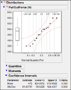
Before constructing the confidence interval we must assess the credibility of the assumption that the population is approximately normal. Two popular plots used for this purpose are the box plot and the normal probability plot. In chapter 1, we discussed the steps in generating these plots, so we will simply present the results in figure 6.1 (I have suppressed the mean confidence diamond and shortest half bracket). Neither plot gives any indication of skew, so it is safe to regard the presumption of a normal population as credible.
Figure 6.1 Checking assumptions

2. Click on the contextual help pop-up triangle for PullOutForce(N) and select Confidence Interval ![]() 0.95.
0.95.
The default interval is a two-sided 95 percent confidence interval, and your results should appear as shown in figure 6.2(a). Of course, it is always an option to pick a different confidence level.
Figure 6.2(a) 95 percent CI
3. Select Confidence Interval ![]() other and type 0.80 in the confidence interval field.
other and type 0.80 in the confidence interval field.
As an example, the presentation in JMP of the 80 percent confidence interval for the population mean is in figure 6.2(b).
Figure 6.2(b) 80 percent CI

It appears that when we recover from the surgery and rehabilitation, we should avoid any shearing forces on our knees that exceed about 440 newtons.
Magnetic Monarchs?
It is well known that a wide variety of animals use magnetic fields to determine their orientation. The homing pigeon is probably the most familiar example, but migratory birds such as the European robin (Erithacus rubecula) and indigo bunting (Passerina cyanea) also use the Earth’s magnetic field. While the influence of the Earth’s magnetic field during migration is well documented, it is not clear in every case how individual species might detect magnetic fields. For detection to occur, the animal must have some sort of magnetic material in its body.
The monarch butterfly (Danaus plexippus) is a familiar animal that migrates over tremendous distances. We will use the capabilities of JMP to address the question of whether these creatures might navigate using magnetic fields.
In an exploratory step toward understanding how the monarch butterfly orients itself for travel, Jones and MacFadden (1982), using extremely sensitive cryogenic magnetometers, attempted to determine if monarchs might have some magnetic material in their bodies. They reasoned that if magnetometers detected the presence of such material, the case for monarchs' use of the magnetic field of the Earth to help orient their migration would be strengthened.
Unfortunately a magnetometer creates “background” magnetism, about 200 pico-emus of magnetic intensity. (A pico-emu is 10-12 electromagnetic units.) In order to demonstrate that monarchs' bodies contain magnetic material it must be shown that the magnetic intensity of the butterflies exceeds the machine’s background magnetic intensity of 200 pico-emus. The researchers prepared a random sample of sixteen butterflies by bathing them in distilled water before placing them near the magnetometer to measure their bodies' background magnetic intensity.
Is there sufficient evidence at the α = 0.05 level that the butterflies possess magnetic intensity in excess of 200 pico-emus? Jones and MacFadden’s data on the measured magnetic intensity for each butterfly are in the JMP file MagneticMonarch.
1. Select Analyze ![]() Distribution
Distribution ![]() MagIntensity
MagIntensity ![]() Y, Columns > OK.
Y, Columns > OK.
As always, we must check the credibility of the presumption of a normal population. The results are shown in figure 6.3. Neither the box plot nor the normal quantile plot suggests any problems, and we are once again comfortable with the presumption of a normal population.
Figure 6.3 Checking assumptions

2. Click on the contextual help pop-up triangle for MagIntensity and select Test mean.
3. Enter the hypothesized value, 200, and click OK.
My results are shown in figure 6.4. Notice the nice graphic representation in JMP of the sample mean as a value and the P-value as an area. In this case our alternate hypothesis is that μ > 200 and we see a P-value of 0.01135. This is pretty clear evidence of a population mean greater than 200 pico-emus. Apparently the monarchs' bodies have at least the possibility of responding to magnetic fields. Now, here’s an added treat from JMP.
Figure 6.4 Testing the mean

4. Click on the Test Mean=value hot spot and select P-value animation ![]() High Side.
High Side.
Drag the handle to adjust the hypothesized mean, and JMP will present a little teaching moment about P-values in figure 6.5(a).
Figure 6.5(a) A JMP P-value script

That’s not all! As is well known, a perennially difficult topic for students is the concept of power.
5. Click the Test Mean = Value hot spot and select Power animation ![]() High Side.
High Side.
The result is shown in Figure 6.5(b). In this panel there are three handles available for manipulation: the estimated mean, the true mean, and the hypothesized mean. You can drag these handles to see how these values affect power in the case of a hypothesis test for a single mean. (Our data has a fixed n, but different sample sizes might be simulated to see the effects of sample size on power.)
Figure 6.5(b) A JMP power script

Inference about Means—Paired Data
Monitoring Small Children
We now consider the paired-t procedure. As we know, this is the standard statistical procedure for studies involving two observations that have been taken from the same or similar experimental units. In elementary statistics we see this when we analyze results from a randomized block experiment with two treatments. The statistical analysis is a kind of hybrid. We are interested in the difference between two means but focus on a single mean: the mean of differences. To illustrate the approach taken by JMP to the paired-t, we will call your attention to data from the world of neonatal pediatrics. The data are in the JMP file Finapres.
When doctors evaluate young children (0–4 years old) for possible cardiovascular abnormalities, continuous monitoring of blood pressure is desirable. Historically, blood pressure of adults has been monitored by inserting a catheter with a pressure-sensing mechanism into an artery. This invasive procedure can be dangerous because of the risk of infection and internal bleeding. In adults and children 6–16 years old, a noninvasive method known as “Finapres” (FINger Arterial PRESsure) is used. With Finapres, a small clamping device called a “cuff” is attached to a middle finger on one end and a monitoring device on the other. Some pediatricians have attempted to use Finapres with newborns by wrapping the device around the newborn’s wrist but have encountered some theoretical and practical problems. A new, tiny Finapres cuff has been developed and data gathered to compare the indicated blood pressures using the Finapres method and the catheter. (The gold standard is the catheter method.) Andriessen et al. (2008) measured the blood pressure of fifteen children, aged 0–4 years, using the two methods simultaneously. If the cuff were applied to the right middle finger, the catheter would be inserted in the left radial artery (lower arm) and vice versa if the cuff were applied to the left middle finger. The left/right decisions for the cuff were made by random assignment. Their results for diastolic pressure are shown in figure 6.6.
Figure 6.6 Finapres data

The investigators were concerned that the Finapres might be giving a biased estimate of the blood pressure and wanted to estimate the amount of bias. A bias of 0 would indicate agreement on average between the two methods.
We will construct a 95 percent confidence interval for the difference in blood pressure measurements between Finapres and the catheter. Our first step, of course, is to generate these differences.
1. Double-click in the top row of the column to the right of Cath to create a new column for the data we will create.
2. Label it Diff (F - C).
That way, we will remember the direction of subtraction without having to return to the data file.
3. Now double-click in the rectangle with the label Diff (F - C).
JMP will respond with the panel shown in figure 6.7.
Figure 6.7 Creating the difference

We will need to create a “difference” formula for this variable.
4. Select Column Properties ![]() Formula
Formula ![]() Edit Formula.
Edit Formula.
JMP has a rich complement of operations and functions, as we can see in figure 6.8. This might be an opportune time to explore some of the powerful functions listed in the Functions (grouped) panel. When we are finished exploring, we shall return to the land of simple arithmetic.
Figure 6.8 Setting up the difference

Perform the following sequence of clicks to construct a formula in the “no formula” rectangle, transforming it into a “yes formula” rectangle.
5. Select Fin ![]() “-” Cath
“-” Cath ![]() OK
OK ![]() OK.
OK.
What you saw in figure 6.6 should now appear with a new column, as shown in figure 6.9. Verify that the calculations have been done correctly, just as you would verify that the data entry is correct.
Figure 6.9 Checking the formula

At this point all we need to do is make the confidence interval as we did with the ACL pullout force. Neither the box plot or normal probability plot gives any indication of skew, so the presumption of a normal population is credible. The mean difference, F-C, in the sample is negative: −2.9333. This result suggests the Finapres method underestimates the blood pressure of these youngsters by close to 3 mmHg when compared to the gold-standard catheter. So that you can check your results with mine, the results I get for the Finapres-Catheter difference are shown in figures 6.10 and 6.11.
Figure 6.10 CI for the difference

The flip side of the confidence interval is, of course, the hypothesis test. Because so much of the two procedures with paired data is duplicative of our earlier inference for a single mean, we will not present a detailed walk-through. We note in passing that this bias problem might just as easily have been cast as a hypothesis test of “0 bias,” with results shown in figure 6.11.
Figure 6.11 Hypothesizing no difference

Inference for Independent Means
Lateralization in the Lower Species
Inferring the difference between two population means, given appropriately gathered samples, is one of the most ubiquitous and important techniques in elementary statistics. Thus, it should come as no surprise to the reader that we take up one of the most ubiquitous and important questions of our day: Are snakes left-handed?
It is well known and well documented that higher vertebrates, such as mammals and birds, exhibit lateralized behaviors, commonly described with more than a hint of anthropomorphism as “handedness.” Biologists theorize that such behavioral asymmetry is linked to specialized development of brain cells occurring fairly recently (i.e., the time of mammals) in the evolutionary chain. However, some recent studies of lower vertebrates suggest that brain lateralization may have occurred earlier in the chain than previously supposed.
For example, some have suggested laterality occurs in the coiling behavior of snakes. Roth (2003) gathered thirty cottonmouth snakes (Agkistrodon piscivorus leucostoma) in his lab and reported on the subsequent observations of their coiling behavior. The cottonmouth is a semiaquatic venomous snake that ranges throughout the southeastern United States. Cottonmouths spend much of their time in a coiled position and are equal-opportunity strikers; both predators and prey fall victim to its venom.
Roth defined a “laterality index” to be the proportion of observed coils that he defined as “left-handed,” that is, the snake was curled so that the left side of the body was “pointing in.” (Observations of outstretched and random coiling behavior were discarded.) His data reside in the JMP file CottonMouth and also are shown in figure 6.12. In addition to the laterality index, the file contains two categorical variables: age (adult/juvenile) and gender (male/female).
Figure 6.12 Handedness data

Those whose data analysis experience with technology is limited to a graphing calculator might wonder why the data are not in the familiar “list” format. There are a couple reasons for this. First, at elevated statistical levels problems are commonly formulated as “modeling” problems where the regression format for data works well. Secondly, and more important at the elementary statistical level, this arrangement allows inference for means without having to duplicate data entry of lists. Suppose, as an example, that one wished to test two hypotheses: Adults and juveniles have equal laterality indices, and males and females have equal laterality indices. On the calculator one would have to create two pairs of lists in order to do the tests. With JMP this is not necessary. One simply identifies the desired categorical characteristic as a separate variable, and only a single column of laterality indices is needed irrespective of how many hypotheses are being entertained. Another implication of this “regression layout” will be seen very quickly as we begin making our inferences for independent means.
1. Select Analyze ![]() Fit Y by X.
Fit Y by X.
“Fit Y by X” is what we did when we were doing regression back in chapters 4 and 5. While it may seem odd, it makes sense if you think of the laterality index as the response variable and the categorical variables as explanatory variables. That thinking is consistent with the way we think in elementary experimental design. The “treatments” (for example, old drug and new drug) are values of a categorical explanatory variable.
In any case, you should now see the slightly complicated presentation by JMP in figure 6.13.
The reason this window is slightly complicated is that JMP doesn’t know yet whether your variables will be quantitative or categorical. It is prepared for any combination of variables, explanatory and response, quantitative and categorical. As soon as I pick the variables to analyze, JMP will determine the correct procedure. In this case our response variable is numeric and our explanatory variable categorical—thus, JMP will select Oneway Analysis of Variance.
Figure 6.13 Independent means, first step

2. Select LatIndex ![]() Y, Response
Y, Response ![]() AdJuv
AdJuv ![]() X, Factor
X, Factor ![]() OK.
OK.
The appearance of the presentation is similar to what we have seen previously when we analyzed the Pinkerton data. JMP knows only that you will be doing inference for means, but doesn’t yet know that you have only two means, so it indicates the forthcoming analysis as the more general statistical technique, Oneway Analysis of Variance, rather than a t test as shown in figure 6.14.
Figure 6.14 The one-way ANOVA presentation

As can be seen in figure 6.14, JMP does know that there are only two values for the explanatory variable, A(dult) and J(uvenile). JMP has placed both values for the explanatory variable (A and J) on the horizontal axis and by default presents dot plots of the values of the laterality index. The dot plots are of limited value in checking the credibility of our presumption of normality, and of course JMP has better options.
3. Click the Oneway Analysis hot spot and Display Options and (a) deselect Grand Mean; (b) deselect X Axis proportional; and (c) select Box Plots.
4. Click the Oneway Analysis hot spot and select Normal quantile plot.
You should now see a presentation similar to that shown in figure 6.15. Neither the box plot nor the normal quantile plot gives any indication of problems, so we will proceed with our t-test.
Figure 6.15 Checking the assumptions

5. Click the Oneway Analysis ![]() t test.
t test.
The t-test panel is then added to figure 6.15 as shown in figure 6.16. Notice that information relevant to the t-test is presented, as are the bounds for the 95 percent confidence interval. Were a different alpha or confidence level desired, this would be accomplished by selecting Display Options and then “Set α level.” It appears from the analysis that adult and juvenile cottonmouths have different coiling behavior. (That adults and juveniles differ will come as no surprise to human parents of teenagers.)
Figure 6.16 Testing the hypothesis

For extra practice, I suggest that you duplicate these steps and test the hypothesis of equal means for the two snake genders.
Inference for Regression
Sand Scorpion versus Cockroach
The burrowing cockroach (Anivaga investigata) and the sand scorpion (Paruroctonus mesaensis) share the same desert. Both of these animals burrow in the sand and can detect low velocity surface waves (vibrations in the sand) transmitted by other creatures. The burrowing cockroach and the sand scorpion are both interested in interpreting the vibrations generated by surface waves. Their interests are, however, at cross purposes because the sand scorpion preys on the burrowing cockroach.
The sand scorpion is a nocturnal ambush predator of insects and other scorpions, always hunting from a motionless resting position outside its own burrow. The scorpion detects nearby prey by sensing the small radiating disturbances made by the prey. These disturbances are in the form of small waves, similar to sound waves in the air. The sand scorpion’s range, accuracy, and speed in targeting allow it to get to a burrowing cockroach 50 centimeters away in about three rotation-and-translation steps and in three seconds. Speed and accuracy are needed in this case because the cockroach detects scorpion vibrations and will try to burrow deeper in the sand for safety. These data are in the JMP file Scorpions.
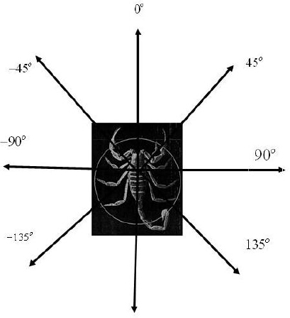
When prey appears on the horizon within about 20 centimeters, the scorpion assumes an alert posture and with quick rotations and translations of position grasps and immobilizes the prey for stinging. Within 10 centimeters, prey is almost always captured in one rotation and translation of position by the scorpion. Brownell and van Hemmen (2001) investigated possible biological mechanisms that the scorpion might use, and our data is taken from the control group in their fascinating experiment. If the scorpions are accurately targeting their prey for all angles, it seems reasonable that a regression equation that predicts the response angle (ρ) of the scorpion from the actual angle (α) of the cockroach prey would be ρ = 0 + 1.0α. We will unleash JMP to study this issue.
After reviewing chapter 4, we have generated the least squares regression line and residuals. As shown in figure 6.17, the actual angle is measured in terms relative to the scorpion. 0 degrees indicates that the prey is directly in front, 90 degrees indicates that the prey is to the right, and so on.
Figure 6.17 Actual angles
The residuals are shown in figure 6.18, and the regression line is shown in figure 6.19. It appears from a glance at the residual plot that there is a tendency for the scorpions to be less accurate if a cockroach is behind them (α < −90°, α > 90°). The plot clearly seems to indicate a linear model is appropriate.
Figure 6.18 The sand scorpion residual plot
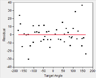
Figure 6.19 Sand scorpion inference

The usual first step when performing inference in a regression context is to perform a Model Utility test, that is, a test for slope = zero. Rejection of the hypothesis indicates that the explanatory variable does indeed help to explain the values of the response variable beyond the customary levels of chance. JMP declares this P-value for the t-test to be less than .0001. (To give the real value of the P-value probably “Pico-Ps” would be required.) Notwithstanding the usual first step, it is normally more revealing to look at confidence intervals for the parameter estimates.
1. Select the Linear Fit hot spot pop-up triangle and then select Confid curves fit.
This command adds “confidence curves” to the fit. These curves are slightly different than confidence intervals, because there are two parameters, the slope and intercept, that go into making the curves.
To find confidence intervals for the individual parameters:
2. Right-click in the Parameter Estimates report (in the report, not on the Parameter Estimates title; see arrow) and select Columns ![]() Lower 95% and Columns
Lower 95% and Columns ![]() Upper 95%.
Upper 95%.
This information is added to the parameter estimates as shown in figure 6.20 (see arrow). If you wish, you can select a different confidence level through the Linear Fit contextual help pop-up triangle.
Figure 6.20 Confidence intervals for regression

The results certainly seem to suggest that the sand scorpions are effective locators of their prey. The estimated slope is very close to 1.0, with a tight confidence interval. It is interesting that there appears to be an ever-so-slight, but statistically significant, bias indicated by the intercept of 5.6 degrees. (Could this be another case of handedness?)
What Have We Learned?
In this chapter we demonstrated the capabilities of JMP for performing standard inferential procedures with quantitative data. From stem (checking assumptions) to stern (making the inference), JMP guided the analysis seamlessly and naturally. Whether hypotheses were being tested or confidence intervals constructed the steps built naturally on what we had previously done with JMP when we considered basic exploratory data analysis techniques.
References
Andriessen, P., et al. (2008). Feasibility of noninvasive continuous finger arterial blood pressure measurements in very young children, aged 0–4 years. Pediatric Research 63(6):691–96.
Aydin, H., et al. (2004). Initial fixation strength of interference nail fixations for anterior cruciate ligament reconstruction with patellar graft (experimental study). Knee Surgery, Sports Traumatology, Arthroscopy 12(2): 94–97.
Brownell, P. H., and J. L. van Hemmen. (2001). Vibration sensitivity and a computational theory for prey-localizing behavior in sand scorpions. American Zoologist 41:1229–40.
Jones, D. S., and B. J. MacFadden. (1982). Induced magnetization in the monarch butterfly, DANAUS PLEXIPPUS (INSECTA, LEPIDOPTERA). Journal of Experimental Biology 96:1–9.
Roth, E. D. (2003). “Handedness” in snakes? Lateralization of coiling behavior in a cottonmouth, Agkistrodon piscivorus leucostoma, population. Animal Behaviour 66(2):337–41.