Chapter 4
The Analysis of Bivariate of Data: Plots and Lines
Observing Facts: Pre-Regression
Crime Scene Investigation Regression: Murder Most Foul!
Introduction
It is difficult to imagine a more important skill than identifying and interpreting associations among variables. In the animal kingdom associating odors or other signals of predators is a survival skill. Human learning builds on associations, such as the association between words and sounds. In the formal empiricism of science as well as in the practical engineering professions, reasoning about the associations induced by experimentation leads to understanding, prediction, and sometimes control of important variables. Understanding the relation between the thickness of beams and their loads allows safe building construction; understanding the relation between dose and response allows identification of safe dosages of anesthesia in the operating room. It is no accident that the formal study of associations among variables plays a prominent role in elementary statistics.
Given our earlier discussions about the difficulties students face when interpreting univariate data, it will come as no surprise that interpreting twice as many variables and their possible relationships is not a simple task. The nature of the difficulty is much more complex than the familiar “correlation implies causation” error. Moritz (2004) and Garfield and Ben-Zvi (2008) and their bibliographies provide extensive discussion of the literature surrounding reasoning about covariation.
The garden-variety scatterplot is used for the graphical display of ordered pairs of continuous data. It is the go-to plot for analyzing questions about relationships between and among variables, and it is not surprising that JMP maximizes the ease of working with scatterplots. In discussing these important plots, I will follow McKnight (1990) and divide reasoning with scatterplots into three parts: (a) observing “facts” as represented by the data points; (b) observing relationships, as represented by the synergistic group of points in a scatterplot; and (c) interpreting and explaining those relationships.
In this chapter, I will demonstrate the capabilities of JMP to facilitate analyses of bivariate data and also consider some of the presentation features of the software. Teachers can use JMP to great effect when teaching the fundamental concepts of data analysis, pointing out interesting features of data. Also, teachers can model good presentation principles for their students with JMP. On the other side of the desk, students can effectively and easily use JMP both for classroom presentations of their projects in real time and in concert with software such as PowerPoint and Word to enhance written reports.
Observing Facts: Pre-Regression
As we know, much of the effort spent interpreting scatterplots is tied up in finding correlations and fitting regression lines to a set of data. In prior statistical studies of univariate data we frequently ask about center, spread, clusters and gaps, and unusual points before we calculate statistics such as means and standard deviations. The data, presented in a graphical form, have a story to tell before the calculation of the statistics. Similarly, bivariate data have a story to tell, irrespective of the correlation and best-fit line. As we do with univariate data, we can ask questions about clusters, gaps, and unusual or unexpected points in the bivariate x-y space. These preliminary questions of the data may actually exhaust the set of reasonable questions, making regression superfluous. For example, suppose we have data summarizing responses to survey questions. The observed pattern of points of mean responses to survey items by two groups, say, male and female, may be interesting and interpretable without the use of regression.
As an example of interpretation without calculation, consider the following data from Jones (1981), a study of young men and women, performed in 1980. Boys (n = 318) and girls (n = 344) in 28 fifth and sixth grade classrooms in 16 schools in rural towns in 7 counties of North Carolina were asked to indicate their degree of interest in several topics. They rated their level of interest on a seven-point scale (see table 4.1). Each point in the dataset represents a topic of interest, found by averaging the responses of the males and females separately. Figure 4.1(a) shows a scatterplot of the averages of their responses to the items, rendered entirely using JMP tools (Tools → Annotate and Tools → Simple Shape). I have scaled the horizontal and vertical axes to be the same, ranging from 1.0 to 7.0. What do we see in the scatterplot? With the help of JMP tools we can highlight the fact that the data consist of three clusters and that there are two outlying points. These points are associated with interests in “Motorcycles” and “War.” Using Tools → Line to add a reference line y = x we can glean some added information, as shown in figure 4.1(b). It appears that both males and females generally agree about what they are interested in, since there is a general southwest to northeast orientation of the points. They seem to agree quantitatively on the points in the low- and high-interest cluster, but the middle cluster garners a higher average interest on the part of girls—the cluster seems to edge in the northerly direction, above the y = x line. Adding the reference line also helps us see something not apparent before; there is a point at which the females exhibit a greater interest than males, a difference as large as the difference in interest between males and females in war. That interest is cooking.
Table 4.1 Interests and gender
| Interest | Male | Female |
| Money | 6.49 | 6.33 |
| Love | 6.35 | 6.47 |
| Life | 6.18 | 6.38 |
| Opposite Sex | 6.20 | 6.00 |
| People | 5.61 | 6.09 |
| Music | 5.33 | 5.96 |
| Sports | 6.12 | 5.23 |
| Peace | 5.50 | 5.84 |
| TV | 5.49 | 5.31 |
| Animals | 5.17 | 5.46 |
| Movies | 5.40 | 5.22 |
| Cars | 5.70 | 4.95 |
| Religion | 5.07 | 5.48 |
| Motorcycles | 5.70 | 3.41 |
| Magazines | 4.08 | 4.16 |
| Teachers | 3.63 | 4.64 |
| School | 3.30 | 4.40 |
| Cooking | 3.05 | 4.40 |
| Other Countries | 3.58 | 3.84 |
| Generation Gap | 3.49 | 3.59 |
| War | 3.05 | 1.86 |
| Death | 1.98 | 2.25 |
| Alcohol | 1.90 | 1.74 |
| Cigarettes | 1.57 | 1.71 |
| Drugs | 1.59 | 1.53 |
Figure 4.1(a) Clusters

Figure 4.1(b) Outliers

The results of another survey where the pattern of points is of more interest than the regression are presented in table 4.2 and plotted in figure 4.2. These data are taken from a study of parents and adolescents (Feldman and Quatman, 1988). The investigators surveyed 217 parents of male early adolescents and an independent group of adolescent males regarding their views about when adolescents should be able to make decisions autonomously. Each data point represents an individual choice (Child_Mean, Parent_Mean). Once again, JMP allows us to focus attention on an interesting aspect of the graph. In this case, we generally notice an unsurprising result: Parents' “years-of-yes” are typically higher than the adolescents' fond wishes. The added reference line, y = x, has also made apparent what we might not have seen at a glance from the numeric data: There are two choices where parent values are lower than adolescent values. Even more surprising is one of the topics: “Go to boy-girl parties at night with friends.” The other, “Choose hairstyle even if your parents don’t like it,” is also interesting. Our point here is, of course, that JMP allows us to focus student (or whatever audience) attention to interesting points, clusters, and trends on a graph. Having said that, it is interesting to speculate: Why are these two points below the line? What do these two points reveal about parents and young men? Given the sample size, it is unlikely to be a sampling error. My students, over the years, have consistently come to two conclusions: (1) parents are operating under the mistaken impression that today’s boy-girl parties are as sedate as they were in “their day,” and (2) with respect to hairstyle, the parents are picking their battles.
Table 4.2 Teen timetable data
| Child | Parent | |
| Choose hairstyle even if your parents don’t like it | 14.8 | 14.1 |
| Choose what books, magazines to read | 13.2 | 14.3 |
| Go to boy-girl parties at night with friends | 14.8 | 13.9 |
| Not have to tell parents where you are going | 17.2 | 18.9 |
| Decide how much time to spend on homework | 13.0 | 15.0 |
| Drink coffee | 16.0 | 17.5 |
| Choose alone what clothes to buy | 13.7 | 14.7 |
| Watch as much TV as you want | 14.3 | 17.2 |
| Go out on dates | 15.4 | 16.1 |
| Smoke cigarettes | 20.3 | 20.5 |
| Take a regular part-time job | 16.2 | 16.6 |
| Make own doctor and dentist appointments | 17.4 | 17.9 |
| Go away with friends without any adults | 15.8 | 18.5 |
| Be able to come home at night as late as you want | 17.7 | 19.4 |
| Decide what clothes to wear even if your parents disapprove | 15.8 | 16.0 |
| Go to rock concerts with friends | 16.1 | 17.3 |
| Stay home alone rather than go out with your family | 14.5 | 15.0 |
| Drink beer | 18.9 | 19.3 |
| Watch any TV, movie, or video show you want | 15.3 | 17.4 |
| Spend money (wages or allowance) however you want | 13.4 | 14.1 |
| Stay home alone if you are sick | 13.4 | 14.2 |
Figure 4.2 Two interesting points

In our last pre-regression analysis of a scatterplot I illustrate a couple of additional JMP features: the capability of comparing scatterplots and of using different “markers” for points in the scatterplots.
These data are from a study of college men and women (Pierce and Kirkpatrick, 1992). Thirty female and twenty-six male residents, recruited from introductory psychology classes at Purdue University, completed a survey of seventy-two “fear items” (see table 4.3). A fear item was defined as something “other” people have reported they fear. The researchers believed that responses to such questions actually tap the respondent’s attitudes. Approximately one month after the first survey, a second survey was given that contained 25 items, 14 of which were duplicates from the first survey. Before the students took the second survey they were hooked up to a machine that they were told monitored heart rate, a measure often used in lie detector tests.
Table 4.3 Fear topics
| Fearful Topics |
| Harmless fish |
| Mice |
| Rats |
| Roller coasters |
| Harmless snakes |
| People with AIDS |
| Crawling insects |
| Death of a loved one |
| Harmless spiders |
| Taking written tests |
| High places on land |
| Speaking in public |
| Enclosed spaces |
| Idea of you being a homosexual |
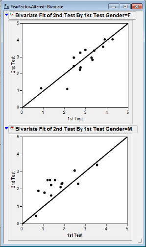
The results for the common items on the two tests for the men and women are shown in figure 4.3.
Figure 4.3 Comparing scatterplots
The data are in the JMP file, FearFactor. A peek at the data in this file appears in figure 4.4. Notice that Gender is a character type variable. The column on the left, at the business end of the arrow, indicates the row number for the data.
1. Click and drag in this column rows 1 to 28. The columns will then have a “filled in” appearance.
2. Right-click in the column and hover over the box where it says “markers.” A list of possible markers for the points will appear.
Figure 4.4 The row number column

I have chosen as a marker the larger filled circles, but you may choose your favorite from the list. (If your favorite does not appear, feel free to choose Custom and make your selection.) It is also possible to have different markers for males and females. To change a marker for, say, males, click and drag in the column rows 1 to 14 and choose a different marker.
3. Select Select Analyze → Fit Y by X.
4. Select the variables as shown in figure 4.5. Then choose OK.
5. Click each of the 4 scales (2 horizontal and 2 vertical), and set them to a minimum of 0 and maximum of 5, with an increment of 1.
6. Use the Tool → Line sequence as before to insert the y = x lines.
Figure 4.5 Set-up for comparing scatterplots

We are now ready to inspect the results. A couple of interesting observations may be noted in these two plots. First, it appears that the female fear scores are clustered at higher values with a couple of possible outliers at the low end (“Harmless fish” and “Idea of you being a homosexual”). The males report generally lower fear scores with two points relatively far away from the herd, one low (“Harmless fish”) and one high (“Death of a loved one”). Another observation might focus on the locations of the points relative to the y = x line. Recall that in the second test the individuals were primed to think that the machine might detect deviations from the truth. The points for females scatter more or less about the y = x line, but the points for males tend to be elevated above the line in this second survey. The investigators concluded that the males might have been slightly less than truthful about their fears in the first survey.
Crime Scene Investigation Regression: Murder Most Foul!
We now turn to the topic of linear regression. We shall consider the extensive capabilities of JMP for performing regression, demonstrate how to check the assumptions for regression, and then turn to techniques of transforming data to achieve linearity.
For a regression analysis context we will turn to the field of crime scene investigation (CSI) and reopen a notorious nineteenth-century homicide case, one that from this point in time can only be regarded as a very cold case. Readers should not their hopes up; unlike the usual television program fare, we will not solve the case. We will only attempt to shed some light on the old forensic evidence with the benefits of 20/20 hindsight, modern statistics, and science. The crime of interest occurred on August 4, 1892, in Fall River, Massachusetts, where the sun was shining on a pleasant New England day. At about 10:45 a.m., in a two-story house at 92 Second Street, Miss Lizzie Borden helped her father, Andrew Borden, settle comfortably on a sofa for a nap. Shortly before 11:00 she went to a barn behind the house. When she returned twenty minutes later, she discovered her father horribly murdered, slaughtered with a hatchet. Shortly after, the body of her stepmother, Abby Borden, was discovered upstairs, similarly brutally slain.
The police initially believed the murderer had come in off the street. Perhaps it was a grudge killing; Andrew Borden was a banker, and some individuals reported that he had recently refused to loan money to a disgruntled citizen. But, considering the excessive violence of the murders, some homicidal hatchet-wielding maniac might have done the deed.
Within a day or two of the murders the police were convinced that Abby Borden was murdered an hour or two before the father. Such a large time lapse tended to rule out the intruder theory, and suspicion settled on Lizzie as the likely murderer. The strongest argument for the time lapse between the murders came from autopsy reports, specifically the level of digestion of stomach contents. Dr. Edward Wood, professor of chemistry at Harvard Medical School, concluded that Abby Borden must have perished about an hour and a half before Andrew Borden. Lizzie’s alibi for her father’s murder was that she was in the barn, a sort of storage area for the family, looking for some metal. She could offer no explanation for how the brutal and presumably noisy murder of her stepmother could have occurred an hour and a half earlier when she was in the house.
In 1892 very little was known about gastric emptying times (GET). As late as 1980 evidence on GET, especially the effects of age on GET, was contradictory. In 1984, researchers finally got some hard data. Horowitz and colleagues (1984) brewed up a “hamburger” containing some 40 millirads of radioactive material mixed in with some food and somehow found some volunteers to ingest it. They then measured the time it took to digest 50 percent of the food. Subjects older than sixty-five were recruited from an elderly citizens' club. Our goal in this analysis will be to see what light, if any, these data shed on the forensic case against Lizzie Borden. The data consist of the ages in years, and the GET in minutes, for the subjects in the study.
To follow along with our analysis of the 50 percent emptying time, open the LizzieBorden.jmp file. The data should appear in the JMP table as shown in figure 4.6. Notice that I have again changed the markers to large filled-in circles. You will need to click and drag over the left column to implement the plotting as larger circles in the graphs.
Figure 4.6 Initial GET data

The first step in a regression analysis is to create the scatterplot and fit a line to the data. We don’t necessarily have any a priori reason for believing the relationship between the two variables is linear, but a linear relation is the default simplest relation. Thus, the linear fit is our first option. If the relation turns out to be more complex, the scatterplot and residual plot will perhaps give us clues about the nature of the complexity. (You may need to refer to chapter 1 to review how to get the plot and regression line.) Inspecting figure 4.7, we see that the line is a reasonable fit to the data, although the relation does not appear to be a very “strong” relation. There is a great deal of variability about the best fit line, and r2 as reported by JMP is only about 0.16.
Figure 4.7 Regression of GET by age

The statistical procedures involved with regression allow us to investigate the relationship between two variables by constructing a “straight line” model of that relationship. Some important assumptions underlie the regression procedures, and these should be checked for credibility before we consider the regression model as adequately justified for inference purposes. The first assumption is, of course, that a straight line is a good representation of the relationship between x and y. If the relation were perfect and deterministic, things would be really simple: y = α + βx would perfectly describe the relation. However, in statistics (unlike elementary algebra) our models must exhibit at least some passing resemblance to reality, including all those real-world random events that occur when measuring and sampling in the field. Thus, our model is constructed in terms of what response we expect to see for a given x:
![]()
More commonly, we acknowledge explicitly that our response variable, y, has an element of “error” in our final model. So we can make two sorts of assumptions about the relationship between x and y: (a) the average or “expected” behavior is a linear function, and (b) we acknowledge that the value of y for a given x will deviate from expectations in a chance-like way. We will represent this “error” due to chance using the Greek symbol ![]() , and our final model can be written as:
, and our final model can be written as:
![]()
The two sorts of assumptions we make are about the structure of the expectations (“linear”) and the distribution of the errors (“normal with zero mean and constant variance”). If our assumptions don’t match the real-world situation, there could be serious repercussions for anyone who trusts our analysis and also neglects to verify. Our statistical credibility and fine-tuned sense of statistical responsibility lead us to the right path: Trust if one must, but verify when one can—and one can trust JMP to make the verification very easy to accomplish.
We first consider the assumption that the relation between GET and Age is linear. Our initial look at the scatterplot doesn’t generate any suspicion of nonlinearity, but perhaps there is a slight curve in the data that we can’t see when our GET scale runs from the neighborhood of 50 to the neighborhood of 130. A residual plot will send a much clearer signal.
JMP makes it very easy to create a residual plot, and just at the time it is needed.
1. Select the hot spot Linear Fit → Plot Residuals.
Something similar to figure 4.8 should appear just below the parameter estimates. Notice that the residual plot presents the residuals versus the explanatory variable, which makes perfect sense for simple regression. Some statistical programs will default to plotting the residuals versus predicted response variable—GET in this case. A residual plot with predicted response variables is certainly appropriate for multiple regression analysis, but for simple regression the residual plot with the explanatory variable seems intuitively clearer. JMP will, of course, perform to your specifications, and if you wish to see the residuals plotted versus the predicted GET scores, that is not a problem. Return to the Linear Fit hot spot, and
2. Select Linear Fit → Save residuals and then Linear Fit → Save Predicteds.
Figure 4.8 GET residuals

The residuals and the predicted GET values are added to the JMP data table as shown in figure 4.9. JMP gives the residual plot quickly and easily, as you can verify by clicking on Linear Fit → Plot Residuals.
Figure 4.9 Residuals and predicted values added

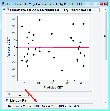
I will sometimes use an alternative method for students to drive home the point that the regression algorithm produces residuals uncorrelated with the predicted response variable and with a mean of zero. I construct a scatterplot and perform a simple regression for residuals versus predicted response values. For any linear regression, the line for “predicting residuals” must always be ![]() esidual = 0x + 0. I am sure you remember how to do this, but just in case here is my sequence of operations:
esidual = 0x + 0. I am sure you remember how to do this, but just in case here is my sequence of operations:
3. Select Analyze → Fit Y by X; Predicted GET → X, Factor; Residuals GET → Y, Response; OK; Bivariate Fit Contextual Popup Menu → Fit Line.
The results are shown in figure 4.10. Note that students may be initially confused by the presentation of equation of the best fit line (arrow) for these residuals; the best fit line in a residual plot is theoretically ![]() Usually a gentle reminder about scientific notation with negative exponents and the limitations of binary computer arithmetic will convince them that the 5.53e-14 and the 9.281e-16 are both sufficiently close to zero to allay their fears.
Usually a gentle reminder about scientific notation with negative exponents and the limitations of binary computer arithmetic will convince them that the 5.53e-14 and the 9.281e-16 are both sufficiently close to zero to allay their fears.
Figure 4.10 GET residuals redux
Inspection of our data so far suggests that it is reasonable to proceed as if the average, or “expected” behavior, of GET and Age is a linear relation. To determine the quality of the fit to the data, we now need to consider our second set of assumptions: The distribution of errors behaves as normal and behaves randomly. As a reminder, the linear regression procedures are based on assumptions that the distribution of errors behaves in a particular chance-like way:
![]() For each value of x, the errors have a mean of zero.
For each value of x, the errors have a mean of zero.
![]() The variance of the errors is a constant across the values of x.
The variance of the errors is a constant across the values of x.
![]() The errors are independent.
The errors are independent.
![]() The errors are normally distributed.
The errors are normally distributed.
Of course we do not actually see the errors, any more than we know the true population intercept and slope in our model. With real data it is convenient to think of the residuals as a “sample” of the errors. If the errors in our model are misbehaving, that should show up in analysis of the residuals. Thus, it is to these residuals we now turn.
At this point a small technical side note may be in order. Instructors with mathematically more capable students may wish to analyze the residuals using “standardized,” or possibly “PRESS,” residuals in preparation for multiple regression. I note in passing that these more mathematically intense features are available for simple linear regression in JMP using the Analyze → Fit Model keystroke commands.
Recall that we saved our residuals in a separate column, Residuals GET, when we plotted our residuals versus the predicted GET values. The residual plot is not only a good way to check the presumption of linearity, but it is also an excellent plot for checking the homogeneity of variance assumption. I will turn to the Pinkerton data from the Civil War to illustrate this idea. In figures 4.11(a) and 4.11(b), the scatterplot, best-fit line, and residual plot are shown for the December %Sick versus October %Sick for Confederate companies. Notice that with greater values of %Sick in October, there is greater variability in the residuals. This is sometimes referred to as “fanning.”
Figure 4.11(a) Scatterplot, %Sick

Figure 4.11(b) Residual plot, %Sick

We do not see this pattern in the GET versus Age plots, which suggests that the presumption of homogeneity of variance is a credible assumption.
The credibility of the assumption of normal errors can be assessed by checking the distribution of residuals. If it appears that the residuals could be a sample from a normal population, the assumption is deemed appropriately made.
1. Select Analyze → Distribution.
JMP presents a choice of univariate plots of the residuals for consideration. To get the display in figure 4.12:
2. Select Distributions → Stack Residuals → Normal Quantile Plot.
3. Click the box plot and toggle off the Mean Confid Diamond and Shortest Half Bracket.
Figure 4.12 NQP, GET residuals

The normal quantile plot appears fairly straight; the boxplot seems symmetric and is bereft of outliers. Even the histogram appears to be cooperating, and to the extent it can with a small dataset, it suggests the reasonableness of the assumption of a normal population.
It appears that we have about as well-behaved data, consistent with a linear relation, as one could hope for. Having said that, which aspect of the regression analysis might shed light on the forensic case against Lizzie Borden? Remember that the autopsies for Mr. and Mrs. Borden showed a large difference in the progress of gastric emptying, with Abby Borden’s stomach contents in a far more digested state. It was this that led to the pronouncement of an hour and a half difference in the times of the murders and refocused police attention away from an “unknown intruder” as the likely murderer. But could this difference be attributed to natural variability in digestion rates from human to human? The estimate of that amount of variability is given by the root mean square error (the estimate of the standard deviation of the population errors) in figure 4.7: 18.8 minutes. Is that enough variability to suggest that the murders could have taken place at the same time and just looked like they were committed 90 minutes apart because of natural variation? One authority on the Borden murders (Masterton, 2000) believes this variability to be a significant piece of evidence that tends to exonerate Lizzie Borden. Discretion being the better part of forensic and statistical valor, I shall carefully avoid treading on the guilt or innocence issue.
What Have We Learned?
In chapter 4, I discussed bivariate data plots in contexts with and without regression. I used the annotation capabilities of JMP to demonstrate their use as teaching tools when data are presented and discussed. I also performed a detailed regression analysis and verified the underlying assumptions. With all assumptions holding, it was possible to clearly interpret this regression analysis in a real context. In chapter 5, I present some illustrative examples of more troublesome data.
References
Feldman, S., & T. Quatman. (1988). Factors influencing age expectations for adolescent autonomy: A study of early adolescents and parents. Journal of Early Adolescence 8(4).
Garfield, J. B., & D. Ben-Zvi. (2008). Developing students' statistical reasoning: Connecting research and teaching practice. New York: Springer Science + Business Media B.V.
Horowitz, M., et al. (1984). Changes in gastric emptying rates with age. Clinical Science 67: 213–18.
Jones, R. M. (1981). A cross-sectional study of age and gender in relation to early adolescent interests. Journal of Early Adolescence 1(4): 365–72.
Masterton, W. (2000). Lizzie Didn‘t Do It! Boston: Branden Publishing Co.
McKnight, C. C. (1990). Critical evaluation of quantitative arguments. In G. Kulm (Ed.), Assessing higher order thinking in mathematics. Washington, DC: American Association for the Advancement of Science.
Moritz, J. (2004). Reasoning about covariation. In D. Ben-Zvi & J. Garfield (Eds), The challenge of developing statistical literacy, reasoning and thinking (227–55). The Netherlands: Kluwer Academic Publishers.
Pierce, K. A, & D. R. Kirkpatrick. (1992). Do men lie on surveys? Behavioral Research Therapy 30(4): 415–18.