
Chapter 7
Inference with Qualitative Data
Inference for a Single Proportion: Pacific Salmon Migration
Inference for Two Proportions: The Tooth Fairy
The Chi-Square Goodness of Fit: The Supreme Court
The Chi-Square Test of Independence: Race and Longevity in the Nineteenth Century
The Chi-Square Test of Homogeneity of Proportions: Is Golf for the Birds?
Introduction
In this chapter, I will round out my discussion of inference, focusing on qualitative (categorical) data. Once again, I will offer a sequence of vignettes for hypothesis testing and confidence intervals. As we work through our examples of inference with categorical data you will see that some of the techniques are slightly different from the standard elementary textbook presentations in statistics. We will keep you aware of these differences as we proceed.
Inference for a Single Proportion: Pacific Salmon Migration
Pacific salmon (Onocorhynchus spp.) seemingly return from foraging in the ocean to their birthplace for spawning. The reason, process, and mechanisms of navigation are subjects of some controversy among biologists (Quinn, 1991). One might reasonably model salmon as individuals with a primitive navigation capability, able to sense where shallow water is but otherwise incapable of any navigation, and specifically unable to tell whether their home river is north or south of where they are when they reach shallow water. Such a salmon, swimming east, would find the coast and turn north or south randomly.
A competing theory is that salmon actually do have a navigation capability. Under this theory salmon would get close to shore and know whether to turn left or right to head for home. Studies in the laboratory have determined that the olfactory organs of fish are very sensitive to concentrations of chemicals in the water and that they remember the chemicals that identify their home rivers.
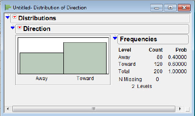
It is possible to test these competing claims by taking a “survey” of the salmon. When salmon are netted by fishing boats using gill nets, it is possible to determine the direction they are swimming by noting their orientation in the net when snagged. Jamon (1990) reasoned that salmon without navigational capabilities should be caught moving north or south in equal proportion. Alternatively, if salmon do have navigational capability, a fishing boat trolling north of the salmon’s home river during migration should detect greater than half the salmon heading south. I will note in passing that this is not a simple salmon sampling problem. Could it be that salmon may be schooling? One might be suspicious of this with a large number of salmon gathered in one dip of the net. On the other hand, if few salmon were netted per dip, they could be regarded as independently sampled. In any case, we will trust the researcher and use Jamon’s (1990) data to illustrate the use of JMP to perform inference for a single proportion. Let p = the population proportion of salmon traveling toward home, and test the hypothesis that H0 : p = 0.5. In Jamon’s (1990) sample 120 out of 200 netted salmon were detected swimming toward their home. The data are in the JMP file Salmon, and the data entry is shown in figure 7.1.
Figure 7.1 The data setup

Entering data in a JMP table when working with categorical data is a great deal more efficient than using one row for each individual salmon; one row is used for each category. In the case of our salmon migration we have only two categories: the salmon that turned toward their home river or those that did not. Thus, we have two variables to enter: direction and the salmon count. (I note in passing that there are circumstances where individual salmon might be entered in a data table. The weight and length might also be measured as part of a larger study of migration habits.)
Notice that when you enter character data into the Direction column, JMP immediately knows that Direction is a categorical variable; the red bars next to the column name indicate this. To see the distribution of responses we use the Distribution Platform in JMP.
1. Select Analyze ![]() Distribution.
Distribution.
2. Select Direction ![]() Y, Columns
Y, Columns ![]() Count
Count ![]() Freq.
Freq.
You should now see something similar to figure 7.2.
Figure 7.2 Distribution choices

3. Click OK.
4. Click the Distributions hot spot and select Stack.
You should now see something similar to figure 7.3. Generally my preference is for a horizontal display, so I selected the Distributions hot spot and Stack to get figure 7.3. This is, of course, a judgment call. First, let’s determine the 95 percent confidence interval for the proportion of homeward-bound salmon. We begin with the Direction context triangle:
Figure 7.3 Proportions, Stack display
5. Select Direction ![]() Confidence interval
Confidence interval ![]() 0.95.
0.95.
JMP adds the confidence intervals to the panel as shown in figure 7.4. The confidence intervals here are slightly different from what your textbook formula and calculator may give you. As JMP notes, the confidence interval is what is known as a “score” confidence interval. It is well known that the large sample confidence interval (the “Wald” interval) for the population proportion is disappointing for some combinations of successes and sample sizes in that the confidence intervals depart significantly from the advertised probabilities of coverage of the true parameter (95 percent in our case). Elementary statistics books are beginning to recommend the “modified Wald,” where one adds 2 to the numerator and denominator. The score interval is different from both the Wald and the modified Wald. The score interval works better for small samples but can be recommended for all sample sizes (Agresti and Coull, 1998). So that you may compare the results, the Wald confidence interval is (0.5321, 0.6679), and modified Wald is (0.5308, 0.6653).
Figure 7.4 Confidence intervals for the proportions

JMP does not know which of the values you have defined as a “success,” so confidence intervals for each proportion, Away and Toward, are presented.
In this example, we have the natural null hypothesis, H0 : p = 0.5. To test that hypothesis in JMP,
6. Select Direction ![]() Test Probabilities.
Test Probabilities.
This time JMP adds Test Probabilities to the panel, as we see in figure 7.5.
Figure 7.5 Hypothesis test selection for a proportion
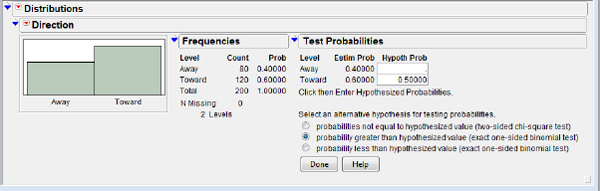
7. Enter 0.5 in the Toward row, select probability greater than hypothesized value (exact one-sided binomial test) ![]() Done.
Done.
Notice again that JMP, using its computational power, is performing the “exact” test based on the binomial distribution, not the large sample approximation to the sampling distribution. The P-value on your calculator may differ slightly from that of JMP. My calculator shows a P-value of 0.0023, only slightly different from JMP’s output, 0.0028, which is shown in figure 7.6.
Figure 7.6 Hypothesis test report for a proportion

With a small P-value we can reject the hypothesis that salmon are randomly choosing their direction of travel when returning home to spawn. Of course, the statistics cannot tell us how the salmon are actually finding their way, but it appears that chance is not the mechanism.
Inference for Two Proportions: The Tooth Fairy
The lives of young children growing up in the United States include many figures, some real and some slightly less so. Among those figures slightly less so are monsters under the bed, and fantasy figures such as Santa Claus, the Easter Bunny, and the Tooth Fairy. Blair, McKee, and Jernigan (1980) were interested in the strength and duration of beliefs in fantasy figures as characteristics of the child’s psychological and cognitive development. Specifically, they were interested in the ages at which belief in such fantasy figures declined.
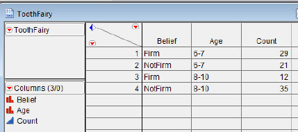
The investigators interviewed white, middle-class, Christian children in southeastern Michigan and categorized them as either “firm believers” or “not firm believers” in various fantasy figures. The children’s faith was of interest because Santa Claus and the Easter Bunny are associated with significant events in the Christian calendar. The data for belief in the Tooth Fairy is presented in table 7.1 and is in the file ToothFairy.
Table 7.1 Firm believers in the Tooth Fairy
| Age (yrs) | Firm believers | Not firm believers |
| 6–7 | 29 | 21 |
| 8–10 | 12 | 35 |
Our current interest centers on testing the hypothesis that the two population proportions are equal.
The data entry for inference with two proportions is very similar to the data entry for inference for a single proportion, as illustrated in figure 7.7. (I assigned Age to be a character variable in advance at data entry because JMP converts expressions such as “6–7” to dates using its two-digit year rule.)
Figure 7.7 Two-proportion data setup
JMP does not provide the usual z-statistic for this hypothesis test; it calculates the more general Pearson chi-square statistic (more of which to follow). The Pearson chi-square statistic is the square of the z statistic in the case of two proportions and has the advantage of generalizing to more than two proportions.
1. Select Analyze ![]() Fit Y by X.
Fit Y by X.
We are wondering if age affects the prevalence of firm belief, so Belief is our response variable.
2. Select Belief ![]() Y, Response
Y, Response ![]() Age
Age ![]() X, Factor
X, Factor ![]() Count
Count ![]() Freq.
Freq.
You should see something similar to that shown in figure 7.8.
Figure 7.8 Two-proportion hypothesis test choices

3. Click OK.
The plot in figure 7.9 is known as a mosaic plot. The bar on the right indicates the unconditional proportions for the two age groups; the two bars on the left indicate the conditional sample proportions for the 6–7-year-olds and the 8–10-year-olds. In this plot one can see very quickly that the proportions differ and get a visual sense of how much they differ.
Figure 7.9 Mosaic plot

4. Click the Contingency Table hot spot.
5. Deselect Total%, Col%, and Row%.
6. Select Expected, Deviation, and Cell Chi Square.
A contingency table with information focused on the chi-square analysis is shown in figure 7.10. We can compare the expected and observed frequencies and see the contributions each cell makes to the chi-square statistic. As shown in figure 7.11, JMP calculates the Pearson chi square of 10.466 (which implies a z-statistic of 3.235). Notice that the P-values for all three alternative hypotheses are provided, together with a very clear verbal description of which P-value goes with which alternative hypothesis.
Figure 7.10 Chi-square analysis

Figure 7.11 Chi-square report
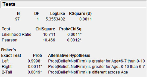
The P-value of 0.0012 leads to the rejection of the hypothesis, and we conclude that the proportion of Firm Believers in the Tooth Fairy is less for Age 8–10 than for Age 6–7. Said another way, the proportion of Firm Believers appears to decrease between Age 6–7 and Age 8–10.
The Chi-Square Goodness of Fit: The Supreme Court
In recent years, appointments to the U.S. Supreme Court have been hot political potatoes. Vacancies on the court occur due to death, retirement, and—theoretically—impeachment, though this has never occurred. In a study of vacancies from 1837 to 1932 (a time over which the number on the court was nine), Wallis (1936) estimated the probabilities of the number of vacancies in any given year to be as indicated in table 7.2.
Table 7.2 Number of vacancies, 1837–1932
| Number of vacancies in a year (1837–1932) | Probability |
| 0 | 0.6065 |
| 1 | 0.3033 |
| >1 | 0.0902 |
Cole (2010) gathered data on vacancies for the seventy-five years between 1933 and 2007 to see if any change had occurred in that period. He used as a baseline the probabilities calculated by Wallis (1936). These data are presented in table 7.3, the data entry is shown in figure 7.12, and the data are in the JMP file Supremes.
Table 7.3 Number of vacancies, 1933–2007
| Number of vacancies in a year (1933–2007) | Observed |
| 0 | 47 |
| 1 | 21 |
| >1 | 7 |
Figure 7.12 Goodness of fit data setup

I will demonstrate the chi-square goodness of fit test using JMP and the data from Cole (2010). Data entry is similar to the salmon example:
1. Select Analyze ![]() Distribution
Distribution ![]() NVacancies
NVacancies ![]() Y, Columns
Y, Columns ![]() Count
Count ![]() Freq
Freq ![]() OK.
OK.
2. Click the Distributions hot spot and select Stack.
3. Click the NVacancies hot spot and select Test Probabilities.
Our probabilities are theory-driven rather than estimated from the data, and we can enter them in the Hypoth Prob column shown in figure 7.13. We should note in passing that a common problem with decimal probabilities is round-off error. A quick check of the current probabilities shows that they add up to 1.000, but this is not always the case. Fortunately, JMP has a built-in capability to handle this problem.
Figure 7.13 Adjust probabilities for decimal round-off

4. Select the Fix omitted at estimated values, rescale hypothesis radio button (arrow). JMP will rescale the probabilities to be legal (that is, adding to 1.0).
5. Enter the probabilities in the Hypoth Prob blanks and click Done.
Be careful; the order of variables is not the same as the order I had in the table! JMP alphabetizes the choices.
We see large P-values in figure 7.14, indicating that the data are consistent with the hypothesis of no change in the distribution of the number of vacancies per year in the modern (1933–2007) U.S. Supreme Court.
Figure 7.14 Goodness of fit report

The Chi-Square Test of Independence: Race and Longevity in the Nineteenth Century
The nineteenth-century African-American experience is rich in anecdotal narrative and is typically reconstructed through the study of diaries, ledgers, and family records. Foster and Eckert (2003) used gravestones and burial records to “expand the historical understanding of an African American community in the rural Midwest in the nineteenth and twentieth centuries” through the examination of data (gravestones and written records) from Coles County, Illinois. They were able to determine the prevalence of African Americans, the ethnicity of surnames, ages at death, and to some extent the causes of death for almost 56,000 individuals, including 338 African Americans.
One part of their analysis focused on the mean age at death for blacks and whites. In most decades from the 1860s to the 1980s the age at death for whites was greater than that of blacks. In a breakdown of the data, the investigators coded the individuals as infants, children, adults, or elders for further analysis. Table 7.4 presents this breakdown.
Table 7.4 Race by age status at death
| Age Status | Blacks | Whites |
| Infant | 37 | 2140 |
| Child | 30 | 1230 |
| Adult | 123 | 4698 |
| Elder | 87 | 6417 |
Foster and Eckert hypothesized that African Americans who had achieved adult status historically did not live as long as whites, and that this explained most of the difference in mean ages across the ethnicities. Each individual’s age status and ethnicity were determined as categorical variables. The data have been entered as shown in figure 7.15 and stored in the JMP file ColesCounty.
Figure 7.15 Data entry

1. Select Analyze ![]() Fit Y by X
Fit Y by X ![]() AgeStatus
AgeStatus ![]() Y, Response
Y, Response ![]() Ethnicity
Ethnicity ![]() X, Factor
X, Factor ![]() Count
Count ![]() Freq
Freq ![]() OK.
OK.
2. Click the Contingency Table hot spot.
3. Hold down the Alt key and deselect Total%, Col%, and Row%; select Expected, Deviation, and Cell Chi Square.
Because the proportion of African-American graves is so small, it may be necessary to enlarge the mosaic plot to see those proportions on the left of the plot (see figure 7.16).
Figure 7.16 Mosaic plot

The chi-square analysis is shown in figures 7.17 and 7.18. The very small P-value is surely due to the huge sample size, and we will probably wish to consider the actual proportions in a thoughtful analysis of the data.
Figure 7.17 Contingency table
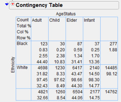
Figure 7.18 Chi-square report

The proportions can be seen in the contingency table in figure 7.19; they are shown as the row percentages, the last value in each cell. The analysis by age status sheds some light on Foster and Eckert’s hypothesis of a shorter life for African Americans. They observe that the proportions of children and infant deaths were very similar for blacks and whites, suggesting that the deaths were driven by disease and the hardships of frontier life. There is a noticeable difference for those who achieved adulthood; the proportion of elderly blacks is significantly smaller than the proportion of elderly whites, consistent with Foster and Eckert’s theory.
Figure 7.19 Table proportions

The Chi-Square Test of Homogeneity of Proportions: Is Golf for the Birds?
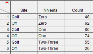
Because of the popularity of golf, new courses are opening all over the world. LeClerc and his colleagues (2005) sought to assess the ecological impact of these courses. Potential ecological problems include habitat fragmentation, chemical pollution due to pesticides, and loss of native vegetation. The focus of their study was eastern bluebirds (Sialia sialis), a species often abundant on golf courses. These bluebirds are “secondary cavity nesters;” that is, they do not excavate their own cavities for nesting. They are particularly attracted to birdhouses and other nesting structures put up in backyards. LeClerc and colleagues monitored the lives of these birds during a breeding season (1 April-30 August) at nine golf courses and ten non-golf course sites. The non-golf course sites had habitat similar to the golf courses, but with no known pesticide use. One characteristic of interest was reproductive success, as measured by nest density in nest boxes. If nest boxes on golf courses are less attractive to bluebirds, this should show up as a difference in the distribution of occupancy frequencies. The data on nest boxes occupied only by bluebirds are presented in table 7.5.
Table 7.5 Nest boxes by location
| Site | 0 nests | 1 nest | 2 -3 nests |
| Golf | 48 | 80 | 55 |
| Non-golf | 62 | 74 | 26 |
Our data have been entered as shown in figure 7.20 and stored in the file Golf.
Figure 7.20 The data setup
1. Select Analyze ![]() Fit Y by X
Fit Y by X ![]() NNests
NNests ![]() Y, Response
Y, Response ![]() Site
Site ![]() X, Factor
X, Factor ![]() Count
Count ![]() Freq
Freq ![]() OK.
OK.
2. Hold down the Alt key and click the Contingency Table hot spot.
3. Deselect Total%, Col%, and Row%; select Expected, Deviation, and Cell Chi Square.
JMP presents the information, as shown in figures 7.21, 7.22, and 7.23.
Figure 7.21 Mosaic plot

Figure 7.22 Contingency table

Figure 7.23 Chi-square analysis

The mosaic plot presents the story graphically. (Notice that the order for NNests is perhaps not what one might like. The order of the values as presented can be altered using the Value Ordering property; consult JMP Help for details.) The proportions of single-nest nest boxes are very similar for golf courses and non-golf course sites. The proportion of nest boxes with zero nests is less, and the proportion of nest boxes with two or three nests is greater than the golf courses' proportion. The P-value certainly suggests a statistically significant result! It appears that the golf sites were more attractive nesting grounds than non-golf course sites.
For those considering building a golf course in the near future, we note that on many of the other variables measured in this study, the golf courses seemed to be more bluebird-friendly than the non-golf course sites.
What Have We Learned?
In this chapter we demonstrated the facility with categorical data in JMP. Both proportions (hypothesis testing and confidence intervals) and the chi-square procedures (goodness of fit, independence, and homogeneity of proportions) were considered.
References
Agresti, A., and A. Coull. (1998). Approximate is better than “exact” for interval estimation of binomial proportions. American Statistician 52(2):119–26.
Blair, J. R., J. S. McKee, and L. F. Jernigan. (1980). Children’s belief in Santa Claus, Easter Bunny and Tooth Fairy. Psychological Reports 46:691–94.
Cole, J. H. (2010). Updating a classic: “The Poisson distribution and the supreme court” revisited. Teaching Statistics 32(3):78–80.
Foster, G., and C. Eckert. (2003). Up from the grave: A sociohistorical reconstruction of an African American community from cemetery data in the rural Midwest. Journal of Black Studies 33(4):468–89.
Jamon, M. (1990). A reassessment of the random hypothesis in the ocean migrations of Pacific salmon. Journal of Theoretical Biology 143:197–213.
LeClerc, J. E., et al. (2005). Reproductive success and developmental stability of eastern bluebirds on golf courses: Evidence that golf courses can be productive. Wildlife Society Bulletin 33(2):483–93.
Quinn, T. P. (1991). Models of Pacific salmon orientation and navigation on the open ocean. Journal of Theoretical Biology 150:539–45.
Wallis, W. A. (1936). The Poisson distribution and the Supreme Court. Journal of the American Statistical Association 31(194):376–80.