Chapter Contents
What Does a Control Chart Look Like
Control charts are a graphical and analytical tool for deciding whether a process is in a state of statistical control. Control charts in JMP are automatically updated when rows are added to the current data table. In this way, control charts can be used to monitor an ongoing process.
The most common types of control charts can be created using the Control Chart Builder. Additional charts are available from the Analyze > Quality and Process > Control Chart menu commands.
The example in Figure 18.1 illustrates characteristics of most control charts:
• Each point represents a summary statistic computed from a subgroup sample of measurements of a quality characteristic.
• The vertical axis of a control chart is scaled in the same units as the summary statistics plotted on the chart.
• The horizontal axis of a control chart identifies the subgroup samples, which are sorted in time order.
• The center line on a control chart indicates the average (expected) value of the summary statistic when the process is in statistical control.
• The upper and lower control limits, labeled UCL and LCL, give the range of variation to be expected in the summary statistic when the process is in statistical control.
• A point outside the control limits signals that there might be a special cause of variation. (Note that there are other signals of special causes.)
Figure 18.1 Control Chart Example

Types of Control Charts
Control charts are broadly classified as variables charts and attributes charts. JMP also provides a number of specialty charts, as shown in Figure 18.2.
Figure 18.2 The Control Chart Menu

The control charts in Figure 18.2 are briefly described below.
Variables Charts
Variables control charts are used when the quality characteristic to be monitored is measured on a continuous scale.
There are different kinds of variables control charts based on the subgroup sample summary statistic plotted on the chart. The plotted statistic can be the mean (average), the range, the standard deviation of a measurement, an individual measurement itself, or a moving range.
For quality characteristics measured on a continuous scale, it is typical to analyze both the process mean and its variability by showing an XBar (mean) chart aligned above its corresponding R-(range) or S- (standard deviation) chart. The center line on the XBar chart is the overall average, and each point is a subgroup mean.
If you are charting individual response measurements, the Individual Measurement chart is aligned above its corresponding Moving Range chart.
Attributes Charts
Attributes control charts are used when the quality characteristic of a process is qualitative in nature. When quality is measured by counting the number of nonconformities (defects) in an item or batch of items, a C or U chart is used to monitor the process. When calculating the proportion of nonconforming (defective) items in a sample a P or NP chart is used.
Specialty Charts
The Control Chart menu also includes a command for run (or line) charts, along with a variety of specialty charts.
• UWMA and EWMA charts are used to plot moving averages.
• CUSUM charts, or cumulative sum charts, are an alternative to Shewhart charts for detecting small process shifts.
• Presummarize and Levey Jennings provide additional options for construction of variables control charts.
• Multivariate charts are for monitoring more than one process characteristic on the same chart.
Control Chart Basics
Control charts are used to monitor a process. They tell us where the process is centered and how much variation we can expect (assuming nothing ‘special’ happens). They also signal when something in the process has changed.
Control limits show the range of variation we can expect to see, assuming that the process is stable.
• A stable process has only common causes of variation. Common cause variation is generally small scale variation that is in inherent to the process.
• An unstable process also has special causes of variation. Special cause variation is external to the process and is often large in scale. For example, there might be a shift in the mean, spikes, cycles, or trends.
Control limits are generally plotted at ±3 standard errors of the plotted statistic. Why ± 3 standard errors? For a normal distribution, approximately 99.73% of all values fall within this interval if the process is stable. That is, a point will only fall outside this interval, just by chance, roughly 0.27% of the time. If a point falls outside the limits, we have a pretty good idea that it is a ‘special’ event.
To make control charts more sensitive to special causes of variation, a number of tests have been developed. In JMP the available tests can be requested for each control chart.
Use the Tests command to request the Western Electric Rules. These 8 tests are based on points falling in zones positioned at one, two, or three standard errors from the center line. Note: These tests will not run when the subgroup sizes are not constant.
An alternative to the Western Electric Rules is Westgard Rules. These tests are based on standard deviations rather than zones, so they can be computed regardless of the subgroup size.
The tests and the rules that apply to them are described in detail in the Quality and Reliability Methods book, available from the Help menu.
Control Charts for Variables Data
Control charts for variables data are classified according to the subgroup summary statistic plotted on the chart.
The XBar selection produces an XBar (averages) chart with an option to produce one of two other charts, an R or and S chart:
• XBar charts display subgroup means (averages).
• R charts display subgroup ranges (maximum–minimum).
• S charts display subgroup standard deviations.
The estimate of the standard error used to compute the control limits on the XBar chart is derived from the within subgroup variation from the R or S chart.
The IR selection produces the following chart types:
• Individuals (or Individual Measurement) charts display individual observations.
• Moving Range charts display moving ranges of two or more successive measurements. The default range span is 2 but this can be changed.
The control limits on the Individuals chart are based on the moving ranges. Because moving ranges are correlated, these charts should be interpreted with care.
Variables control charts can be produced using either the Control Chart Platform, shown in Figure 18.2, or the Control Chart Builder, a new interactive way to quickly and easily generate charts.
Let’s proceed with constructing variables control charts with the Control Chart Builder.
Variables Charts using Control Chart Builder
Control Chart Builder provides a workspace where you can drag-and-drop process variables and subgroup sample variables to investigate the stability of a process. Several basic types of control charts are available: XBar, Range, Standard Deviation, Individual Measurement, and Moving Range.
The Control Chart Builder Work Space
Start Control Chart Builder from an open data table by choosing Analyze > Quality and Process > Control Chart Builder.
You first see a blank workspace like the one shown in Figure 18.3. The workspace has a central area to display the charts, and drop zones labelled Y, Phase, and Subgroup. The variable list is on the left, in the Control Chart Builder control panel. You create charts by dragging variables from the variable list and dropping them in one (or more) of the drop zones. You can also drop a variable in the center of the workspace.
When you drop variables into the workspace, instant feedback encourages further exploration of the data. You can change your mind and quickly create another type of chart, or change the current settings by right-clicking on the existing chart.
The best way to start is to just jump in and try dragging variables to drop areas. However, the next section shows how to construct specific kinds of control charts with the Control Chart Builder.
Figure 18.3 Control Chart Builder Workspace
Control Chart Builder Examples
To create a control chart,
The measure of interest is the diameter of 4.4 mm tubing used in medical applications. Samples of six tubes are measured each day over a 40 day period.
As simple as that, you can see the Individuals and Moving Range (IR) charts shown in Figure 18.4.
Figure 18.4 Individuals and Moving Range Chart of DIAMETER

To create an XBar and R chart, as shown in Figure 18.5,
Figure 18.5 XBar and Range Chart of DIAMETER

If you move your mouse over a point (as shown), the corresponding row numbers display. Click on a point to highlight it and select the corresponding rows in the data table. Each plotted point in the Averages (top) chart is the average of diameter values from a sample size of 6 rows.
Right-click anywhere in the chart to see a menu that lets you change or tailor the control chart. For example, to request tests for special causes, right-click and select Warnings > Tests.
Important: The chart is completely interactive. For example,
• if you don’t want to see the Control Panel, click Done.
• if you make mistakes, click the Undo button on the control panel. You can click Undo multiple times.
• if you create a disastrous and unreadable control chart, click Start Over.
• if you don’t want to see the range chart, simply drag the title away from the chart and it is gone.
• you can drag other variables onto the chart to any of the drop areas.
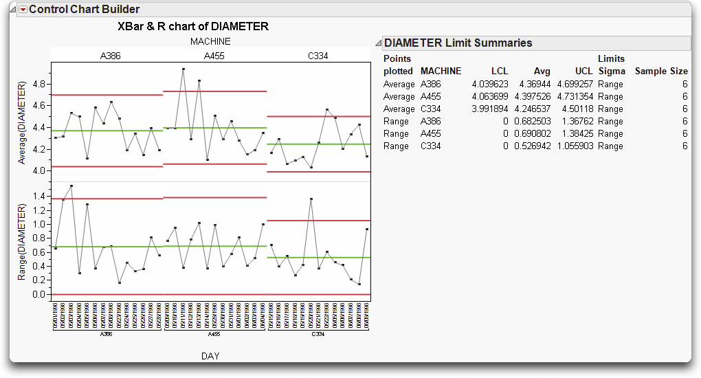
This last bullet is important because that functionality is only available using the Control Chart Builder. For example, the Diameter.jmp file contains information for three different machines.
To generate control limits for each machine,
Figure 18.6 Phased Diameter Control Chart
Control Charts for Attributes Data
Attributes charts, like variables charts, are classified according to the subgroup sample statistic plotted on the chart:
• P-charts display the proportion of nonconforming (defective) items in a subgroup sample.
• NP-charts display the number of nonconforming (defective) items in a subgroup sample.
• C-charts display the number of nonconformities (defects) in a subgroup sample that consists of a constant number of inspection units.
• U-charts display the average number of nonconformities (defects) per unit in a subgroup sample with an arbitrary number of inspection units.
P- and NP-Charts
The Washers.jmp data table contains the number of defective washers in 15 lots of galvanized washers. The washers were inspected for finish defects such as rough galvanization and exposed steel. A defective washer had one or more finish defects.
Lets say that we’re interested in monitoring the proportion of defective washers in a lot, and that the lot size can vary. The chart to the left in Figure 18.7 illustrates a P-chart for the proportion of defective washers per lot. To generate this P-chart,
Like the other charts we’ve discussed thus far, control limits are placed at ± 3 standard errors (of the proportion, in this case). Control limits vary according to the lot (or sample size). Larger lot sizes result in a smaller standard error, and therefore, tighter control limits. The lower control limit is bounded by zero.
Assume, instead, that the number of washers in a lot is constant, and that we’re interested in monitoring the number of defective washers per lot. To generate the NP-chart in Figure 18.7,
Figure 18.7 P and NP Charts for the Washers Data

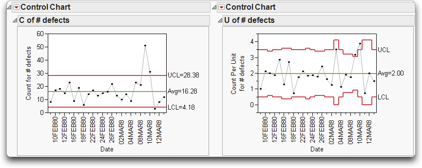
C- and U-Charts
The Braces.jmp data records the defect count in boxes of automobile support braces. A box of braces is one inspection unit. The number of brace defects found in a day is the process variable.
Lets assume that a constant number of units (or boxes) are inspected per day. The C-chart on the left in Figure 18.8 shows the number of defects found per day. To generate this chart,
The U-chart (also known as a DPU chart) shown to the right in Figure 18.8 is monitoring the number of brace defects per box. The subgroup sample size, the number of boxes inspected in a day, is not constant. As we saw with the P-chart, the upper and lower control limits vary according to the sample size (in this case, the number of boxes inspected in a day).
Figure 18.8 C and U Charts for the Braces Data
Specialty Charts
This section discusses the other types of control charts available from the Control Chart menu. The previous control charts plot each point based on information from a single subgroup sample.
More advanced charts such as CUSUM charts and Multivariate Charts are also available, but are not discussed here. For information see book, Quality and Reliability Methods, available from the Help menu.
Presummarize Charts
Presummarize charts summarize the process column before charting. If you select Presummarize from the Control Chart menu, the launch dialog includes the additional set of check-box options shown to the right for plotting variables data. These options give a wider range of control chart types and options within each type.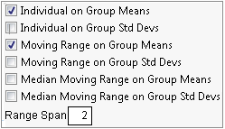
Note: Many of these options are available in the Control Chart Builder.
Levey-Jennings Charts
Levey-Jennings charts show a process mean with control limits based on a long-term sigma, placed at 3 standard deviations from the center line. The standard deviation for the Levey-Jennings chart is the overall standard deviation of the process variable. Figure 18.9 shows a comparison of the same data plotted on an IR chart and on a Levey-Jennings chart.
The overall standard deviation is usually larger than the estimate of the standard deviation based on subgroups, resulting in wider control limits.
Figure 18.9 Compare Limits between IR and Levey-Jennings Control Charts

In the previous control charts, each point plotted is based on information from a single subgroup sample. Moving average charts are different because each point combines information from the current and past samples. As a result, moving average charts are more sensitive to small shifts in the process average. Unfortunately, it is more difficult to interpret patterns of points on a moving average chart because consecutive moving averages can be highly correlated (Nelson 1984).
Uniformly Weighted Moving Average (UWMA) Charts
Each point on a Uniformly Weighted Moving Average (UWMA) chart is the average of the w most recent subgroup means, including the present subgroup mean. When you obtain a new subgroup sample, the next moving average is computed by dropping the oldest of the previous w subgroup means and including the newest subgroup mean. The constant w is called the span of the moving average. There is an inverse relationship between w and the magnitude of the shift that can be detected. Thus, larger values of w allow the detection of smaller shifts.
To see an example,
The measure of interest is the gap between the ends of manufactured metal clips. To monitor the process for a change in average gap, subgroup samples of five clips are selected daily, and a UWMA chart with a moving average span of three samples is examined. To see the UWMA chart, complete the Control Chart dialog.
The Control Chart dialog should look like the one shown in Figure 18.10.
Figure 18.10 Specification for UWMA Charts of Clips1 Data

The point for the first day is the mean of the first subsample only, which consists of the five sample values taken on the first day. The plotted point for the second day is the average of subsample means for the first and second day. The points for the remaining days are the average of subsample means for each day and the two previous days.
Figure 18.11 UWMA Charts for the Clips1 Data

Exponentially Weighted Moving Average (EWMA) Chart
Each point on an Exponentially Weighted Moving Average (EWMA) chart, also referred to as a Geometric Moving Average (GMA) chart, is the weighted average of all the previous subgroup means, including the mean of the present subgroup sample.
The weights decrease exponentially going backward in time. The weight (0 < r < 1) assigned to the present subgroup sample mean is a parameter of the EWMA chart. Small values of r are used to guard against small process shifts. If r = 1, theEWMA chart reduces to a Mean control (Shewhart) chart, previously discussed 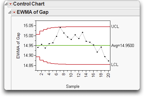
The default value of r is 0.2, which makes the EWMA chart sensitive to relatively small shifts in the process mean. The figure shown here is an EWMA chart for the same data used for Figure 18.11 (Clips1.jmp).
Capability Analysis
As we have seen, control charts are used to assess and monitor the stability of a process. The terms ‘stable’ and ‘in control’ are used to describe a process with only common causes of variation. However, a stable process may not be capable of producing the desired quality relative to specifications or tolerances. In other words, a stable process is not necessarily a capable process.
A capability analysis can be performed in three JMP platforms. The platform you use depends on the number of variables under study and whether or not the data are time ordered, described below.
• Use the Distribution platform for one continuous variable.
• Use the Capability platform for several continuous variables.
• Use Control Chart platform for time-ordered variables.
What is Process Capability?
Capability is a useful measure of how well a process keeps within the specification limits. For normally-distributed measurements, capability is purely a function of the mean and variance of the process. You can have a process go wrong because its mean is off target, or because there is too much variation, or both.
Process capability studies compare the variability (or spread) of a stable process to the width of the specification limits, as shown in Figure 18.12.
Figure 18.12 . Calculating Capability Indices

A variety of indices are available to quantify capability. The most common measures are CP, CPK, CPL and CPU.
The index you use depends on the situation:
• If it is important that you hit a target, then CPK is the best choice.
• If you’re concerned about staying within a one-sided lower or upper specification limit, then CPL (lower) or CPU (upper) should be used.
• If you need to make sure your variation is under control, given it is relatively easy to steer the mean to the target, CP is the best measure.
Formulas for computing these indices are shown below.
The CPK measure is the minimum of CPL and CPU. As a result, if the process is off target CPK will be lower than CP—a penalty for being off target.
Lets take a closer look at these formulas. The LSL and USL are the lower and upper specification limits, s is the standard deviation of the process and x-bar is the mean.
Why is 3s built into the formulas for CPL and CPU (and, thus, CPK)? For a normal distribution, it turns out that at 3 standard deviations we have a tail probability of 0.00134. Lets say that our process is centered at the target, and that the distance between the mean and each spec limit is 3 standard deviations. CPL and CPU are both 1.0. CPK is then 1.0, and the probability that an observation falls either below the lower spec or above the upper spec is 0.0027. This is an acceptable rate of defects for some processes, and the process would be considered capable.
This scenario is illustrated to the left in Figure 18.13. The LSL = 101, the target = 104, the USL = 107, and the process is on target. The CPK is 1.0, and the overall defect rate is 0.27%.
With the same process mean, if the standard deviation increased from 1.0 to 1.5, then the CPK would drop to 0.667, producing 4.55% defects (on the right in Figure 18.13).
Figure 18.13 Capability Examples

If the standard deviation remained at 1.0, but the process mean shifted off target to 105, then the process is also incapable, producing defects at around 2.2% as shown to the left in Figure 18.14.
However, if we cut the variability in half (from 1.0 to 0.5), even if the process remains off target, our capability improves and there will be only rare defects as shown to the right.
Figure 18.14 More Capabilities Examples

Capability for One Process Measurement
The Distribution platform provides a Capability Analysis option on the red triangle menu of each continuous variable plotted. For an example,
This file contains data on pollutants for 52 cities. The variable of interest is CO (Carbon Monoxide). In cities, high levels of carbon monoxide are primarily caused by vehicle exhaust. According to the United States EPA (www.airnow.gov), the ‘Good’ (desired) range of CO is 0-4.5 ppm, while ‘Moderate’ (acceptable) levels are between 4.5 and 9 ppm.
Additional options are noted in Figure 18.15.
Figure 18.15 Distribution Capability Specification Dialog

The specification limits and target display on the histogram, and a Capability Analysis report is appended to the Distribution output, as shown in Figure 18.16 (the Quantiles and Summary Statistics have been deselected).
Figure 18.16 Distribution Capability Analysis for CO (Carbon Monoxide)

The CPK of 0.058 indicates that the carbon monoxide levels in the cities are well above acceptable levels.
Capability for Many Process Measurements
Assessing capability for one process, as we have seen, is easy. But, what if we have hundreds of processes, and we’re only interested in finding the problem cases? To assess the capability of many processes, no one wants to look at a complex report and graph for each process variable. How do we show capability in just one picture, especially when the processes have different targets and different specification limits?
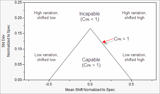
The solution is to normalize the mean and the standard deviation for each process relative to the specification range. These normalized values can then be plotted on the same graph, called a Goal Plot (Figure 18.17).
The Goal Plot displays a triangle corresponding to a CPK = 1.0. Measures with a CPK > 1.0 are plotted inside the triangle, and measures with a CPK < 1.0 are plotted outside the triangle. Where they are plotted depends on the shift from the target and the variation.
• A perfect process is at the origin (0, 0), hitting the target and having no variation.
• An off target process or one with too much variation may be acceptable, as long as it stays within the capability triangle.
• If the process has too much variation but is on-target, it will likely fall outside the triangle.
• If the process has low variation but the mean falls outside the specification limits, the process is producing all defects.
To get a higher CPK, you need to move the mean closer to the target, reduce the variation, or both.
Figure 18.17 Interpretation of the Goal Plot
As an example, the file Semiconductor Capability.jmp contains measurements on 128 quality characteristics. Each of these characteristics has different specification limits, which have been added to the column properties for each variable in the data table. To view this information,
Lets say that, for simplicity, we are interested in seeing a capability analysis for the first 10 quality characteristics, NPN1 through NPN4.
By default, the red triangle in the Goal Plot corresponds to an acceptable CPK of 1.0. However, this can be changed using the slider under the goal post.
Figure 18.18 Capability Analysis Platform Results

The Capability Box Plots panel displays box plots for each variable standardized by individual specification limits. The standardized target is displayed as a solid green line, and the spec limits are displayed as green dashed lines. Box plots for off target characteristics are shifted away from the center line, and box plots for characteristics with too much variability are wider than the dashed spec limits.
Capability indices for each characteristic, and other options, can be requested from the top red triangle menu.
Note: If specification limits are not entered as column properties, as they were in this example, JMP will open a Spec Limit window. Specification limits can either be imported from a table or entered manually.
Capability for Time-Ordered Data
When generating variables control charts from the Control Chart platform for time-ordered data, a capability analysis can be requested in addition to the control chart. To see an example,
Recall that the measure of interest is the gap between the ends of manufactured metal clips. Samples of five clips are selected daily, and the gap is measured. The target and specifications for the process are 15 ± 0.5 mm.
To generate an XBar and R chart, and request the capability analysis from the control chart dialog.
The completed dialog is shown in Figure 18.19.
Figure 18.19 Control Chart Dialog and Capability Analysis

The resulting capability analysis is shown Figure 18.20.
Note: The XBar and R control charts are not displayed. Before conducting a capability analysis, the stability of the process should be verified. If a process is not stable, its future performance is unpredictable. So, by definition, and unstable process is not capable.
Figure 18.20 Control Chart Capability Analysis Results

The output is identical to what we saw from the Distribution platform, with the addition of a Normal Quantile Plot and a second set of capability results. The Normal Quantile Plot should be used to assess the normality of the underlying distribution. The Long Term Sigma results are based on the overall (long term) estimate of the standard deviation. The Control Chart Sigma (short term) results are based on the within-subgroup estimate of the standard deviation computed from the Range chart.
Additional Notes
• The capability analysis can also be requested from the red triangle menu on the Control Chart title bar.
• To use PP and PPK labeling for the Long Term Sigma capability indices, go to Preferences > Platforms > Distribution and check PPK Capability Labeling. This labeling is then used in future analyses (or if you redo the analysis).
A Few Words About Measurement Systems
We generally assume that our measurements are representative of the true value of the characteristic being measured. However, this is often not the case. A measurement system analysis (MSA) is a study used to verify the integrity and quality of our measurement process.
JMP provides two platforms for analyzing measurement systems. Both are found under Analyze > Quality and Process.
• Measurement Systems Analysis is the EMP (Evaluating the Measurement Process) approach developed by Donald Wheeler (2006). A Gauge R&R analysis can also be performed from this platform.
• Variability/Attribute Gauge Chart performs a Variance Components Analysis, Gauge R&R or Attribute measurement system analysis.
Refer to the book Quality and Reliability Methods under the Help menu for details on using these methods.
Exercises
1. The file Oil2 Cusum.jmp contains the distribution of weight measurements for a can filling process. Four cans are measured per hour over a 12 hour period. We are interested in assessing the stability and capability of the process. The specs for the process are 8.1 oz ± 0.1 oz.
(a) Open the data table, and take a look at the data. Which of the two control chart types would be more appropriate for monitoring the filling process: an IR or an XBar R or S? Why?
(b) Use the Control Chart Builder to create the control chart. What is the mean of the process? Does the process appear stable?
(c) Now, run the tests for special causes (the Western Electric Rules). Right-click on teh graph and select Warnings > Tests. Is the process stable?
2. Perform a capability study from the Control Chart platform for the Oil2 Cusum.jmp data using the specs given in question 1.
(a) The assumptions to perform a capability study are that the process is stable and that the underlying distribution is normal. Are these assumptions met?
(b) What percent of the measurements fell outside the specification limits?
(c) What percent of measurements are predicted to fall outside the specification limits over the long term?
(d) Is the process capable? Recall that a CPK of 1.0 is generally considered capable?
(e) Engineers have decided that the process needs to be improved. Should they focus on (1) centering the mean on the target, (2) reducing process variation, or (3) both?
3. The file Fabric.jmp contains information on the number of defects found in upholstery fabric used in automobiles. An incoming inspection process randomly selects and inspects one bolt (100 yards long and 72 inches wide) per shipment and records the number of defects.
(a) Based on the description above, what type of control chart is appropriate to monitor defects per bolt? P, NP, C or U? Why?
(b) Open the file, and use the Control Chart platform to generate the control chart. Does the process appear to be stable?
(c) Run the tests for special causes. Note that for attribute control charts only the first four tests are available. Which tests signal that there are special causes?
(d) Use the JMP Help to investigate the signals of the special causes found above.
4. Open Abrasion.jmp, and use the Control Chart Builder to create and XBar and R chart of Abrasion (Y), Date (Subgroup) and Shift (Phase). Does there appear to be a difference in abrasion measurements between the two shifts?
..................Content has been hidden....................
You can't read the all page of ebook, please click here login for view all page.