
Chapter Contents
Categorical Situations
A categorical response is one in which the response is from a limited number of choices (called response categories). There is a probability associated with each of these choices, and these probabilities sum to 1.
Categorical responses are common:
• Consumer preferences are usually categorical: Which do you like the best— tea, coffee, juice, or soft drinks?
• Medical outcomes are often categorical: Did the patient live or die?
• Biological responses are often categorical: Did the seed germinate?
• Mechanical responses can be categorical: Did the fuse blow at 20 amps?
• Any continuous response can be converted to a categorical response: Did the temperature reach 100 degrees (“yes” or “no”)?
Categorical Responses and Count Data: Two Outlooks
It is important to understand that there are two approaches to handling categorical responses. The two approaches generally give the same results, but they use different tools and terms.
First, imagine that each observation in a data set represents the response of a chooser. Based on conditions of the observation, the chooser is going to respond with one of the response categories. For example, the chooser might be selecting a dessert from the choices pie, ice cream, or cake. Each response category has some probability of being chosen, and that probability varies depending on other characteristics of the observational unit.
Now reverse the situation and think of yourself as the observation collector for one of the categories. For example, suppose that you sell the pies. The category Pies now is a sample category for the vendor, and the response of interest is how many pies can be sold in a day. Given total sales for the day of all desserts, the interest is in the market share of the pies.
Figure 11.1 diagrams these two ways of looking at categorical distributions.
Figure 11.1 Customer or Supplier?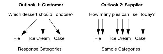
• The customer/chooser thinks in terms of logistic regression, where the Y variable is which dessert you choose and the X variables affect the probabilities associated with each dessert category.
• The supplier/counter thinks about log-linear models, where the Y (responses) is the count, and the X (effect) is the dessert category. There can be other effects interacting with that X.
The modeling traditions for the two outlooks are also different. Customer/chooser-oriented analyses, such as a live/die medical analysis, use continuous X’s (like dose, or how many years you smoked). Supplier/counter-oriented analysts, typified by social scientists, use categorical X’s (like age, race, gender, and personality type) because that keeps the data count-oriented.
The probability distributions for the two approaches are also different. This book won’t go into the details of the distributions, but you can be aware of distribution names. Customer/chooser-oriented analysts refer to the Bernoulli distribution of the choice. Supplier/counter-oriented analysts refer to the Poisson distribution of counts in each category. However, both approaches refer to the multinomial distribution.
• To the customer/chooser analysts, the multinomial counts are aggregation statistics.
• To the supplier /counter analysts, the multinomial counts are the count distribution within a fixed total count.
The customer/chooser analyst thinks the basic analysis is fitting response category probabilities. The supplier/counter analyst thinks that basic analysis is a one-way analysis of variance on the counts and uses weights because the distribution is Poisson instead of Normal.
Both orientations are right—they just have different outlooks on the same statistical phenomenon.
In this book, the emphasis is on the customer/chooser point of view, also known as the logistic regression approach. With logistic regression, it is important to distinguish the responses (Y’s), which have the random element, from the factors (X’s), which are fixed from the point of view of the model. The X’s and Y’s must be distinguished before the analysis is started.
Let’s be clear on what the X’s and Y’s are for the chooser point of view:
• Responses (Y’s) identify a choice or an outcome. They have a random element because the choice is not determined completely by the X factors. Examples of responses are patient outcome (lived or died), or desert preference (Gobi or Sahara).
• Factors (X’s) identify a sample population, an experimentally controlled condition, or an adjustment factor. They are not regarded as random even if you randomly assigned them. Examples of factors are gender, age, treatment or block.
Figure 11.2 illustrates the X and Y variables for both outlooks on categorical models.
The other point of view is the log-linear model approach. The log-linear approach regards the count as the Y variable and all the other variables as X’s. After fitting the whole model, the effects that are of interest are identified. Any effect that has no response category variable is discarded, since it is just an artifact of the sampling design. Log-linear modeling uses a technique called iterative proportional fitting to obtain test statistics. This process is also called raking.
Figure 11.2 Categories or Counts?
A Simulated Categorical Response
A good way to learn statistical techniques is to simulate data with known properties, and then analyze the simulation to see if you find the structure that you put into the simulation.
These steps describe the simulation process:
1. Simulate one batch of data, then analyze.
2. Simulate more batches, analyze them, and notice how much they vary.
3. Simulate a larger batch to notice that the estimates have less variance.
4. Do a batch of batches—simulations that for each run obtain sample statistics over a new batch of data.
5. Use this last batch of batches to look at the distribution of the test statistics.
Simulating Some Categorical Response Data
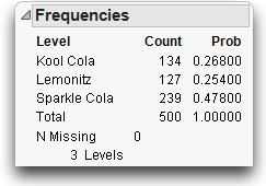
Let’s make a world where there are three soft drinks. The most popular (“Sparkle Cola”) has a 50% market share and the other two (“Kool Cola” and “Lemonitz”) are tied at 25% each. To simulate a sample from this population, we create a data table that has one variable (call it Drink Choice), which is drawn as a random categorical variable using the following formula:

This formula first draws a uniform random number between 0 and 1 using the Random Uniform function, and assigns the result to a temporary variable p. Then it compares that random number using If conditions on the random number and picks the first response where the condition is true. Each case returns the character name of a soft drink as the response value.
This table is in the sample data library (Help > Sample Data).
Note that the column formula has two statements delimited with a semicolon. The Formula Editor operations needed to construct this formula to include the following operations:
• Local Variables: New Local creates a temporary variable named p,
• The If statement from the Conditional functions assigns soft drink names to probability conditions given by the Random Uniform function found in the Random functions.
The table is stored with no rows. A data table stored with no rows and columns with formulas is called a table template.
Don’t expect to get the same numbers that we show here because the formula generates random data. Each time the computations are performed, a different set of data is produced. Even though the data are based on the true probabilities of 0.25, 0.25, and 0.50, the estimates are different (0.34, 0.20, and 0.46). Your data have random values with somewhat different probabilities.
Figure 11.3 Histogram and Frequencies of Simulated Data

Variability in the Estimates
The following sections distinguish between ρ (Greek rho), the true value of a probability, and p, its estimate. The true value ρ is a fixed number, an unknowable “true” value, but its estimate p is an outcome of a random process, so it has variability associated with it.
You cannot compute a standard deviation of the original responses—of “Kool Cola”, et al., because they are character values. However, the variability in the probability estimates is well-defined and computable.
Just as with continuous variables, the variability of an estimate is expressed by its variance or its standard deviation, although the quantities are computed with different formulas. The variance of p is given by the formula
For Sparkle Cola, having a ρ of 0.50, the variance of the probability estimate is(0.5 * 0.5) / 50 = 0.005. The standard deviation of the estimate is the square root of this variance, 0.07071. Table 11.1 compares the difference between the true ρ and its estimate p. Then, it compares the true standard deviation of the statistic p, and the standard error of p, which estimates the standard deviation of p.
Table 11.1. Simulated Probabilities and Estimates
|
Level
|
ρ, the True Probability
|
p, the Estimate of ρ
|
True Standard Deviation of the Estimate
|
Standard Error of the Estimate
|
|
Kool Cola
|
0.25
|
0.34
|
0.06124
|
0.06699
|
|
Lemonitz
|
0.25
|
0.20
|
0.06124
|
0.05657
|
|
Sparkle Cola
|
0.50
|
0.46
|
0.07071
|
0.07048
|
This simulation shows a lot of variability. As with Normally distributed data, you can expect to find estimates that are two standard deviations from the true probability about 5% of the time.
Now let’s see how the estimates vary with a new set of random responses.
Each repetition results in a new set of random responses and a new set of estimates of the probabilities. Table 11.2 gives the estimates from our four Monte Carlo runs.
Table 11.2. Estimates from Monte Carlo Runs
|
Level
|
Probability
|
Probability
|
Probability
|
Probability
|
|
Kool Cola
|
0.32000
|
0.18000
|
0.26000
|
0.40000
|
|
Lemonitz
|
0.26000
|
0.32000
|
0.24000
|
0.18000
|
|
Sparkle Cola
|
0.42000
|
0.50000
|
0.50000
|
0.42000
|
With only 50 observations, there is a lot of variability in the estimates. The “Kool Cola” probability estimate varies between 0.18 and 0.40, the “Lemonitz” estimate varies between 0.18 and 0.32, and the “Sparkle Cola” estimate varies between 0.42 and 0.50.
Larger Sample Sizes
What happens if the sample size increases from 50 to 500? Remember that the variance of p is
With more data, the denominator is larger and the probability estimates have a much smaller variance. To see what happens when we add observations,
Five hundred rows give a smaller variance, (0.5 * 0.5) / 500 = 0.0005, and a standard deviation at about  = 0.022. The figure above shows the simulation for 500 rows.
To see the Std Err Prob column in the report,
Now we extend the simulation.
Table 11.3 shows the results of our next 4 simulations.
Table 11.3. Estimates from Four Monte Carlo Runs
|
Level
|
Probability
|
Probability
|
Probability
|
Probability
|
|
Kool Cola
|
0.28000
|
0.25000
|
0.25600
|
0.23400
|
|
Lemonitz
|
0.24200
|
0.28200
|
0.23400
|
0.26200
|
|
Sparkle Cola
|
0.47800
|
0.46800
|
0.51000
|
0.50400
|
Note that the probability estimates are closer to the true values. The standard errors are also much smaller.
Monte Carlo Simulations for the Estimators
What do the distributions of these counts look like? Variances can be easily calculated, but what is the distribution of the count estimate? Statisticians often use Monte Carlo simulations to investigate the distribution of a statistic.
To simulate estimating a probability (which has a true value of 0.25 in this case) over a given sample size (50 in this case), we’ll construct the formula shown below.
The Random Uniform function generates a random value distributed uniformly between 0 and 1. The term in the numerator evaluates to 1 or 0 depending on whether the random value is less than 0.25. It is 1 about 25% of the time, and 0 about 75% of the time. This random number is generated 50 times (look at the indices of the summation; j = 1 to 50), and the sum of them is divided by 50.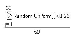
This formula is a simulation of a Bernoulli event with 50 samplings. The result estimates the probability of getting a 1. In this case, you happen to know the true value of this probability (0.25) because you constructed the formula that generated the data.
Now, it is important to see how well these estimates behave. Theoretically, the mean (expected value) of the estimate, p, is 0.25 (the true value), and its standard deviation is the square root of
which is 0.06124.
Distribution of the Estimates
The sample data has a table template called Simprob.jmp that is a Monte Carlo simulation for the probability estimates of 0.25 and 0.5, based on 50 and 500 trials. You can add rows 1000 to the data to draw 1000 Monte Carlo trials.
To see how the estimates are distributed:
• The variance decreases as the sample size increases.
• The distribution of the estimates is approximately Normally distributed, especially as the sample size gets large.
Figure 11.4 Histograms for Simulations with Various n and p Values

The estimates of the probability p of getting response indicator values of 0 or 1 behave like sample means. As the sample gets larger, the value of p gets closer and closer to the true probability (0.25 or 0.50 in our example). Like the mean for continuous data, the standard error of the estimate relates to the sample size by the factor  .
.
The Central Limit Theorem applies here. It says that the estimates approach a Normal distribution when there are a large number of observations.
Table 11.4. Summary of Simulation Results
|
True Value of p
|
N Used to Estimate p
|
Mean of the Trials of the Estimates of p
|
Standard Deviation of Trials of Estimates of p
|
True Mean of Estimates
|
True Standard Deviation of the Estimates
|
|
0.25
|
50
|
0.24774
|
0.06105
|
0.25
|
0.06124
|
|
0.25
|
500
|
0.24971
|
0.01936
|
0.25
|
0.01936
|
|
0.50
|
50
|
0.49990
|
0.07071
|
0.50
|
0.07071
|
|
0.50
|
500
|
0.50058
|
0.02236
|
0.50
|
0.02236
|
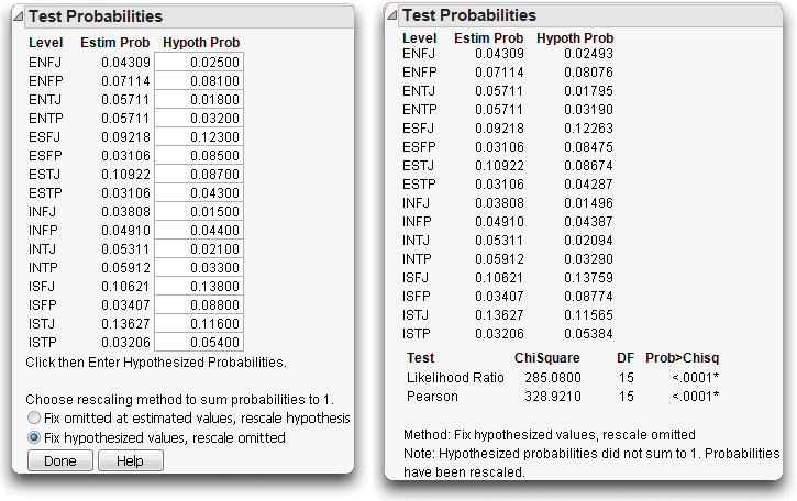
The X2 Pearson Chi-Square Test Statistic
Because of the Normality of the estimates, it is reasonable to use Normal-theory statistics on categorical response estimates. Remember that the Central Limit Theorem says that the sum of a large number of independent and identically distributed random values have a nearly Normal distribution.
However, there is a big difference between having categorical and continuous responses. With categorical responses, the variances of the differences are known. They are solely a function of n and the probabilities. The hypothesis specifies the probabilities, so calculations can be made under the null hypothesis. Rather than using an F-statistic, this situation calls for the χ2 (chi-square) statistic.
The standard chi-square for this model is the following scaled sum of squares:

where Observed and Expected refer to cell counts rather than probabilities.
The G2 Likelihood-Ratio Chi-Square Test Statistic
Whereas the Pearson chi-square assumes Normality of the estimates, another kind of chi-square test is calculated with direct reference to the probability distribution of the response and so does not require Normality.
In statistical language, the MLE finds parameters that make the data that actually occurred less improbable than they would be with any other parameter values. The term likelihood means the probability has been evaluated as a function of the parameters with the data fixed.
It would seem that this requires a lot of guesswork in finding the parameters that maximize the likelihood of the observed data, but just as in the case of least squares, mathematics can provide short cuts to computing the ideal coefficients. There are two fortunate short cuts for finding a maximum likelihood estimator:
• Because observations are assumed to be independent, the joint probability across the observations is the product of the probability functions for each observation.
• Because addition is easier than multiplication, instead of multiplying the probabilities to get the joint probability, you add the logarithms of the probabilities, which gives the log-likelihood.
This makes for easy computations. Remember that an individual response has a multinomial distribution, so the probability is ρi for the i=1 to r probabilities over the r response categories.
Suppose you did the cola simulation, and your first five responses were: Kool Cola, Lemonitz, Sparkle Cola, Sparkle Cola, and Lemonitz. For Kool Cola, Lemonitz, and Sparkle Cola, denote the probabilities as ρ1, ρ2, and ρ3 respectively. The joint log-likelihood is:
log(ρ1) + log(ρ2) + log(ρ3) + log(ρ3) + log(ρ2)
It turns out that this likelihood is maximized by setting the probability parameter estimates to the category count divided by the total count, giving
p1 = n1/n = 1/5
p2 = n2/n = 2/5
p3 = n3/n = 2/5
where p1, p2, and p3 estimate ρ1, ρ2, and ρ3. Substituting this into the log-likelihood gives the maximized log-likelihood of
log(1/5) + log(2/5) + log(2/5) + log(2/5) + log(2/5)
At first it may seem that taking logarithms of probabilities is a mysterious and obscure thing to do, but it is actually very natural. You can think of the negative logarithm of p as the number of binary questions you need to ask to determine which of 1/p equally likely outcomes happens. The negative logarithm converts units of probability into units of information. You can think of the negative loglikelihood as the surprise value of the data because surprise is a good word for unlikeliness.
Likelihood Ratio Tests
One way to measure the credibility for a hypothesis is to compare how much surprise (–log-likelihood) there would be in the actual data with the hypothesized values compared with the surprise at the maximum likelihood estimates. If there is too much surprise, then you have reason to throw out the hypothesis.
It turns out that the distribution of twice the difference in these two surprise (-log-likelihood) values approximately follows a chi-square distribution.
Here is the setup: Fit a model twice. The first time, fit using maximum likelihood with no constraints on the parameters. The second time, fit using maximum likelihood, but constrain the parameters by the null hypothesis that the outcomes are equally likely. It happens that twice the difference in log-likelihoods has an approximate chi-square distribution (under the null hypothesis). These chi-square tests are called likelihood ratio chi-squares, or LR chi-squares.
The likelihood ratio tests are very general. They occur not only in categorical responses, but also in a wide variety of situations.
The G2 Likelihood Ratio Chi-Square Test
Let’s focus on Bernoulli probabilities for categorical responses. The log-likelihood for a whole sample is the sum of natural logarithms of the probabilities attributed to the events that actually occurred.
The likelihood ratio chi-square is twice the difference in the two likelihoods, when one is constrained by the null hypothesis and the other is unconstrained.
G2 = 2 (log-likelihood(unconstrained) – log-likelihood(constrained))
This is formed by the sum over all observations
where  is the hypothesized probability and
  is the estimated rate for the events yi that actually occurred.
If you have already collected counts for each of the responses, and bring the subtraction into the log as a division, the formula becomes
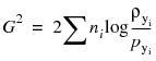
To compare with the Pearson chi-square, which is written schematically in terms of counts, the LR chi-square statistic can be written
Univariate Categorical Chi-Square Tests
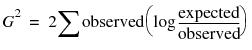
A company gave 998 of its employees the Myers-Briggs Type Inventory (MBTI) questionnaire. The test is scored to result in a 4-character personality type for each person. Scores are based on four dichotomies (E/I = Extraversion/Introversion, S/N = Sensing/Intuition, T/F = Thinking/Feeling, and J/P = Judging/Perceiving), giving 16 possible outcomes (see Figure 11.5). The company wanted to know if its employee force was statistically different in personality types from the general population.
Comparing Univariate Distributions
The data table Mb-dist.jmp has a column called TYPE to use as a Y response, and a Count column to use as a frequency. To see the company test results:
When the report appears,
Figure 11.5 Histogram and Frequencies for Myers-Briggs Data

To test the hypothesis that the personality test results at this company occur at the same rates as the general population:
A dialog appears with boxes to enter proportions (Hypoth Prob) you want to test against for each category.
These are the data collected for the general population for each personality type (category).
You now see the test results appended to the Test Probabilities table, as shown in the table on the right in Figure 11.6.
Note that the company does have a significantly different profile than the general population. Both chi-square tests are highly significant.
Figure 11.6 Test Probabilities Report for the Myers-Briggs Data
By the way, some people find it upsetting that different statistical methods get different results. Actually, the G2 (likelihood ratio) and X2 (Pearson) chi-square statistics are usually close.
Charting to Compare Results
We can chart the results and see the contrast between the general population and the company results.
The bottom of Figure 11.7 shows that the company appears to have more ISTJ’s (introvert-sensing-thinking-judging) and fewer ESFP’s (extrovert-sensing-feeling-perceiving) and ESTPs (extrovert-sensing-thinking-perceiving) than the general population.
Its also easy to see that the company has more people who scored high, in general, on IN (Introvert-Intuitive) than the general population.
Figure 11.7 Mean Personality Scores for Company and General Population

Exercises
1. P&D Candies produces a bag of assorted sugar candies, called “Moons”, in several colors. Based on extensive market research, they have decided on the following mix of Moons in each bag: Red, 20%, Yellow 10%, Brown 30%, Blue 20%, and Green, 20%. A consumer advocate suspects that the mix is not what the company claims, so he gets a bag containing 100 Moons. The 100 pieces of candy are represented in the file Candy.jmp (fictional data).
(a) Can the consumer advocate reasonably claim that the company’s mix is not as they say?
(b) Do you think a single-bag sample is representative of all the candies produced?
2. One of the ways that public schools can make extra money is to install vending machines for students to access between classes. Suppose a high school installed three drink machines for different manufacturers in a common area of the school. After one week, they collected information on the number of visits to each machine, as shown in the following table:
|
Machine A
|
Machine B
|
Machine C
|
|
1546
|
1982
|
1221
|
Is there evidence of the students preferring one machine over another?
..................Content has been hidden....................
You can't read the all page of ebook, please click here login for view all page.