Chapter Contents
Regression
Fitting one mean is easy. Fitting several means is not much harder. How do you fit a mean when it changes as a function of some other variable? In essence, how do you fit a line or a curve through data?
Least Squares
In regression, you pick an equation type (linear, polynomial, and so forth) and allow the fitting mechanism to determine some of its parameters (coefficients). These parameters are determined by the method of least squares, which finds the parameter values that minimize the sum of squared distances from each point to the line of fit. Figure 10.1 illustrates a least squares regression line.
Figure 10.1 Straight-Line Least Squares Regression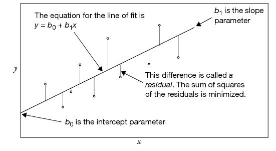
For any regression model, the term residual denotes the difference between the actual response value and the value predicted by the line of fit. When talking about the true (unknown) model rather than the estimated one, these differences are called the errors or disturbances.
Least squares regression is the method of fitting of a model to minimize the sum of squared residuals.
The regression line has interesting balancing properties with regard to the residuals. The sum of the residuals is always zero, which was also true for the simple mean fit. You can think of the fitted line as balancing data in the up-and-down direction. If you add the product of the residuals times the x (regressor) values, this sum is also zero. This can be interpreted as the line balancing the data in a rotational sense. Chapter 19, “Mechanics of Statistics,” shows how these least squares properties can be visualized in terms of the data acting like forces of springs on the line of fit.
An important special case is when the line of fit is constrained to be horizontal (flat). The equation for this fit is a constant; if you constrain the slope of the line to zero, the coefficient of the x term (regressor) is zero, and the x term drops out of the model. In this situation, the estimate for the constant is the sample mean. This special case is important because it leads to the statistical test of whether the regressor really affects the response.
Seeing Least Squares
The principle of least squares can be seen with one of the sample scripts included in the Sample Scripts folder.
You should see a plot of points with a line drawn through them (Figure 10.2). The line has two small squares (handles) that let you reposition it.
Figure 10.2 demoLeastSquares Display


To help you in minimize the area of the squares, a second graph is displayed to the right of the scatterplot. Think of it as a ‘thermometer’ that measures the sum of the area of the squares in the scatterplot. The least squares criterion selects the line that minimizes this area. To see the least squares line as calculated by JMP,
Notice that a horizontal line has been added in the graph that displays the sum of squares. This represents the sum of the squared residuals from the line calculated by the least squares criterion.
To illustrate that the least squares criterion performs as it claims to:
The sum of squares is now the same as the sum calculated by the least squares criterion.
Notice that as your line moves off the line of least squares in any way, the sum of the squares increases. Therefore, the least squares line is truly the line that minimizes the sum of the squared residuals.
Fitting a Line and Testing the Slope
Eppright et al. (1972) as reported in Eubank (1988) measured 72 children from birth to 70 months. You can use regression techniques to examine how the weight-to-height ratio changes as kids grow up.
Click on the red triangle menu on the title bar to see the fitting options

• Fit Mean draws a horizontal line at the mean of ratio.
• Fit Line draws the regression line through the data.
These commands also add statistical tables to the regression report. You should see a scatterplot similar to the one shown in Figure 10.3. The statistical tables are actually displayed beneath the scatterplot in the report window, but have been rearranged here to save space.
Each kind of fit you select has its own menu icon (found under the scatterplot) that lets you request fitting details.
The fitted regression equation is shown under the Linear Fit report (top right in Figure 10.3). The equation for the growth data is:
ratio = 0.6656 + 0.005276 age
The estimated intercept and slope coefficients for this equation are also displayed in the Parameter Estimates report (bottom right in Figure 10.3).
Figure 10.3 Straight-line Least-squares Regression
Testing the Slope by Comparing Models
If we assume that the linear equation is adequate to describe the relationship of the weight to height ratio with age (which turns out to be incorrect), we have some questions to answer:
• Does the regressor really affect the response?
• Does the ratio of weight to height change as a function of age? Is the true slope of the regression line zero?
• Is the true value for the coefficient of age in the model zero?
• Is the sloped regression line significantly different than the horizontal line at the mean?
Actually, these are all the same question.
The Difference Between Two Means presented two analysis approaches that turned out to be equivalent. One approach used the distribution of the estimates, which resulted in the t-test. The other approach compared the sum of squared residuals from two models where one model was a special case of the other. This model comparison approach resulted in an F-test. In regression, there are the same two equivalent approaches: distribution of estimates and model comparison.
The model comparison is between the regression line and what the line would be if the slope were constrained to be zero; that is, you compare the fitted regression line with the horizontal line at the mean. This comparison is our null hypothesis (the slope = 0). If the regression line is a better fit than the line at the mean, then the slope of the regression line is significantly different from zero. This is often stated negatively: “If the regression line does not fit much better than the horizontal fit, then the slope of the regression line does not test as significantly different from zero.”
The F-test in the Analysis of Variance table is the comparison that tests the null hypothesis of the slope of the fitted line. It compares the sum of squared residuals from the regression fit to the sum of squared residuals from the sample mean. Figure 10.4 diagrams the relationship between the quantities in the statistical reports and corresponding plot. Here are descriptions of the quantities in the statistical tables:
C Total
corresponds to the sum of squares error if you had fit only the mean. You can verify this by looking at the Fit Mean table from in the previous example. The C. Total sum of squares (SSE in the Fit Mean report) is 1.0524 for both the mean fit and the line fit.
Error
is the sum of squared residuals after fitting the line, 0.1868. This is sometimes casually referred to as the residual, or residual error. You can think of Error as leftover variation—variation that didn’t get explained by fitting a model.
Model
is the difference between the error sum of squares in the two models (the horizontal mean and the sloped regression line). It is the sum of squares resulting from the regression, 0.8656. You can think of Model as a measure of the variation in the data that was explained by fitting a regression line.
Mean Square (MS)
is a sum of squares divided by its respective degrees of freedom. The mean square for error (Error Mean Square) is the estimate of the error variance (0.002668 in this example).
Root Mean Square Error (RSME)
is found in the Summary of Fit report. It estimates the standard deviation of the error and is calculated as the square root of the Error Mean Square.
Figure 10.4 Diagram to Compare Models

The F-statistic is calculated as the model mean square divided by the error mean square. If the model and error both have the same expected value, the F-statistic is then 1. However, if the model mean square is larger than the error mean square, you suspect that the slope is not zero and the model is explaining some variation. The F-ratio has an F-distribution under the null hypothesis that (in this example) age has no effect on ratio.
If the true regression line has a slope of zero, then the model isn't explaining any of the variation. The model mean square and the error mean square would both estimate the residual error variance, and therefore have the same expected value.
The Distribution of the Parameter Estimates
The formula for a simple straight line only has two parameters, the intercept and the slope. For this example, the model can be written as:
ratio = b0 + b1 age + residual
where b0 is the intercept and b1 is the slopeThe Parameter Estimates Table also shows these quantities:
Std Error
is the estimate of the standard deviation attributed to the parameter estimates.
t-Ratio
is a test that the true parameter is zero. The t-ratio is the ratio of the estimate to its standard error. Generally, you are looking for t-ratios that are greater than 2 in absolute value, which usually correspond to significance probabilities of less than 0.05.
Prob>|t|
is the significance probability (p-value). You can translate this as “the probability of getting an even greater absolute t value by chance alone if the true value of the slope is zero.”.
Note that the t-ratio for the age parameter, 18.01, is the square root of the F-ratio in the Analysis of Variance table, 324.44. You can double-click on the p-values in the tables to show more decimal places, and see that the p-values are exactly the same. This is not a surprise—the t-test for simple regression is testing the same null hypothesis as the F-test.
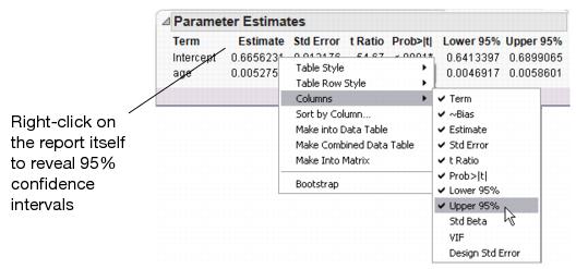
Confidence Intervals on the Estimates
There are several ways to look at the significance of the estimates. The t-tests for the parameter estimates, discussed previously, test that the parameters are significantly different from zero. A more revealing way to look at the estimates is to obtain confidence limits that show the range of likely values for the true parameter values.
This command adds the confidence curves to the graph, as shown in Figure 10.4.
The 95% confidence interval is the smallest interval whose range includes the true parameter values with 95% confidence. The upper and lower confidence limits are calculated by adding and subtracting respectively the standard error of the parameter times a quantile value corresponding to a (0.05)/2 Student’s t-test.
Another way to find the 95% confidence interval is to examine the Parameter Estimates tables. Although the 95% confidence interval values are initially hidden in the report, they can be made visible.
Figure 10.5 Add Confidence Intervals to Table
An interesting way to see this concept is to look from the point of view of the sum of squared errors. Imagine the sum of squared errors (SSE) as a function of the parameter values, so that as you vary the slope and intercept values you calculate the corresponding SSE. The least squares estimates are where this surface is at a minimum.
The left plot in Figure 10.6 shows a three-dimensional view of this interpretation for the growth data regression problem. The 3-D view shows the curvature of the SSE surface as a function of the parameters, with a minimum in the center. The x- and y-axes are a grid of parameter values and the z-axis is the computed SSE for those values.
Figure 10.6 Representation of Confidence Limit Regions

One way to form a 95% confidence interval is to turn the F-test upside down. You take an F value that would be the criterion for a 0.05 test (3.97), multiply it by the MSE, and add that to the SSE. This gives a higher SSE of 0.19737 and forms a confidence region for the parameters. Anything that produces a smaller SSE is believable because it corresponds to an F-test with a p-value greater than 0.05.
The 95% confidence region is the inner elliptical shape in the plot on the right in Figure 10.6. The flatness of the ellipse corresponds to the amount of correlation of the estimates. You can look at the plot to see what parameter values correspond to the extremes of the ellipse in each direction.
• The horizontal scale corresponds to the intercept parameter. The confidence limits are the positions of the vertical tangents to the inner contour line, indicating a low point of 0.6413 and high point of 0.6899.
• The vertical scale corresponds to the slope parameter for age. The confidence limits are the positions of the vertical tangents to the inner contour line, indicating a low of 0.00469 and high point of 0.00586. These are the lower and upper 95% confidence limits for the parameters.
You can verify these numbers by looking at the confidence limits in Figure 10.5.
Examine Residuals
It is always a good idea to take a close look at the residuals from a regression (the difference between the actual values and the predicted values):
This command appends the set of diagnostic plots shown in Figure 10.7 to the bottom of the regression report.
The picture you usually hope to see is the residuals scattered randomly about a mean of zero and clustered close to the normal quantile line. So, in residual plots like the ones shown in Figure 10.7, you are looking for patterns and for points that violate this random scatter. These plots are suspicious because the left side has a pattern of residuals below the reference lines. These points influence the slope of the regression line (Figure 10.3), pulling it down on the left.
You can see what the regression would look like without these points by excluding them from the analysis, as described in the next section.
Exclusion of Rows
To exclude points (rows) from an analysis, you highlight the rows and assign them the Exclude row state characteristic as follows.
You then see a do not use ( ) sign in the row areas for the excluded rows (in the data table).
Note: You’ll still see the excluded points on the scatterplot, since they’ve been excluded from the analysis but have not been hidden.
Figure 10.7 Diagnostic Scatterplots to Look at Residuals

The plot in Figure 10.8 shows the two regression lines. Note that the new line of fit appears to go through the bulk of the points better, ignoring the points at the lower left that are excluded.
Notice in Figure 10.8 (bottom right) that the ratio by predicted ratio residuals no longer have a pattern to them.
Figure 10.8 Regression with Extreme Points Excluded

Time to Clean Up
The next example uses this same scatterplot, so let’s clean it up:
This removes the Excluded row state status from all points so that you can use them in the next steps.
Polynomial Models
Rather than refitting a straight line after excluding some points, let’s try fitting a different model altogether—a quadratic curve. This is a simple curve; it only adds one term to the linear model we’ve been using, a term for the squared value of the regressor, age:
ratio = b0 + b1 age + b2 age2 + residual
To fit a quadratic curve to the ratio by age data,
The left plot in Figure 10.9 shows the linear and quadratic fits and overlaid on the scatterplot. You can compare the straight line and curve, and also compare them statistically with the Analysis of Variance reports that show beneath the plot.
Figure 10.9 Comparison of Linear and Second-Order Polynomial Fits

Look at the Residuals
To examine the residuals,
The Actual by Predicted plot, on the right in Figure 10.9, is a type of residual plot that shows the actual ratio values plotted against the predicted ratio values. This plot allows us to see unexplained patterns in the data. There may be some improvement with the quadratic fit, but there still appears to be a pattern in the residuals, so you might want to continue and fit a model with higher order terms.
Higher-Order Polynomials
To give more flexibility to the curve, specify higher-order polynomials, adding a term to the third power, to the fourth power, and so on.
This plots the curve with linear, quadratic, cubic, and quartic terms, not simply a 4th power term. Plotting polynomials always includes lower-order terms.
The plot on the right in Figure 10.10 shows the actual by predicted ratio plot. Note that the residuals no longer appear to have a pattern to them.
Figure 10.10 Comparison of Linear and Fourth-Order Polynomial Fits
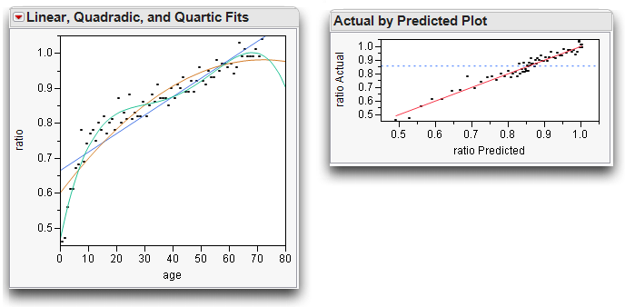
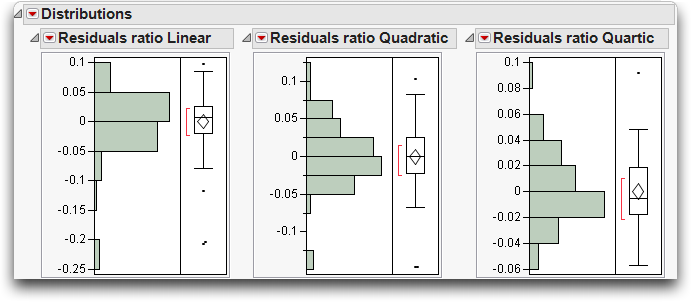
Distribution of Residuals
It is also informative to look at the shape of the distribution of the residuals. If the distribution departs dramatically from the Normal, then you may be able to find further phenomena in the data.
Histograms of residuals are provided when residual plots are requested for a model. Figure 10.11 shows histograms of residuals from the linear fit, the quadratic fit, and quartic (4th degree) fit side-by-side for comparison.
To generate these histograms,
This forms three new columns in the data table.
You can see in Figure 10.11 that the distributions evolve toward Normality − higher-order models explain more variation, so the residuals become more normal.
Figure 10.11 Histograms for Distribution of Residuals
Transformed Fits
Sometimes, you can find a better fit if you transform either the Y or X variable (or sometimes both). When we say transform, we mean that we apply a mathematical function to a variable and examine these new values. For example, rather than looking at x, we might examine log x. One way of doing this is to create a new column in the data table, use the column formula builder to compute the log of age, then use Analyze > Fit Y by X to do a straight-line regression of ratio on this transformed age. Results from this method are shown on the left in Figure 10.12.
Alternatively, you can use the Fit Y by X platform to do this directly:
The Fit Special command displays a dialog that lists natural log, square, square root, exponential, and other transformations as shown here, as selections for both the X and Y variables.
Try fitting ratio to the log of age:
Figure 10.12 Comparison of Fits
Note: If you transform the Y variable, you can’t compare the R2 and error sums of squares of the transformed variable fit with the untransformed variable fit. You are fitting a different variable.
Spline Fit
It would be nice if you could fit a flexible curve, like a leaf spring, through the points. The leaf spring would resist bending somewhat, but would take gentle bends when it’s needed to fit the data better. A smoothing spline is exactly that kind of fit. With smoothing splines, you specify how stiff to make the curve. If the spline is too rigid it looks like a straight line, but if it is too flexible it curves to try to fit each point. Use these commands to see the spline plots in Figure 10.13:
Play with the slider and watch the curviness of the spline change from flexible to rigid as you increase the value of lambda.
Figure 10.13 Comparison of Less Flexible and More Flexible Spline Fits

Are Graphics Important?
Some statistical packages don’t show graphs of the regression, while others require you to make an extra effort to see a regression graph. The following example shows the kind of phenomena that you miss if you don’t examine a graph.
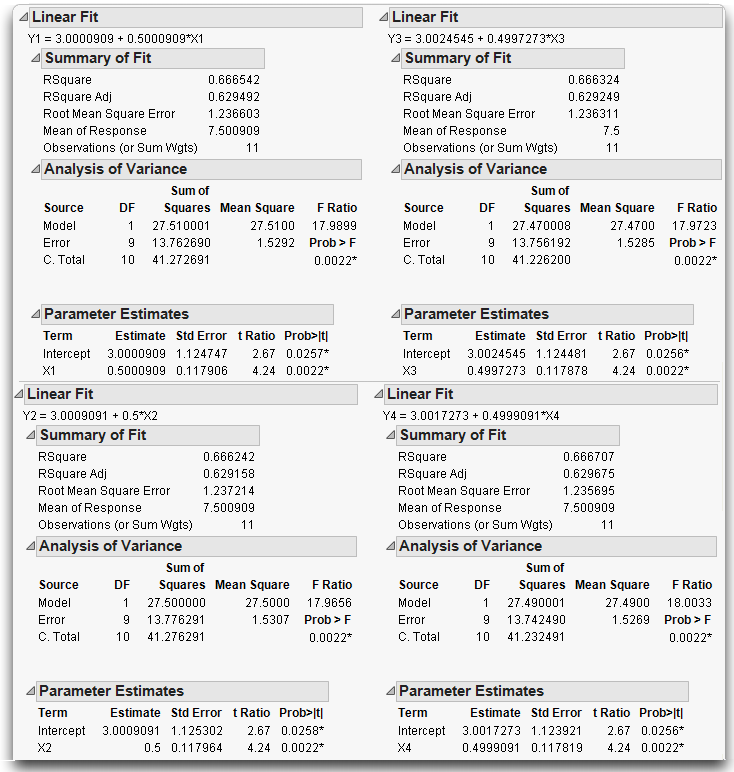
In essence, this stored script is a shortcut for the following actions. By using the script, you don’t have to:
• Choose Analyze > Fit Y by X four times, to fit Y1 by X1, Y2 by X2, Y3 by X3, and Y4 by X4.
• For each pair, select the Fit Line command from the menu on the title bar above each scatterplot.
First, look at the text reports for each bivariate analysis, shown in Figure 10.14, and compare them. Notice that the reports are nearly identical. The R2 values, the F-tests, the parameter estimates and standard errors—they are all the same. Does this mean the situations are the same?
Think of it another way. Suppose you are a doctor, and the four data sets represent patients. Their text reports represent the symptoms they present. Since they are identical, would you give them all the same diagnosis?
Figure 10.14 Statistical Reports for Four Analyses
Now look at the scatterplots shown in Figure 10.15, and note the following characteristics:
• Y1 by X1 shows a typical regression situation. In this case, as X1 increases Y1 increases.
• The points in Y2 by X2 follow a parabola, so a quadratic model is appropriate, with the square of X2 as an additional term in the model. As an exercise, fit this quadratic model.
• There is an extreme outlier in Y3 by X3, which increases the slope of the line that would otherwise be a perfect fit. As an exercise, exclude the outlying point and fit another line.
• In Y4 by X4 all the x-values are the same except for one point, which completely determines the slope of the line. This situation is called leverage. It is not necessarily bad, but you ought to know about it.
Figure 10.15 Regression Lines for Four Analyses

Why It’s Called Regression
Remember the story about the study done by Sir Francis Galton mentioned at the beginning of this chapter? He examined the heights of parents and their grown children to learn how much of height is an inherited characteristic. He concluded that the children’s heights tended to be more moderate than the parent’s heights, and used the term “regression to the mean” to name this phenomenon. For example, if a parent was tall, the children would be tall, but less so than the parents. If a parent was short, the child would tend to be short, but less so than the parent.
Galton’s case is interesting not only because it was the first use of regression, but also because Galton failed to notice some properties of regression that would have changed his mind about using regression to draw his conclusions. To investigate Galton’s data:
The data in the Galton table comes from Galton’s published table, but each point is jittered by a random amount up to 0.5 in either direction. The jittering is done so that all the points show in the plot instead of overlapping. Also, Galton multiplied the women’s heights by 1.08 to make them comparable to men’s. The parent ht variable is defined as the average of the two parents’ heights.
The scatterplot produced by the Matched Pairs platform is the same as that given by the Fit Y by X platform, but it is rotated by 45º(See The Matched Pairs Platform for a Paired t-Test for details on this plot). If the difference between the two variables is zero (our null hypothesis is that the parent and child's heights are the same), the points cluster around a horizontal reference line at zero. The mean difference is shown as a horizontal line, with the 95% confidence interval above and below. If the confidence region includes the horizontal reference line at zero, then the means are not significantly different at the 0.05 level and we can’t reject the null hypothesis. This represents the t-test that Galton could have hypothesized to see if the mean height of the child is the same as the parent.
Figure 10.16 Matched Pairs Output of Galton’s Data

However, this is not the test that Galton considered. He invented regression to fit an arbitrary line on a plot of parent’s height by child’s height, and then tested to see if the slope of the line was 1. If the line has a slope of 1, then the predicted height of the child is the same as that of the parent, except for a generational constant. A slope of less than 1 indicates that the children tended to have more moderate heights (closer to the mean) than the parents. To look at this regression,
When you examine the Parameter Estimates table and the regression line in the left plot of Figure 10.17, you see that the least squares regression slope is 0.61—far below 1. This suggests the regression toward the mean.
What Happens When X and Y Are Switched?
Is Galton’s technique fair to the hypothesis? Think of it in reverse: If the children’s heights were more moderate than the parents, shouldn’t the parent’s heights be more extreme than the children’s? To find out, you can reverse the model and try to predict the parent’s heights from the children’s heights (i.e. switch the roles of x and y). The analysis on the right in Figure 10.17 shows the results when the parent’s height is y and children’s height is x. Because the previous slope was less than 1, you’d think that this analysis would give a slope greater than 1. Surprisingly, the reported slope is 0.28, even less than the first slope!
Figure 10.17 Child’s Height and Parent’s Height

Hint: To fit the diagonal lines, use Fit Special and constrain both the intercept and the slope to 1.
Instead of phrasing the conclusion that children tended to regress to the mean, Galton could have worded his conclusion to say that there is a somewhat weak relationship between the two heights. With regression, there is no symmetry between the Y and X variables. The slope of the regression of Y on X is not the reciprocal of the slope of the regression of X on Y. You cannot calculate the X by Y slope by taking the Y by X equation and solving for the other variable.
Regression is not symmetric because the error that is minimized is only in one direction—that of the Y variable. So if the roles are switched, a completely different problem is solved.
It always happens that the slope will be smaller than the reciprocal of the inverted variables. However, there is a way to fit the slope symmetrically, so that the role of both variables is the same. This is what is you do when you calculate a correlation.
Correlation characterizes the bivariate Normal continuous density. The contours of the Normal density form ellipses like the example illustrated in Figure 10.18. If there is a strong relationship, the ellipse becomes elongated along a diagonal axis. The line along this axis even has a name—it’s called the first principal component.
It turns out that the least squares line is not the same as the first principal component. Instead, the least squares line bisects the contour ellipse at the vertical tangent points (see Figure 10.18).
If you reverse the direction of the tangents, you describe what the regression line would be if you reversed the role of the Y and X variables. If you draw the X by Y line fit in the Y by X diagram as shown in Figure 10.18, it intersects the ellipse at its horizontal tangents.
In both cases, the slope of the fitted line was less than 1, so Galton’s phenomenon of regression to the mean was more an artifact of the method, rather than something learned from the data.
Figure 10.18 Diagram Comparing Regression and Correlation

Curiosities
Sometimes It’s the Picture That Fools You
An experiment by a molecular biologist generated some graphs similar to the scatterplots in Figure 10.19. Looking quickly at the plot on the left, where would you guess the least squares regression line lies? Now look at the graph on the right to see where the least-squares fit really lies.
Figure 10.19 Beware of Hidden Dense Clusters

The biologist was perplexed. How did this unlikely looking regression line happen?
It turns out that there is a very dense cluster of points you can’t see. This dense cluster of hundreds of points dominated the slope estimate even though the few points farther out had more individual leverage. There was nothing wrong with the computer, the method, or the computation. It's just that the human eye is sometimes fooled, especially when many points occupy the same position. (This example uses the Slope.jmp sample data table).
High-Order Polynomial Pitfall
Suppose you want to develop a prediction equation for predicting ozone based on the population of a city. The lower-order polynomials fit fine, but why not take the “more is better” approach and try a higher order one, say, sixth degree.
As you can see in the bivariate fit shown here, the curve fits extremely well—too well, in fact. How trustworthy is the ozone prediction for a city with a population of 7500?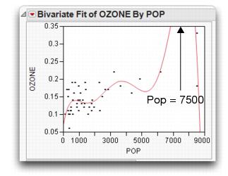
This overfitting phenomenon, shown here, occurs in higher-order polynomials when the data are unequally spaced.
More is not always better.
The Pappus Mystery on the Obliquity of the Ecliptic
Ancient measurements of the angle of the earth’s rotation disagree with modern measurements. Is this because modern ones are based on different (and better) technology, or did the angle of rotation actually change?
Case Study: The Earth’s Ecliptic introduced the angle-of-the-ecliptic data. The data that go back to ancient times is in the Cassini.jmp table (Stigler 1986). Figure 10.20 shows the regression of the obliquity (angle) by time. The regression suggests that the angle has changed over time. The mystery is that the measurement by Pappus is not consistent with the rest of the line. Was Pappus’s measurement flawed or did something else happen at that time? We probably will never know.
These kinds of mysteries sometimes lead to detective work that results in great discoveries. Marie Curie discovered radium because of a small discrepancy in measurements made with pitchblende experiments. If she hadn’t noticed this discrepancy, the progress of physics might have been delayed.
Outliers are not to be dismissed casually. Moore and McCabe (1989) point out a situation in the 1980s where a satellite was measuring ozone levels over the poles. It automatically rejected a number of measurements because they were very low. Because of this, the ozone holes were not discovered until years later by experiments run from the earth’s surface that confirmed the satellite measurements.
Figure 10.20 Measurements of the Earth’s Angular Rotation

Exercises
1. This exercise deals with the data on the top-grossing box-office movies (as of June 2003) found in the data table movies.jmp. Executives are interested in predicting the amount movies will gross overseas based on the domestic gross.
(a) Examine a scatterplot of Worldwide $ versus Domestic $. Do you notice any outliers? Identify them.
(b) Fit a line through the mean of the response using Fit Mean.
(c) Perform a linear regression on Worldwide $ versus Domestic $. Does this linear model describe the data better than the constrained model with only the mean? Justify your answer.
(d) Exclude any outliers that you found in part (a) and re-run the regression. Describe the differences between this model and the model that included all the points. Which would you trust more?
(e) Use the Graph Builder (under the Graph menu) to further explore the relationship between these two variables. Drag Worldwide $ into the Y zone and Domestic $ into the X zone. Explore the graph icons at the top of the window. Fit a regression line (with confidence curves) using the appropriate icon.
(f) In the graph produced in part (e), drag Type into the Group X , Group Y or Overlay zone. Is there a difference in gross dollars for the different types of movies?
(g) Finally, select Local Data Filter from the red triangle next to Graph Builder > Script. In the Local Data Filter, select Type, click the Add button, then select both Drama and Comedy to display results for only these two movie types. Comment on what you see, and whether you think a single prediction equation for all movie types will be useful to the executives.
2. How accurate are past elections in predicting future ones? To answer this question, open the file Presidential Elections.jmp (see Ladd and Carle). This file contains the percent of votes cast for the Democratic nominee in three previous elections.
(a) Produce histograms for the percent of votes in each election, with the three axes having uniform scaling (the Uniform Scaling option is in the drop-down menu at the very top of the Distribution platform.) What do you notice about the three means? If you find a difference, explain why it might be there.
(b) Fit regression lines and find the correlations for 1996 vs. 1980 and 1984 vs. 1980. Comment on the associations you see.
(c) Would the lines generated in these analyses have been useful in predicting the percent votes cast for the Democratic nominee in the next presidential election (2000 and 1988 respectively)? Justify your answer.
3. Open the file Birth Death.jmp to see data on the birth and death rates of several countries around the world.
(a) Identify any univariate outliers in the variables birth and death.
(b) Fit a line through the mean of the response and a regression line to the data with birth as X and death as Y. Is the linear fit significantly better than the constrained fit using just the mean?
(c) Produce residual plots for the linear fit in part (b).
(d) The slope of the regression line seems to be highly significant. Why, then, is this model inappropriate for this situation?
(e) Use the techniques from this chapter to fit several transformed, polynomial, or spline models to the data and comment on the best model.
4. The table Solubility.jmp (Koehler and Dunn, 1988) contains data from a chemical experiment that tested the solubility characteristics of seven chemicals.
(a) Produce scatterplots of all the solutions versus ether. Based on the plots, which chemical has the highest correlation with ether?
(b) Carbon Tetrachloride has solubility characteristics that are highly correlated with hexane. Find a 95% confidence interval for the slope of the regression line of Carbon Tetrachloride versus Hexane.
(c) Suppose the roles of the variables in part (b) were reversed. What can you say about the slope of the new regression line?
..................Content has been hidden....................
You can't read the all page of ebook, please click here login for view all page.