
Chapter 3: Categorical Data
3.2 Graphing and Analysing Frequencies: Horse Race Winners
3.2.1 Looking at Horse Race Winners Using Some Simple Graphics: Bar Charts and Pie Charts
3.2.2 Chi-Square Goodness-of-Fit Test: Does Starting Stall Position Predict Horse Race Winners?
3.3.1 Chi-Square Test: Breast Self-Examination
3.3.3 The Cochrane-Mantel-Haenszel Test for Multiple Related 2 X 2 Tables
3.4.1 Tabulating the Brain Tumour Data Into a Contingency Table
3.5.1 How Is Baiting Behaviour at Suicides Affected by Season? Fisher’s Exact Test
3.5.2 Fisher’s Exact Test for Larger Tables
3.6.1 Juvenile Felons: Where Should They Be Tried? McNemar’s Test
3.1 Introduction
In this chapter, we discuss how to deal with various aspects of the analysis of data containing categorical variables (that is, variables that classify the observations in some way). Some examples of categorical variables are gender, marital status, and social class. Numbers might be used as convenient labels for the categories of categorical variables but have no numerical significance. When using categorical variables, we can simply count the number of our sample that fall into each category of a variable or into a combination of the categories of two or more categorical variables. In this chapter, the statistical topics to be covered are:
• Graphical summary of one-way tables, bar charts, and pie charts
• Testing for association of two categorical variables--chi-squared tests for independence
• Testing for association of two categorical variables when some observed counts are small--Fisher’s exact test
• Testing for equal probability of an event in matched-pairs data--McNemar’s test
3.2 Graphing and Analysing Frequencies: Horse Race Winners
The data shown in Table 3.1 show the starting stall of the winners in 144 horse races held in the USA; all 144 races took place on a circular track and all relate to eight horse races. Starting stall 1 is closest to the rail on the inside of the track. Interest here lies in assessing how the chances of a horse winning a race are affected by its position in the starting line up.
Table 3.1: Horse Racing Data after Classification

3.2.1 Looking at Horse Race Winners Using Some Simple Graphics: Bar Charts and Pie Charts
The horse racing data are in a SAS data set called racestalls, which contains a single variable giving the stall number for each of the 144 winners. To open the data set;
1. Select the Libraries section in the navigator pane.
2. Expand My Libraries and SASUE, scroll down, and double-click on racestalls.
There are 144 rows but only one column that is called stall.
We can now reproduce Table 3.1 showing the number of winners from each of the eight starting stalls and the corresponding percentages:
1. Open Tasks ▶ Statistics ▶ One Way Frequencies.
2. Under Data ▶ Data, add sasue.racestalls.
3. Under Data ▶ Roles ▶ Analysis variables, add stall.
4. Click Run.
The results begin with the frequencies and percentages shown in Output 3.1. We see that the percentage of winning horses from each stall differs considerably suggesting that the stall does play a part in determining which horse will win.
Output 3.1: Horse Racing Data

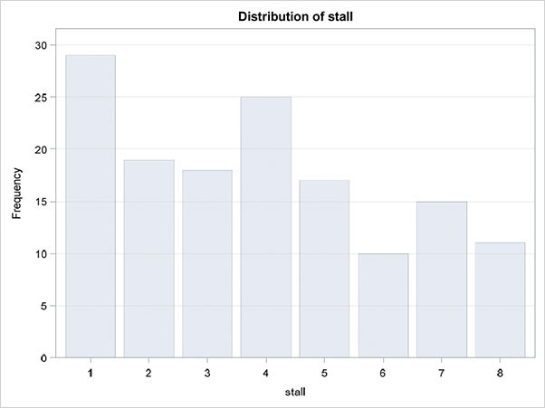
The next section of the results shows the counts graphically as a bar chart, which appears in Figure 3.1.
Figure 3.1: Bar Chart for Horse Racing Data
The same bar chart might also be produced separately by selecting Tasks ▶ Graph ▶ Bar Chart or, alternatively, as a pie chart as follows:
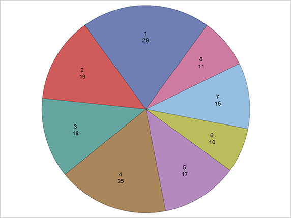
1. Open Tasks ▶ Graph ▶ Pie Chart.
2. Under Data ▶ Data, add sasue.racestalls.
3. Under Data ▶ Roles ▶ Category variable, add stall.
4. Click Run.
The resulting diagram is shown in Figure 3.2. It should be pointed out that despite their widespread popularity, both the general and scientific use of pie charts have been severely criticized (see Tufte, 1983, and Cleveland, 1994, for reasons). Both diagrams simply mirror what we previously gleaned from the percentages in Output 3.1, namely that there does appear to be a difference in the number of winners from each stall.
Figure 3.2: Pie Chart for Horse Racing Data
The bar chart often becomes more useful if the bars are arranged in ascending or descending order of frequency. This is not one of the standard options available within the Bar Chart task using the Data or Options tabs, but it is an option within the SGPLOT procedure that underlies the Bar Chart task. To utilise the option, we need to edit the code produced by the Bar Chart task:
1. Open Tasks ▶ Graph ▶ Bar Chart.
2. Under Data ▶ Data, add sasue.racestalls.
3. Under Data ▶ Roles ▶ Category Variable, add stall.
4. In the code pane, click the Edit button. The code pane then enlarges and you see the following code:
proc sgplot data=SASUE.RACESTALLS noautolegend;
/*--Bar chart settings--*/
vbar stall / name='Bar';
/*--Response Axis--*/
yaxis grid;
run;
5. Edit the VBAR statement to the following, taking care that the semicolon is at the end:
vbar stall / name='Bar' categoryorder=respasc;
6. Run the program.
The edited code could be saved as a code snippet by clicking on the Snippet button (![]() ) and typing a name, such as ordered bar chart.
) and typing a name, such as ordered bar chart.
The resulting plot is shown in Figure 3.3. We can now see clearly that starting stalls 1 to 4 produce many more winners than stalls 5 to 8, and starting stall 1 produces the highest number of winners of all eight starting stalls.
Figure 3.3: Ordered Bar Chart for Horse Racing Data

3.2.2 Chi-Square Goodness-of-Fit Test: Does Starting Stall Position Predict Horse Race Winners?
What would we expect the counts in Table 3.1 to look like if the starting stall does not affect the chances of a horse winning a race? Clearly, we would expect the number of winners from each stall to be approximately equal (random variation will stop them from being exactly equal). So here, our null hypothesis about the population of horse race winners is that there are an equal number of winners from each stall. In our sample of 144 winners, the counts do not appear to be consistent with the null hypothesis, but how can we assess the evidence against the null hypothesis formally? We begin by calculating the counts of winners in each stall that we might expect when we observe the results of 144 races, if the null hypothesis is true. We then compare these expected values with the observed values using what is known as the chi-squared test statistic. The expected values for each stall under the null hypothesis are simply 144/8=18, and the chi-squared statistic is then calculated as the sum of the square of each difference between the observed and expected value divided by the expected value. So, in detail, the required chi-squared test statistic is calculated thus:
If the null hypothesis is true, the chi-squared test statistic has a chi-squared distribution with 7 degrees of freedom. (Full details of the chi-square test are given in Altman, 1991.) To apply the test:
1. Return to the One Way Frequencies task (reopen it or repeat the steps above).
2. Under Options ▶ Statistics ▶ Chi-square goodness-of-fit, select Asymptotic test.
3. Click Run.
The results now include the section shown in Output 3.2 and Figure 3.4. The chi-squared statistic takes the value 16.3 with an associated p-value of 0.02. Consequently, there is evidence that the starting stall is a factor in determining the winning horse, as previously suggested by examination of the frequencies and the corresponding bar charts.
Ouput 3.2: Chi-Square Test for Horse Racing Data

Figure 3.4 demonstrates that the number of winners from stalls 1 to 4 are more than would be expected if the stall did not affect the race results, with stalls 5 to 8 leading to fewer winners than would be expected.
Figure 3.4 Deviation Plot for Horse Racing Stall

3.3 Two-By-Two Tables
Categorical variables having just two categories are often called binary variables, and when two such variables are cross-classified, we get the 2 x 2 table (or the 2 x 2 contingency table), ubiquitous particularly in medical studies but also in many other disciplines.
3.3.1 Chi-Square Test: Breast Self-Examination
Senie et al. (1981) report the results on asking women about how frequently they carried out breast self-examination. The data collected can be presented as a 2 x 2 table with one variable being the age of a woman, categorized as younger than 45 years or 45 years or older, and the other variable being how often a woman performed a self-examination of her breasts, categorized as monthly and occasionally/never. The cross-classification of the observations on the two variables are shown in Table 3.2.
Table 3.2: Data on Breast Self-Examination
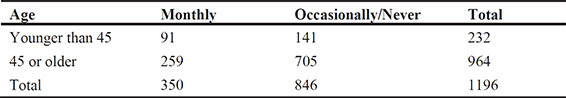
We can use these data to determine whether there is any evidence that the population proportion of younger women (<45 years) who self-examine their breasts monthly differs from the corresponding proportion for older women (>=45 years) or, in other words, whether age and frequency of self-examination are related (that is, not independent of one another). The appropriate chi-square test for assessing a 2 x 2 table for independence is given explicitly in Der and Everitt (2013) and can be applied as follows:
1. Open Tasks ▶ Statistics ▶ Table Analysis.
2. Under Data ▶ Data, add sasue.self_exam.
3. Under Data ▶ Roles, add agegroup to the Row variables box and frequency to the Column variables box. Expand the additional roles and assign num as the Frequency count.
4. Under Options ▶ Statistics, note that Chi-square statistics is selected by default.
5. Under Options ▶ Plots, select Suppress plots to simplify the output.
6. Click Run.
The results are shown in Output 3.3. The chi-square statistic takes the value 13.8 with an associated p-value, which is very small. Clearly, age and frequency of self-examination of breasts are not independent of each other. We shall investigate the association in more detail in the next subsection. The other test statistics given in Output 3.3 are explained in detail in Everitt (1992). Fisher’s exact test is dealt with below in Section 3.4.
Output 3.3: Testing for the Independence of Age and Frequency of Breast Examination

Statistics for Table of agegroup by frequency
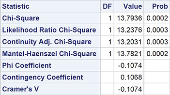

Sample Size = 1196
3.3.2 Odds and Odds Ratios
When 2 x 2 tables are reported in the literature, the chi-square test described in the previous subsection is often supplemented by giving the value of what is known as the odds ratio of the table; in essence, this quantifies the degree of association between the two binary variables that form the table. Odds ratios are described in detail in Agresti (1996) and Der and Everitt (2013); here we content ourselves with a relatively brief account.
Returning to the breast self-examination data, we can estimate the probability that a woman younger than 45 rarely self-examines her breasts as 141/232=0.61 and the corresponding probability that she self-examines monthly is estimated as 91/232=0.39, which is, of course, simply 1 - 0.61. The ratio of these two estimated probabilities gives the estimated odds of rarely using self-examination to monthly examination (that is, the value 1.54); here the value is more than 1, indicating that a larger proportion of women younger than 45 tend to only rarely do self-examination than monthly self-examination.
Now for women aged 45 or older, the estimated odds calculated in the same way is 2.72, again indicating that for these older women, a smaller proportion do regular as opposed to occasional self-examination.
The ratio of the two estimated odds is our estimate of the odds ratio, namely 0.60. A population odds ratio of 1 corresponds to the independence of the two binary variables, so the chi-square test described above is also essentially a test that the population odds ratio has the value 1. But we can find a confidence interval for the odds ratio that enables us to say a little more about the strength of the relationship (if any) between the two variables (that is, to quantify the relationship, which is usually far more informative than simply quoting the value of the chi-square statistic). Details of how this confidence interval is calculated are given in Der and Everitt (2013). The odds ratio and its confidence interval can be obtained as follows:
1. Reopen the Table Analysis task. If it has been closed, repeat the previous example.
2. Under Options ▶ Statistics, select odds ratio and relative risk.
3. Click Run.
The relevant section of the output is shown in Output 3.4.
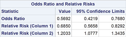
Output 3.4: Odds Ratio for Age and Breast Examination Data
Sample Size = 1196
From Output 3.4, we find the 95% confidence interval for the odds ratio is [0.42, 0.77]. This interval does not contain the value 1, so there is evidence that age and frequency of breast examination are not independent, which is, of course, in agreement with the result of the chi-square test. But from the confidence interval for the odds ratio, we can claim that the odds of rare rather than regular breast examination for younger women is between about 0.4 and 0.8 times the corresponding odds for older women. In other words, the odds are between 20% and 60% lower for women less than 45 years old. It appears that the message that self-examination of breasts is important has been taken on board by a considerably greater proportion of women under 45 rather than women over 45. (The relative risk terms in Output 3.4 are explained in Der and Everitt, 2013, and in Agresti, 1996.)
3.3.3 The Cochrane-Mantel-Haenszel Test for Multiple Related 2 X 2 Tables
Agresti (1996) describes a set of data based on those in Liu (1992), which involves smoking and lung cancer in China. Part of these data are shown in Table 3.3.
Table 3.3: Chinese Smoking and Lung Cancer Data

As the main aim of this study is to investigate the relationship between smoking and lung cancer, it might be asked why not simply collapse the data over cities into a single 2 x 2 table and use the methods described previously to assess this relationship? The dangers of this procedure are well-known and collapsing in this way can, in some circumstances, generate spurious associations and, in others, mask a true relationship (see Everitt, 1992, for examples). Instead, we use the Cochrane-Mantel-Haenszel (CMH) method; essentially, this approach tests that smoking behaviour and lung cancer are conditionally independent given the city. The method is described in detail in Der and Everitt (2013) and can be applied as follows:
1. Open Tasks ▶ Statistics ▶ Table Analysis.
2. Under Data ▶ Data, add sasue.ca_lung.
3. Under Data ▶ Roles, add smoker to the Row variables, add cancer to the Column variables, and city to the Strata variables. Expand the additional roles and assign count as the Frequency count.
4. Under Options ▶ Statistics, select Cochran-Mantel-Haenszel statistics. We could also select odds ratio and relative risk to calculate the separate odds ratios for each city, but as those are already available, we can omit it.
5. Under Options ▶ Plots, select Suppress plots to simplify the output.
6. Click Run.
The results are shown in Output 3.5.
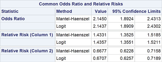
Output 3.5: Results for the Cochrane-Mantel-Haenszel Test Applied to the Chinese Smoking and Lung Cancer Data
Summary Statistics for smoker by cancer
Controlling for city

Total Sample Size = 4316
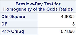
The result we are looking for is in the last part of the output—namely, the chi-square value of 4.8053, which has three degrees of freedom (one less than the number of tables) and an associated p-value of 0.1866. There is no evidence that the odds ratios for the relationship between smoking behaviour and cancer in the four cities considered differ from each other. Given this result, we can use the data from all cities to estimate the odds ratio common to all cities; details of the calculation are given in Der and Everitt (2013) and the value we want is to be found in part of Output 3.5: 2.15 with 95% confidence interval [1.89, 2.43]. The odds of cancer versus no cancer for smokers equals 2.15 times the corresponding odds for non-smokers; the confidence interval shows that the estimated odds are between 89% and 143% higher for smokers.
3.4 Larger Cross-Tabulations
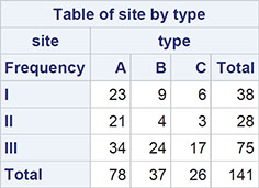
In an investigation of brain tumours, the type and site of the tumour in 141 individuals were noted. The three possible types were: A, benign tumours; B, malignant tumours; and C, other cerebral tumours. The sites concerned were: I, frontal lobes; II, temporal lobes; and III, other cerebral areas. The data are shown in Table 3.4. Do these data give any evidence that some types of tumours occur more frequently at particular sites (that is, that there is an association between the categorical type and site variables)?
Table 3.4: Data on Type and Site of Brain Tumours

3.4.1 Tabulating the Brain Tumour Data Into a Contingency Table
For the data about brain tumours in Table 3.9, we can cross-classify the observations to give what is know as a 3 x 3 contingency table showing the counts in all nine possible combinations of the type and site of tumour categories. The original data are in a SAS data set in the Sasue library, tumours:
1. Open Tasks ▶ Statistics ▶ Table Analysis.
2. Under Data ▶ Data, add sasue.tumors.
3. Under Data ▶ Roles, add site to the Row variables box and type to the Column variables box.
4. Under Options ▶ Plots, select Suppress plots.
5. Under Options ▶ Statistics, note that Chi-square statistics is selected by default.
6. Click Run.
The first part of the results is the contingency table shown in Output 3.6.
Output 3.6: Brain Tumour Data After Cross-Classification
3.4.2 Do Different Types Of Brain Tumours Occur More Frequently at Particular Sites? Chi-Squared Test
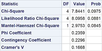
We are now interested in assessing the null hypothesis that the site of tumour and the type of tumour are independent. Independence implies that the probabilities of the tumour types are the same at all sites. More explicitly, independence implies that the probability of a patient having a tumour of a particular type at a particular site is simply the product of the probability of this type of tumour multiplied by the probability of a tumour at this site. We can estimate both the probability of the type of tumour and the probability of a tumour at a particular site by simply dividing the appropriate marginal total by the number of observations. So, for example, the estimate of the probability of being a type A tumour is 78/141=0.553, and the estimate of a tumour being at site I is 38/141=0.270. So, if the null hypothesis of independence is true, the estimate of the probability of a patient having an A type tumour at site I is 0.553 x 0.270=0.149. So, under the assumption of independence, the expected count in the type A, site I cell of the contingency table is 141 x 0.149=21.0. In the same way, we can calculate the expected values for all the other cells in the table, and these can then be compared with the observed values by means of the chi-square statistic. For a contingency table with r rows and c columns, the chi-squared test of independence has (r-1)(c-1) degrees of freedom, where r is the number of rows of the table and c is the number of columns. In the tumour example, both r and c have the value 3, so the chi-squared statistic will have 4 degrees of freedom. (Full details of the chi-squared test of independence in contingency tables are given in Everitt, 1992.)
As noted above, for the Table Analysis task, chi-square statistics is available within Options ▶ Statistics and is selected by default.
The result is shown in Output 3.7. Here, the chi-square test statistic takes the value 7.8 and has an associated p-value of 0.098; there is no strong evidence against the hypothesis that type and site of tumour are independent. The result implies that the observed values in Output 3.6 do not differ greatly from the corresponding values to be expected if tumour site and type are independent. (We will not describe the other terms in Output 3.7; interested readers are referred to Everitt, 1992.)
Output 3.7: Chi-Squared Test of Independence for Brain Tumour Data
The chi-square test statistic and associated p-value simply summarise the evidence against the null hypothesis of independence. But we can often go further by making cell-by-cell comparisons of the differences of observed and estimated expected frequencies under independence, differences usually labelled by statisticians as residuals. Unfortunately, these very simple residuals are not entirely satisfactory because large values tend to occur for cells that have larger expected values; consequently, they might be misleading. A more appropriate residual would be
(Observed-Estimated Expected)/
these are usually know as Pearson residuals but for the reasons given in Everitt (1992), the use of Pearson residuals for detailed examination of a contingency table can often give conservative indications of cells that do not fit the independence hypothesis. More suitable residuals are given by Haberman (1973); these are calculated as
These are known as adjusted residuals or standardized residuals.
The first of these three types of residuals is available under Options ▶ frequency table ▶ Frequencies by selecting Deviation. To produce the other two types of residual requires us to edit the code. We will illustrate all three as follows;
1. Return to the Tables Analysis task above.
2. Under Options ▶ Frequency Table ▶ Frequencies, select Observed, Expected, and Deviation.
3. In the code pane, click the Edit button. The code window should include the following:
proc freq data=SASUE.TUMORS;
tables (site) *(type) / chisq expected deviation nopercent norow nocol
nocum plots=none;
After plots=none but before the semicolon, type crosslist(pearsonres stdres).
4. Run the program.
The resulting cross-tabulation now appears as shown in Output 3.8.
The table is now in the list format, with one row per cell of the original table, showing the observed and estimated expected counts and the three types of residuals.
Output 3.8: Brain Tumour Data Showing Deviation, Pearson, and Standardized Residuals Per Cell
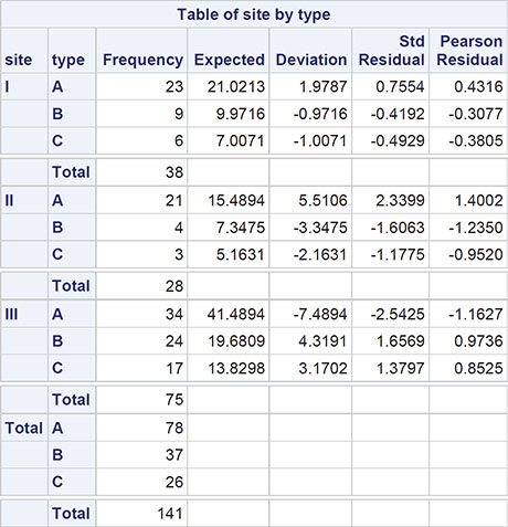
Looking at the standardized residuals, we see that the greatest departures from independence occur for type A tumours in the second site, with more tumours than would be expected under independence, and for the same type of tumour again in the third site, where there are fewer tumours than expected.
3.5 Fisher’s Exact Test
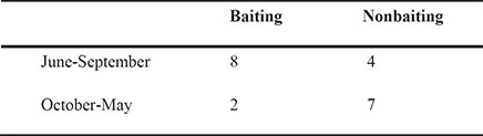
Mann (1981) reports a study carried out to investigate the causes of jeering or baiting behaviour by a crowd when a person is threatening to commit suicide by jumping from a high building. A hypothesis is that baiting is more likely to occur in warm weather. Mann classified 21 accounts of threatened suicide by two factors, the time of the year and whether baiting occurred. The (classified) data are given in Table 3.5 and the question is whether they give any evidence to support the warm weather hypothesis. (The data come from the northern hemisphere, so the months June to September are the warm months.)
Table 3.5: Crowd Behaviour at Threatened Suicides
3.5.1 How Is Baiting Behaviour at Suicides Affected by Season? Fisher’s Exact Test
The chi-squared test carried out in the previous section for the brain tumour data above depends on knowing that the test statistic has a chi-squared distribution if the null hypothesis of independence is true; this allows p-values to be found. But what was not mentioned previously is that the chi-squared distribution is only appropriate under the assumption that the expected values are not too small. Such a term is almost as vague as asking how long is a piece of string and has been interpreted in a number of ways. Most commonly, it has been taken as meaning that the chi-squared distribution is only appropriate if all the expected values are five or more. Such a rule is widely quoted but appears to have little mathematical or empirical justification over, say, a one-or-more rule.
Nevertheless, for contingency tables based on small sample sizes, the usual form of the chi-squared test for independence might not be strictly valid, although it is often difficult to predict a priori whether a given data set might cause problems. But there might be occasions where it is advisable to consider another approach that is available and that is a test that does not depend on the chi-squared distribution at all. Such exact tests of independence for a general r x c contingency table are computationally intensive and, until relatively recently, the computational difficulties have severely limited their application. But within the last 10 years, the advent of fast algorithms and the availability of inexpensive computing power have considerably extended the bounds where exact tests are feasible. Details of the algorithms for applying exact tests are outside the level of this text and interested readers are referred to Mehta and Patel (1986) for a full exposition. But for a table in which both r and c equal two, there is an exact test that has been in use for decades--namely Fisher’s exact test, a test that is described in Everitt (1992). Fisher’s test is produced by default as part of chi-square tests for a 2 x 2 contingency table. (For larger tables, it is available as an option.)
The data on baiting behaviour at suicides provides us with an example of how to apply Fisher’s exact test for a 2 x 2 table and also serves to illustrate how to analyze data that is in the form of a table rather than individual observations. We begin by opening the data set, baiting, to examine its contents:
1. Select Libraries ▶ sasue ▶ baiting.
2. Drag across or double-click.
The view of the opened data set is shown in Display 3.1. It has one row per cell and a column each for the number in the cell; whether there was baiting, and whether the season was warm or cool.
Display 3.1: Baiting Data in Tabular Form

To apply the chi-square and Fisher’s exact test:
1. Open Tasks ▶ Statistics ▶ Table Analysis.
2. Enter sasue.baiting in the data box, add Season to the Row Variables box and baiting to the Column Variables box.
3. Expand Additional Roles and add count to the Frequency count box.
4. Under the Options ▶ Statistics, we see that chi-square statistics is selected by default, but under Exact Test, Fisher’s exact test is not selected. We could select it, but for 2 x 2 tables, it is applied by default.
5. Under Options ▶ Plots, select Suppress plots.
6. Click Run.
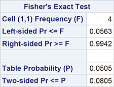
The result is shown in Output 3.9. The cross-tabulation is not reproduced exactly as entered – the categories of season and baiting are in alphabetical order.
The p-value from Fisher’s test is 0.0805. There is no strong evidence of crowd behaviour being associated with time of year of threatened suicide, but it has to be remembered that the sample size is low and the test lacks power. (Carrying out the usual chi-squared test on these data gives a p-value of 0.0436, a considerable difference from the value for the exact test, suggesting there is evidence of an association between crowd behaviour and time of year of threatened suicide.)
Output 3.9: Analysis of Baiting and Suicide Data

Statistics for Table of season by baiting

Sample Size = 21
3.5.2 Fisher’s Exact Test for Larger Tables
Fisher’s test can also be applied to tables with more than two rows and/or more than two columns. Exact tests for contingency tables in which the counts are small have been developed by Mehta and Patel (1986) and, to illustrate, we shall use the data shown in Table 3.6; these data give the distribution of oral cancers found in house-to-house surveys in three geographic regions of rural India by the site of the lesion and by the region. The counts in the table are very small, so we apply the exact test. The data are in tabular form in the data set lesions:
1. Open Tasks ▶ Statistics ▶ Table Analysis.
2. Under Data ▶ Data, add sasue.lesions.
3. Under Data ▶ Roles, add site to the Row variables and region to the Column variables.
4. Under Data ▶ Roles ▶ Additional Roles, add n as the Frequency count.
5. Under Options ▶ Statistics, note that chi-square statistics is selected by default, but now under Exact Test, select Fisher’s exact test.
6. Under Options ▶ Plots, select Suppress plots.
7. Click Run.
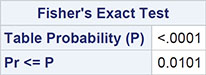
Table 3.6: Data on Oral Lesions in Different Regions of India

The results are shown in Output 3.10. The p-value from Fisher’s test is 0.01, which indicates a strong association between site of lesion and geographic region. For comparison, the chi-squared statistic for these data takes the value 22.01 with 14 degrees of freedom and a p-value of 0.14, suggesting that there is no evidence against the hypothesis of independence of site and region. Here the data are so sparse that the usual chi-square test is misleading.
Output 3.10: Statistics for Table of Site by Region
Statistics for Table of site by region
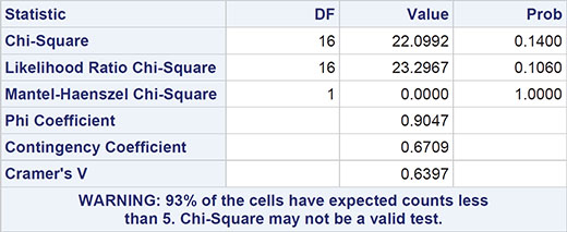
Sample Size = 27
3.6 McNemar’s Test Example
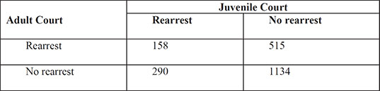
The data in Table 3.7 (taken from Agresti, 1996) arise from a sample of juveniles convicted of felony in Florida in 1987. Matched pairs of offenders were formed using criteria such as age and number of previous offences. For each pair, one subject was handled in the juvenile court and the other was transferred to the adult court. Whether the juvenile was rearrested by the end of 1988 was then noted. Here the question of interest is whether the population proportions rearrested are identical for the adult and juvenile courts.
Table 3.7 Rearrests of Juvenile Felons by Type of Court in Which They Were Tried
3.6.1 Juvenile Felons: Where Should They Be Tried? McNemar’s Test
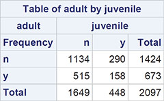
The chi-squared test on categorical data described previously assumes that the observations are independent of one another. But the data on juvenile felons in Table 3.15 arise from matched pairs, so they are not independent. The counts in the corresponding 2 x 2 table of the data refer to the pairs; so, for example, in 158 of the pairs of offenders, both members of the pair were rearrested. To test whether the rearrest rate differs between the adult and juvenile courts, we need to apply what is known as McNemar’s test. The test is described in Everitt (1992). The juvenile offenders data are in the data set sasue.arrests, again in tabular form as shown in Display 3.2. (Open Libraries ▶ Sasue ▶ Arrests to see this.) To apply McNemar’s test:
1. Open Tasks ▶ Statistics ▶ Table Analysis.
2. Under Data ▶ Data, add sasue.arrests.
3. Under Data ▶ Roles, add adult to the Row variables and juvenile to the Column variables.
4. Expand Additional Roles and add num to the Frequency count box.
5. Under Options ▶ Statistics, deselect chi-square statistics and select Measures of agreement.
6. Under Options ▶ Plots, select Suppress plots.
7. Click Run.
Display 3.2: Rearrest Data for Juvenile Felons

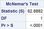
The result is shown in Output 3.11. The test statistics take the value 62.89, with an extremely small associated p-value. There is very strong evidence that the type of court and the probability of rearrest are related. It appears that trial in a juvenile court is less likely to result in rearrest.
Output 3.11: McNemar’s Test for Juvenile Crime Data
Statistics for Table of adult by juvenile
3.7 Exercises
Exercise 3.1: Crash Data
The crash data set lists fictitious counts of fatal air crashes in Australia by quarter over a 20-year period. Assess the hypothesis that the accident rates are uniform across these four quarters:

Exercise 3.2: Fear Data
One hundred American citizens were surveyed and asked to identify which of five items were most fearful to them. The results are given in the fear data set. Test whether sex and greatest fear are independent of each other.
Exercise 3.3: Suicidal Data
In a broad sense, psychiatric patients can be classified as psychotics or neurotics. A psychiatrist whilst studying the symptoms of a random sample of 20 patients from each type found that whereas six patients in the neurotic group had suicidal feelings, only two in the psychotic group suffered in this way. Is there any evidence of an association between the type of patient and suicidal feelings?

The data are in the suicidal data set.
Exercise 3.4: Cancer Data
The data in the cancer data set arise from an investigation of the frequency of exposure to oral conjugated estrogens among 183 cases of endometrial cancer. Each case was matched on age, race, date of admission, and hospital of admission to a suitable control not suffering from cancer. Is there any evidence that use of oral conjugated estrogens is associated with endometrial cancer?

Exercise 3.5: Death Data
Van Belle et al. (2004) report on a study by Peterson et al. (1979) in which the age at death of children who died from various causes was recorded. The data were taken from death records in a region of the USA. The resulting cross-classification of age at death and cause of death is as follows and is in the dataset infdeath:

Investigate the relationship (if any) between the cause of death and the age at death.
Exercise 3.6: Victim Blaming Data
Howell (2002) describes a study reported in Pugh (1983) involving investigation of the “blaming the victim” phenomenon in prosecutions for rape. The data extracted by Howell from Pugh’s detailed report is as follows:

The low and high categories are based on Pugh’s assessment of how strongly the defence alleged that the victim was somewhat partially guilty for the alleged rape.
Do the data give any evidence that how the defence conducts their case in respect to blaming the victim affects the final verdict?