
Chapter 6: Multiple Linear Regression
6.2 Multiple Linear Regression
6.2.1 The Ice Cream Data: An Initial Analysis Using Scatter Plots
6.2.4 A More Complex Example of the Use of Multiple Linear Regression
6.2.5 The Cloud Seeding Data: Initial Examination of the Data Using Box Plots and Scatter Plots
6.3 Identifying a Parsimonious Regression Model
6.1 Introduction
In this chapter, we will discuss how to analyze data in which there are continuous response variables and a number of explanatory variables that can be associated with the response variable. The aim is to build a statistical model that allows us to discover which of the explanatory variables are of most importance in determining the response. The statistical topics covered are
• Multiple regression
• Interpretation of regression coefficients
• Regression diagnostics
6.2 Multiple Linear Regression
The data shown in Table 6.1 were collected in a study to investigate how price and temperature influenced consumption of ice cream. Here the response variable is consumption of ice cream, and we have two explanatory variables, price and temperature. The aim is to fit a suitable statistical model to the data that allows us to determine how consumption of ice cream is affected by the other two variables.
Table 6.1: Ice Cream Consumption Measured Over 30 4-Week Periods

6.2.1 The Ice Cream Data: An Initial Analysis Using Scatter Plots
The ice cream data in Table 6.1 are in the data set sasue.icecream.
Some scatter plots of the three variables will be helpful in an initial examination of the data. For the scatter plots:
1. Open Tasks ▶ Graph ▶ Scatter Plot.
2. Under Data ▶ Data, add sasue.icecream.
3. Under Data ▶ Roles, assign consumption as the y variable and price as the x variable.
4. Under Options ▶ X axis, deselect Show grid lines and do the same for the y axis.
5. Click Run.
Repeat this with temperature as the x variable.
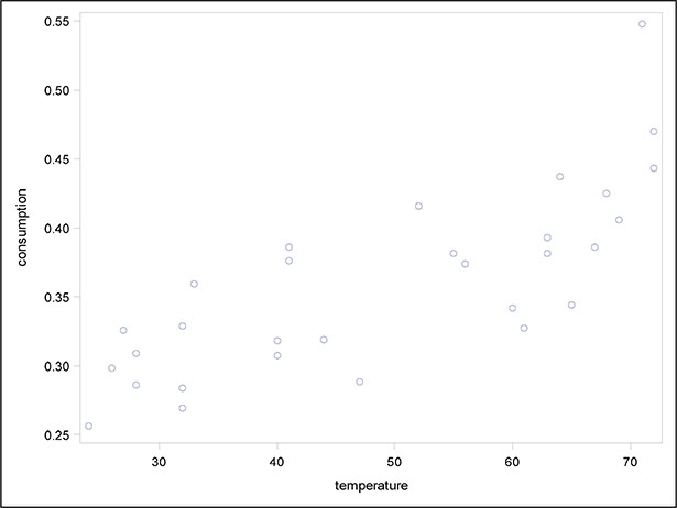
The resulting scatter plots are shown in Figures 6.1 and 6.2. The plots suggest that temperature is more influential than price in determining ice cream consumption, with consumption increasing markedly as temperature increases.
Figure 6.1: Scatter Plot of Ice Cream Consumption Against Price
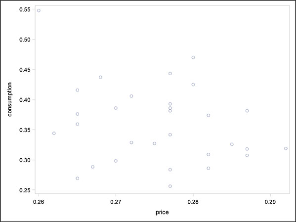
Figure 6.2: Scatter Plot of Ice Cream Consumption Against Temperature
6.2.2 Ice Cream Sales: Are They Most Affected by Price or Temperature? How to Tell Using Multiple Regression
In Chapter 4, we examined the simple linear regression model that allows the effect of a single explanatory variable on a response variable to be assessed. We now need to extend the simple linear regression model to situations where there is more than a single explanatory variable. For continuous response variables, a suitable model is often multiple linear regression, which mathematically can be written as:
where yi, i = 1, n are the observed values of the response variable and xi1, xi2,...., xiq, i = 1, n are the observed values of the q explanatory variables; n is the number of observations in the sample; and the εi terms represent the errors in the model. The regression coefficients, β1, β2,....,βq, give the amount of change in the response variable associated with a unit change in the corresponding explanatory variable, conditional on the other explanatory variables remaining unchanged. The regression coefficients are estimated from the sample data by least squares. For full details, see, for example, Everitt (1996).
The error terms in the model are each assumed to have a normal distribution with mean zero and variance σ2. The assumed normal distribution for the error terms in the model implies that, for given values of the explanatory variables, the response variable is normally distributed with a mean that is a linear function of the explanatory variables and a variance that is not dependent on the explanatory variables. The variation in the response variable can be partitioned into a part due to regression on the explanatory variables and a residual. The various terms in the partition of the variation of the response variable can be arranged in an analysis of variance table, and the F-test of the equality of the regression variance (or mean square) and the residual variance gives a test of the hypothesis that there is no regression on the explanatory variables (that is, the hypothesis that all the population regression coefficients are 0). Further details are available in Everitt (1996).
We now fit the multiple regression model to the ice cream data--here there are two explanatory variables, temperature and price:
1. Open Tasks ▶ Statistics ▶ Linear Regression.
2. Under Data ▶ Data, add sasue.icecream.
3. Under Data ▶ Roles, add consumption as the dependent variable and price and temperature as continuous variables.
4. Under Model ▶ Model Effects, select both price and temperature (Ctrl-Click on both) and click the Add button.
5. Under Options ▶ Plots ▶ Diagnostic and Residual Plots, we note that Diagnostic plots and Residuals for each explanatory variable are selected by default.
6. Click Run.
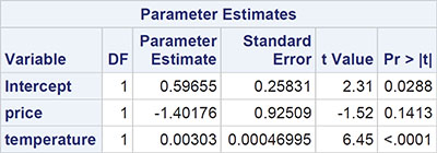
We begin with a discussion of the tabular results, which are shown in Output 6.1. The F-test in the analysis of variance table takes the value 23.27 and has an associated p-value that is very small. Clearly the hypothesis that both regression coefficients are 0 is not tenable. The multiple correlation coefficient gives the correlation between the observed values of the response variable (ice cream consumption) and the values predicted by the fitted model; the square of the coefficient (0.63) gives the proportion of the variance in ice cream consumption accounted for by price and temperature. The negative regression coefficient for price indicates that, for a given mean temperature, consumption decreases with increasing price. But as was suggested by the two scatter plots in Subsection 6.3.1, only the estimated regression coefficient associated with temperature is statistically significant. The regression coefficient of consumption on temperature is estimated to be 0.00303, with an estimated standard error of 0.00047. A one-degree rise in temperature is estimated to increase consumption by 0.00303 units, conditional on price.
Output 6.1: Results from Applying the Multiple Regression Model to the Ice Cream Consumption Data


6.2.3 Diagnosing the Multiple Regression Model Fitted to the Ice Cream Consumption Data: The Use of Residuals
As with the simple linear regression model described in Chapter 4, an important final stage when fitting a multiple regression model is to investigate whether the assumptions made by the model, such as constant variance and normality of error terms, are reasonable. This involves the consideration of suitable plots of residuals, as discussed in Chapter 4, and perhaps other diagnostic plots as well.
So let us turn now to the plots that were produced by the linear regression task for the ice cream data, which are shown in Figures 6.3 and 6.4. Looking at the latter plot first, we see that there are no apparent patterns in the plots that would indicate problems with the fitted model; the two plots look similar to the idealized residual plot in Figure 4.6 (a) given in Chapter 4.
Figure 6.3 gives a number of diagnostic plots. The first plot in the first row of plots is simply a plot of the basic residuals against the predicted value of ice cream consumption. Again, no distinct pattern, for example, like that in Figure 4.6 (b) is apparent. The second plot in the first row is similar to the first but uses what are known as studentized residuals rather than the basic residual described earlier. Studentized residuals are described explicitly in Der and Everitt (2013); a form of standardized residual, they are needed because the simple residuals can be shown to have unequal variances and to be slightly correlated. This correlation makes them less than ideal for detecting problems with fitted models. Details are given in Rawlings et al. (2001), where an account of leverage (see the third plot in the first row) and Cook’s distance (see the third plot in the second row) can also be found.
For the leverage plot, points should ideally lie in the -2 to 2 band shown on the plot; here there are a couple of points lying outside this band, but on the whole the plot is satisfactory. In Cook’s distance index plot, values greater than one give cause for concern; there are no such values here. The first plots in the second and third rows can be used to check the normality assumption in the multiple linear regression model, the first being a normal probability plot (see Der and Everitt, 2013) of the residuals and the second a histogram of the residuals showing a fitted normal distribution. Both plots suggest that the normality assumption is justified for these data.
Figure 6.3: Diagnostic and Residual Plots for the Ice Cream Consumption Data

Figure 6.4: Residual Plots for the Ice Cream Consumption Data

6.2.4 A More Complex Example of the Use of Multiple Linear Regression
Weather modification, or cloud seeding, is the treatment of individual clouds or storm systems with various inorganic or organic materials in the hope of achieving an increase in rainfall. Introduction of such material into a cloud that contains super cooled water (that is, liquid water colder than 0 °C) has the aim of inducing freezing, with the consequent ice particles growing at the expense of liquid droplets and becoming heavy enough to fall as rain from the clouds that otherwise would produce none.
The data in Table 6.2 were collected in the summer of 1975 from an experiment to investigate the use of massive amounts of silver iodine (100 to 1,000 grams per cloud) in cloud seeding to increase rainfall (Woodley et al., 1977). In the experiment, which was conducted in an area of Florida, 24 days were judged suitable for seeding on the basis that a measured suitability criterion was met. The suitability criterion (S-NE) that is defined in detail in Woodley et al. biases the decision for experimentation against naturally rainy days. On thus-defined suitable days, a decision was made at random about whether to seed or not. The aim in analysing the cloud seeding data is to see how rainfall is related to the other variables and, in particular, to determine the effectiveness of seeding.
Table 6.2: Cloud Seeding Data

6.2.5 The Cloud Seeding Data: Initial Examination of the Data Using Box Plots and Scatter Plots
For the cloud seeding data, we will construct box plots of the rainfall in each category of the dichotomous explanatory variables (seeding and echomotion) and scatter plots of rainfall against each of the continuous explanatory variables (cloudcover, sne, prewetness, and time).
For the box plots:
1. Open Tasks ▶ Graph ▶ Box Plot.
2. Under Data ▶ Data, select sasue.cloud.
3. Under Data ▶ Roles, add rainfall as the analysis variable and seeding as the category variable.
4. Click Run.
Repeat with echomotion as the category variable.
For the scatter plots:
1. Open Tasks ▶ Graph ▶ Scatter Plot.
2. Under Data ▶ Data, select sasue.cloud.
3. Under Data ▶ Roles, add rainfall as the y variable and time as the x variable.
4. Click Run.
Repeat with sne, cloudcover, and prewetness as x variables.
The plots are shown in Figures 6.5 to 6.10. Both the box plots and the scatter plots show some evidence of two outliers. In particular, the scatter plot of rainfall against cloud cover suggests one very clear outlying observation, which, on inspection, turns out to be the second observation in the data set. For the time being, we shall not remove any observations, but simply bear in mind during the modelling process to be described later that outliers can cause difficulties.
Figure 6.5: Box Plots of Rainfall for Seeding and Not Seeding Days
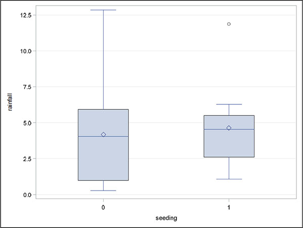
Figure 6.6: Box Plots of Rainfall for Moving and Stationary Echo Motion
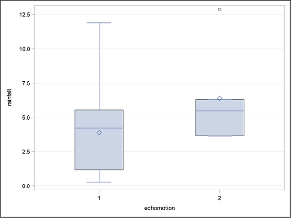
Figure 6.7: Scatter Plot of Rainfall Against Time
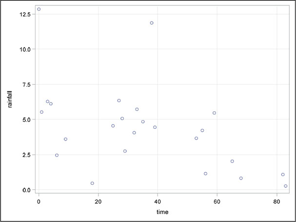
Figure 6.8: Scatter Plot of Rainfall Against S-NE Criterion

Figure 6.9: Scatter Plot of Rainfall Against Cloud Cover
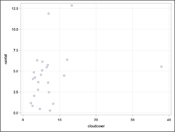
Figure 6.10: Scatter Plot of Rainfall Against Prewetness

6.2.6 When Is Cloud Seeding Best Carried Out? How to Tell Using Multiple Regression Models Containing Interaction Terms
For the cloud seeding data, one thing to note about the explanatory variables is that two of them, seeding and echomotion, are binary variables. Should such an explanatory variable be allowed in a multiple regression model? In fact, there is really no problem in including such variables in the model because, in a strict sense, the explanatory variables are assumed to be fixed rather than random. (In practice, of course, fixed explanatory variables are rarely the case, so the results from a multiple regression analysis are interpreted as being conditional on the observed values of the explanatory variables; this rather arcane point is discussed in more detail in Everitt, 1996. It is only the response variable that is considered to be random.)
In the cloud seeding example, there are theoretical reasons to consider a particular model for the data (see Woodley et al., 1977)—namely, one in which the effect of some of the other explanatory variables is modified by seeding. So the model that we will consider is one that allows interaction terms for seeding with each of the other explanatory variables except time:
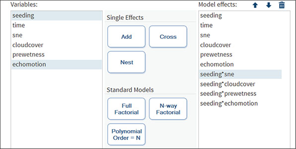
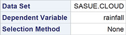
1. Open Tasks ▶ Statistics ▶ Linear Regression.
2. Under Data ▶ Data, select sasue.cloud.
3. Under Data ▶ Roles, add rainfall as the dependent variable and treat the remaining variables as continuous variables.
4. Under Model, select all the variables and click Add to enter their main effects.
To enter the required interactions with seeding, first click on seeding, then Ctrl-Click on the other variable in the interaction (for example, time), and then click the Cross button. Repeat this for each interaction with seeding. When all the terms have been entered, the model pane should look like Display 6.1.
Display 6.1: Model Pane for Cloud Seeding Data
The results of fitting the specified model are shown in Output 6.2. To begin, let us look at the least squares summary table part of the output. This shows how the fit of the regression model changes as the variables are entered into the model in the order specified. The measure of fit used is what is known as the Schwarz Bayesian Criterion (SBC); this measure is defined explicitly in Everitt and Skrondal (2010), but, in simple terms, the measure takes into account both the statistical goodness of fit of a model and the number of parameters that have to be estimated to achieve this particular degree of fit by imposing a penalty for increasing the number of parameters.
Essentially, the SBC tries to find a model with the fewest number of parameters that still provides an adequate fit to the data. Lower values of the SBC indicate the preferred model. In Output 6.2, this criterion indicates that the model that includes seeding x cloudcover interaction and all the variables entered before this term is the preferred model. But it has to be remembered that just as the explanatory variables are not independent of one another, neither are the estimated regression coefficients (see the next section for more discussion of this point). Changing the order in which variables are considered in the least squares summary table might lead to a slightly different preferred model being chosen by the SBC.
Moving on through the output, we find the analysis of variable table in which the F-test assesses the hypothesis that all the regression coefficients in the model are 0 (that is, none of the explanatory variables affect the response variable, rainfall). The significance value associated with the test is 0.024, implying that this very general hypothesis can be rejected. Underneath the analysis of variance table, we find (amongst other things that we will ignore for the moment) the value of the square of the multiple correlation coefficient, which gives the proportion of the variance of the response variable accounted for by the explanatory variables. Here the value is 0.72.
Also, in this part of the output the value for the adjusted R-square appears; this is a modification of R-square that adjusts for the number of explanatory variables in a model. The adjusted R-square does not have the same interpretation as R-square and is essentially an index of the fit of the model in the same manner as the SBC. We shall see this in the next section, where we discuss how to select a parsimonious regression model for a data set.
Finally, Output 6.2 contains the estimated regression coefficients, their estimated standard errors, and the associated t-tests for assessing the hypothesis that the corresponding population regression coefficient is 0.
Output 6.2: Results of Fitting a Multiple Regression Model with Interactions to the Cloud Seeding Data


The tests of the interactions in the model suggest that the interaction of seeding with the S-NE criterion significantly affects rainfall. A suitable graph will help in the interpretation of the significant seeding x S-NE criterion interaction:
1. Open Tasks ▶ Graph ▶ Scatter Plot.
2. Under Data ▶ Data, add sasue.cloud.
3. Under Data ▶ Roles, add rainfall as the y variable, sne as the x variable, and seeding as the group variable.
4. Under Data ▶ Fit Plots, select Regression.
5. Click Run.
The result is shown in Figure 6.11.
Figure 6.11: Scatter Plot of Rainfall versus S-NE for Seeding and Non-Seeding Days
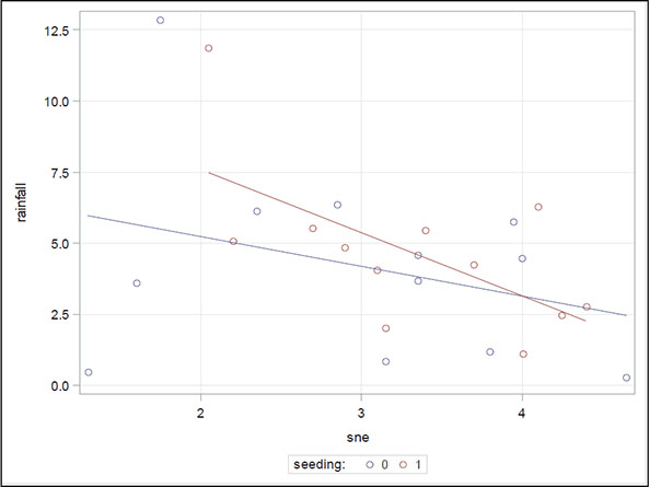
The plot suggests that for smaller S-NE values, seeding produces greater rainfall than not seeding, whereas for larger S-NE values, it tends to produce less. The crossover point is at an S-NE value of approximately 4, which might suggest that, for the most success, seeding should be applied when the S-NE criterion is less than 4.
6.3 Identifying a Parsimonious Regression Model
A multiple regression model begins with a set of observations on a response variable and a number of explanatory variables. After an initial analysis has established that some, at least, of the explanatory variables are predictive of the response, the question arises whether a subset of the explanatory variables might provide a simpler model that is essentially as useful as the full model in predicting, or explaining, the response. It might be thought that such a model could easily be chosen by simply examining the tests of the hypotheses that the regression coefficients associated with each of the explanatory variables in the full model are 0 and then selecting only those variables whose regression coefficients are significantly different from 0 at some particular significance level. This is, indeed, simple, but sadly it is not a procedure that can be recommended. The problem is that the explanatory variables are rarely independent of each other and, consequently, neither are the estimated regression coefficients; dropping a particular explanatory variable from a model, for example, and then fitting the reduced model will likely lead to different estimated regression coefficients for the variables in both models.
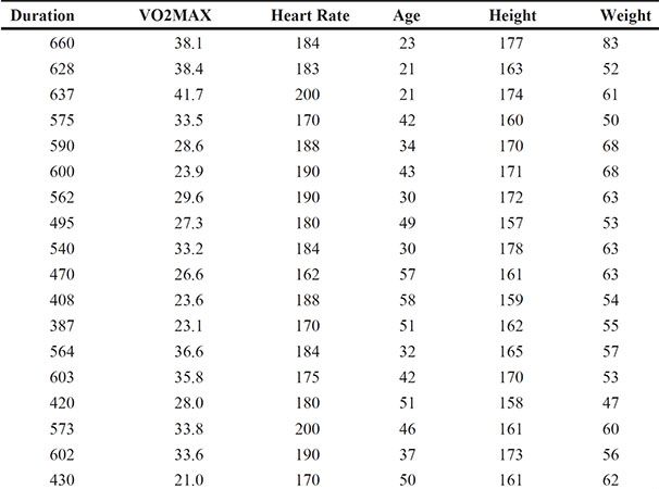
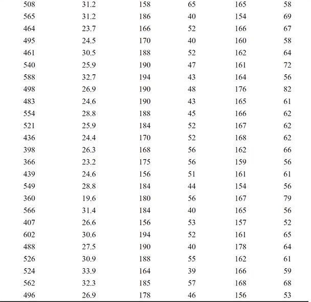
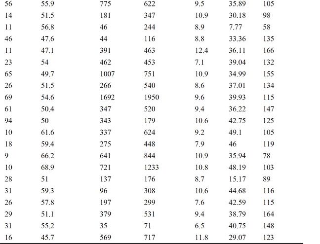
For this reason, a number of methods for choosing the best set of explanatory variables have been developed; forward selection, for example, uses some numerical criterion to decide whether a variable should be added to an existing model and backward elimination uses such a criterion to decide whether a variable in an existing model can be dropped from that model. And stepwise regression uses a combination of these two procedures. For a detailed account of variable selection methods, see Der and Everitt (2013). Here we shall simply illustrate the use of backward elimination using the data shown in Table 6.3, which arise from asking healthy active females to run on a treadmill until unable to go any further. The explanatory variables recorded are the duration of the run in seconds, the maximum heart rate during the exercise (bpm), the participant’s age in years, her height (cm), and her weight (kg). Also measured is the participant’s volume of oxygen used per minute per kilogram of body weight, VO2MAX. Full details of the data are given in Bruce et al. (1973) and in van Belle et al. (2004). Interest lies in finding a model for predicting VO2MAX from the five explanatory variables.
Table 6.3: Exercise Data for Healthy Active Females
We will fit multiple regression models to these data, applying backward selection to find a parsimonious model for the data; the significance level of the t-test for assessing whether a population regression coefficient is 0 has the selection criterion for removing variables from the starting model, which includes all five explanatory variables. The required SAS code is as follows:
1. Open Tasks ▶ Statistics ▶ Linear Regression.
2. Under Data ▶ Data, select sasue.treadmill.
3. Under Data ▶ Roles, add vo2max as the dependent variable and treat the remaining variables as continuous variables.
4. Under Model ▶ Model Effects, select all the variables and click Add to enter their main effects.
5. Under Selection ▶ Model Selection, choose Backward elimination as the Selection method and Significance level as the Criterion to add or remove effects.
6. Click Run.
The result is shown in Output 6.3. The first part of this output indicates the selection criterion being used, which we have chosen to be the significance level as explained above and the value of the threshold significance level below which variables will not be removed for an existing model. The next part of the output shows that the variables for heart rate, height, and age can be removed from the full model, leaving the chosen model with just the two explanatory variables, duration and weight. The R-square value for the selected model shows that duration and weight account for about 65% of the variation in VO2MAX.
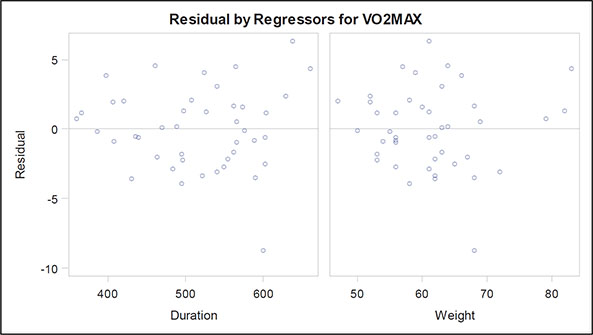
The fit criteria plots show how various measures of fit change as variables are removed from the full model. We have already met the SBC and the adjusted R-square measures; the AIC (Akaike’s information criterion) and AIIC (a slightly amended version of the Akaike information criterion) are similar to SBC, but have different weightings for fit against the number of parameters. They are defined explicitly in Everitt and Skrondal (2010) and Hurvich and Tsai (1989). Examining these plots, we see that SBC selects the same model as the backward selection approach using the significance level criterion, but the other three fit indices chose a model in which age as well as duration and weight are included. Here we shall keep with the simpler model and move on to look at the other graphical output, which include the diagnostic plots (Figures 6.12 through 6.15) previously discussed when dealing with the ice cream consumption data. The only concerning finding in these plots is perhaps that there are a small number of outliers, which may distort the fitted models in some way. We leave it as an exercise for readers to identify these outliers and then repeat the model-fitting procedure described in this section with the identified outliers removed.
Output 6.3: Results from Applying Backward Selection to the Data in Table 6.3


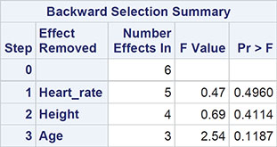
Selection stopped because the next candidate for removal has SLS < 0.05.

Figure 6.12: Plot of Fit Criteria Against Model Chosen for the Exercise Data

The selected model is the model at the last step (Step 3).
![]()


Figure 6.13: Plot of Observed and Fitted Value for the Exercise Data
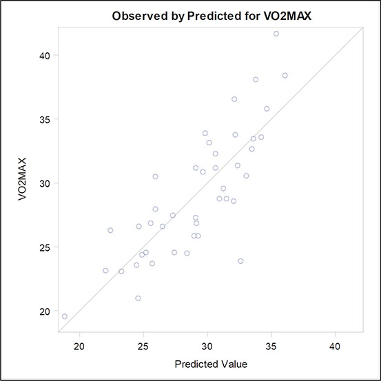
Figure 6.14: Diagnostic and Residual Plots for the Exercise Data
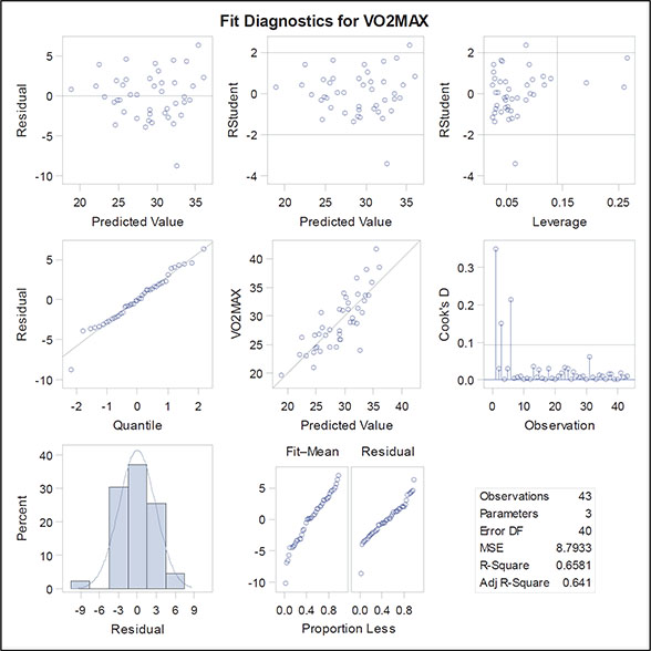
Figure 6.15: Residual Plots for the Exercise Data
Automatic model selection methods must be used with care, and the researcher using them should approach the final model selected with an appropriate degree of scepticism. Agresti (1996) nicely summarizes the potential problems:
Computerized variable selection procedures should be used with caution. When one considers a large number of terms for potential inclusion in a model, one or two of them that are not really important might look impressive simply due to chance. For example when all the true effects are weak, the largest sample effect might substantially overestimate its true effect. In addition, it makes sense to include variables of special interest in a model and report their estimated effects even if they are not statistically significant at some level.
(See McKay and Campbell, 1982a, 1982b for some more thoughts on automatic selection methods in regression.)
6.4 Exercises
Exercise 6.1: Ice Cream Data
For the ice cream consumption data, investigate what happens when you fit a simple linear regression of consumption on price and then add temperature to the model. Repeat this exercise fitting first temperature and then adding price.
Exercise 6.2: Cloud Data
Repeat the analysis of the cloud seeding data after removing observations 1 and 15. Compare your results with those given in the text.
Exercise 6.3: Fat Data
The data in the fat data set are taken from a study investigating a new method of measuring body composition and give the body fat percentage, age, and sex for 20 normal adults aged between 23 and 61 years.
1. Construct a scatter plot of the percentage of fat against the age, labeling the points according to the sex.
2. Fit a multiple regression model to the data using fat as the response variable and age and sex as explanatory variables. Interpret the results with the help of a scatter plot showing the essential features of the fitted model.
3. Fit a further model that allows an interaction between age and sex and again construct a diagram that will help you interpret the results.
Exercise 6.4: Air Pollution Data
The data in the Excel spreadsheet usair.xls relate to air pollution in 41 US cities. Seven variables are recorded for each of the cities:
1. SO2 content of air in micrograms per cubic meter
2. Average annual temperature in °F
3. Number of manufacturing enterprises employing 20 or more workers
4. Population size (1970 census) in thousands
5. Average annual wind speed in miles per hour
6. Average annual precipitation in inches
7. Average number of days with precipitation per year

Use multiple regression to investigate which of the other variables most determine pollution as indicated by the SO2 content of the air and find a parsimonious regression model for the data. (Preliminary investigation of the data might be necessary to identify possible outliers and pairs of explanatory variables that are so highly correlated that they can cause problems for model fitting.)