Chapter 20: Creating Charts and Graphs
20.3 Displaying Statistics for a Response Variable
20.5 Adding a Regression Line and Confidence Limits to the Plot
20.6 Generating Time Series Plots
20.7 Describing Two Methods of Generating Smooth Curves
20.9 Generating a Simple Box Plot
20.10 Producing a Box Plot with a Grouping Variable
20.11 Demonstrating Overlays and Transparency
For the first edition of this book, this chapter was devoted to SAS/GRAPH procedures such a PROC GCHART and PROC GPLOT. Although SAS/GRAPH is still available, you can produce charts and graphs more easily by using PROC SGPLOT (the SG stands for “Statistical Graphics”—although this author thinks it should stand for SAS Graphics instead). Unlike SAS/GRAPH, which requires a separate license, PROC SGPLOT is included in Base SAS.
Three other SG procedures, SGSCATTER, SGPANEL, and SGRENDER, are also included in Base SAS but PROC SGPLOT may be all you need.
Suppose you want to see the frequencies of the four blood types in the Blood data set. If you are familiar with either the older procedure called PROC CHART or the SAS/GRAPH procedure PROC GCHART, you will see some similarities to PROC SGPLOT. Below is a program to create a blood type vertical bar chart using PROC SGPLOT:
Program 20.1: Creating a Vertical Bar Chart
title "Vertical Bar Chart Example";
proc sgplot data=Learn.Blood;
vbar BloodType;
run;
You use the VBAR statement (stands for “vertical bar”) followed by the category variable. Below is the bar chart:
Figure 20.1: Output from Program 20.1

In this bar chart, the height of the bars represents frequency counts. To create a horizontal bar chart, substitute the HBAR statement in place of VBAR as demonstrated in the next program:
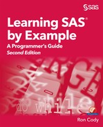
Program 20.2: Creating a Horizontal Bar Chart
title "Horizontal Bar Chart Example";
proc sgplot data=Learn.Blood;
hbar BloodType / nofill barwidth=.25;
run;
Besides changing the orientation of the bars, this program also include two options that work for both vertical and horizontal bar charts. The first, NOFILL, generates a bar outline. If you plan to print your charts using either a laser or ink jet printer, this will save on toner (or ink). The second option used in this program, BARWIDTH=, allows you to control the width of the bars. The value you choose is the proportion of the maximum default bar width. Here is the output:
Figure 20.2: Output from Program 20.2
You can create more complex bar charts by displaying the distribution of one variable at each level of a second variable. This is accomplished by adding a GROUP= option to either the VBAR or HBAR statement. Suppose you want to look at frequencies of blood types for males and females. The program below does just that:
Program 20.3: Vertical Bar Chart Example (Two Variables)
title "Vertical Bar Chart Example (two variables)";
proc sgplot data=Learn.Blood;
vbar Gender / group=BloodType;
run;
Because GROUP= is an option for the VBAR statement, it is entered following a slash (/). The output is shown below:
Figure 20.3: Output from Program 20.3

It appears the distribution of blood types is similar in females and males. If you would like to see the groups displayed side by side, add the option GROUPDISPLAY=CLUSTER right after GROUP=Bloodtype.
The same plot statements, VBAR and HBAR, can be used to display means or sums for each level of a categorical variable. Instead of the height of each bar representing frequencies, it can represent a mean or sum of a response variable. You accomplish this by including the option RESPONSE= in the VBAR or HBAR statement. In the example below, you want to see the mean cholesterol levels for each blood type.
Program 20.4: Vertical Bar Chart Displaying a Response Variable
title "Vertical Bar Chart Displayig a Response Variable";
proc sgplot data=Learn.Blood;
vbar BloodType / response=Chol stat=mean barwidth=.5 nofill;
run;
Here you are requesting that the height of each bar represents the mean cholesteral level for each of the four blood types. You need to include the option, STAT=mean, so that the height of the bars represents means. Without this option, the default statistic of SUM will be used. Here is the output:
Figure 20.4: Output from Program 20.4

This plot shows the mean cholesterol level for each of the four blood types.
Note: Please keep in mind that this data set is made up and does not represent actual values.
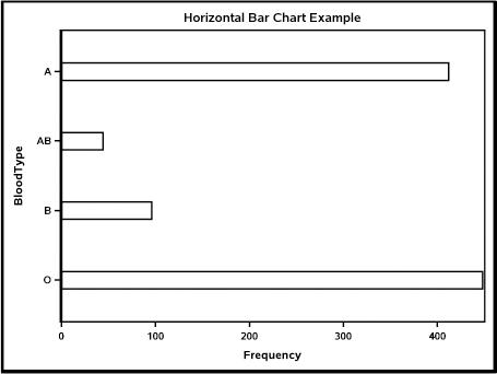
Scatter plots allow you to visually see relationships between two variables. This example uses a data set that is included with SAS software in a library called SASHELP. If you use PROC CONTENTS with option DATA=SASHELP._ALL_, you can see a list of the over 200 data sets in this library. You can also use the SAS HELP icon on the taskbar to learn more about the data sets in this library.
The data set used in this example contains data on various measurements of iris petals. You use the SCATTER statement to produce a scatter plot along with the options X= and Y= to specify which variables go on the x axis and y axis. The program below plots the petal width on the x axis and the petal length on the y axis:
Program 20.5: Simple Scatter Plot
title "Simple Scatter Plot";
proc sgplot data=SASHelp.Iris;
scatter x=PetalWidth y=PetalLength;
run;
Figure 20.5: Output from Program 20.5
Inspection of this plot would lead you to conclude that there is a strong relationship between petal width and petal length. You could verify this by using statistical techniques such as correlation and regression.
By substituting the REG statement for the SCATTER statement in Program 20.5, you can include a regression line on the plot. The two options, CLM and CLI, add two types of confidence limits to the plot. CLM (confidence limit for the mean) shows you the 95% confidence limits for the mean of Y for any particular value of X. CLI (confidence limits for individual points) shows you the limits where you are 95% confident that an individual data point will be between these limits.
Program 20.6: Scatter Plot with a Regression Line and Confidence Intervals
title "Scatter Plot with a Regression Line and Confidence Intervals";
proc sgplot data=SASHelp.Iris;
reg x=PetalWidth y=PetalLength / CLM CLI;
run;
Here is the plot:
Figure 20.6: Output from Program 20.6

You can see the individual data points, the regression line. and the two confidence limits.
This example starts with a short DATA step to create a moving average. The two functions, LAG and LAG2, return the stock price from the previous day and one day before that and then averages the three values (the current price and the price on the two previous days). You use a SERIES statement along with X= and Y= options to specify the x and y variables for the plot. Each plot produced by PROC SGPLOT is additive—that is, each plot appears in the same graph. Later in this chapter, you will see that you can set a value for transparency if one plot covers a previous plot. In this case, overlapping is not a problem.
Program 20.7: Time Series Plot
data Moving_Average;
set Learn.Stocks;
Previous = lag(Price);
Two_Back = lag2(Price);
if _n_ ge 3 then Moving=mean(Price, Previous, Two_Back);
run;
title "Series Plot";
proc sgplot data=Moving_Average;
series x=Date y=Price;
series x=Date y=Moving;
run;
The Price versus Day plot starts on January 1, 2017—the moving average plot starts on day3.
Here is the output:
Figure 20.7: Output from Program 20.7

You can see that using a moving average smooths out some of the day-to-day variations.
In addition to providing the capability of connecting data points by straight lines, PROC SGPLOT also provides two non-linear methods of curve fitting. Both of these methods use local regression models to generate smooth curves.
The first method in this section uses local points to fit portions of the curve. To control how closely the smooth curve follows the data points, specify the SMOOTH option=numeric value in the PBSPLINE statement.
Program 20.8: Smooth Curves - Splines
title "Smooth Curve - Splines";
proc sgplot data=SASHelp.Iris;
pbspline x=PetalWidth y=PetalLength;
run;
You use the PBSPLINE statement and specify the variables on the two axes with the required options X= and Y=. This program uses the iris petal data (see section 20.4) and adds a smooth line to the scatter plot as shown below:
Figure 20.8: Output from Program 20.8

As previously mentioned, you can control the amount of “wiggle” by options in the PBSPLINE statement.
The next smoothing method is called the LOESS method. Although this is not an exact acronym, most documentation for this method says it stands for “LOcal regrESSion.” The next program shown uses the same iris data as Program 20.8, but uses the LOESS method instead of PBSPLINE.
Program 20.9: Smooth Curve - LOESS Method
title "Smooth Curve - LOESS Method";
proc sgplot data=SASHelp.Iris;
loess x=PetalWidth y=PetalLength;
run;
This program produced the plot below:
Figure 20.9: Output from Program 20.9

As with PBSPLINE, you can add options to the LOESS statement to control how closely the line follows the points.
If you would like to see a histogram for a variable, use the HISTOGRAM statement followed by the response variable. The program that follows generates a histogram for the variable RBC (red blood cell count) in the Learn.Blood data set. In addition, the DENSITY statement with the response variable RBC overlays a normal curve on the histogram. An alternative to the default normal density curve is the KERNEL density. You can produce the kernel density curve with the option TYPE=KERNEL. Here is the program with the default normal density curve:
Program 20.10: Histogram with a Normal Curve Overlaid
title "Histogram with a Normal Curve Overlaid";
proc sgplot data=Learn.Blood;
histogram RBC;
density RBC;
run;
The output shows the histogram and the overlaid normal density curve. You can include options to control the number or size of the bins in the plot. You use the option BINWITH= to select a bin width—the option NBINS= allows you to specify the number of bins in the histogram.
Figure 20.10: Output from Program 20.10

This plot was produced without any options. There are also options for the appearance of the x and y axes.
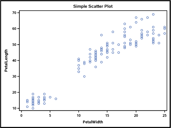
A box plot (also known as a box-and-whisker plot) is a technique used in a field of statistics known as exploratory data analysis (EDA). The plot shows important values such as the median, the first and third quartiles, and data points known as outliers.
To demonstrate a simple box plot, the program below produces a box plot for the variable RBC in the Blood data set. Use the HBOX statement if you want a horizontal plot and the VBOX statement if you prefer a vertical plot.
Program 20.11: Simple Box Plot
title "Simple Box Plot";
proc sgplot data=Learn.Blood;
hbox RBC;
run;
Here is the output:
Figure 20.11: Output from Program 20.11

The vertical line inside the box represents the median, and the left and right sides of the box represent the first and third quartiles, respectively. The lines extending from both sides of the box represent a distance of 1.5 interquartile ranges (the distance between the first and third quartiles) on both sides of the box. The diamond inside the box represents the mean. The circles are data points that fall outside 1.5 interquartile ranges (referred to as outliers).
To generate a box plot for each value of a grouping variable, add a GROUP= option in the HBOX or VBOX statement. The program below generates a box plot of RBC for each blood type:
Program 20.12: Box Plot with a Grouping Variable
title "Box Plot with a Grouping Variable";
proc sgplot data=Learn.Blood;
hbox RBC / group=BloodType;
run;
This program produced the family of box plots shown here:
Figure 20.12: Output from Program 20.12

Plots like this provide an excellent visual display that allows you to see the distribution of one variable for each category of another variable.
As mentioned earlier, each plot produced by PROC SGPLOT is overlaid on the previous plots. In the case of the series plot or the histogram with a normal density plot, this is not a problem. However, in displays such as bar charts one bar may be hidden by an overlaid plot.
You can set the value of transparency for any plot by using the keyword TRANSPARENCY=. The program below produces two vertical bar charts. The second bar chart sets the value of transparency to .2. In addition, the width of the bars in the second chart is set to .3.
Program 20.13: Demonstrating Overlays and Transparency
title "Demonstrating Overlays and Transparency";
proc sgplot data=SASHelp.Iris;
vbar Species / Response=PetalWidth stat=mean barwidth=.8;
vbar Species / Response=PetalLength barwidth=.3
transparency=.2 stat=mean;
run;
Here are the two overlaid charts:
Figure 20.13: Output from Program 20.13

This chapter touched only the basics of PROC SGPLOT. There are several SAS Press books and extensive documentation in SAS Help Center that discuss this procedure. For those of you who have used SAS/GRAPH to produce charts and plots, you will be delighted at how much easier it is to use PROC SGPLOT.
Solutions to odd-numbered problems are located at the back of this book. Solutions to all problems are available to professors. If you are a professor, visit the book’s companion website at support.sas.com/cody for information about how to obtain the solutions to all of the problems.
1. Using the SASHelp data set, Heart, generate a bar chart showing the frequencies for the variable, Status. It should look like this:

2. Using the SASHelp data set, Heart, generate a bar chart showing the mean Cholesterol value for men and women. The variable names are Cholesterol and Sex. It should look like this:

3. Using the SASHelp data set, Heart, generate a horizontal bar chart showing the mean Height for men and women. Use options to make the bars not filled in (outline only) and to make the bars 25% the maximum size. It should look like this:

4. Using the SASHelp data set, Health, generate a scatter plot with Height on the x axis and Weight on the y axis. It should look like this:

5. Using the SASHelp data set, Heart, create a scatter plot with Height on the x axis and Weight on the y axis. Include a regression line and the two types of confidence limits.

6. Starting with the SASHelp data set, Sales, create a temporary SAS data set (call it Sales) that contains a variable (call it Date) that is a SAS date by using the three variables Month, Day, and Year (remember the MDY function). Be aware that the original SASHelp data set also contains a variable called Date, but it is not a SAS date. You can drop the original Date variable with a DROP= data set option on the SET statement when you bring in data from the SASHelp data set. Next, generate a time series plot with Date on the x axis and Sales on the y axis. It should look like this:

7. Using the first 100 observations from the SASHelp data set, Health (remember the data set option OBS=), use the PBSPLINE technique to plot Height on the x axis and Weight on the y axis, with a smooth curve included on the plot. It should look like this:

8. Repeat Problem 7, except use the LOESS method of generating a smooth curve. Your output should look like this:

9. Using the SASHelp data set, Heart, generate a histogram for the variable, Cholesterol. It should look like this:

10. Repeat Problem 9, except add a normal curve along with the histogram. It should look like this:

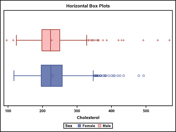
11. Using the SASHelp data set, Heart, generate two horizontal box plots that show the distribution of Cholesterol for men and women (variable Sex). Your plot should look like this:
12. Using the SASHelp data set, Heart, generate a plot showing the mean height for men and women. On the same plot, show the mean weight for men and women. For the latter display, set transparency to .2, and make the bar width 25% of the full width. Your chart should look like this:
