
Histograms are useful when we want to see the distribution of data. They are even effective with continuous data. In a histogram, the data is divided into a limited number of buckets, commonly 10, and the number of items in each bucket is counted. Histograms are especially useful for finding how much data are available for various percentiles. For instance, these charts can clearly show how much of your data was in the 90th percentile or lower.
We'll use the same dependencies in our project.clj file as we did in Creating scatter plots with Incanter.
We'll use this set of imports in our script or REPL:
(require '[incanter.core :as i]
         '[incanter.charts :as c]
         'incanter.datasets)
For this recipe, we'll use the iris dataset that we used in Creating scatter plots in Incanter:
(def iris (incanter.datasets/get-dataset :iris))
As we did in the previous recipes, we just create the graph and display it with incanter.core/view:
- We create a histogram of the iris' petal length:
(def iris-petal-length-hist (c/histogram (i/sel iris :cols :Petal.Length) :title "Iris Petal Lengths" :x-label "cm" :nbins 20)) - Now we view it:
(i/view iris-petal-length-hist)
The preceding line gives us a graph, as shown in the following screenshot:
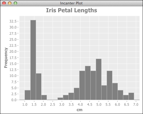
By looking at the graph created, the distribution of the data becomes clear. We can observe that the data does not fit a normal distribution, and in fact, the distribution has two well-separated clusters of values. If we compare this to the graph from Creating scatter plots with Incanter, we can see the cluster of smaller petals there also. Looking at the data, this seems to be the data for Iris Setosa. Versicolor and Virginica are grouped in the upper cluster.
By default, Incanter creates histograms with ten bins. When we made this graph, we wanted more detail and resolution, so we doubled the number of bins by adding the:nbins 20 option when we created the graph.