
Non-linear models are similar to linear regression models, except that the lines aren't straight.
Well, that's overly simplistic and a little tongue-in-cheek, but it does have a grain of truth. We're looking to find a formula that best fits the data, but without the restriction that the formula should be linear. This introduces a lot of complications and makes the problem significantly more difficult. Unlike linear regressions, fitting non-linear models typically involves a lot more guessing, and trial and error. Also, the interpretation of the model is much trickier. Interpreting a line is straightforward enough, but trying to figure out relationships when one involves a curve is much more difficult.
We'll need to declare Incanter as a dependency in the Leiningen project.clj file:
(defproject statim "0.1.0"
  :dependencies [[org.clojure/clojure "1.6.0"]
                 [incanter "1.5.5"]])
We'll also need to require a number of Incanter's namespaces in our script or REPL:
(require
  '[incanter.core :as i]
  'incanter.io
  '[incanter.optimize :as o]
  '[incanter.stats :as s]
  '[incanter.charts :as c])
(import [java.lang Math])
For data, we'll visit the website of the National Highway Traffic Safety Administration (http://www-fars.nhtsa.dot.gov/QueryTool/QuerySection/selectyear.aspx). This organization publishes data on all fatal accidents on US roads. For this recipe, we'll download data for 2010, including the speed limit. You can also download the data file I'm working with directly from http://www.ericrochester.com/clj-data-analysis/data/accident-fatalities.tsv:
(def data-file "data/accident-fatalities.tsv")
For this recipe, we'll see how to fit a formula to a set of data points. In this case, we'll look for a relationship between the speed limit and the number of fatal accidents that occur over a year:
- First, we need to load the data from the tab-delimited files:
(def data (incanter.io/read-dataset data-file :header true :delim ab)) - From this data, we'll use the
$rollupfunction to calculate the number of fatalities per speed limit, and then filter out any invalid speed limits (empty values). We'll then sort it by speed limit and create a new dataset. That seems like a mouthful, but it's really quite simple:(def fatalities (->> data (i/$rollup :count :Obs. :spdlim) (i/$where {:spdlim {:$ne "."}}) (i/$where {:spdlim {:$ne 0}}) (i/$order :spdlim :asc) (i/to-list) (i/dataset [:speed-limit :fatalities]))) - We'll now pull out the columns to make them easier to refer to later:
(def speed-limit (i/sel fatalities :cols :speed-limit))
(def fatality-count (i/sel fatalities :cols :fatalities))
- The first difficult part of non-linear models is that the general shape of the formula isn't predetermined. We have to figure out what type of formula might best fit the data. To do that, let's graph it and try to think of a class of functions that roughly matches the shape of the data:
(def chart
  (doto
    (c/scatter-plot speed-limit fatality-count
                    :title
                    "Fatalities by Speed Limit (2010)"
                    :x-label "Speed Limit"
                    :y-label "Fatality Count"
                    :legend true)
    i/view))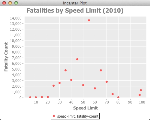
- Eye-balling this graph, I decided to go with a simple, but very general, sine wave formula. This may not be the best fitting function, but it should do well enough for this demonstration:
(defn sine-wave [theta x] (let [[amp ang-freq phase shift] theta] (i/plus (i/mult amp (i/sin (i/plus (i/mult ang-freq x) phase))) shift))) - The non-linear modeling function then determines the parameters that make the function fit the data best. Before that can happen, we need to pick some starting parameters. This involves a lot of guesswork. After playing around some, and trying out different values until I got something in the neighborhood of the data, here's what I came up with:
(def start [3500.0 0.07 Math/PI 2500.0])
- Now we fit the function to the data using the
non-linear-modelfunction:(def nlm (o/non-linear-model sine-wave fatality-count speed-limit start)) - Let's add the function with the starting parameters and the function with the final fitted parameters to the graph:
(-> chart
  (c/add-lines speed-limit (sine-wave start speed-limit))
  (c/add-lines speed-limit (:fitted nlm)))
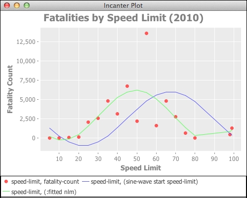
We can see that the function fits all right, but not great. The fatalities for 55 miles per hour seem like an outlier, too. The amount of road mileage may be skewing the data since there are so many miles of road with a speed limit of 55 mph. It stands to reason that there will also be more accidents at that speed limit. If we could get even an approximation of how many miles of roads are marked for various speed limits, we could compare the ratio of fatalities by the miles of road for that speed. This might get more interesting and useful results.
We should also say a few words about the parameters of the sine wave function:
Ais the amplitude. This is the peak of the wave.ωis the angular frequency. This is the slope of the wave, measured in radians per second.ϕis the phase. This is the point of the waves' oscillation where t=0.tis the time along the x axis.