
If we have two different datasets from two different observations, we want to know if those two event sets are correlated. We want to cross correlate them and see if they match in any way. We are looking for a pattern of a smaller data sample in a larger data sample. The pattern does not have to be an obvious or simple pattern.
We can use the matplotlib's function from pyplot lab—matplotlib.pyplot.xcorr. These functions can plot correlation between two datasets in such a way that we can see if there is any significant pattern between the plotted values. It is assumed that x and y are of the same length.
If we pass the normed argument as True, we can normalize by cross correlation at 0-th lag (that is, when there is no time delay or time lag).
Behind the scenes, correlation is done using NumPy's numpy.correlate function.
Using the usevlines argument (setting it to True), we can instruct matplotlib to use vlines() instead of plot() to draw lines of the correlation plot. The main difference is, if we are using plot(), we can style the lines using standard Line2D properties passed in the **kwargs argument to the matplotlib.pyplot.xcorr function.
In this following example, we need to:
- Import the
matplotlib.pyplotmodule. - Import the
numpypackage. - Use cleaned dataset of Google search volume trend for a year for the keyword
'flowers'. - Plot the datasets (real one and artificial one) and cross correlation diagram.
- Tighten the layout in order to have better overview of labels and ticks.
- Add appropriate labels and grids for easier understanding of the plot.
This is the code that will perform the previously mentioned steps:
import matplotlib.pyplot as plt
import numpy as np

# import the data

from ch07_search_data import DATA as d

total = sum(d)
av = total / len(d)
z = [i - av for i in d]

# Now let's generate random data for the same period
d1 = np.random.random(365)
assert len(d) == len(d1)

total1 = sum(d1)
av1 = total1 / len(d1)
z1 = [i - av1 for i in d1]

fig = plt.figure()

# Search trend volume
ax1 = fig.add_subplot(311)
ax1.plot(d)
ax1.set_xlabel('Google Trends data for "flowers"')

# Random: "search trend volume"
ax2 = fig.add_subplot(312)
ax2.plot(d1)
ax2.set_xlabel('Random data')

# Is there a pattern in search trend for this keyword?
ax3 = fig.add_subplot(313)
ax3.set_xlabel('Cross correlation of random data')
ax3.xcorr(z, z1, usevlines=True, maxlags=None, normed=True, lw=2)
ax3.grid(True)
plt.ylim(-1, 1)

plt.tight_layout()

plt.show()
This code will render the following figure:
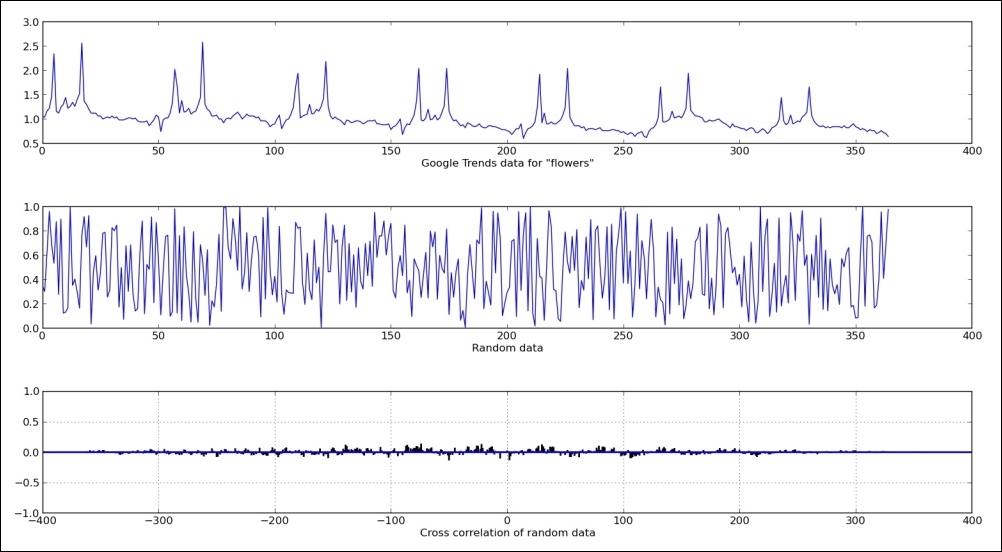
We used real data set with a recognizable pattern in it (two peaks repeating in similar manner across the dataset—see the preceding figure). The other dataset is just a random normal distributed data of the same length as real accrued data from public service Google Trends.
We plotted both datasets over the top half of the figure to visualize the data.
Using matplotlib's xcorr, which in turn uses NumPy's correlate() function, we computed cross correlation and plotted it on the bottom half.
Cross-correlation computation in NumPy returns correlation coefficients array that represent degree of similarity of two datasets (or signals, as usually referred to if used in signal processing field).
The cross-correlation diagram—correlogram—tells us that these two signals are not correlated, which is represented by the height of correlation values (vertical lines at certain time lags). We see that there is no one vertical line (correlation coefficient at time lag n) that is the preceding 0.5 value.
If, for example, two datasets would have correlation at time lag 100 (for example, 100 seconds shift between same object observed by two different sensors), we would see vertical line (representing correlation coefficient) at x = 100 in this preceding figure.