
Scatter plots are very often encountered around, as they are the most common plot to visualize the relation between two variables. If we want to take a quick look at the data and see if there is any relation between those (that is, correlation), we would draw a quick scatter plot. For a scatter plot to exist, we must have one variable that can be systematically changed by, for example, experimenter, so we can inspect the possibilities of influencing another variable.
That's why, in this recipe, you will learn how to understand the scatter plots.
We want to see, for example, how two events are affected by each other or if they are affected at all. This visualization is especially useful on large sets of data, where we cannot make any conclusions by looking at the data in the native form—when it is just numbers.
Correlation between values, if there is any, can be positive and negative. Positive correlation is when, for increasing X values, the Y values are increasing too. In negative correlation, for increasing X values, Y values are decreasing. In an ideal case, positive correlation is a line starting from bottom-left corner of axes to top-right corner. Negative ideal correlation is a line starting from top-left corner to the bottom-right corner of axes.
Ideal positive correlation between two data points is given the value of 1 and ideal negative is given the value of -1. Everything inside this interval represents weaker correlation between two values. Usually, everything inside -0.5 to 0.5 is not considered valuable from a perspective of two variables being in real connection.
Example of positive correlation would be the amount of money put in a charity jar being directly positively correlated to number of people seeing the jar. Negative correlation is between the time required to reach place B from place A, depending on the distance between A and B locations. The greater the distance, more time we need to complete the travel.
For example, what we have presented here is a positive correlation, but this is not perfect, as different people might put different amounts of money per visit. But, in general, we can assume that the more people see that jar, more money will be left inside.
Keep in mind, though, that even if the scatter plot displays correlation between two variables, that correlation might not be a direct one. There might be a third variable that influences both plotted variables, so the correlation is just a case that plotted values are correlated with that third variable. In the end, the correlation might be just apparent and no real relation exists behind.
With the following code sample, we will demonstrate how scatter plot can explain the relation between variables.
The data we use is obtained using the Google Trends web portal, where one can download the CSV file containing normalized values of relative search volumes for given parameters.
We will store our data in the ch07_search_data.py Python module, so we can import it in subsequent code recipes.
Here's the content of it:
# ch07_search_data


# daily search trend for keyword 'flowers' for a year

DATA = [
 1.04, 1.04, 1.16, 1.22, 1.46, 2.34, 1.16, 1.12, 1.24, 1.30, 1.44, 1.22, 1.26,
 1.34, 1.26, 1.40, 1.52, 2.56, 1.36, 1.30, 1.20, 1.12, 1.12, 1.12, 1.06, 1.06,
 1.00, 1.02, 1.04, 1.02, 1.06, 1.02, 1.04, 0.98, 0.98, 0.98, 1.00, 1.02, 1.02,
 1.00, 1.02, 0.96, 0.94, 0.94, 0.94, 0.96, 0.86, 0.92, 0.98, 1.08, 1.04, 0.74,
 0.98, 1.02, 1.02, 1.12, 1.34, 2.02, 1.68, 1.12, 1.38, 1.14, 1.16, 1.22, 1.10,
 1.14, 1.16, 1.28, 1.44, 2.58, 1.30, 1.20, 1.16, 1.06, 1.06, 1.08, 1.00, 1.00,
 0.92, 1.00, 1.02, 1.00, 1.06, 1.10, 1.14, 1.08, 1.00, 1.04, 1.10, 1.06, 1.06,
 1.06, 1.02, 1.04, 0.96, 0.96, 0.96, 0.92, 0.84, 0.88, 0.90, 1.00, 1.08, 0.80,
 0.90, 0.98, 1.00, 1.10, 1.24, 1.66, 1.94, 1.02, 1.06, 1.08, 1.10, 1.30, 1.10,
 1.12, 1.20, 1.16, 1.26, 1.42, 2.18, 1.26, 1.06, 1.00, 1.04, 1.00, 0.98, 0.94,
 0.88, 0.98, 0.96, 0.92, 0.94, 0.96, 0.96, 0.94, 0.90, 0.92, 0.96, 0.96, 0.96,
 0.98, 0.90, 0.90, 0.88, 0.88, 0.88, 0.90, 0.78, 0.84, 0.86, 0.92, 1.00, 0.68,
 0.82, 0.90, 0.88, 0.98, 1.08, 1.36, 2.04, 0.98, 0.96, 1.02, 1.20, 0.98, 1.00,
 1.08, 0.98, 1.02, 1.14, 1.28, 2.04, 1.16, 1.04, 0.96, 0.98, 0.92, 0.86, 0.88,
 0.82, 0.92, 0.90, 0.86, 0.84, 0.86, 0.90, 0.84, 0.82, 0.82, 0.86, 0.86, 0.84,
 0.84, 0.82, 0.80, 0.78, 0.78, 0.76, 0.74, 0.68, 0.74, 0.80, 0.80, 0.90, 0.60,
 0.72, 0.80, 0.82, 0.86, 0.94, 1.24, 1.92, 0.92, 1.12, 0.90, 0.90, 0.94, 0.90,
 0.90, 0.94, 0.98, 1.08, 1.24, 2.04, 1.04, 0.94, 0.86, 0.86, 0.86, 0.82, 0.84,
 0.76, 0.80, 0.80, 0.80, 0.78, 0.80, 0.82, 0.76, 0.76, 0.76, 0.76, 0.78, 0.78,
 0.76, 0.76, 0.72, 0.74, 0.70, 0.68, 0.72, 0.70, 0.64, 0.70, 0.72, 0.74, 0.64,
 0.62, 0.74, 0.80, 0.82, 0.88, 1.02, 1.66, 0.94, 0.94, 0.96, 1.00, 1.16, 1.02,
 1.04, 1.06, 1.02, 1.10, 1.22, 1.94, 1.18, 1.12, 1.06, 1.06, 1.04, 1.02, 0.94,
 0.94, 0.98, 0.96, 0.96, 0.98, 1.00, 0.96, 0.92, 0.90, 0.86, 0.82, 0.90, 0.84,
 0.84, 0.82, 0.80, 0.80, 0.76, 0.80, 0.82, 0.80, 0.72, 0.72, 0.76, 0.80, 0.76,
 0.70, 0.74, 0.82, 0.84, 0.88, 0.98, 1.44, 0.96, 0.88, 0.92, 1.08, 0.90, 0.92,
 0.96, 0.94, 1.04, 1.08, 1.14, 1.66, 1.08, 0.96, 0.90, 0.86, 0.84, 0.86, 0.82,
 0.84, 0.82, 0.84, 0.84, 0.84, 0.84, 0.82, 0.86, 0.82, 0.82, 0.86, 0.90, 0.84,
 0.82, 0.78, 0.80, 0.78, 0.74, 0.78, 0.76, 0.76, 0.70, 0.72, 0.76, 0.72, 0.70,
 0.64]
We need to perform the following steps:
- Use a cleaned dataset of Google Trend search volume for 1 year for keyword
'flowers'. We will import this dataset into variabled. - Use a random normal distribution of the same length (365 data points) as our Google Trend dataset. This will be dataset
d1. - Create a figure containing four subplots.
- In the first subplot, plot scatter-plot of d and
d1. - In the second subplot, plot scatter-plot of
d1withd1. - In the third subplot, render scatter-plot of of
d1with invertedd1. - In the fourth subplot, render scatter-plot of
d1with similar dataset constructed of (d1+d).
This code will illustrate the relation as we explained them earlier in this recipe:
import matplotlib.pyplot as plt
import numpy as np

# import the data

from ch07_search_data import DATA

d = DATA

# Now let's generate random data for the same period
d1 = np.random.random(365)
assert len(d) == len(d1)

fig = plt.figure()

ax1 = fig.add_subplot(221)
ax1.scatter(d, d1, alpha=0.5)
ax1.set_title('No correlation')
ax1.grid(True)

ax2 = fig.add_subplot(222)
ax2.scatter(d1, d1, alpha=0.5)
ax2.set_title('Ideal positive correlation')

ax2.grid(True)

ax3 = fig.add_subplot(223)
ax3.scatter(d1, d1*-1, alpha=0.5)
ax3.set_title('Ideal negative correlation')
ax3.grid(True)

ax4 = fig.add_subplot(224)
ax4.scatter(d1, d1+d, alpha=0.5)
ax4.set_title('Non ideal positive correlation')
ax4.grid(True)

plt.tight_layout()

plt.show()
This is the figure we should get when the preceding code is executed:
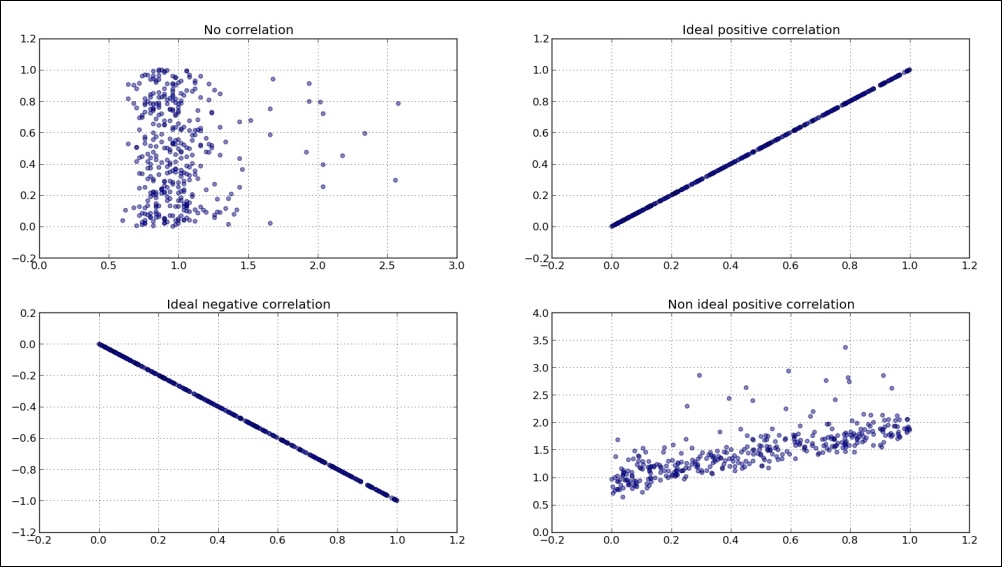
The preceding sample we see, clearly displays if there is any correlation between different datasets. While the second (top right) subplot shows ideal or perfect, positive correlation of dataset d1 with d1 itself (obviously). We can see that the fourth subplot (bottom right) hints that there is a positive correlation, although not ideal. We constructed this dataset from d1 and d (random) to simulate two similar signals (events), where the second one (d + d1) has certain randomness (or noise) in it, but still can be comparable with the original (d) signal.
We can also add histograms to scatter plots in such a way that they can tell us more about the data plotted. We can add horizontal and vertical histograms to show frequencies of data points on the X and Y axes. Using this, we can, at the same time, see the summary of the whole dataset (histogram) and individual data points (scatter-plot).
Here is the example of the code to generate a scatter-histogram combination, using the same two datasets we introduced in this recipe. The meat of the code is the scatterhist()function that is given here to be reusable to different datasets, trying to set some of the variables based on the dataset provided (number of bins in histogram, limits for axes and similar).
We start with the usual imports:
import numpy as np
import matplotlib.pyplot as plt
from mpl_toolkits.axes_grid1 import make_axes_locatable
This is the definition of our function to generate scatter histograms given x,y dataset and, optionally, a figsize parameter:
def scatterhist(x, y, figsize=(8,8)):
    """
    Create simple scatter & histograms of data x, y inside given plot

    @param figsize: Figure size to create figure
    @type figsize: Tuple of two floats representing size in inches

    @param x: X axis data set
    @type x: np.array

    @param y: Y axis data set
    @type y: np.array
    """


_, scatter_axes = plt.subplots(figsize=figsize)

    # the scatter plot:
    scatter_axes.scatter(x, y, alpha=0.5)
    scatter_axes.set_aspect(1.)

    divider = make_axes_locatable(scatter_axes)
    axes_hist_x = divider.append_axes(position="top", sharex=scatter_axes,
                                      size=1, pad=0.1)
    axes_hist_y = divider.append_axes(position="right", sharey=scatter_axes,
                                      size=1, pad=0.1)

    # compute bins accordingly
    binwidth = 0.25

    # global max value in both data sets
    xymax = np.max([np.max(np.fabs(x)), np.max(np.fabs(y))])
    # number of bins
    bincap = int(xymax / binwidth) * binwidth

    bins = np.arange(-bincap, bincap, binwidth)
    nx, binsx, _ = axes_hist_x.hist(x, bins=bins, histtype='stepfilled',
                     orientation='vertical')
    ny, binsy, _ = axes_hist_y.hist(y, bins=bins, histtype='stepfilled',
                     orientation='horizontal')

    tickstep = 50
    ticksmax = np.max([np.max(nx), np.max(ny)])
    xyticks = np.arange(0, ticksmax + tickstep, tickstep)

    # hide x and y ticklabels on histograms
    for tl in axes_hist_x.get_xticklabels():
        tl.set_visible(False)
    axes_hist_x.set_yticks(xyticks)

    for tl in axes_hist_y.get_yticklabels():
        tl.set_visible(False)
    axes_hist_y.set_xticks(xyticks)

    plt.show()
Now, we proceed with loading of the data and function call to generate and render the desired chart:
if __name__ == '__main__':    # import the data
    from ch07_search_data import DATA as d

    # Now let's generate random data for the same period
    d1 = np.random.random(365)
    assert len(d) == len(d1)

    # try with the random data
#     d = np.random.randn(1000)
#     d1 = np.random.randn(1000)

    scatterhist(d, d1)
This should generate the following figure:
