
The basic way to draw a filled polygon in matplotlib is to use matplotlib.pyplot.fill. This function accepts similar arguments as matplotlib.pyplot.plot—multiple x and y pairs and other Line2D properties. This function returns the list of patch instances that were added.
In this recipe, you will learn how to shade certain areas of plot intersections.
matplotlib provides several functions to help us plot filled figures, apart from plotting functions that are inherently plotting closed filled polygons, such as histogram (), of course.
We already mentioned one—matplotlib.pyplot.fill—but there are the matplotlib.pyplot.fill_between() and matplotlib.pyplot.fill_betweenx() functions too. These functions fill the polygons between two curves. The main difference between fill_between() and fill_betweenx() is that the latter fills between the x axis values, whereas the former fills between the y axis values.
The fill_between function accepts argument x—an x axis array of data—and y1 and y2—the y axis arrays of the data. Using arguments, we can specify conditions under which the area will be filled. This condition is the Boolean condition, usually specifying the y axis value ranges. The default value is None—meaning, to fill everywhere.
To start off with a simple example, we will fill the area under a simple function:
import numpy as np
import matplotlib.pyplot as plt
from math import sqrt

t = range(1000)
y = [sqrt(i) for i in t]
plt.plot(t, y, color='red', lw=2)
plt.fill_between(t, y, color='silver')
plt.show()
The preceding code gives us the following plot:

This is fairly straightforward and gives an idea of how fill_between() works. Note how we needed to plot the actual function line (using plot(), of course), where fill_between() just draws a polygonal area filled with color ("silver").
We will demonstrate another recipe here. It will involve more conditioning for the fill function. The following is the code for the example:
import matplotlib.pyplot as plt
import numpy as np

x = np.arange(0.0, 2, 0.01)
y1 = np.sin(np.pi*x)
y2 = 1.7*np.sin(4*np.pi*x)

fig = plt.figure()
axes1 = fig.add_subplot(211)
axes1.plot(x, y1, x, y2, color='grey')
axes1.fill_between(x, y1, y2, where=y2<=y1, facecolor='blue', interpolate=True)
axes1.fill_between(x, y1, y2, where=y2>=y1, facecolor='gold', interpolate=True)
axes1.set_title('Blue where y2<= y1. Gold-color where y2>= y1.')
axes1.set_ylim(-2,2)

# Mask values in y2 with value greater than 1.0
y2 = np.ma.masked_greater(y2, 1.0)
axes2 = fig.add_subplot(212, sharex=axes1)
axes2.plot(x, y1, x, y2, color='black')
axes2.fill_between(x, y1, y2, where=y2<=y1, facecolor='blue', interpolate=True)
axes2.fill_between(x, y1, y2, where=y2>=y1, facecolor='gold', interpolate=True)
axes2.set_title('Same as above, but mask')
axes2.set_ylim(-2,2)
axes2.grid('on')

plt.show()
The preceding code will render the following plot:
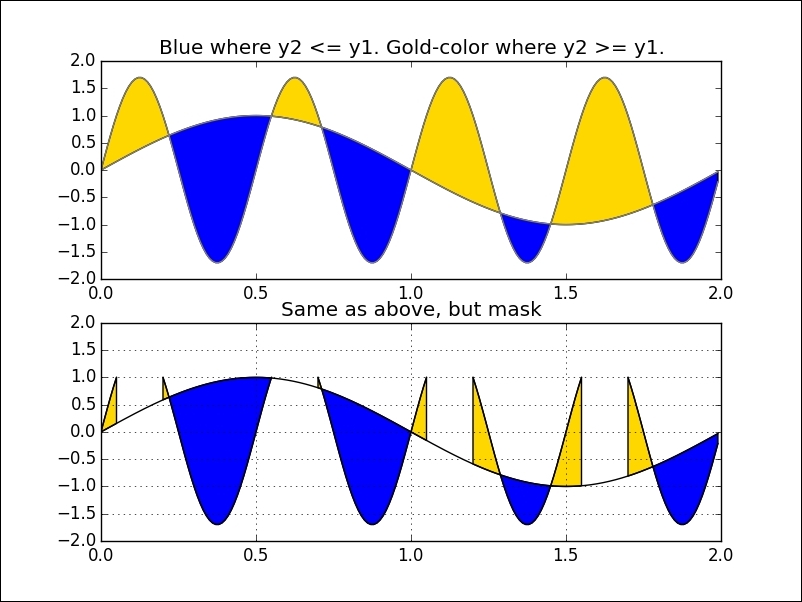
For this example, we first created two sinusoidal functions that overlap at certain points.
We also created two subplots to compare the two variations that render filled regions.
In both cases, we used fill_between() with an argument, where, that accepts an N-length Boolean array and will fill regions where the value equals True.
The bottom subplot illustrates mask_greater, which masks an array at values greater than a given value. This is a function from the numpy.ma package to handle missing or invalid values. We turned the grid on the bottom axes to make it easier to spot this.