
A grid is usually handy to have under lines and charts as it helps the human eye spot differences in patterns and compare plots visually in the figure. To be able to set up how visibly, how frequently, and in what style the grid is displayed—or whether it is displayed at all—we should use matplotlib.pyplot.grid.
In this recipe, you will be learning how to turn the grid on and off and how to change the major and minor ticks on a grid.
The most frequent grid customization is reachable in the matplotlib.pyplot.grid helper function.
To see the interactive effect of this, you should run the following under ipython. The basic call to plt.grid() will toggle the grid visibility in the current interactive session started by the last IPythonPyLab environment:
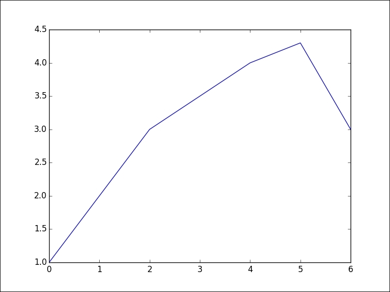
In [1]: plt.plot([1,2,3,3.5,4,4.3,3])
Out[1]: [<matplotlib.lines.Line2D at 0x3dcc810>]

Now, we can toggle the grid on the same figure:
In [2]: plt.grid()
We turn the grid back on, as shown in the following plot:

We then turn it off again:
In [3]: plt.grid()
Apart from just turning it on and off, we can further customize the grid's appearance.
We can manipulate the grid with just major ticks, or just minor ticks, or both; hence, the value of function argument which can be 'major', 'minor', or 'both'. Similarly, we can control the horizontal and vertical ticks separately using the argument axis that can have values 'x', 'y', or 'both'.
All the other properties are passed via kwargs and represent a standard set of properties that a matplotlib.lines.Line2D instance can accept, such as color, linestyle, and linewidth; here is an example:
ax.grid(color='g', linestyle='--', linewidth=1)
This is nice, but we want to be able to customize more. In order to do that, we need to reach deeper into matplotlib and into mpl_toolkits and find the AxesGrid module that allows us to make grids of axes in an easy and manageable way:
import numpy as np
import matplotlib.pyplot as plt
from mpl_toolkits.axes_grid1 import ImageGrid
from matplotlib.cbook import get_sample_data

def get_demo_image():
    f = get_sample_data("axes_grid/bivariate_normal.npy", asfileobj=False)
    # z is a numpy array of 15x15
    Z = np.load(f)
    return Z, (-3, 4, -4, 3)

def get_grid(fig=None, layout=None, nrows_ncols=None):
    assert fig is not None
    assert layout is not None
    assert nrows_ncols is not None

    grid = ImageGrid(fig, layout, nrows_ncols=nrows_ncols,
                    axes_pad=0.05, add_all=True, label_mode="L")
    return grid

def load_images_to_grid(grid, Z, *images):
    min, max = Z.min(), Z.max()
    for i, image in enumerate(images):
        axes = grid[i]
        axes.imshow(image, origin="lower", vmin=min, vmax=max,
                  interpolation="nearest")

if __name__ == "__main__":
    fig = plt.figure(1, (8, 6))
    grid = get_grid(fig, 111, (1, 3))
    Z, extent = get_demo_image()

    # Slice image
    image1 = Z
    image2 = Z[:, :10]
    image3 = Z[:, 10:]

    load_images_to_grid(grid, Z, image1, image2, image3)

    plt.draw()
    plt.show()
The given code will render the following plot:
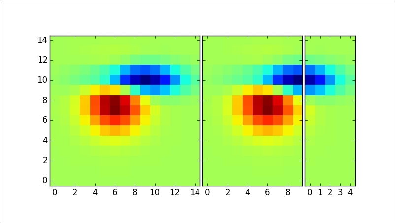
In the get_demo_image function, we loaded data from the sample data directory that comes with matplotlib.
The list grid holds our axes grid (in this case, ImageGrid).
The variables image1, image2, and image3 hold sliced data from Z that we have split over multiple axes in the list grid.
Looping over all the grids, we are plotting data from im1, im2, and im3 using the standard imshow() call, while matplotlib takes care that everything is neatly rendered and aligned.