In KMeans, we assume that the variance of the clusters is equal. This leads to a subdivision of space that determines how the clusters are assigned; but, what about a situation where the variances are not equal and each cluster point has some probabilistic association with it?
There's a more probabilistic way of looking at KMeans clustering. Hard KMeans clustering is the same as applying a Gaussian Mixture Model with a covariance matrix, S, which can be factored to the error times of the identity matrix. This is the same covariance structure for each cluster. It leads to spherical clusters.
However, if we allow S to vary, a GMM can be estimated and used for prediction. We'll look at how this works in a univariate sense, and then expand to more dimensions.
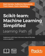
First, we need to create some data. For example, let's simulate heights of both women and men. We'll use this example throughout this recipe. It's a simple example, but hopefully, will illustrate what we're trying to accomplish in an N dimensional space, which is a little easier to visualize:
>>> import numpy as np
>>> N = 1000

>>> in_m = 72
>>> in_w = 66

>>> s_m = 2
>>> s_w = s_m

>>> m = np.random.normal(in_m, s_m, N)
>>> w = np.random.normal(in_w, s_w, N)
>>> from matplotlib import pyplot as plt
>>> f, ax = plt.subplots(figsize=(7, 5))

>>> ax.set_title("Histogram of Heights")
>>> ax.hist(m, alpha=.5, label="Men");
>>> ax.hist(w, alpha=.5, label="Women");
>>> ax.legend()
The following is the output:

Next, we might be interested in subsampling the group, fitting the distribution, and then predicting the remaining groups:
>>> random_sample = np.random.choice([True, False], size=m.size)
>>> m_test = m[random_sample]
>>> m_train = m[~random_sample]

>>> w_test = w[random_sample]
>>> w_train = w[~random_sample]
Now we need to get the empirical distribution of the heights of both men and women based on the training set:
>>> from scipy import stats
>>> m_pdf = stats.norm(m_train.mean(), m_train.std())
>>> w_pdf = stats.norm(w_train.mean(), w_train.std())
For the test set, we will calculate based on the likelihood that the data point was generated from either distribution, and the most likely distribution will get the appropriate label assigned. We will, of course, look at how accurate we were:
>>> m_pdf.pdf(m[0])
0.043532673457165431

>>> w_pdf.pdf(m[0])
9.2341848872766183e-07
Notice the difference in likelihoods.
Assume that we guess situations when the men's probability is higher, but we overwrite them if the women's probability is higher:
>>> guesses_m = np.ones_like(m_test)
>>> guesses_m[m_pdf.pdf(m_test) < w_pdf.pdf(m_test)] = 0
Obviously, the question is how accurate we are. Since guesses_m will be 1 if we are correct, and 0 if we aren't, we take the mean of the vector and get the accuracy:
>>> guesses_m.mean()
0.93775100401606426
Not too bad! Now, to see how well we did with for the women's group, use the following commands:
>>> guesses_w = np.ones_like(w_test)
>>> guesses_w[m_pdf.pdf(w_test) > w_pdf.pdf(w_test)] = 0
>>> guesses_w.mean()
0.93172690763052213
Let's allow the variance to differ between groups. First, create some new data:
>>> s_m = 1
>>> s_w = 4

>>> m = np.random.normal(in_m, s_m, N)
>>> w = np.random.normal(in_w, s_w, N)
Then, create a training set:
>>> m_test = m[random_sample]
>>> m_train = m[~random_sample]

>>> w_test = w[random_sample]
>>> w_train = w[~random_sample]
>>> f, ax = plt.subplots(figsize=(7, 5))
>>> ax.set_title("Histogram of Heights")
>>> ax.hist(m_train, alpha=.5, label="Men");
>>> ax.hist(w_train, alpha=.5, label="Women");
>>> ax.legend()
Let's take a look at the difference in variances between the men and women:

Now we can create the same PDFs:
>>> m_pdf = stats.norm(m_train.mean(), m_train.std())
>>> w_pdf = stats.norm(w_train.mean(), w_train.std())
The following is the output:

You can imagine this in a multidimensional space:
>>> class_A = np.random.normal(0, 1, size=(100, 2))
>>> class_B = np.random.normal(4, 1.5, size=(100, 2))
>>> f, ax = plt.subplots(figsize=(7, 5))

>>> ax.scatter(class_A[:,0], class_A[:,1], label='A', c='r')
>>> ax.scatter(class_B[:,0], class_B[:,1], label='B')
The following is the output:

Okay, so now that we've looked at how we can classify points based on distribution, let's look at how we can do this in scikit-learn:
>>> from sklearn.mixture import GMM
>>> gmm = GMM(n_components=2)
>>> X = np.row_stack((class_A, class_B))
>>> y = np.hstack((np.ones(100), np.zeros(100)))
Since we're good little data scientists, we'll create a training set:
>>> train = np.random.choice([True, False], 200)
>>> gmm.fit(X[train])
GMM(covariance_type='diag', init_params='wmc', min_covar=0.001,
    n_components=2, n_init=1, n_iter=100, params='wmc',
    random_state=None,   thresh=0.01)
Fitting and predicting is done in the same way as fitting is done for many of the other objects in scikit-learn:
>>> gmm.fit(X[train])
>>> gmm.predict(X[train])[:5]
array([0, 0, 0, 0, 0])
There are other methods worth looking at now that the model has been fit.
For example, using score_samples, we can actually get the per-sample likelihood for each label.