
The first sheet we will create is the Analysis sheet; as the current Dashboard sheet already contains a few of the metrics that we want on that sheet, first, let's change the name of the sheet from Dashboard to Analysis:
- Right-click anywhere on the sheet workspace and choose Properties.
- Navigate to the General tab and enter
Analysisin the Title input field. - Click on OK to close the Sheet Properties dialog.
While we're at it, rename the Main sheet to Associations. This sheet will help users to find associations on the data across many different fields. We might need to reposition the listboxes to fit our new layout.
Tip
Sheet handling
The design toolbar at the top of the screen contains some useful commands for dealing with worksheets.
The first icon on the left adds a new sheet. The second and third icons move the currently active sheet to the left or the right on the tab row. The last icon is used to open the properties dialog for the currently active sheet.
The same functionality can also be found under the Layout menu. This menu additionally contains the Remove Sheet function, which will remove the currently active sheet.
Just as a quick review to keep our focus, the following requirements were defined for the Analysis sheet:
- Trend analysis of the number of flights, enplaned passengers, freight, and mail through time
- Top 10 routes based on the number of flights, enplaned passengers, freight, and mail
- The number of passengers versus available seats (Load Factor %) across flight types
- The relationship between enplaned passengers, mail, and the number of flights
Now that we have a general layout to start from, it is time to add another chart to the Analysis sheet. A new chart can be added by selecting Layout | New Sheet Object | Chart from the menu, right-clicking on the worksheet and selecting New Sheet Object | Chart, or clicking on the Create Chart button on the toolbar.
This opens the first page of the Chart Properties dialog: the General tab. On this tab we can set some general settings for the chart, such as what the display text in the caption (Window Title) should be, and, more importantly, what Chart Type we wish to create.

Another interesting option in this window is the Fast Type Change option. This option allows the user to dynamically switch between different types of charts, for example, we may switch between a bar chart and a straight table.
One of the required charts in our document should display number of passengers and number of available seats by flight type. We will use a bar chart to visualize this metric. Follow these steps to create it:
- From the Chart Type section in the New Chart dialog window, select the Bar Chart option (the first one to the left) and click on Next.
- The next dialog is the Dimensions dialog. From the list on the left, locate the Flight Type field and add it to the Used Dimensions list by clicking on the Add > button. After that, click on Next.
- We will now enter an expression to get the total number of enplaned passengers. In the Edit Expression dialog that opens automatically after clicking on Next in the previous window, type the following expression and click on OK:
Sum ([# Transported Passengers])
- We will assign a label to our expression by typing
# of Passengersin the corresponding Label field. - We will add a second expression to calculate the number of available seats. Do this by clicking on the Add button, which will open up the Edit Expression window again.
- Enter the following expression and click on OK:
Sum([# Available Seats])
- Enter the label
# of Available Seatsinto the Label field. - Let's have a look at the intermediate result; click on Finish.

When we look at this chart, we notice that it's quite hard to read. The numbers are really large, all those zeroes occupy a lot of space. Besides that, the title text and caption both say the same thing and do not reference the second expression in the chart.
Let's correct these issues by changing the following settings in the Properties dialog:
- On the General tab, set the Window Title field to
# of Passengers/Available Seats (x 1 million) by Flight Type. Next, uncheck the Show Title in Chart checkbox. - On the Expressions tab, select the # of Passengers expression and tick the Values on Data Points checkbox. Next, highlight # of Available Seats and also check the Values on Data Points checkbox. Modify both expressions' definition by dividing the result by one million. The expressions will now be:
Sum ([# Transported Passengers]) / 1000000
Sum ([# Available Seats]) / 1000000
- On the Style tab, change the Orientation to horizontal (right icon).
- On the Presentation tab, set the legend's font format to Tahoma, with a Regular Font Style, and with the Size set to 8 by first clicking on the Settings button, and then clicking on the Font button in the Legend Settings dialog window.
- On the Axes tab, under Expression Axes, check the Show Grid checkbox. Change the Font format for both Expression Axis and Dimension Axis to Tahoma, with a Regular Font Style, and with the Size set to 8 using their respective Font buttons.
- On the Number tab, hold down the Shift key and select # of Passengers and # of Available Seats from the list of Expressions. Next, select Fixed to under Number Format Settings and set the Decimals field to
1. - On the Layout tab, uncheck the Use Borders option.
- Click on OK to close the Chart Properties window.
The resulting chart should look similar to the following screenshot:

Now that we have formatted our chart, we can copy these settings to another chart using the Format Painter Tool. To do this, activate the object for which formatting needs to be copied and then click the Format Painter Tool button in the design toolbar. Next, click the target object to apply the format. Use it to copy the formatting options we set previously and apply them to our Traffic per Year chart.

In the previous example we went over the most common bar chart properties. As you may have seen in the various dialog windows, QlikView offers a lot of additional options and settings. Let's look at a few notable options available for bar charts.
On the Style tab, you can add a 3D, shadow, or gradient Look to your bar chart. Additionally, you can change the Orientation option, as we did in the example. Choosing a horizontal orientation can make text labels much more readable. Arguably the most important option on this tab is the Subtype option; this lets you change the bar chart from Grouped, in which two bars corresponding to one dimension value will be shown side by side, to a Stacked arrangement, where the two bars will be stacked on top of each other.
Before we look at the other chart types and objects that QlikView has to offer, it is time to have a more in-depth look at Expressions and the Edit Expression window.
By now you may have noticed that QlikView expressions can be used just about everywhere throughout the program, from chart expressions to expressions for setting colors or window titles. This functionality makes QlikView very flexible. Expressions in QlikView are very similar to formulas that you may know from Excel, or functions that you may know from SQL.
The Edit Expression window is used to enter expressions. Whenever you see an ellipsis character (…) accompanying an input box, it means you can click on it to enter an expression.
Let's open the Edit Expression window now and have a closer look:
- Right-click the # of Passengers/Available Seats chart and choose Properties....
- Select the Expressions tab and highlight the # of Passengers expression from the list on the left.
- Click on the … button next to the Definition input box.
The Edit Expression window is shown in the following screenshot:

The Edit Expression window contains a big input field in which expressions can be entered directly. Once you have familiarized yourself with the various expression functions and their syntax (we'll cover many of them throughout the book), you will realize that this is the fastest way to enter an expression. The Edit Expression window automatically checks the syntax of the entered expression; if an error is found, the expression will be underlined with a red squiggly line and the text Error in expression will be displayed.

Be aware that the automatic syntax check does not always work flawlessly; with advanced expressions, the editor will sometimes indicate that an error is present when in fact there is none.
At the bottom of the expression editor, a few tabs can be found. Let's quickly see what each of these tabs does.
The Fields tab
enables "clicking together" an expression by selecting an Aggregation function, such as sum, avg, min, max, and the field to which it should be applied. The Table dropdown can be used to filter the field list to those belonging to a particular table.
When the Distinct checkbox is marked, only unique values will be considered in the aggregation. This can be useful when, for example, we want to count the number of distinct customers, instead of their total number of appearances in the database.
When all selections have been made, the expression can be entered into the Edit Expression input field by clicking on the Paste button. Note that the code will be pasted where the cursor presently is, and will replace any highlighted text in the expression.
While the Fields tab makes it possible to create expressions using just the mouse, it is fairly limited in the type of expressions it can create. The Functions tab, however, contains a comprehensive list of available functions, grouped by Function Category and Function Name.
Selecting a particular function will display its syntax in a box. The selected function can be entered into the expression input field by clicking on the Paste button, but the corresponding parameters have to be set manually.

As we will see later in this chapter, variables can be used to store expressions and values. The advantage of this approach is that we can use an expression in many places, while only maintaining it in a single place.
If, for example, instead of directly typing the # of Passengers expression into the input field we had created a variable containing its definition, we would be able to select that variable from the
drop-down list on the Variables tab and achieve the same result.
A QlikView expression does not always have to be text or a calculation. There are some objects, for example, the Text Object or even a Straight Table, that are also able to display the result of an expression as an image.
The Images tab makes it easy to select images that are built into QlikView, or which have been bundled into the document via script. Simply select an image name from the Image drop-down list or, more conveniently, from a visual menu of images by clicking on the Advanced button.
Clicking on the Paste option will enter a string referencing the corresponding image into the expression input field. These string values can also be used within expressions. For example, the following expression will compare the Target field using the if function. If the value is greater than 100, a green upwards arrow will be displayed, otherwise a red downwards arrow will be shown.
if(Target > 100, 'qmem://<bundled>/BuiltIn/arrow_n_g.png', 'qmem://<bundled>/BuiltIn/arrow_s_r.png')
Click on Cancel in the Edit Expression dialog window to close it without saving any changes and close the Chart Properties window as well.
With expressions in so many locations, it can be hard to keep track of them all. This is where the Expression Overview window comes in handy; it offers a central location to manage all expressions being used in our QlikView document.

The Expression Overview window can be opened by pressing Ctrl + Alt + E or by selecting Settings | Expression Overview from the menu bar.
By default, only Chart Expressions in the QlikView document are shown. This list can be expanded or narrowed down by (de)selecting the checkboxes for each expression type.
It is possible to edit an individual expression by highlighting it from the list and clicking the Edit button. Bulk updates are possible, using the Find/Replace button. Be very cautious when using this function, as unintended changes can occur.
The Line Chart works very much like the bar chart that we looked at earlier. So, instead of creating a new line chart, we will convert one of the already built bar charts into one.
Tip
Bar charts versus line charts
While bar and line charts are considered interchangeable by many, there are actually specific use cases in which it is advisable to use one over the other. Bar charts are best used to compare different categories, for example, for comparing different Flight Types. Line charts are best used to detect trends in series that have an order, such as dates or steps within a process.
Let's follow these steps to convert the Traffic per Year chart from a bar chart into a line chart:
- Right-click the Traffic per Year chart and select Properties….
- On the General tab, under Chart Type select Line Chart (second icon from the top left).
- Click on OK to apply the settings.
The resulting line chart is shown in the following picture.

Notice we have to select a year for the months to be shown. In this case, we have selected 2011 in the Year listbox.
While this already looks quite nice, we will make a few extra changes:
- As we are more interested in the trend than in the exact values, the axis does not necessarily need to start at 0
- We will add dots on the actual data points so it is clear for the user where to point their mouse cursor in case they do want to see the exact values
- The numbers on the Y-axis are quite big; we will format the numbers so that they are shown in thousands, millions, or billions depending on the selection
Follow these steps to apply the changes:
- Right-click on the Traffic per Year chart and select Properties….
- Navigate to the Axes tab and deselect the Forced 0 checkbox.
- Activate the Expressions tab and click on the plus icon next to the circular arrow to display the list of expressions.
- For each expression, individually mark the Symbol checkbox under the Display Options section and select Dots from the drop-down list.
- Open the Presentation tab and set the Symbol Size option to 4pt under the Line/Symbol Settings section; this sets the size of the dots.
- Open the Number tab and select all expressions by clicking on the first expression (
# of Flights) and then holding Shift while clicking on the last expression (Transported Mail). All expressions will be highlighted. - In the Thousand Symbol input field enter
x Thousand. - In the Million Symbol box enter
x Million. - In the Billion Symbol box enter, you guessed it,
x Billion. - Click on OK to apply the changes and close the Chart Properties dialog.
The resulting line chart is shown in the following screenshot:

As you can see, the actual trend can be easily perceived and the individual data points are much more visible. Additionally, the scale on the y axis now contains much shorter numbers. The advantage of setting values for thousands, millions, and billions is that the y axis scale will automatically adjust to the appropriate range when updating the chart based on user selections.
While in the previous example we looked at the most common line chart attributes, there are some additional settings in the Chart Properties dialog that are interesting to take note of.
On the Expressions tab, the Accumulation option can be used to display a moving total. This means that instead of presenting individual values, each new value is added to the sum of all previous values. In the following chart, instead of the individual amount of flights for each month, we see the total cumulative amount of flights as of each period:

The other line you see in the chart represents the Average; this option and is set under the Trendlines section.
On the Style tab, you can change the Look option of the line chart. Besides some 3D effects, an interesting visualization is the area chart (fourth icon from the top). Another useful setting, though admittedly not as useful as it is for bar charts, is the Orientation option. This allows you to change the orientation from vertical to horizontal.
The Presentation tab offers options to change how the data is presented within the chart. Useful options are under the Line/Symbol Settings section; with these options we can change the Line Width option of the chart as well as the size of the symbols (as we saw when we added the dots in the previous chart).
For charts that have many values on the X-axis, a useful option is the Chart Scrolling option. By checking the Enable X-Axis Scrollbar checkbox and setting a value for the When Number of Items Exceeds parameter, a scrollbar is added to the chart whenever the number of values on the X-axis exceeds the specified amount.
Arguably the most useful option in this tab, however, is found under the Reference Lines section. This option can be used to integrate additional, straight lines to the line chart. A practical example would be to add a target reference to compare each data point to a predefined objective.
By clicking on the Add button, the Reference Lines dialog opens. Here we can set an expression for the reference line, set its label, and change some other settings with regard to formatting. The following screenshot shows an example of a static 900,000 flights target line, but of course a dynamic target could also be used if it is included in the data model:

Though it sounds fancy, the Combo Chart is nothing more than a combination of the bar and line charts that we used earlier. It brings together all the properties of both charts.
Let's look at how this combined chart works by converting the # of Passengers / Available Seat (x 1 million) by Flight Type chart that we created earlier:
- Right-click on the bar chart and select Properties….
- From the General tab, change the Chart Type option from Bar Chart (top left icon) to Combo Chart (third icon from the left).
- On the Expressions tab select the # of Passengers expression. Next, deselect the Line checkbox under Display Options and select the Bar checkbox. Disable the Values on Data Points option as well.
- Next, select the # of Available Seats expression. Then, deselect the Line checkbox and mark the Symbol checkbox. Select the Diamonds option from the drop-down list on the right. Disable the Values on Data Points option as well.
- Click on Add to open the Edit Expression window and enter the following new expression and then click on OK to close the editor:
Column(1) / Column(2)
- Enter
Load Factoras this expression's Label. - With the new expression highlighted from the expressions' list, deselect the Line checkbox and enable the Values on Data Points option.
- Navigate to the Presentation tab and set the Symbol Size option to 4 pt.
- On the Number tab, select the Load Factor expression and set the Number Format Settings option to Fixed to 1 Decimals and mark the Show in Percent (%) option.
- Click on OK to close the Chart Properties dialog.
The end result should look like the following chart:

One thing you may notice is that while we entered three expressions, only two are visible in the chart. This happens because we did not select any display mode for the Load Factor expression. However, we did activate the Values on Data Points checkbox, and that is why the value for Load Factor is shown in the chart.
You may also wonder about the expression that we used to calculate the Load Factor value:
Column(1) / Column(2)
This expression tells QlikView to divide the result of the first expression by the result of the second expression. You will understand that the order of the expressions should not be changed in order for this to work reliably.
By now, with three charts already created, our worksheet is becoming somewhat cluttered again. Time to do another round of reorganizing. The option of choice this time will be a container object in which we will group multiple objects together in the same screen space. The user will then be able to interactively switch between objects.
Let's put all three charts (or, two charts and a table) into the container object by following these steps:
- Go to Layout | New Sheet Object | Container in the menu bar.
- On the General tab, select the three items corresponding to our charts from the Existing Objects list (Traffic per Year, Top 10 Routes, and # of Passengers).
- Click on Add to place them in the Objects Displayed in Container list to the right.
- Go to the Presentation tab and select Tabs at bottom from the Appearance drop-down menu.
- Go to the Layout tab and deactivate the Use Borders option.
- Click OK to close the Container Properties dialog and create the new object.
The resulting container is shown in the following image. Notice how we can switch between charts by clicking the tabs on the bottom row.

You will also notice that the original charts are still on the worksheet, making it look even messier. We will remove these old objects by right-clicking on each of them and selecting the Remove option. A pop-up window will appear asking to confirm deletion of either only the selected object or all linked objects. Click on the Delete Selected button as shown in the screenshot below:
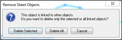
The reason this dialog message appears is that there are now two instances of the same object, and QlikView treats them as linked objects (one object sharing the same properties and IDs, but in different locations). We will look at linked objects in more detail later on in this chapter.
After we've removed all the duplicate charts and have properly aligned the container object, we will remove the container's caption by following these steps:
- Right-click on either the container's caption or one of the buttons on the bottom row and select Properties….
- Go to the Caption tab and deselect the Show Caption option.
- Click on OK to apply the settings and close the dialog window.
It is important to click on the container heading or buttons; otherwise we would not be opening the container properties but the properties of the currently active chart. Now we have space to add even more charts!
One of the analysis requirements we have to meet is to provide an insight into the relationship between the number of passengers, number of transported mail, and the number of performed departures at the carrier level. To visualize this we will add a scatter chart by following these steps:
- Go to Layout | New Sheet Object | Chart in the menu.
- From the New Chart Object window, set the Window Title to:
Transported passengers vs mail
- Disable the Show Title in Chart option and select the Scatter Chart (bottom left icon) option in the Chart Type section from the General tab. Then click on Next.
- Select Carrier Name from the Available Fields/Groups list and click on the Add >button to add it to the Used Dimensions list. Click on Next.
- On the Expressions tab, select # Transported Mail from the X listbox and # Transported Passengers from the Y listbox.
- Mark the Bubble Chart checkbox and enter the following in the Bubble Size Expression input field:
Sum([# Departures Performed])
- Click on Next twice.
- On the Style tab, under the Look section select the third icon from the top in the right column (above the "glossy" bubbles that are selected by default) and click on Next.
- On the Presentation tab, deselect the Show Legend checkbox and click on Next.
- On the Axes tab, mark the Show Grid, Show Minor Grid, and Label Along Axis checkboxes under X-axis as well as under the y axis. These options add a visible grid to the chart as well as place the labels alongside the axes, which takes less space. Click on Next.
- On the Colors tab, enable the Persistent Colors checkbox. This setting ensures that dimensions (in our case carriers) keep the same color even when the selection changes. Click on Next.
- On the Number tab, select all three expressions and set the Number Format Settings option to Integer. Enter
x 1 thousandin the Thousand Symbol field,x 1 millionin the Million Symbol field, andx 1 billionin the Billion Symbol field. - Click on Finish to apply the settings and close the dialog.
The resulting chart is shown in the following screenshot. The Y-axis shows the number of transported passengers while the X-axis shows the amount of transported mail. The bubble size indicates how many flights (departures) have been performed by each carrier.
We can immediately see there are carriers that only transport mail, such as United Parcel Service, and those that only carry passengers, such as Southwest Airlines Co. In fact, most carriers seem to either do one or the other, not both.

Make a few selections on the Carrier's Operating Region listbox and you might gain some interesting insights. Also notice how the unit of the chart's scale changes between selections because we set the Thousand, Million, and Billion Symbol fields.
In our example, we used the Simple Mode option to create the expressions for the scatter chart. As the name implies, this allows for only simple expressions to be formulated. We can switch to the Advanced Mode by checking the Advanced Mode checkbox on the Expressions tab. This will change the view to the regular Expressions tab that we saw on earlier charts.
Now that we have set up the basic structure and the charts for our analysis sheet, it is time to add a few buttons for the user to interact with. QlikView allows us to execute an action, or a sequence of actions, when a button is clicked.
Let's start with a practical example. During analysis, a user will often want to clear their entire set of selections, or undo and redo single steps in their selection. Follow these steps to add a button that will clear the user's selections:
- Go to Layout | New Sheet Object | Button in the menu bar.
- On the General tab of the New Button Object window, enter
Clear Selectionsin the Text input field. - Change the Color option to HighCloud brown, which was defined in the previous chapter and should be part of the custom colors available on the Color window.
- Switch to the Actions tab.
- Click the Add button, select the Clear All option from the Action list on the right, and click on OK.
- Click on OK to close the Button properties dialog.
We have now created a single button that, when clicked, will clear all current selections.
As we saw while creating the button, there are a wide variety of actions that can be assigned to it. These actions can also be chained, so that one click on a button triggers a sequence of actions. The following screenshot shows a sequence of actions in which we first clear all selections, switch to a predefined sheet, and finally make a selection in a predefined field:

Of course, we still have to create the buttons for undoing and redoing a selection. The corresponding actions are found as Back and Forward, respectively. Take a minute to create the buttons for these actions as well and align them under the Current Selections box. If everything goes correctly, you should end up with something like this:

Test each button to make sure they are doing what they are supposed to do.
A statistics box is a convenient way to quickly perform a series of statistics on a single, numeric field. For example, the following shows the total, average, minimum, and maximum distances in a single statistics box.

- Let's follow these steps to add the statistics box to our analysis sheet: Right-click anywhere on the worksheet and select New Sheet Object | Statistics Box….
- On the General tab, select Distance from the Field drop-down menu.
- Double-click on the Total count option in the Displayed Functions list to remove it, since it will not be relevant.
- Go to the Number tab and select all Functions by holding the Shift key while clicking on the first and last item in the list. Set their number format to Override Default Settings and Integer.
- Click on OK to create the statistics box and position it below the buttons we created earlier. Move the bookmark object to a lower position if necessary.
Now whenever we make selections, the Distance statistics box will automatically show the various statistics calculated over all the individual records in the fact table.
With the added statistics box object, and after appropriately resizing and positioning objects, the analysis sheet should now look like this:

The Analysis sheet now meets all the current requirements. The objects we've created while building this sheet are the bar, line, and combo charts, a scatter plot, buttons, and a statistics box. We've also learned how to organize objects using a container and have had a closer look at chart properties, expressions, the expression editor, and expression overview.
Of course, QlikView has many other objects and functions that we can use in our documents. Let's move to our next sheet and discover some more of what QlikView has to offer.