It's now time to peek into some of the object-level properties that affect the QlikView document's appearance. The properties we are most interested in at this point are:
- Caption colors
- Caption font
Let's see what these are.
By default, almost every object in the QlikView document has a caption bar at the top, unless we choose to explicitly hide it. Since the caption bar will be visible for most of our objects, let's apply a touch of corporate identity by setting the default caption color to HighCloud Blue and by selecting a custom styling mode.
Follow these steps to apply a new formatting style to caption bars:
- Right-click on any of the listboxes on the sheet, for example, Carrier's Operating Region.
- Select Properties… and navigate to the Caption tab.
Two types of caption colors can be set: one for when the object is Inactive and one for when the object is Active. An active object is the one on which the user has last clicked, while all of the others are inactive. Since we are not interested in visually identifying the current state of an object, we will apply the same color for both options:
- Click on the Background Color button on the Inactive Caption section to open up the Color Area dialog window.
- Make sure the radio buttons corresponding to Solid Color and Fixed Base Color are selected.
- Click on the colored square next to the Fixed radio button to open the Color dialog window.
- Add the HighCloud Blue color to the Custom colors section by entering the RGB codes
0,112,192into the respective Red, Green, and Blue inputs and click on the Add to Custom Colors button. - While we're here, let's also add the HighCloud Brown color to the Custom colors section. Do this by first selecting the second color placeholder from the left, under the Custom colors section, then enter the RGB codes
73,68,41into the Red, Green, and Blue inputs respectively. Finally, click on the Add to Custom Colors button. - Select the HighCloud Blue custom color again from the Custom colors section and click on OK to close the Color dialog window.
- Click on OK to close the Color Area dialog window as well.
Now that we've changed the Background Color option for the Inactive Caption section, we can repeat the same process to set the Text Color option of the Inactive caption section to white. Once this is done, we've done our fair share of clicking. Fortunately, we can take a different time-saving approach for changing the Background Color option of the Active Caption section:
- Right-click on the Background Color option in the Inactive Caption section and select Copy.
- Right-click on the Background Color option in the Active Caption section and select Paste All.
- Repeat the same process for the Text Color option in the Active Caption section.
The following screenshot shows the Inactive Caption and Active Caption sections:

We've now set the colors used by the caption bars for this particular listbox. We will first need to tweak a few other settings before applying this style to every object caption in our document.
The Color Area and Color dialog windows that we've just worked with are used everywhere throughout QlikView to set the color formatting of a variety of object components.
Besides the static, solid color that we used, it is also possible to use gradients of one or two colors. Furthermore, the colors used do not always need to be fixed, they can be based on a dynamic calculation as well. A use case for this is to show a red color when a certain value is below target, and a green one when it is above the target. Calculated colors are set by using an expression with QlikView's color functions, examples of which are Red(), LightGreen(), Yellow(), and so on. In addition to these standard, pre-defined colors, any custom color can be represented using the
RGB() function.
The following screenshot shows the Color Area dialog window:
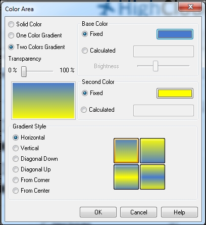
Note that the gradient used in the previous image is an example only, it is inadvisable to use these types of candy-colored gradients in your documents.
At 10 points, the default caption font in QlikView is quite big. Let's change the caption font by following these steps:
- From the Properties dialog window of the Carrier's Operating Region listbox, click the title's Font button on the Caption tab.
- Set the Size to
9in the Font Dialog. The font name and font style will be kept as default (Tahoma, Bold). - Click on OK to apply the changes and close the window.
Besides setting the caption font, we will also change the font used to display the listbox values. To do this, follow these steps:
- Right-click on the Carrier's Operating Region listbox and select Properties….
- Navigate to the Font tab.
- Change the font Size to
9. - Click on OK to close the Properties window.
An interesting feature in the Font Dialog wizard is the option to set a global Default Font option, found in the lower-left corner of the Font Dialog. By selecting either List Boxes, Chart, etc. or Text Objects/Buttons under Default Font, we can apply the currently selected font to all new objects of the selected class.
The Font Dialog window is shown in the following screenshot:

This setting is available from both the caption's font dialog and the content's font dialog.
By following the previously described procedures, we have set the appearance for a single listbox. To apply the same configuration to all of the remaining listboxes, right-click on the one we already configured, select Properties… from the context menu, and go to the Layout tab.
At the upper-right corner of the dialog window you will see an Apply to… button. Click on it and the Caption and Border Properties dialog window will appear. Make sure to mark the following options:
- The Apply properties to… checkbox should be enabled.
- Select the Objects in this document and All object types radio buttons.
- Mark the Set as default for new objects in this document checkbox.

- Click on OK on the two remaining dialog boxes to apply the changes.
The captions, as we've styled them now, still have a very basic look. As we noted at the start of this chapter, having a clean, basic style is not necessarily a bad thing, and in many cases is preferred. For now, however, we'll make our presentation a little bit flashier by setting another default Sheet Object Style, using the following steps:
- Open the Document Properties dialog by selecting Settings | Document Properties or by pressing Ctrl + Alt + D.
- Make sure the General tab is active.
- Set the Styling Mode option to
Advanced. - Set the Sheet Object Style option to
Glass. - Click on OK to apply the settings.
The object captions now have a glass-like appearance and rounded corners. The Advanced styling mode allows us to make additional changes to an object's style, such as setting rounded corners.
There are several pre-defined object styles available through the Sheet Object Style menu. The following screenshot shows how each available combination of Styling Mode and Sheet Object Style looks:
