We aim to involve our business users from the beginning of the customer fact sheet design. As a non-technical, collaborative process, we use Agile project tools, such as Post-It notes and a whiteboard to begin the design process. We begin by writing user stories that we think would be important to include in the fact sheet on Post-It notes.
The user epic we want to solve with our customer fact sheet is as follows:
This user epic then gets broken down into the following user stories that we can eventually translate into a type of data visualization:
- As a sales representative, I need to compare this year's accumulated sales against last year's sales so that I can detect changes to our customers' buying habits
- As a sales representative, I need to compare this year's accumulated sales against the budget so that I can detect whether I'm going to reach the company's objective
- As a sales representative, I need to know of any outstanding payment that is owed to the company so that I can remind the customer and identify the cause
- As a sales representative, I need to know a customer's available credit and payment performance so that I can be prepared if they ask for more credit
- As a sales representative, I need to know a customer's open opportunities and quotations so that I focus on their closing
- As a sales representative, I need to benchmark this customer against others so that I can identify opportunities to negotiate better terms
- As a sales representative, I need to know how well we have delivered our products or services and of any recent service complaints so that I can be prepared to address such issues
- As a sales representative, I need to know how much a customer is expected to purchase so that I can foresee any abnormal behavior
- As a sales representative, I need to know what products I can recommend to a customer so that I can increase sales
- As a sales representative, I need to be able to create my own visualizations so that I can easily answer any ad-lib questions
After we've written out the user stories, let's include a shorter version of each of them on a Post-it note and begin to arrange how we want to organize them in a customer fact sheet. Let's group related user stories together before determining what data visualization satisfies their requirements.

We create a scenario where a sales representative opens the customer fact sheet and reviews the first group of sales-related indicators. They first compare the current status of the YTD sales against last year's sales and the budget. The next information that they review is what is going to fuel the growth in these numbers in the short-term. This data can be found in open sales quotes and opportunities, in addition to the customer's available credit to close these new sales. The final sales indicators predict future sales and make suggestions to sell products that the customer has yet to purchase. We call this last concept cross-selling and recommend products based on what similar customers are purchasing.
After reviewing sales, the sales representative reviews post-sales activities that could affect future sales. The first indicator is the customer's A/R Balance and how much of it is overdue. They also analyze how well we as a company have delivered our products and whether there have been any service complaints.
Now that we have a general overview of our customer, we compare it with other customers using the customer stratification method that we've developed as a benchmarking method. We look closely at their profitability and DSO to give us a better idea how we should negotiate pricing and credit terms. Customer stratification also indicates with what priority we should follow up on all the previous indicators.
Once we've logically grouped our user stories and understood how they are interconnected, we convert each element of the story into a visualization. Just like the previous exercise, we design our customer fact sheet in a non-technical and highly collaborative way.
It is quite easy to create an application in QlikView, but it isn't as easy or as inclusive as using Post-it notes and a whiteboard. Although we can begin to design many applications directly in QlikView or develop visualizations in real time in front of the business users, we prefer a non-technical first approach for the following reasons:
- If business users actively participate in an application's design, then they will make it their own at an early stage and avoid asking for frivolous changes later.
- If we design a QlikView application in the presence of the business user, we risk getting hung up by a complex formula or data visualization. Nobody, especially a busy user, likes to wait ten minutes while someone is trying to figure out why their expression doesn't work properly.
- We break the habit of receiving asynchronous feedback about our designs, which can be less productive and create a discouraging 'us against them' attitude.
- We can use this collaborative design as part of our project documentation. A picture of the design may be worth a thousand or more words.
Today's collaborative technology still involves looking at our computer screens more than looking at our peers and, as such, we still do not have the same communication fidelity as a face-to-face activity. While video conference calls and virtual whiteboards may be the best solution for remote teams, it is otherwise better for everyone to gather around a real whiteboard with dry erase markers and Post-it notes.
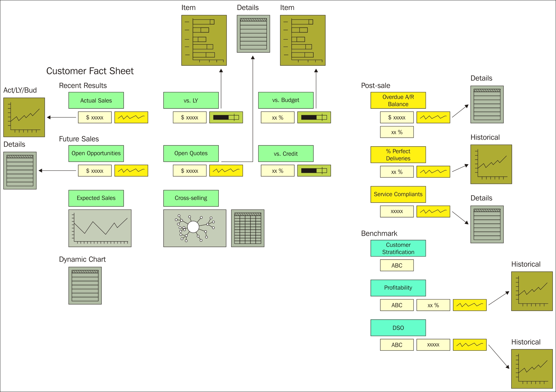
The following figure shows the layout of our customer fact sheet. As many data-analysis applications use the same set of visualizations, we can save time and paper by breaking down the visual components into smaller, reusable parts. For example, we can reuse the sparklines, bullet charts, tables, monetary numbers, and percentages for other collaborative design exercises.

Let's organize our fact sheet in the same way that we broke down the user stories. We start at the upper, left-hand side of the sheet and review the customer's recent sales activity. We propose to use the actual monetary amounts, a sparkline, and two bullet charts to show actual sales and compare it with last year's sales and the budget. The next section reveals possible future sales from opportunities and quotes along with these amounts in comparison with the customer's credit limit. We also add a line chart to evaluate expected customer behavior and cross-selling recommendations that may improve sales. We end the main section of the fact sheet with a dynamic chart that the sales representatives can use to do their own visual ad-hoc analysis.
On the upper, right-hand side of the sheet, we include visualizations that fulfill the user story requirements that are related to post-sales activities. We propose using actual and relative numbers along with sparklines to represent the customer's overdue A/R Balance, % perfect deliveries, and the number of service complaints.
Finally, we end the fact sheet by benchmarking our customer using the customer stratification method that we developed in previous perspectives. Along with a general rating, we also include details about profitably and DSO.
This design does a great job of introducing each concept and fulfills the basic requirements of each user story. However, we often cannot fulfill an entire user story requirement with only one visualization.
At first glance, the customer fact sheet should pique user curiosity and beg them to investigate each concept in greater detail. We can, of course, create a sheet that is dedicated to each section, but, many times, the user has a quick question that they want answered in one click without changing their context.
Alongside the general layout of the customer fact sheet, we include a second level of more detailed visualizations that users can access with one click. The following figure illustrates how we extend the original design to show how we want to display and visualize the details of several metrics.
Together with the user, we choose the appropriate visualization for each concept. We also plan to take advantage of Fast Change and Cyclical Dimensions to make them more dynamic. If a user has more questions that can't be answered will these two levels of visualization, then we can give them the opportunity to navigate to a sheet.