5
Layout with CSS Grid
Without a doubt, the biggest game changer to CSS layout has been Grid.
We now have a layout system capable of achieving everything we have done before with less code and more predictability, as well as enabling things we simply couldn’t do before!
I’d go as far as saying Grid is revolutionary rather than evolutionary. There are entirely new concepts to understand that have no real forebears in past CSS. As such, expect to take some time getting comfortable using it.
But trust me, it is worth it. Let’s go!
In this chapter, we will learn the following:
- What CSS Grid is and the problems it solves
- The essential concepts to understand when dealing with Grid Layout
- Grid-specific terminology
- How to set up a Grid
- How to position items in a Grid
- How to create powerful responsive patterns with minimal code
- How to understand and write the
gridshorthand syntax - The latest Grid addition,
subgrid
Toward the end of the chapter, you will also be tasked with a small exercise to use some of the techniques we have learned to refactor the layout of a portion of the https://rwd.education website we have been looking at in previous chapters.
Before I ask you to do that, I’d better get on with explaining what Grid is all about.
What CSS Grid is and the problems it solves
CSS Grid is a two-dimensional layout system. Flexbox, which we covered in the last chapter, concerns itself with items being laid out in a single dimension/direction at a time. A Flexbox container either lays things out in a row, or it lays them out in a column. It cannot facilitate laying out items horizontally and vertically at once; that is what Grid is for.
I should point out at the outset that you don’t need to choose between Flexbox or Grid when building projects. They are not mutually exclusive. I commonly use both, even within a single visual component.
To be completely clear, when you adopt Grid, you don’t have to forsake any other display methods. For example, a Grid will quite happily allow a Flexbox inside it. Equally, part of your interface coded with Grid can quite happily live inside a Flexbox, standard block, or inline-block.
So there are times when using Grid is the most appropriate option, and there are times when Flexbox, or another layout method, is the most appropriate.
The truth is, we’ve been creating grid-like layouts with CSS for years. We just haven’t had a specific grid layout mechanism in CSS to do it. We have made use of blocks, floats, tables, and many other ingenious techniques to work around the fact we didn’t have a proper Grid Layout system in CSS. Now, thankfully, we do.
Using CSS Grid, we can create grids of virtually infinite permutations and position child elements wherever we want them, regardless of their source order. What’s more, Grid even makes provision for when additional items are added and adapts itself to the needs of the content. This might sound hyperbolic, so let’s not waste any more text. Let’s get to it.
Basic Grid syntax
In the most simple terms, to use Grid, we need to tell the browser:
- How many rows and columns our grid should have
- How those rows and columns should be sized
- Where we want to place the items of our grid
- What should happen when the size of the grid changes or more items are added to the grid
Relating that to the browser is, therefore, just a matter of understanding the terminology.
Grid-specific concepts and terminology
The first concept to understand is explicit and implicit item placement. The Grid Layout you define in your CSS with columns and rows is the explicit grid; it’s the layout of the items you have explicitly defined. Meanwhile, the implicit grid is the grid placement of items that happens when additional items you didn’t foresee also get added to the grid. The placement of these new items is implied by the layout of your explicit grid. Don’t worry if that doesn’t make sense yet; it will!
The next concept that commonly confuses people (it certainly did me) is that grid lines are on either side of the grid items. The bit in the middle, between the lines, is referred to as a grid track. Where two tracks from different directions intersect is where a grid area is formed. This grab from the dev tools of Chrome should help illustrate the point:

Figure 5.1: Be aware that grid lines sit on either side of tracks, where the content lives
A key takeaway is that when you place items within a grid, you can do so by referencing the grid lines (which, therefore, implies a grid area) or the grid areas themselves, if they are named.
There is no limit, theoretically, to the number of tracks a grid can have. However, browsers are at liberty to truncate grids. If you set a value beyond the browser’s limit, the grid will be truncated to that limit. Practically, I can’t imagine hitting a browser’s limit being a likely scenario, but I’m mentioning it here for completeness.
Setting up a Grid Layout
Here is the introduction to the explicit grid section of the W3C specification (https://www.w3.org/TR/css-grid-1/#explicit-grids). It’s worth rereading a few times as it is dense with essential information for understanding how the grid works:
The three properties grid-template-rows, grid-template-columns, and grid-template-areas together define the explicit grid of a grid container. The final grid may end up larger due to grid items placed outside the explicit grid; in this case implicit tracks will be created, these implicit tracks will be sized by the grid-auto-rows and grid-auto-columns properties.
The size of the explicit grid is determined by the larger of the number of rows/columns defined by grid-template-areas and the number of rows/columns sized by grid-template-rows/grid-template-columns.
Any rows/columns defined by grid-template-areas but not sized by grid-template-rows/grid-template-columns take their size from the grid-auto-rows/grid-auto-columns properties. If these properties don’t define any explicit tracks the explicit grid still contains one grid line in each axis.
Numeric indexes in the grid-placement properties count from the edges of the explicit grid. Positive indexes count from the start side (starting from 1 for the start-most explicit line), while negative indexes count from the end side (starting from -1 for the end-most explicit line).
The grid and grid-template are properties that allow a shorthand to be used to set all three explicit grid properties (grid-template-rows, grid-template-columns, and grid-template-areas) at the same time. The grid shorthand also resets properties controlling the implicit grid, whereas the grid-template property leaves them unchanged.
Now, I’m conscious that when you haven’t worked at all with Grid Layout it can be very intimidating, and that quoted section from the specification might seem completely opaque right now. Hopefully, when you have read this chapter through, and played with Grid Layout yourself, it will make a little more sense.
Again, don’t worry if little of that previous text made sense. Let’s start our Grid journey in code with a very simple example. First, the world’s easiest Grid Layout: four numbered boxes.
It will look like this in the browser and you can find it in the chapter code as example_05-01:
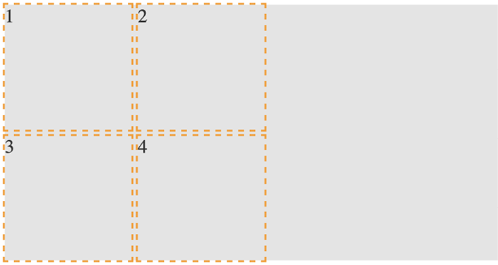
Figure 5.2: Our first grid; as simple as possible
<div class="my-first-grid">
  <div class="grid-item-1">1</div>
  <div class="grid-item-2">2</div>
  <div class="grid-item-3">3</div>
  <div class="grid-item-4">4</div>
</div>
The first thing I want you to consider is that with Grid, the markup pattern is a containing element, which is the grid, and the elements of the grid are the direct children. Write the markup for grid child elements in the order that makes the most sense for the content; Grid can place them visually wherever you need them. Here is the related CSS:
.my-first-grid {
  display: grid;
  grid-gap: 10px;
  grid-template-rows: 200px 200px;
  grid-template-columns: 200px 200px;
  background-color: #e4e4e4;
}
.grid-item-1 {
  grid-row: 1;
  grid-column: 1;
}
.grid-item-2 {
  grid-row: 1;
  grid-column: 2;
}
.grid-item-3 {
  grid-row: 2;
  grid-column: 1;
}
.grid-item-4 {
  grid-row: 2;
  grid-column: 2;
}
[class^='grid-item'] {
  outline: 3px dashed #f90;
  font-size: 30px;
  color: #333;
}
The parts to concentrate on in that CSS are the grid-specific properties. I’ve added some outlines and a background to make it easier to see where the grid is and the size and shape of the grid items.
We use display: grid to set our container as a grid and then use grid-template-rows: 200px 200px to set two rows, each 200 px high, and grid-template-columns: 200px 200px to set the grid to have two 200 px-wide columns.
In terms of the child elements of the grid, we use grid-row with a number to tell Grid Layout which row to place the item in and grid-column to tell it which column to place it in.
By default, the child elements of a grid remain as their standard layout type. Although our grid items belong to our grid, in this example, as they are all div elements, they are still computed as display: block. This is important to understand when we start trying to align grid items.
Let’s use the alignment properties we learned about in the last chapter to try centering our grid items:
.my-first-grid {
  display: grid;
  grid-gap: 10px;
  grid-template-rows: 200px 200px;
  grid-template-columns: 200px 200px;
  background-color: #e4e4e4;
  align-items: center;
  justify-content: center;
}
When I first started with Grid Layout and tried something like this, I expected to see the numbers perfectly centered in their respective grid tracks. However, that is not the case:

Figure 5.3: If you don’t set a width, a grid will consume the available space
If we think about what we have done, it does make sense. We made a grid, with two columns and two rows, each 200 px, and asked for the items to be both vertically and horizontally centered. Because we have used grid and not inline-grid, the grid fills the entire width of the page, despite the fact that our grid items don’t need all that space.
Let’s tweak this so that the grid is only as wide as its content. Furthermore, let’s center the items inside their respective grid items. To do that, we can make the items themselves either Flexbox or Grid. As this is a chapter about Grid, let’s try using that:
.my-first-grid {
  display: inline-grid;
  grid-gap: 10px;
  grid-template-rows: 200px 200px;
  grid-template-columns: 200px 200px;
  background-color: #e4e4e4;
}
[class^='grid-item'] {
  display: grid;
  align-items: center;
  justify-content: center;
  outline: 3px dashed #f90;
  font-size: 30px;
  color: #333;
}
If that selector with the hat symbol doesn’t make sense, don’t worry. We cover that in Chapter 6, CSS Selectors, Typography, and More.
We switched our container to be an inline-grid, set all the grid items to display: grid, and used the alignment properties justify-content and align-items.
That produces this result:
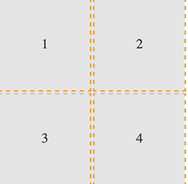
Figure 5.4: By making the child elements flex or grid, we can center their contents
You can find the code for this at example_05-02. As an exercise, try moving the position of the grid elements to different rows and columns.
OK, a little progress has been made. Let’s move on to the topic of explicit and implicit item placement.
Explicit and implicit
Earlier in the chapter, we discussed the difference between an explicit and implicit grid, an explicit grid being the structure you define in your CSS when setting up the grid. When more content is placed in that grid than you provisioned for, the implicit grid comes into effect.
Let’s look at that again by extending our prior example.
We’ll add in another item and see what happens:
<div class="my-first-grid">
  <div class="grid-item-1">1</div>
  <div class="grid-item-2">2</div>
  <div class="grid-item-3">3</div>
  <div class="grid-item-4">4</div>
  <div class="grid-item-5">5</div>
</div>
With that added, this is what we get in the browser:
Figure 5.5: The grid has added our item, but not with the kind of proportions we were hoping for
That’s sort of useful; the grid has created implicit grid lines to create an implicit track for our new item. Now, we didn’t tell it what to do with that extra item, so it made the best guess. However, we can control how Grid handles items implicitly with the following properties: grid-auto-rows and grid-auto-columns.
grid-auto-rows and grid-auto-columns
Let’s use grid-auto-rows and grid-auto-columns to make any extra grid items the same size as the existing ones:
.my-first-grid {
  display: inline-grid;
  grid-gap: 10px;
  grid-template-rows: 200px 200px;
  grid-template-columns: 200px 200px;
  grid-auto-rows: 200px;
  grid-auto-columns: 200px;
  background-color: #e4e4e4;
}
Now, without writing any extra CSS, when additional items are placed in our grid, they get the 200 px x 200 px sizing we have defined. Here, we have added another item in the DOM for a total of six:
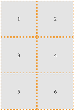
Figure 5.6: With some auto settings, extra elements can be added at a more preferable size
You can even make patterns so that the first extra item is one size and the next is another. The pattern gets repeated:
.my-first-grid {
  display: inline-grid;
  grid-gap: 10px;
  grid-template-rows: 200px 200px;
  grid-template-columns: 200px 200px;
  grid-auto-rows: 100px 150px;
  grid-auto-columns: 100px 150px;
  background-color: #e4e4e4;
}
Here’s what it looks like:
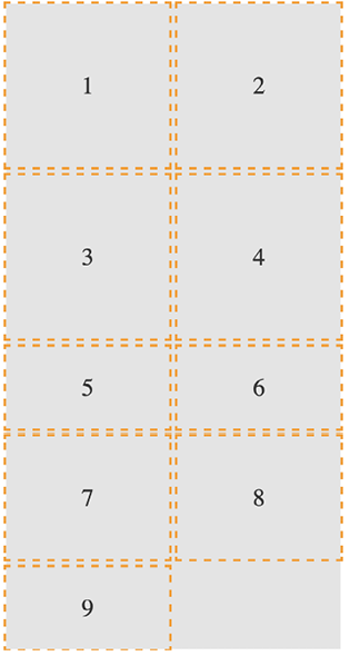
Figure 5.7: You can specify a sizing pattern for any auto-added rows or columns
Can you see how item 5 onward uses the pattern we defined in the value of the grid-auto-rows property? First, 5 and 6 are 100 px tall, then 7 and 8 are 150 px, and then back to 100 px for 9.
So far, you can see that the grid items are flowing vertically down the page. You can easily switch this to flow across the page instead! You can play about with this code in example_05-03.
grid-auto-flow
The grid-auto-flow property allows you to define the direction that any implicitly added items flow inside the grid. Use a value of column when you want the grid to add extra columns to accommodate extra items, and use a value of row when you want the grid to add extra rows.
Let’s amend our example by adding grid-auto-flow: column to make the items flow across the page instead of down:
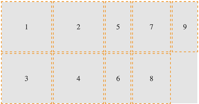
Figure 5.8: Switching the grid to add extra items horizontally
There is an additional dense keyword that can be added so that we have grid-auto-flow: column dense or grid-auto-flow: row dense – we’ll look at that shortly.
Placing and sizing Grid Layout items
So far, each item we have added to a grid has taken up a single grid area. We are going to start a new example now (you can find it in the code as example_05-04). This grid will have 20 grid items; these are just random foods and their source order within their container as a number. However, there are quite a few new things to go over in the CSS. Before we go through each new thing step by step, take a look at the code and the screenshot and see how much of it you can make sense of before reading on.
It’s also worth mentioning that I’ve purposely mixed up the use of whitespace in the values. You can write grid-row: 6 / span 2 or grid-row: 6/span 2 – either is just as valid. Just pick which you prefer.
Here’s the markup:
<div class="container">
  <div class="grid-item1">1. tofu</div>
  <div class="grid-item2">2. egg plant</div>
  <div class="grid-item3">3. onion</div>
  <div class="grid-item4">4. carrots</div>
  <div class="grid-item5">5. swede</div>
  <div class="grid-item6">6. scones</div>
  <div class="grid-item7">7. cucumber</div>
  <div class="grid-item8">8. carrot</div>
  <div class="grid-item9">9. yam</div>
  <div class="grid-item10">10. sweet potato</div>
  <div class="grid-item11">11. peas</div>
  <div class="grid-item12">12. beans</div>
  <div class="grid-item13">13. lentil</div>
  <div class="grid-item14">14. tomato</div>
  <div class="grid-item15">15. butternut squash</div>
  <div class="grid-item16">16. ham</div>
  <div class="grid-item17">17. pizza</div>
  <div class="grid-item18">18. pasta</div>
  <div class="grid-item19">19. cheese</div>
  <div class="grid-item20">20. milk</div>
</div>
Here is the CSS:
.container {
  font-size: 28px;
  font-family: sans-serif;
  display: grid;
  gap: 30px;
  background-color: #ddd;
  grid-template-columns: repeat(4, 1fr);
  grid-auto-rows: 100px;
  grid-auto-flow: row;
}
[class^='grid-item'] {
  outline: 1px #f90 dashed;
  display: grid;
  background-color: goldenrod;
  align-items: center;
  justify-content: center;
}
.grid-item3 {
  grid-column: 2/-1;
}
.grid-item6 {
  grid-row: 3/6;
  grid-column: 3 / 5;
}
.grid-item17 {
  grid-row: 6 / span 2;
  grid-column: 2/3;
}
.grid-item4 {
  grid-row: 4 / 7;
}
And here is what we get in the browser:
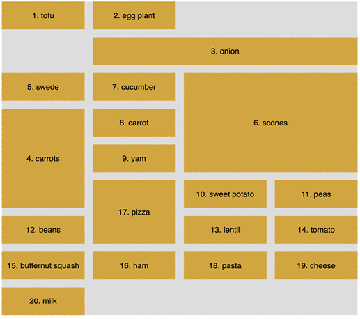
Figure 5.9: Grid items sized arbitrarily
We’ve introduced a few new things here. Let’s cover each in turn, starting with how we have achieved a nice uniform gap between grid elements.
gap
I’ve used gap in some of the prior code samples, but I’ve not explained it. Forgive me! The gap property lets you specify a gap between grid tracks. It is actually shorthand for both row-gap and column-gap. Just like when you specify a margin with two values, the first value applies to the top and bottom (row), and the second to the left and right (columns). If you specify a single value, as we have, it applies to both.
It’s especially useful because, unlike dealing with padding or margin when laying things out, you don’t need to worry about undoing it again on the final item; gap only applies between the items. You should also be aware that all modern browsers allow you to apply gap to Flexbox items too!
repeat
If you were making a grid with 30 identical columns, it would get a little tiring having to write auto 30 times, for instance, grid-template-columns: auto auto auto auto auto auto...; in fact, I got bored just writing that!
Thankfully, the Grid Layout specification writers have blessed us with repeat(). As you might have guessed, the repeat() function provides a convenient way of stamping out the need for any number of items. In our example, we have used it to create four columns, all 1fr in width:
repeat(4, 1fr);
The format of the syntax is that, inside the parentheses, the first value is the number of times you want something repeated, and the second value is the width of each item.
Don’t worry, I’ll explain fr units in a moment; for now, just know that you can create multiple columns/rows with ease. Do you want 15 columns, all 100 px wide? It’s as easy as repeat(15, 100px).
fr units
The fr unit represents “flexible length” and stands for “flex fraction.” It’s used to communicate how much of any available free space we want something to gobble up, much like the flex-grow unit we covered for Flexbox in Chapter 4, Fluid Layout and Flexbox.
The specification doesn’t say so, but I conceptualize fr as standing for “free room” when I’m thinking about a layout. In our example, we have made four columns, each taking up one portion of the available free room.
Placing items in the grid
Before this example, we have been positioning each grid item in a single grid area. However, here, we have certain grid items being assigned spans of columns or rows numerically.
Let’s take the grid-item3 example:
.grid-item3 {
  grid-column: 2/-1;
}
Here, the grid-column property is being set to start at the second grid line and end at the -1 grid line. The -1 looks pretty odd at first, but it is part of a very smart piece of syntax.
The first number is the start point, which is separated from the endpoint with a forward slash, /. Positive numbers count from the start side, the left-hand side in our column example, while negative numbers start from the end side, the right, in this instance. So, -1 basically just means the last grid line. So, this nice terse syntax just reads: “Start at line 2 and go to the end.”
There’s an example of spanning across rows in there too. Take a look at this one again:
.grid-item4 {
  grid-row: 4 / 7;
}
This one says, “Start at grid row line 4 and end at grid row line 7.” If your preference is not telling the Grid where something ends and more how much space something should span, Grid Layout has just the property for you.
span
Take a look at the CSS for .grid-item17 now:
.grid-item17 {
  grid-row: 6 / span 2;
  grid-column: 2/3;
}
Can you see how we have done something a little different with the value for grid-row?
Rather than stipulating a definite start and end point when placing grid items, you can give one or the other and then tell the item to span a number of rows/columns from that point either forward or backward. In our example, we told the item to start at grid line 6 and span 2 rows.
I find going backward a little more confusing, but that might just be me! But to illustrate, we could achieve the same visual effect for our example by changing that line to grid-row: span 2 / 8. In this instance, the definite point we have is the endpoint, so we are telling the grid to make the item start at grid row 8 and span 2 back from there.
dense
Remember when we looked at grid-auto-flow, I mentioned the dense keyword? Well, this is the perfect opportunity to show you what that does. I’ll amend the value of the grid-auto-flow property to this: grid-auto-flow: row dense;. And here is what it does in the browser:
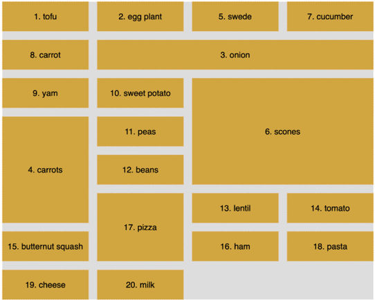
Figure 5.10: The “dense” keyword rearranges grid items so that gaps are removed
Can you see how the gaps have been filled? That’s what dense does for you. However, while this might seem more aesthetically pleasing, there is a cost. The reason the items are numbered is that I wanted to highlight to you that using dense tells the Grid Layout algorithm to move things, visually, from their source order to any available space. Notice how in this instance the items are not necessarily in source order? That’s the cost of the visual nicety.
So far, we have been laying things out using the numbers of the grid lines. However, if you would rather name the grid lines, that is something you can do too.
Named grid lines
Grid Layout allows authors to work with grids in a number of ways. For example, if you’d rather work with words than numbers, it’s possible to name grid lines. Consider a 3-column by 3-row grid.
You can find this example in the book’s code as example_05-05:
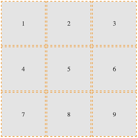
Figure 5.11: We will use named grid lines to rearrange our elements
Here’s our markup:
<div class="my-first-grid">
  <div class="grid-item-1">1</div>
  <div class="grid-item-2">2</div>
  <div class="grid-item-3">3</div>
  <div class="grid-item-4">4</div>
  <div class="grid-item-5">5</div>
  <div class="grid-item-6">6</div>
  <div class="grid-item-7">7</div>
  <div class="grid-item-8">8</div>
  <div class="grid-item-9">9</div>
</div>
We set the grid up with this rule. Note the words in square brackets:
.my-first-grid {
  display: inline-grid;
  grid-gap: 10px;
  grid-template-columns: [left-start] 200px [left-end center-start] 200px
  [center-end right-start] 200px [right-end];
  grid-template-rows: 200px 200px 200px;
  background-color: #e4e4e4;
}
What we are doing inside the square brackets is giving a name to the grid line. In this instance, the first column grid line we have named left-start, and the one after the first column we have named left-end. Notice that, in the center grid line, we have assigned two names: left-end and center-start. We can do this by space-separating the names. In this situation, it makes sense because that grid line is both the end of the left column and the beginning of the center one.
Let’s amend our grid-template-row and add some named grid lines there too:
grid-template-rows: [top-start] 200px [top-end middle-start] 200px [middle-end bottom-start] 200px [bottom-end];
Here’s an example of how we can use these names to position grid items instead of numerical values. This is just the first three of the items we will see in the following diagram:
.grid-item-1 {
  grid-column: center-start / center-end;
  grid-row: middle-start / middle-end;
}
.grid-item-2 {
  grid-column: right-start / right-end;
  grid-row: bottom-start / bottom-end;
}
.grid-item-3 {
  grid-column: left-start / left-end;
  grid-row: top-start / middle-start;
}
In the example code, I have set each grid item to a random position using this technique. You can see how the three above are placed in this diagram:
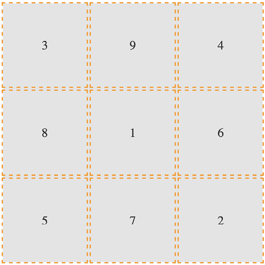
Figure 5.12: You can move things around just as easily with named grid lines
In specification terms, the name we assign to a grid line is known as a custom ident. Because they are just words, avoid using terminology that might interfere with grid keywords. For example, don’t start naming grid lines “dense,” “auto-fit,” or “span”!
Grid Layout has an extra nicety you can make use of when you use named grid lines. If you append your names with -start and -end, as we have in our example, then grid automagically (yes, I know, that’s not a real word) makes you a named grid area. Wait, what? Yep, that means that once you have named your grid lines, you can place items in your grid with a one-line grid-area. To prove that point, here are just the first three grid-item rules from earlier rewritten this way:
.grid-item-1 {
  grid-area: middle / center;
}
.grid-item-2 {
  grid-area: bottom / right;
}
.grid-item-3 {
  grid-area: top / left;
}
I’ve gotten a little bit ahead of myself now, as I have introduced grid-area without any explanation. Let’s cover that now.
grid-template-areas
Yet another way you can work with Grid Layout is to create grid template areas to establish the areas of your grid. Let’s rework our prior example and we will remove the named grid lines entirely, starting again with this basic CSS for the grid.
This is example_05-06 in the code:
.my-first-grid {
  display: inline-grid;
  grid-gap: 10px;
  grid-template-columns: 200px 200px 200px;
  grid-template-rows: 200px 200px 200px;
  background-color: #e4e4e4;
}
[class^='grid-item'] {
  display: grid;
  align-items: center;
  justify-content: center;
  outline: 3px dashed #f90;
  font-size: 30px;
  color: #333;
}
Now, we will define our grid template areas like this, which we will add to the .my-first-grid rule:
grid-template-areas:
  'one two three'
  'four five six'
  'seven eight nine';
With grid-template-areas, we can define rows and columns very simply. A row is defined with quotes (double or single), with the names of each column space-separated inside. Each row in the grid is just another pair of quotes with custom idents inside.
You can use numbers for the start of each grid area, but you then need to escape them when you reference them.
Escaping a character, in computer terms, is a means of invoking an alternative interpretation of the character. It is a way of being more explicit about the meaning you would like a certain character to have that could potentially be interpreted in multiple ways.
For example, if one of our areas was named “9,” it would have to be referenced like this: grid-area: "39;". I find that too burdensome, so I suggest using a string for each area or, at least, starting each custom ident with an alpha character.
And that means we can position our items with grid-area like this:
.grid-item-1 {
  grid-area: five;
}
.grid-item-2 {
  grid-area: nine;
}
.grid-item-3 {
  grid-area: one;
}
Admittedly, this is a simplistic example, but hopefully, you can imagine a more useful scenario: perhaps a blog layout with a header, left-hand sidebar area, main content area, and footer. You might define the necessary grid-template-areas like this:
grid-template-areas:
  'header header header header header header'
  'side side main main main main'
  'side side footer footer footer footer';
As the specification (the link for the relevant section follows) states that any whitespace character fails to produce a token, which for our purposes simply means delineating one area from another, you could opt to separate columns with tab characters if you would rather, to aid in visually lining up the columns: https://www.w3.org/TR/css-grid-1/#valdef-grid-template-areas-string.
When you write the grid template areas, the indentation is not important, nor are the carriage returns; you could lay each row out in a long space-separated list if you liked. As long as the names for each area are inside quotes, with a whitespace character between each, and there is a space between each set of quotes, all is well.
Let’s move on to some even more advanced Grid Layout techniques now.
auto-fit and auto-fill
auto-fit and auto-fill are “repeat-to-fill” keywords used to describe repetition to Grid.
Thanks to the similarity of their names, I can’t help but feel that the auto-fit and auto-fill keywords are almost guaranteed to confuse – just like cover and contain do for background image-sizing (we cover them in Chapter 8, Stunning Aesthetics with CSS).
The upshot of this is that I frequently have to check which one is which. Thankfully, for both our benefits, we’re going to clarify what each of these does now, and why you might want to use them.
Let me start with the why, as that covers both keywords. What if I told you that with the help of auto-fill or auto-fit, we can create a fully responsive grid that adds/removes columns based upon the available size of the viewport, with no media queries needed?
Compelling, right?
Consider a 9-column grid, where each column is at least 300 px wide. In a slightly back-to-front way, I want to start this by showing you the solution:
grid-template-columns: repeat(auto-fit, minmax(300px, 1fr));
And here is what that gives you in the browser in a smaller viewport:
Figure 5.13: One line with Grid gives you a mobile layout…
And the same thing on a wider screen:
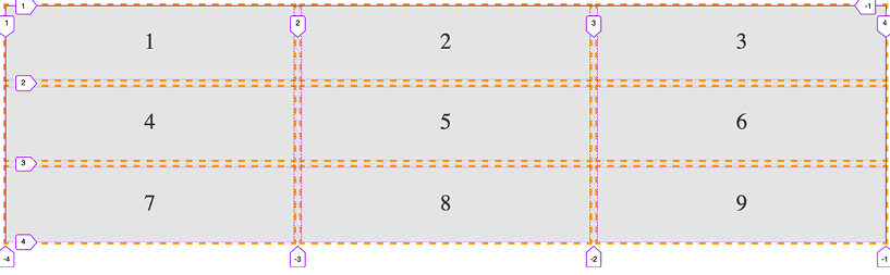
Figure 5.14: …and also a layout for wider viewports!
Pretty handy, right?
Let’s break down all the magic in that one-liner.
We are using grid-template-columns, as we have done before, to set up the columns of our grid. We are using the repeat() function to set up a repeating pattern of columns; however, instead of passing in a number of columns, we tell the grid to auto-fit. We may have used auto-fill there too, but we’ll get to the differences between them in a moment. For now, we have told the browser to repeatedly create auto-fit columns, and we define the width of those columns using the minmax function.
The minmax() function
Now, if you are new to Grid, it’s likely you haven’t used minmax() before. It’s a CSS function that allows you to set up a range for the browser. You specify a minimum size and a maximum size, and it computes something in between based on the available space. In our example, we are passing minmax() a minimum size of 300 px and a maximum size of 1 fr (remember, it might help to think of fr as “free room”).
When dealing with minmax(), if you specify a maximum size that is smaller than the minimum, the maximum will be ignored and the minimum will be the computed value.
With that set, the grid “auto-fits” columns that are at least 300 px wide and no more than the size of its content plus a 1fr share of any remaining space.
In practical terms, this provides a responsive layout that lets our grid resize itself based on the available viewport width.
To more easily show you the difference between auto-fit and auto-fill, let’s revise our one-liner to a minimum of 100 px:
grid-template-columns: repeat(auto-fit, minmax(100px, 1fr));
That gives us this layout on a wide viewport:

Figure 5.15: Using auto-fit will fit our content into the available space
Note how the columns span the entire width of the page. Now we will change to auto-fill:
grid-template-columns: repeat(auto-fill, minmax(100px, 1fr));
Here is what that produces:

Figure 5.16: Using auto-fill, any spare space is filled up with invisible columns
Notice the space at the end? What happened there?
The key to understanding the difference comes down to whether spare columns are collapsed or not.
When the browser creates the grid in both auto-fit and auto-fill, it initially lays them out the same. However, when using auto-fit, any extra columns left, having laid out the content, are collapsed, leaving that space free to be distributed evenly between the items in the row. In our example (play about with it in the code as example_05-07), because each item also has a maximum size of 1fr unit, each takes up an equal portion of that free space. This results in columns that span the entire width of the space.
However, with auto-fill, once the items (in our example, 100 px wide) are laid out, if there is any extra space, the extra empty columns are not collapsed. They remain in situ, filled up, and subsequently the space is not free for the grid items to gobble up. The result is that we get space at the end.
There will be instances where one is more appropriate than the other; just be aware that you can achieve either.
Shorthand syntax
There are a couple of shorthand syntaxes you can use with Grid: one relatively straightforward, one less so. The first one that you’ll probably find most utility for is grid-template.
While shorthand syntaxes can be great, my advice would be to write your grids one property at a time, at least to begin with. When you get confident enough that writing each property and value out individually becomes a chore, take the time to learn the shorthand variant.
With that advice dispensed, let’s look at these two shorthand methods.
grid-template shorthand
This allows you to set grid-template-rows, grid-template-columns, and grid-template-areas in one line.
So, for example, for a grid with two 200 px rows and three 300 px columns, we could write:
grid-template: 200px 200px / 300px 300px 300px;
Or, if you’d rather do it with the repeat function, you could write:
grid-template: repeat(2, 200px) / repeat(3, 300px);
The part before the forward slash (/) deals with the rows and the bit after the columns. You can add grid-template-areas in there too if you like:
grid-template:
  [rows-top] 'a a a' 200px
  'b b b' 200px [rows-bottom]
  / 300px 300px 300px;
That computes to this in the browser:
grid-template-rows: [rows-top] 200px 200px [rows-bottom];
grid-template-columns: 300px 300px 300px;
grid-template-areas: 'a a a' 'b b b';
Personally, I find that once you start mixing in named template areas alongside numerical values, it starts to get too confusing to understand easily. Regardless, some people love the shorthand syntax (maybe you will be one of them), and you should be aware it’s possible.
However, we’re going to take it up another notch now and deal with the grid shorthand.
grid shorthand
The other shorthand syntax, grid, lets you define a grid all in one line.
Using this one property, you can set the properties controlling the explicit portion of a grid: grid-template-rows, grid-template-columns, and grid-template-areas, as well as the properties controlling the implicit part of a grid: grid-auto-rows, grid-auto-columns, and grid-auto-flow.
An essential concept to hold onto when writing the grid shorthand is that a grid can only grow implicitly with either rows or columns, not both.
At first, that might seem odd, but if you think about it, how would a grid that could add both rows and columns implicitly lay items out? How would it decide whether to add rows or columns?
So, with that in mind, we can endeavor to wrap our heads around the grid shorthand.
The grid shorthand is not for the faint-hearted, so don’t be discouraged if it spits you back out a few times before you get to grips with it. I consider myself pretty familiar with CSS (I know, you’d hope so, right?), but it took me hours rather than minutes to feel confident with what the grid shorthand syntax was doing.
I hope you know your Backus-Naur form, because here is how the property is described in the specification:
<'grid-template-rows'> / [ auto-flow && dense? ] <'grid-auto-columns'>? [ auto-flow && dense? ] <'grid-auto-rows'>? / <'grid-template-columns'>
Simple, right?
I kid, of course. At this point, when trying to understand a specification, I tend to search out this piece on understanding CSS specifications: https://www.smashingmagazine.com/2016/05/understanding-the-css-property-value-syntax/.
After rereading that, I’ll now do my best to distill that piece of the specification into something more human-friendly.
What that means is, the grid shorthand can accept any one of three different sets of syntax as its value.
grid shorthand value – option one
This is the same value that you would use if you were using grid-template. For example, here is a grid with two 100 px rows and three 200 px columns:
grid: 100px 100px / 200px 200px 200px;
Just like with our grid-template examples from earlier, you can also use grid-template-areas if you like.
grid shorthand value – option two
This involves specifying a set of lengths for explicit grid rows, then, separated by a forward slash, a definition for how you want to handle implicit columns. This can be auto-flow to set grid-auto-rows, with the option of setting grid-auto-flow by adding dense too. Or, alternatively, you could add a length value for the width of the columns if you want to set grid-template-columns instead.
Phew, that’s a lot to compute. Take a look at some examples.
So, for a grid with two explicit 100 px rows and any number of explicit columns that are 75 px wide:
grid: 100px 100px / repeat(auto-fill, 75px);
With this grid, should you have too many items, they will spill over into the implicit rows with a default size of auto.
In the browser, that shorthand will compute to the following:
grid-template-rows: 100px 100px;
grid-template-columns: repeat(auto-fill, 75px);
grid-template-areas: none;
grid-auto-flow: row;
grid-auto-rows: auto;
grid-auto-columns: auto;
Let’s try another. Say we want to lay out a grid that has only one row, 100 px high, but any number of columns, potentially running off the side of the container:
grid: 100px / auto-flow;
That rule computes to the following:
grid-template-rows: 100px;
grid-template-columns: none;
grid-template-areas: none;
grid-auto-flow: column;
grid-auto-rows: auto;
grid-auto-columns: auto;
It’s also worth knowing that, when you use the grid shorthand, you are resetting all of the values it deals with back to their initial state. You can see that if you look at the computed values of styles in the developer tools of your browser.
grid shorthand value – option three
The final syntax you can pass to grid is effectively the opposite of option two. This time, you set grid-auto-flow to handle implicit rows (with an optional dense) with an optional grid-auto-rows value for the size of the rows. Then, after the forward slash, we handle grid-template-columns.
With this kind of value, we are getting our grid to lay out in rows when needed, rather than in columns, as in the previous option. Here are some examples.
How about a grid that creates as many 100 px rows as needed and 5 columns that occupy 1fr each?
grid: auto-flow 100px / repeat(5, 1fr);
That computes to this:
grid-auto-columns: auto;
grid-auto-flow: row;
grid-auto-rows: 100px;
grid-template-areas: none;
grid-template-columns: 1fr 1fr 1fr 1fr 1fr;
grid-template-rows: none;
Or, what about a grid that creates a single column with as many 100 px rows as needed for the content?
grid: auto-flow 100px / auto;
That computes to this:
grid-auto-columns: auto;
grid-auto-flow: row;
grid-auto-rows: 100px;
grid-template-areas: none;
grid-template-columns: auto;
grid-template-rows: none;
You can see that the grid shorthand is very powerful but, arguably, not particularly intuitive. For some people, the shorthand is preferable. For some, it is maddening. There is no right or wrong – just what is right or wrong for you.
It won’t be long into working with Grid before you hit a seemingly ridiculous shortcoming. If you are dealing with nested elements and wondering why on earth you are not able to make them align with your grid, welcome to the long list of other developers who have thought that very thing. So, what can we do about it?
Allowing nested elements to take part in the Grid
It is important to be aware that when you define a grid, it is only the direct descendant elements of that grid element that can participate in the layout. The children of those direct descendants cannot.
There are more flexible solutions to this shortcoming on the horizon in the form of subgrid. However, right now, subgrid only has an implementation in Firefox and Safari, so we will only take a cursory look at that in a moment.
One way we can work around this particular problem right now is with display: contents.
What the display: contents declaration does is effectively make the layout aspect of the element it is set on – and crucially, not the accessibility side – disappear, allowing the children of that element to behave visually, as if the parent element didn’t exist.
Let’s consider this markup, and try this out for yourself as we go, by playing with example_05-08:
<div class="container">
    <div class="child">Child-1</div>
    <div class="child">Child-2</div>
    <div class="parent">
        <div class="grandchild">Grandchild 3</div>
        <div class="grandchild">Grandchild 4</div>
    </div>
</div>
.container {
    display: grid;
    grid: repeat(2, 200px) / repeat(2, 200px);
}
[class*='child'] {
    border: 2px dashed orange;
}
And by default, that gives us something like this in the browser:

Figure 5.17: By default, descendants of grid items cannot take part in the grid
You can see that the two grandchildren elements are not taking part in the grid. We can solve that like this:
.parent {
    display: contents;
}
By setting the parent element to have display: contents, we are allowing the element to display its contents and therefore allowing those elements to participate in the grid layout.

Figure 5.18: Setting display: contents on an element stops it from producing its own box, allowing child elements to take part in the layout
You are then able to position those elements in the grid as if the parent element didn’t exist.
The subgrid value
Part of the Level 2 CSS Grid Layout specification deals with the subgrid value. There is every chance that, as you read these words, subgrid will already be available to use. However, support for it will not be ubiquitous for some time.
As ever, you can check support levels at https://caniuse.com/css-subgrid, and read the specification here: https://www.w3.org/TR/css-grid-2/#subgrids.
In essence, subgrid provides a mechanism for non-direct child elements of a grid ancestor to inherit their grid tracks. Using subgrid is as simple as setting subgrid as the value of either grid-template-columns or grid-template-rows, or both.
Let us start with the subgrid value by solving the same problem we solved with display: contents in the last section.
When using the subgrid value, instead we would set the CSS for the .parent like this (you can view the full code in example_05-09):
.parent {
    display: grid;
    grid-template-columns: subgrid;
    grid-column: span 2;
}
And just like that, this particular problem is solved.
However, for solving that particular problem, we have actually used more code than the prior solution with display: contents, but bear with me. We can understand how it works with this simple example before we look at something more involved.
First, we are making the .parent element a grid, and then crucially telling it that we want the template for the columns to be a subgrid, so that it will inherit the columns from the ancestor grid it is part of.
Next, we need to tell the browser how big this element is going to be in the ancestor grid it is part of. Here we have set it to span 2 columns, making it the full width of the ancestor grid, as, remember, the ancestor grid is made up of two columns.
With that in place, the .grandchild elements happily position themselves in the next available column. We don’t need to do anything extra with them.
Let’s look at one further, slightly more involved example. Consider this screenshot:

Figure 5.19: Without subgrid, the labels at the bottom are out of alignment
Here, we have a horizontally scrolling component containing images of different planets of our Solar System. Crucially, notice how, due to the information text that accompanies each planet, the caption for the image doesn’t sit at the same level? While that is a problem we could fix with other means and approaches, subgrid is a perfect fit.
Here it is with our subgrid code in place. Notice how the captions below each planet line up perfectly? Let’s look at how this is done.

Figure 5.20: subgrid allows us to inherit the row and column tracks of a parent grid
Firstly, consider the markup. We have a containing element with the class of .Scroll_Wrapper to create the scrolling section, and then a number of figure elements, each with a class of .Item, and containing a planet image and associated information.
For brevity, I’ll just show you the HTML for the opening of the containing element, and one of the planets (the full code is at example_05-10):
<div class="Scroll_Wrapper">
    <figure class="Item">
        <img src="Sun.jpg" alt="Our Sun in space" />
        <figcaption class="Caption">The Sun</figcaption>
        <p>
            The Sun is a yellow dwarf star, a hot ball of glowing gases
            at the heart of our solar system. Its gravity holds everything
            from the biggest planets to tiny debris in its orbit.
        </p>
    </figure>
To set up the outer grid on the container, we have this:
.Scroll_Wrapper {
    display: grid;
    width: 100%;
    overflow-y: hidden;
    overflow-x: auto;
    gap: 0 20px;
    grid-template-rows: auto auto;
    grid-auto-columns: auto;
    grid-auto-flow: column;
}
Those are all grid-related properties you have seen already in this chapter. Now, as we are interested in positioning the contents of each planet, our .Item element, against that grid, we need to introduce subgrid.
We need our element to be a grid itself and, crucially, we need the rows to inherit from the nearest ancestor grid:
.Item {
    grid-row: 1/-1;
    display: grid;
    grid-template-rows: subgrid;
    grid-template-columns: 100px 200px;
    gap: 0 20px;
    margin: 0;
}
As the .Item is itself part of an outer grid, we need to tell it how it should be positioned in that grid, so setting grid-row: 1/-1 tells it to start at the first row and end at the last.
We then set the rows for this item’s own grid with grid-template-rows, but use subgrid to get the row layout from the parent (the .Scroll_Wrapper).
With that in place, we can set the row and column positions of child elements inside the grid as we would normally. But the “magic” part is: because our rows are connected to the outer grid via the subgrid value, it means they are sized with the largest child in mind, which in turn means that all the internal elements of each .Item can line up.
When you hit these kind of child element problems with Grid, if you simply need to remove a containing element, as if it wasn’t there, opt for display:contents. If, however, you need to keep the containing element – perhaps it has a background color or image – then subgrid is the best choice.
This is but one simple use case of a layout conundrum that can be easily solved with subgrid. The exercise that follows will present another to put your mind to.
Applying what you have learned so far
As an exercise, consider this section of the https://rwd.education website:
Figure 5.21: Can you use your grid knowledge to lay out this section?
If you look in the Start folder for this chapter’s code, you will see that, currently, those sections are just one under the other. Try to amend the code for that section using Grid Layout. Perhaps think about how you could easily have it showing one or two of those sections when screen space is limited, and the layout that is shown in the preceding screenshot when space allows.
And what about if the headings for those sections wrap? Do you want to make use of the subgrid value to ensure they stay visually aligned?
Summary
If you are fairly new to building on the web, you almost have an advantage when it comes to learning CSS Grid: a “beginner’s mind,” if you like. For people that have been laying things out with other techniques over the years, the difficulty, in some ways, is undoing what you already know about layout with CSS.
Having read this chapter, you should have some understanding of what is possible with Grid Layout and how you might employ it.
Plus, with subgrid more recently joining the existing capabilities of CSS Grid, we now have an incredibly powerful, complete, and expressive method of laying out elements on our page with CSS.
I should also ask that, if you were in any way successful with the exercises, you congratulate yourself; there’s a lot to consider when you first start using Grid. If you accomplished something with your first effort, you did admirably.
At this point, I’ll also reiterate that Grid is tricky at first. It comes with a lot of possibilities but also quite a few new pieces of terminology and concepts. Expect to take a few runs at it the first time you use it.
Personally, I found the easiest approach was to start remaking a few things I already had built in Flexbox with Grid. Start simple, and write the style of syntax that makes the most sense for you. I still rarely write the shorthand versions, as despite the attractiveness of a terse one-liner, I find them hard to interpret and understand at a glance. For me, clarity trumps brevity.
Regardless of the approach you take, I promise that, once you get competent, CSS Grid will pay you back handsomely for your investment.
These last two chapters, on Flexbox and Grid, have covered single topics in some detail. The next chapter is going to be more broad: a veritable grab-bag of CSS goodies. Turn that page, and let’s move on to Chapter 6, CSS Selectors, Typography, and More.