1
The Essentials of Responsive Web Design
When the first edition of this book came out in 2012, responsive web design was a new and exciting possibility to address the needs of the ever-growing list of devices that could access the internet. A decade later, as I write this in 2022, it’s simply the de facto standard. If you’re building a website or web application and it isn’t responsive, you’re probably doing it wrong!
This first chapter serves as a quick and basic refresher on building out an extremely simple web design, responsively. By the end, we will have covered everything needed to author a fully responsive web page.
You might be wondering, why do we need the other chapters then? By the end of this chapter, that should be apparent too.
Here’s what we will cover in this first chapter:
- The ever-evolving browser and device landscape
- Defining responsive web design
- Setting browser support levels
- A brief discussion on development tools and text editors
- Our first responsive example: a simple HTML5 page
- The viewport
metatag - Fluid images
- Writing CSS3 media queries to make pages adapt
- The shortfalls in our basic example
- Why our journey has only just begun
Are you sitting comfortably? Then we will begin!
The browser and device landscape
A little over a decade ago, it was reasonable to build websites with fixed widths. The device landscape was a whole lot more limited, so the expectation was that all end users would get a fairly consistent experience. This fixed width (typically 960 px wide or thereabouts) wasn’t too wide for laptop screens, and users with large-resolution monitors merely had an abundance of space on either side.
But in 2007, Apple’s iPhone ushered in the first truly usable phone browsing experience, and the way people accessed and interacted with the web changed forever.
In the first edition of this book, published in early 2012, the following was noted about the percentage of total browser usage by device type recorded at gs.statcounter.com:
…in the 12 months from July 2010 to July 2011, global mobile browser use had risen from 2.86 to 7.02 percent…
By September 2019, writing the third edition, using StatCounter, mobile was a whopping 51.11%, desktop was 45.18%, and tablet was 3.71%.
As I write this latest edition, the latest data at gs.statcounter.com for July 2022 shows an even more pronounced change with mobile at 60.73%, desktop at 37% and tablet at 2.27%..
The indisputable fact is that the number of people using smaller-screen devices to view the internet is growing at an ever-increasing rate, while at the other end of the scale, 40-inch ultrawide displays are now also commonplace (along with various tablet and console devices). There is now more difference between the smallest screens browsing the web and the largest than ever before.
Thankfully, there is a solution to this ever-expanding browser and device landscape. A responsive web design, built with HTML and CSS, allows a website to “just work” across multiple devices and screens. It enables the layout and capabilities of a website to respond to their environment (screen size, input type, device/browser capabilities).
Defining responsive web design
The term responsive web design was coined by Ethan Marcotte in 2010. In his seminal A List Apart article, http://www.alistapart.com/articles/responsive-web-design, he consolidated three existing techniques (flexible grid layout, flexible images/media, and media queries) into one unified approach and named it responsive web design.
Responsive web design in a nutshell
To attempt to put the philosophy of responsive web design in a “nutshell,” I would say it’s the presentation of web content in the most relevant format for the viewport and device accessing it.
In its infancy, it was typical for responsive design to be implemented by starting with a fixed-width desktop design before trying to scale the design down as needed for smaller screens. However, processes evolved and it became apparent there was a better way. Namely, that everything from design to content management and development worked better when starting with the smallest screens first, and then “progressively enhancing” the design and content for larger screens and/or more capable devices. If the term “progressive enhancement” makes no sense right now, fear not. We’ll be talking about that again in a moment.
Before we get into things fully, there are a few subjects I’d like to address and get squared away before we continue: browser support, text editors, and tooling.
Browser support
The sheer volume of disparate devices that access the web means most people understand the need for technical solutions that cater to most devices.
The popularity and ubiquity of responsive web design usually make the approach an easy sell to clients and stakeholders. Nowadays, most people have some idea what responsive web design is about, even if that understanding amounts to little more than “a website that looks good and works on phones as well as computers.”
However, one question that almost always comes up when starting a responsive design project is that of browser support. With so many browser and device variants, it’s not always pragmatic to support every single browser permutation fully. Perhaps time is a limiting factor, perhaps money. Perhaps both.
Typically, the older the browser, the greater the work and code required to achieve feature or aesthetic parity with modern, evergreen browsers such as Firefox or Chrome. Be as pragmatic as possible.
By the same token, we are going to practice progressive enhancement, in essence, starting with a functional and accessible website for the most basic browsers, which will get progressively enhanced with features for more capable browsers. It should be a very rare occasion indeed that you are forced to create a website that isn’t at least functional on an old browser or device.
Ultimately, the only browser statistics that really matter are yours.
If you are working on a greenfield project, where there is no existing browser usage data, you can at least think about the demographics of your target audience and make some broad assumptions about likely devices/browsers based on those demographics.
Before considering any web project it makes sense to decide, in advance, what platforms you need to fully support and which you are happy to concede visual/functional anomalies to.
For example, if you’re unlucky enough to have 25% of your website visitors stuck using old versions of iOS (for example), you’ll need to consider what features that browser supports and tailor your solution accordingly.
To this end, if you aren’t already, become familiar with websites such as http://caniuse.com. Can I Use provides a simple interface for establishing the browser support for each web platform feature.
Generally speaking, when starting a project, as a simple and broad way to determine what browsers to support, I apply the following crude piece of logic: if the cost of developing and supporting browser X is more than the revenue/benefit created by the users on browser X, don’t develop specific solutions for browser X.
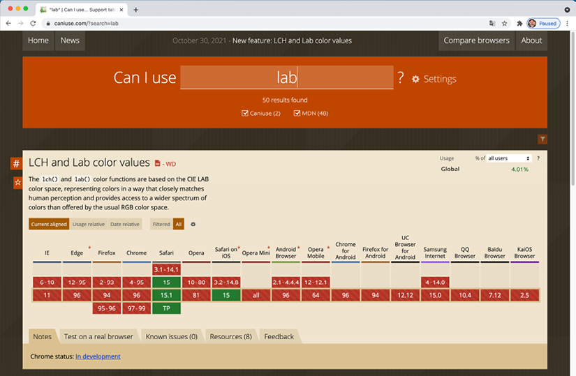
Figure 1.1: Can I Use provides browser support data for every web platform feature
Text editors
It makes no difference what tool you use to write your code. All you actually need is something that enables you to type HTML, CSS, and JavaScript. Whether your preference is Sublime Text, Vim, Emacs, Nova, Visual Studio Code, or Notepad – it matters little. Just use what works best for you.
Tools for software development
Similarly, there are no requisite tools that are essential to get responsive web design out of the door. That said, you should be aware that there are many freely available tools to negate many of the manual and time-intensive tasks of building websites.
CSS post-processors such as PostCSS can automate horrible and thankless jobs like CSS vendor prefixing, an old requirement that necessitated writing multiple versions of a property for each browser engine, and poly-filling new CSS features, where newer syntaxes can be made to work on older browsers. Linting and validation tools can check your HTML, JavaScript, and CSS code as you work, eliminating many time-wasting typos or syntax-induced errors. More recently, code formatters have become popular. Tools like Prettier, for example, automatically format your code with indentation and spacing when you save. None of these tools are essential but they may afford you some benefits.
New tools come out constantly and they are continually evolving. Therefore, while some relevant and beneficial tools will be mentioned by name as we go, be aware that something better may be just around the corner. Hence, we won’t be relying on anything other than standards-based HTML and CSS in our examples. You should, however, use whatever tools you can bring to bear to produce your front-end code as quickly and reliably as possible.
With that out of the way, without further ado, let’s get our first responsive web design made!
Our first responsive example
In the introduction, I promised that by the end of this chapter you would know all you needed to build a fully responsive web page. So far, I’ve just been talking around the issue at hand. It’s time to walk the walk.
Code samples
You can download all the code samples from this book by visiting https://github.com/benfrain/rwd4 or the book’s dedicated website, rwd.education. It’s worth knowing that where individual examples are built up throughout a chapter, there will typically be a “start” and “end” version for each. The start contains just the essentials to start following along. The end contains the completed exercise/example.
Our basic HTML file
We will start with a simple HTML5 structure. Don’t worry at this point about what each of the lines does, especially the content of the <head>, as we will cover that in detail in Chapter 2, Writing HTML Markup.
For now, concentrate on the elements inside the <body> tag. There we have a few divs, a graphic for a logo, some text, and a list of items. Although you can see more of that content in the screengrabs, below is a shorter version of the code. For brevity I have removed the paragraphs of text, as we only need to concern ourselves with the core structure.
However, what you should know is that the text is a recipe and description of how to make scones: a quintessentially British dessert.
Remember, if you want to get your hands on the full HTML file, you can download the example code from https://github.com/benfrain/rwd4 or the rwd.education website.
<!DOCTYPE html>
<html class="no-js" lang="en">
    <head>
        <meta charset="utf-8" />
        <title>Our first responsive web page with HTML5 and CSS3</title>
        <meta
            name="description"
            content="A basic responsive web page – an example from Chapter
            1"
        />
        <link rel="stylesheet" href="css/styles.css" />
    </head>
    <body>
        <div class="Header">
            <a href="/" class="LogoWrapper"
                ><img src="img/SOC-Logo.png" alt="Scone O'Clock logo"
            /></a>
            <h1 class="Strap">Scones: the most resplendent of snacks</h1>
        </div>
        <div class="IntroWrapper">
            <h2 class="IntroText">
                Occasionally maligned and misunderstood; the scone is a
                quintessentially British classic.
            </h2>
            <div class="MoneyShot">
                <p class="ImageCaption">
                    Incredible scones, picture from Wikipedia
                </p>
            </div>
        </div>
        <p>Recipe and serving suggestions follow.</p>
        <div class="Ingredients">
            <h3 class="SubHeader">Ingredients</h3>
            <ul></ul>
        </div>
        <div class="HowToMake">
            <h3 class="SubHeader">Method</h3>
            <ol class="MethodWrapper"></ol>
        </div>
    </body>
</html>
By default, web pages are inherently flexible. If I open the example page, even as it is at this point, with no special work done to make it responsive, and resize the browser window, the text re-flows as needed.
What about on different devices? Again, with no CSS whatsoever added to the page, this is how that renders on an iPhone 13:

Figure 1.2: Not pretty, but by default all web pages are inherently flexible
As you can see, it’s rendering, but like a desktop page shrunken down to fit the space available. The reason for that is that iOS renders web pages at 980 px wide by default and shrinks them down into the viewport.
Before responsive design was “a thing,” it was commonplace to see websites render like that on an iPhone. Nowadays, thanks to the ubiquity of responsive web design, they are as rare as rocking horse droppings!
The area of a browser window that a web page is allowed to be viewed in is known technically as the viewport. To be clear, the viewport area excludes the browser toolbars and URL bar etc. From now on, we will generally use this more accurate term.
We can make the page more mobile friendly by adding this snippet in the <head>:
<meta name="viewport" content="width=device-width,initial-scale=1.0" />
This viewport meta tag is the non-standard but de facto way of telling the browser how to render the page. Although introduced to the web by Apple, rather than a standard process, it remains essential for responsive web design. We will cover the meta tag and its various settings and permutations in Chapter 3, Media Queries and Container Queries.
For now, you just need to know that in this case, our viewport meta tag is effectively saying “make the content render at the width of the device.”
In fact, it’s probably easier to just show you the effect this line has on applicable devices:
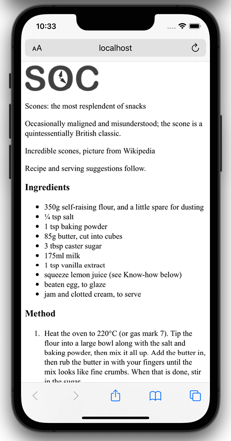
Figure 1.3: With just one line added, already things are improving dramatically
Great! Another snag fixed; the text is now rendering and flowing at a more “native” size. Let’s move on to images.
Taming images
They say a picture speaks a thousand words. All this writing about scones in our sample page and there’s no image of the beauties! I’m going to add in an image of a scone near the top of the page; a sort of “hero” image to entice users to read the page.
Figure 1.4: There is a line or two of CSS that’s always needed to make images appear a sensible size
Oh! That nice big image (2000px wide) is forcing our page to render more than a little wonky. We clearly need to fix that.
Ideas? Well, we could add a fixed width to the image via CSS, but the problem there is that we want the image to scale to different screen sizes. For example, in CSS, our iPhone XR is 414 px wide by 896 px high. If we set a width of 414 px to that image, what happens if a user rotates the screen? On this device, the 414 px-wide viewport is now 896 px wide. Thankfully, it’s pretty easy to achieve fluid images with a single line of CSS.
I’m going to create the css/styles.css CSS file now that’s already linked in the head of the HTML page.
In our blank styles.css file, here is the first thing I’m adding. Ordinarily I’d be setting a few other defaults, and we’ll discuss those defaults in later chapters, but for our purposes I’m happy to open with just this:
img {
    max-width: 100%;
}
With that file saved and the page refreshed, we see something more akin to what we might expect:
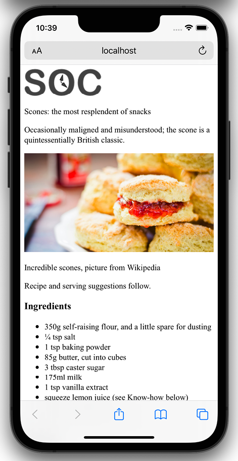
Figure 1.5: With a little CSS, our images will never exceed their bounds
All this max width-based rule does is stipulate that all images should grow to be a maximum of 100% of their size. Where a containing element (such as the body or a div it sits within) is less than the full intrinsic width of the image, the image will simply scale up to display as large as it can within that constraint.
A brief tangent on width/max-width for images
To make images fluid, you could also use the more widely used width property, for example, width:100%, but this has a different effect. When a property of width is used then the image will be displayed at that width, relative to its container if using percentages, regardless of its own inherent size. The result in our example would be that the logo (also an image) would stretch beyond its intrinsic size to fill 100% of its container. With a container far wider than the image, as is the case with our logo, this leads to a massively oversized image.
Excellent. Everything is now laid out as expected. No matter the viewport size, nothing is overflowing the page horizontally.
However, if we look at the page in larger viewports, the basic styles start to get both literally and figuratively stretched. Take a look at the example page at a size around 1400 px:
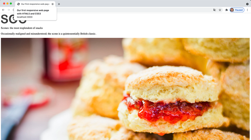
Figure 1.6: We clearly need to fix the size of this image for larger viewports
Oh dear! In fact, at even around 800 px wide it’s starting to suffer. Around this point, it would be handy if we could rearrange a few things. Maybe resize the image and position it off to one side. Perhaps alter some font sizes and background colors of elements.
Thankfully, we can achieve all this functionality quite easily by employing CSS media queries to bend things to our will.
Enter media queries
As we have established, somewhere beyond the 800 px-wide point, our current layout starts to look stretched. We’ll use CSS media queries at this point to adjust the layout depending upon the screen width. We will cover media queries in great depth in Chapter 3, but for now, all you need to appreciate is that media queries are directives in CSS that allow us to isolate CSS rules to certain environment conditions; size of screen, in this instance.
Breakpoints
Before we proceed, it’s worth familiarizing you with the term “breakpoint.”
The term breakpoint is web developer vernacular to define a viewport width or height at which a responsive design should change significantly.
When people first started making use of media queries, it was common to see designs built with specific breakpoints to cater to the popular devices of the day. At the time it was typically iPhone (320 px x 480 px) and iPad (768 px x 1024 px) devices.
That practice was a bad decision then, and it would be an even worse one now. The problem is that doing that means a design caters to specific screen sizes. We want a responsive design – something that is agnostic of the screen size viewing it, responding to any size viewport it finds itself in, not something that only looks its best at specific sizes.
Use a breakpoint if your design, visually, needs to change at a certain point, but not to cater to a specific device!
For the purpose of whipping our basic example into shape, we will concentrate on just one type of media query: a minimum-width media query. CSS rules within this type of media query only get applied if the viewport is or exceeds a certain width.
The exact minimum width can be specified using a raft of different-length units including percent, em, rem, and px. In CSS, a minimum-width media query is written like this:
@media screen and (min-width: 800px) {
    /* styles /*
}
The @media directive tells the browser we are starting a media query, the screen part (declaring screen is technically not needed in this situation, but we will deal with that in detail in Chapter 3) tells the browser these rules should be applied to all screen types, and we then have the and keyword, which chains together another set of conditionals, which in this case is the (min-width: 800px). That tells the browser that the rules should also be limited to all viewports at least 800 px wide.
I believe it was Bryan Rieger, http://www.slideshare.net/bryanrieger/rethinking-the-mobile-web-by-yiibu, who first wrote that:
The absence of support for media queries is in fact the first media query.
What he meant by that is that the first rules we write, outside of a media query, should be our starter, or “base,” rules for the most basic devices, which we then enhance for more capable devices and larger screens.
That is what we are doing in this example. The basic styles are written first. It is only when we need to do something different that we introduce a media query.
This approach also facilitates a “smallest screen first” mentality and allows us to progressively layer on detail as and when the design needs to change for bigger screens.
Amending the example for a larger screen
We’ve already established that our design is starting to suffer at around 800 px width. Therefore, let’s mix things up a little by way of a simple example of how we can lay things out differently at different viewport sizes.
First off, we will stop that main “hero” image from getting too big and keep it over on the right. Then the intro text can sit to the left.
We will then have the main portion of text (the “method” that describes how to make the scones) on the left below, with a small boxed-out section detailing the ingredients over on the right.
All these changes can be achieved relatively simply by encapsulating these specific styles within a media query.
There are some further visual embellishments that don’t add to the understanding of what’s happening responsively, hence I have omitted them here, but if you’d like to view the relevant code, download the chapter code at http://rwd.education.
Here are the layout styles that were added:
@media screen and (min-width: 800px) {
    body {
        border-left: 4px solid #f9f9f9;
        border-right: 4px solid #f9f9f9;
        padding: 1rem 2rem;
    }

    .IntroWrapper {
        display: flex;
        gap: 0 20px;
        flex: 1 1 auto;
        align-items: center;
    }

    .MoneyShot,
    .IntroText {
        margin: 0;
        flex: 1 1 50%;
    }

    .MoneyShotImg {
        filter: drop-shadow(0 0 20px #0008);
        border: 0;
    }

    .IntroText {
        padding: 0.5rem;
        font-size: 2.5rem;
        text-align: left;
        position: relative;
    }
     .Ingredients {
        font-size: 0.9rem;
        float: right;
        padding: 1rem;
        margin: 0 0 0.5rem 1rem;
        border-radius: 3px;
        background-color: #ffffdf;
        border: 9px solid #debb71;
    }

    .Ingredients h3 {
        margin: 0;
    }
}
That wasn’t too bad, was it? With only minimal code, we have built a page that responds to the viewport size and offers a preferable layout as needed. By adding just a few more styles, things look even easier on the eye.
With those in place, our basic responsive page now looks like this on an iPhone:
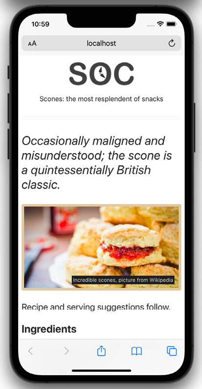
Figure 1.7: A few more styles added and our basic page is palatable
And like this when the viewport is 800 px or wider:
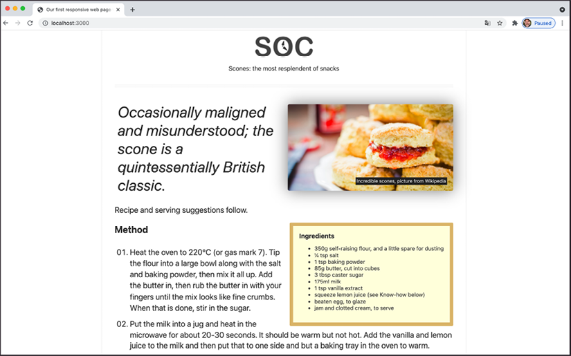
Figure 1.8: The same HTML and CSS provides a different layout for larger viewports
The code samples provided throughout this book do not include “vendor prefix” styles. Vendor prefixes have been employed historically to prefix experimental CSS properties in different browsers. For example: -webkit-backface-visibility. Including vendor prefixes in CSS is often essential to achieve support for certain properties in older browsers. There are now tools to automate this prefixing and, as you might imagine, the tools perform the task faster and more accurately than we can.
Therefore, I’m refraining from including any vendor-prefixed code in the samples, in the hope you will adopt a similar painless approach.
This has been a very basic example but it has encapsulated the essential methodology of building out responsive web design.
Let’s just go over the important points we have covered in this chapter and our basic example:
- Use whatever text editor you like
- Tools exist to make writing code easier, but don’t get hung up on what to use
- Responsive designs are made possible with a flexible layout, fluid images, and media queries
- A
metatag is needed in the head of your HTML so a browser knows how to render the page - You’ll want all images to be set with a max width of 100% in the CSS by default
- A breakpoint is just a point, typically a screen width, at which we use a media query to alter the design
- When you write CSS for responsive design, start with base styles that can work on any device, typically the smallest screen, and then use media queries to adapt for larger screens
- Scones with clotted cream and jam are really tasty
You can find the full specifications for CSS Media Queries (Level 3) here: https://www.w3.org/TR/mediaqueries-3/.
There is also a working draft for CSS Media Queries (Level 4) here: https://drafts.csswg.org/mediaqueries-4/.
The shortcomings of our example
In this chapter, we’ve covered all the essential parts of building a basic responsive web page with HTML and CSS. Granted, it’s not what I’d call a real looker. I’ll forgive you for using words like “infantile,” “lazy,” and “ugly,” but just do it quietly amongst yourselves; I have feelings, you know!
The point here is you and I both know that this basic responsive example is far from the limit of what we will likely be tasked with building day to day. Nor should it reflect the limit of what we are capable of building.
We need to cover typography, color, shadows, hover styles, semantic markup, accessibility concerns, animation, scalable graphics, forms, and so much more!
You get the picture; the truth is we have barely scratched the surface. But don’t worry. That’s what the rest of the book is for.
Summary
Well done, you now know and understand the essential elements needed to create a fully responsive web page. However, as we have just discovered, there are plenty of places where things could be improved.
But that’s fine. We don’t just want the ability to make competent responsive web designs, we want to be able to create “best-of-breed” experiences. And as you’re here, investing your time for the betterment of websites everywhere, I know you’re up to the challenge. So let’s press on.
In the next chapter, Chapter 2, Writing HTML Markup, we are going to take a deep dive into HTML5 markup. HTML is the very skeleton of any web page or application, the bedrock on which to build anything meaningful, the oxygen a website breathes, the… OK, I’m out of analogies – suffice it to say, HTML is pretty important, so let’s press on and get stuck in.
Join our book’s Discord space
Got any burning questions? Join the book’s Discord workspace to discuss all your responsive web design concerns directly with the author and interact with other readers:
