13
Forms
Before HTML5, adding things like date pickers, placeholder text, and range sliders into forms had always needed JavaScript. Similarly, there had been no easy way to signpost to users the kind of data we expect them to input into certain fields. For example, whether we expect telephone numbers, email addresses, or URLs.
The good news is that HTML5 largely solves these common problems.
We have two main aims in this chapter. Firstly, to understand HTML5 form features and, secondly, to understand how we can lay out forms more simply for multiple devices with the latest CSS features. In this chapter, we will learn how to:
- Easily add placeholder text into relevant form input fields
- Disable autocompletion of form fields where necessary
- Set certain fields to be required before submission
- Specify different input types such as email, telephone number, and URL
- Create number range sliders for easy value selection
- Place date and color pickers into a form
- Use a regular expression to define an allowed form value
- Style forms using Flexbox
- Change caret color
HTML5 forms
I think the easiest way to get to grips with HTML5 forms is to work our way through an example form. Just like in daytime TV cooking shows, I have one I made earlier! A minor introduction is needed. Two facts: firstly, I love films. Secondly, I’m very opinionated about what is a good film and what is not.
Every year, when the Oscar nominations are announced, I can’t help feeling the wrong films have got “the nod” from the Academy. Therefore, we will start with an HTML5 form that enables fellow cinephiles to vent their frustrations at the continual travesties of the Oscar nominations.
It’s made up of a few fieldset elements, within which we are including a raft of the HTML5 form input types and attributes. Besides standard form input fields and text areas, we have a number spinner, a range slider, and placeholder text for many of the fields.
The HTML for this form can be found in the example_13-01 code. Here’s how it looks, with no styles applied, in Chrome:
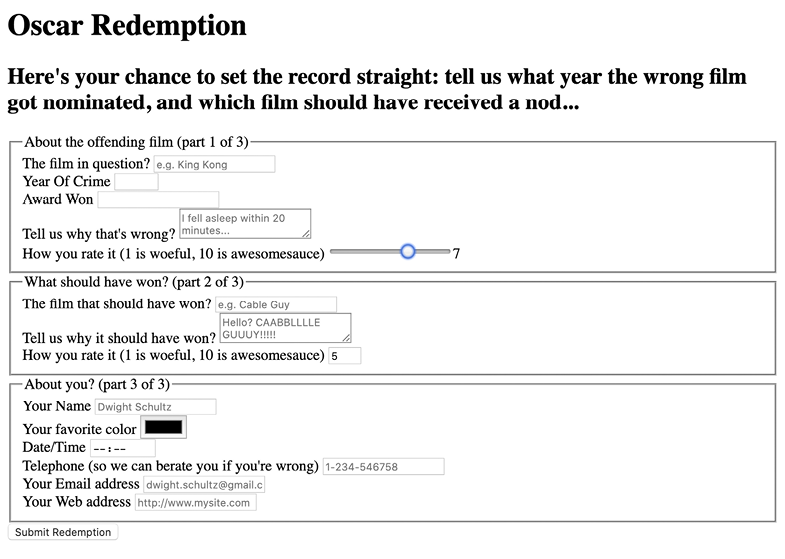
Figure 13.1: A basic form with no styling
If we “focus” on the first field and start inputting text, the placeholder text is removed. If we blur focus without entering anything (by clicking outside of the input box again), the placeholder text reappears. If we submit the form (without entering anything), the following happens:
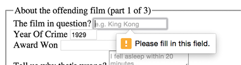
Figure 13.2: A standard browser warning from a required field
The great news is that all these user interface elements, including the aforementioned slider, placeholder text, spinner, and the input validation, are being handled natively by the browser via HTML5, and no JavaScript.
Let’s begin by getting a handle on all the capabilities of HTML5 that relate to forms and make all this possible. Once we understand all the mechanics, we can get to work styling it up.
Understanding the component parts of HTML5 forms
There’s a lot going on in our HTML5-powered form, so let’s break it down. The three sections of the form are each wrapped in a fieldset, which semantically groups the related sets of form fields, and a legend, which provides the textual explanation of what that fieldset is:
<fieldset>
  <legend>About the offending film (part 1 of 3)</legend>
  <div>
    <label for="film">The film in question?</label>
    <input
      id="film"
      name="film"
      type="text"
      placeholder="e.g. King Kong"
      required
      aria-required="true"
    />
  </div>
</fieldset>
You can see from the previous code snippet that each input element of the form is also wrapped in a div with a label associated with each input (we could have wrapped the input with the label element if we’d wanted to, too). So far, so normal. However, within this first input, we’ve just stumbled upon our first HTML5 form feature. After the common attributes of id, name, and type, we have placeholder.
The placeholder attribute
As the name suggests, the placeholder attribute offers a means of providing a hint or some placeholder data to indicate the kind of input we are expecting. An obvious example would be the word Search in a search box.
Needing placeholder text within form fields is such a common requirement that the folks creating HTML5 decided it should be a standard feature of HTML. To add placeholder text for an input, simply add the placeholder attribute. Its value will be displayed in the input until the field gains focus. When it loses focus, if a value has not been entered, it will redisplay the placeholder text.
In our example, the placeholder attribute is filled in like this:
placeholder="e.g. King Kong"
Styling the placeholder text
You can style the placeholder attribute with the :placeholder-shown pseudo-selector:
input:placeholder-shown {
  color: #333;
}
You can also change the text size of the placeholder text; it doesn’t need to be the same as the values. As ever, be mindful of accessibility. Although it is only placeholder text, I still try to ensure the text is 16 px or greater.
You shouldn’t rely on the placeholder text to convey any essential information, as screen readers do not treat placeholder text as a label. Read more about that here: https://www.w3.org/WAI/tutorials/forms/instructions/#placeholder-text.
When it comes to color accessibility, ensure you use appropriate contrast. If you don’t already have a tool to check acceptable contrast levels, I’d recommend bookmarking https://webaim.org/resources/contrastchecker/.
Styling the input caret with the caret-color CSS property
Caret, in our context here, refers to the insertion point in an input area. You might think of that typically blinking vertical line as a “cursor,” but it is purposefully named differently in CSS to make the distinction from other cursors, such as the one produced by mouse input.
By the way, it’s generally pronounced like your favorite orange vegetable, “carrot,” but depending on your accent, you might need to alter your pronunciation to “carrit,” such as we have to in the UK, which is fine as long as the Queen doesn’t hear you!
The caret-color property is a fairly recent addition to CSS that allows us to change the color of the caret.
Suppose we wanted an orange input insert point; we could style it like this:
.my-Input {
  caret-color: #f90;
}
Sadly, apart from color, we don’t get any real control over how the caret appears. We can’t change the shape, thickness, or blink rate and style, for example. Hopefully, by the next edition of this book, all that will be possible!
In case you weren’t aware, there is an attribute called contenteditable that can make the contents of an everyday element, such as a div or span, editable. You can also make use of :caret-color in those situations too.
The required attribute
required is a Boolean attribute, with “Boolean” meaning it has only two possibilities. In this case, you either include it or not.
When it is present, like this:
<input type="text" value="" placeholder="[email protected]" required />
It means that adding a value to this input will be required before the form can be submitted.
If the form submission is attempted without the input containing a requisite value, a warning message is displayed. The message itself differs both in content and styling depending on the browser and the input type used.
To be absolutely clear, the bad news here is that you can’t change the message that the browser displays. But the good news is that it will provide the correct language version of the message for your users to match their language preference.
We’ve already seen what the required field browser message looks like in Chrome. The following screenshot shows the same message in Firefox:
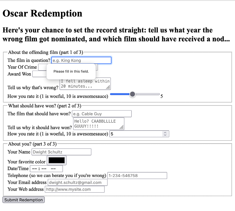
Figure 13.3: Errors when submitting a form in Firefox without the required fields complete
The required value can be used alongside many input types to ensure a value is entered. Notable exceptions are the range, color, button, and hidden input types, as they almost always have a default value.
The autofocus attribute
The HTML5 autofocus attribute allows a form to have a field focused, ready for user input, as soon as the page loads. The following code is an example of an input field wrapped in a div with the autofocus attribute added at the end:
<div>
  <label for="search">Search the site...</label>
  <input
    id="search"
    name="search"
    type="search"
    placeholder="Wyatt Earp"
    autofocus
  />
</div>
Tread carefully with autofocus for a few reasons.
Firstly, if multiple fields have autofocus added, only the first autofocused field will be focused. It’s not hard to imagine a scenario where you accidentally added autofocus to one field, and some time later added autofocus to another. Your user may not get the experience you expected, and you might have yourself a bug to troubleshoot.
Secondly, it’s also worth considering that some users use the spacebar to quickly skip down the content of a web page. On a page where a form has an autofocused input field, this capability is negated; instead, a space is added to the focused input field. It’s easy to see how that could be a source of frustration for users.
In addition, users of assistive technology will be instantly transported to a location on the page they have no control of—not exactly the best user experience!
If using the autofocus attribute, be certain it’s only used once in a form and be sure you understand the implications.
The autocomplete attribute
By default, most browsers aid user input by autocompleting the value of form fields where possible.
While the user can turn this preference on and off within the browser, we can now also indicate to the browser when we don’t want a form or field to allow autocompletion with the autocomplete attribute. This is useful not just for sensitive data (bank account numbers, for example) but also if you want to ensure users pay attention and enter something by hand.
For example, for many forms I complete, if a telephone number is required, I enter a “spoof” telephone number. I know I’m not the only one that does that (doesn’t everyone?), but I can ensure that users don’t enter an autocompleted spoof number by setting the value of the autocomplete attribute to off on the relevant input field. The following is a code example of a field with the autocomplete attribute set to off:
<div>
  <label for="tel">Telephone (so we can berate you if you're wrong)
  </label>
  <input
    id="tel"
    name="tel"
    type="tel"
    placeholder="1-234-546758"
    autocomplete="off"
    required
  />
</div>
It’s not possible to stop autocompletion on entire fieldsets in one go, but you can stop autocompletion on entire forms. Just add the autocomplete attribute to the form element itself. Here’s an example:
<form id="redemption" method="post" autocomplete="off">
  <!-- content -->
</form>
The list attribute and the associated datalist element
This list attribute and the associated datalist element allow a number of selections to be presented to a user once they start entering a value in the field.
The following is a code example of the list attribute in use with an associated datalist, all wrapped in a div:
<div>
  <label for="awardWon">Award Won</label>
  <input id="awardWon" name="awardWon" type="text" list="awards" />
  <datalist id="awards">
    <select>
      <option value="Best Picture"></option>
      <option value="Best Director"></option>
      <option value="Best Adapted Screenplay"></option>
      <option value="Best Original Screenplay"></option>
    </select>
  </datalist>
</div>
datalist contains the list of possible values for the input. To connect the datalist to the input, you have to set the value of the list attribute on the input to the id of the datalist.
In our example, we have added an id of "awards" to the datalist element and then set the value of the list attribute on the input to that.
Although wrapping the options with a select element isn’t strictly necessary, it helps when applying scripts to add comparable functionality for browsers that haven’t implemented the feature.
With our list and datalist wired up, the input field still appears initially to be just a normal text input field. However, when typing in the input, a selection box appears below it with matching results from the datalist. In the following screenshot, we can see the list in action (Firefox).
In this instance, as “B” is present in all options within the datalist, all the values are shown for the user to select from:

Figure 13.4: The datalist element showing the matching possible choices
However, when typing “D” instead, only the matching suggestions appear, as shown in the following screenshot:
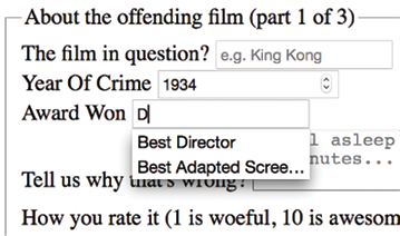
Figure 13.5: The datalist narrows based on input
list and datalist don’t prevent a user from entering different text in the input box, but they do provide another great way of adding common functionality and user enhancement through HTML5 markup alone.
You can read the specification for datalist here: https://html.spec.whatwg.org/multipage/form-elements.html#the-datalist-element.
When we started this chapter, I mentioned that there are ways of hinting to the user and, depending on the device, aiding the user in entering the appropriate data for the input at hand. We can do that with HTML5 input types. Let me show you how.
HTML5 input types
HTML5 has a number of extra input types. These have been a great addition because when they are supported, they offer great additional functionality and, when not supported, they still behave like a standard text type input. Let’s take a look at them.
The email input type
You can set an input to the type of email like this:
type="email"
Supporting browsers will expect a user input that matches the syntax of an email address. In the following code example, type="email" is used alongside required and placeholder:
<div>
  <label for="email">Your Email address</label>
  <input
    type="email"
    id="email"
    name="email"
    placeholder="[email protected]"
    required
  />
</div>
When used in conjunction with required, trying to input a non-conforming value will generate a warning message:

Figure 13.6: An error shows when incorrect data is entered
Perhaps most usefully, most touchscreen devices (Android, iPhone, and so on) change the software keyboard presented to the user based on this input type. The following screenshot shows how the software keyboard on an iPad is shown when focusing an input with type="email".
Notice the “@” symbol has been added for easy email address completion:
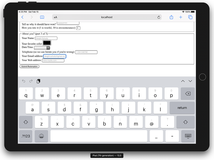
Figure 13.7: Software keyboards will often adapt to the input type
The number input type
You can set an input field to expect a number like this:
type="number"
With the type of input set to number, browsers also sometimes add pieces of UI called “spinner” controls. These are tiny pieces of user interface that allow users to easily click up or down to alter the value input.
The following is a code example:
<div>
  <label for="yearOfCrime">Year Of Crime</label>
  <input
    id="yearOfCrime"
    name="yearOfCrime"
    type="number"
    min="1929"
    max="2015"
    required
  />
</div>
The following screenshot shows how it looks in Chrome, complete with spinners:
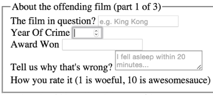
Figure 13.8: On desktop browsers, “spinners” are shown for number inputs
And here is how type="number" makes the software keyboard appear on an iPad. Notice how all the numerical keys display by default:

Figure 13.9: Software keyboards default to showing numbers for number inputs
What happens if you don’t enter a number? This can vary subtly between browser implementations. For example, Firefox does nothing until the form is submitted, at which point it displays a warning, Please enter a number. Safari, on the other hand, gives the vaguer message of Fill out this field.
Using min and max to create number ranges
You’ll notice in the previous code example that we set a minimum and maximum allowed range:
type="number" min="1929" max="2015"
If you try to submit the form with numbers outside of this range, the browser will show a warning that the value should be within the specified range.
Changing the step increments
You can alter the step increments (granularity) for the spinner controls of numerical input types with the use of the step attribute. For example, to step 10 units at a time:
<input type="number" step="10" />
The url input type
You can set an input field to expect a URL like this:
type="url"
As you might expect, the url input type is for URL values. Similar to the tel and email input types, it behaves almost identically to a standard text input. However, some browsers add specific information to the warning message provided when submitted with incorrect values. The following is a code example that includes the placeholder attribute:
<div>
  <label for="web">Your Web address</label>
  <input id="web" name="web" type="url" placeholder="https://www.mysite.
  com" />
</div>
The following screenshot shows what happens when an incorrectly entered URL field is submitted in Chrome:
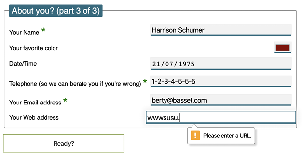
Figure 13.10: Chrome will show a warning when the input doesn’t match the type
Like type="email", touchscreen devices often amend the software keyboard based on this input type. The following screenshot shows how the software keyboard of an iPad is changed with an input type set to url:
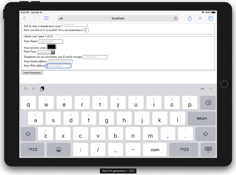
Figure 13.11: Software keyboard adapting for url input
Notice the “.com” key? Because we’ve used a url input type, the software keyboard provides a key for easy top-level domain completion.
On iOS, if you’re not going to a .com site, you can press and hold that button for a few other popular top-level domains.
The tel input type
You can set an input field to expect a telephone number type of value, like this:
type="tel"
Here’s a more complete example:
<div>
  <label for="tel">Telephone (so we can berate you if you're wrong)
  </label>
  <input
    id="tel"
    name="tel"
    type="tel"
    placeholder="1-234-546758"
    autocomplete="off"
    required
  />
</div>
Browsers do little validation on the tel input type. When an incorrect value is input, they fail to provide a suitable warning message.
However, some better news is that, like the email and url input types, touchscreen devices often thoughtfully accommodate this kind of input with an amended software keyboard for easy completion; here’s the tel input type when accessed with an iPad (running iOS 13.3):
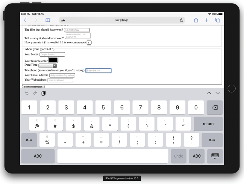
Figure 13.12: Software keyboard adapting to telephone input
Notice the lack of alphabet characters in the keyboard area? This makes it much faster for users to enter a value in the correct format.
If the default blue color of telephone numbers in iOS Safari annoys you when you use a tel input, you can amend it with the following selector:
a[href^=tel] { color: inherit; }
That will set them to the color of the parent element.
The search input type
You can set an input as a search type like this:
type="search"
The search input type works like a standard text input. Here’s an example:
<div>
  <label for="search">Search the site...</label>
  <input id="search" name="search" type="search" placeholder="Wyatt Earp">
</div>
As with many of the prior input types, software keyboards (such as those found on mobile devices) often provide a more tailored keyboard. Note the “go” button in iOS 15.5 when focused in a search box:
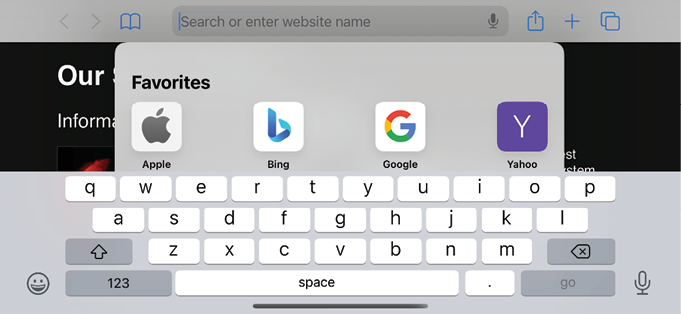
Figure 13.13: A keyboard subtly tailored for searching
The pattern input attribute
You can set an input to expect a certain pattern input like this:
pattern=""
Note that this isn’t an input type. However, it is a means of communicating to the browser that we expect input of a certain pattern.
The pattern attribute allows you to specify, via a regular expression, the syntax of data that should be allowed in a given input field.
Learn about regular expressions (regexes)
If you’ve never encountered regular expressions before, I’d suggest starting here: https://en.wikipedia.org/wiki/Regular_expressions. Regular expressions are used across many programming languages as a means of matching strings. While the format is intimidating at first, they are incredibly powerful and flexible. For example, you could build a regular expression to match a password format or select a certain style of CSS class-naming convention. To help build up your own regex pattern and get a visual understanding of how they work, I’d recommend starting with a browser-based tool like https://www.regexr.com/.
The following code is an example:
<div>
  <label for="name">Your Name (first and last)</label>
  <input
    id="name"
    name="name"
    pattern="^([D]{2,30}s+)+([a-zA-Z]{2,30})$"
    placeholder="Dwight Schultz"
    required
  />
</div>
Such is my commitment to this book, I searched the internet for an entire 458 seconds to find a regular expression that would match a basic first and last name syntax (Western European languages only, sorry). This is by no means bulletproof but should ensure that the value entered is not a number (sorry, R2-D2, you will have to register your film complaints elsewhere) and is made of at least two space-separated values between 2 and 30 characters long.
By entering the regular expression value within the pattern attribute, it makes supporting browsers expect a matching input syntax. Then, when used in conjunction with the required attribute, incorrect entries get the following treatment in supporting browsers. In this instance, I tried submitting the form without providing a last name:
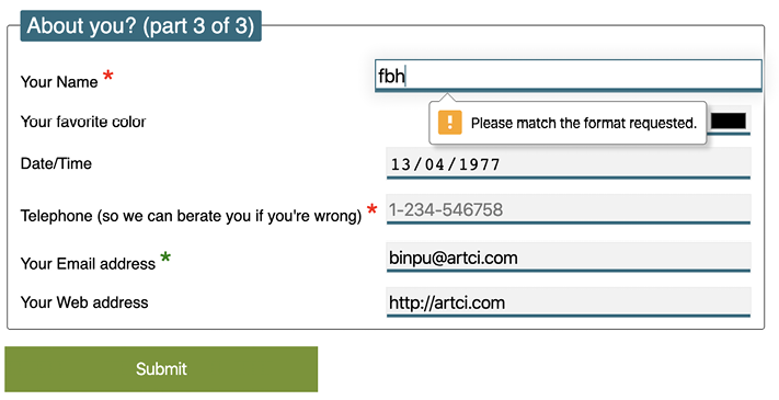
Figure 13.14: The pattern type provides a vaguer warning but allows you to create bespoke requirements
As with other browser-generated form messages, it’s not possible to amend it, so depending on your use case, it may be beneficial to state in your label text the kind of input you require.
The color type input
Want to set an input field to receive a color value?
input type="color"
The color input type invokes the host operating system’s color picker, allowing users to select a color. The following code is an example:
<div>
  <label for="color">Your favorite color</label>
  <input id="color" name="color" type="color" />
</div>
I’ll be honest, it’s not a type I’ve yet to need in practice, but it’s not hard to imagine scenarios where it would be very handy.
Date and time
If you’ve ever bought tickets to an event online, chances are that you have used a date picker of one sort or another. The thinking behind the new date and time input types is so that the browser can provide a consistent piece of user interface for that situation.
Sadly, as I write this in 2022, it’s hard to entirely recommend using the native date and time input types across the board, as compatibility is not consistent.
It’s not a completely useless situation; as with all the HTML5 input types, without support the input will behave like a normal input box. However, it’s worth checking https://caniuse.com/input-datetime first to avoid disappointment. This may be one of the few remaining types where you are going to need a JavaScript solution to provide an entirely consistent experience.
Regardless, in the hope that cross-browser compatibility is sorted soon, let’s consider the core capabilities of the date and time input types.
The date input type
The following code is an example:
<input id="date" type="date" name="date" value="2022-06-16"/>
Notice that it isn’t just a matter of changing the type attribute; you might also want to use the value attribute to set the starting date for the picker. If you don’t set your own date, the picker will default to today’s date. If, however, you set a date in ISO8601 format (YYYY-MM-DD), inside the value, the start date will be set to that. Despite the value being written in code as YYYY-MM-DD, the browser will actually display the picker in a format better suited (arguably) to your own locale in the browser UI.
Here is the UI that is generated in a supporting browser. Note that as a UK user, I get that date displayed in a slightly more UK-friendly format (MM-DD-YYYY):

Figure 13.15: A date-picking interface provided by the browser
However, depending on your locale, this isn’t ideal and may actually be a worse experience for users. In the UK, we write dates in the DD-MM-YYYY format, so this could be confusing if you have a date like 05-06-2024; a UK user would assume that was June 5, 2024. Your own locale may differ again. This discrepancy is what has led many institutions that deal with forms extensively to split the component parts of a date up into separate input fields. For example, the UK government’s design system is well documented with examples, well worth a read if you encounter a form design heavy on the date side of things: https://design-system.service.gov.uk/components/date-input/
There are a variety of different date- and time-related input types available. What follows is a brief overview of the others.
The month input type
The following code is an example:
<input id="month" type="month" name="month" />
The interface allows the user to select a single month and sets the value of the input to a year and month, should you want to access it via scripting; for example, "2023-06". Here is a grab of the user interface that iOS displays:

Figure 13.16: Remember, different operating systems often have their own UIs to achieve the same goal
The week input type
The following code is an example:
<input id="week" type="week" name="week" />
When the week input type is used, the picker allows the user to select a single week within a year and sets the value of the input in "2025-W28" format.
This is currently only supported in Chromium-based browsers. The following screenshot shows how it looks in Chrome:
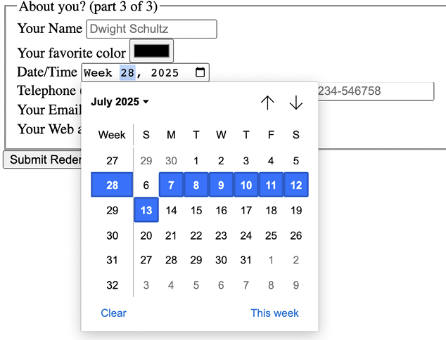
Figure 13.17: The week input type gets its own data picker style in supporting browsers
The time input type
The following code is an example:
<input id="time" type="time" name="time" />
The time input type allows a value to be set to a 24-hour format; for example, "20:26".
It displays like a standard input in supporting browsers but with additional spinner controls, and it only allows relevant time values.
Touch devices show their own UIs. Here’s how it looks on iOS:
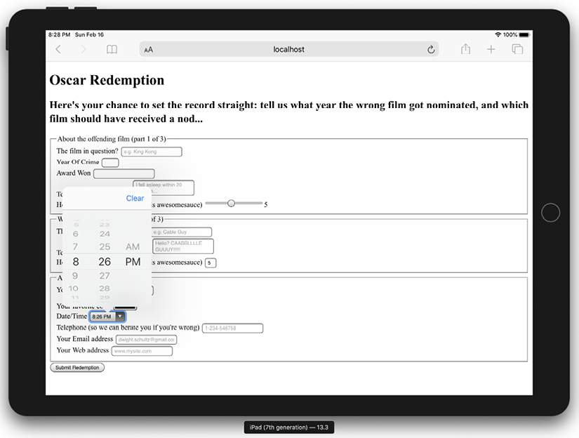
Figure 13.18: The time input type produces specific pieces of interface in supporting browsers
The range input type
The range input type creates a slider interface element. Here’s an example:
<input type="range" min="1" max="10" value="5" />
And the following screenshot shows how it looks in Firefox:

Figure 13.19: A range slider doesn’t show numerical values by default
The default range is from 0 to 100. However, by specifying a min and max value, in our example, we have limited it to between 1 and 10.
One big problem I’ve encountered with the range input type is that the current value is never displayed to the user. Although the range slider is only intended for vague number selections, I’ve often wanted to display the value as it changes. Currently, there is no way to do this using HTML5. However, if you absolutely must display the current value of the slider, it can be achieved easily with some simple JavaScript. Amend the previous example to the following code:
<input
  id="howYouRateIt"
  name="howYouRateIt"
  type="range"
  min="1"
  max="10"
  value="5"
  onchange="showValue(this.value)"
/>
<span id="range">5</span>
We’ve added two things, an onchange attribute and also a span element with the id of "range". Now, we’ll add the following tiny piece of JavaScript:
<script>
  function showValue(newValue)
  {
    document.getElementById("range").innerHTML=newValue;
  }
</script>
All this does is get the current value of the range slider and display it in the element with an id of "range" (our span tag). You can then use whatever CSS you deem appropriate to change the appearance of the value. We will do that ourselves in a moment once we start styling our form.
Styling HTML5 forms with CSS
We have our HTML5-powered form built now, and understand the various input types and associated attributes. However, we need to make it a little more visually appealing across different viewport sizes. By applying some of the techniques we’ve learned throughout the previous chapters, I think we can improve the aesthetics of our form considerably.
I’ve taken my own stab at styling the form; you can check that version out at example_13-02, and remember, if you don’t already have the example code, you can grab it at https://rwd.education.
Here’s how the form looks in a small viewport with that basic styling applied:

Figure 13.20: Our form on mobile with basic styling applied
And here it is with a larger viewport:

Figure 13.21: Our same form styled for wider viewports
If you look at the CSS in the example, you’ll see many of the techniques we’ve looked at throughout previous chapters applied. For example, Flexbox (Chapter 4) is used to create uniform spacing and flexibility for elements.
Transforms and transitions (Chapter 11) are used so that the focused input fields grow and the ready/submit button flips vertically when it gains focus. Box shadows and gradients (Chapter 8) are used to emphasize different areas of the form. Media queries (Chapter 3) are used to switch the Flexbox direction for different viewport sizes, and more recent CSS selectors (Chapter 6) are used for selector negation.
But look, here’s a thought. I’m no hotshot designer. How about you take the markup from example_13-01 and have a shot at styling it up yourself? If it all goes horribly wrong, you can always continue with the styled version, but this would be a solid exercise to put into practice the considerable styling skills you have learned so far.
With that in mind, I won’t be going over the techniques I chose in detail here again. Instead, I just want to focus on a couple of form-specific peculiarities. Firstly, how to visually indicate required fields (and for bonus points, indicate a value has been entered) and, secondly, how to create a “fill” effect when a field gets user focus.
Indicating required fields
We can indicate required input fields to a user using CSS alone. For example:
input:required {
  /* styles */
}
With that selector, we could add a border or outline to the required fields or add a background-image inside the field. Basically, the sky’s the limit! We could also use a specific selector to target an input field that is required, but only when it gains focus. For example:
input:focus:required {
  /* styles */
}
However, that would apply styles to the input itself. What if we want to amend styles on the associated label element? I’ve decided I’d like to indicate required fields with a little asterisk symbol at the side of the label:
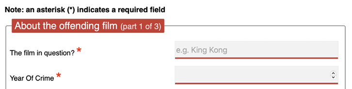
Figure 13.22: An asterisk to indicate a required field is a common pattern
But this presents a problem. Generally, CSS only lets us effect a change on elements if they are children of an element, the element itself, or a general or adjacent sibling of an element that receives “state” (when I say state, I’m talking about hover, focus, active, checked, and so on). In the following examples, I’m using hover, but that would obviously be problematic for touch-based devices:
.item:hover .item-child {
}
With the preceding selector, styles are applied to item-child when the item is hovered over. Now consider:
.item:hover ~ .item-general-sibling {
}
With this selector, when the item is hovered over, styles are applied to item-general-sibling if it is at the same DOM level as item and follows it. Next up:
.item:hover + .item-adjacent-sibling {
}
Here, when the item is hovered over, styles are applied to item-adjacent-sibling if it is the adjacent sibling element of item (straight after it in the DOM).
So, back to our issue. If we have a form with labels and fields like this, with the label above the input (to give us the requisite basic layout), it leaves us a little stuck:
<div class="form-Input_Wrapper">
  <label for="film">The film in question?</label>
  <input
    id="film"
    name="film"
    type="text"
    placeholder="e.g. King Kong"
    required
  />
</div>
In this situation, until recently in CSS, there was no way to change the style of the label based on whether the input is required or not (as it comes after the label in the markup). So, let’s look at two ways to solve the issue. The code for both is in the example_13-02 files.
In recent browsers, which support the :has selector that we looked at in Chapter 6, CSS Selectors, Typography, and More, we can easily use a selector like this:
.form-Input_Wrapper:has(input:required) label::after {}
And then style the ::after pseudo-element accordingly. This looks at the element that contains the label and the label and says, “If I have a required input in here, select the label inside.”
But as support for that isn’t great, let’s consider how to work around the problem for older browsers.
We could switch the order of those two elements in the markup, but then we would end up with the label underneath the input.
However, have you remembered that both Flexbox and Grid give us the ability to visually reverse the order of elements (read all about them in Chapter 4 and Chapter 5 if you haven’t done so already) with ease?
That allows us to use the following markup to create a direct sibling association we can use in CSS:
<div class="form-Input_Wrapper">
  <input
    id="film"
    name="film"
    type="text"
    placeholder="e.g. King Kong"
    required
  />
  <label for="film">The film in question?</label>
</div>
And then simply apply flex-direction: row-reverse or flex-direction: column-reverse to the parent. These declarations reverse the visual order of their child elements, allowing the desired aesthetic of the label above (smaller viewports) or to the left (larger viewports) of the input.
Now, we can get on with actually providing some indication of required fields and when they have received input.
Thanks to our revised markup, the adjacent sibling selector now makes this possible:
input:required + label:after {
}
This selector essentially says, “For every label that follows an input with a required attribute, apply the enclosed rules.” Here is the CSS for that section:
input:required + label:after {
  content: '*';
  font-size: 2.1em;
  position: relative;
  top: 6px;
  display: inline-flex;
  margin-left: 0.2ch;
  transition: color 1s;
}
input:required:invalid + label:after {
  color: red;
}
input:required:valid + label:after {
  color: green;
}
Then, if you focus on a required input and enter a relevant value, the asterisk changes color to green. It’s a subtle but helpful touch.
At this point, it seems appropriate to tell you that the content value is not read out by all screen readers, which makes the point once more that using the right elements, labels, and attributes is always the best policy. In this case, the presence of the required attribute should provide a screen reader with the relevant prompt to communicate this need to the user.
Creating a background fill effect
Back in Chapter 8, Stunning Aesthetics with CSS, we learned how to generate linear and radial gradients as background images. Sadly, it isn’t possible to transition between two background images (which makes sense, as the browser effectively rasterizes the declaration into an image). However, we can transition between values of associated properties like background-position and background-size. We’ll use this capability to create a fill effect when an input or textarea receives focus.
Here are the properties and values added to the input:
input:not([type='range']),
textarea {
  min-height: 40px;
  padding: 2px;
  font-size: 17px;
  border: 1px solid #ebebeb;
  outline: none;
  transition: transform 0.4s, box-shadow 0.4s, background-position 0.2s;
  background: radial-gradient(400px circle, #fff 99%, transparent 99%),
  #f1f1f1;
  background-position: -400px 90px, 0 0;
  background-repeat: no-repeat, no-repeat;
  border-radius: 0;
  position: relative;
}
input:not([type='range']):focus,
textarea:focus {
  background-position: 0 0, 0 0;
}
In the first rule, a solid white radial gradient is being generated but positioned out of view. The background color that sits behind (the hex value after radial-gradient) is not offset and so provides a default color. When input gains focus, background-position on radial-gradient is set back to the default and because we have a transition on background-image set, we get a nice transition between the two. The visual result of this is the appearance of the input being “filled” with a different color when it gains focus.
It’s an effect better used than viewed as a screenshot, so be sure to try out the example code.
Summary
In this chapter, we learned how to use a host of HTML5 form input types and attributes. They have enabled us to make forms more usable and helpful, and in turn, allow us to capture better quality information.
We’ve also made use of some techniques we have learned throughout this book to restyle our form and make its layout respond to the constraints of the device on which it is used.
We’re nearing the end of our responsive HTML5 and CSS journey. But before we get to our final chapter of parting advice, there are a bunch of bleeding-edge features I’m excited to share with you. Some of these have just shipped in browsers as I write this; others are specified and potentially game changers. So much so that I think they are worth looking at, even without an actual browser implementation to test them on.
Got 5 minutes? Let me tell you about CSS cascade layers and nesting.