
In our first recipe, let's learn how to create XAML elements and about data binding to another control like textbox using the ElementName property of the binding object.
- Open the Visual Studio for Phone 7 and create a Windows Phone Application. Name the application
Recipe1and click on OK.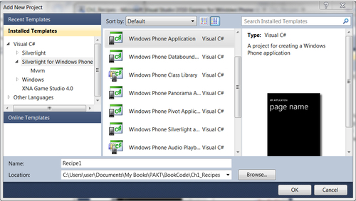
- A shell application with default files is added as shown in the following screenshot. Notice that there are several files added to the project by default. The
App.xamlfile contains the App constructor with different App event handlers included in theApp.xaml.csfile. There are three image files;ApplicationIcon.pngis for the App Icon displayed in the Phone,Background.pngis the default background image of the app, andSplashScreenImage.jpgcan be used for flashing the screen before the app launches.MainPage.xamlis the main page to be displayed when the app is launched. This is where we add all the display elements for the application. TheMainPage.xaml.csfile is where all the code is added to manipulate the data.
- After you open the project, just press F5 and run it to make sure there are no errors. It is good practice to run the app as often as you can so you can resolve any issue, otherwise you end up accumulating too many bugs.
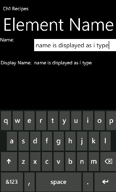
Let's build a simple display page where we have one textbox to enter data and a text block to display it. When you enter text in the textbox you will see it is displayed in the display text block.
- Let's change the application title and the page title text blocks in the
MainPage.xaml.csfile. Open the file and look forStackPanelwithName TitlePanel.<!--TitlePanel contains the name of the application and page title--> <StackPanel x:Name="TitlePanel" Grid.Row="0" Grid.ColumnSpan ="2">> <TextBlock x:Name="ApplicationTitle" Text="Ch1 Recipes" Style="{StaticResource PhoneTextNormalStyle}"/> <TextBlock x:Name="PageTitle" Text="Element Name" Style="{StaticResource PhoneTextTitle1Style}"/> </StackPanel>
Tip
Downloading the example code
You can download the example code files for all Packt books you have purchased from your account at http://www.PacktPub.com. If you purchased this book elsewhere, you can visit http://www.PacktPub.com/support and register to have the files e-mailed directly to you.
- In order to display two columns and three rows, we should change the Grid
ColumnDefinitionandRowDefinitionas illustrated in theXAMLsnippet. Locate this inside theGridnamedLayoutRoot:<Grid.RowDefinitions> <RowDefinition Height="Auto"/> <RowDefinition Height="81"/> <RowDefinition Height="526*"/> </Grid.RowDefinitions> <Grid.ColumnDefinitions> <ColumnDefinition Width="159*"></ColumnDefinition> <ColumnDefinition Width="321*"></ColumnDefinition> </Grid.ColumnDefinitions>
- Add three
TextBlockelements and a text element inside theContentPanelgrid. Here we will add binding information to thetbNameDisplayContentcontrol.ElementNameis assigned toTextBoxcontrol name.Pathis assigned to theTextproperty of theTextBoxcontrol; this is where the data is fetched.<Grid x:Name="ContentPanel" Grid.Row="1" Grid.RowSpan="2" Grid.ColumnSpan="2" Margin="0,0,0,-16"> <TextBlock x:Name ="tbName" Text ="Name:" Margin="2,13,371,582" /> <TextBox x:Name ="txtNameContent" Text ="" Margin="128,0,6,567" /> <TextBlock x:Name ="tbNameDisplay" Text ="Display Name:" Height="43" VerticalAlignment="Top" Margin="2,94,0,0" HorizontalAlignment="Left" Width="133" /> <TextBlock x:Name ="tbNameDisplayContent" Text ="{Binding ElementName=txtNameContent, Path=Text}" Margin="140,100,24,505" /> </Grid> - Press F5; now enter a name in the textbox and as you type you will see the text in the display text block, as shown in the following screenshot. This is the power of Data Binding.
We used the Binding class in the XAML using the following shorthand syntax:
<object property="{Binding ElementName=name, Path=property}" …/>
You can either use Path=Name or just the name in the property Path. We set the binding information to the Content property of the TextBlock control. We used ElementName as the textbox control name and then we assigned the textbox control's Text property to the Path. Basically, the data source for the binding is the Text property of the textbox.
In the last recipe, we learned how to use Binding with ElementName and Path. Similar to Path, we can use many properties like Converter, Mode, StringFormat, and so on. We will discuss the usage of these properties in the next several recipes in this chapter. For more information on Binding check this MSDN article: