
27/
La Nouvelle 4%
Mother
‘Ask anyone and they’ll probably say that they’d love to have been in their twenties in the 1960s. Even now, it’s cool. There is stuff that happened then, and stuff that was designed and created then, that is just cool. The furniture still looks modern now, the cars are beautiful, everything looks beautiful. There was a certain innocence, but it’s when the world changed.’ As John Cherry, a creative at advertising agency Mother in London suggests, the 1960s contained a certain aura of style and sophistication that remains highly desirable today. So when Stella Artois was launching its new 4% variant in 2009, they looked to the decade for inspiration.

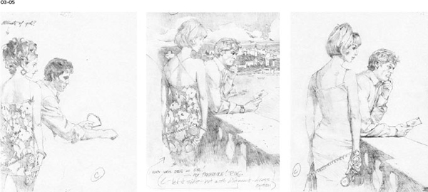

01-06 Robert McGinnis’s early sketches for one of the Stella Artois La Nouvelle 4% posters, with the finished ad shown right. The drawings show McGinnis’s different ideas for the characters in the ad.
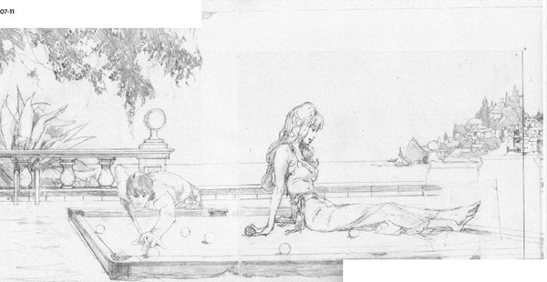

07-11 created by McGinnis for another poster. Each painting shows subtle differences in the characters’ hairstyles and clothing.
‘Robert McGinnis is undoubtedly the best film poster illustrator of the 1960s, and probably one of the best poster designers ever, so it wasn’t a hard choice.… He was retired, but to our surprise he told us he was willing to come out of retirement to do this project.’

12 Robert McGinnis working on the pool poster in his studio in the U.S.

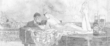
13 The final poster sees the girl presented with her hair up, rather than flowing down her shoulders as in many of the test paintings.
‘Making a painting for an advertising poster is highly unusual today, and this affected the process by which the ads were made. ‘It’s not just a case of doing it quickly on a computer. Which is kind of nice, because you’ve really got to consider feedback.’
The team wanted to achieve an authentic 1960s look for the poster campaign, and in looking at illustrators that would offer this, they discovered the work of Robert McGinnis, who created classic posters for films including Breakfast At Tiffany’s and Barbarella, as well as the Bond movies Live and Let Die and Thunderball. ‘We tried to make the work look as genuine as possible, so it becomes a homage to that era, rather than just a parody of it,’ say Gustavo Sousa and Rodrigo Saavedra, creatives on the project. ‘Robert McGinnis is undoubtedly the best film poster illustrator of the 1960s, and probably one of the best poster designers ever, so it wasn’t a hard choice. In fact, we had been referencing his posters when we started looking for illustrators, but we thought he was retired. Eventually we thought “what if we try it?” and decided to give him a call. As we expected, he was retired, but to our surprise he told us he was willing to come out of retirement to do this project.’
‘When you see his imagery, it defines that era,’ continues Cherry. ‘It was before photomontages were used – it was still painted stuff.’ Making a painting for an advertising poster is highly unusual today, and this affected the process by which the ads were made. ‘It’s not just a case of doing it quickly on a computer,’ says Cherry. ‘Which is kind of nice, because you’ve really got to consider feedback. It’s not unusual now to say, “let’s see it” before you make a judgement on an image, rather than using your imagination.’ These images required a leap of faith by Mother, who would send McGinnis a rough outline of what they wanted in the poster, and then let him develop it. ‘I mean, he knows what the 1960s were like better than we do,’ says Cherry. ‘He painted a lot of Riviera stuff, so we’d just send him references. We’d prowl the internet for the right kind of 1960s furniture and clothing and stuff like that. But it was very much a collaborative thing, and we’d always bow down to his judgement, because he was there.’
McGinnis made early sketches for the posters and would consult the agency over some specific points, but then sent back actual paintings for Mother to view and approve. Often these would be more or less finished when the agency first saw them, which caused some anxiety among the creatives on the project. ‘The first thing he’d supply to us was a painting, with a lot of colour and detail in there, and we’d say “don’t – because you’re going to have to do more work if it’s not right!”,’ says Cherry. ‘Obviously we were going to have a few things to feed back and we didn’t want him to do it all again.’
Despite these concerns, the experience of working with McGinnis was a pleasure for all involved. ‘It was all very easy,’ remembers Cherry. ‘I know I shouldn’t say that, but it was very smooth. He’s an artist and I think the clients were very appreciative that he actually accepted to do it. He is very much the guy that knows that world.’
McGinnis also drew the product image for the posters, which was placed separately onto the painting after it was completed. The type for the project was handpainted in-house at Mother, and again positioned after the central painting was finished. Otherwise, the posters remained largely true to their source images, with little correction made. ‘There was a little bit of jiggery-pokery going on, but there wasn’t a lot,’ says Cherry. ‘But it was quite funny because we would spend a lot of time doing that, because everything else had taken a long time, and we didn’t want to spoil it.’

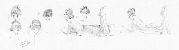
14-16 Drawings for the seaplane poster, including a selection of different potential faces for the characters.

17-19 The slow development of the poster can be seen through these sketches and an early painting. The finished poster is shown centre.

20-22 The piano poster features the female figure reading her book, while the man stares intently out at the viewer.