
Chapter 3
The Pivotal Pivot Table
In This Chapter
![]() Getting to know pivot tables
Getting to know pivot tables
![]() Laying out the geography of a pivot table
Laying out the geography of a pivot table
![]() Building your first pivot table
Building your first pivot table
![]() Creating top and bottom reports
Creating top and bottom reports
![]() Understanding, creating, and formatting slicers
Understanding, creating, and formatting slicers
![]() Sprucing up slicers with customization
Sprucing up slicers with customization
![]() Controlling multiple pivot tables with slicers
Controlling multiple pivot tables with slicers
![]() Using timeline slicers
Using timeline slicers
When creating Power Pivot data models, you will have to use some form of pivot table structure to expose the data in those models available to your audience.
Pivot tables have a reputation for being complicated, but if you’re new to pivot tables, rest easy. This chapter gives you the fundamental understanding you need in order to analyze and report on the data in your Power Pivot data model. After completing this introduction, you’ll be pleasantly surprised at how easy it is to create and use pivot tables.
 You can find the sample files for this chapter on this book’s companion website at
 www.dummies.com/go/excelpowerpivotpowerqueryfd in the workbooks named Chapter 3 Samples.xlsx and Chapter 3 Slicers.xlsx.
Introducing the Pivot Table
A pivot table is a robust tool that allows you to create an interactive view of your dataset, commonly referred to as a pivot table report. With a pivot table report, you can quickly and easily categorize your data into groups, summarize large amounts of data into meaningful analyses, and interactively perform a wide variety of calculations.
Pivot tables get their name from the way they allow you to drag and drop fields within the pivot table report to dynamically change (or pivot) perspective and give you an entirely new analysis using the same data source.
Think of a pivot table as an object you can point at your dataset. When you look at your dataset through a pivot table, you can see your data from different perspectives. The dataset itself doesn’t change, and it’s not connected to the pivot table. The pivot table is simply a tool you’re using to dynamically change analyses, apply varying calculations, and interactively drill down to the detail records.
The reason a pivot table is so well suited for reporting is that you can refresh the analyses shown through the pivot table by simply updating the dataset that it points to. You can set up the analysis and presentation layers only one time; then, to refresh the reporting mechanism, all you have to do is click a button.
Let’s start this exploration of pivot tables with a lesson on the anatomy of a pivot table.
Defining the Four Areas of a Pivot Table
A pivot table is composed of four areas. The data you place in these areas defines both the utility and appearance of the pivot table. Take a moment to understand the function of each of these four areas.
Values area
The values area, as shown in Figure 3-1, is the large, rectangular area below and to the right of the column and row headings. In the example in Figure 3-1, the values area contains a sum of the values in the Sales Amount field.

Figure 3-1: The values area of a pivot table calculates and counts data.
The values area calculates and counts data. The data fields that you drag and drop there are typically those that you want to measure — fields, such as Sum of Revenue, Count of Units, or Average of Price.
Row area
The row area is shown in Figure 3-2. Placing a data field into the row area displays the unique values from that field down the rows of the left side of the pivot table. The row area typically has at least one field, although it’s possible to have no fields.

Figure 3-2: The row area of a pivot table gives you a row-oriented perspective.
The types of data fields that you would drop here include those that you want to group and categorize, such as Products, Names, and Locations.
Column area
The column area is composed of headings that stretch across the top of columns in the pivot table.
As you can see in Figure 3-3, the column area stretches across the top of the columns. In this example, it contains the unique list of business segments.

Figure 3-3: The column area of a pivot table gives you a column-oriented perspective.
Placing a data field into the column area displays the unique values from that field in a column-oriented perspective. The column area is ideal for creating a data matrix or showing trends over time.
Filter area
The filter area is an optional set of one or more drop-down lists at the top of the pivot table. In Figure 3-4, the filter area contains the Region field, and the pivot table is set to show all regions.

Figure 3-4: The filter area allows you to easily apply filters to the pivot table report.
Placing data fields into the filter area allows you to filter the entire pivot table based on your selections. The types of data fields that you might drop here include those that you want to isolate and focus on; for example, Region, Line of Business, and Employees.
Creating Your First Pivot Table
Now that you have a good understanding of the basic structure of a pivot table, it’s time to try your hand at creating your first pivot table.
 You can find the sample file for this chapter on this book’s companion website.
Follow these steps:
Click any single cell inside the data source; it’s the table you use to feed the pivot table.
If you're following along, the data source would be the table found on the Sample Data tab.
Select the Insert tab on the Ribbon. Here, find the PivotTable icon, as shown in Figure 3-5. Choose PivotTable from the drop-down list beneath the icon.
This step opens the Create PivotTable dialog box, as shown in Figure 3-6. As you can see, this dialog box asks you to specify the location of the source data and the place where you want to put the pivot table.
 Notice that in the Create PivotTable dialog box, Excel makes an attempt to fill in the range of your data for you. In most cases, Excel gets this right. However, always make sure that the correct range is selected.
Also note in Figure 3-6 that the default location for a new pivot table is New Worksheet. This means your pivot table is placed in a new worksheet within the current workbook. You can change this by selecting the Existing Worksheet option and specifying the worksheet where you want the pivot table placed.
Click OK.
At this point, you have an empty pivot table report on a new worksheet. Next to the empty pivot table, you see the PivotTable Fields dialog box, shown in Figure 3-7.
The idea here is to add the fields you need into the pivot table by using the four drop zones found in the PivotTable Field List: Filters, Columns, Rows, and Values. Pleasantly enough, these drop zones correspond to the four areas of the pivot table described at the beginning of this chapter.
If clicking the pivot table doesn’t open the PivotTable Fields dialog box, you can manually open it by right-clicking anywhere inside the pivot table and selecting Show Field List.Now, before you go wild and start dropping fields into the various drop zones, you should ask yourself two questions: “What am I measuring?” and “How do I want to see it?” The answers to these questions give you some guidance when determining which fields go where.
For your first pivot table report, measure the dollar sales by market. This automatically tells you that you need to work with the Sales Amount field and the Market field.
How do you want to see that? You want markets to be listed down the left side of the report and the sales amount to be calculated next to each market. Remembering the four areas of the pivot table, you need to add the Market field to the Rows drop zone and add the Sales Amount field to the Values drop zone.
Select the Market check box in the list, as shown in Figure 3-8.
Now that you have regions in the pivot table, it’s time to add the dollar sales.
Select the Sales Amount check box in the list, as shown in Figure 3-9.
Selecting a check box that is non-numeric (text or date) automatically places that field into the row area of the pivot table. Selecting a check box that is numeric automatically places that field in the values area of the pivot table.What happens if you need fields in the other areas of the pivot table? Well, rather than select the field’s check box, you can drag any field directly to the different drop zones.
One more thing: When you add fields to the drop zones, you may find it difficult to see all the fields in each drop zone. You can expand the PivotTable Fields dialog box by clicking and dragging the borders of the dialog box.

Figure 3-5: Start a pivot table via the Insert tab.

Figure 3-6: The Create PivotTable dialog box.

Figure 3-7: The PivotTable Fields dialog box.

Figure 3-8: Select the Market check box.

Figure 3-9: Add the Sales Amount field by selecting its check box.
As you can see, you have just analyzed the sales for each market in just five steps! That’s an amazing feat, considering that you start with more than 60,000 rows of data. With a little formatting, this modest pivot table can become the starting point for a management report.
Changing and rearranging a pivot table
Now, here’s the wonderful thing about pivot tables: You can add as many layers of analysis as made possible by the fields in the source data table. Say that you want to show the dollar sales that each market earned by business segment. Because the pivot table already contains the Market and Sales Amount fields, all you have to add is the Business Segment field.
So, simply click anywhere on the pivot table to reopen the PivotTable Fields dialog box, and then select the Business Segment check box. Figure 3-10 illustrates what the pivot table should look like now.

Figure 3-10: Adding a layer of analysis is as easy as bringing in another field.
If clicking the pivot table doesn’t open the PivotTable Fields dialog box, you can manually open it by right-clicking anywhere inside the pivot table and selecting Show Field List.
Imagine that your manager says that this layout doesn’t work for him. He wants to see business segments displayed across the top of the pivot table report. No problem: Simply drag the Business Segment field from the Rows drop zone to the Columns drop zone. As you can see in Figure 3-11, this instantly restructures the pivot table to his specifications.

Figure 3-11: Your business segments are now column oriented.
Adding a report filter
Often, you’re asked to produce reports for one particular region, market, or product. Rather than work hours and hours building separate reports for every possible analysis scenario, you can leverage pivot tables to help create multiple views of the same data. For example, you can do so by creating a region filter in the pivot table.
Click anywhere on the pivot table to reopen the PivotTable Fields dialog box, and then drag the Region field to the Filters drop zone. This adds a drop-down selector to the pivot table, shown in Figure 3-12. You can then use this selector to analyze one particular region at a time.

Figure 3-12: Using pivot tables to analyze regions.
Keeping the pivot table fresh
In Hollywood, it’s important to stay fresh and relevant. As boring as the pivot tables may seem, they’ll eventually become the stars of your reports. So it’s just as important to keep your pivot tables fresh and relevant.
As time goes by, your data may change and grow with newly added rows and columns. The action of updating your pivot table with these changes is refreshing your data.
The pivot table report can be refreshed by simply right-clicking inside the pivot table report and selecting Refresh, as shown in Figure 3-13.

Figure 3-13: Refreshing the pivot table captures changes made to your data.
Sometimes, you’re the data source that feeds your pivot table changes in structure. For example, you may have added or deleted rows or columns from the data table. These types of changes affect the range of the data source, not just a few data items in the table.
In these cases, performing a simple Refresh of the pivot table won’t do. You have to update the range being captured by the pivot table. Here’s how:
- Click anywhere inside the pivot table to select the PivotTable Tools context tab on the Ribbon.
- Select the Analyze tab on the Ribbon.
Click Change Data Source, as shown in Figure 3-14.
The Change PivotTable Data Source dialog box appears.
- Change the range selection to include any new rows or columns (see Figure 3-15).
- Click OK to apply the change.

Figure 3-14: Changing the range that feeds the pivot table.

Figure 3-15: Select the new range that feeds the pivot table.
Customizing Pivot Table Reports
The pivot tables you create often need to be tweaked to get the look and feel you’re looking for. In this section, I cover some of the options you can adjust to customize your pivot tables to suit your reporting needs.
Changing the pivot table layout
Excel gives you a choice in the layout of the data in a pivot table. The three layouts, shown side by side in Figure 3-16, are the Compact Form, Outline Form, and Tabular Form. Although no layout stands out as better than the others, I prefer using the Tabular Form layout because it seems easiest to read and it’s the layout that most people who have seen pivot tables are used to.

Figure 3-16: The three layouts for a pivot table report.
The layout you choose affects not only the look and feel of your reporting mechanisms but also, possibly, the way you build and interact with any reporting models based on your pivot tables.
Changing the layout of a pivot table is easy. Follow these steps:
- Click anywhere inside the pivot table to select the PivotTable Tools context tab on the Ribbon.
- Select the Design tab on the Ribbon.
- Click the Report Layout icon and choose the layout you like. See Figure 3-17.

Figure 3-17: Changing the layout of the pivot table.
Customizing field names
Notice that every field in the pivot table has a name. The fields in the row, column, and filter areas inherit their names from the data labels in the source table. The fields in the values area are given a name, such as Sum of Sales Amount.
Sometimes you might prefer the name Total Sales instead of the unattractive default name, such as Sum of Sales Amount. In these situations, the ability to change your field names is handy. To change a field name, follow these steps:
Right-click any value within the target field.
For example, if you want to change the name of the field Sum of Sales Amount, right-click any value under that field.
Select Value Field Settings, as shown in Figure 3-18.
The Value Field Settings dialog box appears.
Note that if you were changing the name of a field in the row area or column area, this selection is Field Settings.
- Enter the new name in the Custom Name input box, shown in Figure 3-19.
- Click OK to apply the change.

Figure 3-18: Right-click any value in the target field to select the Value Field Settings option.

Figure 3-19: Use the Custom Name input box to change the name of the field.
If you use the name of the data label used in the source table, you receive an error. For example, if you rename Sum of Sales Amount as Sales Amount, you see an error message because there’s already a Sales Amount field in the source data table. Well, this is kind of lame, especially if Sales Amount is exactly what you want to name the field in your pivot table.
To get around this, you can name the field and add a space to the end of the name. Excel considers Sales Amount (followed by a space) to be different from Sales Amount. This way, you can use the name you want and no one will notice that it’s any different.
Applying numeric formats to data fields
Numbers in pivot tables can be formatted to fit your needs; that is, formatted as currency, percentage, or number. You can easily control the numeric formatting of a field using the Value Field Settings dialog box. Here’s how:
Right-click any value within the target field.
For example, if you want to change the format of the values in the Sales Amount field, right-click any value under that field.
Select Value Field Settings.
The Value Field Settings dialog box appears.
Click the Number Format button.
The Format Cells dialog box opens.
- Apply the number format you desire, just as you typically would on your spreadsheet.
Click OK to apply the changes.
After you set the formatting for a field, the applied formatting persists, even if you refresh or rearrange the pivot table.
Changing summary calculations
When creating the pivot table report, Excel, by default, summarizes your data by either counting or summing the items. Rather than choose Sum or Count, you might want to choose functions, such as Average, Min, Max, for example. In all, 11 options are available, including
- Sum: Adds all numeric data.
- Count: Counts all data items within a given field, including numeric-, text-, and date-formatted cells.
- Average: Calculates an average for the target data items.
- Max: Displays the largest value in the target data items.
- Min: Displays the smallest value in the target data items.
- Product: Multiplies all target data items together.
- Count Nums: Counts only the numeric cells in the target data items.
- StdDevP and StdDev: Calculates the standard deviation for the target data items. Use StdDevP if your dataset contains the complete population. Use StdDev if your dataset contains a sample of the population.
- VarP and Var: Calculates the statistical variance for the target data items. Use VarP if your data contains a complete population. If your data contains only a sampling of the complete population, use
Varto estimate the variance.
You can easily change the summary calculation for any given field by taking the following actions:
- Right-click any value within the target field.
Select Value Field Settings.
The Value Field Settings dialog box appears.
- Choose the type of calculation you want to use from the list of calculations. See Figure 3-20.
- Click OK to apply the changes.

Figure 3-20: Changing the type of summary calculation used in a field.
Did you know that a single blank cell causes Excel to count instead of sum? That’s right: If all cells in a column contain numeric data, Excel chooses Sum. If only one cell is either blank or contains text, Excel chooses Count.
Be sure to pay attention to the fields that you place into the values area of the pivot table. If the field name starts with Count Of, Excel is counting the items in the field instead of summing the values.
Suppressing subtotals
Notice that every time you add a field to the pivot table, Excel adds a subtotal for that field. At times, however, the inclusion of subtotals either doesn’t make sense or simply hinders a clear view of the pivot table report. For example, Figure 3-21 shows a pivot table in which the subtotals inundate the report with totals that hide the real data you’re trying to report.

Figure 3-21: Subtotals sometimes muddle the data you’re trying to show.
Removing all subtotals at one time
You can remove all subtotals at one time by taking these actions:
- Click anywhere inside the pivot table to select the PivotTable Tools context tab on the Ribbon.
- Select the Design tab on the Ribbon.
- Click the Subtotals icon and select Do Not Show Subtotals, as shown in Figure 3-22.

Figure 3-22: Use the Do Not Show Subtotals option to remove all subtotals at one time.
As you can see in Figure 3-23, the same report without subtotals is much more pleasant to review.

Figure 3-23: The report shown in Figure 3-21, without subtotals.
Removing the subtotals for only one field
Maybe you want to remove the subtotals for only one field? In such a case, you can take the following actions:
- Right-click any value within the target field.
Select Field Settings.
The Field Settings dialog box appears.
- Choose the None option under Subtotals, as shown in Figure 3-24.
- Click OK to apply the changes.

Figure 3-24: Choose the None option to remove subtotals for one field.
Removing grand totals
In certain instances, you may want to remove the grand totals from the pivot table. Follow these steps:
- Right-click anywhere on the pivot table.
Select PivotTable Options.
The PivotTable Options dialog box appears.
- Click the Totals & Filters tab.
- Click the Show Grand Totals for Rows check box to deselect it.
- Click the Show Grand Totals for Columns check box to deselect it.
Showing and hiding data items
A pivot table summarizes and displays all records in a source data table. In certain situations, however, you may want to inhibit certain data items from being included in the pivot table summary. In these situations, you can choose to hide a data item.
In terms of pivot tables, hiding doesn’t mean simply preventing the data item from being shown on the report. Hiding a data item also prevents it from being factored into the summary calculations.
In the pivot table illustrated in Figure 3-25, I show sales amounts for all business segments by market. In this example, I want to show totals without taking sales from the Bikes segment into consideration. In other words, I want to hide the Bikes segment.

Figure 3-25: To remove Bikes from this analysis …
You can hide the Bikes Business Segment by clicking the Business Segment drop-down arrow and deselecting the Bikes check box, as shown in Figure 3-26.

Figure 3-26: … deselect the Bikes check box.
After you click OK to close the selection box, the pivot table instantly recalculates, leaving out the Bikes segment. As you can see in Figure 3-27, the Market total sales now reflect the sales without Bikes.

Figure 3-27: The analysis from Figure 3-25, without the Bikes segment.
You can just as quickly reinstate all hidden data items for the field. You simply click the Business Segment drop-down arrow and click the Select All check box, as shown in Figure 3-28.

Figure 3-28: Clicking the Select All check box forces all data items in that field to become unhidden.
Hiding or showing items without data
By default, the pivot table shows only data items that have data. This inherent behavior may cause unintended problems for your data analysis.
Look at Figure 3-29, which shows a pivot table with the SalesPeriod field in the row area and the Region field in the filter area. Note that the Region field is set to (All) and that every sales period appears in the report.

Figure 3-29: All sales periods are showing.
If you choose Europe in the filter area, only a portion of all the sales periods is shown (see Figure 3-30). The pivot table shows only those sales periods that apply to the Europe region.

Figure 3-30: Filtering for the Europe region causes certain sales periods to disappear.
From a reporting perspective, it isn’t ideal if half the year’s data disappears every time customers select Europe.
Here’s how you can prevent Excel from hiding pivot items without data:
Right-click any value within the target field.
In this example, the target field is the SalesPeriod field.
Select Field Settings.
The Field Settings dialog box appears.
- Select the Layout & Print tab in the Field Settings dialog box.
- Select the Show Items with No Data option, as shown in Figure 3-31.
- Click OK to apply the change.

Figure 3-31: Click the Show Items with No Data option to force Excel to display all data items.
As you can see in Figure 3-32, after you choose the Show Items with No Data option, all sales periods appear whether the selected region had sales that period or not.
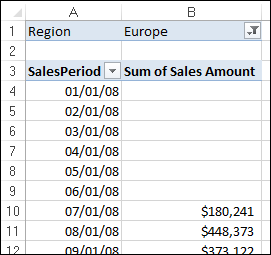
Figure 3-32: All sales periods are now displayed, even if there is no data to be shown.
Now that you’re confident that the structure of the pivot table is locked, you can use it to feed charts and other components on your report.
Sorting the pivot table
By default, items in each pivot field are sorted in ascending sequence based on the item name. Excel gives you the freedom to change the sort order of the items in the pivot table.
Like many actions you can perform in Excel, you have lots of different ways to sort data within a pivot table. The easiest way is to apply the sort directly in the pivot table. Here’s how:
Right-click any value within the target field — the field you need to sort.
In the example shown in Figure 3-33, you want to sort by Sales Amount.
Select Sort and then select the sort direction.
The changes take effect immediately and persist while you work with the pivot table.

Figure 3-33: Applying a sort to a pivot table field.
Understanding Slicers
Slicers allow you to filter your pivot table in a way that’s similar to the way Filter fields filter a pivot table. The difference is that slicers offer a user-friendly interface, enabling you to better manage the filter state of your pivot table reports.
As useful as Filter fields are, they have always had a couple of drawbacks.
First of all, Filter fields are not cascading filters — the filters don’t work together to limit selections when needed. For example, in Figure 3-34, you can see that the Region filter is set to the North region. However, the Market filter still allows you to select markets that are clearly not in the North region (California, for example). Because the Market filter is not in any way limited based on the Region Filter field, you have the annoying possibility of selecting a market that could yield no data because it’s not in the North region.

Figure 3-34: Default pivot table Filter fields do not work together to limit filter selections.
Another drawback is that Filter fields don’t provide an easy way to tell what exactly is being filtered when you select multiple items. In Figure 3-35, you can see an example. The Region filter has been limited to three regions: Midwest, North, and Northeast. However, notice that the Region filter value shows (Multiple Items). By default, Filter fields show (Multiple Items) when you select more than one item. The only way to tell what has been selected is to click the drop-down menu. You can imagine the confusion on a printed version of this report, in which you can’t click down to see which data items make up the numbers on the page.

Figure 3-35: Filter fields show the phrase (Multiple Items) whenever multiple selections are made.
By contrast, slicers don’t have these issues. Slicers respond to one another. As you can see in Figure 3-36, the Market slicer visibly highlights the relevant markets when the North region is selected. The rest of the markets are muted, signaling that they are not part of the North region.
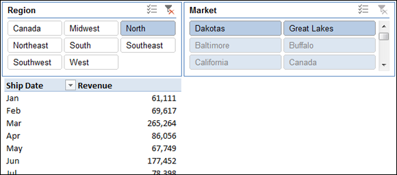
Figure 3-36: Slicers work together to show you relevant data items based on your selection.
When selecting multiple items in a slicer, you can easily see that multiple items have been chosen. In Figure 3-37, you can see that the pivot table is being filtered by the Midwest, North, and Northeast regions. No more (Multiple Items).

Figure 3-37: Slicers do a better job at displaying multiple item selections.
Creating a Standard Slicer
Enough talk. It’s time to create your first slicer. Just follow these steps:
Place the cursor anywhere inside the pivot table, and then go up to the Ribbon and click the Analyze tab. There, click the Insert Slicer icon, shown in Figure 3-38.
This step opens the Insert Slicers dialog box, shown in Figure 3-39. Select the dimensions you want to filter. In this example, the Region and Market slicers are created.
After the slicers are created, simply click the filter values to filter the pivot table.
As you can see in Figure 3-40, clicking Midwest in the Region slicer not only filters the pivot table, but the Market slicer also responds by highlighting the markets that belong to the Midwest region.
You can also select multiple values by holding down the Ctrl key on the keyboard while selecting the needed filters. In Figure 3-41, I held down the Ctrl key while selecting Baltimore, California, Charlotte, and Chicago. This highlights not only the selected markets in the Market slicer but also their associated regions in the Region slicer.
To clear the filtering on a slicer, simply click the Clear Filter icon on the target slicer, as shown in Figure 3-42.

Figure 3-38: Inserting a slicer.

Figure 3-39: Select the dimensions for which you want slicers created.

Figure 3-40: Select the dimensions you want filtered using slicers.

Figure 3-41: The fact that you can see the current filter state gives slicers a unique advantage over Filter fields.

Figure 3-42: Clearing the filters on a slicer.
Getting Fancy with Slicer Customizations
The following sections cover a few formatting adjustments you can make to your slicers.
Size and placement
A slicer behaves like a standard Excel shape object in that you can move it around and adjust its size by clicking it and dragging its position points; see Figure 3-43.

Figure 3-43: Adjust the slicer size and placement by dragging its position points.
You can also right-click the slicer and select Size and Properties. This brings up the Format Slicer pane (see Figure 3-44), allowing you to adjust the size of the slicer, how the slicer should behave when cells are shifted, and whether the slicer should appear on a printed copy of your report.

Figure 3-44: The Format Slicer pane offers more control over how the slicer behaves in relation to the worksheet it’s on.
Data item columns
By default, all slicers are created with one column of data items. You can change this number by right-clicking the slicer and selecting Size and Properties. This opens the Format Slicer pane. Under the Position and Layout section, you can specify the number of columns in the slicer. Adjusting the number to 2, as shown in Figure 3-45, forces the data items to be displayed in two columns, adjusting the number to 3 forces the data items to be displayed in three columns, and so on.

Figure 3-45: Adjust the Number of Columns property to display the slicer data items in more than one column.
Miscellaneous slicer settings
Right-clicking the slicer and selecting Slicer Settings opens the Slicer Settings dialog box, shown in Figure 3-46. Using this dialog box, you can control the look of the slicer’s header, how the slicer is sorted, and how filtered items are handled.

Figure 3-46: The Slicer Settings dialog box.
Controlling Multiple Pivot Tables with One Slicer
Another advantage you gain with slicers is that each slicer can be tied to more than one pivot table; that is to say, any filter you apply to your slicer can be applied to multiple pivot tables.
To connect the slicer to more than one pivot table, simply right-click the slicer and select Report Connections. This opens the Report Connections dialog box, shown in Figure 3-47. Place a check mark next to any pivot table that you want to filter using the current slicer.

Figure 3-47: Choose the pivot tables to be filtered by this slicer.
At this point, any filter you apply to the slicer is applied to all connected pivot tables. Controlling the filter state of multiple pivot tables is a powerful feature, especially in reports that run on multiple pivot tables.
Creating a Timeline Slicer
The Timeline slicer works in the same way a standard slicer does, in that it lets you filter a pivot table using a visual selection mechanism rather than the old Filter fields. The difference is that the Timeline slicer is designed to work exclusively with date fields, providing an excellent visual method to filter and group the dates in the pivot table.
To create a Timeline slicer, the pivot table must contain a field where all data is formatted as a date. It’s not enough to have a column of data that contains a few dates. All values in the date field must be a valid date and formatted as such.
To create a Timeline slicer, follow these steps:
Place the cursor anywhere inside the pivot table, and then click the Analyze tab on the Ribbon. There, click the Insert Timeline command, shown in Figure 3-48.
The Insert Timelines dialog box, shown in Figure 3-49, appears, showing you all available date fields in the chosen pivot table.
- In the Insert Timelines dialog box, select the date fields for which you want to create the timeline.

Figure 3-48: Inserting a Timeline slicer.

Figure 3-49: Select the date fields for which you want slicers created.
After the Timeline slicer is created, you can filter the data in the pivot table and pivot chart, using this dynamic data-selection mechanism. Figure 3-50 demonstrates how selecting Mar, Apr, and May in the Timeline slicer automatically filters the pivot chart.

Figure 3-50: Click a date selection to filter the pivot table or pivot chart.
Figure 3-51 illustrates how you can expand the slicer range with the mouse to include a wider range of dates in your filtered numbers.

Figure 3-51: You can expand the range on the Timeline slicer to include more data in the filtered numbers.
Want to quickly filter the pivot table by quarters? Well, that’s easy with a Timeline slicer. Simply click the time period drop-down menu and select Quarters. As you can see in Figure 3-52, you can also switch to Years or Days, if needed.

Figure 3-52: Quickly switch among Quarters, Years, Months, and Days.
Timeline slicers are not backward compatible; they are usable only in Excel 2013 and Excel 2016. If you open a workbook with Timeline slicers in Excel 2010 or previous versions, the Timeline slicers are disabled.