Chapter 2. The Process Behind the System
Brasilia, the capital of Brazil, is a planned city, built in the 1950s to showcase a futuristic vision of what a city could be. The plan was created by Lucio Costa and Oscar Neimeyer, who dreamed of a deliberate and orderly city that would contrast with other organically grown Brazilian cities like Rio de Janeiro (http://bkaprt.com/eds/02-01/).
From ten thousand feet above, the city resembles an airplane or a soaring bird. At that macro level, the design of the city is perfectly rational, with clear separations of administrative, industrial, commercial, residential, and recreational areas. The individual buildings are striking examples of modernist architecture. So what went wrong?
There were two big problems with the design of Brasilia: it couldn’t scale, and it didn’t consider how real people behave in cities. Brasilia was designed for five hundred thousand people. The city now has a population of two million, with only ten percent living in the original planned city. The rest have created their own communities on the outskirts. The plan also didn’t contain the ingredients of a typical city: messy streets, plazas, sidewalks, meeting places. And Brasilia was built to be traversed by car, making it difficult for pedestrians to get around.
Brasilia contains many beautiful components, but they don’t all work together as a city because its design didn’t consider people’s needs.
We’re not building anything as vast or permanent as a city. But design systems, like cities, need proper planning in order to work well. A well-planned system is easy to use, inspires participation, and grows stronger over time. A poorly planned system feels disjointed, confusing, and difficult to use. And if you don’t plan your system well, people will start creating their own systems on the outskirts.
Before you design any components, start your design system by doing a series of inventories and mapping exercises. Take a broad view of your entire product ecosystem before getting into more granular, individual components. It may feel tedious at first, but this planning will help you make better decisions later on.
Mapping Your Ecosystem
When you start developing a design system, you need to answer some big questions:
- What products will this system serve?
- Which people should we involve?
- What is the scope of this system?
Planning will help you focus. The first step is to understand your system as it exists today. What products or services exist? What is their relationship to one another?
Product and user inventory
We’re going to kick off the planning process by creating a product and user inventory. This works best as a collaborative exercise with everyone in the design systems team; that way, you can draw on your collective memory. Doing this exercise might reveal products you didn’t even know existed.
Carve out a couple of hours as a group and list as many products as possible. Start with the obvious: what are the core products your audiences interact with daily? Then move on to smaller products. List actual product names (like “Gmail”) instead of broad categories (like “mobile apps”).
Your list will vary in complexity based on the size of your organization. If you’re creating a design system for a large website, your “products” may actually be distinct sections or pages of your site that are owned and managed by different people. For example, a University site may list “Home,” “Course Catalog,” “Library,” “Admissions,” and “Virtual Tour.” If you’re a large corporation, you may have many products across a range of platforms. A bank, for example, may have separate websites for banking and credit cards as well as several iOS and Android apps.
After you’ve created a list of your products, the next step is to create a list of your audiences. What different types of people use your products? As you create this list, you may also want to note who your primary audience is. You will eventually want to go further and start thinking about the types of tasks each audience performs when they use your products, but you don’t need to do that just yet.
If you finish this exercise feeling surprised or overwhelmed by the scope of your product landscape, don’t worry. At this point, we’re just trying to understand the bigger picture. We’ll get more granular as we move through the planning.
Document the inventory in a spreadsheet
You want the information you gather to be shareable and to serve as a reference for future design-systems work. So expand on the list in a spreadsheet. Here’s some information that is most useful to document:
- Product name. What is the name of this product?
- Platform. What platform is this product on (Web, iOS, Android, etc.)?
- Audience. Who is the core audience for this product?
- Purpose. What is the primary purpose of this product?
- Product owner. Who is the product owner or team lead?
Depending on your organization, you may also want to document the following:
- Principles. Does this product have any documented principles?
- Brand language. Does this product use a different brand language? If you’re working at a company that has multiple brands or sub-brands, make a note of that.
- Other metadata. Make a note of anything else that can help your planning process. Has this product team expressed interest in the design system? Is this product due for a redesign, or has it recently undergone one?
At this point, you’re not making any decisions. You’re just deepening your understanding of the landscape so you can make informed decisions later.
Drawing an ecosystem map
All of this context you’ve gathered about your products and audiences will help you create an ecosystem map. An ecosystem map reveals the connections between your users and your products.
Small, iterative changes can dilute your brand voice and make it uneven over time. You may not notice any inconsistency unless you happen to see two juxtaposed screens showing different brand applications. Ecosystem mapping allows you to perceive this inconsistency through the eyes of an end user.
Remember when I said, in Chapter 1, that cohesion is harder to accomplish than unity when creating a design system? An ecosystem map helps you understand how your experiences lack cohesion. In the context of your organization, your ecosystem contains all of your products across all platforms. Your users are traveling from place to place in order to accomplish their tasks. Along that path, they might be met with inconsistent naming, visual styles, or interaction patterns.
It’s valuable to perform an ecosystem mapping exercise as a collaborative workshop, especially if you include representatives from different product lines in addition to the design-systems team. Besides spotting inconsistencies, you’re also developing a shared understanding of how users experience your products.
To create an ecosystem map:
- Choose an audience type. Select an audience type from your user inventory. It makes sense to start with your primary audience types.
- List the tasks they perform on a daily basis. Using Post-it notes, write down the tasks this audience type performs on a daily basis. For instance, if you’re working on a website for a university, those tasks might be applying for admission, scheduling a campus visit, applying for financial aid, etc.
- Break a task out into a user flow. Choose one task and break out the steps necessary to complete it. For instance, if your task is “applying for admission,” a user needs to research the programs, find key dates, and submit the application.
- Map the flow to the sections of your product. One way to do this is by using Post-its. Use one color for your users, another color for your tasks, and a third color for the pages or sections a user will visit to complete that task. Place the user at the center and cluster their tasks around them, followed by the corresponding pages in the outer ring (Fig 2.1). If your product is on multiple platforms, take that into account as well. How does a user complete the task of “applying for admission” on a website versus a mobile app?
- Write down which teams are responsible for each of the sections. Pay attention to moments where several teams are responsible for different parts of one flow. In the example above, you might have one team responsible for the “homepage,” another responsible for the “admissions page,” and still another responsible for the “applicant submission” process. Or you might have one team responsible for that entire flow on your website and a different team managing the flow for your mobile app.
- Repeat these steps as needed. Repeat this process for other core flows and audience types.
- Visualize your ecosystem map. After you’ve done the steps above for a few flows, you want to understand what each flow looks like from a user’s perspective. Choose a flow and take screenshots of each of the product sections. This will help you see how a user moves through the various sections of your products.

This exercise works well in person with lots of sticky notes, but you can also use a collaborative whiteboarding tool if your team is remote. I used Miro for this example (http://bkaprt.com/eds/02-02/).
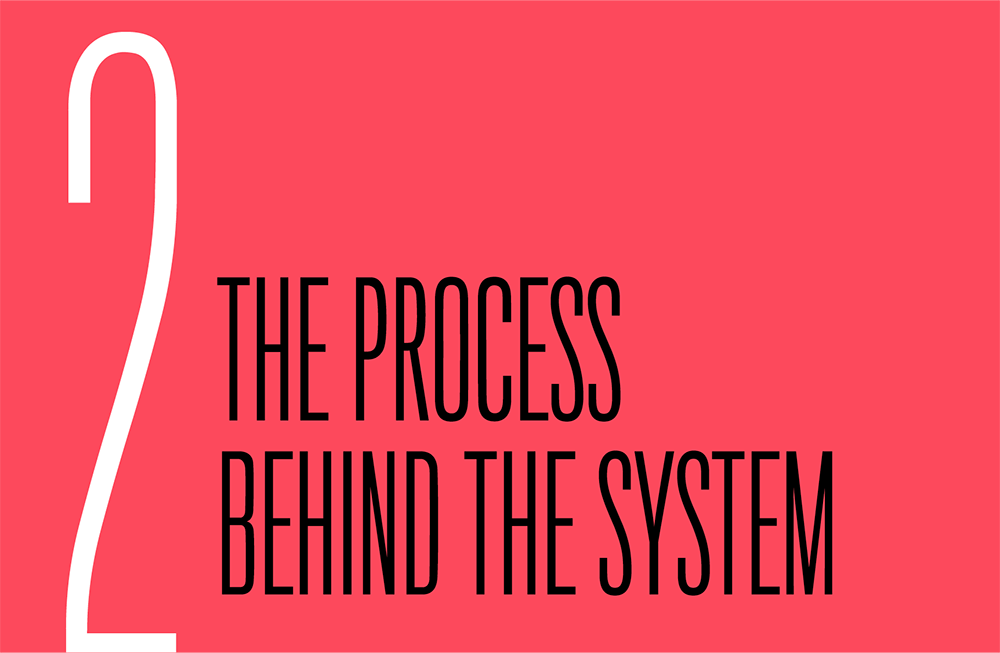
Pay special attention to the times when a user needs to travel across different sections of products to complete a task. Do those flows feel cohesive? How much variation is there across the different products that make up one user journey? Look out for inconsistencies that would make a user feel like they’re suddenly in a new experience (Fig 2.2).
Visual inconsistencies can be easy to spot, but be sure to keep an eye out for different language describing the same task, which can also lead to confusion. Selene Hinkley, a content strategist on the Shopify Polaris team, found that across the App store and Theme store, different terms were being used to describe the action of installing a theme onto a store (“Add Theme” versus “Install Theme”). Because the phrase “Add Theme” was more approachable and embodied the principles the team had established, the team updated all language to use that term.
Evaluating your ecosystem map
The point of these activities is to help you figure out where to start in the planning process.
There are many ways to begin design-system work: you can start with your visual language, or you can start with small, basic components, like buttons. I recommend something else: start with the elements that will most improve the user experience of your products.
Let’s revisit the planning questions that I raised in the beginning:
- What products will this system serve? The product inventory can show you your core product. If you have multiple core products, start with products that share similar purposes and audiences.
- Which people should we involve? Your ecosystem map should illuminate which teams need to work more closely together. For example, you may discover that two teams that don’t work closely together are closely linked in a user’s journey. You may decide that part of your design-system work will involve bringing those teams closer together.
- What is the scope of this system? A design system’s scope is a combination of the products and people it serves and the parts it contains. At this point, you probably have an idea about the products and people, but still don’t know which parts to include in your initial release. We’ll get to that next.
In other words, you’re looking for where your system can have the biggest impact. Consider these goals in your planning process:
- Identify workflow pain points and opportunities. As a user moves through a workflow, is there a similar concept that’s described in a different way? Are there specific flows where users are met with inconsistent navigation patterns? Where are users getting the most confused?
- Find visual inconsistency. Does your company look like it has a unified design language? This exercise should help you spot some of your biggest areas of visual inconsistency right away. This will especially be the case if your team has been iterating on design language in small bits over time (for example, if you’ve been experimenting with different illustration styles in a specific area). Seeing these things next to one another, through the lens of how a user sees them, will illuminate areas where your brand language is falling apart.
- Organize across silos. Even if your team is organized into silos, your users shouldn’t see that. This exercise can help you spot where the siloing leads to a lack of cohesion. And that, in turn, will let you determine how a design system can help you drive alignment across different feature teams. Creating this map gives you a good opportunity to form relationships with these product teams.
Each of these goals maps to an aspect of your design system. If you find you have a lot of uneven workflows, you may want to focus your attention on guidelines for how components are used to solve problems. If you mostly find inconsistency with components, think about how you might improve visual consistency. If you find a lack of cohesion across your team’s product lines, you may want to concentrate on unifying teams and encouraging them to talk with one another more.
Taking Inventory
Your product inventory should have given you a good understanding of the scope of your products. Your ecosystem mapping exercise should have revealed areas where your products lack cohesion. Up to this point, we’ve been looking broadly. Now it’s time to go a level deeper to understand the current state of our design language and user interfaces.
The next step in the planning process is to create an audit. You’ve probably heard of an audit before, or conducted one yourself. It’s frequently recommended as the first activity in any design-system process. I recommend doing your audit after your product inventory and ecosystem map because auditing takes a lot of time. The previous exercises can help you narrow your scope, allowing you to focus on a few products or sections at a time.
When you audit, you’re evaluating the quality and amount of variation in your design. You want to focus on two things: your design language and your user interfaces. Your design language includes all of the elements that express your brand visually: typography, color, iconography, shape, and space. Your user interface is your components.
Some folks recommend auditing the components and design language separately. I recommend doing one audit, and then evaluating the results independently. Think of the auditing process like decluttering your closet. First, you want to take everything out of the closet. Then, you want to group similar items. And finally, you’ll get rid of items that are redundant or not providing value. If you try to do all of these steps at once, the process will take too long and you’ll feel overwhelmed. The same is true for auditing your design language and UI. Get everything out in the open, categorize, and then evaluate for quality.
Here’s what an auditing process looks like:
- Organize a team. Auditing takes time. Working as a team can make it go faster, so no one suffers from audit fatigue. Another benefit: shared perspectives. It’s easy to quantify how many components you have, but it’s much harder to measure the quality of a component. Conducting an audit as a group enables you to develop a shared understanding of quality.
- Choose a tool. Your auditing tool should be digital and collaborative. It should also allow you to add metadata, like where a component is located. Finally, the tool should be visual. You are, after all, evaluating the visual appearance of these components. Based on these criteria, I’ve found that AirTable (airtable.com) works best for this type of audit because it lets you switch between a traditional spreadsheet view and a gallery view (Fig 2.3).

Fig 2.3: AirTable’s gallery view makes it easy to see visual inconsistencies in the user interface, as in this audit Vivian Li conducted at Qwilr (http://bkaprt.com/eds/02-03/). - Decide on categories. Choose the categories you’ll be auditing. You may want to divide your audit into three big categories: UI components, content display components, and visual styles. UI components include small elements like form fields and buttons. Content display components refer to larger components like a hero module or a story card. Visual styles indicate your design language—elements like type and color. After you’ve decided on the categories, assign them to people on the team.
- Screenshot and categorize. Next comes the work of taking and categorizing screenshots. Each auditor reviews your products, taking screenshots of the components and entering relevant information into the spreadsheet. Your spreadsheet should include an image of the component, the component’s name, and the component’s location.
Depending on the scope of your products, an audit can take several weeks. Once you’ve completed this process, it’s time to interpret the results.
Evaluate your design language
The purpose of a visual audit is to evaluate your design language across your products. You’re looking for unity. Do all of your brand elements currently hold together to tell one story? Broadly, you want to understand two things—quality and quantity:
- How well does your design language express your brand? You need some way to measure whether your design language is effective—that is, how well it expresses your brand. Before you start evaluating, it’s helpful to come prepared with any documentation of your strategic brand guidelines. That could be a brand playbook, brand purpose statement, or design principles. I’ve seen teams use a print style guide or printed material as the true representation of their brand and evaluate their digital presence against it.
- Is your design language consistent? While the first question is all about the quality of your design language, here you want to understand the quantity of your design elements. Are you using design elements in a consistent way? Are primary buttons always blue? Is the body copy
18pxthroughout the site? For each of your categories, add up how many variations currently exist. Type sizes and color hex codes are common culprits of inconsistency.
Both questions are important. In general, I’ve seen audits focus more on answering the second question. However, if your design language is consistent but it doesn’t express your brand, then your language isn’t working.
This exercise should help you understand whether you need a full-scale redesign or just some realignment. If your brand language clearly expresses the mission of your products but there are some outliers, then you may just need to make some adjustments.
Evaluate your components
Next, you need to evaluate your components. As with the visual audit, we want to understand quantity as well as quality. However, we’ll start with quantity and then evaluate quality once we’ve narrowed down our component list:
- Which components are used most frequently? First, you’ll find some components that recur often because they are the basic building blocks of any digital product—buttons, accordions, checkboxes, tabs. I consider these high-frequency components because they repeat so often throughout digital products.
- Which high-frequency components are unique to your products? Chances are that in addition to these basic components, your specific product has a few larger components that repeat often, like Airbnb’s listing cards, or the Guardian’s story cards (Fig 2.4). I consider these high-value components. They might not repeat as often as high-frequency components, but they have a huge role in defining the experience of your product. Improving the functionality and design of high-value components is a great way to improve the overall design quality of your products.

Fig 2.4: Airbnb’s listing card and the Guardian’s story card repeat frequently and are specific to their product, making them good design-system contenders.
For your first design-system release, you’ll want to choose a blend of both high-frequency and high-volume components.
Group components by purpose
As useful as they are, these inventories don’t help us understand why the components exist, or what problems they solve.
In her book Design Systems, Alla Kholmatova proposes the idea of a purpose-directed inventory. While a visual inventory focuses on grouping things by appearance and type, like buttons and forms, this inventory groups items by purpose.
You may have two patterns that look different but solve similar problems, or two patterns that look similar but solve different problems. To spot these sorts of patterns, define components (and their variations) by the problem they solve instead of by their visual style.
When components lack clarity and purpose, the result is inconsistency. If you don’t define a purpose, you may get designers and engineers making a new version of a component for a small visual change. An increase in the number of one-off components across your system will increase technical and design debt—the exact opposite of what you want.
Grouping components by purpose works best to help you understand your larger components, especially ones that display content. That’s because the variation on smaller components, like buttons, tends to be visual, not conceptual.
Ask your auditors to work together to group components they think serve a similar purpose. This usually leads to some debate about each component’s purpose until people start to get aligned. Eventually, you’ll have a pile of components that seem like they’re solving the same problem.
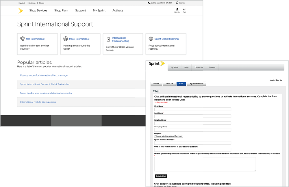
How do you know if components are solving the same problem? Ignore the visual design for a moment and focus on the content. Consider four components from my local library’s website (Fig 2.5). The purpose of each component is to preview book information, such as:
- thumbnail of the book cover
- book title
- author name
- publication date
- type of book
- availability
Why do only some display an author name? How relevant is the publication date to the action the user is taking? These are good questions to dig into once we get to consolidating components.
Consolidate your components
It’s very likely that you found a lot of redundant components in your audit. You can’t bring all of the existing components into your new system because your goal is to reduce design and technical debt. You need to determine whether a component adds value before you try to bring it into the new system.
When we were creating a unified feature template at Vox, we identified eighty-one HTML components—like pull quotes, captions, and galleries—that editors used via the CMS to make their stories more robust. We needed a way to whittle that list down to something more manageable. The team established some criteria to evaluate whether the existing snippets were worth including:
- Does it add value? Value, in this case, was determined by whether or not editorial teams found the snippets enhanced their storytelling. There were a few ways we identified value. If a snippet was used more frequently, we assumed it provided more value. We also talked to editorial teams about how they put stories together.
- Is it available to three or more brands? If it’s common enough to be used by three or more of our eight brands, then we can bring it into the new system.
- Is it a must-have for one brand? If it’s absolutely critical to the editorial mission of a brand, then we can make an exception to the “three or more” rule.
- Does it engage readers? Analytics can also provide insight into which of your existing components perform the best. If you have several components that serve the same purpose, you can use analytics to determine if some are more successful than others. For example, if you have several recirculation modules—maybe one with large images, one with small images, and one with no images—you could see which one drives more page views, and then use that as the model for a new, consolidated component.
- Does it uphold the design principles? Lastly, use the design principles you’ve set to measure the success of your existing components. Rank similar components against your values to see which ones meet your quality standards. Let’s say one of your principles is “Clarity”—if you have a component that makes it very clear to a user what their next step should be, and a similar component that doesn’t, you could remove the more ambiguous component.
At this point, we’ve created a map of our ecosystem, which told us where we should focus our efforts first. We’ve gone one level deeper with a component audit to determine which components are used most frequently. We’ve established some criteria for measuring the success of these existing components. Now let’s begin the work of creating the system.
Beginning Your System
As I said at the beginning of this book, your team is already working in systems, whether they are documented or not. Now that you’ve completed your ecosystem mapping and audits, it’s time to ask yourself if you are happy with the existing system.
That will help you figure out where to start. Your research should lead you to one of two conclusions:
- Your existing system is working well. You want to document what’s working about it and create reusable patterns so everyone on your team can benefit.
- Your existing system isn’t working well. You want to improve the system.
What does “working well” mean? One of the reasons to set up design principles in the beginning is so you can answer this question objectively. “Working well” means the product is upholding your design principles, the design language is communicating your brand voice, and the design system as a whole is responding to user needs.
You may find that some aspects of your system work better than others. Say you’re happy with your typography system, but your color system doesn’t express your brand accurately. Since design systems aren’t linear, you may discover through the process of documenting your typography system that it actually isn’t working as well as you initially thought and that you need to improve it. That’s okay! Systems are meant to evolve as context accumulates.
At this juncture, you want to find a starting point that will be the most valuable for your team, either by documenting what already exists or by starting from scratch.
Start by documenting what exists
If you find your existing system is working well, your goal will primarily be to unify and document what exists. Many teams use one or two core products that work well as the starting point for their design system.
With this approach, you’re starting with an existing product and distilling its proven patterns into a design system. The benefit of this approach is that you’re starting with patterns that have been vetted. This way is quicker because you don’t have to design lots of new things. Instead, you’re cataloging what works well so other teams can benefit. If you find you have too many components that are solving similar problems, you can use the core product as a starting point for consolidation.
There is a downside to this approach, though. The patterns may be too specific to one product. Other teams may feel left out of the process and as if they have to use a system that doesn’t fully reflect their needs. You have to pay close attention to involving other teams in this work.
Start from scratch
The other option is to start from scratch. This is usually the way to go if you find your design language isn’t working well. With this approach, you start by creating a brand-new design language, exploring how that design language might work across multiple products, and creating reusable components. This approach can lead to a more well-rounded system, because it compels you to explore how the design language works across a range of products.
The risk of this approach is that it takes longer, and you may spend too much time exploring a design language in the abstract. The danger here is that an element that works well in isolation might not work well in context. For instance, a primary button style that looks bright and vibrant on its own may feel too overwhelming when it’s placed around other components. Or the spacing built into a component doesn’t work once it’s around other ones. In Chapter 3, I’ll talk about how you can explore a design language by looking across a component hierarchy, so that you can look at design elements both by themselves and in context. However, the best way to avoid this problem is by starting small and integrating a few elements of your new design language into products so you can get a sense of how they feel in actual products.
After your audit and planning work, you will have a list of tasks to start from. Regardless of where you landed, it’s very likely that part of your work will include unifying and documenting a set of components.
What makes a good component?
No matter which entry point you choose, you’re working toward a system of good design components—components that are:
- Purposeful. All of your components should solve a specific problem. Define them by their purpose, not by how they look.
- Reusable. Your components should work for multiple use cases. Reduce the number of components that only work for a singular use case.
- Flexible. They should work in many different contexts. If you design components that are too rigid, people will create their own components and you’ll end up with a bloated system.
By now, you will have a collection of components to work with—components that have the potential to be good, solve specific problems, and provide value to your system. A big part of design-system work is gathering, consolidating, and documenting components until your first release.
The process at work
To understand how this all works together, consider Vox Media’s scorecard component (Fig 2.6). A scorecard is displayed in a review to show the author’s rating of that particular product. Although scorecards at Eater, the Verge, and Polygon all look visually distinct, they all solve the same problem: “Show an author’s rating and summary of a review.”
In order to identify the points where these components aligned—and didn’t—we mapped out the user goals and content for each (Fig 2.7).
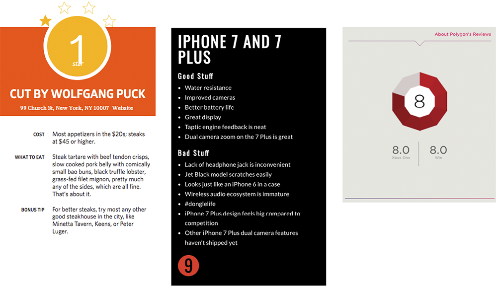
All three scorecards showed a score; two of the three included a title and a text field. We decided that at a minimum, the scorecard component should contain a score, a title, and a text field.
| Brand | User goal | Content |
|---|---|---|
| Eater | Find where to eat and what to order |
|
| The Verge | Find a tech gadget to buy |
|
| Polygon | Find a game to play |
|
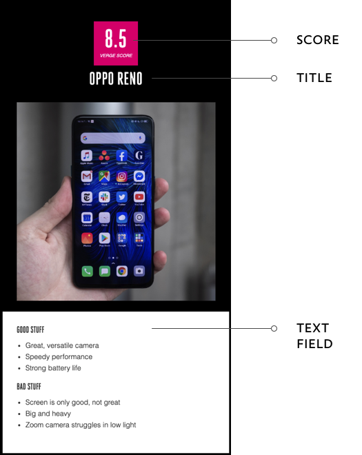
The result was a baseline component: the product card, a flexible component that could be applied broadly across our brands. If you swapped out the gadget image for an image of a kitchen appliance, for example, the design would still work (Fig 2.8).
But we also had to consider the content that was different across the original scorecards, and why it was different. For instance, when looking at an Eater scorecard for a restaurant review, end users need to know venue information like the address and phone number. When looking at a game review at Polygon, they need to know the publisher, developers, and comparative scores across gaming platforms.
These were necessary, brand-specific pieces of information, so we created two variations on the product card: the venue card and the game card. Each variation drew attention to the content that was specific to that card (Fig 2.9).

Another benefit of basing components and their variations on their purpose (instead of on their visual style) is that it lets you iterate on them over time. Once a component is integrated into a product, product teams can measure how well the component solves the problem it is targeting. This allows teams to feel more confident about evolving and improving components.
Documenting Components
Strong, clear, thorough documentation is an important part of any design system. A component or pattern is only as good as the guidance that explains how to use it. Your documentation should help everyone building products understand how to use your components to craft experiences. Explain the purpose of each component and the UX rationale behind it so that everyone involved with the system can use the components thoughtfully.
Name it
The naming of a component should be as diverse and cross-disciplinary as your team is. In “The Language of Modular Design,” Alla Kholmatova explained the importance of collaborative naming: “It’s not so much about giving something a great name (although, of course, that’s an ideal to aspire to), but agreeing on the name. That determines how the element will be used and helps to ensure that it’s used consistently by everyone” (http://bkaprt.com/eds/02-04/). Designers, engineers, product managers, content strategists—all should inform the name of your component.
Establishing a clear, shared language helps us make better decisions about the purpose of each of our components and how they should be used. It improves collaboration and speeds up design and development.
A good component name should be:
- Purposeful. A name should describe the purpose of the component, not what it looks like.
- Specific. A name should be as straightforward as possible.
- Inclusive. Use language that everyone can understand. Because design systems serve many types of people who have varying levels of technical expertise, it’s important to give components names that most people can understand.
While metaphors can be memorable, they can be tough to scale. At Vox Media, we used a “river” metaphor to describe a list of articles. Content flowed down a “river” and could be interrupted by “rocks” and “breakers,” like Most Read modules. This metaphor made sense to the team that created it, but onboarding new people became increasingly difficult. Explaining the river metaphor every time a new person joined the team was a source of friction. A better name for “River” would be “Story Feed.” The name is more straightforward and descriptive. It lets people know that this component is a collection of stories. Because the concept of a “feed” is well established throughout the web and publishing industries, new team members find that language familiar.
Draft some guidelines
At a minimum, your component documentation should include these elements:
- Name and description: A title and short description that helps users quickly understand what the component or pattern is.
- Purpose: A scannable statement that explains the purpose of the component. You want designers and developers to be thoughtful about how each component fits into the bigger picture.
- Example: Preferably an example of the component at work, both in design and in code.
You may also want to include:
- When to use it: The situations in which a component or pattern should be implemented.
- When not to use it: Specific situations where you know a pattern will not work, and what to use instead.
- Content guidelines: How content should be written for this component based on what it needs to communicate to users.
- Related patterns: Other patterns or components in the system that may be related in purpose, presentation, or content.
Meet your users’ needs
Design systems serve many types of users. In order to write effective documentation, figure out who your primary system users are and what they need to understand about using the components. Conduct interviews to learn about other teams’ processes, degrees of technical expertise, and what would best serve them in working with the system.
Shopify’s Polaris team did research with different teams to understand how they each used existing design-system documentation. They discovered that designers and content strategists were likely to scroll to find a more detailed rationale behind how to use components. Developers, on the other hand, craved efficiency; they wanted to be able to grab component code as quickly as possible. Because of this, Shopify created documentation that presented components with code snippets first, and content guidelines farther down (Fig 2.10).

The resulting design system documentation is a reflection of Shopify’s cross-disciplinary process. Design, content, and tech guidelines are all integrated in each component’s documentation.
Integrating Your New Components
After designing your initial components, you’ll need to release them into existing products. There are two ways to roll out a design system: incrementally or with a large-scale redesign.
An incremental rollout involves rolling out small pieces of the design system at a time. If you’ve started your design system by abstracting successful patterns from an existing product, then an incremental rollout makes sense. You can take those components and slowly start to integrate them into other products.
This gives you the opportunity to test your components in a real context and not spend too much time designing in a vacuum—and you’ll see progress more immediately. If you start with common problems, like consolidating icon styles, users will benefit from the consistency more quickly, and you’ll start reducing technical and design debt. An incremental approach also gets you into the habit of working in a system.
The downside to an incremental approach is that your products may exist in a limbo period where they rely on a combination of new and old styles. The impact of this will depend on how much of your design language you’ve changed. If a new button feels completely out of place next to the rest of your UI, then an incremental approach might not make sense.
Keep in mind that some components will be easier to implement than others. A grid, for example, will likely require substantial layout changes because you’re essentially sliding a new foundation under a house. Smaller components, like buttons and icons, require less redesigning, but could be deceptively complicated because they exist in so many places.
On the other hand, a large-scale redesign means you’re engaging in a full design process, changing big things like your design language, layouts, and components. The benefit of a large-scale redesign is you won’t feel that inconsistency of mixing old and new visual styles. The downside is that it takes more time up front, and you’ll wait longer to see the benefits. Also, you may spend too long debating design decisions in isolation without seeing them in context. If you plan on doing a large-scale redesign, I recommend giving your team a time limit to get the initial release out.
It’s also likely that a large-scale redesign will require product teams to redesign some of their work. What if the new design system doesn’t include a component they need? Should they redesign it to fit the new standards? Choose an alternative component? Wait and see if this component ends up on your roadmap? Be prepared to answer those questions and use them to inform future work on the system. If several teams are asking for a toggle component, that would be a good candidate to include in a future release.
Regardless of your initial scope, your design system will require product teams to stop what they’re doing. If you’ve won advocates along the way, by involving a variety of people in your principles workshop, ecosystem mapping, or component design work, it’ll be easier to get buy-in.
So far, we’ve talked about how to plan a system and how to create your initial components. Next, we’ll take a look at defining your brand in a system. Your brand language holds all of these smaller pieces together by presenting a unified voice to your users.