Chapter 3. Communicating Your Brand
In the previous two chapters, I talked about the importance of using a design system to achieve unity and cohesion. When it comes to expressing brand in a system, there’s another quality we want to embody: harmony. Harmony is the result of combining all of our design elements to produce pleasing layouts.
There are a few reasons why I think harmony is important for a design system. First, we’re breaking down our user interfaces into small, reusable pieces. We don’t always know how these pieces are going to be put together, but we do want the pieces to fit. Having consistent building blocks won’t guarantee a harmonious layout.
I often see the conversation about components kept separate from the conversation about design language—which means we’re spending a lot of time defining the functionality of components and then applying the visual language on top, like slapping a coat of paint on a table and hoping for the best.
But a table has more qualities than just its color! The shape of the legs, the height, the style, the material it’s made of—all of these characteristics define what a table looks like. Similarly, brand expression is more than your visual language—it’s how all of your elements come together to communicate your brand voice. Instead of feeling like a skin on top of a component, your design language should feel like a complete experience driven from the core of your brand’s identity.
We won’t be able to predict all of the different combinations of components that will make up our pages. What we can do is think about our brand language as it applies to a component hierarchy. When we are thoughtful about how our brand gets expressed at each level of a component hierarchy, we achieve harmony.
There are many design elements that can express brand, but the trifecta of typography, color, and space is the most essential to achieving harmony. That’s because we rely on typography and color to convey information and emotion more than on any other design elements. Space doesn’t speak, but it’s felt throughout our designs. The difference between a design language that feels complete and one that feels random is usually a judicious use of space.
In this chapter, we’re going to explore component hierarchies and how branding decisions permeate each level. Then, I’ll give you some strategies for composing a design language with component hierarchies in mind.
Component Hierarchy
Breaking your products down into reusable components is a crucial aspect of creating a design system. Those components can either be generic or specific. Generic components are adaptable for different use cases; specific components only work in a few contexts. The more generic a component is, the more flexible it will be.
The word “generic” makes me a little uncomfortable, though. How can our products feel distinct if they’re made up of generic components? We first have to define a component hierarchy to explain how these smaller pieces can be combined to form larger, more expressive components. This hierarchy allows our systems to scale.
Different teams define the hierarchy of their components in different ways. As a general rule, though, these are the different layers:
- Basic components: Small, standalone components like buttons and icons
- Composite components: A collection of basic components combined to make larger, more specific components
- Containers: Areas of a page that contain a collection of components
- Layout: How all of the pieces are laid out on a page
Let’s take a look at how to apply the core building blocks of a visual language to the layers of a design system.
Basic components
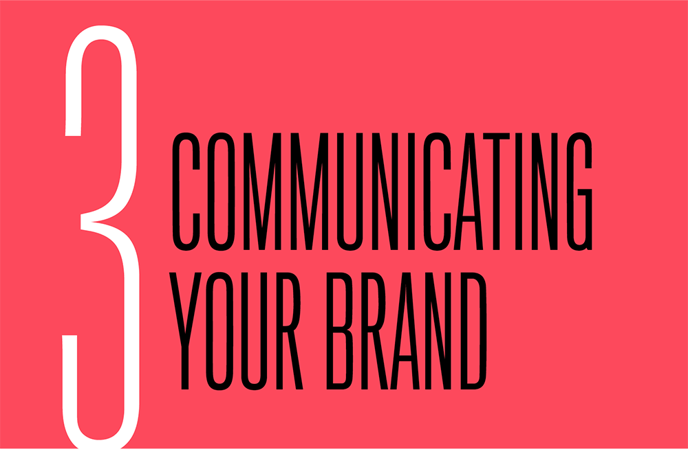
The lowest layer in the hierarchy consists of basic components, sometimes called elements, basics, or atoms. Basic components are the smallest possible elements that can’t be broken down any further, like buttons, links, or text fields (Fig 3.1).
They are the building blocks of your system, and because you will use them to create all of your larger components, they need to be modular. Basic components also need to be the most flexible; because they’re repeated so frequently in your interfaces, they need to work in a range of contexts.
At the basic component level, color should be functional. Most basic components are repeatable UI elements that direct a user toward their next task, so the purpose of color should be to guide attention.
Typography should also be functional. Buttons, labels, and other basic components in the user interface should use highly legible fonts that make it easy for people to complete tasks. Typefaces should have high x-heights, open apertures, and low contrast between strokes, and work well at small sizes.
The space within and between these basic components can also become a style element. Compare the Bon Appetit button with the Guardian button (Fig 3.2). The text on Bon Appetit’s button is reversed out of a dark background, set in all-caps, and tracked out slightly; there’s generous space around the text, giving the button a relaxed and elegant feel. By contrast, the Guardian’s button uses a slightly heavier font weight and tighter tracking; both the arrow and the color yellow feel urgent.
Basic components, like buttons, form fields, and dropdowns, are common ingredients of digital products, but there are ways to make them feel expressive. Take a look at Atlassian’s toggle component (Fig 3.3). It’s small but highly opinionated, using both color and an icon to communicate a state change (which also makes it more accessible). The documentation for the toggle also sets clear, specific guidelines about when it’s appropriate to use the toggle and when it’s better to use a checkbox:
Toggles should never require users to press a button to apply the settings. When you require users to press a submit button with a toggle, you may confuse them because it’s not the expected next step. In those cases, use checkboxes instead (http://bkaprt.com/eds/03-02/).
Broadly used design frameworks, like Bootstrap, don’t (and shouldn’t) include this level of specificity around how to use components—they leave those decisions up to product teams. The rationale you provide for how basic components should be used will set your products apart. Ideally, this rationale will explain how each component can serve the design principles you established at the outset.


Composite components
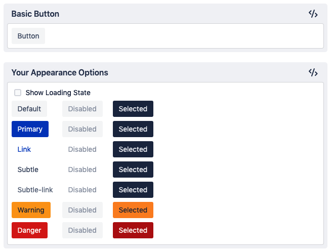
The second layer is more complex. Composite components, often called components, modules, or molecules, are collections of basic components that have been arranged in specific and opinionated ways (Fig 3.4). These components can also be reusable, but they often serve a more specific purpose, which makes them less flexible. While the main measure of success for a basic component is reusability, composite components are measured by how well they solve their chosen problem.
Composite components give you an opportunity to use color and typography expressively. More complex components, like Mailchimp’s story cards, call for larger, more expressive type (Fig 3.5). For components like these, you can choose typefaces that have more character and higher contrast, unlike the more neutral UI fonts that work better for basic components.
Along with typography, color in composite components can also be more expressive—bolder, brighter, and more striking, like the yellow background in MailChimp’s story cards (Fig 3.5).
Compare two story cards from the Guardian and Bon Appetit (Fig 3.6). Functionally, they’re very similar. They both contain an image and a headline, and serve the purpose of providing a preview to an article. Their designs, however, communicate very different tones: the Guardian’s card feels more serious, while Bon Appetit’s feels more relaxed. Let’s unpack the design choices that make us feel that way.
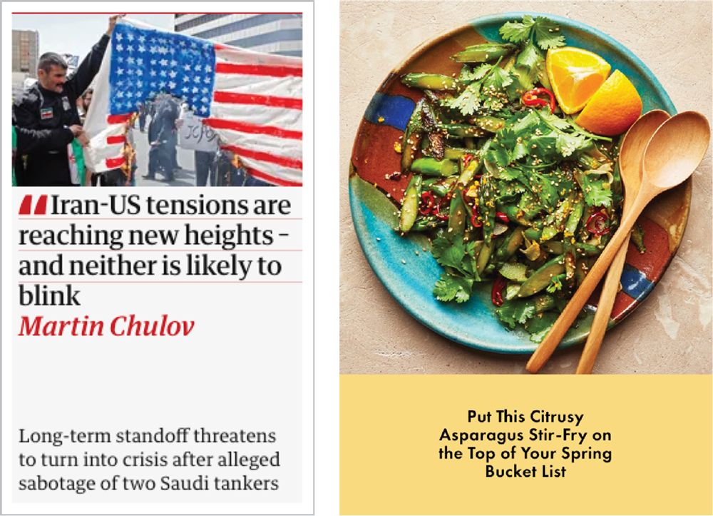
What’s most interesting about these story card examples is their use of space. Bon Appetit’s typography makes generous use of space within and around the text, which lets the design breathe—I feel like I can lean back and take my time browsing this site. The Guardian, on the other hand, uses very tight spacing. The text is tightly leaded; the space between text and container is almost nonexistent. This compression, common in newspapers and news sites, creates a tension that communicates urgency.
At the composite component level, you start to feel the design language more because you’re looking at a collection of components together. In these examples, the photography style, the headline font, and the space around the type all work together to express their respective brands.
Keep in mind that the choices you make at this level should build on the choices you made at the basic level. If you designed your buttons with generous spacing, then your larger components should also have airy spacing.
Containers
Containers (or regions) are larger areas of a page that contain composite components. They are typically full-width horizontal elements; pages are then composed by stacking containers on top of each other. Containers are useful when you want to group content in a specific way, but need to provide flexibility in how those content chunks are arranged.
Once we get to the container level, we can start to see how pieces are working together. The primary design elements for containers are color and space. Color can be used as a background behind a container to signal a shift in content or tone. Space can be used to control density (Fig 3.7). At this level, we’re looking at the horizontal space between elements as well as the vertical space around the container.
It’s really important to consider density holistically—again, we’re building up our decisions at each level. If you have roomier buttons and components, then leaving more space between your containers will make your designs feel more cohesive.
Layouts

Layouts (also known as templates) determine how these components can be arranged on a screen. They are defined by how the information on a screen will be used and how content will be organized.
When you design a layout, you’re thinking about the relationship between all of the elements on the page. Whereas at the container level we were thinking about the vertical space between components, at the layout level we’re thinking about the horizontal space between elements. At this level, you’ll make decisions about how large the various components should be in relation to one another.
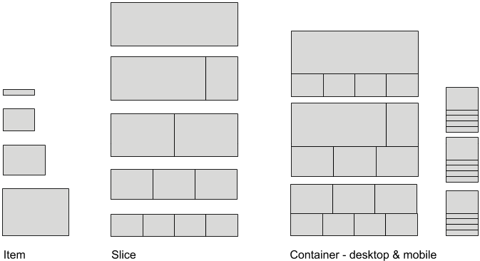
The Guardian’s container model provides a good example of how to compose a page from smaller elements (Fig 3.8). Their smallest building blocks are called items; each item represents an individual story. These items can be grouped horizontally into slices. Then, slices are gathered into containers that can be arranged in different ways. Finally, the Guardian’s pages—Home, News, Sports, and so on—are made up of containers.
By defining its design system with this hierarchy, the Guardian gives itself opportunities for flexibility at every level (Fig 3.9). At the component level, story cards can be displayed in a variety of sizes to communicate hierarchy. Containers can expand or contract based on the number of stories added to them, which communicates importance at any given time. And because the site’s pages are made up of these containers, stories can be grouped and highlighted in a variety of ways. Think about the type of flexibility you want your system to have and create a component hierarchy that helps you meet that goal.
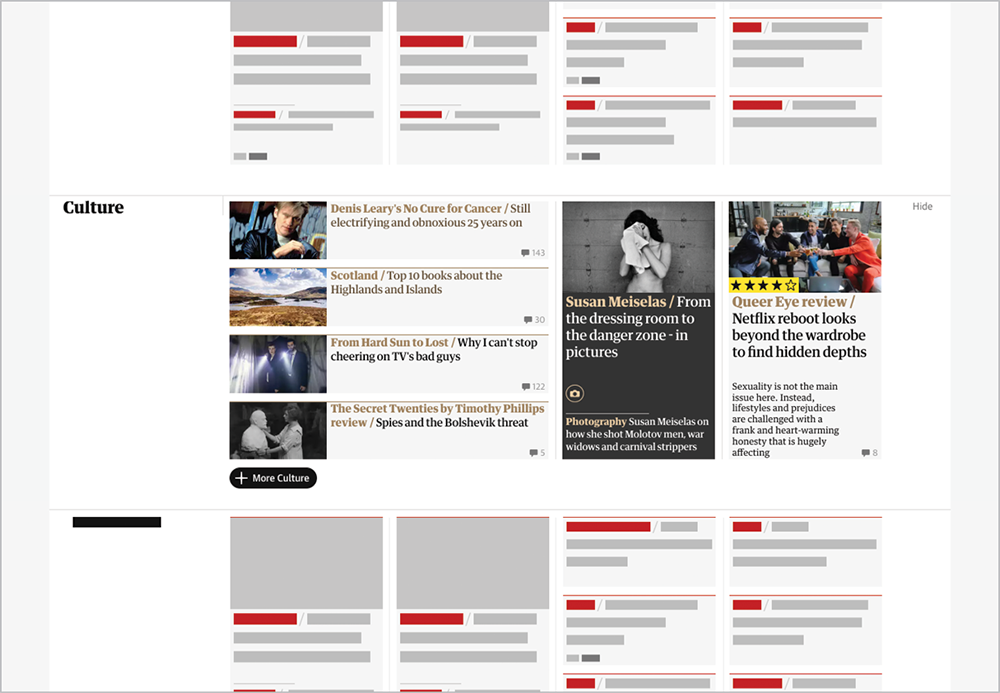
The decisions the Guardian made about its design language are applied consistently at each level of the hierarchy. Spacing is compact within individual cards, between cards, and between containers. Color is used as a wayfinding tool. Lines are used within cards, between cards, and between containers. When you look at your design language at the layout level, you want to ensure that all of your branding attributes work well together.
Now that we’re up to speed with the building blocks of component hierarchies, let’s talk about how to design at every level in order to achieve a harmonious brand.
Big Levers and Small Dials
As we saw when we broke down our component hierarchy, we not only need to think about design elements at each level, but also how they ascend the hierarchy. To do this, we need to explore our design language both globally and granularly.
Just as there’s a hierarchy to components, there’s also a hierarchy to the kinds of design decisions you make. I think about it in terms of big levers and small dials. Levers are broad, sweeping decisions about how our experiences should feel. Dials are small, detailed choices that enable those feelings.
Imagine you have a design in front of you. If you were to make the entire design feel heavier and more dense, what would you change? You would probably reduce the amount of space between elements. You might swap out fonts to a bolder weight or add some dark background colors. Now, what if you wanted to make the design light and airy? You would remove the dark background colors, lighten the font weights, and increase the amount of space between everything.
You’re not actually pulling any levers or turning any dials, but I like to use this metaphor because it gets me in the mindset that all of the elements need to change together to change the overall feeling of a page. Harmony means that everything is working together.
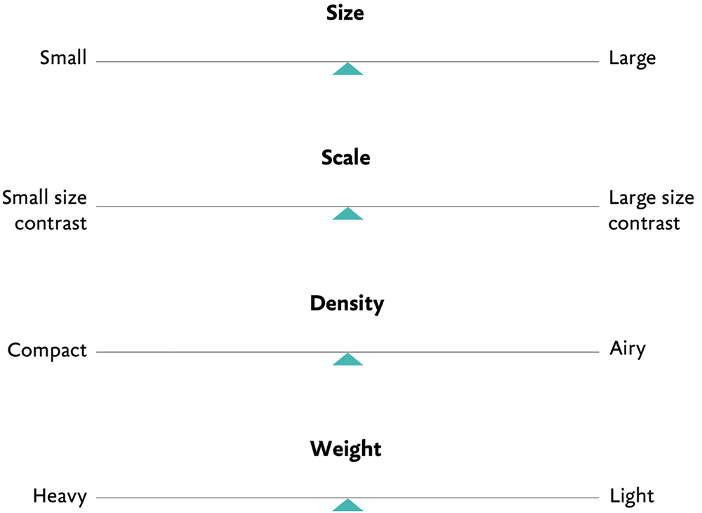
There are four big levers that determine what a design will feel like: size, scale, density, and weight. If you squint, how should your pages feel? Compact or loose? Dynamic or evenly paced? Light or heavy?
Defining the levers helps you make better choices about your dials. The dials define granular elements: typography, spacing, and color values. If your design process is anything like mine, then you know the feeling of meticulously increasing and decreasing a font size by one pixel before finally landing on a size that feels right—it’s like turning a dial ever so slightly.
If you define your dials but not your levers, you risk ending up with design choices that feel arbitrary. You may have really tight spacing in one section and loose spacing in another. Or an area where color is used very heavily next to an area where it’s used lightly. There are a few downsides to this:
- Your pages will lack harmony and your layouts will feel unclear.
- You’ll miss opportunities to be expressive, because levers have a larger global impact than dials.
- Your teammates won’t understand how to apply the design language. As we’ll see in Chapter 5 (when we talk about how to document a design language), it’s important to specify not only the granular design choices, but also the overall characteristics.
Even though we won’t know all the ways components will be used to build pages, we can have harmonious layouts if our levers and dials are in tune. Let’s take a look at how to set them.
Making global design decisions
By manipulating the four levers—size, scale, density, and weight—we can have enormous, sweeping impact on the look and feel of our layouts (Fig 3.10):
- Size: What size are the elements on the page? Should they be large or small? This choice ties back to the purpose of your product and what your audience expects to be able to do. Do you want someone to take their time consuming all of your content, focusing on one thing at a time? Choose larger elements that take up more room. Or, do you want someone to quickly see every action they can take at a glance? Choose smaller elements. Size primarily impacts the speed at which your content is consumed.
- Scale: What size are elements relative to one another? Should there be a more dramatic size contrast between elements, or should everything feel similarly sized? Again, this ties back to purpose, audience expectation, and design principles. Scale is used to focus attention. If you want to guide your audience through a process, you need more pronounced size contrast that points to one primary action. This makes your audience feel more supported in their journey. If you want your audience to choose their own path, then use less contrast to highlight that there are multiple paths to choose from. Your audience will feel more empowered to make a decision. Scale primarily involves how you use size to focus attention.
- Density and weight: How dense is the page? Should it feel airy or compact? Density and weight are related, but not identical: density refers to how tightly packed your elements are, while weight refers to the overall heaviness of a page. While density is primarily communicated through space, weight is communicated through typography and color. A page with lots of space between elements will feel airier than a page with tightly packed elements. A page with dark headers and bold, compact fonts will feel heavier than a page with delicate fonts and light colors.
All of these levers relate to one another. For example, smaller elements that are more densely packed feel more efficient, which is helpful if you want users to complete a task quickly. Larger elements with airier spacing feel more engaging; these design elements make a user spend more time consuming the content. Combined, our levers describe how we can express a brand.
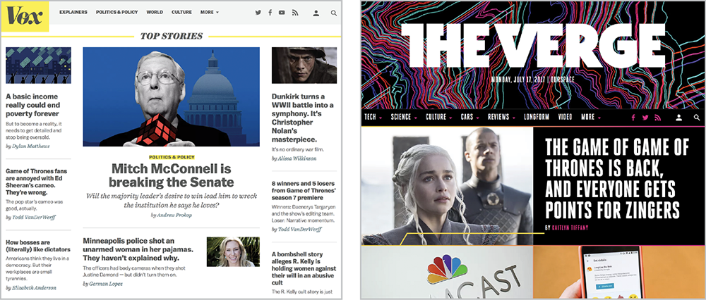
Here’s how I pulled these levers when I was working on designs for Vox.com and the Verge (Fig 3.11). My team was starting from design languages that had been developed for social and print. Our task was to take those brand guidelines and reflect them digitally, as a design system.
Our challenge at Vox Media was representing different brands within one portfolio using the same building blocks. Each of the verticals had a very different brand ethos, so we started there. The following points have been adapted from Vox.com’s brand statement:
- Vox explains the news and the world around you.
- Audiences expect trustworthy and contextual information. Vox conveys this with its brand ethos: “Smart. Audience-first. Generous. Explanatory.”
- The content is primarily text-based, with just a little custom photography and illustration.
- The yellow highlight is a strong visual signifier.
And these have been adapted from the Verge’s brand statement:
- The Verge is an ambitious multimedia effort to examine how technology will change life in the future for a massive mainstream audience.
- Audiences expect in-depth reporting and long-form feature stories, delivered in a cutting-edge way. The Verge does this with its brand ethos: “Illuminating. Beautiful. Rebellious. Entertaining.”
- The Verge is known as much for its custom photography as for its written content.
- The gradients are a strong visual signifier.
Vox.com’s “explanatory” versus the Verge’s “entertaining” sends a useful signal about scale and density. You can deduce that an audience looking for explanation expects information to be more compact than an audience looking to be entertained.
In addition to the publications’ brand statements, we considered their content. The Verge is known for its custom product photography and wanted to highlight it. Vox, on the other hand, often uses photos from sources like Getty Images, so it didn’t want to focus as much attention on photography. We noted, too, that Vox headlines tend to be longer than the Verge’s.
We also looked at the design elements that had already been defined. Balto, Vox’s headline typeface, is sturdy and works well at a range of sizes. Heroic, the Verge’s headline typeface, is tall, narrow, and needs to be set large to be legible.
We determined that, for the Verge, we would need to make the components larger to set Heroic well and highlight the photography. In light of the Verge’s brand ethos of “Rebellious,” we wanted the layout to feel dynamic, so we used a more pronounced size contrast between elements. We selected gradients and a dark color palette to evoke the “Illuminating” ethos. We knew these choices would resonate with the Verge’s audience because it expects the Verge to be entertaining.
For Vox, we wanted to highlight the breadth of its coverage without overwhelming the audience. The components are medium-sized: not big, but not as small as those in a complex web app. While hierarchy is still important to draw your eye to the top story, the size contrast isn’t as dramatic as on the Verge.
At this point, we’re describing what our experiences should feel like and how our broad design choices will communicate those feelings. But we haven’t yet defined specifics, like the exact pixel size of our typography. By taking the time to define our levers first, we’ll be able to make better decisions about our dials later.
While this process describes how to use levers to make choices for a new design language, you might not always have the ability to start from scratch. You can still use the levers to analyze how well your design language is working to convey your brand. What levers are you pulling across your products or websites? Are they the right ones? Are they all working harmoniously? Asking these questions could reveal parts of your design language that could be improved.
Making granular design decisions
After deciding on your global settings, you can translate those decisions to the smaller dials at the composite and basic component levels.
Now, there are a lot of decisions to make when you’re defining a design language, like choosing a font family and creating a color palette. I’m not going to focus on those choices because they’re inherent to design work, not specific to creating a design system. Instead, let’s focus on how to define type, spacing, and color to reflect the choices you made with size, scale, density, and weight.
Type system
Type makes up the majority of our user interfaces, making it the most pervasive and evocative design element. That means that all of the levers will have an impact on your typography. Again, we’re going to assume that you or someone else has already chosen your brand fonts and that those brand fonts are successfully communicating your brand ethos. Now we have to turn those fonts into a type system.
When you’re defining your type system, there are three primary decisions you need to make: defining your base font size, defining your type hierarchy, and defining your global line height.
- Set a base font size. First, you need to set a base font size. The base font size is the size of your body copy and is the number that the rest of your type system will be built from. Choose a size that makes for a comfortable reading experience. Take your “size” lever into account here. If your elements are generally large, consider using a higher base font size, like
18px. If your elements are generally smaller, go with a smaller size (though I wouldn’t go any lower than14px). - Set a scale. Next, create a type scale. Modular type scales size scales for typography based on musical interval ratios. Type scales are helpful for making your type system feel harmonious and proportional. To make a type scale, you take your base font size and multiply that number by a numeric ratio, such as 1.5. You don’t need to do this math on your own. The site modularscale.com is a calculator that allows you to set your base font size and then outputs a variety of type scales based on the ratio you’ve chosen (Fig 3.12). Here’s where our levers come into play. If you’ve decided your design language needs more size contrast between elements, use a type scale with a high ratio between headings. If your design language has less contrast, choose a lower ratio.
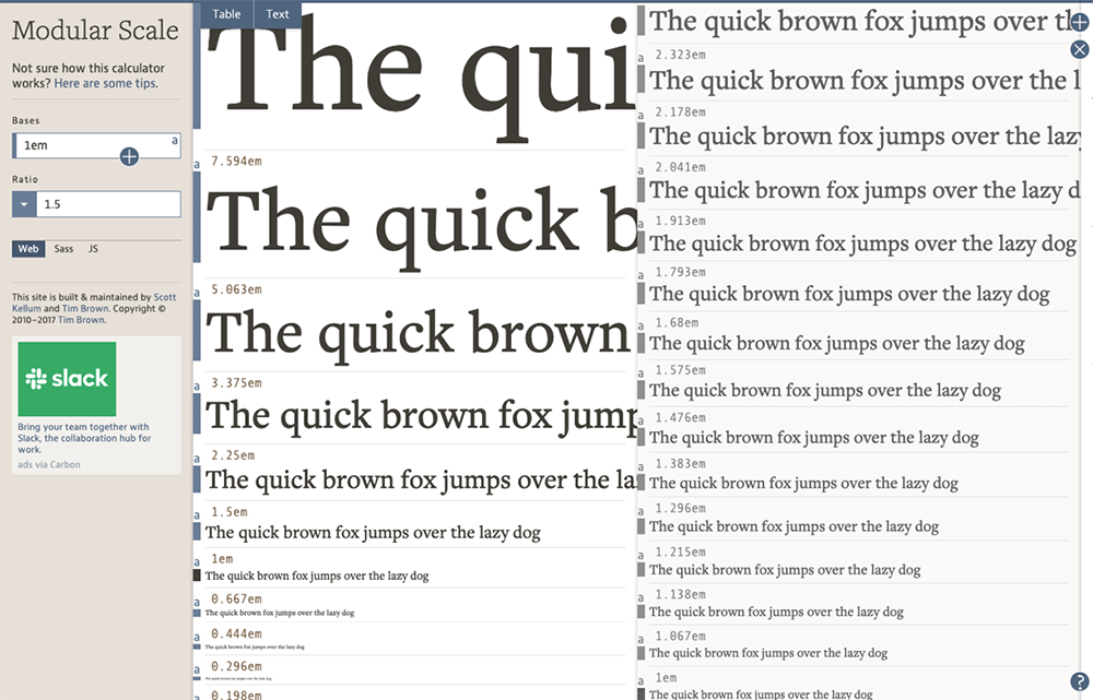
Fig 3.12: Two examples of a type scale using modularscale.com. The scale on the left has much higher contrast between the type headings; the scale on the right has lower contrast. - Set your line height. Line height is the distance between lines of text. A smaller line height will make text appear denser; a higher line height will make it seem airier.
You can achieve typographic density and weight a couple of different ways. First, you have to consider the weight of the fonts themselves. That one is self-explanatory. A heavier font will feel heavier. A lighter font, lighter. Then, you have to consider the space around it. Adding lots of space around a light font will make your layouts feel much airier. Tight spacing makes layouts feel denser and more urgent.
Spacing system
Your spacing system defines the space within and around your components. Having a spacing system gives your products a consistent rhythm and visual balance. It also helps everyone using the design system apply space in a consistent way. The density lever will have the biggest impact on your spacing system.
There are two big decisions you need to make when you’re designing a spacing system:
- Setting a base number. First, you need to set a base number that the rest of your scale will be built from. Many teams build their spacing on a unit of
4pxbecause it’s easily divisible. Even if you choose4pxas your base number, it doesn’t have to be the first number in your scale. You could choose2pxas your first number if you need really tight spacing or with8pxif you want looser spacing. - Setting the scale. The next step is to decide how the spacing system will scale from your base number. Your main options are to choose between a linear scale and a nonlinear scale. With a linear scale, every step is a fixed increment: 4, 8, 12, 16, 20, 24, etc. With a nonlinear scale, the system relies on a ratio as it increases, just like the modular scale we used for type. A nonlinear scale based on a unit of 4 could look like this: 4, 8, 16, 32, 48, etc.
Your density lever will help you figure out what base number to start with, as well as how dramatic your size progression should be (Fig 3.13). If you want your layout to feel compact, start from a smaller base size and only increase your space by small increments. If you want your layout to feel airy, start with a larger base size and increase your space by larger increments. As with our type scale, you get those larger increments by multiplying your base font size by a larger ratio number.

4px. The scale on the left has less contrast between each size, which will result in a layout that feels more compact. The scale on the right has more dramatic contrast between each size, which will produce airier layouts. After defining your space system, you need to help people understand how to use it.
- Name your space intervals. Giving your space intervals clear names will make it easier for people to use the scale. Space is perhaps the element that designers and developers go back and forth on the most. Have you ever gone through a process where a designer annotates a static design mock and hands it over to a developer, who then codes up the page and hands it back—except the space in the built page doesn’t match the space in the annotated design mock? The good news about having a spacing system is that it gives both disciplines a common language to work from. You could give the space descriptive names, like compact, cozy, and airy, but you would run out of names quickly. Extra cozy? Super airy? Or you could assign T-shirt size names, like extra small, small, medium, large, and extra-large. That works if you have just a handful of space intervals. The other option is to name space numerically, like Space 0 =
0px, Space 1 =4px, Space 2 =8px, Space 9 =60px, and so on. This may not be the most creative option, but it’s the most straightforward. The benefit is that it scales better. If you decide you need to add a larger space interval, you can simply add a Space 10, instead of adding another extra to that extra-large. - Define space within and between components. The other way to help other designers and developers use your space scale is by explaining how to apply it to the space within and around components. Your guidance can range from broad to more specific. For instance, you can say: “Use less space within components and more space between containers.” Or you might go further and say: “Always use Space 2 between elements in a form” and “Use Space 1 between an icon and the text in a button.”
Color system
The last design element in the trifecta is color. I recommend reading Josef Albers’ The Interaction of Color to understand how colors influence one another. In it, Albers explains that “colors present themselves in continuous flux, constantly related to changing neighbors and changing conditions.” When you create a color system, you need not only to consider individual colors, but also how they interact. The proximity of colors to one another, when they overlap, and how prominently color appears on a page—all of these factors influence how people use color.
When determining color values, we look at three things:
- Hue refers to where the color lives on a color wheel (green, red, blue).
- Saturation refers to the amount of gray mixed into the color.
- Luminance refers to how much white or black have been mixed into the color.
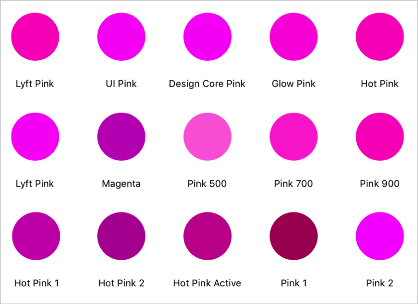
Usually, you begin to see fragmentation in color systems through variations in saturation and luminance. Teams start from a primary hue, but then realize it feels too bright for the design they’re creating, or the color isn’t luminous enough on a dark background, so they create variations (Fig 3.14).
To prevent this fragmentation, study color across a component hierarchy—look at color values by themselves, in components, on a page, and in interactions. Creating a color system is an incremental process; one change can alter the way you perceive another color.
As you define your color system, consider the following questions:
- How should color direct attention? Color directs attention in a few ways. It signals actions users can take on the page (button and link colors). It conveys the urgency of notifications (success, warning, and error colors). And it communicates interactive states (focus states, in-line validation). How many colors do you want to use to signify action? Deciding on which color you want to use for your primary and secondary actions is a good starting point for figuring out the rest of your color system. Let’s say you’ve chosen a bright green for your primary-action color. Now let’s think about how that color will be perceived in context.
- How should your foreground and background colors interact? The bulk of our user interfaces are neutral colors. Our neutral tones can have a major influence on how our action colors are perceived (Fig 3.15). I recommend experimenting with your neutral tones to understand how shifting the hue of your grays will impact the rest of your page. Does a cool-gray palette make your page feel cold and stark or fresh and modern? Does a warm-gray palette feel friendly or dull? That will depend greatly on how your foreground and background colors interact. A cool-gray palette can feel lively if paired with vibrant, warm foreground colors but clinical if paired with foreground colors that lack saturation or luminosity (Fig 3.16).
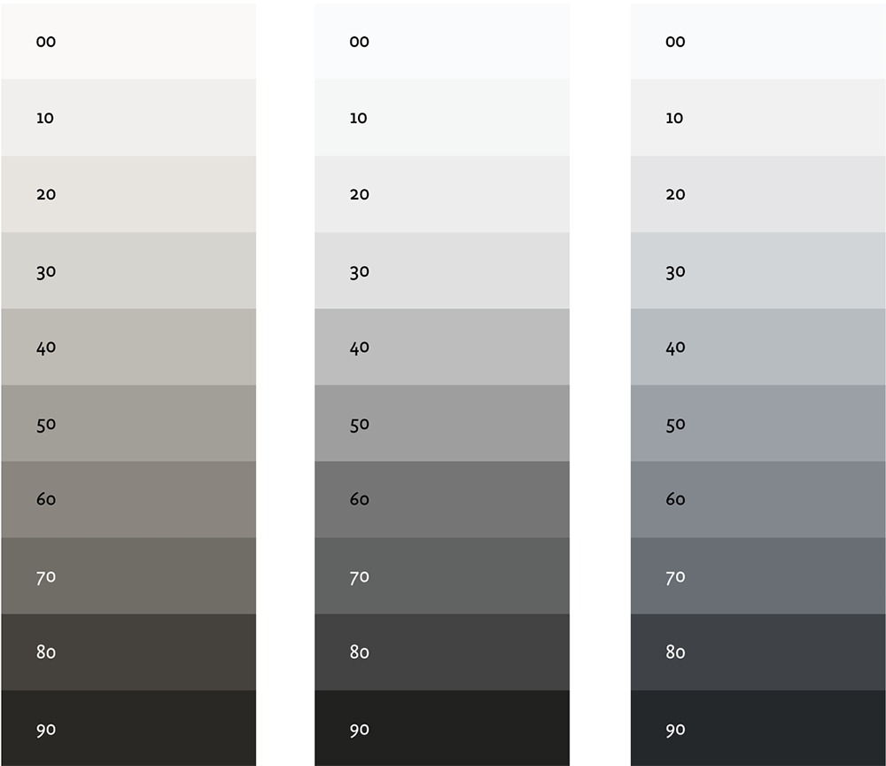
Fig 3.15: Neutrals aren’t neutral. Nudging your grays toward warmer or cooler tones can help express your brand voice. True medium grays can feel unexpressive if they’re used too heavily. 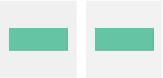
Fig 3.16: The green box on a cool gray background (left) appears more luminous; the same green on a warm gray background (right) feels more muted. - How prominently should color be used? Then, consider how prominently color should be used. You may find that a style that works well in isolation doesn’t work when it’s in context. For example, a colored icon may look great on its own, but when you start to stack the icons in a list, the color becomes too overpowering (Fig. 3.17).
The best way to create a color system that can scale is to consider color at every level of a component hierarchy. Look at pages with lots of actions and pages with only one action. Look at how dark and light background colors shift the way your primary colors look. Adjust the hue, saturation, and luminosity of your palette until you have a color system that feels harmonious.
Achieving Harmony
“Always design a thing by considering it in its next larger context—a chair in a room, a room in a house, a house in an environment, an environment in a city plan,” said Finnish architect Eliel Saarinen (http://bkaprt.com/eds/03-05/). Remember that components aren’t used in isolation, but around and within each other.

Like all aspects of a design system, achieving harmony isn’t a linear process. Use the levers to guide you. You may roll out a new header style that makes your pages feel too heavy. What can you adjust to reduce that heaviness—either adjust the header style or something around it? By considering your brand language in layers—the same way we think about components in layers—you can ensure that every aspect of your design feels branded. As a result, all elements will come together with a harmonious brand voice.
Sometimes our brand voice needs to have separate tones. Or we may be designing systems for entirely different brand voices. In the next chapter, we’ll talk about how to build variations into your design system.