
Chapter 8: Interacting with Your Data on Kibana
As we've explored in the previous chapters, Elasticsearch is a powerful and versatile tool to store, query, and aggregate data. The only way to interact with Elasticsearch is by using its feature-rich set of REST APIs. This includes anything from creating and managing indices and ingesting documents to running queries or aggregating large datasets. We've also looked at how tools such as Beats and Logstash are great at collecting data from various sources and loading it into Elasticsearch clusters for end user consumption. This is where Kibana plays a vital role in the Elastic Stack.
This chapter explores the role that Kibana plays in the Elastic Stack in allowing users to visualize, interact with, and build use cases on top of data in Elasticsearch. Kibana is also the primary way in which users can consume out-of-the-box solutions, such as Enterprise Search, Security, and Observability, as well as manage and configure the backing Elasticsearch cluster.
In this chapter, we will specifically focus on the following:
- Core Kibana concepts and the turnkey solutions on the Elastic Stack
- Using Kibana dashboards to analyze and visualize data
- Building data-driven presentations using Canvas
- Working with geospatial data using Kibana Maps
- Setting up alerts and actions on data
Technical requirements
This chapter walks you through the various features of Kibana when it comes to building and consuming use cases from your data. You will need access to an instance of Kibana connected to an Elasticsearch deployment to follow along. If you don't already have a deployment configured, follow the instructions provided in Chapter 2, Installing and Running the Elastic Stack.
The code for this chapter can be found in the GitHub repository for the book:
https://github.com/PacktPublishing/Getting-Started-with-Elastic-Stack-8.0/tree/main/Chapter8
Navigate to Chapter8/trips-dataset in the code repository for this book and follow the instructions to load a dataset containing flight travel logs for a single passenger over a period of time:
- The following files are provided in the folder:
- flights-template.json contains an Elasticsearch index template for the given dataset, detailing the schema/mappings for the fields in the dataset.
- load.sh is a helper script to load the index template into Elasticsearch. Users may also load the index template using Kibana Dev Tools instead of using this script if preferred.
- logstash-trips.conf contains a Logstash pipeline to load the dataset into Elasticsearch.
- trips.csv contains the flight travel logs data that we will use to build use cases in this chapter.
- Load the index template provided by running load.sh. Enter your Elasticsearch cluster URL, username, and password when prompted:
./load.sh
- Update the elasticsearch output block in the logstash-trips.conf file with the appropriate Elasticsearch cluster credentials. Run Logstash to ingest the dataset as follows:
logstash-8.0.0/bin/logstash -f logstash-trips.conf < trips.csv
- Confirm the data is available on Elasticsearch:
GET trips/_search
Move on to the next section once you've successfully loaded the dataset.
Getting up and running on Kibana
Collecting and ingesting data into your Elasticsearch cluster is only half the challenge when it comes to extracting insights and building useful outcomes from your datasets. Having access to fully featured and well-documented REST APIs on the Elasticsearch level is super useful, especially when your applications and systems programmatically consume responses from queries and aggregations, among other things. However, end users would much rather use an intuitive visual interface to build visualizations to understand trends in business data, diagnose bugs in their applications, and hunt for threats in their environment.
Kibana is the primary user interface when it comes to interacting with Elasticsearch clusters and, to some extent, components such as Logstash and Beats.
Given Kibana is primarily used to interact with data on Elasticsearch, an Elasticsearch cluster must be available for Kibana to run. The backing Elasticsearch cluster is used to achieve persistence of state, settings, and other data; the Kibana instance in itself is stateless. Kibana instances are also not clustered components; they do not interact with other Kibana instances in order to share tasks and workloads.
Multiple Kibana instances can be configured to work with the same Elasticsearch cluster. This is especially useful to achieve high availability as well as scalability at the Kibana level.
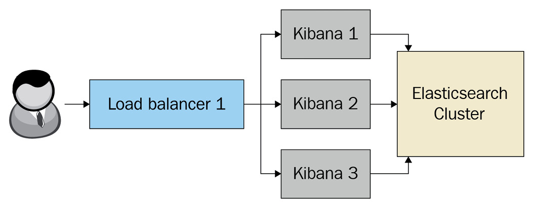
Figure 8.1 – Load balancing across multiple Kibana instances
Next, we will look at some of the solutions offered by Kibana.
Solutions in Kibana
Kibana is the primary way in which users of the Elastic Stack can build and consume solutions with their data. There are three main focus areas for out-of-the-box solutions on the stack. Users can also leverage the generic data analysis, visualization, modeling, and graphing capabilities of Kibana along with the general-purpose Extract, Transform, and Load (ETL), search, and aggregation capabilities from the rest of the stack to build solutions in any other area or domain as required.
The Observability solution in Kibana allows developers and Site Reliability Engineers (SREs) to centralize logs, metrics, and application performance metrics in one place from across their environment. The solution is broken down into the following apps on Kibana and can be accessed from the navigation menu:
- Overview allows the configuration and onboarding of new data sources, monitoring log health and event rates across different sources, and an overview of activity across different aspects of observability in your environment.
- Logs allows easy searching, filtering, and live streaming of log data from your environment.
- Metrics allows easy visualization of host, infrastructure, or container metrics from across your environment. The Metrics app works with data from individual hosts and cloud providers, as well as Kubernetes clusters.
- APM allows the visualization and analysis of application performance metrics from apps or services in your environment. APM supports distributed tracing, meaning you can look at how a user interaction or task travels through multiple layers of your application architecture (across different services) to look for bugs and bottlenecks that can impact user experience and system performance.
- Uptime provides an overview of the uptime and availability of your services, assets, or infrastructure in your environment.
- User Experience visualizes user-experience metrics from your frontend applications to understand and track issues that may impact user experience and search engine ranking for your application.
The Security solution on Kibana allows security analysts and threat hunters to understand, contextualize, and respond to security threats in an environment. The solution provides both Security Information and Event Management (SIEM) and Endpoint Detection and Response (EDR) capabilities to users. The Security app consists of the following capabilities:
- Overview lists security detections, alerts, and event counts from across the environment.
- Detections provide detailed information on the types of detections producing alerts over time, as well as a view to dig into alert details for triage and investigation.
- Hosts provide an overview of all different hosts observed across multiple data sources. Interesting host metrics such as successful/failed authentication requests, unique IP addresses, uncommon processes, and events can also be viewed.
- Network visualizes an overview of network-based communications in the environment. A map representing network flow source/destination geo-locations, as well as important stats broken down by key network protocols, is shown.
- Timelines enable security analysts to inspect and understand the flow of events around a key piece of information. Timelines provide a mechanism to stitch together data related to an investigation to help analysts make decisions around a potential threat.
- Cases allow analysts to collaborate and work on a potential security issue by taking relevant notes and referencing related logs.
- Administration defines endpoint configuration policies for the EDR capability (called Elastic Endpoint Security), provided as part of Elastic Agent.
The Enterprise Search solution allows developers and content managers to create seamless search experiences for apps, websites, or the workplace using the Elastic Stack. The solution consists of the following apps:
- App Search provides out-of-the-box, developer-friendly APIs on top of Elasticsearch to create and manage search experiences for websites and applications. App Search also provides intuitive functionality for content managers to tune relevance and ranking to make content easily discoverable. Analytics help to understand what people are searching for and how easily they can find the content they're after.
- Workplace Search provides a single pane-pane-of-gearch interface across a range of enterprise apps and content repositories for your workplace. Data sources include emails, file shares/collaboration tools (such as Google Drive and OneDrive), GitHub, Slack, and so on. Workplace Search builds on top of Elasticsearch, powering the user-friendly interface for employees to use.
All out-of-the-box and bespoke/user-created solutions on Kibana can leverage the following analytics capabilities in their use cases:
- Discover allows searching and filtering documents on your Elasticsearch indices. Users can easily interrogate granular event-level information and pivot across different data sources with ease.
- Dashboards enable users to put together intuitive visualizations to understand the trends and insights in datasets. Visualizations heavily leverage the data aggregation capabilities of Elasticsearch to produce insights from large volumes of data.
- Canvas helps users create graphical presentations using live data from Elasticsearch. Dashboards are intended to be consumed during the analysis stage; Canvas can be used to represent the insights to a more executive audience.
- Maps allow users to visualize and work with geospatial data on Elasticsearch.
- The Machine Learning app is used to create and configure supervised and unsupervised machine learning jobs to analyze your Elasticsearch datasets.
Kibana data views
A fundamental aspect of starting to work with a dataset on Kibana is configuring the data view for the data. A Kibana data view determines what underlying Elasticsearch indices will be addressed in a given query, dashboard, alert, or machine learning job configuration. Data views also cache some metadata for underlying Elasticsearch indices, including the field names and data types (the schema) in a given group of indices. This cached data is used in the Kibana interface when creating and working with visualizations.
In the case of time series data, data view can configure the name of the field containing the timestamp in a given index. This allows Kibana to narrow down your queries, dashboards, and so on to the appropriate time range on the underlying indices, allowing for fast and efficient results. The universal date and time picker at the top right of the screen allows granular control of time ranges. The time picker will not be available if a time field is not configured for a data view.
Data view can also specify how fields should be formatted and rendered on visualizations. For example, a source.bytes integer field can be represented by bytes to automatically format values in human-readable units such as MB or GB.
To get started with our use cases, follow these steps to create a data view for the trips dataset:
- On your Kibana instance, open the navigation menu in the top-left corner and navigate to Stack Management.
- Click on Data Views under the Kibana section and click on Create data view.
- Type in trips as the name of the data view and click Next.
- Select StartDate for the Time field and click on Create data view.
Your data view should look as follows. All available fields and the corresponding data types should be displayed:
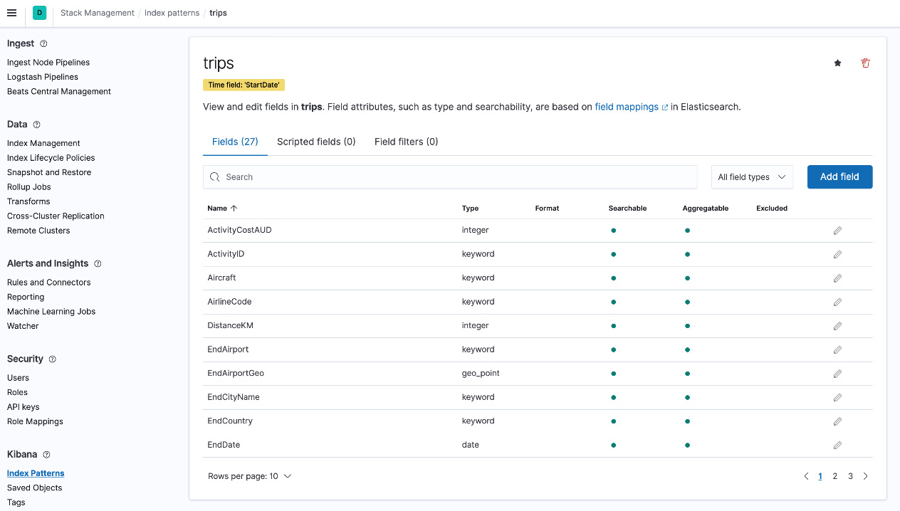
Figure 8.2 – Trips data view
Note
Data views were referred to as "index patterns" on older versions of Kibana. Data views may be referred to as index patterns in some parts of this book as well as online references or documentation.
You should see the data appear as follows in the Discover app. Remember to increase the time range you're searching for using the time range filter in the top right to see all data:
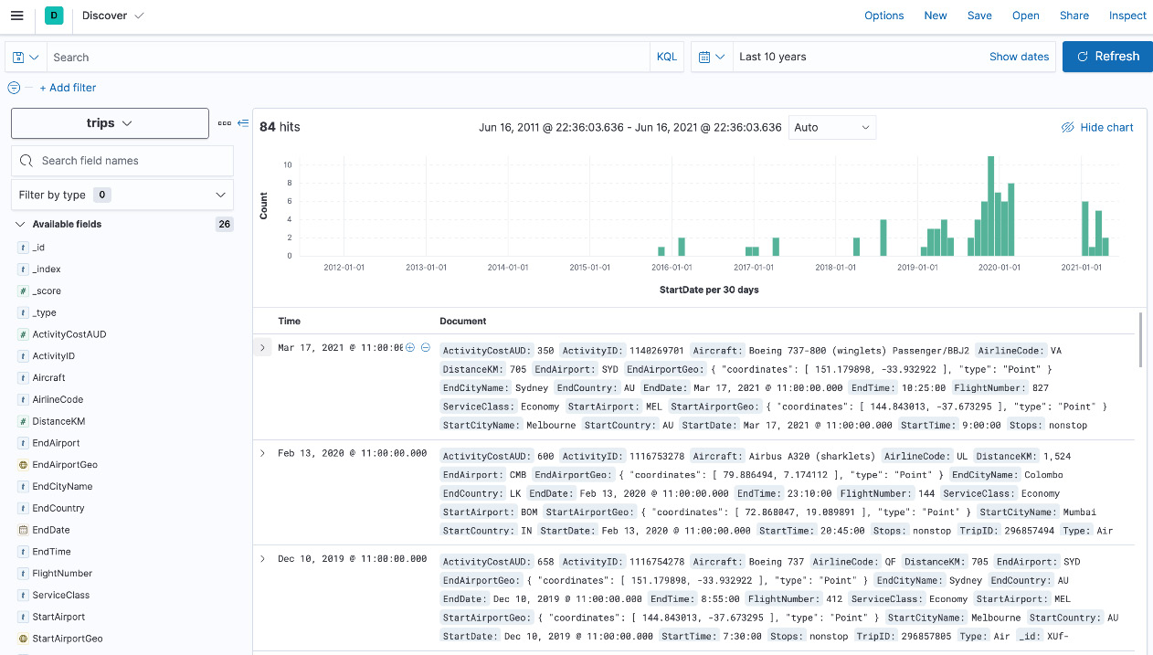
Figure 8.3 – Trips data on Discover
You can also map runtime fields as part of your data view in Kibana. Unlike a regular field in an index, a runtime field is computed by Elasticsearch at search time. This eliminates the time-consuming process of changing log formats on source systems or making changes to ETL configurations to build use cases.
The trips dataset contains a field for StartAirport and EndAirport for each trip. It may, however, be useful to have a field called Route to represent the start and end airports in one value. Given this field doesn't exist in our original dataset, follow these instructions to create a runtime field to make this field available:
- Navigate to Stack Management using the navigation menu and click on Data Views.
- Click on the trips index pattern you created before to view all fields in the index pattern.
- Click on the Add field button.
- Set the name of the field to Route and the type of the field to Keyword.
- Click on the Set value option to define a script for the runtime field and input the following script. The script simply concatenates the StartAirport and EndAirport values into one field:
emit(doc['StartAirport'].value + ">" + doc['EndAirport'].value);
- Click on Save and navigate to Discover to view the runtime field in action. The configuration should look as follows:

Figure 8.4 – A runtime field configuration for the Route field
Now that you've successfully configured the trips data view, let's put together some visualizations.
Visualizing data with dashboards
Dashboards in Kibana are the primary tool to visualize datasets in order to understand what the data means. Users generally spend a significant chunk of their time on Kibana working with dashboards; well-designed dashboards can efficiently communicate important metrics, trends in activity, and any potential issues to look out for.
The Nginx dashboard shown in the following screenshot (available out of the box) visualizes source geo-locations, web server response codes over time, common error types, and top resources accessed on the web server. An engineer eyeballing this data can spot something out of the ordinary. If, for example, HTTP 5xx response codes suddenly start increasing for a given resource on the server, the engineer can quickly narrow down potential issues and proceed to fix them before end users are impacted:
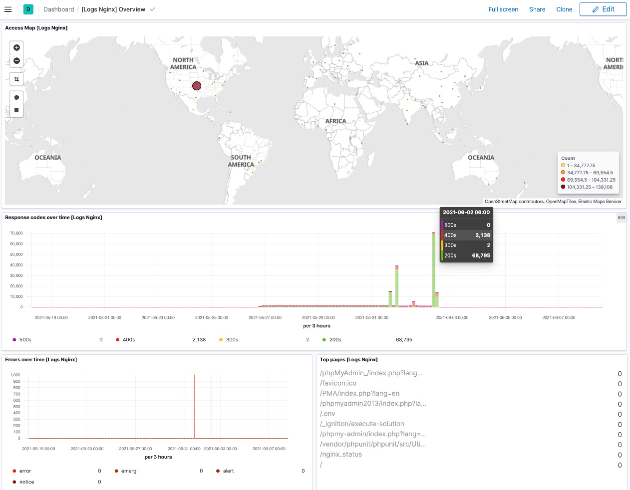
Figure 8.5 – Nginx logs dashboard
Dashboards are designed to work interactively. Most visualizations are clickable and can be used to select and filter on values during analysis, with all components on the dashboard updating in real time.
The universal search bar and time-range filters on the top of the screen can be used to further filter data as required. Filters applied on the top can be pinned across applications in Kibana. A user, for example, may pin a given hostname in the Nginx logs dashboard and pivot to the System overview dashboard for a host-specific view; the pinned filters travel across dashboards to automatically present relevant information.
The following instructions will help you create a new dashboard for the trips dataset:
- Navigate to the Dashboards app using the navigation menu and click on Create dashboard.
- Click on Create visualization to jump into the Lens feature. Lens can automatically select (or suggest) the most appropriate visualizations for a given set of fields that you're looking to understand. To create a view of trip route frequency over time, drag and drop the StartDate field into Lens. Remember to increase the time range visualized using the time picker on the top right (the trip data is from the years 2018 to 2021). You should see the visualization in the following screenshot. You can switch the type of visualization used from the suggested list following the graph:
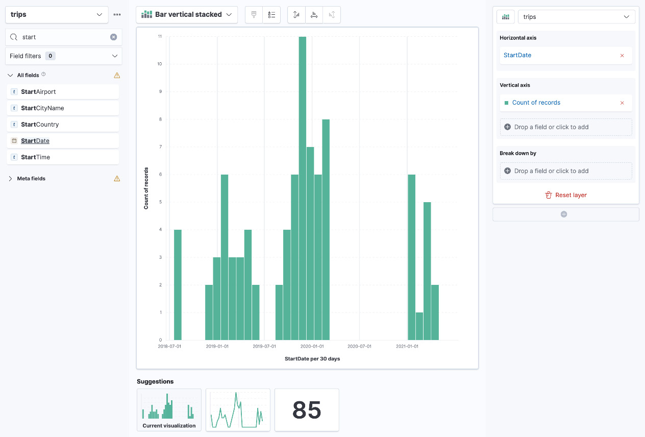
Figure 8.6 – A visualization of trip frequency over time
- Now that we have the frequency of the trips, drag the Route field into the Break down by box on the right side. You should see something as follows:
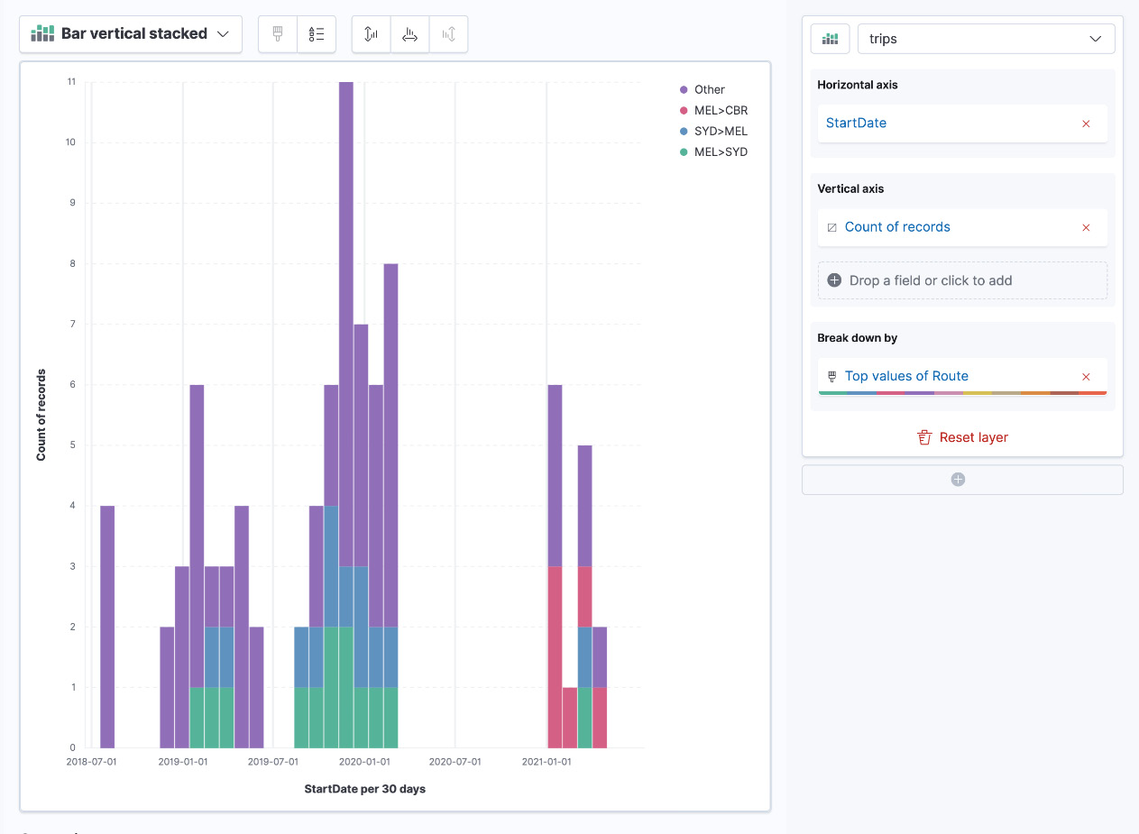
Figure 8.7 – A trip frequency grouped by top routes
- The visualization now satisfies the primary requirement we set out to achieve. Make the following tweaks to tune the graph further:
- Click on StartDate on the right and customize Time interval. Set it to 90 days. This should produce a more compact graph with more space to show the breakdown of routes.
- Enable the Group by this field first setting for the StartDate field.
- Click on Top values of Route and increase Number of values to 15. This should increase the number of routes shown per 3-month group.
- Your visualization should now be ready to add to a dashboard. Click on Save and return to the top right. The visualization will automatically be added to your dashboard. Resize the visualization as required and save the dashboard.
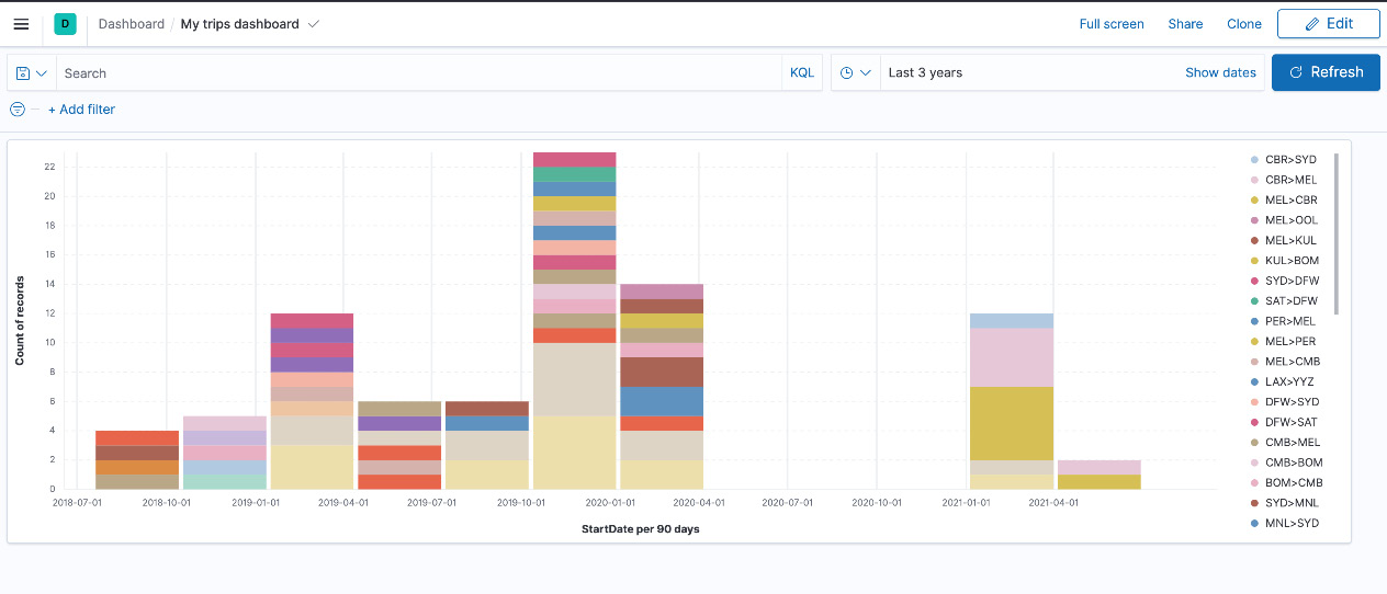
Figure 8.8 – The end result of the visualization
The following is an example of a more complex dashboard looking at various aspects of routes on the trip, including the proportion of routes traveled, total distance traveled per route, average costs, and aircraft types servicing the routes. The types of dashboard elements used include the following:
- Markdown text elements
- Control elements to allow users to filter the data being visualized
- Lens visualizations containing bar charts, pie charts, and treemaps
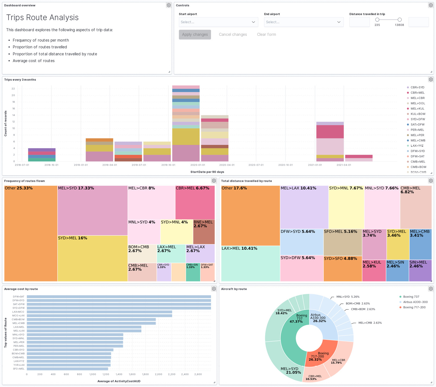
Figure 8.9 – The trips route analysis dashboard
Next, we will look at using Canvas to create presentations powered by data from Elasticsearch.
Creating data-driven presentations with Canvas
Dashboards are a great way to visualize and consume data from Elasticsearch. Given their form factor, dashboards are interactive and can easily support analyst workflows in interrogating and pivoting data.
Dashboards, however, are not ideal when it comes to more granular control of how information is presented to a user. Canvas allows users to control the visual appearance of their data a lot more granularly, making it ideal for use in presenting key insights derived from data. Unlike normal presentations though, Canvas can be powered by live datasets on Elasticsearch in real time.
The following Canvas presentation presents some key insights from the trips dataset. A bunch of key stats, such as total trips, the number of countries, airlines, and total distance traveled, is rendered on the right side. The pie graph in the following Canvas presentation displays the proportion of business and economy class trips while the bubble chart shows the top five cheapest trip routes in the dataset.
You can add images and align visual elements as needed to create aesthetically appealing presentations.

Figure 8.10 – Canvas presentation on travel statistics
Canvas supports multiple slides in the one Canvas workpad. Follow these instructions to create your first Canvas presentation:
- Navigate to Canvas using the navigation menu and click on Create Workpad.
- Click on Add element, click on Chart, and then Metric. Click on the newly created element on the workpad to display its properties in the window on the right-hand side.
- Click on the Data tab for the selected element and click on Demo data to change the data source.

Figure 8.11 – The data source configuration for the metric element
- Canvas supports a range of data sources. Elasticsearch SQL (SQL-like syntax) can be used to pull aggregated datasets while raw documents can be filtered and retrieved using the Elasticsearch documents option. Select the Elasticsearch SQL option and enter the following query to pull the total number of trips in the dataset. Save the data source settings:
SELECT count(*) as count FROM "trips"
- Click on the Display tab to define how the data is represented on the element. Set the Value setting to Value and select count. This displays the exact value retrieved from the SQL query in the previous step. Edit any visual settings as desired:

Figure 8.12 – An element style configuration
You've successfully created your first element in Canvas. Iterate to add all elements in the Travel stats slide, as shown in Figure 8.10.
The following is the second page in the same canvas, visualizing the total distance traveled in the trips in proportion to the distance between the Earth and its moon. As shown, Canvas supports graphical backgrounds and images to emphasize the message in the data. A bar chart and a progress wheel are also used in this slide:

Figure 8.13 – The second Canvas page showing travel stats in relation to moon distance
Next, we will look at using Kibana Maps for geospatial data.
Working with geospatial datasets using Maps
Elasticsearch comes with great support for geospatial data out of the box. Geo-point fields can hold a single geographic location (latitude/longitude pair) while Geo-shape fields support the encoding of arbitrary geoshapes (such as lines, squares, polygons, and so on). When searching for data on Elasticsearch, users can also leverage a range of geo queries, such as geo_distance (which finds docs containing a geo-point within a given distance from a specified geo_point) and geo_bounding_box (which finds docs with geo-points falling inside a specified geographical boundary). Kibana Maps is the visual interface for the geospatial capabilities on Elasticsearch.
Geospatial data is useful (and rather common) in several use cases. For example, logs containing public addresses will often contain (or can be enriched with) geo-location information for the corresponding host.
Analysts can use this context to understand whether connections to certain geographies are expected or application performance differs as users located further away from compute infrastructure may naturally experience degraded performance on network-bound applications.
The data is also useful for extracting insights from data. For example, grouping e-commerce purchases by suburbs in a city helps analysts understand their customer demographic and purchasing preferences. This information is useful for stocking decisions, marketing recommendations, and product development cycles.
Maps on Kibana come with base layer maps, which are loaded from the Elastic Maps Service (EMS). EMS hosts tile and vector layers for maps (for various zoom levels). Base maps include administrative boundary maps for various countries, as well as road maps for the planet.
Important Note
On non-internet-connected Kibana instances, EMS can be hosted locally provided a valid Elastic license/subscription is configured on your Elasticsearch cluster. Alternatively, users may choose to use a third-party mapping service, such as OpenStreetMap or Web Map Service. EMS is free to use for all internet-connected Elastic Kibana instances.
Follow these instructions to create your first map on Kibana:
- Open the Maps app using the navigation menu and click on Create map. The default map includes a Road map base layer. Your blank map should look as follows:

Figure 8.14 – A default map with the road map base layer
- Maps can contain multiple layers, visualizing different bits of information. Click on the Add layer button to see the different types of layers you can add. Select the Documents layer type to visualize a geospatial field contained in Elasticsearch documents.
- Choose the trips data view as the data source and StartAirportGeo as the geospatial field. Click on Add layer to continue.
- You can now edit the layer properties to define the behavior of the layer:
- Set the name as Departure airports.
- Add tooltip fields to the layer. These fields will be displayed when a user hovers over the geo-points in the trip data. Add the StartAirport, StartCityName, and StartCountry fields.
- Map data can also be filtered if required. For example, to view only the trips traveled in economy class, add a filter as follows:
ServiceClass: "Economy"
- Term joins can also be applied to define the scope of the map data. For example, you may want to display only the destination countries that are part of a current marketing campaign (which can be stored in a separate index in Elasticsearch).
- Layer style aspects such as custom icons, fill colors, symbol sizes, and so on can be configured.
- Add a second layer to your map, this time to visualize point-to-point paths in your data. Select the trips data view and set the source field to StartAirportGeo. Select the EndAirportGeo field as the destination. Define the following layer settings:
- Set the layer name as Trips.
- Set the opacity of the layer to 50% to improve the base map and start airport location visibility.
- The metrics aggregation performed on the field determines the thickness of the path drawn. We want to visualize trip frequency in this case, so we can leave the aggregation function as Count. Change the metric as needed for alternate use cases; for example, set it to average of price to visualize the most expensive trip routes, or set it to total distance traveled to visualize the routes with the most distance traveled.
- Save and close the layer when done.
Your map should look as follows:

Figure 8.15 – Map showing departure airports and routes
The map in the preceding screenshot shows all departure airports in the dataset, as well as paths representing the routes traveled. The intensity of the circle markers and thickness of the path represent the frequency of trips for the given route.
The following examples show maps visualizing the trips dataset to understand common departure/arrival locations, route frequencies, countries/cities of travel, and price analysis by the geography of travel.
Maps can also be embedded in dashboards on Kibana and work seamlessly alongside all your other visualizations.
This Trips overview map is similar to the example we just created but uses a heat map to represent trip frequency. The more intense clusters show a larger trip frequency from the airport:
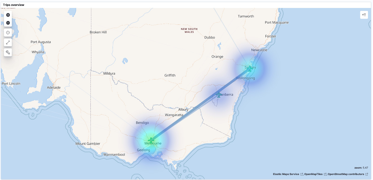
Figure 8.16 – Map showing route frequency as a heat map
Trips by departure country uses a different base layer map than the first two examples. The map uses the World countries base map (as the granularity of analysis is at the country level). The Departure countries layer represents all countries with a departure event. The layer performs a terms join on the base map World Countries layer with the departure country field in the trips index. The last layer selects the top airline (by frequency) per departure airport.

Figure 8.17 – Map showing trips by departure country
The last example looks at Trip cost by destination. On top of a default road map base layer, the map uses a cluster/grid layer to visualize the average activity cost per destination city in the trips data. As expected, the average trip to Perth, Western Australia, has the highest average cost in the country.
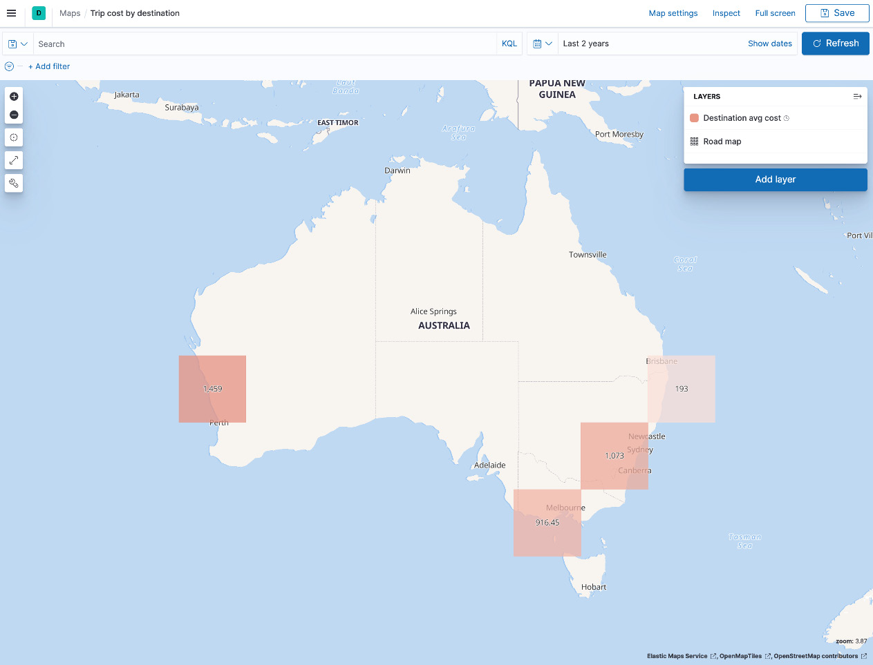
Figure 8.18 – Map showing the average trip cost by destination
Next, we will look at using Kibana alerting in response to changes in incoming data.
Responding to changes in data with alerting
So far in the chapter, we've looked at different ways in which users can interact with various types of data in real time. Analysts can easily explore and interrogate data and find events of interest and the consequences they may have on their use case.
Events of interest once discovered through analysis can happen multiple times in a system. Interactive analysis workflows involving a human do not necessarily scale in these cases, and there is a need to automate the detection of these events. This is where alerting plays an important role.
Kibana alerting is an integrated platform feature across all solutions in Kibana. Security analysts, for example, can use alerting to apply threat detection logic and the appropriate response workflows to mitigate potential issues. Engineering teams may use alerts to find precursors to a potential outage and alert the on-call site reliability engineer to take necessary action. We will explore solution-specific alerting workflows in later chapters of the book.
Alerting can also be applied generally to non-solution-oriented workflows in Kibana. We explore some core alerting concepts in the following sections and dive into some examples with the trips dataset.
The anatomy of an alert
Alerts in Kibana are defined by a rule. A rule determines the logic behind an alert (condition), the interval at which the condition should be checked (schedule), and the response actions to be executed if the detection logic returns any resulting data.
Successful matches/detections returned by a rule are stored as a signal or alert (depending on the solution you're using). Analysts can work off a prioritized or triaged list of alerts (based on severity or importance) in their workflows.
The following diagram illustrates the core concepts behind alerting:
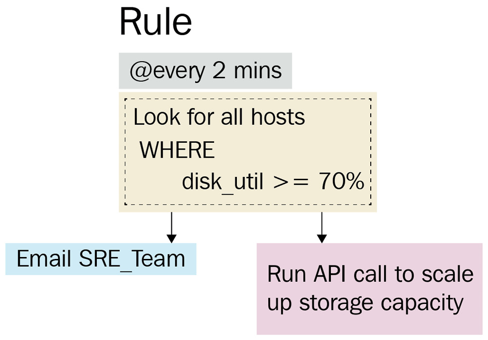
Figure 8.19 – A diagram illustrating alerting concepts
The rule is defined as follows:
- Schedule: 2 minutes
- Data view: Hosts*
- Condition: avg(dist_util) > 70%
- Actions:
Now that we understand some of the core alerting concepts, let's create some for the trips dataset.
Creating alerting rules
Kibana supports a range of rule types for alerting. Rules are categorized as generic and solution-specific, allowing for a rich solution-specific context for security and observability use cases.
A list of all supported rule types can be found here:
https://www.elastic.co/guide/en/kibana/8.0/rule-types.html
First, we will look at creating a simple threshold-based alert to match a given field in the data. The rule looks for the number of trips flown on a non-preferred airline and alerts when the number of trips in the last year exceeds five. Follow these instructions to define the alert:
- Navigate to Stack Management from the navigation menu and click on Rules and Connectors. Click on Create a rule.
- Name the rule Trips on non-preferred airlines.
- Set the rule interval to every 5 minutes.
- Select Elasticsearch Query as the rule type. Set the index to trips and the size to 0, as we only care about the number of hits and not the exact document content. In this instance, the query retrieves all trips not flown on AirlineCode: QF. The query body should be as follows:
{
"query":{
"bool": {
"must_not": [
{
"term": {
"AirlineCode": {
"value": "QF"
}
}
}
]
}
}
}
- Set the rule so that it only alerts whether the number of matches is above 5 in the last 360 days.
- Create an index action to write the alert into an Elasticsearch index. Create a new connector to define the behavior of the action. Set the connector name as Index alerts and set the index as trip-alerts. Save the connector when done.
- The generated alert document should contain some metadata for the analyst to understand the context of the alert. You can add alert/rule parameters to the response within double brackets, as shown. Define the document to index as follows:
{
"alert_type": "non-preferred-airline",
"alert_message": "The number of trips on non-preferred airlines has exceeded {{params.threshold}}",
"rule_id": "{{rule.id}}",
"rule_name": "{{rule.name}}"
}
- Save the alert, which should look as follows:

Figure 8.20 – The Elasticsearch query rule configuration
- Index the following document five times to test the alert in action. Change the StartDate value to be within the last year to simulate a match:
POST trips/_doc
{
"StartDate": "5/12/20",
"AirlineCode": "VA",
"StartAirport": "SYD",
"EndAirport": "MEL"
}
After a few minutes (depending on your rule schedule), you should see the following alert in the Rules UI in Kibana:

Figure 8.21 - Alert for trip on non-preferred airline
If you check the trip-alerts index, you should see the document generated by the alert:

Figure 8.22 – An alert document indexed into the trip-alerts index
Next, we will look at creating a rule to alert on geospatial data.
The rule tracks the location of the StartAirport field in the trips data and alerts if StartAirport falls outside of the boundaries of Australia, stored as a GeoShape field in an Elasticsearch index.
The following figure shows the GeoShape field for the boundary around Australia:
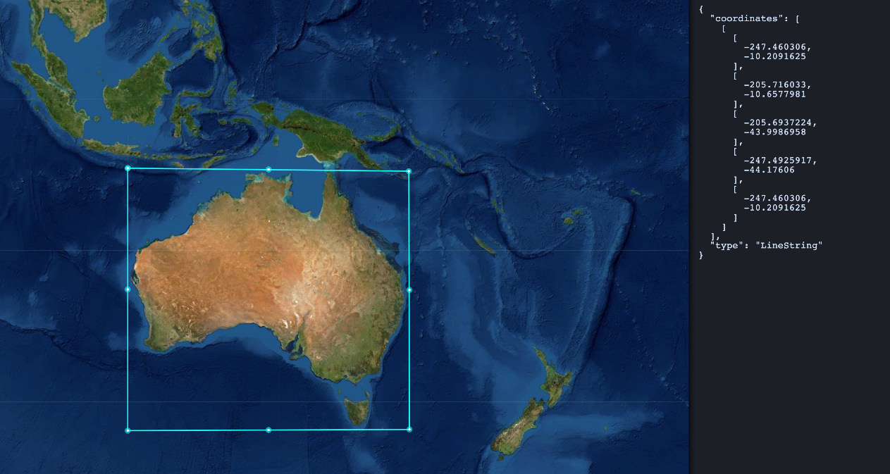
Figure 8.23 – The GeoShape field showing the boundary used for alerting
Follow these instructions to create this alert:
- Create a new country-geoshapes index on Elasticsearch:
PUT country-geoshapes
{
"mappings": {
"properties": {
"country": {
"type": "keyword"
},
"shape": {
"type": "geo_shape"
}
}
}
}
- Index the document containing the geo-shape we want to use:
POST country-geoshapes/_doc/
{
"country": "Australia",
"shape": {
"coordinates": [
[
[-247.460306, -10.2091625],
[-205.716033, -10.6577981],
[-205.6937224, -43.9986958],
[-247.4925917, -44.17606],
[-247.460306, -10.2091625]
]
],
"type": "Polygon"
}
}
- Create a data view for the country-geoshapes index on Kibana.
- Create a new custom-trips index to hold trip information with the passenger's current geo-location:
PUT custom-trips
{
"mappings": {
"properties": {
"StartDate": {
"type": "date"
},
"TripID": {
"type": "keyword"
},
"CurrentGeoLocation": {
"type": "geo_point"
}
}
}
}
- Create a data view for custom-trips on Kibana.
- Create a new rule from the Rules and Connectors page.
- Set the rule name to Trips outside Australia and the interval to every minute.
- Select Tracking containment as the rule type.
- For the entity to be tracked, select the custom-trips index, StartDate as the time field, and CurrentGeoLocation as the geospatial field.
- For the boundary, select the country-geoshapes index, shape as the geospatial field, and country as the human-readable field. Add a filter for country:"Australia" to focus the search only on Australia. Additional geoshapes for other boundaries can be added to the same index and the rule can be tweaked as needed. Your rule should look as follows:

Figure 8.24 – The geo-containment alert configuration
- Set up an index action as in the previous example. Set the indexing action to run when the entity is no longer contained. Configure the document to be indexed to contain the following fields:
{
"alert_type": "trip-outside-australia",
"alert_message": "A trip travelling outside the geo boundary for Australia was found",
"rule_id": "{{rule.id}}",
"rule_name": "{{rule.name}}"
}
- Save the alert and add the following documents to simulate an alert. Edit the timestamp so it is your current browser time, with each document being about 1 minute apart.
Index the first document:
# Trip with location inside the boundary for Australia
POST custom-trips/_doc
{
"StartDate": "2021-06-20T09:24:55.430Z",
"TripID": "test-alert",
"CurrentGeoLocation" : "-37.673298,144.843013"
}
Index the second document:
# Trip with location outside the boundary for Australia
POST custom-trips/_doc
{
"StartDate": "2021-06-20T09:24:55.430Z",
"TripID": "test-alert",
"CurrentGeoLocation" : "-36.1248652,148.4837257"
}
In a few minutes, you should see an alert as follows:

Figure 8.25 – An alert triggered for trips outside Australia
You should also see the corresponding alert document in your trip-alerts index:
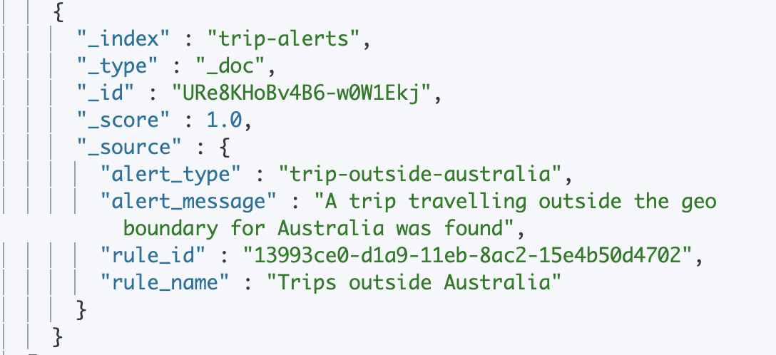
Figure 8.26 – An alert index action for trips outside Australia
The geo-containment alert should now be successfully configured. Now that we've looked at two different examples of alerts on Kibana, let's summarize the contents of this chapter.
Summary
In this chapter, we looked at how you can explore, analyze, and consume data on Elasticsearch using Kibana.
We started with learning how dashboards can be used to extract insights from large datasets. Then, we looked at how image-rich Canvas presentations, backed by live data can be a powerful visualization tool. Next, we looked at how Kibana Maps can help when working with geospatial datasets. We finished by exploring the use of Kibana alerting and actions to respond to changes in datasets.
The next chapter explores the management and continuous onboarding of data using Elastic Agent and Fleet.