We have discussed the deterministic model, where a single outcome with quantitative input values has no randomness. The word stochastic is derived from the Greek word called Stochastikos. It means skillful at guessing or chance. The antonym of this is "certain", "deterministic", or "sure". A stochastic model predicts a set of possible outcomes weighted by their likelihoods or probabilities. For instance, a coin when flipped in the air will "surely" land on earth eventually, but whether it lands heads or tails is "random".
Monte Carlo simulation, which is also viewed as a probability simulation, is a technique used to understand the impact of risk and uncertainty in any forecasting model. The Monte Carlo method was invented in 1940 by Stanislaw Ulam when he was working on several nuclear weapon projects at the Los Alamos National Laboratory. Today, with computers, you can generate random numbers and run simulations pretty fast, but he amazingly found this method many years ago when computing was really hard.
In a forecasting model or any model that plans ahead for the future, there are assumptions made. These may be assumptions about the investment return on a portfolio, or how long it will take to complete a certain task. As these are future projections, the best thing to do is estimate the expected value.
Monte Carlo simulation is a method to iteratively evaluate a deterministic model with sets of random numbers as inputs. This method is often used when the model is complex, nonlinear, or involves more than just a couple of uncertain parameters. A simulation can typically involve more than 100,000 or even a million evaluations of the model. Let's take a look at the difference between a deterministic model and a stochastic model. A deterministic model will have actual inputs that are deterministic to produce consistent results, as shown in the following image:

Let's see how a probabilistic model is different from the deterministic model.
Stochastic models have inputs that are probabilistic and come from a probabilistic density function, producing a result that is also probabilistic. Here is how a stochastic model looks:

Now, how do we describe the preceding diagram in words?
First, create a model. Let's say that you have determined three random inputs: x1, x2, and x3, determined a method: f(x1, x2 , x3), and generated a set of 10,000 random values of inputs (in some cases, it could be less or more). Evaluate the model for these inputs, repeat it for these 10,000 random inputs, and record these as yi, where i runs from 1 to 10,000. Analyze the results and pick one that is most likely.
For instance, if we were to find an answer to the question, that is, "what is the probability that the Los Angeles Clippers will win the seventh game?" With some random inputs in the context of basketball that make reasonable sense to the question, you can find an answer by running Monte Carlo simulation and obtain an answer: there is a 45 percent chance that they will win. Well, actually they lost.
Monte Carlo simulation depends heavily on random number generators; therefore, it makes sense to figure out what is the fastest and efficient way to perform Monte Carlo simulation? Hans Petter Langtangen has performed an outstanding task that shows that Monte Carlo simulation can be made much more efficient by porting the code to Cython at http://hplgit.github.io/teamods/MC_cython/sphinx/main_MC_cython.html, where he also compares it with pure C implementation.
Let's consider several examples to illustrate Monte Carlo simulation. The first example shows an inventory problem. Later, we will discuss an example in sports (Monte Carlo simulation is applicable to many sports analytics.
A fruit retail salesman sells some fruit and places an order for Y units everyday. Each unit that is sold gives a profit of 60 cents and units not sold at the end of the day are thrown out at a loss of 40 cents per unit. The demand, D, on any given day is uniformly distributed on [80, 140]. How many units should the retailer order to maximize the expected profit?
Let's denote the profit as P. When you attempt to create equations based on the preceding problem description, s denotes the number of units sold, whereas d denotes the demand, as shown in the following equation:

Using this representation of profit, the following Python program shows maximum profit:
import numpy as np
from math import log

import matplotlib.pyplot as plt

x=[]
y=[]

#Equation that defines Profit
def generateProfit(d):

   global s

   if d >= s:
     return 0.6*s
   else:
     return 0.6*d - 0.4*(s-d)

# Although y comes from uniform distribution in [80,140]
# we are running simulation for d in [20,305]

maxprofit=0

for s in range (20, 305):

  # Run a simulation for n = 1000
  # Even if we run for n = 10,000 the result would
  # be almost the same
  for i in range(1,1000):

     # generate a random value of d
     d = np.random.randint(10,high=200)

     # for this random value of d, find profit and
     # update maxprofit
     profit = generateProfit(d)
     if profit > maxprofit:
        maxprofit = profit

  #store the value of s to be plotted along X axis
  x.append(s)

  #store the value of maxprofit plotted along Y axis
  y.append(log(maxprofit)) # plotted on log scale

plt.plot(x,y)
print "Max Profit:",maxprofit

# Will display this
Max Profit: 119.4
The following plot shows that the profit increases when the number of units are sold, but when the demand is met, the maximum profit stays constant:

The preceding plot is shown on the log scale, which means that the maximum profit was 119.4 from a simulation run for n=1000. Now, let's try to take a look at an analytical solution and see how close the simulation result is to the one from the analytical method.
As the demand (D) is uniformly distributed in [80,140], the expected profit is derived from the following integral:

The answer using the analytical method is 116, and Monte Carlo simulation also produces somewhere around this figure: 119. Sometimes, it produces 118 or 116. This depends on the number of trials.
Let's consider another simple example and seek an answer to the question: "in a classroom full of 30 students, what is the probability that more than one person will have the same birthday?" We will assume that it is not a leap year and instead of using the month and day, we will just use the days in the calendar year, that is, 365 days. The logic is pretty simple. The following code shows how one can calculate the probability of more than one person having the same birthday in a room of 30 students:
import numpy as np
numstudents = 30
numTrials = 10000
numWithSameBday = 0

for trial in range(numTrials):
    year = [0]*365

    for i in range(numstudents):
        newBDay = np.random.randint(365)
        year[newBDay] = year[newBDay] + 1

    haveSameBday = False
    for num in year:
        if num > 1:
           haveSameBday = True

    if haveSameBday == True:
        numWithSameBday = numWithSameBday + 1

prob = float(numWithSameBday) / float(numTrials)
print("The probability of a shared birthday in a class of ", numstudents, " is ", prob)

('The probability of a shared birthday in a class of ', 30, ' is ', 0.7055)
In other words, there is a 70 percent chance that two people have the same birthday in a class of 30 students. The following example illustrates how Monte Carlo simulation can be applied to know the likelihood of winning the game in a situation that continues to occur more often today than in the past.
Let's consider an example in a basketball game that is being addressed at the Khan Academy using JavaScript. The question was, "when down by three and left with only 30 seconds, is it better to attempt a hard 3-point shot or an easy 2-point shot and get another possession?"(asked by Lebron James).
Most readers may understand the basketball game, but we will only highlight some of the important rules. Each team has a 24-second possession of the ball. Within this time, if they score (even in less time), the opposing team gets possession for the next 24 seconds. However, as there is only 30 seconds left, if a player can make a quick 3-point shot in probably less than 10 seconds, then there is about 20 seconds left for the opposing team. Basketball, similar to any other sport, is very competitive, and since the player's goal is to reduce the trailing points, it is in their best interest to get a 3-point score. Let's try to write a Python program to answer the question.
Before showing the simulation program, let's take a look at some of the parameters that are involved in this problem domain. In order to determine whether shooting a 3-point shot is better in terms of the probability of winning, the following statistics of the player and also the opposing team is very important. The threePtPercent and twoPtPercent of the player not only determines his strength, but also determines the opposing team's percentage of scoring a 2-point labeled oppTwoPtPercent, and the opposing team's strength in a free throw percentage which is labeled oppFtPercent.
There are other combinations too, but to keep it simple, we will stop here. The higher the opposing team's free throw percentage, the more our answer is inclined towards making a 3-point shot. You can lower the value of oppFtPercent and see what is being discussed here. For this example, we will show snippets in different bits and pieces, and you can put them together in whichever way you are comfortable and use them to run. First, we will need the NumPy package because here, we intend to use the random number generator from this package, and matplotlib is required to plot, as shown in the following code:
import numpy as np
import matplotlib.pyplot as plt
In many examples, we will use colors that are standard colors used in tableau, and you may want to put this in a separate file. The following array of color codes can be used in any visualization plot:
colors = [(31, 119, 180), (174, 199, 232), (255, 127,  14),
   (255, 187, 120), (44, 160, 44), (214,  39,  40), (148,103,189),
   (152, 223, 138), (255,152,150), (197, 176, 213), (140, 86, 75),
   (196, 156, 148), (227,119,194), (247, 182, 210), (127,127,127),
   (199, 199, 199),(188,189, 34),(219, 219, 141), (23, 190,207),
   (158, 218, 229),(217,217,217)]

# Scale RGB values to the [0, 1] range, format matplotlib accepts.
for i in range(len(colors)):
  r, g, b = colors[i]
  colors[i] = (r / 255., g / 255., b / 255.)
Let's take a look at the three-point attempt. If threePtPercent is larger than the random number and there is more probability of an overtime, then a win is guaranteed. Take a look at the following code:
def attemptThree():
  if np.random.randint(0, high=100) < threePtPercent:
    if np.random.randint(0, high=100) < overtimePercent:
      return True #We won!!
  return False #We either missed the 3 or lost in OT
The logic for the two-point attempt is a little bit involved because it is all about how much time is left and who has the possession of the ball. Assuming that on an average, it takes only 5 seconds to attempt a two-point shot and the two-point scoring percent labeled twoPtPercent of the player is pretty high, then they score a two-point shot, which will be deducted from the value in the pointsDown variable. The following function is for a two-point scoring attempt:
def attemptTwo():
  havePossession = True
  pointsDown = 3
  timeLeft = 30
  while (timeLeft > 0):
    #What to do if we have possession
    if (havePossession):
      #If we are down by 3 or more, we take the
      #2 quickly.  If we are down by 2 or less
      #We run down the clock first
      if (pointsDown >= 3):
        timeLeft -= timeToShoot2
      else:
        timeLeft = 0

      #Do we make the shot?
      if (np.random.randint(0, high=100) < twoPtPercent):
        pointsDown -= 2
        havePossession = False
    else:
      #Does the opponent team rebound?
      #If so, we lose possession.
      #This doesn't really matter when we run
      #the clock down
      if (np.random.randint(0, high=100) >= offenseReboundPercent):
        havePossession = False
      else:   #cases where we don't have possession
        if (pointsDown > 0):  #foul to get back possession

          #takes time to foul
          timeLeft -= timeToFoul

          #opponent takes 2 free throws
          if (np.random.randint(0, high=100) < oppFtPercent):
            pointsDown += 1

          if (np.random.randint(0, high=100) < oppFtPercent):
            pointsDown += 1
            havePossession = True
        else:
          if (np.random.randint(0, high=100) >= ftReboundPercent):
            #you were able to rebound the missed ft
            havePossession = True
          else:
            #tied or up so don't want to foul;
            #assume opponent to run out clock and take
            if (np.random.randint(0, high=100) < oppTwoPtPercent):
              pointsDown += 2 #They made the 2
            timeLeft = 0


  if (pointsDown > 0):
    return False
  else:
    if (pointsDown < 0):
      return True
    else:
      if (np.random.randint(0, high=100) < overtimePercent):
        return True
      else:
        return False
For the sake of comparison, we will choose five players who have either a good 3-point average or a 2-point average or both, as shown in the following code:
plt.figure(figsize=(14,14))
names=['Lebron James', 'Kyrie Irving', 'Steph Curry',
       'Kyle Krover', 'Dirk Nowitzki']
threePercents = [35.4,46.8,44.3,49.2, 38.0]
twoPercents = [53.6,49.1,52.8, 47.0,48.6]
colind=0

for i in range(5):  # can be run individually as well
  x=[]
  y1=[]
  y2=[]
  trials = 400 #Number of trials to run for simulation
  threePtPercent = threePercents[i] # % chance of making 3-pt shot
  twoPtPercent = twoPercents[i] # % chance of making a 2-pt shot
  oppTwoPtPercent = 40 #Opponent % chance making 2-pter
  oppFtPercent = 70 #Opponent's FT %
  timeToShoot2 = 5 #How many seconds elapse to shoot a 2
  timeToFoul = 5 #How many seconds elapse to foul opponent
  offenseReboundPercent = 25 #% of regular offense rebound
  ftReboundPercent = 15 #% of offense rebound after missed FT
  overtimePercent = 50 #% chance of winning in overtime

  winsTakingThree = 0
  lossTakingThree = 0
  winsTakingTwo = 0
  lossTakingTwo = 0
  curTrial = 1

  while curTrial < trials:
    #run a trial take the 3
    if (attemptThree()):
      winsTakingThree += 1
    else:
      lossTakingThree += 1
      #run a trial taking a 2
      if attemptTwo() == True :
        winsTakingTwo += 1
      else:
        lossTakingTwo += 1

      x.append(curTrial)
      y1.append(winsTakingThree)
      y2.append(winsTakingTwo)
      curTrial += 1


  plt.plot(x,y1, color=colors[colind], label=names[i]+" Wins Taking Three Point", linewidth=2)
  plt.plot(x,y2, color=colors[20], label=names[i]+" Wins Taking Two Point", linewidth=1.2)
  colind += 2

legend = plt.legend(loc='upper left', shadow=True,)
for legobj in legend.legendHandles:
    legobj.set_linewidth(2.6)
plt.show()
This was run for individual players by setting the range 1 and only including that player's name and statistics. In all the cases, as the opponent team's 2-point percent was high (70 percent), for all the players, Monte Carlo simulation resulted in suggesting wins by taking a 3-point score. Let's take a look at the results when one of them is plotted individually and all together.
We have picked players with a reasonably good 3-point percentage from the latest statistics available at http://www.basketball-reference.com/teams/. The statistics is current as of May 12, 2015. In all the cases, taking an attempt to score 3 points has a better chance of winning. If the opposing team has a lower average of free point throws, then the result will be different.
The following two plots shows the results for an individual player and five chosen players from the NBA League (2015):

The preceding screenshot shows the three-point and two-point attempts by Lebron. The following plot shows the attempts of the other four players for comparison:

We have seen many useful Python packages so far. Time and again, we have seen the use of matplotlib, but here, we will show the use of pandas with a very few lines of code so that you can achieve financial plots quickly. Standard deviation is a statistical term that measures the amount of variation or dispersion around an average. This is also a measure of volatility.
By definition, dispersion is the difference between the actual value and the average value. For plotting volatility along with the closed values, this example illustrates how you can see from a given start date, how a particular stock (such as IBM) is performing, and take a look at the volatility with the following code:
import pandas.io.data as stockdata
import numpy as np
r,g,b=(31,  119, 180)
colornow=(r/255.,g/255.,b/255.)
ibmquotes = stockdata.DataReader(name='IBM', data_source='yahoo', start='2005-10-1')
ibmquotes['Volatility'] = np.log(ibmquotes['Close']/
    ibmquotes['Close'].shift(1))
ibmquotes[['Close', 'Volatility']].plot(figsize=(12,10),
    subplots=True, color=colornow)
The following screenshot is a result of the volatility plot:

Now, let's see how our volatility is measured. Volatility is the measure of variation of price, which can have various peaks. Moreover, the exponential function lets us plug in time and gives us growth; logarithm (inverse of exponential) lets us plug in growth and gives us the time measure. The following snippet shows logarithm plot of measuring volatility:
%time
ibmquotes['VolatilityTest'] = 0.0
for I in range(1, len(ibmquotes)):
  ibmquotes['VolatilityTest'] =
    np.log(ibmquotes['Close'][i]/ibmquotes['Close'][i-1])
If we time this, the preceding snippet will take the following:
CPU times: user 1e+03 ns, sys: 0 ns, total: 1e+03 ns Wall time: 5.01 µs
To break down and show how we did is using %time and assigning volatility measure using the ratio of close value against the change in close value, as shown here:
%time
ibmquotes['Volatility'] = np.log(ibmquotes['Close']/ ibmquotes['Close'].shift(1))
If we time this, the preceding snippet will take the following:
CPU times: user 2 µs, sys: 3 µs, total: 5 µs Wall time: 5.01 µs.
The higher the variance in their values, the more volatile it turns out. Before we attempt to plot some of the implied volatility of volatility against the exercise price, let's take a look at the VSTOXX data. This data can be downloaded from http://www.stoxx.com or http://www.eurexchange.com/advanced-services/. Sample rows of the VSTOXX data is shown here:
            V2TX   V6I1   V6I2   V6I3   V6I4   V6I5   V6I6   V6I7   V6I8
  Date
2015-05-18  21.01  21.01  21.04    NaN  21.12  21.16  21.34  21.75 21.84
2015-05-19  20.05  20.06  20.15  17.95  20.27  20.53  20.83  21.38 21.50
2015-05-20  19.57  19.57  19.82  20.05  20.22  20.40  20.63  21.25 21.44
2015-05-21  19.53  19.49  19.95  20.14  20.39  20.65  20.94  21.38 21.55
2015-05-22  19.63  19.55  20.07  20.31  20.59  20.83  21.09  21.59 21.73
This data file consists of Euro Stoxx volatility indices, which can all be plotted via one simple filter mechanism of dates between Dec 31, 2011 to May 1, 2015. The following code can be used to plot the VSTOXX data:
import pandas as pd

url = 'http://www.stoxx.com/download/historical_values/h_vstoxx.txt'
vstoxx_index = pd.read_csv(url, index_col=0, header=2,
                           parse_dates=True, dayfirst=True,
                           sep=',')
vstoxx_short = vstoxx_index[('2011/12/31' < vstoxx_index.index)
                            & (vstoxx_index.index < '2015/5/1')]
# to plot all together
vstoxx_short.plot(figsize=(15,14))
When the preceding code is run, it creates a plot that compares Euro Stoxx volatility index:

The preceding plot shows all the indices plot together, but if they are to be plotted on separate subplots, you may have to set the following subplots to True:
# to plot in subplots separately
vstoxx_short.plot(subplots=True, grid=True, color='r',
     figsize=(20,20), linewidth=2)
The Black–Scholes–Merton model is a statistical model of a financial market. From this model, one can find an estimate of the price of European style options. This formula is widely used, and many empirical tests have shown that the Black–Scholes price is "fairly close" to the observed prices. Fischer Black and Myron Scholes first published this model in their 1973 paper, The Pricing of Options and Corporate Liabilities. The main idea behind the model is to hedge the option by buying and selling the underlying asset in just the right way.
In this model, the price of a European call option on a nondividend paying stock is as follows:


For a given European call option, Cg, the implied volatility is calculated from the preceding equation (the standard deviation of log returns). The partial derivative of the option pricing formula with respect to the volatility is called Vega. This is a number that tells in what direction and to what extent the option price will move if there is a positive 1 percent change in the volatility and only in the volatility, as shown in the following equation:

The volatility model (such as BSM) forecasts the volatility and what the financial uses of this model entail, forecasting the characters of the future returns. Such forecasts are used in risk management and hedging, market timing, portfolio selection, and many other financial activities. American Call or Put Option provides you the right to exercise at any time, but for European Call or Put Option, one can exercise only on the expiration date.
There is no closed form solution to Black–Scholes–Merton (BSM), but with the Newton's method (also known as the Newton-Raphson method), one can obtain an approximate value by iteration. Whenever an iterative method is involved, there is a certain amount of threshold that goes in to determine the terminating condition of the iteration. Let's take a look at the Python code to find the values by iteration (Newton's method) and plot them:
from math import log, sqrt, exp
from scipy import stats
import pandas as pd
import matplotlib.pyplot as plt

colors = [(31, 119, 180), (174, 199, 232), (255,128,0),
 (255, 15, 14), (44, 160, 44), (152, 223, 138), (214, 39, 40),
 (255, 152, 150),(148, 103, 189), (197, 176, 213), (140, 86, 75),
(196, 156, 148),(227, 119, 194), (247, 182, 210), (127, 127, 127),
(199, 199, 199),(188, 189, 34), (219, 219, 141), (23, 190, 207),
(158, 218, 229)]

# Scale the RGB values to the [0, 1] range, which is the format matplotlib accepts.
for i in range(len(colors)):
  r, g, b = colors[i]
  colors[i] = (r / 255., g / 255., b / 255.)

def black_scholes_merton(S, r, sigma, X, T):

  S = float(S) # convert to float
  logsoverx = log (S/X)
  halfsigmasquare = 0.5 * sigma ** 2
  sigmasqrtT = sigma * sqrt(T)

  d1 = logsoverx + ((r + halfsigmasquare) * T) / sigmasqrtT
  d2 = logsoverx + ((r - halfsigmasquare) * T) / sigmasqrtT

  # stats.norm.cdf —> cumulative distribution function
  value = (S * stats.norm.cdf(d1, 0.0, 1.0) –
     X * exp(-r * T) *   stats.norm.cdf(d2, 0.0, 1.0))

  return value

def vega(S, r, sigma, X, T):

  S = float(S)
  logsoverx = log (S/X)
  halfsigmasquare = 0.5 * sigma ** 2
  sigmasqrtT = sigma * sqrt(T)
  d1 = logsoverx + ((r + halfsigmasquare) * T) / sigmasqrtT
  vega = S * stats.norm.cdf(d1, 0.0, 1.0) * sqrt(T)

  return vega

def impliedVolatility(S, r, sigma_est, X, T, Cstar, it):

  for i in range(it):
    numer = (black_scholes_merton(S, r, sigma_est, X, T) - Cstar)
    denom = vega(S,r, sigma_est, X, T)
    sigma_est -= numer/denom

  return sigma_est
We have these functions ready to be used, which can either be used in a separate file and imported, or to run this only once, be embedded in code altogether. The input file is obtained from stoxx.com in a file called vstoxx_data.h5, as shown in the following code:
h5 = pd.HDFStore('myData/vstoxx_data_31032014.h5', 'r')

futures_data = h5['futures_data'] # VSTOXX futures data
options_data = h5['options_data'] # VSTOXX call option data

h5.close()

options_data['IMP_VOL'] = 0.0
V0 = 17.6639  # the closing value of the index
r=0.04        # risk free interest rate
sigma_est=2
tol = 0.5     # tolerance level for moneyness
Now, let's run the iteration with the options_data and futures_data values form:
for option in options_data.index:
  # iterating over all option quotes
  futureval = futures_data[futures_data['MATURITY'] ==
      options_data.loc[option]['MATURITY']]['PRICE'].values[0]

  # picking the right futures value
  if (futureval * (1 - tol) < options_data.loc[option]['STRIKE']
    < futureval * (1 + tol)):
    impliedVol = impliedVolatility(V0,r,sigma_est,
            options_data.loc[option]['STRIKE'],
            options_data.loc[option]['TTM'],
            options_data.loc[option]['PRICE'],  #Cn
            it=100)                             #iterations
    options_data['IMP_VOL'].loc[option] = impliedVol

plot_data = options_data[options_data['IMP_VOL'] > 0]
maturities = sorted(set(options_data['MATURITY']))

plt.figure(figsize=(15, 10))

i=0
for maturity in maturities:

  data = plot_data[options_data.MATURITY == maturity]

  # select data for this maturity
  plot_args = {'lw':3, 'markersize': 9}
  plt.plot(data['STRIKE'], data['IMP_VOL'], label=maturity.date(),
       marker='o', color=colors[i], **plot_args)
  i += 1

plt.grid(True)

plt.xlabel('Strike rate $X$', fontsize=18)
plt.ylabel(r'Implied volatility of $sigma$', fontsize=18)
plt.title('Short Maturity Window (Volatility Smile)', fontsize=22)

plt.legend()
plt.show()
The following plot is the result of running the preceding program that demonstrates implied volatility against the strike rate with data downloaded from http://vstoxx.com. Alternatively, this can be downloaded at http://knapdata.com/python/vstoxx_data_31032014.h5. The following plot shows implied volatility against the strike rate of Euro Stoxx:

The common sense of portfolio valuation of an entity is to estimate its current worth. Valuations are usually applicable on a financial asset or liability and can be performed on stocks, options, business enterprises, or intangible assets. For the purposes of understanding valuation and their visualization methods, we will pick mutual funds and plot them, compare them, and find the correlation.
Let's assume that we value all the portfolios denominated in a single currency. This simplifies the aggregation of values in a portfolio significantly.
We will pick three funds from the Vanguard, such as Vanguard US Total (vus.to), Vanguard Canadian Capped (vre.to), and Vanguard Emerging Markets (vee.to). The following code shows the comparison of three Vanguard funds.
import pandas as pd   #gets numpy as pd.np

from pandas.io.data import get_data_yahoo
import matplotlib.pyplot as plt

# get data
data = get_data_yahoo(["vus.to","vre.to","vee.to"],
  start = '2014-01-01')['Adj Close']

data.plot(figsize=(10,10), lw=2)
plt.show()
There is also another alternative to obtain data using
get_data_yahoo() from pandas.io.data, as shown in the following screenshot:

Besides plotting them, one may also get the correlation matrix after converting prices to log returns in order to scale the values, as shown in the following code:
#convert prices to log returns
retn=data.apply(pd.np.log).diff()

# make corr matrix
retn.corr()

#make scatterplot to show correlation
pd.tools.plotting.scatter_matrix(retn, figsize=(10,10))
plt.show()

# some more stats
retn.skew()
retn.kurt()
# Output
vee.to    0.533157
vre.to    3.717143
vus.to    0.906644
dtype: float64
The correlation plot is shown in the following image. This was obtained using the scatter_matrix function from pandas after applying the skew() and kurt() correlation:

A model is a representation of a construction and system's functions. A model is similar to the system it represents and is easier to understand. A simulation of a system is a working model of the system. The model is usually reconfigurable to allow frequent experimentation. The operation of the model can be useful to study the model. Simulation is useful before an existing system is built to reduce the possibility of failure in order to meet specifications.
When is a particular system suitable for the simulation model? In general, whenever there is a need to model and analyze randomness in a system, simulation is the tool of choice.
Brownian motion is an example of a random walk, which is widely used to model physical processes, such as diffusion and biological processes and social and financial processes (such as the dynamics of a stock market).
Brownian motion is a sophisticated method. This is based on a process in plants discovered by R. Brown in 1827. It has a range of applications, including modeling noise in images, generating fractals, the growth of crystals, and the stock market simulation. For the purposes of the relevance of the contents here, we will pick the latter, that is, the stock market simulation.
M.F.M Osborne studied the logarithms of common stock prices and the value of money and showed that they have an ensemble of impact in statistical equilibrium. Using statistics and the prices of stock choice at random times, he was able to derive a distribution function that closely resembles the distribution for a particle in Brownian motion.
Definition of geometric Brownian motion:
A stochastic process (St) is said to follow a geometric Brownian motion if it satisfies the following stochastic differential equation:

Integrating both sides and applying the initial condition: St = So, the solution to the preceding equation can be arrived at as follows:

Using the preceding derivation, we can plug in the values to obtain the following Brownian motion:
import matplotlib.pyplot as plt
import numpy as np

'''
Geometric Brownian Motion with drift!
u=drift factor
sigma: volatility
T: time span
dt: length of steps
S0: Stock Price in t=0
W: Brownian Motion with Drift N[0,1]
'''
rect = [0.1, 5.0, 0.1, 0.1]
fig = plt.figure(figsize=(10,10))

T = 2
mu = 0.1
sigma = 0.04
S0 = 20
dt = 0.01
N = round(T/dt)
t = np.linspace(0, T, N)

# Standare normal distrib
W = np.random.standard_normal(size = N)
W = np.cumsum(W)*np.sqrt(dt)

X = (mu-0.5*sigma**2)*t + sigma*W

#Brownian Motion
S = S0*np.exp(X)

plt.plot(t, S, lw=2)
plt.xlabel("Time t", fontsize=16)
plt.ylabel("S", fontsize=16)
plt.title("Geometric Brownian Motion (Simulation)",
  fontsize=18)
plt.show()
The result of the Brownian motion simulation is shown in the following screenshot:

The simulating stock prices using Brownian motion is also shown in the following code:
import pylab, random

class Stock(object):
    def __init__(self, price, distribution):
        self.price = price
        self.history = [price]
        self.distribution = distribution
        self.lastChange = 0

    def setPrice(self, price):
        self.price = price
        self.history.append(price)

    def getPrice(self):
        return self.price

    def walkIt(self, marketBias, mo):
        oldPrice = self.price
        baseMove = self.distribution() + marketBias
        self.price = self.price * (1.0 + baseMove)
        if mo:
            self.price = self.price + random.gauss(.5, .5)*self.lastChange
        if self.price < 0.01:
            self.price = 0.0
        self.history.append(self.price)
        self.lastChange = oldPrice - self.price

    def plotIt(self, figNum):
        pylab.figure(figNum)
        pylab.plot(self.history)
        pylab.title('Closing Price Simulation Run-' + str(figNum))
        pylab.xlabel('Day')
        pylab.ylabel('Price')


def testStockSimulation():
    def runSimulation(stocks, fig, mo):
        mean = 0.0
        for s in stocks:
            for d in range(numDays):
                s.walkIt(bias, mo)
            s.plotIt(fig)
            mean += s.getPrice()
        mean = mean/float(numStocks)
        pylab.axhline(mean)
    pylab.figure(figsize=(12,12))
    numStocks = 20
    numDays = 400
    stocks = []
    bias = 0.0
    mo = False
    startvalues = [100,500,200,300,100,100,100,200,200, 300,300,400,500,00,300,100,100,100,200,200,300]
    for i in range(numStocks):
        volatility = random.uniform(0,0.2)
        d1 = lambda: random.uniform(-volatility, volatility)
        stocks.append(Stock(startvalues[i], d1))
    runSimulation(stocks, 1, mo)

testStockSimulation()
pylab.show()
The results of the closing price simulation using random data from the uniform distribution is shown in the following screenshot:

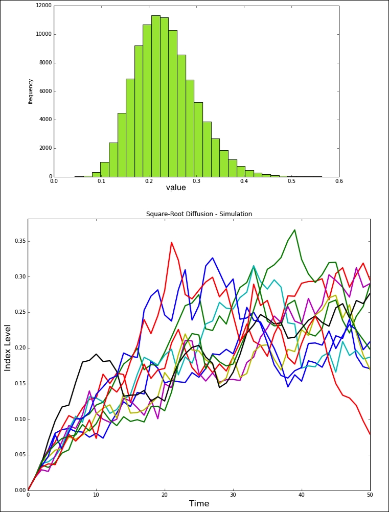
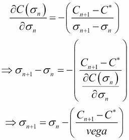
Stochastic models provide a more detailed understanding of the reaction diffusion processes. Such a description is often necessary for the modeling of biological systems. There are a variety of simulation models that have been studied, and to restrict ourselves within the context of this chapter, we will consider the square-root diffusion.
The square-root diffusion, popularized for finance by Cox, Ingersoll, and Ross (1985) is used to model mean reverting quantities (such as interest rates and volatility). The stochastic differential equation of this process is as follows:

The values of xt have chi-squared distribution, but in the discrete version, they can be approximated by normal distribution. By discrete version, we mean applying Euler's numerical method of approximation using the iterative approach, as shown in the following equation:

import numpy as np
import matplotlib.pyplot as plt
import numpy.random as npr

S0 = 100 # initial value
r = 0.05
sigma = 0.25
T = 2.0

x0=0
k=1.8
theta=0.24
i = 100000
M = 50
dt = T / M
def srd_euler():
  xh = np.zeros((M + 1, i))
  x1 = np.zeros_like(xh)
  xh[0] = x0
  x1[0] = x0
  for t in range(1, M + 1):
   xh[t] = (xh[t - 1]
    + k * (theta - np.maximum(xh[t - 1], 0)) * dt
    + sigma * np.sqrt(np.maximum(xh[t - 1], 0)) * np.sqrt(dt)
    * npr.standard_normal(i))
  x1 = np.maximum(xh, 0)
  return x1
x1 = srd_euler()

plt.figure(figsize=(10,6))
plt.hist(x1[-1], bins=30, color='#98DE2f', alpha=0.85)
plt.xlabel('value')
plt.ylabel('frequency')
plt.grid(False)

plt.figure(figsize=(12,10))
plt.plot(x1[:, :10], lw=2.2)
plt.title("Square-Root Diffusion - Simulation")
plt.xlabel('Time', fontsize=16)
plt.ylabel('Index Level', fontsize=16)
#plt.grid(True)
plt.show()