4
SENSITIVITY ANALYSIS IN LINEAR PROGRAMS
As described in Chapter 1, sensitivity analysis involves linking results and conclusions to initial assumptions. In a typical spreadsheet model, we might ask what-if questions regarding the choice of decision variables, looking for effects on the performance measure. Eventually, instead of asking how a particular change in the decision variables would affect the performance measure, we might search for the changes in decision variables that have the best possible effect on performance. That is the essence of optimization. In Microsoft® Office Excel®, the Data Table tool allows us to conduct such a search, at least for one or two decision variables at a time. An optimization procedure performs this kind of search in a sophisticated manner and can handle several decision variables at a time. Thus, we can think of optimization as an ambitious form of sensitivity analysis with respect to decision variables.
In this chapter, we consider another kind of sensitivity analysis—with respect to parameters. Here, we ask what-if questions regarding the choice of a specific parameter, looking for the effects on the objective function and the effects on the optimal choice of decision variables. Sensitivity analysis has an elaborate and elegant structure in linear programming problems, and we approach it from three different perspectives. First, to underscore the analogy with sensitivity analyses in simpler spreadsheet models, we explore a Solver-based approach that resembles the Data Table tool. Second, we summarize the traditional form of sensitivity analysis, which is also available in Solver. Third, we introduce an interpretation that relies on discovering qualitative patterns in optimal solutions. This pattern-based interpretation enhances and extends the more mechanical sensitivity analyses that the software carries out and makes it possible to articulate the broader message in optimization analyses.
For the most part, we examine sensitivity analysis with respect to two kinds of parameters in particular—objective function coefficients and constraint constants. The general thrust of sensitivity analysis is to examine how the optimal solution would change if we were to vary one or more of these parameters. However, the flip side of this analysis is to examine when the optimal solution would not change. In other words, an implicit theme in sensitivity analysis, especially for linear programming models, is to discover robust aspects of the optimal solution—features of the solution that do not change at all when one of the parameters changes. As we will see, this theme becomes visible as a kind of “insensitivity analysis” in our three approaches.
Sensitivity analysis is important from a practical perspective. Because we seldom know all of the parameters in a model with perfect accuracy, it makes sense to study how results would differ if there were some differences in the original parameter values. If we find that our results are robust—that is, a change in a parameter causes little or no change in our decisions—then we tend to proceed with some confidence in those decisions. On the other hand, if we find that our results are sensitive to the accuracy of our numerical assumptions, then we might want to go back and try to obtain more accurate information, or we might want to develop contingency plans in case some of our assumptions are not borne out. Thus, tracing the relation between our assumptions and our eventual course of action is an important step in “solving” the problem we face, and sensitivity analyses can often provide us with the critical information we need.
4.1 PARAMETER ANALYSIS IN THE TRANSPORTATION EXAMPLE
In a simple spreadsheet model, we might change a parameter and record the effect on the objective function. In Excel, the Data Table tool automates this kind of analysis for one or two parameters at a time. A supplementary piece of software called Solver Sensitivity contains a similar tool that allows us to change a parameter, rerun Solver automatically, and record the impact of the parameter’s change on the optimal value of the objective function and on the optimal decisions. Solver Sensitivity is contained in an add-in known as the Sensitivity Toolkit, which can be downloaded from the website http://mba.tuck.dartmouth.edu/toolkit/.
As an illustration, we revisit the transportation problem introduced in Chapter 3. In Example 3.1 (Goodwin Manufacturing Company), the model allowed us to find the cost-minimizing distribution schedule in a setting with three plants shipping to four warehouses. We encountered the optimal solution in Figure 3.2, which is reproduced in Figure 4.1. The tight supply constraints are the Minneapolis and Pittsburgh capacities, and the optimal total cost in the base case is $13,830.

Figure 4.1 Solution for transportation model of Example 3.1.
Suppose that we are using the transportation model as a planning tool and we want to explore a change in the unit cost of shipping from Pittsburgh to Atlanta, which is $0.36 in the base case. We might be negotiating with a trucking company over the charge for shipping, so we want to study a range of alternative values for the PA cost. Suppose that, as a first step, we are willing to examine a large range of values, from $0.25 to $0.75.
We can load Solver Sensitivity from the ribbon by selecting File > Open and selecting the add-in. Once installed, it can be initiated from the Add-ins tab. In the first input window, shown in Figure 4.2, the objective function cell is already identified, and the user can enter the other cells to be monitored during the sensitivity analysis. In the example, we enter the range C13:F13, corresponding to the outbound shipments from Pittsburgh, because we anticipate these will be affected by changes in the PA cost. Then, we press the Next button.

Figure 4.2 First input window for Solver Sensitivity.
The second input window asks for the cell to be modified, which we identify as C6, and the input type, which we usually leave as Begin, End, Increment. We can then fill in the corresponding values, as shown in Figure 4.3, specifying the range from $0.25 to $0.75 in steps of $0.05. When the analysis is specified, we press Finish.

Figure 4.3 Second input window for Solver Sensitivity.
Solver Sensitivity produces a summary report on a new worksheet. The report, which is displayed in Figure 4.4 after some reformatting, shows how the optimal total cost changes and how the optimal Pittsburgh shipments change as the unit cost of the PA route increases. The first column of the table gives the values of the unit cost under study, from $0.25 to $0.75. The second column gives the corresponding optimal total cost. The third column computes the rate of change in each row from one row above. For example, the rate of change for a cost of $0.35 is (13,780 − 13,530)/(0.35 − 0.30) = 5,000.

Figure 4.4 Solver Sensitivity report for PA unit cost.
The four columns D–G, which were selected in Figure 4.2, show the various shipments from the Pittsburgh plant. Thus, for the range of unit costs ($0.25–$0.75), four distinct profiles appear. For values of $0.30 and $0.35, the base-case solution prevails (5,000 units to Atlanta and 10,000 units to Boston), but above and below those values, the optimal shipping schedule changes:
- At a unit cost of $0.25, the PA shipment is 8000 units, while 7000 units are shipped on the PB route.
- At unit costs of $0.30 and $0.35, the PA shipment is 5,000 units, while 10,000 units are shipped on the PB route. In effect, there is a shift away from the PA route as its cost rises.
- At unit costs of $0.40–$0.65, the PA shipment is 3,000 units, while 2,000 units are shipped on PC, as well as 10,000 units on PB. Thus, there is a shift away from the PA route toward an entirely new route.
- At unit costs above $0.70, the PA route is not used at all.
From this information, we can conclude that the optimal shipping schedule is insensitive to changes in the PA unit cost, at least between $0.30 and $0.36. Below that interval, the unit cost could become sufficiently attractive that we would want to shift some shipments to the PA route from PB. Above that interval, however, the unit cost would become less attractive, and we would eventually want to shift some shipments to the PC route. Subsequently, when the profit contribution reaches approximately $0.70, we would prefer not to use the PA route at all. Thus, as we face the prospect of negotiating a unit cost for the PA route, we can anticipate the impact on Pittsburgh shipments, and on the optimal total cost, from the information in the table.
Because we chose a grid of size $0.05, we don’t know the precise cost interval over which the optimal shipping schedule remains unchanged. Since the original unit cost was $0.36, we know that the cost will have to drop to below $0.30 in order to induce a change in the size of the PA shipment. We also know that a cost of $0.25 will be sufficient inducement to make a change. The precise cost at which the change occurs must be somewhere between $0.30 and $0.25. We can rerun Solver Sensitivity with a grid of $0.01 to get a better idea of exactly where the change occurs. Figure 4.5 shows the resulting Solver Sensitivity output.

Figure 4.5 Solver Sensitivity results on a refined grid.
The refined grid shows that the optimal shipments do not change until the unit cost drops below $0.27 or rises above $0.37. If we wanted to see an even finer grid, we could produce another report with an even smaller step size. However, we can find the precise range of “insensitivity” more directly by other means, as we shall see later.
Two important qualitative patterns are visible in Figure 4.4. First, when an objective function coefficient becomes more attractive, the amount of the corresponding variable in the optimal solution will either increase or stay the same; it cannot drop. (However, the increase need not be gradual: The PA shipment jumps from 0 to 3000 to 5000 and to 8000 as we read up the table.) Second, when an objective function coefficient becomes more attractive, the optimal value of the objective function either stays the same or improves. In this example, the total cost remains unchanged when the unit cost of the PA route is $0.70 or more; but for $0.65 and below, the total cost decreases as the PA cost decreases.
In linear programs, a distinct pattern usually appears in sensitivity tables when we vary a coefficient in the objective function. The optimal values of the decision variables remain constant over some interval of increase or decrease. Beyond this interval, a slightly different set of decision variables becomes positive, and some of the decision variables change abruptly, not gradually. Figure 4.5 illustrates these features even in the limited portion of the optimal schedule that it tracks.
Solver Sensitivity can also be run for changes in a right-hand side (RHS) constant. Suppose that, starting from the base case, we wish to explore a change in the Pittsburgh capacity. (The original figure was 15,000 (in cell G6), and at that level, the capacity represents a scarce resource.) To prepare for this analysis, we first have to determine the range of values to study, such as 14,000–24,000, in steps of 1,000. We enter these values in the One-Way Inputs window, after ensuring that the unit cost in C6 remains at its base-case value of $0.36. When we press Finish, an additional worksheet appears showing the results of the analysis. The Solver Sensitivity analysis, slightly reformatted, appears in Figure 4.6.

Figure 4.6 Solver Sensitivity report for Pittsburgh capacity.
The table shows how Pittsburgh shipments and the optimal total cost change as Pittsburgh’s capacity varies. The columns correspond to the same outputs that were selected for the previous table, except that the parameter we’ve varied (Pittsburgh capacity) appears in the first column. The rows correspond to the designated series of input values for this parameter. (For Pittsburgh capacities below 14,000, the optimization problem would be infeasible. At those levels, capacity in the system would be insufficient to meet demand for 39,000 units.) In the table, the following changes appear in the optimal schedule:
- As Pittsburgh’s capacity increases above 14,000, total costs drop, and more shipments occur on the PA route.
- When Pittsburgh’s capacity reaches 18,000, shipments along PA level off at 8,000. Beyond that capacity level, the solution uses the PC route.
- The optimal total cost drops as Pittsburgh’s capacity increases to 20,000. Beyond that level, the optimal schedule stabilizes, and total cost remains at $12,420.
Thus, if we can find a way to increase the capacity at Pittsburgh, we should be interested in an increase up to a level of 20,000 from the base-case level of 15,000. By also investigating the cost of increasing capacity, we can quantify the net benefits of expansion. If there are incremental costs associated with expansion to capacities beyond 20,000, such costs are not worth incurring because there is no benefit (i.e., no reduction in total cost) when capacity exceeds that level. With this kind of information, we can determine whether a proposed initiative to expand capacity would make economic sense.
Suppose, for example, that the Pittsburgh warehouse contained some excess space that we could begin to use for just the cost of utilities. Furthermore, suppose this space corresponded to additional capacity of 3000 units and cost $800 to operate. Would it be economically advantageous to use the space? From the Solver Sensitivity report, we learn that by adding 3,000 units of capacity, and operating with a capacity of 18,000 at Pittsburgh, distribution costs would drop to $12,960, a saving of $870 from the base case. This more than offsets the incremental cost of utilities, making the use of the space economically attractive.
The marginal value of additional capacity is defined as the change in the objective function due to a unit increase in the capacity available (in this instance, an increase of one in the size of Pittsburgh’s capacity). Starting with the base case, we can calculate this marginal value by changing the capacity from 15,000 to 15,001, resolving the problem and noting the change in the objective function: Total cost drops to $13,829.71, a decrease of $0.29.
To pursue this last point, we examine the column labeled Change in Figure 4.6. Entries in this column equal the marginal value of Pittsburgh’s capacity. For example, the first entry, in cell C3, corresponds to the ratio of the cost change (14,120–13,830) to the capacity change (15,000–14,000), or −0.29. As the table shows, the marginal value starts out at $0.29, drops to $0.27, and eventually levels off at zero. Because the table is built with increments of 1000, we get at least a coarse picture of how the marginal value behaves. To refine this picture, we would have to create a Solver Sensitivity report with increments smaller than 1000.
As Pittsburgh’s capacity increases, the marginal value stays level for a while, then drops, stays level at the new value for a while, then drops again. This pattern is an instance of the economic principle known as diminishing marginal returns: If someone were to offer us more and more of a scarce resource, its value would eventually decline. In this case, the scarce resource (binding constraint) is Pittsburgh’s capacity. Limited capacity at Pittsburgh prevents us from achieving an even lower total cost; that is what makes Pittsburgh’s capacity economically scarce.
Starting from the base case—15,000 units—we should be willing to pay up to $0.29 for each additional unit of capacity at the Pittsburgh plant. This value is also called the shadow price. In economic terms, the shadow price is the break-even price at which it would be attractive to acquire more of a scarce resource. In other words, imagine that someone were to offer us additional capacity at Pittsburgh (e.g., if we could lease some automated equipment). We can improve total cost at the margin by acquiring the additional capacity, as long as its price is less than $0.29 per unit. In our example of opening up additional space in the warehouse, the cost of the addition was only $800/3000 = $0.26. This figure is less than the shadow price, indicating that it would be economically attractive to use the space.
Figure 4.6 shows that the marginal value of a scarce resource remains constant in some neighborhood around the base-case value. In this example, the $0.29 shadow price holds for additional capacity up to 18,000 units; then it drops to $0.27. Beyond a capacity of 20,000 units, the shadow price remains at zero. In effect, additional capacity beyond 20,000 units has no incremental value.
A distinct pattern appears in sensitivity tables when we vary the amount of a scarce capacity. The marginal value of capacity remains constant over some interval of increase or decrease. Within this interval, some of the decision variables change linearly with the change in capacity, while other decision variables may stay the same. There is no interval, however, in which all the decision variables remain the same, as is the case when we vary an objective function coefficient. Thus, it is the shadow price—not the set of decision variables—that is insensitive to changes in the amount of a scarce capacity in some interval around the base case. Beyond that range, the story is different. If someone were to continually give us more of a scarce resource, its value would drop and eventually fall to zero. In our example, we can see in Figure 4.6 that the value of additional capacity at Pittsburgh drops to zero at a capacity level of about 21,000.
4.2 PARAMETER ANALYSIS IN THE ALLOCATION EXAMPLE
As a further illustration of the Solver Sensitivity report, let’s revisit Example 2.1 of Chapter 2 (Brown Furniture Company) and the model that finds the profit-maximizing product mix among chairs, desks, and tables. We encountered the optimal solution in Figure 2.6, which is reproduced in Figure 4.7. The optimal product mix is made up of desks and tables, with no chairs; and the tight constraints are assembly and machining hours. The optimal total profit contribution in the base case is $4880.

Figure 4.7 Solution for allocation model of Example 2.1.
Suppose that we are using the allocation model as a planning tool and that we wish to explore a change in the price of chairs. This price may still be subject to revision, pending more information about the market, and we want to study the impact of a price change, which translates into a change in the profit contribution of chairs. For the time being, we’ll assume that if we vary the price, the demand potential for chairs will not be affected. To explore the effect of a price change, we follow the steps introduced in the previous section.
First, we designate a cell for the sensitivity information, in this case cell C8, anticipating that we’ll want to investigate the range of profit contributions from $15 to $35 per unit. The two input windows are shown in Figures 4.8 and 4.9.

Figure 4.8 Solver Sensitivity input window for allocation model.

Figure 4.9 One-Way Inputs window for allocation model.
The resulting Solver Sensitivity report is shown in Figure 4.10. The first column of the table gives the values of the parameter (profit contribution for chairs) that we varied. The second column lists the optimal value of the objective function in each case, and the third column calculates the rate of change in the objective function per unit change in the parameter. These three columns are, again, the standard part of the report. The last three columns in Figure 4.10 give the optimal values of the three decision variables corresponding to each choice of the input parameter.

Figure 4.10 Solver Sensitivity report for profit contribution.
The Solver Sensitivity report shows how the optimal profit and the optimal product mix both change as the profit contribution for chairs increases. For the selected range of profit contributions ($15–$35), we see three distinct profiles. For values up to $21, the base-case solution prevails, but above $21, the optimal mix changes:
- Chairs stay at zero until the unit profit on chairs rises above $21; then chairs enter the optimal mix at a quantity of about 15.
- When the unit profit reaches $32, the number of chairs in the optimal mix increases to 160. At this stage, and beyond, the optimal product mix is made up entirely of chairs.
- Desks are not affected until the unit profit on chairs rises to $22; then the optimal number of desks drops from 160 to 0.
- Tables stay level at 120 until the unit profit on chairs rises to $22; then the optimal number of tables increases to about 326. When the unit profit on chairs rises to $32, the optimal number of tables drops to 0.
- The optimal total profit remains unchanged until the unit profit on chairs rises above $21; then it increases at a rate that reflects the number of chairs in the product mix.
From this information, we can conclude that the optimal solution is insensitive to changes in the unit profit contribution of chairs, up to about $21. (Because we are operating with a grid of $1, we do not have visibility into what might happen at intermediate values.) Beyond that point, however, the profit on chairs would become sufficiently attractive that we would want to include chairs in the mix. In effect, chairs (and additional tables) substitute for desks when the profit contribution of chairs reaches $21. Subsequently, when the profit contribution reaches $32, additional chairs also substitute for tables. Thus, if we decide to alter the price for chairs, we can anticipate the impact on the optimal product mix from the information in the Solver Sensitivity report.
Again, the table illustrates some general qualitative patterns. First, when we improve the objective function coefficient of one variable, the amount of that variable in the optimal solution will either increase or stay the same; it cannot drop. (The effect on other variables, however, may not follow an obvious direction: The optimal number of tables first increases and then later decreases as the price of chairs rises.) Second, the optimal value of the objective function either stays the same or improves.
Now let’s return to the base case and consider one of the RHS constants for sensitivity analysis instead of an objective function coefficient. Suppose we wish to vary the number of machining hours available from 1200 to 2000 in steps of size 50.
The Solver Sensitivity report (see Fig. 4.11) shows how the optimal profit and the optimal decisions both change as the number of machining hours increase. The columns correspond to the same outputs as in the previous table, except for the first column, where the rows correspond to the designated input values for machining capacity. The table reveals the following changes in the optimal product mix:
- Chairs remain out of the product mix until the number of machining hours rises to about 1500. After that, chairs increase with the number of machining hours. At around 1850 machining hours, the number of chairs levels off at about 72.4.
- Desks increase as the number of machining hours rises to about 1450; then desks decrease. At 1850 machining hours, desks drop out of the optimal mix.
- Tables make up the entire product mix until the number of machining hours rises to about 1350. Then, the optimal number of tables first decreases, then increases, and eventually levels off at about 297.
- The optimal total profit grows as the number of machining hours rises, eventually leveling off at $5318.

Figure 4.11 Solver Sensitivity report for machining hours.
Therefore, as we increase machining capacity above the base-case value of 1440, we have an incentive to alter the product mix. First, the product mix changes by swapping desks for tables (but not necessarily at a ratio of 1:1), then by swapping chairs and tables for desks, until the entire product mix becomes devoted to chairs and tables. The qualitative details of the product mix changes are not as important as the fact that the optimal profit contribution increases with the number of machining hours, until leveling off at a capacity of about 1850 hours.
We say “about” 1850 hours because we used a coarse grid in the table and cannot observe precisely what machining capacity drives desks completely out of the product mix. If we want a more precise value, we would have to repeat the analysis using a step size smaller than 50.
The marginal value of additional machining hours is defined as the improvement in the objective function from a unit increase in the number of hours available (i.e., an increase of one in the RHS of the machining hours constraint). Starting with the base case, we can calculate this marginal value, or shadow price, by changing the number of machining hours to 1441, resolving the problem, and tracking the improvement in the objective function. (It grows to $4882, an improvement of $2.)
In Figure 4.11, column C tracks the shadow price over a broader interval. Entries in this column represent the change in the optimal objective function value, from the row above, divided by the change in the input parameter. This ratio describes the marginal value of machining hours. As the table shows, the marginal value starts out at $3.50 for a capacity of 1250 machining hours, drops as the number of machining hours increases, and eventually levels off at zero. Actually, the shadow price appears to level off at $2.00 and at $1.05 before it eventually drops to zero. However, because the table is built on increments of 50 hours, we can get only a coarse picture of how this marginal value behaves.
To get a better picture of the marginal value, we can repeat the analysis, using a step size of 25. The Solver Sensitivity report is shown in Figure 4.12. The marginal values are still approximate; however, a clearer picture of the marginal value emerges. As before, the marginal value lies at $3.50 at around 1200 hours; it falls to $2.00 around 1350 hours, to $1.05 around 1475 hours, and finally to zero around 1850 hours. An even smaller step size would be necessary to be more precise about the levels at which the marginal value changes.

Figure 4.12 Solver Sensitivity report for machining hours on a refined grid.
In linear programs, as mentioned earlier, a distinct pattern in sensitivity analyses typically arises when we vary the availability of a scarce resource: The marginal value of the scarce resource (in this case, the value of $2.00 per machining hour) stays constant over some interval of increase or decrease. Within this interval, some of the decision variables (in this case, desks and tables) change linearly with the change in resource availability, while other decision variables (in this case, chairs) may stay the same. As we acquire more of a scarce resource, its value eventually drops, exhibiting diminishing marginal returns and ultimately falling to zero. In the example, the value of additional machining hours drops to zero at a capacity level around 1850.
For another perspective on this phenomenon, we can construct a graph of optimal profit as a function of machining capacity. Figure 4.13 shows such a graph, with a distinctive piecewise linear shape. Machining capacity appears on the horizontal axis, and optimal profit appears on the vertical axis. The slope of the line in this graph corresponds to the shadow price for machining capacity. As the graph indicates, the shadow price drops in a piecewise fashion as the capacity increases, eventually stabilizing at zero for capacity levels above 1850. As machining capacity increases beyond this level, the optimal profit levels off at $5318, limited by other constraints in the model.

Figure 4.13 Graph showing optimal profit as a function of machining hours available.
The Solver Sensitivity add-in offers an option for generating two-way tables in addition to the one-way tables we have examined thus far. For the two-way table, we first select the Two-Way Table type in the first input window. Then, in the second window, for two-way inputs, we select two parameters and vary them from minimum to maximum, in specified step sizes. (The ranges and step sizes need not be identical.) The report generated by such a run displays only the values of the optimal objective function.
As an illustration, suppose we want to test the sensitivity of the optimal profit contribution in the allocation example to changes in both the profit contribution of chairs and the profit contribution of desks. Specifically, we vary the unit contribution of chairs from 10 to 60 in steps of 10 and the unit contribution of desks from 15 to 30 in steps of 5. These inputs are shown in Figure 4.14. The Solver Sensitivity report is shown in Figure 4.15.

Figure 4.14 Inputs for a two-way sensitivity analysis.

Figure 4.15 Two-way Solver Sensitivity report.
Although two-way tables are available, most sensitivity analyses are carried out for one variable at a time. With a one-at-a-time approach, we can focus on the implications of changing a parameter for the objective function, decision variables, tightness of constraints, and marginal values. Much of the insight we can gain from formal analysis derives from these kinds of investigations. The two-at-a-time capability is computationally similar, but it does not usually provide as much insight.
4.3 THE SENSITIVITY REPORT AND THE TRANSPORTATION EXAMPLE
As we’ve seen, Solver Sensitivity duplicates for optimization models the main functionality of the Data Table tool for basic spreadsheet models. The Solver Sensitivity report is constructed by repeating the optimization run with different parametric values in the model each time. This transparent logic makes the Solver Sensitivity report a convenient and accessible choice for most of the sensitivity analyses we might want to perform with optimization models. However, Solver provides us with an alternative perspective.
The Sensitivity Report is available after an optimization run, once the optimal solution has been found. In the Solver Results window that appears after a Solver run, one of the reports that can be selected (see Fig. 4.16) is the Sensitivity Report. The report, which appears as a table on a new worksheet, has two main sections—one for decision variables and one for constraints. The section entitled Variable Cells contains an entry corresponding to each decision variable, and the section entitled Constraints contains an entry corresponding to each constraint left-hand side. Figure 4.17 shows the Sensitivity Report for the transportation model of Figure 4.1, after some reformatting.

Figure 4.16 Selecting the Sensitivity Report after a Solver run.

Figure 4.17 Sensitivity Report for the transportation example.
The Sensitivity Report displays a name corresponding to each entry in both sections. Following a built-in convention, the report combines the contents of the first cell containing text to the left of the entry and the contents of the first cell containing text above it. Thus, the Variable Cell C13 is assigned the name Pitt Atl in the report (corresponding to the quantity shipped from Pittsburgh to Atlanta), while the Constraint G13 is assigned the name Pitt Sent (corresponding to the total amount shipped from Pittsburgh). In this model, the text labels created to document the model on the spreadsheet happen to work well for the naming convention, although that is not always the case.
In the top section, the report reproduces the values of the decision variables in the optimal solution (under Final Value) and the values of the coefficients in the objective function (under Objective Coefficient). The Allowable Increase and Allowable Decrease columns show how much we could change any one of the objective function coefficients without altering the optimal decision variables. For example, the objective function coefficient for the PA route is $0.36 in the base case, as shown in the first highlighted row of the Sensitivity Report in Figure 4.17. This unit cost could rise to $0.38 without having an impact on the optimal shipping schedule. (This limit is indicated by the allowable increase of 0.02.) In addition, the original value could drop to $0.27 without having an impact on the optimal shipping schedule. (This limit is indicated by the allowable decrease of 0.09.) These increases and decreases from the base case are consistent with the parameter analysis shown in Figure 4.4.
It might be helpful to think about the Sensitivity Report as an “insensitivity report,” because it mainly provides information about changes for which some aspect of the base-case solution does not change. Here, for example, the base-case decisions are insensitive to changes in the PA unit cost between $0.27 and $0.38. In this interval, the base-case schedule remains optimal. Of course, the optimal total cost varies with the PA unit cost, because some 5000 units are shipped along the PA route in the optimal schedule. For example, if the unit cost dropped by $0.04, the optimal schedule would remain unchanged, but the optimal total cost would drop by 5000($0.04) = $200.
The Sensitivity Report is more precise but less flexible than the Solver Sensitivity report. For example, Figure 4.4 provides us with the allowable increase and decrease, but to a precision of only $0.05. We need to search on a smaller grid, as in Figure 4.5, to refine our precision; but even in this more detailed report, we can determine the allowable increase and decrease to a precision of only $0.01. By contrast, the Sensitivity Report provides the exact limits. On the other hand, the Sensitivity Report tells us virtually nothing about what would happen if the PA unit cost rose above $0.38, whereas the Solver Sensitivity report can provide a good deal of information.
The entries in the Reduced Cost column of the Sensitivity Report may initially be displayed as a set of zeros for all variables.1 However, if we display the entries to two decimal places, we see some nonzero values. For decision variables that are not at their upper or lower bounds (and here, the only bound for a variable is zero), the reduced cost is zero. So, for the variable PA, which is positive in the optimal shipping schedule, the report shows a reduced cost of zero.
The reduced cost is nonzero if the corresponding decision variable lies at its bound. In this example, that condition means that the route is not used in the optimal schedule. For the MA route, the reduced cost is $0.28. The interpretation of this value is as follows. Evidently, the unit cost of the MA route is unattractive at its base-case value of $0.60, and we might wonder how much more attractive that unit cost would have to become for the MA route to appear in the optimal solution. The answer is given by the reduced cost: The unit cost would have to drop by more than $0.28 before there would be an incentive to ship along the MA route. However, we already knew that much, from the allowable decrease for the MA variable. As this example shows, the Reduced Cost column provides information that can be obtained elsewhere, and we need not rely on it.
In the bottom section, the Sensitivity Report provides the values of the constraint left-hand sides (under Final Value) and the RHS constants (under Constraint R.H. Side), along with the shadow price for each constraint. Here again, it may be necessary to reformat the column of shadow prices. From the earlier sensitivity analysis for this example, we expect to see a shadow price of $0.29 for Pittsburgh capacity. The Sensitivity Report shows this value as a negative price because it follows a convention of quoting the shadow price as the increase in the objective function induced by a unit increase in the RHS constant. An increase in the Pittsburgh capacity would allow the optimal total cost to drop, so the shadow price is negative.
The Allowable Increase and Allowable Decrease columns show how much we could change any one of the constraint constants without altering the shadow price. In the case of Pittsburgh capacity (15,000 in the base case), the information in the highlighted row of the report’s bottom section indicates that the capacity could increase by 3,000 or decrease by 1,000 (i.e., it could vary between 14,000 and 18,000) without affecting the shadow price of $0.29. Again, this is an “insensitivity” result, and it is consistent with the information in the Solver Sensitivity report of Figure 4.6. Recall from our earlier discussions, however, that the optimal values of some decision variables change with any increase or decrease in the Pittsburgh capacity.
The Sensitivity Report does not offer information about what occurs outside of the allowable increase and allowable decrease. It is also completely based on one-at-a-time analysis. That is, the presumption is that only one parameter at a time is subject to change. No facility exists in the Sensitivity Report to explore the effects of varying two parameters simultaneously, as in the case of the two-way parameter analysis shown in Figure 4.15.
The sensitivity analysis for RHS constants is omitted for constraints that involve a simple lower or upper bound. That is, if the form of the constraint is Variable ≤ Ceiling or Variable ≥ Floor, then the Sensitivity Report does not include the constraint. On the other hand, if the same information is incorporated into the model using the standard SUMPRODUCT constraint form (as in the case of the allocation model) or using the SUM constraint form (as in the case of the transportation model), then the Sensitivity Report treats the constraint in its usual fashion and provides ranging analysis.
4.4 THE SENSITIVITY REPORT AND THE ALLOCATION EXAMPLE
As another illustration of the Sensitivity Report, suppose we obtain it after solving the allocation example in Figure 4.7. The Sensitivity Report is shown in Figure 4.18. In the top section, the Sensitivity Report reproduces the optimal solution and tabulates the allowable increase and allowable decrease for each objective function coefficient. If we ask how much the contribution of chairs ($16 in the base case) could vary without altering the optimal product mix, we can tell from the allowable increase and allowable decrease that the contribution could rise by up to $5 or drop by any amount without altering the optimal mix. Thus, a price increase of more than $5 would provide an inducement to include chairs in the product mix. This conclusion could also be drawn from the parameter analysis in Figure 4.10.

Figure 4.18 Sensitivity Report for the allocation example.
Suppose instead that we ask a similar question about desks: How much could the profit contribution for desks ($20 in the base case) change, without altering the optimal solution? From the Sensitivity Report, in the row for desks, we see that the allowable range is from $19.52 to $21.00 (from an allowable decrease of about $0.48 to an allowable increase of $1.00). Within this interval, the unit profit on desks does not trigger a change in the optimal mix; the best mix remains 160 desks, 120 tables, and no chairs. However, any change outside this range should be examined by rerunning the model. Also, if the profit on desks were to increase by $0.75, which lies within the allowable increase, the optimal value of the objective function would necessarily change because the 160 desks in the optimal mix would account for a profit increase of 160($0.75) = $120.
The example involving the profit on desks reinforces the point that the Sensitivity Report cannot “see” beyond the allowable increase and allowable decrease. The Sensitivity Report tells us nothing about what happens when the profit contribution for desks rises above $21, whereas that information would be available to us from the Solver Sensitivity report, provided we specify a suitable range for the input parameter. Nevertheless, the Sensitivity Report covers all of the decision variables in one report. If we’re primarily interested in the allowable increases and decreases around the base case—that is, if we’re looking for “insensitivity” information—then the Sensitivity Report is the tool of choice. Had we used the Solver Sensitivity report, we could not have produced information on all three coefficients simultaneously.
In the bottom section, the Sensitivity Report provides the shadow price for each constraint and the range over which it holds. The Allowable Increase and Allowable Decrease columns show how much we could change any one of the constraint constants without altering the corresponding shadow price. For example, we should recognize the shadow price on machining time of $2.00 (from Fig. 4.12). However, from the Sensitivity Report, we also know now that this $2.00 value holds up to a capacity of 1460 hours (an allowable increase of 20). Beyond that, there would be a change in the shadow price for machining hours. In fact, there would be a change in the optimal product mix. Once again, we cannot anticipate from Sensitivity Report exactly what that change might look like, whereas the Solver Sensitivity report (Fig. 4.12) shows that the expanded machining capacity will make it desirable to add chairs to the product mix.
Thus, Solver Sensitivity and the Sensitivity Report provide different capabilities. A comparison of the two approaches is summarized in Table 4.1. Generally, Solver Sensitivity is more flexible, whereas the Sensitivity Report is more precise. Although each is suitable for answering particular questions that arise in sensitivity analyses, it would be reasonable to draw on both capabilities to build a comprehensive understanding of a model’s solution. One word of warning must be added. The Sensitivity Report can sometimes be confusing if the model itself does not follow a disciplined layout. As described in Chapter 2, we advocate a standardized approach to building linear programming models on spreadsheets. Solver does permit more flexibility in layout and calculation than our guidelines allow, but some users find the Sensitivity Report confusing when running nonstandard model layouts. This problem is less likely to arise with Solver Sensitivity.
Table 4.1 Comparison of Solver Sensitivity and the Sensitivity Report
| Solver Sensitivity | Sensitivity Report |
| Differences | |
| Describes a user-determined region | Describes only the “insensitivity” region |
| Can look beyond the insensitivity region | Limited to the insensitivity region |
| Contains standard and tailored content | Contains standard content |
| Table grid may need refinements | Allowable increase and decrease are precise |
| User may require several reports | Information is provided simultaneously |
| Two-at-a-time analysis is available | One-at-a-time analysis only |
| Any parameter on the worksheet | Objective coefficients and constraint constants |
| Similarities | |
| Report shown on a new worksheet | Report shown on a new worksheet |
| Column names may need revision | Tabulated names may need revision |
| Entries in table may need reformatting | Entries in report may need reformatting |
4.5 DEGENERACY AND ALTERNATIVE OPTIMA
Viewed from the perspective of the Sensitivity Report, each linear programming solution carries with it an allowable range for the objective function coefficients and RHS constants. Within this range, some aspect of the optimal solution remains stable—decision variables in the case of varying objective function coefficients or shadow prices in the case of varying RHS constants. At the end of such a range, the stability no longer persists, and some change sets in. In this section, we examine the endpoints of these ranges as special cases.
First, let’s consider the allowable range for a constraint constant. For a particular constraint, there is a corresponding range in which the shadow price holds. At the end of that range, the shadow price is in transition, changing to a different value. At a point of transition, a different shadow price holds in each direction. This condition is referred to as a degenerate solution.
Consider our transportation example and its sensitivity report in Figure 4.17. Suppose we are again interested in the analysis of Pittsburgh capacity, originally at 15,000. From Figure 4.17, we find that the shadow price of $0.29 holds for capacities of 14,000 to 18,000. At a capacity of 18,000, the shadow price is in transition. We can see from Figure 4.6 that the shadow price is $0.29 below a capacity of 18,000 and $0.27 for capacities above it. Just at 18,000, it would be correct to say that there are two shadow prices, provided that we also explain that the 29-cent shadow price holds for capacity levels below 18,000, and a 27-cent shadow price holds for capacity levels above 18,000. When we take capacity to be exactly 18,000, however, Solver can display only one of these shadow prices. The Sensitivity Report could show the shadow price either as $0.29 but with an allowable increase of zero or as $0.27 but with an allowable decrease of zero, depending on how the model is expressed on the worksheet.
To recognize a degenerate solution, we look for an entry of zero among the allowable increases and decreases reported in the Constraints section of the Sensitivity Report. This value indicates that a shadow price is at a point of transition. If none of these entries is zero, then the solution is said to be a nondegenerate solution, which means that no shadow price in the solution lies at a point of transition. The significance of degeneracy is a warning: It alerts us to be cautious when using shadow prices to help evaluate the economic consequences of altering a constraint constant. We must be mindful that, in a degenerate solution, the shadow price holds in only one direction. If we want to know the value of the shadow price just beyond the point of transition, we can change the corresponding RHS by a small amount and then rerun Solver. In our example, we could set Pittsburgh capacity equal to 18,001 and reoptimize. The resulting Sensitivity Report reveals a 27-cent shadow price for the Pittsburgh capacity constraint, along with an allowable decrease of one, as shown in the highlighted row of Figure 4.19.

Figure 4.19 Sensitivity Report for the near-degenerate case.
Now, suppose we have a problem that leads to a nondegenerate solution, and we consider ranging analysis for objective function coefficients. For any particular coefficient, there is a corresponding range in which the optimal values of the decision variables remain unchanged. At the end of that range, more than one optimal solution exists. This condition is referred to as alternative optima, or sometimes multiple optima.
As an example, consider the transportation model of Figure 4.1. In the ranging analysis of Figure 4.17, we saw that the unit cost of the PA route can vary from $0.27 to $0.38 without a change in the optimal schedule. At the 38-cent limit of this range, more than one optimal solution exists. To find this solution, we change the unit cost on the PA route to 0.38 and rerun Solver. We find that the optimal total cost is $13,930, as shown in Figure 4.20. In this solution, the shipments from Pittsburgh are 3,000 to Atlanta, 10,000 to Boston, and 2,000 to Chicago, with corresponding adjustments to the Tucson shipments. However, we can verify that the original optimal schedule generates this same total cost. In other words, we can find two different schedules that achieve optimal costs. (In fact, it is possible to show that any weighted average of the two schedules is also optimal; thus, the number of distinct optimal schedules is actually infinite.) Solver is able to display only one of these solutions, depending on how the model is constructed on the spreadsheet.

Figure 4.20 Solution with multiple optima.
To recognize the existence of multiple optima, we look for an entry of zero among the allowable increases and decreases reported in the Variable Cells section of the Sensitivity Report. If there are no zeros, then the optimal solution is a unique optimum, and no alternative optima exist. (Strictly speaking, this is true only for nondegenerate solutions; when the solution is degenerate, these zeros are not necessarily indicators of multiple optima.) Otherwise, the optimal solution displayed on the spreadsheet is one of many alternatives that all achieve the same objective function value. The significance of multiple optima is an opportunity: Knowing that there are alternative ways of reaching the optimal value of the objective function, we might have secondary preferences that we could use as “tiebreakers” in this situation. However, Solver does not have the capability of displaying multiple optima, and it is not always obvious how to generate them on the spreadsheet. In our example, we can at least “trick” Solver into displaying the original optimal schedule for the case of a 38-cent unit cost on the PA route. If we change the unit cost on the PA route to 0.37999 and rerun Solver, we obtain the output we desire. Here, we exploit the fact that this made-up value remains inside the limits of the original ranging analysis (as given in Fig. 4.17), but it effectively behaves like the desired parameter of 0.38.
In summary, the Sensitivity Report examines the objective function coefficients and the RHS constants separately in two tables. Taking each parameter independently, and permitting it to vary, the report provides information on its allowable range—the range of values for which the solution remains stable in some way. At the end of these ranges, indicated by the values of the allowable increase and allowable decrease, special circumstances apply. Box 4.1 summarizes the various conditions that can occur when we start with an optimal solution that is unique and nondegenerate.
4.6 PATTERNS IN LINEAR PROGRAMMING SOLUTIONS
We often hear that the real take-away from a linear programming model is insight, rather than the actual numbers in the answer, but where exactly do we find that insight? This section describes one form of insight, which comes from interpreting the qualitative pattern in the solution. Stated another way, the optimal solution tells a “story” about a pattern of economic priorities, and it’s the recognition of those priorities that provides useful insight. When we know the pattern, we can explain the solution more convincingly than when we simply transcribe Solver’s output. When we know the pattern, we can also anticipate answers to some what-if questions without having to modify the spreadsheet and rerun Solver. In short, the pattern provides a level of understanding that enhances decision making. Therefore, after we optimize a linear programming model, we should always try to describe the qualitative pattern in the optimal solution.
Spotting a pattern involves making observations about both variables and constraints. In the optimal solution, we should ask ourselves, which constraints are binding and which are not? Which variables are positive and which are zero? A structural scheme describing the pattern is simply a qualitative statement about binding constraints and positive variables. However, to make that scheme useful, we translate it into a computational scheme for the pattern, which ultimately allows us to calculate the precise values of the decision variables in terms of the model’s parameters. This computational scheme often allows us to reconstruct the solution in a sequential, step-by-step fashion. To the untrained observer, the computational scheme seems to calculate the quantitative solution directly, without Solver’s help. In fact, we are providing only a retrospective interpretation of the solution, and we need to know that solution before we can construct the interpretation. Nevertheless, we are not merely reflecting information in Solver’s output; we are looking for an economic imperative at the heart of the situation depicted in the model. When we can find that pattern and communicate it, then we have gained some insight.
The examples in each of the subsections illustrate how to describe a pattern without using numbers. The discussion also introduces two tests that determine whether the pattern has been identified. We’ll see how knowledge of the pattern enables us to anticipate the ranges over which shadow prices hold. We’ll also see how to anticipate the ranges over which reduced costs hold. In effect, this material amounts to an explanation of information in the Sensitivity Report, although we can go beyond the report. Ultimately, the ability to recognize patterns allows us to appreciate and interpret solutions to linear programs in a comprehensive fashion, but it is a rather different skill than using the Sensitivity Report. The identification of patterns allows us to look beyond the specific quantitative data of a problem and find a general way of thinking about the solution. Unfortunately, there is no recipe for finding patterns—just some guidelines. The lack of a recipe can make the process challenging, even for people who can build linear programming models quite easily. Therefore, our discussion proceeds with a set of examples, each of which illustrates different aspects of working with patterns.
4.6.1 The Transportation Model
Let’s return to the transportation example of Figure 4.1. We first notice that only six of the available routes are needed to optimize costs. As Solver’s solution reveals, the best routes to use are MC, PA, PB, TA, TC, and TD. Stated another way, the solution tells us that we can ignore the other decision variables.
The solution also tells us that all the demand constraints are binding. This makes intuitive sense because unit costs are positive on all routes, so there is no incentive to ship more than demand to any destination. With all demand met exactly and total demand equal to 39,000 units (compared to total capacity of 40,000), we know that at least one of the supply capacities must be underutilized in the optimal solution. In general, there is no way to anticipate how many sources will be fully utilized and how many will be underutilized, so one useful part of the optimal pattern is the identification of critical sources—those that are fully utilized. The critical sources correspond to binding supply constraints in the model. In the solution, the Minnesota and Pittsburgh plants are at capacity, while Tucson capacity is underutilized. The decision variables associated with Tucson as a source are not determined by the capacity at Tucson; instead, they are determined by other constraints in the model.
In summary, the structural scheme for the pattern is as follows:
- Demands at all five warehouses are binding.
- Capacities at Minnesota and Pittsburgh are binding.
- The desired routes are MC, PA, PB, TA, TC, and TD.
As we shall see, this structural scheme specifies the optimal solution uniquely.
In the optimal schedule, some demands are met entirely from a unique source: Demand at Boston is entirely met from Pittsburgh, and demand at Denver is entirely met from Tucson. In a sense, these are high priority scheduling allocations, and we can think of them as if they are made first. There is also a symmetric feature: Supply from Minneapolis all goes to Chicago. Allocating capacity to a unique destination also marks a high priority allocation.
It is tempting to look for a reason why these routes get high priority. At first glance, we might be inclined to think that these are the cheapest routes. For example, Boston’s cheapest inbound route is certainly the one from Pittsburgh. However, things get a little more complicated after that. The TD route is not the cheapest inbound route for Denver. Luckily, we don’t need to have a reason; our task here is merely to interpret the result.
Once we assign the high priority shipments, we can effectively ignore the supply at the Minneapolis plant and the demands at the Boston and Denver warehouses. We then proceed to a second priority level, where we are left with a reduced problem containing two sources and two destinations. Now, the list of best routes tells us that the remaining supply at Pittsburgh must go to Atlanta; therefore, PA is a high priority allocation in the reduced problem. Similarly, the remaining demand at Chicago is entirely met from Tucson, so the TC route becomes a high priority allocation as well.
Having made the second priority assignments, we can ignore the supply at Pittsburgh and the demand at Chicago. We are left with a net demand at Atlanta and unallocated supply at Tucson. Thus, the last step, at the third priority level, is to meet the remaining demand with a shipment along route TA.
In general, the solution of a transportation problem can be described with the following generic computational scheme:
- Identify a high priority demand—one that is met from a unique source—and allocate its entire demand to this route. Then, remove that destination from consideration.
- Identify a high priority source—one that supplies a single destination—and allocate its remaining supply to this route. Then, remove that source from consideration.
- Repeat the previous two steps, each time using remaining demands and remaining supplies, until all shipments are covered.
The specific steps in the computational scheme for our example are the following:
- Ship as much as possible on routes PB, TD, and MC.
- At the second priority level, ship as much as possible on routes PA and TC.
- At the third priority level, ship as much as possible on route TA.
At each allocation, “as much as possible” is dictated by the minimum of capacity and demand. The following list summarizes computational scheme in priority order.
| Route | Priority | Shipment |
| PB | 1 | 10,000 |
| TD | 1 | 9,000 |
| MC | 1 | 10,000 |
| PA | 2 | 5,000 |
| TC | 2 | 2,000 |
| TA | 3 | 3,000 |
This retrospective calculation of the solution has two important features: It is complete (i.e., it specifies the entire shipment schedule) and it is unambiguous (i.e., the calculation leads to just one schedule). Anyone who constructs the solution using these steps will reach the same result.
The computational scheme characterizes the optimal solution without explicitly using a number if we interpret the numbers in the table as follows:
- PB is determined by Boston demand.
- TD is determined by Denver demand.
- MC is determined by Minneapolis supply.
- PA is determined by (remaining) Pittsburgh supply.
- TC is determined by (remaining) Chicago demand.
- TA is determined by (remaining) Atlanta demand.
By describing the optimal solution in this fashion, without relying on the specific numerical parameters in the problem, we identify a qualitative pattern in the solution. Then, by incorporating the numerical parameters in the problem, we translate the pattern into a list of economic priorities. This list enables us to establish the values of the decision variables one at a time using the problem’s parameters. In the case of our transportation example, it may also be helpful to recognize the precedence ordering among the variables in our list. A precedence diagram for that purpose is shown in Figure 4.21.

Figure 4.21 Precedence logic for the computational scheme in the transportation model.
The figure shows that the computational scheme could have been implemented in several different sequences consistent with this diagram, such as:
- PB TD MC PA TC TA
- MC TD TC PB PA TA
- PB TD PA MC TC TA
For each possible sequence, however, we can identify a specific binding constraint that dictates the value of the variable that’s calculated at each step. For example, the TC variable is dictated by the remaining Chicago demand only after the variable MC is determined, no matter where TC appears in the sequence.
This pattern is important because it holds not just for the specific problem that we solved, but also for other problems that are very similar but with some of the parameters slightly altered. For example, suppose that demand at Boston were raised to 10,500. We could verify that the same pattern applies. The revised details of implementing the same pattern are shown in the following list.
| Route | Priority | Shipment | Change | Δ Cost |
| PB | 1 | 10,500 | 500 | 150 |
| TD | 1 | 9,000 | 0 | 0 |
| MC | 1 | 10,000 | 0 | 0 |
| PA | 2 | 4,500 | −500 | −180 |
| TC | 2 | 2,000 | 0 | 0 |
| TA | 3 | 3,500 | 500 | 325 |
Summing the cost changes in the last column, we find that an increase of 500 in demand at Boston leads to an increase in total cost of $295. In effect, we have derived the shadow price because the per unit change in total cost would be $295/500 = $0.59. This value agrees with the shadow price for Boston demand given in the Sensitivity Report (Fig. 4.17).
In tracing the changes, we can also anticipate the range over which the shadow price continues to hold. As we add units to the demand at Boston, the pattern induces us to make the same incremental adjustments in shipment quantities we tracked in the table. The pattern of shipments will be preserved, and the list of best routes will remain unaltered, as long as we add no more than 1000 units to the demand at Boston. At that level, the excess capacity in the system disappears, and the pattern no longer holds. In the other direction, as demand at Boston drops, the pattern indicates that we should reduce shipments on PB and TA, while increasing PA. After we have reallocated 3000 units in that way, the allocation on route TA disappears. At that point, we have to shift to a new pattern to accommodate a further drop in Boston demand. The limits found here—an increase of 1000 and a decrease of 3000—are precisely the limits on the Sensitivity Report for Boston demand. Thus, using the optimal pattern, we can explain the shadow price and its allowable range.
More generally, we can alter the original problem in several ways at once. Suppose demands at Atlanta, Boston, and Chicago are each raised by 100 simultaneously. What will the optimal schedule look like? In qualitative terms, we already know from the computational scheme. The qualitative pattern allows us to write down the optimal solution to the revised problem without rerunning Solver, but rather by using the priority list and adjusting the shipment quantities for the altered demands. The following table summarizes the calculations.
| Route | Priority | Shipment | Change | Δ Cost |
| PB | 1 | 10,100 | 100 | 30 |
| TD | 1 | 9,000 | 0 | 0 |
| MC | 1 | 10,000 | 0 | 0 |
| PA | 2 | 4,900 | −100 | −36 |
| TC | 2 | 2,100 | 100 | 55 |
| TA | 3 | 3,200 | 200 | 130 |
Tracing the cost implications, we find that the 100-unit increases in the three demands combine to increase the optimal total cost by $179. This value can be obtained by adding the three corresponding shadow prices (and multiplying by the size of the 100-unit increase), but the pattern gives us one additional insight. We can also determine that the $179 value holds for an increase (in the combined demand levels) of 1000, which is the level at which the excess supply disappears, or for a decrease of 1500, which is the level at which the shipment along TA runs out. Thus, we can find the allowable range for a shadow price corresponding to simultaneous changes in several constraint constants.
4.6.2 The Product Portfolio Model
The product portfolio problem asks which products a firm ought to be making. If contractual constraints force the firm to enter certain markets, then the question is which products to make in quantities beyond the required minimum. Consider Grocery Distributors (GD), a company that distributes 15 different vegetables to grocery stores. GD’s vegetables come in standard cardboard cartons that each take up 1.25 cubic feet in the warehouse. The company replenishes its supply of frozen foods at the start of each week and rarely has any inventory remaining at the week’s end. An entire week’s supply of frozen vegetables arrives each Monday morning at the warehouse, which can hold up to 18,000 cubic feet of product. In addition, GD’s supplier extends a line of credit amounting to $30,000. That is, GD is permitted to purchase up to $30,000 worth of product each Monday.
GD can predict sales for each of its 15 products in the coming week. This forecast is expressed in terms of a minimum and maximum anticipated sales quantity. The minimum quantity is based on a contractual agreement that GD has made with a small number of retail grocery chains; the maximum quantity represents an estimate of the sales potential in the upcoming week. The cost and selling price per carton for each product are known. The given information is tabulated as part of the model in Figure 4.22.

Figure 4.22 Optimal solution for GD.
GD solves the linear programming model shown in Figure 4.22. The model’s objective is maximizing profit for the coming week. Sales for each product are constrained by a minimum quantity and a maximum quantity. These are entered as lower and upper bound constraints. In addition, aggregate constraints on purchase credit and warehouse space make up the model. The model specification is as follows:

Figure 4.22 also displays the solution obtained by running Solver. When we look at the constraints of the problem, we see that the credit limit is binding, but the space constraint is not. That means space consumption is dictated by other constraints in the problem. When we look at demand constraints, we see that creamed corn, black-eyed peas, carrots, and green beans are purchased at their maximum demands, whereas all other products are purchased at their minimum, except for lima beans. This observation constitutes a first cut at the structural scheme in the optimal solution.
The pattern thus consists of a set of products purchased at their minimum levels, another set produced at their maximum levels, and the information that the credit limit is binding. We can translate this pattern into a priority list by treating the products produced at their maximum level as high priority products. In other words, we can start by assigning each product to its minimum level. Then, we assign the high priority products to their maximum level. This brings us to the only remaining positive variable—the lima beans. We assign their quantity so that the credit limit becomes binding. The corresponding precedence diagram is shown in Figure 4.23 (omitting the first step, which is to assign all products to their minimum level).

Figure 4.23 Precedence logic for the computational scheme in the GD model.
We can go one step further and recognize from the pattern that we are actually solving a simpler problem than the original: Produce the highest possible value from the 15 products under a tight credit limit. To solve this problem, we can use a commonsense rule: Pursue the products in the order of highest value-to-cost ratio. The only other consideration is satisfying the given minimum quantities. Therefore, we can calculate the solution as follows:
- Purchase enough of each product to satisfy its minimum quantity.
- Rank the products from highest to lowest ratio of profit to cost.
- For the highest-ranking product, raise the purchase quantity toward its maximum quantity. Two things can happen: Either we increase the purchase quantity so that the maximum is reached (in which case we go to the next product), or else we use up the credit limit (in which case we stop).
The ranking mechanism prioritizes the products and defines the computational scheme for the pattern. Using these priorities, we essentially partition the set of products into three groups: a set of high priority products, produced at their maximum levels; a set of low priority products, produced at their minimum levels; and a special (medium priority) product, produced at a level between its minimum and its maximum. The medium priority product is the one we are adding to the purchase plan in our computational scheme when we hit the credit limit.
This procedure is complete and unambiguous, and it describes the optimal solution without explicitly using a number. At first, the pattern was just a collection of positive decision variables and binding constraints. But we were able to convert that pattern into a prioritized list of allocations—a computational scheme—that established the values of the decision variables one at a time. Table 4.2 summarizes the computational scheme. It ranks the products by profit-to-cost ratio and indicates which products are purchased at either their maximum or minimum quantity.
Table 4.2 GD’s Products, Arranged by Priority
| Product | Priority | Quantity | Profit/Cost |
| Creamed corn | 1 | 2000 | 0.127 (max.) |
| Black-eyed peas | 2 | 900 | 0.125 (max.) |
| Carrots | 3 | 1200 | 0.123 (max.) |
| Green beans | 3 | 3200 | 0.123 (max.) |
| Lima beans | 4 | 2150 | 0.118 (spec.) |
| Green peas | 5 | 750 | 0.102 (min.) |
| Cauliflower | 6 | 100 | 0.098 (min.) |
| Spinach | 7 | 400 | 0.081 (min.) |
| Squash | 8 | 100 | 0.079 (min.) |
| Broccoli | 9 | 400 | 0.079 (min.) |
| Succotash | 10 | 200 | 0.078 (min.) |
| Brussel sprouts | 11 | 100 | 0.060 (min.) |
| Whipped potatoes | 12 | 300 | 0.056 (min.) |
| Okra | 13 | 150 | −0.064 (min.) |
Actually, Solver’s solution merely distinguished the three priority classes; it did not actually reveal the value-to-cost ratio rule explicitly. That insight could come from reviewing the makeup of the priority classes or from some outside knowledge about how single-constraint problems are optimized. But this brings up an important point. Usually, Solver does not reveal the economic reason for why a variable is treated as having high priority. In general, it is not always necessary (or even possible) to know why an allocation receives high priority—it is important to know only that it does.
As in the transportation example, we can alter the base-case model slightly and follow the consequences for the optimal purchase plan. For example, if we raise the credit limit, the only change at the margin will be the purchase of additional cartons of the medium priority product. Thus, the marginal value of raising the credit limit is equivalent to the incremental profit per dollar of purchase cost for the medium priority product, or (3.13 − 2.80)/2.80 = 0.1179. Furthermore, we can easily compute the range over which this shadow price continues to hold. At the margin, we are adding to the 2150 cartons of lima beans, where each carton adds $0.1179 of profit per dollar of cost. As we expand the credit limit, the optimal solution will call for an increasing quantity of lima beans, until it reaches its maximum demand of 3300 cartons. Those extra (3300 − 2150) = 1150 cartons consume an extra $2.80 each of an expanded credit limit, thus reaching the maximum demand at an additional 2.80(1150) = $3220 of expansion in the credit limit. This is exactly the allowable increase for the credit limit constraint. For completeness, we should also check on the other (nonbinding) constraint, because we ignored the space constraint in the pattern. The extra 1150 cartons of lima beans consume additional space of (1.25)1150 = 1437.5 sq. ft of space. But this amount can be accommodated by the unused space of 3063 sq. ft in the original optimal solution. This calculation confirms that lima bean demand reaches its maximum level at the allowable increase of $3220 in the credit limit.
Suppose next that we increase the amount of a low priority product in the purchase plan. Then, following the optimal pattern (Steps 1–3), we would have to purchase less of the medium priority product. Consider the purchase of more squash than the 100-carton minimum. Each additional carton costs $2.50, substituting for about 2.50/2.80 = 0.893 cartons of lima beans in the credit limit constraint. The net effect on profit is as follows:
- Add a carton of squash (increase profit by $0.20).
- Remove 0.893 cartons of lima beans (decrease profit by $0.2946).
- Therefore, net profit = 0.20 − 0.2946, or a cost of $0.0946.
Thus, each carton of squash we force into the purchase plan (above the minimum of 100) will reduce profits by 9.46 cents, which corresponds to the reduced cost for squash. Over what range will this value hold? From the optimal pattern, we see that we can continue to swap squash for lima beans only until the squash rises to its maximum demand of 500 cartons, or until lima beans drop to their minimum demand of 500 or until the excess space is consumed, whichever occurs first. The maximum demand for squash turns out to be the tightest of these limits; thus, the reduced cost holds for 400 additional cartons of squash above its minimum demand, a value that is not directly accessible on the Sensitivity Report.
Comparing the analysis of GD’s problem with the transportation problem considered earlier, we see that the optimal pattern, when translated into a computational scheme, is complete and unambiguous in both cases. We can also use the pattern to determine shadow prices on binding constraints and the ranges over which these values continue to hold; similarly, we can use the pattern to derive reduced costs and their ranges as well. A specific feature of GD’s model is the focus on one particular bottleneck constraint. This helps us understand the role of a binding constraint when we interpret a pattern; however, many problems have more than one binding constraint.
4.6.3 The Investment Model
Next, let’s revisit Example 3.5, the network model for multiperiod investment. The optimal solution is reproduced in Figure 4.24. Because it is a network made up of material balance equations, all the constraints are binding. Furthermore, six variables are positive in the optimal solution. Therefore, the structural scheme for the pattern is to take every constraint as binding and rely on the following list of variables:I0, A5, B1, B3, B5, and D1. The solution tells us to ignore the other variables.

Figure 4.24 Optimal solution to the investment model of Example 3.5.
How can we use the constraints to dictate the values of the nonzero variables? One helpful step is to recreate the network diagram, using just the variables known to be part of the solution. Figure 4.25 shows this version of the network diagram.

Figure 4.25 Network model corresponding to Figure 4.22.
If we think of the cash outflows in the last 4 years of the model as being met by particular investments, it follows that the last cash flow is met by either A7 or D1. These are the only investments that mature in year 7, but the structural scheme tells us to ignore A7. From Figure 4.25, we can see that the size of D1 must exactly cover the required outflow in year 7. Similarly, the candidates to cover the year 6 cash outflow are A6, B5, and C4. Of these, only B5 is nonzero, so B5 covers the required outflow in year 6. The use of B5 also adds to the required outflow in year 4. For the required outflow in year 5, the only nonzero candidate is A5, which also adds to the required outflow in year 4. The combined year 4 outflows must be covered by B3, which in turn imposes a required outflow in year 2, to be covered by B1. Table 4.3 summarizes the calculations, working backward from year 7.
Table 4.3 Computational Scheme for the Investment Model
| Year | Outflow | Met By | Rate (%) | Inflow at Year |
| 7 | 30,000 | D1 | 65 | 18,182 at 1 |
| 6 | 28,000 | B5 | 14 | 24,561 at 5 |
| 5 | 26,000 | A5 | 6 | 24,528 at 5 |
| 4 | 73,089 | B3 | 14 | 64,114 at 3 |
| 3 | 0 | |||
| 2 | 64,114 | B1 | 14 | 56,240 at 1 |
| 1 | 74,422 | I0 | — |
Working down this list, the investment in D1 is determined by the requirement in year 7. The size of B5 is determined by the requirement in year 6, and similarly, the size of A5 is determined by the requirement in year 5. These latter two investments and the given outflow in year 4 together determine the investment in B3. (For that reason, we need to know the size of B5 and A5 before we can calculate the size of B3.) The size of B3, in turn, dictates the investment in B1. Finally, the sizes of B1 and D1 determine how much money must be invested initially.
Once again, this description of the solution is complete (specifies the entire investment schedule) and unambiguous (leads to just one schedule). The binding constraints and the positive decision variables, as displayed in Figure 4.25, describe a computational scheme for calculating the values of the decision variables one at a time, as if following a priority list. Although the table lists these variables according to the year in which they mature, we have some options in ordering the list, as shown by the corresponding precedence diagram in Figure 4.26.

Figure 4.26 Precedence logic for the computational scheme in the investment model.
As in the other examples, we can obtain shadow prices by incrementing one of the constraint constants and recreating the list. For example, if the last outflow changes to $31,000, then, following the pattern, we know that the only change will be an increase in D1, raising the initial investment. In particular, for an increased outflow of $1000, D1 would have to be augmented by 1000/1.65 (because it returns 65%) or $606.06. Thus, the shadow price on the last constraint is 0.606, as can be verified by obtaining the Sensitivity Report for the base-case optimization run. To determine the range over which this shadow price holds, we must calculate when some nonbinding constraint becomes tight. For this purpose, the only nonbinding constraints we need to worry about are the nonnegativity constraints on the variables, because each of the formal constraints in the model is already an equality constraint. The shadow price on the last constraint therefore holds for any increase in the size of the last outflow.
4.6.4 The Allocation Model
In the examples discussed thus far, the pattern led us to a way of determining the variables one at a time, in sequence. After one variable in this sequence was determined, we had enough information to determine the next one, and we could continue until all of the positive variables were determined. Not all solutions lead to a sequential listing, however. As an example, let’s revisit the allocation model, shown in Figure 4.7.
When we ignore the zero-valued variables and the nonbinding constraints, we are left with a structural scheme consisting of two binding constraints (for assembly and machining capacity) and two positive variables (desks and tables). There is only one way that a product mix of desks and tables can be chosen to precisely consume all assembly and machining capacity. To find that mix, we must solve the following two equations in two unknowns:
The unique solution to the two equations is D = 160 and T = 120, which is complete and unambiguous for the model. Thus, in this example, we cannot create a priority list for calculating the variables one at a time. Instead, our computational scheme amounts to the solution of a pair of equations, allowing us to compute the values of the two positive variables simultaneously. The corresponding precedence diagram appears in Figure 4.27.
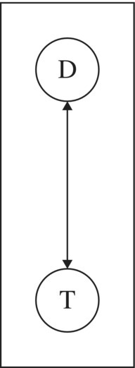
Figure 4.27 Precedence logic for the computational scheme in the allocation model.
Because this is not a difficult system to solve for specific values of D and T, we can also solve it parametrically. Let A and M denote the assembly and machining capacities, respectively. Then, the solution is
This form allows us to evaluate shadow prices easily. For example, if we increase M by a unit amount, D increases by 1.5, T decreases by 2, and the objective function increases by
We recognize the $2 shadow price from earlier analysis (Fig. 4.18).
We can also use the parametric form to derive the allowable range. Again, suppose we increase M. From the parametric solution, we see that D will increase, but T will drop. The combination also increases the consumption of fabrication hours and wood supply. The pattern will last until T drops to zero, fabrication becomes binding, or wood becomes binding, whichever occurs first. It turns out that the first change in the pattern comes from wood. Recall that the wood constraint is
Using the parametric solution in our pattern, this expression becomes
or, with A = 2000,
Therefore, the pattern holds until M = 1460, which corresponds to an allowable increase of 20.
4.6.5 The Refinery Model
To repeat the main idea: When we specify the structural scheme for a pattern in the optimal solution, we focus on the decision variables that are positive and the constraints that are binding. In effect, we ignore zero-valued variables and nonbinding constraints. As a final illustration, we revisit the refinery model of Example 3.6 for Delta Oil. The optimal solution is reproduced in Figure 4.28. Recall that the dimensions for the variables in this model are thousands of barrels per day.

Figure 4.28 Spreadsheet model for the refinery of Example 3.6.
In the solution, all of the decision variables are positive, so the computational scheme must determine each decision variable. When we look for binding constraints, we find the balance equations, which define relationships among the decision variables, along with four others:
- Cracker capacity (at 20,000)
- Reg sales (at 16,000)
- Reg blend quality (at its floor of 50% Cat)
- Prem blend quality (at its floor of 75% Cat)
In the computational scheme, these four binding constraints, together with the definitional relationships in the balance equations, dictate the entire optimal solution. We start with the cracker. Because the cracker is at its capacity limit, this means Feed = 20,000. Furthermore, the output of the cracker occurs in fixed proportions, so it follows that Cat = 12,800 and High = 8,000.
Next, we can use the fact that regular gasoline sells at its market limit (Reg = 16,000), together with the fact that it is blended at the minimum concentration of catalytic, to deduce that
Now that we know Cat and CR, it follows from material balance considerations that CP = Cat − CR = 4800.
Next, we use the fact that premium gasoline is blended at the minimum concentration of catalytic, to deduce that
and it follows that Prem = BP + CP = 6400. We now know the allocation of the distillate blend, so
This calculation brings us back to the output of the tower, which we know is 60% distillate and 40% low-end by-products, yielding one last set of calculations:

Figure 4.29 shows the precedence diagram.

Figure 4.29 Precedence logic for the computational scheme in the refinery model.
Thus, the optimal pattern calls for production that fully utilizes cracker capacity and fully exploits sales potential for regular gasoline while meeting minimum quality levels in the blending of regular and premium gasolines. These qualitative constraints represent the economic drivers that dictate the entire optimal solution.
As we pointed out in Chapter 3, catalytic is a scarce resource at Delta Oil. If more catalytic could be produced, Delta would be able to increase its profits. To consider a specific scenario, suppose that a technological alteration of the cracker could produce 1000 more barrels of catalytic without affecting the output of high-end by-products. (In effect, this alteration modifies the original ratio of catalytic output to feedstock input.) The lists in Table 4.4 show the implications for the variables in the model. The base-case values come from the calculations illustrated earlier; the new-case values are derived in a similar sequence, starting with the fact that cracker capacity is fully utilized at 20,000 barrels and regular sales are at the 16,000-barrel limit.
Table 4.4 Computational Scheme for the Delta Oil Model
| Variable | Base Case | New Case | Change |
| Feed | 20,000 | 20,000 | |
| Reg | 16,000 | 16,000 | |
| Cat | 12,800 | 13,800 | 1000 |
| High | 8,000 | 8,000 | |
| BR | 8,000 | 8,000 | |
| CR | 8,000 | 8,000 | |
| CP | 4,800 | 5,800 | 1000 |
| BP | 1,600 | 1,933 | 333 |
| Prem | 6,400 | 7,733 | 1333 |
| Blend | 9,600 | 9,933 | 333 |
| Dist | 29,600 | 29,933 | 333 |
| Crude | 49,333 | 49,889 | 556 |
| Low | 19,733 | 19,956 | 222 |
The economic implications follow from the objective function. Taking the variables that have nonzero coefficients in the objective function and evaluating the impact of their changed values, we obtain
or
Thus, the alteration in cracker output could produce additional profits of $63,000 if the production plan were adjusted optimally. On a per unit basis, each barrel of catalytic generated this way would produce $63 of additional profit. This figure provides us with a tangible economic value for catalytic, which is an intermediate product and which presumably has no market. However, if there were a market for catalytic, we know that Delta would want to buy more catalytic at any price below $63 per barrel.
These calculations explain the shadow price on the first cracker constraint, which defines catalytic in the linear programming model. An increase of one on the RHS would be equivalent to setting Cat equal to one more than 40% of the output from the tower. We can interpret this situation as equivalent to obtaining one additional unit of Cat from an external source, as if it were freely available outside of our technology. The shadow price tells us how much the objective function would increase, per unit increase in the RHS constant; and in the Constraints section of the Sensitivity Report, we can verify that this value is $63, as shown in Figure 4.30. Thus, our calculation exercise has essentially derived the shadow price. More importantly, we can see how to use the optimal pattern to trace the economic consequences of a technological change in the model.
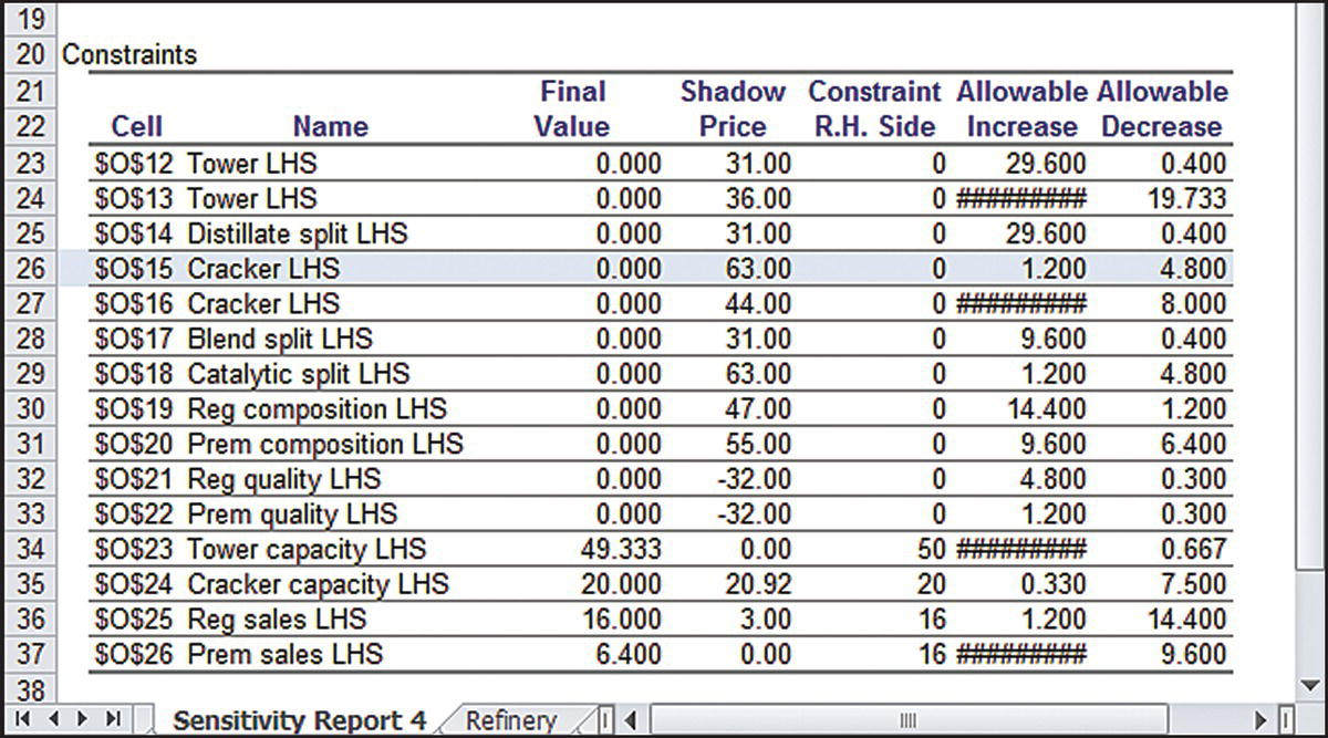
Figure 4.30 Sensitivity Report (Constraints section) for the refinery model.
One additional point is instructive. The $63 shadow price on catalytic has an allowable increase of 1.2. Given the scaling convention in the model, this means that the shadow price holds for an increase of only 1200 barrels of catalytic. To see where this figure comes from, create another column of figures in Table 4.4, starting with a change in catalytic of 1200. The calculations lead to a Crude value of 50,000, meaning that the tower becomes fully utilized. Beyond that level, a new pattern applies.
SUMMARY
The primary role of Solver is to find solutions to optimization models. However, some of the most useful information in the model comes from performing sensitivity analysis after the solution has been found. The information available through sensitivity analyses of linear programs is elegant and comprehensive compared to what we find in other optimization techniques. In that sense, the coverage in this chapter represents a kind of benchmark for the information we would like to acquire in conjunction with an optimization analysis.
This chapter covered three approaches to sensitivity analysis: Solver Sensitivity, the Sensitivity Report, and the interpretation of optimal patterns. The Sensitivity Report is the most canned approach. It is a well-defined report that complements the use of Solver. Most importantly, it automatically reveals shadow prices and allowable ranges.
The Solver Sensitivity output allows the user quite a lot of flexibility, and it provides for linear programs the same kind of capability that Excel’s Data Table tool provides for basic spreadsheet models. The effects of modifying a parameter in the model can be traced well beyond the range in the Sensitivity Report, and shadow prices can be computed in Excel whenever we vary a RHS parameter.
The recognition of patterns in linear programming solutions is a way of looking beyond the specific numbers in the result and toward a broader economic imperative. By focusing on positive variables and binding constraints, this interpretation emphasizes the key factors in the model that drive the form of the solution. The ability to detect these factors sharpens our intuition and enhances our ability to implement effective decisions based on the model.
The examples in Section 4.6 illustrate the process of extracting insight from the pattern in a linear programming solution. The first step is to describe a structural scheme for the pattern by identifying the optimal decision variables and binding constraints. The more challenging step is to convert this qualitative description into a computational scheme that allows us to “construct” the optimal solution from the given parameters. Ideally, the computational scheme determines the variables one at a time. This scheme can often be interpreted as a list of priorities, and those priorities can reveal the economic forces at work.
The pattern that emerges from the economic priorities is essentially a qualitative one, in that we can describe it without using specific numbers. However, once we supply the parameters of the constraints, the pattern leads us to the optimal quantitative solution. In a sense, it is almost as if Solver first spots the optimal qualitative pattern and then says, “Give me the numerical information in your problem.” For any specification of the parameters (within certain limits), Solver could then compute the optimal solution by simply following the sequential steps in the pattern’s computational scheme. In reality, of course, Solver cannot know the pattern until the solution is determined, because the solution is a critical ingredient in the pattern.
Two diagnostic questions help determine whether we have been successful at extracting a pattern: Is the pattern complete? Is it unambiguous? That is, the pattern must lead us to a full solution of the problem, not just to a partial solution, and it must lead to a unique determination of the variables. As a check on our specification of the pattern, we can derive shadow prices. In each case, the shadow price comes from altering one constraint constant in the original problem. We should be able to trace the incremental changes in the variables, through the various steps in the pattern’s computational scheme, and ultimately derive the shadow price for the corresponding constraint. We can also determine marginal values for changing several parameters at a time in much the same way, and we can compute the allowable range over which these marginal values continue to hold.
Unfortunately, it is not always the case that the pattern can be reduced to a list of assignments in priority order. Occasionally, after we identify the positive variables and the binding constraints in the optimal solution, we might be able to say no more than that the pattern comes from solving a system of simultaneous equations determined by those constraints and those variables. Nevertheless, in most cases, as the examples demonstrate, focusing on the pattern can provide added insight beyond the numbers.
Patterns have certain limits, as suggested earlier. If we think of testing our specification of a pattern by deriving shadow prices, we have to recognize that a shadow price has a limited range over which it holds, as indicated by its allowable increase and allowable decrease. Beyond that range, a different pattern prevails. As we change a constraint constant, the shadow price eventually changes. The same is true of the pattern: Beyond the range in which the shadow price holds, the pattern may change. In the product portfolio example, however, we were able to specify the computational scheme in a general way, so that it holds even when the shadow price changes. In that example, we were able to articulate the pattern at a high enough level of generality that the qualitative “story” continues to hold even for substantial changes in the given data.
EXERCISES
- 4.1 Goodwin Manufacturing Model Revisited: Revisit the transportation model of this chapter and its optimal solution.
- Suppose that the unit cost for the Tucson–Atlanta route is open for negotiations. Perform a sensitivity analysis on this cost for a range of $0.60–$0.65 per carton. Construct a table showing the value of the optimal cost and the quantities shipped to Atlanta from each of the three plants.
- Suppose instead that expansion of Minneapolis plant is under consideration. Perform a sensitivity analysis on this capacity for a range of 10,000–30,000 cartons. Construct a table showing the value of the optimal cost in this range and produce a chart showing the results graphically.
- 4.2 Goodwin Manufacturing Pattern Revisited: Revisit the transportation model of this chapter and the pattern in its optimal solution.
- Suppose that Atlanta demand is increased by 100 units. Use the pattern to determine the impact of this increase on the optimal total cost. What is the cost increase per unit increase in demand at Atlanta? For how much of an increase in Atlanta demand will this marginal cost continue to hold? Use the information in the Sensitivity Report only to confirm your calculations.
- Repeat part (a) for a decrease of 100 units in Pittsburgh capacity.
- Repeat part (a) for an increase of 100 units in Minneapolis capacity.
- 4.3 Product Portfolio Pattern Revisited: Revisit the product portfolio model of this chapter and the pattern in its optimal solution.
- Suppose that the credit limit of $30,000 is tightened. For each thousand-dollar reduction, what is the impact on profit? Use the information in the Sensitivity Report only to confirm your results.
- Suppose that the minimum requirement for whipped potatoes is raised (above 300 cartons). Using the pattern, determine the impact of this demand increase on the optimal profit. For how much of an increase in demand does this value hold? Where does this information appear on the Sensitivity Report?
- 4.4 Make or Buy: A sudden increase in the demand for smoke detectors has left Acme Alarms with insufficient capacity to meet demand. The company has seen monthly demand for its electronic and battery-operated detectors rise to 20,000 and 10,000, respectively, and Acme wishes to continue meeting demand. Acme’s production process involves three departments: fabrication, assembly, and shipping. The relevant quantitative data on production and prices are summarized below.
Department Monthly Hours Available Hours/Unit (Electronic) Hours/Unit (Battery) Fabrication 2000 0.15 0.10 Assembly 4200 0.20 0.20 Shipping 2500 0.10 0.15 Variable cost/unit $18.80 $16.00 Retail price $29.50 $28.00 - The company also has the option of obtaining additional units from a subcontractor, who has offered to supply up to 20,000 units per month in any combination of electronic and battery-operated models, at a charge of $21.50 per unit. For this price, the subcontractor will test and ship its models directly to the retailers without using Acme’s production process.
- Determine how the manufacturer should allocate its in-house capacity and how it should utilize the subcontractor. What are the maximum profit and the corresponding make/buy levels? (This is a planning model; fractional decisions are acceptable.)
- Investigate the solution for Shipping capacities between 1200 and 2400 hours. Draw a graph showing how the optimal quantities change over this range.
- 4.5 Make or Buy (Continued): Consider the optimal solution to the previous exercise.
- Describe the qualitative pattern in the solution.
- Use the pattern in (a) to trace the effects of increasing the fabrication capacity by 10%. How will the optimal make/buy mix change? How will the optimal profit change?
- For how much of a change in fabrication capacity will the pattern in (b) persist?
- 4.6 Selecting an Investment Portfolio: An investment manager wants to determine an optimal portfolio for a wealthy client. The fund has $2.5 million to invest, and its objective is to maximize total dollar return from both growth and dividends over the course of the coming year. The client has researched eight high-tech companies and wants the portfolio to consist of shares in these firms only. Three of the firms (S1–S3) are primarily software companies, three (H1–H3) are primarily hardware companies, and two (C1–C2) are Internet consulting companies. The client has stipulated that no more than 40% of the investment be allocated to any one of these three sectors. To assure diversification, at least $100,000 must be invested in each of the eight stocks.
- The table below gives estimates from the investment company’s database relating to these stocks. These estimates include the price per share, the projected annual growth rate in the share price, and the anticipated annual dividend payment per share.
Stock S1 S2 S3 H1 H2 H3 C1 C2 Price per share $40 $50 $80 $60 $45 $60 $30 $25 Growth rate 0.05 0.10 0.03 0.04 0.07 0.15 0.22 0.25 Dividend $2.00 $1.50 $3.50 $3.00 $2.00 $1.00 $1.80 $0.00 - You have been asked to develop an initial planning model (i.e., fractional outcomes for the decisions are acceptable).
- Determine the maximum return on the portfolio. What is the optimal number of shares to buy for each of the stocks? What is the corresponding dollar amount invested in each stock?
- Construct a graph that shows how the optimal dollar return varies with the minimum investment floor for the stocks (currently $100,000; vary it up to $300,000.)
- Construct a table that traces the dollar amounts invested in each stock as the investment floor varies from $100,000 to $300,000.
- 4.7 Selecting an Investment Portfolio (Continued): Consider the optimal solution to the previous exercise.
- Describe the qualitative pattern in the solution.
- Use the pattern in (a) to trace the effects of additional investment, beyond the original $2.5 million. How will the portfolio change? What is the marginal rate of return? Confirm this rate in the Sensitivity Report.
- For how much of a change in the investment quantity will the pattern in (b) persist?
- 4.8 College Expenses Revisited: Revisit Planning for College (Example 3.5). As in Exercise 3.14, suppose the rates on the four investments A, B, C, and D have dropped to 5, 11, 18, and 55%, respectively. Suppose that the estimated yearly costs of college have been revised to 25, 27, 30, and 33.
- Determine the minimum investment needed to cover college expenses.
- Describe the pattern in the optimal solution of part (a).
- Use the pattern in (b) to determine the marginal cost (of increased initial investment) that would be incurred to meet additional expenses in the first year of college. Confirm the value by examining the Sensitivity Report.
- Repeat (c) for the second, third, and fourth years.
- 4.9 Leasing Warehouse Space: Cox Cable Company needs to lease warehouse storage space for 5 months at the start of the year. It knows how much space will be required in each month. However, since these space requirements are quite different, it may be economical to lease only the amount needed each month on a month-by-month basis. On the other hand, the monthly cost for leasing space for additional months is much less than for the first month, so it may be desirable to lease the maximum amount needed for the entire 5 months. Another option is the intermediate approach of changing the total amount of space leased (by adding a new lease and/or having an old lease expire) at least once but not every month. Two or more leases for different terms can begin at the same time.
- The space requirements (in square feet) and the leasing costs (in dollars per thousand square feet) are given in the two tables below.
Month January February March April May Requirements 15,000 10,000 20,000 5000 25,000 Lease length 1 month 2 months 3 months 4 months 5 months Lease cost 280 450 600 730 820 - The task is to find a leasing schedule that provides the necessary amounts of space at the minimum cost.
- Determine the optimal leasing schedule and the optimal total cost.
- Consider what happens when the cost of a 5-month lease (currently $820) changes. Construct a graph showing how the optimal total cost varies with the cost of a 5-year lease, over the range from $800 to $1000.
- Consider instead what happens when the timing of space requirements shifts. In particular, suppose that March requirements drop and April requirements rise by the same amount. Construct a table to show, for shift amounts up to 15,000 sq. ft, how the shift alters the optimal total cost.
- 4.10 Leasing Warehouse Space (Continued): Consider the optimal solution to the previous exercise.
- Describe the qualitative pattern in the solution.
- Use the pattern in (a) to trace the effects of increasing the space required for January. How will the leasing schedule change? How will the total cost change per square foot of increase? Verify this cost in the Sensitivity Report.
- For how much of a change in January’s requirement will the pattern in (b) persist? Confirm this change in the Sensitivity Report.
- 4.11 Production Planning for Automobiles: The Auto Company of America (ACA) produces four types of cars: subcompact, compact, intermediate, and luxury. ACA also produces trucks and vans. Vendor capacities limit total production capacity to at most 1,200,000 vehicles per year. Subcompacts and compacts are built together in a facility with a total annual capacity of 620,000 cars. Intermediate and luxury cars are produced in another facility with capacity of 400,000; and the truck/van facility has a capacity of 275,000. ACA’s marketing strategy requires that subcompacts and compacts must constitute at least half of the product mix for the four car types. Profit margins, market potential, and fuel efficiencies are summarized below.
Type Profit Margin ($/Vehicle) Market Potential (Sales in 000s) Fuel Efficiency (MPG) Subcompact 150 600 40 Compact 225 400 34 Intermediate 250 300 15 Luxury 500 225 12 Truck 400 325 20 Van 200 100 25 - Current Corporate Average Fuel Efficiency (CAFE) standards require an average fleet fuel efficiency of at least 27 MPG. ACA would like to use a linear programming model to understand the implications of government and corporate policies on its production plans.
- Determine the optimal production plan for ACA. What is the maximum profit and the corresponding mix?
- Describe the qualitative pattern in the solution.
- Use the pattern in (b) to trace the effects of increasing market potential for all vehicle types by 10 units, simultaneously. How will the product quantities change? How will the optimal profit change?
- For how much of a simultaneous change in the demands will the pattern in (b) persist?
- Investigate how much annual profit would drop if the fuel efficiency requirement were raised above 27 MPG. Construct a table showing the requirement and the optimal profit, with fuel efficiencies of 27 MPG through 35 MPG.
- 4.12 Oil Distribution: Texxon Oil Distributors, Inc., has three active oil wells in a west Texas oil field. Well 1 has a capacity of 93 thousand barrels per day (TBD), Well 2 can produce 88 TBD, and Well 3 can produce 95 TBD. The company has five refineries along the Gulf Coast, all of which have been operating at stable demand levels. In addition, three pump stations have been built to move the oil along the pipelines from the wells to the refineries. Oil can flow from any one of the wells to any of the pump stations and from any of the pump stations to any of the refineries, and Texxon is looking for a minimum-cost schedule. The refineries’ requirements are as follows.
Refinery R1 R2 R3 R4 R5 Requirement (TBD) 30 57 48 91 48 - The company’s cost accounting system recognizes charges by the segment of pipeline that is used. These daily costs are given in the tables below, in dollars per thousand barrels.
To Pump A Pump B Pump C Well 1 1.52 1.60 1.40 From Well 2 1.70 1.63 1.55 Well 3 1.45 1.57 1.30 To R1 R2 R3 R4 R5 Pump A 5.15 5.69 6.13 5.63 5.80 From Pump B 5.12 5.47 6.05 6.12 5.71 Pump C 5.32 6.16 6.25 6.17 5.87 - Determine the least costly way of supplying oil from the wells to the refineries.
- Describe the qualitative pattern in the solution.
- Use the pattern in (b) to trace the effects of increasing the demands at R1 and R2 by the same quantity simultaneously. How will the shipping schedule change? How will the total cost change?
- For how much of a change in demand will the pattern in (b) persist?
- 4.13 Selecting a Portfolio: A portfolio manager has developed a list of six investment alternatives for a multiyear horizon. These are treasury bills, common stock, corporate bonds, real estate, growth funds, and savings and loans. These investments and their various financial factors are described below. In the table, the length represents the estimated number of years required for the annual rate of return to be realized. The annual rate of return is the expected rate over the multiyear horizon. The risk coefficient is a subjective estimate representing the manager’s appraisal of the relative safety of each alternative, on a scale of 10. The growth potential is also a subjective estimate of the potential increase in value over the horizon.
Portfolio data Alternative TB CS CB RE GF SL Length 4 7 8 6 10 5 Annual return (%) 6 15 12 24 18 9 Risk coefficient 1 5 4 8 6 3 Growth potential (%) 0 18 10 32 20 7 - The manager wishes to maximize the annual rate of return on a $3 million portfolio, subject to the following restrictions:
- The weighted average length should not exceed 7 years.
- The weighted average risk coefficient should not exceed 5.
- The weighted average growth potential should be at least 10%.
- The investment in real estate should be no more than twice the investment in stocks and bonds (i.e., in CS, CB, and GF) combined.
- What is the optimal return and the optimal allocation of investment funds? (Give the optimal return in dollars and also as a percentage.)
- What is the marginal rate of return, as indicated by the shadow price information in the Sensitivity Report? Confirm this marginal rate by raising the investment amount slightly and re-solving the linear program.