
Chapter 8: Combining Graphs and Tabular Data
Example: Dashboard Report of Shoe Sales
Goals for Creating the Shoe Sales Dashboard
Create a Summary Data Set using PROC REPORT
Code for Creating a Summary Data Set
Obtain Regional Ranking Information
Code for Obtaining Regional Ranking Information
Create a New ODS Style Template
Create the ODS LAYOUT for the Report
Create Formats Needed for Outputs
Use PROC SGPLOT to Create Vertical Bar Charts
Code for SGPLOT Vertical Bar Charts
Using PROC SGPLOT to Create a Horizontal Bar Chart
Using PROC REPORT to Obtain Tabular Output
Using PROC SGPANEL to Create Bar Charts for the Top 3 Regions
Introduction
ODS LAYOUT provides the ability to customize reports as never before with SAS. We can present tables, graphics, images, and text on the same page. We can arrange the location of each piece of output on the page. In sum, we have much more control over the reports we develop.
It should be noted that ODS Layout is a preproduction feature of SAS versions 9.0 through 9.3, and will be in full production in SAS version 9.4. This book is written using SAS 9.3 and the chapter focuses on ODS LAYOUT for a PDF file.
Example: Dashboard Report of Shoe Sales
A PDF report is produced to display Shoe Sales, Returns, Percentage of Sales by Region, and Sales by Product for the “Top Three” regions. Three graphs and one table are presented in a Dashboard report format.
Figure 8.1 displays the PDF report.
Figure 8.1 Shoe Sales Dashboard Report

Goals for Creating the Shoe Sales Dashboard
The goals for creating the Dashboard report include designing the layout, making necessary data set modifications, and running a series of procedures whose outputs will be placed into the layout.
Key Steps
Key steps include:
• Declare ODS LAYOUT START and END for a set of graphs and tables to be placed on the page.
∘ This report uses COLUMNS= and ROWS= options to define how the page will be gridded.
• PROC REPORT is used to create a source data set for two of the graphs and the table.
• PROC RANK is used to easily add a ranking variable needed for the final graph.
• SG plots (PROC SGPLOT and PROC SGPANEL) are used to produce the graphs.
• PROC REPORT is used again to produce a printed table.
Source Data
The source data set is the SASHELP.SHOES data set. Several variables are kept for the purpose of this example. These include Region, Product, Sales, and Returns. Table 8.1 displays a partial print, and Table 8.2 displays partial contents of the SASHELP.SHOES data set.
Table 8.1 Partial Print of SASHELP.SHOES Data
Region |
Product |
Sales |
Returns |
Africa |
Boot |
$29,761 |
$769 |
Africa |
Men's Casual |
$67,242 |
$2,284 |
Africa |
Men's Dress |
$76,793 |
$2,433 |
Africa |
Sandal |
$62,819 |
$1,861 |
Africa |
Slipper |
$68,641 |
$1,771 |
Africa |
Sport Shoe |
$1,690 |
$79 |
Africa |
Women's Casual |
$51,541 |
$940 |
Africa |
Women's Dress |
$108,942 |
$3,233 |
Africa |
Boot |
$21,297 |
$710 |
Africa |
Men's Casual |
$63,206 |
$2,221 |
Africa |
Men's Dress |
$123,743 |
$3,621 |
Africa |
Sandal |
$29,198 |
$1,530 |
Africa |
Slipper |
$64,891 |
$1,823 |
Africa |
Sport Shoe |
$2,617 |
$168 |
Africa |
Women's Dress |
$90,648 |
$2,690 |
Africa |
Boot |
$4,846 |
$229 |
Africa |
Men's Casual |
$360,209 |
$9,424 |
Africa |
Men's Dress |
$4,051 |
$97 |
Africa |
Sandal |
$10,532 |
$598 |
Africa |
Slipper |
$13,732 |
$1,216 |
Table 8.2 Partial Contents of SASHELP.SHOES Data
# |
Variable |
Type |
Len |
Format |
Informat |
Label |
1 |
Region |
Char |
25 |
|||
2 |
Product |
Char |
14 |
|||
3 |
Sales |
Num |
8 |
DOLLAR12. |
DOLLAR12. |
Total Sales |
4 |
Returns |
Num |
8 |
DOLLAR12. |
DOLLAR12. |
Total Returns |
ODS Style Template Used
The ODS Style Template MEADOW is modified and saved to a new template named MEADOWG.
Programs Used
The program is named Ch8Graph.sas.
Implementation
Create a Summary Data Set using PROC REPORT
A new data set named SALES is created to summarize total sales, total returns, sales minus returns, and percent of total sales by REGION. PROC REPORT is used to create this data set. The SALES data will be the source of the first three outputs (two graphs and one table) in the ODS LAYOUT.
Code for Creating a Summary Data Set
** Create new data set via PROC REPORT to be fed into graphs and table;
proc report data=sashelp.shoes(keep=region sales returns) nowd missing
OUT = SALES(where=(_BREAK_=" ")); ➊
column region sales returns finamt cumfin pct; ➋
define region /group “Region”; ➌
** Get Cumulative Total;
rbreak before /summarize; ➍
** Create COMPUTEd Variables;
** Sales – Returns;
compute finamt; ➎
if nmiss(returns.sum,sales.sum)=0 then
finamt=sales.sum-returns.sum;
endcomp;
** Grand Total Sales – Returns;
compute cumfin; ➏
if _break_ = "_RBREAK_" then dstot=finamt;
cumfin=dstot;
endcomp;
** Region Percent of Grand Total;
compute pct; ➐
pct= round((finamt/cumfin) * 100,.1);
endcomp;
run;
➊ PROC REPORT is run on the SASHELP.SHOES data set. The output data set is named SALES. Only detail rows are kept (i.e. where _BREAK_=” “).
➋ The last three variables in the COLUMN statement (FINAMT, CUMFIN, and PCT) are computed variables.
➌ REGION is grouped so that rows represent REGION summaries.
➍ The RBREAK BEFORE statement is used to obtain totals across all regions. The Total Sales – Total Returns (i.e. where _break_ = _RBREAK_) amount is copied to the variable CUMFIN. This amount is used as the denominator for the derivation of PCT, Percent of (Total Sales – Total Returns).
➎ FINAMT represents each region’s SALES numbers after RETURNS have been subtracted. Because SALES and RETURNS are by default ANALYSIS variables where statistic = sum, the .statistic suffix is included for derivations in the COMPUTE block (e.g. FINAMT=SALES.SUM-RETURNS.SUM).
➏ CUMFIN puts the total on every record. Though CUMFIN is not reported in the Final printed report, the variable is created as a report variable (versus a temporary variable) and kept in the outgoing SALES data set for reference.
➐ PCT derives each region’s percentage of total sales by dividing each region’s sales (minus returns) by the grand total (CUMFIN). Note that because CUMFIN is a COMPUTED variable rather than an ANAYSIS variable, the .statistic suffix is not included.
Table 8.3 shows the PROC REPORT output data set named Sales. The summary record (where _BREAK_ = _RBREAK_) has been kept here for the reader’s reference.
Table 8.3 PROC REPORT Output Data Set SALES (Formatted With PROC PRINT)
Region |
Sales |
Returns |
Finamt |
cumfin |
pct |
_BREAK_ |
|
$33,851,566 |
$1,172,092 |
$32,679,474 |
$32,679,474 |
100.0% |
_RBREAK_ |
Africa |
$2,342,588 |
$74,087 |
$2,268,501 |
$32,679,474 |
6.9% |
|
Asia |
$460,231 |
$10,895 |
$449,336 |
$32,679,474 |
1.4% |
|
Canada |
$4,255,712 |
$129,394 |
$4,126,318 |
$32,679,474 |
12.6% |
|
Central America/Caribbean |
$3,657,753 |
$126,898 |
$3,530,855 |
$32,679,474 |
10.8% |
|
Eastern Europe |
$2,394,940 |
$86,701 |
$2,308,239 |
$32,679,474 |
7.1% |
|
Middle East |
$5,631,779 |
$206,880 |
$5,424,899 |
$32,679,474 |
16.6% |
|
Pacific |
$2,296,794 |
$77,129 |
$2,219,665 |
$32,679,474 |
6.8% |
|
South America |
$2,434,783 |
$102,851 |
$2,331,932 |
$32,679,474 |
7.1% |
|
United States |
$5,503,986 |
$187,502 |
$5,316,484 |
$32,679,474 |
16.3% |
|
Western Europe |
$4,873,000 |
$169,755 |
$4,703,245 |
$32,679,474 |
14.4% |
|
Obtain Regional Ranking Information
The fourth output in the ODS LAYOUT produces graphs for the “Top 3” regions. PROC RANK is used to easily attach a rank to each region in the SALES data set. Because the ranking variable (REGRANK) is needed in the SHOES data set (the source of the fourth output) the SALES REGRANK variable is merged back to SASHELP.SHOES BY REGION.
Code for Obtaining Regional Ranking Information
** Obtain Ranking of Region According to Sales; ➊
proc rank data=sales out=sales descending ties=low;
var sales;
ranks REGRANK; /* Names the rank variable REGRANK */
run;
** Merge Rank Information back to the Sales Data Set for Graph by Product;
data shoes; ➋
merge sales(keep= region regrank)
sashelp.shoes(keep=region product sales returns);
by region;
if product in("Boot","Sandal","Sport Shoe") then product = "Other";
else product=product;
run;
➊ PROC RANK is run on the SALES data set. Sales are ordered by DESCENDING value so the REGION with the highest sales obtains a rank of 1, the region with the second highest sales obtains a rank of 2, and so on. The new rank variable will be appended to the SALES data set and will be named REGRANK.
➋ SALES is merged back to SASHELP.SHOES to obtain the Regional Ranking variable. Table 8.4 displays the new data set, SHOES, after adding REGRANK.
Table 8.4 SHOES With Regional Rank (REGRANK) Added
Region |
Sales |
Returns |
finamt |
Cumfin |
pct |
_BREAK_ |
Regrank |
Africa |
$2,342,588 |
$74,087 |
$2,268,501 |
$32,679,474 |
6.9% |
|
8 |
Asia |
$460,231 |
$10,895 |
$449,336 |
$32,679,474 |
1.4% |
|
10 |
Canada |
$4,255,712 |
$129,394 |
$4,126,318 |
$32,679,474 |
12.6% |
|
4 |
Central America/Caribbean |
$3,657,753 |
$126,898 |
$3,530,855 |
$32,679,474 |
10.8% |
|
5 |
Eastern Europe |
$2,394,940 |
$86,701 |
$2,308,239 |
$32,679,474 |
7.1% |
|
7 |
Middle East |
$5,631,779 |
$206,880 |
$5,424,899 |
$32,679,474 |
16.6% |
|
1 |
Pacific |
$2,296,794 |
$77,129 |
$2,219,665 |
$32,679,474 |
6.8% |
|
9 |
South America |
$2,434,783 |
$102,851 |
$2,331,932 |
$32,679,474 |
7.1% |
|
6 |
United States |
$5,503,986 |
$187,502 |
$5,316,484 |
$32,679,474 |
16.3% |
|
2 |
Western Europe |
$4,873,000 |
$169,755 |
$4,703,245 |
$32,679,474 |
14.4% |
|
3 |
Create a New ODS Style Template
Several modifications are made to the MEADOW template to style the SG graph elements and attributes in the ODS LAYOUT report.
proc template;
Define style styles.MeadowG; ➊
Parent=styles.meadow;
style graphborderlines / color=white;
Style graphdata1 from graphdata1 / color=WHITE; /*SALE BARS*/ ➋
Style graphdata2 from graphdata2 / color=RED; /*RETURNS BARS*/ ➌
style GraphFonts "Fonts used in graph styles" /
“GraphDataFont” = ("Times New Roman",7pt) ➍
“GraphUnicodeFont” = ("<MTsans-serif-unicode>",7pt)
“GraphValueFont” = ("<sans-serif>, <MTsans-serif>",8pt,bold) ➎
“GraphLabelFont” = ("Times New Roman,<sans-serif>,
<MTsans-serif>",10pt, bold) ➏
“GraphLabel2Font” = ("<sans-serif>, <MTsans-serif>",7pt)
“GraphFootnoteFont” = ("<sans-serif>, <MTsans-serif>",18pt)
“GraphTitleFont” = ("<sans-serif>, <MTsans-serif>",11pt,bold) ➐
“GraphTitle1Font” = ("<sans-serif>, <MTsans-serif>",8pt,bold)
“GraphAnnoFont” = ("<sans-serif>, <MTsans-serif>",8pt);
end;
run;
➊ The MEADOW template is modified and saved as a new template named MEADOWG. Specific changes employed include modification of bar colors and various font attributes.
For the reader’s reference, Figure 8.2 displays the “Shoe Sales and Returns by Region” bar chart without having applied the PROC TEMPLATE modifications. Figure 8.3 displays the same chart with the PROC TEMPLATE modifications.
Figure 8.2 WITHOUT PROC TEMPLATE Modifications
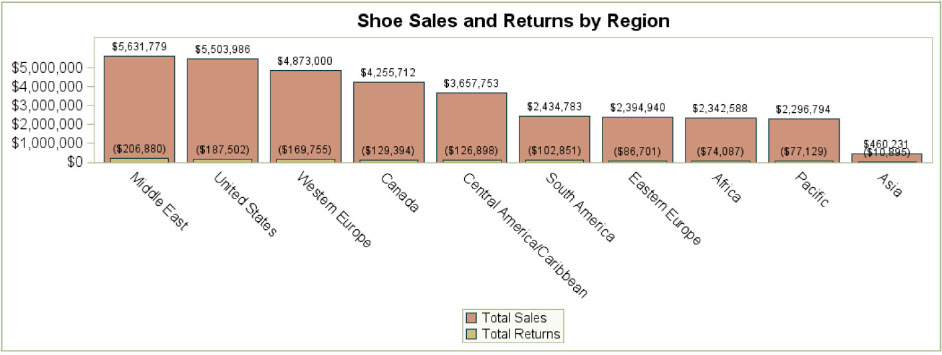
Figure 8.3 WITH PROC TEMPLATE Modifications

Table 8.5 lists some of the graph’s elements and the portion of the graph they impact.
Table 8.5 Graph Style Elements
Graph Element |
Applies to: |
➋ GraphData1 |
First data grouping (e.g., Total Sales bars) |
➌ GraphData2 |
Second data grouping (e.g., Total Returns bars) |
➍ GraphDataFont |
Data Labels (e.g., $5,631,779) |
➎ GraphValueFont |
X & Y Axis Data Point Labels (e.g., $0 tick mark label on y-axis, Middle East category label on x-axis, and legend items “Total Sales” and “Total Returns”) |
➏ GraphLabelFont |
X & Y Axis Labels (Not shown here. E.g, if we had applied a Total Dollars label to the y-axis and a Region label to the x-axis, we could have modified the GraphLabelFont to our liking). |
➐ GraphTitleFont |
Graph Title (e.g., Shoe Sales and Returns by Region) |
Create the ODS LAYOUT for the Report
This example uses a gridded ODS LAYOUT. We use the COLUMNS= and ROWS= options in the ODS LAYOUT START statement to divide the page into one column (COLUMNS=1) and four rows (ROWS=4). Each of the four rows will contain a graph or table. Four procedures are sandwiched between the ODS LAYOUT START statement and the ODS LAYOUT END statement.
** ODS PDF Specifications;
ods escapechar="^";
options nodate nonumber orientation=portrait;
ods pdf file="c: empCh8.pdf" bookmarklist=none style=MeadowG;
** Define Page Layout;
ODS LAYOUT START COLUMNS=1 COLUMN_WIDTHS=(7 IN) ROWS=4;
{PROCEDURE 1 CODE}
{PROCEDURE 2 CODE}
{PROCEDURE 3 CODE}
{PROCEDURE 4 CODE}
ODS LAYOUT END;
Create Formats Needed for Outputs
** Create Picture Formats;
proc format;
**Dollar Format; ➊
picture retamt (round)
low - high = "000,000,009)" (prefix="($");
** Percentage Format; ➋
picture pctdec (round)
0 - 1000 = “0009.9%“
other = “ “;
run;
➊ The format RETAMT will allow us to apply parentheses to shoe return amounts in the vertical bar chart.
➋ The PCTDEC picture format will be used to apply the desired percentage format in the horizontal bar chart and the PROC REPORT table.
Use PROC SGPLOT to Create Vertical Bar Charts
PROC SGPLOT is used to overlay two vertical bar charts, one displaying Sales and the other displaying Returns.
Code for SGPLOT Vertical Bar Charts
ODS GRAPHICS / RESET imagename="Saleret1" imagefmt=PNG height=2.6 in
width=7 in; ➊
ODS LISTING GPATH = “c: emp”; ➋
title “Shoe Sales and Returns by Region”;
proc sgplot data=sales;
vbar region / response=sales categoryorder=respdesc datalabel; ➌
vbar region / response=returns datalabel barwidth=.7; ➍
xaxis display=(nolabel noticks); ➎
yaxis display=(nolabel); ➏
format returns retamt.; ➐
keylegend / across=1; ➑
run;
➊ Although ODS GRAPHICS is already enabled by default for SAS 9.3 SG procedures, we’re using the ODS GRAPHICS statement to set ODS GRAPHICS options. The options set in this statement remain in effect for all graphics until we change or reset the settings with another ODS GRAPHICS statement. Table 8.6 further describes the settings we’re using for the PROC SGPLOT figure.
Table 8.6 ODS GRAPHICS Specifications for the SGPLOT
Option |
Description |
RESET |
RESET without a specification is the same as RESET=ALL. This resets all of the defaults. |
IMAGENAME= |
We name the image to be saved as SALERET1. |
IMAGEFMT=
|
PNG is actually the default ODS GRAPHICS listing image format for SAS 9.3, but we specify the file type for clarity to the programmers. |
HEIGHT= and WIDTH= |
The graph dimensions are specified as 2.6 inches high and 7 inches wide. |
➋ After the first ODS GRAPHICS statement, we tell SAS to save our images to the “c: emp” folder with the statement ODS LISTING GPATH = “c: emp”. We do not reset this path, as want the images saved to this destination throughout this program.
PROC SGPLOT allows us to overlay the bar charts for SALES and RETURNS. The VBAR statements request Vertical Bar Charts.
➌ The first VBAR statement creates the outer vertical bar chart (SALES). We specify the category variable (the variable that immediately follows the word VBAR) as REGION. In doing so, each bar will represent a REGION.
The RESPONSE variable is specified as SALES, requesting that each region’s bar height represents the value of SALES for that region.
CATEGORYORDER=RESPDESC orders our regions in descending order of the response variable, SALES. You can see the result is that the first region displayed is Middle East, as this has the highest sales. The following regions are displayed in order from highest to lowest sales, ending with the Asia region.
The DATALABEL option requests that the SALES amounts are shown above each bar.
➍ The second VBAR statement creates the inner vertical bar chart (RETURNS). Again, we specify the category variable as REGION.
The RESPONSE variable for this inner bar chart is RETURNS.
The DATALABEL option requests that the RETURNS amounts are shown above each bar.
The BARWIDTH option specifies the width of the bars as a ratio of the maximum possible width of 1 (the default is .8). Because we want the RETURNS bars to be narrower than the SALES bars, we specify the RETURNS BARWIDTHs to be .7.
➎ We suppress our X-axis label (“Region”) and tick marks with the DISPLAY= (NOLABEL NOTICKS) specification.
➏ We suppress our Y-axis label.
➐ Here, the picture format we created for Return amounts is applied. The result is that we have the desired parentheses around these negative (in relation to sales) dollar amounts.
➑ The KEYLEGEND statement, along with the ACROSS option, is used to request that our legend contain only one column, i.e. as a stacked legend as shown in Figure 8.4. As shown in Figure 8.5, without this statement our graph shows the legend as one row with two columns.
Figure 8.4 Legend Displayed as One Column

Figure 8.5 Legend Displayed as Two Columns

Using PROC SGPLOT to Create a Horizontal Bar Chart
A horizontal bar chart displaying each region’s proportion of Total Sales is created with a separate PROC SGPLOT.
Horizontal Bar Chart Code
ODS GRAPHICS / RESET imagename=“Distrib1” imagefmt=PNG height=2.5 in
width=7 in; ➊
proc SGPLOT data=SALES;
title "Percentage of Total Shoe Sales (Minus Returns) by Region";
hbar region / response=PCT categoryorder=respdesc datalabel
fillattrs=(color="verylightred"); ➋
yaxis display=(nolabel); ➌
xaxis display=(nolabel); ➍
format pct pctdec.; ➎
run;
➊ We specify the ODS GRAPHICS options that we want to apply to the horizontal bar chart.
➋ The HBAR statement requests a Horizontal Bar Chart. We specify the category variable (the variable that immediately follows the word HBAR) as REGION. In doing so, each bar will represent a REGION.
The RESPONSE variable is specified as PCT, the variable that contains each region’s percentage of the total sales. The horizontal bar for each region will represent the value of PCT for that region.
CATEGORYORDER=RESPDESC orders the regions in descending order of the response variable, PCT. As with the vertical bar chart, the result is that the first region displayed is Middle East, as this has the highest PCT. The following regions are displayed in order from highest to lowest PCT, ending with the Asia region.
The DATALABEL option requests that the PCT values are shown to the right of each horizontal bar.
The FILLATTRS= option specifies style elements for the bar fill. We are changing the fill color to very light red.
➌ We suppress the X-axis label.
➍ Likewise, we suppress the Y-axis label.
➎ The picture format PCTDEC is applied. The result is that we have a rounded percentage value displayed to one decimal place with the “%” sign attached.
Using PROC REPORT to Obtain Tabular Output
Our third row of output in the ODS Layout is a table. As with the previous two outputs, the summary data set SALES is the source for this report.
proc report data=sales nowd split="|"
style(report)=[outputwidth=7 in]
style(column)=[just=c]; ➊
column sales=SALESORD region sales returns finamt pct; ➋
** DEFINE Specifications; ➌
define SALESORD / order order=internal descending noprint;
define region / “Region” style(column)=[just=left];
define sales / “Sales”;
define returns / “Returns”;
define finamt / “Sales Minus|Returns” format=dollar10.;
define pct / “Percentage|of Total” format=pctdec.;
run;
➊ The output width is set to 7 inches so the table fills the full ODS Layout column.
➋ We create an alias for SALES (named SALESORD) so we can order rows by SALES before ordering by REGION. (Recall that columns are processed from left to right. We need the SALES column or an alias to be listed and DEFINED as ORDER prior to REGION). We apply the NOPRINT option to SALESORD and print the SALES column listed after REGION, reflecting the desired order of the SALES column in the printed report.
➌ This is a simple PROC REPORT for which the incoming data only has one record per region and no statistics are performed on the numeric variables, which would by default be analysis variables. SALES was already summed by REGION in the first PROC REPORT and we want to use it as an ORDER variable for the final report. Though not specified as ORDER in the DEFINE statement, SALES is defined as ORDER by default since its alias SALESORD was defined as an ORDER variable earlier.
Using PROC SGPANEL to Create Bar Charts for the Top 3 Regions
Our final graph uses PROC SGPANEL to obtain vertical bar charts for the three regions ranked the highest in sales. PROC SGPANEL allows us to create three side-by-side charts with one procedure. These charts use the SHOES data set as the input source, and each bar chart displays Sales by Product. Because SGPANEL is set up to produce panels, we do not need to specify additional ODS LAYOUT options.
ODS GRAPHICS / RESET imagename=“top31” imagefmt=PNG width=7 in
height=2.4 in; ➊
title height=8 pt “ “;
title2 height=11 pt "Top 3 Regions: Shoe Sales by Product";
title3 height=8 pt “ “;
proc sgpanel data=shoes(where=(regrank in(1,2,3))); ➋
panelby region / layout=columnlattice spacing=48 novarname; ➌
vbar product / response=sales datalabel categoryorder=respdesc
datalabelattrs=(size=6 pt) fillattrs=(color="verylightred"); ➍
** Remove Axis Labels to Save Space;
rowaxis display=(nolabel);
colaxis display=(nolabel);
run;
** END OF ODS LAYOUT; ➎
ODS LAYOUT END;
ods pdf close;
title;
➊ We specify the ODS GRAPHICS options we want to apply to the “Top 3” bar charts.
➋ We are now using PROC SGPANEL instead of PROC SGPLOT. We run PROC SGPANEL, only on data for which a region ranks in the top 3 in terms of sales (based on REGRANK from the PROC RANK procedure).
➌ The PANELBY statement controls our layout. If we specified the statement as PANELBY REGION without any options, the default graph would appear as in Figure 8.6.
Figure 8.6 SGPANEL Graph With Default PANELBY Specifications

In order to achieve the three side-by-side panels with the desired spacing and borders, we apply the following options:
• LAYOUT=COLUMNLATTICE gives us a panel, or column for each of the three regions.
• SPACING=48 provides the desired spacing between each panel (e.g., between the Middle East chart and United States chart, and between the United States chart and Western Europe chart).
• The NOVARNAME option removes the “Region = ” text from the chart headers.
The application of these options results in the desired graph, as shown in Figure 8.7.
Figure 8.7 SGPANEL Graph with PANELBY Specifications Applied
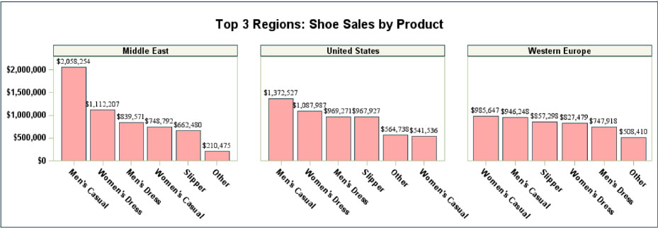
➍ The VBAR statement creates the vertical bar charts for sales. We specify the category variable as PRODUCT.
The RESPONSE variable for the bar chart is SALES. (We do not take RETURNS into account in this by PRODUCT chart).
The DATALABEL option requests that the sales amounts are shown above each bar.
CATEGORYORDER=RESPDESC orders our products in descending order of the response variable, SALES.
We use the DATALABELATTRS= option to set the data labels to 6 pt. font size.
We specify the fill attributes of the bars to be very light red with the FILLATTRS= option.
➎ The (required) ODS LAYOUT END statement closes this ODS layout.
Chapter 8 Summary
This chapter showed how to:
Create a New Data Set with PROC REPORT |
The new data set named SALES summarized Region Total Sales, Total Returns, and Percent of Total. |
Obtain Region Rank Information |
PROC RANK was used to attach a rank to each region in the SALES data. The RANK information was merged with SASHELP.SHOES to put regional ranking on every record. |
Create a New ODS Style Template |
Several modifications were made to the MEADOW template to style the graph elements and attributes in the report. |
Create the ODS LAYOUT for the Report |
The key statements around the procedures were ODS LAYOUT START and ODS LAYOUT END. The ROWS= and COLUMNS= options in this statement were used to set up the page grid. |
Use PROC SGPLOT to Create Vertical Bar Charts |
PROC SGPLOT was used to overlay two vertical bar charts, one displaying Sales and the other displaying Returns. |
Use PROC SGPLOT to Create a Horizontal Bar Chart |
A horizontal bar chart displaying each region’s proportion of Total Sales was also created with a separate PROC SGPLOT. |
Use PROC REPORT to Obtain Tabular Output |
This table also used the new SALES data set to produce the information in tabular format. |
Use PROC SGPANEL to Create Bar Charts for Top 3 Regions |
The three highest ranking regions in terms of sales displayed vertical bar charts based on the SHOES data. PROC SGPANEL allowed us to create the three graphs with one procedure and display them side by side. |