
![]()
Correlation and Linear Regression
In the previous chapter, we covered how to prepare data for model building. In this chapter, we discuss model building, which may be the most important step in a data analytics project. We will discuss the most popular technique of model building—linear regression. We will first discuss correlation in detail and then discuss the differences between correlation and regression. Finally, we will show a detailed example of modeling using linear regression. We will explain the concepts using real-world scenarios wherever possible.
Do the following questions sound familiar to you?
- Is there any association between hours of study and grades?
- Is there any association between the number of church buildings in a city and the number of murders?
- What happens to sweater sales with an increase in temperature? Are the two very strongly related?
- What happens to ice-cream sales when the weather becomes hot?
- Is there any association between health and the gross domestic product (GDP) of a country?
- Can you quantify the association between asthma cases in a city and the level of air pollution?
- Is there any association between average income and fuel consumption?
In all these scenarios, the question is about whether two factors are related. And if they are associated, what is the strength of association? You probably know that there is an association between asthma cases and air pollution; you also know that there is an association between study hours and grades. But how strong are these associations? How do you quantify this association? Is there any measure to quantify the association between two variables? The answer is yes. Correlation is a measure that quantifies the association between two variables.
For example, say a newly opened e-commerce site spends a considerable amount of money on billboard and online advertising. It runs a rigorous advertisement campaign in two phases. The first phase is billboard advertisement, and the second one is an online campaign. Both billboard and online advertising fetch a great response. Now the question is, is there any association between the money spent on advertising and the number of responses? If there is an association, how strong is it? Is the association different for online and billboard marketing campaigns?
The following two scatterplots show the association between the budget and the responses for the two marketing campaigns. Figure 9-1 shows the association between budget and responses in the online segment. You can see a clear strong relation because as the budget increased, the responses increased. Figure 9-2 shows the billboard campaign, where there is no such clear trend.

Figure 9-1. Online campaign: number of responses by budget
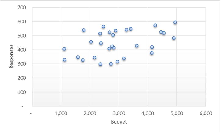
Figure 9-2. Billboards: number of responses by budget
As discussed, correlation is a technique that can be used to quantify the association. It assigns a number to the association, which tells you to what extent the given variables are dependent on each other. The correlation technique translates itself into a measure, which is called a correlation coefficient. The correlation coefficient is represented by r.
Pearson’s Correlation Coefficient (r)
Pearson’s correlation coefficient is defined based on the concept of variances. It is a measure of the linear relation or dependence between two variables, x and y. Its value varies between +1 and -1 (both inclusive). A value of 1 indicates a total positive correlation, 0 indicates an existence of no correlation, and -1 indicates a total negative correlation. This coefficient is widely used in statistics and analytics as a measure of degree of linear dependence between two variables.
As discussed in Chapter 6, the variance gives you an idea about the dispersion within a given variable. If there are two variables x and y, the dispersion within x and dispersion within y are denoted by their variance.
Variance in x is as follows:
Variance in y is as follows:

If you want to see the dispersion in y with respect to the corresponding dispersion in x, then you use covariance. So, covariance always has two factors, and it can be understood as combined variance or parallel variance.
The covariance between x and y is as follows:

As you can see, the formula of covariance looks similar to correlation except that it’s considering the preparation of the variance of both x and y.
So, Pearson’s correlation is nothing but the proportion of covariance in the product of individual variances. If the two variables are independent of each other (that is, the deviation in y doesn’t depend on the corresponding deviation in x), then their covariance will be near to zero, which results in the correlation being zero.
If you have several variables, say, x1, x1, x3…xn, and you are interested in all the combination of correlations, say, x1 versus x3, x2 versus x4, x1 versus x4, and so on, then you represent all the correlation combinations in the form of the following matrix. Correlation can be found between a pair of variables only. Correlation doesn’t give you an idea of the association of x1 with x2 and x3 together.

Calculating Correlation Coefficient Using SAS
In the e-commerce example given earlier, let’s say you load the required data into SAS and find out the correlation between budget and responses, for both online and billboard marketing cases. Here is the code:
PROC IMPORT OUT= WORK.add_budget
            DATAFILE= "C:UsersVENKATGoogle DriveTrainingBooksContent
Regression AnalysisAdd_budget_data.xls"
            DBMS=EXCEL REPLACE;
     RANGE="budget$";
     GETNAMES=YES;
     MIXED=NO;
     SCANTEXT=YES;
     USEDATE=YES;
     SCANTIME=YES;
RUN;
proc contents data= add_budget varnum;
run;
Table 9-1 shows the output for the previous code.
Table 9-1. Output of PROC CONTENTS Procedure on add_budget Data Set

The procedure used for finding correlation is PROC CORR. In the code, we need to mention the dataset name and the variable names that we want to use for finding the correlation. The following is the SAS code using PROC CORR:
proc corr data=add_budget ;
var Online_Budget Responses_online ;
run;
The previous code generates the output shown in Table 9-2.
Table 9-2. Output of PROC CORR Procedure on add_budget Data Set
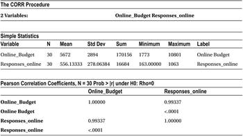
The correlation matrix in the Pearson correlation coefficient table shows the correlation and p-value of correlation. The correlation between budget and response is 99.3 percent (.99337), which indicates a strong association. Any number close to 1(or -) is a strong association.
![]() Note The p-value in the same table is shown as <.0001. This p-value is the result of testing the null hypothesis that the correlation coefficient of the current sample is not significant. If the p-value is less than 5%, we reject that null hypothesis, which means that the correlation coefficient is significant.
Note The p-value in the same table is shown as <.0001. This p-value is the result of testing the null hypothesis that the correlation coefficient of the current sample is not significant. If the p-value is less than 5%, we reject that null hypothesis, which means that the correlation coefficient is significant.
Similarly, you can find the correlation between the billboard advertising budget and corresponding responses by using following code:
proc corr data=add_budget ;
var Live_Budget Responses_live ;
run;
The previous code generates the output given in Table 9-3.
Table 9-3. Output of PROC CORR Procedure on add_budget Data Set
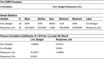
The correlation between the budget and the response is 43.6 percent, which indicates a weak association.
From the correlation analysis done earlier, you can conclude that it may be a good idea to increase the budget for online marketing campaigns because they produce more responses. There is a strong correlation between responses and the advertising money spent in the online campaign. You saw a week correlation between the budget spent and responses in the case of the billboard campaign, so additional spending on this kind of campaign may not be advisable.
Correlation Limits and Strength of Association
What is the correlation between x and x? You can find it by using the correlation equations discussed earlier.


So, the correlation of x with x, or the maximum value of the correlation, is 1. Similarly, you can show that the correlation between x and –x (the opposite of x) is -1. As a conclusion, the extreme values of correlation are -1 and +1.
A perfect positive correlation between a pair of variables will stand at +1, while a perfect negative correlation will have the correlation coefficient value as -1.
The following can be taken as rules of thumb:
- If the correlation is 0, then there is no linear association between two variables.
- If the correlation is between 0 and 0.25, then there is a negligible positive association.
- If the correlation is between 0.25 and 0.5, then there is a weak positive association.
- If the correlation is between 0.5 and 0.75, then there is a moderate positive association.
- If the correlation is between 0.75 and 1, then there is a strong positive association.
Figure 9-3 shows the scatterplot examples between two variables.


The following are the rules of thumb for negative correlation coefficient values:
- If the correlation is 0, then there is no linear association between two variables.
- If the correlation is between 0 and -0.25, then there is an insignificant negative association.
- If the correlation is between -0.25 and -0.5, then there is a weak negative association.
- If the correlation is between -0.5 and -0.75, then there is a moderate negative association.
- If the correlation is between -0.75 and -1, then there is a strong negative association.
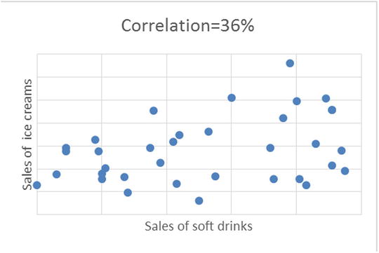
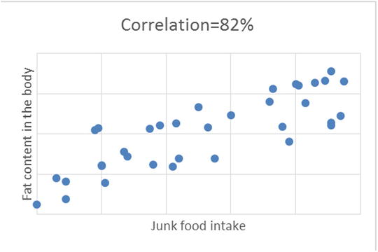
Figure 9-4 shows the scatterplots between two variables.


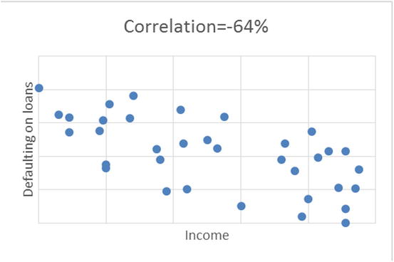

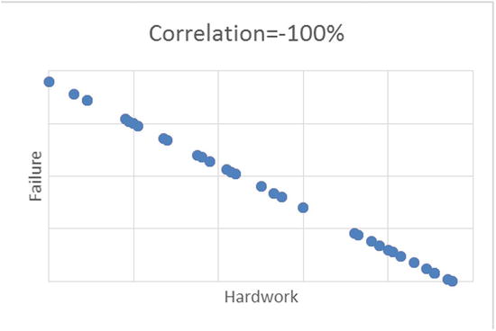
Figure 9-4. Scatterplot examples with different values of correlation percentage, for different set of variables
Properties and Limitations of Correlation Coefficient (r)
Correlation coefficient has some limitations. Following are some interesting properties and limitations of the correlation coefficient.
- The correlation coefficient lies between -1 and +1 ; -1 ≤ r ≤ +1.
- The maximum value of correlation is 1 when there is a perfect positive relationship between variables x and y; similarly, the minimum value is -1 when there is a perfect negative relationship.
- The correlation is unit free.
- Correlation is a coefficient, a number that is unit free. Its variance is divided by variance. The units get cancelled. So, it’s wrong to say correlation is 0.75 meters or 0.23 kilograms.
- r=0 means there is no linear association.
- If the correlation is zero, it means there is no linear association between two variables under study. It does not tell anything about the existence of any nonlinear association, though. There may or may not be a nonlinear association.
- Correlation is independent of change of origin and scales.
- Correlation is purely based on variances. It is the ratio of covariance in the numerator and product of variances in the denominator. Variance doesn’t depend on change of origin. The change of scale also doesn’t affect the correlation coefficient. Suppose you multiply one of the variables by 10 (change of scale); the correlation coefficient will remain the same. Because correlation is the ratio of two variances, the change of scale will cancel out eventually.
- If two variables are independent, then the correlation coefficient is zero, but the opposite may not be true. If the correlation coefficient is zero, then it doesn’t necessarily imply that two variables are independent. There may be a polynomial (nonlinear) dependency between them.
Some Examples on Limitations of Correlation
Having seen the interesting properties of correlation coefficient in the previous section, it will help if you know about some limitations as well.
- r is a measure if linear association: Though r measures how closely two variables approximate a straight line, it does not truly measure the strength of a nonlinear relationship.
As an example, Table 9-4 shows a tabulation of two variables, x and y.
Table 9-4. Tabulation of x and y
x
y
-31
900
-25
625
-24
576
-19
361
-13
169
-6
36
-1
1
3
9
10
100
11
121
14
196
15
225
24
576
24
576
29
841
The correlation coefficient for this example is -0.12, which is negligible. But a simple scan of the table reveals that x and y are directly related by the equation y=x2, which is a nonlinear equation.
Figures 9-5 to 9-9 show some example plots representing a nonlinear relation between two variables. In all these cases, just measuring correlation coefficient is not good enough to predict the existence of an association.
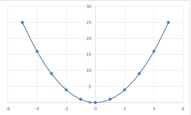
Figure 9-5. y=x2 curve

Figure 9-6. y=x3 curve

Figure 9-7. y=X4 curve
Another nonlinear sine wave looks like the plot in Figure 9-9.
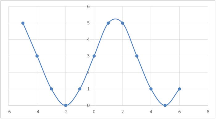
Figure 9-9. A sine curve
- Sufficient sample size: As another example, when the sample size, n, is small, you need to be careful about the reliability of the correlation coefficient. The following is an example with a sample size of just three records:
x
y
1
2
2
2.9
3
3
The r for the previous table is 0.9, which shows a strong relationship between x and y.
Now you make a small change to the second record and change the value of y from 2.9 to 4.
x
y
1
2
2
4
3
3
The r for new table suddenly becomes 0.5, a huge change from the previous value of 0.9. As a matter of fact the sample size or the size of the data needs to be sufficiently large enough to draw any meaningful insights using any statistical technique.
- Outliers leave a noticeable effect on r: We already saw the effect of outliers in data exploration chapter (Chapter 7). The correlation coefficient will also get affected by the outliers in the data. In the tabulation of x and y shown in Table 9-5, there is an outlier (750) in the last record. All the other values of y are remarkable below this lone outlier.
Table 9-5. x-y Tabulation with an Outlier
x
y
10
14
17
25
22
23
21
31
24
29
34
60
25
19
31
35
45
45
33
38
60
50
46
56
47
45
48
70
50
750
The correlation coefficient (r) for this relationship between x and y is 0.36, which shows a weak positive association. After removing the outlier record, r suddenly becomes 0.81, which is a strong positive association. That’s a remarkable change from the previous value!
The following are two plots for this example (see Figure 9-10 and 9-11). One is with the outlier value of y, and another is without it. The extensive difference can be easily noticed. From an analyst point of view, the second plot without outliers will obviously be more meaningful.

Figure 9-10. x-y plot with an outlier

Figure 9-11. x-y plot without an outlier
You can calculate correlation coefficient (r) just by applying a mathematical formula. You judge the strength of association between two variables just by looking at r, which is just a number. Even if r shows a strong association, you can’t conclude that one causes the other, however. Consider an example of two arbitrary variables comprising the number of red buses on the road versus stock market index. You plot a graph using these variables, and there is a sheer chance that this plot turns out to be a straight line, showing a strong positive association. But a commonsense approach will reveal that just by increasing red buses on the road, you can’t expect an increase the stock prices. Though r shows a strong positive relationship, in practice the two variables are not related.
Some correlations are just by chance, but in practice they might not make any sense. An analyst or user has to establish the logical relationship first. In other words, a logical connection (causation) needs to be established first, and then only quantifying the association should be attempted for the whole exercise to make any sense. In other words, a simple correlation does not automatically imply causation in the real-world sense.
Sometimes a positive association between two variables may be caused by a third variable. For example, say it’s noticed in the real-world data that there is generally a high correlation between the number of fire accidents in a city and the sale of ice cream. Obviously, the two are not logically related. But this phenomenon is usually observed in the summer, when the atmospheric temperatures are high. And it’s the temperature, the third variable, which is driving the fire accidents and ice-cream sales in this city.
The following are the types of relationships that generally exist:
- Direct cause and effect; that is, x causes y. For example, smoking causes cancer.
- Both cause and effect. Sometimes x causes y, and y might also cause x. For example, imagine KFC and McDonald’s on the same block. An increase in sales of KFC causes a decrease in sales of McDonald’s, while an increase in sales of McDonald’s causes a decrease in sales of KFC.
- Relationships between y and x caused by a third variable, the fire accidents and ice-cream sales case discussed earlier is a good example for this case.
- Coincidental relationships or spurious correlations. The correlation between tooth brush sales and crime rates can exist only by chance. And if, by chance, you get an r value of 0.95 (95 percent correlation) between the daily milk sales in a city versus the daily sales of smartphones, it can happen only by chance.
As a conclusion, the existence of correlation doesn’t assure you of any causation or logical relationship between any two variables. Correlation just quantifies the causation, which is defined or established by an analyst.
Correlation Example
Now we will discuss the case of a telecom service provider that conducts a customer satisfaction survey. The satisfaction of a customer (c_sat) depends upon many factors. The major ones are service quality, issue resolution ability, call center response, and price plans. The survey was taken with more than 1,000 randomly selected customers. The company wants to study the association of customer satisfaction with all other variables in order to streamline its future investment plans, which are intended to further improve the customer satisfaction levels.
Here is the snapshot of the survey data:
PROC IMPORT OUT= WORK.telecom
            DATAFILE= "C:UsersVENKATGoogle DriveTrainingBooksConte
ntRegression AnalysisTelecom_Csat_correlation.csv"
            DBMS=CSV REPLACE;
     GETNAMES=YES;
     DATAROW=2;
RUN;

proc print data=telecom(obs=10);
run;
Table 9-6 shows the output of this code.
Table 9-6. Output of PROC PRINT on Telecom Dataset (obs=10)
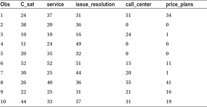
There are five variables in all: c_sat, the overall customer satisfaction score; service score; issue resolution score; call center quality score; and finally price plans score. The company tries to determine the correlation coefficient (r) of c_sat with the remaining four variables. The first four scatterplots are drawn to visualize the relation between c_sat and the other variables.
/*Scatterplots between c_sat and other variables*/

proc gplot data= telecom;
plot  c_sat*service;
run;

proc gplot data= telecom;
plot  c_sat*issue_resolution;
run;

proc gplot data= telecom;
plot  c_sat*call_center;
run;

proc gplot data= telecom;
plot  c_sat*price_plans;
run;
The previous code lines generate the output in Figures 9-12 to 9-15.
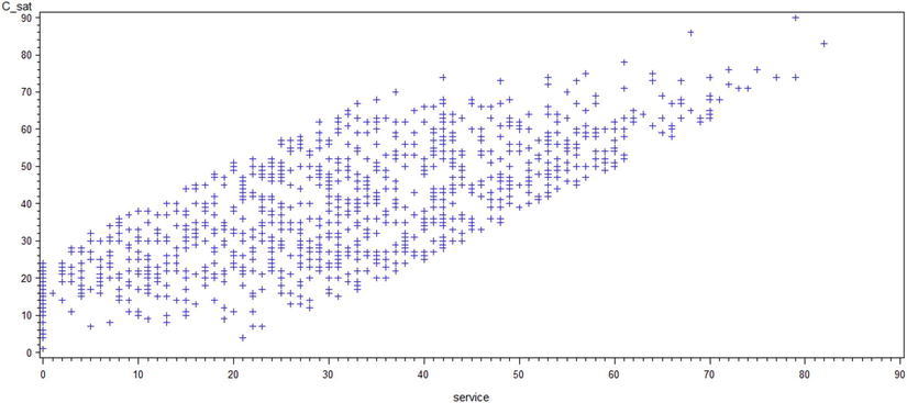
Figure 9-12. A plot of c_sat*service
Figure 9-13. A plot of c_sat*issue_resolution

Figure 9-14. A plot of c_sat*call_center
Figure 9-15. A plot of c_sat*price_plans
Looking at the scatterplots, you can infer these points:
- If the relationship between y and x appears to be linear, you can calculate the correlation coefficient for these variables, and it will be meaningful.
- Looking at the plots, you can conclude that there is a strong association between issue resolution and customer satisfaction scores.
- The call center response and price plans scores don’t seem to have a great impact on the c_sat score.
The following is the code to calculate correlation coefficients:
/* Correlation between the variables*/
proc corr data=    telecom;
var  c_sat service issue_resolution call_center price_plans ;
run;
Table 9-7 shows the output of this code.
Table 9-7. Output of PROC CORR on Telecom Data Set with Five Variables
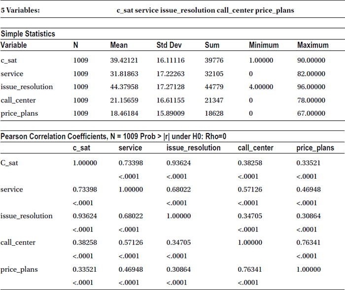
As expected, the output (Table 9-7) shows a high correlation (93.6%) between issue resolution score and customer satisfaction, followed by service quality score and c_sat (73.4%). There is a weak correlation between call center score and c-sat, as with price plans and c-sat. The following table takes out the correlation part separately just for the reading convenience. It is a part of Table 9-7.
|
c_sat | |
|---|---|
|
C_sat |
1.00000 |
|
service |
0.73398 |
|
<.0001 | |
|
issue_resolution |
0.93624 |
|
<.0001 | |
|
call_center |
0.38258 |
|
<.0001 | |
|
price_plans |
0.33521 |
|
<.0001 |
With these results in hand, the customer care executive of the company can make a strong case to management to increase the investments in the area of issue resolution capabilities and to increase overall service quality, if the company wants to improve the customer satisfaction levels.
Correlation Summary
We have discussed correlation coefficient, its derivation, and it properties. You learned about the types of relationships and quantified the strength of association. You studied the difference between correlation and causation. You also learned about how to create a correlation matrix using SAS. You need to keep in mind that correlation is a measure of linear relationship only. There are some other measures of association such as odds ratio, Kruskal’s Lambda, chi-square, and so on. They are meant to quantify some specific type association between variables. In the sections that follow, we will cover more about the quantification of the relationship between the variables.
Regression is one of the most commonly used analytics techniques to study the relation between variables. At this stage, it’s important to understand the difference between correlation and regression, especially when correlation is also used to study the relation between two variables. We will show an example of smartphone sales to demonstrate this difference.
Smartphone sales depend upon a number of factors such as cost, features offered, and the review ratings by critics and users. Current stock market indicators can also affect the sales because they indicate the overall state of economy and indicate the amount of spare money available to people. If the stock market is doing well, there is a chance that spare money is available to people, which can be diverted to the purchase of new smartphones. The sale of a new phone model is also dependent upon the marketing money spent by the phone manufacturer.
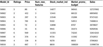
Table 9-8 shows a snapshot of the data collected on sales of some cell phone models and some of the variables that affect the sales.
Table 9-8. Data for the Sales of Cell Phone Models with Variables Affecting Sales
The following is the SAS code for importing the data from a CSV file:
/* Importing the data into SAS*/
PROC IMPORT OUT= WORK.mobiles
            DATAFILE= "C:UsersVENKATGoogle DriveTrainingBooksConte
ntRegression AnalysisRegression_mobile_phones.csv"
            DBMS=CSV REPLACE;
     GETNAMES=YES;
     DATAROW=2;
RUN;

/*Printing the contents of the data*/
proc contents data=    mobiles varnum;
run;
Table 9-9 shows the output for the previous code.

You can see that there is data for 58 smartphone models. This is data available from the first table of the output, where the observations are shown as 58. A detailed interpretation of PROC CONTENTS output was explained in Chapter 4.
Correlation to Regression
As discussed earlier, correlation quantifies the relation between two variables. Correlation can tell up to what extent the two variables are related. It is usually determined in terms of a strong association, a weak association, or no association. If there is a strong association between two variables A and B, then it is possible to accurately predict the value of A given the value of B. In the same way, the variations in A can be predicted accurately if one knows the variations in B. In the smartphone example discussed earlier, it may be natural to conclude that smartphone sales will be dependent upon the price. Now to quantify this association, that is, to determine how closely or strongly these two variables are related, you can use correlation. The following is the SAS code to determine this relationship:
/* Correlation */
proc corr data=    mobiles;
var price sales;
run;
Table 9-10 shows the output of the previous code.
Table 9-10. Output of PROC CORR on the Cell Phone Data Set
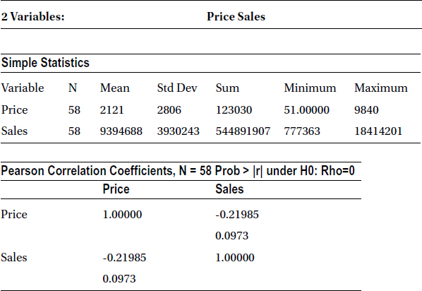
It shows that there is a weak negative association between price and mobile phone sales (r = -0.219885). Given this weak relationship, an analyst might be further interested to quantify how many sales dollars will be produced when the price is $800 or $1,500. Just correlation is not sufficient here; the analyst needs a model or an equation that can give her the sales dollars when she gives price as the input. That’s where regression comes into the picture. A regression model (Figure 9-16) helps determine the value of the dependent variable (sales in this case) given the value of independent variables such as price.
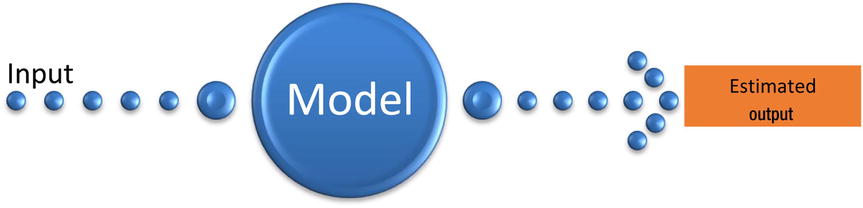
Figure 9-16. A pictorial representation of the modeling process
The previous example shows that correlation is just a coefficient, which indicates whether the relationship between variables is weak or strong. Regression, on the other hand, is a modeling technique, which gives the actual relationship between two variables in the form of an equation. This equation can be used to get an estimated or predicted value of a dependent variable, given the values of independent variable. The dependent variable is denoted by Y, while the independent variables, which can be more than one, are denoted by Xi (i=1,2,3,4 ….).
Table 9-11 shows different substitutes given to dependent and independent variables.
Table 9-11. Substitutes for x and y in regression modelling
|
x |
y |
|---|---|
|
Independent |
Dependent |
|
Input |
Output |
|
Predictor |
Response |
|
Input reading |
Labels |
|
Cause |
Effect |
|
Explanatory variable |
Explained variable |
|
Regressor variable |
Regressand |
|
Controlled variable |
Measured variable |
|
Manipulated variable |
Criterion variable |
|
Feature |
Experimental variable |
|
Exposure variable |
Outcome variable |
|
RHS (Right Hand Side) variable |
LHS (Left Hand Side) variable |
Estimation Example
Take the example of a fast-food shop that is situated in a busy downtown area. The last 30 days of data tells you that the numbers of burgers sold on any given day are directly proportional to the number of visitors to the shop. The shop manager is interested in predicting the number of burgers sold when a given number (say 4,500) visitors come into the shop.
The following are SAS code snippets to read the historical data for the shop and find a correlation between the number of visitors and the number of burgers sold:
/* Importing burger sales data*/
PROC IMPORT OUT= WORK.burgers
            DATAFILE= "C:UsersVENKATGoogle DriveTrainingBooksContent
Regression AnalysisBurger_sales.csv"
            DBMS=CSV REPLACE;
     GETNAMES=YES;
     DATAROW=2;
RUN;
/* Correlation between visitors and burger sales*/
proc corr data=    burgers;
var visitors burgers;
run;
Table 9-12 shows the result of the correlation.
Table 9-12. Output of PROC CORR on Burgers Data Set

The Pearson correlation table in Table 9-12 shows that the burgers to visitor coefficient is approximately 0.87. That shows a strong correlation. But how do you estimate the number of burgers given the number of visitors? You draw the graph shown in Figure 9-17 for the historical data.
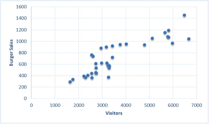
Figure 9-17. Historical data for the burger sales
The graph shows a strong relationship between the numbers of burgers sold and the visitor to the shop. The number of burgers sold is showing a clear increase with the increase in the number of visitors. To know the number of burgers sold when the visitors for the day are 4,500, the exercise is simple. The rough estimate comes out as 800 (Figure 9-18).
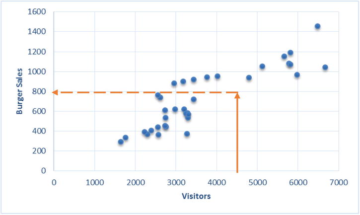
Figure 9-18. Burger sales for number of visitor = 4500
Just imagine a straight line passing through the core data and taking the y-axis value for an x-axis value of 4,500 (Figure 9-19).

Figure 9-19. A straight-line fit for the burger example
The trick here is to fit the best curve, which gives the best representation of historical data. This is required to keep the estimation or prediction errors to a bare minimum. This curve (a straight line in this example) can be extended to get the estimates beyond the historical data. Regression also follows this procedure.
Simple Linear Regression
Depending upon the relationship between the dependent variable y and the independent variable x, you need to estimate the best possible fit. It can be a simple straight line or a curvilinear line, whichever best suits the data. In the burger example given in the earlier section, a simple straight-line fit solves the purpose because it appears to define the relationship with a fair amount of accuracy.
These linear regressions, where you use only one independent variable for estimations, are known as simple linear regressions.
As it’s generally defined in high-school math, the equation of a straight line is
![]() ,
,
where m is the slope and c is the intercept.
The notations used in the regression analysis are slightly different.
![]()
where
- β1is the slope.
- β0 is the intercept.
- x = Independent variable (we provide this)
- y = Dependent variable (we estimate this)
The effort to fit a straight line to the data just takes finding the values of β0 andβ1. Once you have these values, you can simply estimate the values of y given the values of x. For example, consider the following regression line:
![]()
What is the value of y when x stands at 10? Simple! And this equation is called the linear regression model. You can have a similar regression model for the burger example also.
Regression Line Fitting Using Least Squares
In regression analysis, you try to fit a straight line that best represents the data. To do that, the values of β0 and β1 need be determined so that the error in the representation is at its minimum. The intercept β0 and slope β1 are also known as regression coefficients.
The following are the steps to find the regression coefficients:
- Imagine a straight line through the data.
- Since it can’t go through all the points, you will make sure that it will be close to almost all the points.
- In Figure 9-20, you can see the actual values (represented as circles) and the predicted values, which are along the straight line. The errors are represented as dotted lines.
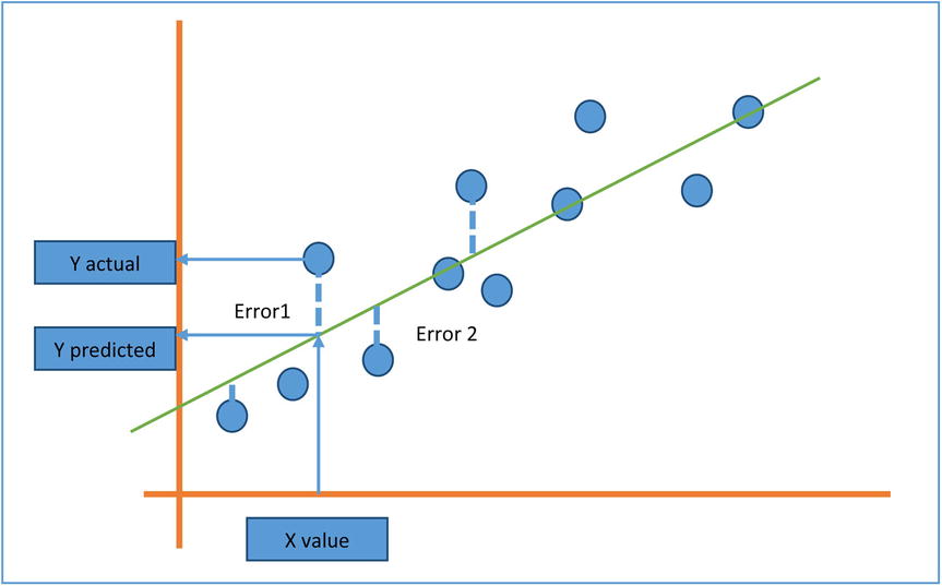
Figure 9-20. Actual values, predicted values, and errors
- The best fit line will be the one with minimum overall error. Some errors are positive, while some are on the opposite side, so it may be a good idea to square the errors and sum them to find the aggregate. The best fit line will have the minimum aggregate value.
- You need to find the regression coefficients in such a way that they will minimize the sum of squares of errors.


- You can use calculus and find the values of β1, the slope, and β0, the intercept that will minimize the above error function. This method is called the least square estimation method, and the reason is obvious. There’s nothing to worry about since usually software like SAS will do this estimation job for you.
The Beta Coefficients: Example 1
For the burger example, you have the independent variable as the number of visitors and the dependent variable as the number of burgers sold. So, fitting a line to this data doesn’t require anything other than finding the regression coefficients in the following line:
![]()
![]()
Given the data set, you have to run the least squares algorithm and get the regression coefficient values. SAS already has built-in libraries that will run this algorithm and give the results. The following is the code:
/*Fitting a regression line*/
proc reg data= burgers;
model burgers=visitors;
run;
Here is what it means:
- proc reg is for calling regression procedure.
- The data set name is burgers.
- You need to mention the dependent and independent variables in a model statement. For example, model y=x.
Table 9-13 shows the output of this code.
Table 9-13. Output of PROC REG on Burgers Data Set

There are so many measures and values in Table 9-13 that we will focus on the numbers that matter the most. You are looking for estimates of intercept β0 and slope β1. From the last table of parameter estimates, you get the regression parameters as follows:
- Intercept β0: 50.854
- Slope, which is coefficient of x (that is, coefficient of visitors in the model equation β1): 0.185
Burgers = 50.8534 + 0.185*visitors
You are only looking for the regression equation or regression line. So, for a day when the numbers of visitors are 4,500, the number of burgers can be estimated as follows:
Burgers = 50.854 + 0.185*4500
Burgers = 883.35

Figure 9-21. Regression Line for the Burgers Sales Example
We built a regression line and gave our predictions using the model. But how do we ensure that our regression model is correct and the estimates are trustworthy? How do we define goodness of fit in a model? The following section will answer this question.
How Good Is My Model?
The regression line that you just built for the burger example will give you reasonably good estimates of burgers sold, given the number of visitors. But it can still be challenged. Someone might come up with another model with the claims that their estimates are better. She might propose a new line with intercepts of 23 and a slope of 0.5. Under such conditions, how should the current model be defended? In other words, how can the accuracy of a given model be quantified? How can the errors in the estimation be calculated? We will show an example to explain this.
Table 9-14 shows some observations in the data.
Table 9-14. Snapshot of Actual Numbers of Visitors vs. Burgers Sold
|
Visitors |
Burgers |
|---|---|
|
3268 |
373 |
|
2299 |
371 |
|
2566 |
363 |
|
1759 |
335 |
|
3440 |
720 |
The burger numbers in Table 9-14 are the actual number of burgers sold based upon the historical data. Now you calculate the same values using the regression model, built in the earlier section, and list the values in the Burgers (Predicted) column. A good model should give estimates near to the actual values (see Table 9-15).
Table 9-15. Predicted and Actual Values of the Burgers Sold
|
Visitors |
Burgers (Actual) |
Burgers (Predicted) |
|---|---|---|
|
3268 |
373 |
656 |
|
2299 |
371 |
477 |
|
2566 |
363 |
526 |
|
1759 |
335 |
377 |
|
3440 |
720 |
688 |
Now in the following sections, you will go on to estimate the error between predicted and actual values.
A perfect model will make sure that the estimated or predicted values are almost the same as the actual values. If they are not the same, at least they should be very close. So, the difference between the actual values denoted by y and predicted values denoted by ŷ should be insignificant at any point. Since these errors can be either positive or negative in nature, you can square and sum them to get an aggregate value. And the aggregate value (in other words, the sum of squares of deviations between actual and predicted values) should be as small as possible for a model to be categorized as good.
![]()
yi is the actual value of y, and y^i is the predicted or estimated value of y.
If you want to compare two models built on the same data set, then the one with less SSE will obviously be considered better.
There no special code to produce the SSE value; by default the regression code will display SSE in the output.
/*Fitting a regression line*/
proc reg data= burgers;
model  burgers=visitors;
run;
In the output (shown Table 9-16), you can read the sum of squares of error when analyzing the variance table.
Table 9-16. Output of PROC REG on Burgers Data Set
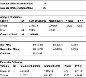
For the model that you built, the error sum of squares is 724, 321.
Just the error sum of squares is not sufficient to decide the goodness of the fit of a model. There is a small challenge in observing SSE in isolation. What are the limitations of SSE? You know it should be close to zero. What if SSE is greater than zero? How big is too big? If the value of dependent variables in a model is in the thousands, SSE can run even in the tens of thousands. If the values of a dependent variable are in fractions (less than 1), then SSE will naturally be less. Under these conditions, based on SSE, how do you interpret the fitness of a model? You need to consider SSE with respect to total variation within y, to determine the exact error percentage. The measure of variance in y or the total sum of squares of y is as follows:
![]()
Where ȳ is the mean of y, the variance in y (SST) is nothing but the squared deviation of y from the mean of y. So SSE/SST is a good measure of accuracy of the model. We can call it as the proportion of unexplained variance in y. What is the proportion of explained variation in y then? It is explained in the next section.
So, we are trying to explain the total variance in dependent variable(y) using the independent variable. Since we could not fit the perfect model or since there is no perfect fit for the data, we settled for a line with some error. So, the best model that can fit the given information will have a small error percentage. This section gives another way of looking at it.
The total variance in y is the sum of the error sum of squares, that is, the variance unexplained and regression model sum of squares (the variance explained successfully).
Total sum of squares = Sum of Squares of Error + Sum of Squares of Regression
SST = SSE + SSR
Total variance = unexplained variance + Explained variance
![]()
SST, SSE, and SSR are shown pictorially in Figure 9-22.

Figure 9-22. Plot to represent SSE, SST, and SSR
So, to have greater accuracy in the estimates, you need to have less error or you need to have a greater regression sum of squares or you need to have an error sum of squares near zero and a regression sum of squares near the total sum of squares.
So, for a best model, the value of SSE/SST should be close to zero, and the value of SSR/SST should be near one. The ratio SSR/SST is known as coefficient of determination or R-squared, denoted by R2.
The Coefficient of Determination R-Square
R-square is a goodness of fit or accuracy measure. The higher the R-square, the better the model. So, the coefficient of determination is nothing, but the ratio of the variation explained to the total variation (of the dependent variable).

Limits of R-Squared
You don’t need to worry much if you don’t fully understand the error equations explained previously. All these calculations are done by the software. If you understand the significance of R-squared given next, it may be good enough for practical purposes.
You can see in the definition of R-squared that the value of R-squared can be a minimum of zero when the model does not explain any variation of the dependent variable and that the maximum can be as follows:
![]()
![]()
An R-squared value of 0.8 indicates that, using the model, we could explain 80 percent of the variance in a dependent variable(y). So, for a model to qualify as a good model, it needs to explain as much variance in y as possible. If you are comparing two models and want to decide which is the best model, the one with a higher R-square is the better model. The general industry norm is to have R-square be a minimum 80 percent, but it may vary depending on the availability of the data and the complexity of the model. A lower R-square value indicates that some, but not all, of variance in y is explained. If R square is close to 1, then you can see that most of the variation in y is explained by x. Given next are the three plots (Figures 9-23, 9-24, and 9-25) show R-square values in three different practical scenarios.

Figure 9-23. R-squared for grades versus study hours regression model
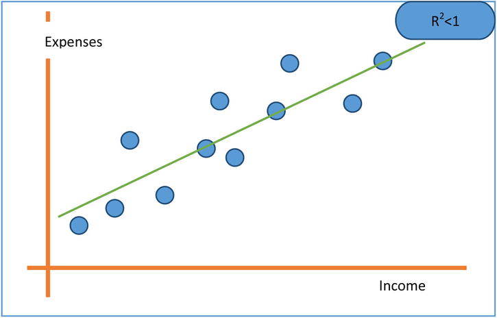
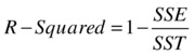
Figure 9-24. R-squared for expenses versus income regression line
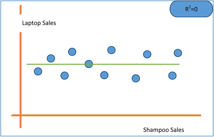
Figure 9-25. R-squared for laptop computer sales versus shampoo sales regression line
R-Squared in SAS
There is no special code for calculating R-squared in SAS. The regression code by default gives the sum of squares and R-squared value.
proc reg data= burgers;
model  burgers=visitors;
run;
SAS output mentions the sum of squares and R-square of the regression model in the Analysis of Variance Table. Table 9-17 shows the SAS output for the burger sales example.
Table 9-17. Output of PROC REG on Burgers Dataset

Following are the sum of squares from the Anova table (analysis of Variance) of the output Table 9-17.
Sum of squares of regression model (SSR) =2,304,330
Sum of squares of error (SSE) =724,321
Total sum of squares (SST) =3,028,651
R-squared =0.7608, this can be verified by the R-squared actual formula

The R-squared value indicates that the model’s accuracy is only 76.08 percent; in other words, the predications of y (number of burgers sold) based on the input values of x (number of visitors) are done with only 76.08 percent accuracy. Is that good enough? Maybe not because an analyst looks for an R-squared value of greater than or equal to 80 percent.
Regression Assumptions
In the burger example, you assumed a linear relationship between the number of burgers sold and the number of visitors in the shop. But in actual practice this may not be the case. If the relationship is not linear in the true sense, a linear regression model should not be attempted. There are other nonlinear techniques available to do the job. The following are some assumptions under which R-squared value is valid. In some cases, you have also given the techniques to test them.
Linearity Assumption
R-squared value is calculated under the assumption that the relationship between the independent variable(x) and the dependent variable (y) is linear.
Consider the plot shown in Figure 9-26. It more or less represents the y=ex relationship. If it’s assumed that the fit here is a straight line, it will never pass through the maximum of the data points. R-squared has no meaning here.

Figure 9-26. An exponential relationship between y and x. R-squared has no meaning here
Detection of Linearity and Fixing the Violation of Linearity
Detecting a linear relationship is fairly simple. In most cases, linearity is clear from the scatterplot. So, to find a linear fit, you can draw a scatterplot for x and y using an analytics software like SAS. If the relation between x and y is not linear, transformations such as square of x, log(x), ex, sqrt(x), and so on, can be tried. Transformation of data can be found in any standard statistics book.
We discussed creating scatterplots in correlation. The following is the code to create a scatterplot in SAS. The following code is for a sample scatterplot customer satisfaction and service in telecom data.
/*Scatterplots between CSAT and service score*/
proc gplot data= telecom;
plot  C_sat*service;
run;
R-squared is calculated under the assumption that the dependent variable y is distributed normally for each value of the independent variable x.
An easy way to understand this assumption is to look at the opposite of it. In other words, what if y is not distributed normally at each point of x? What if y is a constant for some observations of x and for rest of the data points y is distributed normally? The graph in this case might look like Figure 9-27.

Figure 9-27. y versus x, showing two trends
The graph in Figure 9-27 shows that Y behaves differently when X is near multiples of 10, assuming all values are behaving normally. You can clearly see two trends in the data. There is no way you can fit one straight line that goes through the maximum points of the data. Say if you fit a linear regression line, the errors (the deviation between actual and predicted values) should follow normal distribution with the mean close to zero. Normality is a basic assumption while calculating regression coefficients. Generally, outliers are the main reason for the violation of this assumption.
The graph in Figure 9-28 shows some outliers; a model fit on this data will produce errors that are non-normal. If you try to fit a regression line on this data, it will not be valid.

Figure 9-28. y versus x with outliers
Detection of Normality Relation and Fixing Non-normality
The outlier detection and its treatment were already discussed in data exploration in Chapter 7. You need to follow the same procedure to treat the outliers here. Missing values and default values are the main reasons that cause the violation of normality assumption.
The normality can also be detected using two graphs.
- The histogram of standardized residuals should appear like a standard normal distribution with mean zero.
The graph in Figure 9-29 shows that the residuals are roughly following normal distribution, and the graphs in Figures 9-30 and 9-31 are examples where residuals are not following normal distribution.

Figure 9-29. Residuals following normal distribution
Figure 9-30. Residuals not following a normal distribution
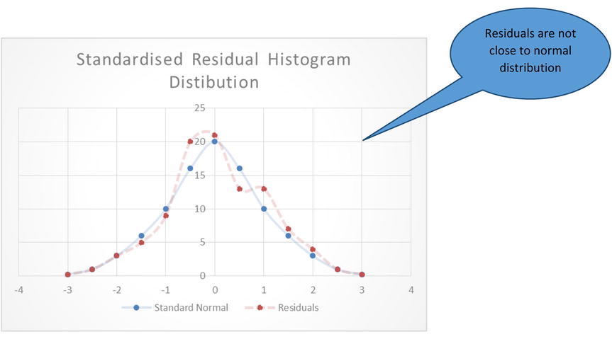
Figure 9-31. Another example pf residuals not following a normal distribution
- A normal probability versus residual probability distribution plot is also known as a P-P plot. The plot basically tries to draw a perfect normal probability distribution (P) and compare it with a residual probability distribution (P). The normal probability and residual distribution plot (P-P plot) has two components, a straight line and dots. If the distribution is normal, then all the points in the P-P plot should fall close to a diagonal straight line, indicating that the probability distribution of residuals (dots in the graph) is almost the same as standard normal probability distribution (line). If this plot looks like a D or the mirror image of D, then it is an indication of outliers, or the errors are too heavy on one side of the mean. Given in Figures 9-32 and 9-33 are the two shapes of the graphs: one is acceptable, and the other one indicates the outliers.

Figure 9-32. Residual probability distribution close to normal

Figure 9-33. Residual probability distribution not following a normal distribution
To fix this normality violation, you need apply the outlier treatment or transform the variables. The outlier treatment and missing value treatment is discussed in Data exploration Chapter.
Independence Assumption: The Observations Are Independent
Independence of y is one of the most common assumptions while attempting to fit a linear regression. You can expect the values of y to depend on independent variables but not on its own previous values. For example, while analyzing sales data for one year, if the current month’s sale is dependent upon the previous month’s sale, then R-squared doesn’t make any sense.
We are trying to predict y using x. If y dependents on its own previous y values then we are not building a robust model. The variable x will never be able to explain y variable’s self-dependency.
Detection and Fixing Independence Violation
The violation of this assumption is observed mostly in time series data. Autocorrelation function (ACF) graphs can give you a clear picture about the dependencies. ACF graphs are explained in Time series analysis chapter. If there is a seasonal dependency, then you might get seasonal indices, and the data can be adjusted accordingly. If the data shows a clear trend, then some smoothing techniques might be used to correct or adjust the data. In such cases, even variable transformation using various mathematical functions can be considered.
Homoscedasticity Assumption: The Variance of Y at Every Value of X Is the Same
We are also assuming that the variance in y is the same at each stage of x and there is no special segment or an interval in X where the dispersion in Y is distinct. Look at the graph given in Figure 9-34, which shows different variance patterns in y for some points of x. Having different variances in different bins of x is called hetroscedasticity. It is the opposite of homoscedasticity, which means the dependent variable has the same variance across all points of independent variables.

Figure 9-34. Note the different variance patterns in y for different ranges of x
In this graph, the variance in y seems to be slightly less when x is less than 40. In the range of x varying from 40 to 80, you see a slightly different variance pattern. Again, after x crossing 80, the pattern is different. In this case, it is hard to fit one regression line and expect it to pass through the maximum points of the data. As shown in the graph in Figure 9-35, the straight line fit can’t be considered the best fit for the entire set of data.

Figure 9-35. Unsuccessfully trying to fit a straight line between y and x
Detection of Homoscedasticity Violation and Fixing It
Again, a scatterplot between x and y gives you a fair idea of homoscedasticity. A more clever idea is to draw the residual versus predicted values (not the actual values). This gives you a picture of whether y is increasing or decreasing or whether residual variation is growing or shrinking or whether it’s random around the predicted line.
The plots in Figures 9-36 and 9-37 show some examples of homoscedasticity and heteroscedasticity.

Figure 9-36. A plot showing homoscedasticity

Figure 9-37. A plot showing heteroscedasticity
Residuals or the errors here are the difference between actual and predicted values.
The simple way to deal with this problem is to segment out the data and build different regression lines for different intervals. In general, if the first three assumptions are satisfied, then heteroscedasticity might not even exist. As a rule of thumb, first three assumptions need to be fixed before attempting to fix heteroscedasticity.
When Linear Regression Can’t Be Applied
In the previous sections, four main regression assumptions were discussed. If any of these assumptions doesn’t hold true, the linear regression modelling should not be applied.
Just to summarize, the following are the four assumptions:
- When the association between X and Y is nonlinear, then a linear regression model is not justified. The estimates are not going to make any sense.
- When the errors are not normally distributed, then the regression coefficients and their standard deviation might not be correct. If the errors are skewed, the basic theory behind the estimation of coefficients will not hold true. Under these circumstances, the linear regression model will not be very helpful.
- When there is a dependency within the values of the dependent variable, then you are always ignoring a trend while building the regression model. What you are trying to capture is the x versus y trend. But if y versus y is still unexplained (y might depend upon previous values of y), you can’t fit a regression line.
- When the variance pattern of y is not the same for the entire range of x, then a single consolidated line can never explain the behavior of y in the different segments of x. Applying linear regression is not a good idea in this scenario as well.
Simple Regression: Example
In the beginning of the regression topic, we had discussed about the cell phone sales data. We will use regression technique to answer the questions like
- What happens to cell phone sales when the price increases or decreases?
- At a given price tag, what will be the estimated sales of a given phone model?
The following is the code for predicting sales using price.
proc reg data= mobiles;
model sales=price;
run;
Table 9-18 shows the result of this code.
Table 9-18. PROC REG Output for Cell Phone Data Set (model sales=price)

Looking at the R-square, you can tell that a mere 4.8 percent of variation in sales is determined by the price of the smartphone. So, the model is not good enough for estimation purposes.
Now you will try to use the rest of the variables individually and see whether they will yield a good regression line. Here is the first example:
The following is the code for predicting sales using ratings.
proc reg data= mobiles;
model sales=Ratings  ;
run;
Table 9-19 shows the result of this code.
Table 9-19. PROC REG Output for Cell Phone Data Set (model sales=ratings)
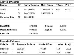
R-square in this case is only 9.06 percent. So again, the model is not a good fit to predict the sales.
The following is the code for predicting sales using number of new features.
proc reg data= mobiles;
model sales= Num_new_features  ;
run;
Table 9-20 shows the result of this code.


R-square in this case is only 2.08 percent. Again, this is not a good fit.
The following is the code for predicting sales using stock market index.
proc reg data= mobiles;
model sales= Stock_market_ind   ;
run;
Table 9-21 shows the result of this code.
Table 9-21. PROC REG Output for Cell Phone Data Set (model sales= stock_market_ind)

R-square in this case is only 5.3 percent. That’s not a good fit again.
The following is the code for predicting the sales using marketing budget:
proc reg data= mobiles;
model sales= Market_promo_budget ;
run;
Table 9-22 shows the result of this code.
Table 9-22. PROC REG Output for Cell Phone Data Set (model sales= Market_promo_budget)

R-square in this case is only 13.25 percent. This is slightly better, but again it’s not good enough for predictions.
Table 9-23 shows the consolidated table of R-squared values.
Table 9-23. Table of R-squares Values for Independent Variables

From Table 9-23 it is evident that none of the variables could explain much of the variation in y. None of these models is sufficient enough to get a good estimate on the sales. Is there any other way to estimate sales? Yes, instead of using these variables individually, you may want to try using them together. All these independent variables together might explain the variation in y. You might want to try a regression line using several independent variables. Regression is called simple when there is a single independent variable, but if there are multiple independent variables, then it is called multiple linear regression, which is the topic of the next chapter.
Conclusion
In this chapter you learned some relatively complicated analysis measures and techniques. Until now we’ve used only the simple descriptive statistics, such as mean, variance, and so on. You learned that the variable association is quantified using correlation. You also learned that the prediction of a target variable using associated variable(s) is done by using simple linear regression. Throughout the section “Simple Linear Regression,” we elaborated on the conceptual part.
Real-world scenarios are not simple. Several predictor variables impact one target variable so we need to use multiple liner regression there. The next chapter covers multiple linear regressions. In upcoming chapters, you will see some other non-linear regression analysis techniques, such as logistic regression.