
![]()
Basic Descriptive Statistics and Reporting in SAS
The first step in statistical data analysis is to define the business objectives, which determines the need of the project. This step will require some initial planning. Once the data is gathered in the required format, the next step is to explore the data.
A raw data set is all that is available at this stage. The next step is to get a basic understanding of the data. If the data set is too large, only the first few records can be printed. The business analyst must then visualize the data, highlight the outliers, identify the caveats, find interesting patterns in the data, or build a predictive model that will help forecast the result, which is still unknown at this stage.
This chapter discusses basic descriptive statistics steps, which will help in data exploration and also help in data-cleansing operations, which is the topic of the next chapter.
As discussed earlier, basic descriptive statistics gives an overall picture of the data set on hand. The actors of this picture are discussed later in this chapter. The topics of advanced statistical modeling techniques, namely, inferences and predictions on the data, will be dealt with in the next few chapters.
Rudimentary Forms of Data Analysis
To get a feel of the data, complex statistical analysis is not always required. Sometimes trivial techniques such as printing the first few rows of the data set or visually inspecting the computer screen can do the job. In fact, before attempting any analysis on the data, we strongly recommend you inspect the first few rows, just to get a feel for the data.
Simply Print the Data
A simple visual inspection of the data in hand can tell a lot and help you to understand it. If the data set is small, it can be printed without trouble, but if it is a large data set, it is recommended that only a few rows (such as 1 to 100) are printed. A simple sorting might help sometimes. If you have a lot of columns or variables, you should print only important variables that deserve careful inspection.
The first few pages of the previous chapter contained the snapshot of a big data set, which showed the statistics on the percentage of population with access to electricity in 2009 and 2010. Recall that we discussed a few simple observations on this data set that helped give you a feel of the complete data set.
Print and Various Options of Print in SAS
SAS gives you easy-to-use print options for any kind of data set. You can print all the variables or select a few important ones to print. We will discuss the SAS print procedure and its options using an example.
The following code outputs a snapshot of some data generated by an online store over a period of one month:
Proc print data = online_sales (obs=20);
run;
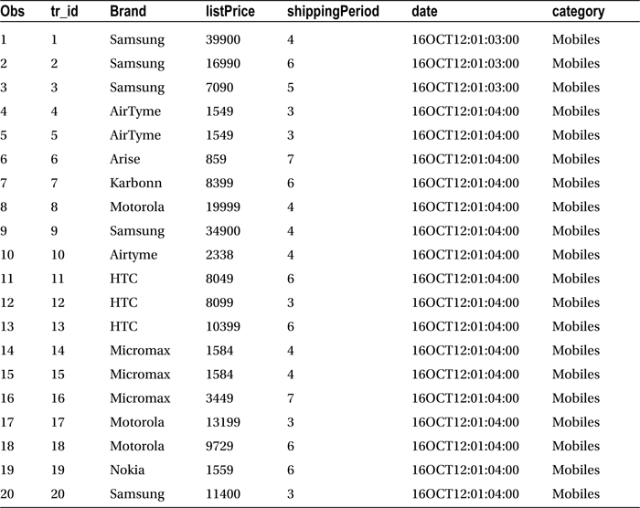
Table 6-1 lists the output of this code, and the explanation of the variables involved in the online_sales data set follows:
- brand: The brand name
- listPrice: The price of the item as listed on web site
- shippingPeriod: The shipping period in days
- date: The date of the order
- category:The item category
The data in Table 6-1 belongs to only a few mobile phone orders placed by the customers.
Table 6-1. Results of proc print on online_sales Data Set
We’ll now discuss some useful options in the SAS print procedure. The following is the generic code and its explanation:
proc print data=<<data set>> label noobs heading=vertical;
var <<variable-list>>;
by var1; run;
- Label:This option prints variable labels as column headings instead of variable names.
- Noobs:This option removes the OBS column from output.
- Heading=vertical:This option prints the column headings vertically. This is useful when the names are long but the values of the variable are short.
- By: The by statement produces output grouped by values of the mentioned variables.
Let’s use an example. The following is the code for sorting the data based on list price:
Proc sort data=online_sales ;
by listPrice  ;
run;
You can use the descending option to sort from high price to low price. SAS sorts in ascending order by default.
Proc sort data=online_sales ;
By descending listPrice  ;
run;
The following is the SAS log for the preceding code:
There were 5129 observations read from the data set WORK.ONLINE_SALES.
The data set WORK.ONLINE_SALES has 5129 observations and 6 variables.
PROCEDURE SORT used (Total process time):
real time           0.04 seconds
cpu time            0.04 seconds
Now let’s try to print this sorted data set.
proc print data =  online_sales (obs=20);
run;
Refer to Table 6-2 for the output of this code.
Table 6-2. Results of proc print on online_sales Data Set After Sorting on listPrice

The output in Table 6-2 shows that Apple has most of the expensive items on the web site. One BlackBerry item tops the list.
Summary Statistics
When the data set is large, opt for summaries or aggregated measures to describe the data. The following are some summary measures that can be applied on each variable of the data set:
- Central tendencies: What is the average value?
- Dispersion: What is the spread in a particular variable? We will discuss more about this in the following sections.
- Other summary statistics such as correlation coefficient: This will be covered in coming chapters.
Next, we describe the summary statistics measures individually and use examples to show how to use them.
Answering questions such as the following will help you understand how to use aggregated measures or summary statistics to describe a data set:
- What were the sales figures last year?
- What is the cost of air travel from Dubai to the United Kingdom?
- How many hours do you sleep in a day?
- How much time does it take to reach the office?
The answers are usually average values rather than definite numbers; for example, answers might be along the following lines: the average sale is worth $5 million a year; it takes 30 minutes to reach the office on an average, and so on. This average is simply a measure of central tendency, a measure that gives an idea about the middle value of a variable containing a number of data points. There are three measures of central tendency.
- Mean
- Median
- Mode
![]() Note All central tendencies are averages.
Note All central tendencies are averages.
We will discuss them individually.
Mean
When a variable is numeric, it is a simple arithmetic mean. This is the most commonly measured central tendency. A simple aggregate sum of values divided by a count of those values gives the arithmetic mean.
For example, the average age of four people aged 24, 24, 27, and 25 is 25. The average age was derived by finding the sum and dividing it by the count.
Average age= (24+24+27+25)/ (4) = 25

Arithmetic mean is a good measure of the central tendency, but it is not perfect. The arithmetic mean might not indicate the middle value of the variable if there are any outliers in the data. It will tend to deflect toward the outlier.
An outlier is the value of a set or a column that is entirely different from other values in the same set. It can be an extraordinarily high or low value, compared to the other entries in that variable column.
For example, Table 6-3 contains the monthly incomes of 14 individuals.
Table 6-3. Monthly Income of 14 Individuals
|
Id |
Monthly Income |
|---|---|
|
1 |
7,400 |
|
2 |
9,800 |
|
3 |
6,500 |
|
4 |
9,100 |
|
5 |
9,000 |
|
6 |
718,900 |
|
7 |
9,400 |
|
8 |
9,300 |
|
9 |
7,800 |
|
10 |
8,900 |
|
11 |
8,600 |
|
12 |
9,600 |
|
13 |
10,000 |
|
14 |
6,800 |
The monthly incomes of 13 individuals out of 14 are less than or equal to $10,000 in the data set. However, there is one individual whose income is $718,900. It is not apparent whether it is an error or a deliberate inclusion. This value is completely different and much higher than the other values. This particular value in the monthly income data is the outlier. Subsequent sections in this chapter will discuss how to identify the outliers.
When the mean of the preceding sample is calculated, the result is $59,364; whereas 13 out of 14 individuals earn less than $59,364. Only one individual’s salary is more than the arithmetic mean. The central tendency is expected to be around the midpoint of the data, so the average value can be determined, but the mean in this instance has changed drastically because of the outlier. Outliers generally pull mean values toward them, whether they are high-side outliers (as in this example) or low-side ones. For example, on the lower side, if the 15th entry in Table 6-3 is 1,000, the average will be lowered to $55,473. Figure 6-1 shows a plot of this example.
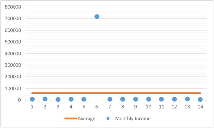
Figure 6-1. Monthly income of individuals with outlier and calculated average
Here, the mean does not give the true central tendency of the variable because of just one outlier. What is the impact when the outlier is removed (Figure 6-2)?

Figure 6-2. Monthly income with outlier removed
Once the outlier is removed, the new mean, $8,631, is in the middle of all the values, the true central tendency or average value. This is called the truncated mean. To arrive at this value, the outlier must be eliminated or replaced with the second highest value for the given variable and then calculated. In general, it might not be a good idea to fiddle with the original data.
It can now be concluded that a mean is not a good measure in the presence of outliers, and a different central tendency that will not be affected by outliers might be necessary. This different central tendency is median, discussed next.
Median
As established earlier, the outliers mark their effect on mean and pull the values mean toward them. In such cases, mean doesn’t serve its original purpose, in other words, giving a true measure of the central tendency. A median, on the other hand, is the exact midpoint of any data set. There are the same numbers of data points above and below the median value.
To calculate the median, the field is arranged in either ascending or descending order. If there are N observations in the data, the median value is ((N+1)/2)th observation if N is an odd value, and if N is an even value, the median is calculated as average of N/2 and (N/2 + 1)th value.
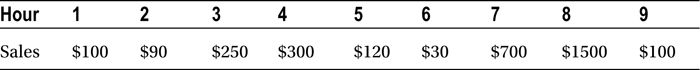
For example, a cake shop is open for nine hours a day. The hourly sales are given in Table 6-4.
Table 6-4. Hourly Sales for a Cake Shop

To find the median, the sales are simply arranged in ascending order, and the fifth value is noted. The median in this case is $120 (Table 6-5). It is independent of the order, either ascending or descending.
Table 6-5. Median for the Cake Shop Example (Odd Number of Observations)
![]()
If the same shop operates 10 hours a day and the least sale amount is $30 in a particular hour, the median is a mean of the fifth and sixth records in the sorted values. Here, it is an average of 100 and 120, that is, $110 (Table 6-6).
Table 6-6. Median for the Cake Shop Example (Even Number of Observations)
![]()
The Outlier Effect Is Nullified in Median
The median doesn’t get affected by the presence of outliers. Regardless of the size of the outliers, the median will still remain the same. In the example of the cake shop, imagine a sale of $1,500 instead of $500 in the eighth hour (Table 6-7).
Table 6-7. Hourly Sales for a Cake Shop with an Outlier
The median in Table 6-8 is still the same.
Table 6-8. Median for the Cake Shop Example with an Outlier
![]()
Median is not affected by the low-side outliers either. The way median works is simple: it takes the position of the record instead of actually considering the value. Its position remains the same from either the top or the bottom, regardless of the size of the value.
![]() Note Is it safe to say that there are no outliers in the data when the mean is close to the median?
Note Is it safe to say that there are no outliers in the data when the mean is close to the median?
Yes, if the mean and median are close, it can be concluded that there are no outliers in the variable. However, If there are balancing outliers on the either side of median (both extreme low and high values), then also the mean and median can be close.
Mode
Mode is the value that occurs most frequently in the data set. Sometimes, calculating mean or median might not make much sense, particularly if a particular value occurs multiple times in a variable. In such a case the recurring value is likely to be quoted as the average.
For example, consider ten families residing in an apartment complex. The numbers of family members are 3, 4, 4, 4, 4, 4, 4, 4, 2, and 4, respectively. What is the average family size in that apartment? The answer is most likely to be 4 since most of the families consist of 4 members and is the mode in this case. Mode is not exactly in the central tendency, but it makes better sense rather than the mean, which is 3.7. A family size of 3.7 is improbable. Mode is a good measure in cases where a mean is not meaningful. Examples are average shoe size of a city, average number of loans, average family size of a country, and so on. As you have already learned, mode is the most frequent value of a variable in a given data set. You just need to look at the frequency table to find the mode as the most frequent occurring value.
Calculating Central Tendencies in SAS
The following code will help find the average list price in the online sales example:
Proc means data=online_sales;
var listPrice;
run;
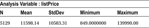
Refer to Table 6-9 for the output of this code.
Table 6-9. Output of proc Means on online_sales data base (listPrice)
SAS gives the mean value by default and additional information on other measures like minimum, maximum, and so on. The following code helps in printing only the mean value:
Proc means data=online_sales mean;
var listPrice;
run;
Refer to Table 6-10 for the output of this code.
Table 6-10. Mean of listPrice
|
Analysis Variable: listPrice |
|---|
Mean |
|
11598.14 |
This code calculates the mean list price by brand:
Proc means data=online_sales mean;
var listPrice;
class brand;
run;
Refer to Table 6-11 for the output of this code.
Table 6-11. Output of proc means on online_sales (Mean Values for Every Brand)
|
Analysis Variable : listPrice | ||
|---|---|---|
brand |
N Obs |
Mean |
|
Acer |
1 |
8499.00 |
|
AirTyme |
90 |
1549.00 |
|
Airtyme |
89 |
2551.10 |
|
Apple |
146 |
42854.80 |
|
Arise |
161 |
1215.92 |
|
BlackBerr |
201 |
14374.20 |
|
Blackberr |
18 |
21221.78 |
|
Canon |
3 |
5964.67 |
|
Fujifilm |
11 |
6512.09 |
|
HTC |
469 |
16816.29 |
|
HTC |
38 |
11511.00 |
|
Huawei |
8 |
8780.25 |
|
IBall |
108 |
5491.60 |
|
Intel |
1 |
17500.00 |
|
Intex |
26 |
887.30 |
|
Karbonn |
299 |
7172.62 |
|
LAVA |
4 |
2100.00 |
|
LG |
361 |
13164.46 |
|
Lava |
25 |
1289.12 |
|
Lemon |
1 |
999.00 |
|
MICROMAX |
19 |
4950.00 |
|
MOTOROLA |
19 |
22368.00 |
|
Micromax |
579 |
3550.90 |
|
Motorola |
259 |
13035.01 |
|
Nikon |
23 |
9319.78 |
|
Nokia |
683 |
9919.18 |
|
Olympus |
4 |
4399.00 |
|
Samsung |
956 |
13313.62 |
|
Sony |
355 |
17242.56 |
|
Sony Eric |
62 |
16899.82 |
|
Soyer |
7 |
1050.00 |
|
Spice |
80 |
3967.20 |
|
Videocon |
13 |
2840.92 |
|
Xolo |
6 |
17937.50 |
|
Zen |
4 |
1999.00 |
The output in Table 6-10 shows the average price of each brand. We will concentrate on the brands that have more than 30 orders (>30). The overall average list price is $11,598. The list price for Apple is way above it, and the average list price for Micromax is much below the overall average.
This code helps find the median:
Proc means data=online_sales median;
var listPrice;
run;
Refer to Table 6-12 for the output of this code.
Table 6-12. Median for listPrice
|
Analysis Variable: listPrice |
|---|
Median |
|
8399.00 |
The median is much lower than the mean, which indicates that there are some high-side outliers. The data indicates that the outliers in this case are the list prices of Apple and BlackBerry.
The following is the code for the mode:
Proc means data=online_sales mode;
var listPrice;
run;
Refer to Table 6-13 for the output of this code.
Table 6-13. Mode for listPrice
|
Analysis Variable: listPrice |
|---|
Mode |
990.00 |
A mode value for a continuous variable may not make a lot of sense. Let’s find the mode of shippingPeriod using the following code:
Proc means data=online_sales mode;
var shippingPeriod;
run;
Refer to Table 6-14 for the output of this code.
Table 6-14. Mode for shippingPeriod
|
Analysis Variable: shippingPeriod |
|---|
Mode |
5 |
The shipping period for most of the items is 5. This is simply the most occurring value. A shipping period of 5 days sounds more probable than 4.98 days, which is the mean value. Take a look at the code that follows:
Proc means data=online_sales mean;
var shippingPeriod;
run;
Refer to Table 6-15 for the output of this code.
Table 6-15. Mean for shippingPeriod
|
Analysis Variable: shippingPeriod |
|---|
|
Mean |
|
4.98 |
The central tendencies of different variables were discussed in the preceding examples. Central tendencies give us a unique value that represents that variable. But the question remains: is it sufficient, or are other measures needed to better understand that variable?
ANDERSON WANTS TO CROSS A RIVER
Mr. Anderson, who can’t swim, wants to cross a small waterway. He asked a neighbor to describe the depth of that river, and the neighbor said its depth is 4 feet on average. Mr. Anderson is happy and starts to cross it. His happiness does not last long. The reason is that although the average is 4 feet, the depth at some places might have been 7 feet, which is more than Mr. Anderson’s height. If he had inquired about the deviation from average depth or the inconsistency of depth at various points, or at least the range of depth apart from the average depth of the river, it would have saved Mr. Anderson from drowning.
Therefore, merely knowing the average or the center value may not be sufficient in all cases. The deviation from center (or the dispersion) or the spread of a variable is also important. Given next are a few measures of dispersion.
What Is Dispersion?
Dispersion is the variation in data—the anomaly or inconsistency in the values of a variable. The measures of dispersion indicate nothing about the middle value of the data. Rather, they give you an idea about the spread.
Next, we discuss a few measures that quantify the dispersion.
Range is a basic measure that explains the dispersion, or the spread, in the data. The calculation of range is simple: it’s the difference between the maximum and minimum values of a variable.
Range = Maximum – Minimum
Range is a good measure of dispersion when dealing with a small data set and a quick estimate of the range is required. It is better to mention the maximum and minimum values while quoting the range.
For example, you are looking for a smartphone with certain features. There are nine brands that produce such a phone. Table 6-16 gives their respective prices.
Table 6-16. Smartphone Brand and Prices

The maximum price is $8,900, and the minimum is $2,900; the range of this price variable is $8,900 – $2, 900 = $ 6,000
Although range is a good measure for small samples, a stronger, more reliable measure for quantifying the actual dispersion in the data is necessary. A more granular measure that considers the spread in each record, instead of the overall range, will serve this purpose. Variance is such a measure.
The overall spread in the data needs to be quantified. For example, consider the closing stock prices of a startup company, in dollars (Table 6-17, Figure 6-3 and Figure 6-4).
Table 6-17. Stock Prices for a Startup Company
|
Day |
Stock Price |
|---|---|
|
1 |
66 |
|
2 |
55 |
|
3 |
60 |
|
4 |
60 |
|
5 |
77 |
|
6 |
70 |
|
7 |
79 |
|
8 |
82 |
|
9 |
77 |
|
10 |
72 |
|
11 |
75 |
|
12 |
67 |
|
Mean |
70 |

Figure 6-3. Stock prices for a startup company (Table 6-17)
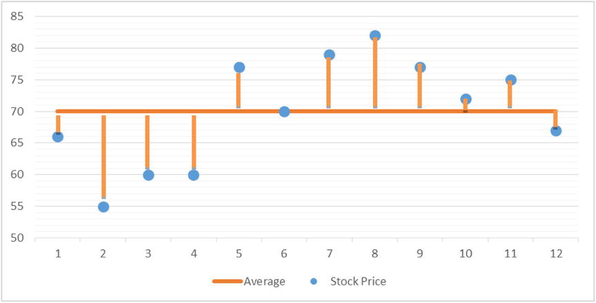
Figure 6-4. Deviations from the mean; stock prices for a startup company
The average stock price is almost $70. The deviation of day 1 from average is 4, and the deviation of day 2 is 15. This deviation from the mean at each point is a good indicator of dispersion. Interestingly, the sum of all such deviations always comes to zero. This inference is obvious because the mean is in the middle and the other values are dispersed above and below the mean line.
A squared deviation is the next best option. The squared deviation average of all the points is called variance, and it quantifies the dispersion perfectly. Less dispersion in the variable means the variable is taking almost the same value at each point. This amounts to a deviation close to zero. Squared deviation will also be close to zero, and it can be concluded that variance is very low. The variance for the last 12 days in this particular stock is 67 (Table 6-18).
Table 6-18. Squared Deviation for the Stock Prices
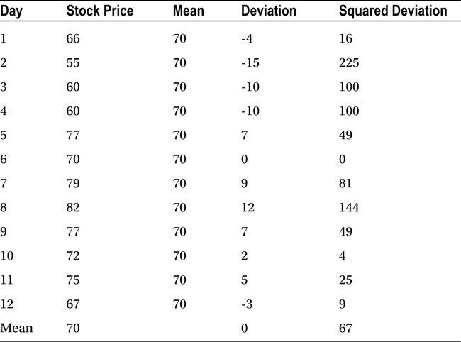
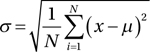
Variance is the mean of squared deviations from the mean. This average squared deviation from the mean is the most widely used measure of dispersion. We consider each point xi while calculating variance, which is the reason why it is an effective measure of dispersion.
![]()
In this formula,
- N is total number of observations.
- xi is the ith value of x.
- μ is the mean of variable x.
Similarly, the variance for a different stock (Table 6-19) with daily values is 413.
Table 6-19. Stock Prices for a Startup Company, Another Example

![]() Note Although variance is a good measure for quantifying the dispersion, it poses a challenge with regard to applying units of measures to the calculated numeric values.
Note Although variance is a good measure for quantifying the dispersion, it poses a challenge with regard to applying units of measures to the calculated numeric values.
In the example in Table 6-18, variance is 67. Is it 67 square dollars? Would a businessperson understand it? Several other variables such as number of customers (square customers), age (year square), and so on, do not make sense. They have to be brought back to the original form of units after calculating variance. Since variance is the average squared deviation, a square root of that value will be in the same units as the original variable. That is called standard deviation.
Standard deviation is the square root of variance, as expressed by this formula:
This measure also helps in comparisons because the unit is the same as in the original unit of the variable. The standard deviation in the stock price example is sqrt(67) = 8.2. This means there is an $8.2 deviation from the mean stock price of $70.
Calculating Dispersion Using SAS
SAS gives convenient procedures to calculate the measures of dispersion. We will show you some examples to help you understand. What follows is the code for calculating variation on the list price:
Proc means data=online_sales var;
var listPrice;
run;
Refer to Table 6-20 for the variance given by this code.
Table 6-20. Variance for online_sales
|
Analysis Variable : listPrice |
|---|
Variance |
112006391 |
The following code calculates the standard deviation on the variable list price:

Proc means data=online_sales std ;
var listPrice;
run;
Refer to Table 6-21 for the variance given by this code.
Table 6-21. Variance for online_sales
|
Analysis Variable: listPrice |
|---|
StdDev |
|
10583.31 |
Determining whether the variance is high or low is not possible simply by looking at variance. The magnitude of the variable will make sense only when it’s compared with the original variable units. For example, a variance of 1,000 may be insignificant if the average variable value is in millions. The following code calculates the standard deviation on the list price for every brand:
/* SD in list price for each brand */
Proc means data=online_sales std ;
var listPrice;
class brand;
run;
Refer to Table 6-22 for the output of this code.
Table 6-22. Output of proc means on online_sales Data Set (Brandwise Standard Deviation)
|
Analysis Variable : listPrice | ||
|---|---|---|
Brand |
N Obs |
StdDev |
|
Acer |
1 |
. |
|
AirTyme |
90 |
0 |
|
Airtyme |
89 |
133.04 |
|
Apple |
146 |
7290.86 |
|
Arise |
161 |
493.21 |
|
BlackBerr |
201 |
10270.17 |
|
Blackberr |
18 |
6220.25 |
|
Canon |
3 |
351.48 |
|
Fujifilm |
11 |
3579.65 |
|
HTC |
469 |
9039.04 |
|
Htc |
38 |
0.00 |
|
Huawei |
8 |
2127.74 |
|
IBall |
108 |
4485.59 |
|
Intel |
1 |
. |
|
Intex |
26 |
0.74 |
|
Karbonn |
299 |
1866.15 |
|
LAVA |
4 |
52.00 |
|
LG |
361 |
7024.66 |
|
Lava |
25 |
198.36 |
|
Lemon |
1 |
. |
|
MICROMAX |
19 |
0.00 |
|
MOTOROLA |
19 |
0.00 |
|
Micromax |
579 |
1919.67 |
|
Motorola |
259 |
5992.82 |
|
Nikon |
23 |
4891.98 |
|
Nokia |
683 |
8026.02 |
|
Olympus |
4 |
0.00 |
|
Samsung |
956 |
11870.12 |
|
Sony |
355 |
7297.27 |
|
Sony Eric |
62 |
1909.80 |
|
Soyer |
7 |
0.00 |
|
Spice |
80 |
871.76 |
|
Videocon |
13 |
786.43 |
|
Xolo |
6 |
479.26 |
|
Zen |
4 |
0.00 |
It can be inferred by Table 6-22 that Samsung has sold mobile phones of different price ranges, and hence the standard deviation is high for this brand. This is partly because of the number of items sold by that brand. Micromax has a relatively low (zero in fact) standard deviation when compared to other brands.
EXAMPLE OF A HEALTHCARE CLAIM
Consider a healthcare insurance company that has collected claims data over a period of time. Here are the variables:
- Patient_id: Patient ID
- Patient_Age: Patient age
- Days_admitted_hosp: Number of days spent in the hospital
- Num_medical_bills_submitted: Number of medical bills submitted
- Claim_amount: The claim amount
The following is the SAS code and analysis on central tendencies and dispersion of the claim amount. Refer to Table 6-23 for the output.
Proc means data= health_claim  ;
var Claim_amount;
run;
Table 6-23. Output of proc means on health_claim data set
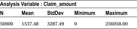
The mean claim amount is $1,537. The maximum claim amount is $256,058. The standard deviation in claim amount is $3,287.5.
The following is the code for the mean and median:
Proc means data= health_claim  meanmedian;
var  Claim_amount;
run;
Refer to Table 6-24 for the output of this code.
Table 6-24. Mean and Median for claim_amount data set
|
Analysis Variable : Claim_amount | |
|---|---|
|
Mean |
Median |
|
1537.48 |
438.00 |
There are definitely some outliers. The mean value is far away from median. Chapter 7 will discuss how to deal with outliers.
This chapter so far discussed some of the measures that give an overall picture of variables. Mean indicates the average value, whereas the variance and standard deviation indicate dispersion. There are a few additional measures, such as quantiles, that help you get a comprehensive understanding of a variable. Quantiles help you better understand the distribution of a variable. In SAS, you use univariate analysis to get quantiles and box plots, which are covered in the following sections.
Quantiles are simply identical fragments. Examples of quantiles are percentiles, quartiles, and deciles, which will be discussed in this section. A percentile is a result of breaking the variable values into 100 pieces.
For example, consider the marks of 20 students in ascending order (Table 6-25).
Table 6-25. Marks for 20 Students

Here, the median is 56.5, and the student who is close to average is S9. This means that S9 is almost at the 50 percent mark of the population (Table 6-26).
Table 6-26. The Median for Population

- Which student is at 100 percent? Remember that it is the 100 percent position value that is relevant here, not the 100 marks. The whole variable is divided into 100 parts, and each part is called a percentile. Now consider Tables 6-27 and 6-28 and the following list to better understand percentiles, and two other terms, deciles and quartiles:
- What value is at the 100th percentile? Is it the maximum value, that is, 75?
- What value is at the 50th percentile? Is it the median value, 56? This means 50% of the cases are less than 56 and rest 50% are more than 56.
- What value is at the 10th percentile? Since there are 20 pieces here, each piece contributes 5% percent in the overall variable, so the 10th percentile is the second one, that is, i.e., 37. This means 10% of the cases are less than 37 and rest 90% are more than 37.
- The 70th percentile is the 14th value, that is, i.e., 63. This means 70% of the cases are less than 63 and rest 30% are more than 63.
- A decile is 1/10th part of the variable, and in this example the first decile equals the 10th percentile (37), and the second decile equals the 20th percentile (40).
- A quartile is a 1/4th part of a variable. In this example, the first quartile equals the 25th percentile (40). The second quartile equals the 50th percentile, which is the median, and it equals the 5th decile (56). The third quartile equals the 75th percentile (66).
Table 6-27. Different Percentile Values for the Population

Table 6-28. Different Quartile Values for the Population

The first and the second quartiles are also known as the lower and upper quartiles, respectively. The difference between lower and upper quartiles is called inter quartile range (Table 6-29). It gives you an idea about the middle 50 percent values range.
Table 6-29. Inter Quartile Range

Inter quartile range = 66 – 40 = 26
This interquartile range is a useful measure in identifying outliers. In the example in Table 6-29, the overall range is 75 – 35 =40, whereas the interquartile range, that is, the middle 50 percent range, is 26, which looks right. Now consider the example given in Table 6-30.
Table 6-30. Another Example of Inter Quartile Range

Inter quartile range = 59 – 46 =13
This indicates that the middle 50 percent of the values are within the range of
13. The overall range is 99 – 35 = 64. The following additional inferences can be drawn for Table 6-30:
- The least 25 percent values are in the range of 11 (46 – 35).
- The middle 50 percent values are in the range of 13.
- The highest 25 percent values are in the range of 99 – 59 = 40, which indicates that there are some unusually high values in the top 25 percent.
What would the scenario be if there were just ten students (Table 6-31)? This is how the first quartiles can be found: The first quartile falls between the second-ranked and third-ranked values. In such a case the quartile is calculated by taking the average. The third quartile falls between the seventh-ranked and eighth-ranked values.
Table 6-31. Quartiles with Only Ten Observations

First quartile = (37 + 37) / 2 = 37
Third quartile = (52 + 54) /2 = 53
Calculating Quantiles Using SAS
The following code yields some of the important quantiles. Box plots, which are discussed in the next section, can also be plotted using univariate analysis, which you use to get quantiles.
Here is the code for obtaining quantiles for the list price in the online sales example:
Proc univariate data= online_sales  ;
var  listPrice ;
run
 ;
Proc univariate offers several other measures about a variable. This section will consider only the quantiles tables in the output (Table 6-32).
Table 6-32. Quartiles from the Output of Proc univariate on online_sales
|
Quantiles (Definition 5) |
|
|---|---|
Quantile |
Estimate |
|
100% Max |
139990 |
|
99% |
44500 |
|
95% |
35198 |
|
90% |
28590 |
|
75% Q3 |
15302 |
|
50% Median |
8399 |
|
25% Q1 |
4110 |
|
10% |
1559 |
|
5% |
999 |
|
1% |
849 |
|
0% Min |
849 |
The minimum list price is $849, and the maximum is $139,990. The 25th percentile, or the first quartile, is $4,110. The third quartile value is $15,302. The interquartile range is 15,302 – 4,110 = 11,192. The quantiles also show that 99 percent of the items list price is less than or equal to $44,500. The maximum value of $139,990 looks much bigger than 99% value i.e $44,500. There is a clear indication of outliers. In later sections we will introduce a measure to identify the outliers.
HEALTH CLAIM EXAMPLE
Given in Table 6-33 is the output taken from a healthcare data set. The code to perform a univariate analysis on health claim data follows:
Proc univariate data= health_claim ;
var Claim_amount ;
run;
Table 6-33. Quartiles for health_claim Example
|
Quantiles (Definition 5) |
|
|---|---|
|
Quantile |
Estimate |
|
100% Max |
256058 |
|
99% |
11428 |
|
95% |
6149 |
|
90% |
4368 |
|
75% Q3 |
2044 |
|
50% Median |
438 |
|
25% Q1 |
0 |
|
10% |
0 |
|
5% |
0 |
|
1% |
0 |
|
0% Min |
0 |
The output in Table 6-33 shows that 25 percent of the customers claimed nothing, and 50 percent of the customers claimed $438. Ninety-five percent of the customers claimed $6,149 or less, so the rest of the customers, who make up 5 percent, seem to have an unusual claim amount. Performing an excess scrutiny of these 5 percent customers might be in order. Elements such as their number of medical bills, type of disease, and so on, might need to be examined.
Box Plots
Box plots indicate outlier values in a variable. A box plot is a graphical representation of the quartiles and minimum and maximum values. Box plots make it easier to interpret the distribution of a variable. A box plot is illustrated in Table 6-33 using the example data given in Table 6-34.
Table 6-34. An Example Population

A box plot shows these values:
- Minimum value
- First quartile value
- Median value
- Second quartile value
- Maximum value
Figure 6-5 illustrates a box plot based on the data shown in Table 6-34.

Figure 6-5. The box plot for Table 6-34
If there are rare values in the variable very different from the others, they will appear at either the upper or lower end of the box. The outliers are glaringly visible in a box plot. The plot given in Figure 6-6 shows that all the values are well distributed. There are no outliers in this variable.
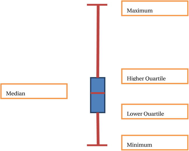
Figure 6-6. A Boxplot without outliers
For example, in Table 6-35 a few of the values are much beyond the median and very far from the third quartile. The box plot looks like Figure 6-7.
Table 6-35. An Example Population with Outliers

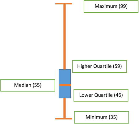
Figure 6-7. The box plot for Table 6-35
An easy way to identify the outliers is to look at the interquartile range. If there are values beyond three times the interquartile range, they can be considered as outliers (Figure 6-8). In this example, the interquartile range is 59 – 46 = 13, but there are values beyond 59 + 3 * (13) = 59 + 39 = 98. Therefore, the values 98 and 99 are outliers in the data.
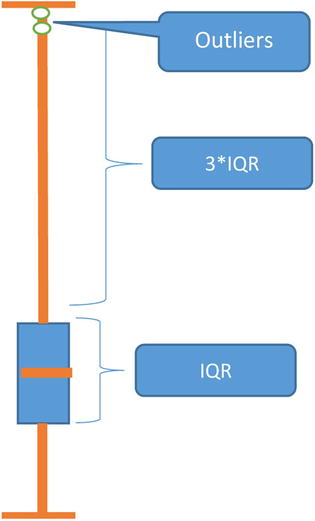
Figure 6-8. Identifying outliers using a box plot
As discussed earlier, univariate analysis gives several values in the output. This section will consider only the box plots. Adding a plot option to univariate code is all that it requires. The example code is given next:
Proc univariate data= health_claim  plot;
var  Claim_amount ;
run;
The resulting quantiles and box plot are shown in Table 6-36 and Figure 6-9, respectively.
Table 6-36. Quantiles Table for the Health Claim Example (claim_amount)
|
Quantiles (Definition 5) | |
|---|---|
Quantile |
Estimate |
|
100% Max |
256058 |
|
99% |
11428 |
|
95% |
6149 |
|
90% |
4368 |
|
75% Q3 |
2044 |
|
50% Median |
438 |
|
25% Q1 |
0 |
|
10% |
0 |
|
5% |
0 |
|
1% |
0 |
|
0% Min |
0 |
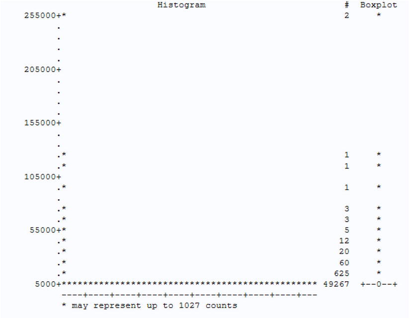
Figure 6-9. Box plot for the health_claim data set (claim_amount)
The graph in Figure 6-9 shows that the whole box (first quartile and median and third quartiles) is right at the bottom. This is because there are some high-side outliers. The first step is to remove all values that are high-side outliers and redraw the box plot. Consider only the first 95 percent of the population, that is, all the customers with a claim amount less than $6,149. The 95 percent value can be found from the quantiles table (Table 6-36).
This code shows a condition on claim amount:
Proc univariate data= health_claim  plot;
var  Claim_amount ;
where  Claim_amount<6149;
run;
The box (Figure 6-10) can now be seen after ignoring outliers.
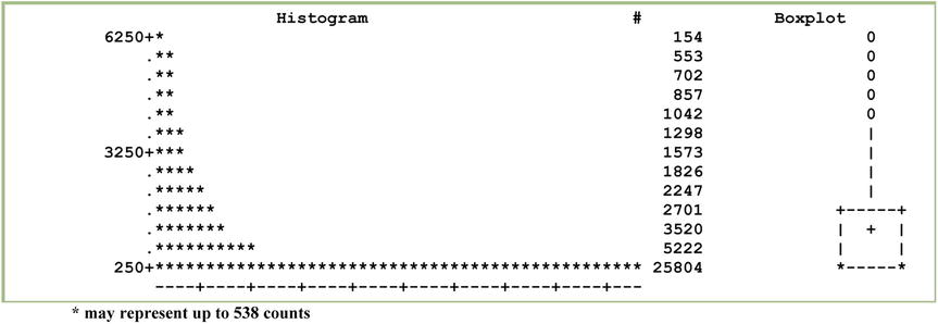
Figure 6-10. Box plot for claim amount after ignoring the outliers
The following code creates a box plot for online sales data:
Proc univariate data= online_sales plot ;
var  listPrice ;
run;
Figure 6-11 is the resulting box plot.

Figure 6-11. Box plot for listPrice
There are some outliers again (Table 6-37).
Table 6-37. Quantiles Table for the Health Claim Example (listPrice)
|
Quantiles (Definition 5) | |
|---|---|
|
Quantile |
Estimate |
|
100% Max |
139990 |
|
99% |
44500 |
|
95% |
35198 |
|
90% |
28590 |
|
75% Q3 |
15302 |
|
50% Median |
8399 |
|
25% Q1 |
4110 |
|
10% |
1559 |
|
5% |
999 |
|
1% |
849 |
|
0% Min |
849 |
Consider the values up to 99 percent to see the box. The elimination and treatment of the outliers are discussed in detail in Chapter 7. This example simply removes outliers and redraws the box plot (Figure 6-12) to show the box clearly. Consider the following code:
Proc univariate data= online_sales plot ;
var  listPrice ;
where listPrice<44500;
run;
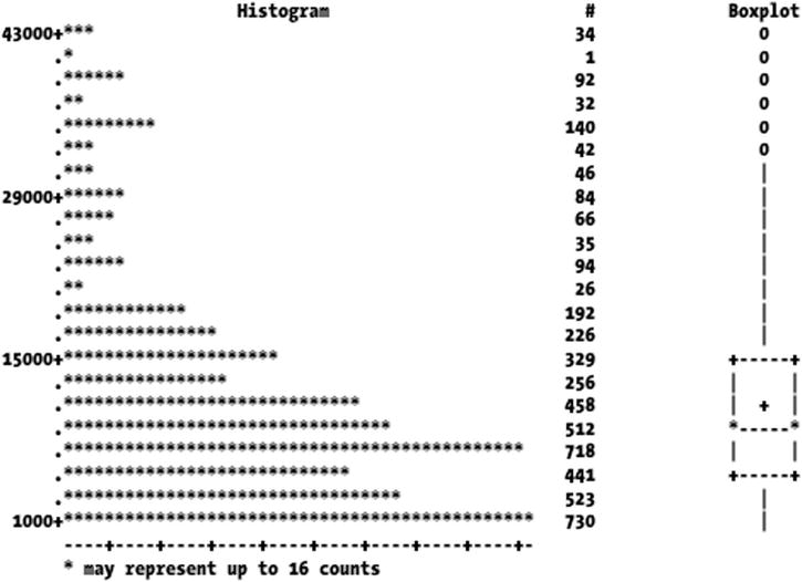
Figure 6-12. Box plot for listPrice after removing outliers
The box now looks better distributed around the population after removing outliers.
You have examined one variable at a time so far. Bivariate analysis analyzes two variables together. It answers questions such as what the association between two variables is, what happens to the other variable when one increases, and so on. Here are some examples:
- If the number of study hours increases, do the exam grades increase too?
- If the number of church buildings increases, does the crime rate decrease?
- If the numbers of cars increase, does the average age decrease?
Correlation is used to quantify the association between two variables. Correlation is one of the most used methods to carry out bivariate analysis. Subsequent chapters will discuss correlation.
Conclusion
In this chapter, you learned how to do some basic reporting on data and analyze variables using some very basic statistical techniques. You also see how univariate analysis can be useful in analyzing variables. Until recently, even this much of statistical analysis was considered good enough. Things have changed a lot in the past few years. Now much more advanced and sophisticated data analysis tools and techniques are employed as an aid to executive decision making. In the coming chapters, we will take you through some classical and advanced data analysis techniques. You will appreciate how easy these otherwise complex techniques become when you deploy SAS as your primary data analysis tool.