
Chapter 6
Predictive Analytics in Action
The best way to predict the future is to create it.
—Abraham Lincoln
In Chapter 5, the vice president (VP) of human resources (HR) asked you to produce measures that would help determine the effectiveness of the Retain & Grow initiative. After several iterations and brainstorming sessions, you both agreed on a set of metrics and how to display them for your business leaders.
This chapter focuses on the actions that happened between the meetings—in particular, how you gathered the data and began to analyze it using graphs and dashboards. This chapter also explores how to link different data sets and how to apply predictive analytics to create information for stakeholders.
FIRST STEP: DETERMINE THE KEY PERFORMANCE INDICATORS
The key performance indicators (KPIs) were developed in Chapter 4 through conversations with the VP, and you segmented the data into three types of measures: efficiency, effectiveness and outcomes. Now comes the sometimes onerous task of gathering the data.
Because the process has many measures and many steps, it is useful to create a tracking tool that contains all of the KPIs and various pieces of information about the measures that will help you gather them the first time and in the future. That tool might include this information:
- In which department does the data reside?
- Who is the gatekeeper or owner of the data?
- Is it sensitive information?
- If so, what approvals are necessary to gain access?
- What type of data is it (e.g., nominal, ordinal, interval ratio, qualitative versus qualitative)?
- What is the format of the data (e.g., HTML, text, comma delimited, etc.)?
- Is there a standard process for requesting the data?
- What is the standard turnaround time for a request?
Exhibit 6.1 shows a typical data tracking tool. The KPIs are listed in the left-hand column, and the tracking information is listed in the columns to the right.
Exhibit 6.1 Data Tracking Tool
| Key Performance Indicators | Where does the data reside? | Gatekeeper/Owner | Sensitive info (Y/N)? | What approvals required? | What is the standard process for requesting data? | Turnaround time for requests? | Qualitative or quantitative? | Data type (Nominal, ordinal, interval, ratio) |
| Efficiency | ||||||||
| Number of open reqs | ||||||||
| Positions filled/month | ||||||||
| Time to fill positions | ||||||||
| Salary associated with positions | ||||||||
| Cost to hire new resource | ||||||||
| Effectiveness | ||||||||
| Performance ratings at 90 days & 365 days | ||||||||
| ID high potentials | ||||||||
| Assessment results | ||||||||
| Speed to competency | ||||||||
| Sponsor satisfaction | ||||||||
| Exit survey results | ||||||||
| Outcomes | ||||||||
| Engagement survey results | ||||||||
| Productivity | ||||||||
| Retention/turnover at 90 & 365 days | ||||||||
| Profitability |
Communications
Because other people in the organization own the data, often it is necessary to file a formal request for the data. Do not be surprised if you have to get one or several approvals before gaining access to the data. Sometimes a formal meeting among all of the relevant stakeholders is all that is necessary to get approvals. Other times it may be necessary to write a formal request, provide a rationale for the project, and demonstrate how the data will be used once it is analyzed. Because individual confidentiality is essential to managing risk for an organization, often it is necessary to state that no individual names, or results from individuals, will be reported. Some organizations require that results be reported in groups no smaller than three or five people to help maintain confidentiality.
When data requests are common, the information technology (IT) organization often has a process for submitting a request. That request might include such things as sponsor, purpose, and requestor as well as all of the details about the data. Exhibit 6.2 shows an example of a data request.
Exhibit 6.2 Data Request Template
| Client: | Internal Business Owner: | Client Business Owner: |
|---|---|---|
| Extract ID: | Internal Due Date: | Client Due Date: |
| Please complete all of the fields below. | ||
| Any additional detail or examples will be helpful in ensuring that the extract meets the client’s needs | ||
| Business Case/Use Description of what the data will be used for and how it will be consumed. Use this field for additional notes. |
|
| Frequency—How often this extract will be run (monthly, quarterly, etc.). | |
| Date Range—The dates over which the report will be run. Specify if this is NOT based on reporting dates. | |
| Required Columns—Include all columns you wish to appear in the extract as they should be named in the extract. Do not write “same as data download”. Provide description if the column name does not clearly define the data it contains. | |
| Data Rights—Provide the user login or other method of determining what data to include in the report. | |
| Filters—If the data is limited beyond dates and data rights, list all other filter items. | |
| Column Delimiter—Provide the character to be used as a delimiter (“,”,”|”, etc.). | |
| File Output Format—Include all formatting information (default is Unicode). | |
| Output File Name—Name of file, including YYMMDD notation to ensure uniqueness over multiple runs. | |
| Data Validity Tests—List MTM reports or other data that can be used to test whether extract is correct. | |
| FTP Folder/Drop—Where the file should be placed or sent when completed. |
Formatting the Data for Analysis
Whether the data set is large or small, it often comes in a package that needs a little unwrapping. First, it may be a string of numbers in rows separated by columns, pipes, or some other delimiters that mark the beginning and end of a column. (See Exhibit 6.3.) This file is useless unless it can be separated into rows and columns. MS Excel and MS Access have import features that allow users to open and align such files. Second, the file structure may be a vertical file (see Exhibit 6.4) with only a few columns and many rows or a cross-tab format (see Exhibit 6.5). A vertical file is great for storage and for using a tool like Pivot Tables in MS Excel. For more advanced analytics, a cross-tab structure is needed, wherein each row is a case (e.g., person) and each column is a variable (e.g., question on a survey). A transformation is required to convert a vertical file into a cross-tab file. MS Access is a capable tool for the conversion.
Exhibit 6.3 Delimited Data File

Exhibit 6.4 Vertical Display of a Data Set
| Course Type | Learning Method | Student Email | Question | Question Category | Answer | Entered Date | Answer Type |
| Uncategorized | Instructor Led | [email protected] | I learned new knowledge and skills from this training | Learning Effectiveness | 2.333333333 | 27-Feb | Likert |
| Uncategorized | Instructor Led | [email protected] | I will be able to apply the knowledge and skills learned in this class to my job. | Job Impact | 2.333333333 | 27-Feb | Likert |
| Uncategorized | Instructor Led | [email protected] | This training will improve my job performance. | Business Results | 2.333333333 | 27-Feb | Likert |
| Uncategorized | Instructor Led | [email protected] | This training was a worthwhile investment in my career development. | Return on Investment | 2.333333333 | 27-Feb | Likert |
| Uncategorized | Instructor Led | [email protected] | This training was a worthwhile investment in my career development. | Return on Investment | 2.777777778 | 30-Mar | Likert |
| Uncategorized | Instructor Led | [email protected] | I learned new knowledge and skills from this training. | Learning Effectiveness | 2.333333333 | 30-Mar | Likert |
| Uncategorized | Instructor Led | [email protected] | This training was a worthwhile investment in my career development. | Return on Investment | 2.333333333 | 18-Apr | Likert |
| Uncategorized | Instructor Led | [email protected] | I learned new knowledge and skills from this training. | Learning Effectiveness | 2.333333333 | 18-Apr | Likert |
| Uncategorized | Instructor Led | [email protected] | I learned new knowledge and skills from this training. | Learning Effectiveness | 2.333333333 | 20-Mar | Likert |
| Uncategorized | Instructor Led | [email protected] | This training was a worthwhile investment in my career development | Return on Investment | 2.333333333 | 20-Mar | Likert |
Exhibit 6.5 Cross-Tab Display of a Data Set

At this time, it is worth describing the actual data that we have collected for our example. Exhibit 6.6 shows each measure and describes the nature of the data and how it was collected.
Exhibit 6.6 Definitions of Metrics
| Measures | Data type | How data are collected |
| Efficiency | ||
| Time to fill open positions | Time in days to hire new hire X | Tracked in the Talent Management System: Recruiting Module |
| Salary associated with positions | Monetary value: Salary for new hire X | Talent Management System |
| Cost to hire the new resource | Monetary value: Salary plus administrative costs of hiring | Talent Management System |
| Number of open requisitions | Not included in this analysis which focuses on the new hires rather than the recruiter | N/A |
| Positions filled per month | Not included in this analysis which focuses on the new hires rather than the recruiter | N/A |
| Effectiveness | ||
| Performance Ratings at 90 days & 365 days | Numeric value ranging from 1 to 9 1 = Low potential/low performance 5 = Moderate potential/as expected performance 9 = High potential/high performance |
Data are collected at 90 days and during the annual review process via an organizational survey |
| Identification of high potentials | Yes or No rating | Based on 90-day performance rating |
| Assessment results | Numeric value ranging from 1 to 5 | Gathered from a competency assessment instrument as the overall level of competence for the technical role of the new hire |
| Speed to competency | Time in days for new hire to demonstrate competency with job tasks | Determined by the new hire’s manager; captured in the Talent Management System |
| Sponsor satisfaction–leader input | Numeric value ranging from 1 to 5 | Business unit leader’s rating of the performance quality of the new hire; collected during the annual performance review via organizational survey |
| Exit survey results | Numeric value ranging from 1 to 5 | Response to the question, “Would you recommend this organization to a friend or family?” |
| Outcomes | ||
| Engagement survey results | Numeric value ranging from 1 to 5 | Response to the question, “Overall, I am thriving in my role.” |
| Productivity | Percentage value ranging from 0 to 100% | This value is based on hours of work performed for clients as percentage of total time worked. |
| Retention/Turnover within 90 or 365 days | Yes or No | Departure from the organization is tracked in the Talent Management System |
| Profitability | Calculated value | (Productivity % − 50%) × Salary = estimated profitability per person |
SECOND STEP: ANALYZE AND REPORT THE DATA
Once the data set is structured into a usable file format, the process of data analysis begins. Statistical analysis is generally divided into two types: Descriptive and inferential.
- Descriptive statistics describe the data by using statistical terms that have become common in day-to-day language, such as the number of responses, the mean or average, the standard deviation, or a frequency distribution. Descriptive analysis is necessary to understand the data.
- Inferential statistics search for relationships among variables using techniques like correlation and regression. Inferential statistics also test for differences between groups using t-tests and analysis of variance, among other techniques. Based on the results of the statistical test, the analyst infers that the relationship (or difference) is true for the cases in the sample but also generalizable to the entire population. Predictive analytics is an extension of inferential statistics because inferential techniques are used to predict future values.
Exhibit 6.7 shows a basic analytics plan for each of the measures in our example. The majority of the work outlined in this table focuses on descriptive statistics—computing N counts, averages, or 9-box ratings for each business unit or level. These results are necessary to describe the current state of the organization using the KPIs.
Exhibit 6.7 Basic Analytics Plan
| Measures | Descriptive | Display: Graphs for Dashboards | Inferential |
| Efficiency | |||
| Number of open requisitions | N count of open requisition by business unit or level | Line chart by business unit or level | ANOVA: compare across business units or levels |
| Positions filled per month | N count of filled positions per month by business unit or level | Line chart by business unit or level | ANOVA: compare across business units or levels |
| Time to fill open positions | Average amount of time in days; also display outliers high and low | Bar chart of average time to fill by business unit or level | ANOVA: compare across business units or levels |
| Salary associated with positions | Average salary (possibly standard deviation) by business unit and level | Box and whisker chart displaying average salary and standard deviation or quartiles | ANOVA: compare across business units or levels |
| Cost to hire the new resource | Average cost to hire (possibly standard deviation) by business unit and level | Box and whisker chart displaying average cost and standard deviation or quartiles | ANOVA: compare across business units or levels |
| Effectiveness | |||
| Performance Ratings at 90 days & 365 days | Percentages within each of the 9 boxes | 9-box (3x3) display | ANOVA: compare across business units or levels |
| Identification of high potentials | Percentage of 6–9 ratings | Bar chart by business unit or level | ANOVA: compare across business units or levels |
| Assessment results | Average of assessment scores by competency; highlight strengths and gaps | Bar chart by business unit or level | ANOVA: compare across business units or levels |
| Speed to competency | Average amount of time to demonstrate competence | Bar chart by business unit or level | ANOVA: compare across business units or levels |
| Sponsor satisfaction–leader input | Average response to each survey question | Bar chart by leader | ANOVA: compare across leader |
| Exit survey results | Average response to each survey question | Bar chart by business unit or level | ANOVA: compare across business units or levels |
| Outcomes | |||
| Engagement survey results | Average response to each survey question | Bar chart by leader or business unit | ANOVA: compare across leaders or business units |
| Productivity | Average number of chargable hours (or widgets produced) | Bar chart by leader or business unit | ANOVA: compare across leaders or business units |
| Retention/Turnover within 90 or 365 days | Average turnover percentage at 90 and 365 days | Bar chart by business unit or level | ANOVA: compare across business units or levels |
| Profitability | Average Revenue | Bar chart by business unit or level | ANOVA: compare across business units or levels |
Inferential statistics are also noted in Exhibit 6.7. For all cases, the analytic technique is analysis of variance (ANOVA). It is used to compare the averages across groups, such as business units or levels. While statistical tests are not always necessary, they can be useful. When the results are shared with stakeholders, someone will likely ask, “Is that difference among groups statistically significant?” If the ANOVA test has been completed, that question can be answered yes or no with authority. It is also worth noting that practical significance is also important. A statistically significant difference may not be meaningful. For example, the turnover rates among three business units might be 8.6%, 9.1%, and 8.8%. An ANOVA test might find that the differences in turnover among the three business units are significant because the business units are so large. (As samples increase in size, the likelihood of finding a statistically significant difference increases). However, these rates are relatively low, and they are still close to each other. A “real” or meaningful difference might be 5% or 10%. Stakeholders will help determine those meaningful differences though discussion.
Additional inferential and predictive statistics will be discussed later in the chapter.
For now, look back to Chapter 4 and the exhibits shown there. The results are displayed at the highest level of aggregation. The next step is to build additional graphs for each metric that reflect values for each business unit. Exhibit 4.1 shows the number of open positions and the number of positions filled by month for the quarter. Exhibits 6.8 and 6.9 show these metrics in more detail by business unit. Exhibit 6.10 shows the average cost per hire for each business unit.
Exhibit 6.8 Open Positions by Business Unit in Quarter
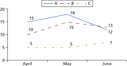
Exhibit 6.9 Average Number of Days to Fill a Position
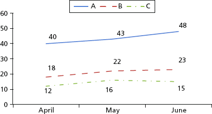
Exhibit 6.10 Average Cost per Hire for Each Business Unit
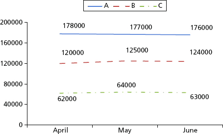
In a step-by-step process, the data analysis plan in Exhibit 6.3 can be completed for each measure. Graphs like those in Exhibits 6.8 through 6.10 should be created to display the data visually. After the preferred displays have been selected by stakeholders, the static graphs should be transformed into dashboards that will be available for stakeholders on demand and will automatically update with new information.
To complete the analysis plan, the results should be tested for statistical significance. Several software packages are available, such as Minitab, MS Excel, SPSS, SAS, and R. The statistical analysis can be complex. If you do not have the skills, find a business analyst in your organization who does or hire an external contractor. Although the statistical analysis itself may be complex, displaying the results should not be complicated. If there are statistical differences between groups, simply add an asterisk (∗) or some form of color coding to the chart to denote the statistical difference. Add a legend at the base of the graph that clarifies the test, such as “Business unit A is significantly greater than business unit B.” Finally, information should lead to action. So, when presenting the results to stakeholders, it is best to highlight meaningful differences that leaders can act on.
RELATIONSHIPS, OPTIMIZATION, AND PREDICTIVE ANALYTICS
The practical value of descriptive statistics is that they provide a good view of the current state. That view often spurs good discussion about the relationships among the data. Moreover, discussions lead to questions. And questions turn into hypotheses that can be tested.
Based on the analysis we have performed in Chapter 4 and Exhibits 6.8 through 6.10, some simple questions arise:
- Why is business unit A hiring more people than units B and C?
- Why is it taking longer to hire people in business unit B?
- Why are salary costs so much higher for business units B and C?
These questions are often easy to answer based on the nature of the business. Business unit A is hiring more people than units B and C because unit A is developing a new product line and needs more engineers. Business unit B is taking longer to hire people because the requisitions are for senior leaders who are scarce and hard to find. For business unit C, salary costs are low because most positions are not highly specialized technical roles.
The data may highlight the differences, but discussions with stakeholders make the results meaningful.
Dashboard results often spur stakeholders to ask a what-if set of questions.
- What if we look outside of our geographic region?
- What if we lowered the standards in the hiring criteria?
- What if we offered higher salaries?
- Would any of these changes lead to improvements in the efficiency measures?
- What is the monetized benefit of reducing time to hire?
These what-if questions are valuable. Leaders ask them so they can manage the business more efficiently. They should also ask similar questions for improving effectiveness measures. This process puts the Boudreau and Ramstad Optimization Model into practice.1 (See Exhibit 6.12). By adjusting the efficiency and effectiveness measures, stakeholders can optimize the performance of the organization.
Exhibit 6.12 Correlation Values between GPA and ACT/SAT Scores: Auburn University
Source: Cappex.com About.com College Admissions. Used with permission.

PREDICTIVE ANALYTICS
At this point, when current data spur what-if questions, we begin venturing into the realm of predictive analytics. If X (efficiency) and Y (effectiveness) inputs change, what will happen to Z (business outcomes)? This model applies for all aspects of the business, including HR. If Unit B lowers its hiring standards (effectiveness), it will increase its efficiency (time to hire). But there may be unexpected consequences of efficient hiring. In the long run, lower-quality hires might produce less effective outcomes (lower-quality product or less innovative products). The “fast” hire, rather than the “best” or “good enough” hire, may not have the management skills necessary for promotion, creating a gap that needs to be filled with skill development or a new hire.
Predictive analytics is based on relationships among variables, and its aim is to answer difficult questions, such as: If X and Y inputs change, what will happen to Z? Using currently available data, the future can be predicted—sometimes with great certainty.
Considering the data that is available in Exhibit 6.11, we can use inferential statistics to understand the relationships among efficiency, effectiveness and outcomes. Insights can be gained simply by looking at graphs of the results (e.g., longer hiring cycles for Unit A lead to faster speed to competency and better quality), but there are several benefits of predictive analytics. The analysis:
Exhibit 6.11 Data Set for Predictive Analytics

- Isolates the best predictors and eliminates those that have no influence
- Quantifies the influence of predictors—determines how much the predictor makes the outcome measure rise or fall
- Provides a mathematical model to describe the current state
- Predicts future values
Exhibit 6.11 is the data set for the predictive analysis performed in the rest of the chapter.
Data analysis begins with a plan. In this case, the plan is to examine the relationships among efficiency, effectiveness, and outcome variables. The plan starts at the highest level by including all cases in the analysis and then moves toward analyzing subgroups, such as business units A, B, and C or campus hires (e.g., new graduates) versus experienced hires (e.g., candidate with job experience). Three analytic techniques are recommended:
- Correlation
- Regression
- Structural equation modeling
Correlation is the simplest of the three techniques. It examines the relationship between two variables. It answers the question: If X increases in value, what happens to Y? If X increases by 1 and Y increases by 1, there is a perfect positive relationship. A correlation is described by the statistic r, which ranges from −1 to + 1. A zero value indicates no relationship. A −1 indicates that Y decreases proportionally as X increases. A +1 indicates that Y increases proportionally as X increases.
Thinking back to high school, the correlation between an individual’s grade point average (GPA) and his or her standardized test score (e.g., American College Testing (ACT) score and Scholastic Aptitude Test (SAT)) is high. That is, if students have a high GPA, they are likely to score high on the SAT. There is not a perfect relationship for many reasons: Some high performers in school do not do well on standardized tests; some high school curricula are harder than others; some teachers give higher grades than others. Regardless of the reasons, there is still a strong relationship between the two scores. Similarly, we can expect that there should be a strong relationship between hiring time and hiring quality for a business unit (e.g., more time equals better quality).
Exhibit 6.12 shows the correlations between GPA and ACT/SAT scores for applicants to Auburn University in 2012. This graph is full of information. It shows the scatter plot of ACT/SAT scores and GPA scores. There is clearly a relationship here. Students with lower ACT/SAT scores often have lower GPAs; likewise, students with high ACT/SAT scores have high GPAs. Additionally, this graph reflects which students were accepted, denied, wait-listed, and accepted but won’t attend. In this graph, the decision (accept/reject) is already displayed.
Interestingly, the graph shows the ACT/SAT scores on the X axis and the GPA scores on the Y axis. This implies that ACT/SAT scores are influencing GPA. Since GPAs are often measured before ACT/SAT scores, they could be graphed on the X axis. This brings up an important point about correlations. They simply quantify the relationship between two variables. While a correlation implies that X causes Y, it may or may not. Think about heart disease for a moment. Age is correlated with heart attacks, but getting older is not the cause. A leading cause is an unhealthy diet and consequential weight gain. Both lead to atherosclerosis (blockage in the arteries of the heart). When the heart receives a limited blood supply and starves for oxygen, it fails. Correlation implies causation, but it does not equal causation. Exhibit 6.13 represents the correlation between GPA and ACT/SAT score. The two-headed arrow indicates that there is a relationship in both directions. A single-headed arrow indicates causation, as shown in Exhibit 6.14.
Exhibit 6.13 Correlation Model Showing Factors that Might Predict ACT/SAT Score

Exhibit 6.14 Regression Model Showing Factors that Might Predict ACT/SAT Scores

Ultimately, we would like to understand causes. What factors lead to quality hires and retention of top talent? In their book, Big Data: A Revolution That Will Transform How We Live, Work and Think, Mayer-Schonberger and Cukier argue that correlation helps describe what is happening, not necessarily why it is happening, and that is often enough.2
Multiple linear regression is a slightly more advanced statistical technique than correlation, but it is based on the same principles—examining how variables covary. The primary difference is the use of multiple simultaneous predictors. To predict SAT scores, several variables can be used, such as GPA, socioeconomic status, advanced placement courses, extracurricular activities, and so forth. Likewise, several variables can be used to predict new hire quality, including time to hire, degree obtained, university attended, major, job experience, industry experience, tenure in role, and others.
Regression examines the correlations among all variables and selects the variables that have the strongest relationship with the outcome variable (e.g., productivity or profitability). It also removes the overlap among the predictors, so the predictive power of each variable is unique. In this way, regression is superior to correlation because it quantifies and rank orders the best unique predictors of an outcome. The regression model shown in Exhibit 6.14 depicts the drivers of SAT/ACT scores.
Another statistical technique, structural equation modeling (SEM), is an excellent way to examine multiple hypotheses at once and determine causal pathways. It is based on confirmatory factor analysis and requires large data sets. It is a much more complicated analysis than regression and requires specialized software, such as Lisrel or AMOS. If the data set is amenable to the analysis, SEM is a preferred technique because it can create a best-fitting model of the relationships among all the variables and provide reliable insights about the influence of multiple factors on each other and an outcome measure. Exhibit 6.15 shows a hypothetical structural equation model for factors influencing high school achievement and ACT/SAT scores.
Exhibit 6.15 Hypothetical Structural Equation Model Showing Possible Predictors of ACT/SAT Scores

INTERPRETING THE RESULTS
Statistical techniques provide valuable results, but they require interpretation before they become useful.
Correlation
Correlational analysis provides good insight into the relationships among the key variables in the data set. Before we examine the relationships, it’s important to formulate a hypothesis—at least to establish in our own minds our expectations about relationships among our measures.
We can expect that several metrics will be closely related to each other, such as the performance ratings at 90 and 365 days. Additionally, the new hire’s salary and the cost to hire should be related because the salary is a component of the cost to hire. We might also expect that high potential status, the competency assessment score, and speed to competency will be similar. The key concern is this: How do these measures relate to individual productivity and in turn profitability? Exhibit 6.16 shows the relationships among variables using the statistic r. The values range from −1.00 to +1.00. The strongest relationships are closest to +1.00 or −1.00.
Exhibit 6.16 Correlations among Variables
| KPI | Time to Fill | Salary | Cost to Hire | Performance Rating 90 Days | Performance Rating 365 Days | Assessment Results | Speed to Competency (days) | Sponsor Satisfaction | Exit Survey Rating | Engagement Survey Rating | Productivity | Profitability |
| Time to fill | 1 | .052 | .065 | .633 | .556 | .398 | −.326 | .201 | .587 | .140 | .537 | .386 |
| Salary | .052 | 1 | .999 | −.170 | −.046 | .105 | −.024 | .070 | −.568 | .029 | −.006 | .514 |
| Cost to hire | .065 | .999 | 1 | −.168 | −.046 | .100 | −.022 | .062 | −.569 | .024 | −.002 | .512 |
| Performance Rating 90 days | .633 | −.170 | −.168 | 1 | .915 | .695 | −.746 | .449 | .851 | .341 | .848 | .468 |
| Performance Rating 365 days | .556 | −.046 | −.046 | .915 | 1 | .714 | −.686 | .492 | .838 | .334 | .864 | .548 |
| Assessment Results | .398 | .105 | .100 | .695 | .714 | 1 | −.749 | .726 | .809 | .492 | .747 | .585 |
| Speed to competency (days) | −.326 | −.024 | −.022 | −.746 | −.686 | −.749 | 1 | −.555 | −.865 | −.264 | −.750 | −.503 |
| Sponsor Satisfaction | .201 | .070 | .062 | .449 | .492 | .726 | −.555 | 1 | .732 | .339 | .572 | .467 |
| Exit survey rating | .587 | −.568 | −.569 | .851 | .838 | .809 | −.865 | .732 | 1 | .525 | .799 | .714 |
| Engagement Survey Rating | .140 | .029 | .024 | .341 | .334 | .492 | −.264 | .339 | .525 | 1 | .316 | .207 |
| Productivity | .537 | −.006 | −.002 | .848 | .864 | .747 | −.750 | .572 | .799 | .316 | 1 | .617 |
| Profitability | .386 | .514 | .512 | .468 | .548 | .585 | −.503 | .467 | .714 | .207 | .617 | 1 |
Italicized values in this figure are significantly correlated. For example, the relationship between cost to hire (third row) and salary (second column) is .999, almost perfect. The correlation between time to fill (first row) and salary (second column) is positive, slight (close to zero) and not significant. Last, the two values that are underlined are nearly significant, close to the .05 significance level.
A diagonal line from the top left to the bottom right of the figure shows a value of 1 at the intersection of each measure with itself. Each measure is perfectly correlated with itself. The triangle of values below this diagonal line of 1s mirrors the triangle of values above the diagonal.
Here is a simple interpretation of the values in the figure.
- Time to fill is correlated with all measures except salary, cost to hire, and the engagement survey rating. Notably, it is negatively correlated with speed to competency. As time to fill increases, the speed to competency decreases.
- Salary is correlated with only three variables: cost to hire, exit survey rating, and profitability. The cost to hire metric and profitability are algebraic variations of salary so we expect these to be related. Surprisingly, salary is negatively correlated with the exit survey rating.
- Cost to hire is correlated with only two variables: the exit survey rating (negatively) and profitability. Cost to hire is a function of salary. Logically, it does not have much influence on exit survey ratings. It is related to profitability because costs impact profitability and for this reason cost has a significant correlation. Profitability increases as salary decreases.
- Performance ratings at 90 days are related to all variables except salary and cost to hire. Speed to competency is negatively correlated. As speed decreases (fewer days required to demonstrate competency), performance ratings increase.
- Performance ratings at 365 days are related to all variables except salary and cost to hire. Speed to competency is negatively correlated. As speed decreases (fewer days required to demonstrate competency), performance ratings increase.
- Speed to competency is correlated with all variables except salary and cost to hire; all correlations are negative. That is, faster speed to competency (fewer days required to demonstrate competence) is correlated better performance.
- Sponsor satisfaction is correlated with all variables except salary and cost to hire. It correlates negatively with speed to competency.
- The exit survey rating is correlated with all ratings except the engagement survey rating. Notably, the correlation value is moderate at .525, which means there is a relationship here. An examination of the significance test shows the p-value to be .054, meaning it missed being included as a statistically significant relationship by four thousandths of a point. Practically, we can consider this a meaningful relationship—positive engagement ratings often yield positive exit survey scores.
- Engagement survey ratings are correlated with all items except time to fill, salary, cost to hire, and the exit survey rating.
- Productivity is correlated with all other measures except salary and cost to hire. The correlation with speed to competency is negative.
- Profitability is correlated with all measures and negatively related to speed to competency.
The correlational analysis describes which measures are related. But it does not always offer clarity. A lot of information is included in the list, and it is not easy to discern which relationships are most important. This is clearly a drawback of correlational analysis, especially when many measures are involved.
The next step is to determine which measures are most strongly related. Rather than looking across all of the variables, let’s consider the two most important: productivity and profitability. Exhibit 6.17 shows the correlation between each measure and productivity. Exhibit 6.18 shows the correlation between each measure and profitability. The correlations are rank ordered within each figure so the strongest relationships are at the top. Again, statistically significant relationships are italicized.
Exhibit 6.17 Rank Ordered Correlations for Productivity
| Productivity | |
| Productivity | 1.00 |
| Performance rating 365 days | .864 |
| Performance rating 90 days | .848 |
| Exit survey rating | .799 |
| Speed to competency (days) | −.750 |
| Assessment results | .747 |
| Profitability | .617 |
| Sponsor satisfaction | .572 |
| Time to fill | .537 |
| Engagement survey rating | .316 |
| Salary | −.006 |
| Cost to hire | −.002 |
Exhibit 6.18 Rank Ordered Correlations for Profitability
| KPI | Profitability |
| Profitability | 1.00 |
| Exit survey rating | .714 |
| Productivity | .617 |
| Assessment results | .585 |
| Performance rating 365 days | .548 |
| Salary | .514 |
| Cost to hire | .512 |
| Speed to competency (days) | −.503 |
| Performance rating 90 days | .468 |
| Sponsor Satisfaction | .467 |
| Time to fill | .386 |
| Engagement survey rating | .207 |
By rank ordering, it becomes quickly apparent that performance ratings are most highly correlated with productivity. This is a good sign; a manager’s opinion about employee performance coincides with actual productivity.
Notably, speed to competency may seem out of place in the exhibit since it is a negative value among positives. However, it is placed among them because of its magnitude, or the strength of the relationship, while ignoring the valence. Similarly, salary has a stronger influence than cost to hire; that is why it is higher in the ranking.
Profitability is significantly related to all of the measures. Profitability is linked to effectiveness and outcomes measures because they are related to performance. Profitability is also related to the efficiency measures because it is computed based on a mathematical combination of productivity and salary. Positive exit survey scores are most strongly related to profitability. This is likely for two reasons. First, people who enjoy their jobs and have a positive view of the organization upon departure are often productive and contribute to the organization’s profitability. Second, those who are not happy or well suited for their jobs and do not like the organization are often not productive and do not contribute to the organization’s profitability.
Throughout this analysis, we have focused on all cases across all business units. The same analysis can be repeated within each business unit to determine if relationships are different across units. In this case, the relationships are not substantially different.
From these results, we see that there are moderate to strong relationships among our key metrics. Yet there may also be some redundancies or overlap in our measures. Rank ordering the correlational values gives us some insight into the relationships, but it does not help us determine the overlap or redundancy in the predictive capabilities of our measures. Another statistical technique is required: regression.
Multiple Linear Regression
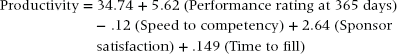
Regression is similar to correlation in that it examines the relationships among measures, but it also does a much better job of sorting the measures that are the best predictors of an outcome. In this case we will predict profitability.
Using software called the Statistical Package for Social Sciences (SPSS), regression analysis was conducted on the data set to determine which measures in Exhibit 6.1 are the best predictors of profitability. The analysis provides the following mathematical model for predicting profitability.
Exhibit 6.19 provides a graphic representation. The r2 value for the equation is 38%, indicating that the productivity measure accounts for 38% of the variance in the profitability measure.
Exhibit 6.19 Predictor of Profitability

This equation indicates that there is only one statistically significant predictor of profitability, and it is productivity. From a theoretical and practical perspective, this is what we would expect. Individual productivity leads to profitability. It would be unexpected and less meaningful if sponsor satisfaction or the exit survey rating was the best predictor of profitability.
Using the equation, we can predict profitability using any productivity score.
A productivity score of 10 yields this profit:
A productivity score of 90 yields this profit:
Thus, a person with who is billable only 10% of the time costs the organization more than $21,000. The negative valence indicates the person is not generating a profit. A person who is billable 90% of the time generates more than $34,000 in profit. The difference in profitability between the two is substantial: $55,364.80.
From this equation, it is clear that productivity (measured as billable hours) is directly and positively related to profitability.
While it is a relief to know that productivity is the driver of profitability, it also raises another question: What are the drivers of productivity? That question can be answered with regression as well.
When predicting productivity, all of the measures we have mentioned are used to predict this outcome. Two exceptions are worth noting: the exit survey rating and profitability. The exit survey measure only has 14 cases. If this measure was used, it would limit the analysis to just those 14 cases. We want to take advantage of the entire data set of 100+ cases, so we will exclude the exit survey measure. Profitability was dropped because we hypothesize that productivity drives it, not that profitability drives productivity.
Exhibit 6.20 provides a graphic representation. The r2 value for the equation is 81%, indicating that the four factors that predict productivity account for 81% of the variance in the measure.
Exhibit 6.20 Predictors of Productivity

The four factors predict productivity in the following way:
This equation shows us that performance ratings at 365 days are the most important predictor. As ratings increase, productivity increases. The second most important predictor is speed to competency. Faster speed (less time) to competency yields higher productivity. The third predictor is the sponsor’s satisfaction. This is probably a redundant measure because it is very similar in nature to the manager’s performance rating, but statistically it still adds unique predictive power. Last, as the time to fill measure increases, so does productivity. That is, it is better to wait longer to find a great candidate than to find a good one quickly.
Interpretation/Action
Practically speaking, the annual performance rating is a powerful predictor here. An employee’s annual rating should be closely linked to actual productivity. However, the utility of this predictor is limited. There is very little value in waiting a full year to predict someone’s expected productivity and, in turn, profitability. A predictor that comes earlier in an employee’s tenure would be much more useful for predicting future profitability at one year. Speed to competency is a very practical measure in this case. According to the data, the average speed to competency is 90 days. Anyone who is declared competent before reaching 90 days on the job is likely to be highly productive and profitable. Anyone requiring more than 90 days is a candidate for performance support or termination.
The sponsor satisfaction rating does not provide additional insight beyond the annual performance rating. It is recommended to stop gathering this measure to save time and effort.
The time-to-fill metric provides good insight. This result indicates that strong candidates often take longer to find. Every additional day spent finding a candidate increases the productivity score by .149. For every additional week of searching the productivity score goes up by 1.0, or 1% of billable time. Spending an additional five weeks to find the best candidate is likely to increase productivity by 5%. This does not mean recruiters should lengthen the recruiting process just to make it longer. It means that it is worth the extra time to search for stronger candidates. Quality comes with time.
PREDICTING THE FUTURE
Assume for a moment that HR wants an early indicator of the quality of the candidates who have been hired. Using what we know from the regression analysis of productivity, we see that two early indicators are useful: speed to competency and time to hire. At 90 days posthire, we will not have the other two measures, performance rating at 365 days and sponsor satisfaction, so we should not consider them as predictors. Let’s modify the prediction equation by dropping the performance rating and sponsor satisfaction metrics. When we rebuild the equation, it looks like this:
Using the prediction equation and the data we have for five new hires, we can predict their future productivity. Exhibit 6.21 shows the values for five new hires at 90 days posthire.
Exhibit 6.21 Predicted Productivity Scores for Five New Hires
| New Hire | Speed to Competency | Time to Fill | Predicted Productivity |
| A | 50 days | 67 days | 96.37 |
| B | 45 days | 50 days | 90.73 |
| C | 66 days | 55 days | 86.53 |
| D | Not declared competent | 12 days | No value |
| E | Not declared competent | 28 days | No value |
New hires A to C look promising. In fact, they should be billable 86% of the time or more, based on our prediction. New hires D and E have no predicted score because they have not been declared competent at 90 days. This in itself should be a good indicator that these two employees will not be stellar performers during the first year. Their managers should review their performance and provide development opportunities or terminate employment.
Exhibit 6.22 extends our predictive capabilities to show the estimated profitability of the three high-performing candidates.
Exhibit 6.22 Predicted Profitability for Three New Hires
| New Hire | Speed to Competency | Time to Fill | Predicted Productivity | Predicted Profitability |
| A | 50 days | 67 days | 96.37 | $38,446 |
| B | 45 days | 50 days | 90.73 | $34,543 |
| C | 66 days | 55 days | 86.53 | $31,636 |
The predicted profitability for each new hire exceeds $30,000. Since salary and benefits are included in the profitability metric, these values represent revenue that goes directly to the bottom line.
Throughout this analysis, we have focused on all cases across all business units. The same analysis can be repeated within each business unit to determine if relationships are different across units. In this case, the relationships are not substantially different.
You may wonder why you should go through all of this effort to demonstrate something that is generally common knowledge—that speed to competence is a good indicator of productivity. The value comes from the ability to predict performance and manage employees as soon as possible. New hires D and E may need some performance support from training, coaching, job aids, or other means. Alternatively, they may need to be terminated. Such early intervention can improve performance, increase productivity, save a career, and continue to improve organizational performance.
STRUCTURAL EQUATION MODELING
SEM can provide insights beyond other statistical techniques. Whereas regression incorporates only the statistically significant predictors and removes the nonsignificant predictors from the model, SEM retains all measures in the model. It also examines multiple predictive relationships simultaneously. With regression, we predicted profitability first and productivity second. With SEM, we can create a model to test for causal pathways among all variables all at once. Exhibit 6.23 shows a hypothetical structural equation model for the measures we’ve examined so far.
Exhibit 6.23 Hypothetical Structural Equation Model
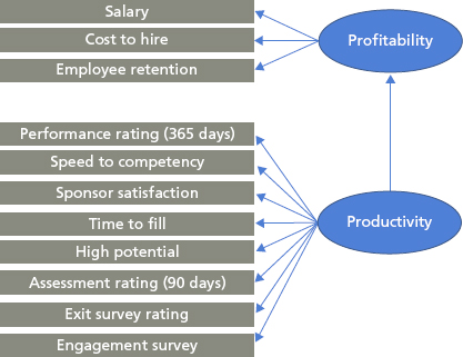
Exhibit 6.23 is just an example. The model was not tested on this data set because there were not enough cases for a reliable analysis. Yet based on the model shown here, we see that all the measures contribute to predicting profitability. The pathways show that efficiency measures (salary and cost to hire) predict profitability directly, and effectiveness measures predict productivity, which in turn predicts profitability. These results do not substantively change our interpretation of the predictors or what we would do with the results (focus on speed to competency and time to fill). The utility of this model is its simplicity. With one picture we can show the causal pathways and the predictors that lead to profitability.
In order to mine data for information, it is necessary to gather it and structure it for analysis. The data you need probably comes from departments outside your own. So it is essential to follow protocols. When requesting the data, be sure to specify the file type (e.g., .csv, .txt, etc.) and the structure (e.g., vertical or cross-tab). The request process and restructuring of the data set (if you do not receive the preferred structure) are often time-consuming steps in the analysis. If you haven’t done this before, build in extra time into your project plan.
Once you receive the data, create a data analysis plan and specify what type of statistical analysis you will apply to answer each question. Most business analysts can perform descriptive statistics. For more complex analytics like correlation, regression, and structural equation modeling, hire a statistician.
Throughout the process, do not lose sight of the end goal: usable information for decision making.