In the previous chapters, we used supervised learning techniques to build machine learning models, using data where the answer was already known—the class labels were already available in our training data. In this chapter, we will switch gears and explore cluster analysis, a category of unsupervised learning techniques that allows us to discover hidden structures in data where we do not know the right answer upfront. The goal of clustering is to find a natural grouping in data so that items in the same cluster are more similar to each other than to those from different clusters.
Given its exploratory nature, clustering is an exciting topic, and in this chapter, you will learn about the following concepts, which can help us to organize data into meaningful structures:
- Finding centers of similarity using the popular k-means algorithm
- Taking a bottom-up approach to building hierarchical clustering trees
- Identifying arbitrary shapes of objects using a density-based clustering approach
Grouping objects by similarity using k-means
In this section, we will learn about one of the most popular clustering algorithms, k-means, which is widely used in academia as well as in industry. Clustering (or cluster analysis) is a technique that allows us to find groups of similar objects that are more related to each other than to objects in other groups. Examples of business-oriented applications of clustering include the grouping of documents, music, and movies by different topics, or finding customers that share similar interests based on common purchase behaviors as a basis for recommendation engines.
K-means clustering using scikit-learn
As you will see in a moment, the k-means algorithm is extremely easy to implement, but it is also computationally very efficient compared to other clustering algorithms, which might explain its popularity. The k-means algorithm belongs to the category of prototype-based clustering. We will discuss two other categories of clustering, hierarchical and density-based clustering, later in this chapter.
Prototype-based clustering means that each cluster is represented by a prototype, which is usually either the centroid (average) of similar points with continuous features, or the medoid (the most representative or the point that minimizes the distance to all other points that belong to a particular cluster) in the case of categorical features. While k-means is very good at identifying clusters with a spherical shape, one of the drawbacks of this clustering algorithm is that we have to specify the number of clusters, k, a priori. An inappropriate choice for k can result in poor clustering performance. Later in this chapter, we will discuss the elbow method and silhouette plots, which are useful techniques to evaluate the quality of a clustering to help us determine the optimal number of clusters, k.
Although k-means clustering can be applied to data in higher dimensions, we will walk through the following examples using a simple two-dimensional dataset for the purpose of visualization:
>>> from sklearn.datasets import make_blobs
>>> X, y = make_blobs(n_samples=150,
...                   n_features=2,
...                   centers=3,
...                   cluster_std=0.5,
...                   shuffle=True,
...                   random_state=0)
>>> import matplotlib.pyplot as plt
>>> plt.scatter(X[:, 0],
...             X[:, 1],
...             c='white',
...             marker='o',
...             edgecolor='black',
...             s=50)
>>> plt.grid()
>>> plt.tight_layout()
>>> plt.show()
The dataset that we just created consists of 150 randomly generated points that are roughly grouped into three regions with higher density, which is visualized via a two-dimensional scatterplot:

In real-world applications of clustering, we do not have any ground truth category information (information provided as empirical evidence as opposed to inference) about those examples; if we were given class labels, this task would fall into the category of supervised learning. Thus, our goal is to group the examples based on their feature similarities, which can be achieved using the k-means algorithm, as summarized by the following four steps:
- Randomly pick k centroids from the examples as initial cluster centers.
- Assign each example to the nearest centroid,
 .
. - Move the centroids to the center of the examples that were assigned to it.
- Repeat steps 2 and 3 until the cluster assignments do not change or a user-defined tolerance or maximum number of iterations is reached.
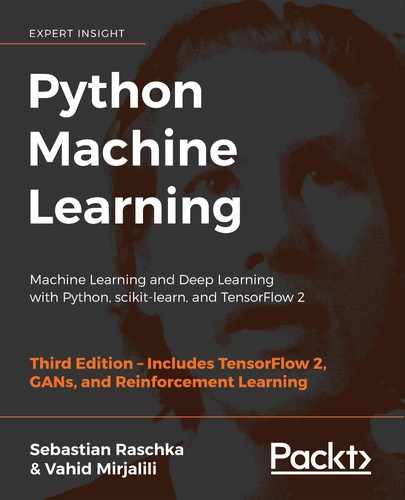
Now, the next question is, how do we measure similarity between objects? We can define similarity as the opposite of distance, and a commonly used distance for clustering examples with continuous features is the squared Euclidean distance between two points, x and y, in m-dimensional space:

Note that, in the preceding equation, the index j refers to the jth dimension (feature column) of the example inputs, x and y. In the rest of this section, we will use the superscripts i and j to refer to the index of the example (data record) and cluster index, respectively.
Based on this Euclidean distance metric, we can describe the k-means algorithm as a simple optimization problem, an iterative approach for minimizing the within-cluster sum of squared errors (SSE), which is sometimes also called cluster inertia:
Here, ![]() is the representative point (centroid) for cluster j.
is the representative point (centroid) for cluster j. ![]() if the example,
if the example, ![]() , is in cluster j, or 0 otherwise.
, is in cluster j, or 0 otherwise.

Now that you have learned how the simple k-means algorithm works, let's apply it to our example dataset using the KMeans class from scikit-learn's cluster module:
>>> from sklearn.cluster import KMeans
>>> km = KMeans(n_clusters=3,
...             init='random',
...             n_init=10,
...             max_iter=300,
...             tol=1e-04,
...             random_state=0)
>>> y_km = km.fit_predict(X)
Using the preceding code, we set the number of desired clusters to 3; specifying the number of clusters a priori is one of the limitations of k-means. We set n_init=10 to run the k-means clustering algorithms 10 times independently, with different random centroids to choose the final model as the one with the lowest SSE. Via the max_iter parameter, we specify the maximum number of iterations for each single run (here, 300). Note that the k-means implementation in scikit-learn stops early if it converges before the maximum number of iterations is reached. However, it is possible that k-means does not reach convergence for a particular run, which can be problematic (computationally expensive) if we choose relatively large values for max_iter. One way to deal with convergence problems is to choose larger values for tol, which is a parameter that controls the tolerance with regard to the changes in the within-cluster SSE to declare convergence. In the preceding code, we chose a tolerance of 1e-04 (=0.0001).
A problem with k-means is that one or more clusters can be empty. Note that this problem does not exist for k-medoids or fuzzy C-means, an algorithm that we will discuss later in this section.
However, this problem is accounted for in the current k-means implementation in scikit-learn. If a cluster is empty, the algorithm will search for the example that is farthest away from the centroid of the empty cluster. Then it will reassign the centroid to be this farthest point.
Feature scaling
When we are applying k-means to real-world data using a Euclidean distance metric, we want to make sure that the features are measured on the same scale and apply z-score standardization or min-max scaling if necessary.
Having predicted the cluster labels, y_km, and discussed some of the challenges of the k-means algorithm, let's now visualize the clusters that k-means identified in the dataset together with the cluster centroids. These are stored under the cluster_centers_ attribute of the fitted KMeans object:
>>> plt.scatter(X[y_km == 0, 0],
...             X[y_km == 0, 1],
...             s=50, c='lightgreen',
...             marker='s', edgecolor='black',
...             label='Cluster 1')
>>> plt.scatter(X[y_km == 1, 0],
...             X[y_km == 1, 1],
...             s=50, c='orange',
...             marker='o', edgecolor='black',
...             label='Cluster 2')
>>> plt.scatter(X[y_km == 2, 0],
...             X[y_km == 2, 1],
...             s=50, c='lightblue',
...             marker='v', edgecolor='black',
...             label='Cluster 3')
>>> plt.scatter(km.cluster_centers_[:, 0],
...             km.cluster_centers_[:, 1],
...             s=250, marker='*',
...             c='red', edgecolor='black',
...             label='Centroids')
>>> plt.legend(scatterpoints=1)
>>> plt.grid()
>>> plt.tight_layout()
>>> plt.show()
In the following scatterplot, you can see that k-means placed the three centroids at the center of each sphere, which looks like a reasonable grouping given this dataset:

Although k-means worked well on this toy dataset, we will highlight another drawback of k-means: we have to specify the number of clusters, k, a priori. The number of clusters to choose may not always be so obvious in real-world applications, especially if we are working with a higher dimensional dataset that cannot be visualized. The other properties of k-means are that clusters do not overlap and are not hierarchical, and we also assume that there is at least one item in each cluster. Later in this chapter, we will encounter different types of clustering algorithms, hierarchical and density-based clustering. Neither type of algorithm requires us to specify the number of clusters upfront or assume spherical structures in our dataset.
In the next subsection, we will cover a popular variant of the classic k-means algorithm called k-means++. While it doesn't address those assumptions and drawbacks of k-means that were discussed in the previous paragraph, it can greatly improve the clustering results through more clever seeding of the initial cluster centers.
A smarter way of placing the initial cluster centroids using k-means++
So far, we have discussed the classic k-means algorithm, which uses a random seed to place the initial centroids, which can sometimes result in bad clusterings or slow convergence if the initial centroids are chosen poorly. One way to address this issue is to run the k-means algorithm multiple times on a dataset and choose the best performing model in terms of the SSE.
Another strategy is to place the initial centroids far away from each other via the k-means++ algorithm, which leads to better and more consistent results than the classic k-means (k-means++: The Advantages of Careful Seeding, D. Arthur and S. Vassilvitskii in Proceedings of the eighteenth annual ACM-SIAM symposium on Discrete algorithms, pages 1027-1035. Society for Industrial and Applied Mathematics, 2007).
The initialization in k-means++ can be summarized as follows:
- Initialize an empty set, M, to store the k centroids being selected.
- Randomly choose the first centroid,
 , from the input examples and assign it to M.
 - For each example,
 , that is not in M, find the minimum squared distance,
  , to any of the centroids in M.
 - To randomly select the next centroid,
 , use a weighted probability distribution equal to
  .
. - Repeat steps 2 and 3 until k centroids are chosen.
- Proceed with the classic k-means algorithm.
To use k-means++ with scikit-learn's KMeans object, we just need to set the init parameter to 'k-means++'. In fact, 'k-means++' is the default argument to the init parameter, which is strongly recommended in practice. The only reason we didn't use it in the previous example was to not introduce too many concepts all at once. The rest of this section on k-means will use k-means++, but you are encouraged to experiment more with the two different approaches (classic k-means via init='random' versus k-means++ via init='k-means++') for placing the initial cluster centroids.
Hard versus soft clustering
Hard clustering describes a family of algorithms where each example in a dataset is assigned to exactly one cluster, as in the k-means and k-means++ algorithms that we discussed earlier in this chapter. In contrast, algorithms for soft clustering (sometimes also called fuzzy clustering) assign an example to one or more clusters. A popular example of soft clustering is the fuzzy C-means (FCM) algorithm (also called soft k-means or fuzzy k-means). The original idea goes back to the 1970s, when Joseph C. Dunn first proposed an early version of fuzzy clustering to improve k-means (A Fuzzy Relative of the ISODATA Process and Its Use in Detecting Compact Well-Separated Clusters, J. C. Dunn, 1973). Almost a decade later, James C. Bedzek published his work on the improvement of the fuzzy clustering algorithm, which is now known as the FCM algorithm (Pattern Recognition with Fuzzy Objective Function Algorithms, J. C. Bezdek, Springer Science+Business Media, 2013).
The FCM procedure is very similar to k-means. However, we replace the hard cluster assignment with probabilities for each point belonging to each cluster. In k-means, we could express the cluster membership of an example, x, with a sparse vector of binary values:

Here, the index position with value 1 indicates the cluster centroid, ![]() , that the example is assigned to (assuming
, that the example is assigned to (assuming ![]()
![]() ). In contrast, a membership vector in FCM could be represented as follows:
). In contrast, a membership vector in FCM could be represented as follows:

Here, each value falls in the range [0, 1] and represents a probability of membership of the respective cluster centroid. The sum of the memberships for a given example is equal to 1. As with the k-means algorithm, we can summarize the FCM algorithm in four key steps:
- Specify the number of k centroids and randomly assign the cluster memberships for each point.
- Compute the cluster centroids,
 .
. - Update the cluster memberships for each point.
- Repeat steps 2 and 3 until the membership coefficients do not change or a user-defined tolerance or maximum number of iterations is reached.
The objective function of FCM—we abbreviate it as ![]() —looks very similar to the within-cluster SSE that we minimize in k-means:
—looks very similar to the within-cluster SSE that we minimize in k-means:

However, note that the membership indicator, ![]() , is not a binary value as in k-means (
, is not a binary value as in k-means (![]() ), but a real value that denotes the cluster membership probability (
), but a real value that denotes the cluster membership probability (![]() ). You also may have noticed that we added an additional exponent to
). You also may have noticed that we added an additional exponent to ![]() ; the exponent m, any number greater than or equal to one (typically m = 2), is the so-called fuzziness coefficient (or simply fuzzifier), which controls the degree of fuzziness.
; the exponent m, any number greater than or equal to one (typically m = 2), is the so-called fuzziness coefficient (or simply fuzzifier), which controls the degree of fuzziness.
The larger the value of m, the smaller the cluster membership, ![]() , becomes, which leads to fuzzier clusters. The cluster membership probability itself is calculated as follows:
, becomes, which leads to fuzzier clusters. The cluster membership probability itself is calculated as follows:

For example, if we chose three cluster centers, as in the previous k-means example, we could calculate the membership of ![]() belonging to the
belonging to the ![]() cluster as follows:
cluster as follows:

The center, ![]() , of a cluster itself is calculated as the mean of all examples weighted by the degree to which each example belongs to that cluster (
, of a cluster itself is calculated as the mean of all examples weighted by the degree to which each example belongs to that cluster (![]() ):
):

Just by looking at the equation to calculate the cluster memberships, we can say that each iteration in FCM is more expensive than an iteration in k-means. On the other hand, FCM typically requires fewer iterations overall to reach convergence. Unfortunately, the FCM algorithm is currently not implemented in scikit-learn. However, it has been found, in practice, that both k-means and FCM produce very similar clustering outputs, as described in a study (Comparative Analysis of k-means and Fuzzy C-Means Algorithms, S. Ghosh, and S. K. Dubey, IJACSA, 4: 35–38, 2013).
Using the elbow method to find the optimal number of clusters
One of the main challenges in unsupervised learning is that we do not know the definitive answer. We don't have the ground truth class labels in our dataset that allow us to apply the techniques that we used in Chapter 6, Learning Best Practices for Model Evaluation and Hyperparameter Tuning, in order to evaluate the performance of a supervised model. Thus, to quantify the quality of clustering, we need to use intrinsic metrics—such as the within-cluster SSE (distortion)—to compare the performance of different k-means clusterings.
Conveniently, we don't need to compute the within-cluster SSE explicitly when we are using scikit-learn, as it is already accessible via the inertia_ attribute after fitting a KMeans model:
>>> print('Distortion: %.2f' % km.inertia_)
Distortion: 72.48
Based on the within-cluster SSE, we can use a graphical tool, the so-called elbow method, to estimate the optimal number of clusters, k, for a given task. We can say that if k increases, the distortion will decrease. This is because the examples will be closer to the centroids they are assigned to. The idea behind the elbow method is to identify the value of k where the distortion begins to increase most rapidly, which will become clearer if we plot the distortion for different values of k:
>>> distortions = []
>>> for i in range(1, 11):
...     km = KMeans(n_clusters=i,
...                 init='k-means++',
...                 n_init=10,
...                 max_iter=300,
...                 random_state=0)
...     km.fit(X)
...     distortions.append(km.inertia_)
>>> plt.plot(range(1,11), distortions, marker='o')
>>> plt.xlabel('Number of clusters')
>>> plt.ylabel('Distortion')
>>> plt.tight_layout()
>>> plt.show()
As you can see in the following plot, the elbow is located at k = 3, so this is evidence that k = 3 is indeed a good choice for this dataset:

Quantifying the quality of clustering via silhouette plots
Another intrinsic metric to evaluate the quality of a clustering is silhouette analysis, which can also be applied to clustering algorithms other than k-means, which we will discuss later in this chapter. Silhouette analysis can be used as a graphical tool to plot a measure of how tightly grouped the examples in the clusters are. To calculate the silhouette coefficient of a single example in our dataset, we can apply the following three steps:
- Calculate the cluster cohesion,
 , as the average distance between an example,
  , and all other points in the same cluster.
 - Calculate the cluster separation,
 , from the next closest cluster as the average distance between the example,
  , and all examples in the nearest cluster.
 - Calculate the silhouette,
 , as the difference between cluster cohesion and separation divided by the greater of the two, as shown here:

The silhouette coefficient is bounded in the range –1 to 1. Based on the preceding equation, we can see that the silhouette coefficient is 0 if the cluster separation and cohesion are equal (![]() ). Furthermore, we get close to an ideal silhouette coefficient of 1 if
). Furthermore, we get close to an ideal silhouette coefficient of 1 if ![]() , since
, since ![]() quantifies how dissimilar an example is from other clusters, and
quantifies how dissimilar an example is from other clusters, and ![]() tells us how similar it is to the other examples in its own cluster.
tells us how similar it is to the other examples in its own cluster.
The silhouette coefficient is available as silhouette_samples from scikit-learn's metric module, and optionally, the silhouette_scores function can be imported for convenience. The silhouette_scores function calculates the average silhouette coefficient across all examples, which is equivalent to numpy.mean(silhouette_samples(...)). By executing the following code, we will now create a plot of the silhouette coefficients for a k-means clustering with k = 3:
>>> km = KMeans(n_clusters=3,
...             init='k-means++',
...             n_init=10,
...             max_iter=300,
...             tol=1e-04,
...             random_state=0)
>>> y_km = km.fit_predict(X)
>>> import numpy as np
>>> from matplotlib import cm
>>> from sklearn.metrics import silhouette_samples
>>> cluster_labels = np.unique(y_km)
>>> n_clusters = cluster_labels.shape[0]
>>> silhouette_vals = silhouette_samples(X,
...                                      y_km,
...                                      metric='euclidean')
>>> y_ax_lower, y_ax_upper = 0, 0
>>> yticks = []
>>> for i, c in enumerate(cluster_labels):
...     c_silhouette_vals = silhouette_vals[y_km == c]
...     c_silhouette_vals.sort()
...     y_ax_upper += len(c_silhouette_vals)
...     color = cm.jet(float(i) / n_clusters)
...     plt.barh(range(y_ax_lower, y_ax_upper),
...              c_silhouette_vals,
...              height=1.0,
...              edgecolor='none',
...              color=color)
...     yticks.append((y_ax_lower + y_ax_upper) / 2.)
...     y_ax_lower += len(c_silhouette_vals)
>>> silhouette_avg = np.mean(silhouette_vals)
>>> plt.axvline(silhouette_avg,
...             color="red",
...             linestyle="--")
>>> plt.yticks(yticks, cluster_labels + 1)
>>> plt.ylabel('Cluster')
>>> plt.xlabel('Silhouette coefficient')
>>> plt.tight_layout()
>>> plt.show()
Through a visual inspection of the silhouette plot, we can quickly scrutinize the sizes of the different clusters and identify clusters that contain outliers:

However, as you can see in the preceding silhouette plot, the silhouette coefficients are not even close to 0, which is, in this case, an indicator of a good clustering. Furthermore, to summarize the goodness of our clustering, we added the average silhouette coefficient to the plot (dotted line).
To see what a silhouette plot looks like for a relatively bad clustering, let's seed the k-means algorithm with only two centroids:
>>> km = KMeans(n_clusters=2,
...             init='k-means++',
...             n_init=10,
...             max_iter=300,
...             tol=1e-04,
...             random_state=0)
>>> y_km = km.fit_predict(X)
>>> plt.scatter(X[y_km == 0, 0],
...             X[y_km == 0, 1],
...             s=50, c='lightgreen',
...             edgecolor='black',
...             marker='s',
...             label='Cluster 1')
>>> plt.scatter(X[y_km == 1, 0],
...             X[y_km == 1, 1],
...             s=50,
...             c='orange',
...             edgecolor='black',
...             marker='o',
...             label='Cluster 2')
>>> plt.scatter(km.cluster_centers_[:, 0],
...             km.cluster_centers_[:, 1],
...             s=250,
...             marker='*',
...             c='red',
...             label='Centroids')
>>> plt.legend()
>>> plt.grid()
>>> plt.tight_layout()
>>> plt.show()
As you can see in the resulting plot, one of the centroids falls between two of the three spherical groupings of the input data.
Although the clustering does not look completely terrible, it is suboptimal:

Please keep in mind that we typically do not have the luxury of visualizing datasets in two-dimensional scatterplots in real-world problems, since we typically work with data in higher dimensions. So, next, we will create the silhouette plot to evaluate the results:
>>> cluster_labels = np.unique(y_km)
>>> n_clusters = cluster_labels.shape[0]
>>> silhouette_vals = silhouette_samples(X,
...                                      y_km,
...                                      metric='euclidean')
>>> y_ax_lower, y_ax_upper = 0, 0
>>> yticks = []
>>> for i, c in enumerate(cluster_labels):
...     c_silhouette_vals = silhouette_vals[y_km == c]
...     c_silhouette_vals.sort()
...     y_ax_upper += len(c_silhouette_vals)
...     color = cm.jet(float(i) / n_clusters)
...     plt.barh(range(y_ax_lower, y_ax_upper),
...              c_silhouette_vals,
...              height=1.0,
...              edgecolor='none',
...              color=color)
...     yticks.append((y_ax_lower + y_ax_upper) / 2.)
...     y_ax_lower += len(c_silhouette_vals)
>>> silhouette_avg = np.mean(silhouette_vals)
>>> plt.axvline(silhouette_avg, color="red", linestyle="--")
>>> plt.yticks(yticks, cluster_labels + 1)
>>> plt.ylabel('Cluster')
>>> plt.xlabel('Silhouette coefficient')
>>> plt.tight_layout()
>>> plt.show()
As you can see in the resulting plot, the silhouettes now have visibly different lengths and widths, which is evidence of a relatively bad or at least suboptimal clustering:

Organizing clusters as a hierarchical tree
In this section, we will take a look at an alternative approach to prototype-based clustering: hierarchical clustering. One advantage of the hierarchical clustering algorithm is that it allows us to plot dendrograms (visualizations of a binary hierarchical clustering), which can help with the interpretation of the results by creating meaningful taxonomies. Another advantage of this hierarchical approach is that we do not need to specify the number of clusters upfront.
The two main approaches to hierarchical clustering are agglomerative and divisive hierarchical clustering. In divisive hierarchical clustering, we start with one cluster that encompasses the complete dataset, and we iteratively split the cluster into smaller clusters until each cluster only contains one example. In this section, we will focus on agglomerative clustering, which takes the opposite approach. We start with each example as an individual cluster and merge the closest pairs of clusters until only one cluster remains.
Grouping clusters in bottom-up fashion
The two standard algorithms for agglomerative hierarchical clustering are single linkage and complete linkage. Using single linkage, we compute the distances between the most similar members for each pair of clusters and merge the two clusters for which the distance between the most similar members is the smallest. The complete linkage approach is similar to single linkage but, instead of comparing the most similar members in each pair of clusters, we compare the most dissimilar members to perform the merge. This is shown in the following diagram:

Alternative types of linkages
Other commonly used algorithms for agglomerative hierarchical clustering include average linkage and Ward's linkage. In average linkage, we merge the cluster pairs based on the minimum average distances between all group members in the two clusters. In Ward's linkage, the two clusters that lead to the minimum increase of the total within-cluster SSE are merged.
In this section, we will focus on agglomerative clustering using the complete linkage approach. Hierarchical complete linkage clustering is an iterative procedure that can be summarized by the following steps:
- Compute the distance matrix of all examples.
- Represent each data point as a singleton cluster.
- Merge the two closest clusters based on the distance between the most dissimilar (distant) members.
- Update the similarity matrix.
- Repeat steps 2-4 until one single cluster remains.
Next, we will discuss how to compute the distance matrix (step 1). But first, let's generate a random data sample to work with. The rows represent different observations (IDs 0-4), and the columns are the different features (X, Y, Z) of those examples:
>>> import pandas as pd
>>> import numpy as np
>>> np.random.seed(123)
>>> variables = ['X', 'Y', 'Z']
>>> labels = ['ID_0', 'ID_1', 'ID_2', 'ID_3', 'ID_4']
>>> X = np.random.random_sample([5, 3])*10
>>> df = pd.DataFrame(X, columns=variables, index=labels)
>>> df
After executing the preceding code, we should now see the following data frame containing the randomly generated examples:

Performing hierarchical clustering on a distance matrix
To calculate the distance matrix as input for the hierarchical clustering algorithm, we will use the pdist function from SciPy's spatial.distance submodule:
>>> from scipy.spatial.distance import pdist, squareform
>>> row_dist = pd.DataFrame(squareform(
...                         pdist(df, metric='euclidean')),
...                         columns=labels, index=labels)
>>> row_dist
Using the preceding code, we calculated the Euclidean distance between each pair of input examples in our dataset based on the features X, Y, and Z.
We provided the condensed distance matrix—returned by pdist—as input to the squareform function to create a symmetrical matrix of the pair-wise distances, as shown here:

Next, we will apply the complete linkage agglomeration to our clusters using the linkage function from SciPy's cluster.hierarchy submodule, which returns a so-called linkage matrix.
However, before we call the linkage function, let's take a careful look at the function documentation:
>>> from scipy.cluster.hierarchy import linkage
>>> help(linkage)
[...]
Parameters:
  y : ndarray
    A condensed or redundant distance matrix. A condensed
    distance matrix is a flat array containing the upper
    triangular of the distance matrix. This is the form
    that pdist returns. Alternatively, a collection of m
    observation vectors in n dimensions may be passed as
    an m by n array.

  method : str, optional
    The linkage algorithm to use. See the Linkage Methods
    section below for full descriptions.

  metric : str, optional
    The distance metric to use. See the distance.pdist
    function for a list of valid distance metrics.

  Returns:
  Z : ndarray
    The hierarchical clustering encoded as a linkage matrix.
[...]
Based on the function description, we understand that we can use a condensed distance matrix (upper triangular) from the pdist function as an input attribute. Alternatively, we could also provide the initial data array and use the 'euclidean' metric as a function argument in linkage. However, we should not use the squareform distance matrix that we defined earlier, since it would yield different distance values than expected. To sum it up, the three possible scenarios are listed here:
- Incorrect approach: Using the
squareformdistance matrix as shown in the following code snippet leads to incorrect results:>>> row_clusters = linkage(row_dist, ... method='complete', ... metric='euclidean') - Correct approach: Using the condensed distance matrix as shown in the following code example yields the correct linkage matrix:
>>> row_clusters = linkage(pdist(df, metric='euclidean'), ... method='complete') - Correct approach: Using the complete input example matrix (the so-called design matrix) as shown in the following code snippet also leads to a correct linkage matrix similar to the preceding approach:
>>> row_clusters = linkage(df.values,
...                        method='complete',
...                        metric='euclidean')
To take a closer look at the clustering results, we can turn those results into a pandas DataFrame (best viewed in a Jupyter Notebook) as follows:
>>> pd.DataFrame(row_clusters,
...              columns=['row label 1',
...                       'row label 2',
...                       'distance',
...                       'no. of items in clust.'],
...              index=['cluster %d' % (i + 1) for i in
...                     range(row_clusters.shape[0])])
As shown in the following screenshot, the linkage matrix consists of several rows where each row represents one merge. The first and second columns denote the most dissimilar members in each cluster, and the third column reports the distance between those members.
The last column returns the count of the members in each cluster:

Now that we have computed the linkage matrix, we can visualize the results in the form of a dendrogram:
>>> from scipy.cluster.hierarchy import dendrogram
>>> # make dendrogram black (part 1/2)
>>> # from scipy.cluster.hierarchy import set_link_color_palette
>>> # set_link_color_palette(['black'])
>>> row_dendr = dendrogram(row_clusters,
...                        labels=labels,
...                        # make dendrogram black (part 2/2)
...                        # color_threshold=np.inf
...                        )
>>> plt.tight_layout()
>>> plt.ylabel('Euclidean distance')
>>> plt.show()
If you are executing the preceding code or reading an e-book version of this book, you will notice that the branches in the resulting dendrogram are shown in different colors. The color scheme is derived from a list of Matplotlib colors that are cycled for the distance thresholds in the dendrogram. For example, to display the dendrograms in black, you can uncomment the respective sections that were inserted in the preceding code:

Such a dendrogram summarizes the different clusters that were formed during the agglomerative hierarchical clustering; for example, you can see that the examples ID_0 and ID_4, followed by ID_1 and ID_2, are the most similar ones based on the Euclidean distance metric.
Attaching dendrograms to a heat map
In practical applications, hierarchical clustering dendrograms are often used in combination with a heat map, which allows us to represent the individual values in the data array or matrix containing our training examples with a color code. In this section, we will discuss how to attach a dendrogram to a heat map plot and order the rows in the heat map correspondingly.
However, attaching a dendrogram to a heat map can be a little bit tricky, so let's go through this procedure step by step:
- We create a new
figureobject and define the x axis position, y axis position, width, and height of the dendrogram via theadd_axesattribute. Furthermore, we rotate the dendrogram 90 degrees counter-clockwise. The code is as follows:>>> fig = plt.figure(figsize=(8, 8), facecolor='white') >>> axd = fig.add_axes([0.09, 0.1, 0.2, 0.6]) >>> row_dendr = dendrogram(row_clusters, ... orientation='left') >>> # note: for matplotlib < v1.5.1, please use >>> # orientation='right' - Next, we reorder the data in our initial
DataFrameaccording to the clustering labels that can be accessed from thedendrogramobject, which is essentially a Python dictionary, via theleaveskey. The code is as follows:>>> df_rowclust = df.iloc[row_dendr['leaves'][::-1]] - Now, we construct the heat map from the reordered
DataFrameand position it next to the dendrogram:>>> axm = fig.add_axes([0.23, 0.1, 0.6, 0.6]) >>> cax = axm.matshow(df_rowclust, ... interpolation='nearest', ... cmap='hot_r') - Finally, we modify the aesthetics of the dendrogram by removing the axis ticks and hiding the axis spines. Also, we add a color bar and assign the feature and data record names to the x and y axis tick labels, respectively:
>>> axd.set_xticks([])
>>> axd.set_yticks([])
>>> for i in axd.spines.values():
...     i.set_visible(False)
>>> fig.colorbar(cax)
>>> axm.set_xticklabels([''] + list(df_rowclust.columns))
>>> axm.set_yticklabels([''] + list(df_rowclust.index))
>>> plt.show()
After following the previous steps, the heat map should be displayed with the dendrogram attached:
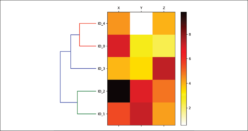
As you can see, the order of rows in the heat map reflects the clustering of the examples in the dendrogram. In addition to a simple dendrogram, the color-coded values of each example and feature in the heat map provide us with a nice summary of the dataset.
Applying agglomerative clustering via scikit-learn
In the previous subsection, you saw how to perform agglomerative hierarchical clustering using SciPy. However, there is also an AgglomerativeClustering implementation in scikit-learn, which allows us to choose the number of clusters that we want to return. This is useful if we want to prune the hierarchical cluster tree. By setting the n_cluster parameter to 3, we will now cluster the input examples into three groups using the same complete linkage approach based on the Euclidean distance metric, as before:
>>> from sklearn.cluster import AgglomerativeClustering
>>> ac = AgglomerativeClustering(n_clusters=3,
...                              affinity='euclidean',
...                              linkage='complete')
>>> labels = ac.fit_predict(X)
>>> print('Cluster labels: %s' % labels)
Cluster labels: [1 0 0 2 1]
Looking at the predicted cluster labels, we can see that the first and the fifth examples (ID_0 and ID_4) were assigned to one cluster (label 1), and the examples ID_1 and ID_2 were assigned to a second cluster (label 0). The example ID_3 was put into its own cluster (label 2). Overall, the results are consistent with the results that we observed in the dendrogram. We should note, though, that ID_3 is more similar to ID_4 and ID_0 than to ID_1 and ID_2, as shown in the preceding dendrogram figure; this is not clear from scikit-learn's clustering results. Let's now rerun the AgglomerativeClustering using n_cluster=2 in the following code snippet:
>>> ac = AgglomerativeClustering(n_clusters=2,
...                              affinity='euclidean',
...                              linkage='complete')
>>> labels = ac.fit_predict(X)
>>> print('Cluster labels: %s' % labels)
Cluster labels: [0 1 1 0 0]
As you can see, in this pruned clustering hierarchy, label ID_3 was assigned to the same cluster as ID_0 and ID_4, as expected.
Locating regions of high density via DBSCAN
Although we can't cover the vast amount of different clustering algorithms in this chapter, let's at least include one more approach to clustering: density-based spatial clustering of applications with noise (DBSCAN), which does not make assumptions about spherical clusters like k-means, nor does it partition the dataset into hierarchies that require a manual cut-off point. As its name implies, density-based clustering assigns cluster labels based on dense regions of points. In DBSCAN, the notion of density is defined as the number of points within a specified radius, ![]() .
.
According to the DBSCAN algorithm, a special label is assigned to each example (data point) using the following criteria:
- A point is considered a core point if at least a specified number (MinPts) of neighboring points fall within the specified radius,
 .
. - A border point is a point that has fewer neighbors than MinPts within ε, but lies within the
 radius of a core point.
 - All other points that are neither core nor border points are considered noise points.
After labeling the points as core, border, or noise, the DBSCAN algorithm can be summarized in two simple steps:
- Form a separate cluster for each core point or connected group of core points. (Core points are connected if they are no farther away than
 .)
.) - Assign each border point to the cluster of its corresponding core point.
To get a better understanding of what the result of DBSCAN can look like, before jumping to the implementation, let's summarize what we have just learned about core points, border points, and noise points in the following figure:

One of the main advantages of using DBSCAN is that it does not assume that the clusters have a spherical shape as in k-means. Furthermore, DBSCAN is different from k-means and hierarchical clustering in that it doesn't necessarily assign each point to a cluster but is capable of removing noise points.
For a more illustrative example, let's create a new dataset of half-moon-shaped structures to compare k-means clustering, hierarchical clustering, and DBSCAN:
>>> from sklearn.datasets import make_moons
>>> X, y = make_moons(n_samples=200,
...                   noise=0.05,
...                   random_state=0)
>>> plt.scatter(X[:, 0], X[:, 1])
>>> plt.tight_layout()
>>> plt.show()
As you can see in the resulting plot, there are two visible, half-moon-shaped groups consisting of 100 examples (data points) each:

We will start by using the k-means algorithm and complete linkage clustering to see if one of those previously discussed clustering algorithms can successfully identify the half-moon shapes as separate clusters. The code is as follows:
>>> f, (ax1, ax2) = plt.subplots(1, 2, figsize=(8, 3))
>>> km = KMeans(n_clusters=2,
...             random_state=0)
>>> y_km = km.fit_predict(X)
>>> ax1.scatter(X[y_km == 0, 0],
...             X[y_km == 0, 1],
...             c='lightblue',
...             edgecolor='black',
...             marker='o',
...             s=40,
...             label='cluster 1')
>>> ax1.scatter(X[y_km == 1, 0],
...             X[y_km == 1, 1],
...             c='red',
...             edgecolor='black',
...             marker='s',
...             s=40,
...             label='cluster 2')
>>> ax1.set_title('K-means clustering')
>>> ac = AgglomerativeClustering(n_clusters=2,
...                              affinity='euclidean',
...                              linkage='complete')
>>> y_ac = ac.fit_predict(X)
>>> ax2.scatter(X[y_ac == 0, 0],
...             X[y_ac == 0, 1],
...             c='lightblue',
...             edgecolor='black',
...             marker='o',
...             s=40,
...             label='Cluster 1')
>>> ax2.scatter(X[y_ac == 1, 0],
...             X[y_ac == 1, 1],
...             c='red',
...             edgecolor='black',
...             marker='s',
...             s=40,
...             label='Cluster 2')
>>> ax2.set_title('Agglomerative clustering')
>>> plt.legend()
>>> plt.tight_layout()
>>> plt.show()
Based on the visualized clustering results, we can see that the k-means algorithm was unable to separate the two clusters, and also, the hierarchical clustering algorithm was challenged by those complex shapes:

Finally, let's try the DBSCAN algorithm on this dataset to see if it can find the two half-moon-shaped clusters using a density-based approach:
>>> from sklearn.cluster import DBSCAN
>>> db = DBSCAN(eps=0.2,
...             min_samples=5,
...             metric='euclidean')
>>> y_db = db.fit_predict(X)
>>> plt.scatter(X[y_db == 0, 0],
...             X[y_db == 0, 1],
...             c='lightblue',
...             edgecolor='black',
...             marker='o',
...             s=40,
...             label='Cluster 1')
>>> plt.scatter(X[y_db == 1, 0],
...             X[y_db == 1, 1],
...             c='red',
...             edgecolor='black',
...             marker='s',
...             s=40,
...             label='Cluster 2')
>>> plt.legend()
>>> plt.tight_layout()
>>> plt.show()
The DBSCAN algorithm can successfully detect the half-moon shapes, which highlights one of the strengths of DBSCAN – clustering data of arbitrary shapes:

However, we should also note some of the disadvantages of DBSCAN. With an increasing number of features in our dataset—assuming a fixed number of training examples—the negative effect of the curse of dimensionality increases. This is especially a problem if we are using the Euclidean distance metric. However, the problem of the curse of dimensionality is not unique to DBSCAN: it also affects other clustering algorithms that use the Euclidean distance metric, for example, k-means and hierarchical clustering algorithms. In addition, we have two hyperparameters in DBSCAN (MinPts and ![]() ) that need to be optimized to yield good clustering results. Finding a good combination of MinPts and
) that need to be optimized to yield good clustering results. Finding a good combination of MinPts and ![]() can be problematic if the density differences in the dataset are relatively large.
can be problematic if the density differences in the dataset are relatively large.
Graph-based clustering
So far, we have seen three of the most fundamental categories of clustering algorithms: prototype-based clustering with k-means, agglomerative hierarchical clustering, and density-based clustering via DBSCAN. However, there is also a fourth class of more advanced clustering algorithms that we have not covered in this chapter: graph-based clustering. Probably the most prominent members of the graph-based clustering family are the spectral clustering algorithms.
Although there are many different implementations of spectral clustering, what they all have in common is that they use the eigenvectors of a similarity or distance matrix to derive the cluster relationships. Since spectral clustering is beyond the scope of this book, you can read the excellent tutorial by Ulrike von Luxburg to learn more about this topic (A tutorial on spectral clustering, U. Von Luxburg, Statistics and Computing, 17(4): 395–416, 2007). It is freely available from arXiv at http://arxiv.org/pdf/0711.0189v1.pdf.
Note that, in practice, it is not always obvious which clustering algorithm will perform best on a given dataset, especially if the data comes in multiple dimensions that make it hard or impossible to visualize. Furthermore, it is important to emphasize that a successful clustering does not only depend on the algorithm and its hyperparameters; rather, the choice of an appropriate distance metric and the use of domain knowledge that can help to guide the experimental setup can be even more important.
In the context of the curse of dimensionality, it is thus common practice to apply dimensionality reduction techniques prior to performing clustering. Such dimensionality reduction techniques for unsupervised datasets include principal component analysis and radial basis function kernel principal component analysis, which we covered in Chapter 5, Compressing Data via Dimensionality Reduction. Also, it is particularly common to compress datasets down to two-dimensional subspaces, which allows us to visualize the clusters and assigned labels using two-dimensional scatterplots, which are particularly helpful for evaluating the results.
Summary
In this chapter, you learned about three different clustering algorithms that can help us with the discovery of hidden structures or information in data. We started this chapter with a prototype-based approach, k-means, which clusters examples into spherical shapes based on a specified number of cluster centroids. Since clustering is an unsupervised method, we do not enjoy the luxury of ground truth labels to evaluate the performance of a model. Thus, we used intrinsic performance metrics, such as the elbow method or silhouette analysis, as an attempt to quantify the quality of clustering.
We then looked at a different approach to clustering: agglomerative hierarchical clustering. Hierarchical clustering does not require specifying the number of clusters upfront, and the result can be visualized in a dendrogram representation, which can help with the interpretation of the results. The last clustering algorithm that we covered in this chapter was DBSCAN, an algorithm that groups points based on local densities and is capable of handling outliers and identifying non-globular shapes.
After this excursion into the field of unsupervised learning, it is now about time to introduce some of the most exciting machine learning algorithms for supervised learning: multilayer artificial neural networks. After their recent resurgence, neural networks are once again the hottest topic in machine learning research. Thanks to recently developed deep learning algorithms, neural networks are considered state-of-the-art for many complex tasks such as image classification and speech recognition. In Chapter 12, Implementing a Multilayer Artificial Neural Network from Scratch, we will construct our own multilayer neural network. In Chapter 13, Parallelizing Neural Network Training with TensorFlow, we will work with the TensorFlow library, which specializes in training neural network models with multiple layers very efficiently by utilizing graphics processing units.