Information dashboards that display BSC-related measures are often designed to replicate the strategy map or the cause-and-effect relationships between each measure. Just as we took a more disciplined approach to combine various perspectives, we will also reflect on a set of formal design rules called the Gestalt principles of perceptual organization to design the information dashboard.
Molded by human evolution, we are biased in the way that we visually perceive our environment. For example, how do we recognize the form of a tree, based on individual leaves and branches? We recognize the shape of a tree by grouping leaves that are close together, are of similar color and shape, or even by how the leaves are connected to the branches.
In the early twentieth century, a group of researchers called Gestalt (the German word for form or shape) psychologists began to study how we were able to unite individual perceptual inputs into complete objects. The following figure is a nonexhaustive list of visual occurrences that we use to perceive groups of individual elements called the Gestalt principles of perceptual organization:
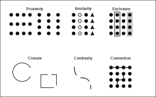
As in the natural world, we use these same principles to organize how we perceive artificial constructs. For example, even though the following sentence is readable, it is less efficient if we don't use proximity to group letters into words:
ThisisatestoftheGestaltprincipleofproximity.
In the same way that we group letters into words with one space, words into sentences with a period, and sentences into paragraphs with a new line, we can also spatially organize the objects of an information dashboard. As it is based on the BSC method, we want to group individual elements into measurements, perspectives, and cause-effect relationships. Along with proximity, we will review the other common principles that we can use to create these three groups.
When we work with proximity in an information dashboard, we focus on how white space divides the visual elements on the screen. We often use white space to group information because this does not add any potentially distracting nondata ink. For example, in the following whiteboard design, we use proximity to group nineteen individual visual elements into three groups that represent the three strategic measurements (YOY Revenue Growth, YOY Revenue Growth by Product Line, and % Revenue Existing Customers) in our financial perspective:

The decision to use proximity to group each measurement leaves us with a greater opportunity to use less obtrusive methods to organize perspectives and relationships. For example, if we were to use the Gestalt principles of closure and and draw a line between each measurement, then we may have to draw a thicker, darker, and more distracting line to separate each perspective. Instead, we are now able to assemble perspectives in subtler ways.
A more explicit way to group elements is to enclose them with a line or a background color. We often use enclosure when we cannot use proximity to group items. For example, when we want to display large amounts of data on a single screen and there is not sufficient white space to separate each visual element, we can use enclosure. In the following whiteboard design, we use a line to draw a box around each perspective:

Enclosure is a stronger grouping method than proximity, and we should use it with care so that we do not to interrupt the flow of information in a dashboard. Let's take a look at how we can use the next Gestalt principle, closure, to make enclosure subtler and reduce its nondata ink.
We don't need a shape to be entirely discovered in order to perceive what form it takes. In the previous whiteboard design, if we draw a single line between each perspective, we still perceive the rectangular enclosures that group each one:

We have now created a subtler way to group different perspectives. An even subtler way would be to replace the lines with the names of each perspective in a very large font size. Sometimes, a simple outdented heading, such as "Balanced Scorecard" in the previous whiteboard design, is enough to perceive an enclosure. However, we elect to use a line so that we avoid overlapping headings with the lines that we will use in the following section to connect related measurements.
In the previous sections, we used proximity to group measurements, and we used enclosure and closure to group perspectives. In the following sections, we'll use connection, continuity, and similarity to assemble the cause-and-effect relationships. Connection groups elements together more powerfully than proximity but less than enclosure. In the following whiteboard design, we link cause-and-effect measurements in accordance with our strategy map:

Even though we've now grouped the cause-and-effect measurements, we've also created possible confusion between these new lines and the ones that group each perspective. When we confront conflicting elements, we are often inclined to differentiate them by making one stronger and more explicit than the other. However, for example, if we were to make the lines dividing the perspectives thicker so as to differentiate them from the others, then we risk stealing attention away from what should be the most important element in the dashboard: the data. Let's see how we can use continuity to make sure that our grouping techniques complement rather than supplant the data.
Similarly to closure, we don't have to see a complete line in order to perceive one. We can use the Gestalt principle of continuity to create a subtler, dashed line that connects the related measures in the following whiteboard design:

Continuity can also work in a more subtle way when we align objects in the dashboard. For example, the grouping of each perspective is reinforced by the fact that the measurements are vertically aligned. We may also notice that the measurements found in the customer and learning perspectives are also horizontally aligned even though they have no direct relationship. We've aligned them so that the dashboard is symmetric and aesthetically pleasing. In this case, the lines that we've added to enclose each perspective and separate the measurements help lower the risk that they will be interpreted as a meaningful group. We will now review the last Gestalt principle that will help us to further distinguish between the lines that we use to enclose the perspectives and the ones that connect related measurements.
Finally, we interpret elements that are alike as part of the same group. Visual likeness can be determined by the elements' color, shape, and size. For example, in the whiteboard design, we've used the principle of similarity to group elements that are alike but dispersed throughout the dashboard. In the previous figure, we can decipher individual bullet charts as neon green and calculated numbers as pale yellow and efficiently identify them during an extremely dynamic agile design exercise.
In the actual dashboard, we use the similarity principle to reaffirm the distinction between the two sets of lines that we use to define two distinct groupings. In the final version of our design that we've migrated to QlikView in the following figure, we use black lines to divide the perspectives and light gray lines to group the cause-and-effect relationships.

In the same way that we used the continuity principle, we use similarity to differentiate groups by making one subtler rather than making one more explicit. If we were to use a different hue to group the cause-and-effect relationships, then we risk stealing unnecessary attention away from the actual measurements again. In the previous figure, we can appreciate how well the eight BCS measurements stand out at first glance. Then, upon further exploration, we can see how they are first grouped by their perspective and then by their cause-and-effect relationship.
The Gestalt principles of perceptual organization are an important set of rules that help us make user-interface design less an art and more a science. However, they still leave us with plenty of leeway to create unique, aesthetic interfaces. In the next section, we will review how to incorporate a filter pane without changing our original information dashboard design.