23. Advanced Userform Techniques
Chapter 10, “Userforms: An Introduction,” covered the basics of adding controls to userforms. This chapter continues this topic by looking at more advanced controls and methods for making the most out of userforms.
Using the UserForm Toolbar in the Design of Controls on Userforms
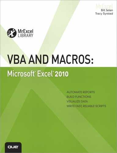
In the VB Editor, hidden under the View menu in the Toolbars command are a few toolbars that do not appear unless the user intervenes. One of these is the UserForm toolbar, shown in Figure 23.1. It has functionality useful for organizing the controls you add to a userform; for example, it will make all the controls you select the same size.
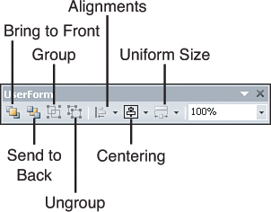
Figure 23.1. The UserForm toolbar has tools to organize the controls on a userform.
More Userform Controls
Chapter 10 began a review of some of the controls available on userforms. The review is continued here. At the end of each control review is a table listing that control’s events.
Check Boxes
Check boxes allow the user to select one or more options on a userform. Unlike the option buttons discussed in Chapter 10, a user can select one or more check boxes at a time.
The value of a checked box is True; the value of an un checked box is False. If you clear the value of a check box (Checkbox1.value = ""), when the userform runs, the check box will have a faded check in it, as shown in Figure 23.2. This can be useful to verify that users have viewed all options and made a selection.
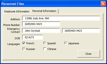
Figure 23.2. Use the null value of the check box to verify that users have viewed and answered all options.
The following code reviews all the check boxes in the language group. If a value is null, the user is prompted to review the selections:
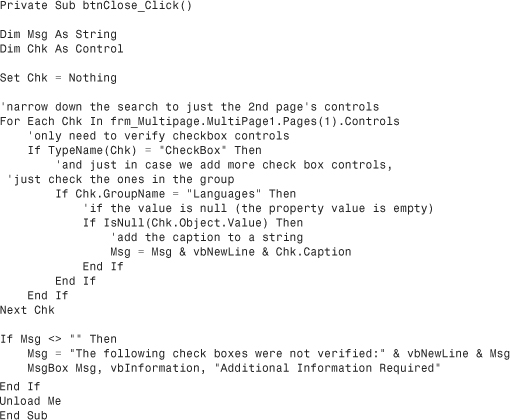
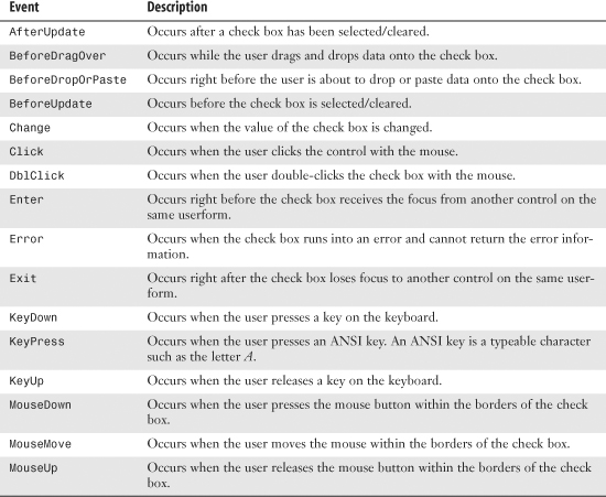
Table 23.1 lists the events for CheckBox controls.
Table 23.1. Events for CheckBox Controls
Tab Strips
The MultiPage control allows a userform to have several pages. Each page of the form can have its own set of controls, unrelated to any other control on the form. A TabStrip control also allows a userform to have many pages, but the controls on a tab strip are identical; they are drawn only once. Yet when the form is run, the information changes according to the tab strip that is active (see Figure 23.3).
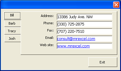
Figure 23.3. A tab strip allows a userform with multiple pages to share controls but not information.
→ To learn more about MultiPage controls, see “Using the MultiPage Control to Combine Forms” on p. 198.
By default, a tab strip is thin with two tabs at the top. Right-clicking a tab enables you to add, remove, rename, or move that tab. The tab strip should also be sized to hold all the controls. A button for closing the form should be drawn outside the tab strip area.
The tabs can also be moved around the strip. This is done by changing the TabOrientation property. The tabs can be at the top, bottom, left, or right side of the userform.
The following lines of code were used to create the tab strip form shown in Figure 23.3. The Initialize sub calls the sub SetValuestoTabStrip, which sets the value for the first tab:
Private Sub UserForm_Initialize()
SetValuesToTabStrip 1 'As default
End Sub
These lines of code handle what happens when a new tab is selected.
Private Sub TabStrip1_Change()
Dim lngRow As Long
lngRow = TabStrip1.Value + 1
SetValuesToTabStrip lngRow
End Sub
This sub provides the data shown on each tab. A sheet was set up, with each row corresponding to a tab.

The tab strip’s values are automatically filled in. They correspond to the tab’s position in the strip; moving a tab changes its value. The value of the first tab of a tab strip is 0, which is why in the preceding code, we add 1 to the tab strip value when the form is initialized.
Tip
If you want a single tab to have an extra control, the control could be added at runtime when the tab is activated and removed when the tab is deactivated.
Table 23.2 lists the events for the TabStrip control.
Table 23.2. Events for TabStrip Controls

RefEdit
The RefEdit control allows the user to select a range on a sheet; the range is returned as the value of the control. It can be added to any form. The userform disappears after it is activated by a click of the button on the right side of the field. The userform is replaced with the range selection form that is used when selecting ranges with Excel’s many wizard tools. Click the button on the right to show the userform once again.
The form in Figure 23.4 and the following code allow the user to select a range, which is then made bold.
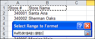
Figure 23.4. Use RefEdit to enable the user to select a range on a sheet.
Private Sub cb1_Click()
Range(RefEdit1.Value).Font.Bold = True
End Sub
Table 23.3 lists the events for RefEdit controls.
Table 23.3. Events for RefEdit Controls

Toggle Buttons
A toggle button looks like a normal command button, but when the user presses it, it stays pressed until it is selected again. This allows a True or False value to be returned based on the status of the button. Table 23.4 lists the events for the ToggleButton controls.
Table 23.4. Events for ToggleButton Controls
Using a Scrollbar As a Slider to Select Values
Chapter 10 discussed using a SpinButton control to allow someone to choose a date. The spin button is useful, but it allows clients to adjust up or down by only one unit at a time. An alternative method is to draw a horizontal or vertical scrollbar in the middle of the userform and use it as a slider. Clients can use arrows on the ends of the scrollbar like the spin button arrows, but they can also grab the scrollbar and instantly drag it to a certain value.
The userform shown in Figure 23.5 includes a label named Label1 and a scrollbar called ScrollBar1.

Figure 23.5. Using a scrollbar control allows the user to drag to a particular numeric or data value.
The userform’s Initialize code sets up the Min and Max values for the scrollbar. It initializes the scrollbar to a value from Cell A1 and updates the Label1.Caption:
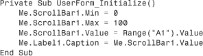
Two event handlers are needed for the scrollbar. The Change event handles if users click the arrows at the ends of the scrollbar. The Scroll event handles if they drag the slider to a new value:
Finally, the event attached to the button writes the scrollbar value out to the worksheet:

Table 23.5 lists the events for Scrollbar controls.
Table 23.5. Events for Scrollbar Controls
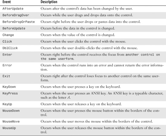
Controls and Collections
In Chapter 22, “Creating Classes, Records, and Collections,” several labels on a sheet were grouped together into a collection. With a little more code, these labels were turned into help screens for the users. Userform controls can also be grouped into collections to take advantage of class modules. The following example selects or clears all the check boxes on the userform, depending on which label the user chooses.
Place the following code in the class module, clsFormEvents. It consists of one property, chb, and two methods, SelectAll and UnselectAll.
The SelectAll method selects a check box by setting its value to True:
Option Explicit
Public WithEvents chb As MSForms.CheckBox
Public Sub SelectAll()
chb.Value = True
End Sub
The UnselectAll method clears the check box:
Public Sub UnselectAll()
chb.Value = False
End Sub
That sets up the class module. Next, the controls need to be placed in a collection. The following code, placed behind the form, frm_Movies, places the check boxes into a collection. The check boxes are part of a frame, f_Selection, which makes it easier to create the collection because it narrows the number of controls that need to be checked from the entire userform to just those controls within the frame:

When the form is opened, the controls are placed into the collection. All that’s left now is to add the code for labels to select and clear the check boxes:
Private Sub lbl_SelectAll_Click()
Dim ctl As clsFormEvents
For Each ctl In col_Selection
ctl.SelectAll
Next ctl
End Sub
The following code clears the check boxes in the collection:
Private Sub lbl_unSelectAll_Click()
Dim ctl As clsFormEvents
For Each ctl In col_Selection
ctl.Unselectall
Next ctl
End Sub
All the check boxes can be selected and cleared with a single click of the mouse, as shown in Figure 23.6.

Figure 23.6. Use frames, collections, and class modules together to create quick and efficient userforms.
Tip
If your controls cannot be placed in a frame, you can use a tag to create an improvised grouping. A tag is a property that holds more information about a control. Its value is of type string, so it can hold any type of information. For example, it can be used to create an informal group of controls from different groupings.
Modeless Userforms
Have you ever had a userform active but needed to look at something on a sheet? There was a time when the form had to be shut down before anything else in Excel could be done. No longer! Forms can now be modeless, which means they don’t have to interfere with the functionality of Excel. The user can type in a cell, switch to another sheet, copy/paste data, and use the ribbon—it is as if the userform were not there.
By default, a userform is modal, which means that there is no interaction with Excel other than the form. To make the form modeless, change the ShowModal property to False. After it is modeless, the user can select a cell on the sheet while the form is active, as shown in Figure 23.7.
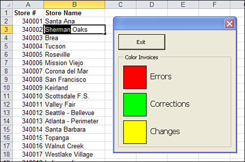
Figure 23.7. A modeless form enables the user to enter a cell while the form is still active.
Using Hyperlinks in Userforms
In the userform example shown in Figure 23.3, there is a field for e-mail and a website address. It would be nice to click these and have a blank e-mail message or web page appear automatically. You can do this by using the following program, which creates a new message or opens a web browser when the corresponding label is clicked.
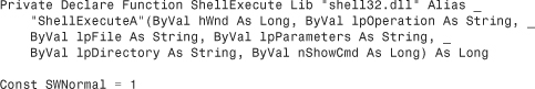
Tip
The application programming interface (API) declaration, and any other constants, go at the very top of the code.
This sub controls what happens when the e-mail label is clicked, as shown in Figure 23.8:

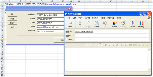
Figure 23.8. Turn e-mail addresses and websites into clickable links.
This sub controls what happens when the website label is clicked:

Adding Controls at Runtime
It is possible to add controls to a userform at runtime. This is convenient if you are not sure how many items you will be adding to the form.
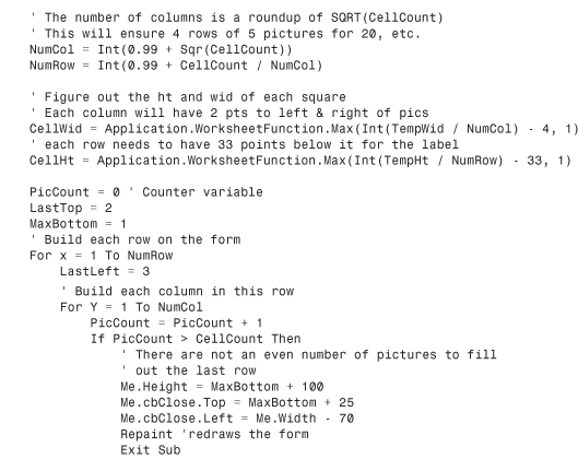
Figure 23.9 shows a plain form with only one button. This plain form is used to display any number of pictures from a product catalog. The pictures and accompanying labels appear at runtime, as the form is being displayed.

Figure 23.9. Flexible forms can be created if you add most controls at runtime.
A sales rep making a sales presentation uses this form to display a product catalog. He can select any number of SKUs from an Excel worksheet and press a hot key to display the form. If he selects 18 items on the worksheet, the form displays with a small version of each picture, as shown in Figure 23.10.
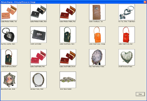
Figure 23.10. The sales rep asked to see photos of 18 SKUs. The UserForm_Initialize procedure adds each picture and label on-the-fly.
If the sales rep selects fewer items, the images are displayed larger, as shown in Figure 23.11.
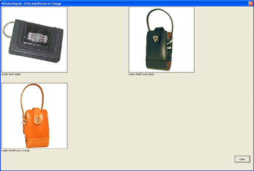
Figure 23.11. The logic in Userform_Initialize decides how many pictures are being displayed and adds the appropriate size controls.
A number of techniques are used to create this userform on-the-fly. The initial form contains only one button, called cbClose. Everything else is added on-the-fly.
Resizing the Userform On-the-fly
One goal is to give the best view of the images in the product catalog. This means having the form appear as large as possible. The following code uses the form’s Height and Width properties to make sure the form fills almost the entire screen:
' resize the form
Me.Height = Int(0.98 * ActiveWindow.Height)
Me.Width = Int(0.98 * ActiveWindow.Width)
Adding a Control On-the-fly
For a normal control added at design time, it is easy to refer to the control by using its name:
Me.cbSave.Left = 100
However, for a control that is added at runtime, you have to use the Controls collection to set any properties for the control. For this reason, it is important to set up a variable to hold the name of the control. Controls are added with the .Add method. The important parameter is the bstrProgId. This code name dictates whether the added control is a label, text box, command button, or something else.
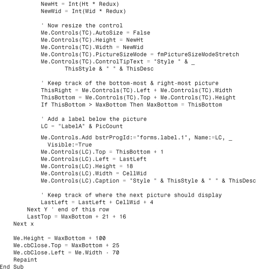
The following code adds a new label to the form. PicCount is a counter variable used to ensure that each label has a new name. After the form is added, specify a position for the control by setting the Top and Left properties. You should also set a Height and Width for the control:
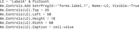
Caution
You lose some of the AutoComplete options with this method. Normally, if you would start to type Me.cbClose., the AutoComplete options would present the valid choices for a command button. However, when you use the Me.Controls(LC) collection to add controls on-the-fly, VBA does not know what type of control is referenced. In this case, it is helpful to know you need to set the Caption property rather than the Value property for a label.
Sizing On-the-fly
In reality, you need to be able to calculate values for Top, Left, Height, and Width on-the-fly. You would do this based on the actual height and width of the form and on how many controls are needed.
Adding Other Controls
To add other types of controls, change the ProgId used with the Add method. Table 23.6 shows the ProgIds for various types of controls.
Table 23.6. Userform Controls and Corresponding ProgIds

Adding an Image On-the-fly
There is some unpredictability in adding images. Any given image might be shaped either landscape or portrait. The image might be small or huge. The strategy you might want to use is to let the image load full size by setting the .AutoSize parameter to True before loading it:

After the image has loaded, you can read the control’s Height and Width properties to determine whether the image is landscape or portrait and whether the image is constrained by available width or available height:
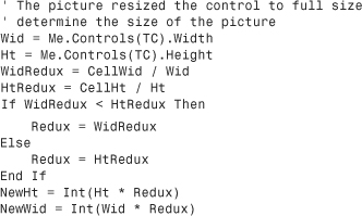
After you find the proper size for the image so that it draws without distortion, set the AutoSize property to False. Use the correct height and width to have the image not appear distorted:

Putting It All Together
This is the complete code for the Picture Catalog userform:


Adding Help to the Userform
Even though you designed a great userform, there is one thing missing: guidance for the users. The following sections show four ways you can help users fill out the form properly.
Showing Accelerator Keys
Built-in forms often have keyboard shortcuts that allow actions to be triggered or fields selected with a few keystrokes. These shortcuts are identified by an underlined letter on a button or label.
You can add this same capability to custom userforms by entering a value in the Accelerator property of the control. Alt + the accelerator key selects the control. For example, in Figure 23.12, Alt+H selects the VHS check box. Repeating the combination clears the box.
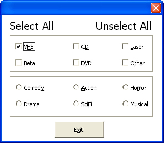
Figure 23.12. Use accelerator key combinations to give userforms the power of keyboard shortcuts.
Adding Control Tip Text
When a cursor is waved over a toolbar, tip text appears, hinting at what the control does. You can also add tip text to userforms by entering a value in the ControlTipText property of a control. In Figure 23.13, tip text has been added to the frame surrounding the various categories.
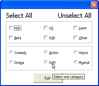
Figure 23.13. Add tips to controls to provide help to users.
Creating the Tab Order
Users can also tab from one field to another. This is an automatic feature in a form. To control which field the next tab brings a user to, you can set the TapStop property value for each control.
The first tab stop is zero, and the last tab stop is equal to the number of controls in a group. Remember, a group can be created with a frame. Excel does not allow multiple controls to have the same tab stop. After tab stops are set, the user can use the Tab key and Spacebar to select/deselect various options, as shown in Figure 23.14.
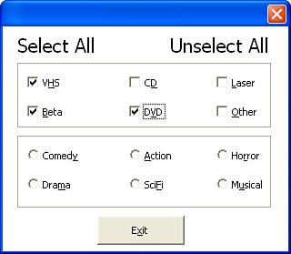
Figure 23.14. The options in this form were selected with the Tab key and Spacebar.
Coloring the Active Control
Another method for helping a user fill out a form is to color the active field. The following example changes the color of a text box or combo box when it is active.
Place the following in a class module called clsCtlColor:

Place the following behind the userform:
Private WithEvents objForm As clsCtlColor
Private Sub UserForm_Initialize()
Set objForm = New clsCtlColor
End Sub
This sub changes the BackColor of the active control when the form is activated:
Private Sub UserForm_Activate()
If TypeName(ActiveControl) = "ComboBox" Or _
TypeName(ActiveControl) = "TextBox" Then
ActiveControl.BackColor = &HC0E0FF
End If
objForm.CheckActiveCtrl Me
End Sub
This sub changes the BackColor of the active control when it gets the focus:
Private Sub objForm_GetFocus()
ActiveControl.BackColor = &HC0E0FF
End Sub
This sub changes the BackColor back to white when the control loses the focus:
Private Sub objForm_LostFocus(ByVal strCtrl As String)
Me.Controls(strCtrl).BackColor = &HFFFFFF
End Sub
This sub clears the objForm when the form is closed:
Private Sub UserForm_QueryClose(Cancel As Integer, CloseMode As Integer)
Set objForm = Nothing
End Sub
Case Study: Multicolumn List Boxes
You have created several spreadsheets containing store data. The primary key of each set is the store number. The workbook is used by several people, but not everyone memorizes stores by his or her store numbers. You need some way of letting a user select a store by its name. At the same time, you need to return the store number to be used in the code. You could use VLOOKUP or MATCH, but there is another way.
A list box can have more than one column, but not all the columns need to be visible to the user. In addition, the user can select an item from the visible list, but the list box returns the corresponding value from another column.
Draw a list box and set the ColumnCount property to 2. Set the RowSource to a two-column range called Stores. The first column of the range is the store number; the second column is the store name. At this point, the list box is displaying both columns of data. To change this, set the column width to 0, 20—the text automatically updates to 0 pt;20 pt. The first column is now hidden. Figure 23.15 shows the list box properties as they need to be.

Figure 23.15. Setting the list box properties creates a two-column list box that appears to be a single column of data.
The appearance of the list box has now been set. When the user activates the list box, she will see only the store names. To return the value of the first column, set the BoundColumn property to 1. This can be done through the Properties window or through code. This example uses code to maintain the flexibility of returning the store number (see Figure 23.16):
Private Sub UserForm_Initialize()
lb_StoreName.BoundColumn = 1
End Sub
Private Sub lb_StoreName_Click()
lbl_StoreNum.Caption = lb_StoreName.Value
End Sub

Figure 23.16. Use a two-column list box to allow the user to select a store name but return the store number.
Transparent Forms
Have you ever had a form that you had to keep moving out of the way so you could see the data behind it? The following code sets the userform at a 50 percent transparency (see Figure 23.17) so that you can see the data behind it without moving the form somewhere else on the screen (and blocking more data).
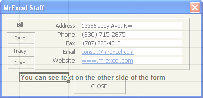
Figure 23.17. Create a 50 percent transparent form to view the data on the sheet behind it.
Place the following in the declarations section of the userform:
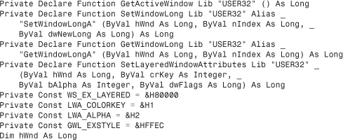
Place the following behind a userform. When the form is activated, the transparency will be set:

Next Steps
In Chapter 24, “Windows Application Programming Interface (API),” you learn how to access functions and procedures hidden in files on your computer.