11. Creating Charts
IN THIS CHAPTER
Referencing Charts and Chart Objects in VBA Code
Recording Commands from the Layout or Design Tabs
Using SetElement to Emulate Changes on the Layout Tab
Changing a Chart Title Using VBA
Emulating Changes on the Format Tab
Exporting a Chart as a Graphic
Charting in Excel 2010
Microsoft rewrote the Excel charting engine for Excel 2007. Most code from Excel 2003 will continue to work in Excel 2010.
The following are some important methods and features available in Excel 2010:
• ApplyLayout—This method applies one of the chart layouts available on the Design tab.
• SetElement—This method chooses any of the built-in element choices from the Layout tab.
• ChartFormat—This object enables you to change the fill, glow, line, reflection, shadow, soft edge, or 3-D format of most individual chart elements. This is similar to settings on the Format tab.
• AddChart—This method enables you to add a chart to an existing worksheet.
Referencing Charts and Chart Objects in VBA Code
If you go back far enough in Excel history, you find that all charts used to be created as their own chart sheets. Then, in the mid-1990s, Excel added the amazing capability to embed a chart right onto an existing worksheet. This allowed a report to be created with tables of numbers and charts all on the same page, something we take for granted today.
These two different ways of dealing with charts make it necessary for you to deal with two separate object models for charts. When a chart is on its own standalone chart sheet, you are dealing with a Chart object. When a chart is embedded in a worksheet, you are dealing with a ChartObject object. Excel 2010 includes a third evolutionary branch because objects on a worksheet are also members of the Shapes collection.
In legacy versions of Excel, to reference the color of the chart area for an embedded chart, you must refer to the chart in this manner:
Worksheets("Jan").ChartObjects("Chart 1").Chart.ChartArea.Interior.ColorIndex _
= 4
In Excel 2010, you can use the Shapes collection:
Worksheets("Jan").Shapes("Chart 1").Chart.ChartArea.Interior.ColorIndex = 4
In any version of Excel, if a chart is on its own chart sheet, you don’t have to specify the container; you can simply refer to the Chart object:
Sheets("Chart1").ChartArea.Interior.ColorIndex = 4
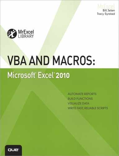
Creating a Chart
In legacy versions of Excel, you used the Charts.Add command to add a new chart. Next, you specified the source data, type of chart, and whether the chart should be on a new sheet or embedded on an existing worksheet. The first three lines of the following code create a clustered column chart on a new chart sheet. The fourth line moves the chart back to be an embedded object in Sheet1:

If you plan to share your macros with people who still use Excel 2003, you should use the Charts.Add method. However, if your application will be running only Excel 2007 or Excel 2010, you can use the new AddChart method. The code for the AddChart method can be as simple as the following:
Alternatively, you can specify the chart type, size, and location as part of the AddChart method, as described in the next section.
Specifying the Size and Location of a Chart
The AddChart method has additional parameters you can use to specify the type of chart, the chart’s location on the worksheet, and the size of the chart.
The location and size of a chart are specified in points (72 points = 1 inch). For example, the Top parameter requires the number of points from the top of Row 1 to the top edge of the worksheet.
The following code creates a chart that roughly covers the Range C11:J30:

It requires a lot of trial and error to randomly figure out the exact distance in points to cause a chart to line up with a certain cell. Fortunately, you can ask VBA to tell you the distance in points to a certain cell. If you ask for the Left property of any cell, you find the distance to the top-left corner of that cell. You can also ask for the width of a range or the height of a range. For example, the following code creates a chart in exactly C11:J30:

In this case, you are not moving the location of the Chart object. Instead, you are moving the location of the container that contains the chart. In Excel 2010, it is either the ChartObject or the Shape object. If you try to change the actual location of the chart, you move it within the container. Because you can actually move the chart area a few points in either direction inside the container, the code will run, but you will not get the desired results.
![]() To see a demo of specifying chart location, search for Excel VBA 11 at YouTube.
To see a demo of specifying chart location, search for Excel VBA 11 at YouTube.
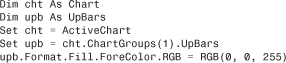
To move a chart that has already been created, you can reference either the ChartObject or the Shape and change the Top, Left, Width, and Height properties, as shown in the following macro:

Later Referring to a Specific Chart
When a new chart is created, it is given a sequential name, such as Chart 1. If you select a chart and then look in the name box, you see the name of the chart. In Figure 11.1, the name of the chart is Chart 14. This does not mean that there are 14 charts on the worksheet. In this particular case, many individual charts have been created and deleted.

Figure 11.1. Select a chart and look in the name box to find the name of the chart.
This means that on any given day that your macro runs, the Chart object might have a different name. If you need to reference the chart later in the macro, perhaps after you have selected other cells and the chart is no longer active, you might ask VBA for the name of the chart and store it in a variable for later use, as shown here:

In the preceding macro, the variable ThisChartObjectName contains the name of the Chart object. This method works great if your changes will happen later in the same macro. However, after the macro finishes running, the variable will be out of scope, and you won’t be able to access the name later.
If you want to be able to remember a chart name, you could store the name in an out-of-the-way cell on the worksheet. The first macro here stores the name in Cell Z1, and the second macro then later modifies the chart using the name stored in Cell Z1:

After the previous macro stored the name in Cell Z1, the following macro will use the value in Z1 to figure out which chart to change:

If you need to modify a preexisting chart—such as a chart that you did not create—and there is only one chart on the worksheet, you can use this line of code:
WS.ChartObjects(1).Chart.Interior.ColorIndex = 4
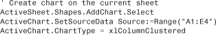
If there are many charts, and you need to find the one with the upper-left corner located in Cell A4, you can loop through all the Chart objects until you find one in the correct location, like this:
Recording Commands from the Layout or Design Tabs
With charts in Excel 2010, there are three levels of chart changes. The global chart settings that indicate the chart type and style are on the Design tab. Selections from the built-in element settings appear on the Layout tab. You make microchanges by using the Format tab.
The macro recorder was not finished in Excel 2007, but it is working in Excel 2010. If you need to make certain changes, this enables you to quickly record a macro and then copy its code.
Specifying a Built-in Chart Type
Excel 2010 has 73 built-in chart types. To change a chart to one of the 73 types, you use the ChartType property. This property can be applied either to a chart or to a series within a chart. Here is an example that changes the type for the entire chart:
ActiveChart.ChartType = xlBubble
To change the second series on a chart to a line chart, you use this:
ActiveChart.Series(2).ChartType = xlLine
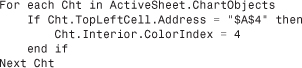
Table 11.1 lists the 73 chart type constants that you can use to create various charts. The sequence of Table 11.1 matches the sequence of the charts in the Chart Type dialog.
Table 11.1. Chart Types for Use in VBA


Specifying a Template Chart Type
Excel 2010 allows you to create a custom chart template with all your preferred settings such as colors and fonts. This technique is a great way to save time when you are creating a chart with a lot of custom formatting.
A VBA macro can make use of a custom chart template, provided you plan to distribute the custom chart template to each person who will run your macro.
In Excel 2010, you save custom chart types as .crtx files and store them in the %appdata%MicrosoftTemplatesCharts folder.
To apply a custom chart type, you use the following:
ActiveChart.ApplyChartTemplate "MyChart.crtx"
If the chart template does not exist, VBA returns an error. If you would like Excel to continue without displaying a debug error, you can instruct the error handler to resume with the next line. After applying the chart template, go back to the default state of the error handler so that you will see any errors. Here’s how you do this:
On Error Resume Next
ActiveChart.ApplyChartTemplate ("MyChart.crtx")
On Error GoTo 0 ' that final character is a zero
Changing a Chart’s Layout or Style
Two galleries—the Chart Layout gallery and the Styles gallery—make up the bulk of the Design tab.
The Chart Layout gallery offers from 4 to 12 combinations of chart elements. These combinations are different for various chart types. When you look at the gallery shown in Figure 11.2, the ToolTips for the layouts show that the layouts are named imaginatively as Layout 1 through Layout 11.

Figure 11.2. The built-in layouts are numbered 1 through 11. For other chart types, you might have from 4 to 12 layouts.
To apply one of the built-in layouts in a macro, you have to use the ApplyLayout method with a number from 1 through 12 to correspond to the built-in layouts. The following code applies Layout 1 to the active chart:
ActiveChart.ApplyLayout 1
Caution
Whereas line charts offer 12 built-in layouts, other types such as radar charts offer as few as four built-in layouts. If you attempt to specify a layout number that is larger than the layouts available for the current chart type, Excel returns a runtime error 5. Unless you just created the active chart in the same macro, there is always the possibility that the person running the macro changed your line charts to radar charts, so include some error handling before you use the ApplyLayout command.
Therefore, to use a built-in layout effectively, you must have actually built a chart by hand and found a layout that you like.
As shown in Figure 11.3, the Styles gallery contains 48 styles. These styles are also numbered sequentially, with Styles 1 through 8 in Row 1, Styles 9 through 16 in Row 2, and so on. These styles follow a bit of a pattern:
• Styles 1, 9, 17, 25, 33, and 41 (that is, the styles in Column 1) are monochrome.
• Styles 2, 10, 18, 26, 34, and 42 (that is, the styles in Column 2) use different colors for each point.
• All the other styles use hues of a particular theme color.
• Styles 1 through 8 are simple styles.
• Styles 17 through 24 use moderate effects.
• Styles 33 through 40 have intense effects.
• Styles 41 through 48 appear on a dark background.

Figure 11.3. The built-in styles are numbered 1 through 48.
Tip
If you are going to mix styles in a single workbook, consider staying within a single row or a single column of the gallery.
To apply a style to a chart, you use the ChartStyle property, assigning it a value from 1 to 48:
ActiveChart.ChartStyle = 1
The ChartStyle property changes the colors in the chart. However, a number of formatting changes from the Format tab are not overwritten when you change the ChartStyle property. For example, suppose that you had applied glow or a clear glass bezel to a chart. Running the preceding code will not clear that formatting.
To clear any previous formatting, you use the ClearToMatchStyle method:
ActiveChart.ChartStyle = 1
ActiveChart.ClearToMatchStyle
Using SetElement to Emulate Changes on the Layout Tab
The Layout tab contains a number of built-in settings. Figure 11.4 shows a few of the built-in menu items for the Legend tab. There are similar menus for each of the icons in the figure.

Figure 11.4. There are built-in menus similar to this one for each icon. If your choice is in the menu, the VBA code uses the SetElement method.
If you use a built-in menu item to change the titles, legend, labels, axes, gridlines, or background, it is probably handled in code that uses the SetElement method that is available in Excel 2010.
Tip
SetElement does not work with the More choices at the bottom of each menu. It also does not work with the 3-D Rotation button. Other than that, you can use SetElement to change everything in the Labels, Axes, Background, and Analysis groups.
The macro recorder always works for the built-in settings on the Layout tab. If you do not feel like looking up the proper constant in this book, you can always quickly record a macro.
The SetElement method is followed by a constant that specifies which menu item to select. For example, if you want to choose Show Legend at Left, you can use this code:
ActiveChart.SetElement msoElementLegendLeft
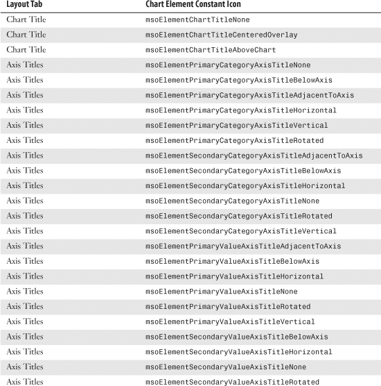
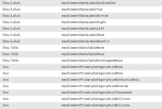
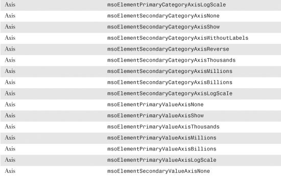
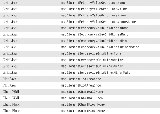
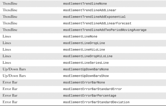
Table 11.2 shows all the available constants that you can use with the SetElement method. These constants are in roughly the same order as they appear on the Layout tab.
Table 11.2. Constants Available with SetElement


Caution
If you attempt to format an element that is not present, Excel will return a –2147467259 Method Failed error.
Changing a Chart Title Using VBA
The Layout tab’s built-in menus enable you to add a title above a chart, but they do not enable you to change the characters in a chart title or axis title.
In the Excel interface, you can double-click the chart title text and type a new title to change the title.
To specify a chart title in VBA, use this code:
ActiveChart.ChartTitle.Caption = "My Chart"
Similarly, you can specify the axis titles by using the Caption property. The following code changes the axis title along the category axis:
ActiveChart.Axes(xlCategory, xlPrimary).AxisTitle.Caption = "Months"
Emulating Changes on the Format Tab
The Format tab offers icons for changing colors and effects for individual chart elements. While many people call the Shadow, Glow, Bevel, and Material settings “chart junk,” there are ways in VBA to apply these formats.
Using the Format Method to Access Formatting Options
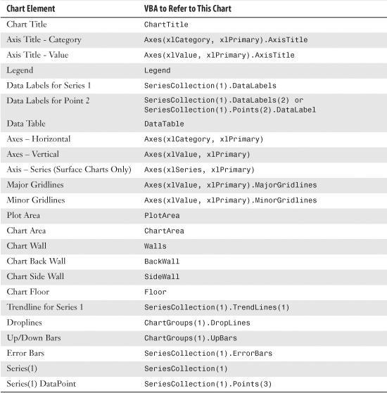
Excel 2010 includes an object called the ChartFormat object that contains the settings for Fill, Glow, Line, PictureFormat, Shadow, SoftEdge, TextFrame2, and ThreeD. You can access the ChartFormat object by using the Format method on many chart elements. Table 11.3 lists a sampling of chart elements that can be formatted using the Format method.
Table 11.3. Chart Elements to Which Formatting Applies
The Format method is the gateway to settings for Fill, Glow, and so on. Each of those objects has different options. The following sections provide examples of how to set up each type of format.
Changing an Object’s Fill
As shown in Figure 11.5, the Shape Fill drop-down on the Format tab enables you to choose a single color, a gradient, a picture, or a texture for the fill.

Figure 11.5. Fill options include a solid color, a gradient, a texture, or a picture.
To apply a specific color, you can use the RGB (red, green, blue) setting. To create a color, you specify a value from 0 to 255 for levels of red, green, and blue. The following code applies a simple blue fill:
If you would like an object to pick up the color from a specific theme accent color, you use the ObjectThemeColor property. The following code changes the bar color of the first series to accent color 6, which is an orange color in the Office theme. However, this might be another color if the workbook is using a different theme.

To apply a built-in texture, you use the PresetTextured method. The following code applies a green marble texture to the second series. However, you can apply any of the 20 different textures:

Tip
When you type PresetTextured followed by a space, the VB Editor offers a complete list of possible texture values.
To fill the bars of a data series with a picture, you use the UserPicture method and specify the path and filename of an image on the computer, as in the following example:

Microsoft removed patterns as fills from Excel 2007. However, this method was restored in Excel 2010 because of the outcry from customers who used patterns to differentiate columns printed on monochrome printers.
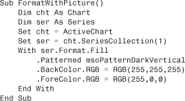
In Excel 2010, you can apply a pattern using the .Patterned method. Patterns have a type such as msoPatternPlain, as well as a foreground and background color. The following code creates dark red vertical lines on a white background:
Caution
Code that uses patterns will work in every version of Excel except Excel 2007. Therefore, do not use this code if you will be sharing the macro with coworkers who use Excel 2007.
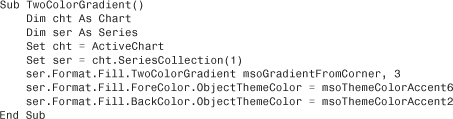
Gradients are more difficult to specify than fills. Excel 2010 provides three methods that help you set up the common gradients. The OneColorGradient and TwoColorGradient methods require that you specify a gradient direction such as msoGradientFromCorner. You can then specify one of four styles, numbered 1 through 4, depending on whether you want the gradient to start at the top left, top right, bottom left, or bottom right. After using a gradient method, you need to specify the ForeColor and the BackColor settings for the object. The following macro sets up a two-color gradient using two theme colors:
When using the OneColorGradient method, you specify a direction, a style (1 through 4), and a darkness value between 0 and 1 (0 for darker gradients or 1 for lighter gradients).
When using the PresetGradient method, you specify a direction, a style (1 through 4), and the type of gradient such as msoGradientBrass, msoGradientLateSunset, or msoGradientRainbow. Again, as you are typing this code in the VB Editor, the AutoComplete tool provides a complete list of the available preset gradient types.
Formatting Line Settings
The LineFormat object formats either a line or the border around an object. You can change numerous properties for a line, such as the color, arrows, dash style, and so on.
The following macro formats the trendline for the first series in a chart:
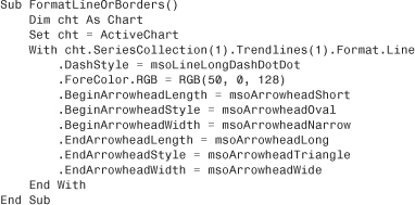
When you are formatting a border, the arrow settings are not relevant, so the code is shorter than the code for formatting a line. The following macro formats the border around a chart:

Formatting Glow Settings
To create a glow, you have to specify a color and a radius. The radius value can be from 1 to 20. A radius of 1 is barely visible, whereas a radius of 20 is often too thick.
Note
A glow is applied to the shape outline. If you try to add a glow to an object where the outline is set to None, you cannot see the glow.
The following macro adds a line around the title and adds a glow around that line:

Formatting Shadow Settings
A shadow is composed of a color, a transparency, and the number of points by which the shadow should be offset from the object. If you increase the number of points, it appears that the object is farther from the surface of the chart. The horizontal offset is known as OffsetX, and the vertical offset is known as OffsetY.
The following macro adds a light blue shadow to the box surrounding a legend:

Formatting Reflection Settings
No chart elements can have reflections applied. The Reflection settings on the Format tab are grayed-out continuously when a chart is selected. Similarly, the ChartFormat object does not have a reflection object.
Formatting Soft Edges
There are six levels of soft edge settings. The settings feather the edges by 1, 2.5, 5, 10, 25, or 50 points. The first setting is barely visible. The biggest settings are usually larger than most of the chart elements you are likely to format.
Microsoft says that the following is the proper syntax for SoftEdge:
Chart.Seriess(1).Points(i).Format.SoftEdge.Type = msoSoftEdgeType1
However, msoSoftEdgeType1 and words like it are really variables defined by Excel. To try a cool trick, go to the VB Editor and open the Immediate window by pressing Ctrl+G. In the Immediate window, type Print msoSoftEdgeType2 and press Enter. The Immediate window tells you that using this word is equivalent to typing 2. Therefore, you can use either msoSoftEdgeType2 or the value 2.
If you use msoSoftEdgeType2, your code will be slightly easier to understand than if you use simply 2. However, if you hope to format each point of a data series with a different format, you might want to use a loop such as this one, in which case it is far easier to use just the numbers 1 through 6 than msoSoftEdgeType1 through msoSoftEdgeType6, as shown in this macro:

Caution
It is a bit strange that the soft edges are defined as a fixed number of points. In a chart that is sized to fit an entire sheet of paper, a 10-point soft edge might work fine. However, if you resize the chart so that you can fit six charts on a page, a 10-point soft edge applied to all sides of a column might make the column completely disappear.
Formatting 3-D Rotation Settings
The 3-D settings handle three different menus on the Format tab. In the Shape Effects drop-down, settings under Preset, Bevel, and 3-D are all actually handled by the ThreeD object in the ChartFormat object. This section discusses settings that affect the 3-D rotation. The next section discusses settings that affect the bevel and 3-D format.
The methods and properties that can be set for the ThreeD object are very broad. In fact, the 3-D settings in VBA include more preset options than do the menus on the Format tab.
Figure 11.6 shows the presets available in the 3-D Rotation fly-out menu.

Figure 11.6. Whereas the 3-D Rotation menu offers 25 presets, VBA offers 62 presets.
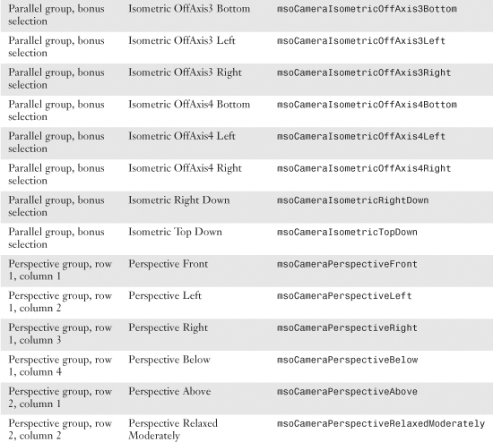
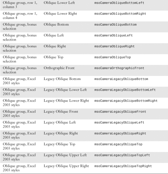
To apply one of the 3-D rotation presets to a chart element, you use the SetPresetCamera method, as shown here:

Table 11.4 lists all the possible SetPresetCamera values.
Table 11.4. 3-D Preset Formats and Their VBA Constant Values


Tip
If the first column indicates that it is a bonus or an Excel 2003 style, you know the value is a preset that is available in VBA. However, the value was not chosen by Microsoft to be included in the 3-D Rotation fly-out menu. You can make some charts in Excel 2010 that no one else will be able to replicate using the Excel interface.
If you prefer not to use the presets, you can explicitly control the rotation around the x-, y-, or z-axis. You can use the following properties and methods to change the rotation of an object:
• RotationX—Returns or sets the rotation of the extruded shape around the x-axis, in degrees. This can be a value from –90 through 90. A positive value indicates upward rotation; a negative value indicates downward rotation.
• RotationY—Returns or sets the rotation of the extruded shape around the y-axis, in degrees. This can be a value from –90 through 90. A positive value indicates rotation to the left; a negative value indicates rotation to the right.
• RotationZ—Returns or sets the rotation of the extruded shape around the z-axis, in degrees. This can be a value from –90 through 90. A positive value indicates upward rotation; a negative value indicates downward rotation.
• IncrementRotationX—Changes the rotation of the specified shape around the x-axis by the specified number of degrees. You specify an increment from –90 to 90. Negative degrees tip the object down, and positive degrees tip the object up.
• IncrementRotationY—Changes the rotation of the specified shape around the y-axis by the specified number of degrees. A positive value tilts the object left, and a negative value tips the object right.
• IncrementRotationZ—Changes the rotation of the specified shape around the z-axis by the specified number of degrees. A positive value tilts the object left, and a negative value tips the object right.
• IncrementRotationHorizontal—Changes the rotation of the specified shape horizontally by the specified number of degrees. You specify an increment from –90 to 90 to specify how much (in degrees) the rotation of the shape is to be changed horizontally. A positive value moves the shape left; a negative value moves it right.
• IncrementRotationVertical—Changes the rotation of the specified shape vertically by the specified number of degrees. You specify an increment from –90 to 90 to specify how much (in degrees) the rotation of the shape is to be changed horizontally. A positive value moves the shape left; a negative value moves it right.
• ResetRotation—Resets the extrusion rotation around the x-axis and the y-axis to 0 so that the front of the extrusion faces forward. This method does not reset the rotation around the z-axis.
Changing the Bevel and 3-D Format
There are 12 presets in the Bevel fly-out menu. These presets affect the bevel on the top face of the object. In charts, you usually see the top face. However, there are some bizarre rotations of a 3-D chart where you see the bottom face of charting elements.
The Format Shape dialog contains the same 12 presets as the Bevel fly-out but allows you to apply the preset to the top or bottom face. You can also control the width and height of the bevel. The VBA properties and methods correspond to the settings on the 3-D Format category of the Format Shape dialog (see Figure 11.7).
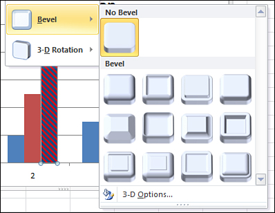
Figure 11.7. You can control the 3-D Format settings such as bevel, surface, and lighting.
You set the type of bevel by using the BevelTopType and BevelBottomType properties. You can further modify the bevel type by setting the BevelTopInset value to set the width and the BevelTopDepth value to set the height. The following macro adds a bevel to the columns of Series 1:

The 12 possible settings for the bevel type are shown in Table 11.5; these settings correspond to the thumbnails in the fly-out menu. To turn off the bevel, you use msoBevelNone.
Table 11.5. Bevel Types

Usually, the accent color used in a bevel is based on the color used to fill the object. However, if you would like control over the extrusion color, you should first specify that the extrusion color type is custom and then specify either a theme accent color or an RGB color. Here’s an example:

You use the Depth property to control the amount of extrusion in the bevel, and you specify the depth in points. Here’s an example:
ser.Format.ThreeD.Depth = 5
For the contour, you can specify either a color or a size of the contour or both. You can specify the color as an RGB value or a theme color. You specify the size in points, using the ContourWidth property. Here’s an example:
ser.Format.ThreeD.ContourColor.RGB = RGB(0, 255, 0)
ser.Format.ThreeD.ContourWidth = 10
The Surface drop-downs are controlled by the following properties:
• PresetMaterial—Contains choices from the Material drop-down
• PresetLighting—Contains choices from the Lighting drop-down
• LightAngle—Controls the angle from which the light is shining on the object
Note
The Material drop-down menu from the 3-D category of the Format dialog box offers 11 settings, although it appears that Microsoft designed a 12th setting in the object model. It is not clear why Microsoft does not offer the SoftMetal style in the dialog box, but you can use it in VBA.
In addition, there are three legacy styles in the object model, which are not available in the Format dialog box. In theory, the new Plastic2 material is better than the old Plastic material. Table 11.6 shows the settings for each thumbnail.
Table 11.6. VBA Constants for Material Types
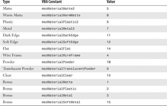
In legacy versions of Excel, the material property was limited to matte, metal, plastic, and wire frame. Microsoft apparently was not happy with the old matte, metal, and plastic settings. It left those values in place to support legacy charts but created the new Matte2, Plastic2, and Metal2 settings. These settings are actually available in the dialog box. In VBA, you are free to use either the old or the new settings.
The columns in Figure 11.8 compare the new and old settings. The final column is for the SoftMetal setting that Microsoft left out of the Format dialog box. This was probably an aesthetic decision instead of an “oh no; this setting crashes the computer” decision. You should feel free to use msoMaterialSoftMetal to create a look that has a subtle difference from charts others create using the settings in the Format dialog box.

Figure 11.8. Comparison of some new and old material presets.
The Lighting drop-down menu from the 3-D category of the Format dialog box offers 15 settings. The object model offers these 15 settings, plus 13 legacy settings from the Excel 2003 Lighting toolbar. Table 11.7 shows the settings for each of these thumbnails.
Table 11.7. VBA Constants for Lighting Types

Creating Advanced Charts
In Charts & Graphs for Microsoft Excel 2010 (Que, ISBN 0789743124), I included some amazing charts that do not look like they can possibly be created using Excel. Building these charts usually involves adding a rogue data series that appears in the chart as an XY series to complete some effect.
The process of creating these charts manually is very tedious, which ensures that most people will never resort to creating such charts. However, if the process could be automated, the creation of the charts starts to become feasible.
The next sections explain how to use VBA to automate the process of creating these rather complex charts.
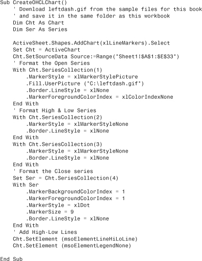
Creating True Open-High-Low-Close Stock Charts
If you are a fan of stock charts in the Wall Street Journal or finance.yahoo.com, you will recognize the chart type known as Open-High-Low-Close (OHLC) chart. Excel does not offer such a chart. Its High-Low-Close (HLC) chart is missing the left-facing dash that represents the opening for each period. You might think that HLC charts are close enough to OHLC charts. However, one of my personal pet peeves is that the WSJ can create better-looking charts than Excel can.
In Figure 11.9, you can see a true OHLC chart.

Figure 11.9. Excel’s built-in High-Low-Close chart leaves out the Open mark for each data point.
Note
In Excel 2010, you can specify a custom picture that you can use as the marker in a chart. Given that Excel has a right-facing dash but not a left-facing dash, you need to use Photoshop to create a left-facing dash as a GIF file. This tiny graphic makes up for the fundamental flaw in Excel’s chart marker selection.
In the Excel user interface, you will indicate that the Open series should have a custom picture and then specify LeftDash.gif as the picture. In VBA code, you use the UserPicture method, as shown here:
ActiveChart Cht.SeriesCollection(1).Fill.UserPicture "C:leftdash.gif"
To create a true OHLC chart, follow these steps:
- Create a line chart from four series; Open, High, Low, Close.
- Change the line style to none for all four series.
- Eliminate the marker for the High and Low series.
- Add a High-Low line to the chart.
- Change the marker for Close to a right-facing dash, which is called a dot in VBA, with a size of 9.
- Change the marker for Open to a custom picture and load
LeftDash.gifas the fill for the series.
The following code creates the top chart in Figure 11.9:
Creating Bins for a Frequency Chart
Suppose that you have results from 3,000 scientific trials. There must be a good way to produce a chart of those results. However, if you just select the results and create a chart, you will end up with chaos (see Figure 11.10).

Figure 11.10. Try to chart the results from 3,000 trials and you will have a jumbled mess.
The trick to creating an effective frequency distribution is to define a series of categories, or bins. A FREQUENCY array function counts the number of items from the 3,000 results that fall within each bin.
The process of creating bins manually is rather tedious and requires knowledge of array formulas. It is better to use a macro to perform all of the tedious calculations.
The macro in this section requires you to specify a bin size and a starting bin. If you expect results in the 0 to 100 range, you might specify bins of 10 each, starting at 0. This would create bins of 0–10, 11–20, 21–30, and so on. If you specify bin sizes of 15 with a starting bin of 5, the macro will create bins of 5–20, 21–35, 36–50, and so on.
To use the following macro, your trial results should start in Row 2 and should be in the rightmost column of a dataset. Three variables near the top of the macro define the starting bin, the ending bin, and the bin size:
' Define Bins
BinSize = 10
FirstBin = 0
LastBin = 100
After that, the macro skips a column and then builds a range of starting bins. In Cell D4 in Figure 11.11, the 10 is used to tell Excel that you are looking for the number of values larger than the 0 in D3, but equal to or less than the 10 in D4.
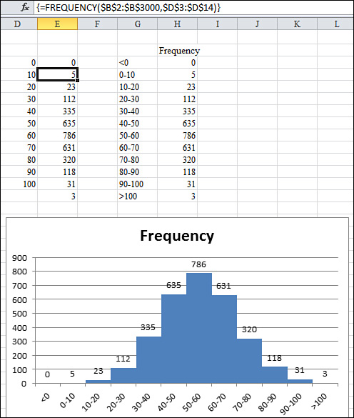
Figure 11.11. The macro summarizes the results into bins and provides a meaningful chart of the data.
Although the bins extend from D3:D13, the FREQUENCY function entered in Column E needs to include one extra cell, in case any results are larger than the last bin. This single formula returns many results. Formulas that return more than one answer are called array formulas. In the Excel user interface, you specify an array formula by holding down Ctrl+Shift while pressing Enter to finish the formula. In Excel VBA, you need to use the FormulaArray property. The following lines of the macro set up the array formula in Column E:

It is not evident to the reader if the bin indicated in Column D is the upper or lower limit. The macro builds readable labels in Column G and then copies the frequency results over to Column H.
After the macro builds a simple column chart, the following line eliminates the gap between columns, creating the traditional histogram view of the data:
Cht.ChartGroups(1).GapWidth = 0
The macro to create the chart in Figure 11.11 follows:


Creating a Stacked Area Chart
The stacked area chart shown in Figure 11.12 is incredibly difficult to create in the Excel user interface. Although the chart appears to contain four independent charts, this chart actually contains nine series:
• The first series contains the values for the East region.
• The second series contains 1,000 minus the East values. This series is formatted with a transparent fill.
• Series 3, 5, and 7 contain values for Central, Northwest, and Southwest.
• Series 4, 6, and 8 contain 1,000 minus the preceding series.
• The final series is a XY series used to add labels for the left axis. There is one point for each gridline. The markers are positioned at an X position of 0. Custom data labels are added next to invisible markers to force the labels along the axis to start again at 0 for each region.

Figure 11.12. A single chart appears to hold four different charts.
To use the macro provided here, your data should begin in Column A and Row 1. The macro adds new columns to the right of the data and new rows below the data, so the rest of the worksheet should be blank.
Two variables at the top of the macro define the height of each chart. In the current example, leaving a height of 1000 allows the sales for each region to fit comfortably. The LabSize value should indicate how frequently labels should appear along the left axis. This number must be evenly divisible into the chart height. In this example, values of 500, 250, 200, 125, or 100 would work:

The macro builds a copy of the data to the right of the original data. New “dummy” series are added to the right of each region to calculate 1,000 minus the data point. In Figure 11.13, this series is shown in G1:O5.
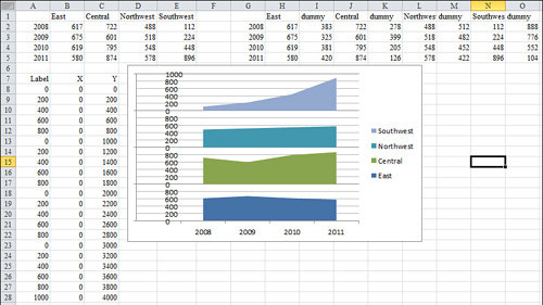
Figure 11.13. Extra data to the right and below the original data are created by the macro to create the chart.
The macro then creates a stacked area chart for the first eight series. The legend for this chart indicates values of East, dummy, Central, dummy, and so on. To delete every other legend entry, use this code:

Similarly, the fill for each even numbered series in the chart needs to be set to transparent:
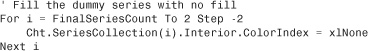
The trickiest part of the process is adding a new final series to the chart. This series will have far more data points than the other series. Range B8:C28 contains the X and Y values for the new series. You will see that each point has an X value of 0 to ensure that it appears along the left side of the plot area. The Y values increase steadily by the value indicated in the LabSize variable. In Column A next to the X and Y points are the actual labels that will be plotted next to each marker. These labels give the illusion that the chart starts over with a value of 0 for each region.
The process of adding the new series is actually much easier in VBA than in the Excel user interface. The following code identifies each component of the series and specifies that it should be plotted as an XY chart:

Finally, code applies a data label from Column A to each point in the final series:

The complete code to create the stacked chart in Figure 11.13 is shown here:


Note
The websites of Andy Pope (http://www.andypope.info) and Jon Peltier (http://peltiertech.com) are filled with examples of unusual charts that require extraordinary effort. If you find that you will regularly be creating stacked charts or any other chart like those on their websites, taking the time to write the VBA will ease the pain of creating the charts in the Excel user interface.
Exporting a Chart as a Graphic
You can export any chart to an image file on your hard drive. The ExportChart method requires you to specify a filename and a graphic type. The available graphic types depend on graphic file filters installed in your Registry. It is a safe bet that JPG, BMP, PNG, and GIF will work on most computers.
For example, the following code exports the active chart as a GIF file:

Caution
Since Excel 2003, Microsoft has supported an Interactive argument in the Export method. Excel Help indicates that if you set Interactive to TRUE, Excel asks for additional settings depending on the file type. However, the dialog that asks for additional settings never appears—at least not for the four standard types of JPG, GIF, BMP, or PNG. To prevent any questions from popping up in the middle of your macro, set Interactive:=False.
Creating a Dynamic Chart in a Userform
With the ability to export a chart to a graphic file, you can also load a graphic file into an Image control in a userform. This means you can create a dialog box in which someone can dynamically control values used to plot a chart.
To create the dialog shown in Figure 11.14, follow these steps:
- In the VBA window, select Insert, UserForm. In the Properties window, rename the form
frmChart. - Resize the userform.
- Add a large Image control to the userform.
- Add two spin buttons named
sbXandsbY. Set them to have a minimum of1and a maximum of5. - Add a
Label3control to display the formula. - Add a command button labeled Close.
- Enter this code in the code window behind the form:
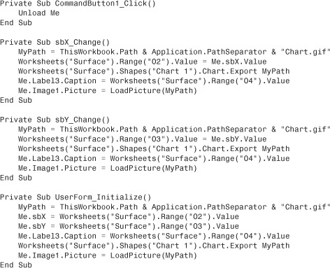
- Use Insert, Module to add a Module1 component with this code:
Sub ShowForm()
frmChart.Show
End Sub
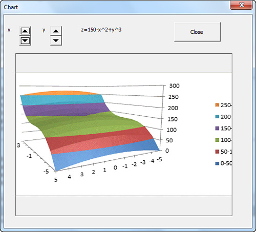
Figure 11.14. This dialog box is a VBA userform displaying a chart. The chart redraws based on changes to the dialog controls.
As someone changes the spin buttons in the userform, Excel writes new values to the worksheet. This causes the chart to update. The userform code then exports the chart and displays it in the userform, as shown in Figure 11.14.
Creating Pivot Charts
A pivot chart is a chart that uses a pivot table as the underlying data source. Unfortunately, pivot charts do not have the cool “show pages” functionality that regular pivot tables have. You can overcome this problem with a quick VBA macro that creates a pivot table and then a pivot chart based on the pivot table. The macro then adds the customer field to the report filter area of the pivot table. It then loops through each customer and exports the chart for each customer.
In Excel 2010, you first create a pivot cache by using the PivotCache.Create method. You can then define a pivot table based on the pivot cache. The usual procedure is to turn off pivot table updating while you add fields to the pivot table. Then you update the pivot table to have Excel perform the calculations.
It takes a bit of finesse to figure out the final range of the pivot table. If you have turned off the column and row totals, the chartable area of the pivot table starts one row below the PivotTableRange1 area. You have to resize the area to include one fewer row to make your chart appear correctly.
After the pivot table is created, you can switch back to the Charts.Add code discussed earlier in this chapter. You can use any formatting code to get the chart formatted as you desire.
The following code creates a pivot table and a single pivot chart that summarize revenue by region and product:
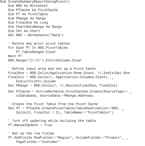

Figure 11.15 shows the resulting chart and pivot table.

Figure 11.15. VBA creates a pivot table and then a chart from the pivot table. Excel automatically displays the PivotChart Filter window in response.
Next Steps
Charts provide a visual picture that can help to summarize data for a manager. In Chapter 12, “Data Mining with Advanced Filter,” you learn about using the Advanced Filter tools to produce reports quickly.