Chapter 6
Black and white

I was eleven years old when I first got into photography. My first darkroom was kept under the stairs of our house and like most other budding amateurs, my early experiments were all done in black and white. Back then, very few amateur photographers were competent enough to know how to process color, so black and white was all that most of us could manage to work with. For me, there has always been something rather special about black and white photography and digital imaging has done nothing to diminish this. If anything, I would say that the quality of capture from the latest digital cameras, coupled with the processing expertise of Photoshop and improvements in inkjet printing have now made black and white photography an even more exciting avenue to explore.
Converting color to black and white
The most important tip here is to always shoot in color. Wherever possible you are far better off capturing a scene in full color and using Camera Raw or Photoshop to carry out the color to mono conversion. Although having said that, you do need to use an appropriate conversion method to get the best black and white photographs from your color files.

Dumb black and white conversions
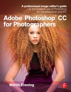
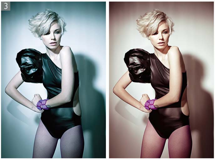
When you change a color image from RGB to Grayscale mode in Photoshop, the tonal values of the three RGB channels are averaged out to produce a smooth continuous tone grayscale. The formula for this conversion consists of blending 60% of the green channel with 30% of the red and 10% of the blue. The rigidity of this color to mono conversion limits the scope for obtaining the best grayscale conversion from a scanned color original (see Figure 6.1). The same thing is true if you make a Lab mode conversion, delete the a and b channels and convert the image to grayscale mode, or if you were to simply desaturate the image. There is nothing necessarily wrong with any of these methods, but they aren’t really making full use of the information that can be contained in a color image.
Smarter black and white conversions
If you capture in color, the RGB master image contains three different grayscale versions of the original scene and these can be blended together in different ways. One of the best ways to do this is to use the Black & White image adjustment in Photoshop, which while not perfect, can still do a good job in providing you with most of the controls you need to make full use of the RGB channel data when applying a conversion. The Black & White slider adjustments will, for the most part, manage to preserve the image luminance range without clipping the shadows or highlights. These adjustments can be applied to color images directly, or by using the Adjustments panel method to add an adjustment layer. The advantage of using an adjustment layer to apply a black and white conversion is that you can quickly convert an image to black and white and have the option to play with the blending modes to refine the appearance of the black and white outcome. Let’s start though by looking at the typical steps used when working with the Black & White adjustment controls.
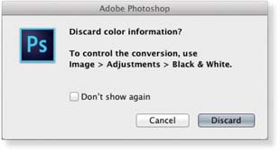
Figure 6.1
If you convert a color image to grayscale mode, Photoshop pops the dialog shown here which is basically advising you there are better ways to convert to black and white.

1 The following steps show a basic method for converting a full color original photograph to black and white. The Black & White image adjustment can be applied directly by going to the Image ![]() Image Adjustments menu, or you can go to the Adjustments panel and click on the Black & White button (circled) to add a new adjustment layer.
Image Adjustments menu, or you can go to the Adjustments panel and click on the Black & White button (circled) to add a new adjustment layer.

2 To begin with I clicked on the Auto button (also circled). This applied an auto slider setting based on an analysis of the image color content. The auto setting usually offers a good starting point for most color to black and white conversions and won’t do anything too dramatic to the image, but is immediately a lot better than choosing Image ![]() Mode
Mode ![]() Grayscale.
Grayscale.


3 If you don’t like the auto setting result, you can adjust the sliders manually to achieve a better conversion. In this example, I lightened the Yellows and darkened the reds slightly.

4 Lastly, I clicked on the target adjustment mode button (circled) for the Black & White adjustment. This allowed me to move the cursor over particular areas of interest (such as the sky) and drag directly on the image to modify the Black & White adjustment. This step selected the nearest color slider in the Black & White adjustment panel. Dragging to the left made the tones beneath the target adjustment tool cursor go darker and dragging to the right, lighter. In the example you see here I managed to increase the contrast in the sky.
Black & White adjustment presets
As with other image adjustments, the Black & White adjustment has a Presets menu at the top from where you can select a number of shipped preset settings. Figure 6.3 shows examples of the different outcomes that can be achieved through selecting some of the different presets from this list.
Once you have created a Black & White adjustment setting that you would like to use again you can choose Save Preset… from the Properties panel options menu (Figure 6.2). For example, I was able to save the slider settings shown here as a custom preset called ‘Red Contrast’.
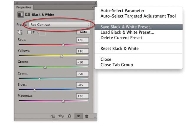
Figure 6.2
Once you have found a Black & White adjustment setting that you would like to use again, you can choose Save Preset… from the Properties panel options menu for the Black & White adjustment. The slider settings shown here were saved as a ‘Red Contrast’ preset. Saved presets can be accessed by mousing down on the Presets menu at the top of the Black & White adjustment Properties panel (circled).
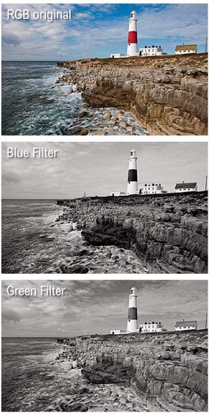

Figure 6.3
This shows some examples of different Black & White adjustment presets applied to a color image.
Split color toning using Color Balance
Although the Black & White adjustment contains a Tint option for coloring images, this only applies a single color overlay adjustment and I have never really found it to be that useful. It is nice though to have the ability to apply a split tone coloring to a photograph and one of the best ways to do this is by using the Color Balance image adjustment. This is ideal for coloring RGB images that have been converted to monochrome using the Black & White adjustment method, mainly because the Color Balance controls are really quite intuitive and simple to use. If you want to colorize the shadows, click on the Shadows radio button and adjust the color settings, then go to the Midtones, make them a different color, and so on. Note that it is best to apply coloring effects with the adjustment layer set to the Color blend mode. The advantage of using the Color blend mode is that you will be able to alter the color component of an image without affecting the luminosity. This is important if you wish to preserve as much of the tone levels information as possible.

1 I started here with an RGB color image and converted it to monochrome using the Black & White image adjustment. I then added a Color Balance adjustment layer to colorize the RGB/monochrome image. To do this, I went to the Adjustment panel and selected the Color Balance adjustment. In the Properties panel l selected the Shadows option from the Tone menu and adjusted all three sliders to apply a color cast to the shadows.

2 I then selected the Midtones Tone menu option and adjusted the color sliders to add a warm color balance to the midtones. You will notice that I had Preserve Luminosity checked. This helped prevent the image tones from becoming clipped.

3 Finally I selected the Highlights option from the Tone menu and added a red/yellow cast to the highlights. I also set the adjustment layer blending mode to Color, which helped preserve all the image luminance information.
Split color toning using Curves adjustments
The Color Balance method is reasonably versatile, but you can also colorize a photograph by using two Curves adjustment layers and take advantage of the Layer Style blending options to create a more adaptable split tone coloring effect.


1 To tone this image, I first added a Curves adjustment layer above a Black & White adjustment layer and adjusted the channel curves to apply a blue/cyan color adjustment.
2 I then added a second Curves adjustment above the previous one and this time adjusted the channel curves to apply a sepia type color adjustment.

3 I made the first Curves layer active and double-clicked to open the Layer Style dialog shown here. I then ![]() -clicked on the highlight divider triangle in the ‘This Layer’ ‘Blend If’ layer options. This enabled me to separate the divider, splitting it into two halves (circled). This allowed me to control where the split between these two points occurred.
-clicked on the highlight divider triangle in the ‘This Layer’ ‘Blend If’ layer options. This enabled me to separate the divider, splitting it into two halves (circled). This allowed me to control where the split between these two points occurred.

4 The advantage of this method is that you can adjust the layer opacity and Layer Style blending modes of each individual layer and this offers more flexibility when it comes to deciding how best to color the shadows and highlights.
Split color toning using a Gradient Map
The coloring techniques shown so far allow you to apply split tone type coloring effects. Of these the Color Balance method is perhaps the easiest to use. However, there is another method you can apply in Photoshop and that is to use the Gradient Map adjustment that’s shown here. When applied using the Normal blend mode the Gradient Map uses a gradient to map the tones in the image to new values. This in itself can produce some interesting effects when combined with standard Photoshop gradients. But if you set the Gradient Map adjustment layer blend mode to Color you can restrict the adjustment so that it can be used just to colorize the image. As you can see in Step 2, the gradient doesn’t have to go from dark to light, what counts are the color hue and saturation values that are applied at each stage of the gradient. To edit the colors you just need to click on the gradient ramp to add a new color swatch and double-click a swatch color to open the Photoshop Color Picker and select a new color.

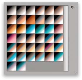
Figure 6.4
This shows the gradient map presets in the new Photographic Toning set.
1 Here is a photograph that I wished to apply a duotone type effect to, but at the same time I wanted to keep this image in RGB mode.
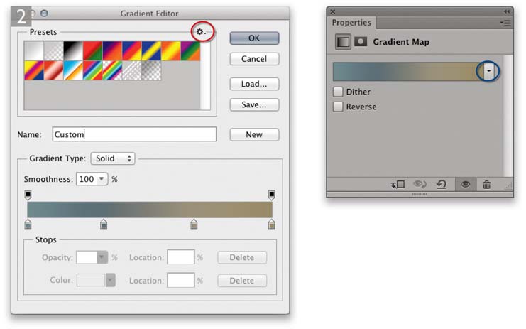
2 I added a Gradient Map adjustment layer to the image and double-clicked the gradient in the Gradient Map adjustment Properties panel to create a new gradient setting.
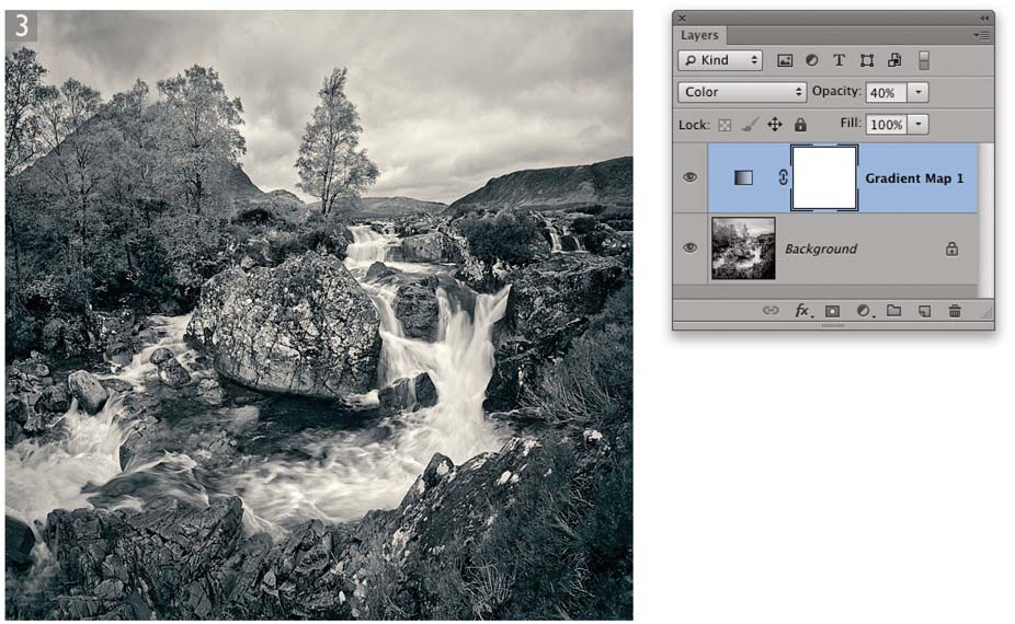
3 I set the Gradient Map layer blend mode to Color and in this instance reduced the layer opacity to 40% to produce the coloring effect seen here.
Camera Raw black and white conversions
You may already have noticed that you can use Camera Raw to convert images to black and white. This can be done at the raw processing stage to a raw, JPEG, or TIFF image (providing the TIFF is flattened). Or, you can do so using the Camera Raw filter from the Filter menu.

If you go to the HSL/Grayscale panel and check the Convert to Grayscale box, Camera Raw creates a black and white version of the image, which is produced by blending the color channel data to produce a monochrome rendering of the original. Clicking ‘Auto’ applies a custom setting that is based on the white balance setting applied in the Basic panel and if you click ‘Default’, this resets all the sliders to zero. You can manually drag the sliders to make certain colors in the color original lighter or darker, or select the target adjustment tool (circled in Step 2) to click and drag on the image to make certain colors convert to a darker or lighter tone. The overall tone brightness and contrast should not fluctuate much as you adjust the settings here and this makes it easy to experiment with different slider combinations. For example, if you want to make a sky go darker, you would do as I did in Step 2. Here, I selected the target adjustment tool, clicked on the sky and dragged to the left. This caused the Aquas and Blues sliders to shift to the left, darkening these tones. I would also suggest sometimes switching over to the Basic and Tone Curve panels to make continued adjustments to the white balance and tone controls as these can also have a strong bearing on the outcome of a black and white conversion.
Pros and cons of the Camera Raw approach
In my view, Camera Raw black and white conversions have the edge over using the Black & White adjustment in Photoshop. This is because the slider controls are better thought out and the addition of the in-between color sliders (see sidebar) makes it possible to target certain colors more precisely. The target adjustment mode correction tool in Camera Raw also performs better than the one found in the Photoshop Black & White adjustment.
An important question to raise here is ‘when is the best time to convert a photo to black and white?’ If you do this at the early Camera Raw stage it limits what you can do to a photo should you then want to retouch the image in Photoshop. I find it is usually better to carry out the black and

1 This shows a color image opened in Camera Raw.
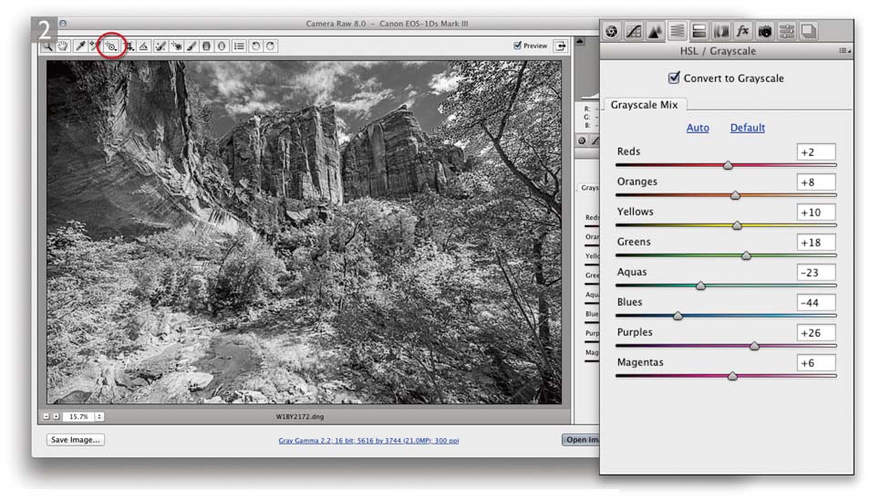
2 In the HSL/Grayscale panel I clicked on the Convert to Grayscale button and with the help of the target adjustment tool (circled), clicked and dragged directly on the image to make adjustments that would increase the contrast in the clouds.
white conversion at the end, just prior to print and have the adjustment be reversible. This is not a problem in Photoshop, because if you add a Black & White adjustment layer, it is easy enough to toggle the adjustment on or off. If you want to use Camera Raw to make the black and white conversion, you need to somehow take the Photoshop-edited image back through Camera Raw again. Before Photoshop CC this meant saving a JPEG or flattened TIFF version and re-editing a derivative version of the master image via Camera Raw. But as I mentioned earlier, now that Camera Raw is available as a filter from the Filter menu, it is much easier to apply a Camera Raw adjustment directly in Photoshop, though I would recommend you convert the image layer or layers you wish to edit into a smart object first, so the Camera Raw black and white edits remain non-destructive. Another option still is to use Lightroom. Here, it is possible to re-import your Photoshop-edited images back into Lightroom and use the Develop module in Lightroom to carry out the conversion. The advantage of this approach is that both PSD and TIFF formats can be read and they don’t have to be flattened – Lightroom doesn’t have a problem processing layered PSD or TIFF format images.
HSL grayscale conversions
If you set all the Saturation sliders in the HSL panel to −100, you can then use the Luminance sliders in the HSL panel to make almost the same type of adjustments as in the Grayscale mode. One of the chief advantages of this method is that you can use the Saturation and Vibrance controls in the Basic panel to fine-tune the grayscale conversion effect, which you can’t do when using just the ordinary Grayscale conversion mode.
Camera Calibration panel tweaks
Another thing I discovered recently is that you can also use the Camera Calibration panel sliders to affect the outcome of a Camera Raw black and white conversion.
Camera Raw Split Toning panel
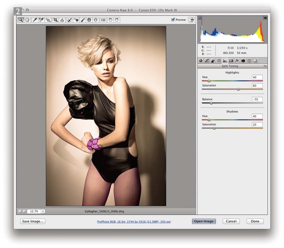
After you have used the HSL/Grayscale panel to convert a photograph to black and white you can use the Split Toning panel to colorize the image. These controls allow you to apply one color to the highlights, another color to the shadows and use the Saturation sliders to adjust the intensity of the colors. This is how you create a basic split tone color effect. There is also the Balance slider, which lets you adjust the midpoint for the split tone. In Figure 6.5 I applied a warm tone to both the highlights and shadows and adjusted the Balance slider so that the split toning was more biased towards the highlights. The HSL/Grayscale and Split Tone controls are incredibly versatile. Bear in mind these can work equally well with non-raw images.
Saturation shortcut
When dragging the Hue sliders in the Split Toning panel you can hold down the ![]() key to temporarily apply a boosted saturation to the split tone adjustment and thereby see more clearly the hue value you are applying. This works even when the Saturation sliders are set to zero.
key to temporarily apply a boosted saturation to the split tone adjustment and thereby see more clearly the hue value you are applying. This works even when the Saturation sliders are set to zero.

Figure 6.5
This shows an example of a Split Toning adjustment in Camera Raw.
Camera Raw color image split toning
Although the Split Toning panel appears to be designed for black and white work, these controls can be just as useful when editing color images. There are still ways to produce color cross processing effects in Photoshop, but the Camera Raw Split Toning controls can produce similar results, but with less hassle.

1 Here you can see a photo before I had applied a split toning effect. But note that I first applied a −40 Vibrance adjustment in order to desaturate the colors slightly.
2 I then went to the Split Toning panel and adjusted the Hue and Saturation sliders to create the split toning effect shown here. Essentially, the Hue sliders allow you to independently set the hue color for the highlights and the shadows and the Saturation sliders let you adjust the saturation. As I mentioned on page 453, if you hold down the ![]() key as you drag on a Hue slider you’ll see a temporary, saturated preview. This allows you to set the Hue slider for the desired color, without needing to adjust the Saturation slider first. The Balance slider can be used to adjust the balance between the highlight and shadow colors. This lets you offset the midpoint between the two. What is interesting to note here is that although the Hue values were the same for both the highlights and shadows, the Balance slider can still have a subtle effect on the outcome of any Split Tone adjustment.
key as you drag on a Hue slider you’ll see a temporary, saturated preview. This allows you to set the Hue slider for the desired color, without needing to adjust the Saturation slider first. The Balance slider can be used to adjust the balance between the highlight and shadow colors. This lets you offset the midpoint between the two. What is interesting to note here is that although the Hue values were the same for both the highlights and shadows, the Balance slider can still have a subtle effect on the outcome of any Split Tone adjustment.

3 To demonstrate the versatility of the Split Toning panel, these four additional looks were created by further tweaking the Split Toning panel settings.
Black and white output
Black and white printing should be easy, but if you are printing from RGB files you’ll meet the exact same issues that affect normal color printing. Your ability to match the print output to the display will, as always, be dependent on the accuracy of the computer display calibration, the type of paper you are printing with and the effectiveness of the printer profile you are using. Mind you, with black and white printing there is perhaps more latitude for the color to be off and still produce pleasing results. But if you are aiming for a perfectly neutral black and white print, then the profile used must be accurate. In theory, if the measured Info panel gray values are all neutral, the print output should be neutral too.
Advanced B&W Photo tips
If you are using one of the more advanced Epson printers you may be interested to know that you can access the Advanced B&W Photo settings shown in Figure 6.6, where you can apply coloring effects via the Epson driver system Print dialog. There are a few things you need to do in order to access and make the most of the Advanced B&W feature for Epson printers. Firstly, this is only available with certain printer models, such as the Epson 4800 and later models. You can make a print from either RGB or Grayscale images, but the printer driver assumes the image to be in neutral RGB (and ignores any colors), or to be in Grayscale mode. Normally you would convert to Grayscale first, in which case the gamma of the Grayscale space you convert to should match the gamma of your RGB workspace (see the Color Management PDF that is on the book website). In the Photoshop Print dialog you will want to select Photoshop Manages Colors and select an appropriate printer profile and rendering intent (again, see the Color Management PDF). When you click Print, this will take you to the Epson print dialog, where in the Print Settings section you will need to select an appropriate media type, such as Photo Paper ![]() Premium Glossy Photo Paper, in order to match the profile selected in the Photoshop Print dialog (note also that not all paper media settings support Advanced B&W). Next, select ‘Advanced B&W Photo’ from the Color section of the Print dialog (see page 752). Having done that, click on the Advanced Color Settings, to access the Print dialog options shown in Figure 6.6, where the key thing is to leave most of these sliders as they are, apart from choosing a color toning method. You can choose a preset color from this menu, click on the color wheel below, or adjust the Horizontal and Vertical values. You will notice that the Tone setting says ‘Darker’. This is actually the default setting, but you can modify this if you wish.
Premium Glossy Photo Paper, in order to match the profile selected in the Photoshop Print dialog (note also that not all paper media settings support Advanced B&W). Next, select ‘Advanced B&W Photo’ from the Color section of the Print dialog (see page 752). Having done that, click on the Advanced Color Settings, to access the Print dialog options shown in Figure 6.6, where the key thing is to leave most of these sliders as they are, apart from choosing a color toning method. You can choose a preset color from this menu, click on the color wheel below, or adjust the Horizontal and Vertical values. You will notice that the Tone setting says ‘Darker’. This is actually the default setting, but you can modify this if you wish.

Figure 6.6
This shows the Advanced Color Settings for the Epson 4800 printer when the ‘Advanced B&W Photo’ option is selected in the main Print Settings section of the System print interface. This allows you to apply different black and white output toning options.