People are such interesting and varied subjects to draw. With this compilation of projects from some of the most popular titles in our How to Draw and Paint series, you’ll find in-depth information on every aspect of drawing people. Featuring instruction from four accomplished artists, this book is filled with step-by-step demonstrations that show you how to re-create a range of people of differing ages and ethnicities. You’ll find plenty of helpful tips on tools and materials, shading, and other fundamental drawing techniques, as well as important information about the influences of bone structure and musculature. And detailed examples of facial features, hands, and feet will help guide you through the most challenging aspects of drawing people. With practice, you’ll soon be able to capture amazing likenesses of family and friends in your pencil drawings!

TOOLS & MATERIALS
Drawing is not only fun, it also is an important art form in itself. Even when you write or print your name, you are actually drawing! If you organize the lines, you can make shapes; and when you carry that a bit further and add dark and light shading, your drawings begin to take on a three-dimensional form and look more realistic. One of the great things about drawing is that you can do it anywhere, and the materials are very inexpensive. You do get what you pay for, though, so purchase the best you can afford at the time, and upgrade your supplies whenever possible. Although anything that will make a mark can be used for some type of drawing, you’ll want to make certain your magnificent efforts will last and not fade over time. Here are some materials that will get you off to a good start.

Work Station It is a good idea to set up a work area that has good lighting and enough room for you to work and lay out your tools. Of course, an entire room with track lighting, easel, and drawing table is ideal. But all you really need is a place by a window for natural lighting. When drawing at night, you can use a soft white light bulb and a cool white fluorescent light so that you have both warm (yellowish) and cool (bluish) light.

Sketch Pads Conveniently bound drawing pads come in a wide variety of sizes, textures, weights, and bindings. They are particularly handy for making quick sketches and when drawing outdoors. You can use a large sketchbook in the studio for laying out a painting, or take a small one with you for recording quick impressions when you travel. Smooth-to mediumgrain paper texture (which is called the “tooth”) often is an ideal choice.

Drawing Papers For finished works of art, using single sheets of drawing paper is best. They are available in a range of surface textures: smooth grain (plate and hot pressed), medium grain (cold pressed), and rough to very rough. The cold-pressed surface is the most versatile. It is of medium texture but it’s not totally smooth, so it makes a good surface for a variety of different drawing techniques.

Charcoal Papers Charcoal paper and tablets also are available in a variety of textures. Some of the surface finishes are quite pronounced, and you can use them to enhance the texture in your drawings. These papers also come in a variety of colors, which can add depth and visual interest to your drawings.
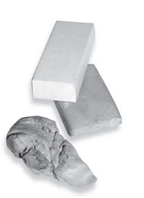
Artist’s Erasers A kneaded eraser is a must. It can be formed into small wedges and points to remove marks in very tiny areas. Vinyl erasers are good for larger areas; they remove pencil marks completely. Neither eraser will damage the paper surface unless scrubbed too hard.

Tortillons These paper “stumps” can be used to blend and soften small areas where your finger or a cloth is too large. You also can use the sides to quickly blend large areas. Once the tortillons become dirty, simply rub them on a cloth, and they’re ready to go again.

Utility Knives Utility knives (also called “craft” knives) are great for cleanly cutting drawing papers and mat board. You also can use them for sharpening pencils. (See the box on page 9.) Blades come in a variety of shapes and sizes and are easily interchanged. But be careful; the blades are as sharp as scalpels!
GATHERING THE BASICS
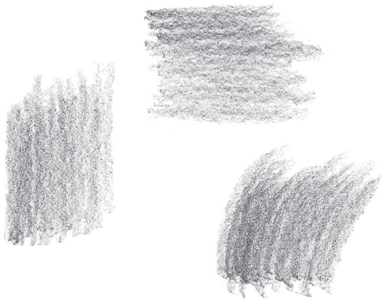
You don’t need a lot of supplies to start; you can begin enjoying drawing with just a #2 or an HB pencil, a sharpener, a vinyl eraser, and any piece of paper. You always can add more pencils, charcoal, tortillons, and such later. When shopping for pencils, notice that they are labeled with letters and numbers; these indicate the degree of lead softness. Pencils with B leads are softer than those with H leads, and so they make darker strokes. An HB is in between, which makes it very versatile and a good beginner’s tool. The chart at right shows a variety of drawing tools and the kinds of strokes that are achieved with each one. As you expand your pencil supply, practice shaping different points and creating different effects with each by varying the pressure you put on the pencil. The more comfortable you are with your tools, the better your drawings will be!
ADDING ON
Unless you already have a drawing table, you may want to purchase a drawing board. It doesn’t have to be expensive; just get one large enough to accommodate individual sheets of drawing paper. Consider getting one with a cut-out handle, especially if you want to draw outdoors, so you easily can carry it with you.

Spray Fix A fixative “sets” a drawing and protects it from smearing. Some artists avoid using fixative on pencil drawings because it tends to deepen the light shadings and eliminate some delicate values. However, fixative works well for charcoal drawings. Fixative is available in spray cans or in bottles, but you need a mouth atomizer to use bottled fixative. Spray cans are more convenient, and they give a finer spray and more even coverage.

HB An HB with a sharp point produces crisp lines and offers good control. With a round point, you can make slightly thicker lines and shade small areas.

Flat For wider strokes, use the sharp point of a flat 4B. A large, flat sketch pencil is great for shading large areas, but the sharp, chiseled edge can be used to make thinner lines too.

Charcoal 4B charcoal is soft, so it makes a dark mark. Natural charcoal vines are even softer, and they leave a more crumbly residue on the paper. Some artists use white charcoal pencils for blending and lightening areas in their drawings.
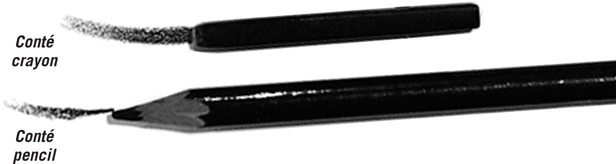
Conté Crayon or Pencil Conté crayon is made from very fine Kaolin clay. Once it came only in black, white, red, and sanguine sticks, but now it’s also available in a wide range of colored pencils. Because it’s water soluble, it can be blended with a wet brush or cloth.

A Utility Knife can be used to form different points (chiseled, blunt, or flat) than are possible with an ordinary pencil sharpener. Hold the knife at a slight angle to the pencil shaft, and always sharpen away from you, taking off only a little wood and graphite at a time.

A Sandpaper Block will quickly hone the lead into any shape you wish. It also will sand down some of the wood. The finer the grit of the paper, the more controllable the resulting point. Roll the pencil in your fingers when sharpening to keep the shape even.

Rough Paper is wonderful for smoothing the pencil point after tapering it with sandpaper. This also is a great way to create a very fine point for small details. Again, it is important to gently roll the pencil while honing to sharpen the lead evenly.
THE ELEMENTS OF DRAWING
Drawing consists of three elements: line, shape, and form. The shape of an object can be described with simple one-dimensional line. The three-dimensional version of the shape is known as the object’s “form.” In pencil drawing, variations in value (the relative lightness or darkness of black or a color) describe form, giving an object the illusion of depth. In pencil drawing, values range from black (the darkest value) through different shades of gray to white (the lightest value). To make a two-dimensional object appear three-dimensional, you must pay attention to the values of the highlights and shadows. When shading a subject, you must always consider the light source, as this is what determines where your highlights and shadows will be.
MOVING FROM SHAPE TO FORM
The first step in creating an object is establishing a line drawing or outline to delineate the flat area that the object takes up. This is known as the “shape” of the object. The four basic shapes—the rectangle, circle, triangle, and square—can appear to be three-dimensional by adding a few carefully placed lines that suggest additional planes. By adding ellipses to the rectangle, circle, and triangle, you’ve given the shapes dimension and have begun to produce a form within space. Now the shapes are a cylinder, sphere, and cone. Add a second square above and to the side of the first square, connect them with parallel lines, and you have a cube.


ADDING VALUE TO CREATE FORM
A shape can be further defined by showing how light hits the object to create highlights and shadows. First note from which direction the source of light is coming. (In these examples, the light source is beaming from the upper right.) Then add the shadows accordingly, as shown in the examples below. The core shadow is the darkest area on the object and is opposite the light source. The cast shadow is what is thrown onto a nearby surface by the object. The highlight is the lightest area on the object, where the reflection of light is strongest. Reflected light, often overlooked by beginners, is surrounding light reflected into the shadowed area of an object.

Just as a musician uses a musical scale to measure a range of notes, an artist uses a value scale to measure changes in value. You can refer to the value scale so you’ll always know how dark to make your dark values and how light to make your highlights. The scale also serves as a guide for transitioning from lighter to darker shades. Making your own value scale will help familiarize you with the different variations in value. Work from light to dark, adding more and more tone for successively darker values (as shown at upper right). Then create a blended value scale (shown at lower right). Use a tortillon to smudge and blend each value into its neighboring value from light to dark to create a gradation.

BASIC PENCIL TECHNIQUES
You can create an incredible variety of effects with a pencil. By using various hand positions and shading techniques, you can produce a world of different lines and strokes. If you vary the way you hold the pencil, the mark the pencil makes changes. It’s just as important to notice your pencil point. The point is every bit as essential as the type of lead in the pencil. Experiment with different hand positions and techniques to see what your pencil can do!
GRIPPING THE PENCIL
Many artists use two main hand positions for drawing. The writing position is good for very detailed work that requires fine hand control. The underhand position allows for a freer stroke with more arm movement—the motion is almost like painting. (See the captions below for more information on using both hand positions.)

Using the Writing Position This familiar position provides the most control. The accurate, precise lines that result are perfect for rendering fine details and accents. When your hand is in this position, place a clean sheet of paper under your hand to prevent smudging.

Using the Underhand Position Pick up the pencil with your hand over it, holding the pencil between the thumb and index finger; the remaining fingers can rest alongside the pencil. You can create beautiful shading effects from this position.
PRACTICING BASIC TECHNIQUES
By studying the basic pencil techniques below, you can learn to render everything from a smooth complexion and straight hair to shadowed features and simple backgrounds. Whatever techniques you use, though, remember to shade evenly. Shading in a mechanical, side-to-side direction, with each stroke ending below the last, can create unwanted bands of tone throughout the shaded area. Instead try shading evenly, in a back-and-forth motion over the same area, varying the spot where the pencil point changes direction.

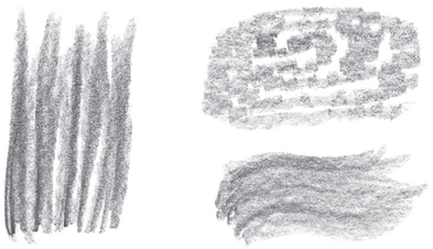
Hatching This basic method of shading involves filling an area with a series of parallel strokes. The closer the strokes, the darker the tone will be.

Crosshatching For darker shading, place layers of parallel strokes on top of one another at varying angles. Again, make darker values by placing the strokes closer together.

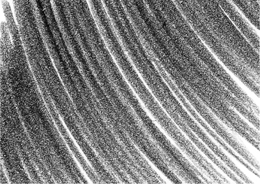
Gradating To create graduated values (from dark to light), apply heavy pressure with the side of your pencil, gradually lightening the pressure as you stroke.
Shading Darkly By applying heavy pressure to the pencil, you can create dark, linear areas of shading.

Shading with Texture For a mottled texture, use the side of the pencil tip to apply small, uneven strokes.

Blending To smooth out the transitions between strokes, gently rub the lines with a tortillon or tissue.
OTHER WAYS TO SHADE
PRACTICING LINES
When drawing lines, it is not necessary to always use a sharp point. In fact, sometimes a blunt point may create a more desirable effect. When using larger lead diameters, the effect of a blunt point is even more evident. Play around with your pencils to familiarize yourself with the different types of lines they can create. Make every kind of stroke you can think of, using both a sharp point and a blunt point. Practice the strokes below to help you loosen up.
As you experiment, you will find that some of your doodles will bring to mind certain imagery or textures. For example, little Vs can be reminiscent of birds flying, whereas wavy lines can indicate water.

Drawing with a Sharp Point First draw a series of parallel lines. Try them vertically; then angle them. Make some of them curved, trying both short and long strokes. Then try some wavy lines at an angle and some with short, vertical strokes. Try making a spiral and then grouping short, curved lines together. Then practice varying the weight of the line as you draw. Os, Vs, and Us are some of the most common alphabet shapes used in drawing.

Drawing with a Blunt Point It is good to take the same exercises and try them with a blunt point. Even if you use the same hand positions and strokes, the results will be different when you switch pencils. Take a look at these examples. The same shapes were drawn with both pencils, but the blunt pencil produced different images. You can create a blunt point by rubbing the tip of the pencil on a sandpaper block or on a rough piece of paper.
“PAINTING” WITH PENCIL
When you use painterly strokes, your drawing will take on a new dimension. Think of your pencil as a brush and allow yourself to put more of your arm into the stroke. To create this effect, try using the underhand position, holding your pencil between your thumb and forefinger and using the side of the pencil. (See page 11.) If you rotate the pencil in your hand every few strokes, you will not have to sharpen it as frequently. The larger the lead, the wider the stroke will be. The softer the lead, the more painterly an effect you will have. These examples were all made on smooth paper with a 6B pencil, but you can experiment with rough papers for more broken effects.
Starting Simply First experiment with vertical, horizontal, and curved strokes. Keep the strokes close together and begin with heavy pressure. Then lighten the pressure with each stroke.

Varying the Pressure Randomly cover the area with tone, varying the pressure at different points. Continue to keep your strokes loose.

Using Smaller Strokes Make small circles for the first example. This is reminiscent of leathery animal skin. For the second example (at far right), use short, alternating strokes of heavy and light pressure to create a pattern that is similar to stone or brick.
Loosening Up Use long vertical strokes, varying the pressure for each stroke until you start to see long grass (at right). Then use somewhat looser movements that could be used for water (at far right). First create short spiral move ments with your arm (above). Then use a wavy movement, varying the pressure (below).
FINDING YOUR STYLE
Many great artists of the past can now be identified by their unique experiments with line. Van Gogh’s drawings were a feast of calligraphic lines; Seurat became synonymous with pointillism; and Giacometti was famous for his scribble. Can you find your identity in a pencil stroke?
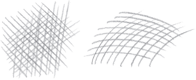
Using Criss-Crossed Strokes If you like a good deal of fine detail in your work, you’ll find that crosshatching allows you a lot of control (see page 11). You can adjust the depth of your shading by changing the distance between your strokes.

Sketching Circular Scribbles If you work with round, loose strokes like these, you are probably very experimental with your art. These looping lines suggest a free-form style that is more concerned with evoking a mood than with capturing precise details.

Drawing Small Dots This technique is called “stippling”—many small dots are used to create a larger picture. Make the points different sizes to create various depths and shading effects. Stippling takes a great deal of precision and practice.

Simulating Brush-strokes You can create the illusion of brushstrokes by using short, sweeping lines. This captures the feeling of painting but allows you the same control you would get from crosshatching. These strokes are ideal for a more stylistic approach.
WORKING WITH DIFFERENT TECHNIQUES
Below are several examples of techniques that can be done with pencil. These techniques are important for creating more painterly effects in your drawing. Remember that B pencils have soft lead and H pencils have hard lead—you will need to use both for these exercises.

Creating Washes First shade an area with a water-soluble pencil (a pencil that produces washes similar to watercolor paint when manipulated with water). Then blend the shading with a wet brush. Make sure your brush isn’t too wet, and use thicker paper, such as vellum board.

Rubbing Place paper over an object and rub the side of your pencil lead over the paper. The strokes of your pencil will pick up the pattern and replicate it on the paper. Try using a soft pencil on smooth paper, and choose an object with a strong textural pattern. This example uses a wire grid.

Lifting Out Blend a soft pencil on smooth paper, and then lift out the desired area of graphite with an eraser. You can create highlights and other interesting effects with this technique.

Producing Indented Lines Draw a pattern or design on the paper with a sharp, non-marking object, like a knitting needle or skewer, before drawing with a pencil. When you shade over the area with the side of your pencil, the graphite will not reach the indented areas, leaving white lines.
Smudging is an important technique for creating shading and gradients. Use a tortillon or chamois cloth to blend your strokes. It is important to not use your finger, because your hand, even if clean, has natural oils that can damage your art.

Smudging on Rough Surfaces Use a 6B pencil on vellum-finish Bristol board. Make your strokes with the side of the pencil and blend. In this example, the effect is very granular.

Smudging on Smooth Surfaces Use a 4B pencil on plate-finish Bristol board. Stroke with the side of the pencil, and then blend your strokes with a blending stump.
LEARNING TO SEE
Many beginners draw without really looking carefully at their subject; instead of drawing what they actually see, they draw what they think they see. Try drawing something you know well, such as your hand, without looking at it. Chances are your finished drawing won’t look as realistic as you expected. That’s because you drew what you think your hand looks like. Instead, you need to forget about all your preconceptions and learn to draw only what you really see in front of you (or in a photo). Two great exercises for training your eye to see are contour drawing and gesture drawing.
PENCILING THE CONTOURS
In contour drawing, you pick a starting point on your subject and then draw only the contours—or outlines—of the shapes you see. Because you’re not looking at your paper, you’re training your hand to draw the lines exactly as your eye sees them. Try doing some contour drawings of your own; you’ll be surprised at how well you’re able to capture the subjects.

Drawing “Blind” For the contour drawing on the left, the artist occasionally looked down at the paper. The drawing on the right is an example of a blind contour drawing, where the artist drew without looking at his paper even once. It’s a little distorted, but it’s clearly a hand. Blind contour drawing is one of the best ways of making sure you’re truly drawing only what you see.

Drawing with a Continuous Line When drawing this man pushing a wheelbarrow, try glancing only occasionally at your paper to check that you are on track, but concentrate on really looking at the subject and tracing the outlines you see. Instead of lifting your pencil between shapes, keep the line unbroken by freely looping back and crossing over your lines. Notice how this simple technique effectively captures the subject.
To test your observation skills, study an object very closely for a few minutes, and then close your eyes and try drawing it from memory, letting your hand follow the mental image.


Drawing Children Once you have trained your eye to observe carefully and can draw quickly, you’ll be able to capture actions such as this child looking and then reaching into the bag.
DRAWING GESTURE AND ACTION
Another way to train your eye to see the essential elements of a subject—and train your hand to record them rapidly—is through gesture drawing. Instead of rendering the contours, gesture drawings establish the movement of a figure. First determine the main thrust of the movement, from the head, down the spine, and through the legs; this is the line of action, or action line. Then briefly sketch the general shapes of the figure around this line. These quick sketches are great for practicing drawing figures in action and sharpening your powers of observation.

Studying Repeated Action Group sports provide a great opportunity for practicing gesture drawings and learning to see the essentials. Because the players keep repeating the same action, you will be able to observe each movement closely and keep it in your memory long enough to sketch it correctly.
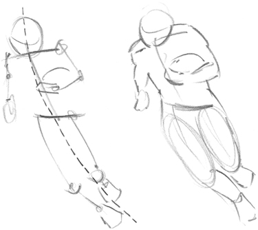
Starting with an Action Line Once you establish the line of action, try building a “skeleton” stick drawing around it. Here the artist paid particular attention to the angles of the shoulders, spine, and pelvis. Then he sketched in the placement of the arms, knees, and feet and roughly filled out the basic shapes of the figure.

Working Quickly To capture the action accurately, work very quickly, without including even a suggestion of detail. If you want to correct a line, don’t stop to erase; just draw over it.
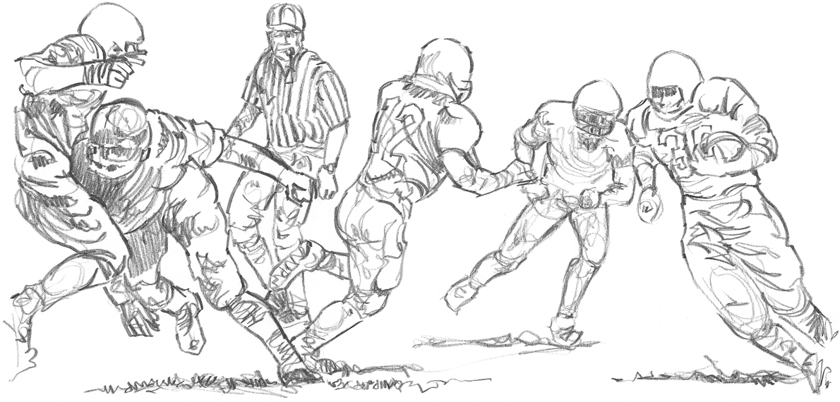
Drawing a Group in Motion Once you have compiled a series of gesture drawings, you’ll be able to combine them into a scene of football players in action.
PEOPLE IN PERSPECTIVE
Knowing the principles of perspective (the representation of objects on a two-dimensional surface that creates the illusion of three-dimensional depth and distance) allows you to draw more than one person in a scene realistically. Eye level changes as your elevation of view changes. In perspective, eye level is indicated by the horizon line. Imaginary lines receding into space meet on the horizon line at what are known as “vanishing points.” Any figures drawn along these lines will be in proper perspective. Study the diagrams below to help you.


Note that objects appear smaller and less detailed as they recede into the distance.

Try drawing a frontal view of many heads as if they were in a theater. Start by establishing your vanishing point at eye level. Draw one large head representing the person closest to you, and use it as a reference for determining the sizes of the other figures in the drawing. The technique illustrated above can be applied when drawing entire figures, shown in the diagram below. Although all of these examples include just one vanishing point, a composition can even have two or three vanishing points.
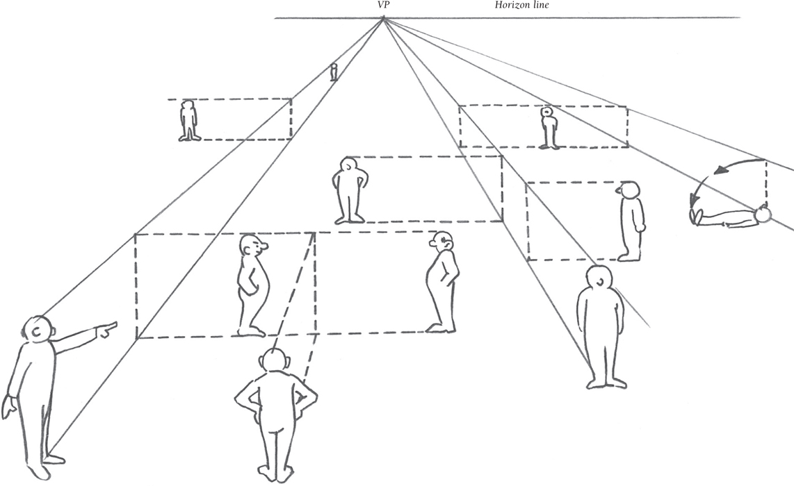
If you’re a beginner, you may want to begin with basic one-point perspective, shown on this page. As you progress, attempt to incorporate two-or three-point perspective. For more in-depth information, refer to the book Perspective (AL13) in Walter Foster’s Artist’s Library series.
PLACING PEOPLE IN A COMPOSITION
The positioning and size of a person on the picture plane (the physical area covered by the drawing) is of utmost importance to the composition, or the arrangements of elements on your paper. The open or “negative” space around the portrait subject generally should be larger than the area occupied by the subject, providing a sort of personal space surrounding them. Whether you are drawing only the face, a head-and-shoulders portrait, or a complete figure, thoughtful positioning will establish a pleasing composition with proper balance. Practice drawing thumbnail sketches of people to study the importance of size and positioning.
BASICS OF PORTRAITURE
Correct placement on the picture plane is key to a good portrait, and the eyes of the subject are the key to placement. The eyes catch the viewer’s attention first, so they should not be placed on either the horizontal or vertical centerline of the picture plane; preferably, the eyes should be placed above the centerline. Avoid drawing too near the sides, top, or bottom of the picture plane, as this gives an uneasy feeling of imbalance.

Placement of a Portrait The smaller thumbnails here show the girl’s head placed too far to the side and too low in the picture plane, suggesting that she might “slide off” the page. The larger sketch shows the face at a comfortable and balanced horizontal and vertical position, which allows room to add an additional element of interest to enhance the composition.

Multiple Subjects If you are drawing several, similarly sized subjects, use the rules of perspective to determine relative size (see pages 16–17). Draw a vanishing point on a horizon line and a pair of perspective lines. Receding guidelines extended from the perspective lines will indicate the top of the head and chin of faces throughout the composition. The heads become smaller as they get farther from the viewer.
ADDING ELEMENTS TO PORTRAITS
Many portraits are drawn without backgrounds to avoid distracting the viewer from the subject. If you do add background elements to portraits, be sure to control the size, shape, and arrangement of elements surrounding the figure. Additions should express the personality or interests of the subject.

Repetition of Shapes within the Portrait The delicate features of this young woman are emphasized by the simple, abstract elements in the background. The flowing curves fill much of the negative space while accenting the elegance of the woman’s hair and features. Simplicity of form is important in this composition; the portrait highlights only her head and neck. Notice that her eyes meet the eyes of the viewer—a dramatic and compelling feature.

Depicting the Subject’s Interest This portrait of a young man includes a background that shows his interest in rocketry. The straight lines in the background contrast the rounded shapes of the human form. Although the background detail is complex, it visually recedes and serves to balance the man’s weight. The focus remains on the man, but we’ve generated visual interest by adding elements to the composition.
Intentionally drawing your subject larger than the image area, as in the example below, can create a unique composition. Even if part of the image is cut off, this kind of close-up creates a dramatic mood.

Curved lines are good composition elements—they can evoke harmony and balance in your work. Try drawing some curved lines around the paper. The empty areas guide you in placing figures around your drawing.

Sharp angles can produce dramatic compositions. Draw a few straight lines in various angles, and make them intersect at certain points. Zigzagging lines also form sharp corners that give the composition an energetic feeling.

You can create a flow or connection between multiple subjects in a composition by creatively using circles and ellipses, as shown below.


Guiding the Eye The compositions above illustrate how arm position, eyesight direction, and line intersection can guide the eye to a particular point of interest. Using these examples, try to design some of your own original compositions.
ADDING COMPLETE FIGURES
Creating a composition that shows a complete person can be challenging. A standing figure is much taller than it is wide, so the figure should be positioned so that its action relates naturally to the eye level of the viewer and the horizon line. To place more than one figure on the picture plane, use perspective as we did with the portrait heads. Remember that people appear smaller and less distinct when they are more distant. For comfortable placement of people in a composition, they should be on the same eye level as the viewer with the horizon line about waist high.

Full Figure Placement In thumbnail A, the subject is too perfectly centered in the picture plane. In thumbnail B, the figure is placed too far to the left. Thumbnail C is an example of effective placement of a human figure in a composition.

Sizing Multiple Figures For realistic compositions, we need to keep figures in proportion. All the figures here are in proportion; we use perspective to determine the height of each figure. Start by drawing a horizon line and placing a vanishing point on it. Then draw your main character (on the right here) to which all others will be proportional. Add light perspective lines from the top and bottom of the figure to the vanishing point to determine the height of other figures. If we want figures on the other side of the vanishing point, we draw horizontal placement guidelines from the perspective lines to determine his height, and then add perspective lines on that side.

Line of Sight Figures in a composition like this one can relate to one another or to objects within the scene through line of sight (shown here as dotted lines). You can show line of sight with the eyes, but also by using head position and even a pointing hand. These indications can guide the viewer to a particular point of interest in the composition. Though the man on the left is facing forward, his eyes are looking to our right. The viewer’s eye follows the line of sight of those within the drawing and is guided around the picture plane as the people interact. The man at the top is looking straight up.
PLACEMENT OF SINGLE AND GROUPED FIGURES
Artists often use the external shape and mass of figures to assist in placing elements within a composition—individual figures form various geometric shapes based on their pose, and several figures in close proximity form one mass. Establish a concept of what you want to show in your composition, and make thumbnail studies before attempting the final drawing. The following exercise is based on using the shape and mass of single and grouped figures to create the drawing at the bottom of the page.

Step One Begin by considering the overall setting—foreground, middle ground, and background—for a subject like these children at the beach. You can use elements from different photos and place them in one setting. Block in the basic shapes of your subjects; the boy in the foreground is a clipped triangular shape, and the group of children forms a rough rectangle. Determine balanced placement of the two masses of people.

Step Two Next, sketch in outlines of the figures. The little boy with the shovel and pail occupies an area close to the viewer. The three children occupy a slightly smaller mass in the middle ground at the water’s edge. Even though there are three children in this area, they balance the little boy through size and placement at the opposite corner. The wave and water line unite the composition and lead the eye between the two masses.

Step Three Place your figures so that they fit comfortably on the picture plane. Add detail and shading to elements that are important in the composition. Use an element in the foreground to help direct the viewer’s eye to other areas, such as the outstretched arm of the boy. Placing the small rock between the middle-and foreground creates a visual stepping stone to the three children at right.
BEGINNING PORTRAITURE
A good starting point for drawing people is the head and face. The shapes are fairly simple, and the proportions are easy to measure. And portraiture also is very rewarding. You’ll feel a great sense of satisfaction when you look at a portrait you’ve drawn and see a true likeness of your subject, especially when the model is someone near and dear to you. So why not start with children?
DRAWING A CHILD’S PORTRAIT
Once you’ve practiced drawing features, you’re ready for a full portrait. You’ll probably want to draw from a photo, though, as children rarely sit still for very long! Study the features carefully, and try to draw what you truly see, and not what you think an eye or a nose should look like. But don’t be discouraged if you don’t get a perfect likeness right off the bat. Just keep practicing!

Starting with a Good Photo When working from photographs, you may prefer candid, relaxed poses over formal, “shoulders square” portraits. Also try to get a close-up shot of the face so you can really study the features. This photograph of 2-1/2-year-old Gage fits the bill perfectly!

Sketching the Guidelines First pencil an oval for the shape of the head, and lightly draw a vertical centerline. Then add horizontal guidelines according to the chart at the top of the page, and sketch in the general outlines of the features. When you’re happy with the overall sketch, carefully erase the guidelines.

Finishing the Portrait With the side of your pencil, start laying in the middle values of the shadow areas, increasing the pressure slightly around the eye, nose, and collar. For the darkest shadows and Gage’s straight, black hair, use the side of a 2B and overlap your strokes, adding a few fine hairs along the forehead with the sharp-pointed tip of your pencil.

Child Proportions Draw guidelines to divide the head in half horizontally; then divide the lower half into fourths. Use the guidelines to place the eyes, nose, ears, and mouth, as shown.

Separating the Features Before you attempt a full portrait, try drawing the features separately to get a feel for the shapes and forms. Look at faces in books and magazines, and draw as many different features as you can.
Quite a few things are wrong with these drawings of Gage’s head. Compare them with the photo at left, and see if you can spot the errors before reading the captions.

Thin Neck Gage has a slender neck, but not this slender. Refer to the photo to see where his neck appears to touch his face and ear.

Not Enough Forehead Children have proportionately larger foreheads than adults do. By drawing the forehead too small, you will add years to Gage’s age.

Cheeks Too Round Children do have round faces, but don’t make them look like chipmunks. And be sure to make the ears round, not pointed.

Sticks for Eyelashes Eyelashes should not stick straight out like spokes on a wheel. And draw the teeth as one shape; don’t try to draw each tooth separately.
DRAWING THE ADULT HEAD
An adult’s head has slightly different proportions than a child’s head, but the drawing process is the same: Sketch in guidelines to place the features, and start with a sketch of basic shapes. And don’t forget the profile view. Adults with interesting features are a lot of fun to draw from the side, where you can really see the shape of the brow, the outline of the nose, and the form of the lips.

Adult Proportions Look for the proportions that make your adult subject unique; notice the distance from the top of the head to the eyes, from the eyes to the nose, and from the nose to the chin. Look at where the mouth falls between the nose and the chin and where the ears align with the eyes and the nose.

Portraying the Profile The artist liked this fellow’s pronounced features, so he drew the subject in profile. He used the point and the side of an HB for this pose.
EXPRESSING EMOTION
It’s great fun to draw a wide range of different facial expressions and emotions, especially ones that are extreme. Because these are just studies and not formal portraits, draw loosely to add energy and a look of spontaneity, as if a camera had captured the face at just that moment. You usually don’t need to bother with a background—you don’t want anything to detract from the expression—but you may want to draw the neck and shoulders so the head doesn’t appear to be floating in space.
If you can’t find a photo of an expression you want to draw, try looking in a mirror and drawing your own expressions. That way you can “custom make” them!

Shocked When you want to show an extreme expression, focus on the lines around the eyes and mouth. Exposing the whole, round shape of the iris conveys a sense of shock, just as the exposed eyelid and open mouth do.

Happy Young children have smooth complexions, so make their smile lines fairly subtle. Use light shading with the side of your pencil to create creases around the mouth, and make the eyes slightly narrower to show how smiles pull up the cheek muscles.
